<!DOCTYPE html>
<html lang="en" class="scroll-smooth">
<head>
    <meta charset="UTF-8">
    <meta name="viewport" content="width=device-width, initial-scale=1.0">
    <title>Andreas Waldetoft - Music Composer</title>
    <!-- Modern SVG Favicon matching the AW logo on the website -->
    <link rel="icon" type="image/svg+xml" href="data:image/svg+xml,<svg xmlns=%22http://www.w3.org/2000/svg%22 viewBox=%220 0 100 100%22><rect width=%22100%22 height=%22100%22 rx=%2220%22 fill=%22%232563EB%22/><text x=%2250%25%22 y=%2254%25%22 font-family=%22system-ui, sans-serif%22 font-weight=%22bold%22 font-size=%2250%22 fill=%22%23ffffff%22 text-anchor=%22middle%22 dominant-baseline=%22middle%22>AW</text></svg>">
    <script src="https://cdn.tailwindcss.com"></script>
    <link rel="preconnect" href="https://fonts.googleapis.com">
    <link rel="preconnect" href="https://fonts.gstatic.com" crossorigin>
    <link href="https://fonts.googleapis.com/css2?family=Inter:wght@300;400;500;600;700;800&family=JetBrains+Mono:wght@400;500&display=swap" rel="stylesheet">
    <script src="https://unpkg.com/lucide@latest"></script>
    
    <style>
        :root {
            --bg-base: #030712;
            --bg-surface: #0a0e17;
            --bg-surface-elevated: #111827;
            --border-color: rgba(255, 255, 255, 0.08);
            --accent-glow: rgba(59, 130, 246, 0.15);
            --text-primary: #F9FAFB;
            --text-secondary: #9CA3AF;
        }

        body { 
            font-family: 'Inter', sans-serif; 
            background-color: var(--bg-base); 
            color: var(--text-primary); 
            overflow-x: hidden; 
            -webkit-font-smoothing: antialiased;
        }

        .font-mono {
            font-family: 'JetBrains Mono', monospace;
        }

        /* Giga.ai inspired structural grid */
        .page-grid {
            display: grid;
            grid-template-columns: 1fr;
            width: 100%;
            max-width: 1600px;
            margin: 0 auto;
            border-left: 1px solid var(--border-color);
            border-right: 1px solid var(--border-color);
        }

        /* Nav styles */
        .glass-nav {
            background-color: rgba(3, 7, 18, 0.8);
            backdrop-filter: blur(12px);
            -webkit-backdrop-filter: blur(12px);
            border-bottom: 1px solid var(--border-color);
        }

        .nav-link {
            position: relative;
            color: var(--text-secondary);
            transition: color 0.3s ease;
            font-size: 0.875rem;
            font-weight: 500;
            letter-spacing: 0.025em;
        }

        .nav-link:hover { color: var(--text-primary); }
        .nav-link.active { color: var(--text-primary); }
        .nav-link.active::after {
            content: '';
            position: absolute;
            bottom: -1.5rem;
            left: 0;
            width: 100%;
            height: 2px;
            background: #3B82F6;
        }

        /* Section styling */
        .section-container {
            border-bottom: 1px solid var(--border-color);
            position: relative;
        }

        .section-header {
            border-bottom: 1px solid var(--border-color);
            padding: 1rem 2rem;
            display: flex;
            align-items: center;
            gap: 1rem;
            background: rgba(10, 14, 23, 0.5);
        }

        .section-number {
            font-family: 'JetBrains Mono', monospace;
            color: #3B82F6;
            font-size: 0.875rem;
        }

        /* Hero styling */
        .hero-section { 
            position: relative; 
            min-height: 90vh; 
            display: flex; 
            align-items: center; 
            overflow: hidden; 
        }

        .hero-bg-glow {
            position: absolute;
            top: 50%;
            left: 50%;
            transform: translate(-50%, -50%);
            width: 80vw;
            height: 80vw;
            max-width: 1000px;
            max-height: 1000px;
            background: radial-gradient(circle, var(--accent-glow) 0%, transparent 70%);
            z-index: 0;
            pointer-events: none;
        }

        /* Typography */
        .display-title {
            font-size: clamp(3rem, 8vw, 6.5rem);
            font-weight: 800;
            line-height: 1.05;
            letter-spacing: -0.03em;
            background: linear-gradient(180deg, #FFFFFF 0%, #A1A1AA 100%);
            -webkit-background-clip: text;
            -webkit-text-fill-color: transparent;
            padding-right: 0.1em;
        }

        /* Buttons */
        .btn-structural {
            display: inline-flex;
            align-items: center;
            justify-content: center;
            padding: 0.875rem 1.5rem;
            background-color: var(--text-primary);
            color: var(--bg-base);
            font-weight: 600;
            font-size: 0.875rem;
            border-radius: 4px;
            transition: all 0.2s ease;
        }

        .btn-structural:hover {
            background-color: #D1D5DB;
            transform: translateY(-1px);
        }

        .btn-outline {
            display: inline-flex;
            align-items: center;
            justify-content: center;
            padding: 0.875rem 1.5rem;
            border: 1px solid var(--border-color);
            color: var(--text-primary);
            font-weight: 500;
            font-size: 0.875rem;
            border-radius: 4px;
            transition: all 0.2s ease;
            background: transparent;
        }

        .btn-outline:hover {
            border-color: var(--text-secondary);
            background: rgba(255,255,255,0.02);
        }

        /* Cards */
        .structural-card {
            background-color: var(--bg-surface);
            border: 1px solid var(--border-color);
            border-radius: 8px;
            overflow: hidden;
            transition: border-color 0.3s ease, background-color 0.3s ease;
        }

        .structural-card:hover {
            border-color: rgba(255, 255, 255, 0.2);
            background-color: var(--bg-surface-elevated);
        }

        /* Specific container styles */
        .youtube-embed-container { 
            position: relative; 
            width: 100%; 
            padding-bottom: 56.25%; 
            height: 0; 
            overflow: hidden; 
            border-bottom: 1px solid var(--border-color);
        }
        
        .youtube-embed-container iframe { 
            position: absolute; 
            top: 0; 
            left: 0; 
            width: 100%; 
            height: 100%; 
            border: 0; 
        }

        .form-input { 
            background-color: transparent; 
            border: 1px solid var(--border-color); 
            color: var(--text-primary); 
            border-radius: 4px; 
            padding: 1rem; 
            transition: border-color 0.2s ease; 
            font-size: 0.875rem; 
            width: 100%;
        }

        .form-input:focus { 
            border-color: #3B82F6; 
            outline: none; 
            background: rgba(255,255,255,0.02);
        }

        /* Scrollbar */
        ::-webkit-scrollbar { width: 8px; }
        ::-webkit-scrollbar-track { background: var(--bg-base); border-left: 1px solid var(--border-color); }
        ::-webkit-scrollbar-thumb { background: #374151; border-radius: 4px; }
        ::-webkit-scrollbar-thumb:hover { background: #4B5563; }

        /* Ambient Glow Effect */
        @keyframes ambient-pulse {
            0% { opacity: 0.3; transform: scale(0.99); filter: blur(35px); }
            50% { opacity: 0.7; transform: scale(1.02); filter: blur(45px); }
            100% { opacity: 0.3; transform: scale(0.99); filter: blur(35px); }
        }
        .animate-ambient-pulse {
            animation: ambient-pulse 6s ease-in-out infinite;
            will-change: transform, opacity, filter;
        }

        /* Rotating Edge Glow */
        @property --glow-angle {
            syntax: '<angle>';
            initial-value: 0deg;
            inherits: false;
        }
        @keyframes rotate-gradient {
            0% { --glow-angle: 0deg; }
            100% { --glow-angle: 360deg; }
        }
        .edge-glow {
            background: conic-gradient(
                from var(--glow-angle),
                transparent 10%,
                rgba(255, 85, 0, 1) 30%,
                transparent 50%,
                transparent 60%,
                rgba(0, 85, 255, 1) 80%,
                transparent 100%
            );
            animation: rotate-gradient 12s linear infinite;
        }
    </style>
</head>
<body>

    <header class="fixed top-0 left-0 right-0 z-50 glass-nav">
        <div class="max-w-[1600px] w-full mx-auto flex justify-between items-center h-16 px-4 sm:px-8 border-l border-r border-[rgba(255,255,255,0.08)]">
            <a href="#home" class="flex items-center gap-3 group">
                <div class="w-8 h-8 bg-blue-600 rounded flex items-center justify-center text-white font-bold tracking-tighter group-hover:bg-blue-500 transition-colors">
                    AW
                </div>
                <span class="text-sm font-semibold tracking-wide text-white uppercase">Andreas Waldetoft</span>
            </a>
            
            <!-- Desktop Nav -->
            <nav class="hidden md:flex space-x-8 h-full items-center">
                <a href="#home" class="nav-link active">Home</a>
                <a href="#about" class="nav-link">About</a>
                <a href="#music" class="nav-link">Music</a>
                <a href="#news" class="nav-link">News</a> 
                <a href="#contact" class="nav-link">Contact</a>
            </nav>

            <!-- Mobile Nav Toggle -->
            <button id="mobile-menu-toggle" class="md:hidden text-gray-400 hover:text-white transition-colors">
                <i data-lucide="menu" id="mobile-menu-icon"></i>
            </button>
        </div>

        <!-- Mobile Menu Dropdown -->
        <div id="mobile-menu" class="hidden absolute top-16 left-0 w-full bg-[rgba(3,7,18,0.98)] backdrop-blur-xl border-b border-[rgba(255,255,255,0.08)] py-4 flex-col gap-2 px-6 md:hidden shadow-2xl transition-all">
            <a href="#home" class="nav-link mobile-link active block py-3">Home</a>
            <a href="#about" class="nav-link mobile-link block py-3">About</a>
            <a href="#music" class="nav-link mobile-link block py-3">Music</a>
            <a href="#news" class="nav-link mobile-link block py-3">News</a> 
            <a href="#contact" class="nav-link mobile-link block py-3">Contact</a>
        </div>
    </header>

    <main class="page-grid pt-16">
        
        <section id="home" class="hero-section section-container">
            <div class="hero-bg-glow"></div>
            
            <div class="w-full flex flex-col lg:flex-row relative z-10 h-full min-h-[80vh]">
                <!-- Left Content -->
                <div class="flex-1 flex flex-col justify-center p-8 lg:p-16 border-b lg:border-b-0 lg:border-r border-[rgba(255,255,255,0.08)] relative">
                    <div class="absolute top-8 left-8 font-mono text-xs text-blue-500 tracking-widest uppercase">
                        // Composer & Producer
                    </div>
                    
                    <div class="w-full max-w-4xl mt-12 lg:mt-0">
                        <h1 class="display-title mb-6">Music<br>Compositions<br><span class="text-gray-500">For Media.</span></h1>
                        <p class="text-gray-400 text-lg md:text-xl font-light mb-10 max-w-lg leading-relaxed">
                            Immersive and innovative soundscapes for games, film, and interactive experiences.
                        </p>
                        <div class="flex flex-wrap gap-4">
                            <a href="#music" class="btn-structural group">
                                Discover Work
                                <i data-lucide="arrow-right" class="ml-2 w-4 h-4 group-hover:translate-x-1 transition-transform"></i>
                            </a>
                            <a href="#contact" class="btn-outline">
                                Get in touch
                            </a>
                        </div>
                    </div>
                </div>

                <!-- Right Visual -->
                <div class="flex-1 relative min-h-[40vh] lg:min-h-full bg-[#0a0e17] overflow-hidden group">
                    <div class="absolute inset-0 bg-blue-500/5 mix-blend-overlay z-10 pointer-events-none"></div>
                    <video autoplay loop muted playsinline class="absolute inset-0 w-full h-full object-cover opacity-60 grayscale-[30%] group-hover:grayscale-0 transition-all duration-700">
                        <source src="https://andreaswaldetoft.com/Piano_Video_Space_Blue_Black.mp4" type="video/mp4">
                    </video>
                    
                    <!-- Decorative elements & Profile Picture Link -->
                    <div class="absolute bottom-8 right-8 flex items-end gap-4 z-20">
                        <a href="#contact" class="bg-black/50 backdrop-blur-md border border-white/10 p-2 rounded cursor-pointer group/pic transition-transform hover:-translate-y-1 hover:shadow-lg hover:shadow-blue-500/20">
                            <img src="https://andreaswaldetoft.com/files/andreasprofilepic.jpg" alt="Andreas" class="w-16 h-16 rounded grayscale group-hover/pic:grayscale-0 transition-all duration-300">
                        </a>
                        <div class="font-mono text-xs text-white/50 text-right pb-2 hidden sm:block">
                            SYS.REC // ON<br>
                            VOL.01
                        </div>
                    </div>
                </div>
            </div>
        </section>

        <section id="about" class="section-container bg-[#0a0e17]">
            <div class="section-header">
                <span class="section-number">01</span>
                <h2 class="text-sm font-semibold tracking-widest uppercase text-gray-400">Profile</h2>
            </div>
            
            <div class="p-8 lg:p-16 flex flex-col lg:flex-row gap-12 lg:gap-24">
                <div class="lg:w-1/3">
                    <h3 class="text-3xl lg:text-4xl font-bold mb-4">Experienced composer for Interactive Media.</h3>
                    <p class="text-gray-500 mb-8">Over two decades of crafting narrative-driven audio.</p>
                    
                    <div class="relative w-full aspect-square md:aspect-auto md:h-[400px] rounded-lg overflow-hidden border border-[rgba(255,255,255,0.08)]">
                        <img src="https://andreaswaldetoft.com/files/deepwoods01.JPEG" alt="Studio" class="absolute inset-0 w-full h-full object-cover grayscale-[20%]">
                    </div>
                </div>
                
                <div class="lg:w-2/3 flex flex-col justify-center gap-8 text-gray-300 font-light leading-relaxed text-lg">
                    <div class="pl-0 lg:pl-8 border-l-0 lg:border-l border-[rgba(255,255,255,0.08)]">
                        <p class="mb-6">Andreas Waldetoft is a distinguished music composer with a profound understanding of music's capacity to evoke emotion and enhance storytelling. He has over 20 years of experience composing music for games and interactive media. After serving as the Main Music Composer at Paradox Interactive for over a decade, Andreas transitioned to leading his own music production company.</p>
                        
                        <p class="mb-6">He specializes in creating bespoke scores that are deeply integrated with a project's vision. A hallmark of his style is a strong emphasis on thematic writing and memorable melodies. Whether crafting expansive orchestral arrangements for epic grand strategy games or designing minimalist electronic textures for atmospheric narratives, Waldetoft's focus remains on delivering music that establishes a distinct identity for every project.</p>

                        <p class="mb-6">His technical proficiency extends far beyond traditional composition. As an experienced multi-instrumentalist, he frequently records live instruments to bring a vital, human element to his scores. He is also highly skilled with industry-standard audio middleware, including Wwise and FMOD, allowing him to design complex, dynamic, and adaptive music systems that respond organically to player actions.
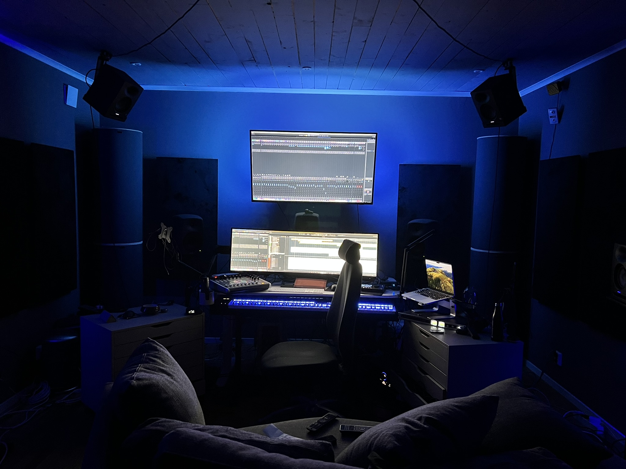
</p>
                        
                        <p class="mb-6">Operating from a custom-built, fully acoustically treated studio, Andreas ensures every project meets the highest modern audio standards. The facility is equipped for immersive <strong>Dolby Atmos</strong> mixing, featuring a precision <strong>Genelec monitoring system</strong>, allowing him to craft expansive spatial soundscapes with absolute clarity. At the heart of his production workflow is <strong>Steinberg Nuendo</strong>, which provides the ultimate environment for handling complex orchestral mockups, live recordings, and multi-channel audio routing.</p>
                        
                        <p>Collaboration is central to his creative process. He works closely with creative teams to understand the nuances of their worlds and characters, ensuring the music becomes an integral and seamless part of the overall experience. His extensive portfolio includes work on critically acclaimed titles such as <em>Stellaris</em>, <em>Hearts of Iron</em>, and <em>Europa Universalis</em>.</p>
                        
                        <div class="mt-12 grid grid-cols-2 md:grid-cols-3 gap-y-8 gap-x-6 font-mono text-sm border-t border-[rgba(255,255,255,0.08)] pt-8">
                            <div>
                                <span class="block text-gray-500 mb-1">Experience</span>
                                <span class="text-white">20+ Years</span>
                            </div>
                            <div>
                                <span class="block text-gray-500 mb-1">Specialty</span>
                                <span class="text-white">Thematic Writing</span>
                            </div>
                            <div>
                                <span class="block text-gray-500 mb-1">Environment</span>
                                <span class="text-white">Dolby Atmos Setup</span>
                            </div>
                           
                            <div>
                                <span class="block text-gray-500 mb-1">Middleware</span>
                                <span class="text-white">Wwise / FMOD</span>
                            </div>
                            <div>
                                <span class="block text-gray-500 mb-1">Focus</span>
                                <span class="text-white">Narrative Scoring</span>
                            </div>
                        </div>
                    </div>
                </div>
            </div>
        </section>

        <section id="music" class="section-container bg-[#030712]">
            <div class="section-header">
                <span class="section-number">02</span>
                <h2 class="text-sm font-semibold tracking-widest uppercase text-gray-400">Selected Works</h2>
            </div>

            <div class="p-8 lg:p-16">
                <div class="mb-16 max-w-3xl">
                    <h3 class="text-3xl lg:text-4xl font-bold mb-4">Portfolio Showcase</h3>
                    <p class="text-gray-500">Explore a selection of Andreas musical works and visual scores.</p>
                </div>

                <!-- Disco Embed with Glow -->
                <div class="relative mb-16 max-w-4xl mx-auto">
                    <!-- Rotating Clockwise Edge Glow -->
                    <div class="absolute -inset-[2px] md:-inset-[4px] z-0 rounded-xl edge-glow blur-[16px] md:blur-[22px] opacity-100 pointer-events-none mix-blend-screen"></div>
                    
                    <!-- Main Card Content -->
                    <div class="relative z-10 border border-[rgba(255,255,255,0.08)] rounded-lg p-1 bg-[#0a0e17] shadow-2xl">
                        <div class="px-6 py-4 border-b border-[rgba(255,255,255,0.08)] flex justify-between items-center">
                            <div class="flex items-center gap-3">
                                <i data-lucide="disc" class="text-blue-500 w-5 h-5"></i>
                                <h4 class="font-medium text-sm tracking-wide">Music Library</h4>
                            </div>
                            <span class="font-mono text-xs text-gray-500">DISCO.AC</span>
                        </div>
                        <iframe id="disco-playlist-29214501" name="disco-playlist-29214501" allowfullscreen frameborder="0" src="https://andreaswaldetoft.disco.ac/e/p/29214501?download=false&s=hUZZPQsZsbzyi1uyS3isHRH6Imc%3AQdEnLZa3&artwork=true&color=%234E98FF&theme=dark" width="100%" height="395" class="rounded-b-lg block bg-[#0a0e17]"></iframe>
                    </div>
                </div>

                <!-- YouTube Grid Container -->
                <div class="mb-8 flex items-center justify-between border-b border-[rgba(255,255,255,0.08)] pb-4">
                    <h4 class="font-medium text-sm tracking-wide uppercase text-gray-400">Visual Scores</h4>
                    <span class="font-mono text-xs text-blue-500">[3] Items</span>
                </div>
                <div id="music-container" class="grid grid-cols-1 md:grid-cols-2 xl:grid-cols-4 gap-6">
                    <!-- Music cards are generated via JavaScript -->
                </div>
            </div>
        </section>

        <section id="news" class="section-container bg-[#0a0e17]">
            <div class="section-header border-b border-[rgba(255,255,255,0.08)]">
                <span class="section-number">04</span>
                <h2 class="text-sm font-semibold tracking-widest uppercase text-gray-400">Updates</h2>
            </div>

            <div class="flex flex-col lg:flex-row min-h-screen">
                <!-- Sticky Left Title Area -->
                <div class="lg:w-1/3 p-8 lg:p-16 border-b lg:border-b-0 lg:border-r border-[rgba(255,255,255,0.08)] relative">
                    <div class="lg:sticky lg:top-32">
                        <h3 class="text-3xl lg:text-4xl font-bold mb-4">Latest News</h3>
                        <p class="text-gray-500 mb-8">Stay informed about current projects, releases, and other tidbits.</p>
                        
                        <div class="hidden lg:flex items-center gap-2 text-sm text-gray-600 font-mono">
                            <i data-lucide="arrow-down" class="w-4 h-4"></i>
                            Scroll to read
                        </div>
                    </div>
                </div>

                <!-- Scrolling Right Content Area -->
                <div class="lg:w-2/3 p-8 lg:p-16">
                    <div id="news-container">
                        <div id="news-list" class="space-y-12">
                            <!-- News items are generated via JavaScript -->
                        </div>
                        <div id="load-more-container" class="mt-12 text-center" style="display: none;">
                            <button id="load-more-btn" class="btn-outline w-full md:w-auto group">
                                <i data-lucide="plus" class="w-4 h-4 mr-2 group-hover:rotate-90 transition-transform duration-300"></i>
                                Load Previous Updates
                            </button>
                        </div>
                    </div>
                </div>
            </div>
        </section>

        <section id="contact" class="section-container bg-[#030712]">
            <div class="section-header">
                <span class="section-number">04</span>
                <h2 class="text-sm font-semibold tracking-widest uppercase text-gray-400">Network</h2>
            </div>

            <div class="flex flex-col md:flex-row">
                <!-- Form Area -->
                <div class="md:w-1/2 p-8 lg:p-16 border-b md:border-b-0 md:border-r border-[rgba(255,255,255,0.08)]">
                    <div class="mb-10">
                        <h3 class="text-3xl font-bold mb-2">Connect</h3>
                        <p class="text-gray-500 text-sm">Let's discuss how my music can elevate your next project.</p>
                    </div>

                    <form action="https://formspree.io/f/myzwvral" method="POST" class="space-y-6">
                        <div class="grid grid-cols-1 sm:grid-cols-2 gap-6">
                            <div>
                                <label for="name" class="block text-xs font-mono text-gray-500 mb-2 uppercase">Name</label>
                                <input type="text" name="name" id="name" required class="form-input" placeholder="John Doe">
                            </div>
                            <div>
                                <label for="email" class="block text-xs font-mono text-gray-500 mb-2 uppercase">Email</label>
                                <input type="email" name="email" id="email" required class="form-input" placeholder="john@example.com">
                            </div>
                        </div>
                        <div>
                            <label for="subject" class="block text-xs font-mono text-gray-500 mb-2 uppercase">Subject</label>
                            <input type="text" name="subject" id="subject" required class="form-input" placeholder="Project Inquiry">
                        </div>
                        <div>
                            <label for="message" class="block text-xs font-mono text-gray-500 mb-2 uppercase">Message</label>
                            <textarea name="message" id="message" rows="4" required class="form-input resize-none" placeholder="Provide details here..."></textarea>
                        </div>
                        <button type="submit" class="btn-structural w-full">
                            Transmit Message
                            <i data-lucide="send" class="w-4 h-4 ml-2"></i>
                        </button>
                    </form>
                </div>

                <!-- Info Area -->
                <div class="md:w-1/2 p-8 lg:p-16 bg-[rgba(10,14,23,0.3)] flex flex-col justify-between">
                    <div>
                        <div class="mb-12">
                            <h4 class="text-xs font-mono text-gray-500 mb-4 uppercase">Direct Contact</h4>
                            <p class="text-lg text-gray-300">Please use the contact form for inquiries.</p>
                        </div>
                        
                        <div class="mb-12">
                            <h4 class="text-xs font-mono text-gray-500 mb-4 uppercase">Representation / Agent</h4>
                            <div class="text-gray-300 space-y-1">
                                <p class="font-medium text-white text-base md:text-lg">Jeremi Valiquette</p>
                                <p>1E Avenue Music</p>
                                <p>(438) 884 1340</p>
                                <p class="break-all">jeremi.valiquette@1eavenuemusic.com</p>
                                <p><a href="https://www.1eavenuemusic.com" target="_blank" rel="noopener noreferrer" class="hover:text-blue-400 transition-colors">www.1eavenuemusic.com</a></p>
                            </div>
                        </div>

                        <div>
                            <h4 class="text-xs font-mono text-gray-500 mb-4 uppercase">Social Graph</h4>
                        <div class="flex flex-col gap-4">
                            <a href="https://www.linkedin.com/in/andreas-waldetoft-0b0bb1a/" target="_blank" class="group flex items-center gap-3 text-gray-400 hover:text-white transition-colors p-3 border border-[rgba(255,255,255,0.05)] rounded hover:bg-[rgba(255,255,255,0.02)]">
                                <svg xmlns="http://www.w3.org/2000/svg" width="20" height="20" viewBox="0 0 24 24" fill="none" stroke="currentColor" stroke-width="2" stroke-linecap="round" stroke-linejoin="round" class="text-gray-400 group-hover:text-white transition-colors"><path d="M16 8a6 6 0 0 1 6 6v7h-4v-7a2 2 0 0 0-2-2 2 2 0 0 0-2 2v7h-4v-7a6 6 0 0 1 6-6z"/><rect width="4" height="12" x="2" y="9"/><circle cx="4" cy="4" r="2"/></svg>
                                <span class="text-sm font-medium">LinkedIn Profile</span>
                                <i data-lucide="external-link" class="w-3 h-3 ml-auto opacity-50 group-hover:text-white transition-colors"></i>
                            </a>
                            <a href="https://x.com/composerandreas" target="_blank" class="group flex items-center gap-3 text-gray-400 hover:text-white transition-colors p-3 border border-[rgba(255,255,255,0.05)] rounded hover:bg-[rgba(255,255,255,0.02)]">
                                <svg xmlns="http://www.w3.org/2000/svg" width="20" height="20" viewBox="0 0 24 24" fill="currentColor" class="text-gray-400 group-hover:text-white transition-colors"><path d="M18.901 1.153h3.68l-8.04 9.19L24 22.846h-7.406l-5.8-7.584-6.638 7.584H.474l8.6-9.83L0 1.154h7.594l5.243 6.932ZM17.61 20.644h2.039L6.486 3.24H4.298Z"/></svg>
                                <span class="text-sm font-medium">X (Twitter)</span>
                                <i data-lucide="external-link" class="w-3 h-3 ml-auto opacity-50 group-hover:text-white transition-colors"></i>
                            </a>
                            <a href="https://www.youtube.com/@AndreasWaldetoftOfficial" target="_blank" class="group flex items-center gap-3 text-gray-400 hover:text-white transition-colors p-3 border border-[rgba(255,255,255,0.05)] rounded hover:bg-[rgba(255,255,255,0.02)]">
                                <svg xmlns="http://www.w3.org/2000/svg" width="20" height="20" viewBox="0 0 24 24" fill="none" stroke="currentColor" stroke-width="2" stroke-linecap="round" stroke-linejoin="round" class="text-gray-400 group-hover:text-white transition-colors"><path d="M2.5 17a24.12 24.12 0 0 1 0-10 2 2 0 0 1 1.4-1.4 49.56 49.56 0 0 1 16.2 0A2 2 0 0 1 21.5 7a24.12 24.12 0 0 1 0 10 2 2 0 0 1-1.4 1.4 49.55 49.55 0 0 1-16.2 0A2 2 0 0 1 2.5 17"/><path d="m10 15 5-3-5-3z"/></svg>
                                <span class="text-sm font-medium">YouTube Channel</span>
                                <i data-lucide="external-link" class="w-3 h-3 ml-auto opacity-50 group-hover:text-white transition-colors"></i>
                            </a>
                            <a href="#" target="_blank" class="group flex items-center gap-3 text-gray-400 hover:text-white transition-colors p-3 border border-[rgba(255,255,255,0.05)] rounded hover:bg-[rgba(255,255,255,0.02)]">
                                <svg xmlns="http://www.w3.org/2000/svg" width="20" height="20" viewBox="0 0 24 24" fill="none" stroke="currentColor" stroke-width="2" stroke-linecap="round" stroke-linejoin="round" class="text-gray-400 group-hover:text-white transition-colors"><rect x="2" y="2" width="20" height="20" rx="5" ry="5"/><path d="M16 11.37A4 4 0 1 1 12.63 8 4 4 0 0 1 16 11.37z"/><line x1="17.5" y1="6.5" x2="17.51" y2="6.5"/></svg>
                                <span class="text-sm font-medium">Instagram</span>
                                <i data-lucide="external-link" class="w-3 h-3 ml-auto opacity-50 group-hover:text-white transition-colors"></i>
                            </a>
                            <a href="#" target="_blank" class="group flex items-center gap-3 text-gray-400 hover:text-white transition-colors p-3 border border-[rgba(255,255,255,0.05)] rounded hover:bg-[rgba(255,255,255,0.02)]">
                                <svg xmlns="http://www.w3.org/2000/svg" width="20" height="20" viewBox="0 0 24 24" fill="none" stroke="currentColor" stroke-width="2" stroke-linecap="round" stroke-linejoin="round" class="text-gray-400 group-hover:text-white transition-colors"><path d="M18 2h-3a5 5 0 0 0-5 5v3H7v4h3v8h4v-8h3l1-4h-4V7a1 1 0 0 1 1-1h3z"/></svg>
                                <span class="text-sm font-medium">Facebook Page</span>
                                <i data-lucide="external-link" class="w-3 h-3 ml-auto opacity-50 group-hover:text-white transition-colors"></i>
                            </a>
                        </div>
                    </div>
                </div>
            </div>
        </section>

        <footer class="border-t border-[rgba(255,255,255,0.08)] bg-[#030712] p-8 flex flex-col md:flex-row justify-between items-center gap-4">
            <div class="flex items-center gap-3">
                <div class="w-6 h-6 bg-blue-600 rounded flex items-center justify-center text-white text-xs font-bold">AW</div>
                <span class="text-xs font-mono text-gray-500 uppercase tracking-wider">Productions</span>
            </div>
            
            <p class="text-xs text-gray-500 font-mono">
                SYS.TIME: <span id="currentYear"></span> // ALL RIGHTS RESERVED
            </p>
        </footer>
    </main>

    <div id="custom-alert-container" class="fixed bottom-8 right-8 z-[100] flex flex-col gap-2 w-full max-w-sm"></div>

    <script>
        // Initialize Lucide icons
        lucide.createIcons();

        // =========================================================================
        // HOW TO ADD NEW NEWS UPDATES
        // =========================================================================
        // To add a new post, copy the template below and paste it at the TOP of the `newsData` list.
        // Make sure to include the comma at the end of the curly brace!
        // Also: When adding links inside the content area, always include target="_blank" rel="noopener noreferrer" 
        // to ensure they open in a new tab without taking visitors away from the website.
        //
        // TEMPLATE:
        // {
        //     date: "Month DD, YYYY",
        //     title: "Your News Title",
        //     link: "https://your-link.com", // Leave as "#" if you don't have a link
        //     image: "https://link-to-your-image.jpg", // Leave as "" if you don't have an image
        //     content: `
        //         <p class="mb-4">Your first paragraph of text here.</p>
        //         <a href="https://your-link.com" target="_blank" rel="noopener noreferrer" class="text-blue-400 hover:text-blue-300 transition-colors">Your Link Text</a>
        //     `
        // },
        // =========================================================================

        const newsData = [
		          {
                date: "May 18th, 2026",
                title: "Stellaris Concert in Shanghai",
                link: "https://stellarisconcert.cn/", 
                image: "https://andreaswaldetoft.com/Pictures/audition-poster.OFyM3FzG.png",
                content: `
                    <p class="mb-4">If you are close to Shanghai, there will be a Stellaris Concert with Andreas Music for the game on August 16th 2026. </p>
                    <a href="https://stellarisconcert.cn/#tickets" target="_blank" rel="noopener noreferrer" class="inline-flex items-center text-sm font-medium text-blue-400 hover:text-blue-300 transition-colors">
                        Get Tickets Here <i data-lucide="arrow-up-right" class="w-4 h-4 ml-1"></i>
                    </a>
                `
            }, 
            {
                date: "April 27, 2026",
                title: "Paradox Concert in Stockholm",
                link: "https://www.youtube.com/watch?v=_oEOdEWf4FE&list=RD_oEOdEWf4FE&start_radio=1", 
                image: "https://andreaswaldetoft.com/Pictures/paradox-concert-logo.webp",
                content: `
                    <p class="mb-4">On September 26 there will be a concert with Andreas have done for Paradox over the years. Join Andreas and listen to the soundtracks from Paradox games. Hearts of Iron 4, Stellaris, Crusader Kings 3 and more.</p>
                    <a href="https://www.ticketmaster.se/event/paradox-in-concert-biljetter/1503231684" target="_blank" rel="noopener noreferrer" class="inline-flex items-center text-sm font-medium text-blue-400 hover:text-blue-300 transition-colors">
                        Get Tickets Here <i data-lucide="arrow-up-right" class="w-4 h-4 ml-1"></i>
                    </a>
                `
            },            
           {
                date: "January 20, 2026",
                title: "Foundation - Galactic Frontier",
                link: "https://www.foundation.game/en#home",
                image: "https://andreaswaldetoft.com/Pictures/foundation%20galactic%20frontiers.jpg",
                content: `
                    <p class="mb-4">Andreas is proud to have composed the original score for Foundation: Galactic Frontier.</p>
                    <p>Set within the expansive universe of the Apple TV+ series and inspired by the legendary works of Isaac Asimov, the game offers a deep, immersive sci-fi experience.</p>
                `
            },
            {
                date: "June 11, 2025",
                title: "Guardians of the Wild Sky",
                link: "https://store.steampowered.com/app/1579420/Guardians_of_the_Wild_Sky/",
                image: "https://shared.akamai.steamstatic.com/store_item_assets/steam/apps/1579420/header.jpg?t=1749495166",
                content: `
                    <p class="mb-4">Andreas is composing music for the survival game Guardian of the Wild Sky, this is one of many games Andreas is currently working on!</p>
                    <p>You can wishlist the game on Steam right now, just click the picture to get to the store!</p>
                `
            }
        ];

        // =========================================================================
        // HOW TO ADD NEW YOUTUBE VIDEOS (VISUAL SCORES)
        // =========================================================================
        const musicData = [
            {
                title: "Hearts of Iron IV",
                subtitle: "Main Theme",
                genre: "Orchestral, WW2",
                videoId: "8p60_JCZBK0",
                youtubeLink: "https://www.youtube.com/watch?v=99_qehhZUds"
            },
            {
                title: "Crusader Kings III",
                subtitle: "Knights of Jerusalem",
                genre: "Orchestral, Medieval",
                videoId: "SJc3qvqgfj8",
                youtubeLink: "https://www.youtube.com/watch?v=4Cubt2PsisM"
            },
            {
                title: "Stellaris",
                subtitle: "Creation and Beyond",
                genre: "Orchestral, Sci-Fi",
                videoId: "LDdEUhEM5G8", 
                youtubeLink: "https://www.youtube.com/watch?v=LDdEUhEM5G8"
            },
            {
                title: "Europa Universalis IV",
                subtitle: "Main Theme",
                genre: "Orchestral, Historic",
                videoId: "99_qehhZUds",
                youtubeLink: "https://www.youtube.com/watch?v=8p60_JCZBK0"
            }
        ];

        // Render functions
        let currentNewsPage = 1;
        const newsPerPage = 3;

        function renderNews() {
            const container = document.getElementById('news-list');
            if(!container) return;
            let html = '';
            
            const visibleNews = newsData.slice(0, currentNewsPage * newsPerPage);
            
            visibleNews.forEach((item, index) => {
                const imageHtml = item.image ? `
                    <a href="${item.link}" target="_blank" rel="noopener noreferrer" class="block lg:w-1/3 shrink-0 overflow-hidden rounded border border-[rgba(255,255,255,0.08)]">
                        <img src="${item.image}" alt="${item.title}" class="w-full h-full object-cover aspect-video lg:aspect-auto grayscale-[40%] hover:grayscale-0 transition-all duration-500">
                    </a>` : '';
                    
                html += `
                <article class="structural-card p-6 flex flex-col lg:flex-row gap-6 relative group animate-ambient-pulse" style="animation: none;">
                    <div class="absolute top-0 right-0 p-4 opacity-10 font-mono text-4xl font-bold">0${index + 1}</div>
                    ${imageHtml}
                    <div class="flex-1 flex flex-col justify-center relative z-10">
                        <div class="flex items-center gap-3 mb-3">
                            <span class="w-2 h-2 rounded-full bg-blue-500"></span>
                            <span class="text-xs font-mono text-gray-500 uppercase tracking-widest">${item.date}</span>
                        </div>
                        <h3 class="text-xl md:text-2xl font-bold text-white mb-4 group-hover:text-blue-400 transition-colors">${item.title}</h3>
                        <div class="text-gray-400 text-sm font-light leading-relaxed">
                            ${item.content}
                        </div>
                    </div>
                </article>`;
            });
            container.innerHTML = html;

            // Handle Load More Button Visibility
            const loadMoreContainer = document.getElementById('load-more-container');
            if (loadMoreContainer) {
                if (visibleNews.length >= newsData.length) {
                    loadMoreContainer.style.display = 'none';
                } else {
                    loadMoreContainer.style.display = 'block';
                }
            }

            lucide.createIcons(); // Re-init icons for dynamic content
        }

        function renderMusic() {
            const container = document.getElementById('music-container');
            if(!container) return;
            let html = '';

            musicData.forEach(item => {
                html += `
                <div class="structural-card group flex flex-col"> 
                    <div class="youtube-embed-container bg-black">
                        <iframe src="https://www.youtube.com/embed/${item.videoId}" title="${item.title}" frameborder="0" allow="accelerometer; autoplay; clipboard-write; encrypted-media; gyroscope; picture-in-picture" allowfullscreen class="opacity-80 group-hover:opacity-100 transition-opacity duration-300"></iframe>
                    </div>
                    <div class="p-5 flex flex-col flex-grow border-t border-[rgba(255,255,255,0.05)]">
                        <div class="flex justify-between items-start mb-2">
                            <h3 class="text-lg font-bold text-white leading-tight">${item.title}</h3>
                            <a href="${item.youtubeLink}" target="_blank" class="text-gray-500 hover:text-blue-400 transition-colors">
                                <i data-lucide="external-link" class="w-4 h-4"></i>
                            </a>
                        </div>
                        <p class="text-sm text-gray-400 mb-4">${item.subtitle}</p>
                        
                        <div class="mt-auto pt-4 border-t border-[rgba(255,255,255,0.05)]">
                            <span class="inline-block px-2 py-1 bg-[rgba(255,255,255,0.05)] border border-[rgba(255,255,255,0.05)] rounded text-[10px] font-mono text-gray-400 uppercase tracking-wider">
                                ${item.genre}
                            </span>
                        </div>
                    </div>
                </div>`;
            });
            container.innerHTML = html;
            lucide.createIcons();
        }

        // Initialization
        document.addEventListener('DOMContentLoaded', () => {
            renderNews();
            renderMusic();
            document.getElementById('currentYear').textContent = new Date().getFullYear();
            
            // Load More Button Event
            const loadMoreBtn = document.getElementById('load-more-btn');
            if (loadMoreBtn) {
                loadMoreBtn.addEventListener('click', () => {
                    currentNewsPage++;
                    renderNews();
                });
            }
        });

        // Form Handling
        const contactForm = document.querySelector('#contact form');
        if (contactForm) {
            contactForm.addEventListener('submit', function(e) {
                let isFormValid = true;
                contactForm.querySelectorAll('[required]').forEach(input => {
                    if (!input.value) isFormValid = false;
                });
                
                if (isFormValid) {
                    if (contactForm.getAttribute('action').includes('formspree')) {
                        setTimeout(() => showCustomAlert('TRANSMISSION SUCCESSFUL', 'success'), 500); 
                    } else {
                        e.preventDefault();
                        showCustomAlert('TRANSMISSION SUCCESSFUL (DEMO)', 'success');
                        contactForm.reset();
                    }
                } else {
                    e.preventDefault(); 
                    showCustomAlert('ERROR: INCOMPLETE DATA FIELDS', 'error');
                }
            });
        }

        // Alert System
        function showCustomAlert(message, type = 'success') {
            const container = document.getElementById('custom-alert-container');
            if (!container) return;
            
            const alertBox = document.createElement('div');
            const icon = type === 'success' ? 'check-circle' : 'alert-circle';
            const color = type === 'success' ? 'text-blue-400 border-blue-500/30 bg-blue-500/10' : 'text-red-400 border-red-500/30 bg-red-500/10';
            
            alertBox.innerHTML = `
                <div class="flex items-center gap-3">
                    <i data-lucide="${icon}" class="w-4 h-4"></i>
                    <span class="font-mono text-xs tracking-wider uppercase">${message}</span>
                </div>
            `;
            
            alertBox.className = `p-4 border rounded shadow-lg backdrop-blur-md transition-all duration-300 ease-in-out transform opacity-0 translate-x-8 ${color}`;
            
            container.appendChild(alertBox);
            lucide.createIcons();
            
            // Animate in
            requestAnimationFrame(() => {
                alertBox.classList.remove('opacity-0', 'translate-x-8');
                alertBox.classList.add('opacity-100', 'translate-x-0');
            });
            
            // Animate out
            setTimeout(() => {
                alertBox.classList.add('opacity-0', 'translate-x-8');
                alertBox.addEventListener('transitionend', () => alertBox.remove());
            }, 3000);
        }

        // Smooth Scrolling & Active Nav State
        const headerHeight = 64; // h-16 = 4rem = 64px
        
        document.querySelectorAll('a[href^="#"]').forEach(anchor => {
            anchor.addEventListener('click', function (e) {
                const targetId = this.getAttribute('href');
                if (targetId && targetId.startsWith('#') && targetId !== '#') {
                    e.preventDefault(); 
                    const targetElement = document.querySelector(targetId);
                    if (targetElement) {
                        const elementPosition = targetElement.getBoundingClientRect().top;
                        const offsetPosition = elementPosition + window.pageYOffset - headerHeight;
                        window.scrollTo({ top: offsetPosition, behavior: 'smooth' });
                    }
                }
            });
        });
        
        // Mobile Menu Logic
        const mobileMenuToggle = document.getElementById('mobile-menu-toggle');
        const mobileMenu = document.getElementById('mobile-menu');
        const mobileMenuIcon = document.getElementById('mobile-menu-icon');
        const mobileLinks = document.querySelectorAll('.mobile-link');

        if (mobileMenuToggle) {
            mobileMenuToggle.addEventListener('click', () => {
                const isHidden = mobileMenu.classList.contains('hidden');
                
                if (isHidden) {
                    mobileMenu.classList.remove('hidden');
                    mobileMenu.classList.add('flex');
                    mobileMenuIcon.setAttribute('data-lucide', 'x');
                } else {
                    mobileMenu.classList.add('hidden');
                    mobileMenu.classList.remove('flex');
                    mobileMenuIcon.setAttribute('data-lucide', 'menu');
                }
                lucide.createIcons(); 
            });
        }

        // Close mobile menu when a link is clicked
        mobileLinks.forEach(link => {
            link.addEventListener('click', () => {
                mobileMenu.classList.add('hidden');
                mobileMenu.classList.remove('flex');
                mobileMenuIcon.setAttribute('data-lucide', 'menu');
                lucide.createIcons();
            });
        });

        const sections = document.querySelectorAll('section[id]');
        const navLinks = document.querySelectorAll('.nav-link'); // Now targets desktop and mobile
        
        function updateActiveNavLink() {
            let current = '';
            sections.forEach(section => {
                const sectionTop = section.offsetTop - headerHeight - 100; 
                if (window.pageYOffset >= sectionTop) current = section.getAttribute('id');
            });
            
            // If scrolled to the very bottom, force the last section to be active
            if ((window.innerHeight + window.pageYOffset) >= document.body.offsetHeight - 10) {
                current = 'contact';
            }
            
            navLinks.forEach(link => {
                link.classList.remove('active');
                if (link.getAttribute('href').substring(1) === current) {
                    link.classList.add('active');
                }
            });
        }
        
        window.addEventListener('scroll', updateActiveNavLink, { passive: true });
    </script>
</body>
</html>