<!doctype html>
<html lang="en">
  <head>
    <script src="https://analytics.ahrefs.com/analytics.js" data-key="mWs2Vwvu0yj/a5TAXbtxwQ" async></script>
    <meta charset="utf-8">
    <meta http-equiv="X-UA-Compatible" content="IE=edge">
    <meta name="viewport" content="width=device-width,initial-scale=1">
    <meta name="theme-color" content="">
    <link rel="canonical" href="https://backyardbrains.com/"><link rel="icon" type="image/png" href="//backyardbrains.com/cdn/shop/files/favicon-1.png?crop=center&height=32&v=1725892694&width=32"><link rel="preconnect" href="https://fonts.shopifycdn.com" crossorigin>

    <!-- Custom font preloading for better performance -->
    
    <link rel="preload" href="https://cdn.shopify.com/s/files/1/0613/9684/4785/files/boldoa_mat-webfont-bea6a7002d4d290e4287aaa46e34f2ae.woff2?v=1722935743" as="font" type="font/woff2" crossorigin>
    

    <script>
      document.addEventListener('DOMContentLoaded', function () {
        if (window.location.pathname.includes('/cart')) {
          localStorage.setItem('triggerCartClick', 'true');
          window.location.href = '/';
        } else {
          const triggerCartClick = localStorage.getItem('triggerCartClick');
          if (triggerCartClick === 'true') {
            localStorage.removeItem('triggerCartClick');
            const cartIcon = document.querySelector('.header-actions .swp-cart-icon-inline');
            if (cartIcon) {
              cartIcon.click();
            } else {
              console.warn('Элемент cart icon не найден.');
            }
          }
        }
      });
    </script>
    <title>
      Backyard Brains
</title>

    
      <meta name="description" content="Want to understand more about how the brain works? Now you can bring the world of Neuroscience to your classroom and home.">


<meta property="og:site_name" content="Backyard Brains">
<meta property="og:url" content="https://backyardbrains.com/">
<meta property="og:title" content="Backyard Brains">
<meta property="og:type" content="website">
<meta property="og:description" content="Want to understand more about how the brain works? Now you can bring the world of Neuroscience to your classroom and home."><meta property="og:image" content="http://backyardbrains.com/cdn/shop/files/Shopify-Social-Sharing.png?v=1734470529">
  <meta property="og:image:secure_url" content="https://backyardbrains.com/cdn/shop/files/Shopify-Social-Sharing.png?v=1734470529">
  <meta property="og:image:width" content="1200">
  <meta property="og:image:height" content="628"><meta name="twitter:card" content="summary_large_image">
<meta name="twitter:title" content="Backyard Brains">
<meta name="twitter:description" content="Want to understand more about how the brain works? Now you can bring the world of Neuroscience to your classroom and home.">


    <script src="https://unpkg.com/swiper/swiper-bundle.min.js" defer></script>
    <link href="https://unpkg.com/tippy.js@6/dist/tippy.css" rel="stylesheet" type="text/css" media="all" />
    <script src="https://unpkg.com/@popperjs/core@2" defer></script>
    <script src="https://unpkg.com/tippy.js@6" defer></script>
    <link href="https://cdnjs.cloudflare.com/ajax/libs/animate.css/4.1.1/animate.min.css" rel="stylesheet" type="text/css" media="all" />
    <script src="//backyardbrains.com/cdn/shop/t/22/assets/constants.js?v=132983761750457495441744814906" defer="defer"></script>
    <script src="//backyardbrains.com/cdn/shop/t/22/assets/pubsub.js?v=158357773527763999511744814905" defer="defer"></script>
    <script src="//backyardbrains.com/cdn/shop/t/22/assets/global.js?v=151672923474702512281762361119" defer="defer"></script>
    <script src="//backyardbrains.com/cdn/shop/t/22/assets/details-disclosure.js?v=13653116266235556501744814905" defer="defer"></script>
    <script src="//backyardbrains.com/cdn/shop/t/22/assets/details-modal.js?v=25581673532751508451744814905" defer="defer"></script>
    <script src="//backyardbrains.com/cdn/shop/t/22/assets/search-form.js?v=133129549252120666541744814905" defer="defer"></script>
    <script src="//backyardbrains.com/cdn/shop/t/22/assets/jquery.min.js?v=165274141613633811011744814905" defer="defer"></script>
    <script src="//backyardbrains.com/cdn/shop/t/22/assets/maps_points.js?v=132385747180082661411744814906" defer="defer"></script>
    <script src="//backyardbrains.com/cdn/shop/t/22/assets/main.js?v=148419274938589496461744914315" defer="defer"></script>
    <script src="//backyardbrains.com/cdn/shop/t/22/assets/main-new.js?v=96130823475363734901762361680" defer="defer"></script><script src="//backyardbrains.com/cdn/shop/t/22/assets/animations.js?v=88693664871331136111744814906" defer="defer"></script><script>window.performance && window.performance.mark && window.performance.mark('shopify.content_for_header.start');</script><meta name="google-site-verification" content="rgJgVtD8WTl9s6z-FL12Wt7qn1HBEromYtJpdBwz_pw">
<meta name="facebook-domain-verification" content="h2kl5la3i7mpt12iyqwweysmf46quw">
<meta id="shopify-digital-wallet" name="shopify-digital-wallet" content="/61396844785/digital_wallets/dialog">
<meta name="shopify-checkout-api-token" content="d44a1e0bbebf405d11cc42b6dc5f8a3f">
<link rel="alternate" hreflang="x-default" href="https://backyardbrains.com/">
<link rel="alternate" hreflang="en" href="https://backyardbrains.com/">
<link rel="alternate" hreflang="en-DE" href="https://backyardbrains.de/">
<script async="async" src="/checkouts/internal/preloads.js?locale=en-US"></script>
<link rel="preconnect" href="https://shop.app" crossorigin="anonymous">
<script async="async" src="https://shop.app/checkouts/internal/preloads.js?locale=en-US&shop_id=61396844785" crossorigin="anonymous"></script>
<script id="apple-pay-shop-capabilities" type="application/json">{"shopId":61396844785,"countryCode":"US","currencyCode":"USD","merchantCapabilities":["supports3DS"],"merchantId":"gid:\/\/shopify\/Shop\/61396844785","merchantName":"Backyard Brains","requiredBillingContactFields":["postalAddress","email","phone"],"requiredShippingContactFields":["postalAddress","email","phone"],"shippingType":"shipping","supportedNetworks":["visa","masterCard","amex","discover","elo","jcb"],"total":{"type":"pending","label":"Backyard Brains","amount":"1.00"},"shopifyPaymentsEnabled":true,"supportsSubscriptions":true}</script>
<script id="shopify-features" type="application/json">{"accessToken":"d44a1e0bbebf405d11cc42b6dc5f8a3f","betas":["rich-media-storefront-analytics"],"domain":"backyardbrains.com","predictiveSearch":true,"shopId":61396844785,"locale":"en"}</script>
<script>var Shopify = Shopify || {};
Shopify.shop = "backyard-brains.myshopify.com";
Shopify.locale = "en";
Shopify.currency = {"active":"USD","rate":"1.0"};
Shopify.country = "US";
Shopify.theme = {"name":"shop.backyardbrains.com\/main","id":148247609585,"schema_name":"Dawn","schema_version":"15.0.2","theme_store_id":null,"role":"main"};
Shopify.theme.handle = "null";
Shopify.theme.style = {"id":null,"handle":null};
Shopify.cdnHost = "backyardbrains.com/cdn";
Shopify.routes = Shopify.routes || {};
Shopify.routes.root = "/";
Shopify.shopJsCdnBaseUrl = "https://cdn.shopify.com/shopifycloud/shop-js";</script>
<script type="module">!function(o){(o.Shopify=o.Shopify||{}).modules=!0}(window);</script>
<script>!function(o){function n(){var o=[];function n(){o.push(Array.prototype.slice.apply(arguments))}return n.q=o,n}var t=o.Shopify=o.Shopify||{};t.loadFeatures=n(),t.autoloadFeatures=n()}(window);</script>
<script>
  window.ShopifyPay = window.ShopifyPay || {};
  window.ShopifyPay.apiHost = "shop.app\/pay";
  window.ShopifyPay.redirectState = null;
</script>
<script>
  window.Shopify = window.Shopify || {};
  window.Shopify.SignInWithShop = window.Shopify.SignInWithShop || {};
  window.Shopify.SignInWithShop.eligible = true;
</script>
<script id="shop-js-analytics" type="application/json">{"pageType":"index"}</script>
<script defer="defer" async type="module" src="//backyardbrains.com/cdn/shopifycloud/shop-js/modules/v2/loader.init-shop-cart-sync.en.esm.js"></script>
<script type="module">
  await import("//backyardbrains.com/cdn/shopifycloud/shop-js/modules/v2/loader.init-shop-cart-sync.en.esm.js");

  window.Shopify.SignInWithShop?.initShopCartSync?.({"fedCMEnabled":true,"windoidEnabled":true});

</script>
<script>
  window.Shopify = window.Shopify || {};
  if (!window.Shopify.featureAssets) window.Shopify.featureAssets = {};
  window.Shopify.featureAssets['shop-js'] = {"shop-toast-manager":["modules/v2/loader.shop-toast-manager.en.esm.js"],"init-shop-user-recognition":["modules/v2/loader.init-shop-user-recognition.en.esm.js"],"shop-button":["modules/v2/loader.shop-button.en.esm.js"],"init-shop-email-lookup-coordinator":["modules/v2/loader.init-shop-email-lookup-coordinator.en.esm.js"],"init-fed-cm":["modules/v2/loader.init-fed-cm.en.esm.js"],"init-windoid":["modules/v2/loader.init-windoid.en.esm.js"],"checkout-modal":["modules/v2/loader.checkout-modal.en.esm.js"],"shop-cash-offers":["modules/v2/loader.shop-cash-offers.en.esm.js"],"init-shop-cart-sync":["modules/v2/loader.init-shop-cart-sync.en.esm.js"],"init-shop-for-new-customer-accounts":["modules/v2/loader.init-shop-for-new-customer-accounts.en.esm.js"],"avatar":["modules/v2/loader.avatar.en.esm.js"],"shop-login-button":["modules/v2/loader.shop-login-button.en.esm.js"],"shop-cart-sync":["modules/v2/loader.shop-cart-sync.en.esm.js"],"init-customer-accounts-sign-up":["modules/v2/loader.init-customer-accounts-sign-up.en.esm.js"],"shop-login":["modules/v2/loader.shop-login.en.esm.js"],"shop-follow-button":["modules/v2/loader.shop-follow-button.en.esm.js"],"init-customer-accounts":["modules/v2/loader.init-customer-accounts.en.esm.js"],"shop-user-recognition":["modules/v2/loader.shop-user-recognition.en.esm.js"],"pay-button":["modules/v2/loader.pay-button.en.esm.js"],"lead-capture":["modules/v2/loader.lead-capture.en.esm.js"],"payment-terms":["modules/v2/loader.payment-terms.en.esm.js"]};
</script>
<script>(function() {
  var isLoaded = false;
  function asyncLoad() {
    if (isLoaded) return;
    isLoaded = true;
    var urls = ["https:\/\/store.xecurify.com\/moas\/rest\/shopify\/check?shop=backyard-brains.myshopify.com","https:\/\/ajax.googleapis.com\/ajax\/libs\/jquery\/3.5.1\/jquery.min.js?shop=backyard-brains.myshopify.com"];
    for (var i = 0; i < urls.length; i++) {
      var s = document.createElement('script');
      s.type = 'text/javascript';
      s.async = true;
      s.src = urls[i];
      var x = document.getElementsByTagName('script')[0];
      x.parentNode.insertBefore(s, x);
    }
  };
  if(window.attachEvent) {
    window.attachEvent('onload', asyncLoad);
  } else {
    window.addEventListener('load', asyncLoad, false);
  }
})();</script>
<script id="__st">var __st={"a":61396844785,"offset":-14400,"reqid":"75af3baf-dcad-41c0-9fab-8f84af959fb5-1778006479","pageurl":"backyardbrains.com\/","u":"c69ea2835c7c","p":"home"};</script>
<script>window.ShopifyPaypalV4VisibilityTracking = true;</script>
<script id="form-persister">!function(){'use strict';const t='contact',e='new_comment',n=[[t,t],['blogs',e],['comments',e],[t,'customer']],o='password',r='form_key',c=['recaptcha-v3-token','g-recaptcha-response','h-captcha-response',o],s=()=>{try{return window.sessionStorage}catch{return}},i='__shopify_v',u=t=>t.elements[r],a=function(){const t=[...n].map((([t,e])=>`form[action*='/${t}']:not([data-nocaptcha='true']) input[name='form_type'][value='${e}']`)).join(',');var e;return e=t,()=>e?[...document.querySelectorAll(e)].map((t=>t.form)):[]}();function m(t){const e=u(t);a().includes(t)&&(!e||!e.value)&&function(t){try{if(!s())return;!function(t){const e=s();if(!e)return;const n=u(t);if(!n)return;const o=n.value;o&&e.removeItem(o)}(t);const e=Array.from(Array(32),(()=>Math.random().toString(36)[2])).join('');!function(t,e){u(t)||t.append(Object.assign(document.createElement('input'),{type:'hidden',name:r})),t.elements[r].value=e}(t,e),function(t,e){const n=s();if(!n)return;const r=[...t.querySelectorAll(`input[type='${o}']`)].map((({name:t})=>t)),u=[...c,...r],a={};for(const[o,c]of new FormData(t).entries())u.includes(o)||(a[o]=c);n.setItem(e,JSON.stringify({[i]:1,action:t.action,data:a}))}(t,e)}catch(e){console.error('failed to persist form',e)}}(t)}const f=t=>{if('true'===t.dataset.persistBound)return;const e=function(t,e){const n=function(t){return'function'==typeof t.submit?t.submit:HTMLFormElement.prototype.submit}(t).bind(t);return function(){let t;return()=>{t||(t=!0,(()=>{try{e(),n()}catch(t){(t=>{console.error('form submit failed',t)})(t)}})(),setTimeout((()=>t=!1),250))}}()}(t,(()=>{m(t)}));!function(t,e){if('function'==typeof t.submit&&'function'==typeof e)try{t.submit=e}catch{}}(t,e),t.addEventListener('submit',(t=>{t.preventDefault(),e()})),t.dataset.persistBound='true'};!function(){function t(t){const e=(t=>{const e=t.target;return e instanceof HTMLFormElement?e:e&&e.form})(t);e&&m(e)}document.addEventListener('submit',t),document.addEventListener('DOMContentLoaded',(()=>{const e=a();for(const t of e)f(t);var n;n=document.body,new window.MutationObserver((t=>{for(const e of t)if('childList'===e.type&&e.addedNodes.length)for(const t of e.addedNodes)1===t.nodeType&&'FORM'===t.tagName&&a().includes(t)&&f(t)})).observe(n,{childList:!0,subtree:!0,attributes:!1}),document.removeEventListener('submit',t)}))}()}();</script>
<script integrity="sha256-JjoPp5ZfB1sSAs5SQaol1x1GgvveM+BgmRzyDexInEQ=" data-source-attribution="shopify.loadfeatures" defer="defer" src="//backyardbrains.com/cdn/shopifycloud/storefront/assets/storefront/load_feature-1bd60354.js" crossorigin="anonymous"></script>
<script crossorigin="anonymous" defer="defer" src="//backyardbrains.com/cdn/shopifycloud/storefront/assets/shopify_pay/storefront-bf1cdb70.js?v=20250812"></script>
<script data-source-attribution="shopify.dynamic_checkout.dynamic.init">var Shopify=Shopify||{};Shopify.PaymentButton=Shopify.PaymentButton||{isStorefrontPortableWallets:!0,init:function(){window.Shopify.PaymentButton.init=function(){};var t=document.createElement("script");t.src="https://backyardbrains.com/cdn/shopifycloud/portable-wallets/latest/portable-wallets.en.js",t.type="module",document.head.appendChild(t)}};
</script>
<script data-source-attribution="shopify.dynamic_checkout.buyer_consent">
  function portableWalletsHideBuyerConsent(e){var t=document.getElementById("shopify-buyer-consent"),n=document.getElementById("shopify-subscription-policy-button");t&&n&&(t.classList.add("hidden"),t.setAttribute("aria-hidden","true"),n.removeEventListener("click",e))}function portableWalletsShowBuyerConsent(e){var t=document.getElementById("shopify-buyer-consent"),n=document.getElementById("shopify-subscription-policy-button");t&&n&&(t.classList.remove("hidden"),t.removeAttribute("aria-hidden"),n.addEventListener("click",e))}window.Shopify?.PaymentButton&&(window.Shopify.PaymentButton.hideBuyerConsent=portableWalletsHideBuyerConsent,window.Shopify.PaymentButton.showBuyerConsent=portableWalletsShowBuyerConsent);
</script>
<script data-source-attribution="shopify.dynamic_checkout.cart.bootstrap">document.addEventListener("DOMContentLoaded",(function(){function t(){return document.querySelector("shopify-accelerated-checkout-cart, shopify-accelerated-checkout")}if(t())Shopify.PaymentButton.init();else{new MutationObserver((function(e,n){t()&&(Shopify.PaymentButton.init(),n.disconnect())})).observe(document.body,{childList:!0,subtree:!0})}}));
</script>
<link id="shopify-accelerated-checkout-styles" rel="stylesheet" media="screen" href="https://backyardbrains.com/cdn/shopifycloud/portable-wallets/latest/accelerated-checkout-backwards-compat.css" crossorigin="anonymous">
<style id="shopify-accelerated-checkout-cart">
        #shopify-buyer-consent {
  margin-top: 1em;
  display: inline-block;
  width: 100%;
}

#shopify-buyer-consent.hidden {
  display: none;
}

#shopify-subscription-policy-button {
  background: none;
  border: none;
  padding: 0;
  text-decoration: underline;
  font-size: inherit;
  cursor: pointer;
}

#shopify-subscription-policy-button::before {
  box-shadow: none;
}

      </style>

<script>window.performance && window.performance.mark && window.performance.mark('shopify.content_for_header.end');</script>


    <style data-shopify>
      @font-face {
  font-family: Assistant;
  font-weight: 400;
  font-style: normal;
  font-display: swap;
  src: url("//backyardbrains.com/cdn/fonts/assistant/assistant_n4.9120912a469cad1cc292572851508ca49d12e768.woff2") format("woff2"),
       url("//backyardbrains.com/cdn/fonts/assistant/assistant_n4.6e9875ce64e0fefcd3f4446b7ec9036b3ddd2985.woff") format("woff");
}

      @font-face {
  font-family: Assistant;
  font-weight: 700;
  font-style: normal;
  font-display: swap;
  src: url("//backyardbrains.com/cdn/fonts/assistant/assistant_n7.bf44452348ec8b8efa3aa3068825305886b1c83c.woff2") format("woff2"),
       url("//backyardbrains.com/cdn/fonts/assistant/assistant_n7.0c887fee83f6b3bda822f1150b912c72da0f7b64.woff") format("woff");
}


      @font-face {
  font-family: Assistant;
  font-weight: 400;
  font-style: normal;
  font-display: swap;
  src: url("//backyardbrains.com/cdn/fonts/assistant/assistant_n4.9120912a469cad1cc292572851508ca49d12e768.woff2") format("woff2"),
       url("//backyardbrains.com/cdn/fonts/assistant/assistant_n4.6e9875ce64e0fefcd3f4446b7ec9036b3ddd2985.woff") format("woff");
}


      /* Boldoa Mat Font Definition */
      @font-face {
        font-family: Boldoa_Mat;
        src: url(https://cdn.shopify.com/s/files/1/0613/9684/4785/files/boldoa_mat-webfont-bea6a7002d4d290e4287aaa46e34f2ae.woff2?v=1722935743) format("woff2");
        font-weight: normal;
        font-style: normal;
      }

      
        :root,
        .color-scheme-1 {
          --color-background: 255,255,255;
          --color-background-secondary: 255,255,255;
        
          --gradient-background: #ffffff;


        --color-foreground: 18,18,18;
        --color-foreground-secondary: 18,18,18;
        --color-foreground-tertiary: 18,18,18;
        --color-background-contrast: 191,191,191;
        --color-shadow: 18,18,18;
        --color-button: 18,18,18;
        --color-button-text: 255,255,255;
        --color-secondary-button: 255,255,255;
        --color-secondary-button-text: 18,18,18;
        --color-link: 18,18,18;
        --color-badge-foreground: 18,18,18;
        --color-badge-background: 255,255,255;
        --color-badge-border: 18,18,18;
        --payment-terms-background-color: rgb(255 255 255);
      }
      
        
        .color-scheme-2 {
          --color-background: 243,243,243;
          --color-background-secondary: 255,255,255;
        
          --gradient-background: #f3f3f3;


        --color-foreground: 18,18,18;
        --color-foreground-secondary: 18,18,18;
        --color-foreground-tertiary: 18,18,18;
        --color-background-contrast: 179,179,179;
        --color-shadow: 18,18,18;
        --color-button: 18,18,18;
        --color-button-text: 243,243,243;
        --color-secondary-button: 243,243,243;
        --color-secondary-button-text: 18,18,18;
        --color-link: 18,18,18;
        --color-badge-foreground: 18,18,18;
        --color-badge-background: 243,243,243;
        --color-badge-border: 18,18,18;
        --payment-terms-background-color: rgb(243 243 243);
      }
      
        
        .color-scheme-3 {
          --color-background: 36,40,51;
          --color-background-secondary: 255,255,255;
        
          --gradient-background: #242833;


        --color-foreground: 255,255,255;
        --color-foreground-secondary: 18,18,18;
        --color-foreground-tertiary: 18,18,18;
        --color-background-contrast: 47,52,66;
        --color-shadow: 18,18,18;
        --color-button: 255,255,255;
        --color-button-text: 0,0,0;
        --color-secondary-button: 36,40,51;
        --color-secondary-button-text: 255,255,255;
        --color-link: 255,255,255;
        --color-badge-foreground: 255,255,255;
        --color-badge-background: 36,40,51;
        --color-badge-border: 255,255,255;
        --payment-terms-background-color: rgb(36 40 51);
      }
      
        
        .color-scheme-4 {
          --color-background: 18,18,18;
          --color-background-secondary: 255,255,255;
        
          --gradient-background: #121212;


        --color-foreground: 255,255,255;
        --color-foreground-secondary: 18,18,18;
        --color-foreground-tertiary: 18,18,18;
        --color-background-contrast: 146,146,146;
        --color-shadow: 18,18,18;
        --color-button: 255,255,255;
        --color-button-text: 18,18,18;
        --color-secondary-button: 18,18,18;
        --color-secondary-button-text: 255,255,255;
        --color-link: 255,255,255;
        --color-badge-foreground: 255,255,255;
        --color-badge-background: 18,18,18;
        --color-badge-border: 255,255,255;
        --payment-terms-background-color: rgb(18 18 18);
      }
      
        
        .color-scheme-5 {
          --color-background: 51,79,180;
          --color-background-secondary: 255,255,255;
        
          --gradient-background: #334fb4;


        --color-foreground: 255,255,255;
        --color-foreground-secondary: 18,18,18;
        --color-foreground-tertiary: 18,18,18;
        --color-background-contrast: 23,35,81;
        --color-shadow: 18,18,18;
        --color-button: 255,255,255;
        --color-button-text: 51,79,180;
        --color-secondary-button: 51,79,180;
        --color-secondary-button-text: 255,255,255;
        --color-link: 255,255,255;
        --color-badge-foreground: 255,255,255;
        --color-badge-background: 51,79,180;
        --color-badge-border: 255,255,255;
        --payment-terms-background-color: rgb(51 79 180);
      }
      
        
        .color-scheme-74a7375c-b784-42f4-8d93-c8b5c36aeb21 {
          --color-background: 255,255,255;
          --color-background-secondary: 255,255,255;
        
          --gradient-background: #ffffff;


        --color-foreground: 18,18,18;
        --color-foreground-secondary: 18,18,18;
        --color-foreground-tertiary: 18,18,18;
        --color-background-contrast: 191,191,191;
        --color-shadow: 18,18,18;
        --color-button: 18,18,18;
        --color-button-text: 255,255,255;
        --color-secondary-button: 255,255,255;
        --color-secondary-button-text: 18,18,18;
        --color-link: 18,18,18;
        --color-badge-foreground: 18,18,18;
        --color-badge-background: 255,255,255;
        --color-badge-border: 18,18,18;
        --payment-terms-background-color: rgb(255 255 255);
      }
      
        
        .color-scheme-90ba1069-96e0-43c4-a6ce-6218a4050fb4 {
          --color-background: 255,255,255;
          --color-background-secondary: 255,255,255;
        
          --gradient-background: #ffffff;


        --color-foreground: 18,18,18;
        --color-foreground-secondary: 18,18,18;
        --color-foreground-tertiary: 18,18,18;
        --color-background-contrast: 191,191,191;
        --color-shadow: 18,18,18;
        --color-button: 18,18,18;
        --color-button-text: 255,255,255;
        --color-secondary-button: 255,255,255;
        --color-secondary-button-text: 18,18,18;
        --color-link: 18,18,18;
        --color-badge-foreground: 18,18,18;
        --color-badge-background: 255,255,255;
        --color-badge-border: 18,18,18;
        --payment-terms-background-color: rgb(255 255 255);
      }
      
        
        .color-scheme-7530a045-26d6-4109-b562-55a526ca64c9 {
          --color-background: 255,255,255;
          --color-background-secondary: 255,255,255;
        
          --gradient-background: #ffffff;


        --color-foreground: 255,128,95;
        --color-foreground-secondary: 18,18,18;
        --color-foreground-tertiary: 18,18,18;
        --color-background-contrast: 191,191,191;
        --color-shadow: 18,18,18;
        --color-button: 18,18,18;
        --color-button-text: 255,255,255;
        --color-secondary-button: 255,255,255;
        --color-secondary-button-text: 18,18,18;
        --color-link: 18,18,18;
        --color-badge-foreground: 255,128,95;
        --color-badge-background: 255,255,255;
        --color-badge-border: 255,128,95;
        --payment-terms-background-color: rgb(255 255 255);
      }
      
        
        .color-scheme-6b3c9def-5320-46f6-8825-2cee5da38c2b {
          --color-background: 255,245,242;
          --color-background-secondary: 255,255,255;
        
          --gradient-background: #fff5f2;


        --color-foreground: 18,18,18;
        --color-foreground-secondary: 255,128,95;
        --color-foreground-tertiary: 255,255,255;
        --color-background-contrast: 255,147,114;
        --color-shadow: 18,18,18;
        --color-button: 18,18,18;
        --color-button-text: 255,255,255;
        --color-secondary-button: 255,245,242;
        --color-secondary-button-text: 18,18,18;
        --color-link: 18,18,18;
        --color-badge-foreground: 18,18,18;
        --color-badge-background: 255,245,242;
        --color-badge-border: 18,18,18;
        --payment-terms-background-color: rgb(255 245 242);
      }
      

      body, .color-scheme-1, .color-scheme-2, .color-scheme-3, .color-scheme-4, .color-scheme-5, .color-scheme-74a7375c-b784-42f4-8d93-c8b5c36aeb21, .color-scheme-90ba1069-96e0-43c4-a6ce-6218a4050fb4, .color-scheme-7530a045-26d6-4109-b562-55a526ca64c9, .color-scheme-6b3c9def-5320-46f6-8825-2cee5da38c2b {
        color: rgba(var(--color-foreground), 0.75);
        background-color: rgb(var(--color-background));
      }

      :root {
        --font-body-family: Assistant, sans-serif;
        --font-body-style: normal;
        --font-body-weight: 400;
        --font-body-weight-bold: 700;

        --font-heading-family: Assistant, sans-serif;
        --font-heading-style: normal;
        --font-heading-weight: 400;

        --font-body-scale: 1.0;
        --font-heading-scale: 1.0;

        --media-padding: px;
        --media-border-opacity: 0.05;
        --media-border-width: 1px;
        --media-radius: 0px;
        --media-shadow-opacity: 0.0;
        --media-shadow-horizontal-offset: 0px;
        --media-shadow-vertical-offset: 4px;
        --media-shadow-blur-radius: 5px;
        --media-shadow-visible: 0;

        --page-width: 120rem;
        --page-width-margin: 0rem;

        --product-card-image-padding: 0.0rem;
        --product-card-corner-radius: 0.0rem;
        --product-card-text-alignment: left;
        --product-card-border-width: 0.0rem;
        --product-card-border-opacity: 0.1;
        --product-card-shadow-opacity: 0.0;
        --product-card-shadow-visible: 0;
        --product-card-shadow-horizontal-offset: 0.0rem;
        --product-card-shadow-vertical-offset: 0.4rem;
        --product-card-shadow-blur-radius: 0.5rem;

        --collection-card-image-padding: 0.0rem;
        --collection-card-corner-radius: 0.0rem;
        --collection-card-text-alignment: left;
        --collection-card-border-width: 0.0rem;
        --collection-card-border-opacity: 0.1;
        --collection-card-shadow-opacity: 0.0;
        --collection-card-shadow-visible: 0;
        --collection-card-shadow-horizontal-offset: 0.0rem;
        --collection-card-shadow-vertical-offset: 0.4rem;
        --collection-card-shadow-blur-radius: 0.5rem;

        --blog-card-image-padding: 0.0rem;
        --blog-card-corner-radius: 0.0rem;
        --blog-card-text-alignment: left;
        --blog-card-border-width: 0.0rem;
        --blog-card-border-opacity: 0.1;
        --blog-card-shadow-opacity: 0.0;
        --blog-card-shadow-visible: 0;
        --blog-card-shadow-horizontal-offset: 0.0rem;
        --blog-card-shadow-vertical-offset: 0.4rem;
        --blog-card-shadow-blur-radius: 0.5rem;

        --badge-corner-radius: 4.0rem;

        --popup-border-width: 1px;
        --popup-border-opacity: 0.1;
        --popup-corner-radius: 0px;
        --popup-shadow-opacity: 0.05;
        --popup-shadow-horizontal-offset: 0px;
        --popup-shadow-vertical-offset: 4px;
        --popup-shadow-blur-radius: 5px;

        --drawer-border-width: 1px;
        --drawer-border-opacity: 0.1;
        --drawer-shadow-opacity: 0.0;
        --drawer-shadow-horizontal-offset: 0px;
        --drawer-shadow-vertical-offset: 4px;
        --drawer-shadow-blur-radius: 5px;

        --spacing-sections-desktop: 0px;
        --spacing-sections-mobile: 0px;

        --grid-desktop-vertical-spacing: 8px;
        --grid-desktop-horizontal-spacing: 8px;
        --grid-mobile-vertical-spacing: 4px;
        --grid-mobile-horizontal-spacing: 4px;

        --text-boxes-border-opacity: 0.1;
        --text-boxes-border-width: 0px;
        --text-boxes-radius: 0px;
        --text-boxes-shadow-opacity: 0.0;
        --text-boxes-shadow-visible: 0;
        --text-boxes-shadow-horizontal-offset: 0px;
        --text-boxes-shadow-vertical-offset: 4px;
        --text-boxes-shadow-blur-radius: 5px;

        --buttons-radius: 0px;
        --buttons-radius-outset: 0px;
        --buttons-border-width: 1px;
        --buttons-border-opacity: 1.0;
        --buttons-shadow-opacity: 0.0;
        --buttons-shadow-visible: 0;
        --buttons-shadow-horizontal-offset: 0px;
        --buttons-shadow-vertical-offset: 4px;
        --buttons-shadow-blur-radius: 5px;
        --buttons-border-offset: 0px;

        --inputs-radius: 0px;
        --inputs-border-width: 1px;
        --inputs-border-opacity: 0.55;
        --inputs-shadow-opacity: 0.0;
        --inputs-shadow-horizontal-offset: 0px;
        --inputs-margin-offset: 0px;
        --inputs-shadow-vertical-offset: 4px;
        --inputs-shadow-blur-radius: 5px;
        --inputs-radius-outset: 0px;

        --variant-pills-radius: 40px;
        --variant-pills-border-width: 1px;
        --variant-pills-border-opacity: 0.55;
        --variant-pills-shadow-opacity: 0.0;
        --variant-pills-shadow-horizontal-offset: 0px;
        --variant-pills-shadow-vertical-offset: 4px;
        --variant-pills-shadow-blur-radius: 5px;

        --font-boldoa-mat: 'Boldoa_Mat', sans-serif;
      }

      *,
      *::before,
      *::after {
        box-sizing: inherit;
      }

      html {
        box-sizing: border-box;
        font-size: calc(var(--font-body-scale) * 62.5%);
        height: 100%;
      }

      body {
        display: grid;
        grid-template-rows: auto auto 1fr auto;
        grid-template-columns: 100%;
        min-height: 100%;
        margin: 0;
        font-size: 1.5rem;
        letter-spacing: 0.06rem;
        line-height: calc(1 + 0.8 / var(--font-body-scale));
        font-family: var(--font-body-family);
        font-style: var(--font-body-style);
        font-weight: var(--font-body-weight);
      }

      @media screen and (min-width: 750px) {
        body {
          font-size: 1.6rem;
        }
      }
    </style>
    <link href="//backyardbrains.com/cdn/shop/t/22/assets/component-product-tile.css?v=132661353514613574151744814907" rel="stylesheet" type="text/css" media="all" />
    <link href="//backyardbrains.com/cdn/shop/t/22/assets/base.css?v=95614995713667750381747665640" rel="stylesheet" type="text/css" media="all" />
    <link href="//backyardbrains.com/cdn/shop/t/22/assets/maps-points.css?v=139237659684774479991744814906" rel="stylesheet" type="text/css" media="all" />
    <link href="//backyardbrains.com/cdn/shop/t/22/assets/general.css?v=117815653302383917661744814905" rel="stylesheet" type="text/css" media="all" />
    <link href="//backyardbrains.com/cdn/shop/t/22/assets/layout.css?v=147380749159771107481744814906" rel="stylesheet" type="text/css" media="all" />
    <link href="//backyardbrains.com/cdn/shop/t/22/assets/cart.css?v=180954443646578114911744814906" rel="stylesheet" type="text/css" media="all" />
    <link rel="stylesheet" href="https://unpkg.com/swiper/swiper-bundle.min.css">
    <link href="//backyardbrains.com/cdn/shop/t/22/assets/style.css?v=51100154209904194241762362471" rel="stylesheet" type="text/css" media="all" />
    <link rel="stylesheet" href="//backyardbrains.com/cdn/shop/t/22/assets/component-cart-items.css?v=127384614032664249911744814906" media="print" onload="this.media='all'"><link href="//backyardbrains.com/cdn/shop/t/22/assets/component-cart-drawer.css?v=127486103252334001411744814906" rel="stylesheet" type="text/css" media="all" />
      <link href="//backyardbrains.com/cdn/shop/t/22/assets/component-cart.css?v=165982380921400067651744814907" rel="stylesheet" type="text/css" media="all" />
      <link href="//backyardbrains.com/cdn/shop/t/22/assets/component-totals.css?v=15906652033866631521744814906" rel="stylesheet" type="text/css" media="all" />
      <link href="//backyardbrains.com/cdn/shop/t/22/assets/component-price.css?v=70172745017360139101744814907" rel="stylesheet" type="text/css" media="all" />
      <link href="//backyardbrains.com/cdn/shop/t/22/assets/component-discounts.css?v=152760482443307489271744814906" rel="stylesheet" type="text/css" media="all" />

      <link rel="preload" as="font" href="//backyardbrains.com/cdn/fonts/assistant/assistant_n4.9120912a469cad1cc292572851508ca49d12e768.woff2" type="font/woff2" crossorigin>
      

      <link rel="preload" as="font" href="//backyardbrains.com/cdn/fonts/assistant/assistant_n4.9120912a469cad1cc292572851508ca49d12e768.woff2" type="font/woff2" crossorigin>
      
<link href="//backyardbrains.com/cdn/shop/t/22/assets/component-localization-form.css?v=120620094879297847921744814906" rel="stylesheet" type="text/css" media="all" />
      <script src="//backyardbrains.com/cdn/shop/t/22/assets/localization-form.js?v=144176611646395275351744814906" defer="defer"></script><link
        rel="stylesheet"
        href="//backyardbrains.com/cdn/shop/t/22/assets/component-predictive-search.css?v=118923337488134913561744814906"
        media="print"
        onload="this.media='all'"
      ><script>
      if (Shopify.designMode) {
        document.documentElement.classList.add('shopify-design-mode');
      }
    </script>
    <!-- Google Tag Manager --><script>(function(w,d,s,l,i){w[l]=w[l]||[];w[l].push({'gtm.start': new Date().getTime(),event:'gtm.js'});var f=d.getElementsByTagName(s)[0], j=d.createElement(s),dl=l!='dataLayer'?'&l='+l:'';j.async=true;j.src= 'https://collector.backyardbrains.com/gtm.js?id='+i+dl;f.parentNode.insertBefore(j,f); })(window,document,'script','dataLayer','GTM-W4T4PRXR');</script><!-- End Google Tag Manager -->
  <!-- BEGIN app block: shopify://apps/miniorange-sso/blocks/auto-redirect-to-idp/48152e16-8060-4bf5-8478-83efdf88901f --><style data-shopify>
  body {
    opacity: 0;
  }
  .MOheader {
    margin: auto;
    width: 200px;
  }
  </style>


  <script>
  var loginUrl = '/account/login';
  var shopifyShopId = '61396844785';

  let postReturnUrl = '/index';
  
    
      postReturnUrl = '';


  const whiteListPage = ""
  const loadscript = "false" === "true";
  const storename = "backyardbrains.com";
  const domain =  "store.xecurify.com" ;

  window.onload = function () {
    // find the container where you want to inject the widget
    const moWidget = document.querySelector("#mo-sso-login-widget");
    
    if (moWidget) {
        // create the HTML block (with Liquid tags if needed)
        const moHeader = document.createElement("div");
        moHeader.id = "MOmyHeader";
        moHeader.className = "MOheader";
        moHeader.innerHTML = `
          
        `;

        // inject into the widget container
        moWidget.prepend(moHeader);
    }
};

  </script>

  
  <div id="mo-iat" data-value="" style="display:none;"></div>

  <script src="https://cdn.shopify.com/extensions/019d680e-2194-7ae3-bcef-79eb1c140bbb/single-sign-onss-79/assets/complete-store.js" defer="defer"></script>
  <script src="https://cdn.shopify.com/extensions/019d680e-2194-7ae3-bcef-79eb1c140bbb/single-sign-onss-79/assets/sso-widget.js" defer="defer"></script>
  
  <!-- END app block --><script src="https://cdn.shopify.com/extensions/019d680e-2194-7ae3-bcef-79eb1c140bbb/single-sign-onss-79/assets/auto-redirect.js" type="text/javascript" defer="defer"></script>
<link href="https://monorail-edge.shopifysvc.com" rel="dns-prefetch">
<script>(function(){if ("sendBeacon" in navigator && "performance" in window) {try {var session_token_from_headers = performance.getEntriesByType('navigation')[0].serverTiming.find(x => x.name == '_s').description;} catch {var session_token_from_headers = undefined;}var session_cookie_matches = document.cookie.match(/_shopify_s=([^;]*)/);var session_token_from_cookie = session_cookie_matches && session_cookie_matches.length === 2 ? session_cookie_matches[1] : "";var session_token = session_token_from_headers || session_token_from_cookie || "";function handle_abandonment_event(e) {var entries = performance.getEntries().filter(function(entry) {return /monorail-edge.shopifysvc.com/.test(entry.name);});if (!window.abandonment_tracked && entries.length === 0) {window.abandonment_tracked = true;var currentMs = Date.now();var navigation_start = performance.timing.navigationStart;var payload = {shop_id: 61396844785,url: window.location.href,navigation_start,duration: currentMs - navigation_start,session_token,page_type: "index"};window.navigator.sendBeacon("https://monorail-edge.shopifysvc.com/v1/produce", JSON.stringify({schema_id: "online_store_buyer_site_abandonment/1.1",payload: payload,metadata: {event_created_at_ms: currentMs,event_sent_at_ms: currentMs}}));}}window.addEventListener('pagehide', handle_abandonment_event);}}());</script>
<script>
  window.__TREKKIE_SHIM_QUEUE = window.__TREKKIE_SHIM_QUEUE || [];
</script>
<script id="web-pixels-manager-setup">(function(){var wpmLoader=function(){"use strict";return function(e,d,r,n){var o=arguments.length>4&&void 0!==arguments[4]?arguments[4]:{};if(!Boolean(null==(i=null==(a=window.Shopify)?void 0:a.analytics)?void 0:i.replayQueue)){var a,i;window.Shopify=window.Shopify||{};var t=window.Shopify;t.analytics=t.analytics||{};var s=t.analytics;s.replayQueue=[],s.publish=function(e,d,r){return s.replayQueue.push([e,d,r]),!0};try{self.performance.mark("wpm:start")}catch(e){}var l,u,c,m,p,f,h,g,y,w,v,b,S,P=(u=(l={modern:/Edge?\/(1{2}[4-9]|1[2-9]\d|[2-9]\d{2}|\d{4,})\.\d+(\.\d+|)|Firefox\/(1{2}[4-9]|1[2-9]\d|[2-9]\d{2}|\d{4,})\.\d+(\.\d+|)|Chrom(ium|e)\/(9{2}|\d{3,})\.\d+(\.\d+|)|(Maci|X1{2}).+ Version\/(15\.\d+|(1[6-9]|[2-9]\d|\d{3,})\.\d+)([,.]\d+|)( \(\w+\)|)( Mobile\/\w+|) Safari\/|Chrome.+OPR\/(9{2}|\d{3,})\.\d+\.\d+|(CPU[ +]OS|iPhone[ +]OS|CPU[ +]iPhone|CPU IPhone OS|CPU iPad OS)[ +]+(15[._]\d+|(1[6-9]|[2-9]\d|\d{3,})[._]\d+)([._]\d+|)|Android:?[ /-](13[3-9]|1[4-9]\d|[2-9]\d{2}|\d{4,})(\.\d+|)(\.\d+|)|Android.+Firefox\/(13[5-9]|1[4-9]\d|[2-9]\d{2}|\d{4,})\.\d+(\.\d+|)|Android.+Chrom(ium|e)\/(13[3-9]|1[4-9]\d|[2-9]\d{2}|\d{4,})\.\d+(\.\d+|)|SamsungBrowser\/([2-9]\d|\d{3,})\.\d+/,legacy:/Edge?\/(1[6-9]|[2-9]\d|\d{3,})\.\d+(\.\d+|)|Firefox\/(5[4-9]|[6-9]\d|\d{3,})\.\d+(\.\d+|)|Chrom(ium|e)\/(5[1-9]|[6-9]\d|\d{3,})\.\d+(\.\d+|)([\d.]+$|.*Safari\/(?![\d.]+ Edge\/[\d.]+$))|(Maci|X1{2}).+ Version\/(10\.\d+|(1[1-9]|[2-9]\d|\d{3,})\.\d+)([,.]\d+|)( \(\w+\)|)( Mobile\/\w+|) Safari\/|Chrome.+OPR\/(3[89]|[4-9]\d|\d{3,})\.\d+\.\d+|(CPU[ +]OS|iPhone[ +]OS|CPU[ +]iPhone|CPU IPhone OS|CPU iPad OS)[ +]+(10[._]\d+|(1[1-9]|[2-9]\d|\d{3,})[._]\d+)([._]\d+|)|Android:?[ /-](13[3-9]|1[4-9]\d|[2-9]\d{2}|\d{4,})(\.\d+|)(\.\d+|)|Mobile Safari.+OPR\/([89]\d|\d{3,})\.\d+\.\d+|Android.+Firefox\/(13[5-9]|1[4-9]\d|[2-9]\d{2}|\d{4,})\.\d+(\.\d+|)|Android.+Chrom(ium|e)\/(13[3-9]|1[4-9]\d|[2-9]\d{2}|\d{4,})\.\d+(\.\d+|)|Android.+(UC? ?Browser|UCWEB|U3)[ /]?(15\.([5-9]|\d{2,})|(1[6-9]|[2-9]\d|\d{3,})\.\d+)\.\d+|SamsungBrowser\/(5\.\d+|([6-9]|\d{2,})\.\d+)|Android.+MQ{2}Browser\/(14(\.(9|\d{2,})|)|(1[5-9]|[2-9]\d|\d{3,})(\.\d+|))(\.\d+|)|K[Aa][Ii]OS\/(3\.\d+|([4-9]|\d{2,})\.\d+)(\.\d+|)/}).modern,c=l.legacy,(m=navigator.userAgent).match(u)?"modern":m.match(c)?"legacy":"unknown"),C="modern"===P?"modern":"legacy",_=(null!=n?n:{modern:"",legacy:""})[C],O=[(p={baseUrl:d,hashVersion:r,buildTarget:C}).baseUrl,"/wpm","/b",p.hashVersion,"modern"===p.buildTarget?"m":"l",".js"].join(""),U=(f={version:r,bundleTarget:P,surface:e.surface,pageUrl:self.location.href,monorailEndpoint:e.monorailEndpoint},h=f.version,g=f.bundleTarget,y=f.surface,w=f.pageUrl,v=f.monorailEndpoint,{emit:function(e){var d=e.status,r=e.errorMsg,n=(new Date).getTime(),o=JSON.stringify({metadata:{event_sent_at_ms:n},events:[{schema_id:"web_pixels_manager_load/3.1",payload:{version:h,bundle_target:g,page_url:w,status:d,surface:y,error_msg:r},metadata:{event_created_at_ms:n}}]});if(!v)return console&&console.warn&&console.warn("[Web Pixels Manager] No Monorail endpoint provided, skipping logging."),!1;try{return self.navigator.sendBeacon.bind(self.navigator)(v,o)}catch(e){}var a=new XMLHttpRequest;try{return a.open("POST",v,!0),a.setRequestHeader("Content-Type","text/plain"),a.send(o),!0}catch(e){return console&&console.warn&&console.warn("[Web Pixels Manager] Got an unhandled error while logging to Monorail."),!1}}});try{o.browserTarget=P,function(e){var d=e.src,r=e.async,n=void 0===r||r,o=e.onload,a=e.onerror,i=e.sri,t=e.scriptDataAttributes,s=void 0===t?{}:t,l=document.createElement("script"),u=document.querySelector("head"),c=document.querySelector("body");if(l.async=n,l.src=d,i&&(l.integrity=i,l.crossOrigin="anonymous"),s)for(var m in s)if(Object.prototype.hasOwnProperty.call(s,m))try{l.dataset[m]=s[m]}catch(e){}if(o&&l.addEventListener("load",o),a&&l.addEventListener("error",a),u)u.appendChild(l);else{if(!c)throw new Error("Did not find a head or body element to append the script");c.appendChild(l)}}({src:O,async:!0,onload:function(){if(!function(){var e,d;return Boolean(null==(d=null==(e=window.Shopify)?void 0:e.analytics)?void 0:d.initialized)}()){var d=window.webPixelsManager.init(e)||void 0;if(d){var r=window.Shopify.analytics;r.replayQueue.forEach(function(e){var r=e[0],n=e[1],o=e[2];d.publishCustomEvent(r,n,o)}),r.replayQueue=[],r.publish=d.publishCustomEvent,r.visitor=d.visitor,r.initialized=!0}}},onerror:function(){return U.emit({status:"failed",errorMsg:"".concat(O," has failed to load")})},sri:(b=_,S=/^sha384-[A-Za-z0-9+/=]+$/,"string"==typeof b&&S.test(b)?_:""),scriptDataAttributes:o}),U.emit({status:"loading"})}catch(e){U.emit({status:"failed",errorMsg:(null==e?void 0:e.message)||"Unknown error"})}}}}();wpmLoader({shopId: 61396844785,storefrontBaseUrl: "https://backyardbrains.com",extensionsBaseUrl: "https://extensions.shopifycdn.com/cdn/shopifycloud/web-pixels-manager",monorailEndpoint: "https://monorail-edge.shopifysvc.com/unstable/produce_batch",surface: "storefront-renderer",enabledBetaFlags: ["2dca8a86","d5bdd5d0","5476ea20","5acaffe6"],webPixelsConfigList: [{"id":"588447985","configuration":"{\"pixel_id\":\"1537689776542289\",\"pixel_type\":\"facebook_pixel\"}","eventPayloadVersion":"v1","runtimeContext":"OPEN","scriptVersion":"d72ab942028ee4f6bccc581083be605e","type":"APP","apiClientId":2329312,"privacyPurposes":["ANALYTICS","MARKETING","SALE_OF_DATA"],"dataSharingAdjustments":{"protectedCustomerApprovalScopes":["read_customer_address","read_customer_email","read_customer_name","read_customer_personal_data","read_customer_phone"],"dataSharingControls":["share_all_events"]},"dataSharingState":"optimized","enabledFlags":["9a3ed68a"]},{"id":"588316913","configuration":"{\"config\":\"{\\\"google_tag_ids\\\":[\\\"G-ZXJF7KJVH3\\\",\\\"AW-16886163219\\\",\\\"GT-WRGJCJKB\\\",\\\"G-M0GWQPZSL1\\\"],\\\"target_country\\\":\\\"US\\\",\\\"gtag_events\\\":[{\\\"type\\\":\\\"search\\\",\\\"action_label\\\":[\\\"G-ZXJF7KJVH3\\\",\\\"AW-16886163219\\\/TAA-CLyghtkaEJPO-fM-\\\",\\\"G-M0GWQPZSL1\\\",\\\"G-08J7MVSKCB\\\"]},{\\\"type\\\":\\\"begin_checkout\\\",\\\"action_label\\\":[\\\"G-ZXJF7KJVH3\\\",\\\"AW-16886163219\\\/rs7pCLifhtkaEJPO-fM-\\\",\\\"G-M0GWQPZSL1\\\",\\\"G-08J7MVSKCB\\\"]},{\\\"type\\\":\\\"view_item\\\",\\\"action_label\\\":[\\\"G-ZXJF7KJVH3\\\",\\\"AW-16886163219\\\/QP5RCLmghtkaEJPO-fM-\\\",\\\"MC-DKN7M9SVXY\\\",\\\"G-M0GWQPZSL1\\\",\\\"G-08J7MVSKCB\\\"]},{\\\"type\\\":\\\"purchase\\\",\\\"action_label\\\":[\\\"G-ZXJF7KJVH3\\\",\\\"AW-16886163219\\\/-hszCLWfhtkaEJPO-fM-\\\",\\\"MC-DKN7M9SVXY\\\",\\\"G-M0GWQPZSL1\\\",\\\"G-08J7MVSKCB\\\"]},{\\\"type\\\":\\\"page_view\\\",\\\"action_label\\\":[\\\"G-ZXJF7KJVH3\\\",\\\"AW-16886163219\\\/1E6BCL6fhtkaEJPO-fM-\\\",\\\"MC-DKN7M9SVXY\\\",\\\"G-M0GWQPZSL1\\\",\\\"G-08J7MVSKCB\\\"]},{\\\"type\\\":\\\"add_payment_info\\\",\\\"action_label\\\":[\\\"G-ZXJF7KJVH3\\\",\\\"AW-16886163219\\\/zLOxCL-ghtkaEJPO-fM-\\\",\\\"G-M0GWQPZSL1\\\",\\\"G-08J7MVSKCB\\\"]},{\\\"type\\\":\\\"add_to_cart\\\",\\\"action_label\\\":[\\\"G-ZXJF7KJVH3\\\",\\\"AW-16886163219\\\/_7YqCLufhtkaEJPO-fM-\\\",\\\"G-M0GWQPZSL1\\\",\\\"G-08J7MVSKCB\\\"]}],\\\"enable_monitoring_mode\\\":false}\"}","eventPayloadVersion":"v1","runtimeContext":"OPEN","scriptVersion":"5a723296a9ab7d2cddda5d574ded9c79","type":"APP","apiClientId":1780363,"privacyPurposes":[],"dataSharingAdjustments":{"protectedCustomerApprovalScopes":["read_customer_address","read_customer_email","read_customer_name","read_customer_personal_data","read_customer_phone"],"dataSharingControls":["share_all_events"]},"dataSharingState":"optimized","enabledFlags":["9a3ed68a"]},{"id":"shopify-app-pixel","configuration":"{}","eventPayloadVersion":"v1","runtimeContext":"STRICT","scriptVersion":"0460","apiClientId":"shopify-pixel","type":"APP","privacyPurposes":["ANALYTICS","MARKETING"]},{"id":"shopify-custom-pixel","eventPayloadVersion":"v1","runtimeContext":"LAX","scriptVersion":"0460","apiClientId":"shopify-pixel","type":"CUSTOM","privacyPurposes":["ANALYTICS","MARKETING"]}],isMerchantRequest: false,initData: {"shop":{"name":"Backyard Brains","paymentSettings":{"currencyCode":"USD"},"myshopifyDomain":"backyard-brains.myshopify.com","countryCode":"US","storefrontUrl":"https:\/\/backyardbrains.com"},"customer":null,"cart":null,"checkout":null,"productVariants":[],"products":null,"purchasingCompany":null,"page":null},},"https://backyardbrains.com/cdn","0e5903b9w30da4f4cpba42852dm66c2cf35",{"modern":"","legacy":""},{"trekkieShim":true,"pageType":"home","shopId":"61396844785","storefrontBaseUrl":"https:\/\/backyardbrains.com","extensionBaseUrl":"https:\/\/extensions.shopifycdn.com\/cdn\/shopifycloud\/web-pixels-manager","surface":"storefront-renderer","enabledBetaFlags":"[\"2dca8a86\", \"d5bdd5d0\", \"5476ea20\", \"5acaffe6\"]","isMerchantRequest":"false","hashVersion":"0e5903b9w30da4f4cpba42852dm66c2cf35","publish":"custom","events":"[[\"page_viewed\",{}]]"});})();</script><script>
  window.ShopifyAnalytics = window.ShopifyAnalytics || {};
  window.ShopifyAnalytics.meta = window.ShopifyAnalytics.meta || {};
  window.ShopifyAnalytics.meta.currency = 'USD';
  var meta = {"page":{"pageType":"home","requestId":"75af3baf-dcad-41c0-9fab-8f84af959fb5-1778006479"}};
  for (var attr in meta) {
    window.ShopifyAnalytics.meta[attr] = meta[attr];
  }
</script>
<script class="analytics">
  (function () {
    var customDocumentWrite = function(content) {
      var jquery = null;

      if (window.jQuery) {
        jquery = window.jQuery;
      } else if (window.Checkout && window.Checkout.$) {
        jquery = window.Checkout.$;
      }

      if (jquery) {
        jquery('body').append(content);
      }
    };

    var hasLoggedConversion = function(token) {
      if (token) {
        return document.cookie.indexOf('loggedConversion=' + token) !== -1;
      }
      return false;
    }

    var setCookieIfConversion = function(token) {
      if (token) {
        var twoMonthsFromNow = new Date(Date.now());
        twoMonthsFromNow.setMonth(twoMonthsFromNow.getMonth() + 2);

        document.cookie = 'loggedConversion=' + token + '; expires=' + twoMonthsFromNow;
      }
    }

    var trekkie = window.ShopifyAnalytics.lib = window.trekkie = window.trekkie || [];
    window.ShopifyAnalytics.lib.trekkie = window.trekkie;
    if (trekkie.integrations) {
      return;
    }
    trekkie.methods = [
      'identify',
      'page',
      'ready',
      'track',
      'trackForm',
      'trackLink'
    ];
    trekkie.factory = function(method) {
      return function() {
        var args = Array.prototype.slice.call(arguments);
        args.unshift(method);
        trekkie.push(args);
        if (window.__TREKKIE_SHIM_QUEUE && (method == 'track' || method == 'page')) {
          try {
            window.__TREKKIE_SHIM_QUEUE.push({
              from: 'trekkie-stub',
              method: method,
              args: args.slice(1)
            });
          } catch (e) {
            // no-op
          }
        }
        return trekkie;
      };
    };
    for (var i = 0; i < trekkie.methods.length; i++) {
      var key = trekkie.methods[i];
      trekkie[key] = trekkie.factory(key);
    }
    trekkie.load = function(config) {
      trekkie.config = config || {};
      trekkie.config.initialDocumentCookie = document.cookie;
      var first = document.getElementsByTagName('script')[0];
var script = document.createElement('script');
script.type = 'text/javascript';
script.onerror = function(e) {
  var scriptFallback = document.createElement('script');
  scriptFallback.type = 'text/javascript';
  scriptFallback.onerror = function(error) {
          var Monorail = {
      produce: function produce(monorailDomain, schemaId, payload) {
        var currentMs = new Date().getTime();
        var event = {
          schema_id: schemaId,
          payload: payload,
          metadata: {
            event_created_at_ms: currentMs,
            event_sent_at_ms: currentMs
          }
        };
        return Monorail.sendRequest("https://" + monorailDomain + "/v1/produce", JSON.stringify(event));
      },
      sendRequest: function sendRequest(endpointUrl, payload) {
        // Try the sendBeacon API
        if (window && window.navigator && typeof window.navigator.sendBeacon === 'function' && typeof window.Blob === 'function' && !Monorail.isIos12()) {
          var blobData = new window.Blob([payload], {
            type: 'text/plain'
          });

          if (window.navigator.sendBeacon(endpointUrl, blobData)) {
            return true;
          } // sendBeacon was not successful

        } // XHR beacon

        var xhr = new XMLHttpRequest();

        try {
          xhr.open('POST', endpointUrl);
          xhr.setRequestHeader('Content-Type', 'text/plain');
          xhr.send(payload);
        } catch (e) {
          console.log(e);
        }

        return false;
      },
      isIos12: function isIos12() {
        return window.navigator.userAgent.lastIndexOf('iPhone; CPU iPhone OS 12_') !== -1 || window.navigator.userAgent.lastIndexOf('iPad; CPU OS 12_') !== -1;
      }
    };
    Monorail.produce('monorail-edge.shopifysvc.com',
      'trekkie_storefront_load_errors/1.1',
      {shop_id: 61396844785,
      theme_id: 148247609585,
      app_name: "storefront",
      context_url: window.location.href,
      source_url: "//backyardbrains.com/cdn/s/trekkie.storefront.f004f70532a80935fbc1843785865c9096eb1816.min.js"});

  };
  scriptFallback.async = true;
  scriptFallback.src = '//backyardbrains.com/cdn/s/trekkie.storefront.f004f70532a80935fbc1843785865c9096eb1816.min.js';
  first.parentNode.insertBefore(scriptFallback, first);
};
script.async = true;
script.src = '//backyardbrains.com/cdn/s/trekkie.storefront.f004f70532a80935fbc1843785865c9096eb1816.min.js';
first.parentNode.insertBefore(script, first);

    };
    trekkie.load(
      {"Trekkie":{"appName":"storefront","development":false,"defaultAttributes":{"shopId":61396844785,"isMerchantRequest":null,"themeId":148247609585,"themeCityHash":"17040032181439682561","contentLanguage":"en","currency":"USD","eventMetadataId":"46e853e7-bcf9-44da-9cca-afc6b4912d2a"},"isServerSideCookieWritingEnabled":true,"monorailRegion":"shop_domain","enabledBetaFlags":["b5387b81","d5bdd5d0"]},"Session Attribution":{},"S2S":{"facebookCapiEnabled":true,"source":"trekkie-storefront-renderer","apiClientId":580111}}
    );

    var loaded = false;
    trekkie.ready(function() {
      if (loaded) return;
      loaded = true;

      window.ShopifyAnalytics.lib = window.trekkie;

      var originalDocumentWrite = document.write;
      document.write = customDocumentWrite;
      try { window.ShopifyAnalytics.merchantGoogleAnalytics.call(this); } catch(error) {};
      document.write = originalDocumentWrite;

      window.ShopifyAnalytics.lib.page(null,{"pageType":"home","requestId":"75af3baf-dcad-41c0-9fab-8f84af959fb5-1778006479","shopifyEmitted":true});

      var match = window.location.pathname.match(/checkouts\/(.+)\/(thank_you|post_purchase)/)
      var token = match? match[1]: undefined;
      if (!hasLoggedConversion(token)) {
        setCookieIfConversion(token);
        
      }
    });

    var eventsListenerScript = document.createElement('script');
    eventsListenerScript.async = true;
    eventsListenerScript.src = "//backyardbrains.com/cdn/shopifycloud/storefront/assets/shop_events_listener-3da45d37.js";
    document.getElementsByTagName('head')[0].appendChild(eventsListenerScript);
})();</script>
  <script>
  if (!window.ga || (window.ga && typeof window.ga !== 'function')) {
    window.ga = function ga() {
      (window.ga.q = window.ga.q || []).push(arguments);
      if (window.Shopify && window.Shopify.analytics && typeof window.Shopify.analytics.publish === 'function') {
        window.Shopify.analytics.publish("ga_stub_called", {}, {sendTo: "google_osp_migration"});
      }
      console.error("Shopify's Google Analytics stub called with:", Array.from(arguments), "\nSee https://help.shopify.com/manual/promoting-marketing/pixels/pixel-migration#google for more information.");
    };
    if (window.Shopify && window.Shopify.analytics && typeof window.Shopify.analytics.publish === 'function') {
      window.Shopify.analytics.publish("ga_stub_initialized", {}, {sendTo: "google_osp_migration"});
    }
  }
</script>
<script
  defer
  src="https://backyardbrains.com/cdn/shopifycloud/perf-kit/shopify-perf-kit-3.3.1.min.js"
  data-application="storefront-renderer"
  data-shop-id="61396844785"
  data-render-region="gcp-europe-west1"
  data-page-type="index"
  data-theme-instance-id="148247609585"
  data-theme-name="Dawn"
  data-theme-version="15.0.2"
  data-monorail-region="shop_domain"
  data-resource-timing-sampling-rate="10"
  data-shs="true"
  data-shs-beacon="true"
  data-shs-export-with-fetch="true"
  data-shs-logs-sample-rate="1"
  data-shs-beacon-endpoint="https://backyardbrains.com/api/collect"
></script>
</head>

  <body class="gradient">
    <!-- Google Tag Manager (noscript) --><noscript><iframe src="https://collector.backyardbrains.com/ns.html?id=GTM-W4T4PRXR" height="0" width="0" style="display:none;visibility:hidden"></iframe></noscript><!-- End Google Tag Manager (noscript) -->
    <div class="wrapper">
      <!--
        <a class="skip-to-content-link button visually-hidden" href="#MainContent">
          Skip to content
        </a>
      -->

<link href="//backyardbrains.com/cdn/shop/t/22/assets/quantity-popover.css?v=78745769908715669131744814905" rel="stylesheet" type="text/css" media="all" />
<link href="//backyardbrains.com/cdn/shop/t/22/assets/component-card.css?v=174342799622113807961744814906" rel="stylesheet" type="text/css" media="all" />

<script src="//backyardbrains.com/cdn/shop/t/22/assets/cart.js?v=83778655787237169841744814907" defer="defer"></script>
<script src="//backyardbrains.com/cdn/shop/t/22/assets/quantity-popover.js?v=987015268078116491744814905" defer="defer"></script>

<cart-drawer class="drawer swp-cart swp-cart-is-not-empty swp-cart-is-ready-to-checkout css-1iii30x-cartContainerCSS">
  <div class="swp-cart-inner css-1lvohor-cartInnerCSS">
    <div class="swp-cart-container wps-cart css-141b6tc-cartCSS">
      <section class="swp-l-rel100 swp-cart-header wps-cart-header css-1cr0zld-containerFluidCSS-CartHeaderCSS-CartHeader">
        <div class="swp-l-row swp-cart-header-inner css-1ejevgu-CartHeaderRow">
          <div class="swp-cart-title-wrapper wps-cart-title-wrap css-wrq1as-CartTitleWrap">
            <h2 class="swp-cart-title wps-cart-title css-hmbh62-cartTitleCSS">Shopping cart</h2>
          </div>
          <button class="swp-cart-close-button wps-btn-close wps-modal-close-trigger css-19uevhj-CartCloseButtonCSS" title="Close Cart" aria-label="Close" tabindex="0">
            <span class="wps-modal-close-trigger">×</span>
          </button>
        </div>
      </section>
      <section class="swp-cart-contents wps-cart-contents css-nx5cq3-CartContentsCSS" data-is-cart-empty="CartDrop" style="">
        <ul class="swp-cart-lineitems css-844pso-CartLineItemsCSS" role="list">
          
        </ul>
      </section>
      <section class="swp-cart-footer wps-cart-footer" data-is-showing-cart-notes="false" data-is-showing-cart-terms="false" data-is-showing-cart-discount="false">
        <div class="swp-cart-footer-totals">
          <div class="wps-subtotal-row swp-subtotal-row swp-l-col swp-l-col-end swp-l-row-between swp-0 swp-mt10">
            <div class="wps-total-amount swp-total-amount swp-l-row swp-m-l-row swp-l-row-between swp-mb5 swp-mt10">
              <p class="wps-total-prefix swp-total-prefix swp-0">Total:</p>
              <p class='cart-total-cost'>$0.00</p>
            </div>
          </div>
        </div>
        <a href="/checkout" id="cart-drawer-checkout-button" class="swp-btn swp-btn-checkout wps-btn-checkout css-17gpiog-buttonCSS-checkoutButtonCSS-CartCheckoutButton"  target="_self" data-is-disabled="0">
          Begin checkout
        </a>
      </section>
    </div>
  </div>
</cart-drawer><!-- BEGIN sections: header-group -->
<div id="shopify-section-sections--19038793990385__header" class="shopify-section shopify-section-group-header-group section-header">
  <header-banner></header-banner>
  <div class="mobile-header">
    <div class="container">
      <div class="mobile-header__inner">
        <a href="#" class="header-sandwich">
          <svg
            width="20px"
            height="12px"
            viewBox="0 0 20 12"
            version="1.1"
            xmlns="http://www.w3.org/2000/svg"
            xmlns:xlink="http://www.w3.org/1999/xlink"
            class="header-sandwich__icon"
          >
            <g stroke="none" stroke-width="1" fill="none" fill-rule="evenodd">
              <g transform="translate(-26.000000, -44.000000)" fill="#000000" fill-rule="nonzero">
                <g transform="translate(26.000000, 44.000000)">
                  <path d="M1,2 L19,2 C19.5522847,2 20,1.55228475 20,1 C20,0.44771525 19.5522847,0 19,0 L1,0 C0.44771525,0 0,0.44771525 0,1 C0,1.55228475 0.44771525,2 1,2 Z M19,10 L1,10 C0.44771525,10 0,10.4477153 0,11 C0,11.5522847 0.44771525,12 1,12 L19,12 C19.5522847,12 20,11.5522847 20,11 C20,10.4477153 19.5522847,10 19,10 Z M19,5 L1,5 C0.44771525,5 0,5.44771525 0,6 C0,6.55228475 0.44771525,7 1,7 L19,7 C19.5522847,7 20,6.55228475 20,6 C20,5.44771525 19.5522847,5 19,5 Z"></path>
                </g>
              </g>
            </g>
          </svg>
        </a>
        <a href="https://backyardbrains.com" class="logo">
          <img
            src="//backyardbrains.com/cdn/shop/files/logo_1024x1024.svg?v=1722937736"
            alt=""
            width="282"
            height="100"
            class="logo__image"
          >
        </a>
        <div class="mobile-header__right">
          
          <a href="#" class="header-search">
            <svg
              width="20.0119057px"
              height="19.9967137px"
              viewBox="0 0 20.0119057 19.9967137"
              version="1.1"
              xmlns="http://www.w3.org/2000/svg"
              xmlns:xlink="http://www.w3.org/1999/xlink"
              class="header-search__icon"
            >
              <g stroke="none" stroke-width="1" fill="none" fill-rule="evenodd">
                <g transform="translate(-384.000000, -40.000000)" fill="#000000" fill-rule="nonzero" class="header-search__fill">
                  <g transform="translate(384.000000, 40.000000)">
                    <path d="M19.7309154,18.3109154 L16.0209154,14.6309154 C19.0111294,10.9025602 18.5656881,5.48718845 15.0064354,2.29755951 C11.4471827,-0.89206943 6.01555512,-0.743440717 2.6360572,2.6360572 C-0.743440717,6.01555512 -0.89206943,11.4471827 2.29755951,15.0064354 C5.48718845,18.5656881 10.9025602,19.0111294 14.6309154,16.0209154 L18.3109154,19.7009154 C18.498682,19.8902281 18.7542779,19.9967137 19.0209154,19.9967137 C19.2875529,19.9967137 19.5431488,19.8902281 19.7309154,19.7009154 C20.1055691,19.3133188 20.1055691,18.698512 19.7309154,18.3109154 Z M9.0209154,16.0209154 C5.15492215,16.0209154 2.0209154,12.8869087 2.0209154,9.0209154 C2.0209154,5.15492215 5.15492215,2.0209154 9.0209154,2.0209154 C12.8869087,2.0209154 16.0209154,5.15492215 16.0209154,9.0209154 C16.0209154,10.8774308 15.2834175,12.6579082 13.9706629,13.9706629 C12.6579082,15.2834175 10.8774308,16.0209154 9.0209154,16.0209154 Z"></path>
                  </g>
                </g>
              </g>
            </svg>
          </a>
        </div>
      </div>
    </div>
  </div>
  <header class="header">
    <div class="container">
      <div class="header__inner">
        <a href="#" class="header-close">
          <svg
            width="12px"
            height="12px"
            viewBox="0 0 12 12"
            version="1.1"
            xmlns="http://www.w3.org/2000/svg"
            xmlns:xlink="http://www.w3.org/1999/xlink"
            class="header-close__icon"
          >
            <g stroke="none" stroke-width="1" fill="none" fill-rule="evenodd">
              <g transform="translate(-372.000000, -44.000000)" fill="#000000" fill-rule="nonzero">
                <g transform="translate(372.000000, 44.000000)">
                  <path d="M7.40863871,5.99914736 L11.7044873,1.7126801 C12.0962309,1.32088084 12.0962309,0.685648715 11.7044873,0.293849449 C11.3127437,-0.0979498165 10.6776018,-0.0979498165 10.2858582,0.293849449 L6,4.59030847 L1.7141418,0.293849449 C1.3223982,-0.0979498065 0.687256347,-0.0979498018 0.295512755,0.29384946 C-0.0962308371,0.685648722 -0.0962308418,1.32088083 0.295512745,1.7126801 L4.59136129,5.99914736 L0.295512745,10.2856146 C0.106382866,10.4732266 8.87320924e-16,10.728612 8.87320924e-16,10.9950299 C8.87320924e-16,11.2614479 0.106382866,11.5168333 0.295512745,11.7044453 C0.483098064,11.893602 0.738447162,12 1.00482727,12 C1.27120738,12 1.52655648,11.893602 1.7141418,11.7044453 L6,7.40798624 L10.2858582,11.7044453 C10.4734435,11.893602 10.7287926,12 10.9951727,12 C11.2615528,12 11.5169019,11.893602 11.7044873,11.7044453 C11.8936171,11.5168333 12,11.2614479 12,10.9950299 C12,10.728612 11.8936171,10.4732266 11.7044873,10.2856146 L7.40863871,5.99914736 Z"></path>
                </g>
              </g>
            </g>
          </svg>
        </a>
        <a href="https://backyardbrains.com" class="logo">
          <img
            src="//backyardbrains.com/cdn/shop/files/logo_1024x1024.svg?v=1722937736"
            alt=""
            width="282"
            height="100"
            class="logo__image"
          >
        </a>
        <nav class="header-nav">
          <ul class="header-nav__list">


                  <li
                    id="menu-item-572"
                    class="menu-item menu-item-type-post_type menu-item-object-page menu-item-home current-menu-item  current_page_item"
                  >
                    <a
                      href="/"
                      aria-current="page"
                    >Home</a>
                  </li>


                  <li
                    id="menu-item-2"
                    class="menu-item menu-item-type-post_type menu-item-object-page menu-item-2 "
                  >
                    <a
                      href="/collections/featured"
                      aria-current=""
                    >Store</a>
                  </li>


                  <li
                    id="menu-item-3"
                    class="menu-item menu-item-type-post_type menu-item-object-page menu-item-3 "
                  >
                    <a
                      href="/pages/experiments"
                      aria-current=""
                    >Experiments</a>
                  </li>


                  <li
                    id="menu-item-4"
                    class="menu-item menu-item-type-post_type menu-item-object-page menu-item-4 "
                  >
                    <a
                      href="https://forum.backyardbrains.com/"
                      aria-current=""
                    >Community</a>
                  </li>


                  <li
                    id="menu-item-5"
                    class="menu-item menu-item-type-post_type menu-item-object-page menu-item-5 "
                  >
                    <a
                      href="/pages/about"
                      aria-current=""
                    >About</a>
                  </li>


          </ul>
        </nav>
        <div class="header-nav header-nav_kickstarter">
          <ul class="header-nav__list"></ul>
        </div>
        <ul class="header-actions">
          <li class="header-actions__item header-actions__item_search">
            <a href="#" class="header-action" data-action="search">
               <svg width="22.0000033px" height="21.9999033px" viewBox="0 0 22.0000033 21.9999033" version="1.1" xmlns="http://www.w3.org/2000/svg" xmlns:xlink="http://www.w3.org/1999/xlink" class="header-action__icon">
        <g stroke="none" stroke-width="1" fill="none" fill-rule="evenodd" stroke-linecap="round">
          <g transform="translate(1.000003, 1.000000)" stroke="#000000" stroke-width="2" class="header-action__stroke">
            <path d="M20,7.077 C20,10.985 16.832,14.154 12.923,14.154 C9.015,14.154 5.846,10.985 5.846,7.077 C5.846,3.168 9.015,0 12.923,0 C16.832,0 20,3.168 20,7.077 Z" fill="#FFFFFF" class="header-action__fill"></path>
            <line x1="7.5" y1="11.9999" x2="0" y2="19.9999"></line>
          </g>
        </g>
      </svg>
            </a>
          </li>
          <li class="header-actions__item header-actions__item_account">
            <a href="/account" id="login-button" class="header-action">
              <svg width="22px" height="24px" viewBox="0 0 22 24" version="1.1" xmlns="http://www.w3.org/2000/svg" xmlns:xlink="http://www.w3.org/1999/xlink" class="header-action__icon">
                  <g stroke="none" stroke-width="1" fill="none" fill-rule="evenodd">
            <g transform="translate(1.000000, 1.000000)">
              <path d="M0,18.2421723 C0,13.137603 4.47769057,9 9.99947321,9 C15.5223094,9 20,13.137603 20,18.2421723 L20,20.9726592 C20,21.5403745 19.502713,22 18.8884792,22 L1.11152083,22 C0.497287046,22 0,21.5403745 0,20.9726592 L0,18.2421723 Z" fill="#FFFFFF" class="header-action__fill"></path>
              <path d="M0,18.2421723 C0,13.137603 4.47769057,9 9.99947321,9 C15.5223094,9 20,13.137603 20,18.2421723 L20,20.9726592 C20,21.5403745 19.502713,22 18.8884792,22 L1.11152083,22 C0.497287046,22 0,21.5403745 0,20.9726592 L0,18.2421723 Z" stroke="#000000" stroke-width="2" stroke-linecap="round" class="header-action__stroke"></path>
              <path d="M16,6 C16,9.31335436 13.3131189,12 9.99947419,12 C6.68582946,12 4,9.31335436 4,6 C4,2.68664564 6.68582946,0 9.99947419,0 C13.3131189,0 16,2.68664564 16,6" fill="#FFFFFF" class="header-action__fill"></path>
              <path d="M16,6 C16,9.31335436 13.3131189,12 9.99947419,12 C6.68582946,12 4,9.31335436 4,6 C4,2.68664564 6.68582946,0 9.99947419,0 C13.3131189,0 16,2.68664564 16,6 Z" stroke="#000000" stroke-width="2" stroke-linecap="round" class="header-action__stroke"></path>
            </g>
          </g>
              </svg>
              <span class="header-action__label">Login</span>
            </a>
          </li>
          <li class="header-actions__item header-actions__item_cart">
            <section
              data-wpshopify-component=""
              data-wpshopify-component-id="78f02513ba640d338597cde802fb099e5142"
              data-wpshopify-component-type="cartIcon"
              data-wpshopify-payload-settings="eyJpY29uIjoiaHR0cHM6XC9cL2FwcGxpZWRzY2kub3JnXC93cC1jb250ZW50XC90aGVtZXNcL2JhY2t5YXJkLWJyYWluc1wvc3RhdGljXC9pbWFnZXNcL2ljX3Nob3AgKDMpLnN2ZyIsInR5cGUiOiJpbmxpbmUiLCJzaG93X2NvdW50ZXIiOnRydWUsImNvdW50ZXJfdGV4dF9jb2xvciI6IiMwMDAwMDAiLCJjb3VudGVyX2JhY2tncm91bmRfY29sb3IiOiIjZmZmZmZmIn0="
            >
              <button
                role="button"
                aria-label="Cart icon"
                class="cart-button swp-cart-icon swp-cart-icon-inline wps-btn-cart wps-cart-is-empty css-tboa3q-cartIconCSS-cartIconInlineCSS-CartIcon"
              >
                <span class="swp-cart-counter wps-cart-counter css-4stm4l-counterCSS-customCounterCSS-CartCounter">
                  <span class="swp-cart-counter-text css-1o631kb-counterTextCSS" aria-label="Number of items in cart: 0"
                    >0</span
                  >
                </span>
                  <svg width="20px" height="26px" viewBox="0 0 20 26" version="1.1" xmlns="http://www.w3.org/2000/svg" xmlns:xlink="http://www.w3.org/1999/xlink">
    <title>ic_shop (3)</title>
    <g id="Page-1" stroke="none" stroke-width="1" fill="none" fill-rule="evenodd">
        <g id="ic_shop-(3)" transform="translate(1.000000, 1.000000)" stroke="#000000" stroke-width="2">
            <path d="M13,5.173 L13,4 C13,1.791 11.209,0 9,0 C6.791,0 5,1.791 5,4 L5,5.173" id="Stroke-267"></path>
            <path d="M1,24 L17,24 C17.552,24 18,23.552 18,23 L18,6 C18,5.448 17.552,5 17,5 L1,5 C0.448,5 0,5.448 0,6 L0,23 C0,23.552 0.448,24 1,24 Z" id="Stroke-271" stroke-linecap="round"></path>
        </g>
    </g>
  </svg>
              </button>
            </section>
            <span class="header-actions__label">My cart</span>
          </li>
        </ul>
      </div>
      <form action="/pages/search" class="search-form">
        <div class="search-form__input-wrapper">
          <input
            type="text"
            name="q"
            id="search-form-input"
            class="search-form__input"
            placeholder="Search Backyard Brains..."
          >
          <a href="#" class="search-form__clear">
            <svg
              width="12.0115966px"
              height="12.00989px"
              viewBox="0 0 12.0115966 12.00989"
              version="1.1"
              xmlns="http://www.w3.org/2000/svg"
              xmlns:xlink="http://www.w3.org/1999/xlink"
              class="search-form__clear-icon"
            >
              <g stroke="none" stroke-width="1" fill="none" fill-rule="evenodd">
                <g transform="translate(-934.000000, -242.000000)" fill="#A8A8A8" fill-rule="nonzero">
                  <g transform="translate(132.000000, 216.000000)">
                    <g transform="translate(802.000000, 26.000000)">
                      <path d="M7.41579832,6.00409163 L11.7157983,1.71409163 C12.1079205,1.32196946 12.1079205,0.686213802 11.7157983,0.294091629 C11.3236762,-0.0980305431 10.6879205,-0.0980305431 10.2957983,0.294091629 L6.00579832,4.59409163 L1.71579832,0.294091629 C1.32367615,-0.0980305331 0.687920503,-0.0980305284 0.295798335,0.29409164 C-0.0963238333,0.686213808 -0.0963238381,1.32196946 0.295798324,1.71409163 L4.59579832,6.00409163 L0.295798324,10.2940916 C0.106485674,10.4818582 0,10.7374541 0,11.0040916 C0,11.2707292 0.106485674,11.526325 0.295798324,11.7140916 C0.483564924,11.9034043 0.739160788,12.00989 1.00579832,12.00989 C1.27243586,12.00989 1.52803172,11.9034043 1.71579832,11.7140916 L6.00579832,7.41409163 L10.2957983,11.7140916 C10.4835649,11.9034043 10.7391608,12.00989 11.0057983,12.00989 C11.2724359,12.00989 11.5280317,11.9034043 11.7157983,11.7140916 C11.905111,11.526325 12.0115966,11.2707292 12.0115966,11.0040916 C12.0115966,10.7374541 11.905111,10.4818582 11.7157983,10.2940916 L7.41579832,6.00409163 Z"></path>
                    </g>
                  </g>
                </g>
              </g>
            </svg>
          </a>
        </div>
        <button type="submit" class="search-form__button">Search</button>
        <!--
          <div class="search-form__note">
            <div class="search-form__note-label">Hit Enter for Search</div>
            <svg width="22px" height="14px" viewBox="0 0 22 14" version="1.1" xmlns="http://www.w3.org/2000/svg" xmlns:xlink="http://www.w3.org/1999/xlink" class="search-form__note-icon">
              <g stroke="none" stroke-width="1" fill="none" fill-rule="evenodd">
                <g transform="translate(-1110.000000, -241.000000)" fill="#FF805F" fill-rule="nonzero">
                  <g transform="translate(132.000000, 216.000000)">
                    <g transform="translate(978.000000, 25.000000)">
                      <path d="M5.71,4.29 C5.5222334,4.10068735 5.26663754,3.99420168 5,3.99420168 C4.73336246,3.99420168 4.4777666,4.10068735 4.29,4.29 C4.19895937,4.38510371 4.12759439,4.49724868 4.08,4.62 C3.92340327,4.9923971 4.00625544,5.4224393 4.29,5.71 C4.38720094,5.79833094 4.49881511,5.86935813 4.62,5.92 C4.73867938,5.97598135 4.86882347,6.00338011 5,6 C5.33258473,5.99834325 5.6425818,5.83144326 5.82706891,5.5547126 C6.01155601,5.27798195 6.04638789,4.9276385 5.92,4.62 C5.87240561,4.49724868 5.80104063,4.38510371 5.71,4.29 Z M9,6 C9.33258473,5.99834325 9.6425818,5.83144326 9.82706891,5.5547126 C10.011556,5.27798195 10.0463879,4.9276385 9.92,4.62 C9.87240561,4.49724868 9.80104063,4.38510371 9.71,4.29 C9.47753826,4.04864503 9.13964016,3.93976675 8.81,4 C8.74376529,4.00927083 8.67954668,4.02955039 8.62,4.06 L8.44,4.15 L8.29,4.27 C8.10252859,4.46664964 7.99858069,4.72831159 7.99998565,5 C7.99998565,5.55228475 8.44771525,6 9,6 Z M5.38,8.08 C5.13653864,7.97998198 4.86346136,7.97998198 4.62,8.08 C4.24657449,8.2334036 4.00201515,8.59629811 4,9 C4.00165675,9.33258473 4.16855674,9.6425818 4.4452874,9.82706891 C4.72201805,10.011556 5.0723615,10.0463879 5.38,9.92 C5.50118489,9.86935813 5.61279906,9.79833094 5.71,9.71 C5.89718651,9.52128117 6.00153676,9.26580298 6.00001674,9 C6.00153676,8.73419702 5.89718651,8.47871883 5.71,8.29 C5.61613108,8.19739731 5.5036434,8.12581424 5.38,8.08 L5.38,8.08 Z M13,8 L9,8 C8.44771525,8 8,8.44771525 8,9 C8,9.55228475 8.44771525,10 9,10 L13,10 C13.5522847,10 14,9.55228475 14,9 C14,8.44771525 13.5522847,8 13,8 Z M13.71,4.29 C13.5222334,4.10068735 13.2666375,3.99420168 13,3.99420168 C12.7333625,3.99420168 12.4777666,4.10068735 12.29,4.29 C12.1989594,4.38510371 12.1275944,4.49724868 12.08,4.62 C11.9205223,4.99454553 12.0040064,5.42838131 12.291097,5.71699261 C12.5781876,6.00560391 13.0115763,6.09137875 13.3869591,5.93388198 C13.7623419,5.77638521 14.0047857,5.407056 14,5 C14.0033801,4.86882347 13.9759814,4.73867938 13.92,4.62 C13.8724056,4.49724868 13.8010406,4.38510371 13.71,4.29 Z M17.56,8.17 C17.5042548,8.13215359 17.4437243,8.10188832 17.38,8.08 C17.1365386,7.97998198 16.8634614,7.97998198 16.62,8.08 C16.4988151,8.13064187 16.3872009,8.20166906 16.29,8.29 C16.1072663,8.48163379 16.0036835,8.73523302 16,9 C16,9.55228475 16.4477153,10 17,10 C17.5522847,10 18,9.55228475 18,9 C17.9963165,8.73523302 17.8927337,8.48163379 17.71,8.29 L17.56,8.17 Z M19,0 L3,0 C1.34314575,0 0,1.34314575 0,3 L0,11 C0,12.6568542 1.34314575,14 3,14 L19,14 C20.6568542,14 22,12.6568542 22,11 L22,3 C22,1.34314575 20.6568542,0 19,0 Z M20,11 C20,11.5522847 19.5522847,12 19,12 L3,12 C2.44771525,12 2,11.5522847 2,11 L2,3 C2,2.44771525 2.44771525,2 3,2 L19,2 C19.5522847,2 20,2.44771525 20,3 L20,11 Z M17.71,4.29 C17.4239095,4.00154005 16.9917332,3.91483814 16.6165185,4.07062905 C16.2413038,4.22641996 15.9976374,4.59373493 16,5 C15.9952143,5.407056 16.2376581,5.77638521 16.6130409,5.93388198 C16.9884237,6.09137875 17.4218124,6.00560391 17.708903,5.71699261 C17.9959936,5.42838131 18.0794777,4.99454553 17.92,4.62 C17.8724056,4.49724868 17.8010406,4.38510371 17.71,4.29 L17.71,4.29 Z"></path>
                    </g>
                  </g>
                </g>
              </g>
            </svg>
          </div>
        -->
      </form>
    </div>
  </header>


<script>
  document.addEventListener('DOMContentLoaded', function () {
    var cartButton = document.querySelector('.cart-button');

    if (cartButton) {
      cartButton.addEventListener('click', function (event) {
        event.preventDefault();
        var cartDrawer = document.querySelector('cart-drawer');

        if (cartDrawer) {
          cartDrawer.classList.add('is-open');
        }
      });
    }
  });
</script>


</div>
<!-- END sections: header-group -->
<main id="MainContent" class="content-for-layout focus-none " role="main" tabindex="-1"><div class="main-content">
          <section id="shopify-section-template--19463677182193__kickstarter_hero_slide_kWbpKw" class="shopify-section"><link href="//backyardbrains.com/cdn/shop/t/22/assets/component-kickstarter-hero-slide.css?v=153904915080610254911753405124" rel="stylesheet" type="text/css" media="all" />
<link href="https://cdnjs.cloudflare.com/ajax/libs/glightbox/3.3.1/css/glightbox.min.css" rel="stylesheet">
<script src="https://cdnjs.cloudflare.com/ajax/libs/glightbox/3.3.1/js/glightbox.min.js" defer></script>
<script>
  document.addEventListener('DOMContentLoaded', function () {
    var lightbox = GLightbox({});
  });
</script>

<div class="kh-slide">
  <div class="container">
    <div class="kh-slide__inner">
      <div class="kh-slide__content">
        <h1 class="kh-slide__title">
          
            <span class="kh-slide__title-line kh-slide__title-line_1 animate__animated animate__fadeInRightBig">Turn Your</span>
          
          
            <span class="kh-slide__title-line kh-slide__title-line_2 animate__animated animate__fadeInRightBig">Body</span>
          
          
            <span class="kh-slide__title-line kh-slide__title-line_3 animate__animated animate__fadeInRightBig">Signals</span>
          
          
            <span class="kh-slide__title-line kh-slide__title-line_4 animate__animated animate__fadeInRightBig">Into</span>
          
          
            <span class="kh-slide__title-line kh-slide__title-line_5 animate__animated animate__fadeInRightBig">Interactive Inventions!</span>
          
        </h1>
        
          <div class="kh-slide__paragraph animate__animated animate__fadeInRightBig">
            <p>spiker:bit lets anyone control creations using brainwaves, heartbeats, and muscles — no coding needed!</p>
          </div>
        
        <div class="kh-slide__buttons">
          
            
              <a
                href="/products/spiker-bit"
                class="bb-button kh-slide__button animate__animated animate__fadeInRightBig"
              >Learn More about Spiker:bit</a>


              <a
                href="https://www.youtube.com/watch?v=NQKluxLZ5ns"
                class="bb-button glightbox kh-slide__button kh-slide__button_secondary animate__animated animate__fadeInRightBig"
              >Watch Video</a>
            
          
        </div>
      </div>
      
        <div class="kh-slide__image-wrapper">
          <img
            src="//backyardbrains.com/cdn/shop/files/hero-img_2x_09628b15-5ec4-40a3-88f5-c6a0198720cf.png?v=1753313679"
            alt="Turn Your"
            class="kh-slide__image"
          >
          
            <img
              src="//backyardbrains.com/cdn/shop/files/hero-img_3x_2ea13e3b-4aca-4a47-af23-882175365cf8.png?v=1753374610"
              alt="Turn Your"
              class="kh-slide__image kh-slide__image_mobile"
            >
          
        </div>
      
    </div>
  </div>
</div>


</section><div id="shopify-section-template--19463677182193__custom_section_fhxAiB" class="shopify-section"><style data-shopify>.section-template--19463677182193__custom_section_fhxAiB-padding {
    padding-top: 45px;
    padding-bottom: 45px;
    
      background-color: #ffcdbf;
    
  }

  @media screen and (min-width: 750px) {
    .section-template--19463677182193__custom_section_fhxAiB-padding {
      padding-top: 60px;
      padding-bottom: 60px;
    }
  }</style><div
  class="custom-section  section-template--19463677182193__custom_section_fhxAiB-padding"
  id="class-list"
>
  

<link href="//backyardbrains.com/cdn/shop/t/22/assets/grid-base.css?v=134820127638915630821744814906" rel="stylesheet" type="text/css" media="all" />


  <link href="//backyardbrains.com/cdn/shop/t/22/assets/grid-min-width.css?v=48607143580155666621744814907" rel="stylesheet" type="text/css" media="all" />


<style>
  /* Scoped variables for this specific grid instance */
  #grid-AWDIxN2dYTitidDNST__grid_9hED7n {
    /* Layout */
    --columns:none;

    
    --flex-wrap: wrap;
    

    /* Spacing */
    --column-gap:20px
      ;

    --row-gap:20px
      ;

    /* Alignment */
    --justify-content:center
      ;

    --align-content:;

    /* Individual padding variables */
    --padding-top: 0px;
    --padding-bottom: 0px;
    --padding-left: 0px;
    --padding-right: 0px;

    /* Individual margin variables */
    --margin-top: 0px;
    --margin-bottom: 0px;
    --margin-left: 0px;
    --margin-right: 0px;

    --background-color:transparent;

    --text-color:inherit;

    --border-top:none;
    --border-bottom:none;

    --border-radius:0;

    --box-shadow:none;

    /* Max width */
    --max-width: 100%
    ;

    /* Auto-center when max-width is applied */
    
  }

  /* Responsive grid adjustments */
  @media screen and (max-width: 989px) {
    #grid-AWDIxN2dYTitidDNST__grid_9hED7n {
      --columns:var(--columns);
    }
  }

  @media screen and (max-width: 749px) {
    #grid-AWDIxN2dYTitidDNST__grid_9hED7n {
      --columns:var(--columns);

      /* Add mobile horizontal alignment if not inheriting */


    }
  }
</style>


<div
  id="grid-AWDIxN2dYTitidDNST__grid_9hED7n"
  class="grid-block grid-min-width"
  
  
  role="region"
  
>
  

<link href="//backyardbrains.com/cdn/shop/t/22/assets/column-block.css?v=58789759279877732081744814905" rel="stylesheet" type="text/css" media="all" />


<style>
  /* Each column gets its own ID-based selector */
  #column-AR2t0MlFMcDBWN1pzY__column_PUYhyH{
    /* Add offset variables */
    --offset-x: 0px;
    --offset-y: 0px;

    /* Clean variable declarations using case statements */


    --padding: 0
      ;

    --background-color: transparent
      ;

    --text-color: inherit;

    --border-radius: 0
      ;

    --background-image: none;
    --background-position: center center;
    --background-size: cover;
    --background-repeat: no-repeat;
    --background-overlay: transparent;

    /* Add z-index variable */
    --z-index: 1;

    @media screen and (max-width: 749px) {


    }
  }
</style>

<div
  id="column-AR2t0MlFMcDBWN1pzY__column_PUYhyH"
  class="column-block column-width-50"
  
>

<link href="//backyardbrains.com/cdn/shop/t/22/assets/image-block.css?v=123873222179053638491744814905" rel="stylesheet" type="text/css" media="all" />
<figure
  id="figure-ARE5WWGhtUEU1Mnluc__image_W4jGUJ"
  class="image-block radius-none shadow-none effect-none fit-contain"
  
>
  <style>
    #figure-ARE5WWGhtUEU1Mnluc__image_W4jGUJ {
      --offset-x: 0px;
      --offset-y: 20px;
      --margin-top: 0px;
      --margin-bottom: 0px;
      --z-index: 1;
      --rotation: 0deg;


        --display-width: 80px;
      

      /* Desktop alignment */
      
          --desktop-alignment-margin-left: auto;
          --desktop-alignment-margin-right: auto;
        

      /* Mobile alignment */
      

      @media screen and (max-width: 749px) {
        
          --offset-x: 0px;
          --offset-y: 10px;
        
        
      }
    }

    #image-ARE5WWGhtUEU1Mnluc__image_W4jGUJ {


        --display-width: 80px;
      

      @media screen and (max-width: 749px) {
        
      }
    }
  </style>

  <div id="image-ARE5WWGhtUEU1Mnluc__image_W4jGUJ"><img src="//backyardbrains.com/cdn/shop/files/arrow-left-angled-down.svg?v=1741456222&amp;width=80" alt="Decorative image" width="83" height="63" loading="lazy" sizes="(min-width: 1200px) 550px,
(min-width: 750px) calc((100vw - 130px) / 2), calc((100vw - 50px) / 2)" fetchpriority="auto" class="custom-image" aria-hidden="false">
</div>

  
</figure>


</div>


<link href="//backyardbrains.com/cdn/shop/t/22/assets/column-block.css?v=58789759279877732081744814905" rel="stylesheet" type="text/css" media="all" />


<style>
  /* Each column gets its own ID-based selector */
  #column-ASzZ5V1dzY0hiVUFOY__column_zHbmc4{
    /* Add offset variables */
    --offset-x: 0px;
    --offset-y: 0px;

    /* Clean variable declarations using case statements */


    --padding: 0
      ;

    --background-color: transparent
      ;

    --text-color: inherit;

    --border-radius: 0
      ;

    --background-image: none;
    --background-position: center center;
    --background-size: cover;
    --background-repeat: no-repeat;
    --background-overlay: transparent;

    /* Add z-index variable */
    --z-index: 1;

    @media screen and (max-width: 749px) {


    }
  }
</style>

<div
  id="column-ASzZ5V1dzY0hiVUFOY__column_zHbmc4"
  class="column-block column-width-50"
  
>

<link href="//backyardbrains.com/cdn/shop/t/22/assets/heading-block.css?v=118475790897222081781744814908" rel="stylesheet" type="text/css" media="all" />


<style>
  /* Custom CSS variables for this specific heading instance */
  #heading-AKyt5S3BkL1dHeXdwd__heading_3aXpir {
    --text-color: #000000;
    
    --margin-top: 0px;
    --margin-bottom: 0px;
    --max-width: 1200px;
  }
</style>

<h2 
  id="heading-AKyt5S3BkL1dHeXdwd__heading_3aXpir"
  class="heading-block fluid-typography text-center size-h1 style-normal weight-bold spacing-normal"
  
  data-anchor="neuroscience-unlocked"
>
  NEUROSCIENCE UNLOCKED
</h2>


<link href="//backyardbrains.com/cdn/shop/t/22/assets/text-block.css?v=60548446454617784341746202731" rel="stylesheet" type="text/css" media="all" />
<div class="text-block fluid-typography align-center size-2xl weight-normal style-normal spacing-normal width-small" id="text-AUzhYUW1oOHpIb0c1Z__text_rTVACA" >
  <style>
    #text-AUzhYUW1oOHpIb0c1Z__text_rTVACA {
      --margin-top: 0px;
      --margin-bottom: 30px;
      
      
      --highlight-color: #ff805f;
      --padding: 0px;
      
    }
  </style>
  
  <p>Engaging, hands-on tools for teachers, professors, and parents to inspire the next generation of scientists!</p>
</div>


</div>


<link href="//backyardbrains.com/cdn/shop/t/22/assets/column-block.css?v=58789759279877732081744814905" rel="stylesheet" type="text/css" media="all" />


<style>
  /* Each column gets its own ID-based selector */
  #column-ASG1vTDIzMTRKN1cra__column_8f3gWU{
    /* Add offset variables */
    --offset-x: 0px;
    --offset-y: 0px;

    /* Clean variable declarations using case statements */


    --padding: 0
      ;

    --background-color: transparent
      ;

    --text-color: inherit;

    --border-radius: 0
      ;

    --background-image: none;
    --background-position: center center;
    --background-size: cover;
    --background-repeat: no-repeat;
    --background-overlay: transparent;

    /* Add z-index variable */
    --z-index: 1;

    @media screen and (max-width: 749px) {


    }
  }
</style>

<div
  id="column-ASG1vTDIzMTRKN1cra__column_8f3gWU"
  class="column-block column-width-50"
  
>

<link href="//backyardbrains.com/cdn/shop/t/22/assets/image-block.css?v=123873222179053638491744814905" rel="stylesheet" type="text/css" media="all" />
<figure
  id="figure-ARjhpNTRJdXBlMjQrb__image_YmBJXq"
  class="image-block radius-none shadow-none effect-none fit-contain"
  
>
  <style>
    #figure-ARjhpNTRJdXBlMjQrb__image_YmBJXq {
      --offset-x: 0px;
      --offset-y: 20px;
      --margin-top: 0px;
      --margin-bottom: 0px;
      --z-index: 1;
      --rotation: 0deg;


        --display-width: 80px;
      

      /* Desktop alignment */
      
          --desktop-alignment-margin-left: auto;
          --desktop-alignment-margin-right: auto;
        

      /* Mobile alignment */
      

      @media screen and (max-width: 749px) {
        
          --offset-x: 0px;
          --offset-y: 10px;
        
        
      }
    }

    #image-ARjhpNTRJdXBlMjQrb__image_YmBJXq {


        --display-width: 80px;
      

      @media screen and (max-width: 749px) {
        
      }
    }
  </style>

  <div id="image-ARjhpNTRJdXBlMjQrb__image_YmBJXq"><img src="//backyardbrains.com/cdn/shop/files/arrow-right-angled-down.svg?v=1741456379&amp;width=80" alt="Decorative image" width="83" height="63" loading="lazy" sizes="(min-width: 1200px) 550px,
(min-width: 750px) calc((100vw - 130px) / 2), calc((100vw - 50px) / 2)" fetchpriority="auto" class="custom-image" aria-hidden="false">
</div>

  
</figure>


</div>


</div>


<link href="//backyardbrains.com/cdn/shop/t/22/assets/grid-base.css?v=134820127638915630821744814906" rel="stylesheet" type="text/css" media="all" />


  <link href="//backyardbrains.com/cdn/shop/t/22/assets/grid-min-width.css?v=48607143580155666621744814907" rel="stylesheet" type="text/css" media="all" />


<style>
  /* Scoped variables for this specific grid instance */
  #grid-ARnNoZzNMemczTHdwb__grid_FNWd7h {
    /* Layout */
    --columns:none;

    
    --flex-wrap: wrap;
    

    /* Spacing */
    --column-gap:20px
      ;

    --row-gap:20px
      ;

    /* Alignment */
    --justify-content:center
      ;

    --align-content:stretch;

    /* Individual padding variables */
    --padding-top: 0px;
    --padding-bottom: 0px;
    --padding-left: 0px;
    --padding-right: 0px;

    /* Individual margin variables */
    --margin-top: 75px;
    --margin-bottom: 0px;
    --margin-left: 0px;
    --margin-right: 0px;

    --background-color:transparent;

    --text-color:inherit;

    --border-top:none;
    --border-bottom:none;

    --border-radius:0;

    --box-shadow:none;

    /* Max width */
    --max-width: 100%
    ;

    /* Auto-center when max-width is applied */
    
  }

  /* Responsive grid adjustments */
  @media screen and (max-width: 989px) {
    #grid-ARnNoZzNMemczTHdwb__grid_FNWd7h {
      --columns:var(--columns);
    }
  }

  @media screen and (max-width: 749px) {
    #grid-ARnNoZzNMemczTHdwb__grid_FNWd7h {
      --columns:var(--columns);

      /* Add mobile horizontal alignment if not inheriting */


        --margin-top: 0px;
        --margin-bottom: 0px;
      
    }
  }
</style>


<div
  id="grid-ARnNoZzNMemczTHdwb__grid_FNWd7h"
  class="grid-block grid-min-width mobile-scroll mobile-custom-margin"
  
  
  role="region"
  
>
  

<link href="//backyardbrains.com/cdn/shop/t/22/assets/column-block.css?v=58789759279877732081744814905" rel="stylesheet" type="text/css" media="all" />


<style>
  /* Each column gets its own ID-based selector */
  #column-ASWhJUkFmdVpMY1F3W__column_9TrGMM{
    /* Add offset variables */
    --offset-x: 0px;
    --offset-y: 0px;

    /* Clean variable declarations using case statements */


    --vertical-align: space-evenly
    ;


    --padding: 20px
      ;

    --background-color: #f8f8f8
      ;

    --text-color: inherit;

    --border-radius: 16px
      ;

    --background-image: none;
    --background-position: center center;
    --background-size: cover;
    --background-repeat: no-repeat;
    --background-overlay: transparent;

    /* Add z-index variable */
    --z-index: 1;

    @media screen and (max-width: 749px) {
      
        --mobile-margin-top: 110px;
        --mobile-margin-bottom: 0px;


    }
  }
</style>

<div
  id="column-ASWhJUkFmdVpMY1F3W__column_9TrGMM"
  class="column-block mobile-custom-margin column-width-50"
  
>

<link href="//backyardbrains.com/cdn/shop/t/22/assets/image-block.css?v=123873222179053638491744814905" rel="stylesheet" type="text/css" media="all" />
<figure
  id="figure-AaHhYK0kreGNkS2VNQ__image_JFpTmt"
  class="image-block radius-none shadow-none effect-none fit-contain"
  
>
  <style>
    #figure-AaHhYK0kreGNkS2VNQ__image_JFpTmt {
      --offset-x: 0px;
      --offset-y: -100px;
      --margin-top: 0px;
      --margin-bottom: 0px;
      --z-index: 1;
      --rotation: 0deg;


        --display-width: 150px;
      

      /* Desktop alignment */
      
          --desktop-alignment-margin-left: auto;
          --desktop-alignment-margin-right: auto;
        

      /* Mobile alignment */
      

      @media screen and (max-width: 749px) {
        
        
      }
    }

    #image-AaHhYK0kreGNkS2VNQ__image_JFpTmt {


        --display-width: 150px;
      

      @media screen and (max-width: 749px) {
        
      }
    }
  </style>

  <div id="image-AaHhYK0kreGNkS2VNQ__image_JFpTmt"><img src="//backyardbrains.com/cdn/shop/files/for-teachers_1x_6024ca9d-3a29-456e-b956-96e574cd0b0e.svg?v=1740386695&amp;width=150" alt="Decorative image" width="157" height="140" loading="lazy" sizes="(min-width: 1200px) 550px,
(min-width: 750px) calc((100vw - 130px) / 2), calc((100vw - 50px) / 2)" fetchpriority="auto" class="custom-image" aria-hidden="false">
</div>

  
</figure>


<link href="//backyardbrains.com/cdn/shop/t/22/assets/text-block.css?v=60548446454617784341746202731" rel="stylesheet" type="text/css" media="all" />
<div class="text-block fluid-typography use-heading-font align-center size-4xl weight-bold style-normal spacing-normal width-full" id="text-AZjh5YWVITDFmNmdwM__text_XET68J" >
  <style>
    #text-AZjh5YWVITDFmNmdwM__text_XET68J {
      --margin-top: 15px;
      --margin-bottom: 0px;
      
      
      --highlight-color: #ff805f;
      --padding: 0px;
      
    }
  </style>
  
  <p>FOR</p>
</div>


<link href="//backyardbrains.com/cdn/shop/t/22/assets/heading-block.css?v=118475790897222081781744814908" rel="stylesheet" type="text/css" media="all" />


<style>
  /* Custom CSS variables for this specific heading instance */
  #heading-Aem1ZcTk3b2hLUGdxR__heading_LnByMX {
    --text-color: #ff805f;
    
    --margin-top: 0px;
    --margin-bottom: 10px;
    --max-width: 1200px;
  }
</style>

<h2 
  id="heading-Aem1ZcTk3b2hLUGdxR__heading_LnByMX"
  class="heading-block fluid-typography text-center size-h2 style-normal weight-bold spacing-normal"
  
  data-anchor="teachers"
>
  TEACHERS
</h2>


<link href="//backyardbrains.com/cdn/shop/t/22/assets/text-block.css?v=60548446454617784341746202731" rel="stylesheet" type="text/css" media="all" />
<div class="text-block fluid-typography align-center size-2xl weight-normal style-normal spacing-normal width-tiny" id="text-ARGpucXNoK3JpNXMxR__text_3iP8Vw" >
  <style>
    #text-ARGpucXNoK3JpNXMxR__text_3iP8Vw {
      --margin-top: 0px;
      --margin-bottom: 30px;
      
      
      --highlight-color: #ff805f;
      --padding: 0px;
      
    }
  </style>
  
  <p>Engaging, hands-on tools for teachers, professors, and parents to inspire the next generation of scientists!</p>
</div>


<link href="//backyardbrains.com/cdn/shop/t/22/assets/button-block.css?v=69112092691938232801744814905" rel="stylesheet" type="text/css" media="all" />


<style>
  /* Custom CSS variables for this specific button instance */


  #button-ANFhyT3UycndCWlpQM__button_TpawDU .button-block:focus-visible {
    outline: 2px solid var(--text-color, #fff);
    outline-offset: 2px;
    box-shadow: 0 0 0 4px rgba(0, 0, 0, 0.1);
  }
  
  
  /* Fix for alignment - make wrapper respond to alignment setting */
  #button-ANFhyT3UycndCWlpQM__button_TpawDU.button-wrapper {
    display: block;
    width: 100%;
    text-align: center;
  }

  @media screen and (max-width: 749px) {
    #button-ANFhyT3UycndCWlpQM__button_TpawDU.button-wrapper {
      text-align: center;
    }
  }
  
  /* For stretch alignment, make button wrapper text alignment center */
  #button-ANFhyT3UycndCWlpQM__button_TpawDU.button-wrapper.align-stretch {
    text-align: center;
  }
</style>

<div id="button-ANFhyT3UycndCWlpQM__button_TpawDU" class="button-wrapper align-center" >
  <a
    class="button-block variant-primary size-large shape-square shadow-none align-center full-width"


    href="/pages/neuroscience-kits-lesson-plans-teachers"
    title="EXPLORE CLASSROOM KITS"
    
  >
    <span class="button-text">EXPLORE CLASSROOM KITS</span>
    
    
  </a>
</div>


</div>


<link href="//backyardbrains.com/cdn/shop/t/22/assets/column-block.css?v=58789759279877732081744814905" rel="stylesheet" type="text/css" media="all" />


<style>
  /* Each column gets its own ID-based selector */
  #column-AblZSd01JaXV0ckJlb__column_xKa3Uy{
    /* Add offset variables */
    --offset-x: 0px;
    --offset-y: 0px;

    /* Clean variable declarations using case statements */


    --vertical-align: space-evenly
    ;


    --padding: 20px
      ;

    --background-color: #f8f8f8
      ;

    --text-color: inherit;

    --border-radius: 16px
      ;

    --background-image: none;
    --background-position: center center;
    --background-size: cover;
    --background-repeat: no-repeat;
    --background-overlay: transparent;

    /* Add z-index variable */
    --z-index: 1;

    @media screen and (max-width: 749px) {
      
        --mobile-margin-top: 110px;
        --mobile-margin-bottom: 0px;


    }
  }
</style>

<div
  id="column-AblZSd01JaXV0ckJlb__column_xKa3Uy"
  class="column-block mobile-custom-margin column-width-50"
  
>

<link href="//backyardbrains.com/cdn/shop/t/22/assets/image-block.css?v=123873222179053638491744814905" rel="stylesheet" type="text/css" media="all" />
<figure
  id="figure-AS2c0aXIwRUtncy9xS__image_QiQ7za"
  class="image-block radius-none shadow-none effect-none fit-contain"
  
>
  <style>
    #figure-AS2c0aXIwRUtncy9xS__image_QiQ7za {
      --offset-x: 0px;
      --offset-y: -110px;
      --margin-top: 0px;
      --margin-bottom: 0px;
      --z-index: 1;
      --rotation: 0deg;


        --display-width: 120px;
      

      /* Desktop alignment */
      
          --desktop-alignment-margin-left: auto;
          --desktop-alignment-margin-right: auto;
        

      /* Mobile alignment */
      

      @media screen and (max-width: 749px) {
        
        
      }
    }

    #image-AS2c0aXIwRUtncy9xS__image_QiQ7za {


        --display-width: 120px;
      

      @media screen and (max-width: 749px) {
        
      }
    }
  </style>

  <div id="image-AS2c0aXIwRUtncy9xS__image_QiQ7za"><img src="//backyardbrains.com/cdn/shop/files/bain_image_1x_50d272de-2eb3-4d1d-b0dd-6151e451dad7.svg?v=1740386839&amp;width=120" alt="Decorative image" width="123" height="140" loading="lazy" sizes="(min-width: 1200px) 550px,
(min-width: 750px) calc((100vw - 130px) / 2), calc((100vw - 50px) / 2)" fetchpriority="auto" class="custom-image" aria-hidden="false">
</div>

  
</figure>


<link href="//backyardbrains.com/cdn/shop/t/22/assets/text-block.css?v=60548446454617784341746202731" rel="stylesheet" type="text/css" media="all" />
<div class="text-block fluid-typography use-heading-font align-center size-4xl weight-bold style-normal spacing-normal width-full" id="text-AV2lObEpzYjA5Z0JMZ__text_LFErwf" >
  <style>
    #text-AV2lObEpzYjA5Z0JMZ__text_LFErwf {
      --margin-top: 15px;
      --margin-bottom: 0px;
      
      
      --highlight-color: #ff805f;
      --padding: 0px;
      
    }
  </style>
  
  <p>FOR</p>
</div>


<link href="//backyardbrains.com/cdn/shop/t/22/assets/heading-block.css?v=118475790897222081781744814908" rel="stylesheet" type="text/css" media="all" />


<style>
  /* Custom CSS variables for this specific heading instance */
  #heading-AUWNGZENiZjlCUlc5M__heading_kemChC {
    --text-color: #ff805f;
    
    --margin-top: 0px;
    --margin-bottom: 10px;
    --max-width: 1200px;
  }
</style>

<h2 
  id="heading-AUWNGZENiZjlCUlc5M__heading_kemChC"
  class="heading-block fluid-typography text-center size-h2 style-normal weight-bold spacing-normal"
  
  data-anchor="professors"
>
  PROFESSORS
</h2>


<link href="//backyardbrains.com/cdn/shop/t/22/assets/text-block.css?v=60548446454617784341746202731" rel="stylesheet" type="text/css" media="all" />
<div class="text-block fluid-typography align-center size-2xl weight-normal style-normal spacing-normal width-tiny" id="text-AWjJ1ZCtaRTdsNDNwY__text_Jthkin" >
  <style>
    #text-AWjJ1ZCtaRTdsNDNwY__text_Jthkin {
      --margin-top: 0px;
      --margin-bottom: 30px;
      
      
      --highlight-color: #ff805f;
      --padding: 0px;
      
    }
  </style>
  
  <p>Elevate your lectures with real-time neuroscience experiments and research tools.</p>
</div>


<link href="//backyardbrains.com/cdn/shop/t/22/assets/button-block.css?v=69112092691938232801744814905" rel="stylesheet" type="text/css" media="all" />


<style>
  /* Custom CSS variables for this specific button instance */


  #button-AeDNXV2FaWW1wNHd2e__button_NAanag .button-block:focus-visible {
    outline: 2px solid var(--text-color, #fff);
    outline-offset: 2px;
    box-shadow: 0 0 0 4px rgba(0, 0, 0, 0.1);
  }
  
  
  /* Fix for alignment - make wrapper respond to alignment setting */
  #button-AeDNXV2FaWW1wNHd2e__button_NAanag.button-wrapper {
    display: block;
    width: 100%;
    text-align: center;
  }

  @media screen and (max-width: 749px) {
    #button-AeDNXV2FaWW1wNHd2e__button_NAanag.button-wrapper {
      text-align: center;
    }
  }
  
  /* For stretch alignment, make button wrapper text alignment center */
  #button-AeDNXV2FaWW1wNHd2e__button_NAanag.button-wrapper.align-stretch {
    text-align: center;
  }
</style>

<div id="button-AeDNXV2FaWW1wNHd2e__button_NAanag" class="button-wrapper align-center" >
  <a
    class="button-block variant-primary size-large shape-square shadow-none align-center full-width"


    href="/pages/university-neuroscience-lab-activities-outreach-college-courses"
    title="ENCHANCE CURRICULUM"
    
  >
    <span class="button-text">ENCHANCE CURRICULUM</span>
    
    
  </a>
</div>


</div>


<link href="//backyardbrains.com/cdn/shop/t/22/assets/column-block.css?v=58789759279877732081744814905" rel="stylesheet" type="text/css" media="all" />


<style>
  /* Each column gets its own ID-based selector */
  #column-AOVAwSW5BaWR2eUV6e__column_8gjWDY{
    /* Add offset variables */
    --offset-x: 0px;
    --offset-y: 0px;

    /* Clean variable declarations using case statements */


    --vertical-align: space-evenly
    ;


    --padding: 20px
      ;

    --background-color: #f8f8f8
      ;

    --text-color: inherit;

    --border-radius: 16px
      ;

    --background-image: none;
    --background-position: center center;
    --background-size: cover;
    --background-repeat: no-repeat;
    --background-overlay: transparent;

    /* Add z-index variable */
    --z-index: 1;

    @media screen and (max-width: 749px) {
      
        --mobile-margin-top: 110px;
        --mobile-margin-bottom: 0px;


    }
  }
</style>

<div
  id="column-AOVAwSW5BaWR2eUV6e__column_8gjWDY"
  class="column-block mobile-custom-margin column-width-50"
  
>

<link href="//backyardbrains.com/cdn/shop/t/22/assets/image-block.css?v=123873222179053638491744814905" rel="stylesheet" type="text/css" media="all" />
<figure
  id="figure-AcmJDQUYwakRlT0JsR__image_bQBATJ"
  class="image-block radius-none shadow-none effect-none fit-contain"
  
>
  <style>
    #figure-AcmJDQUYwakRlT0JsR__image_bQBATJ {
      --offset-x: 0px;
      --offset-y: -110px;
      --margin-top: 0px;
      --margin-bottom: 0px;
      --z-index: 1;
      --rotation: 0deg;


        --display-width: 120px;
      

      /* Desktop alignment */
      
          --desktop-alignment-margin-left: auto;
          --desktop-alignment-margin-right: auto;
        

      /* Mobile alignment */
      

      @media screen and (max-width: 749px) {
        
        
      }
    }

    #image-AcmJDQUYwakRlT0JsR__image_bQBATJ {


        --display-width: 120px;
      

      @media screen and (max-width: 749px) {
        
      }
    }
  </style>

  <div id="image-AcmJDQUYwakRlT0JsR__image_bQBATJ"><img src="//backyardbrains.com/cdn/shop/files/bain_lab_image_1x_2.svg?v=1740386856&amp;width=120" alt="Decorative image" width="126" height="140" loading="lazy" sizes="(min-width: 1200px) 550px,
(min-width: 750px) calc((100vw - 130px) / 2), calc((100vw - 50px) / 2)" fetchpriority="auto" class="custom-image" aria-hidden="false">
</div>

  
</figure>


<link href="//backyardbrains.com/cdn/shop/t/22/assets/text-block.css?v=60548446454617784341746202731" rel="stylesheet" type="text/css" media="all" />
<div class="text-block fluid-typography use-heading-font align-center size-4xl weight-bold style-normal spacing-normal width-full" id="text-AWXE1Ym1UNzZNT1lyO__text_iLQCYy" >
  <style>
    #text-AWXE1Ym1UNzZNT1lyO__text_iLQCYy {
      --margin-top: 15px;
      --margin-bottom: 0px;
      
      
      --highlight-color: #ff805f;
      --padding: 0px;
      
    }
  </style>
  
  <p>FOR</p>
</div>


<link href="//backyardbrains.com/cdn/shop/t/22/assets/heading-block.css?v=118475790897222081781744814908" rel="stylesheet" type="text/css" media="all" />


<style>
  /* Custom CSS variables for this specific heading instance */
  #heading-AcnpPb2w2eURVUzJlW__heading_qLF3Tf {
    --text-color: #ff805f;
    
    --margin-top: 0px;
    --margin-bottom: 10px;
    --max-width: 1200px;
  }
</style>

<h2 
  id="heading-AcnpPb2w2eURVUzJlW__heading_qLF3Tf"
  class="heading-block fluid-typography text-center size-h2 style-normal weight-bold spacing-normal"
  
  data-anchor="parents"
>
  PARENTS
</h2>


<link href="//backyardbrains.com/cdn/shop/t/22/assets/text-block.css?v=60548446454617784341746202731" rel="stylesheet" type="text/css" media="all" />
<div class="text-block fluid-typography align-center size-2xl weight-normal style-normal spacing-normal width-tiny" id="text-ANFhkQ1FSbC84cTBuT__text_8ABXm9" >
  <style>
    #text-ANFhkQ1FSbC84cTBuT__text_8ABXm9 {
      --margin-top: 0px;
      --margin-bottom: 30px;
      
      
      --highlight-color: #ff805f;
      --padding: 0px;
      
    }
  </style>
  
  <p>Spark curiosity at home with fun, interactive neuroscience experiments for kids!</p>
</div>


<link href="//backyardbrains.com/cdn/shop/t/22/assets/button-block.css?v=69112092691938232801744814905" rel="stylesheet" type="text/css" media="all" />


<style>
  /* Custom CSS variables for this specific button instance */


  #button-Acjc2K3NSSkEyTDJQR__button_kD3yAb .button-block:focus-visible {
    outline: 2px solid var(--text-color, #fff);
    outline-offset: 2px;
    box-shadow: 0 0 0 4px rgba(0, 0, 0, 0.1);
  }
  
  
  /* Fix for alignment - make wrapper respond to alignment setting */
  #button-Acjc2K3NSSkEyTDJQR__button_kD3yAb.button-wrapper {
    display: block;
    width: 100%;
    text-align: center;
  }

  @media screen and (max-width: 749px) {
    #button-Acjc2K3NSSkEyTDJQR__button_kD3yAb.button-wrapper {
      text-align: center;
    }
  }
  
  /* For stretch alignment, make button wrapper text alignment center */
  #button-Acjc2K3NSSkEyTDJQR__button_kD3yAb.button-wrapper.align-stretch {
    text-align: center;
  }
</style>

<div id="button-Acjc2K3NSSkEyTDJQR__button_kD3yAb" class="button-wrapper align-center" >
  <a
    class="button-block variant-primary size-large shape-square shadow-none align-center full-width"


    href="/pages/stem-neuroscience-kits-for-kids"
    title="SHOP SCIENCE KITS"
    
  >
    <span class="button-text">SHOP SCIENCE KITS</span>
    
    
  </a>
</div>


</div>


</div>


</div>


<style> #shopify-section-template--19463677182193__custom_section_fhxAiB .heading-block {font-family: "Boldoa_Mat";} </style></div><div id="shopify-section-template--19463677182193__custom_section_pQFzQM" class="shopify-section"><style data-shopify>.section-template--19463677182193__custom_section_pQFzQM-padding {
    padding-top: 45px;
    padding-bottom: 45px;
    
  }

  @media screen and (min-width: 750px) {
    .section-template--19463677182193__custom_section_pQFzQM-padding {
      padding-top: 60px;
      padding-bottom: 60px;
    }
  }</style><div
  class="custom-section container section-template--19463677182193__custom_section_pQFzQM-padding"
  id=""
>
  

<link href="//backyardbrains.com/cdn/shop/t/22/assets/grid-base.css?v=134820127638915630821744814906" rel="stylesheet" type="text/css" media="all" />


  <link href="//backyardbrains.com/cdn/shop/t/22/assets/grid-standard.css?v=47006761176795654121744814907" rel="stylesheet" type="text/css" media="all" />


<style>
  /* Scoped variables for this specific grid instance */
  #grid-ATloyVXQzMzhVUjlWU__grid_YfKwPW {
    /* Layout */
    --columns:1fr
      ;


    /* Spacing */
    --column-gap:20px
      ;

    --row-gap:20px
      ;

    /* Alignment */
    --justify-content:;

    --align-content:;

    /* Individual padding variables */
    --padding-top: 0px;
    --padding-bottom: 10px;
    --padding-left: 0px;
    --padding-right: 0px;

    /* Individual margin variables */
    --margin-top: 0px;
    --margin-bottom: 0px;
    --margin-left: 0px;
    --margin-right: 0px;

    --background-color:transparent;

    --text-color:inherit;

    --border-top:none;
    --border-bottom:none;

    --border-radius:0;

    --box-shadow:none;

    /* Max width */
    --max-width: 100%
    ;

    /* Auto-center when max-width is applied */
    
  }

  /* Responsive grid adjustments */
  @media screen and (max-width: 989px) {
    #grid-ATloyVXQzMzhVUjlWU__grid_YfKwPW {
      --columns:var(--columns);
    }
  }

  @media screen and (max-width: 749px) {
    #grid-ATloyVXQzMzhVUjlWU__grid_YfKwPW {
      --columns:var(--columns);

      /* Add mobile horizontal alignment if not inheriting */


    }
  }
</style>


<div
  id="grid-ATloyVXQzMzhVUjlWU__grid_YfKwPW"
  class="grid-block grid-standard mobile-stack mobile-columns-one"
  
  
  role="region"
  
>
  

<link href="//backyardbrains.com/cdn/shop/t/22/assets/column-block.css?v=58789759279877732081744814905" rel="stylesheet" type="text/css" media="all" />


<style>
  /* Each column gets its own ID-based selector */
  #column-AWFFHTnlaWXNBRjhSU__column_CiQDTK{
    /* Add offset variables */
    --offset-x: 0px;
    --offset-y: 0px;

    /* Clean variable declarations using case statements */
    
    --horizontal-align: center
      ;


    --padding: 0
      ;

    --background-color: transparent
      ;

    --text-color: inherit;

    --border-radius: 0
      ;

    --background-image: none;
    --background-position: center center;
    --background-size: cover;
    --background-repeat: no-repeat;
    --background-overlay: transparent;

    /* Add z-index variable */
    --z-index: 1;

    @media screen and (max-width: 749px) {


    }
  }
</style>

<div
  id="column-AWFFHTnlaWXNBRjhSU__column_CiQDTK"
  class="column-block column-width-50"
  
>

<link href="//backyardbrains.com/cdn/shop/t/22/assets/heading-block.css?v=118475790897222081781744814908" rel="stylesheet" type="text/css" media="all" />


<style>
  /* Custom CSS variables for this specific heading instance */
  #heading-AOUhEWWxDYUFLbFJZS__heading_jPQzEW {
    --text-color: #000000;
    
    --margin-top: 0px;
    --margin-bottom: 0px;
    --max-width: 1200px;
  }
</style>

<h2 
  id="heading-AOUhEWWxDYUFLbFJZS__heading_jPQzEW"
  class="heading-block fluid-typography text-center size-h1 style-normal weight-bold spacing-normal"
  
  data-anchor="uncover-the-wonders-of-neuroscience"
>
  UNCOVER THE WONDERS OF NEUROSCIENCE!
</h2>


<link href="//backyardbrains.com/cdn/shop/t/22/assets/text-block.css?v=60548446454617784341746202731" rel="stylesheet" type="text/css" media="all" />
<div class="text-block fluid-typography align-center size-2xl weight-bold style-normal spacing-normal width-narrow" id="text-AbHd3ZTJuQWxDa3Ayb__text_tk3UpV" >
  <style>
    #text-AbHd3ZTJuQWxDa3Ayb__text_tk3UpV {
      --margin-top: 0px;
      --margin-bottom: 30px;
      
      
      --highlight-color: #ff805f;
      --padding: 0px;
      
    }
  </style>
  
  <p>From the finest critters to the digital realm, our product lines are your playground for delightful discoveries and hands-on learning.</p>
</div>


</div>


</div>


<link href="//backyardbrains.com/cdn/shop/t/22/assets/grid-base.css?v=134820127638915630821744814906" rel="stylesheet" type="text/css" media="all" />


  <link href="//backyardbrains.com/cdn/shop/t/22/assets/grid-min-width.css?v=48607143580155666621744814907" rel="stylesheet" type="text/css" media="all" />


<style>
  /* Scoped variables for this specific grid instance */
  #grid-AbTg1c0xSeFQxejVWc__grid_HGw8LT {
    /* Layout */
    --columns:none;

    
    --flex-wrap: wrap;
    

    /* Spacing */
    --column-gap:80px;

    --row-gap:20px
      ;

    /* Alignment */
    --justify-content:center
      ;

    --align-content:;

    /* Individual padding variables */
    --padding-top: 0px;
    --padding-bottom: 0px;
    --padding-left: 0px;
    --padding-right: 0px;

    /* Individual margin variables */
    --margin-top: 0px;
    --margin-bottom: 0px;
    --margin-left: 0px;
    --margin-right: 0px;

    --background-color:transparent;

    --text-color:inherit;

    --border-top:none;
    --border-bottom:none;

    --border-radius:0;

    --box-shadow:none;

    /* Max width */
    --max-width: 100%
    ;

    /* Auto-center when max-width is applied */
    
  }

  /* Responsive grid adjustments */
  @media screen and (max-width: 989px) {
    #grid-AbTg1c0xSeFQxejVWc__grid_HGw8LT {
      --columns:var(--columns);
    }
  }

  @media screen and (max-width: 749px) {
    #grid-AbTg1c0xSeFQxejVWc__grid_HGw8LT {
      --columns:var(--columns);

      /* Add mobile horizontal alignment if not inheriting */


    }
  }
</style>


<div
  id="grid-AbTg1c0xSeFQxejVWc__grid_HGw8LT"
  class="grid-block grid-min-width mobile-stack mobile-columns-two"
  
  
  role="region"
  
>
  

<link href="//backyardbrains.com/cdn/shop/t/22/assets/column-block.css?v=58789759279877732081744814905" rel="stylesheet" type="text/css" media="all" />


<style>
  /* Each column gets its own ID-based selector */
  #column-AaDVJSUhHTXJqSUFCe__column_Qm6ERR{
    /* Add offset variables */
    --offset-x: 0px;
    --offset-y: 0px;

    /* Clean variable declarations using case statements */


    --padding: 0
      ;

    --background-color: transparent
      ;

    --text-color: inherit;

    --border-radius: 0
      ;

    --background-image: none;
    --background-position: center center;
    --background-size: cover;
    --background-repeat: no-repeat;
    --background-overlay: transparent;

    /* Add z-index variable */
    --z-index: 1;

    @media screen and (max-width: 749px) {


    }
  }
</style>

<div
  id="column-AaDVJSUhHTXJqSUFCe__column_Qm6ERR"
  class="column-block column-width-50 is-clickable"
  
><a href="/collections/invertibrate" class="column-link" aria-label="Learn more about invertebrate"></a>

<link href="//backyardbrains.com/cdn/shop/t/22/assets/image-block.css?v=123873222179053638491744814905" rel="stylesheet" type="text/css" media="all" />
<figure
  id="figure-AUm5ROTc5Y2dqTExpQ__image_iU4Yjt"
  class="image-block radius-none shadow-none effect-none fit-contain"
  
>
  <style>
    #figure-AUm5ROTc5Y2dqTExpQ__image_iU4Yjt {
      --offset-x: 0px;
      --offset-y: 0px;
      --margin-top: 0px;
      --margin-bottom: 20px;
      --z-index: 1;
      --rotation: 0deg;


        --display-width: 630px;
      

      /* Desktop alignment */
      
          --desktop-alignment-margin-left: auto;
          --desktop-alignment-margin-right: auto;
        

      /* Mobile alignment */
      

      @media screen and (max-width: 749px) {
        
        
      }
    }

    #image-AUm5ROTc5Y2dqTExpQ__image_iU4Yjt {


        --display-width: 630px;
      

      @media screen and (max-width: 749px) {
        
      }
    }
  </style>

  <div id="image-AUm5ROTc5Y2dqTExpQ__image_iU4Yjt"><img src="//backyardbrains.com/cdn/shop/files/ic_invertibrate_medium_210ffb37-3286-4607-b97d-1d6edf3ae694.png?v=1725995850&amp;width=630" alt="Decorative image" srcset="//backyardbrains.com/cdn/shop/files/ic_invertibrate_medium_210ffb37-3286-4607-b97d-1d6edf3ae694.png?v=1725995850&amp;width=165 165w, //backyardbrains.com/cdn/shop/files/ic_invertibrate_medium_210ffb37-3286-4607-b97d-1d6edf3ae694.png?v=1725995850&amp;width=360 360w, //backyardbrains.com/cdn/shop/files/ic_invertibrate_medium_210ffb37-3286-4607-b97d-1d6edf3ae694.png?v=1725995850&amp;width=535 535w" width="625" height="626" loading="lazy" sizes="(min-width: 1200px) 550px,
(min-width: 750px) calc((100vw - 130px) / 2), calc((100vw - 50px) / 2)" fetchpriority="auto" class="custom-image" aria-hidden="false">
</div>

  
</figure>


<link href="//backyardbrains.com/cdn/shop/t/22/assets/text-block.css?v=60548446454617784341746202731" rel="stylesheet" type="text/css" media="all" />
<div class="text-block fluid-typography use-heading-font align-center size-3xl weight-normal style-normal spacing-none width-full" id="text-AUE5raXFLd0p0cy8xQ__text_bFyiWQ" >
  <style>
    #text-AUE5raXFLd0p0cy8xQ__text_bFyiWQ {
      --margin-top: 0px;
      --margin-bottom: 30px;
      
      
      --highlight-color: #ff805f;
      --padding: 0px;
      
    }
  </style>
  
  <p>INVERTEBRATE</p>
</div>


</div>


<link href="//backyardbrains.com/cdn/shop/t/22/assets/column-block.css?v=58789759279877732081744814905" rel="stylesheet" type="text/css" media="all" />


<style>
  /* Each column gets its own ID-based selector */
  #column-AdEhkakdwRnZWVHIwd__column_c93y7G{
    /* Add offset variables */
    --offset-x: 0px;
    --offset-y: 0px;

    /* Clean variable declarations using case statements */


    --padding: 0
      ;

    --background-color: transparent
      ;

    --text-color: inherit;

    --border-radius: 0
      ;

    --background-image: none;
    --background-position: center center;
    --background-size: cover;
    --background-repeat: no-repeat;
    --background-overlay: transparent;

    /* Add z-index variable */
    --z-index: 1;

    @media screen and (max-width: 749px) {


    }
  }
</style>

<div
  id="column-AdEhkakdwRnZWVHIwd__column_c93y7G"
  class="column-block column-width-50 is-clickable"
  
><a href="/collections/human" class="column-link" aria-label="Learn more about humans"></a>

<link href="//backyardbrains.com/cdn/shop/t/22/assets/image-block.css?v=123873222179053638491744814905" rel="stylesheet" type="text/css" media="all" />
<figure
  id="figure-ASWE3eDNkcG1zM2tua__image_Hr8haE"
  class="image-block radius-none shadow-none effect-none fit-contain"
  
>
  <style>
    #figure-ASWE3eDNkcG1zM2tua__image_Hr8haE {
      --offset-x: 0px;
      --offset-y: 0px;
      --margin-top: 0px;
      --margin-bottom: 20px;
      --z-index: 1;
      --rotation: 0deg;


        --display-width: 630px;
      

      /* Desktop alignment */
      
          --desktop-alignment-margin-left: auto;
          --desktop-alignment-margin-right: auto;
        

      /* Mobile alignment */
      

      @media screen and (max-width: 749px) {
        
        
      }
    }

    #image-ASWE3eDNkcG1zM2tua__image_Hr8haE {


        --display-width: 630px;
      

      @media screen and (max-width: 749px) {
        
      }
    }
  </style>

  <div id="image-ASWE3eDNkcG1zM2tua__image_Hr8haE"><img src="//backyardbrains.com/cdn/shop/files/ic_human_150x150_1163f14f-85a0-428d-85c1-b6581a468757.png?v=1725993371&amp;width=630" alt="Decorative image" srcset="//backyardbrains.com/cdn/shop/files/ic_human_150x150_1163f14f-85a0-428d-85c1-b6581a468757.png?v=1725993371&amp;width=165 165w, //backyardbrains.com/cdn/shop/files/ic_human_150x150_1163f14f-85a0-428d-85c1-b6581a468757.png?v=1725993371&amp;width=360 360w, //backyardbrains.com/cdn/shop/files/ic_human_150x150_1163f14f-85a0-428d-85c1-b6581a468757.png?v=1725993371&amp;width=535 535w" width="625" height="626" loading="lazy" sizes="(min-width: 1200px) 550px,
(min-width: 750px) calc((100vw - 130px) / 2), calc((100vw - 50px) / 2)" fetchpriority="auto" class="custom-image" aria-hidden="false">
</div>

  
</figure>


<link href="//backyardbrains.com/cdn/shop/t/22/assets/text-block.css?v=60548446454617784341746202731" rel="stylesheet" type="text/css" media="all" />
<div class="text-block fluid-typography use-heading-font align-center size-3xl weight-normal style-normal spacing-none width-full" id="text-AUlNOQ3RMenBzSVdhW__text_T3F3pg" >
  <style>
    #text-AUlNOQ3RMenBzSVdhW__text_T3F3pg {
      --margin-top: 0px;
      --margin-bottom: 30px;
      
      
      --highlight-color: #ff805f;
      --padding: 0px;
      
    }
  </style>
  
  <p>HUMAN</p>
</div>


</div>


<link href="//backyardbrains.com/cdn/shop/t/22/assets/column-block.css?v=58789759279877732081744814905" rel="stylesheet" type="text/css" media="all" />


<style>
  /* Each column gets its own ID-based selector */
  #column-ATCtGR0k5RDcyQkpXc__column_T69Mxy{
    /* Add offset variables */
    --offset-x: 0px;
    --offset-y: 0px;

    /* Clean variable declarations using case statements */


    --padding: 0
      ;

    --background-color: transparent
      ;

    --text-color: inherit;

    --border-radius: 0
      ;

    --background-image: none;
    --background-position: center center;
    --background-size: cover;
    --background-repeat: no-repeat;
    --background-overlay: transparent;

    /* Add z-index variable */
    --z-index: 1;

    @media screen and (max-width: 749px) {


    }
  }
</style>

<div
  id="column-ATCtGR0k5RDcyQkpXc__column_T69Mxy"
  class="column-block column-width-50 is-clickable"
  
><a href="/collections/plant" class="column-link" aria-label="Learn more about plants"></a>

<link href="//backyardbrains.com/cdn/shop/t/22/assets/image-block.css?v=123873222179053638491744814905" rel="stylesheet" type="text/css" media="all" />
<figure
  id="figure-Aa2dUVTJPUmpZUkpDN__image_rYWhrD"
  class="image-block radius-none shadow-none effect-none fit-contain"
  
>
  <style>
    #figure-Aa2dUVTJPUmpZUkpDN__image_rYWhrD {
      --offset-x: 0px;
      --offset-y: 0px;
      --margin-top: 0px;
      --margin-bottom: 20px;
      --z-index: 1;
      --rotation: 0deg;


        --display-width: 630px;
      

      /* Desktop alignment */
      
          --desktop-alignment-margin-left: auto;
          --desktop-alignment-margin-right: auto;
        

      /* Mobile alignment */
      

      @media screen and (max-width: 749px) {
        
        
      }
    }

    #image-Aa2dUVTJPUmpZUkpDN__image_rYWhrD {


        --display-width: 630px;
      

      @media screen and (max-width: 749px) {
        
      }
    }
  </style>

  <div id="image-Aa2dUVTJPUmpZUkpDN__image_rYWhrD"><img src="//backyardbrains.com/cdn/shop/files/ic_plant_medium_199efdfc-8da1-4386-af8d-52c57f2e6094.png?v=1725997105&amp;width=630" alt="Decorative image" srcset="//backyardbrains.com/cdn/shop/files/ic_plant_medium_199efdfc-8da1-4386-af8d-52c57f2e6094.png?v=1725997105&amp;width=165 165w, //backyardbrains.com/cdn/shop/files/ic_plant_medium_199efdfc-8da1-4386-af8d-52c57f2e6094.png?v=1725997105&amp;width=360 360w, //backyardbrains.com/cdn/shop/files/ic_plant_medium_199efdfc-8da1-4386-af8d-52c57f2e6094.png?v=1725997105&amp;width=535 535w" width="625" height="626" loading="lazy" sizes="(min-width: 1200px) 550px,
(min-width: 750px) calc((100vw - 130px) / 2), calc((100vw - 50px) / 2)" fetchpriority="auto" class="custom-image" aria-hidden="false">
</div>

  
</figure>


<link href="//backyardbrains.com/cdn/shop/t/22/assets/text-block.css?v=60548446454617784341746202731" rel="stylesheet" type="text/css" media="all" />
<div class="text-block fluid-typography use-heading-font align-center size-3xl weight-normal style-normal spacing-none width-full" id="text-AOGN3bHhDV3Q1S3FqM__text_G7wkfG" >
  <style>
    #text-AOGN3bHhDV3Q1S3FqM__text_G7wkfG {
      --margin-top: 0px;
      --margin-bottom: 30px;
      
      
      --highlight-color: #ff805f;
      --padding: 0px;
      
    }
  </style>
  
  <p>PLANT</p>
</div>


</div>


<link href="//backyardbrains.com/cdn/shop/t/22/assets/column-block.css?v=58789759279877732081744814905" rel="stylesheet" type="text/css" media="all" />


<style>
  /* Each column gets its own ID-based selector */
  #column-ATkZDandSRDdrdTlhS__column_iPyUmi{
    /* Add offset variables */
    --offset-x: 0px;
    --offset-y: 0px;

    /* Clean variable declarations using case statements */


    --padding: 0
      ;

    --background-color: transparent
      ;

    --text-color: inherit;

    --border-radius: 0
      ;

    --background-image: none;
    --background-position: center center;
    --background-size: cover;
    --background-repeat: no-repeat;
    --background-overlay: transparent;

    /* Add z-index variable */
    --z-index: 1;

    @media screen and (max-width: 749px) {


    }
  }
</style>

<div
  id="column-ATkZDandSRDdrdTlhS__column_iPyUmi"
  class="column-block column-width-50 is-clickable"
  
><a href="/collections/neuroengineering" class="column-link" aria-label="Learn more about neuroengineering"></a>

<link href="//backyardbrains.com/cdn/shop/t/22/assets/image-block.css?v=123873222179053638491744814905" rel="stylesheet" type="text/css" media="all" />
<figure
  id="figure-Aa3gvM1N6TnNtbjY0Y__image_e8zQxq"
  class="image-block radius-none shadow-none effect-none fit-contain"
  
>
  <style>
    #figure-Aa3gvM1N6TnNtbjY0Y__image_e8zQxq {
      --offset-x: 0px;
      --offset-y: 0px;
      --margin-top: 0px;
      --margin-bottom: 20px;
      --z-index: 1;
      --rotation: 0deg;


        --display-width: 630px;
      

      /* Desktop alignment */
      
          --desktop-alignment-margin-left: auto;
          --desktop-alignment-margin-right: auto;
        

      /* Mobile alignment */
      

      @media screen and (max-width: 749px) {
        
        
      }
    }

    #image-Aa3gvM1N6TnNtbjY0Y__image_e8zQxq {


        --display-width: 630px;
      

      @media screen and (max-width: 749px) {
        
      }
    }
  </style>

  <div id="image-Aa3gvM1N6TnNtbjY0Y__image_e8zQxq"><img src="//backyardbrains.com/cdn/shop/files/ic_computational_2.png?v=1753376011&amp;width=630" alt="Decorative image" srcset="//backyardbrains.com/cdn/shop/files/ic_computational_2.png?v=1753376011&amp;width=165 165w, //backyardbrains.com/cdn/shop/files/ic_computational_2.png?v=1753376011&amp;width=360 360w, //backyardbrains.com/cdn/shop/files/ic_computational_2.png?v=1753376011&amp;width=535 535w" width="625" height="625" loading="lazy" sizes="(min-width: 1200px) 550px,
(min-width: 750px) calc((100vw - 130px) / 2), calc((100vw - 50px) / 2)" fetchpriority="auto" class="custom-image" aria-hidden="false">
</div>

  
</figure>


<link href="//backyardbrains.com/cdn/shop/t/22/assets/text-block.css?v=60548446454617784341746202731" rel="stylesheet" type="text/css" media="all" />
<div class="text-block fluid-typography use-heading-font align-center size-3xl weight-normal style-normal spacing-none width-full" id="text-AZ0JQSzA1bTRTVHphN__text_GAbGmA" >
  <style>
    #text-AZ0JQSzA1bTRTVHphN__text_GAbGmA {
      --margin-top: 0px;
      --margin-bottom: 30px;
      
      
      --highlight-color: #ff805f;
      --padding: 0px;
      
    }
  </style>
  
  <p>COMPUTATIONAL</p>
</div>


</div>


</div>


</div>


<style> #shopify-section-template--19463677182193__custom_section_pQFzQM .heading-block {font-family: "Boldoa_Mat";} #shopify-section-template--19463677182193__custom_section_pQFzQM img {width: 150px; height: auto; display: block; margin: 0;} </style></div><div id="shopify-section-template--19463677182193__custom_section_QN8iRN" class="shopify-section"><style data-shopify>.section-template--19463677182193__custom_section_QN8iRN-padding {
    padding-top: 45px;
    padding-bottom: 45px;
    
      background-color: #ffcdbf;
    
  }

  @media screen and (min-width: 750px) {
    .section-template--19463677182193__custom_section_QN8iRN-padding {
      padding-top: 60px;
      padding-bottom: 60px;
    }
  }</style><div
  class="custom-section  section-template--19463677182193__custom_section_QN8iRN-padding"
  id=""
>
  

<link href="//backyardbrains.com/cdn/shop/t/22/assets/grid-base.css?v=134820127638915630821744814906" rel="stylesheet" type="text/css" media="all" />


  <link href="//backyardbrains.com/cdn/shop/t/22/assets/grid-min-width.css?v=48607143580155666621744814907" rel="stylesheet" type="text/css" media="all" />


<style>
  /* Scoped variables for this specific grid instance */
  #grid-AMHVWY3JaaTRUYnJWV__grid_YEqL4K {
    /* Layout */
    --columns:none;

    
    --flex-wrap: wrap;
    

    /* Spacing */
    --column-gap:20px
      ;

    --row-gap:20px
      ;

    /* Alignment */
    --justify-content:center
      ;

    --align-content:;

    /* Individual padding variables */
    --padding-top: 0px;
    --padding-bottom: 0px;
    --padding-left: 0px;
    --padding-right: 0px;

    /* Individual margin variables */
    --margin-top: 0px;
    --margin-bottom: 15px;
    --margin-left: 0px;
    --margin-right: 0px;

    --background-color:transparent;

    --text-color:inherit;

    --border-top:none;
    --border-bottom:none;

    --border-radius:0;

    --box-shadow:none;

    /* Max width */
    --max-width: 100%
    ;

    /* Auto-center when max-width is applied */
    
  }

  /* Responsive grid adjustments */
  @media screen and (max-width: 989px) {
    #grid-AMHVWY3JaaTRUYnJWV__grid_YEqL4K {
      --columns:var(--columns);
    }
  }

  @media screen and (max-width: 749px) {
    #grid-AMHVWY3JaaTRUYnJWV__grid_YEqL4K {
      --columns:var(--columns);

      /* Add mobile horizontal alignment if not inheriting */


    }
  }
</style>


<div
  id="grid-AMHVWY3JaaTRUYnJWV__grid_YEqL4K"
  class="grid-block grid-min-width"
  
  
  role="region"
  
>
  

<link href="//backyardbrains.com/cdn/shop/t/22/assets/column-block.css?v=58789759279877732081744814905" rel="stylesheet" type="text/css" media="all" />


<style>
  /* Each column gets its own ID-based selector */
  #column-AaDJCZWRReklJbHVDd__column_BFrDM6{
    /* Add offset variables */
    --offset-x: 0px;
    --offset-y: 0px;

    /* Clean variable declarations using case statements */


    --padding: 0
      ;

    --background-color: transparent
      ;

    --text-color: inherit;

    --border-radius: 0
      ;

    --background-image: none;
    --background-position: center center;
    --background-size: cover;
    --background-repeat: no-repeat;
    --background-overlay: transparent;

    /* Add z-index variable */
    --z-index: 1;

    @media screen and (max-width: 749px) {


    }
  }
</style>

<div
  id="column-AaDJCZWRReklJbHVDd__column_BFrDM6"
  class="column-block column-width-50"
  
>

<link href="//backyardbrains.com/cdn/shop/t/22/assets/image-block.css?v=123873222179053638491744814905" rel="stylesheet" type="text/css" media="all" />
<figure
  id="figure-AM2R1ejBNdStLZUZ4c__image_miGNEi"
  class="image-block radius-none shadow-none effect-none fit-contain mobile-custom-size"
  
>
  <style>
    #figure-AM2R1ejBNdStLZUZ4c__image_miGNEi {
      --offset-x: 0px;
      --offset-y: 0px;
      --margin-top: 0px;
      --margin-bottom: 0px;
      --z-index: 1;
      --rotation: 0deg;


        --display-width: 80px;
      

      /* Desktop alignment */
      
          --desktop-alignment-margin-left: auto;
          --desktop-alignment-margin-right: auto;
        

      /* Mobile alignment */
      

      @media screen and (max-width: 749px) {
        
        
      }
    }

    #image-AM2R1ejBNdStLZUZ4c__image_miGNEi {


        --display-width: 80px;
      

      @media screen and (max-width: 749px) {
        
          --display-width: 40px;
        
      }
    }
  </style>

  <div id="image-AM2R1ejBNdStLZUZ4c__image_miGNEi"><img src="//backyardbrains.com/cdn/shop/files/lightning-left.svg?v=1741631026&amp;width=80" alt="Decorative image" width="79" height="103" loading="lazy" sizes="(min-width: 1200px) 550px,
(min-width: 750px) calc((100vw - 130px) / 2), calc((100vw - 50px) / 2)" fetchpriority="auto" class="custom-image" aria-hidden="false">
</div>

  
</figure>


</div>


<link href="//backyardbrains.com/cdn/shop/t/22/assets/column-block.css?v=58789759279877732081744814905" rel="stylesheet" type="text/css" media="all" />


<style>
  /* Each column gets its own ID-based selector */
  #column-AanNmSWNYR1BLN1dLb__column_kDPQRR{
    /* Add offset variables */
    --offset-x: 0px;
    --offset-y: 0px;

    /* Clean variable declarations using case statements */


    --padding: 0
      ;

    --background-color: transparent
      ;

    --text-color: inherit;

    --border-radius: 0
      ;

    --background-image: none;
    --background-position: center center;
    --background-size: cover;
    --background-repeat: no-repeat;
    --background-overlay: transparent;

    /* Add z-index variable */
    --z-index: 1;

    @media screen and (max-width: 749px) {


    }
  }
</style>

<div
  id="column-AanNmSWNYR1BLN1dLb__column_kDPQRR"
  class="column-block column-width-50"
  
>

<link href="//backyardbrains.com/cdn/shop/t/22/assets/heading-block.css?v=118475790897222081781744814908" rel="stylesheet" type="text/css" media="all" />


<style>
  /* Custom CSS variables for this specific heading instance */
  #heading-AdUdUK3UybnozcVFIQ__heading_eXCjCw {
    --text-color: #000000;
    
    --margin-top: 0px;
    --margin-bottom: 0px;
    --max-width: 250px;
  }
</style>

<h2 
  id="heading-AdUdUK3UybnozcVFIQ__heading_eXCjCw"
  class="heading-block fluid-typography text-center size-h1 style-normal weight-bold spacing-normal"
  
  data-anchor="see-neurons-in-action"
>
  SEE NEURONS IN ACTION
</h2>


</div>


<link href="//backyardbrains.com/cdn/shop/t/22/assets/column-block.css?v=58789759279877732081744814905" rel="stylesheet" type="text/css" media="all" />


<style>
  /* Each column gets its own ID-based selector */
  #column-AWmRnWk8za1BVcTUzT__column_QxfHFa{
    /* Add offset variables */
    --offset-x: 0px;
    --offset-y: 0px;

    /* Clean variable declarations using case statements */


    --padding: 0
      ;

    --background-color: transparent
      ;

    --text-color: inherit;

    --border-radius: 0
      ;

    --background-image: none;
    --background-position: center center;
    --background-size: cover;
    --background-repeat: no-repeat;
    --background-overlay: transparent;

    /* Add z-index variable */
    --z-index: 1;

    @media screen and (max-width: 749px) {


    }
  }
</style>

<div
  id="column-AWmRnWk8za1BVcTUzT__column_QxfHFa"
  class="column-block column-width-50"
  
>

<link href="//backyardbrains.com/cdn/shop/t/22/assets/image-block.css?v=123873222179053638491744814905" rel="stylesheet" type="text/css" media="all" />
<figure
  id="figure-AVWl6RHMxSm9IR20vT__image_AhH77w"
  class="image-block radius-none shadow-none effect-none fit-contain mobile-custom-size"
  
>
  <style>
    #figure-AVWl6RHMxSm9IR20vT__image_AhH77w {
      --offset-x: 0px;
      --offset-y: 0px;
      --margin-top: 0px;
      --margin-bottom: 0px;
      --z-index: 1;
      --rotation: 0deg;


        --display-width: 80px;
      

      /* Desktop alignment */
      
          --desktop-alignment-margin-left: auto;
          --desktop-alignment-margin-right: auto;
        

      /* Mobile alignment */
      

      @media screen and (max-width: 749px) {
        
        
      }
    }

    #image-AVWl6RHMxSm9IR20vT__image_AhH77w {


        --display-width: 80px;
      

      @media screen and (max-width: 749px) {
        
          --display-width: 40px;
        
      }
    }
  </style>

  <div id="image-AVWl6RHMxSm9IR20vT__image_AhH77w"><img src="//backyardbrains.com/cdn/shop/files/lightning-right.svg?v=1741631571&amp;width=80" alt="Decorative image" width="79" height="103" loading="lazy" sizes="(min-width: 1200px) 550px,
(min-width: 750px) calc((100vw - 130px) / 2), calc((100vw - 50px) / 2)" fetchpriority="auto" class="custom-image" aria-hidden="false">
</div>

  
</figure>


</div>


</div>


<link href="//backyardbrains.com/cdn/shop/t/22/assets/grid-base.css?v=134820127638915630821744814906" rel="stylesheet" type="text/css" media="all" />


  <link href="//backyardbrains.com/cdn/shop/t/22/assets/grid-standard.css?v=47006761176795654121744814907" rel="stylesheet" type="text/css" media="all" />


<style>
  /* Scoped variables for this specific grid instance */
  #grid-AT2JJbCt1Z3F2T1NJb__grid_qc7LrD {
    /* Layout */
    --columns:1fr
      ;


    /* Spacing */
    --column-gap:20px
      ;

    --row-gap:20px
      ;

    /* Alignment */
    --justify-content:center
      ;

    --align-content:;

    /* Individual padding variables */
    --padding-top: 0px;
    --padding-bottom: 0px;
    --padding-left: 0px;
    --padding-right: 0px;

    /* Individual margin variables */
    --margin-top: 0px;
    --margin-bottom: 0px;
    --margin-left: 0px;
    --margin-right: 0px;

    --background-color:transparent;

    --text-color:inherit;

    --border-top:none;
    --border-bottom:none;

    --border-radius:0;

    --box-shadow:none;

    /* Max width */
    --max-width: 100%
    ;

    /* Auto-center when max-width is applied */
    
  }

  /* Responsive grid adjustments */
  @media screen and (max-width: 989px) {
    #grid-AT2JJbCt1Z3F2T1NJb__grid_qc7LrD {
      --columns:var(--columns);
    }
  }

  @media screen and (max-width: 749px) {
    #grid-AT2JJbCt1Z3F2T1NJb__grid_qc7LrD {
      --columns:var(--columns);

      /* Add mobile horizontal alignment if not inheriting */


    }
  }
</style>


<div
  id="grid-AT2JJbCt1Z3F2T1NJb__grid_qc7LrD"
  class="grid-block grid-standard mobile-stack mobile-columns-one"
  
  
  role="region"
  
>
  

<link href="//backyardbrains.com/cdn/shop/t/22/assets/column-block.css?v=58789759279877732081744814905" rel="stylesheet" type="text/css" media="all" />


<style>
  /* Each column gets its own ID-based selector */
  #column-AK2JmclVaR2ZPZ3Rlc__column_aV6PEH{
    /* Add offset variables */
    --offset-x: 0px;
    --offset-y: 0px;

    /* Clean variable declarations using case statements */


    --padding: 0
      ;

    --background-color: transparent
      ;

    --text-color: inherit;

    --border-radius: 0
      ;

    --background-image: none;
    --background-position: center center;
    --background-size: cover;
    --background-repeat: no-repeat;
    --background-overlay: transparent;

    /* Add z-index variable */
    --z-index: 1;

    @media screen and (max-width: 749px) {


    }
  }
</style>

<div
  id="column-AK2JmclVaR2ZPZ3Rlc__column_aV6PEH"
  class="column-block column-width-50"
  
>

<link href="//backyardbrains.com/cdn/shop/t/22/assets/text-block.css?v=60548446454617784341746202731" rel="stylesheet" type="text/css" media="all" />
<div class="text-block fluid-typography align-center size-2xl weight-normal style-normal spacing-normal width-small" id="text-AaXRMdnFJYjNGNDhrV__text_48cmeg" >
  <style>
    #text-AaXRMdnFJYjNGNDhrV__text_48cmeg {
      --margin-top: 0px;
      --margin-bottom: 30px;
      
      
      --highlight-color: #ff805f;
      --padding: 0px;
      
    }
  </style>
  
  <p>
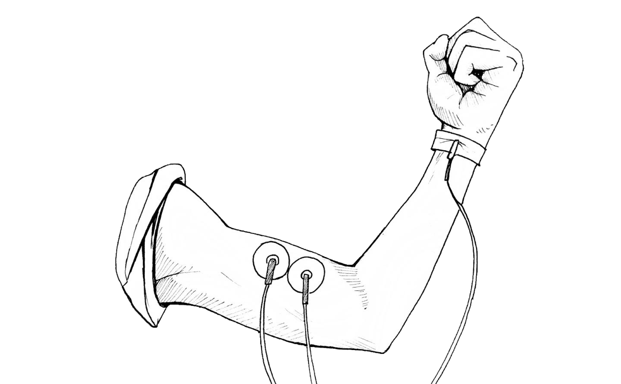
Experiment with the physical and electrical properties of neurons using our famous products!</p>
</div>


</div>


</div>


<link href="//backyardbrains.com/cdn/shop/t/22/assets/featured-products-block.css?v=126713192281405172821744814908" rel="stylesheet" type="text/css" media="all" />
<script src="//backyardbrains.com/cdn/shop/t/22/assets/featured-products-block.js?v=34880180099952340921744814905" defer></script>


<style>
  #block-AV1pmTDNwbFBIaGptR__featured_products_bBFHze {
    --products-per-row: 3;
    --dot-color: #ffffff;
    --slide-gap: 20px;
    --slider-speed: 5000ms;
  }
</style>

<featured-products
  id="block-AV1pmTDNwbFBIaGptR__featured_products_bBFHze"
  class="featured-products is-slider"
  
>
  
    <div class="featured-products__container">
      <div
        class="featured-products__grid splide"
        data-slider-enabled="true"
        data-slider-autoplay="true"
        data-slider-arrows="true"
        data-slider-dots="true"
        data-slider-speed="5000"
        data-slider-pause-on-hover="true"
      >
        
          <div class="splide__track">
            <div class="splide__list">
        
        
          <div class="splide__slide">
            
<article class="ptile ptile--default">
  <div class="ptile__inner">
    <!-- Product Media -->
    <div class="ptile__media">
      <a href="/products/book-how-your-brain-works" class="ptile__media-link">
        
          <img
            src="//backyardbrains.com/cdn/shop/files/HYBW_Book_product.png?height=300&v=1726089987"
            srcset="
              //backyardbrains.com/cdn/shop/files/HYBW_Book_product.png?height=300&v=1726089987 200w,
              //backyardbrains.com/cdn/shop/files/HYBW_Book_product.png?height=300&v=1726089987 400w
            "
            sizes="(max-width: 749px) 200px, 400px"
            loading="lazy"
            width="400"
            height="170"
            alt="Book: How Your Brain Works"
            class="ptile__image"
          >
        
      </a>

      
        <div class="ptile__badges">
          
            <span class="ptile__badge ptile__badge--sale">Sale</span>


        </div>


        <button
          type="button"
          class="ptile__quick-view"
          data-product-handle="book-how-your-brain-works"
          aria-label="Quick view Book: How Your Brain Works"
        >
          <span class="ptile__quick-view-text">Quick View</span>
        </button>
      
    </div>

    <!-- Product Info -->
    <div class="ptile__content">
      <a href="/products/book-how-your-brain-works" class="ptile__title-link">
        <h3 class="ptile__title">
          Book: How Your Brain Works
        </h3>
      </a>
      <div class="ptile__pricing">
        
          
            <span class="ptile__price ptile__price--compare">
              $27.95
            </span>


          <span class="ptile__price ptile__price--current">
            $25.95
          </span>
        
      </div>

      <!-- Product Actions -->
      <div class="ptile__actions">
        
          <button
            type="button"
            class="ptile__btn ptile__btn--primary swp-btn-add-to-cart product-item__add-to-cart"
            data-variant-id="45514393616625"
            data-add-to-cart
          >
            <span>Add to Cart</span>
          </button>
        
      </div>
    </div>
  </div>
</article>

          </div>
        
          <div class="splide__slide">
            
<article class="ptile ptile--default">
  <div class="ptile__inner">
    <!-- Product Media -->
    <div class="ptile__media">
      <a href="/products/cockroaches-3" class="ptile__media-link">
        
          <img
            src="//backyardbrains.com/cdn/shop/files/cockroach_f0b7de49-661b-49b5-916e-ec72b2dde61b.jpg?height=300&v=1737486730"
            srcset="
              //backyardbrains.com/cdn/shop/files/cockroach_f0b7de49-661b-49b5-916e-ec72b2dde61b.jpg?height=300&v=1737486730 200w,
              //backyardbrains.com/cdn/shop/files/cockroach_f0b7de49-661b-49b5-916e-ec72b2dde61b.jpg?height=300&v=1737486730 400w
            "
            sizes="(max-width: 749px) 200px, 400px"
            loading="lazy"
            width="400"
            height="170"
            alt="Box of 3 Cockroaches"
            class="ptile__image"
          >
        
      </a>

      
        <div class="ptile__badges">


            <span class="ptile__badge ptile__badge--sold-out">Sold out</span>
          
        </div>


        <button
          type="button"
          class="ptile__quick-view"
          data-product-handle="cockroaches-3"
          aria-label="Quick view Box of 3 Cockroaches"
        >
          <span class="ptile__quick-view-text">Quick View</span>
        </button>
      
    </div>

    <!-- Product Info -->
    <div class="ptile__content">
      <a href="/products/cockroaches-3" class="ptile__title-link">
        <h3 class="ptile__title">
          Box of 3 Cockroaches
        </h3>
      </a>
      <div class="ptile__pricing">


          <span class="ptile__price ptile__price--current">
            $13.00
          </span>
        
      </div>

      <!-- Product Actions -->
      <div class="ptile__actions">
        
          <button
            type="button"
            class="ptile__btn ptile__btn--disabled"
            disabled
          >
            <span>Sold Out</span>
          </button>
        
      </div>
    </div>
  </div>
</article>

          </div>
        
          <div class="splide__slide">
            
<article class="ptile ptile--default">
  <div class="ptile__inner">
    <!-- Product Media -->
    <div class="ptile__media">
      <a href="/products/eegheadband" class="ptile__media-link">
        
          <img
            src="//backyardbrains.com/cdn/shop/files/EEGHeadband_Large_1d2f4a30-944d-4f1d-8147-2088f9b88538.jpg?height=300&v=1726520386"
            srcset="
              //backyardbrains.com/cdn/shop/files/EEGHeadband_Large_1d2f4a30-944d-4f1d-8147-2088f9b88538.jpg?height=300&v=1726520386 200w,
              //backyardbrains.com/cdn/shop/files/EEGHeadband_Large_1d2f4a30-944d-4f1d-8147-2088f9b88538.jpg?height=300&v=1726520386 400w
            "
            sizes="(max-width: 749px) 200px, 400px"
            loading="lazy"
            width="400"
            height="170"
            alt="Brain (EEG) Headband"
            class="ptile__image"
          >
        
      </a>

      
        <div class="ptile__badges">


        </div>


        <button
          type="button"
          class="ptile__quick-view"
          data-product-handle="eegheadband"
          aria-label="Quick view Brain (EEG) Headband"
        >
          <span class="ptile__quick-view-text">Quick View</span>
        </button>
      
    </div>

    <!-- Product Info -->
    <div class="ptile__content">
      <a href="/products/eegheadband" class="ptile__title-link">
        <h3 class="ptile__title">
          Brain (EEG) Headband
        </h3>
      </a>
      <div class="ptile__pricing">


          <span class="ptile__price ptile__price--current">
            $10.00
          </span>
        
      </div>

      <!-- Product Actions -->
      <div class="ptile__actions">
        
          <button
            type="button"
            class="ptile__btn ptile__btn--primary swp-btn-add-to-cart product-item__add-to-cart"
            data-variant-id="45523809435889"
            data-add-to-cart
          >
            <span>Add to Cart</span>
          </button>
        
      </div>
    </div>
  </div>
</article>

          </div>
        
          <div class="splide__slide">
            
<article class="ptile ptile--default">
  <div class="ptile__inner">
    <!-- Product Media -->
    <div class="ptile__media">
      <a href="/products/spikerecorder" class="ptile__media-link">
        
          <img
            src="//backyardbrains.com/cdn/shop/files/app-icon-v2.png?height=300&v=1753404695"
            srcset="
              //backyardbrains.com/cdn/shop/files/app-icon-v2.png?height=300&v=1753404695 200w,
              //backyardbrains.com/cdn/shop/files/app-icon-v2.png?height=300&v=1753404695 400w
            "
            sizes="(max-width: 749px) 200px, 400px"
            loading="lazy"
            width="400"
            height="170"
            alt="BYB Spike Recorder"
            class="ptile__image"
          >
        
      </a>

      
        <div class="ptile__badges">
          
            <span class="ptile__badge ptile__badge--free">Free</span>


        </div>


        <button
          type="button"
          class="ptile__quick-view"
          data-product-handle="spikerecorder"
          aria-label="Quick view BYB Spike Recorder"
        >
          <span class="ptile__quick-view-text">Quick View</span>
        </button>
      
    </div>

    <!-- Product Info -->
    <div class="ptile__content">
      <a href="/products/spikerecorder" class="ptile__title-link">
        <h3 class="ptile__title">
          BYB Spike Recorder
        </h3>
      </a>
      <div class="ptile__pricing">
        
          <span class="ptile__price ptile__price--free">Free</span>
        
      </div>

      <!-- Product Actions -->
      <div class="ptile__actions">
        
          <a href="/products/spikerecorder" class="ptile__btn ptile__btn--download">
            <span>Download</span>
          </a>
        
      </div>
    </div>
  </div>
</article>

          </div>
        
          <div class="splide__slide">
            
<article class="ptile ptile--default">
  <div class="ptile__inner">
    <!-- Product Media -->
    <div class="ptile__media">
      <a href="/products/cockroach-care-kit" class="ptile__media-link">
        
          <img
            src="//backyardbrains.com/cdn/shop/files/prod_cockroach-care-kit.jpg?height=300&v=1740002887"
            srcset="
              //backyardbrains.com/cdn/shop/files/prod_cockroach-care-kit.jpg?height=300&v=1740002887 200w,
              //backyardbrains.com/cdn/shop/files/prod_cockroach-care-kit.jpg?height=300&v=1740002887 400w
            "
            sizes="(max-width: 749px) 200px, 400px"
            loading="lazy"
            width="400"
            height="170"
            alt="Cockroach Care Kit"
            class="ptile__image"
          >
        
      </a>

      
        <div class="ptile__badges">


        </div>


        <button
          type="button"
          class="ptile__quick-view"
          data-product-handle="cockroach-care-kit"
          aria-label="Quick view Cockroach Care Kit"
        >
          <span class="ptile__quick-view-text">Quick View</span>
        </button>
      
    </div>

    <!-- Product Info -->
    <div class="ptile__content">
      <a href="/products/cockroach-care-kit" class="ptile__title-link">
        <h3 class="ptile__title">
          Cockroach Care Kit
        </h3>
      </a>
      <div class="ptile__pricing">


          <span class="ptile__price ptile__price--current">
            $25.00
          </span>
        
      </div>

      <!-- Product Actions -->
      <div class="ptile__actions">
        
          <button
            type="button"
            class="ptile__btn ptile__btn--primary swp-btn-add-to-cart product-item__add-to-cart"
            data-variant-id="45516941885681"
            data-add-to-cart
          >
            <span>Add to Cart</span>
          </button>
        
      </div>
    </div>
  </div>
</article>

          </div>
        
          <div class="splide__slide">
            
<article class="ptile ptile--default">
  <div class="ptile__inner">
    <!-- Product Media -->
    <div class="ptile__media">
      <a href="/products/electrode-gel" class="ptile__media-link">
        
          <img
            src="//backyardbrains.com/cdn/shop/files/ElectrodeGel2.png?height=300&v=1747747211"
            srcset="
              //backyardbrains.com/cdn/shop/files/ElectrodeGel2.png?height=300&v=1747747211 200w,
              //backyardbrains.com/cdn/shop/files/ElectrodeGel2.png?height=300&v=1747747211 400w
            "
            sizes="(max-width: 749px) 200px, 400px"
            loading="lazy"
            width="400"
            height="170"
            alt="Electrode Gel"
            class="ptile__image"
          >
        
      </a>

      
        <div class="ptile__badges">


        </div>


        <button
          type="button"
          class="ptile__quick-view"
          data-product-handle="electrode-gel"
          aria-label="Quick view Electrode Gel"
        >
          <span class="ptile__quick-view-text">Quick View</span>
        </button>
      
    </div>

    <!-- Product Info -->
    <div class="ptile__content">
      <a href="/products/electrode-gel" class="ptile__title-link">
        <h3 class="ptile__title">
          Electrode Gel
        </h3>
      </a>
      <div class="ptile__pricing">


          <span class="ptile__price ptile__price--current">
            $25.00
          </span>
        
      </div>

      <!-- Product Actions -->
      <div class="ptile__actions">
        
          <button
            type="button"
            class="ptile__btn ptile__btn--primary swp-btn-add-to-cart product-item__add-to-cart"
            data-variant-id="45885161537777"
            data-add-to-cart
          >
            <span>Add to Cart</span>
          </button>
        
      </div>
    </div>
  </div>
</article>

          </div>
        
          <div class="splide__slide">
            
<article class="ptile ptile--default">
  <div class="ptile__inner">
    <!-- Product Media -->
    <div class="ptile__media">
      <a href="/products/heart-and-brain-spikerbox-classic" class="ptile__media-link">
        
          <img
            src="//backyardbrains.com/cdn/shop/files/HeartAndBrainSpikerBox-In-Action.jpg?height=300&v=1734723375"
            srcset="
              //backyardbrains.com/cdn/shop/files/HeartAndBrainSpikerBox-In-Action.jpg?height=300&v=1734723375 200w,
              //backyardbrains.com/cdn/shop/files/HeartAndBrainSpikerBox-In-Action.jpg?height=300&v=1734723375 400w
            "
            sizes="(max-width: 749px) 200px, 400px"
            loading="lazy"
            width="400"
            height="170"
            alt="Heart and Brain SpikerBox Classic"
            class="ptile__image"
          >
        
      </a>

      
        <div class="ptile__badges">


        </div>


        <button
          type="button"
          class="ptile__quick-view"
          data-product-handle="heart-and-brain-spikerbox-classic"
          aria-label="Quick view Heart and Brain SpikerBox Classic"
        >
          <span class="ptile__quick-view-text">Quick View</span>
        </button>
      
    </div>

    <!-- Product Info -->
    <div class="ptile__content">
      <a href="/products/heart-and-brain-spikerbox-classic" class="ptile__title-link">
        <h3 class="ptile__title">
          Heart and Brain SpikerBox Classic
        </h3>
      </a>
      <div class="ptile__pricing">


          <span class="ptile__price ptile__price--current">
            $189.99
          </span>
        
      </div>

      <!-- Product Actions -->
      <div class="ptile__actions">
        
          <button
            type="button"
            class="ptile__btn ptile__btn--primary swp-btn-add-to-cart product-item__add-to-cart"
            data-variant-id="42206483415281"
            data-add-to-cart
          >
            <span>Add to Cart</span>
          </button>
        
      </div>
    </div>
  </div>
</article>

          </div>
        
        
          </div>
          </div>
        
        
          <div class="splide__arrows">
            <button
              class="splide__arrow splide__arrow--prev"
              type="button"
              aria-label="Previous step"
            >
              <svg xmlns="http://www.w3.org/2000/svg" xmlns:xlink="http://www.w3.org/1999/xlink" width="50px" height="50px" viewBox="0 0 50 50" version="1.1">
    <title>045E6927-B99C-4572-849D-6B037E38C577</title>
    <g id="Desktop" stroke="none" stroke-width="1" fill="none" fill-rule="evenodd">
        <g id="BYB---Store----Human-Spikerbox" transform="translate(-72.000000, -1344.000000)">
            <g id="Accessories" transform="translate(0.000000, 1013.000000)">
                <g id="arrow_left" transform="translate(72.000000, 331.000000)">
                    <path d="M25,0 C11.193,0 0,11.193 0,25 C0,38.807 11.193,50 25,50 C38.807,50 50,38.807 50,25 C50,11.193 38.807,0 25,0" id="Fill-5" fill="#FFFFFF"/>
                    <path d="M25,0 C11.193,0 0,11.193 0,25 C0,38.807 11.193,50 25,50 C38.807,50 50,38.807 50,25 C50,11.193 38.807,0 25,0 M25,1 C38.233,1 49,11.767 49,25 C49,38.234 38.233,49 25,49 C11.767,49 1,38.234 1,25 C1,11.767 11.767,1 25,1" id="Fill-5" fill="#FF835F"/>
                    <path d="M17.5261077,23.6316509 L25.9345273,14.5708137 C27.0658216,13.3517411 29,14.2149167 29,15.9392628 L29,34.0609372 C29,35.7852833 27.0658216,36.6484589 25.9345273,35.4293863 L17.5261077,26.3685491 C16.8246308,25.6126439 16.8246308,24.3865536 17.5261077,23.6316509" id="Fill-8" fill="#FF835F"/>
                </g>
            </g>
        </g>
    </g>
</svg>
            </button>
            <button
              class="splide__arrow splide__arrow--next"
              type="button"
              aria-label="Next step"
            >
              <svg xmlns="http://www.w3.org/2000/svg" xmlns:xlink="http://www.w3.org/1999/xlink" width="50px" height="50px" viewBox="0 0 50 50" version="1.1">
    <title>C3E0AE06-BCF9-4549-AB5E-16DF3ED9C108</title>
    <g id="Desktop" stroke="none" stroke-width="1" fill="none" fill-rule="evenodd">
        <g id="BYB---Store----Human-Spikerbox" transform="translate(-1158.000000, -1344.000000)">
            <g id="Accessories" transform="translate(0.000000, 1013.000000)">
                <g id="arrow_right" transform="translate(1183.000000, 356.000000) scale(-1, 1) translate(-1183.000000, -356.000000) translate(1158.000000, 331.000000)">
                    <path d="M25,0 C11.193,0 0,11.193 0,25 C0,38.807 11.193,50 25,50 C38.807,50 50,38.807 50,25 C50,11.193 38.807,0 25,0" id="Fill-5" fill="#FFFFFF"/>
                    <path d="M25,0 C11.193,0 0,11.193 0,25 C0,38.807 11.193,50 25,50 C38.807,50 50,38.807 50,25 C50,11.193 38.807,0 25,0 M25,1 C38.233,1 49,11.767 49,25 C49,38.234 38.233,49 25,49 C11.767,49 1,38.234 1,25 C1,11.767 11.767,1 25,1" id="Fill-5" fill="#FF835F"/>
                    <path d="M17.5261077,23.6316509 L25.9345273,14.5708137 C27.0658216,13.3517411 29,14.2149167 29,15.9392628 L29,34.0609372 C29,35.7852833 27.0658216,36.6484589 25.9345273,35.4293863 L17.5261077,26.3685491 C16.8246308,25.6126439 16.8246308,24.3865536 17.5261077,23.6316509" id="Fill-8" fill="#FF835F"/>
                </g>
            </g>
        </g>
    </g>
</svg>
            </button>
          </div>
        
      </div>
    </div>
  
</featured-products>


</div>


<style> #shopify-section-template--19463677182193__custom_section_QN8iRN .heading-block {font-family: "Boldoa_Mat";} </style></div><div id="shopify-section-template--19463677182193__custom_section_UNiGmF" class="shopify-section"><style data-shopify>.section-template--19463677182193__custom_section_UNiGmF-padding {
    padding-top: 45px;
    padding-bottom: 45px;
    
  }

  @media screen and (min-width: 750px) {
    .section-template--19463677182193__custom_section_UNiGmF-padding {
      padding-top: 60px;
      padding-bottom: 60px;
    }
  }</style><div
  class="custom-section container section-template--19463677182193__custom_section_UNiGmF-padding"
  id=""
>
  

<link href="//backyardbrains.com/cdn/shop/t/22/assets/grid-base.css?v=134820127638915630821744814906" rel="stylesheet" type="text/css" media="all" />


  <link href="//backyardbrains.com/cdn/shop/t/22/assets/grid-standard.css?v=47006761176795654121744814907" rel="stylesheet" type="text/css" media="all" />


<style>
  /* Scoped variables for this specific grid instance */
  #grid-ATVVSdkJLT0l1THk0a__grid_U6pPVW {
    /* Layout */
    --columns:repeat(2, 1fr)
      ;


    /* Spacing */
    --column-gap:20px
      ;

    --row-gap:20px
      ;

    /* Alignment */
    --justify-content:;

    --align-content:;

    /* Individual padding variables */
    --padding-top: 0px;
    --padding-bottom: 0px;
    --padding-left: 0px;
    --padding-right: 0px;

    /* Individual margin variables */
    --margin-top: 0px;
    --margin-bottom: 0px;
    --margin-left: 0px;
    --margin-right: 0px;

    --background-color:transparent;

    --text-color:inherit;

    --border-top:none;
    --border-bottom:none;

    --border-radius:0;

    --box-shadow:none;

    /* Max width */
    --max-width: 100%
    ;

    /* Auto-center when max-width is applied */
    
  }

  /* Responsive grid adjustments */
  @media screen and (max-width: 989px) {
    #grid-ATVVSdkJLT0l1THk0a__grid_U6pPVW {
      --columns:var(--columns);
    }
  }

  @media screen and (max-width: 749px) {
    #grid-ATVVSdkJLT0l1THk0a__grid_U6pPVW {
      --columns:1fr
        ;

      /* Add mobile horizontal alignment if not inheriting */


    }
  }
</style>


<div
  id="grid-ATVVSdkJLT0l1THk0a__grid_U6pPVW"
  class="grid-block grid-standard"
  
  
  role="region"
  
>
  

<link href="//backyardbrains.com/cdn/shop/t/22/assets/column-block.css?v=58789759279877732081744814905" rel="stylesheet" type="text/css" media="all" />


<style>
  /* Each column gets its own ID-based selector */
  #column-Aa1lFM3FsVXVrL3FuZ__column_hbXXRm{
    /* Add offset variables */
    --offset-x: 0px;
    --offset-y: 0px;

    /* Clean variable declarations using case statements */
    
    --horizontal-align: center
      ;


    --vertical-align: center
      ;


    --text-align: center
      ;
    

    --padding: 0
      ;

    --background-color: transparent
      ;

    --text-color: inherit;

    --border-radius: 0
      ;

    --background-image: none;
    --background-position: center center;
    --background-size: cover;
    --background-repeat: no-repeat;
    --background-overlay: transparent;

    /* Add z-index variable */
    --z-index: 1;

    @media screen and (max-width: 749px) {


    }
  }
</style>

<div
  id="column-Aa1lFM3FsVXVrL3FuZ__column_hbXXRm"
  class="column-block column-width-50"
  
>

<h2
  class="heading-wrapper"
  
>
  

<link href="//backyardbrains.com/cdn/shop/t/22/assets/grid-base.css?v=134820127638915630821744814906" rel="stylesheet" type="text/css" media="all" />


  <link href="//backyardbrains.com/cdn/shop/t/22/assets/grid-min-width.css?v=48607143580155666621744814907" rel="stylesheet" type="text/css" media="all" />


<style>
  /* Scoped variables for this specific grid instance */
  #grid-AZFRxOGc5SWN6d2p1Q__grid_EaBrwp {
    /* Layout */
    --columns:none;

    
    --flex-wrap: wrap;
    

    /* Spacing */
    --column-gap:20px
      ;

    --row-gap:20px
      ;

    /* Alignment */
    --justify-content:;

    --align-content:;

    /* Individual padding variables */
    --padding-top: 0px;
    --padding-bottom: 0px;
    --padding-left: 0px;
    --padding-right: 0px;

    /* Individual margin variables */
    --margin-top: 0px;
    --margin-bottom: 0px;
    --margin-left: 0px;
    --margin-right: 0px;

    --background-color:transparent;

    --text-color:inherit;

    --border-top:none;
    --border-bottom:none;

    --border-radius:0;

    --box-shadow:none;

    /* Max width */
    --max-width: 100%
    ;

    /* Auto-center when max-width is applied */
    
  }

  /* Responsive grid adjustments */
  @media screen and (max-width: 989px) {
    #grid-AZFRxOGc5SWN6d2p1Q__grid_EaBrwp {
      --columns:var(--columns);
    }
  }

  @media screen and (max-width: 749px) {
    #grid-AZFRxOGc5SWN6d2p1Q__grid_EaBrwp {
      --columns:var(--columns);

      /* Add mobile horizontal alignment if not inheriting */
      
        --justify-content:center
          ;


    }
  }
</style>


<div
  id="grid-AZFRxOGc5SWN6d2p1Q__grid_EaBrwp"
  class="grid-block grid-min-width"
  
  
  role="region"
  
>
  

<link href="//backyardbrains.com/cdn/shop/t/22/assets/column-block.css?v=58789759279877732081744814905" rel="stylesheet" type="text/css" media="all" />


<style>
  /* Each column gets its own ID-based selector */
  #column-ARVZlTWY2clhnOXFWR__column_VDbCGB{
    /* Add offset variables */
    --offset-x: 0px;
    --offset-y: 0px;

    /* Clean variable declarations using case statements */


    --padding: 0
      ;

    --background-color: transparent
      ;

    --text-color: inherit;

    --border-radius: 0
      ;

    --background-image: none;
    --background-position: center center;
    --background-size: cover;
    --background-repeat: no-repeat;
    --background-overlay: transparent;

    /* Add z-index variable */
    --z-index: 1;

    @media screen and (max-width: 749px) {


    }
  }
</style>

<div
  id="column-ARVZlTWY2clhnOXFWR__column_VDbCGB"
  class="column-block column-width-50"
  
>

<link href="//backyardbrains.com/cdn/shop/t/22/assets/grid-base.css?v=134820127638915630821744814906" rel="stylesheet" type="text/css" media="all" />


  <link href="//backyardbrains.com/cdn/shop/t/22/assets/grid-min-width.css?v=48607143580155666621744814907" rel="stylesheet" type="text/css" media="all" />


<style>
  /* Scoped variables for this specific grid instance */
  #grid-ASUw0TzMzSE9YN1Vxc__grid_VBchtf {
    /* Layout */
    --columns:none;

    
    --flex-wrap: wrap;
    

    /* Spacing */
    --column-gap:20px
      ;

    --row-gap:20px
      ;

    /* Alignment */
    --justify-content:;

    --align-content:end
      ;

    /* Individual padding variables */
    --padding-top: 0px;
    --padding-bottom: 0px;
    --padding-left: 0px;
    --padding-right: 0px;

    /* Individual margin variables */
    --margin-top: 0px;
    --margin-bottom: 0px;
    --margin-left: 0px;
    --margin-right: 0px;

    --background-color:transparent;

    --text-color:inherit;

    --border-top:none;
    --border-bottom:none;

    --border-radius:0;

    --box-shadow:none;

    /* Max width */
    --max-width: 100%
    ;

    /* Auto-center when max-width is applied */
    
  }

  /* Responsive grid adjustments */
  @media screen and (max-width: 989px) {
    #grid-ASUw0TzMzSE9YN1Vxc__grid_VBchtf {
      --columns:var(--columns);
    }
  }

  @media screen and (max-width: 749px) {
    #grid-ASUw0TzMzSE9YN1Vxc__grid_VBchtf {
      --columns:var(--columns);

      /* Add mobile horizontal alignment if not inheriting */


    }
  }
</style>


<div
  id="grid-ASUw0TzMzSE9YN1Vxc__grid_VBchtf"
  class="grid-block grid-min-width"
  
  
  role="region"
  
>
  

<link href="//backyardbrains.com/cdn/shop/t/22/assets/column-block.css?v=58789759279877732081744814905" rel="stylesheet" type="text/css" media="all" />


<style>
  /* Each column gets its own ID-based selector */
  #column-AdHZ1a1pISGQ2TG5KR__column_3qVAwx{
    /* Add offset variables */
    --offset-x: 0px;
    --offset-y: 0px;

    /* Clean variable declarations using case statements */


    --padding: 0
      ;

    --background-color: transparent
      ;

    --text-color: inherit;

    --border-radius: 0
      ;

    --background-image: none;
    --background-position: center center;
    --background-size: cover;
    --background-repeat: no-repeat;
    --background-overlay: transparent;

    /* Add z-index variable */
    --z-index: 1;

    @media screen and (max-width: 749px) {


    }
  }
</style>

<div
  id="column-AdHZ1a1pISGQ2TG5KR__column_3qVAwx"
  class="column-block column-width-50"
  
>

<link href="//backyardbrains.com/cdn/shop/t/22/assets/text-block.css?v=60548446454617784341746202731" rel="stylesheet" type="text/css" media="all" />
<div class="text-block fluid-typography align-left size-custom weight-normal style-normal spacing-none width-full" id="text-ARzdQV210b3Y2emFPQ__text_LyBTUA" >
  <style>
    #text-ARzdQV210b3Y2emFPQ__text_LyBTUA {
      --margin-top: 0px;
      --margin-bottom: 0px;
      
      
      --highlight-color: #ff805f;
      --padding: 0px;
      
        --custom-size: 40px;
      
    }
  </style>
  
  <p>FOR</p>
</div>


</div>


<link href="//backyardbrains.com/cdn/shop/t/22/assets/column-block.css?v=58789759279877732081744814905" rel="stylesheet" type="text/css" media="all" />


<style>
  /* Each column gets its own ID-based selector */
  #column-Ab3hTcVNrY1IxZjBpL__column_34UBkg{
    /* Add offset variables */
    --offset-x: 0px;
    --offset-y: 0px;

    /* Clean variable declarations using case statements */


    --padding: 0
      ;

    --background-color: transparent
      ;

    --text-color: inherit;

    --border-radius: 0
      ;

    --background-image: none;
    --background-position: center center;
    --background-size: cover;
    --background-repeat: no-repeat;
    --background-overlay: transparent;

    /* Add z-index variable */
    --z-index: 1;

    @media screen and (max-width: 749px) {


    }
  }
</style>

<div
  id="column-Ab3hTcVNrY1IxZjBpL__column_34UBkg"
  class="column-block column-width-50"
  
>

<link href="//backyardbrains.com/cdn/shop/t/22/assets/image-block.css?v=123873222179053638491744814905" rel="stylesheet" type="text/css" media="all" />
<figure
  id="figure-AbUlzamFxM0FxM1MxN__image_cWLpqg"
  class="image-block radius-none shadow-none effect-none fit-contain mobile-custom-size"
  
>
  <style>
    #figure-AbUlzamFxM0FxM1MxN__image_cWLpqg {
      --offset-x: 0px;
      --offset-y: 0px;
      --margin-top: 0px;
      --margin-bottom: 0px;
      --z-index: 1;
      --rotation: 0deg;


        --display-width: 150px;
      

      /* Desktop alignment */
      
          --desktop-alignment-margin-left: auto;
          --desktop-alignment-margin-right: auto;
        

      /* Mobile alignment */
      

      @media screen and (max-width: 749px) {
        
        
      }
    }

    #image-AbUlzamFxM0FxM1MxN__image_cWLpqg {


        --display-width: 150px;
      

      @media screen and (max-width: 749px) {
        
          --display-width: 100px;
        
      }
    }
  </style>

  <div id="image-AbUlzamFxM0FxM1MxN__image_cWLpqg"><img src="//backyardbrains.com/cdn/shop/files/Spikerbox_1x_afe74f64-07f6-4555-b6d5-3a38b9e78baa.svg?v=1740399896&amp;width=150" alt="Decorative image" width="141" height="103" loading="lazy" sizes="(min-width: 1200px) 550px,
(min-width: 750px) calc((100vw - 130px) / 2), calc((100vw - 50px) / 2)" fetchpriority="auto" class="custom-image" aria-hidden="true">
</div>

  
</figure>


</div>


</div>


<link href="//backyardbrains.com/cdn/shop/t/22/assets/text-block.css?v=60548446454617784341746202731" rel="stylesheet" type="text/css" media="all" />
<div class="text-block fluid-typography align-left size-custom weight-normal style-normal spacing-none width-full" id="text-AVDQzcHJRdllid0Zjc__text_FR9gww" >
  <style>
    #text-AVDQzcHJRdllid0Zjc__text_FR9gww {
      --margin-top: 0px;
      --margin-bottom: 0px;
      --text-color: #ff805f;
      
      --highlight-color: #ff805f;
      --padding: 0px;
      
        --custom-size: 80px;
      
    }
  </style>
  
  <p>TRANSFORM</p>
</div>


<link href="//backyardbrains.com/cdn/shop/t/22/assets/text-block.css?v=60548446454617784341746202731" rel="stylesheet" type="text/css" media="all" />
<div class="text-block fluid-typography align-left size-custom weight-normal style-normal spacing-none width-full" id="text-AZDRFTVhoeExzMllyN__text_pVi8wL" >
  <style>
    #text-AZDRFTVhoeExzMllyN__text_pVi8wL {
      --margin-top: 0px;
      --margin-bottom: 0px;
      
      
      --highlight-color: #ff805f;
      --padding: 0px;
      
        --custom-size: 54px;
      
    }
  </style>
  
  <p>YOUR CLASSROOM</p>
</div>


</div>


<link href="//backyardbrains.com/cdn/shop/t/22/assets/column-block.css?v=58789759279877732081744814905" rel="stylesheet" type="text/css" media="all" />


<style>
  /* Each column gets its own ID-based selector */
  #column-AQklpb2VuUlhwVW13W__column_9gyeer{
    /* Add offset variables */
    --offset-x: 0px;
    --offset-y: 0px;

    /* Clean variable declarations using case statements */


    --vertical-align: flex-end
      ;


    --padding: 0
      ;

    --background-color: transparent
      ;

    --text-color: inherit;

    --border-radius: 0
      ;

    --background-image: none;
    --background-position: center center;
    --background-size: cover;
    --background-repeat: no-repeat;
    --background-overlay: transparent;

    /* Add z-index variable */
    --z-index: 1;

    @media screen and (max-width: 749px) {


    }
  }
</style>

<div
  id="column-AQklpb2VuUlhwVW13W__column_9gyeer"
  class="column-block column-width-50"
  
>

<link href="//backyardbrains.com/cdn/shop/t/22/assets/text-block.css?v=60548446454617784341746202731" rel="stylesheet" type="text/css" media="all" />
<div class="text-block fluid-typography align-left size-custom weight-normal style-normal spacing-none width-full" id="text-AeXpKZEw0ZVRzNys3a__text_CP6AcR" >
  <style>
    #text-AeXpKZEw0ZVRzNys3a__text_CP6AcR {
      --margin-top: 0px;
      --margin-bottom: 0px;
      --text-color: #ff805f;
      
      --highlight-color: #ff805f;
      --padding: 0px;
      
        --custom-size: 200px;
      
    }
  </style>
  
  <p>?</p>
</div>


</div>


</div>


</h2>


<link href="//backyardbrains.com/cdn/shop/t/22/assets/text-block.css?v=60548446454617784341746202731" rel="stylesheet" type="text/css" media="all" />
<div class="text-block fluid-typography align-left size-3xl weight-normal style-normal spacing-normal width-full" id="text-AaE1Db3JIejBiZFBYe__text_rHMMDN" >
  <style>
    #text-AaE1Db3JIejBiZFBYe__text_rHMMDN {
      --margin-top: 0px;
      --margin-bottom: 30px;
      
      
      --highlight-color: #ff805f;
      --padding: 0px;
      
    }
  </style>
  
  <p>Experiment with the physical and electrical properties of neurons! Reproduce the science and make discoveries with Spikerbox!</p>
</div>


<link href="//backyardbrains.com/cdn/shop/t/22/assets/button-block.css?v=69112092691938232801744814905" rel="stylesheet" type="text/css" media="all" />


<style>
  /* Custom CSS variables for this specific button instance */


  #button-ATTZhd25WYWF1WHc4M__button_Yzykfb .button-block:focus-visible {
    outline: 2px solid var(--text-color, #fff);
    outline-offset: 2px;
    box-shadow: 0 0 0 4px rgba(0, 0, 0, 0.1);
  }
  
  
  /* Fix for alignment - make wrapper respond to alignment setting */
  #button-ATTZhd25WYWF1WHc4M__button_Yzykfb.button-wrapper {
    display: block;
    width: 100%;
    text-align: left;
  }

  @media screen and (max-width: 749px) {
    #button-ATTZhd25WYWF1WHc4M__button_Yzykfb.button-wrapper {
      text-align: center;
    }
  }
  
  /* For stretch alignment, make button wrapper text alignment center */
  #button-ATTZhd25WYWF1WHc4M__button_Yzykfb.button-wrapper.align-stretch {
    text-align: center;
  }
</style>

<div id="button-ATTZhd25WYWF1WHc4M__button_Yzykfb" class="button-wrapper align-left" >
  <a
    class="button-block variant-primary size-large shape-square shadow-none align-left"


    href="/collections/all-products"
    title="BROWSE ALL PRODUCTS"
    
  >
    <span class="button-text">BROWSE ALL PRODUCTS</span>
    
    
  </a>
</div>


</div>


<link href="//backyardbrains.com/cdn/shop/t/22/assets/column-block.css?v=58789759279877732081744814905" rel="stylesheet" type="text/css" media="all" />


<style>
  /* Each column gets its own ID-based selector */
  #column-AdWFrWlNnTFVuM2hMN__column_9yTkiK{
    /* Add offset variables */
    --offset-x: 0px;
    --offset-y: 0px;

    /* Clean variable declarations using case statements */


    --padding: 0
      ;

    --background-color: transparent
      ;

    --text-color: inherit;

    --border-radius: 0
      ;

    --background-image: none;
    --background-position: center center;
    --background-size: cover;
    --background-repeat: no-repeat;
    --background-overlay: transparent;

    /* Add z-index variable */
    --z-index: 1;

    @media screen and (max-width: 749px) {


    }
  }
</style>

<div
  id="column-AdWFrWlNnTFVuM2hMN__column_9yTkiK"
  class="column-block column-width-50"
  
>

<link href="//backyardbrains.com/cdn/shop/t/22/assets/image-block.css?v=123873222179053638491744814905" rel="stylesheet" type="text/css" media="all" />
<figure
  id="figure-AOTI2WWdVSnRVcjF2R__image_dUB7ab"
  class="image-block radius-none shadow-none effect-none fit-contain mobile-custom-size"
  
>
  <style>
    #figure-AOTI2WWdVSnRVcjF2R__image_dUB7ab {
      --offset-x: 0px;
      --offset-y: 0px;
      --margin-top: 0px;
      --margin-bottom: 0px;
      --z-index: 1;
      --rotation: 0deg;


        --display-width: 1000px;
      

      /* Desktop alignment */
      
          --desktop-alignment-margin-left: auto;
          --desktop-alignment-margin-right: auto;
        

      /* Mobile alignment */
      

      @media screen and (max-width: 749px) {
        
        
      }
    }

    #image-AOTI2WWdVSnRVcjF2R__image_dUB7ab {


        --display-width: 1000px;
      

      @media screen and (max-width: 749px) {
        
          --display-width: 300px;
        
      }
    }
  </style>

  <div id="image-AOTI2WWdVSnRVcjF2R__image_dUB7ab"><img src="//backyardbrains.com/cdn/shop/files/image_2x_bbe5c8e3-2e9e-4608-bed8-6648ba36fcc9.jpg?v=1740429482&amp;width=1000" alt="Decorative image" srcset="//backyardbrains.com/cdn/shop/files/image_2x_bbe5c8e3-2e9e-4608-bed8-6648ba36fcc9.jpg?v=1740429482&amp;width=165 165w, //backyardbrains.com/cdn/shop/files/image_2x_bbe5c8e3-2e9e-4608-bed8-6648ba36fcc9.jpg?v=1740429482&amp;width=360 360w, //backyardbrains.com/cdn/shop/files/image_2x_bbe5c8e3-2e9e-4608-bed8-6648ba36fcc9.jpg?v=1740429482&amp;width=535 535w, //backyardbrains.com/cdn/shop/files/image_2x_bbe5c8e3-2e9e-4608-bed8-6648ba36fcc9.jpg?v=1740429482&amp;width=750 750w" width="1008" height="1468" loading="lazy" sizes="(min-width: 1200px) 550px,
(min-width: 750px) calc((100vw - 130px) / 2), calc((100vw - 50px) / 2)" fetchpriority="auto" class="custom-image" aria-hidden="false">
</div>

  
</figure>


</div>


</div>


</div>


</div><div id="shopify-section-template--19463677182193__custom_section_FetGjP" class="shopify-section"><style data-shopify>.section-template--19463677182193__custom_section_FetGjP-padding {
    padding-top: 45px;
    padding-bottom: 45px;
    
      background-color: #ffcdbf;
    
  }

  @media screen and (min-width: 750px) {
    .section-template--19463677182193__custom_section_FetGjP-padding {
      padding-top: 60px;
      padding-bottom: 60px;
    }
  }</style><div
  class="custom-section  section-template--19463677182193__custom_section_FetGjP-padding"
  id=""
>
  

<link href="//backyardbrains.com/cdn/shop/t/22/assets/grid-base.css?v=134820127638915630821744814906" rel="stylesheet" type="text/css" media="all" />


  <link href="//backyardbrains.com/cdn/shop/t/22/assets/grid-dynamical.css?v=173925019040253457601744814907" rel="stylesheet" type="text/css" media="all" />


<style>
  /* Scoped variables for this specific grid instance */
  #grid-AV1pZV0t0VzlwRHd2N__grid_NGqwQH {
    /* Layout */
    --columns:;


    /* Spacing */
    --column-gap:20px
      ;

    --row-gap:20px
      ;

    /* Alignment */
    --justify-content:;

    --align-content:;

    /* Individual padding variables */
    --padding-top: 0px;
    --padding-bottom: 0px;
    --padding-left: 0px;
    --padding-right: 0px;

    /* Individual margin variables */
    --margin-top: 0px;
    --margin-bottom: 0px;
    --margin-left: 0px;
    --margin-right: 0px;

    --background-color:transparent;

    --text-color:inherit;

    --border-top:none;
    --border-bottom:none;

    --border-radius:0;

    --box-shadow:none;

    /* Max width */
    --max-width: 1280px
      ;

    /* Auto-center when max-width is applied */
    
    margin-left: auto;
    margin-right: auto;
    
  }

  /* Responsive grid adjustments */
  @media screen and (max-width: 989px) {
    #grid-AV1pZV0t0VzlwRHd2N__grid_NGqwQH {
      --columns:var(--columns);
    }
  }

  @media screen and (max-width: 749px) {
    #grid-AV1pZV0t0VzlwRHd2N__grid_NGqwQH {
      --columns:var(--columns);

      /* Add mobile horizontal alignment if not inheriting */


    }
  }
</style>


<div
  id="grid-AV1pZV0t0VzlwRHd2N__grid_NGqwQH"
  class="grid-block grid-dynamical mobile-stack mobile-columns-one"
  
  
  role="region"
  
>
  

<link href="//backyardbrains.com/cdn/shop/t/22/assets/column-block.css?v=58789759279877732081744814905" rel="stylesheet" type="text/css" media="all" />


<style>
  /* Each column gets its own ID-based selector */
  #column-AQTFRb1NWb2Mya29UW__column_8cMYyB{
    /* Add offset variables */
    --offset-x: 0px;
    --offset-y: 0px;

    /* Clean variable declarations using case statements */


    --padding: 0
      ;

    --background-color: transparent
      ;

    --text-color: inherit;

    --border-radius: 0
      ;

    --background-image: none;
    --background-position: center center;
    --background-size: cover;
    --background-repeat: no-repeat;
    --background-overlay: transparent;

    /* Add z-index variable */
    --z-index: 1;

    @media screen and (max-width: 749px) {


    }
  }
</style>

<div
  id="column-AQTFRb1NWb2Mya29UW__column_8cMYyB"
  class="column-block column-width-40"
  
>

<link href="//backyardbrains.com/cdn/shop/t/22/assets/image-block.css?v=123873222179053638491744814905" rel="stylesheet" type="text/css" media="all" />
<figure
  id="figure-AOUNPSytZa1hzUGdOa__image_4TgNTV"
  class="image-block radius-none shadow-none effect-none fit-contain mobile-custom-size"
  
>
  <style>
    #figure-AOUNPSytZa1hzUGdOa__image_4TgNTV {
      --offset-x: 0px;
      --offset-y: 110px;
      --margin-top: 0px;
      --margin-bottom: 0px;
      --z-index: 2;
      --rotation: 0deg;


        --display-width: 460px;
      

      /* Desktop alignment */
      
          --desktop-alignment-margin-left: auto;
          --desktop-alignment-margin-right: auto;
        

      /* Mobile alignment */
      

      @media screen and (max-width: 749px) {
        
          --offset-x: 0px;
          --offset-y: 0px;
        
        
      }
    }

    #image-AOUNPSytZa1hzUGdOa__image_4TgNTV {


        --display-width: 460px;
      

      @media screen and (max-width: 749px) {
        
          --display-width: 200px;
        
      }
    }
  </style>

  <div id="image-AOUNPSytZa1hzUGdOa__image_4TgNTV"><img src="//backyardbrains.com/cdn/shop/files/brain-work-illustration.svg?v=1722947366&amp;width=460" alt="Decorative image" srcset="//backyardbrains.com/cdn/shop/files/brain-work-illustration.svg?v=1722947366&amp;width=165 165w, //backyardbrains.com/cdn/shop/files/brain-work-illustration.svg?v=1722947366&amp;width=360 360w" width="468" height="540" loading="lazy" sizes="(min-width: 1200px) 550px,
(min-width: 750px) calc((100vw - 130px) / 2), calc((100vw - 50px) / 2)" fetchpriority="auto" class="custom-image" aria-hidden="false">
</div>

  
</figure>


</div>


<link href="//backyardbrains.com/cdn/shop/t/22/assets/column-block.css?v=58789759279877732081744814905" rel="stylesheet" type="text/css" media="all" />


<style>
  /* Each column gets its own ID-based selector */
  #column-AQzZzVHBOckdXZUJKa__column_gYRDxY{
    /* Add offset variables */
    --offset-x: 0px;
    --offset-y: 0px;

    /* Clean variable declarations using case statements */


    --padding: 0
      ;

    --background-color: transparent
      ;

    --text-color: inherit;

    --border-radius: 0
      ;

    --background-image: none;
    --background-position: center center;
    --background-size: contain;
    --background-repeat: no-repeat;
    --background-overlay: transparent;

    /* Add z-index variable */
    --z-index: 1;

    @media screen and (max-width: 749px) {


    }
  }
</style>

<div
  id="column-AQzZzVHBOckdXZUJKa__column_gYRDxY"
  class="column-block column-width-50"
  
>

<link href="//backyardbrains.com/cdn/shop/t/22/assets/cloud-content-block.css?v=82501108328852444711744814907" rel="stylesheet" type="text/css" media="all" />


<div id="cloud-content-AZlNJTDVXMmtIZEw4Z__cloud_content_pcxaN3" class="cloud-content-block" >
  <style>
    #cloud-content-AZlNJTDVXMmtIZEw4Z__cloud_content_pcxaN3 {
      --cloud-background: url(//backyardbrains.com/cdn/shop/files/cloud-illustration_1x_12ad09f1-c4cd-4488-8dcf-85cba645290f.svg?v=1740428481&width=1200);
      --heading-color: #ffffff;
      --text-color: #000000;
    }
  </style>
  
  <div class="cloud-content__wrapper">
    
      <h2 class="cloud-content__heading">
        EXPLORE OUR MOST POPULAR EXPERIMENTS
      </h2>


      <div class="cloud-content__text">
        <p>Dive into the captivating world of neuroscience with <strong>Backyard Brains</strong>! Our affordable kits enable learners of all ages to become neuroscientists.</p>
      </div>
    
  </div>
</div>

 </div>


</div>


<link href="//backyardbrains.com/cdn/shop/t/22/assets/grid-base.css?v=134820127638915630821744814906" rel="stylesheet" type="text/css" media="all" />


  <link href="//backyardbrains.com/cdn/shop/t/22/assets/grid-dynamical.css?v=173925019040253457601744814907" rel="stylesheet" type="text/css" media="all" />


<style>
  /* Scoped variables for this specific grid instance */
  #grid-AR2ZiS2h5K2ZnNld0U__grid_LxKNhA {
    /* Layout */
    --columns:;


    /* Spacing */
    --column-gap:20px
      ;

    --row-gap:20px
      ;

    /* Alignment */
    --justify-content:;

    --align-content:;

    /* Individual padding variables */
    --padding-top: 0px;
    --padding-bottom: 0px;
    --padding-left: 0px;
    --padding-right: 0px;

    /* Individual margin variables */
    --margin-top: 0px;
    --margin-bottom: 0px;
    --margin-left: 0px;
    --margin-right: 0px;

    --background-color:transparent;

    --text-color:inherit;

    --border-top:none;
    --border-bottom:none;

    --border-radius:0;

    --box-shadow:none;

    /* Max width */
    --max-width: 1280px
      ;

    /* Auto-center when max-width is applied */
    
    margin-left: auto;
    margin-right: auto;
    
  }

  /* Responsive grid adjustments */
  @media screen and (max-width: 989px) {
    #grid-AR2ZiS2h5K2ZnNld0U__grid_LxKNhA {
      --columns:var(--columns);
    }
  }

  @media screen and (max-width: 749px) {
    #grid-AR2ZiS2h5K2ZnNld0U__grid_LxKNhA {
      --columns:var(--columns);

      /* Add mobile horizontal alignment if not inheriting */


    }
  }
</style>


<div
  id="grid-AR2ZiS2h5K2ZnNld0U__grid_LxKNhA"
  class="grid-block grid-dynamical mobile-stack mobile-columns-one"
  
  
  role="region"
  
>
  

<link href="//backyardbrains.com/cdn/shop/t/22/assets/column-block.css?v=58789759279877732081744814905" rel="stylesheet" type="text/css" media="all" />


<style>
  /* Each column gets its own ID-based selector */
  #column-ASG0zTFVlb0dqZTZNR__column_6xDkg3{
    /* Add offset variables */
    --offset-x: 0px;
    --offset-y: 0px;

    /* Clean variable declarations using case statements */


    --padding: 0
      ;

    --background-color: transparent
      ;

    --text-color: inherit;

    --border-radius: 0
      ;

    --background-image: none;
    --background-position: center center;
    --background-size: cover;
    --background-repeat: no-repeat;
    --background-overlay: transparent;

    /* Add z-index variable */
    --z-index: 1;

    @media screen and (max-width: 749px) {


    }
  }
</style>

<div
  id="column-ASG0zTFVlb0dqZTZNR__column_6xDkg3"
  class="column-block column-width-36"
  
></div>


<link href="//backyardbrains.com/cdn/shop/t/22/assets/column-block.css?v=58789759279877732081744814905" rel="stylesheet" type="text/css" media="all" />


<style>
  /* Each column gets its own ID-based selector */
  #column-AK1JDWUI2VVhzZTJkc__column_wQPT8p{
    /* Add offset variables */
    --offset-x: -185px;
    --offset-y: -165px;

    /* Clean variable declarations using case statements */


    --padding: 0
      ;

    --background-color: transparent
      ;

    --text-color: inherit;

    --border-radius: 0
      ;

    --background-image: none;
    --background-position: center center;
    --background-size: cover;
    --background-repeat: no-repeat;
    --background-overlay: transparent;

    /* Add z-index variable */
    --z-index: 1;

    @media screen and (max-width: 749px) {


    }
  }
</style>

<div
  id="column-AK1JDWUI2VVhzZTJkc__column_wQPT8p"
  class="column-block column-width-64"
  
>

<link href="//backyardbrains.com/cdn/shop/t/22/assets/grid-base.css?v=134820127638915630821744814906" rel="stylesheet" type="text/css" media="all" />


  <link href="//backyardbrains.com/cdn/shop/t/22/assets/grid-standard.css?v=47006761176795654121744814907" rel="stylesheet" type="text/css" media="all" />


<style>
  /* Scoped variables for this specific grid instance */
  #grid-AL1pMOXI3cERiRGFDd__grid_iexRWp {
    /* Layout */
    --columns:repeat(2, 1fr)
      ;


    /* Spacing */
    --column-gap:20px
      ;

    --row-gap:20px
      ;

    /* Alignment */
    --justify-content:;

    --align-content:;

    /* Individual padding variables */
    --padding-top: 0px;
    --padding-bottom: 30px;
    --padding-left: 0px;
    --padding-right: 0px;

    /* Individual margin variables */
    --margin-top: 0px;
    --margin-bottom: 0px;
    --margin-left: 0px;
    --margin-right: 0px;

    --background-color:transparent;

    --text-color:inherit;

    --border-top:none;
    --border-bottom:none;

    --border-radius:0;

    --box-shadow:none;

    /* Max width */
    --max-width: 100%
    ;

    /* Auto-center when max-width is applied */
    
  }

  /* Responsive grid adjustments */
  @media screen and (max-width: 989px) {
    #grid-AL1pMOXI3cERiRGFDd__grid_iexRWp {
      --columns:var(--columns);
    }
  }

  @media screen and (max-width: 749px) {
    #grid-AL1pMOXI3cERiRGFDd__grid_iexRWp {
      --columns:1fr
        ;

      /* Add mobile horizontal alignment if not inheriting */


    }
  }
</style>


<div
  id="grid-AL1pMOXI3cERiRGFDd__grid_iexRWp"
  class="grid-block grid-standard mobile-scroll"
  
  
  role="region"
  
>
  

<link href="//backyardbrains.com/cdn/shop/t/22/assets/column-block.css?v=58789759279877732081744814905" rel="stylesheet" type="text/css" media="all" />


<style>
  /* Each column gets its own ID-based selector */
  #column-AZnlKMHRRQUVmc2dyW__column_n8Cjnp{
    /* Add offset variables */
    --offset-x: 0px;
    --offset-y: 0px;

    /* Clean variable declarations using case statements */


    --padding: 0
      ;

    --background-color: transparent
      ;

    --text-color: inherit;

    --border-radius: 0
      ;

    --background-image: none;
    --background-position: center center;
    --background-size: cover;
    --background-repeat: no-repeat;
    --background-overlay: transparent;

    /* Add z-index variable */
    --z-index: 1;

    @media screen and (max-width: 749px) {


    }
  }
</style>

<div
  id="column-AZnlKMHRRQUVmc2dyW__column_n8Cjnp"
  class="column-block column-width-50"
  
>

<link href="//backyardbrains.com/cdn/shop/t/22/assets/experiment-card.css?v=97150971741301319951744814906" rel="stylesheet" type="text/css" media="all" />
<link href="//backyardbrains.com/cdn/shop/t/22/assets/experiments-list.css?v=168643435641514594641746219975" rel="stylesheet" type="text/css" media="all" />


  <a
    href="/pages/experiment-electromyography-emg-of-motor-movements"
    class="sb-experiment-card"
    id="experiment-card-ANXQ4NnQ1ci9CRGpIQ__experiment_card_7eRRwt"
    
  >
    <style>
      #experiment-card-ANXQ4NnQ1ci9CRGpIQ__experiment_card_7eRRwt:hover {
        background: #ffc600;
      }
    </style>
    <div class="sb-experiment-card__inner ">
      <div class="sb-experiment-card__image-wrapper ">
        
<img src="//backyardbrains.com/cdn/shop/files/cat_image_1_3x_fdc8350a-3a69-4e87-bb6c-1486ac2ecc4e.png?v=1753432567&amp;width=2000" alt="Electromyography (EMG) : Hear and See Muscles in Action" srcset="//backyardbrains.com/cdn/shop/files/cat_image_1_3x_fdc8350a-3a69-4e87-bb6c-1486ac2ecc4e.png?v=1753432567&amp;width=200 200w, //backyardbrains.com/cdn/shop/files/cat_image_1_3x_fdc8350a-3a69-4e87-bb6c-1486ac2ecc4e.png?v=1753432567&amp;width=400 400w, //backyardbrains.com/cdn/shop/files/cat_image_1_3x_fdc8350a-3a69-4e87-bb6c-1486ac2ecc4e.png?v=1753432567&amp;width=600 600w, //backyardbrains.com/cdn/shop/files/cat_image_1_3x_fdc8350a-3a69-4e87-bb6c-1486ac2ecc4e.png?v=1753432567&amp;width=800 800w, //backyardbrains.com/cdn/shop/files/cat_image_1_3x_fdc8350a-3a69-4e87-bb6c-1486ac2ecc4e.png?v=1753432567&amp;width=1000 1000w, //backyardbrains.com/cdn/shop/files/cat_image_1_3x_fdc8350a-3a69-4e87-bb6c-1486ac2ecc4e.png?v=1753432567&amp;width=1200 1200w, //backyardbrains.com/cdn/shop/files/cat_image_1_3x_fdc8350a-3a69-4e87-bb6c-1486ac2ecc4e.png?v=1753432567&amp;width=1500 1500w, //backyardbrains.com/cdn/shop/files/cat_image_1_3x_fdc8350a-3a69-4e87-bb6c-1486ac2ecc4e.png?v=1753432567&amp;width=2000 2000w" width="2000" height="1238" loading="lazy" class="experiment-card-block__image" sizes="(min-width: 1400px) 1200px, (min-width: 990px) 1000px, (min-width: 750px) 800px, calc(100vw - 30px)">

      </div>
      <div class="sb-experiment-card__content">
        
          <ul class="sb-experiment-card__tags">


<link href="//backyardbrains.com/cdn/shop/t/22/assets/exp-badge.css?v=176059927099173082251744814906" rel="stylesheet" type="text/css" media="all" />
<li class="exp_badge ">
  
    <img src="//backyardbrains.com/cdn/shop/files/ic_human_150x150_1163f14f-85a0-428d-85c1-b6581a468757.png?v=1725993371&amp;width=80" alt="Human" srcset="//backyardbrains.com/cdn/shop/files/ic_human_150x150_1163f14f-85a0-428d-85c1-b6581a468757.png?v=1725993371&amp;width=20 20w, //backyardbrains.com/cdn/shop/files/ic_human_150x150_1163f14f-85a0-428d-85c1-b6581a468757.png?v=1725993371&amp;width=40 40w, //backyardbrains.com/cdn/shop/files/ic_human_150x150_1163f14f-85a0-428d-85c1-b6581a468757.png?v=1725993371&amp;width=80 80w" width="80" height="80" loading="lazy" class="exp_badge__icon" sizes="40px">
  

  <span
    class="exp_badge__label"
    style="background: #ffe6a9;"
  >
    Human
  </span>
</li>


<link href="//backyardbrains.com/cdn/shop/t/22/assets/exp-badge.css?v=176059927099173082251744814906" rel="stylesheet" type="text/css" media="all" />
<li class="exp_badge ">
  
    <img src="//backyardbrains.com/cdn/shop/files/ic_power_1_hover.png?v=1737678093&amp;width=80" alt="Elementary" srcset="//backyardbrains.com/cdn/shop/files/ic_power_1_hover.png?v=1737678093&amp;width=20 20w, //backyardbrains.com/cdn/shop/files/ic_power_1_hover.png?v=1737678093&amp;width=40 40w, //backyardbrains.com/cdn/shop/files/ic_power_1_hover.png?v=1737678093&amp;width=80 80w" width="80" height="77" loading="lazy" class="exp_badge__icon" sizes="40px">
  

  <span
    class="exp_badge__label"
    style="background: #ffcdbf;"
  >
    Grade 4+
  </span>
</li>

            
          </ul>
        

        <h3 class="sb-experiment-card__title">Electromyography (EMG) : Hear and See Muscles in Action</h3>

        
          <div class="sb-experiment-card__excerpt">Explore how neurons in your brain control muscle movements, powering every step, jump, and dance.</div>
        
      </div>
    </div>
  </a>


</div>


<link href="//backyardbrains.com/cdn/shop/t/22/assets/column-block.css?v=58789759279877732081744814905" rel="stylesheet" type="text/css" media="all" />


<style>
  /* Each column gets its own ID-based selector */
  #column-AZ0wzMUwwK3VjNG1Nd__column_LgGRxg{
    /* Add offset variables */
    --offset-x: 0px;
    --offset-y: 0px;

    /* Clean variable declarations using case statements */


    --padding: 0
      ;

    --background-color: transparent
      ;

    --text-color: inherit;

    --border-radius: 0
      ;

    --background-image: none;
    --background-position: center center;
    --background-size: cover;
    --background-repeat: no-repeat;
    --background-overlay: transparent;

    /* Add z-index variable */
    --z-index: 1;

    @media screen and (max-width: 749px) {


    }
  }
</style>

<div
  id="column-AZ0wzMUwwK3VjNG1Nd__column_LgGRxg"
  class="column-block column-width-50"
  
>

<link href="//backyardbrains.com/cdn/shop/t/22/assets/experiment-card.css?v=97150971741301319951744814906" rel="stylesheet" type="text/css" media="all" />
<link href="//backyardbrains.com/cdn/shop/t/22/assets/experiments-list.css?v=168643435641514594641746219975" rel="stylesheet" type="text/css" media="all" />


  <a
    href="/pages/experiment-wirelessly-control-a-cyborg-cockroach"
    class="sb-experiment-card"
    id="experiment-card-ARGtINmZWWGtIaFI1V__experiment_card_7YrfyG"
    
  >
    <style>
      #experiment-card-ARGtINmZWWGtIaFI1V__experiment_card_7YrfyG:hover {
        background: #0093ff;
      }
    </style>
    <div class="sb-experiment-card__inner ">
      <div class="sb-experiment-card__image-wrapper ">
        
<img src="//backyardbrains.com/cdn/shop/files/exp.en.roboroach.png?v=1737391966&amp;width=2000" alt="Wirelessly Control a Cyborg Cockroach" srcset="//backyardbrains.com/cdn/shop/files/exp.en.roboroach.png?v=1737391966&amp;width=200 200w, //backyardbrains.com/cdn/shop/files/exp.en.roboroach.png?v=1737391966&amp;width=400 400w, //backyardbrains.com/cdn/shop/files/exp.en.roboroach.png?v=1737391966&amp;width=600 600w, //backyardbrains.com/cdn/shop/files/exp.en.roboroach.png?v=1737391966&amp;width=800 800w, //backyardbrains.com/cdn/shop/files/exp.en.roboroach.png?v=1737391966&amp;width=1000 1000w, //backyardbrains.com/cdn/shop/files/exp.en.roboroach.png?v=1737391966&amp;width=1200 1200w, //backyardbrains.com/cdn/shop/files/exp.en.roboroach.png?v=1737391966&amp;width=1500 1500w, //backyardbrains.com/cdn/shop/files/exp.en.roboroach.png?v=1737391966&amp;width=2000 2000w" width="2000" height="1703" loading="lazy" class="experiment-card-block__image" sizes="(min-width: 1400px) 1200px, (min-width: 990px) 1000px, (min-width: 750px) 800px, calc(100vw - 30px)">

      </div>
      <div class="sb-experiment-card__content">
        
          <ul class="sb-experiment-card__tags">


<link href="//backyardbrains.com/cdn/shop/t/22/assets/exp-badge.css?v=176059927099173082251744814906" rel="stylesheet" type="text/css" media="all" />
<li class="exp_badge ">
  
    <img src="//backyardbrains.com/cdn/shop/files/ic_computational.png?v=1725627064&amp;width=80" alt="Neuroengineering" srcset="//backyardbrains.com/cdn/shop/files/ic_computational.png?v=1725627064&amp;width=20 20w, //backyardbrains.com/cdn/shop/files/ic_computational.png?v=1725627064&amp;width=40 40w, //backyardbrains.com/cdn/shop/files/ic_computational.png?v=1725627064&amp;width=80 80w" width="80" height="80" loading="lazy" class="exp_badge__icon" sizes="40px">
  

  <span
    class="exp_badge__label"
    style="background: #c8e6ff;"
  >
    Neuroengineering
  </span>
</li>


<link href="//backyardbrains.com/cdn/shop/t/22/assets/exp-badge.css?v=176059927099173082251744814906" rel="stylesheet" type="text/css" media="all" />
<li class="exp_badge ">
  
    <img src="//backyardbrains.com/cdn/shop/files/ic_power_3_hover.png?v=1737678070&amp;width=80" alt="High School" srcset="//backyardbrains.com/cdn/shop/files/ic_power_3_hover.png?v=1737678070&amp;width=20 20w, //backyardbrains.com/cdn/shop/files/ic_power_3_hover.png?v=1737678070&amp;width=40 40w, //backyardbrains.com/cdn/shop/files/ic_power_3_hover.png?v=1737678070&amp;width=80 80w" width="80" height="77" loading="lazy" class="exp_badge__icon" sizes="40px">
  

  <span
    class="exp_badge__label"
    style="background: #ffcdbf;"
  >
    Grade 9+
  </span>
</li>

            
          </ul>
        

        <h3 class="sb-experiment-card__title">Wirelessly Control a Cyborg Cockroach</h3>

        
          <div class="sb-experiment-card__excerpt">Ever wondered how devices like cochlear implants can use electricity to make people perceive sounds? </div>
        
      </div>
    </div>
  </a>


</div>


<link href="//backyardbrains.com/cdn/shop/t/22/assets/column-block.css?v=58789759279877732081744814905" rel="stylesheet" type="text/css" media="all" />


<style>
  /* Each column gets its own ID-based selector */
  #column-ASFZQZnEyQWJLM2Yxb__column_tnCKiy{
    /* Add offset variables */
    --offset-x: 0px;
    --offset-y: 0px;

    /* Clean variable declarations using case statements */


    --padding: 0
      ;

    --background-color: transparent
      ;

    --text-color: inherit;

    --border-radius: 0
      ;

    --background-image: none;
    --background-position: center center;
    --background-size: cover;
    --background-repeat: no-repeat;
    --background-overlay: transparent;

    /* Add z-index variable */
    --z-index: 1;

    @media screen and (max-width: 749px) {


    }
  }
</style>

<div
  id="column-ASFZQZnEyQWJLM2Yxb__column_tnCKiy"
  class="column-block column-width-50"
  
>

<link href="//backyardbrains.com/cdn/shop/t/22/assets/experiment-card.css?v=97150971741301319951744814906" rel="stylesheet" type="text/css" media="all" />
<link href="//backyardbrains.com/cdn/shop/t/22/assets/experiments-list.css?v=168643435641514594641746219975" rel="stylesheet" type="text/css" media="all" />


  <a
    href="/pages/experiment-control-a-claw-neuroprosthetic"
    class="sb-experiment-card"
    id="experiment-card-AZVo0U2VnQ3lxd2h0c__experiment_card_wjhtKb"
    
  >
    <style>
      #experiment-card-AZVo0U2VnQ3lxd2h0c__experiment_card_wjhtKb:hover {
        background: #0093ff;
      }
    </style>
    <div class="sb-experiment-card__inner ">
      <div class="sb-experiment-card__image-wrapper ">
        
<img src="//backyardbrains.com/cdn/shop/files/exp.claw.hero.png?v=1746812671&amp;width=2000" alt="Control a Claw Neuroprosthetic" srcset="//backyardbrains.com/cdn/shop/files/exp.claw.hero.png?v=1746812671&amp;width=200 200w, //backyardbrains.com/cdn/shop/files/exp.claw.hero.png?v=1746812671&amp;width=400 400w, //backyardbrains.com/cdn/shop/files/exp.claw.hero.png?v=1746812671&amp;width=600 600w, //backyardbrains.com/cdn/shop/files/exp.claw.hero.png?v=1746812671&amp;width=800 800w, //backyardbrains.com/cdn/shop/files/exp.claw.hero.png?v=1746812671&amp;width=1000 1000w, //backyardbrains.com/cdn/shop/files/exp.claw.hero.png?v=1746812671&amp;width=1200 1200w, //backyardbrains.com/cdn/shop/files/exp.claw.hero.png?v=1746812671&amp;width=1500 1500w, //backyardbrains.com/cdn/shop/files/exp.claw.hero.png?v=1746812671&amp;width=2000 2000w" width="2000" height="1518" loading="lazy" class="experiment-card-block__image" sizes="(min-width: 1400px) 1200px, (min-width: 990px) 1000px, (min-width: 750px) 800px, calc(100vw - 30px)">

      </div>
      <div class="sb-experiment-card__content">
        
          <ul class="sb-experiment-card__tags">


<link href="//backyardbrains.com/cdn/shop/t/22/assets/exp-badge.css?v=176059927099173082251744814906" rel="stylesheet" type="text/css" media="all" />
<li class="exp_badge ">
  
    <img src="//backyardbrains.com/cdn/shop/files/ic_computational.png?v=1725627064&amp;width=80" alt="Neuroengineering" srcset="//backyardbrains.com/cdn/shop/files/ic_computational.png?v=1725627064&amp;width=20 20w, //backyardbrains.com/cdn/shop/files/ic_computational.png?v=1725627064&amp;width=40 40w, //backyardbrains.com/cdn/shop/files/ic_computational.png?v=1725627064&amp;width=80 80w" width="80" height="80" loading="lazy" class="exp_badge__icon" sizes="40px">
  

  <span
    class="exp_badge__label"
    style="background: #c8e6ff;"
  >
    Neuroengineering
  </span>
</li>


<link href="//backyardbrains.com/cdn/shop/t/22/assets/exp-badge.css?v=176059927099173082251744814906" rel="stylesheet" type="text/css" media="all" />
<li class="exp_badge ">
  
    <img src="//backyardbrains.com/cdn/shop/files/ic_power_1_hover.png?v=1737678093&amp;width=80" alt="Elementary" srcset="//backyardbrains.com/cdn/shop/files/ic_power_1_hover.png?v=1737678093&amp;width=20 20w, //backyardbrains.com/cdn/shop/files/ic_power_1_hover.png?v=1737678093&amp;width=40 40w, //backyardbrains.com/cdn/shop/files/ic_power_1_hover.png?v=1737678093&amp;width=80 80w" width="80" height="77" loading="lazy" class="exp_badge__icon" sizes="40px">
  

  <span
    class="exp_badge__label"
    style="background: #ffcdbf;"
  >
    Grade 4+
  </span>
</li>

            
          </ul>
        

        <h3 class="sb-experiment-card__title">Control a Claw Neuroprosthetic</h3>

        
          <div class="sb-experiment-card__excerpt">Experience a real-life brain-machine interface by using your forearm muscle signals to operate a robotic gripper!</div>
        
      </div>
    </div>
  </a>


</div>


<link href="//backyardbrains.com/cdn/shop/t/22/assets/column-block.css?v=58789759279877732081744814905" rel="stylesheet" type="text/css" media="all" />


<style>
  /* Each column gets its own ID-based selector */
  #column-AZ0JRREdHQVYyZU5Cb__column_hTfXm6{
    /* Add offset variables */
    --offset-x: 0px;
    --offset-y: 0px;

    /* Clean variable declarations using case statements */


    --padding: 0
      ;

    --background-color: transparent
      ;

    --text-color: inherit;

    --border-radius: 0
      ;

    --background-image: none;
    --background-position: center center;
    --background-size: cover;
    --background-repeat: no-repeat;
    --background-overlay: transparent;

    /* Add z-index variable */
    --z-index: 1;

    @media screen and (max-width: 749px) {


    }
  }
</style>

<div
  id="column-AZ0JRREdHQVYyZU5Cb__column_hTfXm6"
  class="column-block column-width-50"
  
>

<link href="//backyardbrains.com/cdn/shop/t/22/assets/experiment-card.css?v=97150971741301319951744814906" rel="stylesheet" type="text/css" media="all" />
<link href="//backyardbrains.com/cdn/shop/t/22/assets/experiments-list.css?v=168643435641514594641746219975" rel="stylesheet" type="text/css" media="all" />


  <a
    href="/pages/experiment-venus-flytrap-electrophysiology"
    class="sb-experiment-card"
    id="experiment-card-AN3ZuYXJyNTd3K3dkZ__experiment_card_Dxhq8p"
    
  >
    <style>
      #experiment-card-AN3ZuYXJyNTd3K3dkZ__experiment_card_Dxhq8p:hover {
        background: #00aa4f;
      }
    </style>
    <div class="sb-experiment-card__inner ">
      <div class="sb-experiment-card__image-wrapper ">
        
<img src="//backyardbrains.com/cdn/shop/files/exp-pl-venus-trap-eating.png?v=1737128118&amp;width=2000" alt="Venus Flytrap Electrophysiology" srcset="//backyardbrains.com/cdn/shop/files/exp-pl-venus-trap-eating.png?v=1737128118&amp;width=200 200w, //backyardbrains.com/cdn/shop/files/exp-pl-venus-trap-eating.png?v=1737128118&amp;width=400 400w, //backyardbrains.com/cdn/shop/files/exp-pl-venus-trap-eating.png?v=1737128118&amp;width=600 600w, //backyardbrains.com/cdn/shop/files/exp-pl-venus-trap-eating.png?v=1737128118&amp;width=800 800w, //backyardbrains.com/cdn/shop/files/exp-pl-venus-trap-eating.png?v=1737128118&amp;width=1000 1000w, //backyardbrains.com/cdn/shop/files/exp-pl-venus-trap-eating.png?v=1737128118&amp;width=1200 1200w, //backyardbrains.com/cdn/shop/files/exp-pl-venus-trap-eating.png?v=1737128118&amp;width=1500 1500w, //backyardbrains.com/cdn/shop/files/exp-pl-venus-trap-eating.png?v=1737128118&amp;width=2000 2000w" width="2000" height="1795" loading="lazy" class="experiment-card-block__image" sizes="(min-width: 1400px) 1200px, (min-width: 990px) 1000px, (min-width: 750px) 800px, calc(100vw - 30px)">

      </div>
      <div class="sb-experiment-card__content">
        
          <ul class="sb-experiment-card__tags">


<link href="//backyardbrains.com/cdn/shop/t/22/assets/exp-badge.css?v=176059927099173082251744814906" rel="stylesheet" type="text/css" media="all" />
<li class="exp_badge ">
  
    <img src="//backyardbrains.com/cdn/shop/files/ic_plant_medium_199efdfc-8da1-4386-af8d-52c57f2e6094.png?v=1725997105&amp;width=80" alt="Plant" srcset="//backyardbrains.com/cdn/shop/files/ic_plant_medium_199efdfc-8da1-4386-af8d-52c57f2e6094.png?v=1725997105&amp;width=20 20w, //backyardbrains.com/cdn/shop/files/ic_plant_medium_199efdfc-8da1-4386-af8d-52c57f2e6094.png?v=1725997105&amp;width=40 40w, //backyardbrains.com/cdn/shop/files/ic_plant_medium_199efdfc-8da1-4386-af8d-52c57f2e6094.png?v=1725997105&amp;width=80 80w" width="80" height="80" loading="lazy" class="exp_badge__icon" sizes="40px">
  

  <span
    class="exp_badge__label"
    style="background: #94edba;"
  >
    Plant
  </span>
</li>


<link href="//backyardbrains.com/cdn/shop/t/22/assets/exp-badge.css?v=176059927099173082251744814906" rel="stylesheet" type="text/css" media="all" />
<li class="exp_badge ">
  
    <img src="//backyardbrains.com/cdn/shop/files/ic_power_2_hover.png?v=1737678085&amp;width=80" alt="Middle" srcset="//backyardbrains.com/cdn/shop/files/ic_power_2_hover.png?v=1737678085&amp;width=20 20w, //backyardbrains.com/cdn/shop/files/ic_power_2_hover.png?v=1737678085&amp;width=40 40w, //backyardbrains.com/cdn/shop/files/ic_power_2_hover.png?v=1737678085&amp;width=80 80w" width="80" height="77" loading="lazy" class="exp_badge__icon" sizes="40px">
  

  <span
    class="exp_badge__label"
    style="background: #ffcdbf;"
  >
    Grade 6+
  </span>
</li>

            
          </ul>
        

        <h3 class="sb-experiment-card__title">Venus Flytrap Electrophysiology</h3>

        
          <div class="sb-experiment-card__excerpt">Electrical impulses aren’t exclusive to animals. Plants like the Venus Flytrap also use electricity to interact with their environment. </div>
        
      </div>
    </div>
  </a>


</div>


</div>


<link href="//backyardbrains.com/cdn/shop/t/22/assets/button-block.css?v=69112092691938232801744814905" rel="stylesheet" type="text/css" media="all" />


<style>
  /* Custom CSS variables for this specific button instance */


  #button-AY1BMb0FQUUJPV3Zxb__button_B9YxYU .button-block:focus-visible {
    outline: 2px solid var(--text-color, #fff);
    outline-offset: 2px;
    box-shadow: 0 0 0 4px rgba(0, 0, 0, 0.1);
  }
  
  
  /* Fix for alignment - make wrapper respond to alignment setting */
  #button-AY1BMb0FQUUJPV3Zxb__button_B9YxYU.button-wrapper {
    display: block;
    width: 100%;
    text-align: center;
  }

  @media screen and (max-width: 749px) {
    #button-AY1BMb0FQUUJPV3Zxb__button_B9YxYU.button-wrapper {
      text-align: center;
    }
  }
  
  /* For stretch alignment, make button wrapper text alignment center */
  #button-AY1BMb0FQUUJPV3Zxb__button_B9YxYU.button-wrapper.align-stretch {
    text-align: center;
  }
</style>

<div id="button-AY1BMb0FQUUJPV3Zxb__button_B9YxYU" class="button-wrapper align-center" >
  <a
    class="button-block variant-primary size-large shape-square shadow-none align-center full-width"


    href="https://backyardbrains.com/pages/experiments"
    title="EXPLORE ALL EXPERIMENTS"
    
  >
    <span class="button-text">EXPLORE ALL EXPERIMENTS</span>
    
    
  </a>
</div>


</div>


</div>


</div>


<style> #shopify-section-template--19463677182193__custom_section_FetGjP .sb-experiment-card {height: 100%;} </style></div><div id="shopify-section-template--19463677182193__custom_section_h9j79R" class="shopify-section"><style data-shopify>.section-template--19463677182193__custom_section_h9j79R-padding {
    padding-top: 45px;
    padding-bottom: 45px;
    
  }

  @media screen and (min-width: 750px) {
    .section-template--19463677182193__custom_section_h9j79R-padding {
      padding-top: 60px;
      padding-bottom: 60px;
    }
  }</style><div
  class="custom-section container section-template--19463677182193__custom_section_h9j79R-padding"
  id=""
>
  

<link href="//backyardbrains.com/cdn/shop/t/22/assets/heading-block.css?v=118475790897222081781744814908" rel="stylesheet" type="text/css" media="all" />


<style>
  /* Custom CSS variables for this specific heading instance */
  #heading-AWGZhcjcrVHNqcjFaR__heading_kbd8zE {
    --text-color: #000000;
    
    --margin-top: 0px;
    --margin-bottom: 0px;
    --max-width: 1200px;
  }
</style>

<h2 
  id="heading-AWGZhcjcrVHNqcjFaR__heading_kbd8zE"
  class="heading-block fluid-typography text-center size-h1 style-normal weight-bold spacing-tight"
  
  data-anchor="what-do-professors-say"
>
  WHAT DO PROFESSORS SAY?
</h2>


<link href="//backyardbrains.com/cdn/shop/t/22/assets/grid-base.css?v=134820127638915630821744814906" rel="stylesheet" type="text/css" media="all" />


  <link href="//backyardbrains.com/cdn/shop/t/22/assets/grid-min-width.css?v=48607143580155666621744814907" rel="stylesheet" type="text/css" media="all" />


<style>
  /* Scoped variables for this specific grid instance */
  #grid-AZFUwbDRRL2FUUFlMd__grid_GkiUV7 {
    /* Layout */
    --columns:none;

    
    --flex-wrap: wrap;
    

    /* Spacing */
    --column-gap:0px
      ;

    --row-gap:20px
      ;

    /* Alignment */
    --justify-content:center
      ;

    --align-content:center
      ;

    /* Individual padding variables */
    --padding-top: 0px;
    --padding-bottom: 0px;
    --padding-left: 0px;
    --padding-right: 0px;

    /* Individual margin variables */
    --margin-top: 65px;
    --margin-bottom: 0px;
    --margin-left: 0px;
    --margin-right: 0px;

    --background-color:transparent;

    --text-color:inherit;

    --border-top:none;
    --border-bottom:none;

    --border-radius:0;

    --box-shadow:none;

    /* Max width */
    --max-width: 100%
    ;

    /* Auto-center when max-width is applied */
    
  }

  /* Responsive grid adjustments */
  @media screen and (max-width: 989px) {
    #grid-AZFUwbDRRL2FUUFlMd__grid_GkiUV7 {
      --columns:var(--columns);
    }
  }

  @media screen and (max-width: 749px) {
    #grid-AZFUwbDRRL2FUUFlMd__grid_GkiUV7 {
      --columns:var(--columns);

      /* Add mobile horizontal alignment if not inheriting */


    }
  }
</style>


<div
  id="grid-AZFUwbDRRL2FUUFlMd__grid_GkiUV7"
  class="grid-block grid-min-width"
  
  
  role="region"
  
>
  

<link href="//backyardbrains.com/cdn/shop/t/22/assets/column-block.css?v=58789759279877732081744814905" rel="stylesheet" type="text/css" media="all" />


<style>
  /* Each column gets its own ID-based selector */
  #column-AWlczYTV0Y0JFVmcya__column_EqyfAK{
    /* Add offset variables */
    --offset-x: 0px;
    --offset-y: 0px;

    /* Clean variable declarations using case statements */


    --padding: 0
      ;

    --background-color: transparent
      ;

    --text-color: inherit;

    --border-radius: 0
      ;

    --background-image: none;
    --background-position: center center;
    --background-size: cover;
    --background-repeat: no-repeat;
    --background-overlay: transparent;

    /* Add z-index variable */
    --z-index: 1;

    @media screen and (max-width: 749px) {


    }
  }
</style>

<div
  id="column-AWlczYTV0Y0JFVmcya__column_EqyfAK"
  class="column-block column-width-50"
  
>

<link href="//backyardbrains.com/cdn/shop/t/22/assets/image-block.css?v=123873222179053638491744814905" rel="stylesheet" type="text/css" media="all" />
<figure
  id="figure-AclVCTDB6QlRCQlpsM__image_4BRmrd"
  class="image-block radius-none shadow-none effect-none fit-contain"
  
>
  <style>
    #figure-AclVCTDB6QlRCQlpsM__image_4BRmrd {
      --offset-x: 0px;
      --offset-y: 0px;
      --margin-top: 0px;
      --margin-bottom: 0px;
      --z-index: 1;
      --rotation: 0deg;


        --display-width: 50px;
      

      /* Desktop alignment */
      
          --desktop-alignment-margin-left: auto;
          --desktop-alignment-margin-right: auto;
        

      /* Mobile alignment */
      

      @media screen and (max-width: 749px) {
        
        
      }
    }

    #image-AclVCTDB6QlRCQlpsM__image_4BRmrd {


        --display-width: 50px;
      

      @media screen and (max-width: 749px) {
        
      }
    }
  </style>

  <div id="image-AclVCTDB6QlRCQlpsM__image_4BRmrd"><img src="//backyardbrains.com/cdn/shop/files/spread-lines.svg?v=1742032724&amp;width=50" alt="Decorative image" width="52" height="52" loading="lazy" sizes="(min-width: 1200px) 550px,
(min-width: 750px) calc((100vw - 130px) / 2), calc((100vw - 50px) / 2)" fetchpriority="auto" class="custom-image" aria-hidden="false">
</div>

  
</figure>


</div>


<link href="//backyardbrains.com/cdn/shop/t/22/assets/column-block.css?v=58789759279877732081744814905" rel="stylesheet" type="text/css" media="all" />


<style>
  /* Each column gets its own ID-based selector */
  #column-Aei9GdVM3VVVhYjZLb__column_WGYajn{
    /* Add offset variables */
    --offset-x: 0px;
    --offset-y: 0px;

    /* Clean variable declarations using case statements */


    --padding: 0
      ;

    --background-color: transparent
      ;

    --text-color: inherit;

    --border-radius: 0
      ;

    --background-image: none;
    --background-position: center center;
    --background-size: cover;
    --background-repeat: no-repeat;
    --background-overlay: transparent;

    /* Add z-index variable */
    --z-index: 1;

    @media screen and (max-width: 749px) {


    }
  }
</style>

<div
  id="column-Aei9GdVM3VVVhYjZLb__column_WGYajn"
  class="column-block column-width-50"
  
>

<link href="//backyardbrains.com/cdn/shop/t/22/assets/image-block.css?v=123873222179053638491744814905" rel="stylesheet" type="text/css" media="all" />
<figure
  id="figure-AaEFKZll3SjB5REFOe__image_EjqgiD"
  class="image-block radius-none shadow-none effect-none fit-contain"
  
>
  <style>
    #figure-AaEFKZll3SjB5REFOe__image_EjqgiD {
      --offset-x: 0px;
      --offset-y: 0px;
      --margin-top: 0px;
      --margin-bottom: 0px;
      --z-index: 1;
      --rotation: 0deg;


        --display-width: 160px;
      

      /* Desktop alignment */
      
          --desktop-alignment-margin-left: auto;
          --desktop-alignment-margin-right: auto;
        

      /* Mobile alignment */
      

      @media screen and (max-width: 749px) {
        
        
      }
    }

    #image-AaEFKZll3SjB5REFOe__image_EjqgiD {


        --display-width: 160px;
      

      @media screen and (max-width: 749px) {
        
      }
    }
  </style>

  <div id="image-AaEFKZll3SjB5REFOe__image_EjqgiD"><img src="//backyardbrains.com/cdn/shop/files/user-pic_2x_77149dec-d3ed-4389-aac2-8281f4c44dcd.png?v=1740477073&amp;width=160" alt="Decorative image" width="320" height="320" loading="lazy" sizes="(min-width: 1200px) 550px,
(min-width: 750px) calc((100vw - 130px) / 2), calc((100vw - 50px) / 2)" fetchpriority="auto" class="custom-image" aria-hidden="false">
</div>

  
</figure>


</div>


<link href="//backyardbrains.com/cdn/shop/t/22/assets/column-block.css?v=58789759279877732081744814905" rel="stylesheet" type="text/css" media="all" />


<style>
  /* Each column gets its own ID-based selector */
  #column-AclFUTEZ1dkRGYWNnL__column_bL7mYE{
    /* Add offset variables */
    --offset-x: 0px;
    --offset-y: 0px;

    /* Clean variable declarations using case statements */


    --padding: 0
      ;

    --background-color: transparent
      ;

    --text-color: inherit;

    --border-radius: 0
      ;

    --background-image: none;
    --background-position: center center;
    --background-size: cover;
    --background-repeat: no-repeat;
    --background-overlay: transparent;

    /* Add z-index variable */
    --z-index: 1;

    @media screen and (max-width: 749px) {


    }
  }
</style>

<div
  id="column-AclFUTEZ1dkRGYWNnL__column_bL7mYE"
  class="column-block column-width-50"
  
>

<link href="//backyardbrains.com/cdn/shop/t/22/assets/image-block.css?v=123873222179053638491744814905" rel="stylesheet" type="text/css" media="all" />
<figure
  id="figure-AZDBPYm1FT0NZTkRYb__image_6Heeyj"
  class="image-block radius-none shadow-none effect-none fit-contain"
  
>
  <style>
    #figure-AZDBPYm1FT0NZTkRYb__image_6Heeyj {
      --offset-x: 0px;
      --offset-y: 0px;
      --margin-top: 0px;
      --margin-bottom: 0px;
      --z-index: 1;
      --rotation: 180deg;


        --display-width: 50px;
      

      /* Desktop alignment */
      
          --desktop-alignment-margin-left: auto;
          --desktop-alignment-margin-right: auto;
        

      /* Mobile alignment */
      

      @media screen and (max-width: 749px) {
        
        
      }
    }

    #image-AZDBPYm1FT0NZTkRYb__image_6Heeyj {


        --display-width: 50px;
      

      @media screen and (max-width: 749px) {
        
      }
    }
  </style>

  <div id="image-AZDBPYm1FT0NZTkRYb__image_6Heeyj"><img src="//backyardbrains.com/cdn/shop/files/spread-lines.svg?v=1742032724&amp;width=50" alt="Decorative image" width="52" height="52" loading="lazy" sizes="(min-width: 1200px) 550px,
(min-width: 750px) calc((100vw - 130px) / 2), calc((100vw - 50px) / 2)" fetchpriority="auto" class="custom-image" aria-hidden="false">
</div>

  
</figure>


</div>


</div>


<link href="//backyardbrains.com/cdn/shop/t/22/assets/grid-base.css?v=134820127638915630821744814906" rel="stylesheet" type="text/css" media="all" />


  <link href="//backyardbrains.com/cdn/shop/t/22/assets/grid-standard.css?v=47006761176795654121744814907" rel="stylesheet" type="text/css" media="all" />


<style>
  /* Scoped variables for this specific grid instance */
  #grid-AQmQzNEZtdHVCZXdmU__grid_gXfnXH {
    /* Layout */
    --columns:1fr
      ;


    /* Spacing */
    --column-gap:20px
      ;

    --row-gap:20px
      ;

    /* Alignment */
    --justify-content:;

    --align-content:;

    /* Individual padding variables */
    --padding-top: 0px;
    --padding-bottom: 0px;
    --padding-left: 0px;
    --padding-right: 0px;

    /* Individual margin variables */
    --margin-top: 15px;
    --margin-bottom: 0px;
    --margin-left: 0px;
    --margin-right: 0px;

    --background-color:transparent;

    --text-color:inherit;

    --border-top:none;
    --border-bottom:none;

    --border-radius:0;

    --box-shadow:none;

    /* Max width */
    --max-width: 1056px
      ;

    /* Auto-center when max-width is applied */
    
    margin-left: auto;
    margin-right: auto;
    
  }

  /* Responsive grid adjustments */
  @media screen and (max-width: 989px) {
    #grid-AQmQzNEZtdHVCZXdmU__grid_gXfnXH {
      --columns:var(--columns);
    }
  }

  @media screen and (max-width: 749px) {
    #grid-AQmQzNEZtdHVCZXdmU__grid_gXfnXH {
      --columns:var(--columns);

      /* Add mobile horizontal alignment if not inheriting */


    }
  }
</style>


<div
  id="grid-AQmQzNEZtdHVCZXdmU__grid_gXfnXH"
  class="grid-block grid-standard mobile-stack mobile-columns-one"
  
  
  role="region"
  
>
  

<link href="//backyardbrains.com/cdn/shop/t/22/assets/column-block.css?v=58789759279877732081744814905" rel="stylesheet" type="text/css" media="all" />


<style>
  /* Each column gets its own ID-based selector */
  #column-AcitSRTcrMGJmUGs4e__column_G4CPDr{
    /* Add offset variables */
    --offset-x: 0px;
    --offset-y: 0px;

    /* Clean variable declarations using case statements */
    
    --horizontal-align: center
      ;


    --padding: 0
      ;

    --background-color: transparent
      ;

    --text-color: inherit;

    --border-radius: 0
      ;

    --background-image: none;
    --background-position: center center;
    --background-size: cover;
    --background-repeat: no-repeat;
    --background-overlay: transparent;

    /* Add z-index variable */
    --z-index: 1;

    @media screen and (max-width: 749px) {


    }
  }
</style>

<div
  id="column-AcitSRTcrMGJmUGs4e__column_G4CPDr"
  class="column-block column-width-50"
  
>

<link href="//backyardbrains.com/cdn/shop/t/22/assets/text-block.css?v=60548446454617784341746202731" rel="stylesheet" type="text/css" media="all" />
<div class="text-block fluid-typography align-center size-3xl weight-bold style-normal spacing-normal width-full" id="text-AZy8xQkZWTk1kZ3FNQ__text_nKwzYy" >
  <style>
    #text-AZy8xQkZWTk1kZ3FNQ__text_nKwzYy {
      --margin-top: 0px;
      --margin-bottom: 0px;
      
      
      --highlight-color: #ff805f;
      --padding: 0px;
      
    }
  </style>
  
  <p>Dr. Manuel Diaz-Rios</p>
</div>


<link href="//backyardbrains.com/cdn/shop/t/22/assets/text-block.css?v=60548446454617784341746202731" rel="stylesheet" type="text/css" media="all" />
<div class="text-block fluid-typography align-center size-xl weight-normal style-normal spacing-normal width-tiny" id="text-AWFBJVG1LV1BYck4xc__text_3MF8hY" >
  <style>
    #text-AWFBJVG1LV1BYck4xc__text_3MF8hY {
      --margin-top: 5px;
      --margin-bottom: 0px;
      
      
      --highlight-color: #ff805f;
      --padding: 0px;
      
    }
  </style>
  
  <p>Professor of Neurosband and Biology at Bowdon College Brunswick (ME)</p>
</div>


<link href="//backyardbrains.com/cdn/shop/t/22/assets/quote-block.css?v=82243930815198485771744814907" rel="stylesheet" type="text/css" media="all" />
<figure
  id="quote-AUVFsY0YzaWtKdm01S__quote_VHqbLz"
  class="quote-block"
  
>
  <style>
    #quote-AUVFsY0YzaWtKdm01S__quote_VHqbLz {
      --background-color: #ffe6df;
      --border-color: #ff805f;
    }
  </style>

  
    <div class="quote-block__image-wrapper">
      <img src="//backyardbrains.com/cdn/shop/files/quote.svg?v=1742036970&amp;width=160" alt="" srcset="//backyardbrains.com/cdn/shop/files/quote.svg?v=1742036970&amp;width=80 80w, //backyardbrains.com/cdn/shop/files/quote.svg?v=1742036970&amp;width=160 160w" width="80" height="80" loading="lazy" class="quote-block__image">
    </div>
  

  <div class="quote-block__content">
    <p>"The greatest strength of the BYB lab kits is the DIY components and the fact that students have so many potential options for reacting their own experiments (open-ended science). So, I can have students first use themselves or others an experiments subjects to test the BYB lab kits with leads to discussion of the biological processes being activated/accessed. Then, I can help them come up with potential experiments to test/apply this knowledge."  </p>
  </div>
</figure>


</div>


</div>


</div>


<style> #shopify-section-template--19463677182193__custom_section_h9j79R .heading-block {font-family: "Boldoa_Mat";} </style></div><div id="shopify-section-template--19463677182193__custom_section_TGiBjJ" class="shopify-section"><style data-shopify>.section-template--19463677182193__custom_section_TGiBjJ-padding {
    padding-top: 45px;
    padding-bottom: 45px;
    
      background-color: #f9f9f9;
    
  }

  @media screen and (min-width: 750px) {
    .section-template--19463677182193__custom_section_TGiBjJ-padding {
      padding-top: 60px;
      padding-bottom: 60px;
    }
  }</style><div
  class="custom-section container section-template--19463677182193__custom_section_TGiBjJ-padding"
  id=""
>
  

<link href="//backyardbrains.com/cdn/shop/t/22/assets/heading-block.css?v=118475790897222081781744814908" rel="stylesheet" type="text/css" media="all" />


<style>
  /* Custom CSS variables for this specific heading instance */
  #heading-AeXpLY2NrRE1PQWlMa__heading_MkR6HX {
    --text-color: #000000;
    
    --margin-top: 0px;
    --margin-bottom: 20px;
    --max-width: 1200px;
  }
</style>

<h2 
  id="heading-AeXpLY2NrRE1PQWlMa__heading_MkR6HX"
  class="heading-block fluid-typography text-center size-h3 style-normal weight-bold spacing-normal"
  
  data-anchor="as-featured-on"
>
  AS FEATURED ON
</h2>


<link href="//backyardbrains.com/cdn/shop/t/22/assets/logo-list.css?v=164438541771907079011744814907" rel="stylesheet" type="text/css" media="all" />
<div class="logo-list" id="logo-list-AUDF1dE9CcENxZEx6Q__logo_list_nh96rU" >
  <style>
    #logo-list-AUDF1dE9CcENxZEx6Q__logo_list_nh96rU {
      --logo-height: 100px;
      --logo-padding: 28px;
    }
  </style>
  
  <div class="logo-list__container">
    

<div class="logo-list__item" ><img src="//backyardbrains.com/cdn/shop/files/wired.svg?v=1770196475&amp;width=200" alt="" srcset="//backyardbrains.com/cdn/shop/files/wired.svg?v=1770196475&amp;width=50 50w, //backyardbrains.com/cdn/shop/files/wired.svg?v=1770196475&amp;width=100 100w, //backyardbrains.com/cdn/shop/files/wired.svg?v=1770196475&amp;width=150 150w, //backyardbrains.com/cdn/shop/files/wired.svg?v=1770196475&amp;width=200 200w" width="200" height="40" loading="lazy" class="logo-list__image">
</div>


<div class="logo-list__item" ><img src="//backyardbrains.com/cdn/shop/files/TED_three_letter_logo.svg?v=1722949662&amp;width=200" alt="" srcset="//backyardbrains.com/cdn/shop/files/TED_three_letter_logo.svg?v=1722949662&amp;width=50 50w, //backyardbrains.com/cdn/shop/files/TED_three_letter_logo.svg?v=1722949662&amp;width=100 100w, //backyardbrains.com/cdn/shop/files/TED_three_letter_logo.svg?v=1722949662&amp;width=150 150w, //backyardbrains.com/cdn/shop/files/TED_three_letter_logo.svg?v=1722949662&amp;width=200 200w" width="200" height="73" loading="lazy" class="logo-list__image">
</div>


<div class="logo-list__item" ><img src="//backyardbrains.com/cdn/shop/files/Netflix_2015_logo.svg?v=1722949681&amp;width=200" alt="" srcset="//backyardbrains.com/cdn/shop/files/Netflix_2015_logo.svg?v=1722949681&amp;width=50 50w, //backyardbrains.com/cdn/shop/files/Netflix_2015_logo.svg?v=1722949681&amp;width=100 100w, //backyardbrains.com/cdn/shop/files/Netflix_2015_logo.svg?v=1722949681&amp;width=150 150w, //backyardbrains.com/cdn/shop/files/Netflix_2015_logo.svg?v=1722949681&amp;width=200 200w" width="200" height="54" loading="lazy" class="logo-list__image">
</div>


<div class="logo-list__item" ><img src="//backyardbrains.com/cdn/shop/files/CNN.svg?v=1722949698&amp;width=200" alt="" srcset="//backyardbrains.com/cdn/shop/files/CNN.svg?v=1722949698&amp;width=50 50w, //backyardbrains.com/cdn/shop/files/CNN.svg?v=1722949698&amp;width=100 100w, //backyardbrains.com/cdn/shop/files/CNN.svg?v=1722949698&amp;width=150 150w, //backyardbrains.com/cdn/shop/files/CNN.svg?v=1722949698&amp;width=200 200w" width="200" height="95" loading="lazy" class="logo-list__image">
</div>


<div class="logo-list__item" ><img src="//backyardbrains.com/cdn/shop/files/BBC_World_Service_red.png?v=1725697639&amp;width=200" alt="" srcset="//backyardbrains.com/cdn/shop/files/BBC_World_Service_red.png?v=1725697639&amp;width=50 50w, //backyardbrains.com/cdn/shop/files/BBC_World_Service_red.png?v=1725697639&amp;width=100 100w, //backyardbrains.com/cdn/shop/files/BBC_World_Service_red.png?v=1725697639&amp;width=150 150w, //backyardbrains.com/cdn/shop/files/BBC_World_Service_red.png?v=1725697639&amp;width=200 200w" width="200" height="151" loading="lazy" class="logo-list__image">
</div>

 
  </div>
</div>

 
</div>


</div><div id="shopify-section-template--19463677182193__custom_section_pTUJLD" class="shopify-section"><style data-shopify>.section-template--19463677182193__custom_section_pTUJLD-padding {
    padding-top: 45px;
    padding-bottom: 45px;
    
  }

  @media screen and (min-width: 750px) {
    .section-template--19463677182193__custom_section_pTUJLD-padding {
      padding-top: 60px;
      padding-bottom: 60px;
    }
  }</style><div
  class="custom-section container section-template--19463677182193__custom_section_pTUJLD-padding"
  id=""
>
  

<link href="//backyardbrains.com/cdn/shop/t/22/assets/accordion-block.css?v=172475382951048395871744814905" rel="stylesheet" type="text/css" media="all" />
<div id="accordion-ANm1ZUkg3NHZSTmVPc__accordion_inbzaG" class="accordion-block" >
  <style>
    #accordion-ANm1ZUkg3NHZSTmVPc__accordion_inbzaG {
      --heading-color: #000000;
      --heading-color-active: #ff805f;
    }
  </style>
  
  
<details
  id="accordion-item-AU1IxbnRJTGRSVThiO__accordion_item_LwBNwy"
  class="accordion-block__item"
  
>
  <summary class="accordion-block__trigger">
    <span class="accordion-block__icon"><svg
  xmlns="http://www.w3.org/2000/svg"
  xmlns:xlink="http://www.w3.org/1999/xlink"
  width="7px"
  height="13px"
  viewBox="0 0 7 13"
  version="1.1"
>
  <title>ic_arrow@1x</title>
  <g id="Homepage" stroke="none" stroke-width="1" fill="none" fill-rule="evenodd">
      <g id="BYB---Home---v.3.1" transform="translate(-168, -6890)" fill="#000000">
          <g id="FAQ" transform="translate(160, 6590)">
              <path d="M14.6928056,307.246311 L9.78817015,312.18864 C9.1282128,312.853669 8,312.38287 8,311.442329 L8,301.557671 C8,300.61713 9.1282128,300.146331 9.78817015,300.81136 L14.6928056,305.753689 C15.1023981,306.16643 15.1023981,306.83357 14.6928056,307.246311" id="ic_arrow"/>
          </g>
      </g>
  </g>
</svg>
</span>
    <span class="accordion-block__heading">Why study the brain</span>
  </summary>

  <div class="accordion-block__content">
    <p>The brain is complex, but extremely fascinating.The brain is the command center of our body, influencing every thought, emotion, action, and decision we make. Understanding how the brain works helps us unravel the mysteries behind human behavior, perception, learning, and health. By studying neuroscience, we can develop solutions for improving mental health, advancing learning techniques, and enhancing overall well-being. We need more people interested in studying the brain because 1 in 5 people are likely to develop a neurological disorder... and there are no cures!</p>
  </div>
</details>


<details
  id="accordion-item-AWU92ejk4aG14eTQ4T__accordion_item_CmTCKf"
  class="accordion-block__item"
  
>
  <summary class="accordion-block__trigger">
    <span class="accordion-block__icon"><svg
  xmlns="http://www.w3.org/2000/svg"
  xmlns:xlink="http://www.w3.org/1999/xlink"
  width="7px"
  height="13px"
  viewBox="0 0 7 13"
  version="1.1"
>
  <title>ic_arrow@1x</title>
  <g id="Homepage" stroke="none" stroke-width="1" fill="none" fill-rule="evenodd">
      <g id="BYB---Home---v.3.1" transform="translate(-168, -6890)" fill="#000000">
          <g id="FAQ" transform="translate(160, 6590)">
              <path d="M14.6928056,307.246311 L9.78817015,312.18864 C9.1282128,312.853669 8,312.38287 8,311.442329 L8,301.557671 C8,300.61713 9.1282128,300.146331 9.78817015,300.81136 L14.6928056,305.753689 C15.1023981,306.16643 15.1023981,306.83357 14.6928056,307.246311" id="ic_arrow"/>
          </g>
      </g>
  </g>
</svg>
</span>
    <span class="accordion-block__heading">What you can do</span>
  </summary>

  <div class="accordion-block__content">
    <p>
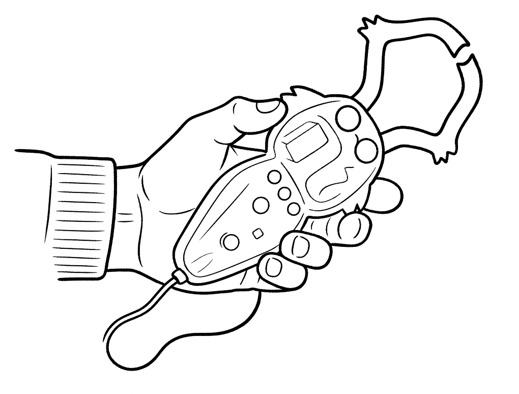
With Backyard Brains' hands-on neuroscience kits, anyone—from students and teachers to hobbyists and curious minds—can explore real brain activity and nervous system functions in engaging and accessible ways. Conduct fascinating experiments like controlling muscles with electrical signals, visualizing neuron activity, or even controlling a cockroach robot. No lab coat needed, just curiosity!</p>
  </div>
</details>


<details
  id="accordion-item-AL3ZUdm9ubXUrRWFtc__accordion_item_KF8eaz"
  class="accordion-block__item"
  
>
  <summary class="accordion-block__trigger">
    <span class="accordion-block__icon"><svg
  xmlns="http://www.w3.org/2000/svg"
  xmlns:xlink="http://www.w3.org/1999/xlink"
  width="7px"
  height="13px"
  viewBox="0 0 7 13"
  version="1.1"
>
  <title>ic_arrow@1x</title>
  <g id="Homepage" stroke="none" stroke-width="1" fill="none" fill-rule="evenodd">
      <g id="BYB---Home---v.3.1" transform="translate(-168, -6890)" fill="#000000">
          <g id="FAQ" transform="translate(160, 6590)">
              <path d="M14.6928056,307.246311 L9.78817015,312.18864 C9.1282128,312.853669 8,312.38287 8,311.442329 L8,301.557671 C8,300.61713 9.1282128,300.146331 9.78817015,300.81136 L14.6928056,305.753689 C15.1023981,306.16643 15.1023981,306.83357 14.6928056,307.246311" id="ic_arrow"/>
          </g>
      </g>
  </g>
</svg>
</span>
    <span class="accordion-block__heading">How it works</span>
  </summary>

  <div class="accordion-block__content">
    <p>Our tools bridge neuroscience with everyday experiences, letting you directly observe and measure electrical signals from muscles, nerves, and neurons. Using simple equipment and clear instructions, you'll learn firsthand about neural pathways, reflexes, and the electrical nature of your nervous system. Dive into neuroscience and see your own brain in action!</p>
  </div>
</details>


</div>


</div>


</div>
        </div>
      </main>

      <!-- BEGIN sections: footer-group -->
<div id="shopify-section-sections--19038793826545__footer" class="shopify-section shopify-section-group-footer-group"><footer class="footer">
  <div class="footer__top">
    <div class="container">
      <div class="footer__top-inner">
        <div class="newsletter footer__newsletter">
          <div class="newsletter__icon">
            <img
              src="//backyardbrains.com/cdn/shop/files/subscribe_illustration_1_1024x1024.svg?v=1722953690"
              alt=""
              width="200"
              height="47"
              class="newsletter__icon-src"
            >
          </div>
          <h2 class="newsletter__title">Stay Connected.</h2>
          <div class="newsletter__form">
            <form method="post" action="/contact#contact_form" id="contact_form" accept-charset="UTF-8" class="newsletter-form"><input type="hidden" name="form_type" value="customer" /><input type="hidden" name="utf8" value="✓" />
              <form
                id="mc4wp-form-1"
                class="mc4wp-form mc4wp-form-346"
                method="post"
                data-id="346"
                data-name="Stay Connected"
              >
                <div class="mc4wp-form-fields">
                  <div class="newsletter-form">
                    <input
                      type="email"
                      name="contact[email]"
                      placeholder="Email address"
                      required=""
                      class="newsletter-form__input"
                    >
                    <input type="submit" value="Subscribe" class="bb-button bb-button_black">
                  </div>
                </div>
                <label style="display: none !important;"
                  >Leave this field empty if you're human:
                  <input type="text" name="_mc4wp_honeypot" value="" tabindex="-1" autocomplete="off">
                </label>
                <input type="hidden" name="_mc4wp_timestamp" value="1722353803">
                <input type="hidden" name="_mc4wp_form_id" value="346">
                <input type="hidden" name="_mc4wp_form_element_id" value="mc4wp-form-1">
                <div class="mc4wp-response"></div>
              </form></form>
          </div>
          <div class="newsletter__content">Get monthly newsletters about our events, workshops, products and experiments.</div>
        </div>
        <nav class="footer-nav footer__nav">
          <ul class="footer-nav__list ">
            
              <li class="footer-nav__item">
                <a href="/" class="footer-nav__link">Home</a>
              </li>
            
              <li class="footer-nav__item">
                <a href="/pages/contact" class="footer-nav__link">Contact</a>
              </li>
            
              <li class="footer-nav__item">
                <a href="/pages/who-we-are" class="footer-nav__link">Our Story</a>
              </li>
            
              <li class="footer-nav__item">
                <a href="/pages/privacy" class="footer-nav__link">Privacy</a>
              </li>
            
              <li class="footer-nav__item">
                <a href="https://forum.backyardbrains.com/" class="footer-nav__link">Community</a>
              </li>
            
              <li class="footer-nav__item">
                <a href="https://docs.backyardbrains.com/" class="footer-nav__link">BYB Docs</a>
              </li>
            
              <li class="footer-nav__item">
                <a href="/pages/press" class="footer-nav__link">Press</a>
              </li>
            
              <li class="footer-nav__item">
                <a href="https://blog.backyardbrains.com/" class="footer-nav__link">Blog</a>
              </li>
            
          </ul>
        </nav>
        <div class="footer__socials socials">
          <h3 class="socials__title">We’re social</h3>
          <ul class="socials-list socials__list">
            
              
                <li class="social-item">
                  <a
                    href="https://twitter.com/BackyardBrains"
                    target="_blank"
                    rel="nofollow"
                    class="social-item__link"
                  >
                    <img
                      src="//backyardbrains.com/cdn/shop/files/twitter_1024x1024.svg?v=1722954301"
                      alt=""
                      class="social-item__icon"
                    >
                  </a>
                </li>


                <li class="social-item">
                  <a
                    href="https://www.facebook.com/BackyardBrains"
                    target="_blank"
                    rel="nofollow"
                    class="social-item__link"
                  >
                    <img
                      src="//backyardbrains.com/cdn/shop/files/facebook_1024x1024.svg?v=1722954352"
                      alt=""
                      class="social-item__icon"
                    >
                  </a>
                </li>


                <li class="social-item">
                  <a
                    href="https://www.instagram.com/backyardbrains"
                    target="_blank"
                    rel="nofollow"
                    class="social-item__link"
                  >
                    <img
                      src="//backyardbrains.com/cdn/shop/files/instagram_1024x1024.svg?v=1722954405"
                      alt=""
                      class="social-item__icon"
                    >
                  </a>
                </li>


                <li class="social-item">
                  <a
                    href="https://www.youtube.com/user/backyardbrains"
                    target="_blank"
                    rel="nofollow"
                    class="social-item__link"
                  >
                    <img
                      src="//backyardbrains.com/cdn/shop/files/youtube_1024x1024.svg?v=1722954435"
                      alt=""
                      class="social-item__icon"
                    >
                  </a>
                </li>


          </ul>
          <div class="socials__hashtags p-wrapper">


                <p>@BackyardBrains</p>


                <p>#roboroach</p>


                <p>#neuroscienceforeveryone</p>


          </div>
        </div>
      </div>
    </div>
  </div>
  <div class="footer__bottom">
    <div class="container">
      <div class="footer__bottom-inner">
        <div class="copyright">
          
          <div class="copyright__text">
            Copyright © 2026 Backyard Brains | Protected under the Creative Common License
          </div>
          <ul class="creative-commons">


                <li class="creative-common">
                  <a
                    href="http://creativecommons.org/licenses/"
                    target="_blank"
                    rel="nofollow"
                    class="creative-common__link"
                  >
                    <img
                      src="//backyardbrains.com/cdn/shop/files/cc_1_1024x1024.svg?v=1722955668"
                      alt=""
                      width="30"
                      height="30"
                      class="creative-common__icon"
                    >
                  </a>
                </li>


                <li class="creative-common">
                  <a
                    href="http://creativecommons.org/licenses/by-sa/3.0/"
                    target="_blank"
                    rel="nofollow"
                    class="creative-common__link"
                  >
                    <img
                      src="//backyardbrains.com/cdn/shop/files/cc_2_1024x1024.svg?v=1722955697"
                      alt=""
                      width="30"
                      height="30"
                      class="creative-common__icon"
                    >
                  </a>
                </li>


                <li class="creative-common">
                  <a
                    href="https://creativecommons.org/licenses/by-nc/3.0/"
                    target="_blank"
                    rel="nofollow"
                    class="creative-common__link"
                  >
                    <img
                      src="//backyardbrains.com/cdn/shop/files/cc-icons_1024x1024.svg?v=1739780252"
                      alt=""
                      width="30"
                      height="30"
                      class="creative-common__icon"
                    >
                  </a>
                </li>


          </ul>
        </div>
        <nav class="bottom-nav">
          <ul class="bottom-nav__list ">


                <li
                  id="menu-item-50"
                  class="menu-item menu-item-type-post_type menu-item-object-page menu-item-50"
                >
                  <a
                    href="https://shop.backyardbrains.com/pages/faq-1"
                  >FAQ</a>
                </li>


                <li
                  id="menu-item-50"
                  class="menu-item menu-item-type-post_type menu-item-object-page menu-item-50"
                >
                  <a
                    href="https://shop.backyardbrains.com/pages/legal"
                  >T&C</a>
                </li>
              
            
          </ul>
        </nav>
      </div>
    </div>
  </div>
</footer>
<div class="overlay"></div>


</div>
<!-- END sections: footer-group -->

      <ul hidden>
        <li id="a11y-refresh-page-message">Choosing a selection results in a full page refresh.</li>
        <li id="a11y-new-window-message">Opens in a new window.</li>
      </ul>

      <script>
        window.shopUrl = 'https://backyardbrains.com';
        window.routes = {
          cart_add_url: '/cart/add',
          cart_change_url: '/cart/change',
          cart_update_url: '/cart/update',
          cart_url: '/cart',
          predictive_search_url: '/search/suggest',
        };

        window.cartStrings = {
          error: `There was an error while updating your cart. Please try again.`,
          quantityError: `You can only add [quantity] of this item to your cart.`,
        };

        window.variantStrings = {
          addToCart: `Add to cart`,
          soldOut: `Sold out`,
          unavailable: `Unavailable`,
          unavailable_with_option: `[value] - Unavailable`,
        };

        window.quickOrderListStrings = {
          itemsAdded: `[quantity] items added`,
          itemAdded: `[quantity] item added`,
          itemsRemoved: `[quantity] items removed`,
          itemRemoved: `[quantity] item removed`,
          viewCart: `View cart`,
          each: `[money]/ea`,
          min_error: `This item has a minimum of [min]`,
          max_error: `This item has a maximum of [max]`,
          step_error: `You can only add this item in increments of [step]`,
        };

        window.accessibilityStrings = {
          imageAvailable: `Image [index] is now available in gallery view`,
          shareSuccess: `Link copied to clipboard`,
          pauseSlideshow: `Pause slideshow`,
          playSlideshow: `Play slideshow`,
          recipientFormExpanded: `Gift card recipient form expanded`,
          recipientFormCollapsed: `Gift card recipient form collapsed`,
          countrySelectorSearchCount: `[count] countries/regions found`,
        };
      </script><script src="//backyardbrains.com/cdn/shop/t/22/assets/predictive-search.js?v=57209189334897115771744814906" defer="defer"></script><script src="//backyardbrains.com/cdn/shop/t/22/assets/cart-drawer.js?v=668338366537835261744814906" defer="defer"></script></div>

<div id="back-to-top" class="back-to-top" style="display: none;">↑ Back to Top</div>


</body>
</html>
