TGF0bzozMDA=
LnRiLWltYWdlLXNsaWRlci0tY2Fyb3VzZWx7b3BhY2l0eTowO2RpcmVjdGlvbjpsdHJ9LnRiLWltYWdlLXNsaWRlciAuZ2xpZGV7cG9zaXRpb246cmVsYXRpdmV9LnRiLWltYWdlLXNsaWRlciAuZ2xpZGVfX3NsaWRle2hlaWdodDphdXRvO3Bvc2l0aW9uOnJlbGF0aXZlO21hcmdpbi1sZWZ0OjB9LnRiLWltYWdlLXNsaWRlciAuZ2xpZGVfX3NsaWRlLS1jbG9uZXtjdXJzb3I6cG9pbnRlcn0udGItaW1hZ2Utc2xpZGVyIC5nbGlkZV9fc2xpZGUgaW1ne3dpZHRoOjEwMCU7ZmxvYXQ6bm9uZSAhaW1wb3J0YW50fS50Yi1pbWFnZS1zbGlkZXIgLmdsaWRlX192aWV3e3dpZHRoOjEwMCU7dHJhbnNpdGlvbjpvcGFjaXR5IDM1MG1zIGVhc2UtaW4tb3V0O3Bvc2l0aW9uOnJlbGF0aXZlfS50Yi1pbWFnZS1zbGlkZXIgLmdsaWRlX192aWV3IGltZ3stby1vYmplY3QtZml0OmNvbnRhaW47b2JqZWN0LWZpdDpjb250YWluO3dpZHRoOjEwMCU7ZmxvYXQ6bm9uZSAhaW1wb3J0YW50fS50Yi1pbWFnZS1zbGlkZXIgLmdsaWRlX192aWV3LS1mYWRlLW91dHtvcGFjaXR5OjB9LnRiLWltYWdlLXNsaWRlciAuZ2xpZGVfX3ZpZXctLWZhZGUtaW57b3BhY2l0eToxfS50Yi1pbWFnZS1zbGlkZXIgLmdsaWRlX19hcnJvd3tib3JkZXI6bm9uZTtwb3NpdGlvbjphYnNvbHV0ZTt6LWluZGV4OjEwO3RvcDo1MCU7ZGlzcGxheTppbmxpbmUtZmxleDtqdXN0aWZ5LWNvbnRlbnQ6Y2VudGVyO2FsaWduLWl0ZW1zOmNlbnRlcjt3aWR0aDo0MHB4O2hlaWdodDo0MHB4O3RleHQtYWxpZ246Y2VudGVyO3BhZGRpbmc6MDtjdXJzb3I6cG9pbnRlcjt0cmFuc2Zvcm06dHJhbnNsYXRlWSgtNTAlKTtib3JkZXItcmFkaXVzOjUwcHg7dHJhbnNpdGlvbjphbGwgMC4ycyBsaW5lYXI7YmFja2dyb3VuZDpyZ2JhKDI1NSwyNTUsMjU1LDAuNyl9LnRiLWltYWdlLXNsaWRlciAuZ2xpZGVfX2Fycm93OmZvY3Vze291dGxpbmU6bm9uZTtib3gtc2hhZG93OjAgMCA1cHggIzY2NjtiYWNrZ3JvdW5kOnJnYmEoMjU1LDI1NSwyNTUsMC43KTtvcGFjaXR5OjF9LnRiLWltYWdlLXNsaWRlciAuZ2xpZGVfX2Fycm93OmhvdmVye2JhY2tncm91bmQ6cmdiYSgyNTUsMjU1LDI1NSwwLjkpfS50Yi1pbWFnZS1zbGlkZXIgLmdsaWRlX19hcnJvdy0tbGVmdHtsZWZ0OjVweH0udGItaW1hZ2Utc2xpZGVyIC5nbGlkZV9fYXJyb3ctLWxlZnQgc3Zne21hcmdpbi1sZWZ0Oi0xcHh9LnRiLWltYWdlLXNsaWRlciAuZ2xpZGVfX2Fycm93LS1sZWZ0IHNwYW4udGItc2xpZGVyLWxlZnQtYXJyb3d7ZGlzcGxheTppbmxpbmUtYmxvY2s7d2lkdGg6MjVweDtoZWlnaHQ6MjVweDtiYWNrZ3JvdW5kLWltYWdlOnVybCgiZGF0YTppbWFnZS9zdmcreG1sLCUzQ3N2ZyB4bWxucz0naHR0cDovL3d3dy53My5vcmcvMjAwMC9zdmcnIHZpZXdCb3g9JzAgMCAxMjkgMTI5JyB3aWR0aD0nMjUnIGhlaWdodD0nMjUnJTNFJTNDZyUzRSUzQ3BhdGggZD0nbTcwLDkzLjVjMC44LDAuOCAxLjgsMS4yIDIuOSwxLjIgMSwwIDIuMS0wLjQgMi45LTEuMiAxLjYtMS42IDEuNi00LjIgMC01LjhsLTIzLjUtMjMuNSAyMy41LTIzLjVjMS42LTEuNiAxLjYtNC4yIDAtNS44cy00LjItMS42LTUuOCwwbC0yNi40LDI2LjRjLTAuOCwwLjgtMS4yLDEuOC0xLjIsMi45czAuNCwyLjEgMS4yLDIuOWwyNi40LDI2LjR6JyBmaWxsPSclMjM2NjYnLyUzRSUzQy9nJTNFJTNDL3N2ZyUzRSIpfS50Yi1pbWFnZS1zbGlkZXIgLmdsaWRlX19hcnJvdy0tcmlnaHR7cmlnaHQ6NXB4fS50Yi1pbWFnZS1zbGlkZXIgLmdsaWRlX19hcnJvdy0tcmlnaHQgc3Zne21hcmdpbi1yaWdodDotMXB4fS50Yi1pbWFnZS1zbGlkZXIgLmdsaWRlX19hcnJvdy0tcmlnaHQgc3Bhbi50Yi1zbGlkZXItcmlnaHQtYXJyb3d7ZGlzcGxheTppbmxpbmUtYmxvY2s7d2lkdGg6MjVweDtoZWlnaHQ6MjVweDtiYWNrZ3JvdW5kLWltYWdlOnVybCgiZGF0YTppbWFnZS9zdmcreG1sLCUzQ3N2ZyB4bWxucz0naHR0cDovL3d3dy53My5vcmcvMjAwMC9zdmcnIHZpZXdCb3g9JzAgMCAxMjkgMTI5JyB3aWR0aD0nMjUnIGhlaWdodD0nMjUnJTNFJTNDZyUzRSUzQ3BhdGggZD0nbTUxLjEsOTMuNWMwLjgsMC44IDEuOCwxLjIgMi45LDEuMiAxLDAgMi4xLTAuNCAyLjktMS4ybDI2LjQtMjYuNGMwLjgtMC44IDEuMi0xLjggMS4yLTIuOSAwLTEuMS0wLjQtMi4xLTEuMi0yLjlsLTI2LjQtMjYuNGMtMS42LTEuNi00LjItMS42LTUuOCwwLTEuNiwxLjYtMS42LDQuMiAwLDUuOGwyMy41LDIzLjUtMjMuNSwyMy41Yy0xLjYsMS42LTEuNiw0LjIgMCw1Ljh6JyBmaWxsPSclMjM2NjYnLyUzRSUzQy9nJTNFJTNDL3N2ZyUzRSIpfS50Yi1pbWFnZS1zbGlkZXIgLmdsaWRlOmhvdmVyIC5nbGlkZV9fYXJyb3csLnRiLWltYWdlLXNsaWRlciAuZ2xpZGU6Zm9jdXMgLmdsaWRlX19hcnJvd3tvcGFjaXR5OjF9LnRiLWltYWdlLXNsaWRlci0tY3JvcCAuZ2xpZGVfX3NsaWRlIGltZ3stby1vYmplY3QtZml0OmNvdmVyO29iamVjdC1maXQ6Y292ZXI7aGVpZ2h0OjEwMCUgIWltcG9ydGFudH0udGItaW1hZ2Utc2xpZGVyIC5nbGlkZV9fc2xpZGVze2xpc3Qtc3R5bGUtdHlwZTpub25lO3BhZGRpbmctbGVmdDowO21hcmdpbi1sZWZ0OmF1dG99LnRiLWltYWdlLXNsaWRlcl9fY2FwdGlvbntwb3NpdGlvbjphYnNvbHV0ZTtib3R0b206MDt3aWR0aDoxMDAlO2JhY2tncm91bmQ6cmdiYSgyNTUsMjU1LDI1NSwwLjYpO3RleHQtYWxpZ246Y2VudGVyO2NvbG9yOiMzMzN9LnRiLWltYWdlLXNsaWRlcl9fY2FwdGlvbiA6ZW1wdHl7YmFja2dyb3VuZDp0cmFuc3BhcmVudCAhaW1wb3J0YW50O21hcmdpbjowO3BhZGRpbmc6MH0udGItaW1hZ2Utc2xpZGVyX19jYXB0aW9uIGZpZ2NhcHRpb257cGFkZGluZzo1cHggMnB4O21hcmdpbi10b3A6NXB4fSAudGItaW1hZ2Utc2xpZGVyW2RhdGEtdG9vbHNldC1ibG9ja3MtaW1hZ2Utc2xpZGVyPSI3MTU1YzdhZWZmMzdiNGFmYWE1MGEzOTc3ODViMzU5OCJdIC50Yi1pbWFnZS1zbGlkZXItLWNhcm91c2VsIHsgYmFja2dyb3VuZC1jb2xvcjogcmdiYSggMjU1LCAyNTUsIDI1NSwgMSApO2JvcmRlci1yYWRpdXM6IDE1cHg7Ym9yZGVyOiAwcHggc29saWQgcmdiYSggMCwgMCwgMCwgMSApOyB9IC50Yi1pbWFnZS1zbGlkZXJbZGF0YS10b29sc2V0LWJsb2Nrcy1pbWFnZS1zbGlkZXI9IjcxNTVjN2FlZmYzN2I0YWZhYTUwYTM5Nzc4NWIzNTk4Il0gLnRiLWltYWdlLXNsaWRlcl9fY2FwdGlvbiB7IGZvbnQtd2VpZ2h0OiBib2xkO2JhY2tncm91bmQ6IHJnYmEoIDAsIDAsIDAsIDEgKTsgfSAudGItaW1hZ2Utc2xpZGVyW2RhdGEtdG9vbHNldC1ibG9ja3MtaW1hZ2Utc2xpZGVyPSI3MTU1YzdhZWZmMzdiNGFmYWE1MGEzOTc3ODViMzU5OCJdIC50Yi1pbWFnZS1zbGlkZXJfX2NhcHRpb24gZmlnY2FwdGlvbiB7IGZvbnQtZmFtaWx5OiBMYXRvO2NvbG9yOiByZ2JhKCAyNTUsIDI1NSwgMjU1LCAxICk7IH0gQG1lZGlhIG9ubHkgc2NyZWVuIGFuZCAobWF4LXdpZHRoOiA3ODFweCkgeyAudGItaW1hZ2Utc2xpZGVyLS1jYXJvdXNlbHtvcGFjaXR5OjA7ZGlyZWN0aW9uOmx0cn0udGItaW1hZ2Utc2xpZGVyIC5nbGlkZXtwb3NpdGlvbjpyZWxhdGl2ZX0udGItaW1hZ2Utc2xpZGVyIC5nbGlkZV9fc2xpZGV7aGVpZ2h0OmF1dG87cG9zaXRpb246cmVsYXRpdmU7bWFyZ2luLWxlZnQ6MH0udGItaW1hZ2Utc2xpZGVyIC5nbGlkZV9fc2xpZGUtLWNsb25le2N1cnNvcjpwb2ludGVyfS50Yi1pbWFnZS1zbGlkZXIgLmdsaWRlX19zbGlkZSBpbWd7d2lkdGg6MTAwJTtmbG9hdDpub25lICFpbXBvcnRhbnR9LnRiLWltYWdlLXNsaWRlciAuZ2xpZGVfX3ZpZXd7d2lkdGg6MTAwJTt0cmFuc2l0aW9uOm9wYWNpdHkgMzUwbXMgZWFzZS1pbi1vdXQ7cG9zaXRpb246cmVsYXRpdmV9LnRiLWltYWdlLXNsaWRlciAuZ2xpZGVfX3ZpZXcgaW1ney1vLW9iamVjdC1maXQ6Y29udGFpbjtvYmplY3QtZml0OmNvbnRhaW47d2lkdGg6MTAwJTtmbG9hdDpub25lICFpbXBvcnRhbnR9LnRiLWltYWdlLXNsaWRlciAuZ2xpZGVfX3ZpZXctLWZhZGUtb3V0e29wYWNpdHk6MH0udGItaW1hZ2Utc2xpZGVyIC5nbGlkZV9fdmlldy0tZmFkZS1pbntvcGFjaXR5OjF9LnRiLWltYWdlLXNsaWRlciAuZ2xpZGVfX2Fycm93e2JvcmRlcjpub25lO3Bvc2l0aW9uOmFic29sdXRlO3otaW5kZXg6MTA7dG9wOjUwJTtkaXNwbGF5OmlubGluZS1mbGV4O2p1c3RpZnktY29udGVudDpjZW50ZXI7YWxpZ24taXRlbXM6Y2VudGVyO3dpZHRoOjQwcHg7aGVpZ2h0OjQwcHg7dGV4dC1hbGlnbjpjZW50ZXI7cGFkZGluZzowO2N1cnNvcjpwb2ludGVyO3RyYW5zZm9ybTp0cmFuc2xhdGVZKC01MCUpO2JvcmRlci1yYWRpdXM6NTBweDt0cmFuc2l0aW9uOmFsbCAwLjJzIGxpbmVhcjtiYWNrZ3JvdW5kOnJnYmEoMjU1LDI1NSwyNTUsMC43KX0udGItaW1hZ2Utc2xpZGVyIC5nbGlkZV9fYXJyb3c6Zm9jdXN7b3V0bGluZTpub25lO2JveC1zaGFkb3c6MCAwIDVweCAjNjY2O2JhY2tncm91bmQ6cmdiYSgyNTUsMjU1LDI1NSwwLjcpO29wYWNpdHk6MX0udGItaW1hZ2Utc2xpZGVyIC5nbGlkZV9fYXJyb3c6aG92ZXJ7YmFja2dyb3VuZDpyZ2JhKDI1NSwyNTUsMjU1LDAuOSl9LnRiLWltYWdlLXNsaWRlciAuZ2xpZGVfX2Fycm93LS1sZWZ0e2xlZnQ6NXB4fS50Yi1pbWFnZS1zbGlkZXIgLmdsaWRlX19hcnJvdy0tbGVmdCBzdmd7bWFyZ2luLWxlZnQ6LTFweH0udGItaW1hZ2Utc2xpZGVyIC5nbGlkZV9fYXJyb3ctLWxlZnQgc3Bhbi50Yi1zbGlkZXItbGVmdC1hcnJvd3tkaXNwbGF5OmlubGluZS1ibG9jazt3aWR0aDoyNXB4O2hlaWdodDoyNXB4O2JhY2tncm91bmQtaW1hZ2U6dXJsKCJkYXRhOmltYWdlL3N2Zyt4bWwsJTNDc3ZnIHhtbG5zPSdodHRwOi8vd3d3LnczLm9yZy8yMDAwL3N2Zycgdmlld0JveD0nMCAwIDEyOSAxMjknIHdpZHRoPScyNScgaGVpZ2h0PScyNSclM0UlM0NnJTNFJTNDcGF0aCBkPSdtNzAsOTMuNWMwLjgsMC44IDEuOCwxLjIgMi45LDEuMiAxLDAgMi4xLTAuNCAyLjktMS4yIDEuNi0xLjYgMS42LTQuMiAwLTUuOGwtMjMuNS0yMy41IDIzLjUtMjMuNWMxLjYtMS42IDEuNi00LjIgMC01LjhzLTQuMi0xLjYtNS44LDBsLTI2LjQsMjYuNGMtMC44LDAuOC0xLjIsMS44LTEuMiwyLjlzMC40LDIuMSAxLjIsMi45bDI2LjQsMjYuNHonIGZpbGw9JyUyMzY2NicvJTNFJTNDL2clM0UlM0Mvc3ZnJTNFIil9LnRiLWltYWdlLXNsaWRlciAuZ2xpZGVfX2Fycm93LS1yaWdodHtyaWdodDo1cHh9LnRiLWltYWdlLXNsaWRlciAuZ2xpZGVfX2Fycm93LS1yaWdodCBzdmd7bWFyZ2luLXJpZ2h0Oi0xcHh9LnRiLWltYWdlLXNsaWRlciAuZ2xpZGVfX2Fycm93LS1yaWdodCBzcGFuLnRiLXNsaWRlci1yaWdodC1hcnJvd3tkaXNwbGF5OmlubGluZS1ibG9jazt3aWR0aDoyNXB4O2hlaWdodDoyNXB4O2JhY2tncm91bmQtaW1hZ2U6dXJsKCJkYXRhOmltYWdlL3N2Zyt4bWwsJTNDc3ZnIHhtbG5zPSdodHRwOi8vd3d3LnczLm9yZy8yMDAwL3N2Zycgdmlld0JveD0nMCAwIDEyOSAxMjknIHdpZHRoPScyNScgaGVpZ2h0PScyNSclM0UlM0NnJTNFJTNDcGF0aCBkPSdtNTEuMSw5My41YzAuOCwwLjggMS44LDEuMiAyLjksMS4yIDEsMCAyLjEtMC40IDIuOS0xLjJsMjYuNC0yNi40YzAuOC0wLjggMS4yLTEuOCAxLjItMi45IDAtMS4xLTAuNC0yLjEtMS4yLTIuOWwtMjYuNC0yNi40Yy0xLjYtMS42LTQuMi0xLjYtNS44LDAtMS42LDEuNi0xLjYsNC4yIDAsNS44bDIzLjUsMjMuNS0yMy41LDIzLjVjLTEuNiwxLjYtMS42LDQuMiAwLDUuOHonIGZpbGw9JyUyMzY2NicvJTNFJTNDL2clM0UlM0Mvc3ZnJTNFIil9LnRiLWltYWdlLXNsaWRlciAuZ2xpZGU6aG92ZXIgLmdsaWRlX19hcnJvdywudGItaW1hZ2Utc2xpZGVyIC5nbGlkZTpmb2N1cyAuZ2xpZGVfX2Fycm93e29wYWNpdHk6MX0udGItaW1hZ2Utc2xpZGVyLS1jcm9wIC5nbGlkZV9fc2xpZGUgaW1ney1vLW9iamVjdC1maXQ6Y292ZXI7b2JqZWN0LWZpdDpjb3ZlcjtoZWlnaHQ6MTAwJSAhaW1wb3J0YW50fS50Yi1pbWFnZS1zbGlkZXIgLmdsaWRlX19zbGlkZXN7bGlzdC1zdHlsZS10eXBlOm5vbmU7cGFkZGluZy1sZWZ0OjA7bWFyZ2luLWxlZnQ6YXV0b30udGItaW1hZ2Utc2xpZGVyX19jYXB0aW9ue3Bvc2l0aW9uOmFic29sdXRlO2JvdHRvbTowO3dpZHRoOjEwMCU7YmFja2dyb3VuZDpyZ2JhKDI1NSwyNTUsMjU1LDAuNik7dGV4dC1hbGlnbjpjZW50ZXI7Y29sb3I6IzMzM30udGItaW1hZ2Utc2xpZGVyX19jYXB0aW9uIDplbXB0eXtiYWNrZ3JvdW5kOnRyYW5zcGFyZW50ICFpbXBvcnRhbnQ7bWFyZ2luOjA7cGFkZGluZzowfS50Yi1pbWFnZS1zbGlkZXJfX2NhcHRpb24gZmlnY2FwdGlvbntwYWRkaW5nOjVweCAycHg7bWFyZ2luLXRvcDo1cHh9IH0gQG1lZGlhIG9ubHkgc2NyZWVuIGFuZCAobWF4LXdpZHRoOiA1OTlweCkgeyAudGItaW1hZ2Utc2xpZGVyLS1jYXJvdXNlbHtvcGFjaXR5OjA7ZGlyZWN0aW9uOmx0cn0udGItaW1hZ2Utc2xpZGVyIC5nbGlkZXtwb3NpdGlvbjpyZWxhdGl2ZX0udGItaW1hZ2Utc2xpZGVyIC5nbGlkZV9fc2xpZGV7aGVpZ2h0OmF1dG87cG9zaXRpb246cmVsYXRpdmU7bWFyZ2luLWxlZnQ6MH0udGItaW1hZ2Utc2xpZGVyIC5nbGlkZV9fc2xpZGUtLWNsb25le2N1cnNvcjpwb2ludGVyfS50Yi1pbWFnZS1zbGlkZXIgLmdsaWRlX19zbGlkZSBpbWd7d2lkdGg6MTAwJTtmbG9hdDpub25lICFpbXBvcnRhbnR9LnRiLWltYWdlLXNsaWRlciAuZ2xpZGVfX3ZpZXd7d2lkdGg6MTAwJTt0cmFuc2l0aW9uOm9wYWNpdHkgMzUwbXMgZWFzZS1pbi1vdXQ7cG9zaXRpb246cmVsYXRpdmV9LnRiLWltYWdlLXNsaWRlciAuZ2xpZGVfX3ZpZXcgaW1ney1vLW9iamVjdC1maXQ6Y29udGFpbjtvYmplY3QtZml0OmNvbnRhaW47d2lkdGg6MTAwJTtmbG9hdDpub25lICFpbXBvcnRhbnR9LnRiLWltYWdlLXNsaWRlciAuZ2xpZGVfX3ZpZXctLWZhZGUtb3V0e29wYWNpdHk6MH0udGItaW1hZ2Utc2xpZGVyIC5nbGlkZV9fdmlldy0tZmFkZS1pbntvcGFjaXR5OjF9LnRiLWltYWdlLXNsaWRlciAuZ2xpZGVfX2Fycm93e2JvcmRlcjpub25lO3Bvc2l0aW9uOmFic29sdXRlO3otaW5kZXg6MTA7dG9wOjUwJTtkaXNwbGF5OmlubGluZS1mbGV4O2p1c3RpZnktY29udGVudDpjZW50ZXI7YWxpZ24taXRlbXM6Y2VudGVyO3dpZHRoOjQwcHg7aGVpZ2h0OjQwcHg7dGV4dC1hbGlnbjpjZW50ZXI7cGFkZGluZzowO2N1cnNvcjpwb2ludGVyO3RyYW5zZm9ybTp0cmFuc2xhdGVZKC01MCUpO2JvcmRlci1yYWRpdXM6NTBweDt0cmFuc2l0aW9uOmFsbCAwLjJzIGxpbmVhcjtiYWNrZ3JvdW5kOnJnYmEoMjU1LDI1NSwyNTUsMC43KX0udGItaW1hZ2Utc2xpZGVyIC5nbGlkZV9fYXJyb3c6Zm9jdXN7b3V0bGluZTpub25lO2JveC1zaGFkb3c6MCAwIDVweCAjNjY2O2JhY2tncm91bmQ6cmdiYSgyNTUsMjU1LDI1NSwwLjcpO29wYWNpdHk6MX0udGItaW1hZ2Utc2xpZGVyIC5nbGlkZV9fYXJyb3c6aG92ZXJ7YmFja2dyb3VuZDpyZ2JhKDI1NSwyNTUsMjU1LDAuOSl9LnRiLWltYWdlLXNsaWRlciAuZ2xpZGVfX2Fycm93LS1sZWZ0e2xlZnQ6NXB4fS50Yi1pbWFnZS1zbGlkZXIgLmdsaWRlX19hcnJvdy0tbGVmdCBzdmd7bWFyZ2luLWxlZnQ6LTFweH0udGItaW1hZ2Utc2xpZGVyIC5nbGlkZV9fYXJyb3ctLWxlZnQgc3Bhbi50Yi1zbGlkZXItbGVmdC1hcnJvd3tkaXNwbGF5OmlubGluZS1ibG9jazt3aWR0aDoyNXB4O2hlaWdodDoyNXB4O2JhY2tncm91bmQtaW1hZ2U6dXJsKCJkYXRhOmltYWdlL3N2Zyt4bWwsJTNDc3ZnIHhtbG5zPSdodHRwOi8vd3d3LnczLm9yZy8yMDAwL3N2Zycgdmlld0JveD0nMCAwIDEyOSAxMjknIHdpZHRoPScyNScgaGVpZ2h0PScyNSclM0UlM0NnJTNFJTNDcGF0aCBkPSdtNzAsOTMuNWMwLjgsMC44IDEuOCwxLjIgMi45LDEuMiAxLDAgMi4xLTAuNCAyLjktMS4yIDEuNi0xLjYgMS42LTQuMiAwLTUuOGwtMjMuNS0yMy41IDIzLjUtMjMuNWMxLjYtMS42IDEuNi00LjIgMC01LjhzLTQuMi0xLjYtNS44LDBsLTI2LjQsMjYuNGMtMC44LDAuOC0xLjIsMS44LTEuMiwyLjlzMC40LDIuMSAxLjIsMi45bDI2LjQsMjYuNHonIGZpbGw9JyUyMzY2NicvJTNFJTNDL2clM0UlM0Mvc3ZnJTNFIil9LnRiLWltYWdlLXNsaWRlciAuZ2xpZGVfX2Fycm93LS1yaWdodHtyaWdodDo1cHh9LnRiLWltYWdlLXNsaWRlciAuZ2xpZGVfX2Fycm93LS1yaWdodCBzdmd7bWFyZ2luLXJpZ2h0Oi0xcHh9LnRiLWltYWdlLXNsaWRlciAuZ2xpZGVfX2Fycm93LS1yaWdodCBzcGFuLnRiLXNsaWRlci1yaWdodC1hcnJvd3tkaXNwbGF5OmlubGluZS1ibG9jazt3aWR0aDoyNXB4O2hlaWdodDoyNXB4O2JhY2tncm91bmQtaW1hZ2U6dXJsKCJkYXRhOmltYWdlL3N2Zyt4bWwsJTNDc3ZnIHhtbG5zPSdodHRwOi8vd3d3LnczLm9yZy8yMDAwL3N2Zycgdmlld0JveD0nMCAwIDEyOSAxMjknIHdpZHRoPScyNScgaGVpZ2h0PScyNSclM0UlM0NnJTNFJTNDcGF0aCBkPSdtNTEuMSw5My41YzAuOCwwLjggMS44LDEuMiAyLjksMS4yIDEsMCAyLjEtMC40IDIuOS0xLjJsMjYuNC0yNi40YzAuOC0wLjggMS4yLTEuOCAxLjItMi45IDAtMS4xLTAuNC0yLjEtMS4yLTIuOWwtMjYuNC0yNi40Yy0xLjYtMS42LTQuMi0xLjYtNS44LDAtMS42LDEuNi0xLjYsNC4yIDAsNS44bDIzLjUsMjMuNS0yMy41LDIzLjVjLTEuNiwxLjYtMS42LDQuMiAwLDUuOHonIGZpbGw9JyUyMzY2NicvJTNFJTNDL2clM0UlM0Mvc3ZnJTNFIil9LnRiLWltYWdlLXNsaWRlciAuZ2xpZGU6aG92ZXIgLmdsaWRlX19hcnJvdywudGItaW1hZ2Utc2xpZGVyIC5nbGlkZTpmb2N1cyAuZ2xpZGVfX2Fycm93e29wYWNpdHk6MX0udGItaW1hZ2Utc2xpZGVyLS1jcm9wIC5nbGlkZV9fc2xpZGUgaW1ney1vLW9iamVjdC1maXQ6Y292ZXI7b2JqZWN0LWZpdDpjb3ZlcjtoZWlnaHQ6MTAwJSAhaW1wb3J0YW50fS50Yi1pbWFnZS1zbGlkZXIgLmdsaWRlX19zbGlkZXN7bGlzdC1zdHlsZS10eXBlOm5vbmU7cGFkZGluZy1sZWZ0OjA7bWFyZ2luLWxlZnQ6YXV0b30udGItaW1hZ2Utc2xpZGVyX19jYXB0aW9ue3Bvc2l0aW9uOmFic29sdXRlO2JvdHRvbTowO3dpZHRoOjEwMCU7YmFja2dyb3VuZDpyZ2JhKDI1NSwyNTUsMjU1LDAuNik7dGV4dC1hbGlnbjpjZW50ZXI7Y29sb3I6IzMzM30udGItaW1hZ2Utc2xpZGVyX19jYXB0aW9uIDplbXB0eXtiYWNrZ3JvdW5kOnRyYW5zcGFyZW50ICFpbXBvcnRhbnQ7bWFyZ2luOjA7cGFkZGluZzowfS50Yi1pbWFnZS1zbGlkZXJfX2NhcHRpb24gZmlnY2FwdGlvbntwYWRkaW5nOjVweCAycHg7bWFyZ2luLXRvcDo1cHh9IH0g
Learn marketing from the top 1%
On-demand marketing training for teams at growth/expansion stage companies overcome growth challenges and stand out in the market .
“I attended a 9-month long program where professors from MIT & Columbia Business School taught us Digital Strategy. CXL makes that program seem like kindergarten.”
Some companies who train their teams at CXL
Marketing training by the world’s best marketers
We turn the strategies, tactics, and insights from the world’s top marketing practitioners into
See what you get
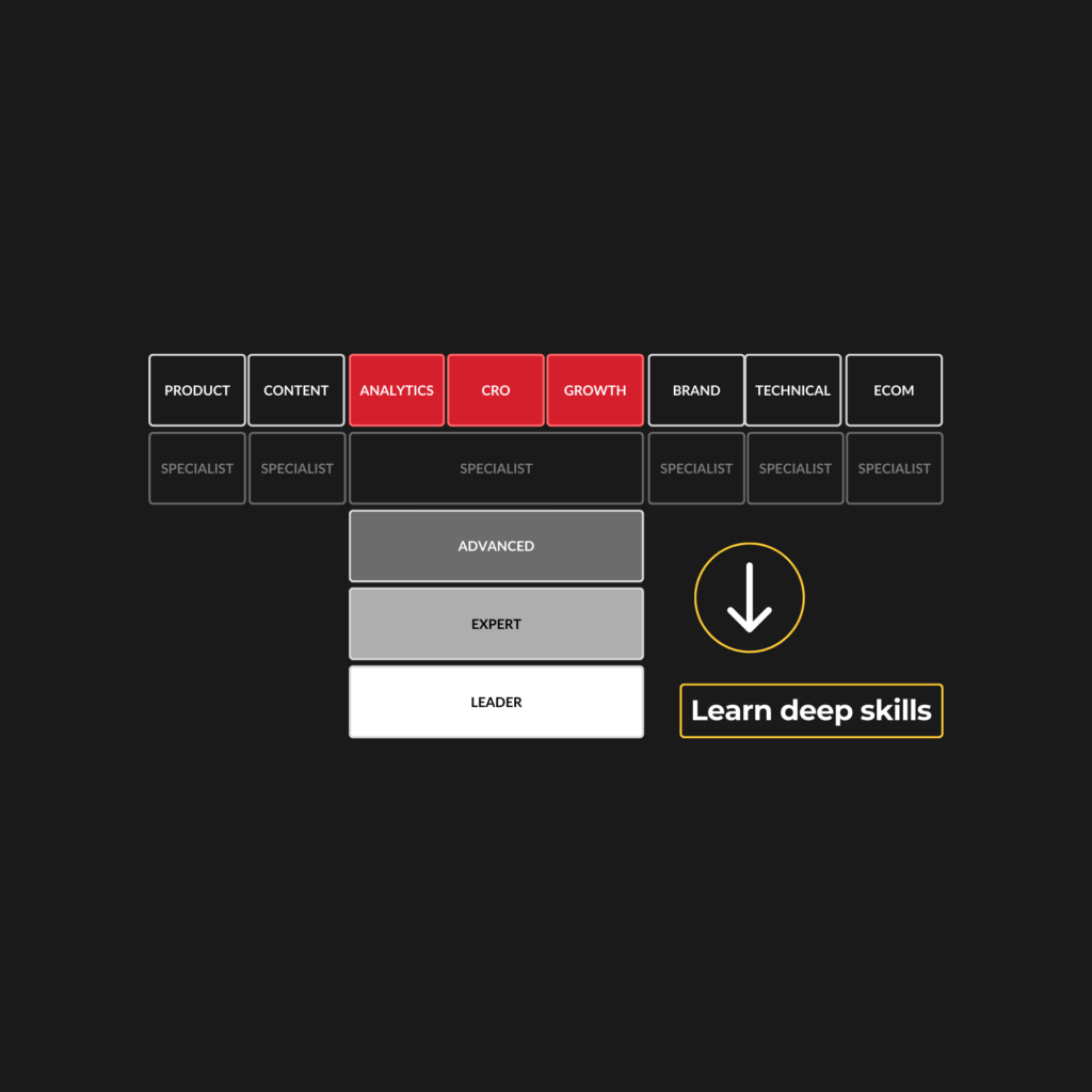
Winning teams T-shaped
The best marketers today are strong across all areas of marketing, and have deep skills in two or three disciplines.
CXL helps marketers build deep skills in growth, analytics, and conversion optimization, as well as broad skills in a wide range of areas.
Upskill at yourBuilt for busy marketers with tight targets and limited time.
✔ PLAYBOOKS ✔ TESTS & CERTIFICATES✔ 15-20 MIN LESSONS
Become aCXL-certified marketer
Pass our tests to earn your place among the industry elite. CXL certificates are recognized as a badge of excellence in the industry.
Get scale-up growth strategies in your inbox.
An expert-led newsletter focused on helping marketing teams at growth/expansion stage companies
Join 140,000+ marketers | Subscribe to our educational newsletter
What other marketers have to say about CXL
Waiting for testimonial.to embed code to be provided.