The only Gratitude app that comes with free coaching, community and rewards.
IMPROVES HEALTH
A five-minute a day gratitude journal can increase your long-term well-being by more than 10%. That’s the same impact as doubling your income!
IMPROVES SLEEP
Gratitude increases sleep quality, reduces the time required to fall asleep, and increases sleep duration. In other words, gratitude can help with insomnia.
EMOTIONAL STRENGTH
Gratitude improves your optimism and optimism in turn makes you happier, improves your health, and increases your lifespan.
WHAT PEOPLE ARE SAYING.
Gratitude has helped hundreds of thousands around the world.
ROZ SAVAGE
Rowed 3 Oceans Solo
Rowing across the Pacific, the Gratitude app helped me through the toughest days and still practice it daily for my mental strength.
BRANDON BLOCK
World Famous DJ
I was keeping a gratitude journal for years, then started using the Gratitude app because it's so easy. It's a real game change. Love it.
GINA DIN
Award Winning Executive
Living in Kenya, life changes quickly. Gratitude has been my foundation for years, reminding me that all change is good.
THE GRATITUDE COMMUNITY.
When you get Gratitude, you also receive access to an incredible community of uplifters helping you achieve your goals faster.
MORE THAN JUST AN APP.
Created by a woman who truly knows the value of gratitude.
Scientifically Proven
Research shows that daily writing in the Gratitude app will rewire the synapsis in your mind, lowering stress and increasing confidence.
Daily Reminders
Fun reminders that prompt you to write when you need them most, easily making it a habit.
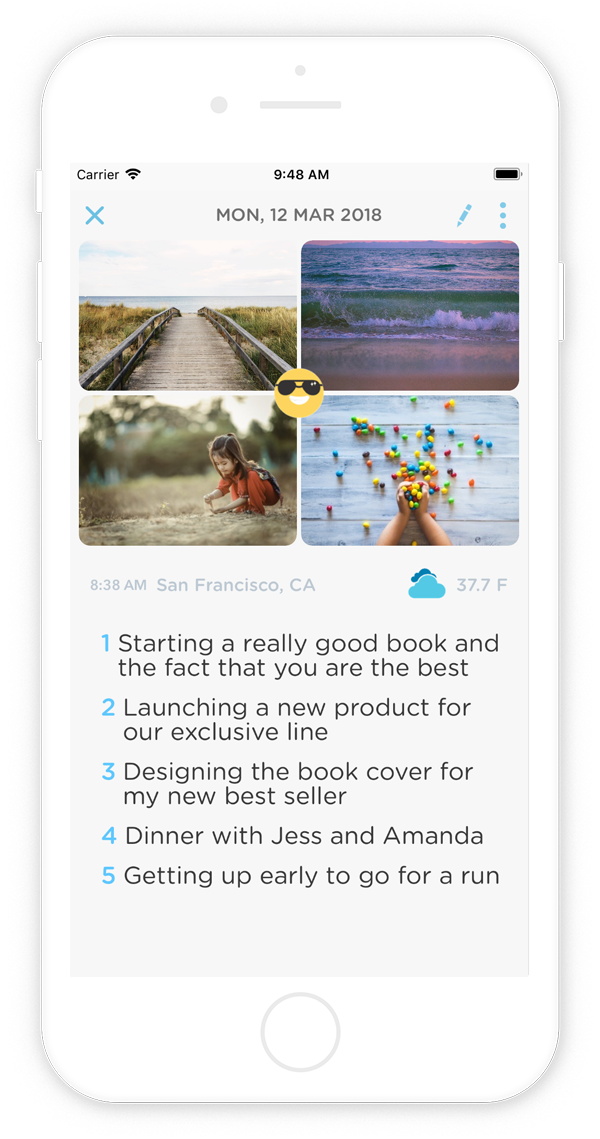
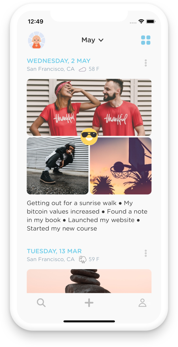
Add Photos
Seeing the best moments of your day as well as writing about them gets you results even faster.
On This Day
See what you wrote about a week ago, a year ago or four years ago.
Export Entries
Create a PDF file of all your entries to create a memoir of your life's best moments.
100% Private
Your data is 100% private. We don't sell it, use it to market to you, or share it in any way at all.
START TODAY.
In as little as 7 days, your life will change. Don't waste another minute. Get Gratitude Now!

