To listen to an audio version of this report, join the Patreon »
Revenue for the first quarter of 2026 was:
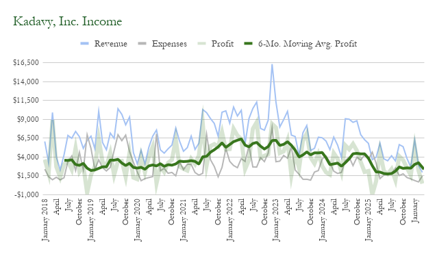
- January: $6,269
- February: $2,918
- March: $1,967
- Q1 Total: $11,155
Q4 2025’s revenue was $11,883.
Q1 2026 profits were:
- January: $5,386
- February: $2,217
- March: $478
- Q1 Total: $8,081
Q4 2025’s profit was $7,724.
First quarterly income report
I’ve talked in past reports about my doubts over how much time these reports take to compile, and whether the juice was worth the squeeze. As the months of 2026 went by, I decided to try a quarterly report.
This compresses the time investment both in bookkeeping and report writing. Doing three months of books does not take thrice as much time as one, and writing a quarterly report doesn’t take much longer than a monthly one.
For data consistency, however, I’m still recording each month’s numbers separately.
There’s also the question of how big a ship I am steering. While the ship isn’t currently “big” in terms of revenue, it has certainly gotten bigger over the years in terms of complexity. More books to track means more complicated to collect data.
Yet after years of writing these reports I have a better idea of what my business does and I feel I’ve improved my focus and decision-making. So it’s not as advantageous for me to think things over on a monthly basis as it once was. So maybe quarterly will suffice?
Records
In past months I’ve been breaking lots of record lows in revenue and profit. In fact, March marks a record-low twelve-month income, at $49,474.
But, that record low was on a five-month streak which was briefly broken in January, at $52,221.
However, profit has trended back up to $31,888 at the end of March, from the record-low of $25,771 in December.
That’s because expenses have been lower. March marks the end of a four-month streak of record-low twelve-month ad spend, with $10,528. The streak started in December with $17,599, the lowest since December 2019, when it was $18,214.
(If there was advertising that clearly worked, I would be buying it!)
Direct sales of books bounced back up to 30% of book revenue over the six months ending in March. At the end of December, that was only 8.7%.
Finish What Matters Preview Edition complete!
The big focus in Q1 was the Preview Edition of Finish What Matters. In a primary launch and a secondary launch, I sold over $5,700 in the various levels of the Preview Edition.
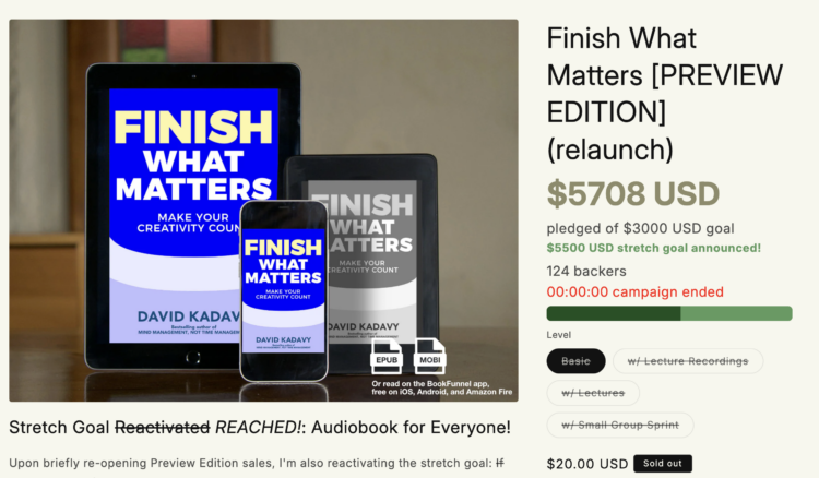
That just edged us above the stretch goal at which all Preview Edition customers will get a copy of the audiobook.
I’ve broken up the numbers below to separate purchases of the book portion of the Preview Edition from elements of the more premium levels. There was a three-lecture series, and a three-session small-group workshop.
There were 124 total customers:
- 98 Basic Customers @ $20: $1,960
- 15 Lecture Customers @ $89: $1,335
- 7 Lecture Recordings @ $59: $413
- 4 Cohort Students @ $500: $2,000
- Total Earnings: $5,708
For a point of reference, I earned $4,220 from the Preview Edition of Mind Management. However that was purely from $20 equivalents to the “Basic” package – 211 sales.
So from one perspective, I converted a smaller number of Preview Edition customers. From another perspective, I made more money, and in the process built lectures and a small cohort course that should make the contents of the book better, and that can be future sources of revenue.
I locked into “devastating focus” mode for the quarter, and just delivered the final chapters of the Preview Edition (ahead of schedule!)
If you missed the Preview Edition, or want to be sure to get the Kindle edition, Finish What Matters is available for pre-order!
Media experiments for FWM
As I let the Preview Edition manuscript incubate a bit, I’m currently in a sort of “coming up for air” period in which I’m doing various media experiments for repurposing some of the ideas within FWM.
The purposes of these experiments are twofold: 1) Get a feel for what channels might be a good use of my energy when the launch comes around and 2) Experiment with repurposing the ideas to various mediums, which should in turn make the book better as I edit.
The past two weeks I gave myself permission to spend my mornings working on reels for both TikTok and Instagram. I once again find I’m able to get pretty solid views on my reels, but it continues to be difficult to convert those views into anything.
For example, I’m trying to give away a chapter of the Preview Edition as a lead magnet, and I’ve gotten about 18 email addresses on Instagram and one on TikTok.
Part of this process is also anticipating podcast questions and pontificating about what might be the most effective way to answer them. That process also informs some reels, but of course the medium is the message and what’s good for a podcast isn’t necessarily good for a reel and vice versa.
Migrating email to Kit + BigMailer
My focus in the afternoons, evenings, and sometimes late into the nights of the past month has been migrating my email marketing from ActiveCampaign to a combination of Kit + BigMailer. And I’m really excited about it!
I think we’re entering a new era in email marketing. Automation platforms like AC and Kit are getting really expensive, and how much of your list is in a sophisticated automation at any given moment?
Meanwhile, platforms like Kit have recommendation networks that can help creators grow (as do Substack and Beehiv).
And LLMs have made it easy for those who are merely somewhat-technical to use more sophisticated tools like Amazon Simple Email Service, which costs like 10¢ per 1,000 emails sent, and has excellent deliverability (so long as you can stay below their maximum unsubscribe, complaint, and bounce thresholds).
These recommendation networks fill creators’ lists with low-quality leads, which can’t be good for the sender reputations and deliverability rates of these platforms (Substack in particular I’ve heard a lot of complaints about).
So, my new email marketing stack will look like this:
- Kit: Processing new leads through lead magnets, email courses, and the recommendation network, while nurturing existing Shopify customers through their integration.
- BigMailer: A front-end for Amazon SES, for sending the weekly newsletter, these blog updates, and other bigger blasts.
- Zapier: For keeping subscription preferences synced across platforms.
I’ve yapped a few times in recent years about why I still think RSS is an awesome technology, and I think that’s increasingly true. If you’re a content creator more interested in getting your work to readers than squeezing every last dime out of them, it makes sense to have a more decentralized or “federated” email strategy.
So Love Mondays is still powered by RSS, and the blog updates via email are, too. But I’ve realized Substack publications have RSS. So I’ve considered making that where I publish – for the growth potential – which would push the email updates to my existing list (you as a subscriber wouldn’t know the difference). By the way I syndicate LM to Substack if that is your platform of choice – I could use the subscribers.
But, RSS support isn’t great on the ESPs. ActiveCampaign’s is alright, but it got buggy recently and they don’t care about it. Kit’s templating is wonky for RSS. But BigMailer’s is perfect.
So if you are reading this report via email, you may be in the portion of subscribers already getting email via BigMailer instead of ActiveCampaign.
I’ve long had my eye on Kit, but the difference never felt urgent enough or the timing never felt right for what I knew would be an arduous migration process.
But ActiveCampaign has sent some signals lately that I interpret as them surrendering the creator market and focusing on enterprise. Along with that they have made some low-integrity moves that made me want to be less dependent on them or any single ESP.
It does feel great to have the automations set up on Kit. The user experience is so much faster and easier than AC. Their automation builder isn’t as “do whatever you want” as ActiveCampaign, but with some creativity you can do most things. It’s genius how versatile they’ve made such a simple interface.
I’m also excited about their Shopify integration, which will allow me to create follow-up sequences based upon customers’ purchase behavior. I think AC had something like that available, but it was on a much more expensive plan.
If you’re interested in sending email blasts for cheap, please use my affiliate link for BigMailer (it’s so cheap I won’t make much, but it’s so cool – just ask an LLM how to link it with Amazon SES).
It seems anyone who might be interested already switched to Kit long ago, but I have a link for Kit, too. And if you’re in charge of big enterprise email-marketing initiatives ActiveCampaign is still powerful.
Spotify payments now quarterly
Sometime last year, Findaway Voices split off into Spotify and InAudio. That’s been pretty confusing and I haven’t paid much attention to it, but I did eventually figure out that Spotify is now only paying on a quarterly basis.
You won’t see the breakdown in these reports, but it definitely got my attention when I got my latest payment from them.
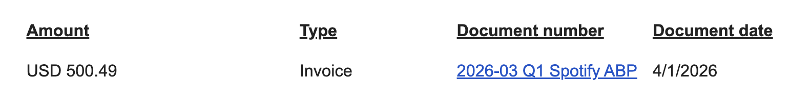
Okay so I guess that’s only like $166 a month, but the way things have been going lately this has me considering trying some Spotify ads or other ways of promoting my audiobooks there.
ActiveCampaign affiliate revenue (almost) disappeared
I had thought going into 2026 that I still had another year of collecting revenue for my ActiveCampaign referrals. But it turned out they had some sneaky language in their agreements migrating affiliates to the new system.
So something like $15,000 of revenue I was anticipating for 2026 pretty much vanished. There’s a couple hundred dollars in my PartnerStack account that I haven’t transferred over yet – still considering whether maybe I should start counting that revenue on an accrual basis.
As you can imagine, this accelerated the switch I already had planned after they increased their prices without sufficient notice.
Digital Zettelkasten in Spanish! ¡Zettelkasten Digital en Español!
Amazon has made automatic translations available to some authors, and one book they made it available for was Digital Zettelkasten. So I clicked a couple buttons and literally within an hour there was a Spanish version available on the Kindle store.
My wife is a native speaker and I’m functionally fluent, so we read it together, and it’s a good translation! There wasn’t one part that was weird.
The only limitation is that words within graphics aren’t translated, nor, strangely, is the table of contents. However, they don’t allow you to edit any part of the translation. But I did upload a custom cover.
Spanish is definitely a sweet-spot language for automatic translation like this because the market is huge, yet you have to be selling really well to get a translation deal.
I once commissioned a translation of How to Write a Book, and I’ve made like $750 off the $250 translation in eight years – and there was a fair amount of extra translation and work I hadn’t anticipated.
This one has been out not even a month and I’ve sold 11 copies and made less than $5, so it remains to be seen that it contributes meaningfully to revenue.
MMT, HTS, and HSB are all eligible for translation and I’m putting it off – I don’t know exactly why. It would be cool for my wife to finally be able to read my books. Looks like you can also translate into German.
January Income
Book Sales
Misc. Products
Affiliates / Advertising
Reader Support
| Patreon |
$142 |
| Total Reader Support |
$142 |
Services
January Expenses
General
| Accounting |
$35 |
| Book Printing |
$0 |
| Outside Contractors |
$0 |
| Quickbooks |
$34 |
| Shipping and Handling |
$127 |
| Total General |
$196 |
Advertising
| Amazon |
$245 |
| BookBub |
$0 |
| Meta |
$20 |
| Google |
$0 |
| Influencer Marketing |
$0 |
| Product Samples |
$0 |
| Total Advertising |
$265 |
Hosting
February Income
Book Sales
Misc. Products
Affiliates / Advertising
Reader Support
| Patreon |
$138 |
| Total Reader Support |
$138 |
Services
February Expenses
General
| Accounting |
$115 |
| Book Printing |
$0 |
| Outside Contractors |
$0 |
| Quickbooks |
$34 |
| Shipping and Handling |
$23 |
| Total General |
$172 |
Advertising
| Amazon |
$145 |
| BookBub |
$0 |
| Meta |
$0 |
| Google |
$0 |
| Influencer Marketing |
$0 |
| Product Samples |
$0 |
| Total Advertising |
$145 |
Hosting
March Income
Book Sales
Misc. Products
Affiliates / Advertising
Reader Support
| Patreon |
$126 |
| Total Reader Support |
$126 |
Services
March Expenses
General
| Accounting |
$735 |
| Book Printing |
$0 |
| Outside Contractors |
$0 |
| Quickbooks |
$34 |
| Shipping and Handling |
$20 |
| Total General |
$789 |
Advertising
| Amazon |
$181 |
| BookBub |
$0 |
| Meta |
$95 |
| Google |
$0 |
| Influencer Marketing |
$0 |
| Product Samples |
$0 |
| Total Advertising |
$276 |
Hosting
]]>


.png)