


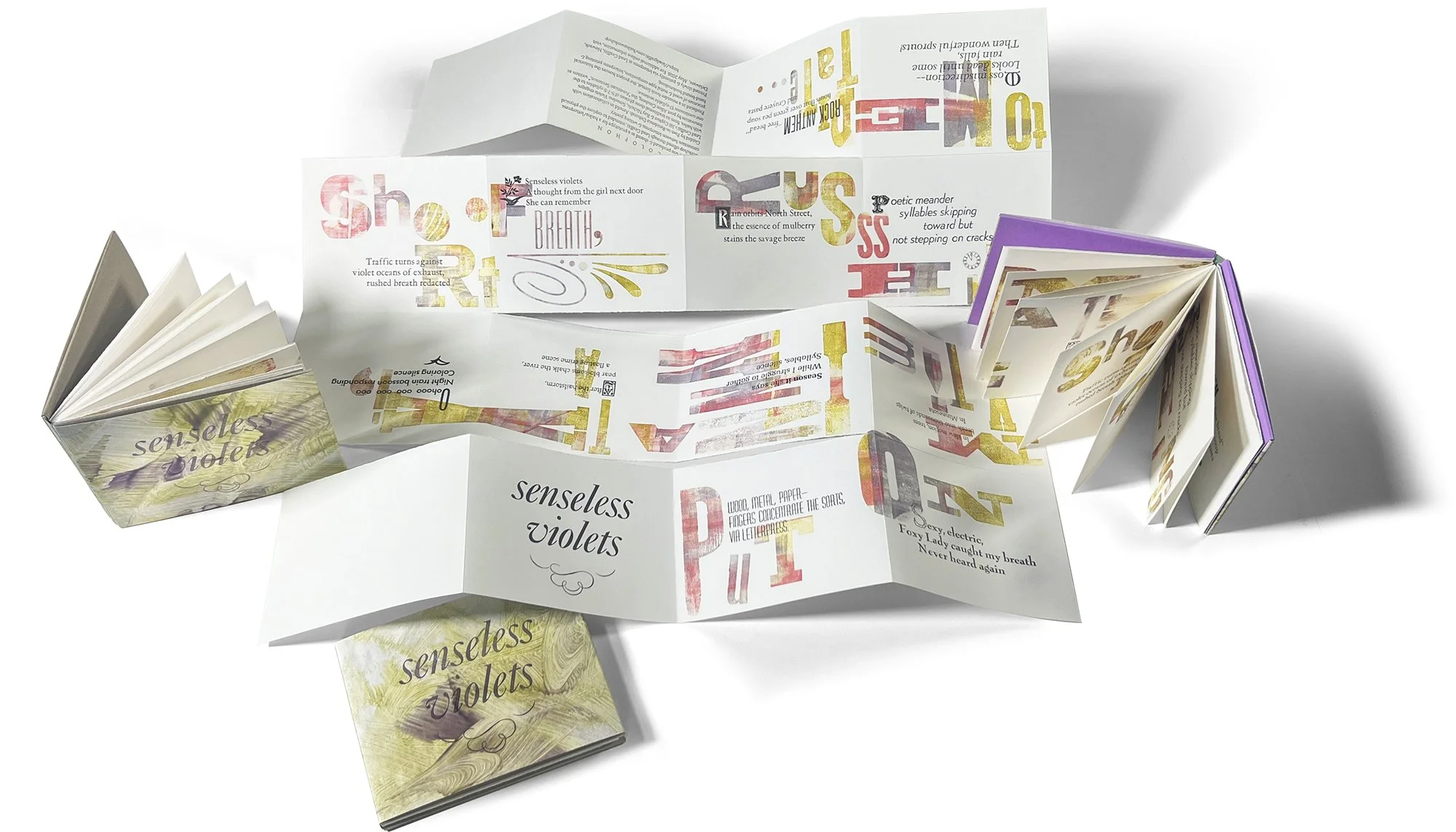
⬆ This shows a prototype for a new version of our Meander Book workshop intended to explore the physical connection between letterpress and writing poetry. The writing includes an “American Sentence” (the colored text above) and 12 Haiku poems written by the workshop participants.
Guided by Poet-in-Residence Deborah Arnold in collaboration with Lead Graffiti’s Jill Cypher & Ray Nichols, Senseless Violets engages with haiku, from its traditional three phrases of 5-7-5 syllables to the innovation by poet Allen Ginsberg, the “American Sentence,” written as one continuous 17-syllable sentence.
Produced in a meander-book format, the project honors the historical processes of wood & metal type composition, letterpress printing & hand-bound bookmaking.
Printed slowly & patiently via letterpress at Lead Graffiti, Newark, Delaware / May 2026.
Page size is 6” w x 4” h.

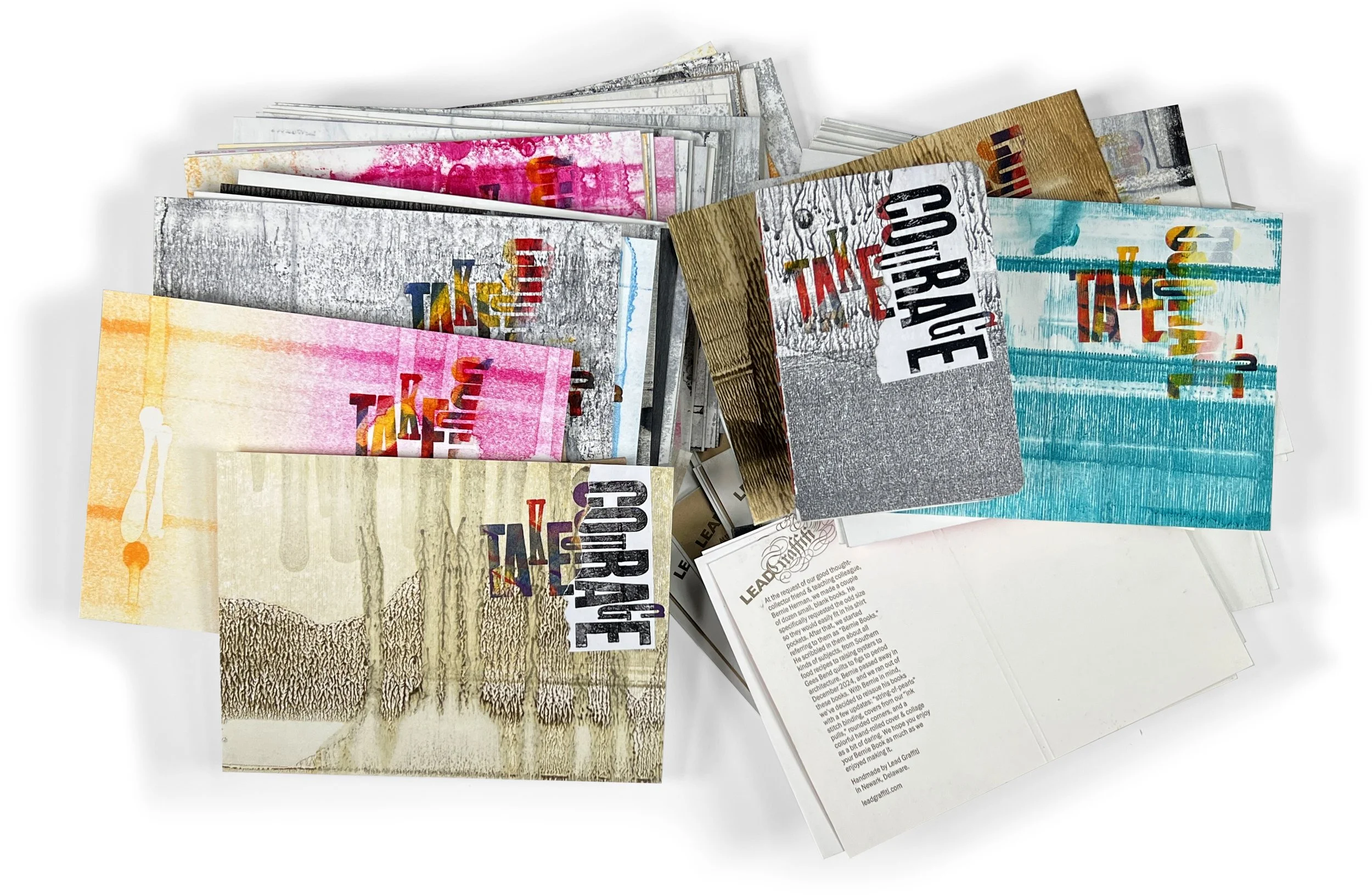
⬆ Finally, over several hours each of three days, we trimmed, scored, and printed about 125 Bernie Book covers. And we are quite happy with the way they look. They will still need to use the version of “courage” printed on white paper, which is then torn, glued, and applied over the multicolored words printed directly on the cover stock.
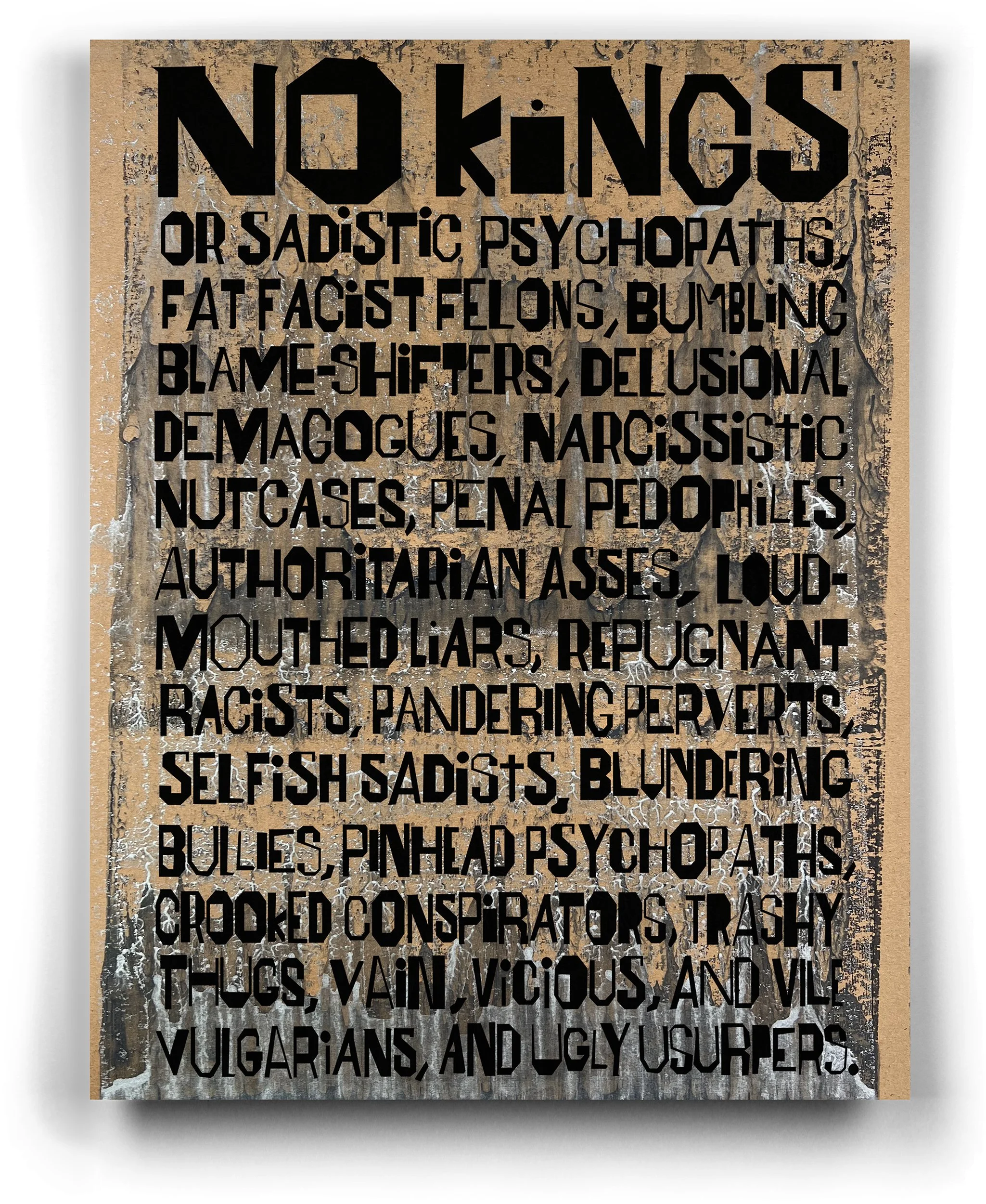
⬆ In today’s America, we at Lead Graffiti love doing politically focused pieces. Just for the record, we are not happy NEEDING to do them. The “NO KINGS” gatherings on March 28 gave us just such an opportunity. You might say, “No one is going to read that much on a protest sign.” I would say I agree. It isn’t that I wanted them to read it; it was that I wanted to say it.
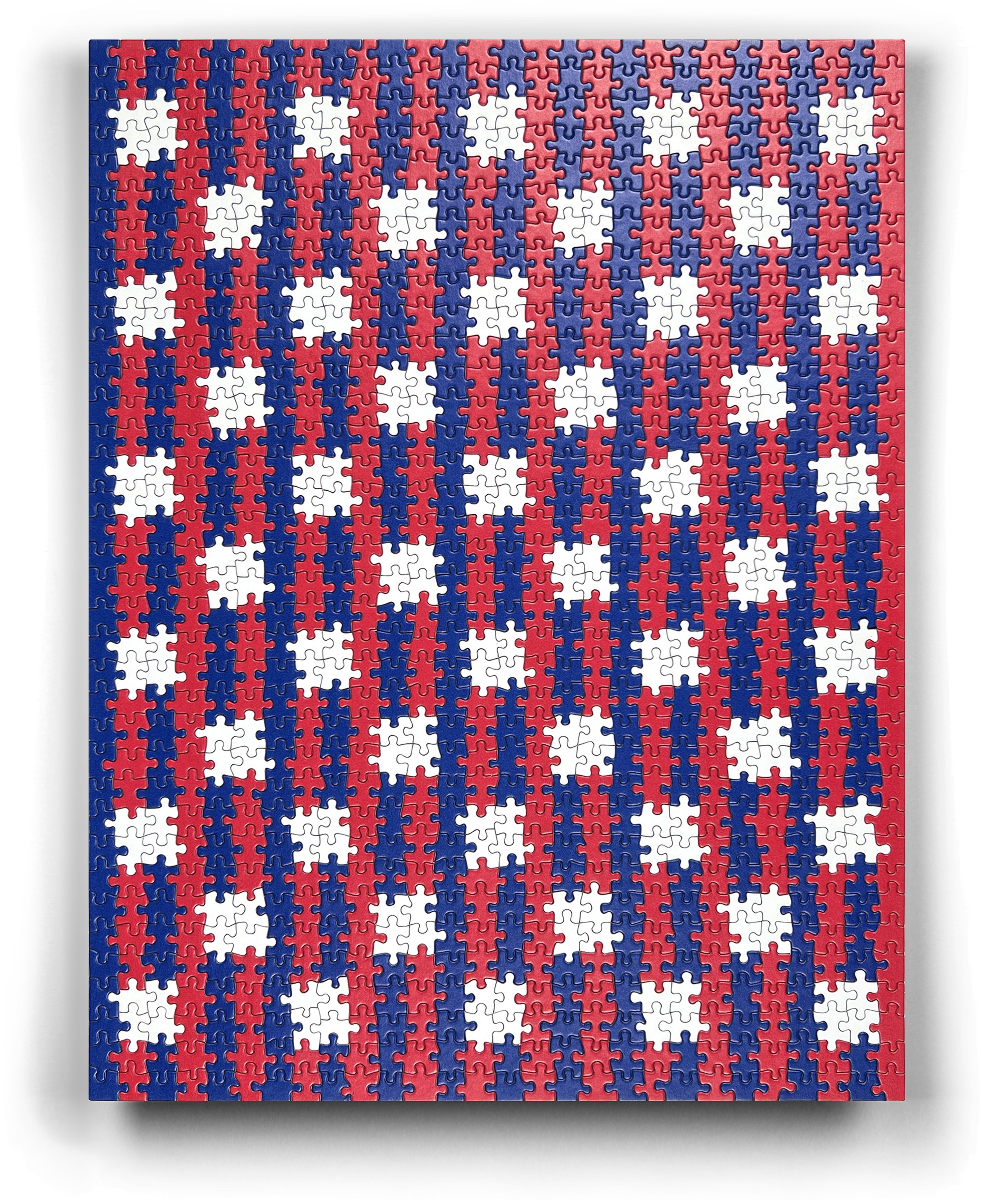
After buying a blank white puzzle and working on slipping in 50 stars, which was a lot harder to organize than we had thought.
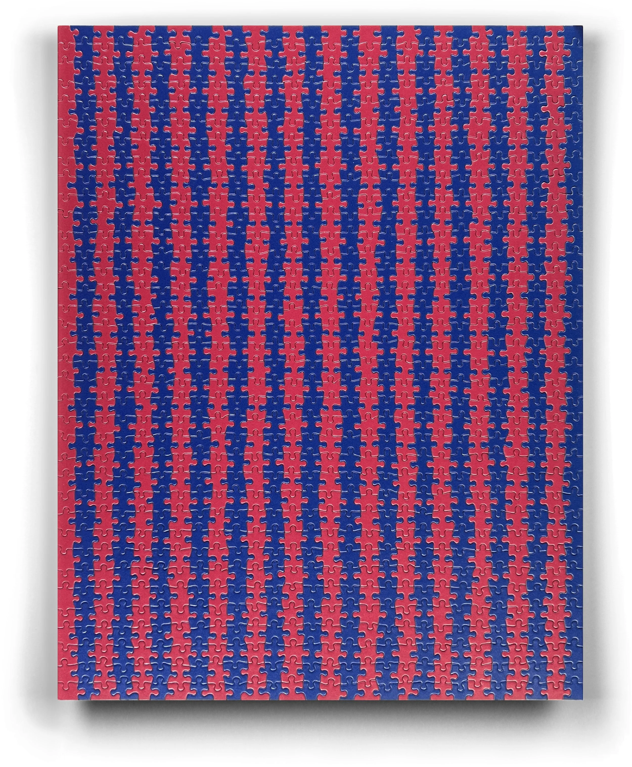
⬆ A bit heavy into playing around puzzle options at the moment. Anyway, the UNUM broadside project a few months ago got our brains into a red-and-blue state of mind. Doing the puzzle of the ink pull broadside (two images below) kept it at the front of my mind. Noticing that the two recent puzzles used the same die set, our math-oriented brain worked out an equation. Voila! You get this puzzle solution. We also bought a white one we were going to mix in, but think it would over-balance the tonal value of the image.
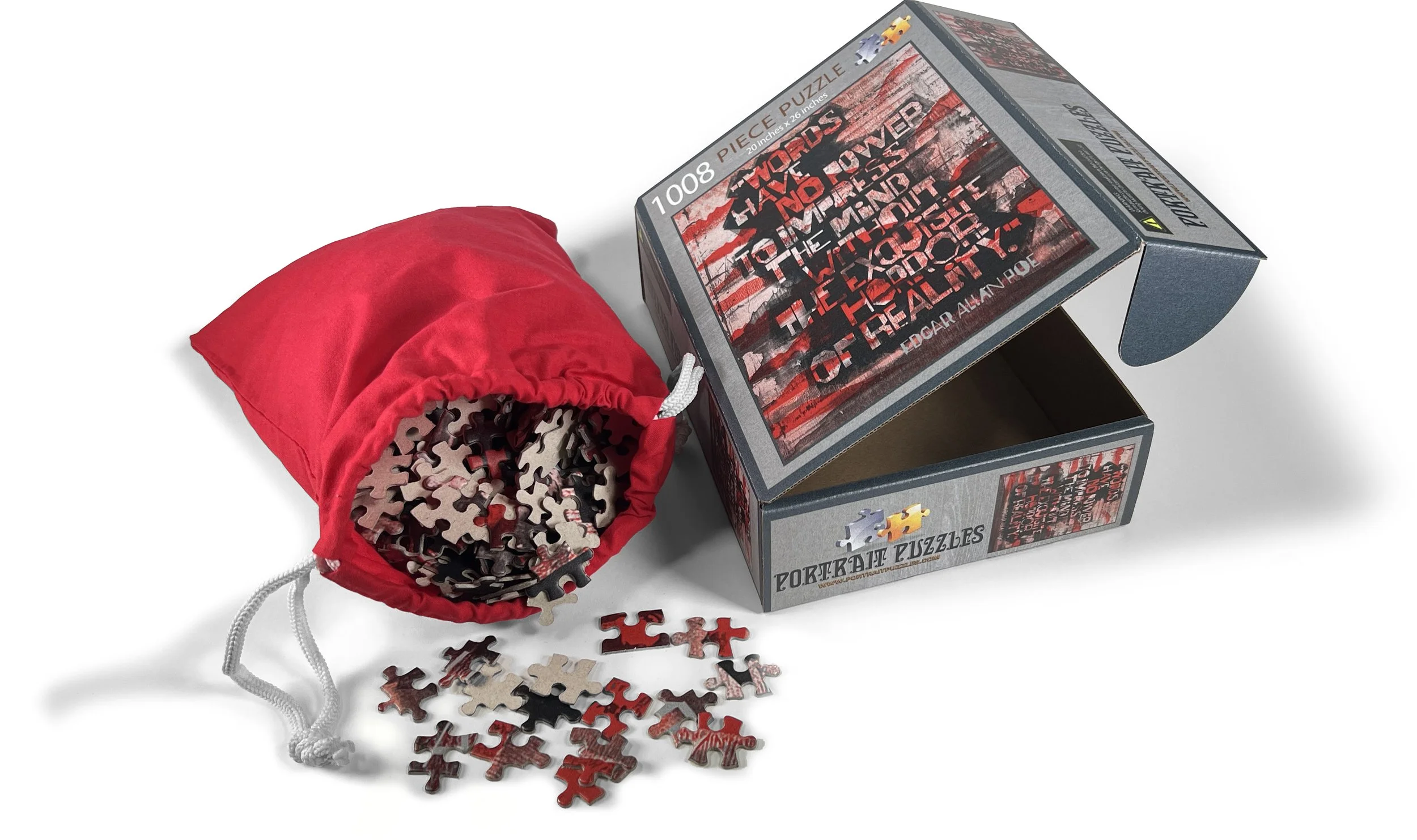
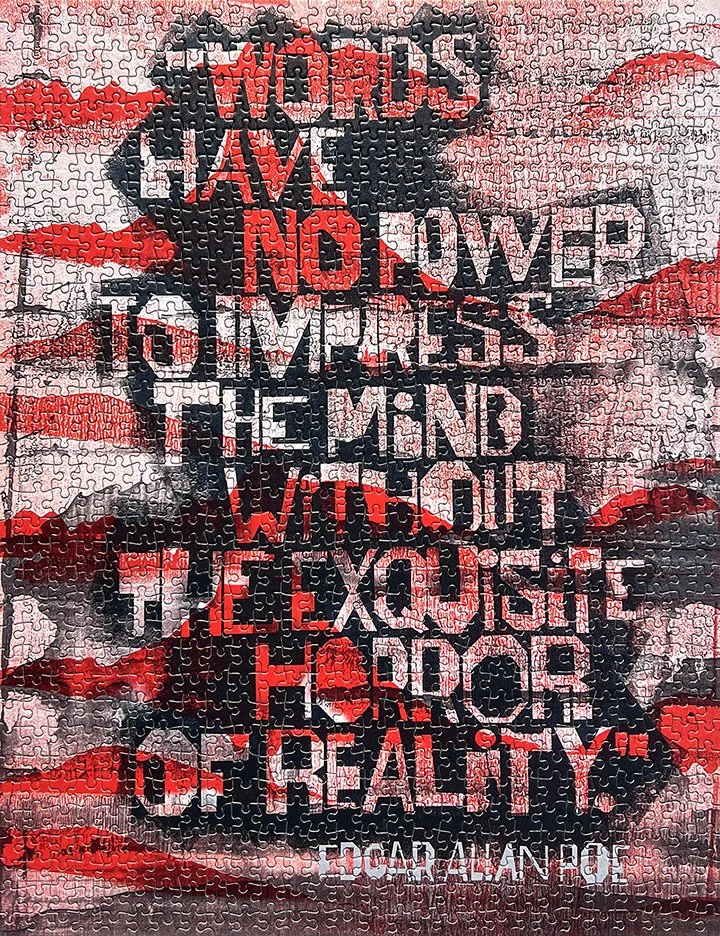
⬆ We put our two 20” x 26” letterpress 1,008-piece puzzles on our “to buy” site. Was looking around for ways to jazz them up and found these cool, blood red cotton drawstring bags that worked quite nicely with the Poe quote. Here’s the link if you want the whole story. You can see the actual puzzle below.
⬆ We took a shot at digitally overlaying two of our ink pulls and then adding the type layout from a previous broadside. The issue was maintaining the text's readability in a sometimes difficult-to-read typeface, given the randomness of the ink pull. We thought it worked quite well.
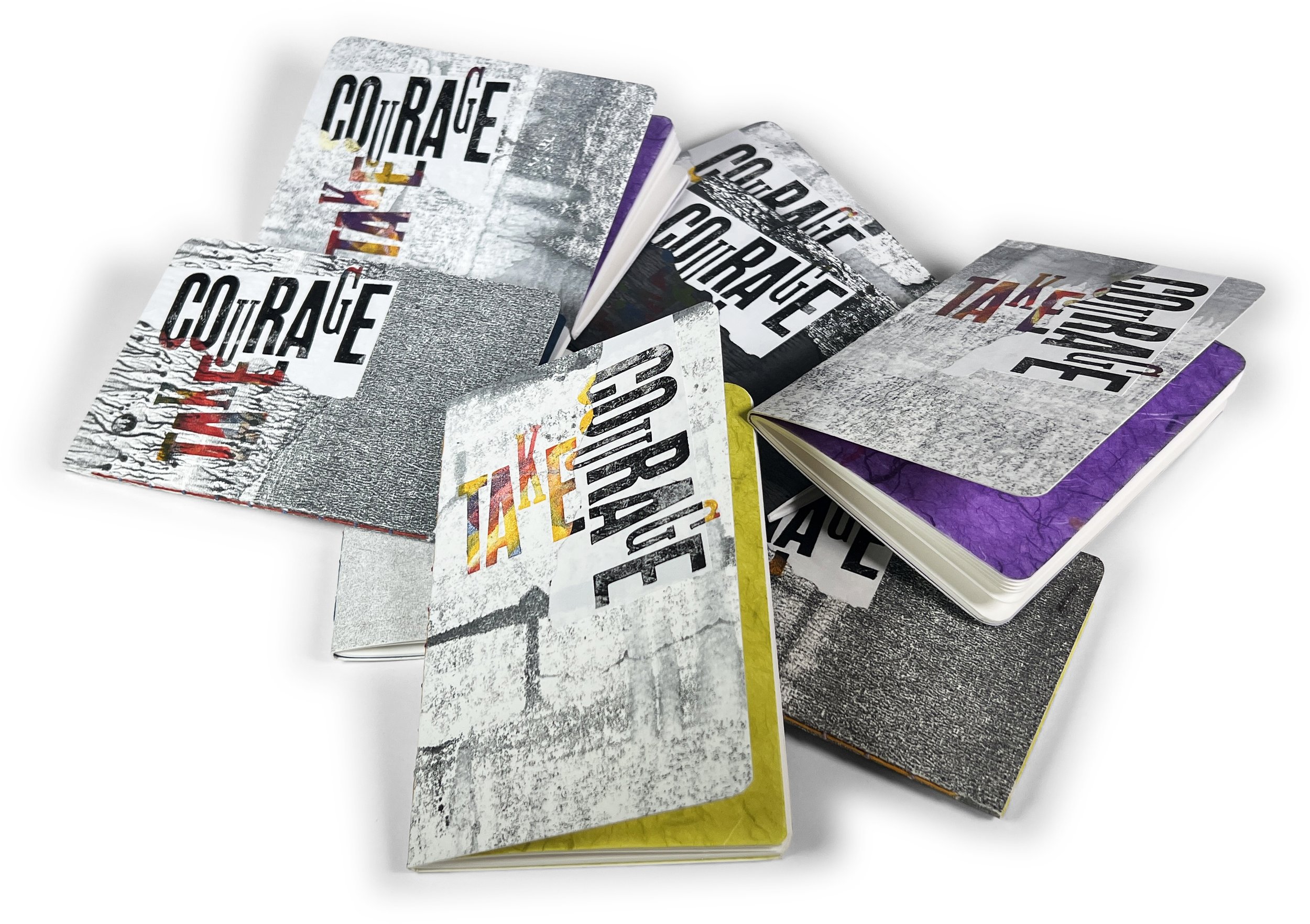
⬆ After a lot of fits and starts, we’ve finally settled on the size, design, etc., for a series of small blank books, which we call Bernie Books in honor of a friend who recently passed away. They are a bit expensive at $25 apiece (or 5 for $100), but the amount of work that goes into them is just too much to make them any cheaper.
We are going to write up the steps for our blog and are thinking this would make a good YouTube video to show the entire process.
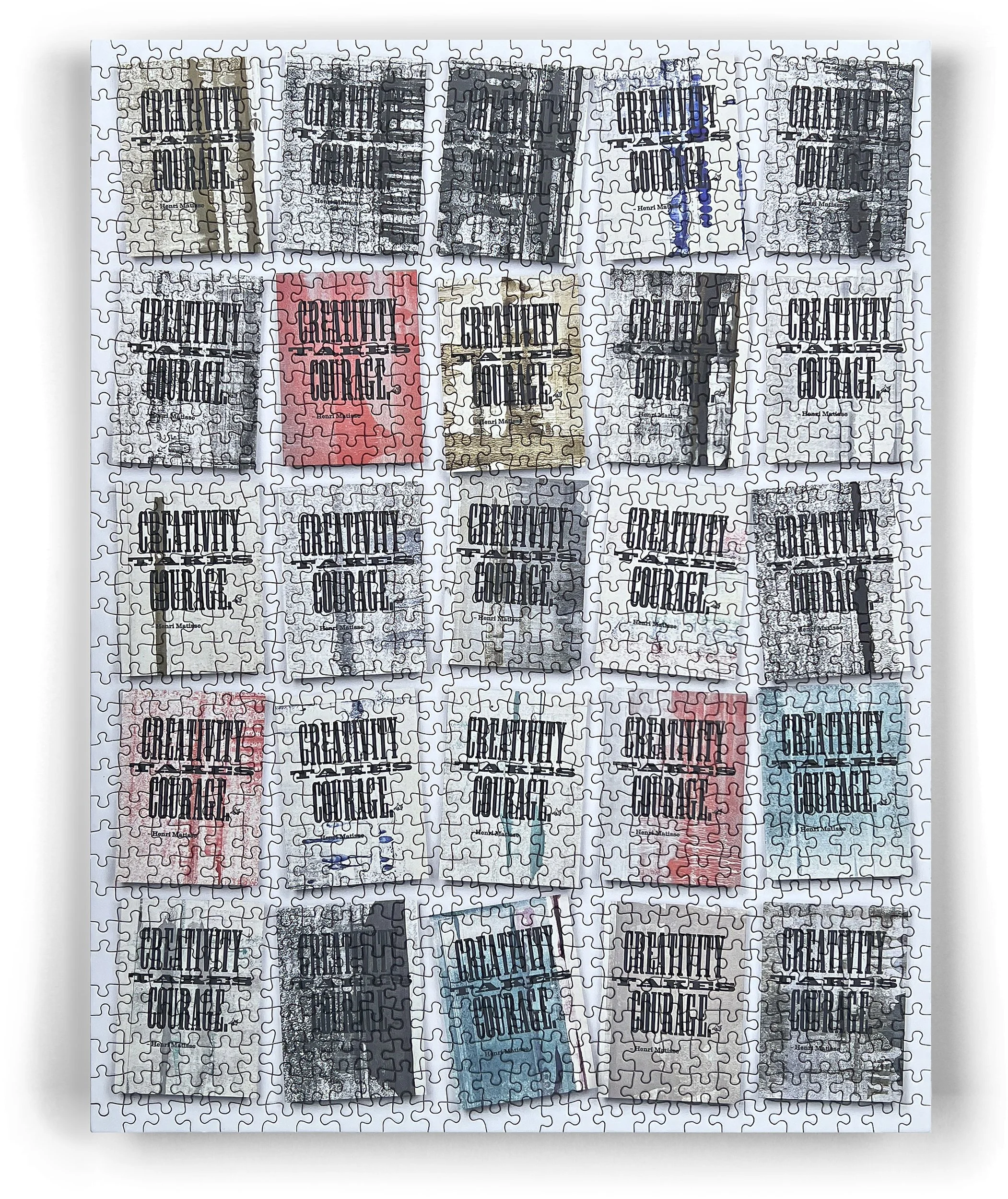
⬆ We are currently working on a YouTube piece showcasing Lead Graffiti’s portfolio of letterpress work from the past 20 years. We gave a talk to Ray’s niece’s 2nd-grade class a couple of years ago, and in preparation for that, we printed 30 or so 11” x 14” pieces using our ink pulls for stock and a Henri Matisse quote (“Creativity takes courage”) for the text. We hoped the families might frame the piece and hang it on their kids’ walls for the next 20 years.
After laying out the image in a 5 x 5 grid for the portfolio, we thought it might make a nice 1,000-piece picture puzzle. Works pretty well.
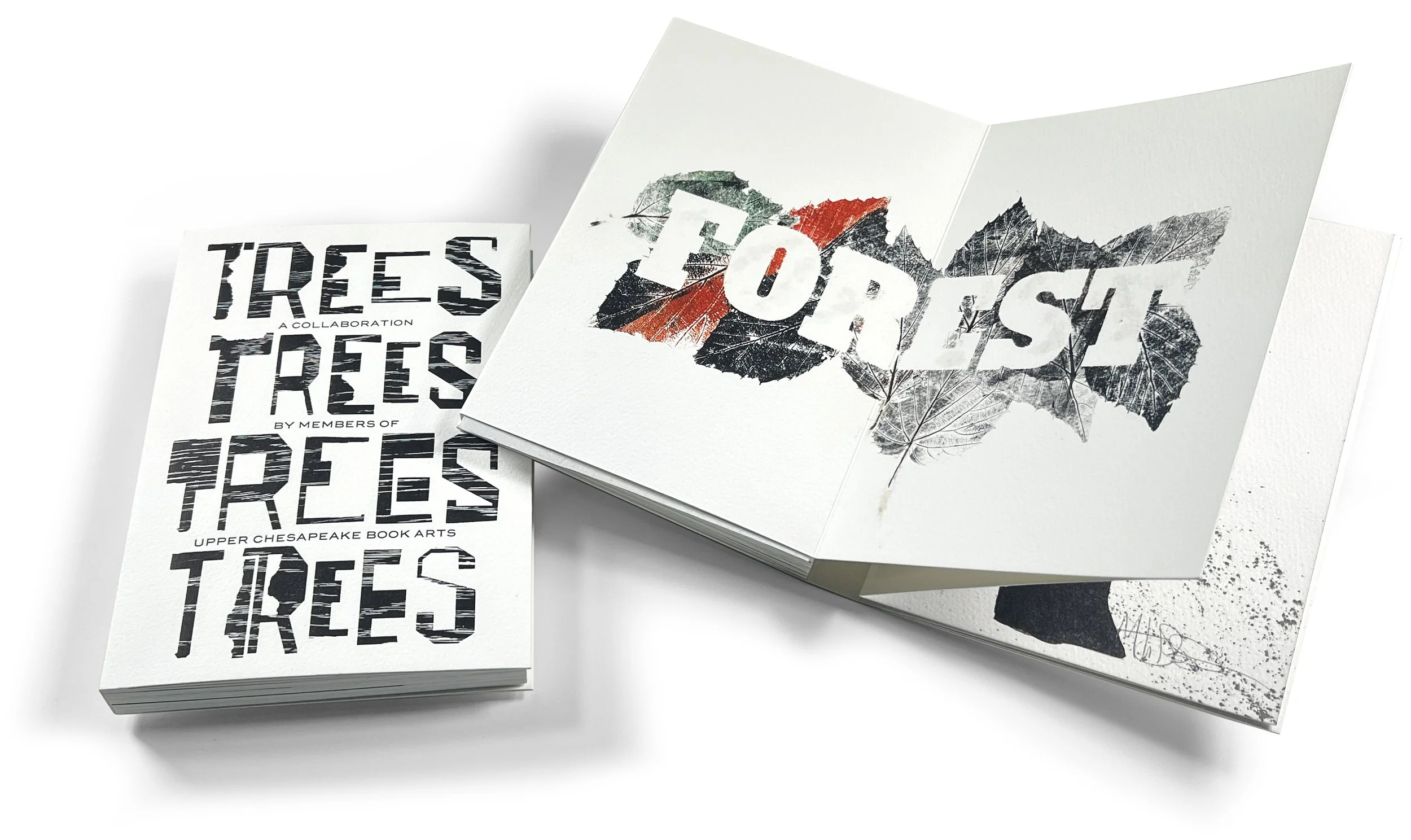
⬆ Upper Chesapeake Book Arts has just completed its collaborative book using the subject of “Trees.” The photo shows Ray’s page, as described in the fourth image below this one.

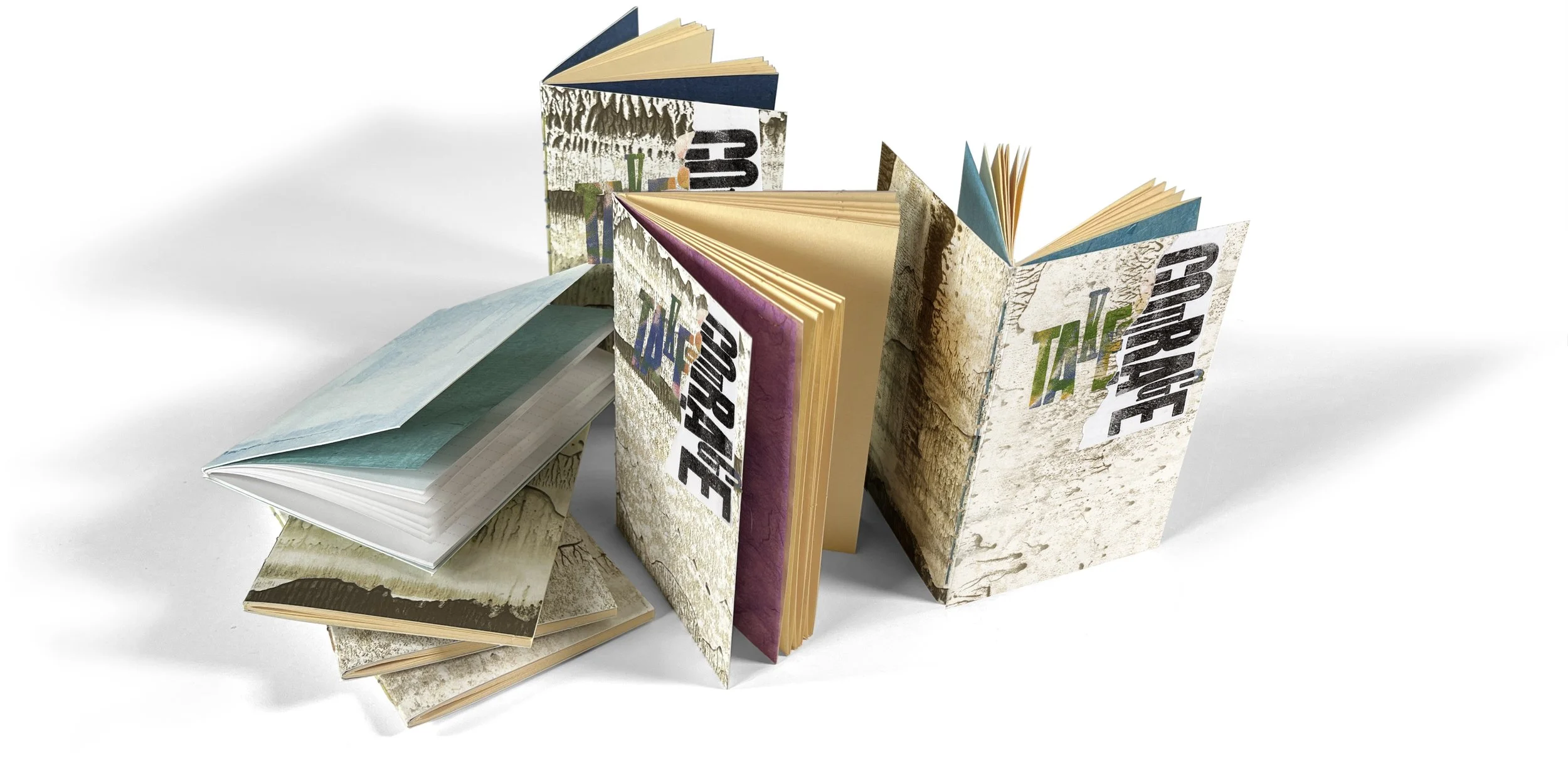
⬆ Several years ago, we made dozens of these 3.875” x 5.875” blank notebooks at the request of an important friend, Bernie Herman. He specifically requested the odd size so they would fit in his shirt pockets. After that, we started calling them “Bernie Books.” He scribbled in them about all kinds of subjects, from Southern food recipes to raising oysters to Gees Bend quilts to figs. Bernie passed away in December 2024. Eventually, we sold all of these books. So we decided to make more with a few updates. The first of these will feature “ink pull” covers, a fly-leaf of various and colored papers, various inside pages, and be bound with a “string-of-pearls” stitch. But the fit-the-pocket-size will remain the same. You can look for them in our online store.
⬆ Jill finished her page for Upper Chesapeake Book Arts just using a brayer and ink. She’s very happy with the result. Below you can also see the final books trimmed and ready for the cover, which will be printed in the next couple of days.
⬆ Set the type for this broadside and print it on some “ink pulls.” Turned out to be an interesting project. We’ll see if it goes anywhere.
Ray’s prints for his spread in the 2025 UCBA collaborative book. The group’s chosen topic was “Trees.” Everyone contributed a spread, which we will frame and seek exhibition opportunities for. If you know of someone who might be interested, we would appreciate a shout-out. Soon, I will post all the contributions. However, several people’s efforts had somewhat radical differences while sharing similarities, across the 16 spreads we required from each contributor, as you can see below.
Ray’s prints for his part of the UCBA collaborative book based on “Trees.”.
NYC, Grolier Club, Morgan Library
About 6 of us went to NYC to see the “After Words” exhibition at The Grolier Club, which explored the work of many concrete poetry practitioners. We got a personalized exhibition tour by Mary Catherine Kinniburgh, one of the exhibition creators & director at Granary Books in NYC. One of the exhibit pieces, “Braille-Pouim” by Herman Deman, gave us an excellent idea for our Thank You for sharing her time.
Cutting Braille from Plexiglas with our laser cutter set the tone. Jill added some of her nice hand-drawn typography, along with signatures from everyone in our tour group, and voilà.
Try translating the text.


Printing slowly & patiently via letterpress
WELCOME TO LEAD GRAFFITI, a laboratory of sorts in Newark, Delaware, for all things letterpress—a place where you can do some serious experimenting, as well as creative & playful tinkering, with letterpress, typography, and bookmaking, because:
WE BELIEVE we are part of a continuing story that passed through Johannes Gutenberg around 1450.
WE BELIEVE creative pursuits should be a higher priority in terms of time spent and perceived value.
WE BELIEVE all people, especially kids, need the opportunity to experience “aha” moments and to learn the value of opposable thumbs.
WE BELIEVE in aggressively searching for the road less traveled.
WE BELIEVE in collaborating with kids as much as we can.
WE BELIEVE in knowing how to read a ruler and doing math in your head.
WE BELIEVE in stockpiling “shelves” of ideas.
WE BELIEVE in working spontaneously and intuitively with those ideas.
Lead Graffiti put on a version of its H.N. Werkman letterpress workshop, celebrating National Print Day at the Frederick Book Art Center, in Frederick, MD. The local newspaper included a nice article on the workshop. You can read the article here.
Here are a couple of our favorite photos from the workshop.

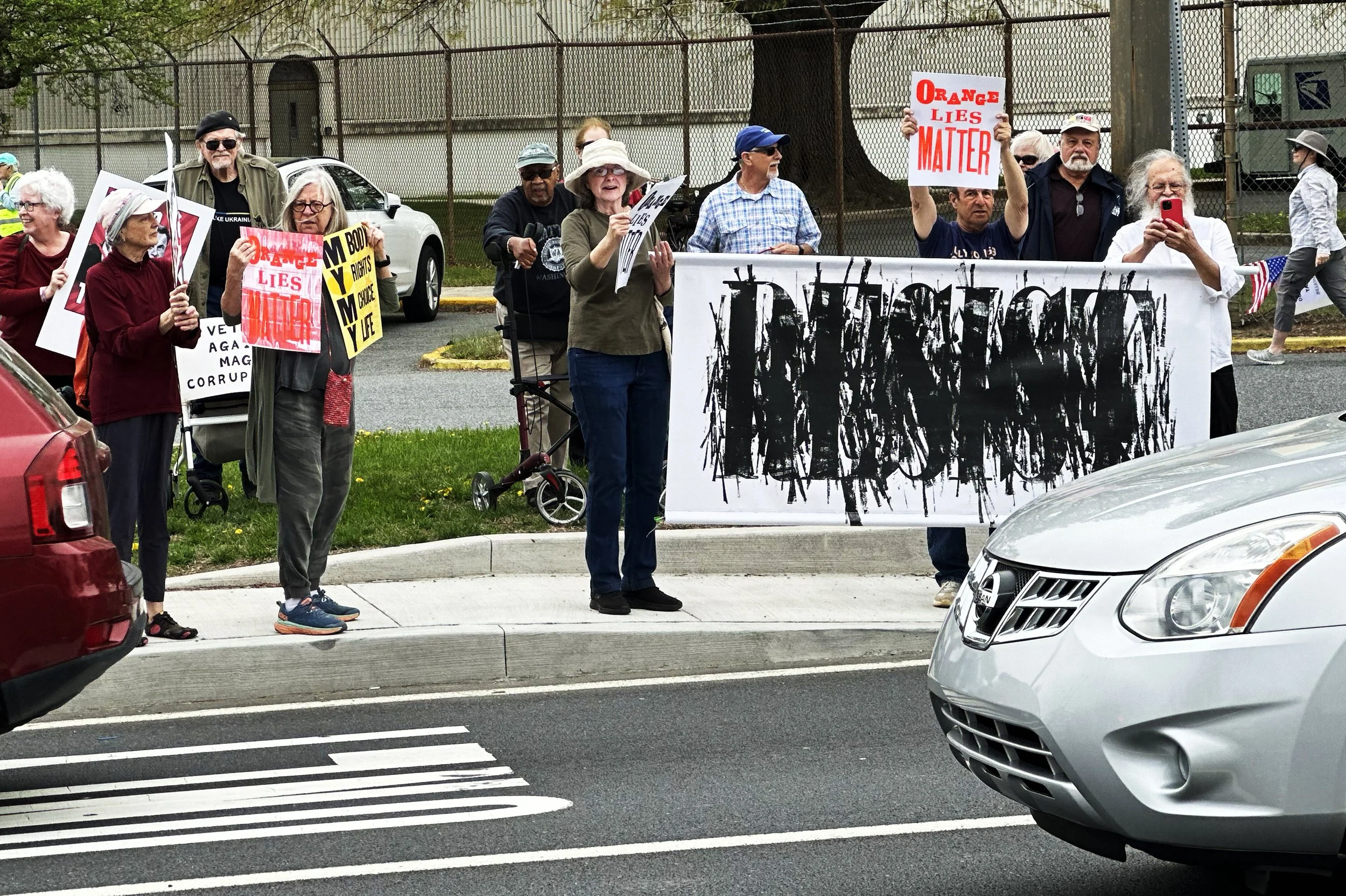
Ray was working on printing some huge type (15” tall produced using our laser cutter and bookboard), focusing on the word “resist.” Jill in an entirely separate creative project of her own was hand-rollin ink in those little short blasts you see in the image. We loved the idea of “resisting” breaking out of the complete political mess the USA now finds itself in. So we merged the two efforts.
Below is a Lead Graffiti typographic mark we created to promote to groups that write or send out 6” x 4” postcards to potential voters. If that works for you, you can have the group’s logo in full color and a printed note on the back. It is not printed via letterpress, but it could be if desired. Email us if you want to start a conversation and find out the cost (which, for full-color postcards, is relatively cheap). We also produced the image as a 6-foot banner, which we often use during protests. See the second photo.

Solo Exhibition at the Frederick Book Arts Center
Lead Graffiti held a two-month-long retrospective exhibition of their work at the Frederick Book Arts Center in Frederick, MD, running from Saturday, March 1, through Saturday, May 3, which was National Print Day. We were at the FBAC for two days during the exhibition. First, there was a talk on Saturday, April 5, held in the exhibition space, about our endeavors, our design, and our printing process. Hopefully, we answered many questions about our work, letterpress, our love of books, cycling, the Tour de France, and more for those in attendance. We also presented a workshop on printing slowly & patiently via letterpress and worked on ideas for a Protest Poster Workshop for Print Day. All in all, we displayed 200 pieces of our work

Subscriptions to the Lead Graffiti maker space
We like people in the Lead Graffiti studio. We are also seeking financial support to keep Lead Graffiti going. We’ve fallen out of love working with clients who often want work that isn’t worth our time in our studio or a place in our portfolio. Also, we hate estimating a job’s cost. Please tell us what you need and the maximum you will pay to fulfill that need. We’ll politely refuse if it isn’t enough. With that in mind, we’ve started offering “studio subscriptions” to people who might want to use Lead Graffiti as a letterpress “maker space” for their creative outlet. We also provide studio tours specifically related to the letterpress medium at least once a month. Check out our calendar for dates, or email us a date and an idea of what you want to do. And check out the details about “studio subscriptions.” Maybe an after-school program for your kids who seem to have a creative streak.
If you don’t see anything listed, email us with a couple of dates or times, and we’ll try to accommodate your schedule.
LETTERPRESS LIVE sessions in the planning:
We try to post instances when we can accurately schedule a “Letterpress Live session.” When we list it as a “Letterpress Live session,” we explain the project, and anyone can come and watch. There may be instances when we can let you participate in the printing. Please email us if you intend to join us.
When you missed our LETTERPRESS LIVE session on Monday, February 24th, this is what we were printing. The signage being implemented is shown in the photo above.

We ended up using an ink wash (ink diluted with mineral spirits) to print our 16” Onyx (cut from Linoleum blocks) on brown wrapping paper. It took us nearly four hours to do what you see above. We plan to hang these in the middle of the gallery at the Frederick Book Arts Center when hanging the show on February 26th & 27th. Wish us luck. You can see the gallery with the banners two images above this.
A Lead Graffiti “Letterpress Live” event on Friday, February 28, involved printing the numbers on our “Just the Ticket” project. Letterpress live events are instances where we print a project and invite anyone to help/watch. Such notices usually happen at the top of this page.
Indivisible protest

We wanted to participate in the Indivisible protest on President’s Day (March 17) at Rodney Square in Wilmington, DE. Zoe helped us make signs for each of us. It looks like Jill’s Guantanamo sign worked, as the government has scrapped most of its plans to hold detainees there. Jill’s sign reads, “Is Guantanamo America’s Auschwitz?” Ray’s sign reads, ‘Did I wake up this morning in Nazi America?” Zoe’s sign reads, “The voting age should be 13.”
Giveaway Zoo card for “Liar, Liar.”

The back of the card reads
“9,296 pages document 30,573 false or misleading claims by Donald Trump from his first day in office, 2017, to his final day on January 20, 2020, when Joe Biden was sworn in as the country’s next president. All that verbiage is 53” thick, weighs 52 pounds, and it started like this.
The dissolution of the Delaware College of Art & Design, to whom Lead Graffiti had donated 100s of design books over the past decade, brought an invitation to reclaim them. We found a few, which led to another interesting find—a blank Coptic-stitched book with a spine about 36 inches wide, bound by Ema Ishii Holdredge for her BFA show at the Corcoran School of Art in 2008. That book haunted us for several weeks, and we decided it was too audacious not to give it a Lead Graffiti shot. For a while, we pondered how to fill a several-thousand-page book with content that made a serious point.
The notion of the presidential untruths came to mind, so maybe there was some documentation we could “borrow?” Sure enough, within a few minutes in Safari, we found a downloadable PDF from The Washington Post that we could massage into a typographic form we could use. We were off. Ray undertook the ink-jet printing of the pages, folding and inserting the red cover-weight sheets for structural support, and gathering and punching the folds for sewing. Jill did 99.8% of the sewing.
At a 302United gathering, we encouraged attendees to stroke the book. The head of the Delaware ACLU, shown at right, has excellent technique.

Newark Arts Alliance Solo Exhibition
Lead Graffiti is the subject of a solo exhibition at the Newark Arts Alliance from December 31 through January 18. We will exhibit work from our earliest days through work produced in the past 2 weeks. The exhibition is designed to group work by conceptual connections. While we fell in love with the letterpress process relatively quickly, we love its fluidity and its ability to be constantly reinvented. The gallery is open Tuesdays through Saturdays from 12 - 4 and Fridays until 8. An artist’s reception will be held on Friday, January 10, from 6 - 8 pm. We plan on being there starting at 4. Email us if you would like a tour, and we will post those times on our calendar as we establish them. Lead Graffiti offers workshops in its studio space in the Sandy Brae Industrial Park here in Newark on various processes relating to letterpress and bookmaking.
207 Louviers Drive in Newark, DE, is located on Papermill Road, across from Bank of America and W.L. Gore.
Lead Graffiti was chosen as “the city’s favorite artist studio of 2024” in a poll by the Newark Post.


Our Vandercook Universal III rebirth
Many of you know that our Vandercook Universal III, our main production press, has been down after a complete motor and electronics breakdown. As of January 3, this problem has been fairly well corrected. We are up and running again with a new motor and new relays. Thanks to Orbit Electrical, our Uni III should run another 55 years. There are still a few things we would like fixed, but we can now print larger work up to 18” x 24”.

It is a CARD time of year. We just completed a holiday card workshop, and another (the one-sided POSTCARD version) was scheduled for the following week.
It all started with a surprise visit from one of my favorite students, Melissa, who was seriously involved with Raven Press at the University of Delaware. Granddaughter Zoe was also at the studio, and they played around, drawing with pastels.
When Melissa (usually in California for her job) is in the studio, we almost always print something. She said her dad wanted “thank you” cards.
Here’s an instant Lead graffiti typographic experiment idea: We will make a folding thank you card and print it in black (already on our Vandercook SP15). Then, jazz them up with some pastel playfulness. The image above shows each of the final cards. Three hours. Bang. I love the electricity in that bottom one.
A future Afternoon Diversion idea: If someone wants to come over and help, I’d like to take a 20-foot length of paper, 22” wide, and print a sheet at least 20’ long by pulling the paper through one of our iron hand presses. There is no charge for the experience. I’d imagine you would need to commit to 5 hours. I’d even buy lunch to start things off.

We’ve been playing with a new base for printing. We took Lead Graffiti’s “Shahn Torn” typeface with an Edgar Allan Poe quote to produce a broadside. We were also using some of our “ink pulls” that we’ve been collecting from the initial stage of cleaning the ink off of our Vandercook after a run. Here are 4 more that we especially liked.

Newark Arts Alliance “Printed Slowly & Patiently Via Letterpress”
Lead Graffiti, Newark, Delaware’s Art Studio of the Year, is having a solo show at the Newark Arts Alliance for the first 3 weeks of 2025. More details and dates will be forthcoming. The Exhibition Committee voted unanimously to have Lead Graffiti as the first exhibition of 2025 at the Newark Arts Alliance. ‘Lead Graffiti: An Exhibition of Letterpress and Book Arts’ will open to the public on Tuesday, December 31, and will continue during the regular open hours of the NAA location, with an evening reception on Friday, January 10, from 6 to 8 pm.


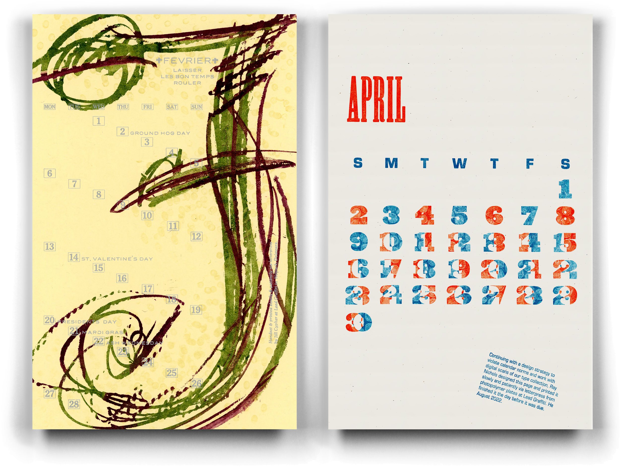
APHA 2025 Calendar
The Chesapeake Chapter of the American Printing History Association prints an annual calendar, and this year, four of the 12 months for 2025 were printed at the Lead Graffiti studio. From left to right: January / Ray Nichols, August / Carol Maurer, October / Jill Cypher, and November / Casey Smith. These designs represent quite an excellent range of styles and tastes to egg things forward. It is fantastic to have creative talent circling you.
NAA “Visual Messages: Socially Engaged Art”
The Newark Arts Alliance is having an exhibition entitled “Visual Messages: Socially Engaged Art.” Lead Graffiti entered four pieces into the show, and all four were accepted: “Lies, Lies. Pants on Fire,” No More War, No More Putin,” and “No Zombies Allowed.” A framed set of 12 political postcards was also accepted.


Jill led an excellent book-making workshop on constructing and binding a “concertina spine” book. The 13 members of the Upper Chesapeake Book Arts Group who attended seemed to have a good time, and the results looked professional.
If you live within a comfortable driving distance of Newark, Delaware, and are interested in making books (either with or without content), consider joining our group. We don’t have a membership fee, though there may be a small materials fee for an event like this or for making paste paper. We typically meet on the third Wednesday of the month from 6:30 to 8:30.


Below is the studio photo of the finished book. It takes my book-making breath.

Waldorf School of Philadelphia 8th-grade diplomas

Since 2012, we’ve had the privilege of printing the Waldorf School of Philadelphia’s 8th-grade diplomas. We’ve always described our experience as our favorite project for a client for money. No question. The students are always uniquely involved, asking questions and crowding close, as almost always our favorite students. COVID had interrupted our direct involvement with the students, but they came to the Lead Graffiti studio this time. Each student and the teacher produce several sheets of paste paper and choose one to wrap their diploma. They also print the text for their diploma on our Vandercook SP15. Then, they handset their name in metal type and printed it onto their diplomas using our Albion iron hand press. It’s about as perfect a day as Lead Graffiti could dream of.


The Lead Graffiti Labyrinth
We built a labyrinth in the front yard of our home in Newark, Delaware. You can read the whole story on our blog. If you want to look up labyrinths.

Here is our labyrinth after the first snow of the season.


Lead Graffiti is happy to announce a new collaboration with long-time friend and book artist Anne Hessel. We’ve established a “buy” section of our website devoted to her interest in designing and sewing blank books and encaustic work. Anne will arrange her area over the next few weeks, so feel free to look it over, but expect changes.


A few years ago, we spent a lot of time working with a fellow letterpress printer, Bill Roberts of Bottle of Smoke Press in Dover, DE. Bill often produced “Cinderella stamps,” which he used as part of the promotion process for various books he printed.
We have a nice Rosbach perforator that lets you produce the old-school holes between stamps, but controlling them is a “process.” We’ve used the perforator to include holes in several projects we’ve produced over the years. But now, adding our Boss laser cutter gives us a highly controllable way to produce the holes.
So, we took our newest wood-type design, Reacshahn, as an opportunity to produce Lead Graffiti’s first set of Cinderella stamps. We’d like to include information about the stamps and the project it represents, but we don’t want to clutter the card. An added problem was finding a glassine envelope (like the kind stamp collectors use) that was the right size. Sometimes, trying to do a project that feels right in almost every way is a total pain. We think we may just do a Zoo card to include with the stamps. This would give us more space, control, and the chance to include some full-color production shots. We’ll try to jump on that.

Lead Graffiti’s 1st wood type


September (August?) First Friday Eve happened
We highlighted our “IMHO” book, produced by Upper Chesapeake Book Arts, shown below. You can read a more thorough explanation and the list of contributors by clicking here.
I might take this opportunity to encourage you to check out our “Opposites” book, also produced in collaboration with the UCBO, on our YouTube channel. You can click here to see it.


⬆ This photo shows Jill (paste paper) and Deborah Arnold’s (poetry) new book from Lead Graffiti entitled “bouquet.”
Lead Graffiti’s “bouquet”
Jill (paste paper) & Deborah Arnold’s (poetry) book entitled “Bouquet” - 36 pages was our best-selling book at the Manhattan Fine Press book fair in late March. We think we sold 6. We are producing an extra book and an enclosure for anyone who has or will buy the book, making it a deluxe edition. You can see a more thorough description by clicking here.
Workshops / check calendar & shop
Interested in a letterpress or bookmaking experience? Please email us.


⬆ Newark Arts Alliance “Abstract” exhibition.
The Lead Graffiti book, “How Ink Writes Poetry,” was accepted to the Newark Arts Alliance exhibition entitled “In the Abstract.” The call for entries stated, “Work in any medium that depicts the subject matter in an unconventional and nonrepresentational manner.” The pages are “Ink Pulls” that we create using our Vandercook Universal III. The exhibit was juried by Rebecca Howell.
The exhibition runs from January 31 to February 24, with the public opening on Friday, February 10, from 6 - 8. The exhibition location is at the Newark Arts Alliance, 276 E. Main Street, Suite 102, Newark, Delaware. Maybe we’ll see a few of you there. Be sure to introduce yourself if we don’t know each other.
“How Ink Write Poetry” has been purchased by the Library of Congress.


⬆ New Impressions 2022 juried exhibition Hamilton Wood Type Museum
Lead Graffiti’s broadside “Teleport” was chosen by the judges for the Hamilton Wood Type Museum’s “2022 New Impressions” exhibition. There will be an exhibition during the spring, and a printed exhibit catalog available soon after. Printed in May 2021, the poster below was an experiment inking bubblewrap on our 1868 Washington #5 iron hand press.
For more details about the process and tools, click here.

⬆ Clamshell boxes for members of the Anne Arundel Community College Printmaking Club
Made to enclose a set of student prints at the Adkins Arboretum Visitor’s Center in Ridgely, Maryland.


⬆ A 2-year AFTERNOON DIVERSION
January 6, 2020, happened. I pretty much wanted to do a broadside instantly.
I don’t like zombie movies, but sometime around January the following year, I watched “World War Z.” Z stands for zombies who climb walls. Saw a photo from inside through a broken window of the Capitol building, looking at the Library of Congress (one of my favorite places on the planet. Melissa Lentz, an essential student from my teaching days, was taking a COVID break from Apple, where she worked. She came to the studio, and we printed the type in February 2021.
I played around with how to do the glass. CLICK HERE for an explanation on Instagram (9 images) of how that was accomplished. Melissa returned to the studio, and we finished the broadside on November 20, 2022.
Size: 14.25” (w) x 22.5” (h)
Runs: 3 (title, credits, broken glass)
Stock: Stonehenge
Fonts: various
Press: Vandercook Universal III
Printed: November 2022
⬆ American Printing History Association 2023 calendar pages
February (Jill / left) and April (Ray / right) are 2 of the pages from 14 letterpress printing members of the Chesapeake Chapter. The calendar is for sale to support chapter events. The edition is 130 prints.
Jill’s is printed from hand-rolled photopolymer for the “F” and handset metal type for all of the text.
Ray’s is printed from photopolymer using scanned wood type from their collection. The plates of overlapping numbers are inked and then hand-pressed with bubble wrap to subtract ink, creating visual unevenness.

⬆ No more war. No more Putin.
Size 14.25” (w) x 22.5” (h)
Runs: 18 (title, credit, lines 1-3, each line 4-18)
Stock: Somerset Textured White, 300gsm
Fonts: 72 point Empire, 12 point Blair
Press: Vandercook Universal III
Printed: March 2022
Signed & numbered in an edition of 20; the broadside below represents Ray’s adverse reaction to the Russian invasion of Ukraine. It also means a continuing complicated experiment with ghost printing. The broadside is available for $60 (shipping is free), with 100% of the proceeds supporting the Ukraine relief effort. See details in our shop under “broadsides.”
WE SENT THE INTERNATIONAL RELIEF TEAM $1200.
—————
Hello Ray,
Thank you for your generous gift supporting families during the crisis in Ukraine. We are grateful for your generosity and could not do this without you.
Your gift details:
Amount: $1,200.00
Payment Method: Visa Use SECURE PAYMENT button below for Credit Card, Debit Card, PayPal, or Venmo ending in . . . .
Date: 5/3/2022
Designation: Ukraine Crisis
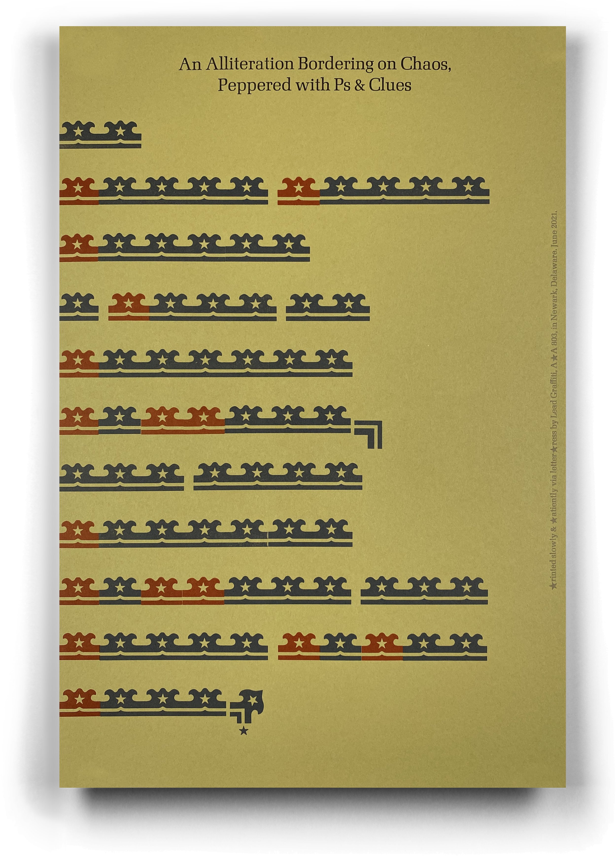
⬆ An Alliteration Bordering on Chaos, Peppered with Ps & Clues.
Size: 12” (w) x 18” (h)
Runs 11
Stock: French Paper
Fonts: wood border material substituting for text
Press: Vandercook Universal III
Edition: 65
Printed: September 2021
The project was dreamed up by Tony Guadagnolo, a letterpress friend. Tony loves wood borders, and he cut this one with his laser cutter. He made 4 sets containing various groupings and variations of the pieces you see. The main design is that “double” you see in the top line. There were singles, doubles, triples, and quads. There were also a few corner versions. You can see 2 of those at the end of the 6th and last lines.
The project was to use the border material in some fashion and to use alliteration, which is the repetition of the same letter or sound at the beginning of adjacent or closely connected words.
We had a hard time figuring out what we could do, but once we got this idea, we were really happy with the results.
Here is information about the tongue twister courtesy of Mental Floss.

⬆ Somebody’s got a tight grip on Joe Manchin’s balls
Size : 14.25” (w) x 22.5” (h)
Runs : 2
Stock : French Construction Kraft, 100# cover
Fonts : various wood types from 4-line to 40-line
Press : Vandercook Universal III
Printed : February 2022
Signed & numbered in an edition of 20; this broadside is a reaction to our disappointment with the Democrat-but-Republican-leaning Joe Manchin. Printed in February 2022, it is for sale for $35. You can see details in our shop under “broadsides.”

⬆ First ONLINE Meander Book with Baylor University students’
Size : 16” (w) x 20” (h)
Runs : 2 custom mixed inks
Stock : Mohawk Superfine, 80# text
Fonts : various wood & metal fonts & printer’s ornaments
scanned from the Lead Graffiti collection
Press : Vandercook Universal III & Vandercook SP15
Edition : 70
Printed : September 2021
The colorful and typographically energetic results of the FIRST ONLINE OFFERING of our MEANDER BOOK workshop with a BAYLOR UNIVERSITY sophomore-level ART 3330 typography class. Students designed their pages and bound their no-sew-no-glue books in Waco, Texas. Via Zoom meetings, Lead Graffiti provided a design critique, composed and locked up the individual pages, and printed the text block in Newark, Delaware.