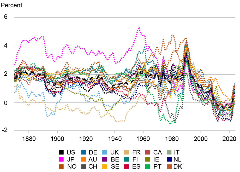
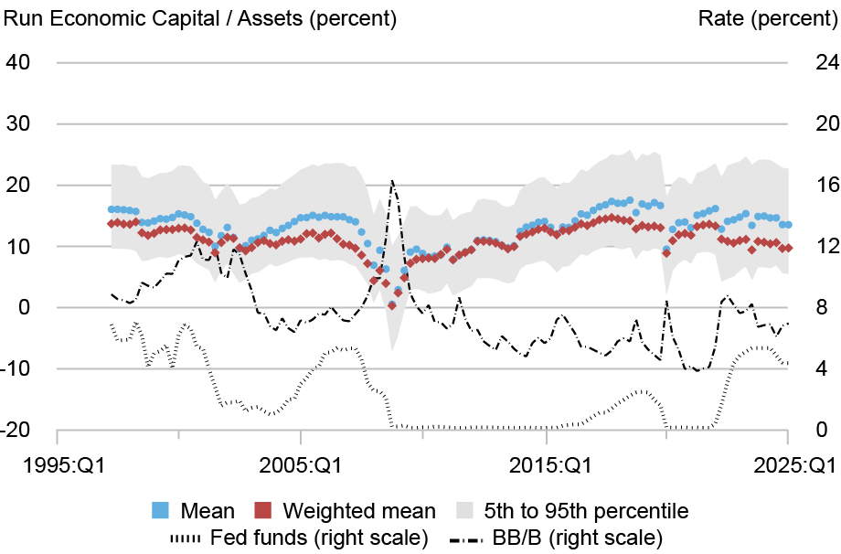
Liberty Street Economics2026-06-22T14:49:21Zhttps://libertystreeteconomics.newyorkfed.org/feed/atom/WordPress<![CDATA[The New York Fed DSGE Model Forecast—June 2026]]>https://libertystreeteconomics.newyorkfed.org/?p=433182026-06-22T14:49:21Z2026-06-22T13:00:00ZMarch 2026. To summarize, inflation forecasts are higher in 2026 than predicted in March. Projections for the short-run real natural rate of interest (r*) increased slightly relative to March.]]>
Marco Del Negro, Keshav Dogra, Elena Elbarmi, Donggyu Lee, and Michael Pham
This post presents an update of the economic forecasts generated by the Federal Reserve Bank of New York’s dynamic stochastic general equilibrium (DSGE) model. We describe very briefly our forecast and its change since March 2026. To summarize, inflation forecasts are higher in 2026 than predicted in March. Projections for the short-run real natural rate of interest (r*) increased slightly relative to March.
Note: The DSGE model forecast is not an official New York Fed forecast, but only an input to the Research staff’s overall forecasting process. For more information about the model and variables discussed here, see our DSGE model Q & A.
The New York Fed DSGE model forecasts use data released through 2026:Q1, augmented for 2026:Q2 with median forecasts for real GDP growth and core PCE inflation from the May release of the Philadelphia Fed Survey of Professional Forecasters (SPF), as well as the yields on 10-year Treasury securities and Baa corporate bonds based on 2026:Q2 averages up to May 27. Starting in 2021:Q4, the expected federal funds rate (FFR) between one and six quarters into the future is restricted to equal the corresponding median point forecast from the latest available Survey of Market Expectations (SME) in the corresponding quarter. For the current projection, this is the April SME.
The SPF expects core inflation in 2026:Q2 to be more than 1 percent higher in annualized terms than the DSGE model expected in March. In light of this forecast miss (if the SPF turns out to be correct), the model revised its inflation forecasts upward in 2026, from 2.4 to 3.1 percent. The DSGE attributes the forecast error to mark-up shocks, which may capture the effects of both tariff and energy shocks. The model views the impact of these shocks as vanishing by the end of the year and hence the inflation forecasts are largely unchanged throughout the rest of the forecast horizon.
On the output front, the DSGE is more upbeat than it was in March, although its projections remain somewhat pessimistic. The model does see the positive growth effect of the AI-related boom in investment—positive MEI (marginal efficiency of investment) shocks push output up, especially in 2026—but also believes that the adverse markup shocks will push down growth in the future.
The model’s predictions for the short-run real natural rate of interest (r*) increased by 0.1 percentage point relative to March (2.0, 1.7, and 1.3 percent for 2026, 2027, and 2028, versus 1.9, 1.6, and 1.3 percent), partly reflecting higher total factor productivity (TFP).
Forecast Comparison
Forecast Period
2026
2027
2028
2029
Date of Forecast
Jun26
Mar26
Jun26
Mar26
Jun26
Mar26
Jun26
Mar26
GDP growth (Q4/Q4)
1.2 (-2.2, 4.5)
1.0 (-3.4, 5.6)
0.2 (-5.0, 5.2)
0.2 (-5.1, 5.4)
0.7 (-4.8, 6.0)
0.8 (-4.7, 6.3)
1.5 (-4.1, 6.9)
1.3 (-4.4, 6.9)
Core PCE inflation (Q4/Q4)
3.1 (2.5, 3.7)
2.5 (1.6, 3.3)
1.8 (0.7, 3.0)
2.0 (0.8, 3.2)
1.6 (0.4, 2.9)
1.9 (0.6, 3.2)
1.7 (0.4, 3.0)
2.0 (0.6, 3.3)
Real natural rate of interest (Q4)
2.0 (0.7, 3.3)
1.9 (0.6, 3.3)
1.7 (0.2, 3.1)
1.6 (0.0, 3.1)
1.3 (-0.3, 2.9)
1.2 (-0.4, 2.8)
1.1 (-0.5, 2.8)
1.0 (-0.6, 2.7)
Source: Authors’ calculations. Notes: This table lists the forecasts of output growth, core PCE inflation, and the real natural rate of interest from the June 2026 and March 2026 forecasts. The numbers outside parentheses are the mean forecasts, and the numbers in parentheses are the 68 percent bands.
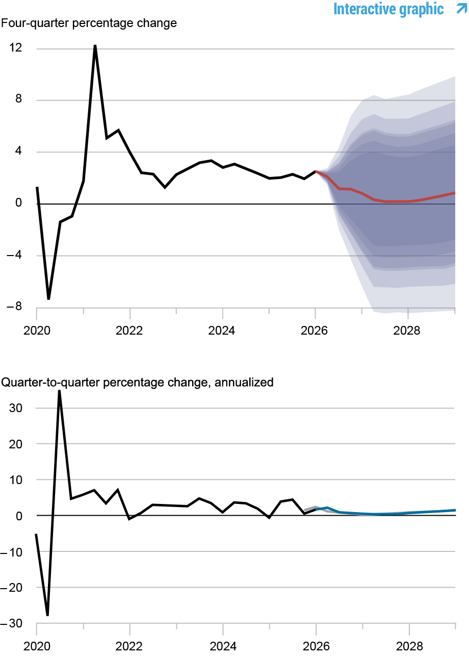
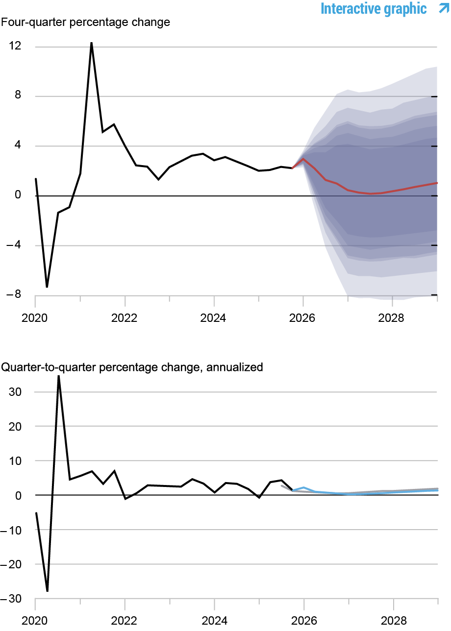
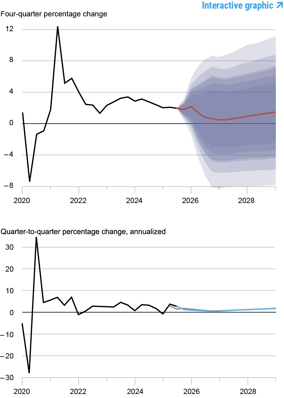
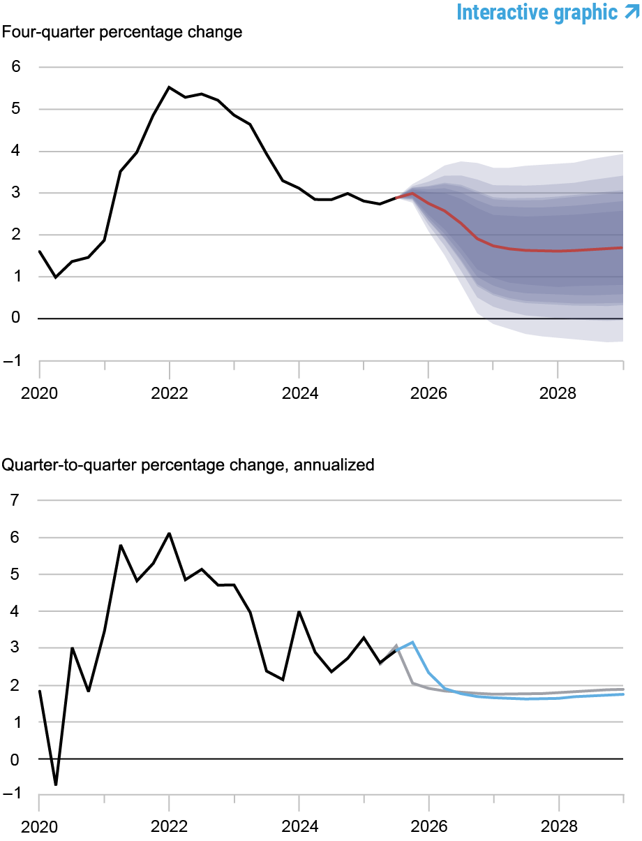
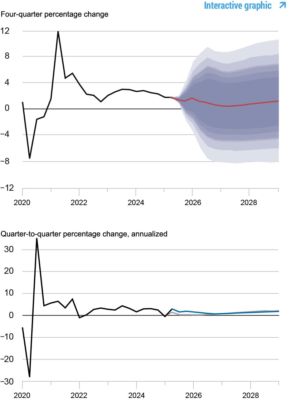
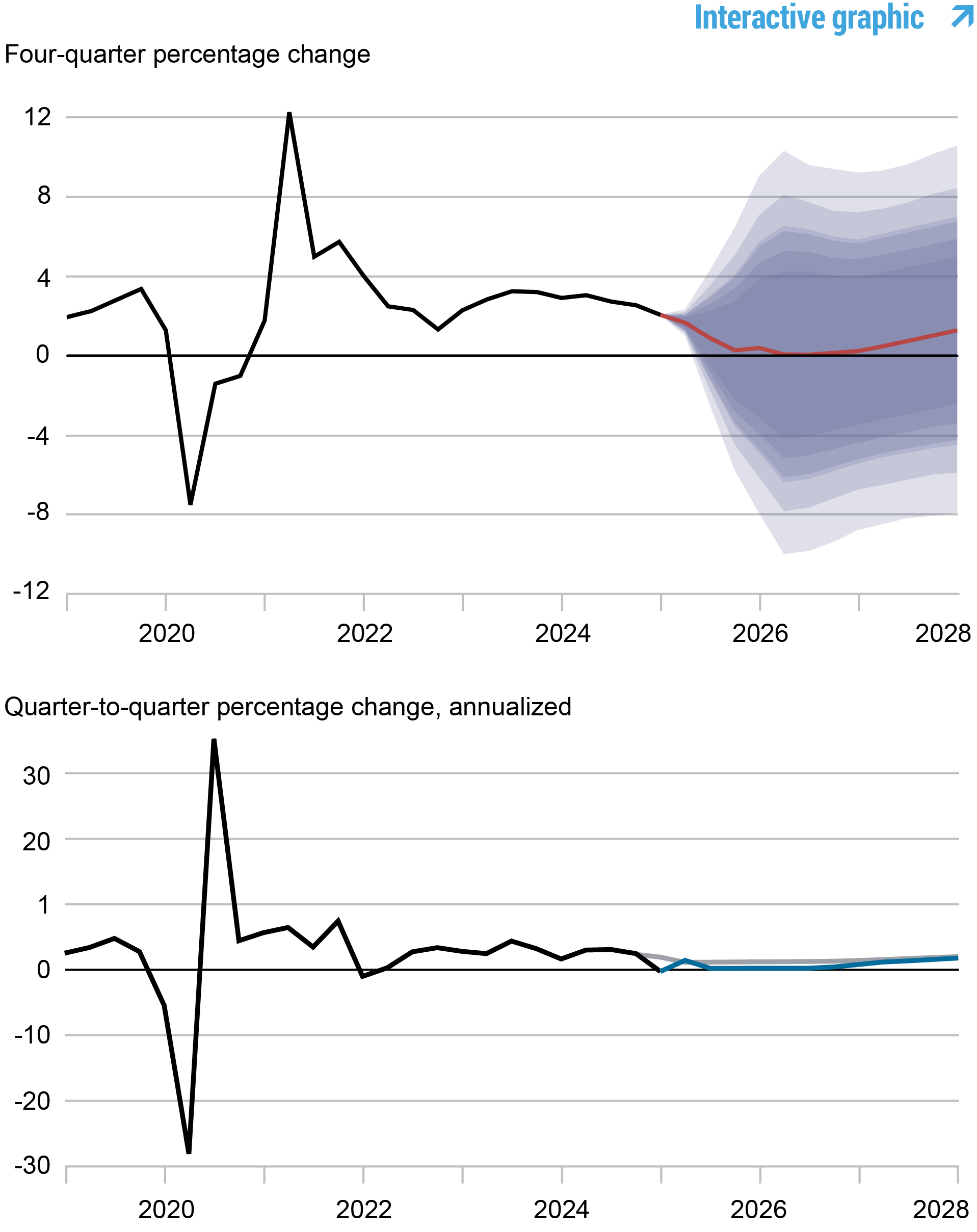
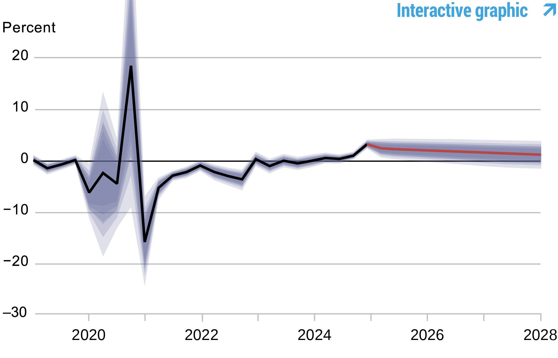
Forecasts of Output Growth
Source: Authors’ calculations. Notes: These two panels depict output growth. In the top panel, the black line indicates actual data and the red line shows the model forecasts. The shaded areas mark the uncertainty associated with our forecasts at 50, 60, 70, 80, and 90 percent probability intervals. In the bottom panel, the blue line shows the current forecast (quarter-to-quarter, annualized), and the gray line shows the March 2026 forecast.
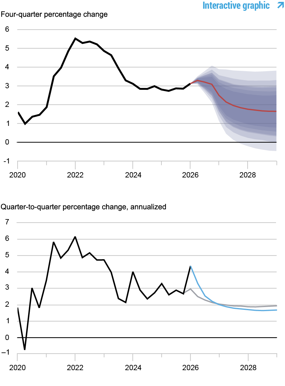
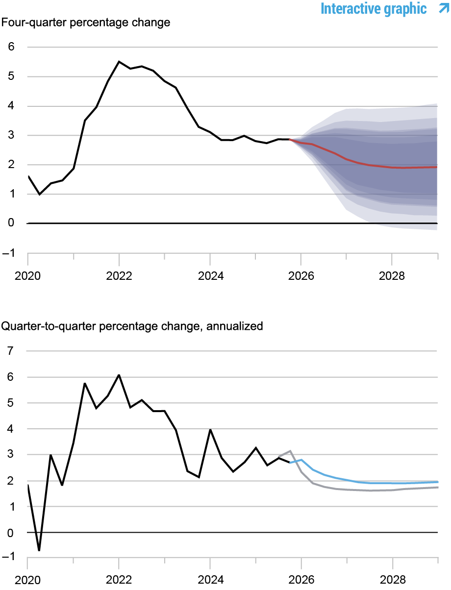
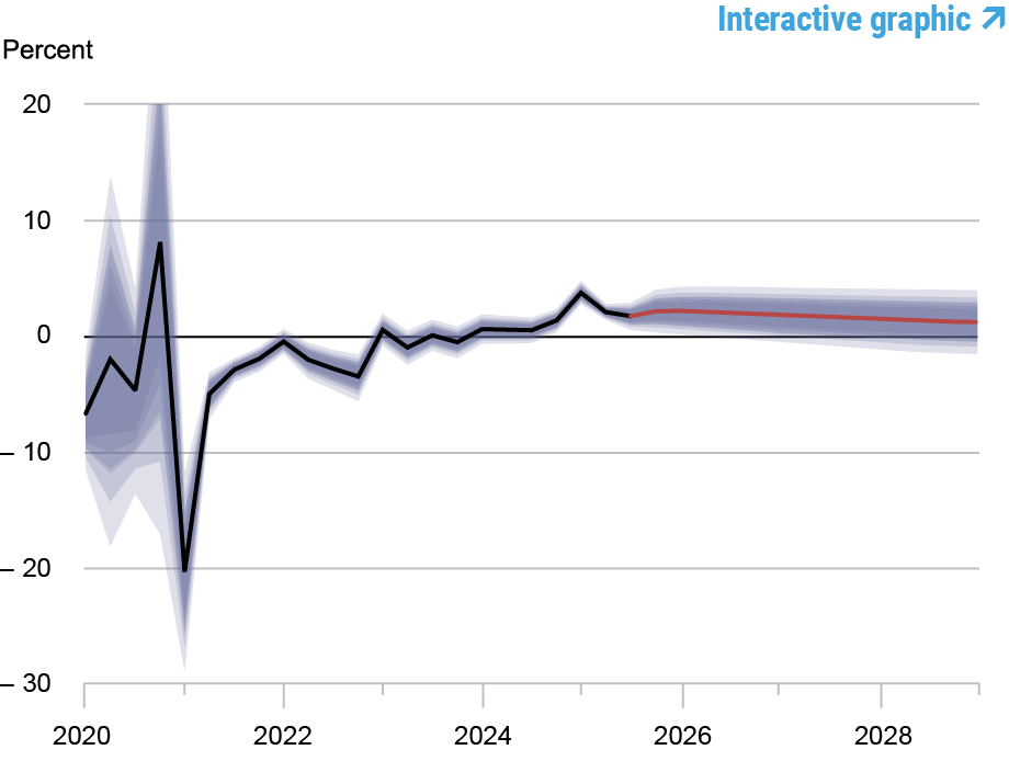
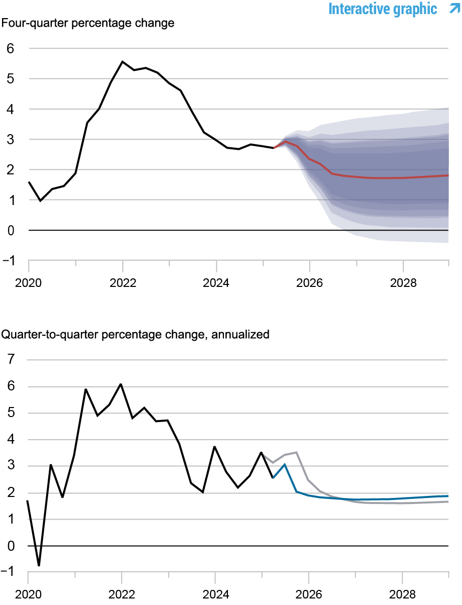
Forecasts of Inflation
Source: Authors’ calculations. Notes: These two panels depict core personal consumption expenditures (PCE) inflation. In the top panel, the black line indicates actual data and the red line shows the model forecasts. The shaded areas mark the uncertainty associated with our forecasts at 50, 60, 70, 80, and 90 percent probability intervals. In the bottom panel, the blue line shows the current forecast (quarter-to-quarter, annualized), and the gray line shows the March 2026 forecast.
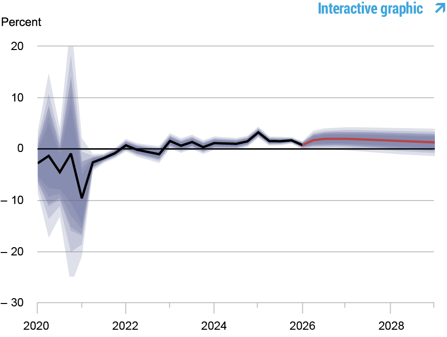
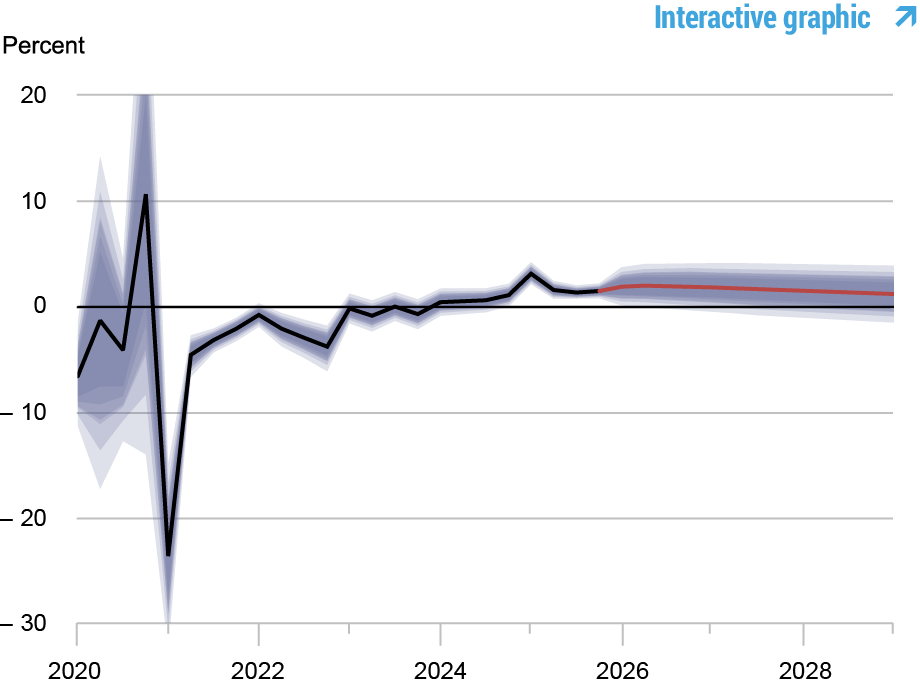
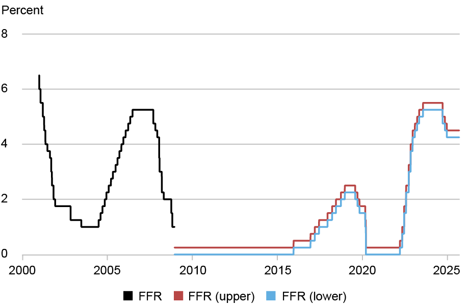
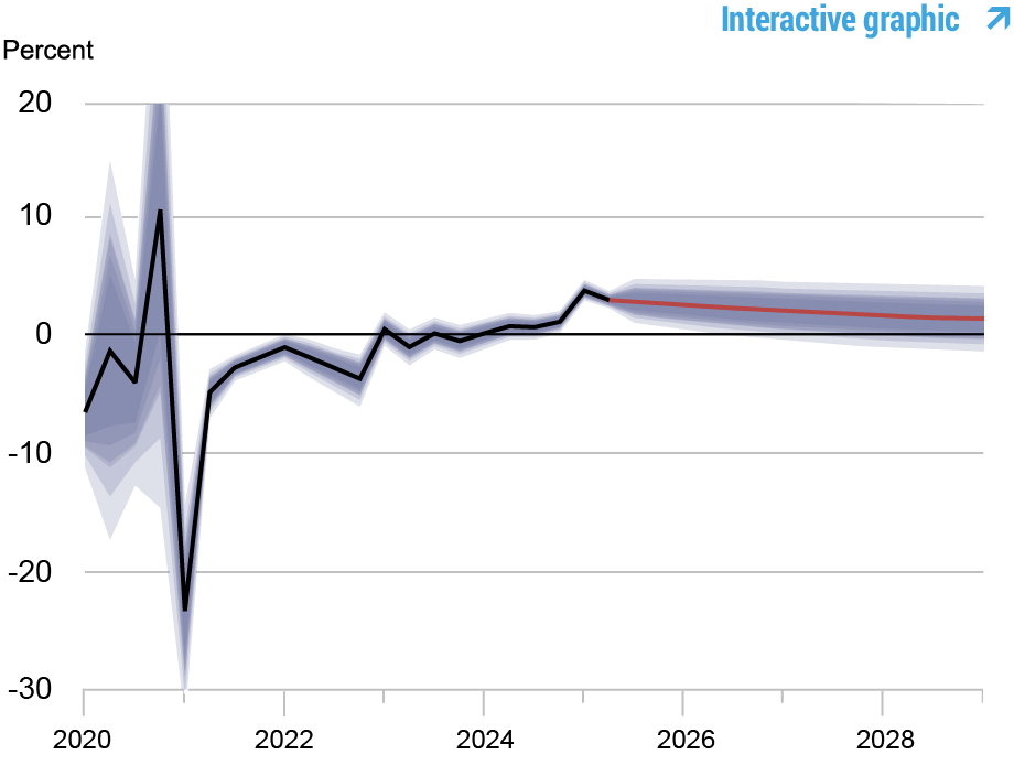
Real Natural Rate of Interest
Source: Authors’ calculations. Notes: The black line shows the model’s mean estimate of the real natural rate of interest; the red line shows the model forecast of the real natural rate. The shaded area marks the uncertainty associated with the forecasts at 50, 60, 70, 80, and 90 percent probability intervals.
Marco Del Negro is an economic research advisor in the Federal Reserve Bank of New York’s Research and Statistics Group.
Keshav Dogra is an economic research advisor in the Federal Reserve Bank of New York’s Research and Statistics Group.
Elena Elbarmi is a research analyst in the Federal Reserve Bank of New York’s Research and Statistics Group.
Donggyu Lee is a research economist in the Federal Reserve Bank of New York’s Research and Statistics Group.
Michael Pham is a research analyst in the Federal Reserve Bank of New York’s Research and Statistics Group.
How to cite this post:
Marco Del Negro, Keshav Dogra, Elena Elbarmi, Donggyu Lee, and Michael Pham, “The New York Fed DSGE Model Forecast—June 2026,” Federal Reserve Bank of New York Liberty Street Economics, June 22, 2026, https://libertystreeteconomics.newyorkfed.org/2026/06/the-new-york-fed-dsge-model-forecast-june-2026/
BibTeX: View |
@article{DelNegroDograElbarmiLeePham2026,
    author={Del Negro, Marco and Dogra, Keshav and Elbarmi, Elena and Lee, Donggyu and Pham, Michael},
    title={The New York Fed DSGE Model Forecast—June 2026},
    journal={Liberty Street Economics},
    note={Liberty Street Economics Blog},
    number={June 22},
    year={2026},
    url={https://libertystreeteconomics.newyorkfed.org/2026/06/the-new-york-fed-dsge-model-forecast-june-2026/}
}
Disclaimer The views expressed in this post are those of the author(s) and do not necessarily reflect the position of the Federal Reserve Bank of New York or the Federal Reserve System. Any errors or omissions are the responsibility of the author(s).
]]>0<![CDATA[The Unintended Effects of Interest Rate Caps: Credit Reallocation to Safer Borrowers]]>https://libertystreeteconomics.newyorkfed.org/?p=427232026-06-03T18:03:28Z2026-06-03T11:01:00ZStaff Report, we study how these interventions have played out in three states. In our first post about that study, we showed that rate caps lead riskier borrowers to face rationing in the credit market. One question that naturally arises is what lenders do with the credit they used to provide to high-risk borrowers before the caps were imposed. Lenders that lend exclusively to high-risk borrowers (at rates above the cap) may decide to stop lending to high-risk borrowers in that state. Others, however, may try to change their “credit box” by lending more to somewhat safer borrowers. In this post, we will try to understand how lenders reallocate credit after usury limits are implemented.]]>
Rajashri Chakrabarti, Gabriel Leonard, Donald P. Morgan, Thu Pham, and Lee Seltzer
Several states have recently capped consumer loan rates with the stated purpose of protecting borrowers. In a recent Staff Report, we study how these interventions have played out in three states. In our first post about that study, we showed that rate caps lead riskier borrowers to face rationing in the credit market. One question that naturally arises is what lenders do with the credit they used to provide to high-risk borrowers before the caps were imposed. Lenders that lend exclusively to high-risk borrowers (at rates above the cap) may decide to stop lending to high-risk borrowers in that state. Others, however, may try to change their “credit box” by lending more to somewhat safer borrowers. In this post, we will try to understand how lenders reallocate credit after usury limits are implemented.
Rationing versus Re-allocation
While credit rationing under usury limits is clearly predicted by textbook economic theory, reallocation is less obvious. After all, if lending more to safer borrowers is profitable with a rate cap, why not do so without a cap? Based on the simple model provided in the last post, rate caps on high-risk borrowers should not affect borrowers with higher risk scores that have access to traditional credit markets. However, lenders may not be able to lend to both high-risk and low-risk borrowers due to limited access to capital, and some will find it more profitable to concentrate on high-risk borrowers. When the usury limits are put in place, lenders who had previously chosen to focus on high-risk borrowers may reallocate their capital to safer borrowers.
Some existing theoretical work supports this view. For instance, an early analysis by Blitz and Lang (1965) shows that under certain conditions, lenders will reallocate credit to moderate-risk borrowers when facing a usury limit: “it is the less risky borrowers…who are most likely to benefit from usury limits.” Indeed, Adam Smith, of all people, favored usury limits so more credit would flow from “prodigals and projectors” toward more “sober” borrowers.
There is empirical evidence of credit reallocation as well. Hodenborn finds usury limits in the 19th century led banks to favor safer borrowers “to the detriment of small, subprime borrowers.” A study of usury limits in Peru found that banks made fewer small loans and more medium-sized ones, “favoring incumbent firms at the expense of new borrowers.” Our paper looks for evidence of credit reallocation in the context of a modern usury limit in the U.S.
Our Study
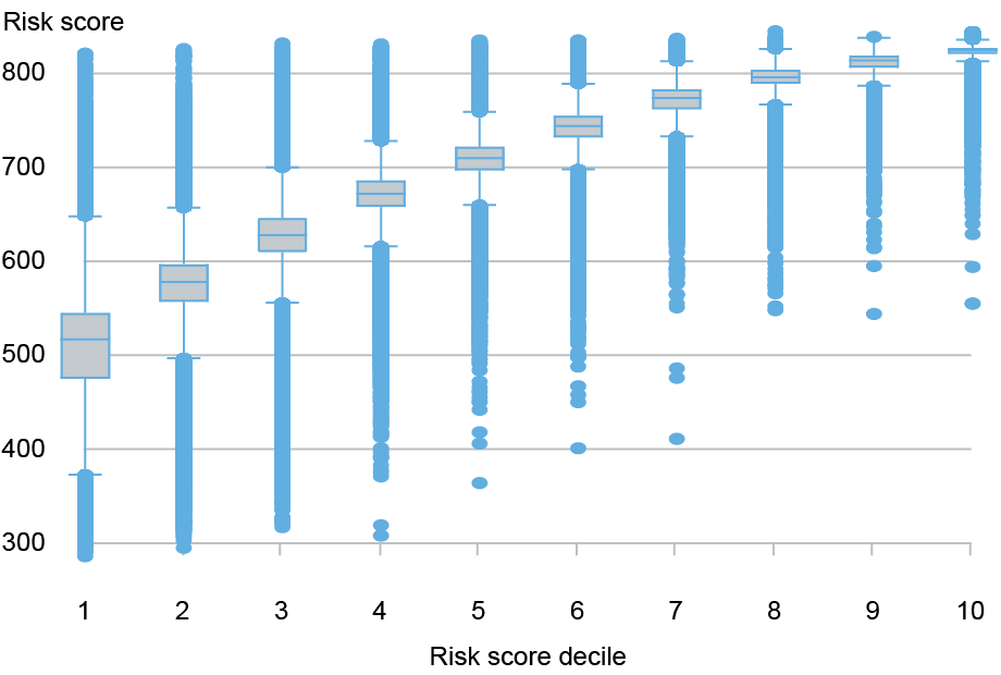
We examined how credit changed in three states that enacted 36 percent rate caps sometime between 2016 and 2022 (Illinois, South Dakota, and North Dakota). Our credit data are from the New York Fed Consumer Credit Panel/Equifax (CCP). The CCP tracks quarterly credit profiles for an anonymized random sample of 5 percent of households covered by the Equifax credit bureau. The sample comprises over 35 million borrowers. We measure borrower creditworthiness with the Equifax Risk Score 3.0; scores range between 350 and 800 and increase with creditworthiness.
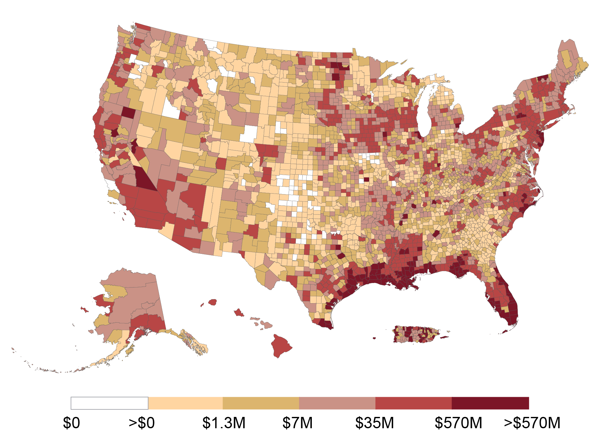
The chart below displays the distribution of risk scores for the three states that enacted a usury limit between 2016 and 2022. Specifically, the chart shows the breakdown of borrowers within each risk score decile, showing the detailed distribution of risk scores within each decile. The risk score deciles are defined based on risk scores in the year before the usury limit passed (see our Staff Report for details). The median risk score in the lowest decile is about 518.
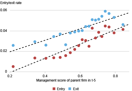
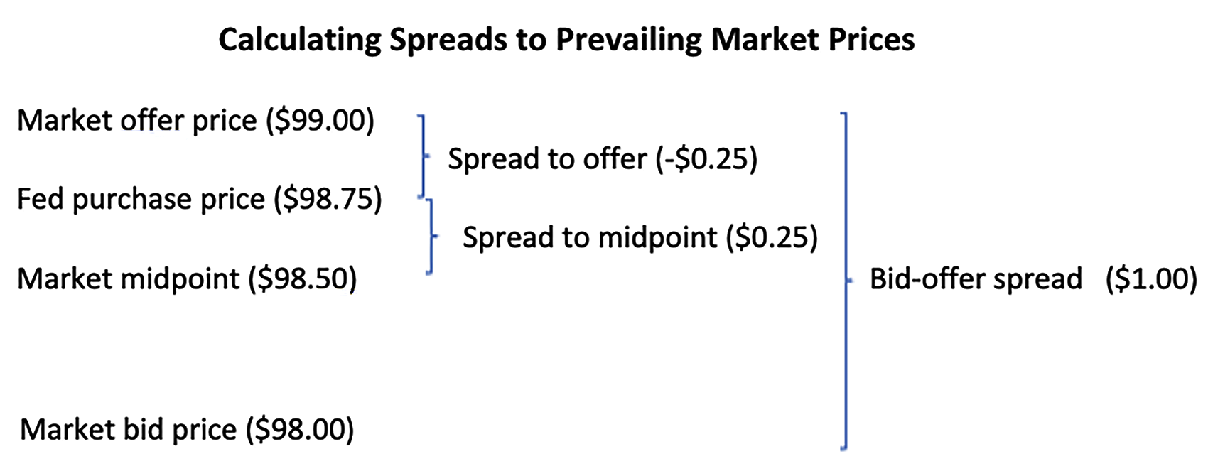
Risk Scores in the Lowest Decile Are About 150 Points Below Prime on Average
Sources: New York Fed Consumer Credit Panel/Equifax; authors’ calculations. Notes: This chart shows the distribution of risk scores by risk score decile for households in Illinois, North Dakota, and South Dakota; households with the lowest scores are in the first decile. Risk scores are as of the year before usury limits took effect. The center line in each box represents the median score in that decile. The top and bottom of each box represent the 25th and 75th percentiles of risk scores, respectively, in that decile. The interquartile range is the difference between the 75th and 25th quartiles.
In the absence of interest rate caps, high-cost lenders specialize in extending credit to higher-risk (low risk score) borrowers that are generally avoided by traditional, more risk-averse lenders such as banks and credit unions. In the presence of usury limits, these lenders may instead choose to lend more to slightly more creditworthy borrowers, for whom the usury limit does not bind. For instance, the median risk score in the third decile is around 620, which is the traditional cutoff for whether a borrower is subprime or prime. Lenders may extend newly available credit to prime borrowers after usury limits make lending to subprime borrowers unprofitable.
The chart below shows the increase in borrowing over time for the third risk score decile relative to all higher deciles. Similar increases in borrowing are observed in the fourth and fifth risk score deciles relative to all higher deciles. The results from these graphical analyses are consistent with lenders reallocating credit to relatively more creditworthy borrowers after the imposition of usury limits. Further consistent with this view, in the Staff Report we show that while borrowing declines substantially for borrowers in the lowest risk score decile, only a marginal decline is observed in the aggregate. This indicates that the increase in lending to borrowers in the third through fifth risk score deciles mostly offsets the decline in lending to borrowers in the second risk score decile.
Borrowers in the Middle of the Risk Score Distribution See Increased Lending after Rate Caps Relative to Control States
Sources: New York Fed Consumer Credit Panel/Equifax; authors’ calculations. Note: This chart shows how debt balances changed for borrowers in the third risk decile in Illinois, North Dakota, and South Dakota relative to their counterparts in control states.
Conclusion
In the previous post, we found that lenders reduce credit to the least creditworthy borrowers after usury limits are imposed. In this post, we show evidence that lenders simultaneously increase credit to marginally more creditworthy borrowers. Whether this reallocation was an intention of the proposer of the limits is unclear. In any case, our results imply that there may be tradeoffs involved in enacting usury limits, with some borrowers facing more adverse outcomes as others benefit.
Rajashri Chakrabarti is an economic research advisor in the Federal Reserve Bank of New York’s Research and Statistics Group.
Gabriel Leonard is a research analyst in the Federal Reserve Bank of New York’s Research and Statistics Group.
At the time this post was written, Donald P, Morgan was a financial research advisor in the Federal Reserve Bank of New York’s Research and Statistics Group. He is now retired.
Thu Pham is a research analyst in the Federal Reserve Bank of New York’s Research and Statistics Group.
Lee Seltzer is a financial research economist in the Federal Reserve Bank of New York’s Research and Statistics Group.
How to cite this post:
Rajashri Chakrabarti, Gabriel Leonard, Donald P. Morgan, Thu Pham, and Lee Seltzer, “The Unintended Effects of Interest Rate Caps: Credit Reallocation to Safer Borrowers,” Federal Reserve Bank of New York Liberty Street Economics, June 3, 2026, https://doi.org/10.59576/lse.20260603bBibTeX: View |
@article{ChakrabartiLeonardMorganPhamSeltzer2026,
    author={Chakrabarti, Rajashri and Leonard, Gabriel and Morgan, Donald P. and Pham, Thu and Seltzer, Lee},
    title={The Unintended Effects of Interest Rate Caps: Credit Reallocation to Safer Borrowers},
    journal={Liberty Street Economics},
    note={Liberty Street Economics Blog},
    number={June 3},
    year={2026},
    url={https://doi.org/10.59576/lse.20260603b}
}
Disclaimer The views expressed in this post are those of the author(s) and do not necessarily reflect the position of the Federal Reserve Bank of New York or the Federal Reserve System. Any errors or omissions are the responsibility of the author(s).
]]>0<![CDATA[The Unintended Effects of Interest Rate Caps: Credit Rationing for Risky Borrowers]]>https://libertystreeteconomics.newyorkfed.org/?p=427082026-06-03T18:02:54Z2026-06-03T11:00:00Zlight cane.” (Rockoff 2003) Centuries later, many U.S. states are imposing the same cap (without corporal penalties) on alternative credit providers, such as payday, installment, and auto-title lenders, with the goal of lowering credit costs and delinquency for the high-risk borrowers that rely on these funding sources. A concern, however, is that lenders will simply refuse to lend to these borrowers at lower interest rates. Our recent Staff Report studies how interest rate caps have played out in several states that recently adopted them. Using household-level data from a major credit bureau, we find that loan balances for the riskiest borrowers declined substantially relative to counterparts in states without caps. Despite taking on less debt, these borrowers did not experience an improvement in delinquencies.]]>
Rajashri Chakrabarti, Gabriel Leonard, Donald P. Morgan, Thu Pham, and Lee Seltzer
In imperial China, 3 percent was the maximum legal monthly loan rate; charging more was punishable by 40 to 100 blows with the “light cane.” (Rockoff 2003) Centuries later, many U.S. states are imposing the same cap (without corporal penalties) on alternative credit providers, such as payday, installment, and auto-title lenders, with the goal of lowering credit costs and delinquency for the high-risk borrowers that rely on these funding sources. A concern, however, is that lenders will simply refuse to lend to these borrowers at lower interest rates. Our recent Staff Report studies how interest rate caps have played out in several states that recently adopted them. Using household-level data from a major credit bureau, we find that loan balances for the riskiest borrowers declined substantially relative to counterparts in states without caps. Despite taking on less debt, these borrowers did not experience an improvement in delinquencies.
The Resurgence of Usury Limits
Usury limits have waned over the centuries in the U.S, but their recent resurgence on the consumer side was triggered by payday lenders’ entry into the small dollar loan market in the mid-1990s (Rockoff 2003). In 2007, rates on loans to military staff were capped at 36 percent—marking the first-ever national usury limit in the U.S. A bill currently before Congress, the Predatory Loan Elimination Act, would extend the 36 percent cap across the entire U.S.
Saunders (2021) traces the 36 percent standard back to credit reform in the early 20th century. Concerned that prevailing usury limits were too low, the Russell Sage Foundation promulgated a Uniform Small Loan Law recommending a higher cap of 3.5 percent per month. Thirty-four states raised caps to between 36 and 42 percent over the next few decades (Anderson et al. 2015).
Cheaper Credit…or Less Credit?
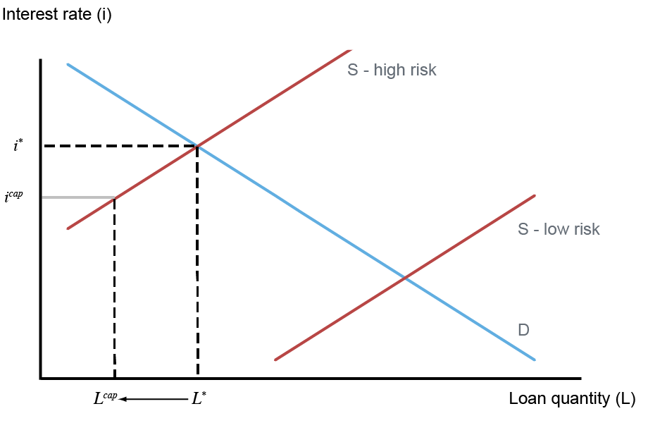
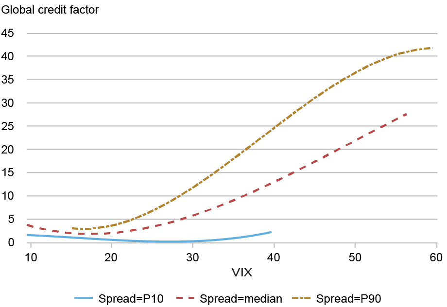
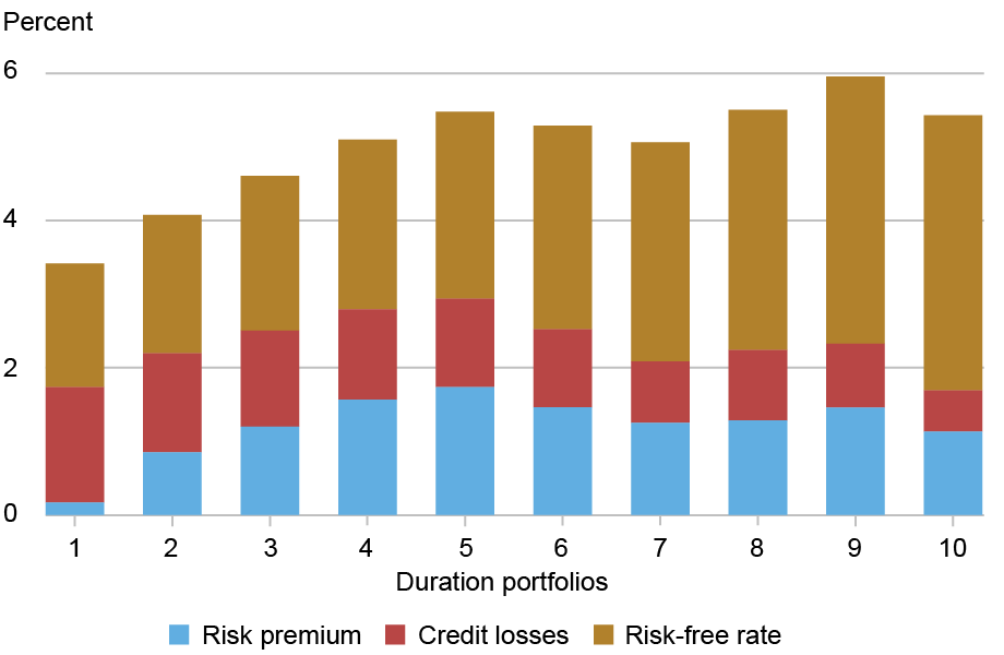
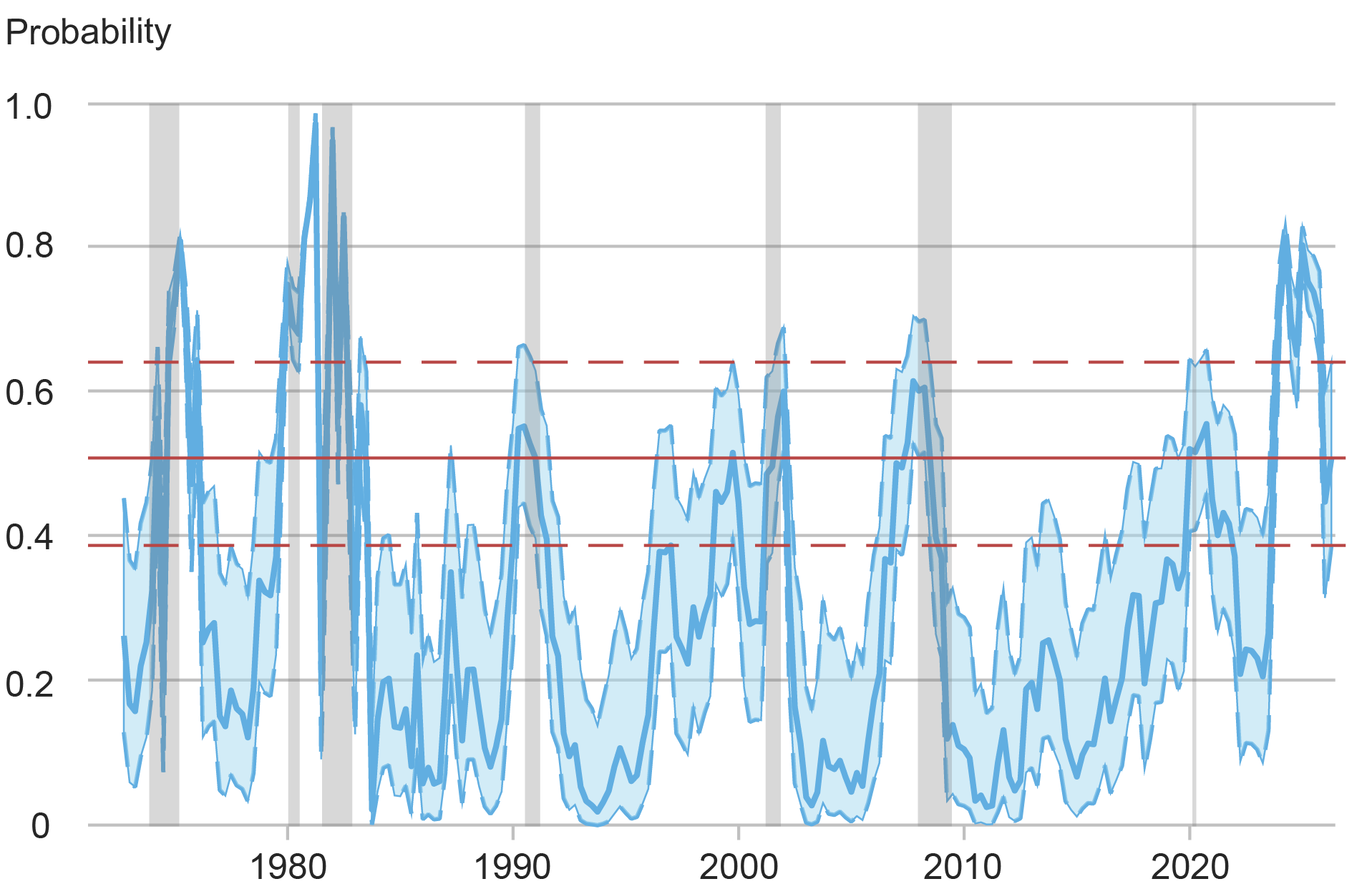
Opponents of rate caps predict that they will lower the supply of credit for riskier borrowers rather than drive down the cost of credit. The textbook credit model below illustrates this effect. In this model, lenders separately provide credit for high-risk borrowers (sH) and low-risk borrowers (sL). At market equilibrium, lenders charge high-risk borrowers i*, which is higher than what they would charge low-risk borrowers; lenders charge high-risk borrowers a higher interest rate to compensate for higher expected loan losses. However, a usury cap requires lenders to charge no higher than icap for interest, which is lower than the equilibrium rate i*. As a result, lenders contract the quantity of loans supplied, as shown. In fact, if profits from loans to high-risk borrowers don’t cover the fixed cost of providing them, lenders may entirely refuse to make any loans to high-risk borrowers, which is referred to as credit rationing. This is particularly likely as less creditworthy borrowers are also typically more likely to take out relatively small loans.
Note that icap is higher than the equilibrium interest rate for low-risk borrowers, and under standard model assumptions, lending to lower-risk borrowers does not change. However, under certain conditions, the rate cap could also have implications for low-risk borrowers, a situation we examine in the next post in this series.
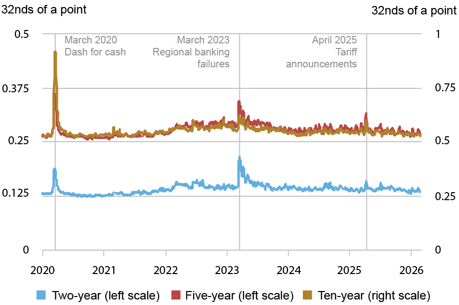
Rate Caps May Contract Credit to Riskier Borrowers
Source: Authors’ rendering. Notes: This chart shows a simple model of consumer lending and illustrates how a usury cap would affect the market. There are two types of borrowers—high-risk and low-risk—and supply of credit is separately determined for high- (sH) and low-risk borrowers (sL). At equilibrium, high-risk borrowers are able to borrow L* dollars of loans, at an interest rate of i*. Under the usury cap, lenders can only charge icap, and as a result reduce the quantity of loans supplied to Lcap.
Our Study
We examined how credit changed in three states that enacted 36 percent rate caps sometime between 2016 and 2022 (Illinois, South Dakota, and North Dakota). Only alternative lenders’ loan rates are capped; banks and credit unions are exempt. Our data are from the New York Fed Consumer Credit Panel/Equifax (CCP), which tracks quarterly debt and delinquency for an anonymized, random subset of households covered by the Equifax credit bureau. Comprising 5 percent of Equifax-monitored households, the sample includes over 35 million borrowers.
Since rate caps are more likely to bind for riskier borrowers, we sorted households into ten equal-sized groups (deciles) based on their credit scores (Equifax Risk Score 3.0), with the lowest-scoring borrowers in the first decile. The average loan delinquency rate for this group was over six times higher than the average across the other deciles.
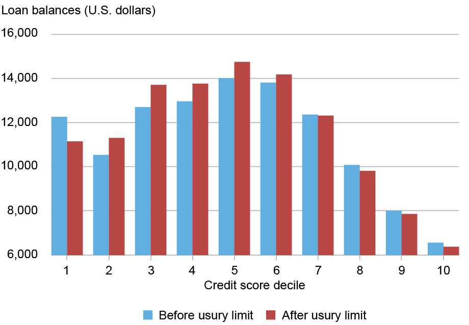
To get a sense of the data, the chart below shows average loan balances for borrowers in the states with usury limits (excluding mortgages and student loans) for each risk decile. Predictably, households with the lowest and highest scores owe less. More relevant is that balances declined by about 8 percent for the first (riskiest) decile after rates were capped; balances for safer borrowers were little changed overall.
Loan Balances for the Riskiest Borrowers Declined After Rate Caps
Sources: New York Fed Consumer Credit Panel/Equifax; authors’ calculations. Notes: This chart shows how average loan balances for households in Illinois, North Dakota, and South Dakota changed after loan rates were capped in those states. Households are stratified by credit score decile, with decile 1 containing those with the lowest scores. Mortgage and student loans are excluded.
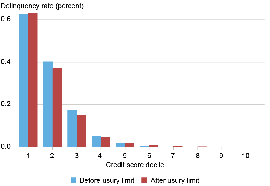
Lower debt balances might be salutary if they reflect that riskier borrowers are avoiding “debt traps.” Yet rate caps did not lead to fewer delinquencies for those borrowers, as the chart below shows. Their share of delinquent accounts (90+ days overdue) was essentially unchanged, while delinquency for somewhat lower-risk households tended to fall.
Loan Delinquency Among the Riskiest Borrowers Did Not Decline After Usury Limits
Sources: New York Fed Consumer Credit Panel/Equifax; authors’ calculations. Notes: This chart shows how delinquency rates for households in Illinois, North Dakota, and South Dakota changed after loan rates were capped in those states. Households are stratified by credit score decile, with decile 1 containing those with the lowest scores. Delinquency is measured by the share of accounts that are 90+ days overdue. Delinquencies on all types of debt are included in the chart.
Cross-State Comparison
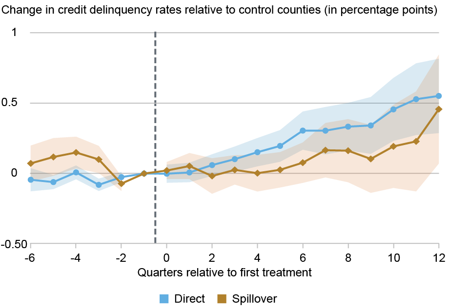
The charts above only show changes in credit for borrowers in the states that capped rates. In our main analysis, we compare borrowers in those states to counterparts in a set of control states that did not cap rates over the study period. Using regression analysis, we estimate how credit for high-risk borrowers in the treated states changed relative to counterparts after rate caps took effect, where high-risk borrowers are defined as those who were in the lowest decile of risk scores before the usury limit. In particular, we estimate an event-study regression to examine how credit market outcomes changed for high-risk borrowers in states with usury limits, relative to control with no usury limit. Importantly, these regressions allow us to control for changes over time happening in each state that are unrelated to the usury limit, and for differences between borrowers unrelated to the usury limit.
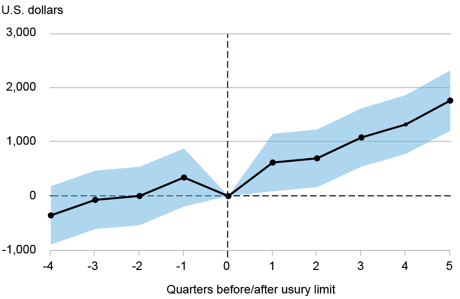
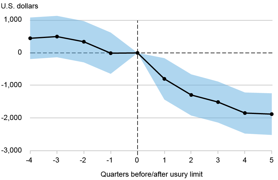
The estimates for loan balances are plotted below, along with confidence intervals. Relative to control state levels, the average loan balances of the riskiest borrowers in rate-cap states were not significantly different before those caps took effect, which indicates that the control groups used in this study offer a reasonable point of comparison. However, they declined significantly afterward. The effect is substantial. Specifically, as of five quarters after rates are capped, debt balances of the riskiest borrowers in those states fall by around $2,000, relative to the balances of the riskiest borrowers in control-states.
Balances for the Riskiest Borrowers Decline After Rate Caps Relative to Control States
Sources: New York Fed Consumer Credit Panel/Equifax; authors’ calculations. Note: This chart shows how the debt balances of high-risk borrowers in Illinois, North Dakota, and South Dakota changed after the implementation of usury limits in those states, relative to the debt balances of their counterparts in control states.
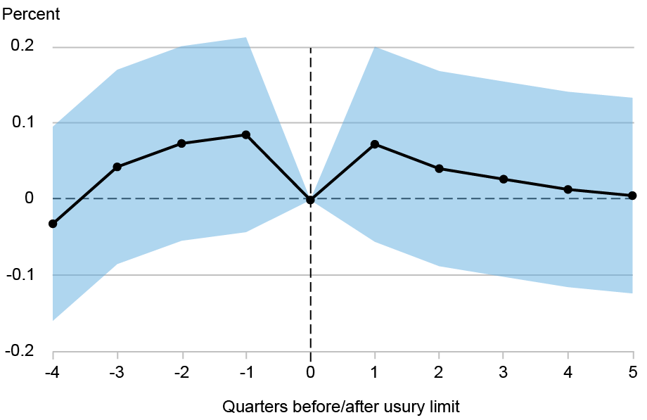
The next chart shows how relative delinquencies evolved. These estimates are less precise (as reflected in the wide confidence bands), but they certainly do not point to a decline in delinquencies. Overall, it seems that there was no change in delinquencies for the riskiest borrowers in states with usury limits relative to those in control states after the usury limits were passed.
Delinquency Rates of Riskiest Borrowers Hold Steady Relative to Control States
Sources: New York Fed Consumer Credit Panel/Equifax; authors’ calculations. Note: This chart shows how the probability of having a delinquent loan changed for high-risk borrowers in Illinois, North Dakota, and South Dakota after the implementation of usury limits in those states, relative to delinquency rates for their counterparts in control states.
Summing Up
Usury limits, an ancient type of financial regulation, are resurgent in the U.S. Advocates expect rate caps to lower borrowing costs for high-risk borrowers while opponents predict that the result will be less credit for these borrowers. Our findings square better with the latter view, calling into question the benefits of these laws for high-risk borrowers. In our next post, we examine whether lenders reallocate credit to somewhat lower-risk borrowers in response to rate caps.
Rajashri Chakrabarti is an economic research advisor in the Federal Reserve Bank of New York’s Research and Statistics Group.
Gabriel Leonard is a research analyst in the Federal Reserve Bank of New York’s Research and Statistics Group.
At the time this post was written, Donald P, Morgan was a financial research advisor in the Federal Reserve Bank of New York’s Research and Statistics Group. He is now retired.
Thu Pham is a research analyst in the Federal Reserve Bank of New York’s Research and Statistics Group.
Lee Seltzer is a financial research economist in the Federal Reserve Bank of New York’s Research and Statistics Group.
How to cite this post:
Rajashri Chakrabarti, Gabriel Leonard, Donald P. Morgan, Thu Pham, and Lee Seltzer, “The Unintended Effects of Interest Rate Caps: Credit Rationing for Risky Borrowers,” Federal Reserve Bank of New York Liberty Street Economics, June 3, 2026, https://doi.org/10.59576/lse.20260603aBibTeX: View |
@article{ChakrabartiLeonardMorganPhamSeltzer2026,
    author={Chakrabarti, Rajashri and Leonard, Gabriel and Morgan, Donald P. and Pham, Thu and Seltzer, Lee},
    title={The Unintended Effects of Interest Rate Caps: Credit Rationing for Risky Borrowers},
    journal={Liberty Street Economics},
    note={Liberty Street Economics Blog},
    number={June 3},
    year={2026},
    url={https://doi.org/10.59576/lse.20260603a}
}
Disclaimer The views expressed in this post are those of the author(s) and do not necessarily reflect the position of the Federal Reserve Bank of New York or the Federal Reserve System. Any errors or omissions are the responsibility of the author(s).
]]>0<![CDATA[Struggling Regional Small Businesses Deeply Pessimistic About 2026 Prospects]]>https://libertystreeteconomics.newyorkfed.org/?p=429442026-06-02T18:24:41Z2026-06-02T11:00:00Zsuite of indicators describing the performance of small businesses in the Second District (defined, for the purpose of this study, as New York, New Jersey, and Connecticut) and nationally with data from the 2025 edition of the Small Business Credit Survey (SBCS). In this post, we find that regional small businesses reported severe declines in employment and revenue growth in 2025 and became more pessimistic about growth in 2026. In contrast, small firms in the rest of the nation enjoyed stable revenues and employment in 2025 and, while they also had lower expectations of future growth, the decline was smaller in magnitude. Given the importance of small businesses in employment generation, analyzing such data helps to inform the design of effective monetary policy and to understand trends in the regional economy.]]>
Will Aarons and Asani Sarkar
We recently updated the suite of indicators describing the performance of small businesses in the Second District (defined, for the purpose of this study, as New York, New Jersey, and Connecticut) and nationally with data from the 2025 edition of the Small Business Credit Survey (SBCS). In this post, we find that regional small businesses reported severe declines in employment and revenue growth in 2025 and became more pessimistic about growth in 2026. In contrast, small firms in the rest of the nation enjoyed stable revenues and employment in 2025 and, while they also had lower expectations of future growth, the decline was smaller in magnitude. Given the importance of small businesses in employment generation, analyzing such data helps to inform the design of effective monetary policy and to understand trends in the regional economy.
What Is New and Relevant About Small Business Indicators?
The New York Fed small business indicators leverage data from the Small Business Credit Survey (SBCS), an annual survey of business owners with fewer than 500 employees by the twelve Federal Reserve Banks. We focus on employer firms—that is, firms with at least one employee other than the owner. In addition to reviewing performance indicators for small businesses nationally (also provided in the SBCS 2026 report), we show how these indicators vary by firm size and compare indicators for small businesses in the Second District with their national counterparts.
Profitability, Revenues, and Costs
Revenue performance in 2025 was worse for regional firms as compared to national firms. Relative to 2024, revenues in 2025 were similar for national firms but worsened by more than 8 percentage points for regional firms. Moreover, lower revenues in 2025 were driven by the smallest firms (with fewer than ten employees) nationally but by firms of all sizes regionally.
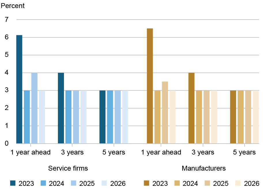
Revenue expectations for 2026 were notably pessimistic (see chart below). Revenue expectations for all size groups declined by 6 percentage points year-over-year for national firms, and an astounding 20 to 30 percentage points for regional firms. These numbers are the worst recorded in the survey since 2020 both at the national and regional levels.
Expected Change in Revenues for 2026 Declined Sharply for Regional Small Businesses
Percent
Sources: Federal Reserve Banks, 2019-2025 Small Business Credit Surveys. Notes: The chart plots the diffusion index (percentage expecting an increase minus percentage expecting a decrease) of responses to the question: “How does your business expect its revenue to change over the next 12 months?” The total number of respondents by year was: 2019, 4,967; 2020, 9,616; 2021, 10,692; 2022, 7,674; 2023, 5,945; 2024, 7,456; 2025, 6,389.
Profitability numbers in the survey are more backward looking, as they are a snapshot of conditions in December 2024. National firms reported profits 13 percentage points more often than losses while regional firms did so 8 percentage points more often. Thus, in contrast to revenues, profitability increased for firms of all sizes, perhaps reflecting better conditions for small businesses in 2024 than 2025. Despite the improvements, profitability remains far below the pre-pandemic differential of 46 percentage points for national firms and 41 percentage points for regional firms in December 2019.
As in the prior year’s survey, fewer firms in the national sample reported higher input and wage costs as a financial challenge in recent years.
Employment
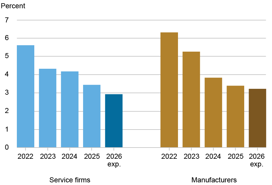
Like their poorer revenue conditions, the employment performance of regional firms was also worse than that of national firms in 2025. Year-over-year employment growth held steady for all national firms except for the larger ones (with ten or more employees), which have exhibited weakening employment recovery after 2022. In contrast, employment growth fell for regional firms of all sizes in 2025, decreasing by 9 percentage points overall.
Mirroring pessimistic revenue expectations, a lower share of firms of all sizes expected higher employment growth in 2026 relative to recent years. However, the magnitude of declining expectations was markedly higher for regional as compared to national firms. Thus, the net share of firms expecting to generate employment in 2026, relative to 2025, declined by 16 percentage points for regional firms but less than 4 percentage points for national firms (see chart below). Indeed, for the first time in the survey, large regional firms expected negative employment growth. These results are part of an ongoing pattern whereby firms in the region have struggled to generate employment since the pandemic.
Expected Change in Employment for 2026 Declined Sharply for Regional Small Businesses
Percent
Sources: Federal Reserve Banks, 2019-2025 Small Business Credit Surveys. Notes: The chart plots the diffusion index (percentage expecting an increase minus percentage expecting a decrease) of responses to the question: “How does your business expect its employment to change over the next 12 months?” The total number of respondents by year was: 2019, 4,967; 2020, 9,616; 2021, 10,692; 2022, 7,674; 2023, 5,945; 2024, 7,456; 2025, 6,389.
Indebtedness
Debt (defined as the mid-point of the range reported by respondents) in 2025 was about $67,000 per employee for national firms, similar to 2024, and $81,000 per employee for regional firms, a small increase from 2024. Similar shares of firms received less than the full amount of credit that they applied for and reported that they did not apply for credit because they did not need funds as in 2024, suggesting that credit supply was typically not a major constraint in 2025.
Technology and Supply Chain
In the region, more firms of all sizes reported difficulties with utilizing technology while the share of firms reporting supply chain issues continued to decline both nationally and regionally.
Summing Up
Using annual survey data, we report on national and Second District trends in small business performance from 2019 to 2025. We find that Second District firms continued to struggle to generate revenues and employment and were deeply pessimistic of their prospects in 2026. In no other major U.S. state were small business expectations for 2026 so downbeat (other than revenue expectations in Massachusetts). While national firms also lowered their expectations of employment and revenue growth in 2026, the decline was smaller in magnitude than that of regional firms.
Will Aarons is a research analyst in the Federal Reserve Bank of New York’s Research and Statistics Group.
Asani Sarkar is a financial research advisor in the Federal Reserve Bank of New York’s Research and Statistics Group.
How to cite this post:
Will Aarons and Asani Sarkar, “Struggling Regional Small Businesses Deeply Pessimistic About 2026 Prospects,” Federal Reserve Bank of New York Liberty Street Economics, June 2, 2026, https://doi.org/10.59576/lse.20260602BibTeX: View |
@article{AaronsSarkar2026,
    author={Aarons, Will and Sarkar, Asani},
    title={Struggling Regional Small Businesses Deeply Pessimistic About 2026 Prospects},
    journal={Liberty Street Economics},
    note={Liberty Street Economics Blog},
    number={June 2},
    year={2026},
    url={https://doi.org/10.59576/lse.20260602}
}
Disclaimer The views expressed in this post are those of the author(s) and do not necessarily reflect the position of the Federal Reserve Bank of New York or the Federal Reserve System. Any errors or omissions are the responsibility of the author(s).
]]>0<![CDATA[Remote Work Leaves Younger Workers Sidelined]]>https://libertystreeteconomics.newyorkfed.org/?p=428622026-06-02T15:48:31Z2026-06-01T14:30:00Z
Natalia Emanuel, Emma Harrington, and Amanda Pallais
Youth unemployment has risen dramatically since the pandemic—as has the prevalence of remote work. Our analysis suggests that these trends are related, with remote work making it more difficult for managers to train and mentor new employees. Accordingly, companies may be reluctant to hire less-experienced workers in distributed work arrangements. We estimate that remote work can explain 64 percent of the recent increase in unemployment among young college graduates. Further, the timing of this surge suggests that remote work—not generative AI—explains the bulk of the rise in youth unemployment.
(Not) Working from Home
Unemployment among young college graduates has risen significantly since the pandemic, a topic much discussed by scholars and the popular press. While unemployment among those under 29 was 3.1 percent on average in 2017-19, it rose by 20 percent to 3.7 percent in 2022-25.
The unemployment dynamics for young graduates particularly stand out given that the unemployment rate for more experienced college graduates actually dipped from 1.9 percent in 2017-19 to 1.8 percent in 2022-25. The chart below shows how unemployment evolved for college-educated workers of varying ages.
Unemployment among Young College Graduates Surges Above That of Experienced Workers
Percentage points
Source: Authors’ calculations from CPS data. Notes: Gray shading denotes the early pandemic period. Series show change in unemployment rates by age group relative to 2019 levels.
The high unemployment rates of young college graduates are particularly concerning because early-career experiences can have lasting consequences. For example, entering the labor market in a recession can scar a person’s career. Research finds that individuals who began looking for jobs in slacker labor markets tend to have lower earnings and slower career progression relative to comparable peers who began their job search in better market conditions.
Remote Job Prospects
We document that one factor contributing to youth unemployment is the four-fold rise in remote work since the pandemic. Employers may not want to hire fresh graduates onto distributed teams because it is more difficult to teach them the requisite skills from afar.
We compare unemployment rates among people working in “remotable” jobs—such as software engineering—to those in “non-remotable” jobs—such as mechanical engineering. To categorize an occupation as remotable or non-remotable, we use a commonly used index of how easily the tasks required for a given job can be done remotely. We then compare the unemployment rates of younger individuals in remotable and non-remotable jobs to those of more experienced workers.
The aggregate increase in the unemployment rate for young college graduates can be traced to remotable occupations, where young people’s unemployment rate increased by almost 1 percentage point between 2017-19 and 2022-24. By contrast, the unemployment rate of older workers in remotable sectors marginally declined over that period. As a result, the age gap in unemployment between younger and older workers significantly increased in remotable occupations. This relative increase in young people’s unemployment coincided with the pandemic and has remained elevated since then, as have rates of remote work.
By contrast, in non-remotable jobs, young graduates’ relative unemployment rate ticked up in 2020 but returned to baseline soon afterward. This divergence is illustrated in the chart below.
Unemployment Age Gap for College Graduates Driven by Job Remotability
Source: Authors’ calculations from CPS data. Notes: Gray shading denotes the early pandemic period. Series show the age gap (18-28 versus 29+) in unemployment rates by occupation category relative to 2019 levels.
Since so many young college graduates are in remotable occupations, our back-of-the-envelope calculation indicates that remote work can explain 64 percent of the increase in unemployment for all young college graduates between 2017−19 and 2022−24.
The AI Factor
Many analysts have attributed the recent labor market challenges of young college graduates to generative AI, among other factors. But the uptick in youth unemployment rates predates the rapid diffusion of AI. Moreover, even when we hold occupations’ exposure to AI constant, we find that the differences between younger and older workers persist in both remotable and non-remotable jobs.
Of course, generative AI and other factors may play a more primary role in determining the employment patterns of younger workers going forward. Nonetheless, the evidence to date suggests that the rise of remote work has meaningfully contributed to the recent challenges facing young college graduates.
Patterns at the Firm Level
Working with proprietary data from a Fortune 500 company, we are able to shed light on the underlying reasons for these labor market changes. We show that when people work next to their colleagues, they receive more feedback on their output and more mentorship. When they are separated even by a short distance, that feedback tapers off dramatically. The loss in feedback is more pronounced for younger workers, who miss out on constructive comments that spur their development.
The negative effects of operating remotely from one’s colleagues show up in work quality as well. When all employees functioned in isolation, those who had previously worked side-by-side with teammates, and consequently received more mentorship from their colleagues, produced better-quality output than those who had spent more time working at a distance from their teammates. Further, when we analyze the firm’s return-to-office (RTO) mandates, we find that workers on co-located teams, who experienced a more meaningful change in their proximity to colleagues, likewise showed greater improvements in their work quality.
The firm’s hiring patterns suggest that it understood the pitfalls of distance for worker development. When its offices were closed due to the pandemic, the firm hired fewer inexperienced workers and more experienced workers, who might need less mentorship to do their jobs well. Once its offices reopened, the company shifted back to hiring younger workers. However, there is a twist: for positions on distributed teams, the firm consistently hired more experienced workers, even after reopening. This divergence suggests that the firm’s hiring decisions were influenced by the complications of remote work rather than other macroeconomic trends. Overall, the firm’s hiring patterns suggest that it is willing to teach junior workers when proximity is feasible but shies away from employing inexperienced workers if distance creates barriers to training and development.
RTO and Job Opportunities
Consistent with our findings, many firms’ RTO mandates have cited the importance of colocation for mentorship and learning. The firm we study had a stricter RTO policy than other tech firms, which enabled it to mentor in-person and therefore hire young workers post-pandemic.
These dynamics suggest that remote work has weakened incentives to hire young workers by impeding on-the-job training. Ironically, when jobs are scarce, it becomes even harder for young workers to secure the training they need.
Natalia Emanuel is a research economist in the Federal Reserve Bank of New York’s Research and Statistics Group.
Emma Harrington is an assistant professor of economics at the University of Virginia.
Amanda Pallais is a professor of economics at Harvard University.
How to cite this post:
Natalia Emanuel, Emma Harrington, and Amanda Pallais, “Remote Work Leaves Younger Workers Sidelined,” Federal Reserve Bank of New York Liberty Street Economics, June 1, 2026, https://doi.org/10.59576/lse.20260601BibTeX: View |
@article{EmanuelHarringtonPallais2026,
    author={Emanuel, Natalia and Harrington, Emma and Pallais, Amanda},
    title={Remote Work Leaves Younger Workers Sidelined},
    journal={Liberty Street Economics},
    note={Liberty Street Economics Blog},
    number={June 1},
    year={2026},
    url={https://doi.org/10.59576/lse.20260601}
}
Disclaimer The views expressed in this post are those of the author(s) and do not necessarily reflect the position of the Federal Reserve Bank of New York or the Federal Reserve System. Any errors or omissions are the responsibility of the author(s).
]]>3<![CDATA[The Regional Side of the Story: K‑Shaped Pattern in Region, Wider Gap in Gas Spending]]>https://libertystreeteconomics.newyorkfed.org/?p=428572026-05-28T13:09:19Z2026-05-28T14:00:00Zwe documented earlier. We find similar K‑shaped patterns in both retail and gas spending in our region as we do in the nation, with the K‑shaped pattern in gasoline in response to the recent gas price shock being more pronounced in the region.]]>
Rajashri Chakrabarti, Thu Pham, Beck Pierce, and Maxim L. Pinkovskiy
In this post, we use the inaugural release of our regional consumer spending indicators to ask whether these patterns hold for a significant portion of the Second District, and how regional spending patterns by income have been similar to or different from the national patterns we documented earlier. We find similar K‑shaped patterns in both retail and gas spending in our region as we do in the nation, with the K‑shaped pattern in gasoline in response to the recent gas price shock being more pronounced in the region.
Introducing the Regional Consumer Spending EHIs
This post accompanies the release of the Economic Heterogeneity Indicators (EHIs) through April 2026, which for the first time feature regional consumer spending indicators based on microdata from the market research firm Numerator. These indicators demonstrate our commitment to understanding how economic trends affect different segments of society not just in the nation, but in this region.
To create the regional consumer spending EHIs, we narrow the panel to participants in Numerator’s sample who live in zip codes within a significant portion of the Second District (New York State, northern New Jersey, and Fairfield County, CT. The Numerator panel does not cover Puerto Rico or the Virgin Islands). We verify the demographics of the panel participants to closely match the demographics of the Second District in the American Community Survey (ACS). We also verify that aggregate growth rates of retail spending excluding autos and excluding nonstore spending using the Numerator data for New York State and New Jersey closely match the corresponding growth rates in the Advance Monthly Retail Trade Survey (MARTS ). We are therefore confident that our Second District consumer spending indicators can be trusted to give us accurate trends for different demographic groups within the Second District.
To obtain real Second District spending growth rates, we deflate retail and gas spending by goods-specific demographic prices based on city-level goods-specific CPIs, and goods-specific spending shares for high, middle, and low-income households.
Similar K-Shaped Retail Spending Pattern in the Second District and in the Nation
National nominal cumulative growth (indexed to 2023)
Percent change
Regional nominal cumulative growth (indexed to 2023)
Percent change
National real cumulative growth (January 2023 = 100%)
Percent change
Regional real cumulative growth (January 2023 = 100%)
Percent change
Sources: Numerator Consumer Spending Data, Consumer Price Index from the Bureau of Labor Statistics via Haver Analytics, and authors’ calculations. Regional charts use three-month moving averages. Notes: Real spending uses corresponding demographic retail prices. Income denotes annual household income.
The above chart shows nominal and real retail spending ex auto from the EHIs at the national level and for the Second District for high (earning $125,000+ a year), middle ($40,000-$125,000) and low-income (less than $40,000) households, in gold, red, and blue respectively. The high-income households represent approximately one third of all households. Retail spending ex auto in the nation includes nonstore (online) purchases while retail spending ex auto in the Second District excludes nonstore purchases to match the analogous concept in MARTS. Both nominal and real retail spending growth in the Second District show a K-shaped pattern that is very similar to the national trend. In every month, cumulative spending growth since 2023 for high-income households exceeds that for middle-income households, while in almost every month, cumulative spending growth for middle-income households exceeds cumulative spending growth for low-income households.
By April 2026, real retail ex auto ex nonstore spending has grown by 4.7 percent relative to January 2023 for the high-income households in the region, but only by 1.8 percent for the middle-income households and has actually shrunk by 0.6 percent for the low-income households. The difference in real spending growth rates between high and low-income groups in the region is almost the same as it is in the nation.
Nominal Gas Spending Decreased in the Nation but Increased in the Region until February 2026
National nominal cumulative growth (indexed to 2023)
Percent change
Regional nominal cumulative growth (indexed to 2023)
Percent change
National real cumulative growth (January 2023 = 100%)
Percent change
Regional real cumulative growth (January 2023 = 100%)
Percent change
Sources: Numerator Consumer Spending Data, Consumer Price Index from the Bureau of Labor Statistics via Haver Analytics, and authors’ calculations. Regional charts use three-month moving averages. Notes: Real spending uses corresponding demographic gas prices. Income denotes annual household income.
We now turn to trends in gasoline consumption in the nation and in the region. The above chart shows nominal and real gas station spending in both the nation and the region for high-, middle-, and low-income households. As we are looking at spending in physical gas stations, the exclusion of nonstore spending in the regional data is no longer an issue and the two sets of series are directly comparable. We see that up until February 2026, the gas spending trends in the nation and in the region have been different—nominal gas spending in the region had approximately held steady and real spending, on average, increased by about 10 percent of the January 2023 level, while nominal gas spending in the nation, on average, had actually declined by 10 percent, and real spending had increased by 5 percent.
K-Shaped Dynamics of Real Gas Consumption Even More Pronounced in Region
National real cumulative growth (February 2026 = 100%)
Percent change
Regional real cumulative growth (February 2026 = 100%)
Percent change
Sources: Numerator Consumer Spending Data, Consumer Price Index from the Bureau of Labor Statistics via Haver Analytics, and authors’ calculations. Notes: Real spending uses corresponding demographic gas prices. Income denotes annual household income.
We now zoom into the last three months of the data to look at real gas consumption trends by income group following the March 2026 gas price shock. To do this, in the chart above, we present the last three months of the data, indexing each series to 100 in February 2026 to better see how real gas consumption by income group differentially evolved relative to the month before gas prices rose. We see that a similar K-shaped pattern opened up in the region and in the nation. High-income households in the region barely decreased real gas spending (0.5 percent between February and April 2026), while low-income households decreased their gas spending by 9.4 percent, with middle-income households in between. In contrast, low-income households in the nation decreased real gas spending by only 3.2 percent, while high-income households marginally increased real gas spending (by 0.4 percent).
It is notable that the K-shaped pattern is actually even more extreme in the region than it is in the nation, a nearly 9 percentage point difference in real spending changes between high- and low-income households in the region, when such differences in the nation are closer to 4 percentage points. The extreme K-shaped dynamics in the Second District may partially be explained by the greater presence of public transportation, enabling commuters to more easily substitute between driving and taking public transit to work.
Looking Ahead
Having taken a regional view of consumer spending, we conclude that the Second District shares many of the same economic trends that have been affecting consumption in the nation, but with its own unique twist. While K-shaped dynamics have been very similar in the nation and the region over the past three years, the region’s gasoline consumption trends following the March 2026 gas price shock have seen an even greater bifurcation between high- and low-income households, with larger reductions in real gas consumption by lower-income groups. This may be a result of the greater development of public transportation in the Second District. We will continue to monitor how consumer spending evolves for different segments of our society both in the region and in the nation in subsequent releases of the EHIs.
Rajashri Chakrabarti is an economic research advisor in the Federal Reserve Bank of New York’s Research and Statistics Group.
Thu Pham is a research analyst in the Federal Reserve Bank of New York’s Research and Statistics Group.
Beck Pierce is a research analyst in the Federal Reserve Bank of New York’s Research and Statistics Group.
Maxim L. Pinkovskiy is an economic research advisor in the Federal Reserve Bank of New York’s Research and Statistics Group.
How to cite this post:
Rajashri Chakrabarti, Thu Pham, Beck Pierce, and Maxim L. Pinkovskiy, "The Regional Side of the Story: K‑Shaped Pattern in Region, Wider Gap in Gas Spending," Federal Reserve Bank of New York Liberty Street Economics, May 28, 2026, https://doi.org/10.59576/lse.20260528BibTeX: View |
@article{ChakrabartiPhamPiercePinkovskiy2026,
    author={Chakrabarti, Rajashri and Pham, Thu and Pierce, Beck and Pinkovskiy, Maxim L.},
    title={The Regional Side of the Story: K‑Shaped Pattern in Region, Wider Gap in Gas Spending},
    journal={Liberty Street Economics},
    note={Liberty Street Economics Blog},
    number={May 28},
    year={2026},
    url={https://doi.org/10.59576/lse.20260528}
}
Disclaimer The views expressed in this post are those of the author(s) and do not necessarily reflect the position of the Federal Reserve Bank of New York or the Federal Reserve System. Any errors or omissions are the responsibility of the author(s).
]]>0<![CDATA[Food Insecurity and Consumer Pessimism]]>https://libertystreeteconomics.newyorkfed.org/?p=427152026-05-27T15:39:47Z2026-05-27T14:30:00Zour 2020 analysis of disproportionate financial hardship experienced during the early pandemic and to investigate recent changes in food insecurity and broader economic strains. We then examine how food insecurity relates to the increase in consumer pessimism. We find a remarkable increase in food insecurity, particularly among lower-educated and lower-income households and households with young children. We document a contemporaneous increase in pessimism among the same groups, along with a sharp decline in job-finding expectations. ]]>
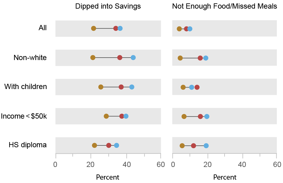
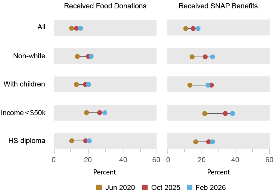
Gizem Kosar, Ishva Mehta, and Wilbert van der Klaauw
Current discussions regarding a bifurcated U.S. economy highlight the increasing economic divide between lower- and higher-income Americans in spending and earnings growth and wealth accumulation. While many households are doing fine and economic activity overall has been expanding at a solid pace, large segments of the population are facing high levels of economic insecurity and financial strain, and consumer sentiment on the whole has dropped to low levels. In this post, we use newly collected data from the Survey of Consumer Expectations (SCE) to update our 2020 analysis of disproportionate financial hardship experienced during the early pandemic and to investigate recent changes in food insecurity and broader economic strains. We then examine how food insecurity relates to the increase in consumer pessimism. We find a remarkable increase in food insecurity, particularly among lower-educated and lower-income households and households with young children. We document a contemporaneous increase in pessimism among the same groups, along with a sharp decline in job-finding expectations.
Declining Consumer Sentiment in a K-Shaped Economy
Despite solid economic fundamentals (low unemployment, historically high household net wealth, and resilient consumer spending), consumers overall have been pessimistic about their own financial circumstances and outlook. Current levels of consumer sentiment, capturing how optimistic consumers are about their personal finances and the overall economy, have fallen near or below the low levels seen during the Great Recession and pandemic.
These macroeconomic indicators mask significant heterogeneity across households, supporting the notion of a “K-shaped” economy, in which consumption growth in recent years has been driven largely by higher-income and college-educated households while lower-income households have seen fewer gains. The top of the K-shape reflects high and growing levels of net wealth, fueled by rising stock prices, near-peak home equity levels, and reductions in mortgage payments following the 2020-21 refinance boom. The bottom of the K-shape represents a significant share of the middle- and lower-income population experiencing elevated levels of economic uncertainty and financial hardship. Such financial stress is reflected in concerns about affordability due to the high cost of living, persistent inflation, and high interest rates, and in high delinquency rates for credit cards and auto and student loans.
Lower- and middle-income households generally have experienced higher effective inflation rates, with a greater share of their spending allocated to goods that have seen prices soar since the pandemic, such as housing, groceries, and utilities, causing them to cut back on groceries. The greater financial strain due to the high cost of living, combined with the expiration of pandemic-era aid (such as expanded SNAP benefits), have led to renewed concerns about food insecurity among those at the bottom of the K-shape.
New Evidence from the Survey of Consumer Expectations
To provide further recent evidence on financial and food insecurity, we draw on the SCE. The SCE is a monthly internet-based survey that has been conducted by the Federal Reserve Bank of New York since June 2013. It is based on a twelve-month rotating panel of roughly 1,200 nationally representative U.S. household heads. As part of its May and June 2020, October 2025, and February 2026 surveys, the SCE included a set of targeted questions to study household financial stress and food insufficiency, as well as households’ expectations about their financial situation a year from now.
Specifically, we asked household heads whether they (or someone in their household) experienced any of the following four events over the prior three months: dipped into savings or emergency accounts to cover expenses; had trouble finding enough food to eat or had kids who missed meals; received food donations from family, friends, or food banks; or received aid through SNAP. Note that eligibility for SNAP benefits is based on household income and size, and is an imperfect proxy for food insecurity. In our analysis, we pool data from the two 2020 surveys and refer to it as the June 2020 survey.
As shown in the charts below, since May/June 2020, and also between October 2025 and February 2026, there have been meaningful increases in the shares of households reporting that they’d experienced the four situations described above. The increases were mostly broad-based across race, age, income, and education groups, but were generally larger for non-whites, lower-income and lower-educated households, and households with children, as detailed in the chart.
Broad-Based Increases in Food Insecurity and Broader Economic Strains Since 2020
Source: Survey of Consumer Expectations, May and June 2020, October 2025, and February 2026 surveys. Notes: The chart shows the shares of respondents in the four surveys (May 2020 and June 2020 results are grouped as June 2020) who reported that over the previous three months they (or someone in their household) had dipped into savings and emergency accounts to cover expenses; had trouble finding enough food to eat or had kids who missed meals; received food donations from family, friends, or food banks; or received aid through SNAP.
While related, our measures differ from the U.S. Department of Agriculture’s (USDA) official survey measure of food insecurity, which aims to capture “the limited or uncertain availability of nutritionally adequate and safe foods, or limited or uncertain ability to acquire acceptable foods in socially acceptable ways.” The USDA’s measure of food insecurity for 2024, its most recent survey, stood at 13.7 percent of households (18.4 percent among households with children). The rate is the highest since reaching a post-2001 low of 10.2 percent in 2021 but remains below its post-2001 high of 14.9 percent attained in 2011. Food insecurity is associated with poor health outcomes as well as lower educational attainment, worker productivity, and lifetime earnings.
Increased Food Insecurity Is Also Associated with Declining Consumer Sentiment
In addition to the increasing trend in these shares, we find that among those reporting incidents of food insufficiency (not enough food, received food donations) and SNAP receipt, there is a lower, and more rapidly declining, net share of respondents expecting to be better versus worse off financially a year from now (as shown in the table below). This means that an increase in the incidence of food insecurity is associated with a deterioration in consumer sentiment. However, the increase in food insecurity clearly is not the only factor that matters—even among those not reporting these incidents of food insecurity we find a sizable decline between 2020 and October 2025 in the net share of respondents expecting to be better versus worse off a year from now, though this decline was followed by partial reversal from October 2025 to February 2026.
Food Insecure Households Report Greater Pessimism on the Economy, Labor Market, and Debt
Household expectations
May/June 2020
October 2025
February 2026
Net share better/worse off
8.0
-4.2
–0.6
– Not enough food/skipped meals
-10.2
-22.1
-32.5
– Received food donations
0.8
-14.8
-22.7
– Received SNAP benefits
0.4
-0.2
-11.7
Average job-finding probability, if were to lose job
48.0
46.8
44.0
– Not enough food/skipped meals
48.8
37.2
41.4
– Received food donations
48.6
37.0
39.4
– Received SNAP benefits
50.1
36.7
33.7
Average debt delinquency probability
11.2
13.1
11.6
– Not enough food/skipped meals
41.4
41.8
32.3
– Received food donations
23.4
30.1
23.4
– Received SNAP benefits
19.6
31.1
20.3
Source: Survey of Consumer Expectations, May and June 2020, October 2025, and February 2026 surveys. Notes: The top panel of the table shows the net share of respondents expecting their household to be financially better versus worse off twelve months from now, overall and for those reporting food need and assistance, in the May/June 2020, October 2025, and February 2026 surveys. The middle panel shows, for each subgroup and survey wave, the average reported percentage chance of finding a job within the following three months, if one’s job were to be lost today. The bottom panel shows the average reported probability of, over the next three months, not being able to make a minimum debt payment. See the SCE questionnaire for the exact question wordings.
Interestingly, we also find considerably larger reductions in the expected job-finding rate (measured as the probability of finding a job in the next three months if one’s current job is lost) for those reporting food needs or SNAP receipt. In contrast, we see little movement over the period in debt delinquency expectations, which measures the probability of missing a minimum debt payment within the next three months—although it’s worth noting that respondents who experience food insecurity have significantly higher debt delinquency expectations. Overall, these trends point to a deterioration in sentiment or an increased pessimism among those who report food insecurity and SNAP receipt.
While not necessarily causal, the observed positive association between food insecurity and overall consumer pessimism, together with the increase in the incidence of food insecurity, especially among households at the bottom of the K-shape, point to a potential explanation for the unusually low recent levels of consumer sentiment at a time when the hard economic data paint a more positive picture.
Gizem Kosar is an economic research advisor in the Federal Reserve Bank of New York’s Research and Statistics Group.
Ishva Mehta is a research analyst in the Federal Reserve Bank of New York’s Research and Statistics Group.
Wilbert van der Klaauw is an economic research advisor in the Federal Reserve Bank of New York’s Research and Statistics Group.
How to cite this post:
Gizem Kosar, Ishva Mehta, and Wilbert van der Klaauw, “Food Insecurity and Consumer Pessimism,” Federal Reserve Bank of New York Liberty Street Economics, May 27, 2026, https://doi.org/10.59576/lse.20260527BibTeX: View |
@article{KosarMehtavanderKlaauw2026,
    author={Kosar, Gizem and Mehta, Ishva and van der Klaauw, Wilbert},
    title={Food Insecurity and Consumer Pessimism},
    journal={Liberty Street Economics},
    note={Liberty Street Economics Blog},
    number={May 27},
    year={2026},
    url={https://doi.org/10.59576/lse.20260527}
}
Disclaimer The views expressed in this post are those of the author(s) and do not necessarily reflect the position of the Federal Reserve Bank of New York or the Federal Reserve System. Any errors or omissions are the responsibility of the author(s).
]]>0<![CDATA[Assessing the Current State of Wage Inflation]]>https://libertystreeteconomics.newyorkfed.org/?p=427042026-05-22T17:45:40Z2026-05-26T11:00:00Z]]>
Martin Almuzara, Richard Audoly, and Davide Melcangi
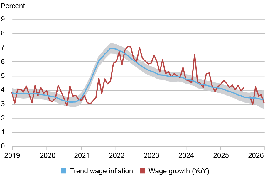
Economists often look at nominal wage growth to gauge labor market imbalances, price pressures, and households’ spending ability. But to use wage growth for these purposes, it is important to look through short-run fluctuations and retrieve underlying wage inflation. In this post, we use our own measure of wage growth persistence—called Trend Wage Inflation (TWIn in short)—to summarize what we learned from wage growth behavior in the past years and draw conclusions for what may lie ahead. Since peaking in late 2021, TWIn has been on a steady decline, reaching levels near those of the 2017-19 period. In the past few months, however, this decline seems to have lost momentum. Our analysis shows that most of the decline in TWIn between 2022 and 2025 was common across industries. Recently, however, a few sectors have shown a decoupling of wage growth dynamics.
Measuring Trend Wage Inflation
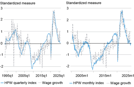
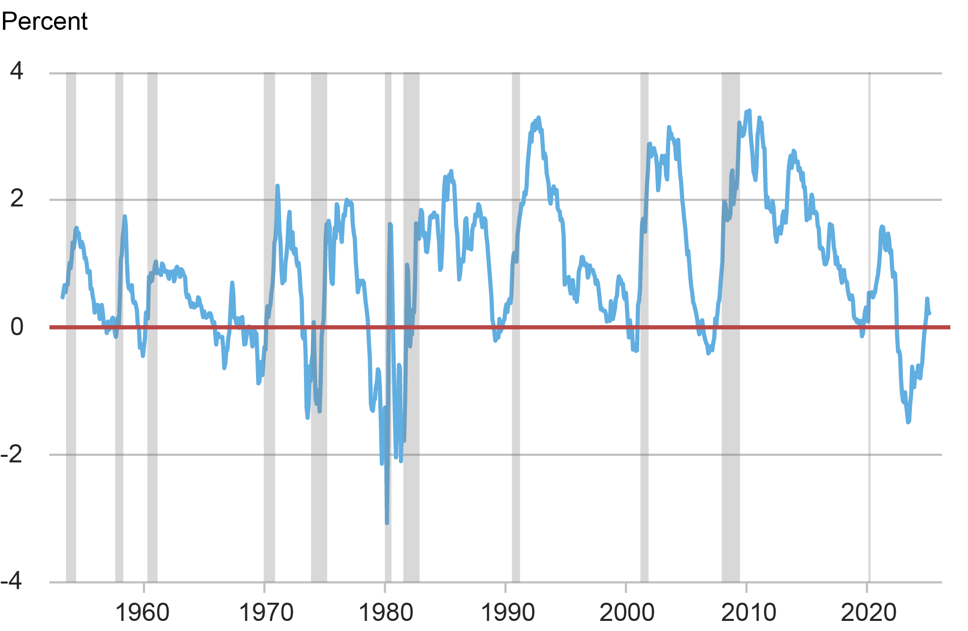
To recover the persistent (“trend”) component of wage inflation, we rely on a framework that combines worker-level data with time series filtering techniques. We have described the methodology in previousposts and in this paper. We estimate a model that decomposes wage growth in each industry into a persistent component and a noise term capturing transitory variation and measurement error. Each component is further split into a common and an industry-specific term. The chart below shows our estimated trend (TWIn, blue line), together with the realized twelve-month wage growth (red line). The shaded area around the trend is a 68 percent confidence band that captures the uncertainty associated with the estimates.
Trend Wage Inflation May Have Steadied After a Prolonged Period of Moderation
Sources: Bureau of Labor Statistics; Current Population Survey; authors’ estimates. Note: The gap in the wage growth line reflects the absence of October 2025 wage data due to the U.S. government shutdown.
Since its peak toward the end of 2021, TWIn has been steadily declining, with the exception of the second half of 2023: that plateau, which we discussed in an earlier post, turned out to be transient. Looking closer at the recent months, TWIn appears to have leveled off again, this time near the 2017-19 average. This recent flattening is consistent with other signs of labor market stabilization. The unemployment rate has changed little since the end of last summer. And the HPW Labor Market Tightness Index, despite some ups and downs, has hovered near zero for several months, a value reflecting broadly balanced labor market conditions. This behavior therefore confirms our earlier analysis that TWIn moves in tandem with measures of labor market tightness.
Note that compared to the second half of the 2010s, the gap between TWIn and measures of trend price inflation, like the Multivariate Core Trend (MCT) inflation, is narrower, suggesting that households’ earnings have been growing more slowly in real terms.
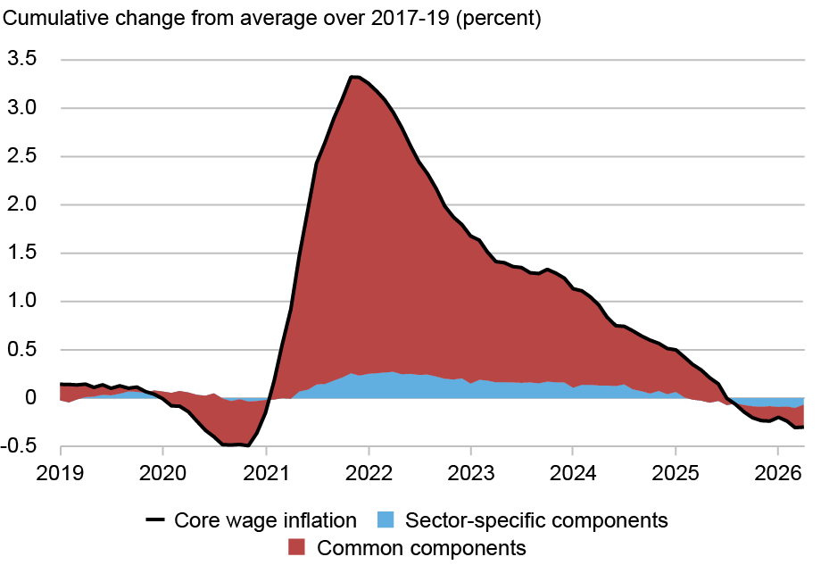
Looking Under the Hood of Trend Wage Dynamics
Our methodology also allows us to investigate whether specific industries have disproportionately contributed to the dynamics of trend wage inflation. As a first step, in the chart below, we decompose the cumulative change in TWIn since its 2017-19 average into changes that are common across industries and changes that are industry-specific. The decline in TWIn since its peak was widespread across the economy. In other words, the common force that pushed up wage inflation in 2021 subsided thereafter.
Most of the TWIn Dynamics Have Been Common Across Industries
Sources: Bureau of Labor Statistics; Current Population Survey; authors’ estimates.
While quantitatively less sizable, sector-specific components of trend wage inflation have also retracted. As we discuss in the paper, these components typically tend to capture lower-frequency movements in trend wage inflation. In some instances, however, they can signal that trend wage dynamics in an industry are decoupling from the rest of the economy.
In this context, our analysis highlights two industries worth discussing. First, wage inflation of public administration workers has followed delayed dynamics with respect to the rest of the economy. This is not surprising: our analysis over a long time period shows that this industry always displays a strong idiosyncratic component.
Another industry in which wage inflation has remained higher than the rest of the economy is construction and mining. Our analysis suggests that these dynamics may be idiosyncratic to that industry, rather than a reflection of different sensitivities to a common factor. In the chart below, we show trend wage inflation in construction and mining (in red), in public administration (in gold), and in the aggregate (in blue).
Most but Not All Industries Have Seen a Synchronized Decline in Wage Growth
Trend wage inflation (percent)
Sources: Bureau of Labor Statistics; Current Population Survey; authors’ estimates.
The idiosyncratic trend specific to the construction and mining industry has risen since 2022, in contrast with economy-wide downward pressures to wage growth. As a result, wage growth in this industry has been consistently and persistently stronger than in the rest of the economy. This pattern could be related to construction of AI data centers, with sustained labor demand fueling wage inflation. Recent reductions in net immigration could work in the same direction, especially since the construction industry tends to rely on immigrant workers.
In summary, our measure of persistent nominal wage growth, TWIn, provides an indication of underlying wage inflation. After a prolonged period of moderation, the easing in our TWIn measure appears to have slowed. This stabilization, at levels near those seen in the second half of the 2010s, is consistent with a broadly balanced labor market. Looking ahead, considerable uncertainty remains. On the one hand, specific industries such as construction may continue to put some upward pressure on wage inflation, as they have done in recent months. On the other hand, any deterioration of labor market conditions could result in renewed downward pressure on wage inflation.
Martín Almuzara is a research economist in the Federal Reserve Bank of New York’s Research and Statistics Group.
Richard Audoly is a research economist in the Federal Reserve Bank of New York’s Research and Statistics Group.
Davide Melcangi is an economic research advisor in the Federal Reserve Bank of New York’s Research and Statistics Group.
How to cite this post:
Martin Almuzara, Richard Audoly, and Davide Melcangi, “Assessing the Current State of Wage Inflation,” Federal Reserve Bank of New York Liberty Street Economics, May 26, 2026, https://doi.org/10.59576/lse.20260526BibTeX: View |
@article{AlmuzaraAudolyMelcangi2026,
    author={Almuzara, Martin and Audoly, Richard and Melcangi, Davide},
    title={Assessing the Current State of Wage Inflation},
    journal={Liberty Street Economics},
    note={Liberty Street Economics Blog},
    number={May 26},
    year={2026},
    url={https://doi.org/10.59576/lse.20260526}
}
Disclaimer The views expressed in this post are those of the author(s) and do not necessarily reflect the position of the Federal Reserve Bank of New York or the Federal Reserve System. Any errors or omissions are the responsibility of the author(s).
]]>1<![CDATA[AI’s Macroeconomic Challenges and Promises]]>https://libertystreeteconomics.newyorkfed.org/?p=422772026-06-02T15:12:45Z2026-05-20T11:00:00Z
Simone Lenzu
In the third quarter of 2025, America’s largest tech firms for the first time spent more on capital investment than they earned from operations. The implication is that AI, a technology with the potential to make the economy more productive, is, for now, absorbing resources faster than it is generating returns. This post discusses how the tension between AI’s long-run promise and its short-run costs affects the outlooks for inflation, real activity, and financial stability.
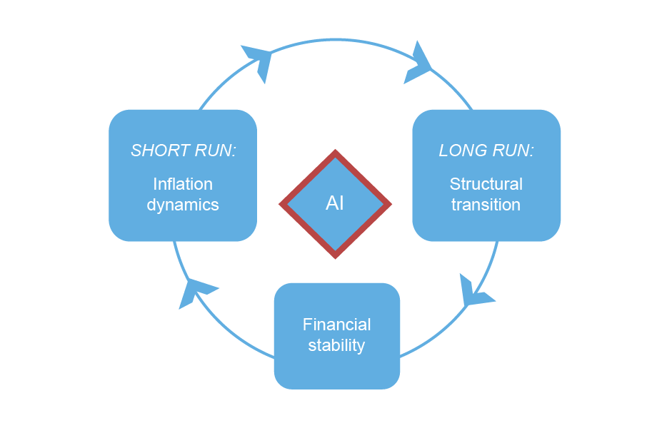
Three Channels, One Framework
Drawing on my research, I describe three interrelated channels—inflation dynamics, structural transition, and financial stability—through which AI bears on the economy (see figure below).
Three Channels Through Which Diffusion of AI Can Affect the Economy
Source: Author’s illustration.
Inflation Dynamics
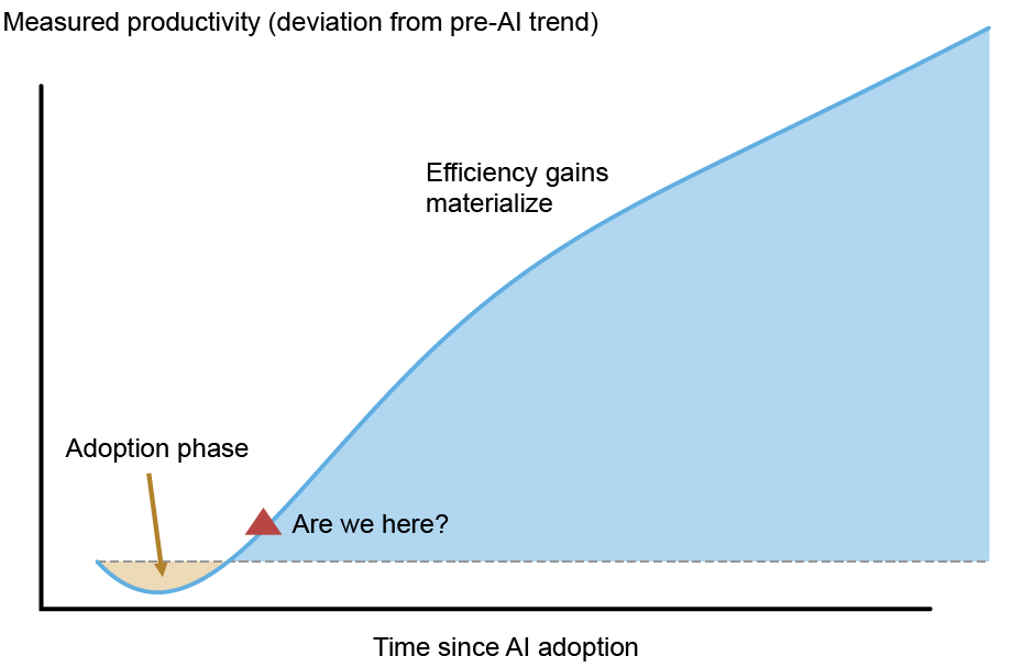
In the short run, the diffusion of AI can reshape how interest rates influence inflation and real activity. A widely held view is that AI, by raising productivity, will be a powerful disinflationary force. This view may ultimately prove correct, but it skips a crucial step. What matters for inflation is not whether AI raises productivity, but whether it raises productivity faster than it increases the costs of adopting it.
During the transition, firms divert substantial resources toward reorganization, data infrastructure, and integration, which can temporarily raise production costs even as the technological frontier expands. This is the so-called “productivity J-curve,” depicted in the figure below.
Measured Productivity Can Fall During the Adoption Phase
Source: Stylized illustration based on Brynjolfsson, Rock, and Syverson (2021).
The effects on prices, on the other hand, are already visible in input markets. In 2025, the major AI firms (Google, OpenAI, Anthropic, Meta, Amazon, Oracle) committed roughly $300 billion to capital investment across semiconductor supply chains, power grids, and specialized labor. Aggressive investment spending continued into the first quarter of 2026 and is projected to rise further, adding to cost pressures across the economy.
Recent data suggest that AI-driven demand has been pushing prices up over the past two years, and those costs are now passing through to prices of consumer electronics. For example, the prices for memory chips are up substantially. A recent report indicates that energy consumption and prices are also being affected.
Structural Transition over the Long Run
AI may shift the economy’s fundamentals: the level of potential output and the natural rate of interest. The critical question is whether AI generates a one-time level shift in productive capacity or a sustained acceleration in growth (see figure below). A level shift temporarily raises the natural interest rate during the transition before growth reverts to baseline, while a growth acceleration raises it permanently.
Faster AI Adoption Can Signal Either That the Economy Is Overheating or That It’s Catching Up to Its AI-Lifted Potential
Source: Author’s illustration.
To date, estimates of the productivity impact span both scenarios, from modest gains of a few percentage points of GDP over a decade to considerably larger effects if AI augments the innovation process itself. The range is wide and the uncertainty is compounded by countervailing forces, including a possible increase in market concentration and shifts in household saving and spending.
Concentration matters because AI adoption tends to be skewed toward large firms: if rents accrue to a handful of incumbents, the investment boom that lifts the neutral rate may prove narrower than aggregate figures suggest, and winner-take-all dynamics may also slow the diversity of research that sustains long-run growth. On the household side, the fall in consumption among workers whose tasks AI displaces may be only partially offset by the gains of those it complements. If the latter tend to save a higher share of their earnings, aggregate consumption may be weaker than productivity figures alone would suggest.
Financial Stability
AI is rewiring the financial system. Until recently, the major AI companies funded capital investment almost entirely from retained earnings, insulating the AI buildout from credit-market conditions.
That changed in late 2025: capital expenditures began to exceed operating cash flows, and the firms raised over $100 billion of new debt. Beneath those headline bond issues lies a more intricate layer—off-balance-sheet project finance vehicles funding data center construction, securitizations backed by lease cash flows, and hundreds of billions in forward lease commitments that will not appear on balance sheets for years. Much of this debt is predicated on AI productivity returns that have not yet materialized. If expectations shift, the correction could travel quickly and widely: the same institutions—insurers, asset managers, pension funds—hold overlapping exposures across corporate bonds, securitizations, and private placements, so a broad repricing would hit them from multiple directions at once.
Putting AI in Perspective
1. AI’s Centrifugal Bind
The three channels described above do not operate independently, and their interaction creates a challenge in tracking the economy. Consider the following scenario. AI adoption initially raises costs without raising productivity (the J-curve), while firms, consumers, and markets already expect solid gains ahead. Inflationary pressure builds from the supply side: firms’ production costs rise as input markets tighten due to, for example, higher prices for memory chips and energy. Demand-side pressure builds too: expectations of future productivity sustain elevated asset valuations and support spending today, before the productivity gains arrive. And the financial system is exposed: a wave of capital expenditures financed with debt is predicated on returns that have not yet materialized.
The result is what physicists would call a centrifugal bind: forces pulling outward in opposite directions. Higher inflation could puncture asset valuations built on real but distant productivity gains, triggering financial stress precisely when the supply-side payoff has yet to arrive. Efforts to protect financial stability enable the cost and demand pressures to compound. Both forces are real and trace back to the same underlying gap between what AI is expected eventually to deliver and what it is actually delivering now.
2. Rethinking “Long and Variable Lags”
Milton Friedman observed that policy works with “long and variable lags”—that when a central bank adjusts rates, the effects on inflation and activity take months or even years to materialize, and the timing shifts unpredictably across episodes. His point was not just that the real effects of policy are slow, but that they are slow in ways that cannot be reliably anticipated. AI unsettles this tenet in two ways.
First, AI may reshape which lags are long and which are short. Some lags may compress: faster information flows, algorithmic pricing, and more elastic expectations speed up transmission. Other lags may lengthen: reorganization costs and factor market frictions mean supply-side adjustments can take years and move in the wrong direction first. The result is not a uniform shortening but a reshaping of timing and direction, unlike anything historical models were built to handle.
Second, even if the lags themselves don’t change, the rapid diffusion of AI complicates the distinction between cyclical fluctuations and structural shifts. During a major technological transition, it becomes genuinely hard to tell whether output is rising because demand is overheating or because the economy’s speed limit is expanding. The trouble is that the data look identical under both interpretations, often for years.
3. A Cautionary Tale from the Dot-Com Era
The IT revolution of the 1900s offers a cautionary precedent. In the 1990s, Fed Chairman Alan Greenspan resisted calls to tighten prematurely, betting that IT was expanding the economy’s productive capacity. He was right. But the dot-com crash that followed showed that even when the supply-side narrative is broadly correct, expectations can generate asset-price dynamics that create independent financial stability risks. Getting the trend right did not protect against the bubble.
Today’s AI cycle features some of the same tensions as that episode—uncertain productivity effects, difficulty distinguishing supply from demand, and expectations-driven asset dynamics. But it is unfolding within a layered and leveraged financial system. As a result, the path toward an AI-driven high-productivity economy might prove to be a bumpy one.
Simone Lenzu is a financial research economist in the Federal Reserve Bank of New York’s Research and Statistics Group.
How to cite this post:
Simone Lenzu, “AI’s Macroeconomic Challenges and Promises,” Federal Reserve Bank of New York Liberty Street Economics, May 20, 2026, https://doi.org/10.59576/lse.20260520BibTeX: View |
@article{Lenzu2026,
    author={Lenzu, Simone},
    title={AI’s Macroeconomic Challenges and Promises},
    journal={Liberty Street Economics},
    note={Liberty Street Economics Blog},
    number={May 20},
    year={2026},
    url={https://doi.org/10.59576/lse.20260520}
}
Disclaimer The views expressed in this post are those of the author(s) and do not necessarily reflect the position of the Federal Reserve Bank of New York or the Federal Reserve System. Any errors or omissions are the responsibility of the author(s).
]]>0<![CDATA[The Global Credit Cycle in Corporate Bond Returns]]>https://libertystreeteconomics.newyorkfed.org/?p=421372026-05-27T18:39:25Z2026-05-19T12:14:00Z
Nina Boyarchenko and Leonardo Elias
The global corporate nonfinancial bond market is both a large investment asset class and a vital source of funding for nonfinancial firms. With $19 trillion outstanding at the end of 2024, a broad portfolio of corporate bonds would be expected to be well diversified. Yet, in 37 percent of months between 1998 and 2024, more than 80 percent of bonds in the ICE Global Bond Indices—a portfolio with over 10,000 constituents spanning diverse industries, credit ratings, and regions—moved in the same direction, suggesting a large degree of synchronization. In this post, we introduce the global credit factor, which proxies for the global price of risk in international corporate bond markets. The global credit factor creates a global credit cycle in bond risk premia and generates predictable comovement in bond prices.
Measuring the Global Credit Cycle
Is there a global credit cycle in global corporate bond returns? To answer that question, we construct a proxy for a global component of credit risk pricing, which we dub the global credit factor. Our approach, described in detail in our Staff Report, is motivated by the literature on intermediary asset pricing, which argues that risk prices reflect balance sheet constraints of financial intermediaries. Because the tightness of balance sheet constraints fluctuates over time, so do risk prices.
We implement this idea in our setting by estimating a nonlinear predictive relationship between returns on portfolios of corporate bonds and observable predictors. We sort bonds into portfolios by credit rating—AAA/AA, A, BBB, and high yield—so that the global credit factor uses information both from the overall time-series variation in returns and from the differential fluctuation in returns across bonds with different levels of credit risk. Focusing on the predictive relationship between predictors and returns allows us to estimate how risk attitudes translate into expected, rather than realized, returns; that is, into the price of credit risk.
The observable predictors proxy for the tightness of balance sheet constraints. In particular, we use the average default-risk-adjusted spread for U.S. bonds, also called the excess bond premium (EBP), and the Chicago Board Options Exchange’s CBOE Volatility Index, or VIX. While Gilchrist and Zakrajsek (2012) argue that the EBP is a quantitative proxy of the risk attitude of financial intermediaries in fixed income markets, the price of global credit risk is likely to also reflect the risk attitudes of a broader set of intermediaries. For this reason, we also allow the factor to depend on the VIX, a commonly used proxy for the tightness of constraints faced by a broader set of institutions.
The next chart shows the time series of the estimated global credit factor, together with some of the largest events identified by peaks in the measure. The global credit factor tightens when both the EBP and the VIX are high, such as during the COVID-19 pandemic (March 2020) and in the aftermath of the Lehman Brothers liquidation (Fall 2008). The factor is instead historically low—attitudes towards global credit risk are particularly benign—in advance of large tightenings of the global credit factor, such as in the run-up to the Asian crisis and the global financial crisis.
The Global Credit Factor over Time
Sources: Lehman-Warga Fixed Income Database; ICE Global Indices; authors’ calculations. Note: The chart shows the time series of the global credit factor, together with some notable events in the time series.
We examine the relationship between the global credit factor and the VIX, conditional on the level of credit spreads, in the next chart. The chart shows that the estimated relationship between the global price of credit risk and the VIX is highly nonlinear. For levels of the VIX below the historical median of 18, the global credit factor is to a large extent flat as a function of the VIX, regardless of the level of credit spreads. When the VIX is above the median, however, the slope of the global credit factor with respect to the VIX increases as the level of credit spreads increases. In other words, the factor is more sensitive to increases in the VIX at higher levels of credit spreads, highlighting the importance of interactions between credit spreads and volatility in determining the global price of credit risk.
A Nonlinear Relationship Between the Global Credit Factor and the VIX
Sources: Lehman-Warga Fixed Income Database; ICE Global Indices; authors’ calculations. Notes: The chart shows the relationship between the global credit factor and the VIX, conditional on three levels of the credit spread: the historical tenth percentile (EBP=-0.65), the historical median (EBP=-0.19), and the historical ninetieth percentile (EBP=0.51). EBP is excess bond premium.
Considering the relationship between the global credit factor and the EBP, instead, a similar picture emerges. The sensitivity of the global credit factor to the EBP is similar for low and intermediate levels of the VIX. For high levels of the VIX, the factor is considerably more sensitive to changes in credit spreads.
A Nonlinear Relationship Between the Global Credit Factor and the EBP
Sources: Lehman-Warga Fixed Income Database; ICE Global Indices; authors’ calculations. Notes: The chart shows the relationship between the global credit factor and the excess bond premium (EBP), conditional on three levels of the VIX: the historical tenth percentile (VIX=12), the historical median (VIX=18), and the historical ninetieth percentile (VIX=29).
Is the Factor Truly Global?
We construct the global credit factor to target returns on bonds of firms in advanced economies, using U.S.-based variables as predictors. Does the credit factor truly capture global conditions? To answer that question, we conduct two exercises. In the first exercise, we keep the same predictors—the U.S. EBP and the VIX—and examine how the estimate of the global credit factor changes as we change the set of target returns. The next chart shows that the estimated time series of global credit risk are similar regardless of whether we use the original advanced economy portfolios, portfolios of bonds of U.S. firms only, portfolios of bonds of firms in the rest of advanced economies, or, indeed, portfolios of bonds of firms in emerging markets. This finding is particularly remarkable since our data on returns on non-U.S. bonds only starts in 1998, so that the relationship between the factor and predictors is stable even outside of the data used for estimation.
Factors Constructed to Target Alternative Portfolios Are Similar to the Baseline
Sources: Lehman-Warga Fixed Income Database: ICE Global Indices; authors’ calculations. Notes: The chart shows the time series of the global credit factor, together with factors constructed to fit three alternative sets of portfolios: portfolios of U.S. corporate bonds only, portfolios of advanced economy (AE) bonds excluding the U.S., and portfolios of emerging market (EM) corporate bonds. All factors are rescaled to have a mean 0 and a standard deviation 1 for comparability.
In the second exercise, we consider how the estimated global credit factor changes when we use European predictors instead of U.S.-based predictors. In particular, in the chart below, we use the Euro Stoxx 50 Volatility, or VSTOXX, instead of the VIX and the weighted average default adjusted spread across eight major European countries instead of the U.S. EBP. The chart below shows that the factor constructed using European predictors is similar to our global credit factor, albeit each factor reflects some local events. For the factor constructed using European predictors, the European debt crisis is a significantly larger event than for the baseline global credit factor. Similarly, the baseline credit factor tightens during the U.S. stock market crash in December 2018, while the credit factor built with European predictors identifies the same period as an episode of loose credit conditions. Thus, while the price of credit risk is indeed global, the locality of predictors used may influence individual observations.
Factors Constructed Using U.S. and European Predictors Are Similar
Sources: Lehman-Warga Fixed Income Database; ICE Global Indices; authors’ calculations. Notes: The chart shows the time series of the global credit factor, together with the global credit factor constructed using the Euro Stoxx 50 Volatility (VSTOXX) instead of the VIX, and the weighted average excess bond premium (EBP) across eight European countries instead of the U.S. EBP.
Wrapping Up
Global credit markets are deeply interconnected. In this blog post, we have argued that there is a common component to global corporate bond returns. In our Staff Report, we show that high levels of the factor predict high corporate bond returns and deteriorations in local credit conditions, and are associated with outflows from global bond funds. Taken together, our results are consistent with the factor proxying for a common, time-varying global price of credit risk.
Nina Boyarchenko is a financial research advisor in the Federal Reserve Bank of New York’s Research and Statistics Group.
Leonardo Elias is a financial research economist in the Federal Reserve Bank of New York’s Research and Statistics Group.
How to cite this post:
Nina Boyarchenko and Leonardo Elias, “The Global Credit Cycle in Corporate Bond Returns,” Federal Reserve Bank of New York Liberty Street Economics, May 19, 2026, https://doi.org/10.59576/lse.20260519BibTeX: View |
@article{BoyarchenkoElias2026,
    author={Boyarchenko, Nina and Elias, Leonardo},
    title={The Global Credit Cycle in Corporate Bond Returns},
    journal={Liberty Street Economics},
    note={Liberty Street Economics Blog},
    number={May 19},
    year={2026},
    url={https://doi.org/10.59576/lse.20260519}
}
Disclaimer The views expressed in this post are those of the author(s) and do not necessarily reflect the position of the Federal Reserve Bank of New York or the Federal Reserve System. Any errors or omissions are the responsibility of the author(s).
]]>0<![CDATA[Honey, Who Shrunk the U.S. Income Surplus?]]>https://libertystreeteconomics.newyorkfed.org/?p=415732026-05-15T17:22:34Z2026-05-18T11:00:00Z
Matthew Higgins and Thomas Klitgaard
Foreign holdings of U.S. financial assets are immense, with official estimates putting their current market value at $69 trillion. U.S. holdings of foreign assets are also impressive but much smaller, at $41 trillion. The shortfall in U.S. foreign assets relative to foreign liabilities has been mounting for decades. Yet U.S. investment income receipts—in profits, dividends, and interest—comfortably exceeded income payments until recently. We show that the fading of the net investment income surplus stems from the upward shift in interest rates in the aftermath of the pandemic along with the continued net sales of U.S. assets to foreign investors.
The U.S. International Balance Sheet
The U.S. international investment position can be summarized via a balance sheet, with foreign assets held by U.S. investors on the asset side, and U.S. assets held by foreign investors on the liability side. The table below, drawn from data compiled by the U.S. Bureau of Economic Analysis, details these claims by asset type. Figures are estimated market values at the end of last year.
U.S. Foreign Assets and Liabilities in 2025
Trillions of U.S. dollars, year-end
Assets
Liabilities
Net Assets
Total
41.0
68.5
-27.5
Foreign direct investment
13.9
20.3
-6.4
Portfolio equity shares
15.1
22.3
-7.2
Interest-bearing assets
10.8
25.9
-15.1
Fixed-income securities *
4.1
15.9
-11.8
Other lending **
6.7
10.0
-3.2
Gold held as reserves
1.1
NA
1.1
Source: U.S. Bureau of Economic Analysis. Notes: All figures are estimated market values. Total assets and liabilities exclude the gross notional value of derivative positions; these have a net value of roughly zero. * Includes securities held as foreign exchange reserves. ** Largely bank loans, bank deposits, and trade credit.
Total U.S. holdings of foreign assets amounted to $41 trillion. Foreign direct investment (U.S. multinationals’ foreign affiliates and large minority stakes in foreign companies) accounted for roughly one-third of these holdings. Portfolio equity holdings accounted for another third. Most of the rest was held in interest-bearing assets, including foreign fixed-income securities, foreign deposits, and cross-border bank loans.
Foreign assets in the U.S. amounted to almost $69 trillion. Of this sum, $20 trillion went to foreign direct investment (FDI) claims, more than $22 trillion was invested in the U.S. stock market, and $26 trillion was held in interest-bearing claims, with Treasuries and other U.S. fixed income securities representing the largest part of this total.
The net U.S. international investment position is simply the difference between U.S. foreign assets and foreign holdings here: -$28 trillion at the end of 2025, or 90 percent of U.S. GDP. Note that U.S. assets fell short of U.S. liabilities in every major category.
The Balance Sheet, Financial Flows, and Valuation Changes
The evolution of the U.S. net investment position is closely connected to the current account balance, the broadest measure of the trade balance. In international commerce, you only get what you pay for. When U.S. exports fall short of imports, the balance must be covered by selling off domestic assets. If the United States runs a current account deficit and purchases foreign assets, still larger asset sales are required to balance the books.
U.S. assets and liabilities are also affected by asset price changes. For example, higher foreign stock prices boost estimated values for U.S. portfolio equity and FDI holdings. Movements in the dollar also play a role, by changing the value of U.S. foreign currency assets when translated into dollar terms. There is no meaningful impact on U.S. liabilities, given that they are denominated almost exclusively in dollar terms.
The solid red line in the chart below shows the evolution of the U.S. international investment position over the past two decades. (We’ll discuss the dotted blue line in the next section.) Note that the net position turned more negative by $16 trillion since the end of 2019, from -$12 trillion to -$28 trillion.
Huge Net Liabilities, but Net Income Still Slightly Positive
Source: U.S. Bureau of Economic Analysis. Notes: Net asset position is at market value. Net income is measured as a four-quarter rolling sum.
Financial flows accounted for -$5.5 trillion of this deterioration, with U.S. purchases of foreign assets at almost $6 trillion but foreign purchases of U.S. assets totaling more than $11 trillion. Aside from the small statistical discrepancy, the -$5.5 billion in net asset purchases matches the cumulated U.S. current account deficit over the period, in line with the “You only get what you pay for” principle described above.
Valuation changes have subtracted $10 trillion from the U.S. net position since 2019, adding $6 trillion to U.S. assets but a massive $16 trillion to U.S. liabilities. Most of the gain on both sides of the ledger reflects the impact of higher stock prices on estimated portfolio equity and FDI holdings. (The larger gain on the liability side owes to a booming U.S. stock market.) There was little net impact from exchange rate changes.
The Income Surplus Puzzle
While U.S. net liabilities have continued to mount, the U.S. income balance has seemed to defy gravity. To be sure, the income balance has fallen in recent years, from a surplus $260 billion in 2019 to near zero in 2024 and 2025. (See the dotted blue line in the chart above.) But it remains far out of line with the massive U.S. liability position. What explains this disconnect?
A breakdown of net income flows by asset type provides important clues. The chart below shows flows beginning in 2008, broken down into FDI income (profits), portfolio equity income (dividends), and interest income.
Growing Interest Deficit Weighs on Net Income Balance
Source: U.S. Bureau of Economic Analysis. Note: Figures show four-quarter sums for income receipts less income payments.
The U.S. FDI position has generated a consistent net income surplus, dipping as low as $250 billion during the height of the pandemic, but rebounding to $360 billion more recently. The U.S. portfolio equity position has also generated a consistent surplus, at roughly $70 billion to $120 billion since 2019. The combination of income surpluses and position deficits in these asset categories comes with a clear implication: U.S. assets earn higher rates of return than similar liabilities.
The U.S. position in interest-bearing assets, in contrast, has generated large income deficits since prior to the 2008 financial crisis. Net interest payments have swelled since the pandemic, with the interest balance reaching -$450 billion last year. This increase in interest payments accounts for the shrinking of the U.S. income surplus.
The U.S. Rate of Return Advantage
Rates of return on foreign assets can be measured by the ratio of income receipts to market value. Income on FDI assets includes dividends remitted to the parent company plus reinvested earnings. Income on portfolio equity consists of dividends. Income on interest-bearings assets includes coupon and other interest receipts.
The chart below shows rates of return for U.S. FDI assets and liabilities, with far higher returns for U.S. investment abroad. The returns gap explains how a positive FDI income balance can exist alongside a negative net asset position. (To take the latest figures, a profit rate of 5.6 percent on $14 trillion in assets easily exceeds a rate of 1.8 percent on $20 trillion in liabilities.) The FDI income surplus, in turn, has been the main factor keeping the overall U.S. income balance in positive territory.
Persistent Superior Returns for U.S. FDI Assets
Source: U.S. Bureau of Economic Analysis. Note: Returns are measured as income-receipts or payments of the past four quarters divided by estimated market values.
The U.S. advantage in FDI profitability has attracted considerable skepticism, with some observers arguing that it represents a statistical illusion, perhaps from corporate tax arbitrage strategies. This debate has been ongoing for more than three decades—see our earlier work—and we do not propose to settle it here.
The U.S. also enjoys a longstanding rate of return advantage on portfolio equity investments. Although this gap is less stark than for FDI, it remains more than enough to outweigh the large shortfall in U.S. assets relative to liabilities. The portfolio income surplus has been a supporting factor in keeping the aggregate income balance in positive territory.
Finally, the chart below shows rates of return for interest-bearing assets and liabilities. Historically, these rates have tended to move together, partly because both assets and liabilities are denominated largely in dollars. A second reason is that central banks in the U.S. and abroad often face common global shocks.
Similar Returns on Interest-Bearing Assets and Liabilities
Source: U.S. Bureau of Economic Analysis. Note: Returns are measured as income-receipts or payments over the past four quarters divided by estimated market values.
Note the sharp rise in U.S. and foreign rates in 2022 and 2023, during the post-pandemic recovery. Given the large U.S. net liability position in interest-bearing assets, higher rates translate into a significant drag on net income. According to our calculations, some $170 billion of the $240 billion increase in net payouts since 2021 owes to higher interest rates. The remainder owes to ongoing growth in U.S. net liabilities. Notably, only the partial retracement in market rates since 2024 has prevented the interest deficit from growing even more sharply.
Conclusion
Payments on U.S. assets owned by foreign investors represent a servicing burden for the U.S. economy. Profits, dividends, and interest payments that would otherwise accrue to domestic investors instead flow abroad. Given the need to sell U.S. assets to finance ongoing trade deficits, this servicing burden seems likely to mount.
The related buildup in the U.S. net liability position in interest-bearing assets will also make the income balance more sensitive to swings in interest rates. This increased sensitivity is already in evidence. At present, with the asset-liability gap at -$15 trillion, a 1 percentage point increase in U.S. and foreign interest rates would subtract $150 billion from the U.S. net income balance. (A 1 percentage point fall in rates would result in a similar improvement.) Only five years ago, a 1 percentage point rise in rates would have subtracted $100 billion.
Matthew Higgins is an economic policy advisor in the Federal Reserve Bank of New York’s Research and Statistics Group.
Thomas Klitgaard is an economic policy advisor in the Federal Reserve Bank of New York’s Research and Statistics Group.
How to cite this post:
Matthew Higgins and Thomas Klitgaard, “Honey, Who Shrunk the U.S. Income Surplus?,” Federal Reserve Bank of New York Liberty Street Economics, May 18, 2026, https://doi.org/10.59576/lse.20260518BibTeX: View |
@article{HigginsKlitgaard2026,
    author={Higgins, Matthew and Klitgaard, Thomas},
    title={Honey, Who Shrunk the U.S. Income Surplus?},
    journal={Liberty Street Economics},
    note={Liberty Street Economics Blog},
    number={May 18},
    year={2026},
    url={https://doi.org/10.59576/lse.20260518}
}
Disclaimer The views expressed in this post are those of the author(s) and do not necessarily reflect the position of the Federal Reserve Bank of New York or the Federal Reserve System. Any errors or omissions are the responsibility of the author(s).
]]>0<![CDATA[Do Job Postings Show Early Labor‑Market Effects of AI?]]>https://libertystreeteconomics.newyorkfed.org/?p=422572026-06-02T15:12:45Z2026-05-14T11:00:00Z
Richard Audoly, Miles Guerin, and Giorgio Topa
As generative AI tools become more widely used, a key issue is the technology’s impact on labor demand. Where might we find evidence of that impact? In this post, we examine whether early evidence of AI’s effect on the labor market appears in firms’ job postings. We combine an occupational measure of AI exposure with detailed U.S. job-posting data from Lightcast, which aggregates listings from company career pages, national and local job boards, and job-listing aggregators. Using this data, we test whether postings for AI-exposed occupations declined disproportionately since the release of ChatGPT in late 2022. We find that, while overall hiring has slowed since then, the evidence from job postings provides little indication of a distinct AI-driven decline in labor demand.
Measuring a Job’s Exposure to AI
To measure how exposed different jobs are to AI, we use a task-level AI exposure metric developed by Anthropic that combines detailed task descriptions from O*NET with observed AI usage. O*NET breaks each occupation into a set of specific activities that workers regularly perform. For example, a copywriter may edit or rewrite marketing text, while a web developer may write supporting code for websites and web applications. The Anthropic measure evaluates each task and assigns it an AI exposure score based on three factors: whether the task could theoretically be mostly completed by AI; whether the task actually appears in a sample of AI usage data; and whether AI is used to automate the task rather than augment it.
Tasks receive a higher AI exposure score if most of the observed usage is used to automate, rather than augment, work. These task-level scores are then aggregated to the occupation level using information on how much time workers spend on each task, producing an occupation-level measure of exposure to AI on a scale from 0 to 1.
Using this measure of an occupation’s exposure to AI, the chart below compares the distribution of AI exposure across occupations in employment (blue) and in job postings (gold). Each bar shows the share of workers or vacancies in occupations within a given range of AI exposure. Moving right along the x-axis corresponds to occupations with higher exposure, while the y-axis reports the share of employment or postings in those exposure bins.
AI Exposure Remains Limited in Both Employment and Vacancies
Sources: Anthropic; Lightcast; U.S. Bureau of Labor Statistics Occupational Employment and Wage Statistics (OEWS); authors’ calculations. Notes: Bars show the share of total employment in 2024 (blue) and vacancies from January 2026 (gold) across occupations grouped by ranges of AI exposure. (The dark green is where the two overlap.) The x-axis reports bins of AI exposure, and the y-axis reports the share of employment or vacancies within each bin.
The chart highlights that AI exposure remains relatively limited. Only a small share of employment or vacancies is concentrated in occupations with high AI exposure—less than 10 percent of workers and vacancies are in occupations with an AI exposure of at least 0.4—and 40 percent of workers are in jobs with zero measured AI exposure. Given this limited exposure, do we see any impact of AI when we look at the change in job postings over time?
To examine whether AI is affecting labor demand, we conduct an event study that compares how job postings evolve for occupations with relatively high versus low AI exposure around the release of ChatGPT in late 2022. Here, we define high-exposure occupations as those with an AI exposure of at least 0.2; the results are similar under alternative cutoff values.
The chart below plots the estimated difference in job postings between these high-exposure occupations and less-exposed occupations for each quarter relative to the last period prior to the release of ChatGPT (the difference in 2022:Q3 is zero by construction). The blue line in the chart shows how much more (or less) hiring occurred in high-exposure occupations compared with low-exposure occupations at each point in time, relative to the quarter before ChatGPT was released. The shaded area depicts statistical uncertainty around those estimates. This event study also accounts for persistent differences across occupations (since some jobs consistently have more postings than others) and economy-wide changes in hiring over time, allowing us to focus on differences in hiring by AI exposure.
Declines in Vacancies for AI-Exposed Occupations Began Before the Release of ChatGPT in Late 2022
Sources: Anthropic; Lightcast; authors’ calculations. Notes: Occupations are classified as “high exposure” if they have a job-level exposure of at least 0.2. Occupation weights are derived from the number of vacancies for that occupation in 2019. The vertical red line indicates the quarter of ChatGPT’s first public release. Shaded regions indicate 95 percent confidence intervals.
If AI had had a significant causal effect on employment, we would expect the employment difference between exposed and less exposed occupations to behave in the following two ways. First, prior to ChatGPT’s release, hiring trends in high- and low-exposure occupations would move similarly. This would suggest that, in the absence of AI, the two groups would have continued evolving similarly. In the chart, this would correspond to estimates being statistically indistinguishable from zero in all quarters prior to 2022:Q3. Second, a sustained divergence between high- and low-exposure occupations should emerge at some point after ChatGPT’s release. A gap that opens up—and especially one that grows over time—would be consistent with AI affecting labor demand.
While the chart shows a relative decline in postings for occupations with higher AI exposure, the event study indicates that this trend predates the release of ChatGPT. The divergence between high- and low-exposure occupations began before 2022 and does not show a clear additional break in trajectory after 2022. Besides, the gap in labor demand between high- and low-exposure jobs stabilizes after 2023, at odds with AI gradually displacing exposed occupations. This makes it difficult to interpret the relative decline in hiring in AI-exposed occupations as a direct consequence of AI adoption.
Is AI Reducing Demand for Entry-Level Jobs?
Much of the early discussion about AI’s labor-market effects has focused on younger and entry-level workers. Research on the employment impact of AI has found a larger decline in the number of younger workers in occupations with high AI exposure after the release of ChatGPT. At the same time, related work using job postings finds that demand for junior and senior roles in these occupations declined at roughly the same time and by similar magnitudes beginning in 2022.
We conduct another event study to measure the difference in postings between junior and senior roles within occupations with high AI exposure, relative to late 2022 (shown in the chart below). Values above zero indicate that postings for junior roles increased relative to those for senior roles within the same high-AI-exposure occupation, while values below zero indicate the opposite. For example, if the line remained consistently above the horizontal axis after 2022, it would suggest that labor demand for junior positions in high-AI-exposure occupations had grown relative to hiring for senior roles in those same occupations.
No Clear Divergence in Labor Demand Between Junior and Senior Positions in Occupations with High AI Exposure
Sources: Anthropic; Lightcast; authors’ calculations. Notes: Occupations are classified as “high exposure” if they have a job-level exposure of at least 0.2. Job postings are categorized as either “junior” or “senior” level by Lightcast based on information in the posting. Occupation weights are derived from the number of vacancies for that occupation in 2019. The vertical red line indicates the quarter of ChatGPT’s first public release. Shaded regions indicate 95 percent confidence intervals.
If AI were disproportionately reducing demand for entry-level work, we would expect the line to move downward after 2022, indicating a relative decline in postings for junior roles. Instead, the line fluctuates, without a clear upward or downward trend. This suggests that labor demand for junior and senior roles within highly exposed occupations is moving broadly in parallel, and that the slowdown in postings is not concentrated specifically in entry-level highly exposed jobs.
Conclusion
Overall hiring has slowed since 2022, and unemployment has increased among young workers and recent college graduates. The evidence from job postings suggests that while AI may be contributing to recent labor market developments, it is not the main driver of the slowdown in hiring. In line with this interpretation, the New York Fed’s business surveys indicate that, so far, firms intend to incorporate AI mainly via retraining, with limited effects on hiring. While job postings show a relative decline in vacancies in occupations with greater exposure to AI, that divergence began before the release of ChatGPT in late 2022. Moreover, we do not observe a divergence in labor demand between junior and senior positions within highly exposed occupations. These patterns make it difficult to attribute the recent slowdown in entry-level hiring to AI alone.
Richard Audoly is a research economist in the Federal Reserve Bank of New York’s Research and Statistics Group.
Miles Guerin is a research analyst in the Federal Reserve Bank of New York’s Research and Statistics Group.
Giorgio Topa is an economic research advisor in the Federal Reserve Bank of New York’s Research and Statistics Group.
How to cite this post:
Richard Audoly, Miles Guerin, and Giorgio Topa, “Do Job Postings Show Early Labor‑Market Effects of AI?,” Federal Reserve Bank of New York Liberty Street Economics, May 14, 2026, https://doi.org/10.59576/lse.20260514BibTeX: View |
@article{AudolyGuerinTopa2026,
    author={Audoly, Richard and Guerin, Miles and Topa, Giorgio},
    title={Do Job Postings Show Early Labor‑Market Effects of AI?},
    journal={Liberty Street Economics},
    note={Liberty Street Economics Blog},
    number={May 14},
    year={2026},
    url={https://doi.org/10.59576/lse.20260514}
}
Disclaimer The views expressed in this post are those of the author(s) and do not necessarily reflect the position of the Federal Reserve Bank of New York or the Federal Reserve System. Any errors or omissions are the responsibility of the author(s).
]]>0<![CDATA[Federal Student Loan Defaults Return After Pandemic Pause]]>https://libertystreeteconomics.newyorkfed.org/?p=423782026-05-12T12:50:30Z2026-05-12T15:00:00ZQuarterly Report on Household Debt and Credit from the New York Fed’s Center for Microeconomic Data. Amid upticks in mortgage, HELOC, and auto balances and a seasonal decline in credit card balances, student loan balances remained unchanged. However, the share of student loan balances past due increased, nearing pre-pandemic levels at just over 10 percent. In this post, we focus on which borrowers entered default on their federal student loans over the past two quarters. We find that the average borrower entering default is nearly 40 years old, was not past due on their student loans prior to the pandemic, and is more likely to live in the South. While defaulted borrowers are more likely to be past due on other forms of debt, the overall scope of student loan defaults is still relatively low, suggesting that fears of broader contagion to other credit products are premature.]]>
Zara Jacob, Donghoon Lee, Daniel Mangrum, Joelle W. Scally, and Wilbert van der Klaauw
During 2026:Q1, household debt balances increased slightly, by $18 billion, to reach $18.8 trillion, according to the latest Quarterly Report on Household Debt and Credit from the New York Fed’s Center for Microeconomic Data. Amid upticks in mortgage, HELOC, and auto balances and a seasonal decline in credit card balances, student loan balances remained unchanged. However, the share of student loan balances past due increased, nearing pre-pandemic levels at just over 10 percent. In this post, we focus on which borrowers entered default on their federal student loans over the past two quarters. We find that the average borrower entering default is nearly 40 years old, was not past due on their student loans prior to the pandemic, and is more likely to live in the South. While defaulted borrowers are more likely to be past due on other forms of debt, the overall scope of student loan defaults is still relatively low, suggesting that fears of broader contagion to other credit products are premature.
Methodology Note: This quarter’s report also introduces a change in the credit score measure we use in several of our charts. Starting with this report, the figures and analysis that depend on credit scores will shift to using VantageScore 4.0, instead of Equifax Risk Score 3.0. We provide some context on how this shift will impact the observed population with credit scores and our analysis in this technical paper.
The (Gradual) Return to Repayment
At the onset of the pandemic, student loan payments were paused, and interest rates were set to zero percent. Due to many extensions of the payment pause, borrowers were not required to make payments for over three years. The pause officially ended in September 2023, when payments resumed and interest began accruing again. Most borrowers were expected to make their first payment in October 2023. While payments were required, during a 12-month “on-ramp” period through October 2024, missed payments were not reported to credit bureaus.
As we noted in our previous post, the first student loan delinquencies were reported on credit reports during 2025:Q1. Since then, over 17 percent of student loan borrowers have fallen at least 90 days past due on their payments at least once. As it takes 270 days of missed payments to enter federal student loan default, 2025:Q4 was the first quarter when new defaults began appearing on credit reports. We estimate that roughly 1 million federal student loan borrowers defaulted during 2025:Q4, with an additional 2.6 million borrowers defaulting during 2026:Q1. Note that borrowers in the now-defunct SAVE repayment plan entered repayment, but were put into a forbearance during the on-ramp due to litigation. Very few have re-entered repayment since missed payments were reported to credit bureaus. This delay means that a second wave of defaults might emerge as these 7 million borrowers reach the nine-month mark in the repayment period.
Who Is Entering Default?
We begin our exploration by examining the age distribution of newly defaulted student loan borrowers. In the chart below, we plot the age distribution of student loan borrowers who entered default between 2018:Q2 and 2019:Q4 (the dashed gold line) against those who newly defaulted over the last two quarters (the solid red line). Additionally, we plot the means of both groups with vertical lines.
Borrowers who recently defaulted are 2.5 years older on average than those in default prior to the pandemic (38.9 years compared to 36.4 years). Of course, this increase in average age could be an artifact of the four-year pause on delinquency reporting rather than a genuine shift in the profile of a borrower in default—someone who might have otherwise defaulted in 2021 would instead default in 2025, now four years older. However, comparing the full distribution of pre-pause and post-pause defaulters suggests that there is also a shift across the age demographic of borrowers at risk of default. The chart shows that the curve has not merely shifted four years older. Instead, there is uniformly more mass among older borrowers, especially those 50 and older. The flattening in the 25-30 age range and the increased mass in the 50+ age range is further evidence that older student loan borrowers are struggling with payments at a higher rate than before the pause on payments.
The Age Distribution of Defaulted Borrowers Has Shifted
Source: New York Fed Consumer Credit Panel/Equifax Notes: The chart plots the age distribution of borrowers who defaulted in 2025:Q4 or 2026:Q1 (bolded red line) and borrowers who defaulted between 2018:Q2 and 2019:Q4 (dotted gold line). The corresponding vertical lines show the means for each group.
Were These Borrowers Already Struggling with Payments?
To see whether newly defaulted borrowers had struggled with payments before the pandemic, we look back at the 2019 payment status of those borrowers who recently defaulted. The chart below shows that most recent defaulters were not past due before the pause. Nearly 30 percent were current on their loans and making payments, while nearly half either had not yet taken out student loans or had no payment due yet (due to grace periods, deferment, or $0 payments under income-driven repayment plans). About 20 percent were past due but not yet in default, and about 4 percent were already in default before the pause. So roughly one in four recently defaulted borrowers were already past due before the pandemic but were given a reprieve during the payment pause, then ultimately fell into default after payments resumed.
Among those who did have payments due in 2019, the majority were current on their loans at that time. Overall, these patterns suggest that the borrowers who defaulted over the past two quarters were not concentrated among those who were struggling with payments before the pandemic—more than three-quarters were current or did not have a student loan payment due in 2019.
Most of the Newly Defaulted Were Not Past Due on Their Student Loans before the Pause
Percent
Source: New York Fed Consumer Credit Panel/Equifax. Notes: The chart shows the 2019 payment status for borrowers who newly entered default during 2025:Q4 or 2026:Q1.
The map below shows the share of student loan borrowers in each state who have newly defaulted on their student loans. States in the South have the largest share of newly defaulted borrowers, with at least 10 percent of borrowers defaulting in Louisiana, Mississippi, Alabama, Georgia, and South Carolina. However, no state was immune from the wave of defaults. Even the states with the lowest concentration have a non-trivial share, at least 4 percent, of student loan borrowers in default.
New Student Loan Defaults Are Concentrated in the South
Source: New York Fed Consumer Credit Panel/Equifax. Notes: This map presents the share of student loan borrowers in each state who defaulted on their federal student loans in 2025:Q4 or 2026:Q1.
Implications for Defaulted Borrowers and Other Credit Products
What now for these 3.6 million defaulted borrowers? The primary consequence of default is garnishment of wages, Social Security, and tax returns. However, collection efforts for defaulted federal student loan borrowers are currently suspended with no clear timeline for resumption. Another consequence is deteriorated credit access. On average, credit scores for defaulted borrowers dropped 91 points between 2024:Q3 and 2025:Q4 (from 567 to 476; credit scores are Equifax Risk Score 3.0). While many of these borrowers already had subprime credit scores before missed student loan payments further reduced their scores, most will be cut off from accessing traditional credit while the default remains on their credit record, which typically lasts for seven years.
But what about their existing credit? The chart below shows delinquency rates for post-pandemic defaulted borrowers on other credit products in 2019:Q4, in 2020:Q3, and in 2026:Q1. These borrowers saw modest declines in delinquency rates during the pandemic, consistent with the trend across the broader population. But they now have very high delinquency rates across all credit products: nearly 40 percent of those with auto loans are past due, 56 percent of those with at least one credit card are past due, and 20 percent with a mortgage are past due. These high rates suggest that their payment struggles extend beyond student loans—and are likely to worsen when collection efforts resume.
Newly Defaulted Student Loan Borrowers Also Tend to Be Behind on Other Debts
Delinquency rate (percent)
Source: New York Fed Consumer Credit Panel/Equifax Notes: This chart presents the share of newly defaulted borrowers that are delinquent on auto loans (blue), credit cards (gold), and mortgages (gray) in 2019:Q4, 2020:Q3, and 2026:Q1. Each share is computed conditional on borrowers holding that debt type.
What does this mean for the broader household credit space? Delinquent and newly defaulted borrowers make up only 2 percent of the credit population and, given their troubled credit records, generally do not have extensive debt portfolios; spillover from the recent wave of defaults and delinquencies to broader credit markets is likely to be limited. Balances held by defaulted or delinquent student loan borrowers represent 2.7 percent of auto loans, 2 percent of credit cards, and 1 percent of mortgages. Further, Chart 14 in the Quarterly Report on Household Debt & Credit shows a decline in new flows into student loan delinquency, suggesting that the initial wave has crested.
Though delinquencies may increase again when borrowers on the sunsetting SAVE plan transition back into repayment this year, we believe that the largest wave of student loan defaults has passed. But the ripples from this wave may continue to reverberate through the credit space if the financial struggles from defaulted loans spill over into family members’ credit profiles, and when collections on defaulted loans eventually resume. We will continue to monitor student loan delinquencies and potential spillovers in the coming quarters.
Zara Jacob is a research analyst in the Federal Reserve Bank of New York’s Research and Statistics Group.
Donghoon Lee is an economic research advisor in the Federal Reserve Bank of New York’s Research and Statistics Group.
Daniel Mangrum is a research economist in the Federal Reserve Bank of New York’s Research and Statistics Group.
Joelle Scally is an economic policy advisor in the Federal Reserve Bank of New York’s Research and Statistics Group.
Wilbert van der Klaauw is an economic research advisor in the Federal Reserve Bank of New York’s Research and Statistics Group.
How to cite this post:
Zara Jacob, Donghoon Lee, Daniel Mangrum, Joelle W. Scally, and Wilbert van der Klaauw, “Federal Student Loan Defaults Return After Pandemic Pause,” Federal Reserve Bank of New York Liberty Street Economics, May 12, 2026, https://doi.org/10.59576/lse.20260512BibTeX: View |
@article{JacobLeeMangrumScallyvanderKlaauw2026,
    author={Jacob, Zara and Lee, Donghoon and Mangrum, Daniel and Scally, Joelle W. and van der Klaauw, Wilbert},
    title={Federal Student Loan Defaults Return After Pandemic Pause},
    journal={Liberty Street Economics},
    note={Liberty Street Economics Blog},
    number={May 12},
    year={2026},
    url={https://doi.org/10.59576/lse.20260512}
}
Disclaimer The views expressed in this post are those of the author(s) and do not necessarily reflect the position of the Federal Reserve Bank of New York or the Federal Reserve System. Any errors or omissions are the responsibility of the author(s).
]]><![CDATA[Will Mounting Supply Chain Strains Hamstring the AI Investment Boom?]]>https://libertystreeteconomics.newyorkfed.org/?p=423312026-06-02T15:12:46Z2026-05-11T11:00:00Zand physical shortages of goods. A critical conduit for spillovers through these channels is via Asian supply chains, especially from middle- to lower-middle income countries in southeast Asia, which are key suppliers for goods needed for the AI infrastructure build-out in the U.S. These countries are also heavily reliant on Middle East energy imports. This post examines key factors related to these Asian supply chain vulnerabilities.]]>
Hunter L. Clark, Jeffrey B. Dawson, and Shad Turney
Editor’s Note: The original version of the post included an inaccurate statement about the last chart. The chart itself is correct. The text has been removed. May 14, 3:22pm.
The conflict in the Middle East has precipitated a global supply shock—the third in six years following the pandemic in 2020 and Russia’s invasion of Ukraine in 2022. The current shock raises the specter of spillovers to the U.S. through both prices and physical shortages of goods. A critical conduit for spillovers through these channels is via Asian supply chains, especially from middle- to lower-middle income countries in southeast Asia, which are key suppliers for goods needed for the AI infrastructure build-out in the U.S. These countries are also heavily reliant on Middle East energy imports. This post examines key factors related to these Asian supply chain vulnerabilities.
How Large Are Supply Strains Thus Far?
The Middle East conflict has caused the virtual closure of the Strait of Hormuz (SOH). While the closure has had major implications for global energy markets—prior to the onset of hostilities, shipments through the SOH account for approximately one-fifth of global crude oil and a quarter of liquified natural gas (LNG) exports—the effects on global supply chains are much broader. This is illustrated in the chart below of the New York Fed’s Global Supply Chain Pressure Index (GSCPI). Over the two months since the conflict began, the index rose by 1.3 points, to 1.8 standard deviations above its average value.
The GSCPI extracts the supply signal from survey data on manufacturing industry delivery times, order backlogs, and inventory stocks as well as shipping costs for ocean and airfreight. The index had been gradually climbing even before the conflict began, likely in part reflecting strains from the boom in artificial intelligence investment. Within the GSCPI model, the increases in the index have been driven predominantly by lengthening delivery times and growing order backlogs.
Global Supply Chain Pressure Index
Source: Federal Reserve Bank of New York.
The increase in the GSCPI has exceeded the level of the Fukushima nuclear crisis in 2011 but remains well below the peaks reached during the COVID-19 pandemic. Nonetheless, the abruptness of the increase has been among the largest experienced outside of the pandemic and the index itself may not be capturing the nuances of the geographic and industry-specific supply pressures that are currently being experienced, and are the focus of this post. Moreover, research suggests that supply-inflation dynamics can be nonlinear at levels of the GSCPI below pandemic peaks.
As implied by the large increase in the GSCPI, recent geopolitical events have much broader supply implications than the oil market alone. Indeed, the petrochemical industry plays a key role in a wide range of goods and services. The world’s food supply, for example, relies on fertilizers that are a byproduct of LNG production in the Middle East. The petrochemical industry produces fuels for aircraft, ocean shipping, and cooking as well as plastics, rubber, fibers, and helium—all critical inputs for both low- and high-tech manufacturing, including investment in artificial intelligence.
These broader strains are readily apparent in prices for industrial inputs. The first chart below shows selected petrochemical-related prices—fertilizer, feedstocks and products for plastics (ethylene and polyethylene), and naphtha (a hydrocarbon product with a wide range of fuel and industrial uses). These prices have all skyrocketed, with recent attention focused on the “plastic shock.” The second chart shows that even before the conflict, surging demand for AI-related investment was already straining the high-tech supply chain: computer memory prices had skyrocketed, while U.S. producer prices for computer-related goods were on a steepening upward trend. Semiconductor manufacturing could face additional strains if helium falls into short supply as about a third of the world’s supply passes through the SOH.
Middle East Conflict Is Driving Petrochemical Higher
Source: Bloomberg LP. Note: Prices shown are averages of spot or near-future indices for Asia, North America, and Europe, where available.
High Tech Prices Are Surging on AI Investment Boom
Sources: Bloomberg LP and BLS via Haver Analytics. Notes: PPI shows PPI for final demand of electronic computers and computer equipment. PPI data are monthly and memory prices are daily.
Asia Supply Chain Vulnerabilities
Although the supply shock so far has manifested mostly in prices, there is a risk of physical shortages similar to those during the pandemic. Manufacturing supply chains in Asia would be a particularly salient vector for disruptions as the region is highly reliant on Middle Eastern suppliers and plays a central role in high-tech and AI investment.
As the table below shows, Asia is highly dependent on petroleum products from the Middle East, and these supply disruptions threaten the region’s manufacturing supply chains through several channels. In countries reliant on imported LNG for a meaningful share of power generation (for example, Thailand), electricity shortages in a severe shortfall scenario could reduce factory operating hours. Reduced supply of diesel and jet fuel are already increasing the cost of road, rail, water, and air transport—both for inputs heading to factories and final goods headed to ports.
Asia Faces Significant Energy Exposure to the Middle East
Share of Imports From Middle East (Percent)
Share of Imports From Middle East (Percent)
Imported Energy Dependence*
Crude Oil
Liquified Natural Gas
ASEAN
Thailand
58
60
27
Philippines
54
97
8
Vietnam
34
72
26
`
Malaysia
0
72
0
Indonesia
0
18
0
Northeast (high-income) Asia
Taiwan
94
69
38
Japan
87
94
10
South Korea
85
66
19
China
24
41
30
Sources: U.S. Energy Information Administration, World Bank, S&P Global Trade Atlas Databasde. * Net energy imports as a percent of total energy use.
The Strait of Hormuz closure has also curtailed the supplies and raised the price of the petrochemical naphtha, a key feedstock for polymers used in a wide spectrum of manufacturing goods including plastics, rubber, fibers, and industrial gases. These are critical inputs for Asian manufacturers from low value-added footwear to auto parts to integrated circuits and other high value-added electronics.
Petroleum stockpiles vary significantly across countries in Asia, meaning differences in the timing and severity of some of the SOH disruption’s effects on manufacturing supply chains. According to U.S. Energy Information Administration data, China is estimated to hold the largest petroleum reserves in the world of 1.4 billion barrels of crude, enough to cover at least nine months of lost net oil imports from the Persian Gulf. High income economies Japan and South Korea are reported by the International Energy Agency (IEA) to have roughly six months of total net import coverage. Based on public comments from government officials, Taiwan appears to hold the equivalent of about five months of crude oil imports (although Taiwan is more vulnerable to LNG shortages due to minimal stockpiles).
By contrast, government statements and press reports indicate ASEAN countries (Association of Southeast Asian Nations, comprising 11 member states including Indonesia, Malaysia, the Philippines, Thailand, and Vietnam) hold relatively lower petroleum stockpiles, ranging from the equivalent of around three months of middle eastern crude oil imports in Thailand to around a month in Vietnam. The government of the Philippines recently reported the country holds petroleum inventories equal to roughly three months of imports from the Middle East.
How Exposed Is the U.S. to Supply Disruptions in Asia?
The high inventories in China and high-income Asian economies provide some runway before shortages reach the U.S.—but there is nonetheless risk that spillovers will materialize more quickly through the “weakest links” in ASEAN. The reason is straightforward: ASEAN has become tightly integrated into the Asia manufacturing supply chain. Since the beginning of 2024, U.S. reported imports from ASEAN have increased by about 46 percent, including a nearly 30 percent growth rate last year. Imports from the high-income countries grew by a similar amount, while those from China have plunged. Total U.S. imports from these three groups of countries have grown strongly. Based on analysis in a previous post, ASEAN has become a key supplier of goods like networking equipment (for example, switching and routing apparatuses) that are crucial inputs for the build-out of AI-related data centers in the U.S.
The chart below shows that supply pressures are rapidly building in Asia outside of China. This chart shows purchasing manager survey indices of supplier delivery times for China, high-income northeast Asia (Japan, Korea, and Taiwan) and the three largest exporters to the U.S. from ASEAN (Vietnam, Malaysia, and Thailand), with the two regions weighted by U.S. import shares. An increase in these indices signifies a lengthening in delivery times, and the effects of changes in demand have been removed from the delivery times by regressing new orders on the latter. The weighted average of both regions has already exceeded two standard deviations above historical averages and are among the highest recorded outside of the pandemic. Only China has been relatively unscathed so far, reflecting its relatively greater resilience.
Asia ex-China Supply Chains are Strained
Source: S&P Global. Notes: Individual country supplier delivery time indices are adjusted for demand influence, set to mean zero and unit standard deviation, and weighted by rolling three year U.S. import. High income NE Asia is Japan, Korea, and Taiwan. ASEAN-3 is Malaysia, Thailand, and Vietnam.
The charts below give some perspective on the role that the economies in ASEAN play relative to the much larger economies of northeast Asia. The top chart shows exports to the U.S. of a range of goods—mostly intermediate inputs to industrial processes—that are directly impacted by the SOH closure. ASEAN’s exports of these goods are comparable in size to those from northeast Asia and substantially larger than from China. The bottom chart gives a sense of the importance of the ASEAN region in supplying goods needed for AI and high-tech investment. The increase in ASEAN’s importance for the U.S. has been dramatic and has coincided with a sharp decline in China’s share.
Asia’s Integral Trade Linkages to the U.S., Particularly for AI Investment
Exports to the U.S. of Goods Vulnerable to Supply Shock
Source: S&P Global Trade Atlas. Note: Exports from partner reporter to the U.S. of approximately 60 goods at the HS 6 digit level believed to be particularly vulnerable to supply disruptions in the Strait of Hormuz.
Exports to U.S. of Goods Critical for AI Investment
Source: S&P Global Trade Atlas. Note: Exports from partner reporter to the U.S. of approximately 36 goods at the HS 4 digit level that play key roles in AI and data center investment.
Watchpoints Abound
Because U.S. imports of both consumer electronics and AI-infrastructure components have shifted substantially into ASEAN, energy and petrochemical price shocks from the Strait of Hormuz disruption could pass through via higher input and transport costs and, in severe cases, physical shortages. For this reason, ASEAN energy vulnerabilities and specific product flows (laptops, memory, networking equipment and related components) bear close monitoring for anticipating potential near-term U.S. price and supply chain risks.
Hunter L. Clark is an economic policy advisor in the Federal Reserve Bank of New York’s Research and Statistics Group.
Jeffrey B. Dawson is an economic policy advisor in the Federal Reserve Bank of New York’s Research and Statistics Group.
Shad Turney is an international policy and strategy analysis principal in the Federal Reserve Bank of New York’s Markets Group.
How to cite this post:
Hunter L. Clark, Jeffrey B. Dawson, and Shad Turney, “Will Mounting Supply Chain Strains Hamstring the AI Investment Boom?,” Federal Reserve Bank of New York Liberty Street Economics, May 11, 2026, https://doi.org/10.59576/lse.20260511BibTeX: View |
@article{ClarkDawsonTurney2026,
    author={Clark, Hunter L. and Dawson, Jeffrey B. and Turney, Shad},
    title={Will Mounting Supply Chain Strains Hamstring the AI Investment Boom?},
    journal={Liberty Street Economics},
    note={Liberty Street Economics Blog},
    number={May 11},
    year={2026},
    url={https://doi.org/10.59576/lse.20260511}
}
Disclaimer The views expressed in this post are those of the author(s) and do not necessarily reflect the position of the Federal Reserve Bank of New York or the Federal Reserve System. Any errors or omissions are the responsibility of the author(s).
]]><![CDATA[Stress and Strain from NBFIs to Banks]]>https://libertystreeteconomics.newyorkfed.org/?p=421962026-05-08T14:08:07Z2026-05-08T11:00:00Zsome stress and strain” for banks and that policymakers are “watching carefully” for exposure across banks. In a series of previous posts, we showed that shocks to nonbank financial institutions (NBFIs) directly impact banks that have exposures to NBFIs. In this post, we show that bank stocks have been directly impacted by NBFIs yet again. In short, NBFI troubles do result in “stress and strain” for banks.]]>
Viral V. Acharya, Nicola Cetorelli, and Bruce Tuckman
Do the recent stresses in the NBFI space—notably the bankruptcies of Tricolor and First Brands, and the decision of Blue Owl Capital Corp II (OBDC II) to end its redemption program and return capital through a wind-down of the fund—create distress for banks? The general sentiment is that the recent stresses are unlikely to amount to systemic concerns, although it does not mean there might not be “some stress and strain” for banks and that policymakers are “watching carefully” for exposure across banks. In a series of previous posts, we showed that shocks to nonbank financial institutions (NBFIs) directly impact banks that have exposures to NBFIs. In this post, we show that bank stocks have been directly impacted by NBFIs yet again. In short, NBFI troubles do result in “stress and strain” for banks.
The Bank-NBFI Interaction
NBFIs have grown rapidly since the financial crisis of 2007-09 and now constitute more than 50 percent of total global financial assets. In addition, in the U.S., bank lending to NBFIs seems to have accounted for all of the bank lending growth in 2025. Indeed, banks’ credit exposures to the broader NBFI sector are quite large and diffuse. From publicly available regulatory filings as of year-end 2025, there were about fifty bank holding companies with total credit exposures (that is, on-balance sheet loans and undrawn commitments) to NBFI obligors that exceeded 100 percent of their Tier 1 equity capital, with the more extreme exposures being 4 to 6 times as much. Notably, many of these institutions are regional banks (that is, they have assets of $10-100 billion).
We have argued in several pieces, from April 2024 to more recently, that NBFI growth should be viewed not as migrations of intermediation activities from banks to NBFIs, but as transformations of activities. The transformations are at least in part motivated by regulatory arbitrage, in which NBFIs retain junior credit exposure to borrowers while banks extend senior loans and contingent credit lines to NBFIs. Furthermore, we have shown empirically that the NBFI and bank sectors have become more intertwined since the financial crisis, and that shocks to NBFIs do spill over to banks, particularly through the NBFI drawdowns of bank credit lines.
Turbulence in both the NBFI and banking sectors over the last several quarters provides an opportunity to revisit our analysis. Most notably, in September 2025, several NBFIs (for example, collateralized loan obligations; asset-backed securities; trade finance funds; warehouse lenders; business development companies (BDCs); and other private credit funds) were shaken by the Tricolor and First Brands bankruptcies. These bankruptcies raised broad concerns about credit quality throughout the sector and, more narrowly, drove listed BDCs to trade at a discount and sparked significant and widely publicized redemption requests from some non-traded BDCs. And, at the end of January 2026, Anthropic’s launch of artificial intelligence (AI) automation tools for legal and related business tasks intensified concerns about the credit quality of software-sector loans. Over the same period, bank stocks fluctuated in a wide range.
To what extent did shocks to NBFIs spill over to banks with exposures to NBFIs, despite the seniority of bank claims and credit lines? The chart below compares the cumulative return in asset-weighted average stock prices of banks that have high exposures to NBFIs with those that have low exposures. The returns are normalized to zero on February 17, 2026, the day before OBDC II’s announcement mentioned earlier, a negative news event in the NBFI space. The average stock returns for the more exposed banks are below those with low exposure, and the gap seems persistent over many days. This evidence supports the idea that banks with greater exposure to NBFIs were more adversely affected by these credit market stresses.
Stock Prices for Banks Based on NBFI Exposure After February 17, 2026
Cumulative change in stock price, percent
Sources: Bank returns data from Center for Research in Security Prices (CRSP); Bank NBFI Exposure and Assets data from FR Y-9C regulatory filings. Notes: The chart plots cumulative percentage changes (relative to February 17, 2026) in asset-weighted average bank stock prices for banks with high and low NBFI exposure. Banks are classified according to whether NBFI exposure (NBFI loans + unused commitments) / assets is above or below the 75th percentile of all banks in a given quarter. Within each NBFI Exposure group, stock prices are averaged using bank assets as weights.
Of course, correlation does not necessarily imply causation. It may be that the banks with high exposures to NBFIs and the NBFIs themselves are exposed to a common set of risk factors that induce a correlation between bank returns and NBFI distress.
To lend better support to the proposition that NBFI distress might be causing bank distress, we do the following.
First, we focus on NBFI and bank distress around multiple recent events: the sudden bankruptcy filing of Tricolor on September 10, 2025; the bankruptcy filing of First Brands, with word spreading around September 22, 2025; and the event used in the chart above, Blue Owl’s announcement about its OBDC II fund on February 18,2026.
Second, we regress each bank’s stock return on the S&P 500 return index.
Third, we calculate each bank’s daily, abnormal return—that is, the difference between the stock return and the predicted return from the above market regression. Note that, by construction, these abnormal returns are after accounting for any market-wide, common factors driving the performance of both banks and NBFIs.
Fourth, we calculate cumulative abnormal returns (CAR) for each bank as the sum of its abnormal returns from five days before to five days after each of the three event dates we consider.
Finally, we estimate cross-sectional regressions of these CARs on our metric of banks’ NBFI exposure, controlling for bank-specific characteristics, such as their total asset size and Tier 1 ratio, as reported by banks at the end of the quarter before each event date.
We report the results of these regressions in the table below. The first three columns provide the estimates for each of the three events, while the fourth column shows the results of a regression where we pooled the three events together.
Bank Cumulative Abnormal Returns Around Three NBFI-related Stress Events
Bank CAR
Sept 10 (1)
Sept 22 (2)
Feb 18 (3)
Pooled (4)
NBFI Exposure / Assets
-0.072***
-0.078**
-0.071***
-0.078***
(0.025)
(0.032)
(0.026)
(0.024)
Log Total Assets
0.003**
0.006***
-0.006***
-0.001
(0.001)
(0.001)
(0.001)
(0.001)
Tier 1 Capital Ratio
-0.001
0.001
-0.001
-0.000
(0.001)
(0.001)
(0.001)
(0.000)
Constant
-0.072***
-0.134***
0.082***
-0.045***
(0.019)
(0.021)
(0.021)
(0.016)
Number of Banks
211
211
203
211
Observations
211
211
203
625
Adjusted R2
0.039
0.096
0.219
0.033
Standard errors in parentheses (clustered by Bank in column 4). * p<0.10, ** p<0.05, *** p<0.01
Sources: Bank returns data from Center for Research in Security Prices (CRSP); Bank NBFI Exposure, Assets, and Tier 1 Capital data from FR Y-9C regulatory filings. Notes: Bank cumulative abnormal returns (CAR) is calculated by summing abnormal returns five days before and five days after event date specified in column title. NBFI expsoure is loans + unused commitments to NBFIs. Loans, unused commitments, assets and Tier 1 capital are lagged one quarter. “Pooled” indicates CAR regression estimated over September 10, 2025; September 22, 2025; and February 18, 2026 in one regression.
These results suggest that banks with greater exposure to NBFIs experience worse abnormal returns over periods of distress in the NBFI sector. Furthermore, the estimates are economically significant. For instance, from the estimated coefficient from the pooled regression (fourth column in the table), increasing NBFI exposures by 2 standard deviations (approximately 15 percent) decreases cumulative abnormal returns of banks around the three events by about 1.2 percent (0.078 x 15 percent). This is a sizable effect, considering that the mean CAR calculated across all banks over rolling 10-day windows since January 2025 is about 0.04 percent.
Summing Up
Why do exposure to NBFIs drive bank stress? A relatively benign possibility is that NBFI difficulties foreshadow reduced bank earnings. As mentioned earlier, bank lending to NBFIs has grown substantially and loans to NBFIs are particularly profitable. Because of their seniority these loans receive favored capital treatment. Another possibility is that NBFI drawdowns on credit lines are likely to be correlated with each other and with broader demands on bank liquidity, which could stress bank resources, including bank capital against drawn down balances. Finally, the most worrisome possibility is that NBFI losses in extreme scenarios result in actual bank losses on loans and credit lines, despite their seniority, either directly or through markdowns of assets falling in value due to fire sales or impairment.
Although the precise mechanism by which NBFI distress spills over to banks is a subject for future research, the resulting “stress and strain” for banks seems to be an empirical regularity that should be of interest to investors and regulators.
Viral V. Acharya is a professor of finance at New York University Stern School of Business.
Nicola Cetorelli is head of Financial Intermediation in the Federal Reserve Bank of New York’s Research and Statistics Group.
Bruce Tuckman is a professor of finance at New York University Stern School of Business.
How to cite this post:
Viral V. Acharya, Nicola Cetorelli, and Bruce Tuckman, “Stress and Strain from NBFIs to Banks,” Federal Reserve Bank of New York Liberty Street Economics, May 8, 2026, https://doi.org/10.59576/lse.20260508BibTeX: View |
@article{AcharyaCetorelliTuckman2026,
    author={Acharya, Viral V. and Cetorelli, Nicola and Tuckman, Bruce},
    title={Stress and Strain from NBFIs to Banks},
    journal={Liberty Street Economics},
    note={Liberty Street Economics Blog},
    number={May 8},
    year={2026},
    url={https://doi.org/10.59576/lse.20260508}
}
Disclaimer The views expressed in this post are those of the author(s) and do not necessarily reflect the position of the Federal Reserve Bank of New York or the Federal Reserve System. Any errors or omissions are the responsibility of the author(s).
]]>Rajashri Chakrabarti, Thu Pham, Beck Pierce, and Maxim Pinkovskiy<![CDATA[Same Shock, Different Roads? A K‑Shaped Pattern at the Pump]]>https://libertystreeteconomics.newyorkfed.org/?p=418552026-05-06T19:29:54Z2026-05-06T15:30:00ZLiberty Street Economics post, we use the new consumer spending module of the Economic Heterogeneity Indicators to analyze recent changes in nominal and real gas consumption across different income groups. We find that households had very different experiences with gasoline spending: in March, high-income households increased nominal spending the most and kept real consumption essentially unchanged, while low-income households decreased real consumption of gasoline but still saw sharply increased nominal spending because of the rise in gas prices. Therefore, with the sharp increases in gasoline prices in March, a K-shaped pattern in gasoline consumption emerged—showing faster consumption growth for high-income households relative to low-income households. These gasoline consumption patterns qualitatively match those following the increase in energy prices at the beginning of the Russia-Ukraine war in spring 2022, even though the gap in consumption trends during the current episode is quantitatively larger.]]>
Rajashri Chakrabarti, Thu Pham, Beck Pierce, and Maxim Pinkovskiy
In March 2026, energy prices surged to a four-year high, driven by the Iranian closure of the Strait of Hormuz amid the ongoing conflict in the Middle East. In this Liberty Street Economics post, we use the new consumer spending module of the Economic Heterogeneity Indicators to analyze recent changes in nominal and real gas consumption across different income groups. We find that households had very different experiences with gasoline spending: in March, high-income households increased nominal spending the most and kept real consumption essentially unchanged, while low-income households decreased real consumption of gasoline but still saw sharply increased nominal spending because of the rise in gas prices. Therefore, with the sharp increases in gasoline prices in March, a K-shaped pattern in gasoline consumption emerged—showing faster consumption growth for high-income households relative to low-income households. These gasoline consumption patterns qualitatively match those following the increase in energy prices at the beginning of the Russia-Ukraine war in spring 2022, even though the gap in consumption trends during the current episode is quantitatively larger.
Spending on Gas
To understand how different income groups responded to the increase in energy prices in March 2026, we use a panel of 200,000 respondents from the analytics firm Numerator. We focus on spending at gas stations, which we take as a close proxy for spending on gasoline. As the chart below shows, the cumulative growth in gasoline station spending since January 2023 in Numerator closely tracks cumulative growth in aggregate gasoline station spending in Monthly Retail Sales from the Advance Monthly Retail Trade Survey (MARTS) data. We are therefore reasonably confident that the Numerator data provide reliable information on gasoline spending by income group.
The left panel of the chart below shows nominal gasoline spending rose by over 15 percent in Numerator in March 2026, going from being 10 percent below the 2023 level to being 5.5 percent above. This increase was driven by the rising price of gasoline as real gasoline consumption fell 3 percent (right panel). MARTS recorded a similar increase in gasoline station spending for March 2026 (14.5 percent).
Real Spending on Gasoline Fell Overall in March
Nominal cumulative growth (January 2023 = 100%)
Real cumulative growth (January 2023 = 100%)
Sources: Numerator Consumer Spending Data; Advance Monthly Sales for Retail and Food Services (from MARTS); Consumer Price Index (CPI) via Haver Analytics; Authors’ calculations. Note: Real spending uses headline gasoline CPI.
We now consider how these aggregate moves were distributed across three income categories. We divide all households into low-income (earning less than $40,000 a year) households, middle-income (earning between $40,000 and $125,000) households, and high-income (earning over $125,000) households, as we have done in previous blogs on the divergence in retail spending growth by income level and potential explanations. The high-income households represent approximately a third of all households. In the panel chart below, we present how the rises and falls in spending and consumption varied for the three income types. We deflate gas station spending for each income group using a demographic-specific gasoline price deflator.
Recent Gasoline Price Increases Are Associated with a K-Shaped Pattern in Gasoline Consumption
Nominal cumulative growth (January 2023 = 100%)
Real cumulative growth (January 2023 = 100%)
Sources: Numerator Consumer Spending Data; Consumer Price Index (CPI) via Haver Analytics; Authors’ calculations. Note: Real spending uses corresponding demographic-specific gasoline prices.
We see that the three income categories had very different experiences during the March 2026 energy price shock. Low-income households increased their nominal gas spending by the least (12 percent). However, this was accomplished because they cut their real gas consumption the most (7 percent). On the other hand, high-income households increased their nominal gas spending by the most (19 percent) in a large part because they reduced their real gas consumption the least (1 percent). Middle-income households had intermediate increases in nominal spending and decreases in real consumption at gas stations. Thus, the K-shaped consumption pattern in both nominal and real gasoline spending was strongly evident in March 2026.
A Similar Episode
These divergences in the response to an energy price shock are not unique to the month. Four years ago, energy prices rose and remained elevated during the spring and summer of 2022 when the Russia-Ukraine war disrupted energy markets. The magnitude of the initial Russia-Ukraine gasoline price shock was broadly similar to the current one, but it lasted longer to date and ramped up over time. As we see from the panel chart below, between January and July 2022, nominal gas spending rose more for high- and middle-income households than it did for low-income households, while real gas consumption declined less for high-income households than it did for middle-income and low-income households. Notably though, while directionally similar, the magnitudes of the gaps (both for nominal and real spending) were noticeably smaller than the corresponding gaps we see in March 2026. Nominal and real spending rebounded to their pre-shock levels after energy prices declined in late 2022.
Smaller Spending Gap, Same Direction Seen in the 2022 Price-Shock Episode
Nominal cumulative growth (January 2020 = 100%)
Real cumulative growth (January 2020 = 100%)
Sources: Numerator Consumer Spending Data; Consumer Price Index (CPI) via Haver Analytics; Authors’ calculations. Notes: Shaded region indicates the COVID-19 recession. Real spending uses corresponding demographic-specific gasoline prices.
With the current energy price shock, a K-shaped pattern in gasoline consumption has opened up much more than before. Higher-income households have reduced real gas consumption only modestly and increased gasoline spending considerably compared with 2023. In contrast, lower-income households increased spending by much less and decreased real consumption by much more, potentially by carpooling or substituting to public transit where available. In subsequent releases of the EHIs, we will continue monitoring the consequences of the current energy price shock on different segments of our society.
Rajashri Chakrabarti is an economic research advisor in the Federal Reserve Bank of New York’s Research and Statistics Group.
Thu Pham is a research analyst in the Federal Reserve Bank of New York’s Research and Statistics Group.
Beck Pierce is a research analyst in the Federal Reserve Bank of New York’s Research and Statistics Group.
Maxim L. Pinkovskiy is an economic research advisor in the Federal Reserve Bank of New York’s Research and Statistics Group.
How to cite this post:
Rajashri Chakrabarti, Thu Pham, Beck Pierce, and Maxim Pinkovskiy, "Same Shock, Different Roads? A K‑Shaped Pattern at the Pump," Federal Reserve Bank of New York Liberty Street Economics, May 6, 2026, https://doi.org/10.59576/lse.20260506BibTeX: View |
@article{RajashriChakrabarti,ThuPham,BeckPierce,andMaximPinkovskiy2026,
    author={Rajashri Chakrabarti, Thu Pham, Beck Pierce, and Maxim Pinkovskiy},
    title={Same Shock, Different Roads? A K‑Shaped Pattern at the Pump},
    journal={Liberty Street Economics},
    note={Liberty Street Economics Blog},
    number={May 6},
    year={2026},
    url={https://doi.org/10.59576/lse.20260506}
}
Disclaimer The views expressed in this post are those of the author(s) and do not necessarily reflect the position of the Federal Reserve Bank of New York or the Federal Reserve System. Any errors or omissions are the responsibility of the author(s).
]]>1<![CDATA[In What Ways Has U.S. Trade with China Changed?]]>https://libertystreeteconomics.newyorkfed.org/?p=414142026-06-02T15:49:05Z2026-05-04T11:00:00Z
Hunter L. Clark and Gregory Simitian
Over the past year, U.S. trade policy with China has undergone enormous changes, but with surprisingly little effect on overall trade balances. In fact, the U.S.’s twelve-month trade deficit, while highly volatile due to import front-running early in the year, ended 2025 at $1.2 trillion, almost unchanged from 2024. At the same time, China’s trade surplus with the world actually increased from $1 trillion to $1.2 trillion. However, when looking at changes between individual countries, one sees large shifts in bilateral balances. In this post, we will focus on changing trade flows between the U.S., China, and southeast Asia.
What Has Happened with U.S.–China Trade?
The charts below plot several views of the trade balances between the U.S., China, and countries in the Association of Southeast Asian Nations (ASEAN). The top panel shows the U.S.’s reported trade deficit with China and China’s reported trade surplus with the U.S. Both measures broadly agree that the bilateral trade imbalance decreased. The middle panel shows a similar set of plots for the trade imbalances between the U.S. and ASEAN. Both agree that the U.S.’s trade deficit with ASEAN increased significantly. Among the countries within ASEAN, Vietnam was the single largest driver of the deficit increase. Finally, the bottom panel shows the bilateral balances vis-à-vis China and ASEAN. These data agree that there was a large increase in China’s surplus with ASEAN. Taken as a whole, these charts provide evidence that, last year, China’s trade with the U.S. increasingly rerouted—one way or another—through ASEAN.
Trade Patterns Between U.S., China, and ASEAN
U.S. Trade Deficit with China Shrinks
Billions of dollars
Billions of dollars
U.S. Trade Deficit with ASEAN Increases
Billions of dollars
Billions of dollars
China’s Trade Surplus with ASEAN Increases
Billions of dollars
Billions of dollars
Sources: U.S. Census Bureau; China National Bureau of Statistics via CEIC.
Some of the Changes in U.S. Deficits Reflected Statistical Anomalies
Digging a bit deeper into changes in these bilateral trade flows, we see first that there are clear discrepancies in the data that the U.S. and foreign statistical agencies report about trade with each other. As discussed in 2021 and 2025, these discrepancies in part reflect underreporting of U.S. imports from China. The chart below illustrates this phenomenon. The solid red line shows the discrepancy between what the U.S. says it imports from China and what China says it exports to the U.S. The dashed red line shows the average of this discrepancy in the period before the first trade war in 2018, while the dotted line shows the average during 2021 to 2024. The “missing import” gap with China has ballooned since the first trade war, including an additional $25 billion last year alone. Notably, a similar, but smaller, discrepancy has emerged in U.S. trade with Vietnam (and ASEAN more broadly), but in the opposite direction, so that U.S. imports appear to be overstated.
The U.S.’s “Missing” Imports with China Have Increased
Sources: U.S. Census Bureau; China National Bureau of Statistics; Vietnam General Statistics Office via CEIC. Note: The discrepancy is defined as the U.S.’s reported imports from the partner country minus the partner country’s reported exports to the U.S.
The direction of these discrepancies makes sense, as the realized effective tariff rate last year—calculated tariff duties divided by imports subject to duties—on U.S. imports from China is much higher than from ASEAN (34 percent versus 25 percent), and about half of ASEAN trade was not even dutiable. Against this backdrop, part of the change last year in the U.S.’s trade balances with China and ASEAN appears to have been “artificial” in the sense that U.S. import flows appear to have been distorted by tariff minimization strategies.
A Look into the Tech Sector…
However, there have clearly been major shifts in true trade flows, and those will be the focus of the rest of this post. The charts below dig deeper by showing the five largest changes in the U.S. trade balances with China and ASEAN at the Harmonized System Code (HS code) two-digit level. By far the largest are in HS codes 84 and 85, which are the categories for high-tech computer- and networking-related goods. For example, the U.S.’s deficit with China in HS 84 and 85 declined by about $70 billion, and increased by a rather similar amount, $80 billion, for ASEAN. China’s own balance with ASEAN shows a nearly $70 billion increase in its surplus in HS 85.
Changes in Trade Are Visible in Machinery and Electronics
Billions of dollars
Source: Global Trade Atlas via S&P Global. Note: U.S. values show changes in deficit; China values show changes in surplus.
What are some examples of goods in these categories? We’ll start with consumer-facing products in HS 84, where laptops and tablets (HS 847130) illustrate the rerouting most vividly. These devices experienced very significant shifts in trade flows last year. Specifically, the U.S. trade deficit with ASEAN in laptops and tablets surged by $21 billion, accounting for half of the overall $43 billion increase in the deficit within HS 84. Conversely, the U.S. deficit with China in this subcategory has decreased by $24 billion out of a $29 billion total drop in HS 84. These changes are shown in the chart below.
The U.S. Deficit in Laptops Has Risen from ASEAN and Has Fallen from China
Billions of dollars
Source: Global Trade Atlas via S&P Global. Note: The chart plots the U.S. deficit in Laptops and Tablets (HS 847130).
This pattern aligns with corporate strategies to diversify manufacturing amid U.S.-China trade tensions. For instance, Lenovo has shifted production outside of China, including to India and ASEAN. Similarly, Apple has expanded operations in Vietnam for iPad production, while Dell and HP began relocating portions of their notebook manufacturing to Southeast Asia as early as 2023. These changes point to a redirection of final assembly from China to ASEAN nations, reducing direct U.S. exposure to Chinese exports. Moreover, only about 1 percent of goods under HS 84 face an import tariff when coming from ASEAN, versus nearly 90 percent for China.
This rerouting doesn’t require a complete overhaul of supply chains, thanks to their inherent flexibility. Companies can relocate final assembly stages (like putting together laptops in Vietnam or Thailand) while continuing to source upstream components from established Chinese suppliers, preserving efficiency even as trade patterns shift to avoid direct U.S.-China exposure. Looking more closely at some of these upstream components, it becomes clear that Chinese inputs have found new inroads into ASEAN. These inputs, like processors, memories, displays, parts of transmission devices, and integrated circuits (HS 854231, 854232, 852491, 851779, 854239), make up $47 billion of the previously mentioned nearly $70 billion increase in China’s trade surplus with ASEAN in HS 85.
From Small Devices to Surging Data Centers
The sheer scale of these shifts, far exceeding what consumer products alone could absorb, points to larger structural forces. Specifically, the explosive buildout of digital infrastructure to support AI training, inference, cloud services, and data storage is driving massive demand for some of these components. Indeed, forecasts for investment in AI infrastructure and equipment vary widely, but some sources estimate that spending on computing hardware—including semiconductors and networking equipment— will reach roughly $550 billion in 2026 alone.
The flows into ASEAN are also supplying the components needed for digital infrastructure in the United States. The data centers powering technology companies’ AI needs rely heavily on servers, high-speed networking, and supporting electronics. One subcategory that stands out in our analyses is networking equipment, broadly defined as switching and routing apparatuses (HS 851762). Routers direct packets of data between different networks while switches handle the massive flow of information between servers within the same network. The U.S. import surge in this category reveals where the supply chain is actually shifting. Networking equipment has contributed $24 billion to the U.S.’s increasing deficit with ASEAN, representing nearly two-thirds of the $37 billion total rise in HS 85 deficits from the region. Meanwhile, the U.S.-China deficit in this category has continued to fall steadily, down by $2.2 billion this year. At the same time, China’s trade balance with ASEAN in networking equipment has flipped from a surplus to a deficit, showing a net inflow of just under half a billion dollars of such equipment into China. Although the net ASEAN-China flows in the category are small, we believe that it is a good example of how ASEAN is becoming more central in the supply chain of data center inputs.
Overall, the picture points to one in which trade policy uncertainty and geopolitical tensions are driving geographical diversification, with ASEAN both absorbing and rerouting flows that previously moved directly from China to the U.S.
Closing Thoughts
The shift in U.S. trade away from China is real, but the full picture is more complicated. Tariff-driven distortions obscure the headline numbers, and Chinese inputs continue to flow through ASEAN supply chains. Both consumer electronics and AI infrastructure are now driving U.S. imports from ASEAN, reflecting the expanding footprint of the region. Tariff tensions and the outlook on the AI industry will be critical drivers of supply chain reorientation in this region, and tracking trade flows will be essential to understanding how the various pressures shape the future geography of technology production.
Hunter L. Clark is an economic policy advisor in the Federal Reserve Bank of New York’s Research and Statistics Group.
Gregory Simitian is a research analyst in the Federal Reserve Bank of New York’s Research and Statistics Group.
How to cite this post:
Hunter L. Clark and Gregory Simitian, “In What Ways Has U.S. Trade with China Changed?,” Federal Reserve Bank of New York Liberty Street Economics, May 4, 2026, https://doi.org/10.59576/lse.20260504BibTeX: View |
@article{ClarkSimitian2026,
    author={Clark, Hunter L. and Simitian, Gregory},
    title={In What Ways Has U.S. Trade with China Changed?},
    journal={Liberty Street Economics},
    note={Liberty Street Economics Blog},
    number={May 4},
    year={2026},
    url={https://doi.org/10.59576/lse.20260504}
}
Disclaimer The views expressed in this post are those of the author(s) and do not necessarily reflect the position of the Federal Reserve Bank of New York or the Federal Reserve System. Any errors or omissions are the responsibility of the author(s).
]]>2<![CDATA[Explaining the K‑Shaped Economy: What’s Behind the Divide?]]>https://libertystreeteconomics.newyorkfed.org/?p=415402026-06-03T15:42:43Z2026-05-01T14:01:00Z Economic Heterogeneity Indicators (EHIs) to shed light on how recent retail spending growth has been driven by high-income households. This fact is consistent with the popular press’s idea of a “K-shaped economy” in which higher-income households experience faster growth in spending than lower-income households. In this post, we dive deeper into the reasons behind this divergence by analyzing for which goods this trend holds true and ask whether it can be explained by changes in wages, inflation, or wealth. We find that, since 2023, wealth has increased the most for high-income households, while inflation has risen the most for low-income households, with both factors helping explain the fact that real retail spending rose the most for high-income households. In contrast, earnings display a more mixed pattern, though earnings of the highest earners have grown more rapidly than earnings of the lowest earners.]]>
Rajashri Chakrabarti, Thu Pham, Beck Pierce, and Maxim L. Pinkovskiy
In our companion post, we used a new module of our Economic Heterogeneity Indicators (EHIs) to shed light on how recent retail spending growth has been driven by high-income households. This fact is consistent with the popular press’s idea of a “K-shaped economy” in which higher-income households experience faster growth in spending than lower-income households. In this post, we dive deeper into the reasons behind this divergence by analyzing for which goods this trend holds true and ask whether it can be explained by changes in wages, inflation, or wealth. We find that, since 2023, wealth has increased the most for high-income households, while inflation has risen the most for low-income households, with both factors helping explain the fact that real retail spending rose the most for high-income households. In contrast, earnings display a more mixed pattern, though earnings of the highest earners have grown more rapidly than earnings of the lowest earners.
Author Brief
“The recent growth in consumption has not been broad based. Rather, it has been driven by the high-income households.”
—Raji Chakrabarti, coauthor
Who Is Buying What?
We first exploit our consumption data to examine the types of goods that contributed the most to the divergent patterns across income groups. In the chart below, we present real cumulative spending growth for two types of goods: necessities (food and gas, top panel) and luxuries (retail spending less autos, food and gas, bottom panel). We see that real spending on luxuries increased cumulatively since 2023 for all three income groups and spending on necessities declined for most groups. Notably, the growth in retail spending has been driven by the growth in luxury spending. We also see that growth of both necessity and luxury spending by income group displayed the same K‑shaped pattern as seen in total retail spending.
K-Shaped Pattern Evident for Both Necessity and Luxury Spending
Real food cumulative growth (Jan 2023 = 100%)
Real gas cumulative growth (Jan 2023 = 100%)
Real luxuries cumulative growth (Jan 2023 = 100%)
Sources: Numerator Consumer Spending Data, Consumer Price Index via Haver Analytics, and authors’ calculations. Note: Real spending uses corresponding demographic food, gas, and luxuries prices.
What’s Driving the Divergence?
Next we consider whether differences across income in wages, real wealth, and inflation have been important contributors to this divergence. Using the Federal Reserve Bank of Atlanta’s Wage Growth Tracker, we examine workers’ wage growth by their wage quartile. The Atlanta Fed observes a panel of individuals and are thus able to define growth as the median percent change in the hourly wages of individuals observed twelve months apart.
In the chart below, although the lowest wage quartile has experienced the lowest wage growth in the past year, we see that this has not always been the case. In fact, in some periods of 2023 and 2024, this group experienced the highest growth out of all the quartiles. Given that the K-shaped spending growth appeared in late 2023 and has persisted since, we suggest that there are other factors besides wages that may explain the K-shaped spending pattern starting in late 2023.
Wage Growth Cannot Fully Explain the K-Shaped Spending Pattern
Wage Growth Tracker by wage level
Sources: Current Population Survey, Bureau of Labor Statistics, and calculations from the Federal Reserve Bank of Atlanta. Notes: Twelve-month moving averages. October 2025 data not collected by the Bureau of Labor Statistics.
We turn to our EHIs to explore whether differential inflation by income group may be playing a part in this K-shaped economy. In the chart below, we examine differences between each income group (the bottom 40 percent, middle 40 percent, and top 20 percent of the income distribution) and the national average. We see that beginning in late 2022, low-income households consistently faced higher inflation than middle- and high-income households did. Specifically, the lowest-income households have experienced inflation above the national average, restraining their spending, whereas the middle 40 percent and top 20 percent of the income distribution have experienced inflation below or near the national average.
Low-Income Households Experience Higher Than Average Inflation
Source: BLS Consumer Expenditure Survey microdata; BLS Consumer Price Indexes. Notes: Shaded region indicates the COVID-19 recession. Demographic inflation gaps are calculated as demographic inflation less overall inflation. Three-month moving averages.
Finally, using data from the Board of Governors’ Distributional Financial Accounts (DFA) we note that there have also been K-shaped growth patterns in household wealth. The left panel below shows cumulative growth in real wealth (where we define wealth as net worth or assets less liabilities) for the bottom 20 percent, the middle 40 percent (the third and fourth 20 percent), the second to top quintile, the top quintile excluding the top percentile, and finally the top percentile by nominal household income. Once again, we deflate nominal net worth using our income-specific deflators. We see that, like retail spending, real net worth has displayed a K-shaped pattern since 2023, with higher income groups experiencing higher cumulative wealth growth, relative to the first quarter of 2023, than lower income groups in nearly every quarter. The bottom quintile was an exception as its net worth grew slightly faster than that of the middle 40 percent. Thus, real net worth of the top percentile grew by more than 25 percent, while that of the middle 40 percent grew by less than 10 percent. This growth in net worth has been driven by large increases in financial assets for higher-income groups and especially the top percentile (right panel below). Given these wealth patterns, it is not surprising that higher income groups also increased their retail spending by more than lower income groups.
K-Shaped Patterns Exist in Wealth and Financial Assets Growth
Real net worth (2023:Q1 = 100%)
Real financial assets (2023:Q1 = 100%)
Sources: Distributional Financial Accounts via Federal Reserve, Consumer Price Index via Haver Analytics, and authors’ calculations. Notes: Real spending uses corresponding demographic prices.
Looking Ahead
In this post, we have seen that the K-shaped recovery characterizing real retail spending is mirrored to an extent in earnings, but more notably in inflation and especially in wealth accumulation, especially of financial assets. The substantial role played by financial assets raises questions regarding the potential vulnerability of retail spending to a financial market correction. We will continue monitoring differential trends in spending across demographics, as well as their potential explanations, in subsequent releases of the Economic Heterogeneity Indicators.
Rajashri Chakrabarti is an economic research advisor in the Federal Reserve Bank of New York’s Research and Statistics Group.
Thu Pham is a research analyst in the Federal Reserve Bank of New York’s Research and Statistics Group.
Beck Pierce is a research analyst in the Federal Reserve Bank of New York’s Research and Statistics Group.
Maxim L. Pinkovskiy is an economic research advisor in the Federal Reserve Bank of New York’s Research and Statistics Group.
How to cite this post:
Rajashri Chakrabarti, Thu Pham, Beck Pierce, and Maxim L. Pinkovskiy, “Explaining the K‑Shaped Economy: What’s Behind the Divide?,” Federal Reserve Bank of New York Liberty Street Economics, May 1, 2026, https://doi.org/10.59576/lse.20260501bBibTeX: View |
@article{ChakrabartiPhamPiercePinkovskiy2026,
    author={Chakrabarti, Rajashri and Pham, Thu and Pierce, Beck and Pinkovskiy, Maxim L.},
    title={Explaining the K‑Shaped Economy: What’s Behind the Divide?},
    journal={Liberty Street Economics},
    note={Liberty Street Economics Blog},
    number={May 1},
    year={2026},
    url={https://doi.org/10.59576/lse.20260501b}
}
Disclaimer The views expressed in this post are those of the author(s) and do not necessarily reflect the position of the Federal Reserve Bank of New York or the Federal Reserve System. Any errors or omissions are the responsibility of the author(s).
]]><![CDATA[Tracking the K‑Shaped Economy: Who’s Driving Spending?]]>https://libertystreeteconomics.newyorkfed.org/?p=415842026-06-03T15:50:16Z2026-05-01T14:00:00ZEconomic Heterogeneity Indicators (EHIs) and find that retail spending growth has been driven by high-income households—those earning more than $125,000 per year. In the popular press, the phenomenon of higher-income households growing at a faster rate than lower-income households has been referred to as the K-shaped economy. We find that consumption has exhibited a K-shaped economy since 2023, although not in the pre-COVID period or during the post-COVID recovery. ]]>
Rajashri Chakrabarti, Thu Pham, Beck Pierce, and Maxim L. Pinkovskiy
Editors’ Note: The title of the second chart in this post has been corrected. May 1, 10:40 am.
Aggregate real consumer spending has risen solidly since 2023. However, it is less clear how widely shared this improvement has been across all segments of society. This is important because systematic heterogeneity may mask the dependence of aggregate growth on a relatively small group of households and thus conceal macroeconomic risks. In this post, we use consumer spending data recently added to the Economic Heterogeneity Indicators (EHIs) and find that retail spending growth has been driven by high-income households—those earning more than $125,000 per year. In the popular press, the phenomenon of higher-income households growing at a faster rate than lower-income households has been referred to as the K-shaped economy. We find that consumption has exhibited a K-shaped economy since 2023, although not in the pre-COVID period or during the post-COVID recovery.
Author Brief
“The recent growth in consumption has not been broad based. Rather, it has been driven by the high-income households.”
—Raji Chakrabarti, coauthor
Our Data
To look at consumer spending by income, we use a panel of 200,000 respondents from the analytics firm Numerator. For the remainder of this discussion, we analyze retail sales excluding automobiles (ex auto), which is typical in this literature because of the high volatility of auto sales. We start by benchmarking the Numerator data against the widely used Advance Monthly Retail Trade Survey (MARTS ) from the Census Bureau. As the chart below shows, the cumulative growth of overall retail spending from Numerator (in red) relative to January 2023 has tracked MARTS (in blue) closely. We are therefore reasonably confident that the Numerator data provide reliable information about retail spending for individual groups, such as by income.
Numerator/EHI Consumer Spending Data Tracks Census Data
Nominal cumulative growth (Jan 2023 = 100%)
Sources: Numerator Consumer Spending Data, Advance Monthly Sales for Retail and Food Services (from MARTS), Consumer Price Index via Haver Analytics, and authors’ calculations.
In the next chart, we use Numerator data to investigate spending growth across income groups. Each line displays cumulative growth in average retail spending ex auto relative to January 2023 for households with nominal annual household income falling into the three groups: 1) low income (less than $40,000), 2) middle income ($40,000-$125,000), and 3) high income (more than $125,000). As seen in the left panel of the chart, although nominal retail sales growth was positive for all three groups, it was most elevated for the high-income group, followed by the middle-income group and then the low-income group.
In the right panel, we compute retail sales growth in real terms for all three income groups. To do so, we compute income-specific retail price deflators —that is price indices that reflect the different spending patterns of each income group for retail goods. For this purpose, we combine information from the CPI on city-level price changes of components of retail (such as food, apparel, gas, household furnishings, educational commodities) with data from the Consumer Expenditure Survey (CEX) on the city-level consumption share of these goods categories by different income groups. Specifically, to compute income-specific retail price deflators, we calculate city-level weighted averages of inflation for the various goods within retail where the weights are the income specific expenditure shares of those goods. The intuition here is that if a certain income group has a higher share of a certain component of retail that also faces higher inflationary pressure, then that income group will also face higher inflationary pressure. Using these income-specific retail price deflators, we are able to deflate nominal retail sales growth for all three income groups to obtain real retail sales growth.
We see that growth over this period has been K-shaped, with much of the divergence taking place in 2023, shortly after many of the pandemic-era subsidies for low- and middle-income households expired. Only the high-income group consistently displayed real spending growth over this period. By contrast, real spending declined over part of the period for low-income households, and regained its January 2023 level only in mid-2024, while the real spending of middle-income households stalled for most of 2023 and grew only after early 2023.
Spending by Income Groups
Nominal cumulative growth (Jan 2023 = 100%)
Real cumulative growth (Jan 2023 = 100%)
Sources: Numerator Consumer Spending Data, Consumer Price Index via Haver Analytics, and authors’ calculations. Notes: Real spending uses corresponding demographic retail prices.
Next, we examine in more detail the spending of high-income consumers. The chart below shows nominal and real retail spending cumulative growth for subdivisions of the $125,000+ income bracket. We see that for each of these brackets, retail sales relative to the January 2023 level are higher than for the bracket below it. The exception is the highest income bracket of households earning $250,000+, who, based on the CEX, spend a disproportionately large share of consumption (relative to the next highest bracket) on services that are aren’t comprehensively covered by Numerator, such as high-end restaurants, entertainment fees and admissions, education and insurance.
High-Income Households Have Experienced Faster Nominal and Real Spending Growth
Nominal cumulative growth (Jan 2023 = 100%)
Real cumulative growth (Jan 2023 = 100%)
Sources: Numerator Consumer Spending Data, Consumer Price Index via Haver Analytics, and authors’ calculations. Notes: Real spending uses corresponding demographic retail prices.
It is notable that other recent periods did not experience similar K‑shaped spending growth patterns. For example, most of the period between 2018 and early 2022 saw higher spending growth by lower-income groups. In the post-COVID period, earnings of lower-income groups rose rapidly, aided by pandemic relief and a strong labor market at the bottom of the wage distribution, helping to fuel greater consumption growth (see the chart below).
No K-Shaped Spending Dynamics During Pre-COVID or COVID Period
Cumulative growth (Jan 2018 = 100%)
Cumulative growth (Jan 2018 = 100%)
Sources: Numerator Consumer Spending Data, Consumer Price Index via Haver Analytics, and authors’ calculations. Notes: Real spending uses corresponding demographic retail prices.
In recent years, people with higher incomes have increased their spending more than those with lower incomes and the recent growth in retail spending has been mostly due to the high-income households. This pattern extends to incomes within the top of the income distribution as well. This phenomenon is also specific to recent years, not occurring during the pandemic or immediate pre-pandemic period. Reliance on a single segment of the economy has important implications for spending growth and its fragility, as well as for economic vulnerability and policy. Our companion post discusses the mechanisms underlying this trend with the goal of better understanding what has been driving this heterogeneity in retail spending.
Rajashri Chakrabarti is an economic research advisor in the Federal Reserve Bank of New York’s Research and Statistics Group.
Thu Pham is a research analyst in the Federal Reserve Bank of New York’s Research and Statistics Group.
Beck Pierce is a research analyst in the Federal Reserve Bank of New York’s Research and Statistics Group.
Maxim L. Pinkovskiy is an economic research advisor in the Federal Reserve Bank of New York’s Research and Statistics Group.
How to cite this post:
Rajashri Chakrabarti, Thu Pham, Beck Pierce, and Maxim L. Pinkovskiy, "Tracking the K‑Shaped Economy: Who’s Driving Spending?," Federal Reserve Bank of New York Liberty Street Economics, May 1, 2026, https://doi.org/10.59576/lse.20260501aBibTeX: View |
@article{ChakrabartiPhamPiercePinkovskiy2026,
    author={Chakrabarti, Rajashri and Pham, Thu and Pierce, Beck and Pinkovskiy, Maxim L.},
    title={Tracking the K‑Shaped Economy: Who’s Driving Spending?},
    journal={Liberty Street Economics},
    note={Liberty Street Economics Blog},
    number={May 1},
    year={2026},
    url={https://doi.org/10.59576/lse.20260501a}
}
Disclaimer The views expressed in this post are those of the author(s) and do not necessarily reflect the position of the Federal Reserve Bank of New York or the Federal Reserve System. Any errors or omissions are the responsibility of the author(s).
]]>3Sergio Correia, Stephan Luck, and Emil Verner<![CDATA[Bank Failures: The Roles of Solvency and Liquidity]]>https://libertystreeteconomics.newyorkfed.org/?p=412992026-04-15T20:49:04Z2026-04-16T14:00:00Z
Sergio Correia, Stephan Luck, and Emil Verner
Do banks fail because of runs or because they become insolvent? Answering this question is central to understanding financial crises and designing effective financial stability policies. Long-run historical evidence reveals that the root cause of bank failures is usually insolvency. The importance of bank runs is somewhat overstated. Runs matter, but in most cases they trigger or accelerate failure at already weak banks, rather than cause otherwise sound banks to fail.
Why Bank Failures Matter
Bank failures are a key feature of banking crises that impose large real economic costs (Bernanke, 1983). The United States has experienced repeated waves of bank failures (see chart below). Each crisis revives a longstanding debate: Are bank failures caused by runs? Or are they mainly caused by deeper solvency problems, which may in turn trigger runs?
The answers to these questions have first-order implications for policy. If runs are the main cause of bank distress, deposit insurance and central bank emergency lending may suffice to prevent costly failures. For instance, after the failure of Silicon Valley Bank and other regional U.S. banks in March 2023, many observers argued for improvements in lender-of-last-resort policy and expanded deposit insurance. If instead insolvency is the deeper problem, emphasis must shift toward bank capital, supervision, and risk management.
In a recent paper, we survey the research on the causes of bank failures (Correia, Luck, and Verner, 2026a). We draw on the long-run history of bank failures, considering evidence from both before and after the introduction of deposit insurance. We argue that fundamental insolvency is usually a necessary condition for bank failure. Runs are rarely a plausible standalone cause of failure for otherwise solvent banks, but they can be an important trigger of failure at already insolvent banks.
Bank Failures in the United States, 1863–2024
Source: “Bank Failures: The Roles of Solvency and Liquidity,” Correia, Luck, and Verner (2026a).
Bank Failures: The Theory
Bank failures can stem from two related but distinct sources. Under the liquidity view, a sudden wave of withdrawals forces a bank to liquidate assets at fire-sale discounts, rendering it insolvent. Runs can thus trigger the failure of otherwise healthy banks (Diamond and Dybvig, 1983) or of weak but still solvent banks (Goldstein and Pauzner, 2005).
Under the solvency view, losses on loans or investments erode a bank’s equity. Once bank assets are not worth enough to fully repay depositors, the bank is fundamentally insolvent. A run may then be the final trigger that forces closure. The run can determine when and how the bank fails, but it is not the root cause of the problem.
Bank Failures: The Evidence
Finding 1: Bank failures are always and everywhere related to weak bank fundamentals.
The debate over whether bank failures are caused by insolvency or illiquidity has a long history. In A Monetary History of the United States, Friedman and Schwartz (1963) argued that many bank failures during the Great Depression resulted from “self-justifying” runs on solvent banks. However, subsequent empirical work has placed more emphasis on poor economic and bank-level fundamentals. Studies using regional and bank-level data find that banks that failed during the Depression were more exposed to declining local economic conditions, were less well capitalized, held more illiquid assets, and relied more on wholesale funding than surviving banks (White 1984, Calomiris and Mason 2003).
The crucial role of poor bank fundamentals extends well beyond the Great Depression. In a recent paper, we extend these findings across 160 years of U.S. banking data, covering over 5,000 bank failures (Correia, Luck, and Verner, 2026b). Failing banks consistently exhibit declining income and capitalization, rising asset losses, and growing reliance on expensive funding in the years before failure. A common precursor to failure is rapid asset growth, usually from aggressive lending. These patterns hold for bank failures with and without runs. They also hold across institutional regimes with and without deposit insurance or a public lender of last resort. As a result, bank failures are substantially predictable based on weak bank fundamentals. More broadly, crises in which many banks fail are often a predictable consequence of deteriorating fundamentals.
Finding 2: Recovery rates suggest most, but not all, failed banks subject to runs were fundamentally insolvent.
Are most failures caused by runs on weak-but-solvent banks or on fundamentally insolvent bank? Recovery rates on failed bank assets provide new insights into this question. Before the introduction of federal deposit insurance in 1934, overall creditors recovered, on average, only 75 cents on the dollar, while unsecured depositors recovered only 66 cents on the dollar (Correia, Luck, and Verner 2026a, 2026b). This means that failed bank assets fell substantially short of covering debt claims, indicating that most failed banks were fundamentally insolvent. Runs on weak-but-solvent banks therefore accounted for only a modest share of national bank failures, unless one assumes that receivership itself destroyed substantial value. While runs were an important trigger of failure at insolvent banks, low recovery rates suggest they were less often the cause of failure for otherwise solvent banks.
Finding 3: Bank examiners emphasize poor asset quality and rarely attribute failures to runs.
What do bank examiners say about the condition of failed banks and the causes of bank failure? In the pre-deposit-insurance U.S. banking system, OCC examiners’ assessments indicate that most failed banks held assets exposed to substantial losses. On average, examiners classified only 36 percent of failed bank assets as “good,” while 47 percent were considered “doubtful” and 18 percent “worthless.”
Furthermore, U.S. bank examiners historically classified the cause of death for banks. In the OCC’s bank-specific cause-of-failure reports, the most common causes were poor local economic conditions, asset losses, and fraud. Runs and liquidity issues were cited in fewer than 20 out of over 2,000 cases.
The Great Depression is a partial exception. Federal Reserve Board’s classifications of Depression-era suspensions suggest that liquidity issues played a larger role than in other periods (Richardson 2007). But even then, examiners’ assessments remained pessimistic about asset quality. As a 1936 Federal Reserve report put it, “In our long, failure-studded history of banking, most of the institutions which suspended business were subsequently proved to be insolvent.”
Finding 4: Strong banks usually survive runs through various mechanisms, including interbank cooperation, suspension, and examination.
Why don’t runs cause solvent banks to fail? Part of the answer is that runs are more common at weak banks. But strong banks do sometimes experience runs (Correia, Luck, and Verner 2026c). These runs rarely lead to failure because strong banks can employ several mechanisms to avoid costly failure.
First, in some cases, owners would provide cash to credibly signal confidence in their bank, much like how George Bailey stops the run in It’s a Wonderful Life. Second, interbank lending can provide needed liquidity, as banks are often better informed about a peer’s true condition (Blickle, Brunnermeier, and Luck 2024). Third, in the historical U.S. banking system, clearinghouses acted as quasi-central banks, issuing loan certificates to provide liquidity. Finally, during severe runs, banks would temporarily suspend convertibility, both to cool panics and to allow examiners to audit their financial statements and assess solvency. Together, these mechanisms reduce the scope for runs to force healthy banks into costly failure.
Policy Implications
The finding that most bank failures stem from solvency problems has important implications for financial stability policy.
Deposit insurance, introduced at the federal level with the creation of the FDIC in 1933, sharply reduced failures with runs. However, because pre-FDIC failures were rarely caused by runs on healthy banks, deposit insurance has not eradicated waves of bank failures altogether. What it did change was the way banks fail. In the absence of depositor discipline, bank failure is now more often the result of supervisory interventions (Correia, Luck, and Verner 2025). This framework reduces the occurrence of potentially costly runs, but it also reduces the ex post discipline that runs impose on insolvent banks. Without this discipline, there is more onus on supervisors to identify potential insolvent banks and then to mitigate the associated losses over time.
Lender-of-last-resort policy can also help solvent banks survive panics. A natural experiment from the Depression, comparing the Atlanta Fed’s generous lending with the St. Louis Fed’s more restrictive approach, shows that liquidity support can reduce failures (Richardson and Troost, 2009). But liquidity provision cannot fix insolvency. International evidence shows that even banking distress without bank runs can produce severe contractions in credit and output (Baron, Verner, and Xiong, 2021). Likewise, targeted liquidity interventions in the 21st century have never resolved bank distress on their own; balance-sheet restructuring was always required (Kelly et al., 2025).
If most bank failures are ultimately driven by insolvency, then higher equity capital plays a key role in making the banking system more resilient (Admati and Hellwig 2014). Better capitalization reduces both the likelihood of failure and the scope for runs to cause damage. Effective supervision also plays a central role by ensuring that banks recognize losses and by identifying when recapitalization is needed. In crises rooted in weak solvency, recapitalization is arguably the most effective way to restore confidence in the banking system.
Summing Up
The long-run evidence on bank failures points in one direction: Bank failures usually begin with bad assets, weak earnings, and deteriorating solvency. Runs can accelerate failure and worsen the damage, but by the time depositors head for the exit, the deeper problem is usually baked into bank balance sheets. History has shown that ensuring banks are funded with adequate capital and avoiding reckless lending booms are the most reliable ways to prevent failures from reaching that stage.
Sergio Correia is a senior economist at the Federal Reserve Bank of Richmond.
Stephan Luck is a financial research advisor in the Federal Reserve Bank of New York’s Research and Statistics Group.
Emil Verner is the Lemelson Professor of Management and Financial Economics and a professor of finance at MIT Sloan School of Management.
How to cite this post:
Sergio Correia, Stephan Luck, and Emil Verner, “Bank Failures: The Roles of Solvency and Liquidity,” Federal Reserve Bank of New York Liberty Street Economics, April 16, 2026, https://doi.org/10.59576/lse.20260416BibTeX: View |
@article{SergioCorreia,StephanLuck,andEmilVerner2026,
    author={Sergio Correia, Stephan Luck, and Emil Verner},
    title={Bank Failures: The Roles of Solvency and Liquidity},
    journal={Liberty Street Economics},
    note={Liberty Street Economics Blog},
    number={April 16},
    year={2026},
    url={ https://doi.org/10.59576/lse.20260416}
}
Disclaimer The views expressed in this post are those of the author(s) and do not necessarily reflect the position of the Federal Reserve Bank of New York or the Federal Reserve System. Any errors or omissions are the responsibility of the author(s).
]]>Sophia Cho and John C. Williams<![CDATA[The R*–Labor Share Nexus]]>https://libertystreeteconomics.newyorkfed.org/?p=411552026-04-14T20:05:45Z2026-04-15T11:00:00Z
Sophia Cho and John C. Williams
Over the past quarter century, the U.S. economy has experienced significant declines in both the labor share of income and the natural rate of interest, referred to as R*. Existing research has largely analyzed these two developments in isolation. In this post, we provide a simple model that captures the joint evolution of the labor share and R*, which we call the R*–labor share nexus. Our key finding is that structural changes affecting R* also influence the evolution of the labor share, and thereby wages and prices. This highlights a potentially important channel, absent from many macroeconomic models, through which the factors that determine R* also affect the labor share and, in turn, broader macroeconomic developments, with implications for monetary policy.
Common Trends
The declines in the labor share and R* over the past twenty-five years are evident in the chart below. The labor share is “the fraction of economic output that accrues to workers as compensation in exchange for their labor” (Giandrea and Sprague 2017). The blue line shows the labor share in the U.S. nonfarm business sector, which fluctuated between 60 and 65 percent from 1970 to 2000, then declined to about 55 percent in recent years. A similar pattern is observed across alternative measures of the labor share. R* is “the real interest rate consistent with output equaling its natural rate and stable inflation” (Laubach and Williams 2003). The red line shows estimates of U.S. R* from the Holston–Laubach–Williams (HLW) model (Holston et al. 2017; Holston et al. 2023), which fluctuated between 2½ and 4 percent from 1970 to 2000, then declined to about 1 percent in recent years.
Parallel Movement of the Labor Share and R*
Percent
Percent
Sources: Haver Analytics; authors’ calculations. Note: This chart plots the labor share of income in the U.S. nonfarm business sector and estimates of the U.S. natural rate of interest, R*, from the Holston–Laubach–Williams (HLW) model, from 1970:Q1 to 2025:Q4.
A striking feature of the above chart is the close parallel movement of the labor share and R* over time. However, this visual similarity should be interpreted with caution. Many unrelated data series exhibit similar trends over stretches of time, so the finding that two series look alike may merely reflect random chance. In addition, one should heed the adage that “correlation does not imply causation”: the labor share and R* may not be directly connected, but rather jointly influenced by other factors. To address these issues, researchers turn to economic theory and statistical methods to better understand the sources and nature of correlations over time.
Taken together, these two literatures suggest that common factors may affect the labor share and R* in the same direction, providing a potential theoretical link between the two. For example, the model of Grossman et al. (2021) predicts that the labor share is positively related to the rate of productivity growth and negatively related to life expectancy. This positive longer-run relationship between growth and the labor share is supported by evidence in Charpe et al. (2020). The literature on R* yields the same qualitative predictions for how growth and life expectancy affect R*. At the same time, one should not expect the correlation between the labor share and R* to be exact, as each may be affected by additional idiosyncratic factors. These considerations guide the empirical analysis that follows.
From Theory to Evidence
Building on economic theory, we hypothesize that the labor share and R* are jointly determined, while allowing for idiosyncratic factors that affect each separately. Throughout the empirical analysis, we use the natural logarithm of the nonfarm business labor share index from the Bureau of Labor Statistics. We measure R* using HLW estimates as of 2025:Q4. Note that HLW estimates of R* consist of two components: the estimated trend growth rate of the economy and an unobserved variable that reflects influences on R* beyond trend growth.
We begin by testing for a longer-run relationship between the labor share and R* using cointegration, a standard statistical method for analyzing relationships between nonstationary variables—that is, variables that do not revert to a constant mean over time. The results indicate strong evidence of a cointegrating relationship between the labor share and R*, implying that a linear combination of these two time series exhibits a stable and bounded longer-run relationship. Next, we test for a longer-run relationship between the labor share and only the trend growth component of R*, but we do not find similarly strong evidence. This suggests that the other component of R*, which reflects influences beyond trend growth, also plays an important role in explaining the strong relationship between the labor share and R*.
Based on this statistical analysis, we posit a simple model of the labor share, in which the trend labor share depends on R* and a constant, and the actual labor share adjusts toward this trend value over time. Specifically, the trend labor share, denoted S*, is given by S* = αR* + θ. Each quarter, the labor share closes a portion ρ of the gap between its actual and trend values.
The first column of the table below reports the model’s parameter estimates for the sample 1970–2025, which we refer to as the baseline specification. The estimate of α implies that a 1 percentage point increase in R* is associated with a 0.044 increase in the (log) trend labor share. Evaluated at the sample average labor share of 60 percent, this corresponds to approximately a 2½ percentage point increase in the trend labor share. The estimate of ρ implies that it takes about three quarters for half of the gap between the actual and trend labor share to close.
Labor Share Model Parameter Estimates
Sample
Parameter
1970–2025
1970–2025 with time trend
1970–2005
1970–2015
1965–2025
α
0.044 (0.003)
0.038 (0.005)
0.038 (0.007)
0.040 (0.002)
0.040 (0.004)
θ
4.549 (0.007)
4.565 (0.013)
4.568 (0.022)
4.562 (0.008)
4.555 (0.011)
ρ
0.222 (0.034)
0.240 (0.037)
0.216 (0.042)
0.269 (0.038)
0.143 (0.027)
τ
–
0.000 (0.000)
–
–
–
S.E. of regression
0.009
0.009
0.008
0.009
0.009
Source: Authors’ calculations. Notes: This table reports parameter estimates from several specifications of our labor share model, in which the trend labor share is given by S* = αR* + θ, and each quarter, the labor share closes a portion ρ of the gap between its actual and trend values. The first column reports estimates for the sample 1970–2025 (baseline specification). The second column reports estimates for the sample 1970–2025 including a time trend with parameter τ. The third through fifth columns report estimates for alternative samples 1970–2005, 1970–2015, and 1965–2025. Standard errors are in parentheses. The bottom row reports the standard error of each regression.
The chart below shows that the model’s dynamic forecast of the labor share (red line)—based solely on R* and the model’s parameter estimates—tracks the actual labor share (blue line) well, capturing both longer-run trends and short-term fluctuations.
Dynamic Forecasts of the Labor Share
Log labor share index
Sources: Haver Analytics; authors’ calculations. Notes: This chart plots the natural logarithm of the nonfarm business labor share index and our model’s dynamic forecasts of the labor share under the baseline (constant θ) and time-varying θ specifications, from 1970:Q1 to 2025:Q4. The forecasts are based on R*, the model’s parameter estimates, and—under the time-varying θ specification—the estimated path of θ.
These results are robust to modifications in the model specification, such as including a time trend and using alternative samples, providing further support that the relationship between the labor share and R* is not spurious. The second column of the above table reports parameter estimates from a specification that includes a time trend in the trend labor share. The estimated parameter on the time trend, denoted τ, is statistically insignificant, and the estimate of α—which measures the strength of the relationship between R* and the trend labor share—is only modestly smaller than in the baseline specification. This indicates that the relationship between the labor share and R* is not merely the result of both having downward trends over the sample. The third through fifth columns of the above table report parameter estimates for alternative samples. The estimates of α are quite similar across samples, regardless of whether they include the period of sharp decline in the labor share following the 2007–2009 recession.
Up to this point, by assuming that θ is constant, we have effectively assumed that R* is the only factor influencing the trend labor share. We now relax this assumption by allowing θ to vary over time, capturing additional influences on the trend labor share beyond R*. We let θ follow a random walk and estimate it using the Kalman filter. The gold line in the above chart shows the model’s dynamic forecast of the labor share under this time-varying θ specification. Allowing for time-varying θ only modestly improves the model’s fit to the data relative to the baseline (constant θ) specification, and the resulting forecast does not differ meaningfully from the baseline forecast. This suggests that once the relationship between R* and the labor share is accounted for, other factors have had relatively little net effect on the labor share over the sample.
Monetary Policy Implications
Our results indicate that much of the variation in the labor share can be accounted for by movements in R*. This R*–labor share nexus suggests that structural changes in the economic environment that affect R*—such as shifts in productivity growth or demographics—may have broader implications for wages and prices than is typically assumed in macroeconomic models that treat the labor share as constant. Accordingly, one should take into account the joint determination of R* and the labor share when analyzing the macroeconomic effects and monetary policy implications of changes in the factors that influence R*. For example, future periods of very low R* are likely to be accompanied by low levels of the labor share, while increases in the trend growth rate of the economy may boost both R* and the labor share.
Sophia Cho is a research analyst in the Federal Reserve Bank of New York’s Research and Statistics Group.
John C. Williams is the president and chief executive officer of the Federal Reserve Bank of New York.
How to cite this post:
Sophia Cho and John C. Williams, “The R*–Labor Share Nexus,” Federal Reserve Bank of New York Liberty Street Economics, April 15, 2026, https://doi.org/10.59576/lse.20260415BibTeX: View |
@article{SophiaChoandJohnC.Williams2026,
    author={Sophia Cho and John C. Williams},
    title={The R*–Labor Share Nexus},
    journal={Liberty Street Economics},
    note={Liberty Street Economics Blog},
    number={April 15},
    year={2026},
    url={https://doi.org/10.59576/lse.20260415}
}
Disclaimer The views expressed in this post are those of the author(s) and do not necessarily reflect the position of the Federal Reserve Bank of New York or the Federal Reserve System. Any errors or omissions are the responsibility of the author(s).
]]>1<![CDATA[Use of Gen AI in the Workplace and the Value of Access to Training]]>https://libertystreeteconomics.newyorkfed.org/?p=412052026-06-02T15:12:46Z2026-04-14T14:30:00Z
Ali Hashim, Gizem Kosar, and Wilbert van der Klaauw
The rapid spread of generative AI (AI) tools is reshaping the workplace at a remarkable rate. Yet relatively little is known about whether workers have access to these tools, how the tools affect workers’ daily productivity, and how much workers value the training needed to use the tools effectively. In this post, we shed light on these issues by drawing on supplemental questions in the November 2025 Survey of Consumer Expectations (SCE), fielded to a representative sample of the U.S. population. We find that adoption of AI tools at work is heterogeneous, that a sizable share of workers see AI training as important, and that a significant share of employers are nonetheless not yet providing access to AI tools or training on how to use them.
Who Is Using AI at Work?
Among currently employed respondents, 39 percent report that they are either using AI tools in their current job or have used AI tools in their jobs in the last twelve months. This statistic, however, masks wide variation across demographic groups. As shown in the chart below, college graduates are more than twice as likely to have used AI tools at work in the past twelve months as those without a college degree (58.7 percent versus 22.9 percent). The usage difference across income groups is equally pronounced: AI adoption rises from 15.9 percent among workers earning under $50,000 to 66.3 percent among those earning over $200,000 annually. And full-time workers are considerably more likely to use AI than part-time workers (42.7 percent versus 24.7 percent). Taken together, these patterns suggest that AI adoption at work currently favors higher-income, higher-educated, and full-time workers. This finding raises questions about whether AI may widen rather than narrow existing labor market inequalities.
AI Use in the Workplace Is Concentrated Among Higher-Income, Higher-Educated, and Full-Time Workers
Source: November 2025 Survey of Consumer Expectations. Notes: The chart shows the share of respondents reporting AI use in their current jobs in the past twelve months. The differences in AI usage shares across groups are tested against the first group for each category. The significance levels are denoted as follows: * 10 percent, ** 5 percent, *** 1 percent.
When we focus on workers who have used AI tools in the past twelve months in their current workplace, about 66 percent report that these tools increase their own personal productivity. Looking specifically at how using AI tools is related to their own productivity, 40 percent said that the tools help them finish tasks faster and 22 percent report that the tools enable them to complete more tasks overall. At the same time, 19 percent report that they are still learning to use AI and, therefore, tasks actually take longer. However, barriers to adoption also remain significant, as 37 percent of employed respondents say their workplace does not offer AI tools, and an additional 11 percent say their employer actively prohibits their use.
Are Workers Ready to Use AI Tools at Work?
Although most workers with access to AI tools recognize the productivity-enhancing impacts of AI, training in AI tools is not available to all of them. Around 38 percent of employed respondents said that having training in how to use AI tools is important to them, yet only 15.9 percent report that their employer currently offers any AI training.
Employed respondents who value training in using AI tools are particularly likely to emphasize near-term on-the-job benefits as reasons why they find such training useful: 68.0 percent cite making their job easier and 56.7 percent cite increased productivity, as shown in the chart below. Furthermore, 39.2 percent cite that there won’t be many jobs that don’t use AI in the future. Among the roughly 60 percent of employed respondents who do not consider AI training important, the most common reason is simply that they do not expect to use AI in their jobs (48.5 percent). Other commonly cited reasons include not thinking AI will change their industry (21.1 percent) and not thinking training is required or useful for using AI tools at work (19.6 percent).
Workers Find Training in Using AI Tools Important for Near-Term On-The-Job Benefits
Source: November 2025 Survey of Consumer Expectations. Notes: The chart shows the share of respondents choosing each reason for why they find training in AI tools important. The sample for the chart only includes respondents who stated they find training in AI tools useful.
What Is the Worth of AI Training?
To elicit the monetary value that workers attach to having access to training in AI tools, we asked workers without access to employer-provided AI training what percentage of their salary they would be willing to give up for an otherwise identical job that offers extensive AI training. Workers who already have access to employer-sponsored training were asked the reverse: what salary increase they would require to accept an otherwise identical job that offers no AI training.
Among workers who currently lack access to training, the average willingness to pay (WTP) for gaining this access is 11.4 percent of current salary. However, the distribution is highly skewed: the median response is 0, meaning that a large share of workers are unwilling to accept any pay cut for training (see left panel of chart below). Around 61 percent of respondents who lack access to AI training have 0 WTP for training in AI tools. Yet, among those who do assign positive value, the amounts are often substantial. Around 20 percent of workers who lack access to training have a WTP between 0 and 10 percent of their current salaries, and 19 percent have a WTP larger than 10 percent.
Workers’ Who Have Access to AI Training Value It More Than Workers Who Don’t
Source: November 2025 Survey of Consumer Expectations.
The picture is notably different for workers who already have access to training. On average, these workers report that they would require a 24.2 percent salary increase to accept an otherwise identical job that doesn’t offer access to any AI training, with a median of 15 percent (see chart above, right panel). Around 26 percent of workers with access to AI training do not need any salary increase, 21 percent need between 0 and 10 percent additional salary, and 53 percent need more than 10 percent to move to a similar job without employer-provided AI training. (Note that the fact that their employers provide access to AI training does not necessarily mean that these workers have already received AI training or that they are confident in their skills to use AI tools.)
The large gap between the average compensation needed to give up access to training (24.2 percent) and the average WTP to gain access (11.4 percent) may also reflect patterns of loss aversion: once a benefit is part of an existing job package, people demand considerably more to surrender it than they would be willing to pay to obtain it. This is consistent with findings on the willingness to pay for workplace benefits in general, suggesting that workers sort into jobs based on their preferences for non-wage workplace benefits.
This difference in WTPs may also reflect selection: AI tools are considered more valuable in jobs or industries that provide training in how to use them effectively.
Workers’ WTP for access to training in the use of AI tools varies across worker characteristics. In particular, younger workers, non-white workers, those without a college degree, and those with less than one year of job tenure express significantly higher willingness to pay for having access to training in AI skills. On the other side of the trade-off, full-time workers and those without a college degree require a significantly larger salary premium to accept a job that does not offer access to training in AI tools.
Expectations About AI’s Effects on the Labor Market
Our data also capture respondents’ expectations on how access to AI tools will alter the labor market. Around 62 percent of all respondents believe the unemployment rate will increase over the next twelve months due to AI, while around 11.6 percent expect it will decrease due to AI.
Wrapping Up
The November 2025 SCE results document that AI tools are already in meaningful workplace use, but that adoption is heavily concentrated among higher-income, higher-educated, and full-time workers. A sizable share of workers value having training in how to use AI tools. However, employer provision of training remains limited. Crucially, some of the workers who place the highest value on AI training, such as those without a college degree, are also those with the lowest rates of AI usage and the lowest share of access to employer-provided training in how to use AI tools. Closing this gap may be essential to reaching the productivity gains from having generative AI tools in the workplace.
Ali Hashim is a research analyst in the Federal Reserve Bank of New York’s Research and Statistics Group.
Gizem Kosar is an economic research advisor in the Federal Reserve Bank of New York’s Research and Statistics Group.
Wilbert van der Klaauw is an economic research advisor in the Federal Reserve Bank of New York’s Research and Statistics Group.
How to cite this post:
Ali Hashim, Gizem Kosar, and Wilbert van der Klaauw, “Use of Gen AI in the Workplace and the Value of Access to Training,” Federal Reserve Bank of New York Liberty Street Economics, April 14, 2026, https://doi.org/10.59576/lse.20260414BibTeX: View |
@article{HashimKosarvanderKlaauw2026,
    author={Hashim, Ali and Kosar, Gizem and van der Klaauw, Wilbert},
    title={Use of Gen AI in the Workplace and the Value of Access to Training},
    journal={Liberty Street Economics},
    note={Liberty Street Economics Blog},
    number={April 14},
    year={2026},
    url={https://doi.org/10.59576/lse.20260414}
}
Disclaimer The views expressed in this post are those of the author(s) and do not necessarily reflect the position of the Federal Reserve Bank of New York or the Federal Reserve System. Any errors or omissions are the responsibility of the author(s).
]]><![CDATA[What Millions of Homeowner’s Insurance Contracts Reveal About Risk Sharing]]>https://libertystreeteconomics.newyorkfed.org/?p=411202026-04-10T20:00:07Z2026-04-13T11:00:00Z“Economics of Property Insurance,” we examine how homeowner’s insurance contracts are structured in practice. Using a new granular dataset covering millions of homeowner’s insurance policies, we document four striking patterns about coverage limits, deductibles, insurance pricing, and the distribution of property losses.]]>
Hyeyoon Jung and Jaehoon (Kyle) Jung
Housing is the largest component of assets held by households in the United States, totaling $48 trillion in 2025. When natural disasters strike, the resulting damage to homes can be large relative to households’ liquid savings. Homeowner’s insurance is the primary financial tool households use to protect themselves against property risk. Despite the economic importance of homeowner’s insurance, we know surprisingly little about how insurance contracts are actually designed with respect to property risk. In this post, which is based on our new paper, “Economics of Property Insurance,” we examine how homeowner’s insurance contracts are structured in practice. Using a new granular dataset covering millions of homeowner’s insurance policies, we document four striking patterns about coverage limits, deductibles, insurance pricing, and the distribution of property losses.
The Basic Structure of Homeowner’s Insurance Contracts
A homeowner’s insurance contract transfers the financial consequences of property damage from the household to the insurer in exchange for a monthly premium. The three main terms in the contract are: the premium, the coverage limit, and the deductible. The premium is the price households pay for insurance. The coverage limit sets the maximum amount the insurer will pay if a loss occurs. The deductible is the portion of the loss the household must pay before the insurer begins covering damages. Together, these contract terms determine how much risk is transferred to the insurer and how much remains with the household.
Why do these terms exist? Economic theory highlights the role of frictions due to information asymmetries between insurers and policyholders. In a frictionless setting, theory predicts that full insurance would be optimal, meaning that losses would be fully covered. In practice, however, frictions exist because insurers cannot perfectly observe how well homeowners maintain or protect their properties. Deductibles and coverage limits help address these frictions. By exposing households to part of the loss, these contract features can mitigate moral hazard by encouraging policyholders to maintain their homes and reduce damage risk.
We analyze millions of homeowner’s insurance contracts from 2021 using ICE McDash—contract-level data from residential mortgage servicers—merged with property-level disaster risk metrics from CoreLogic. ICE McDash captures each insurance policy’s premium, deductible, coverage limit, insurer, and associated mortgage loan. CoreLogic provides average annual loss and tail risk metrics for each property. By merging these datasets, we observe each policyholder’s insurance policy details and the disaster risk their home faces.
Fact 1: Coverage Limits Rarely Bind
Damages rarely approach the coverage limit. The median coverage limit equals 77 percent of the home’s recovery value (the cost to fully rebuild the property). Yet even in a severe one-in-one-hundred year event, losses for the median policy are only 1.4 percent of recovery value. This implies that realized losses almost never approach the coverage limit. As a result, reducing coverage limits would have little effect on expected insurer payouts.
Instead, the economically important margin of the contract is the deductible. Deductibles determine whether any payout occurs at all and therefore play a central role in shaping both household risk exposure and incentives for property maintenance.
This pattern has implications for how we interpret insurance prices. Measures such as premium divided by coverage limit are often used as proxies for the price of insurance. However, because coverage limits rarely bind, such measures may not be informative about the effective price of insurance. Expected payouts depend crucially on the deductible and the distribution of losses relative to it, not simply on the nominal coverage limit.
Fact 2: Deductibles Are Small Relative to Property Value but Large Relative to Expected Loss
Deductibles are typically offered in discrete, round-number increments, such as $500, $1,000, $1,500, $2,000, $2,500, or $5,000, with $1,000 being the most common choice. Therefore, compared to property value, deductibles appear small: the median deductible is about 0.3 percent of the home’s recovery value.
However, expected losses are even smaller. The median annual expected loss is only 0.09 percent of property recovery value, well below the median deductible. Even after adjusting expected losses to account for non-disaster-related components, we find that deductibles are large relative to expected losses. Because a sizable portion of losses occurs in the range of losses where the deductible applies, deductibles play a central role in determining household risk retention and in incentivizing owners to take due care of their properties.
Premiums are much larger than the expected claims they pay out. The median ratio of annual expected loss to premium is 28 percent, indicating that expected claim costs account for only a portion of the premium households pay.
This pattern is robust to several adjustments. Excluding the flood component slightly reduces the ratio to 26 percent, while adjusting for theft and liability shares increases it to 32 percent. Even under an aggressive assumption where CoreLogic captures only catastrophe events rather than the full loss distribution, the ratio reaches 43 percent—still implying that premiums substantially exceed expected losses. This pattern is consistent with risk-aversion of policyholders. Households are willing to pay more than the expected claim payout in order to transfer disaster risk off their balance sheets, generating a risk premium in insurance prices.
The chart below illustrates how premiums relate to other contract terms. The top panel shows that premiums increase with coverage after controlling for expected loss, property value, deductible, and insurer and state fixed effects. This reflects the fact that higher coverage shifts more potential losses to the insurer. The middle panel shows that premiums decrease as deductibles rise, holding coverage and risk constant, consistent with households retaining more of the initial loss. The bottom panel shows that deductibles tend to increase with coverage after controlling for premiums and the same set of variables.
Relationship Between Premiums, Coverage, and Deductibles
Source: Authors’ calculations based on the ICE McDash 2021 data.
Fact 4: Damage Risk Is Low on Average But Skewed to the Right
Property losses are small on average but can be much larger in the tail of the distribution. The median expected annual loss rate is only 0.09 percent of property value. However, losses in rare events are much larger: the median 98th percentile loss rate is 0.8 percent, and the 99th percentile loss rate is 1.4 percent. In other words, although the expected annual loss is less than 0.1 percent of property recovery value, a one-hundred-year event is roughly sixteen times larger. This combination of a very small average loss and occasional large shocks implies that the distribution of property damages is highly right-skewed, with substantial mass near zero but a heavy upper tail.
Takeaways
Our analysis reveals four key patterns. Deductibles, not the nominal coverage limit, are the main economic determinants of homeowner’s insurance contracts. Coverage limits rarely bind, while deductibles frequently do. Premiums substantially exceed expected losses, reflecting the value households place on transferring rare but severe risks. And the underlying distribution of property losses is highly skewed, with small average damages but occasional large shocks.
These findings are robust across adjustments. Flood exposure, typically excluded from standard homeowner’s insurance policies, has minimal impact on results when removed. We also adjust for non-disaster claims, such as theft and liability claims, by comparing modeled damages with realized claims data. This adjustment modestly increases estimated losses but does not change the takeaway.
Looking Ahead
Several questions remain. How are premiums, deductibles, and coverage limits jointly determined? How much risk is ultimately retained by households? Does risk retention vary systematically across household types and insurers? And how severe and pervasive is moral hazard in homeowner’s insurance? In a future post, we will introduce a structural model of property insurance contracts that links household risk preferences, disaster risk, and optimal contract design.
Hyeyoon Jung is a financial research economist in the Federal Reserve Bank of New York’s Research and Statistics Group.
Jaehoon (Kyle) Jung is an assistant professor at the NYU Stern School of Business.
How to cite this post:
Hyeyoon Jung and Jaehoon (Kyle) Jung, “What Millions of Homeowner’s Insurance Contracts Reveal About Risk Sharing,” Federal Reserve Bank of New York Liberty Street Economics, April 13, 2026, https://doi.org/10.59576/lse.20260413BibTeX: View |
@article{JungJung2026,
    author={Jung, Hyeyoon and Jung, Jaehoon (Kyle)},
    title={What Millions of Homeowner’s Insurance Contracts Reveal About Risk Sharing},
    journal={Liberty Street Economics},
    note={Liberty Street Economics Blog},
    number={April 13},
    year={2026},
    url={https://doi.org/10.59576/lse.20260413}
}
Disclaimer The views expressed in this post are those of the author(s) and do not necessarily reflect the position of the Federal Reserve Bank of New York or the Federal Reserve System. Any errors or omissions are the responsibility of the author(s).
]]><![CDATA[A Closer Look at Emerging Market Resilience During Recent Shocks]]>https://libertystreeteconomics.newyorkfed.org/?p=410272026-04-08T20:59:55Z2026-04-09T11:00:00Zattention on the improved economic and financial resilience of emerging market economies. For some of these economies, this assessment is well-founded and highlights the fruits of deep, structural economic reforms since the 1990s. However, for a much larger universe of countries, the ability to weather shocks is still mixed and many remain vulnerable. In this post, we explore the divide between the two sets of countries and focus on the effects of recent economic shocks, including the ongoing conflict in the Middle East.]]>
Hunter L. Clark, Jeffrey B. Dawson, and Julian Gonzalez-Murphy
A succession of shocks to the global economy in recent years has focused attention on the improved economic and financial resilience of emerging market economies. For some of these economies, this assessment is well-founded and highlights the fruits of deep, structural economic reforms since the 1990s. However, for a much larger universe of countries, the ability to weather shocks is still mixed and many remain vulnerable. In this post, we explore the divide between the two sets of countries and focus on the effects of recent economic shocks, including the ongoing conflict in the Middle East.
Defining Emerging Markets
There is no official definition of what constitutes an emerging market (EM) economy, but the term is often associated with a country’s level of per capita income, exports of goods and services, and integration into the global financial system. It is also a financial market convention used for asset allocation, risk assessment, and index inclusion. A common market reference, the MSCI Emerging Market Index, includes twenty-four mostly middle-income economies with liquid bond and equity markets, but excludes the much larger swath of developing countries that represent a significant share of the world’s population, including a disproportionate share of the world’s poorest countries.
For comparison, we segment emerging markets into two groupings. We consider “Core” emerging markets to be those countries included in the MSCI Index (excluding advanced economies South Korea and Taiwan). More broadly, our “Periphery” emerging markets comprise ninety-two countries that fall outside the MSCI Index. The latter group excludes both countries that are in sustained large-scale armed conflict and small island states that lack access to international sovereign bond markets.
As highlighted in the table below, Core EMs have more than doubled their share of the world economy over the past twenty-five years, with much of that growth attributable to China’s remarkable (albeit uneven) development. Over the same period, Periphery EMs’ share of global GDP has remained stagnant, while their share of world population has grown, widening the wealth gap in per capita terms. Excluding China and India, the Periphery countries have a substantially larger share of the world’s population than the Core countries.
Stark Differences Between Core and Periphery Emerging Markets
Core EMs
Periphery EMs
22 countries
Ex. China & India
92 countries
Share of global:
2000
2025
2000
2025
2000
2025
GDP
14%
33%
9%
13%
6%
6%
Gov’t debt
7%
26%
5%
7%
2%
7%
Population
55%
52%
17%
17%
22%
27%
Sources: IMF; UN; J.P. Morgan; MSCI; Uppsala Conflict Data Program (UCDP); authors’ calculations. Notes: Core EMs include Brazil, Chile, China, Colombia, Hungary, India, Indonesia, Kuwait, Malaysia, Mexico, Morocco, Peru, Philippines, Poland, Qatar, Romania, Saudi Arabia, South Africa, Thailand, Turkey, U.A.E., and Vietnam. Periphery EMs exclude countries that meet the UCDP definition of being at “war” and UN-defined small island developing states that are not in the JP Morgan EMBI Index.
How Core EMs Built Resilience
The improved resilience of Core EM economies reflects the sustained period of macroeconomic and institutional reform that began after the crises of the 1990s. At that time, many governments faced high exposure to foreign currency liabilities, limited foreign exchange reserves, and weak monetary policy frameworks, leaving them vulnerable to capital flow reversals. Over subsequent decades, Core EMs implemented reforms aimed at reducing these vulnerabilities and strengthening policy credibility.
A central reform has been the reduction in reliance on foreign currency borrowing. Historically, EMs had little option but to issue debt primarily in U.S. dollars (i.e., “original sin”), exposing their public finances to exchange rate movements. Core EMs gradually expanded their domestic capital markets and broadened their local investor base, enabling governments to issue a larger share of debt in domestic currency. As shown in the upper left panel of the chart below, while foreign currency debt exposure fluctuated, it declined on net for Core EMs over the past twenty years and remained at relatively low levels compared to Periphery economies, where exposure remained significantly elevated.
Core EMs also strengthened external buffers through sustained foreign exchange reserve accumulation. Their median reserve buffers have risen significantly in recent decades, providing greater capacity to absorb external shocks and allowing exchange rates to adjust. The upper right panel of the chart below illustrates this widening gap: Core EMs entered recent global shocks with substantially higher reserve coverage than Periphery economies.
Institutional reforms reinforced macroeconomic improvements. Core EMs enhanced central bank independence and clarified policy mandates, contributing to better anchored inflation expectations. As shown in the bottom left panel of the chart below, Core EMs experienced a smaller inflation spike and a faster return toward pre-pandemic levels. This performance contrasts with Periphery economies, where inflation remained elevated for longer.
Finally, financial markets reflected these differences through sovereign borrowing costs. The bottom right panel of the chart below shows a lower cost of sovereign borrowing for Core EMs even in the aftermath of recent global shocks (e.g., the pandemic and global monetary tightening), while Periphery EM sovereign credit spreads (above U.S. Treasury securities) remained elevated.
Core EMs’ Larger Buffers Lead to Better Outcomes Compared to Periphery EMs
Sources: Bloomberg L.P.; J.P. Morgan; IMF; central banks; World Bank; IIF; authors’ calculations. Notes: Sovereign spreads are measured by U.S. dollar-denominated debt over U.S. Treasuries. Periphery borrowing costs and foreign currency share of government debt may be understated due to limited international market access and data availability.
The Policy Dilemma Facing Periphery Economies
Many Periphery economies still borrow predominantly in foreign currencies, hold lower levels of foreign exchange reserve buffers, and have central banks that investors view as less credible. When global risk appetite shifts, capital outflows from emerging markets typically lead to currency depreciations. In economies with significant reliance on foreign currency borrowing, this depreciation tightens financial conditions by straining government and private-sector balance sheets and raising debt servicing costs. For many Periphery EMs, policymakers are still unable to react to a shock with countercyclical policy (i.e., monetary policy easing or fiscal expansion) due to concerns over inflation and financial stability. Often authorities in these countries tighten policies or sell foreign exchange reserves to defend the currency, often worsening output losses (i.e., “fear of floating”).
Comparing Emerging Market Resilience During and After the Pandemic
Recent global shocks highlight the divergence in resilience between Core and Periphery EMs. We focus on the respective sovereign borrowing costs during risk-off periods around COVID and the ensuing global monetary tightening and supply shocks of 2022. The upper left panel of the chart below illustrates substantially larger increases in borrowing costs (as measured by changes in median sovereign bond spreads over U.S. Treasury securities) among Periphery EMs during both shocks.
In the upper right panel, we also consider changes in sovereign borrowing costs since the onset of the most recent conflict in the Middle East. The median sovereign spread across Periphery EMs has increased by 45 bps from February 27 to 332 bps, whereas the median spread on Core EM debt has increased by only 4 bps over the same period.
Sovereign credit ratings tell a similar story. These ratings measure the default probability of government borrowers by considering a country’s economic, policy, and institutional strengths, making them a natural barometer of structural resilience. In the chart below, the lower panel shows Periphery EMs with larger and more widespread credit rating downgrades relative to their Core counterparts and slower, less pronounced upgrades since 2023. Sovereign borrowing costs and credit ratings matter because they directly affect market access and refinancing risks. Higher spreads and downgrades raise the cost of rolling over existing debt and can limit access to external financing when funding needs are greatest.
Periphery EMs Faced Larger Borrowing Cost Spikes and Steeper Credit Rating Downgrades in Recent Shocks
Sources: J.P. Morgan; Bloomberg L.P.; authors’ calculations. Notes: The upper left panel shows the median spread change (in basis points) from the day before each of two shocks. The COVID shock has a baseline date of January 22, 2020 (the day before the Wuhan shutdown) and spans January 23-April 30, 2020. The 2022 shock has a baseline date of February 23, 2022 (the day before Russia’s invasion of Ukraine) and spans February 24-May 31, 2022. Bars show the median change in sovereign spreads (episode median minus baseline day); error bars show the interquartile range (25th-75th percentile). The upper right panel shows median sovereign spreads since February 27, 2026 (the day before the outbreak of the Iran conflict). Countries in the midst of debt restructuring at the time of each episode are excluded from the relevant panels. The lower panel shows the change in mean sovereign credit ratings from a January 2020 baseline; shifts higher reflect upgrades.
The Role—and Limits—of the Global Financial Safety Net
The global financial safety net has played an important role in shaping emerging market outcomes, with Core emerging markets engaged with IMF facilities on a precautionary basis, thus reinforcing market confidence and preserving policy flexibility. By contrast, Periphery economies have more often relied on IMF support under conditions of acute stress, typically alongside rising borrowing costs and loss of market access.
These differences reflect constraints imposed by the global financial cycle and the limited ability of external financing to offset shifts in global risk appetite. Nearly half of Periphery economies accessed IMF distress financing between 2020 and 2023, often amid sharp increases in sovereign spreads and widespread credit rating downgrades. Repeated program use has been common; of the Periphery countries that have entered IMF programs since 2000, 70 percent have had to seek three or more such arrangements.
While IMF support has helped stabilize conditions during periods of stress, it has not consistently restored durable market access. This pattern is consistent with earlier evidence on IMF-supported programs and market access showing that official financing can contain crises without fully resolving underlying vulnerabilities. Since 2005, Periphery economies have recorded thirty-two sovereign defaults across seventeen countries (Argentina, Belize, and El Salvador have defaulted at least three times each), while no Core emerging market has defaulted over the same period.
Looking Forward
Recent shocks have reinforced the divide between emerging markets that have strengthened their policy frameworks and those that remain more exposed to external volatility. Core EMs have been better positioned to absorb shocks and maintain market access, while many Periphery economies continue to face difficult tradeoffs when global conditions tighten. Bridging this gap will require sustained progress in domestic policy credibility, macroeconomic stability, and shock absorption capacity. External support can ease adjustment during periods of stress, but durable resilience ultimately depends on reforms implemented at home.
Hunter L. Clark is an economic policy advisor in the Federal Reserve Bank of New York’s Research and Statistics Group.
Jeffrey B. Dawson is an economic policy advisor in the Federal Reserve Bank of New York’s Research and Statistics Group.
Julian Gonzalez-Murphy is a country risk associate in the Federal Reserve Bank of New York’s Markets Group.
How to cite this post:
Hunter L. Clark, Jeffrey B. Dawson, and Julian Gonzalez-Murphy, “A Closer Look at Emerging Market Resilience During Recent Shocks,” Federal Reserve Bank of New York Liberty Street Economics, April 9, 2026, https://doi.org/10.59576/lse.20260409BibTeX: View |
@article{ClarkDawsonGonzalez-Murphy2026,
    author={Clark, Hunter L. and Dawson, Jeffrey B. and Gonzalez-Murphy, Julian},
    title={A Closer Look at Emerging Market Resilience During Recent Shocks},
    journal={Liberty Street Economics},
    note={Liberty Street Economics Blog},
    number={April 9},
    year={2026},
    url={https://doi.org/10.59576/lse.20260409}
}
Disclaimer The views expressed in this post are those of the author(s) and do not necessarily reflect the position of the Federal Reserve Bank of New York or the Federal Reserve System. Any errors or omissions are the responsibility of the author(s).
]]>Adam Copeland and Owen Engbretson <![CDATA[The Fed Has Two Tools to Influence Money Market Conditions ]]>https://libertystreeteconomics.newyorkfed.org/?p=409592026-04-06T12:51:17Z2026-04-06T12:51:00ZStaff Report that explores how these tools affect money market conditions. Using confidential trade-level data, we find that both tools have significant effects on the pricing of funds sourced through repo. These results suggest that the Fed can manage how financing conditions are affected even as it influences economic conditions. For example, the Fed can lower its administrative rates to loosen economic conditions, while shrinking its balance sheet to maintain financing conditions in the money markets. ]]>
Adam Copeland and Owen Engbretson
The Federal Reserve’s 2022-23 tightening cycle involved the use of two monetary policy tools: changes in administrative rates and changes in the size of its balance sheet. This post highlights the results of a recent Staff Report that explores how these tools affect money market conditions. Using confidential trade-level data, we find that both tools have significant effects on the pricing of funds sourced through repo. These results suggest that the Fed can manage how financing conditions are affected even as it influences economic conditions. For example, the Fed can lower its administrative rates to loosen economic conditions, while shrinking its balance sheet to maintain financing conditions in the money markets.
Background
Our analysis focuses on Treasury repurchase agreements (repo), a critical financial market used to secure funding and provide liquidity, with an estimated size of over $5 trillion outstanding in the first half of 2024 (see the appendix of this white paper). Secured funding trades in the U.S. are often documented as repos, and within repo, trades involving Treasury securities are the dominant type. Using data on Treasury repo, then, provides a representative look at secured funding conditions in the U.S.
Dealers are the main intermediaries in secured funding markets, borrowing from cash-rich investors such as money market mutual funds and lending to levered clients such as hedge funds (see this comprehensive report on dealers’ intermediary activities). The OFR data allow for the construction of the spreads charged by dealers to intermediate funds, as we observe the repo rate dealers’ charge to lend funds to levered clients as well as the rates paid to borrow funds from mutual funds. The chart below shows the distribution of those spreads for overnight Treasury repo for each quarter from 2020 to 2024.
Distribution of Spreads Charged by Dealers, by Quarter
Sources: OFR centrally cleared repo data collection; authors’ calculations. Notes: This chart is a box-and-whisker plot of the average daily spreads charged by dealers to intermediate funding among clients by quarter. Spreads are computed as the rate charged by dealers to lend funds to clients in an overnight Treasury repo minus the rate paid by dealers to borrow funds from clients in an overnight Treasury repo. The three lines of the box represent the 25th, 50th, and 75th percentiles of the average daily spread. The lower whisker is equal to the 25th percentile minus 1.5 times the interquartile range (75th minus 25th percentiles). The upper whisker is similarly defined. The plot excludes outside values.
These statistics suggest that dealers charged wider spreads to intermediate funding with the tightening of monetary policy, which began in March 2022. The chart below displays the changes to monetary policy, both in terms of changes to the Fed’s administrative rate of interest on reserve balances (IORB) and to the Fed’s balance sheet (our measure is the amount of reserves that banks hold at Federal Reserve Banks plus the amount of cash placed at the Federal Reserve overnight reverse repo facility, hereafter Fed liabilities). Over the sample period, IORB increased from 15 to 540 basis points, with large steps up in 2022. At the end of the sample, in the last half of 2024, there are three decreases in IORB. Fed liabilities are hump-shaped: Starting at about $4 trillion, they rise steeply in 2021 to almost $6 trillion. They then stay roughly flat through the beginning of 2023, before steadily falling through 2024, reaching $3.5 trillion by December 2024.
Monetary Policy Changes over the Sample Period
Sources: Federal Reserve Bank of New York; authors’ calculations. Notes: This chart displays the evolution of IORB and the size of Federal Reserve liabilities as measured by the amount of reserves that banks hold at Federal Reserve Banks plus the amount of cash placed at the Federal Reserve overnight reverse repo facility.
Analysis
Our analysis focuses on how monetary policy affects the cost to dealers to intermediate funding among clients. As intermediaries, dealers face risks, even for short-term trades where funding is secured by high-quality collateral (see this Treasury Market Practices Group white paper for a distillation of these risks). To mitigate these risks, dealers often hold a buffer of liquid securities, where the cost of holding this buffer should be reflected in the spread charged by the dealer.
We term this cost the liquidity risk premium and note that this premium should vary with the opportunity cost of holding cash. Changes in monetary policy, both in terms of IORB and Fed liabilities, change the opportunity cost of holding cash. Our main empirical exercise, then, is to estimate how changes in both IORB and Fed liabilities influence the spreads charged by dealers to intermediate funds. The identifying assumption of this analysis is that the decision to change rates or Fed liabilities is exogenous to the spreads charged by dealers, a plausible assumption for this period of analysis when the Fed wanted to move from abundant to ample reserves.
Our main results are that both an increase in IORB or a decrease in Fed liabilities raises the liquidity risk premium, driving up the cost of intermediating funding. The estimates imply that a one standard deviation increase in IORB, or 226 basis points, drives up the liquidity risk premium by 2.1 to 3.5 basis points. A one standard deviation increase in Fed liabilities ($750 billion) drives down the premium by 1.6 to 2.5 basis points. These are economically significant effects, as evidenced by the fact that the average spread dealers charge clients to intermediate funding in the sample period is 7.5 basis points.
The cumulative impact of each monetary policy tool on the liquidity risk premium is illustrated in the chart below. The estimated cumulative effects naturally mirror their respective monetary policy tools, although the magnitudes slightly differ because of the estimated nonlinear effects. For example, a $1 billion change in Fed liabilities has a larger estimated effect on the liquidity risk premium when IORB is low compared to when IORB is high.
Estimated Cumulative Effect of Monetary Policy on the Liquidity Risk Premium
Source: OFR centrally cleared repo data collection; author’s calculations. Notes: This chart displays the cumulative effect of monetary policy on the liquidity risk premium as implied from the estimated results, where the cumulative effect is set to zero at the beginning of the sample. A decomposition is also provided, separately showing the effect of changes to IORB and Fed liabilities on the liquidity risk premium.
Takeaway
Over the last monetary tightening period, the Fed’s increase in IORB and decrease in Fed liabilities both drove up the opportunity cost of money, pushing up the liquidity risk premium. A key insight from the results is the possibility of a wider range of outcomes on how the Fed impacts the money markets. For example, in a hypothetical situation where the economy needs support and the level of financial sector leverage is concerning, the Fed has tools available to offset both issues: lowering interest rates and decreasing its liabilities. Lowering rates would bolster the economy through the usual channels, and a large enough decrease in Fed liabilities would result in a widening of the spread dealers charge clients to intermediate funds, dampening overall financial sector leverage. We can quantify those effects on the liquidity risk premium. Using the values of rates and Fed liabilities at the end of the sample period, our results imply that a 100-basis-point decrease in IORB and a $400 billion decrease in Fed liabilities would have largely offsetting effects on the liquidity risk premium.
Adam Copeland is a financial research advisor in the Federal Reserve Bank of New York’s Research and Statistics Group.
Owen Engbretson is a research analyst in the Federal Reserve Bank of New York’s Research and Statistics Group.
How to cite this post:
Adam Copeland and Owen Engbretson , “The Fed Has Two Tools to Influence Money Market Conditions ,” Federal Reserve Bank of New York Liberty Street Economics, April 6, 2026, https://doi.org/10.59576/lse.20260406BibTeX: View |
@article{AdamCopelandandOwenEngbretson 2026,
    author={Adam Copeland and Owen Engbretson },
    title={The Fed Has Two Tools to Influence Money Market Conditions },
    journal={Liberty Street Economics},
    note={Liberty Street Economics Blog},
    number={April 6},
    year={2026},
    url={ https://doi.org/10.59576/lse.20260406}
}
Disclaimer The views expressed in this post are those of the author(s) and do not necessarily reflect the position of the Federal Reserve Bank of New York or the Federal Reserve System. Any errors or omissions are the responsibility of the author(s).
]]><![CDATA[Treasury Market Liquidity Since April 2025]]>https://libertystreeteconomics.newyorkfed.org/?p=409652026-04-17T15:32:22Z2026-04-02T11:00:00Z
Henry Dyer and Michael J. Fleming
In this post, we examine the evolution of U.S. Treasury market liquidity over the past year, which has witnessed myriad economic and political developments. Liquidity worsened markedly one year ago as volatility increased following the announcement of higher-than-expected tariffs. Liquidity quickly improved when the tariff increases were partially rolled back and then remained fairly stable thereafter (through the end of our sample in February 2026), including after the recent Supreme Court decision striking down the emergency tariffs and the subsequent announcement of new tariffs.
Why Treasury Market Liquidity Matters
The U.S. Treasury market is the largest securities market in the world, with more than $30 trillion in marketable debt outstanding as of February 28. The market is used by the Treasury Department to finance the U.S. government, by the Federal Reserve to implement monetary policy, and by financial institutions to manage interest rate risk and value other securities. Liquidity is essential to all of these uses and is therefore followed closely by market participants and policymakers.
How We Measure Treasury Market Liquidity
We define market liquidity as the cost of quickly converting an asset into cash (or vice versa). As in our past Staff Report, we look at three liquidity measures, estimated using high-frequency data from the interdealer market: the bid-ask spread, order book depth, and price impact. The measures are calculated for the most recently auctioned (on-the-run) two-, five-, and ten-year notes over New York trading hours (defined as 7:30 a.m. to 5 p.m., Eastern time).
Volatility and News over the Past Year
Because volatility is tightly linked to Treasury market liquidity (see this LSE post, for example), we first assess price volatility around important news events since April 2025. Volatility reflects the uncertainty that often emanates from economic and political developments. We measure so-called realized volatility (volatility based on actual price variation) at a daily level for the same securities—and using the same data—employed for our liquidity measures.
The chart below shows that volatility rose sharply after the April 2, 2025 tariff announcement, peaking between April 7 and April 9. Treasury yields initially declined following the April 2 announcement (perhaps due to flight-to-safety behavior by investors), with the 10‑year yield declining from about 4.2 percent to as low as 3.9 percent on April 4 before closing the day at about 4.0 percent (see the slide deck accompanying this May speech by Roberto Perli, manager of the System Open Market Account).
Volatility Trended Down after April 2025 Spike
Source: Authors’ calculations, based on data from BrokerTec. Notes: The chart plots five-day moving averages of price volatility for the on-the-run two-, five-, and ten-year notes in the interdealer market from January 2, 2020 to February 27, 2026. Price volatility is calculated for each day by summing squared one-minute returns (log changes in midpoint prices) from 7:30 a.m. to 5 p.m., annualizing by multiplying by 252, and then taking the square root. It is reported in percent. Drop lines flag the peaks in the five-day moving average for the ten-year note, which are centered around March 11, 2020, March 14, 2023, and April 8, 2025.
At the start of the next trading week, the ten-year yield opened lower than Friday’s close but rose rapidly, from about 3.9 percent to 4.5 percent, or roughly 60 basis points, between 8 p.m. on April 6 and midnight two days later. Some analyses suggest the unwinding of swap spread trades contributed to the rise in yields while others point to foreigners’ decreased willingness to hold Treasuries. On April 9, President Trump announced that most of the new country-specific tariffs were being postponed for 90 days. The ten-year yield declined sharply that day, later ending the week about 20 basis points higher than its level at the time of the April 2 announcement.
After April 9, volatility quickly declined to more normal levels and continued trending down in subsequent months as additional tariff-related news was announced: the implementation of the reciprocal tariffs, the Supreme Court decision striking down the tariffs, and the immediate imposition of new temporary tariffs. There was a blip up in volatility in February 2026 around the releases of the employment report (February 11) and consumer price index (February 13) but not around the Supreme Court decision (February 20). Note that our analysis ends with the last trading day of February 2026 and hence does not reflect effects from the conflict with Iran, which started the next day.
Market Liquidity over the Past Year
The bid-ask spread is the difference between the lowest ask price and highest bid price for a security, with a wider spread suggesting worse liquidity. Bid-ask spreads, shown in the chart below, widened markedly after the April 2 tariff announcement, albeit much less than in March 2020 and even somewhat less than during the March 2023 regional banking turmoil. Bid-ask spreads narrowed after the April 9 announcement that the new tariffs were mostly being postponed and since then have been similar to levels typically observed in recent years.
Bid-Ask Spreads Were Relatively Stable after April 2025 Widening
Source: Authors’ calculations, based on data from BrokerTec. Notes: The chart plots five-day moving averages of average daily bid-ask spreads for the on-the-run two-, five-, and ten-year notes in the interdealer market from January 2, 2020 to February 27, 2026. Spreads are measured in 32nds of a point, where a point equals one percent of par. Drop lines flag the peaks in the five-day moving average for the ten-year note, which are centered around March 16, 2020, March 15, 2023, and April 9, 2025.
Order book depth is measured as the average quantity of securities posted for purchase or sale at the best bid and offer prices. Lower depth implies worse liquidity. This metric also points to relatively poor liquidity in April 2025, when available depth declined to the lowest levels since March 2023 (see chart below). Depth quickly recovered and by late summer 2025 was at levels similar to, if not better than, any time since the Fed’s post-COVID tightening cycle started in March 2022. Depth continued trending higher through February 2026.
Order Book Depth Increased Steadily after April 2025 Decline
Source: Authors’ calculations, based on data from BrokerTec. Notes: The chart plots five-day moving averages of average daily depth for the on-the-run two-, five-, and ten-year notes in the interdealer market from January 2, 2020 to February 27, 2026. Data are for order book depth at the inside tier, averaged across the bid and offer sides. Depth is measured in millions of U.S. dollars par and plotted on a logarithmic scale. Drop lines flag the low points in the five-day moving average for the ten-year note, which are centered around March 16, 2020, March 15, 2023, and April 9, 2025.
Measures of the price impact of trades also suggest a sharp deterioration of liquidity in April 2025, a quick rebound, and steady improvement thereafter. The next chart plots the estimated price impact per $100 million in net order flow (defined as buyer-initiated trading volume less seller-initiated trading volume). A higher price impact suggests reduced liquidity. Price impact rose abruptly on April 2, but then quickly reverted. By early 2026, price impact had become as low as at any time since 2021.
Price Impact Trended Down after April 2025 Increase
Source: Authors’ calculations, based on data from BrokerTec. Notes: The chart plots five-day moving averages of slope coefficients from daily regressions of one-minute price changes on one-minute net order flow (buyer-initiated trading volume less seller-initiated trading volume) for the on-the-run two-, five-, and ten-year notes in the interdealer market from January 2, 2020 to February 27, 2026. Price impact is measured in 32nds of a point per $100 million, where a point equals one percent of par. Drop lines flag the peaks in the five-day moving average for the ten-year note, which are centered around March 17, 2020, March 16, 2023, and April 9, 2025.
Summing Up
Treasury market liquidity over the past year was marked by a sudden but brief worsening after the April 2, 2025 tariff announcement, followed by quick improvement when the proposed tariffs were partially rolled back. Liquidity steadily improved thereafter, reaching its best level since 2021 in early 2026. Economic uncertainty and interest rate volatility have increased since the end of our sample period—given the conflict with Iran and its repercussions—underlining the view that Treasury market liquidity warrants continued close watching.
Henry Dyer is a research analyst in the Federal Reserve Bank of New York’s Research and Statistics Group.
Michael J. Fleming is head of Capital Markets in the Federal Reserve Bank of New York’s Research and Statistics Group.
How to cite this post:
Henry Dyer and Michael J. Fleming, “Treasury Market Liquidity Since April 2025,” Federal Reserve Bank of New York Liberty Street Economics, April 2, 2026, https://doi.org/10.59576/lse.20260402BibTeX: View |
@article{DyerFleming2026,
    author={Dyer, Henry and Fleming, Michael J.},
    title={Treasury Market Liquidity Since April 2025},
    journal={Liberty Street Economics},
    note={Liberty Street Economics Blog},
    number={April 2},
    year={2026},
    url={https://doi.org/10.59576/lse.20260402}
}
Disclaimer The views expressed in this post are those of the author(s) and do not necessarily reflect the position of the Federal Reserve Bank of New York or the Federal Reserve System. Any errors or omissions are the responsibility of the author(s).
]]><![CDATA[Behind the ATM: Exploring the Structure of Bank Holding Companies]]>https://libertystreeteconomics.newyorkfed.org/?p=408262026-04-27T19:43:39Z2026-03-31T13:00:00Z
Lily Gordon and Lee Seltzer
Editor’s note: The fifth and sixteenth paragraphs have been revised for technical accuracy. April 8, 2026, 5:00 p.m.
Many modern banking organizations are highly complex. A “bank” is often a larger structure made up of distinct entities, each subject to different regulatory, supervisory, and reporting requirements. For researchers and policymakers, understanding how these institutions are structured and how they have evolved over time is essential. In this post, we illustrate what a modern financial holding company looks like in practice, document how banks’ organizational structures have changed over time, and explain why these details matter for conducting accurate analyses of the financial system.
Note: As of March 2026, the New York Fed will discontinue the Quarterly Trends for Consolidated U.S. Banking Organizations report. In its place, staff economists will begin producing periodic blog posts that highlight evolutions and developments in the banking sector; this marks the first post in that series.
Inside a Financial Holding Company
To illustrate the structure of a holding company in practical terms, we present a stylized example: the fictional “Central Point Corporation.”
Central Point Corporation’s Organizational Hierarchy
Source: Authors’ rendering. Note: The relevant regulatory filing is indicated for each entity type.
At the top of the organizational structure is the parent, or top-tier, holding company. This is Central Point Corporation (blue box).
The most common type of holding company is a bank holding company (BHC) which is Central Point Holdings LLC (grey box) in our diagram, which files an FR Y-9LP. These are holding companies that own or control one or more commercial banks or other BHCs. The BHC structure was first established by the Bank Holding Company Act of 1956.
The top-tier holding company, Central Point Corporation, however, is classified as a financial holding company (FHC), and these submit FR Y-9C and FR Y-9LP filings. Financial holding companies were introduced as part of the Gramm-Leach Bliley Act (GLBA) of 1999 as a special type of holding company that can engage in a broader range of financial activities beyond traditional banking, such as insurance and securities underwriting. As you can see from our example, though, an FHC may itself hold a BHC.
Holding companies can have many types of subsidiaries. Some of these are domestic commercial banks, such as national banks and state-chartered member banks (which both file an FFIEC 031). Central Point Corporation owns a national bank (Central Point Bank, N.A.) and a state-chartered member bank (Central Point Bank, New York). Holding companies can also contain nonbank financial institutions (NBFIs, which file an FR Y-11 if domestic, and an FR 2314 if international), firms that engage in financial activities besides banking. For example, CP Capital, Inc. and Central Investments, Inc. are NBFIs.
Other subsidiaries may be foreign. These subsidiaries may be placed in an edge corporation (which files an FR 2886b) that is allowed by its charter to engage in foreign business. In our example, Central Point Corporation owns an edge corporation (Central Point International), which in turn holds a foreign bank (Central Point France (FR)) and a foreign nonbank (Global Market Capital Ltd). This organizational structure has direct implications for how institutions are observed in the data. Different entities within the same holding company are subject to different reporting requirements, file different regulatory forms, and may appear (or not appear) in commonly used datasets. To support research on these institutions, the table below (full version available for download) summarizes several commonly used U.S. regulatory forms and the types of entities required to file them. While not exhaustive, it provides a strong starting point for navigating the regulatory reporting landscape and identifying appropriate sources for given research questions.
Preview: U.S. Regulatory Forms and Corresponding Entities
Notes: Filings used exclusively by the Federal Reserve are prefixed with “FR”, while filings used by other agencies in addition to the Federal Reserve are prefixed with “FFIEC.” DOWNLOAD FULL TABLE
The Evolution of Financial Institutions
Banking organizations were not always as complex as Central Point, and in fact were previously all organized as BHCs. How did banking organizations change over time? And what were the regulatory developments associated with these changes?
Next, we conduct an analysis to show how the composition of holding company types has evolved over time. In addition to FHCs and BHCs, we will also discuss the development of savings and loan holding companies (SLHCs) and intermediate holding companies (IHCs), which have developed as alternative holding company structures in recent decades. SLHCs own or control one or more savings associations or other SLHCs, while IHCs are established by large foreign banking organizations to hold all of their U.S. non-branch subsidiaries. Throughout our analysis, we will describe how these holding company types differ from one another, and the regulatory developments that have encouraged their growth.
The chart below shows both the number and share of holding company types (BHCs, FHCs, SLHCs, and IHCs) from 1990 to 2024.
Evolution of U.S. Holding Company Types
Sources: FR Y-9C; FR Y-10. Notes: The chart shows the evolution of U.S. Holding Company types from 1990 to 2024 at the annual frequency. The top panel shows the count of institutions by entity type for bank holding companies (BHC, dark grey), financial holding companies (FHC, blue), savings and loan holding companies (SLHC, brown), and intermediate holding companies (IHC, red). The light grey shaded area shows the total across all holding company types. The bottom panel shows consolidated assets of top-tier holding companies that file the FR Y-9C, in trillions of 2024 U.S. dollars, using the same colors for each group. Vertical lines represent key regulatory milestone: the GLBA of 1999 (creation of FHCs), the 2012 transfer of SLHC supervision to the Federal Reserve under Dodd-Frank, and the 2016 implementation of the IHC requirement for certain foreign banking organizations.
Two patterns stand out. First, the total number of holding companies declined substantially from 6,307 in 1990 to 3,801 in 2024, reflecting consolidation in the banking sector. Despite this decline, BHCs remain the most prevalent holding company type, accounting for roughly 80 percent of all regulated holding companies.
Second, changes in holding company types have been closely tied to regulatory developments. The introduction of the FHC following the GLBA of 1999 allowed BHCs to expand into a broader range of financial activities. While FHCs represent less than 20 percent of all regulated holding companies, the bottom panel of the chart above shows that they hold a disproportionately large share of total assets.
SLHCs have remained relatively small in count, falling from 459 in 2012 (when they were first incorporated into the Federal Reserve reporting framework) to 190 in 2024. IHCs are few in number (only 11 as of 2024), but account for a meaningful volume of assets given the size of their parent organizations.
To understand shifts in the composition of holding company types, the chart below tracks changes in holding companies’ designations over time.
Entity-Type Switches by Year
Sources: FR Y-9C; FR Y-10. Notes: The chart shows the number of holding-company-type switches from 2000 to 2024 at the annual frequency. The top panel reports switches between bank holding companies (BHC) and financial holding companies (FHC). The middle panel reports switches between BHCs and savings and loan holding companies (SLHC). The bottom panel reports switches involving intermediate holding companies (IHC), including switches from BHCs and FHCs. Vertical lines represent key regulatory milestone: the GLBA of 1999 (creation of FHCs), the 2012 transfer of SLHC supervision to the Federal Reserve under Dodd-Frank, and the 2016 implementation of the IHC requirement for certain foreign banking organizations.
The most common switch is from BHC to FHC, as shown in the top panel. 518 conversions occurred immediately upon the passage of the GLBA in 2000. Another 123 firms converted in 2001, after which the pace of conversions slowed considerably. After the global financial crisis (GFC) in 2008, BHC-to-FHC conversions dipped while FHC-to-BHC reversions spiked. One reason for these conversions may be that Dodd-Frank increased the regulatory requirements and reporting burdens for large FHCs, making it relatively more costly to have this structure.
The middle panel shows switches between BHCs and SLHCs, and the bottom panel shows conversions into IHCs. While the conversions to SLHCs and IHCs occurred after the introduction of the respective holding company types in 2011 and 2016, these switches are less frequent than those between BHCs and FHCs. One driving force behind the shifts between BHCs and SLHCs is the transfer of supervisory authority over SLHCs from the Office of Thrift Supervision (OTS) to the Federal Reserve in 2012, which made such switches easier. The switches from BHCs to IHCs occurred once the IHC structure was first mandated under the 2016 intermediate holding company rule, which requires any FBO with more than $50 billion in total global consolidated assets and at least $50 billion in U.S. non-branch assets to establish an IHC to house its U.S. subsidiaries.
Why This Matters
The organizational structure of financial organizations is critical for researchers and other analysts to understand, as it shapes both what banks do and what we observe in the data. Ignoring this information can lead to mismeasurement, sample selection errors, and misleading conclusions.
For example, consider a researcher trying to understand differences between banking and non-banking activities of holding companies using FR Y-9C filings. In our stylized example, the top-tier entity, Central Point Corporation, files the FR Y-9C but is designated a financial holding company rather than a bank holding company. If the researcher identifies banking activities as only those related to BHCs, they may inadvertently underestimate the amount of banking activities performed by Central Point Corporation and other economically relevant institutions. Because these firms tend to be the largest and most complex, such misclassifications can systematically bias results.
As a second example, consider an analyst tracking the activities of a single organization over time. Suppose Central Point Corporation initially operated as a BHC and later reclassified itself as an FHC. Such a change would expand the range of activities that the organization is able to conduct, thus altering how it appears in regulatory data. The analyst might observe abrupt changes in reporting variables that reflect reclassification rather than true changes in behavior. Without accounting for organizational transitions, these reporting shifts can be misinterpreted as behavioral effects. We would encourage researchers to use the National Information Center database to confirm the structure of holding companies in their data, which could prevent the misclassifications described here.
Summing Up
In this blog post, we described the structure of modern financial institutions with the help of a stylized example, documented how holding company types and designations have evolved, and explained why this knowledge is important for banking analysis. Understanding these organizational choices clarifies how institutions fit within the broader regulatory framework and is essential for researchers involved in banking analysis.
Lily Gordon is a research analyst in the Federal Reserve Bank of New York’s Research and Statistics Group.
Lee Seltzer is a financial research economist in the Federal Reserve Bank of New York’s Research and Statistics Group.
How to cite this post:
Lily Gordon and Lee Seltzer, “Behind the ATM: Exploring the Structure of Bank Holding Companies,” Federal Reserve Bank of New York Liberty Street Economics, March 31, 2026, https://doi.org/10.59576/lse.20260331BibTeX: View |
@article{GordonSeltzer2026,
    author={Gordon, Lily and Seltzer, Lee},
    title={Behind the ATM: Exploring the Structure of Bank Holding Companies},
    journal={Liberty Street Economics},
    note={Liberty Street Economics Blog},
    number={March 31},
    year={2026},
    url={https://doi.org/10.59576/lse.20260331}
}
Disclaimer The views expressed in this post are those of the author(s) and do not necessarily reflect the position of the Federal Reserve Bank of New York or the Federal Reserve System. Any errors or omissions are the responsibility of the author(s).
]]>Jacob Goss and Daniel Mangrum<![CDATA[Sports Betting Is Everywhere, Especially on Credit Reports]]>https://libertystreeteconomics.newyorkfed.org/?p=407902026-05-29T16:11:37Z2026-03-25T11:00:00ZStaff Report, we examine how legalized sports betting affects household financial health by comparing betting activity and consumer credit outcomes between states that legalized to those that have not. We find that legalization increases spending at online sportsbooks roughly tenfold, but betting does not stop at state boundaries. Nearby areas where betting is not legal still experience roughly 15 percent the increase of counties where it is legal. At the same time, consumer financial health suffers. Our analysis finds rising delinquencies in participating states, with spillover effects across state lines. What is more, even though the share of people taking up sports betting after legalization is small (roughly 3 percent of the population), overall credit delinquency rises by about 0.3 percentage points. Our findings suggest that sports betting can have dramatic implications for household financial stability.]]>
Jacob Goss and Daniel Mangrum
Editor’s Note: The chart notes for the first chart have been updated to correct errors in how we labeled the trend line colors. (March25,2026)
Since 2018, more than thirty states have legalized mobile sports betting, leading to more than a half trillion dollars in wagers. In our recent Staff Report, we examine how legalized sports betting affects household financial health by comparing betting activity and consumer credit outcomes between states that legalized to those that have not. We find that legalization increases spending at online sportsbooks roughly tenfold, but betting does not stop at state boundaries. Nearby areas where betting is not legal still experience roughly 15 percent the increase of counties where it is legal. At the same time, consumer financial health suffers. Our analysis finds rising delinquencies in participating states, with spillover effects across state lines. What is more, even though the share of people taking up sports betting after legalization is small (roughly 3 percent of the population), overall credit delinquency rises by about 0.3 percentage points. Our findings suggest that sports betting can have dramatic implications for household financial stability.
Legalization Leads to High Spending that Continues to Rise
Using anonymized transaction-level consumer spending data, we aggregate online sportsbook deposits at a county-quarter level to compare counties in legal states to those in not-legal states before and after legalization. The chart below plots two measures of average online sportsbook deposits within legal states over time. The red line (measured by the left axis), presents average deposits per adult. We see that spending grew dramatically after mid-2020, exhibits seasonal patterns consistent with the National Football League season, and continues to grow through the end of 2025.
The blue line (measured on the right axis) shows the total deposits divided by the number of individuals with at least one online sportsbook deposit each quarter. In contrast to average deposits in the population, average deposits per bettor have leveled since 2022. We conclude that long-run growth in total betting is driven less by rising deposits among existing bettors and more by broader participation and continued market expansion.
Average Deposits at Sportsbooks Rise Steeply After Mid-2020
Sources: Earnest Analytics; authors’ calculations. Notes: The chart plots quarterly average deposits at sportsbooks per adult (left axis, red) and per bettor (right axis, blue) in counties with legal mobile sports betting. Both series are unweighted averages across all counties in states where mobile betting is legal in that quarter.
Betting Across Borders
An interesting wrinkle to sports betting access is that potential bettors do not have to be residents of a legal state to place a wager. Since they only need to be physically present in a legal state at the time they make a bet, those living near legal states have relatively easy access to legal sports betting. To account for spillovers across borders in our analysis, we split our sample into three mutually exclusive groups in each quarter: a direct treatment group of counties within a legal state, a spillover group of counties near a legal state but in still-illegal states (within fifteen miles), and a control group of counties farther away from any legal states (at least sixty miles from a legal state). We then compare the evolution of online betting in each quarter relative to the first quarter of legal access (own legalization for the legal counties or nearby legalization for the spillover counties).
The chart below plots the estimated effect of legalization on average deposits at sportsbooks separately for the direct effect and the spillover effect in each quarter relative to the first quarter of legal access. We find a large increase in spending within state lines (blue line) with a similarly sharp but smaller increase in nearby spillover counties (gold line). On average, online betting deposits per adult increase by roughly $30 per quarter in the first few quarters after legalization and grow to around $40 after three years. Most striking is the magnitude of spillovers: for nearby counties that are not legal, the impact is roughly 15 percent the size of the direct effect, representing significant spending coming from across state lines.
Sportsbook Deposits Grow Dramatically After Legalization in Legal Counties and in Nearby Illegal Counties
Sources: Earnest Analytics; authors’ calculations. Notes: The chart plots estimates (in circles and squares) and 95 percent confidence intervals (in shaded regions) for the change in average sportsbook deposits per adult in quarters relative to the first quarter of legal access. Legal access is defined as own-state legalization for counties in legal states (blue line) and nearby legalization for counties in spillover states (gold line). The full empirical specification can be found in Goss and Mangrum (2026).
Implications for Consumer Credit
Next, we examine credit delinquencies using the New York Fed Consumer Credit Panel (CCP), a nationally representative 5 percent sample of anonymized Equifax credit reports, with the same geographic approach as above. The chart below shows the impact of legalization on the share of the county population with any account ninety or more days past due, with the blue line showing the direct effect and the gold line showing the spillover effect. Following legalization, delinquency rose steadily in legal counties and surpassed half a percentage point three years after legalization, representing a noticeable deterioration in repayment performance from a baseline of 10.7 percent. Spillover counties follow a similar pattern with a smaller magnitude increase in delinquencies, suggesting that, as with betting activity, the financial consequences extend across state lines. In our Staff Report, we show that the overall increase in delinquency is driven by borrowers under the age of 40. Following legalization, the share of under-40 borrowers who are delinquent rises by 1.02 percentage points for credit cards and 0.55 percentage point for auto loans.
Our consumer credit analysis explores the overall impact of sports betting on the full population without differentiating between those that gamble and those that do not. However, the spending analysis shows that only around 3 percent of the population newly takes up sports betting after legalization. If we instead focus on only the 3 percent of people who newly take up sports betting after legalization, the implied increase in delinquency rate conditional on take-up is 10 percentage points, roughly a doubling from the baseline rate.
Credit Delinquencies Increase Steadily After Sports Betting Legalization
Sources: New York Fed Consumer Credit Panel/Equifax; authors’ calculations. Notes: The chart plots estimates (in circles and squares) and 95 percent confidence intervals (in shaded regions) for the change in credit delinquency rates in quarters relative to the first quarter of legal access. Legal access is defined as own-state legalization for counties in legal states (blue line) and nearby legalization for counties in spillover states (gold line). The full empirical specification can be found in Goss and Mangrum (2026).
Implications for Not-Yet-Legal States
In our Staff Report, we find that following the legalization of sports betting in a state, credit delinquencies increase, driven by those under 40 years old. In addition, betting activity, and the resulting consumer credit distress, do not stop at state boundaries. Some who live in not-yet-legal states near legal states travel across state lines to wager and delinquencies rise in these not-legal areas as well. In legal states, tax revenue from sports betting can help offset some of the negative impacts of legalized sports betting (states collected nearly $3 billion in such tax revenue in 2024 alone), but states that are not legal themselves bear negative consequences of sports betting without the tax revenue to offset these costs. As we show in the Staff Report, the negative consequences without compensating tax revenue may create incentives for states to legalize, particularly those with population centers near legal states.
Jacob Goss is a former research analyst in the Federal Reserve Bank of New York’s Research and Statistics Group and a current graduate student at the University of Wisconsin—Madison.
Daniel Mangrum is a research economist in the Federal Reserve Bank of New York’s Research and Statistics Group.
How to cite this post:
Jacob Goss and Daniel Mangrum, “Sports Betting Is Everywhere, Especially on Credit Reports,” Federal Reserve Bank of New York Liberty Street Economics, March 25, 2026, https://doi.org/10.59576/lse.20260325BibTeX: View |
@article{JacobGossandDanielMangrum2026,
    author={Jacob Goss and Daniel Mangrum},
    title={Sports Betting Is Everywhere, Especially on Credit Reports},
    journal={Liberty Street Economics},
    note={Liberty Street Economics Blog},
    number={March 25},
    year={2026},
    url={https://doi.org/10.59576/lse.20260325}
}
Disclaimer The views expressed in this post are those of the author(s) and do not necessarily reflect the position of the Federal Reserve Bank of New York or the Federal Reserve System. Any errors or omissions are the responsibility of the author(s).
]]><![CDATA[China’s Electric Trade]]>https://libertystreeteconomics.newyorkfed.org/?p=402912026-03-20T16:30:34Z2026-03-23T11:00:00Z
Thomas Klitgaard
China has spent considerable government resources to develop advanced electric technology industries, such as those that produce electric vehicles, lithium batteries, and solar panels. These efforts have spilled over to international trade as improvements in price and quality have increased the global demand for these goods. One consequence is that passenger cars and batteries have been disproportionately large contributors to the rise in the country’s trade surplus in recent years. This has not been the case, though, for solar panels, as falling prices due to a supply glut pulled down export revenues despite higher volumes.
Industrial Policies
The use of industrial policies to promote advanced electric technology started in response to concerns about pollution and then transitioned into being part of China’s efforts to be at the vanguard of new technologies. The Five-Year Plan approved in 2011 committed to increasing the share of electricity provided by non-fossil fuels. The 2016 Plan focused on promoting environmental technology industries, specifically mentioning electric vehicles and renewable energy, and the 2021 Plan set a goal of half of all passenger cars sold in China being battery powered by 2035.
The various policies used have been expensive, but the efforts have led to rapid growth in these technologies. Plug-in cars (battery electric and plug-in hybrid) represented 54 percent of passenger cars sold in China in 2025, up from 28 percent in 2022, while China added 360 gigawatts (GW) of solar power capacity in 2024, compared to the 100 GW added in 2022.
One consequence of this rapid growth is that some of the new capacity has gone to satisfy foreign demand.
Motor Vehicles
Meeting the 50 percent goal ten years early illustrates how unexpectedly fast the plug-in passenger car industry has grown. The numbers are impressive. Battery electric vehicle production increased from 1 million units in 2020 to 9.5 million units in 2025, and the output of plug-in hybrids increased from 200,000 units to over 4.5 million units.
China has historically not exported passenger cars to global markets, so pouring money into the development of plug-in vehicles was a chance to leapfrog established auto firms. Exports of plug-ins, which totaled $3 billion in 2020, rose to $23 billion in 2022 and $59 billion in 2025, as shown in the chart below, despite tariffs closing off the U.S. market. (The data are twelve-month rolling sums, meaning each data point represents sales over the past twelve months.) Trade flows were also affected on the import side as increased demand for domestically produced plug-ins helped cause imports of passenger cars to fall from $52 billion in 2022 to $23 billion last year.
China’s Electric Passenger Car Exports Have Soared
Source: China General Administration of Customs via Haver.
In terms of the trade balance’s composition, the rise in plug-in car exports and the decline in passenger car imports, both representing very small shares of total trade flows, contributed $65 billion to the $270 billion increase in China’s trade surplus from 2022 to 2025.
Lithium-Ion Batteries
Progress in producing better and cheaper lithium-ion batteries has been the key factor behind the rise of electric vehicles. One implication is that plug-ins assembled elsewhere often use batteries made in China. Foreign demand is also coming from the need to manage the world’s growing reliance on solar and wind power.
The chart below shows the upward trend in battery exports, albeit with a pause in 2024 after surging the previous year, putting 2025 foreign sales 50 percent higher than they were in 2022 ($51 billion to $77 billion). Imports during this period were negligible, so batteries also made a disproportionately large contribution to China’s higher trade surplus.
China’s Battery Exports Are Trending Higher
Source: China General Administration of Customs via Haver.
The global dominance of Chinese firms is evident in import data reported by other countries. The United States and the European Union (EU) both bought around $25 billion worth of lithium-ion batteries in 2024 (HS commodity code 850760), with China supplying 70 percent of U.S. imports and 86 percent of the EU’s purchases. The shares were similarly high for other importers such as India (91 percent), Pakistan (99 percent), Brazil (80 percent), and Saudi Arabia (98 percent).
Solar Panels
The rest of the world has been investing in solar power, with estimates that capacity additions went from 150 GW in 2022 to 250 GW in 2024. Despite more investment spending abroad, though, China’s solar panel export revenues fell 40 percent between 2022 and 2025, from $46 billion to $28 billion.
The chart below compares export revenues with export volumes, measured by weight, with both series set to equal 100 in 2022. Driving the co-movement of these lines are changes in prices. For example, if the price per pound is unchanged, then the two lines move together, as is the case from 2022 through the first half of 2023. (Trade data limitations prevent using the standard price per watt measure.) Alternatively, when prices fall, in this case from a supply glut that intensified competitive pressures, then revenues fall even though volumes are rising, as seen in the second half of 2023 and in 2024. Prices stabilized somewhat in 2025, so the value and the weight measures both moved higher.
Solar Panel Export Revenues Are Down While Weight Volumes Are Up
Source: China General Administration of Customs via Haver.
Falling prices have been a drag on revenues, but the aggressive cost competitiveness has allowed China to maintain almost total dominance in international trade in solar panels. In 2024, Chinese panels (HS commodity code 854143) accounted for almost all of the EU’s imports, with similarly high percentages recorded in India (80 percent), Pakistan (100 percent), Brazil (100 percent), and Saudi Arabia (100 percent).
High trade barriers mean the United States does not import panels from China, though U.S. panel imports were still substantial in 2024 at $15 billion versus $12 billion by the EU, with the bulk coming from other East Asian countries. The 2025 tariff hikes then caused imports to collapse, with the U.S. managing the cutoff by adding solar power capacity at a slower pace and by increasing the domestic production of assembled solar panels.
Outlook
Advanced electric technology products are enjoying growing demand around the world as China’s policies have helped lower prices and improve the quality of these goods. China’s dominance in global trade in electric technologies seems likely to be sustained in the near term, with competition at this point largely from other East Asian economies. The issue is complicated for governments that want to challenge China’s dominance as they will have to consider the costs and benefits of fostering domestic alternatives.
Thomas Klitgaard is an economic policy advisor in the Federal Reserve Bank of New York’s Research and Statistics Group.
How to cite this post:
Thomas Klitgaard, “China’s Electric Trade,” Federal Reserve Bank of New York Liberty Street Economics, March 23, 2026, https://doi.org/10.59576/lse.20260323BibTeX: View |
@article{Klitgaard2026,
    author={Klitgaard, Thomas},
    title={China’s Electric Trade},
    journal={Liberty Street Economics},
    note={Liberty Street Economics Blog},
    number={March 23},
    year={2026},
    url={ https://doi.org/10.59576/lse.20260323}
}
Disclaimer The views expressed in this post are those of the author(s) and do not necessarily reflect the position of the Federal Reserve Bank of New York or the Federal Reserve System. Any errors or omissions are the responsibility of the author(s).
]]><![CDATA[The New York Fed DSGE Model Forecast—March 2026]]>https://libertystreeteconomics.newyorkfed.org/?p=407322026-03-19T13:45:13Z2026-03-20T13:00:00ZDecember 2025. To summarize, growth in 2026 is expected to be more robust, and inflation more persistent, than predicted in December. Stronger investment is the main driver for higher growth, while cost-push shocks, possibly capturing the effects of tariffs, are the key factors behind higher inflation. Projections for the short-run real natural rate of interest (r*) are the same as in December.]]>
Marco Del Negro, Ibrahima Diagne, Keshav Dogra, Elena Elbarmi, Donggyu Lee, and Michael Pham
This post presents an update of the economic forecasts generated by the Federal Reserve Bank of New York’s dynamic stochastic general equilibrium (DSGE) model. We describe very briefly our forecast and its change since December 2025. To summarize, growth in 2026 is expected to be more robust, and inflation more persistent, than predicted in December. Stronger investment is the main driver for higher growth, while cost-push shocks, possibly capturing the effects of tariffs, are the key factors behind higher inflation. Projections for the short-run real natural rate of interest (r*) are the same as in December.
Note: The DSGE model forecast is not an official New York Fed forecast, but only an input to the Research staff’s overall forecasting process. For more information about the model and variables discussed here, see our DSGE model Q & A.
The New York Fed DSGE model forecasts use data released through 2025:Q4, augmented for 2026:Q1 with median forecasts for real GDP growth and core PCE inflation from the March release of the Philadelphia Fed Survey of Professional Forecasters (SPF), as well as the yields on 10-year Treasury securities and Baa-rated corporate bonds based on 2026:Q1 averages up to February 25. Starting in 2021:Q4, the expected federal funds rate (FFR) between one and six quarters into the future is restricted to equal the corresponding median point forecast from the latest available Survey of Market Expectations (SME) in the corresponding quarter. For the current projection, this is the January SME. Note that the DSGE forecasts were produced before the start of the Iran war and therefore do not incorporate its economic impact.
Once again, the economy turned out to be more resilient, and inflation more persistent, than the DSGE model had predicted in December. GDP growth in 2025:Q3 turned out to be about 1.5 percentage points higher than anticipated in the November SPF (which the December DSGE forecast used as a nowcast for 2025:Q3, as the Q3 GDP data were not available at the time due to the government shutdown). Moreover, growth in 2026:Q1, at least according to the current nowcast, is also more than one percentage point higher than the model predicted in December. The model attributes these upside surprises mainly to shocks that drive up investment. These shocks, which in the DSGE lingo are known as MEI (marginal efficiency of investment) shocks, arguably capture the strength of AI-related investment in the second half of 2025 and the beginning of 2026.
In light of the forecast misses, the model revised upward its projections for growth in 2026 by nearly half a percentage point (1.0 versus 0.6 percent). GDP growth projections are lower than they were in December for the remainder of the forecast horizon, as the level effects of the shocks on output fade (2027, 2028, and 2029 GDP growth forecasts are 0.2, 0.9, and 1.3 percent in March versus 0.8, 1.3, and 1.8 percent, respectively, in the December forecasts). The probability of a recession, defined as four-quarter output growth falling below -1.0 percent over the next four quarters, is 35.8 percent, lower than in December (37.5 percent).
Core PCE inflation in 2025:Q4 was slightly lower than expected, but the nowcast for 2026:Q1 inflation is almost half a percentage point higher than the model predicted in December. The DSGE attributes this forecast error to cost-push shocks, which possibly capture the effects of tariffs, as well as other idiosyncratic factors affecting inflation. As a consequence of this forecast error, the model revised upward its projections for core PCE inflation (2.4, 1.9, 1.9, and 2.0 percent for 2026, 2027, 2028, and 2029, versus 1.9, 1.6, 1.7, and 1.8 percent, respectively, in December).
The model’s predictions for the short-run real natural rate of interest (r*) are essentially the same as in December (1.9, 1.6, 1.3, and 1.1 percent for 2026, 2027, 2028, and 2029, versus 2.0, 1.6, 1.3, and 1.2 percent, respectively, in December). Since projections for the path of the nominal FFR are also unchanged relative to December, but inflation projections are higher, the model views the current path of policy as slightly more accommodative than it was in December.
Forecast Comparison
Forecast Period
2026
2027
2028
2029
Date of Forecast
Mar26
Dec25
Mar26
Dec25
Mar26
Dec25
Mar26
Dec25
GDP growth (Q4/Q4)
1.0 (-3.4, 5.5)
0.6 (-4.6, 5.9)
0.2 (-5.0, 5.4)
0.8 (-4.5, 6.0)
0.9 (-4.7, 6.4)
1.3 (-4.3, 6.8)
1.3 (-4.3, 7.0)
1.8 (-3.9, 7.6)
Core PCE inflation (Q4/Q4)
2.4 (1.6, 3.2)
1.9 (0.8, 3.0)
1.9 (0.8, 3.1)
1.6 (0.4, 2.8)
1.9 (0.6, 3.2)
1.7 (0.4, 3.0)
2.0 (0.6, 3.3)
1.8 (0.4, 3.2)
Real natural rate of interest (Q4)
1.9 (0.6, 3.3)
2.0 (0.6, 3.4)
1.6 (0.0, 3.1)
1.6 (0.0, 3.1)
1.3 (-0.4, 2.9)
1.3 (-0.3, 2.9)
1.1 (-0.6, 2.7)
1.2 (-0.5, 2.9)
Source: Authors’ calculations. Notes: This table lists the forecasts of output growth, core PCE inflation, and the real natural rate of interest from the March 2026 and December 2025 forecasts. The numbers outside parentheses are the mean forecasts, and the numbers in parentheses are the 68 percent bands.
Forecasts of Output Growth
Source: Authors’ calculations. Notes: These two panels depict output growth. In the top panel, the black line indicates actual data and the red line shows the model forecasts. The shaded areas mark the uncertainty associated with our forecasts at 50, 60, 70, 80, and 90 percent probability intervals. In the bottom panel, the blue line shows the current forecast (quarter-to-quarter, annualized), and the gray line shows the December 2025 forecast.
Forecasts of Inflation
Source: Authors’ calculations. Notes: These two panels depict core personal consumption expenditures (PCE) inflation. In the top panel, the black line indicates actual data and the red line shows the model forecasts. The shaded areas mark the uncertainty associated with our forecasts at 50, 60, 70, 80, and 90 percent probability intervals. In the bottom panel, the blue line shows the current forecast (quarter-to-quarter, annualized), and the gray line shows the December 2025 forecast.
Real Natural Rate of Interest
Source: Authors’ calculations. Notes: The black line shows the model’s mean estimate of the real natural rate of interest; the red line shows the model forecast of the real natural rate. The shaded area marks the uncertainty associated with the forecasts at 50, 60, 70, 80, and 90 percent probability intervals.
Marco Del Negro is an economic research advisor in the Federal Reserve Bank of New York’s Research and Statistics Group.
Ibrahima Diagne is a research analyst in the Federal Reserve Bank of New York’s Research and Statistics Group.
Keshav Dogra is an economic research advisor in the Federal Reserve Bank of New York’s Research and Statistics Group.
Elena Elbarmi is a research analyst in the Federal Reserve Bank of New York’s Research and Statistics Group.
Donggyu Lee is a research economist in the Federal Reserve Bank of New York’s Research and Statistics Group.
Michael Pham is a research analyst in the Federal Reserve Bank of New York’s Research and Statistics Group.
How to cite this post:
Marco Del Negro, Ibrahima Diagne, Keshav Dogra, Elena Elbarmi, Donggyu Lee, and Michael Pham, “The New York Fed DSGE Model Forecast—March 2026,” Federal Reserve Bank of New York Liberty Street Economics, March 20, 2026, https://libertystreeteconomics.newyorkfed.org/2026/03/the-new-york-fed-dsge-model-forecast-march-2026/
BibTeX: View |
@article{DelNegroDiagneDograElbarmiLeePham2026,
    author={Del Negro, Marco and Diagne, Ibrahima and Dogra, Keshav and Elbarmi, Elena and Lee, Donggyu and Pham, Michael},
    title={The New York Fed DSGE Model Forecast—March 2026},
    journal={Liberty Street Economics},
    note={Liberty Street Economics Blog},
    number={March 20},
    year={2026},
    url={https://libertystreeteconomics.newyorkfed.org/2026/03/the-new-york-fed-dsge-model-forecast-march-2026/}
}
Disclaimer The views expressed in this post are those of the author(s) and do not necessarily reflect the position of the Federal Reserve Bank of New York or the Federal Reserve System. Any errors or omissions are the responsibility of the author(s).
]]><![CDATA[Firms’ Inflation Expectations Return to 2024 Levels]]>https://libertystreeteconomics.newyorkfed.org/?p=403752026-03-03T17:28:26Z2026-03-04T15:02:00Zcost pressures in 2025 as the cost of insurance and utilities rose sharply, while an increase in tariffs contributed to rising goods and materials costs. This post examines how firms in the New York-Northern New Jersey region adjusted their prices in response to these cost pressures and describes their expectations for future price increases and inflation. Survey results show an acceleration in firms’ price increases in 2025, with an especially sharp increase in the manufacturing sector. While both cost and price increases intensified last year, our surveys reveal that these do not contribute to firms believing that inflation will be on the rise in the short or longer term. In fact, firms’ inflation expectations have moderated compared to what was expected a year ago. Firms now anticipate inflation of 3 percent in the year ahead, lower than what was expected last year at this time. Importantly, like last year, longer-term inflation expectations also remain well anchored.]]>
Jaison R. Abel, Richard Deitz, and Nick Montalbano
Businesses experienced substantial cost pressures in 2025 as the cost of insurance and utilities rose sharply, while an increase in tariffs contributed to rising goods and materials costs. This post examines how firms in the New York-Northern New Jersey region adjusted their prices in response to these cost pressures and describes their expectations for future price increases and inflation. Survey results show an acceleration in firms’ price increases in 2025, with an especially sharp increase in the manufacturing sector. While both cost and price increases intensified last year, our surveys reveal that these do not contribute to firms believing that inflation will be on the rise in the short or longer term. In fact, firms’ inflation expectations have moderated compared to what was expected a year ago. Firms now anticipate inflation of 3 percent in the year ahead, lower than what was expected last year at this time. Importantly, like last year, longer-term inflation expectations also remain well anchored.
Price Increases Picked Up Last Year
According to our surveys, on the heels of sharp price hikes during the post-pandemic inflationary period, firms’ price increases had moderated in 2023 and 2024, but the pace picked back up again in 2025. Service sector firms increased their prices by an average of 5.0 percent in 2025, up from 4.1 percent in 2024, as shown in the chart below, which plots average price increases among firms in our surveys. The increase in prices was even more pronounced in the manufacturing sector, where firms raised prices by 6.0 percent in 2025 on average, nearly double the 3.3 percent pace reported in 2024.
Price Increases Picked Up in 2025, But Are Expected to Moderate
Source: New York Fed, Regional Business Surveys, December 2025, February 2025, February 2024, December 2022. Note: These averages represent a trimmed mean; the highest 5 percent and the lowest 5 percent of responses are excluded.
These realized price increases in 2025 were fairly close to what was expected by service firms when they were surveyed last year, but were somewhat higher than the 5.4 percent increase manufacturing firms had anticipated. Looking ahead to 2026, firms expect price increases to moderate somewhat, but to remain elevated at just over 4 percent. This expected pace of price increases represents a deceleration from 2025 levels but remains above price increases reported in 2024 when inflationary pressures were subsiding.
Year-Ahead Inflation Expectations Move Down
Despite a year of elevated cost and price increases, firms’ median year-ahead inflation expectations fell to 3.0 percent, returning to where expectations were in 2024, as shown in the chart below. This represents a moderation compared to last year, when service firms expected 4.0 percent inflation for 2025 and manufacturers expected 3.5 percent. These figures are consistent with the year-ahead inflation expectations of consumers, which also fell to around 3 percent in early 2026. This stability in inflation expectations could be partially attributed to firms interpreting tariff-induced cost increases in 2025 as a temporary, one-time adjustment rather than the beginning of sustained inflationary pressure. Firms may also be extrapolating from their own planned pricing behavior and expected future costs, as firms expect to raise prices and experience cost growth at a slower pace in 2026 than in 2025.
Firms’ Inflation Expectations Are Well Anchored
Source: New York Fed Regional Business Surveys, February 2026, February 2025, February 2024, May 2022. Note: Figures represent medians.
Like the expectations of households, firms’ longer-term inflation expectations at three- and five-year horizons remain anchored at 3.0 percent, meaning shorter-term expectations have come back down to the same level as longer-term expectations. This anchoring of inflation expectations is important. Firms’ expectations about future inflation can shape how they set wages and prices—in other words, expectations about the path of future inflation can affect how current inflation will evolve. If businesses and consumers expect inflation to be high in the future because it is elevated today, they may change their behavior accordingly, which can make inflation even more persistent. All in all, the fact that year-ahead expectations have moved lower and longer-term expectations have held steady despite the significant cost and price pressures firms faced last year suggests that firms’ behavior is less likely to induce more persistent inflation pressures going forward.
Jaison R. Abel is head of Microeconomics in the Federal Reserve Bank of New York’s Research and Statistics Group.
Richard Deitz is an economic policy advisor in the Federal Reserve Bank of New York’s Research and Statistics Group.
Nick Montalbano is a data analytics specialist in the Federal Reserve Bank of New York’s Research and Statistics Group.
How to cite this post:
Jaison R. Abel, Richard Deitz, and Nick Montalbano, “Firms’ Inflation Expectations Return to 2024 Levels,” Federal Reserve Bank of New York Liberty Street Economics, March 4, 2026, https://doi.org/10.59576/lse.20260304cBibTeX: View |
@article{AbelDeitzMontalbano2026,
    author={Abel, Jaison R. and Deitz, Richard and Montalbano, Nick},
    title={Firms’ Inflation Expectations Return to 2024 Levels},
    journal={Liberty Street Economics},
    note={Liberty Street Economics Blog},
    number={March 4},
    year={2026},
    url={https://doi.org/10.59576/lse.20260304c}
}
Disclaimer The views expressed in this post are those of the author(s) and do not necessarily reflect the position of the Federal Reserve Bank of New York or the Federal Reserve System. Any errors or omissions are the responsibility of the author(s).
]]><![CDATA[Are Rising Employee Health Insurance Costs Dampening Wage Growth?]]>https://libertystreeteconomics.newyorkfed.org/?p=403322026-03-04T15:17:46Z2026-03-04T15:01:00Zclimbed by close to 20 percent over the past five years. Indeed, the average annual premium for employer-sponsored family health insurance coverage was about $27,000 in 2025—roughly equivalent to the wage of a full-time worker paid $15 per hour. Our February regional business surveys asked firms whether their wage setting decisions were influenced by the rising cost of employee health insurance. As we showed in our companion post, respondents reported an average increase in such costs of more than 13 percent this year. Businesses providing insurance to their workers indicated that absent these cost increases, they would have raised wages by roughly an additional percentage point, on average, suggesting that rising health insurance costs resulted in a drag on wage growth for workers at these firms.]]>
Jaison R. Abel, Richard Deitz, and Nick Montalbano
Employer-sponsored health insurance represents a substantial component of total compensation paid by firms to many workers in the United States. Such costs have climbed by close to 20 percent over the past five years. Indeed, the average annual premium for employer-sponsored family health insurance coverage was about $27,000 in 2025—roughly equivalent to the wage of a full-time worker paid $15 per hour. Our February regional business surveys asked firms whether their wage setting decisions were influenced by the rising cost of employee health insurance. As we showed in our companion post, respondents reported an average increase in such costs of more than 13 percent this year. Businesses providing insurance to their workers indicated that absent these cost increases, they would have raised wages by roughly an additional percentage point, on average, suggesting that rising health insurance costs resulted in a drag on wage growth for workers at these firms.
Wage Growth Continues to Slow
Our February regional business surveys asked firms in the New York-Northern New Jersey region about past and expected changes in their wages, questions which we asked in prior years. As shown in the chart below, wage growth has slowed every year since 2022, likely reflecting the effects from lower inflation pressures and a cooling of the labor market over the last few years. Among service firms, the average wage increase slowed from 5.6 percent in 2022 to 3.4 percent in 2025, and among manufacturers, from 6.3 percent in 2022 to 3.4 percent in 2025. Wage growth is expected to slow further to 2.9 percent among service firms and to 3.2 percent among manufacturers in the year ahead.
Wage Growth Has Slowed, And Is Expected to Slow Further
Source: New York Fed, Regional Business Surveys, February 2026, February 2025, February 2024, February 2023. Note: These averages represent a trimmed mean; the highest 5 percent and the lowest 5 percent of responses are excluded.
Rising Employee Health Insurance Costs Dampening Wage Growth
Though wage growth has slowed in recent years, wages are only one part of total labor costs. About three-quarters of service firms in our surveys and 90 percent of manufacturers provide health insurance to their workers. And while wage growth has been slowing since 2022, health insurance costs have been rising sharply. According to the Kaiser Family Foundation, health insurance costs increased by about 6percent in 2025, and were projected to rise by 11 percent in 2026, similar to the more than 13 percent increase businesses in our surveys reported as their policies renewed. Based on information provided by insurers, these higher insurance costs have been driven in large part by the increased cost of hospitalization and physician care, as well as the high cost of providing GLP-1 and other prescription drugs.
How have firms managed these substantial cost increases? Some firms reported that they passed a portion of the cost increases on to their customers by raising prices, while others absorbed them through reduced profit margins. A number of firms reported that they had offset at least some of the increased costs by reducing health insurance coverage to workers or by increasing employee contributions. However, many firms responded to these higher costs by reducing the wage increases they gave to their workers.
In order to better understand the relationship between rising health insurance costs and wages, we asked businesses who saw health insurance cost increases what wage growth would have been in a world where, hypothetically, such costs hadn’t gone up. Though this hypothetical likely does not represent a realistic counterfactual given existing healthcare cost trends, it helps illuminate the extent to which some firms are managing cost pressures by modifying wages in response to higher health insurance costs. Results of this counterfactual are shown in the chart below.
Wage Increases Would Be Higher Absent Rising Employee Health Insurance Costs
Source: New York Fed, Regional Business Surveys, February 2026 Notes: These averages represent a trimmed mean; the highest 5 percent and the lowest 5 percent of responses are excluded. Figures are based on firms reporting an increase in employee health insurance costs over the past year.
Among those businesses experiencing an increase in employee health insurance costs, the average wage increase over the past year was 3.8 percent for both service firms and manufacturers, slightly higher than the 3.4 percent reported among all firms in the surveys. However, these firms reported that the average wage increase they would have given to their workers if health insurance costs had not gone up was about 4.7 percent. Thus, wage growth for workers at these service and manufacturing firms would have been about one percentage point higher, on average, if health insurance costs had held steady—the equivalent of a 20 percent drag on wage growth. As such, there does appear to be a connection between rising health insurance costs and wage growth among many firms.
Labor Costs Are Rising Faster Than Wage Increases Suggest
Since health insurance expenditures represent a significant portion of total labor compensation for many firms, the true cost of employing workers at these firms has been climbing faster than wage increases alone suggest, potentially squeezing profit margins and making labor more expensive than it appears from the wage bill alone. While not every firm provides health insurance to its workers, it appears that rising employee health insurance costs are increasing cost pressures for some businesses, limiting wage growth for many workers.
Jaison R. Abel is head of Microeconomics in the Federal Reserve Bank of New York’s Research and Statistics Group.
Richard Deitz is an economic policy advisor in the Federal Reserve Bank of New York’s Research and Statistics Group.
Nick Montalbano is a data analytics specialist in the Federal Reserve Bank of New York’s Research and Statistics Group.
How to cite this post:
Jaison R. Abel, Richard Deitz, and Nick Montalbano, “Are Rising Employee Health Insurance Costs Dampening Wage Growth?,” Federal Reserve Bank of New York Liberty Street Economics, March 4, 2026, https://doi.org/10.59576/lse.20260304bBibTeX: View |
@article{AbelDeitzMontalbano2026,
    author={Abel, Jaison R. and Deitz, Richard and Montalbano, Nick},
    title={Are Rising Employee Health Insurance Costs Dampening Wage Growth?},
    journal={Liberty Street Economics},
    note={Liberty Street Economics Blog},
    number={March 4},
    year={2026},
    url={https://doi.org/10.59576/lse.20260304b}
}
Disclaimer The views expressed in this post are those of the author(s) and do not necessarily reflect the position of the Federal Reserve Bank of New York or the Federal Reserve System. Any errors or omissions are the responsibility of the author(s).
]]>Jaison R. Abel, Richard Deitz, and Nick Montalbano<![CDATA[What’s Driving Rising Business Costs?]]>https://libertystreeteconomics.newyorkfed.org/?p=403162026-03-03T17:25:52Z2026-03-04T15:00:00Ztariffs played a role in driving up the costs of many inputs—especially among manufacturers—they represent only part of the story. Indeed, firms grappled with substantial cost increases across many categories in the past year. This post is the first in a three-part series analyzing cost and price dynamics among businesses in the New York-Northern New Jersey region based on data collected through our regional businesssurveys. Firms reported that the sharpest cost increases over the past year were for employee health insurance and utilities, followed by business insurance, and goods and materials inputs. Firms expect cost growth to moderate in 2026. Our second post will examine the sharp increase in employee health insurance costs in more detail and show that such rising costs dampened wage growth for some workers. The third post will analyze firms’ pricing behavior in light of these cost pressures, as well as firms’ inflation expectations.]]>
Jaison R. Abel, Richard Deitz, and Nick Montalbano
After a period of moderating cost increases, businesses faced mounting cost pressures in 2025. While tariffs played a role in driving up the costs of many inputs—especially among manufacturers—they represent only part of the story. Indeed, firms grappled with substantial cost increases across many categories in the past year. This post is the first in a three-part series analyzing cost and price dynamics among businesses in the New York-Northern New Jersey region based on data collected through our regional businesssurveys. Firms reported that the sharpest cost increases over the past year were for employee health insurance and utilities, followed by business insurance, and goods and materials inputs. Firms expect cost growth to moderate in 2026. Our second post will examine the sharp increase in employee health insurance costs in more detail and show that such rising costs dampened wage growth for some workers. The third post will analyze firms’ pricing behavior in light of these cost pressures, as well as firms’ inflation expectations.
After Slowing, Cost Increases Picked Up Noticeably Last Year
As shown in the chart below, businesses reported that the pace of cost increases picked up significantly in 2025 compared to the previous two years, especially among manufacturers. Indeed, cost increases were reported to be about 5 percent in 2024, on average, among both types of firms in our surveys. However, costs rose by about 7 percent among service firms in 2025—an increase of 1.7 percentage points—and by 8.5 percent among manufacturers—an increase of 3.6 percentage points. These increases were meaningfully higher than what was expected last year, when service firms predicted 2025 would bring a nearly 6 percent increase and manufacturers expected about a 7 percent increase.
Cost Increases Picked Up Noticeably in 2025, But Are Expected to Moderate
Source: New York Fed Regional Business Surveys: December 2025, February 2025, February 2024, December 2022. Note: These averages represent a trimmed mean; the highest 5 percent and the lowest 5 percent of responses are excluded.
Sharp Increases in the Cost of Insurance and Utilities
We asked firms for their estimates of cost increases for several categories of inputs over the past twelve months, with average increases shown in the chart below. Notably, cost increases were generally larger among manufacturers than service firms. The largest increase by a wide margin was for employee health insurance, which saw an average increase of 14.2 percent among manufacturers and 12.9 percent for service firms. Though not common, some firms reported increases of between 25 percent and 50 percent when they renewed their coverage.
The next largest cost increase was for utilities, which climbed by 8.5 percent over the past year for both types of firms, with about 15 percent of all respondents reporting increases of 20 percent or more. Indeed, sharply rising utilities costs in some areas have been tied to the explosive growth of AI-related data centers. Business insurance—which includes liability, property, auto, and workers’ compensation, among other things—climbed by about 7 percent, on average, for service firms and by 7.5 percent for manufacturers. Here too, a significant number of firms reported large increases—close to one in ten reported business insurance hikes of 20 percent or more. At the other end of the spectrum, wage increases came in at a more modest 3.4 percent and rent increases were relatively small, at around 2 percent.
Insurance and Utilities Saw Largest Cost Increase over Past Year
Source: New York Fed, Regional Business Surveys, February 2026. Note: These averages represent a trimmed mean; the highest 5 percent and the lowest 5 percent of responses are excluded.
Of note, goods and materials costs climbed by 8 percent, on average, among manufacturers, but rose by a more modest yet still significant 5.5 percent among service firms. A greater exposure to tariffs may be part of the reason manufacturing firms faced a sharper increase in goods and materials costs. Indeed, a number of firms in our surveys have told us about significant increases in the costs of tariffed inputs over the past year, on products such as aluminum, steel, equipment, electrical supplies, auto parts, coffee, and cocoa, among others.
Although the chart above shows which cost categories increased the most, the impact of such increases can vary depending on the nature of the firm. For example, utilities and materials inputs would represent a larger share of costs for manufacturers compared to, say, a consulting firm, where labor costs would have more of an impact. Thus, cost increases for any category could have more of an effect on some firms than others.
Looking Ahead
As shown in the first chart, cost increases are expected to slow to 5.4 percent for service firms and 4.8 percent for manufacturers in 2026—a decline from 2025, and a pace similar to what was reported in 2024. Still, these are significant cost increases for many businesses to manage. Our second post will examine the sharp rise in employee health insurance costs and the effects it has had on the wages firms pay, and our third post will analyze firms’ pricing behavior and inflation expectations.
Jaison R. Abel is head of Microeconomics in the Federal Reserve Bank of New York’s Research and Statistics Group.
Richard Deitz is an economic policy advisor in the Federal Reserve Bank of New York’s Research and Statistics Group.
Nick Montalbano is a data analytics specialist in the Federal Reserve Bank of New York’s Research and Statistics Group.
How to cite this post:
Jaison R. Abel, Richard Deitz, and Nick Montalbano, “What’s Driving Rising Business Costs?,” Federal Reserve Bank of New York Liberty Street Economics, March 4, 2026, https://doi.org/10.59576/lse.20260304aBibTeX: View |
@article{JaisonR.Abel,RichardDeitz,andNickMontalbano2026,
    author={Jaison R. Abel, Richard Deitz, and Nick Montalbano},
    title={What’s Driving Rising Business Costs?},
    journal={Liberty Street Economics},
    note={Liberty Street Economics Blog},
    number={March 4},
    year={2026},
    url={https://doi.org/10.59576/lse.20260304a}
}
Disclaimer The views expressed in this post are those of the author(s) and do not necessarily reflect the position of the Federal Reserve Bank of New York or the Federal Reserve System. Any errors or omissions are the responsibility of the author(s).
]]>2<![CDATA[The Post‑Pandemic Global R*]]>https://libertystreeteconomics.newyorkfed.org/?p=402302026-02-24T22:24:08Z2026-02-25T12:00:00Z“Global Trends in Interest Rates” (Del Negro, Giannone, Giannoni, and Tambalotti). After declining significantly from the 1990s to before the COVID-19 pandemic, global r* has risen but remains well below its pre-1990s level. These conclusions are based on an econometric model called “trendy VAR” that extracts common trends across a multitude of variables. Specifically, the common trend in real rates across all the countries in the sample is what we call global r*. The post is based on the discussion of an insightful paper by Lukasz Rachel on the drivers of r* presented at the Brookings Papers on Economic Activity Fall 2025 conference.]]>
Marco Del Negro, Elena Elbarmi, and Michael Pham
In this post we provide a measure of “global” r* using data on short- and long-term yields and inflation for several countries with the approach developed in “Global Trends in Interest Rates” (Del Negro, Giannone, Giannoni, and Tambalotti). After declining significantly from the 1990s to before the COVID-19 pandemic, global r* has risen but remains well below its pre-1990s level. These conclusions are based on an econometric model called “trendy VAR” that extracts common trends across a multitude of variables. Specifically, the common trend in real rates across all the countries in the sample is what we call global r*. The post is based on the discussion of an insightful paper by Lukasz Rachel on the drivers of r* presented at the Brookings Papers on Economic Activity Fall 2025 conference.
Is There a Global R*? Cross-Country Convergence in R*
The chart below plots estimates of r* using macroeconomic data for the eighteen developed countries included in the Jordà-Schularick-Taylor Macrohistory database. It shows that before the 1980s there is a lot of dispersion in r* across countries. But after the late 1980s this dispersion disappears all of a sudden, arguably as a result of financial market integration. Therefore, after the late 1980s, we can actually talk of a global r*, since the trends in real rates are one and the same across advanced countries. The important implication of this finding, which was first documented in “Global Trends in Interest Rates,” is that both the decline in r* from the 1990s to before COVID and the post-COVID rise that is evident from the chart are global phenomena.
The Decline, and Recent Rise, in the Global (and U.S.) R*
The dashed black line in the chart below shows the posterior median of global r* with the shaded areas showing the 68 and 95 percent posterior coverage intervals. The dotted black line shows the posterior median of U.S. r*. According to the model, global r* fell from about 3 percent in the early 1990s to below 0 percent after the financial crisis. It continued declining in the 2010s and then rose by about 1 percentage point after COVID. By and large, the U.S. r* has tracked global r* since the late 1980s, except that it declined comparatively more in the aftermath of the financial crisis. By 2024, the end of the sample, the median posterior estimates of both global and U.S. r* are around 0.5 percent (more precisely, 0.31 and 0.46). This figure is broadly consistent with “the GDP-weighted average of estimates of r-star for … Canada, the Euro Area, the United Kingdom, and the United States,” according to a recent presentation by New York Fed President and CEO John C. Williams, although the U.S. r* point estimate is a bit below current estimates of U.S. r* from the well-known Laubach-Williams and Holston-Laubach-Williams models, which are about 1 percent. However, the large posterior coverage intervals shown in the chart are there to remind us that extracting trend from cycle is a difficult task, and that one should take point estimates with more than a grain of salt. The 68 percent posterior coverage intervals for both global and U.S. r* range from about -0.5 to above 1 percent, while the 95 percent intervals range from about -1.5 to above 2 percent.
Even if the level of r* is very uncertain, the model is able to detect changes in r* over time with greater statistical confidence. The first row of the table below reports the decline in global and U.S. r* from 1990 to 2019, by our calculations. The median estimate of the decline is about 3.5 percentage points for both the world and the U.S. Although the width of the 95 percent posterior coverage intervals (in parentheses) indicate that the exact magnitude of the decline is uncertain, there is no question statistically that such a decline in r* has taken place from the 1990s to before COVID: the posterior probability that the change is less than zero is greater than 97.5 percent, as indicated by the three stars next to each number.
Both the table and the charts above also point to a statistically significant rise in both global and U.S. r* in the post-COVID period: of about 0.8 percentage point for the global r* and a little more than 1 percentage point for the U.S. r*. It is important to remark that the magnitude of the increase is smaller than that of the pre-COVID decline, hence r* remains well below what it was in the 1990s. To the extent that one believes the model’s message of a post-COVID increase in r*, it begs the question of what is driving it. Since the increase is not just a U.S. phenomenon but global—the first chart in the post shows that r* rose in pretty much all developed countries—its drivers better be global as well. Purely country-specific explanations for the increase in r* may not be the whole story.
In previous research, some of us have argued that an increase in the global convenience yield—that is, the convenience for safety and liquidity that applies to all advanced economies’ government bonds—is an important driver of the pre-COVID decline in r*. In other words, investors’ appetite for safety (and liquidity) drove government bond yields across advanced economies down between 1990 and 2019. To what extent did a sudden decline in the convenience yield between 2019 and 2024 drive r* up?
The bottom panel of the table above decomposes changes in r* into a component attributable to the convenience yield (“cy”) and a component attributable to other drivers (“Other”). The table shows that indeed the increase in the convenience yield explains about one-third of the decline in r* both for the U.S. and the world between 1990 and 2019. The decline in the convenience yield for government bonds also explains one-third to one-half of the post-COVID rise in r*, although it is not precisely estimated. This decline, which in the U.S. is reflected in a compression of corporate bond spreads, reflects the fact that for a variety of reasons, possibly including the surge in government debt across advanced economies, the appeal of government bonds in the U.S. and around the world in terms of safety and liquidity has declined. At the same time, the table shows that this decline is clearly not the entire story: the change in the remainder is larger and statistically more significant than the change in “cy.”
If not the convenience yield, what explains the post-COVID rise in r*? Two plausible candidates are: a forthcoming artificial-intelligence-driven uptick in productivity growth and future surges in debt-to-GDP, possibly driven by a perceived unwillingness on the part of governments in advanced economies to raise taxes to deal with the demographic transition, and/or by higher expected military spending. Rachel’s Brookings paper considers these scenarios and shows that both factors might well be driving the rise in r*, although the abruptness of the rise is harder to rationalize in the model.
In sum, we find that r* has risen by about 1 percentage point in the U.S. and in advanced economies after COVID, and that about one-third of the change may be due to a decline in the convenience yield for government bonds. The r* estimates discussed in this post, and the replication code, are available on this GitHub page. We hope to update these estimates as new data becomes available.
Marco Del Negro is an economic research advisor in the Federal Reserve Bank of New York’s Research and Statistics Group.
Elena Elbarmi is a research analyst in the Federal Reserve Bank of New York’s Research and Statistics Group.
Michael Pham is a research analyst in the Federal Reserve Bank of New York’s Research and Statistics Group.
How to cite this post:
Marco Del Negro, Elena Elbarmi, and Michael Pham, “The Post‑Pandemic Global R*,” Federal Reserve Bank of New York Liberty Street Economics, February 25, 2026, https://doi.org/10.59576/lse.20260225BibTeX: View |
@article{DelNegroElbarmiPham2026,
    author={Del Negro, Marco and Elbarmi, Elena and Pham, Michael},
    title={The Post‑Pandemic Global R*},
    journal={Liberty Street Economics},
    note={Liberty Street Economics Blog},
    number={February 25},
    year={2026},
    url={https://doi.org/10.59576/lse.20260225}
}
Disclaimer The views expressed in this post are those of the author(s) and do not necessarily reflect the position of the Federal Reserve Bank of New York or the Federal Reserve System. Any errors or omissions are the responsibility of the author(s).
]]><![CDATA[Estimating the Term Structure of Corporate Bond Risk Premia]]>https://libertystreeteconomics.newyorkfed.org/?p=401332026-02-23T21:46:20Z2026-02-24T12:00:00Z
Tomas Jankauskas
Understanding how short- and long-term assets are priced is one of the fundamental questions in finance. The term structure of risk premia allows us to perform net present value calculations, test asset pricing models, and potentially explain the sources of many cross-sectional asset pricing anomalies. In this post, I construct a forward-looking estimate of the term structure of risk premia in the corporate bond market following Jankauskas (2024). The U.S. corporate bond market is an ideal laboratory for studying the relationship between risk premia and maturity because of its large size (standing at roughly $16 trillion as of the end of 2024) and because the maturities are well defined (in contrast to equities).
Extracting Risk Premia from Yields
The forward-looking nature of yields, combined with the rich literature on expected default probabilities (Campbell, Hilscher, and Szilagyi [2008]; Feldhütter and Schaefer [2018]), allows us to extract expected returns without relying on historical price information. This feature provides powerful empirical advantages because in short historical samples realized returns may be driven by a few recessionary periods (for example, the Global Financial Crisis), structural shifts in the risk-free rate, or time-variation in risk premia, thereby biasing estimates of short- and long-duration returns.
The key input in the risk premium calculations is the expected default loss component. The corporate bond yield is composed of three main parts, as depicted in the figure below: the maturity matched risk-free rate, expected default losses, and a risk premium. The latter two components constitute credit spreads, which are directly observable in the data. The expected default component is estimated using a structural model of default following Feldhütter and Schaefer (2018), along with historical data on loss given default. The advantage of using a structural model to construct expected losses is that it provides ex-ante time-varying measures of risk premia for a wide range of maturities and firms. The resulting time-series and cross-sectional patterns can shed light on how investors price different types of risk.
Note: The figure depicts the decomposition of corporate bond yields into three main components: the maturity-matched risk-free rate, expected losses of default, and a risk premium.
Duration Varies Substantially Across Corporate Bonds
Corporate bonds display substantial variation in duration, ranging from just a few years to over fifteen years, as shown in the chart below. This duration dispersion is useful because it allows for the construction of duration-based bond portfolios that diversify idiosyncratic risk and isolate the effects of duration. I form these portfolios as of June each year and keep their composition fixed for a year. The average duration of such portfolios is reported in the table. The shortest-duration portfolios have an average duration of only one to two years, whereas the longest-duration decile has an average duration closer to fourteen years. These values serve as reference points when referring to short- and long-duration risk premia in the subsequent analysis.
Distribution of Bond-Month Observations Across Maturity and Duration
Sources: TRACE; author’s calculations. Notes: The chart presents the distribution of the data sample (2002-20) monthly observations by duration and maturity. The duration is measured using the standard Macaulay duration commonly used in the corporate bond literature. Bonds with maturities less than one year or above thirty years are excluded. The dark red bars are where the two histograms overlap.
Average Duration in Duration Deciles
Low
2
3
4
5
6
7
8
9
High
High-Low
1.3
2.4
3.4
4.2
5.1
6.0
7.1
8.8
11.5
14.1
12.7
Sources: TRACE; authors’ calculations. Notes: The table reports the average durations of corporate bonds in the data sample (2002-20) sorted each June into duration deciles. Bonds with maturities less than one year or above thirty years are excluded.
The Slope of the Risk Premia Term Structure
The next chart presents the decomposition of yields into the risk premium, credit loss, and risk-free rate components across the different duration portfolios. The average term structure of yields is upward-sloping, with most of the slope concentrated between portfolios 1 and 5 and driven primarily by the upward slope of the risk-free rate (depicted in gold). In contrast, the credit spreads, that is, the sum of the blue and red areas, are somewhat hump-shaped.
My analysis decomposes the credit spreads using a structural default model. The main finding is that the term structure of the risk premium is upward sloping (depicted in blue). Since the average risk-free rate term structure also has a positive slope, the total expected returns are strongly upward-sloping, yielding a term premium of roughly 3.4 percent. Most of this term premium is driven by the slope of the risk-free rate (2.1 percent), but a substantial part comes from the slope of the risk premia (1.3 percent). Importantly, the contribution of the risk premium is economically meaningful: it constitutes up to 20 percent of long-term bond yields, and up to 30 percent of total expected returns (the sum of the risk-free rate and the risk premium). The positive risk premia slope is consistent with classical habit and long-run risk models, which link asset maturity to higher risk exposure.
Risk-Free Rate and Risk Premium Term Structures Are Both Upward Sloping
Source: Author’s calculations. Notes: The chart presents the average yields, credit spreads, and decomposition of credit spreads into the risk premia and credit losses components by duration decile based on the structural default model of Feldhütter and Schaefer (2018).
The absolute size of risk premia falls well within a reasonable economic magnitude. Short-term bonds, with durations of one to two years, carry a premium close to 0 percent. This modest short-term risk premium indicates that investors do not treat corporate bonds strikingly differently from short-term government bonds, despite corporate bonds’ substantial heterogeneity. At longer horizons, the risk premium is much more substantial: it peaks at around 1.8 percent at intermediate horizons (four to six years) and levels off at approximately 1.5 percent for the longest duration portfolios (twelve years and more). This nonlinear effect is largely driven by the fact that most long-term bonds are issued by the safest issuers.
At first glance, the risk premia may appear small, especially if one compares them with the equity term structure estimates of 10-20 percent reported in Weber (2018). Part of the difference arises because the bond returns are net of the maturity-matched risk-free rate. In addition, the equity risk premium arguably reflects compensation for upside risks, to which bonds have limited exposure.
Conclusion
In this post, I quantify the shape of the forward-looking term structure in the U.S. corporate bond market. Overall, the evidence from the market highlights that risk premia, while modest in absolute size, play a meaningful role in shaping the term structure of returns. The upward-sloping profile of both the risk-free rate and the risk premium generates a sizeable term premium, with the latter accounting for a nontrivial share of long-term yields. These findings suggest that the corporate bond market provides a good laboratory for studying how investors are rewarded with different types of risk, offering valuable insights into both asset pricing theory and practical portfolio allocation.
Tomas Jankauskas is a financial research economist in the Federal Reserve Bank of New York’s Research and Statistics Group.
How to cite this post:
Tomas Jankauskas, “Estimating the Term Structure of Corporate Bond Risk Premia,” Federal Reserve Bank of New York Liberty Street Economics, February 24, 2026, https://doi.org/10.59576/lse.20260224BibTeX: View |
@article{Jankauskas2026,
    author={Jankauskas, Tomas},
    title={Estimating the Term Structure of Corporate Bond Risk Premia},
    journal={Liberty Street Economics},
    note={Liberty Street Economics Blog},
    number={February 24},
    year={2026},
    url={https://doi.org/10.59576/lse.20260224}
}
Disclaimer The views expressed in this post are those of the author(s) and do not necessarily reflect the position of the Federal Reserve Bank of New York or the Federal Reserve System. Any errors or omissions are the responsibility of the author(s).
]]>1Rachel Schuh<![CDATA[What Workplace Composition Are Job Candidates Looking For?]]>https://libertystreeteconomics.newyorkfed.org/?p=394262026-02-19T14:51:14Z2026-02-19T12:00:00Zpaper, I conducted a survey experiment to estimate men’s and women’s preferences for sex composition in the workplace. One result is that women and young single men prefer jobs with at least half female coworkers.]]>
Rachel Schuh
Why do workers still segregate by sex across occupations, industries, and firms? Recent research has focused on how preferences for job amenities, like flexibility, may differ by sex. However, one “amenity” that has received relatively little attention is the sex composition of a job itself. In a recent paper, I conducted a survey experiment to estimate men’s and women’s preferences for sex composition in the workplace. One result is that women and young single men prefer jobs with at least half female coworkers.
Measuring Preferences for Job Amenities
Quantifying worker preferences for job amenities is not straightforward. Using observational data, it is hard to disentangle worker preferences, the cost of providing amenities, and firm hiring behavior. For example, if women are more likely to be in part-time jobs, is that because women prefer working part-time, because it is less costly to offer part-time options in occupations that women perform, or because firms expect that women will be more successful or happy in part-time jobs? Separating these channels is even more difficult when we consider the demographic makeup of a firm as an amenity: sex composition is a direct consequence of both worker choice and firm hiring behavior.
In my paper, I use a hypothetical job choice experiment to measure worker preferences for workplace composition. In the experiment, respondents make several choices between pairs of workplaces where the occupation performed is the same and the job tasks are the same, but the two workplaces differ in wages and demographics. Through this design, I hold constant many attributes that would typically vary with the sex composition of a job, and thus I can estimate preferences for sex composition itself. Respondents make several of these choices across different occupations, including teacher, insurance sales agent, nurse, and software engineer.
Below, I show an example of a choice respondents might make, namely between two jobs as a sales associate at a retail store.
Example Job Choice
The chart below shows the estimated willingness-to-pay (WTP) for sex composition separately for men and women. All WTPs are expressed relative to a 50 percent female workplace. For example, the -3 percent WTP among women for a 10 percent female job means that, on average, the wage in a 10 percent female job must be 3 percent higher than that in a 50 percent female job for a woman to be indifferent between them.
Estimated Willingness-to-Pay for Female Share by Sex
Response to “With Whom Would You Rather Work”
Source: Schuh (2024). Notes: The chart shows the willingness-to-pay, as a fraction of the wage, for each possible female share estimated on data from the survey. Bars show 95 percent confidence intervals.
Strikingly, the shape of the WTP profile across sex compositions is smooth and remarkably similar for men and women. Women have negative WTPs for jobs less than 50 percent female, indicating that they prefer jobs with a female majority. However, above 50 percent, the WTP curve is mostly flat and even slightly downward sloping, indicating that the value women place on additional female coworkers is negligible once a job is at least 50 percent female.
The pattern of WTPs is similar for men. They have, on average, a negative WTP for majority-male jobs, which decreases in magnitude as the female share approaches 50 percent. However, relative to women, men have a slightly larger negative WTP for majority-female jobs, and most prefer jobs that are evenly balanced by sex. Overall, men’s WTPs for their preferred sex composition are slightly smaller than women’s.
In the accompanying paper, I also examine workers’ WTP for other demographic attributes, including age and parental status. I find that respondents aged 40 and up prefer more coworkers aged 40 and up, and those without children have a slight preference for more coworkers without children.
Preference Heterogeneity
The estimated sex composition preferences vary widely across individuals. The chart below shows the preference estimates from a model that groups respondents into preference classes based purely on their answers to the hypothetical choice questions. (The values in parentheses are shares of the total.) I find that for both women (top panel) and men (bottom panel), about half of respondents seem to have no preference for sex composition at all—they prefer higher-wage jobs and are indifferent to the sex of their coworkers. Another group of men and women prefer majority-female jobs, and dislike majority-male jobs more than the average respondent. Finally, for men, there is a third group that prefers more male coworkers. These results suggest that composition preferences are not homogenous across individuals, so understanding this heterogeneity can be important for understanding the motivations behind these preferences.
Heterogeneous Willingness-to-Pay for Female Share
Source: Schuh (2024). Notes: The top panel of the chart shows the willingness-to-pay (WTP), as a fraction of the wage, for the two classes among women estimated as described in Schuh (2024). The bottom panel shows the same for the three classes among men as described in the paper. The values in parentheses are shares of the total. Bars show 95 percent confidence intervals.
In the paper, I explore how different respondent characteristics vary with their composition preferences. I find that older women are more likely to prefer female coworkers, relative to younger and middle-aged women. Although I cannot distinguish directly from my survey whether this is a cohort effect or an age effect, both possibilities present interesting stories. On the one hand, if it is a cohort effect, it could be that older women experienced a labor market with more restrictive gender norms in the past or may have experienced more gender-based discrimination in the workplace, leading them to prefer more female coworkers. On the other hand, it could be that as women age, their preferences change, or they learn from experience that they prefer female workplaces.
Interestingly, younger, single men are more likely to prefer female coworkers. This suggests that for young men, finding a romantic partner in the workplace may be a motivation for demographic preferences. Coupled with recent research demonstrating both the prevalence of couple formation in the workplace and the potential costs of workplace dating for women, a potential area for further research would be exploring the selection of men into female-dominated jobs and its effect on female workers’ welfare.
Rachel Schuh is a research economist in the Federal Reserve Bank of New York’s Research and Statistics Group.
How to cite this post:
Rachel Schuh, “What Workplace Composition Are Job Candidates Looking For?,” Federal Reserve Bank of New York Liberty Street Economics, February 19, 2026, https://doi.org/10.59576/lse.20260219BibTeX: View |
@article{RachelSchuh2026,
    author={Rachel Schuh},
    title={What Workplace Composition Are Job Candidates Looking For?},
    journal={Liberty Street Economics},
    note={Liberty Street Economics Blog},
    number={February 19},
    year={2026},
    url={https://doi.org/10.59576/lse.20260219}
}
Disclaimer The views expressed in this post are those of the author(s) and do not necessarily reflect the position of the Federal Reserve Bank of New York or the Federal Reserve System. Any errors or omissions are the responsibility of the author(s).
]]><![CDATA[Seeing Through the Shutdown’s Missing Inflation Data]]>https://libertystreeteconomics.newyorkfed.org/?p=399282026-02-20T21:45:10Z2026-02-17T12:00:00ZMultivariate Core Trend (MCT) inflation model to examine changes in underlying inflation over this period. The MCT model is well-suited to do so because it decomposes sectoral inflation rates into a trend (“persistent”) and a transitory component. In contrast to core (ex-food and energy) inflation, its aim is to remove all transitory factors, thus identifying the underlying trend. In addition, since the model can handle missing data—like for October—it can produce values for trend inflation for months where little or no data were released. Our findings suggest caution: while the fragmented data from November initially signaled a deceleration in price pressures, the integration of December data indicates that these reductions were largely transitory. Once the full data set is used, the aggregate trend for December stands at 2.83 percent, an increase from 2.55 percent in September.]]>
Martin Almuzara and Geert Mesters
Data releases for inflation have been scarce over the past four months due to the government shutdown. As a result, until January 22 no personal consumer expenditures (PCE) data were available beyond September and the consumer price index (CPI) had many missing entries for the one-month changes for October and November. In this post, we use an extended version of the New York Fed’s Multivariate Core Trend (MCT) inflation model to examine changes in underlying inflation over this period. The MCT model is well-suited to do so because it decomposes sectoral inflation rates into a trend (“persistent”) and a transitory component. In contrast to core (ex-food and energy) inflation, its aim is to remove all transitory factors, thus identifying the underlying trend. In addition, since the model can handle missing data—like for October—it can produce values for trend inflation for months where little or no data were released. Our findings suggest caution: while the fragmented data from November initially signaled a deceleration in price pressures, the integration of December data indicates that these reductions were largely transitory. Once the full data set is used, the aggregate trend for December stands at 2.83 percent, an increase from 2.55 percent in September.
Measuring Missing Inflation Data
We start by measuring month-on-month inflation rates for the last half of 2025. We are mainly interested in the rates for October, November, and December, as little to no data came out over this period.
The observation equation of the MCT model links annualized month-on-month sector-specific inflation rates to common and sector-specific trend and transitory components:
where τ(c,t) and τ(i,t) are the common and sector-specific trends that follow a random walk, and ε(c,t) and ε(i,t) are transitory components that are modeled as moving average processes. The model takes both sectoral CPI and PCE rates as input. The equation above is for sectoral PCE inflation. CPI inflation sectors are modeled similarly, but the same trends and idiosyncratic components as for PCE are included, up to a constant of proportionality that is estimated along with the other model parameters. Using the trend components, we can compute the aggregate trend:
where the weight ω(i,t) is the expenditure share of sector i. As we are primarily interested in the trend underlying core inflation, the weights for the sectors food, gasoline, and utilities are set to zero. In addition, we compute trend estimates for core goods, nonhousing core services, and housing using a similar aggregation scheme as for the aggregate trend but tailored to the specific categories.
We estimate the model five times based on the increases in data availability described in the following table. The 10/24/25 information set establishes a benchmark by using only the inflation data available during the shutdown. This is used to produce a nowcast for realized inflation in all components for September and corresponding forecasts for October-December. Next, we update the information set and our estimates every time a new CPI or PCE data set is released.
The Government Shutdown Created Important Gaps in Inflation Data
Release Date
Latest CPI
Latest PCE
10/24/2025
September
August
12/5/2025
September
September
12/18/2025
November
September
1/13/2026
December
September
1/22/2026
December
November
Sources: Bureau of Labor Statistics; Bureau of Economic Analysis. Notes: Each line shows the date at which the information set was increased and to which month the CPI or PCE release corresponded. We note that there was an additional PCE release on 12/23/25 when the September PCE was revised. As this revision did not significantly change the results relative to 12/18/25, we do not include it in the analysis. The 01/22/26 PCE release included data for November as well as October. However, the data for October were based on interpolating between September and November, therefore we do not include it in the MCT model.
Incorporating the November CPI and PCE releases requires additional care. Specifically, as there was no CPI released for October, and only an estimate for PCE in October, we cannot compute the month-on-month inflation rates for October and November (see the technical note in the January 22 PCE release); only the bimonthly inflation rate can be directly computed from the price indexes for September and November. To ensure that the components are correctly measured, we adjust the observation equation above for this period. Specifically, we adjust the observation equation for the bimonthly inflation measurement in November as follows:
where the unobserved month-on-month inflation rates for October and November, November, πi,tand πi,t-1, respectively, are modeled as above. With this modified observation equation, we can back out estimates for the trend and transitory components for October and November just as in the original model. Moreover, we can also back out estimates (that is, nowcasts) for the unobserved monthly PCE inflation rates πi,t and πi,t-1 for October and November. Together with a forecast for PCE inflation in December, this helps us answer the question of whether inflation is persistent or temporary.
The nowcasts and forecasts for headline and core PCE inflation are shown in the following chart, where the different lines describe the estimates for the different information sets. We find that the PCE release for September (12/05/25) had limited influence on the forecasts for October-December when compared to our October baseline. In contrast, the November CPI release (12/18/25) greatly reduces the PCE nowcasts and forecasts for October through December; that is, the November nowcast for headline inflation is nearly 50 percent lower (falling from 0.23 to 0.12) when compared to the benchmark. For core inflation, the drop is slightly lower but still sizable (from 0.23 to 0.13).
November and December Data Gave Opposing Messages About Inflation Dynamics
Sources: Bureau of Labor Statistics; Bureau of Economic Analysis; authors’ calculations. Notes: The chart plots PCE inflation nowcasts and forecasts for the information sets available on 10/24/25, 12/05/25, 12/18/25, 01/13/26, and 01/22/26 as indicated by the different colored lines. The vertical gray bar indicates that no CPI/PCE data were available for this period. The top panel provides estimates for headline PCE inflation and the bottom panel for core PCE inflation.
The December CPI release (01/13/26) changes the optimistic impression that the November CPI provides. Based on December data, the nowcast for November moved upward slightly, but most importantly, the December nowcast now exceeds the benchmark forecasts for December, thus erasing any reductions in inflation suggested by intermediate data releases. This holds both for headline and core PCE inflation.
Is It Trend?
The nowcasts and forecasts that we discussed mix transitory and trend components. This leaves open the possibility that the documented differences stemming from the November and December CPI releases are merely transitory. For instance, measurement error introduced by data collection during or just after the government shutdown may explain the differences. To investigate this possibility, we extract the trend estimates from the MCT for the different data releases. The estimates are shown in the following chart. The top left panel shows the aggregate trends for each release.
November and December Data also Impacted Trend Estimates
Sources: Bureau of Labor Statistics; Bureau of Economic Analysis; authors’ calculations. Notes: The panel chart plots trend inflation estimates for different information sets that were available on 10/24/25, 12/05/25, 12/18/25, 01/13/26, and 01/22/26 are indicated by the different colored lines. The vertical gray bar indicates that no CPI/PCE data were available for this period.
We find a similar pattern to that for the PCE nowcasts: the November CPI greatly reduced the trend estimate, whereas the December CPI returns the trend to its benchmark level established by the pre-shutdown information set dated 10/24/25. Not only is the aggregate trend estimate for December roughly unchanged from its October forecast, but it increased relative to the September estimate. Specifically, the December MCT stands at 2.83 percent whereas the September estimate was 2.55 percent.
Looking at the trend components for different broadly defined sectors—core goods, nonhousing core services, and housing—shows that the patterns observed for the aggregate are replicated across sectors. There are differences regarding the post December level, which is either above its September level (core goods and nonhousing services) or below (housing). But the conflicting effects of the November and December CPI releases are visible in each sector-specific trend.
We conclude that the changes documented in the PCE nowcasts and forecasts across the different CPI releases are not solely due to transitory components but are very much driven by changes in the trend components of the model.
Was November CPI Unusual?
Given the findings above, it is natural to ask whether the November CPI and PCE releases were unusual. Indeed, at the time of the CPI release, numerous economists and market analysts raised substantial concerns about the reliability of the release, noting that significant gaps in data collection—caused by the recent federal government shutdown—likely distorted the inflation figures. Many price observations typically gathered in October were missing, and delayed data collection in November meant that some prices were only captured later in the month, including during heavy holiday discounting, which can artificially lower reported inflation. This raised skepticism among experts who warned that the headline slowdown may not reflect true underlying price trends and could be an artifact of the disrupted methodology rather than a genuine shift in inflation dynamics.
To study the impact of the November CPI in more detail, we compare our latest nowcast, based on the information available on 01/22/26, with a nowcast that is computed after setting the November CPI and PCE to missing. The next chart shows the comparison for the PCE nowcasts. We find that PCE headline and core nowcasts omitting the November CPI release imply that headline and core PCE inflation were nearly constant, or slightly increasing over the September-November period.
November CPI/PCE Inflation Was Unusually Low
Sources: Bureau of Labor Statistics; Bureau of Economic Analysis; authors’ calculations. Notes: The chart plots monthly PCE inflation nowcasts and forecasts for the information set available on 01/22/26, either including (solid line) or excluding (dashed line) November CPI and PCE. The vertical gray bar indicates that no CPI/PCE data were available for this period.
The large downward revision in the trend estimates leads us to conclude that the November data were indeed unusual, likely reflecting the delays in data collection caused by the shutdown. But because these issues were temporary, we see the trend estimates from our MCT model that incorporate December data as a reliable signal of the current state of inflation. By that measure, inflation was close to 3 percent by the end of 2025.
Martín Almuzara is a research economist in the Federal Reserve Bank of New York’s Research and Statistics Group.
Geert Mesters is an economic research advisor in the Federal Reserve Bank of New York’s Research and Statistics Group.
How to cite this post:
Martin Almuzara and Geert Mesters, “Seeing Through the Shutdown’s Missing Inflation Data,” Federal Reserve Bank of New York Liberty Street Economics, February 17, 2026, https://doi.org/10.59576/lse.20260217BibTeX: View |
@article{AlmuzaraMesters2026,
    author={Almuzara, Martin and Mesters, Geert},
    title={Seeing Through the Shutdown’s Missing Inflation Data},
    journal={Liberty Street Economics},
    note={Liberty Street Economics Blog},
    number={February 17},
    year={2026},
    url={https://doi.org/10.59576/lse.20260217}
}
Disclaimer The views expressed in this post are those of the author(s) and do not necessarily reflect the position of the Federal Reserve Bank of New York or the Federal Reserve System. Any errors or omissions are the responsibility of the author(s).
]]><![CDATA[Who Is Paying for the 2025 U.S. Tariffs?]]>https://libertystreeteconomics.newyorkfed.org/?p=399632026-04-07T18:19:19Z2026-02-12T12:00:00Z
Mary Amiti, Chris Flanagan, Sebastian Heise, and David E. Weinstein
Over the course of 2025, the average tariff rate on U.S. imports increased from 2.6 to 13 percent. In this blog post, we ask how much of the tariffs were paid by the U.S., using import data through November 2025. We find that nearly 90 percent of the tariffs’ economic burden fell on U.S. firms and consumers.
2025 Tariffs
In the chart below, we plot U.S. import tariffs by month in 2025. The blue dots depict the average statutory tariff rate, weighted by 2024 annual import values. The red dots show the average duty rate by month, calculated as total duties collected divided by the value of total imports. The average tariff rate was very low at the beginning of the year, at 2.6 percent. It then spiked in April and May, when tariffs on Chinese goods were raised by 125 percentage points, before being reversed by 115 percentage points in mid-May. By the end of the year, the average tariff rate was 13 percent.
The Average Tariff Rate Has Increased
Sources: U.S. Census Bureau, Foreign Trade Statistics; U.S. International Trade Commission (USITC); U.S. Government, Statutory Tariff Rates. Notes: The tariff rate is the average statutory tariff rate, weighted by 2024 annual import values. The average duty rate is the total monthly tariff revenue divided by the total value of imports in the month.
The average duty rate is lower than the average tariff rate because of the many exemptions granted. For example, although the U.S. levies a 35 percent tariff on Canadian imports, 83 percent of those imports are exempt from U.S. duties under the U.S.-Mexico-Canada Agreement (USMCA). A second reason for the lower average duties is that importers shift away from high-tariffed goods. The difference between the statutory rate and the duty rate peaked in April and May, when importers shifted away from Chinese imports in order to avoid the higher tariffs levied on Chinese goods.
The next chart shows how global supply chains shifted in response to the higher tariffs. We plot import shares by country (or region) for 2017, 2024, and 2025, and countries are ordered by their 2017 import shares. These seven exporters accounted for approximately 80 percent of U.S. imports in 2017, with Chinese goods making up nearly 25 percent of total imports that year. Following a 9-percentage-point increase in tariffs on Chinese goods levied in 2018 and 2019, Chinese imports fell to around 15 percent by 2024. What is striking is that, in the first eleven months of 2025, China’s share of U.S. imports fell by another 5 percentage points, slipping below 10 percent. In contrast, Mexico and Vietnam gained the most market share. China now faces the highest tariffs among the countries and regions shown in the chart.
China’s Share of U.S. Imports Has Fallen Markedly
Source: U.S. Census Bureau, Foreign Trade Statistics. Notes: The height of each bar represents the value of non-oil imports from that country as a share of total non-oil imports. For 2025 (red bars), the data cover January to November. Countries are ordered by import share in 2017.
Who Bears the Cost of Tariffs?
Tariff incidence is the technical term for how the costs of a tariff are split between foreign exporters and domestic importers. While importers pay the duty, the “economic burden” of the tariff can be shifted onto exporters if they lower their export prices. We illustrate this effect through a simple example: Suppose foreign exporters charge $100 for a good, and the importing country decides to levy a 25 percent tariff on it. If the foreign price remains unchanged at $100, the duty paid is $25, increasing the import price to $125. In this case, the tariff incidence falls entirely on the importer; in other words, there is 100 percent pass-through from tariffs to import prices, and therefore on U.S. consumers and firms.
In contrast, the exporter might lower its price in order to avoid losing market share. If foreign exporters respond to the tariff by lowering their price to $80 (i.e., $100 divided by 1.25), the price paid by importers will remain $100 (with $20 in duties paid to the government). In this case, 100 percent of the tariff incidence falls on foreign exporters, who now receive $20 less for the same good; in other words, there is zero pass-through from the tariff since the import price is unchanged.
Considering an intermediate case, suppose the exporter lowers its price to $96 to absorb some of the cost in response to the 25 percent tariff. The 25 percent tariff is then calculated on the new, lower price, making the tariff-inclusive price the importer pays $120. In this scenario, the lower export price means the exporter pays $4 of the burden, while the higher tariff-inclusive price means the importer pays $20. We define the incidence on the importer as the ratio between the price increase due to the tariff ($120 minus $100) and the total tariff revenues; in this example, the incidence on the importer is 83 percent ($20 divided by $24); the incidence on the exporter (that is, the price decrease they suffer as a ratio of the total revenues from tariffs) is 17 percent ($4 divided by $24).
Because tariff incidence hinges on how tariffs affect export and import prices, we now focus on estimating the impact of tariffs on these prices. We follow the approach used in our previous study, which analyzed the effect of the 2018-2019 tariffs on prices for goods exported to the U.S. In that earlier work, we regressed the twelve-month percentage change in foreign export prices on the twelve-month percentage change in tariffs. We also controlled for average price changes of finely defined products across all countries, and changes in the average price of imports into any country in any month to isolate the differential effects of the tariff. Our past work found that foreign exporters did not lower their prices at all, so the full incidence of the tariffs was borne by the U.S. That is, there was 100 percent pass-through from tariffs into import prices.
We now conduct the same analysis for the 2025 tariffs, covering twelve-month changes from January 2024 through November 2025 (the most recent available data). We report the results in the table below. In this analysis, we also allow the pass-through to change for different months in 2025. Our results show that the bulk of the tariff incidence continues to fall on U.S. firms and consumers. These findings are consistent with two otherstudies that report high pass-through of tariffs to U.S. import prices.
Tariff Incidence Falls Mostly on U.S. Importers
Average by 2025 Period
Tariff Incidence on Foreign Exporters (%) (1)
Tariff Incidence on U.S. Importers (%) (2)
January-August
6
94
September-October
8
92
November
14
86
Sources: Authors’ calculations; U.S. Census Bureau, Foreign Trade Statistics. Notes: The results are estimated on a sample of monthly data at the 10-digit Harmonized Tariff Schedule (HTS)-country level from 2023m1 to 2025m11, with all variables in twelve-month log changes. The dependent variable is the log change in import prices (proxied by unit values), exclusive of tariffs (i.e., foreign export prices). The independent variable is the twelve-month log change in (1 + tariff rate). We interact this variable with a dummy variable equal to 1 for September/October 2025 and another dummy equal to 1 for November 2025. The regression includes HTS10 product fixed effects and country-date fixed effects.
We highlight two main results. First, 94 percent of the tariff incidence was borne by the U.S. in the first eight months of 2025. This result means that a 10 percent tariff caused only a 0.6 percentage point decline in foreign export prices. Second, the tariff pass-through into import prices has declined in the latter part of the year. That is, a larger share of the tariff incidence was borne by foreign exporters by the end of the year. In November, a 10 percent tariff was associated with a 1.4 percent decline in foreign export prices, suggesting an 86 percent pass-through to U.S. import prices. Given that the average tariff in December was 13 percent (see the first chart), our results imply that U.S. import prices for goods subject to the average tariff increased by 11 percent (13 times 0.86) more than those for goods not subject to tariffs. These higher import prices caused firms to reorganize supply chains, as suggested by the findings presented in the two charts above.
In sum, U.S. firms and consumers continue to bear the bulk of the economic burden of the high tariffs imposed in 2025.
Mary Amiti is head of Labor and Product Markets in the Federal Reserve Bank of New York’s Research and Statistics Group.
Chris Flanagan is a research analyst in the Federal Reserve Bank of New York’s Research and Statistics Group.
Sebastian Heise is a research economist in the Federal Reserve Bank of New York’s Research and Statistics Group.
David E. Weinstein is an economics professor at Columbia University.
How to cite this post:
Mary Amiti, Chris Flanagan, Sebastian Heise, and David E. Weinstein, “Who Is Paying for the 2025 U.S. Tariffs?,” Federal Reserve Bank of New York Liberty Street Economics, February 12, 2026, https://doi.org/10.59576/lse.20260212BibTeX: View |
@article{AmitiFlanaganHeiseWeinstein2026,
    author={Amiti, Mary and Flanagan, Chris and Heise, Sebastian and Weinstein, David E.},
    title={Who Is Paying for the 2025 U.S. Tariffs?},
    journal={Liberty Street Economics},
    note={Liberty Street Economics Blog},
    number={February 12},
    year={2026},
    url={https://doi.org/10.59576/lse.20260212}
}
Disclaimer The views expressed in this post are those of the author(s) and do not necessarily reflect the position of the Federal Reserve Bank of New York or the Federal Reserve System. Any errors or omissions are the responsibility of the author(s).
]]>18<![CDATA[Where Are Mortgage Delinquencies Rising the Most?]]>https://libertystreeteconomics.newyorkfed.org/?p=399462026-02-10T14:59:12Z2026-02-10T16:00:00ZCenter for Microeconomic Data recently released its Quarterly Report on Household Debt and Credit for the fourth quarter of 2025, revealing continued growth in household debt balances. Aggregate household debt balances rose by $191 billion to reach $18.8 trillion, marking a $4.6 trillion increase since the end of 2019. Mortgage balances grew by $98 billion to $13.2 trillion, while credit card debt increased by $44 billion to $1.28 trillion. Credit card and auto loan delinquency rates appear to have stabilized, albeit at elevated rates. By contrast, the delinquency rate for mortgages—although still near low levels on a longer-term basis—has been steadily increasing over the past few years. Underlying these aggregate figures, however, there are notable differences in mortgage credit performance across places with different income levels and labor and housing market dynamics. This analysis, as well as the Quarterly Report on Household Debt and Credit, are based on anonymous credit report data from Equifax. ]]>
Andrew F. Haughwout, Donghoon Lee, Daniel Mangrum, Joelle W. Scally, and Wilbert van der Klaauw
The Federal Reserve Bank of New York’s Center for Microeconomic Data recently released its Quarterly Report on Household Debt and Credit for the fourth quarter of 2025, revealing continued growth in household debt balances. Aggregate household debt balances rose by $191 billion to reach $18.8 trillion, marking a $4.6 trillion increase since the end of 2019. Mortgage balances grew by $98 billion to $13.2 trillion, while credit card debt increased by $44 billion to $1.28 trillion. Credit card and auto loan delinquency rates appear to have stabilized, albeit at elevated rates. By contrast, the delinquency rate for mortgages—although still near low levels on a longer-term basis—has been steadily increasing over the past few years. Underlying these aggregate figures, however, there are notable differences in mortgage credit performance across places with different income levels and labor and housing market dynamics. This analysis, as well as the Quarterly Report on Household Debt and Credit, are based on anonymous credit report data from Equifax.
While the stock of mortgage balances are held by borrowers with strong credit profiles relative to historic standards, mortgage delinquency rates increased in the fourth quarter. This deterioration has been most pronounced among borrowers living in lower-income zip codes. To illustrate this pattern, we use zip-code level adjusted gross income from the IRS Statistics of Income and categorize borrowers into four income groups of equal size.
The chart below breaks out the new 90+ days delinquency rates by these income groups. While borrowers in the lowest-income zip codes (quartile 1) have seen their 90+ day delinquency rates surge since 2021—rising from approximately 0.5 percent to nearly 3.0 percent by late 2025—those in the highest-income areas (quartile 4) continue to maintain historically lower delinquency rates. Although financial distress appears to be deepening for households in lower-income areas, borrowers in higher-income areas appear largely insulated from these pressures, at least as measured by mortgage delinquency. The middle-income quartiles show intermediate trends, with delinquency rates rising but not as precipitously as for the lowest income group.
Mortgage Delinquency Rates Return to Levels of Ten Years Ago
Sources: New York Fed Consumer Credit Panel/Equifax; IRS Statistics of Income. Notes: The chart plots new 90+ days delinquent mortgage balances by zip-income quartile. The lowest-income quartile is quartile 1; the highest-income quartile is quartile 4. Mortgage delinquency rates are at an annual rate, summing over the four quarters.
We next examine some potential factors that may be contributing to disparities in mortgage performance. Could worsening regional labor markets be associated with borrowers’ inability to remain current on their debts? The unemployment rate nationally bottomed out at 3.4 percent in April 2023 but has risen about 1 percentage point since then. Still, there is considerable regional heterogeneity: two-thirds of counties have seen their local unemployment rates rise, and 5 percent of the population lives in counties where unemployment rates have risen by more than 1.6 percentage points (these counties are disproportionally located in Florida and Minnesota). The chart below presents a binned scatter plot that reveals a correlation between local labor market deterioration and rising mortgage delinquency rates. We divide counties into twenty groups of equal population based on their one-year change in unemployment rate and compute how mortgage delinquency flows have evolved for each group. Counties experiencing the steepest increases in unemployment saw a notable worsening in mortgage delinquency by nearly 0.6 percentage points over the past year. In contrast, in counties where unemployment rates have remained stable or declined, the increase in newly delinquent mortgages has been relatively modest—around 0.2 percentage points. The upward-sloping fitted line illustrates this relationship, suggesting that as local labor markets weaken, households increasingly struggle to remain current on their mortgage obligations.
Counties with Rising Unemployment Rates Experience Rising Mortgage Delinquencies
Sources: American Community Survey (ACS); New York Fed Consumer Credit Panel/Equifax. Notes: Counties are grouped into twenty bins based on the change in the unemployment rate, with the median change within each bin reported on the x-axis. Bins are weighted using 2022 county population from the ACS. Flow delinquency rates are calculated by grouping borrowers by bins of county unemployment change.
Next, we consider whether local housing market conditions may help explain differential performance in mortgage repayment. As of November 2025, home prices in the United States were up by 1.0 percent nationally since the previous year but the national change masks enormous regional variation. When we consider a more regional look into the evolution of home prices, we see that some areas of the country, such as along the Gulf Coast of Florida, have seen pronounced declines in home prices. The chart below plots the change in area home prices, using the Cotality/CoreLogic Home Price Indices at the zip-code level, against the change in mortgage delinquency rates. Mortgage delinquency rates are negatively associated with the pace and direction of home price changes, although this relationship is not as strong as the relationship with unemployment.
Counties with Falling House Prices Experience Rising Mortgage Delinquencies
Sources: Cotality/Core Logic; American Community Survey (ACS); New York Fed Consumer Credit Panel/Equifax. Notes: Zip codes are grouped into twenty bins based on the change in Home Price Index (HPI), with the median change within each bin reported on the x-axis. Bins are weighted using 2022 population from the ACS at the zip code tabulation area (ZCTA). Flow delinquency rates are calculated by grouping borrowers by bins of ZIP-HPI change.
It is important to note that overall, mortgages continue to perform well by historical standards and have risen recently only after having reached artificially low levels during the pandemic due to the stimulus and forbearances available to borrowers at that time. On average, about 1.3 percent of mortgage balances became seriously delinquent during 2025—a share that looks very similar to the averages observed outside of the period around the Great Recession (when delinquencies exceeded 8 percent). Tight lending standards for mortgages have been a major contributor to this improvement; the median credit score of newly originated mortgages has remained persistently above 750 since 2009. Still, in lower-income areas and in areas experiencing worsening labor market or housing market conditions, we are seeing mortgage delinquencies grow at a fast pace.
Andrew F. Haughwout is an economic research advisor in the Federal Reserve Bank of New York’s Research and Statistics Group.
Donghoon Lee is an economic research advisor in the Federal Reserve Bank of New York’s Research and Statistics Group.
Daniel Mangrum is a research economist in the Federal Reserve Bank of New York’s Research and Statistics Group.
Joelle Scally is an economic policy advisor in the Federal Reserve Bank of New York’s Research and Statistics Group.
Wilbert van der Klaauw is an economic research advisor in the Federal Reserve Bank of New York’s Research and Statistics Group.
How to cite this post:
Andrew F. Haughwout, Donghoon Lee, Daniel Mangrum, Joelle W. Scally, and Wilbert van der Klaauw, “Where Are Mortgage Delinquencies Rising the Most?,” Federal Reserve Bank of New York Liberty Street Economics, February 10, 2026, https://doi.org/10.59576/lse.20260210BibTeX: View |
@article{HaughwoutLeeMangrumScallyvanderKlaauw2026,
    author={Haughwout, Andrew F. and Lee, Donghoon and Mangrum, Daniel and Scally, Joelle W. and van der Klaauw, Wilbert},
    title={Where Are Mortgage Delinquencies Rising the Most?},
    journal={Liberty Street Economics},
    note={Liberty Street Economics Blog},
    number={February 10},
    year={2026},
    url={https://doi.org/10.59576/lse.20260210}
}
Disclaimer The views expressed in this post are those of the author(s) and do not necessarily reflect the position of the Federal Reserve Bank of New York or the Federal Reserve System. Any errors or omissions are the responsibility of the author(s).
]]><![CDATA[Does the Phillips Curve Steepen When Costs Surge?]]>https://libertystreeteconomics.newyorkfed.org/?p=394322026-02-05T15:06:21Z2026-02-05T12:00:00Zcompanion post, and how firm-level data can help us understand the mechanisms behind them.]]>
Simone Lenzu
Inflation does not always respond to cost and demand pressures in the same way. When shocks are small, the mapping from costs to prices is roughly proportional—double the shock, double the inflation response. But when the economy is hit by large shocks, this proportionality breaks down. As the recent surge and subsequent decline of global inflation showed, price growth can accelerate—or decelerate—by more than one-for-one relative to the size of the disturbance. Economists refer to this pattern as nonlinear inflation dynamics. In this post, I discuss what these nonlinearities mean, how they relate to the slope of the Phillips curve discussed in a companion post, and how firm-level data can help us understand the mechanisms behind them.
Evidence of Nonlinearities in the Data
The chart below illustrates nonlinear inflation dynamics taken from a recent working paper. It plots a measure of real cost changes for the Belgian manufacturing sector against producer price inflation (PPI) over the period 1999–2023.
The Nonlinear Relation Between Inflation Cost Shocks and Inflation
Source: Gagliardone, Gertler, Lenzu, and Tielens (2025). Notes: Each dot represents the joint realization of year-over-year change in a production-cost index (x-axis) against year-over-year PPI inflation (y-axis) for Belgian manufacturing in the same quarter. The data cover the period 2000:Q1 through 2023:Q4.
For small and medium-sized cost shocks, inflation rises roughly one-for-one with costs: the dots align along a straight line. When the economy is under stress, however, this proportionality breaks down. Once cost shocks exceed a threshold—around a 20 percent annual increase in our data—the slope steepens sharply. Double the size of the shock and inflation rises by much more than twofold. That is, inflation becomes more sensitive to shocks when disturbances are sufficiently large. This pattern is exactly what we observe in recent years, when the energy shocks and supply-chain disruptions associated with the COVID-19 pandemic and the war in Ukraine drove exceptionally large increases in producers’ costs.
The State-Dependent Nature of Pricing
Nonlinear inflation dynamics reflect the microeconomics of firms’ pricing decisions—and, in particular, the state-dependent way firms respond to shocks. Simply put, firms do not react uniformly: when shocks are small, many wait; when shocks are large, more firms adjust, and by larger amounts.
To see the intuition, consider a world where firms can adjust prices only at random and with a fixed probability—like in a lottery. In this world, the firms that reprice are not necessarily those facing the largest shocks (those whose prices deviate most from their optimal level). Yet when they do reprice, they update their prices to reflect current economic conditions. These ideas underlie the Calvo model, the workhorse model used in academic and policy analysis. In this framework, the average frequency of price changes does not vary with economic conditions, implying that inflation scales linearly with the size of the shock (a linear Phillips curve). Strict as they may seem, the assumptions behind the Calvo model—particularly the fixed probability of price adjustment—are remarkably consistent with the data in normal times.
Things look different when shocks are large. If adjusting prices is costly—because, for example, it involves updating menus or risks alienating customers—firms reprice only when the benefits outweigh those costs, much as a restaurant rewrites its menu only when prices are far out of date. When pressures are modest, few firms find it worthwhile; when shocks surge, many do. These shifts show up clearly in the data: large jumps in the average frequency of price changes occurred, more recently, during the recent pandemic inflation surge.
Such spikes are inconsistent with the Calvo model, but they are exactly what state-dependent pricing models—such as menu-cost models or models with information frictions—predict. These models capture the idea that when the economy is hit by large shocks, the entire price-setting process speeds up.
Three Facts About Pricing
Using detailed administrative data on thousands of Belgian manufacturing firms, we construct an empirical measure of each firm’s price gap—the percentage difference (in percentage terms) between the price it currently charges and the price it would set if it could adjust freely (its “desired price”). The larger the gap—whether positive or negative—the greater the changes in costs or competitive pressures the firm faces, and the further its current price drifts from the desired one. We thus provide a natural way to study how often and by how much firms adjust in response to shocks of different sizes.
Fact 1: Firms adjust more frequently when their prices drift far from optimal
The chart below shows the relationship between firms’ price gaps and the frequency of price adjustment. The blue line represents the probability density function of price gaps and the red line the fraction of firms that adjust their prices (y-axis) at each point of the price gap distribution. Firms in the tails—those with prices far above or below their desired price level—change prices much more often. The relationship is U-shaped: the further a firm’s price is from its target, the more likely it is to adjust. This is exactly what state-dependent pricing models predict. By contrast, in the Calvo model the probability of adjustment is unrelated to the price gap—its predicted curve would be flat.
The Probability of Price Adjustment Rises with the Size of the Price Gap
Source: Gagliardone, Gertler, Lenzu, and Tielens (2025). Notes: The blue line represents the probability density function of the distribution of price gaps; the red line shows the measured frequency of price adjustment along the price gap distribution.
Fact 2: Large aggregate shocks shift the entire distribution of price gaps, prompting more frequent price changes
The chart below shows how aggregate shocks reshape firms’ incentives to reprice. Before the pandemic, the distribution of price gaps was centered around zero (blue line). In 2022:Q2—the quarter with the largest jump in firms’ production costs—the entire curve shifts rightward (red dashed line) as producers grappled with surging energy prices and widespread supply chain disruptions, and, as predicted by state-dependent pricing, the share of firms changing prices nearly doubled, leading to a marked acceleration in inflation.
Large Aggregate Shocks Shift the Entire Distribution of Price Gaps, Prompting More Frequent Price Changes
Source: Gagliardone, Gertler, Lenzu, and Tielens (2025). Notes: The blue curve is the pre-pandemic (1999–2019) density of price gaps; the red dashed curve is the 2022:Q2 density. Vertical lines mark the average gaps in the pre-pandemic period and in 2022:Q2. Horizontal lines show average adjustment probabilities in each period.
Fact 3: Inflation grows disproportionately larger when large shockshit
In the chart below, we again group firms by the size of their price gap. Each dot represents the average price gap for a group of firms (x-axis) plotted against their average price change (y-axis). The red dashed line shows a nonlinear fit through this cloud of points.
Inflation Responds Nonlinearly with the Size of the Shocks to Firms’ Desired Prices
Source: Gagliardone, Gertler, Lenzu, and Tielens (2025). Notes: The blue dashed line represents a linear fit of price changes (inflation) on price gaps, estimated on the subsample of bins covering firms between the 25th and 75th percentiles of the price gap distribution, with the estimated slope reported in black. The red dashed line represents the fit of a third-order polynomial in price gaps, estimated using bins across the entire price gap distribution.
At any point along this curve, its slope measures how strongly cost shocks are passed through into prices—the steeper the slope, the stronger the pass-through, and the steeper the Phillips curve. This exercise reveals that the mapping between expected price changes and price gaps is not constant. In fact, we can identify two distinct regions.
The Calvo region. When price gaps are small (roughly +/- 10 percent), pricing behavior looks linear: adjustment frequencies are stable, pass-through is proportional, and the elasticity of price changes with respect to gaps matches the average adjustment frequency. This pattern helps explain why the Calvo model works well in low-inflation environments.
The nonlinear regions. At the tails of the price gap distribution, pricing becomes far more reactive. Firms hit by large shocks exhibit nearly double the usual pass-through due to the significant rise in the frequency of price adjustment. The behavior of these firms mirrors what happens to the broader economy during major disturbances—such as those triggered by the COVID-19 pandemic. During these episodes, the economy is pushed into regions where the slope of the Phillips curve rises, and inflation reacts much more strongly and quickly to cost pressures.
Recognizing when the economy shifts between these regimes is important for decision makers who rely on timely signals about changing inflation conditions. Accounting for these transitions is key to understanding how inflation builds and eventually unwinds.
Simone Lenzu is a financial research economist in the Federal Reserve Bank of New York’s Research and Statistics Group.
How to cite this post:
Simone Lenzu, “Does the Phillips Curve Steepen When Costs Surge?,” Federal Reserve Bank of New York Liberty Street Economics, February 5, 2026, https://doi.org/10.59576/lse.20260205BibTeX: View |
@article{Lenzu2026,
    author={Lenzu, Simone},
    title={Does the Phillips Curve Steepen When Costs Surge?},
    journal={Liberty Street Economics},
    note={Liberty Street Economics Blog},
    number={February 5},
    year={2026},
    url={https://doi.org/10.59576/lse.20260205}
}
Disclaimer The views expressed in this post are those of the author(s) and do not necessarily reflect the position of the Federal Reserve Bank of New York or the Federal Reserve System. Any errors or omissions are the responsibility of the author(s).
]]><![CDATA[Anatomy (not Autopsy) of the Phillips Curve]]>https://libertystreeteconomics.newyorkfed.org/?p=390992026-02-05T15:12:26Z2026-02-04T12:00:00Z
Simone Lenzu
The relationship between inflation and real economic activity has long been central to debates in macroeconomics and monetary policy. At the core of this debate is the Phillips curve (PC), which measures how strongly inflation reacts to movements in economic conditions. The steepness of this curve matters enormously for monetary policy: if the PC is steeper, inflation rises faster during booms and falls faster in recessions, which entails central banks having to act more forcefully if they want to stabilize inflation around their target. Prior analysis found astonishingly small estimates of the slope of the PC, which suggests that the curve is “flat” (or even dead). In this post, I present evidence from coauthored research showing that, contrary to the conventional view, the Phillips curve is alive and steep, and it captures inflation volatility remarkably well once real marginal cost is used instead of standard real economic activity measures.
The Conventional Formulation of the Phillips Curve
The Phillips curve links inflation to expectations of future inflation and a measure of economic slack. In the conventional formulation of the PC, economic slack is typically proxied by the output or unemployment gaps—the deviation of output or employment from its natural level:
In this view, inflation rises when the economy overheats and falls during slowdowns. The slope of the Phillips curve,Kin the equation above, captures how sensitive inflation is to these fluctuations. A large body of research finds that the PC is quite flat—the slope is very small—implying that inflation hardly moves in response to shifts in output or employment gaps. These findings have long puzzled economists and fueled debate about how active monetary policy should be to steer inflation.
The Primitive (Cost-Based) Formulation of the Phillips Curve
There is another way to think about inflation dynamics and its drivers. At its foundation, the Phillips curve emerges from the aggregation of firms’ pricing decisions in response to changes in production costs. In the primitive formulation of the PC, the variable influencing inflation is real marginal cost in percentage deviation from trend, rather than the output or unemployment gap:
In this view, inflation rises when economic forces increase firms’ production costs. The slope of the curve reflects how strongly (and quickly) these costs are passed through into output prices.
The Slope of the Cost-Based Phillips Curve
The cost-based formulation makes it easier to understand the key forces that determine the slope of the PC. In theory, if markets were perfectly competitive and frictionless, prices would move one-for-one with costs: any increase in wages or input prices would be instantly reflected in consumer prices. That is, the slope would be one.
Reality is very different. Firms typically adjust prices infrequently, since doing so involves both direct costs (such as relabeling or updating systems) and indirect costs (such as confusing customers or losing goodwill). In addition, firms often set prices strategically, choosing to delay changes until they are sure cost pressures will last, or timing revisions to match competitors. Thus, frictions that lead to infrequent price changes and strategic considerations in price setting weaken the transmission of cost shocks into prices. The more firms deviate from the ideal of flexible, competitive markets, the flatter the Phillips curve becomes.
Estimating the Slope of the Cost-Based Phillips Curve Using Microdata
How steep is the cost-based PC in the data? Answering this question is notoriously difficult, particularly when the estimation is solely based on aggregate data in which many shocks influence inflation and real activity at the same time. To address this problem, we turn to firm-level evidence. In a recent paper coauthored with Mark Gertler (New York University), Luca Gagliardone (Yale University), and Joris Tielens (National Bank of Belgium), we use detailed microdata on prices and costs to study how individual firms adjust their prices in response to changes in production costs. This approach allows us to quantify how nominal rigidities (infrequent price changes) and real rigidities (strategic interactions among firms) dampen the response of prices to cost shocks. With these estimates we recover the slope of the primitive form of the Phillips curve.
Our analysis suggests a strong link between inflation and real economic conditions, as captured by producers’ costs. On average, firms keep prices fixed for three to four quarters, confirming a substantial degree of nominal rigidity. We also find strong evidence of strategic complementarities: firms adjust less aggressively because they prefer to move in step with competitors, which cuts the pass-through of cost shocks roughly in half. Taking these frictions into account, we estimate the slope of the cost-based Phillips curve to be three to ten times larger than the estimates for the output- or unemployment-based PC formulation. This implies that the Phillips curve is steep, not flat, even in normal times.
Accounting for Aggregate Inflation Dynamics
Cost pass-through plays a dominant role in shaping aggregate inflation. To illustrate this, we build a cost index by combining firm-level changes in labor and input costs and then feed it into the cost-based Phillips curve. Using the Belgian manufacturing sector as a case study, we construct a model-generated inflation series by feeding data on costs into the Phillips curve. The results, shown in the chart below, show that the predicted inflation aligns very closely with actual producer price inflation (PPI) in Belgium. The two series are highly correlated, with a correlation coefficient above 80 percent; quantitatively, movements in production costs alone account for about 70 percent of observed inflation fluctuations, highlighting the central role of costs in driving inflation dynamics.
Through the Lens of the Cost-Based Phillips Curve, Fluctuations in Production Costs Account Well for Inflation Volatility
Inflation
Source: Gagliardone, Gertler, Lenzu, and Tielens (2025). Notes: The blue line represents the time series of manufacturing PPI in Belgium. The red line is the model-implied manufacturing PPI obtained feeding an aggregate cost index to a cost-based PC.
Reconciling the Steep Cost-Based Phillips Curve with the Flat Output-Based Phillips Curve
These results raise a natural question: Why does the cost-based Phillips curve slope steeply while the output-based one appears flat? And are these findings at odds with previous research?
Our research shows that the “flatness” of the conventional Phillips curve reflects a weak link between output gaps and marginal costs. In other words, while production costs feed directly into firms’ pricing decisions, movements in output (or unemployment) bear only a loose relationship to inflation.
From a conceptual standpoint, the conventional PC holds only if marginal cost and the output gap move proportionally—an assumption that requires, among other things, perfectly flexible wages. When these conditions fail, the output gap may be a poor proxy for real marginal cost, biasing estimates of PC downward. Moreover, even if proportionality roughly holds, the output-based slope equals the cost-based slope scaled by the elasticity of marginal cost with respect to output. If this elasticity is low, the slope of output-based PC will be low as well, even if the slope of the cost-based PC is sizable.
These results are confirmed in the data. Focusing on the pre-pandemic period (1999–2019), we estimate a very low elasticity of marginal cost with respect to output. This finding helps explain why the cost-based PC is steep while the conventional PC looks flat.
Lessons for the Post-Pandemic Inflation Surge
Our findings show a strong pass-through from marginal costs to prices, which explains why the cost-based Phillips curve matches inflation dynamics so well. The weak link between output and marginal cost, on the other hand, helps explain why the conventional output-gap version of the PC looks “flat.” In normal times, two factors drive this low elasticity: firms’ cost schedules tend to display nearly constant short-run returns to scale, so marginal costs barely move with output; and wage rigidity further dampens any feedback from demand to costs.
The pandemic and its aftermath revealed how quickly these relationships can change under stress. Severe shocks—whether from labor market tightness or supply chain bottlenecks—pushed firms against capacity limits, sending marginal costs sharply higher and fueling inflation. At the same time, the slope of the Phillips curve itself can shift. Pre-pandemic data showed stable adjustment frequencies and an approximate linear relationship between inflation and (percentage) changes in real marginal costs. More recently, however, firms have been adjusting prices much more often, raising the elasticity of inflation with respect to costs and generating nonlinear inflation dynamics. I will talk about nonlinear inflation dynamics—what it means, how it works, and what it implies—in a companion post on Liberty Street Economics.
Simone Lenzu is a financial research economist in the Federal Reserve Bank of New York’s Research and Statistics Group.
How to cite this post:
Simone Lenzu, “Anatomy (not Autopsy) of the Phillips Curve,” Federal Reserve Bank of New York Liberty Street Economics, February 4, 2026, https://doi.org/10.59576/lse.20260204BibTeX: View |
@article{Lenzu2026,
    author={Lenzu, Simone},
    title={Anatomy (not Autopsy) of the Phillips Curve},
    journal={Liberty Street Economics},
    note={Liberty Street Economics Blog},
    number={February 4},
    year={2026},
    url={https://doi.org/10.59576/lse.20260204}
}
Disclaimer The views expressed in this post are those of the author(s) and do not necessarily reflect the position of the Federal Reserve Bank of New York or the Federal Reserve System. Any errors or omissions are the responsibility of the author(s).
]]>2<![CDATA[New York Fed EHIs Reveal Small Business Struggles]]>https://libertystreeteconomics.newyorkfed.org/?p=395562026-04-16T20:22:32Z2026-02-03T15:01:00ZEconomic Heterogeneity Indicators (EHIs) aim to study macroeconomic outcomes experienced by various groups of people and businesses. We recently added a suite of indicators describing the performance of small businesses to the EHIs—both for the region (defined, for the purpose of this study, as New York, New Jersey, and Connecticut) and nationally. Small businesses are critical to employment generation as they accounted for almost 63 percent of new private sector jobs since 2005 and employed almost 46 percent of all U.S. workers in 2025. Thus, understanding economic trends and impacts for small businesses is important for designing effective monetary policy and aligns with the New York Fed’s mission to support the regional economy. In this post, we highlight some aspects of small business profitability, revenues, employment, and indebtedness since 2019 for firms of different sizes. ]]>
Will Aarons and Asani Sarkar
The New York Fed’s Economic Heterogeneity Indicators (EHIs) aim to study macroeconomic outcomes experienced by various groups of people and businesses. We recently added a suite of indicators describing the performance of small businesses to the EHIs—both for the region (defined, for the purpose of this study, as New York, New Jersey, and Connecticut) and nationally. Small businesses are critical to employment generation as they accounted for almost 63 percent of new private sector jobs since 2005 and employed almost 46 percent of all U.S. workers in 2025. Thus, understanding economic trends and impacts for small businesses is important for designing effective monetary policy and aligns with the New York Fed’s mission to support the regional economy. In this post, we highlight some aspects of small business profitability, revenues, employment, and indebtedness since 2019 for firms of different sizes.
What is New and Relevant About Small Business Indicators?
The small business EHIs leverage data from the Small Business Credit Survey (SBCS), an annual survey of business owners with fewer than 500 employees by the twelve Federal Reserve Banks. We focus on employer firms—that is, firms with at least one employee other than the owner. In addition to performance indicators for small businesses nationally (also provided in the SBCS 2025 report), we show how these indicators vary by firm size. In particular, we find that firms with fewer than ten employees (about two-thirds of all firms in our sample, on average) face more difficulties in responding to economic and technological challenges. We further report performance indicators for small businesses in the region and show how they have lagged relative to their national counterparts.
Profitability, Revenues, and Costs
Not surprisingly, small business profitability fell sharply during the COVID-19 pandemic in 2020 as 46 percentage points more firms reported they were running losses rather than making a profit. By the end of 2023, profitability had recovered partially, with 11 percentage points more firms reporting profits instead of losses. Smaller shares of firms in the region were profitable than firms nationally, with just 6 percentage points more firms reporting profits instead of losses at the end of 2023.
The recovery in revenue growth following the pandemic has been slower and less sustained than the recovery in profits, with the net share of firms reporting higher revenues remaining well below the level in 2019. This is particularly so for firms in the region, with a larger share of these firms reporting lower rather than higher revenues in every year since 2020. Firms with fewer than ten employees have struggled the most, and, in 2024, more respondents from these firms reported lower rather than higher revenues for the first time since the pandemic (see chart below). Across size groups, lower shares of firms raised prices while higher shares reported weaker sales in 2024, although these changes were small. Nevertheless, revenue expectations for 2025 remained stable for firms nationally, but larger shares of firms in the region expected revenues to decline relative to 2024.
Recovery in Revenue Growth Since the Pandemic Has Been Sluggish
Diffusion index
1-9 Employees
Diffusion index
10+ Employees
Sources: Federal Reserve Banks, 2019-24 Small Business Credit Surveys. Notes: The chart plots the diffusion index (% Increase – % Decrease) of responses to the question: “How did your revenue change over the past 12 months?” Total number of respondents by year: 2019, 336; 2020, 1213; 2021, 1745; 2022, 1074; 2023, 594; 2024, 81. Number of respondents with 1-9 employees by year: 2019, 222; 2020, 895; 2021, 1231; 2022, 756; 2023, 412; 2024, 556.
Consistent with declining inflation, fewer firms in the national sample reported higher input and wage costs as a financial challenge in recent years. But, bucking the national trend, regional firms with fewer than ten employees reported higher input and wage costs as a financial challenge in 2024.
Employment
Similar to revenue growth, employment growth exhibited a gradual but weak recovery from the pandemic, especially for smaller firms. As with Tri-State firms in general, small businesses in the region have struggled even more than firms nationally to generate employment since the pandemic. Indeed, each year since 2020, with the exception of 2023, more firms in the region reported negative employment growth than positive employment growth. Those with fewer than ten employees had the least employment growth (see chart below), and a higher share of these firms downsized and had hiring difficulties in 2024 than in 2023. Even among firms with ten or more employees, lower shares expected higher employment in 2025 nationally and in the region, relative to the previous year.
Growth in Employment Has Been Weak for Smaller Firms
Diffusion index
1-9 Employees
Diffusion index
10+ Employees
Sources: Federal Reserve Banks, 2019-24 Small Business Credit Surveys. Notes: The chart plots the diffusion index (% Increase – % Decrease) of responses to the question: “How did your number of employees change over the past 12 months?” Total number of respondents by year: 2019, 310; 2020, 1173; 2021, 1722; 2022, 1057; 2023, 600; 2024, 812. Number of respondents with 1-9 employees by year: 2019, 202; 2020, 859; 2021, 1206; 2022, 733; 2023, 415; 2024, 547.
Indebtedness
In the national sample, debt (defined as the mid-point of the range reported by respondents) per employee declined in 2024, especially for firms with fewer than ten employees. Indebtedness could decrease either due to lower demand for credit or constrained supply of credit. Consistent with a supply effect, higher shares of firms received less than the full amount of credit that they applied for while a lower share of firms reported that they did not apply because they did not need funds. Contrary to national trends, debt per employee for regional firms increased in 2024.
Technology and Supply Chain
In 2024, more firms (especially those with fewer than ten employees) reported difficulties with utilizing technology such as cybersecurity, e‑commerce, and social media. In the region, more firms of all sizes reported difficulties with utilizing technology, mirroring national trends. The share of firms reporting supply chain difficulties has declined substantially since 2021, both for the national and regional samples.
Summing Up
Using annual survey data, we report on national and regional trends in small business performance from 2019 to 2024. We find only partial recovery from the pandemic in profitability, and growth in revenues and employment, with worse performance for smaller firms and firms in the region. These trends in employment and revenue growth continued in 2025 for small businesses with 1 to 9 employees, as reported by Intuit’s Small Business Index using data for almost 475,000 firms that run payroll with QuickBooks. Our findings emphasize the increasing fragility of the very smallest firms when responding to economic and technological challenges.
Asani Sarkar is a financial research advisor in the Federal Reserve Bank of New York’s Research and Statistics Group.
Will Aarons is a research analyst in the Federal Reserve Bank of New York’s Research and Statistics Group.
How to cite this post:
Will Aarons and Asani Sarkar, “New York Fed EHIs Reveal Small Business Struggles,” Federal Reserve Bank of New York Liberty Street Economics, February 3, 2026, https://doi.org/10.59576/lse.20260203bBibTeX: View |
@article{AaronsSarkar2026,
    author={Aarons, Will and Sarkar, Asani},
    title={New York Fed EHIs Reveal Small Business Struggles},
    journal={Liberty Street Economics},
    note={Liberty Street Economics Blog},
    number={February 3},
    year={2026},
    url={https://doi.org/10.59576/lse.20260203b}
}
Disclaimer The views expressed in this post are those of the author(s) and do not necessarily reflect the position of the Federal Reserve Bank of New York or the Federal Reserve System. Any errors or omissions are the responsibility of the author(s).
]]><![CDATA[A New Dataset for Consumer Spending in the New York Fed EHIs]]>https://libertystreeteconomics.newyorkfed.org/?p=394702026-04-15T15:56:52Z2026-02-03T15:00:00ZEconomic Heterogeneity Indicators (EHIs) by adding a set of metrics on consumer spending with data presented by income, education, race and ethnicity, age, and urban status. The data will help track the evolution of aggregate behavior by analyzing the spending of specific groups in a more timely manner than is possible using public surveys.]]>
Rajashri Chakrabarti, Thu Pham, Beck Pierce, and Maxim L. Pinkovskiy
We are enhancing our set of Economic Heterogeneity Indicators (EHIs) by adding a set of metrics on consumer spending with data presented by income, education, race and ethnicity, age, and urban status. The data will help track the evolution of aggregate behavior by analyzing the spending of specific groups in a more timely manner than is possible using public surveys.
Background
Our data comes from the consumer analytics firm Numerator, which maintains an elective panel of 200,000 U.S. consumers that it reweighs to match Census aggregates across multiple dimensions. Numerator retail sales aggregates do a good job of capturing consumer spending behavior in the U.S. economy, successfully matching consumer spending growth from the U.S. Census Bureau’s Advance Monthly Retail Trade Survey (MARTS). Numerator reports data on consumer spending by spending category and by the multiple heterogeneities listed above. This new set of metrics will give us a unique opportunity to track—at a granular level and virtually in real time—which groups in the economy may be particularly salient for overall consumption dynamics, and which groups, on the contrary, may be dialing consumption back.
Consumer Spending Grows Faster for College Graduates
The charts below present examples of what the EHIs can show about heterogeneities in consumer spending, in this case, by education. In the top panel, we see nominal growth in retail spending (excluding autos) relative to January 2023 for households in which the respondent has graduated from college (in red) and households in which the respondent has not graduated from college (in blue). By December 2025, households in which the respondent is a college graduate have experienced growth in retail spending about 2.4 percentage points faster than households in which the respondent is not a college graduate, with most of the divergence between the two sets of households taking place by spring 2024.
Spending of College Graduates Outpaces Spending of Nongraduates Since 2023
Nominal cumulative growth (indexed to 2023)
Real cumulative growth (index to 2023)
Sources: Numerator Consumer Spending Data, Consumer Price Index via Haver Analytics, and authors’ calculations. Note: Real spending uses corresponding demographic prices.
The bottom panel shows growth in retail spending for the two educational groups adjusted for inflation. We deflate retail spending using our demographic-specific inflation indices. We see that real retail spending for households with no college graduate respondent was actually lower in 2023 and most of 2024, than it was in January 2023 and currently stands at only about 4 percent higher than it was in January 2023. On the other hand, while college graduates’ retail spending stagnated in 2023-24, by December 2025 it has risen by 6 percent relative to January 2023.
Despite the relatively more difficult labor market faced by college graduates in 2025, they are continuing to consume more than nongraduates do at the same or higher rate than they did in the previous few years. The difference in the trend in retail spending between college graduates and nongraduates is consistent with the story of a “K-shaped economy.”
We are looking forward to sharing more insights from Numerator’s consumer spending data in Liberty Street Economics and in subsequent releases of the Economic Heterogeneity Indicators.
Rajashri Chakrabarti is an economic research advisor in the Federal Reserve Bank of New York’s Research and Statistics Group.
Thu Pham is a research analyst in the Federal Reserve Bank of New York’s Research and Statistics Group.
Beck Pierce is a research analyst in the Federal Reserve Bank of New York’s Research and Statistics Group.
Maxim L. Pinkovskiy is an economic research advisor in the Federal Reserve Bank of New York’s Research and Statistics Group.
How to cite this post:
Rajashri Chakrabarti, Thu Pham, Beck Pierce, and Maxim L. Pinkovskiy, “A New Dataset for Consumer Spending in the New York Fed EHIs,” Federal Reserve Bank of New York Liberty Street Economics, February 3, 2026, https://doi.org/10.59576/lse.20260203aBibTeX: View |
@article{ChakrabartiPhamPiercePinkovskiy2026,
    author={Chakrabarti, Rajashri and Pham, Thu and Pierce, Beck and Pinkovskiy, Maxim L.},
    title={A New Dataset for Consumer Spending in the New York Fed EHIs},
    journal={Liberty Street Economics},
    note={Liberty Street Economics Blog},
    number={February 3},
    year={2026},
    url={https://doi.org/10.59576/lse.20260203a}
}
Disclaimer The views expressed in this post are those of the author(s) and do not necessarily reflect the position of the Federal Reserve Bank of New York or the Federal Reserve System. Any errors or omissions are the responsibility of the author(s).
]]><![CDATA[Understating Rising Quality Means Import Price Inflation Is Overstated]]>https://libertystreeteconomics.newyorkfed.org/?p=392552026-04-15T15:04:29Z2026-01-14T12:00:00Z
Danial Lashkari
It is common for price measures to consider changes in quality. That is, a price index might fall even though listed prices are unchanged because the quality of the item has improved. An adjustment for quality captures the fact that consumers are effectively getting more for the same dollar when product quality rises. In practice, however, it is notoriously difficult to measure quality changes since it requires access to detailed data on all product characteristics that matter to consumers. We offer a novel method to infer quality changes and apply it to U.S. import price indices. When we account for quality improvements in this way, we find that the import price inflation based on official measures has been overstated, revealing that consumers have been getting more from their purchases of imported goods than what standard quality adjustments suggest.
Adjusting for Quality
So how can one address not having detailed information on product characteristics? In a recent paper we estimate quality change for a product by looking at changes in consumer demand for imports that are not accounted for by changes in prices.
Take a simple example. Our approach starts by estimating the elasticity of substitution between imports and domestically produced goods. That is, how responsive is the demand for imported goods if those prices rise by 10 percent relative to the producer price index (PPI) for domestic alternatives. An estimated elasticity of 1 would mean that the quantity sold would fall by 10 percent. If the data show that quantities sold only fell by 5 percent after that kind of jump in relative prices, then one can infer there was a partially offsetting improvement in quality. With that information, we can calculate an alternative import price index. Note that the PPI data are adjusted for quality improvements for several industries and we use this as a quality benchmark for adjusting import prices.
The next stage is to calculate import price indices for 155 individual industries, with the estimated elasticity of substitution allowed to vary across industries. These price series are then aggregated to create an overall import price index, seen in the chart below. While the published import price index rose 13 percent from 1989 to 2018, our alternative index fell 8 percent.
U.S. Import Prices Trend Lower When Adjusted for Higher Quality
Sources: Authors’ calculations based on data from the NBER-CES Manufacturing Industry Database, Bureau of Economic Analysis (BEA), and U.S. Census Bureau. Notes: The chart plots the aggregate import price index and its decomposition into the price and quality components. The solid line represents the aggregate import price index including both the price and quality components. The dashed line represents the price component only. U.S. varieties are used to normalize the quality of imported goods.
One can further decompose quality improvements by industry, to examine which industries have been the most important drivers of higher quality. We find, not surprisingly, that imported machinery and electronic equipment (which includes computers and peripheral equipment) exhibit the strongest quality improvements.
Much of the Understated Quality Improvement Is in the Machinery and Electronics Industry
Sources: Authors’ calculations based on data from the NBER-CES Manufacturing Industry Database, Bureau of Economic Analysis (BEA), and U.S. Census Bureau. Notes: The chart plots the quality improvement index at the sectoral level. The index is constructed using the inferred quality at the variety level aggregated using a Tornqvist index.
The chart below shows the ratio of import to domestic prices rises without our quality adjustment and falls with our adjustments. This result resolves a puzzle—U.S. data show import volumes of these products moving higher even though import prices have been trending higher relative to domestic prices in the published data. With our quality adjustment, the costs of imported machinery and electronics are no longer rising relative to domestic prices, helping to explain the ever-increasing demand for these imported goods.
Quality Adjustment Implies Falling Relative Prices of Imported Computers Relative to Domestically Produced Alternatives
Sources: Bureau of Labor Statistics (BLS); authors’ calculations. Notes: This chart plots the ratio between the import price index (IPI) and the producer price index (PPI) for the Computer and Peripheral Equipment sector (NAICS 3341). The producer price index is from the BLS. The blue line uses the official import price index from BLS, while the red line uses the import price index adjusted for the inferred quality from the Kimball specification.
Conclusion
This post deals with the issue of how to adjust price data for changes in quality. The approach presented here addresses this challenge with a novel method that uses customs records to infer quality change. The analysis shows that import price indices appear to substantially overstate import price inflation by failing to fully capture quality improvements.
Danial Lashkari is an economic research advisor in the Federal Reserve Bank of New York’s Research and Statistics Group.
How to cite this post:
Danial Lashkari, “Understating Rising Quality Means Import Price Inflation Is Overstated,” Federal Reserve Bank of New York Liberty Street Economics, January 14, 2026, https://doi.org/10.59576/lse.20260114BibTeX: View |
@article{Lashkari2026,
    author={Lashkari, Danial},
    title={Understating Rising Quality Means Import Price Inflation Is Overstated},
    journal={Liberty Street Economics},
    note={Liberty Street Economics Blog},
    number={January 14},
    year={2026},
    url={ https://doi.org/10.59576/lse.20260114}
}
Disclaimer The views expressed in this post are those of the author(s) and do not necessarily reflect the position of the Federal Reserve Bank of New York or the Federal Reserve System. Any errors or omissions are the responsibility of the author(s).
]]>1<![CDATA[Disability in the Labor Market: Earnings]]>https://libertystreeteconomics.newyorkfed.org/?p=387762026-03-04T16:47:26Z2026-01-12T12:01:00Zprevious post we learned that, in general, people with disabilities participate in the labor market at significantly lower rates, and that they are much more likely to be unemployed. Despite these patterns, we found that the labor force participation of workers with disabilities rose noticeably following the pandemic. A relevant question then is how earnings of workers with disabilities compare with workers without disabilities. In this companion post we investigate differences in weekly earnings for workers with and without disabilities. We find that workers with disabilities earn considerably less than workers without disabilities. Additionally, with few exceptions, their earnings have remained roughly constant in real terms since the pre-pandemic period.]]>
Rajashri Chakrabarti, Thu Pham, Beck Pierce, and Maxim L. Pinkovskiy
In our previous post we learned that, in general, people with disabilities participate in the labor market at significantly lower rates, and that they are much more likely to be unemployed. Despite these patterns, we found that the labor force participation of workers with disabilities rose noticeably following the pandemic. A relevant question then is how earnings of workers with disabilities compare with workers without disabilities. In this companion post we investigate differences in weekly earnings for workers with and without disabilities. We find that workers with disabilities earn considerably less than workers without disabilities. Additionally, with few exceptions, their earnings have remained roughly constant in real terms since the pre-pandemic period.
Workers with Disabilities Earn 20 Percent Less than Workers Without Disabilities
Weekly earnings (real), dollars
Source: Authors’ calculations.
The chart above shows that since January 2019, workers with disabilities have earned about $1,000 per week in 2025 dollars after adjusting for inflation. This amount has remained relatively constant over time, rising or falling only slightly. This is four-fifths of the $1,250 per week in real terms earned by workers without disabilities, which also remained flat during this period. The exception was the period from May 2020 to September 2021, when earnings of workers with disabilities experienced a short-lived increase to as high as $1,107 per week (in October 2020), proportionately a slightly higher rise than the increase experienced by workers without disabilities during this time. During the period between the aftermath of the pandemic recession and widespread vaccination, real weekly earnings increased. This was due to two main reasons: many workers who otherwise would have obtained lower earnings were unemployed or outside of the labor force, and additional compensation was necessary to incentivize workers in many industries for accepting the risk of infection. Unlike the trend of employment for workers with disabilities, which saw a secular increase in the aftermath of the pandemic that persisted for several years, the earnings of workers with disabilities fully returned to their pre-pandemic mean as soon as labor market conditions recovered from the pandemic.
The Current Population Survey data enable us to investigate how earnings differentials for workers with disabilities relative to workers without disabilities vary by type of disability. The chart below presents average weekly earnings for workers with vision, hearing, memory, physical and mobility/care disabilities. Workers with vision and hearing disabilities earn relatively more than workers with other kinds of disabilities, with workers with hearing disabilities earning more than $1,100 per week, while workers with vision disabilities earn between $1,000 and $1,100 per week. In contrast, workers with physical disabilities earn around $1,000 per week, while workers with mobility/care disabilities earn between $800 and $900 per week (as in the previous post, we combine the latter two similar disability groups to improve precision). Workers with memory disabilities are the only workers with disabilities to experience a secular increase in their weekly earnings, which rose from around $800 per week before the COVID-19 recession to around $900 per week subsequently, without reversion to the pre-COVID mean as of September 2025. The rise in earnings of workers with memory disabilities may be due to the appearance of long COVID, as workers who previously did not have disabilities now developed memory disabilities but may continue to earn somewhat more than did people with memory disabilities pre‑COVID.
Weekly Earnings Are Higher for Workers Without Physical Disabilities; Earnings Rise for Workers with Memory Disabilities but Stable for Everyone Else
Why do workers with disabilities earn less than workers without disabilities? We could see this happening for two different reasons. First, workers with disabilities could be earning lower wages. Second, they could be earning similar wages to workers without disabilities but working fewer hours. In the chart below, we present average hours (top panel) worked by people with disabilities compared to workers without disabilities, as well as average earnings per hour (wages) obtained by workers with disabilities and workers without disabilities (bottom panel). We see that workers with disabilities work about thirty-six hours per week on average, about 3‑4 hours less per week than workers without disabilities. We also see that workers with disabilities earn about $29 per hour, on average, compared to more than $32 per hour on average for workers without disabilities. Thus, the lower earnings of workers with disabilities comes from both of these sources, with lower wages playing a slightly larger role but lower hours explaining nearly half of the overall earnings difference.
Workers With Disabilities Work Both Fewer Hours and In Lower-Paying Jobs Than Workers Without Disabilities
Hours worked in a typical week
Source: Authors’ calculations.
Real earnings per hour
Source: Authors’ calculations.
Workers with disabilities earn considerably less than workers without disabilities, and experience some of the largest earnings differentials among the groups that we consider in the Economic Heterogeneity Indicators (EHIs). COVID may have reshaped the landscape of earnings for people with disabilities. Previously high-earning workers may have experienced a decline in their own earnings due to long COVID, but pulled up the average earnings of workers with memory disabilities. We will continue monitoring trends in labor market outcomes, both employment and earnings, for workers with disabilities in future releases of the EHIs.
Rajashri Chakrabarti is an economic research advisor in the Federal Reserve Bank of New York’s Research and Statistics Group.
Thu Pham is a research analyst in the Federal Reserve Bank of New York’s Research and Statistics Group.
Beck Pierce is a research analyst in the Federal Reserve Bank of New York’s Research and Statistics Group.
Maxim L. Pinkovskiy is an economic research advisor in the Federal Reserve Bank of New York’s Research and Statistics Group.
How to cite this post:
Rajashri Chakrabarti, Thu Pham, Beck Pierce, and Maxim L. Pinkovskiy, “Disability in the Labor Market: Earnings,” Federal Reserve Bank of New York Liberty Street Economics, January 12, 2026, https://doi.org/10.59576/lse.20260112bBibTeX: View |
@article{ChakrabartiPhamPiercePinkovskiy2026,
    author={Chakrabarti, Rajashri and Pham, Thu and Pierce, Beck and Pinkovskiy, Maxim L.},
    title={Disability in the Labor Market: Earnings},
    journal={Liberty Street Economics},
    note={Liberty Street Economics Blog},
    number={January 12},
    year={2026},
    url={https://doi.org/10.59576/lse.20260112b}
}
Disclaimer The views expressed in this post are those of the author(s) and do not necessarily reflect the position of the Federal Reserve Bank of New York or the Federal Reserve System. Any errors or omissions are the responsibility of the author(s).
]]><![CDATA[Disability in the Labor Market: Employment and Participation]]>https://libertystreeteconomics.newyorkfed.org/?p=387722026-02-17T22:05:47Z2026-01-12T12:00:00Z
Rajashri Chakrabarti, Thu Pham, Beck Pierce, and Maxim L. Pinkovskiy
Among people in prime working age (25-54), around 7 percent have a disability of some kind. In this set of companion posts, we will examine how prime-aged workers with disabilities have fared in the labor market compared to the year prior to the pandemic. In this first post, we will show that people with disabilities are far less likely to be employed than people without disabilities, with both lower labor force participation and higher unemployment playing a role. We will also show that although employment rates of people with disabilities are very low, they have risen rapidly during the post-pandemic period, largely because of rising labor force participation. Our results are consistent with an increased prevalence of work from home (WFH) arrangements in the post-COVID period differentially benefiting people with disabilities.
We obtain data on employment and disability status from the Current Population Survey (CPS). Respondents are asked to indicate whether or not they have a disability, and if they do, whether it is a vision, hearing, memory, physical, mobility, or care disability. It is important to note that respondents in the CPS are a representative sample of the civilian noninstitutionalized population and therefore people with disabilities are represented in proportion to their prevalence in the population aged 25-54 years old.
Employment for People with Disabilities Is Much Lower than for Other Prime-Aged Individuals
EPOP (percent)
Sources: U.S. Census Bureau/BLS – Current Population Survey (CPS) microdata; authors’ calculations, three-month moving averages. Note: The CPS covers the civilian noninstitutional population, which excludes active-duty members of the U.S. armed forces and people confined to, or living in, institutions or facilities.
The chart above presents employment rates for people without disabilities aged 25-54 and for the people with disabilities in that age group. We see that while more than 83 percent of the population aged 25-54 who do not have a disability were employed in August 2025, only about 45 percent of people with disabilities aged 25-54 were employed. The employment gap between people with and without disabilities is far larger than any of the racial, ethnic, and gender gaps, and is even larger than the employment gap between people with a bachelor’s degree and people who did not graduate from high school.
However, the employment rate for people with disabilities was lower before the pandemic. In January 2019 it stood at a little under 37 percent, more than eight percentage points below its current level. During the pandemic, the fraction of people with disabilities who were employed tumbled to a low of 32.6 percent but then began a secular rise to exceed 47 percent in July 2024. Since that point, the employment rate for people with disabilities has decreased slightly to its present level but still remains far above its pre-pandemic numbers.
Employment Growth More Pronounced for People with Memory and Physical Difficulties
EPOP(percent): physical disabilities
EPOP(percent): non-physical disabilities
Sources: U.S. Census Bureau/BLS – Current Population Survey (CPS) microdata; authors’ calculations, three-month moving averages. Note: The CPS covers the civilian noninstitutional population, which excludes active-duty members of the U.S. armed forces and people confined to, or living in, institutions or facilities.
Using the CPS, we can look at the employment rates for people with specific disabilities. As the above chart shows, as of August 2025, people with hearing and vision disabilities had employment rates above 50 percent, while people with memory disabilities had an employment rate of 43 percent. People with physical disabilities were employed at a rate of 29 percent, people with mobility or care difficulties at 22 percent (we combine these two groups to obtain more precise estimates and as these disabilities are substantially similar). Employment rates increased after the pandemic for nearly every disability category, although the rise was more pronounced for people with memory and physical difficulties. This increase may have been contributed to by two factors: the increased incidence of work from home and long COVID.
First, expanded opportunities to work from home that arose during the pandemic and beyond may have been especially salient for workers with physical and care disabilities, opening up remote work opportunities and consequently resulting in increases in their employment rates. This factor played a positive role in employment rates for workers with other disabilities as well. A second reason may be that more prime-aged workers now have disabilities due to long COVID—for example, brain fog could be a “memory disability”—but remain employable, more so in a remote work setting, driving the employment rate of people with disabilities upward. In fact, the fraction of prime-aged with memory disabilities increased from 2.5 percent to 3.5 percent of the prime-age population after the beginning of the pandemic. The decline of employment rates for people with disabilities starting mid-2024 is consistent with the gradual curtailment of WFH opportunities in the workforce, as the fraction of workers engaged in telework fell from a peak of 23.8 percent in October 2024 to 22.1 percent in August 2025.
Labor Force Participation Drives Employment Differential for People with Disabilities
Unemployment rate (percent)
Labor force participation (percent)
Sources: U.S. Census Bureau/BLS – Current Population Survey (CPS) microdata; authors’ calculations, three-month moving averages. Note: The CPS covers the civilian noninstitutional population, which excludes active-duty members of the U.S. armed forces and people confined to, or living in, institutions or facilities.
Is the convergence of the employment gap between workers with and without disabilities that followed the pandemic driven by a convergence of labor force participation (LFP) rates or of unemployment rates? In the bottom panel of the above chart, we see a visible convergence of the labor force participation gap until mid-2024 (with the difference between the LFP of workers with and without disabilities declining by 10 percentage points), with the decline driven by an increase in the labor force participation of people with disabilities.
In the top panel, we see a relatively constant gap in unemployment rates of workers with and without disabilities of roughly five percentage points since mid-2022, with few fluctuations over time. Thus, the convergence in employment rates between people with and without disabilities is driven by the convergence in their labor force participation rates. The labor force participation rate of people with disabilities peaked in July 2024 and subsequently declined by two percentage points, driving most of the concurrent decline in their employment rate. Nevertheless, unemployment is also a serious problem for people with disabilities, who experience unemployment rates of 8 percent, more than twice the rates for people without disabilities. So differences in both LFP and unemployment rates contribute to the employment gap faced by workers with disabilities.
People with disabilities have some of the worst labor market outcomes among the groups we have considered in the Economic Heterogeneity Indicators (EHIs), but this picture has been evolving. The significant increase in employment for people with disabilities during the post-pandemic period may be a consequence of the interplay of two factors: increased remote-work opportunities and an increase in the fraction of people with disabilities due to COVID. However, it also suggests that the low labor market participation of people with disabilities may not be a constant and we will continue to monitor their labor market situation in future releases of the EHIs. In our companion post, we will discuss the labor market earnings of people with disabilities.
Rajashri Chakrabarti is an economic research advisor in the Federal Reserve Bank of New York’s Research and Statistics Group.
Thu Pham is a research analyst in the Federal Reserve Bank of New York’s Research and Statistics Group.
Beck Pierce is a research analyst in the Federal Reserve Bank of New York’s Research and Statistics Group.
Maxim L. Pinkovskiy is an economic research advisor in the Federal Reserve Bank of New York’s Research and Statistics Group.
How to cite this post:
Rajashri Chakrabarti, Thu Pham, Beck Pierce, and Maxim L. Pinkovskiy, “Disability in the Labor Market: Employment and Participation,” Federal Reserve Bank of New York Liberty Street Economics, January 12, 2026, https://doi.org/10.59576/lse20260112aBibTeX: View |
@article{ChakrabartiPhamPiercePinkovskiy2026,
    author={Chakrabarti, Rajashri and Pham, Thu and Pierce, Beck and Pinkovskiy, Maxim L.},
    title={Disability in the Labor Market: Employment and Participation},
    journal={Liberty Street Economics},
    note={Liberty Street Economics Blog},
    number={January 12},
    year={2026},
    url={https://doi.org/10.59576/lse20260112a}
}
Disclaimer The views expressed in this post are those of the author(s) and do not necessarily reflect the position of the Federal Reserve Bank of New York or the Federal Reserve System. Any errors or omissions are the responsibility of the author(s).
]]><![CDATA[Measuring Labor Market Tightness: Data Update and New Web Feature]]>https://libertystreeteconomics.newyorkfed.org/?p=379772026-01-08T16:52:21Z2026-01-08T19:00:00ZOctober 2024 post, we introduced a new indicator of labor market tightness and showed that it tracked wage inflation best out of a broad range of tightness measures. In this post, we update our index through 2025 and show that it also forecasts future wage inflation best both in and out of sample. In addition, we highlight availability of the index as a new regularly updated feature on the New York Fed's website.]]>
Sebastian Heise, Jeremy Pearce, and Jacob P. Weber
Good measures of labor market tightness are essential to predict wage inflation and to calibrate monetary policy. In an October 2024 post, we introduced a new indicator of labor market tightness and showed that it tracked wage inflation best out of a broad range of tightness measures. In this post, we update our index through 2025 and show that it also forecasts future wage inflation best both in and out of sample. In addition, we highlight availability of the index as a new regularly updated feature on the New York Fed’s website.
Watch as the economists behind the HPW Index describe the index, how it compares to other measures, and its usefulness for policymakers.
Updating the HPW Index and Introducing a Monthly Series
Many policymakers and practitioners are interested in the tightness of the labor market—that is, how difficult it is for firms to find workers—to forecast wage inflation. However, traditional measures of labor market tightness, such as the unemployment rate or the ratio of vacancies to unemployed, have had mixed performance in tracking wage growth recently. For example, the unemployment rate quickly returned to its pre-pandemic level after spiking in early 2020, while wage growth remained elevated at far above its pre-pandemic level into 2022. As shown in our earlier post, we can account for this elevated wage growth if we factor in the behavior of employed job seekers, as on-the-job search is a key component of labor market tightness.
Specifically, we find that two measures stand out in their ability to track wage growth—the quits rate and vacancies per effective searcher (V/ES), where searchers include both the unemployed and the employed. We obtain the quits rate and job openings from the Job Openings and Labor Turnover Survey (JOLTS) and construct effective searchers from the Current Population Survey (CPS). Both measures incorporate employed job seekers’ activity as a central input. We build on this insight by constructing the Heise, Pearce, Weber (HPW) Labor Market Tightness Index, which combines the quits rate and V/ES using as weights coefficients from a regression of wage growth on these two variables. The HPW Index tracks current and future wage growth best out of a large range of tightness measures.
The chart below shows an updated version of the HPW Index at the quarterly (left panel) and monthly (right panel) frequency, through 2025:Q3 and November 2025, respectively. We compare the index to three-month wage growth from the Employment Cost Index (ECI), with each series normalized to have a mean zero and a standard deviation of one. The monthly HPW tightness series is constructed using the monthly quits rate and V/ES weighted by the regression weights from the quarterly regression, since the ECI is only available at a quarterly frequency. A reading of one for either variable indicates that the measure is one standard deviation above its mean in the period between 1990:Q2 and 2025:Q3. The chart shows that in the recent period both the HPW Index and wage growth have been relatively flat, after trending downward from 2022 through 2024. The current reading of the monthly HPW Index (-0.01 in November 2025) indicates that wage pressures are at their long-run average.
The HPW Index Has Fallen to Its Long-Run Average in Both the Quarterly and Monthly Series
Sources: Bureau of Labor Statistics, Job Openings and Labor Turnover Survey (JOLTS) and Employment Cost Index (ECI); Davis, Faberman, and Haltiwanger (2012); Barnichon (2010). Notes: The HPW Index is computed as a weighted average of the quits rate and vacancies per effective searcher, where the weights are obtained as described in Table 2 of Heise, Pearce, and Weber (2024, rev. March 2025). Wage growth is measured using the three-month percentage change in the ECI for salaries and wages of private industry workers. Both the HPW Index and wage growth are normalized to have a mean of zero and a standard deviation of one. Quarterly data are from the first quarter of 1994 to 2025:Q3. Monthly data are from December 2000 to November 2025.
Forecasting
Our previous post highlighted that our quarterly tightness index tracked wage growth contemporaneously, as shown in the chart above. Here, we show that the HPW Index can also forecast wage inflation well, using only the information available in real time.
The chart below uses quarterly data to investigate how well various labor market tightness measures forecast next quarter’s reading of the three-month ECI wage growth out-of-sample. For comparison, we also include results from a model that forecasts next period’s wage inflation based on last period’s wage inflation alone, in other words, assuming an AR(1) model for wage inflation. Note that the chart highlights only a few of the tightness measures we considered; see our accompanying StaffReportfor a full list and more detailed definitions.
HPW and the Quits Rate Provide the Best Out-of-Sample Forecast of Wage Growth
Source: Bureau of Labor Statistics, Job Openings and Labor Turnover Survey (JOLTS) and Current Population Survey (CPS); authors’ calculations. Notes: HPW is the HPW Labor Market Tightness Index. The quits rate is from JOLTS. V/ES-S is vacancies per effective searcher computed from JOLTS and CPS data following Sahin (2020). V/ES-AHR is the same ratio but following Abraham, Haltiwanger, and Rendell (2020). The AR(1) model forecasts wage growth using its own lag. V/U is the ratio of vacancies to unemployed. Aggregate hours gap is from Faberman, Mueller, Sahin, and Topa (2020). Unemployment is the U‑3 unemployment rate. Both the U-3 and the job-finding rate for unemployed workers are computed from CPS data. Series do not extend beyond 2024:Q4 because some series are not available beyond that date.
We construct the out-of-sample forecasts starting with 2004:Q1 using the data available up to 2003:Q4 to predict the next quarter’s ECI growth, and then roll this methodology forward to subsequent quarters. Given the predictions, we compute the squared difference between our predicted wage growth and the realized wage growth in each quarter. We average these differences over forty-quarter rolling windows, starting with the window that ends in 2010:Q1. The vertical axis plots this root mean square error (root MSE) over time from 2010:Q1 onward. To interpret the chart, note that a lower value for a particular measure is good, in the sense that the measure would have been more accurate and made fewer errors up to that point in time than a measure with a higher value.
The chart shows that prior to the COVID period, the quits rate and the HPW Index were the measures with the best forecasting performance, but many other tightness measures performed nearly as well. In 2020, the quits rate and HPW separate from the other measures of tightness and become unambiguously the best out-of-sample predictors of wage growth. Toward the end of our sample, HPW modestly outperforms even quits in forecasting wage inflation. They are the only two measures to consistently outperform the AR(1) model.
Traditional tightness measures such as vacancies over unemployment (V/U) also do a relatively good job in predicting wage growth until about 2015, when V/U begins to falter. The steady deterioration in the forecasting performance of vacancy-based measures such as V/U and V/ES on its own aligns with earlier work finding that the relationship between vacancies and other labor market variables has shifted over time.
Conclusion
Our findings suggest that the HPW Index and the quits rate are the best predictors of wage growth in the next quarter. Going forward, the web feature launched today will update both a quarterly and a monthly series of HPW in conjunction with the ECI, to track wage pressures in real time. The model is estimated at the quarterly frequency due to wage information, but with monthly releases of CPS and JOLTS data the HPW Index is also released at the monthly level to provide a regularly updated summary of the state of the U.S. labor market.
Sebastian Heise is a research economist in the Federal Reserve Bank of New York’s Research and Statistics Group.
Jeremy Pearce is a research economist in the Federal Reserve Bank of New York’s Research and Statistics Group.
Jacob P. Weber is a research economist in the Federal Reserve Bank of New York’s Research and Statistics Group.
How to cite this post:
Sebastian Heise, Jeremy Pearce, and Jacob P. Weber, “Measuring Labor Market Tightness: Data Update and New Web Feature,” Federal Reserve Bank of New York Liberty Street Economics, January 8, 2026, https://doi.org/10.59576/lse.20260108BibTeX: View |
@article{HeisePearceWeber2026,
    author={Heise, Sebastian and Pearce, Jeremy and Weber, Jacob P.},
    title={Measuring Labor Market Tightness: Data Update and New Web Feature},
    journal={Liberty Street Economics},
    note={Liberty Street Economics Blog},
    number={January 8},
    year={2026},
    url={https://doi.org/10.59576/lse.20260108}
}
Disclaimer The views expressed in this post are those of the author(s) and do not necessarily reflect the position of the Federal Reserve Bank of New York or the Federal Reserve System. Any errors or omissions are the responsibility of the author(s).
]]><![CDATA[What Is a Carbon Tariff and Why Is the EU Imposing One?]]>https://libertystreeteconomics.newyorkfed.org/?p=386842025-12-31T17:09:35Z2026-01-07T12:01:00Zcompanion post, the policy’s impact was moderated by firms increasing their reliance on high-emissions imports. To eliminate this workaround, the EU will expand the ETS to imports in 2026, through the Carbon Border Adjustment Mechanism (CBAM). The CBAM will essentially put a tariff on imported goods based on their carbon content. Our recent work provides a quantitative analysis of how the ETS and CBAM affect firms’ supply choice decisions, and the resulting changes in domestic prices and emissions. ]]>
Pierre Coster, Julian di Giovanni, and Isabelle Mejean
The European Union has been an early adopter of carbon policies, with the introduction of the EU Emissions Trading System (ETS) in 2005. This scheme sets a common price for carbon and is applied to the most polluting manufacturing sectors. By increasing the cost of emissions-intensive production, the system incentivizes firms to decrease their use of fossil fuels. However, as we show in a companion post, the policy’s impact was moderated by firms increasing their reliance on high-emissions imports. To eliminate this workaround, the EU will expand the ETS to imports in 2026, through the Carbon Border Adjustment Mechanism (CBAM). The CBAM will essentially put a tariff on imported goods based on their carbon content. Our recent work provides a quantitative analysis of how the ETS and CBAM affect firms’ supply choice decisions, and the resulting changes in domestic prices and emissions.
A Quantitative Framework
Our companion post showed that French firms adapted to the ETS by increasing their imports of ETS-regulated products from outside the EU. Here, we highlight findings from a model that allows firms to choose between unregulated and regulated inputs, based on the relative costs of these inputs. The distinction between unregulated and regulated inputs makes it possible to mimic the two ETS policy regimes: (1) a carbon tax on all inputs produced by regulated sectors in ETS member states, and (2) the ETS + CBAM system, in which the same inputs imported from outside the EU are also taxed. These simulations thus allow us to study how adding the CBAM impacts firms’ supply chain adjustments across types of inputs and countries, along with the resulting changes in emissions and in prices faced by French households in their consumption of final goods.
Model Estimation
Before running the model-based policy simulations, we estimate several parameters that drive the sourcing decisions of French firms. One key statistic is a country’s sourcing potential, which captures the comparative advantage that firms in another country have in producing an input relative to those produced by French firms. We use French firms’ product-level import data to estimate these sourcing potentials for pre-ETS data for the year 2004. This estimation provides intuitive results—for example, that non-ETS countries like Russia and Australia and the ETS member Norway, all of which are major exporters of petroleum products and high-emissions raw materials, have a comparative advantage in producing such goods relative to firms operating in France. The estimated model is able to generate data that match the share of French imports of regulated and unregulated goods observed in the actual data.
Policy Scenario Analysis
Under the ETS-only scenario and applying a carbon tax that matches the price of carbon in the ETS market, global emissions fall by 0.7 million tons of CO2, but at the cost of a modest increase in the price of French manufacturing products (0.87 percent). The impact on emissions is small due to French firms switching input sourcing away from regulated countries—the carbon leakage we documented in our companion post. Indeed, the model replicates 80 percent of the carbon leakage estimated in the data.
When we extend the ETS system to include imported products, thus mimicking the future CBAM, the global reduction in emissions increases sevenfold while the manufacturing price level nearly doubles (1.42 percent). The combined ETS + CBAM tax is far more powerful than ETS alone, as the CBAM eliminates the incentive to import regulated goods. Firms shift sourcing away from countries like Russia and China that are outside the regulated area and toward less polluting countries, such as France. According to the model’s simulation, the resulting cut in emissions comes with a cost, however, as prices faced by French consumers rise quite a bit given the higher cost of inputs.
Conclusion
The results in our two posts underscore the importance of considering the indirect impacts of carbon policy through supply chain linkages. Firms can adapt along multiple dimensions to minimize the cost of carbon policies. These adaptation strategies can be welfare-improving when incentivizing clean technology investment, but they can also induce undesirable carbon leakage effects when firms adapt their sourcing strategy. While firms in our model reshore regulated inputs locally under the ETS + CBAM policy, thus reducing emissions generated by French production, firms’ international competitiveness is also reduced, which leads to higher prices faced by domestic households.
Pierre Coster is an economics Ph.D. student at the University of Southern California.
Julian di Giovanni is an economic research advisor in the Federal Reserve Bank of New York’s Research and Statistics Group.
Isabelle Mejean is a professor of economics at Sciences Po.
How to cite this post:
Pierre Coster, Julian di Giovanni, and Isabelle Mejean, “What Is a Carbon Tariff and Why Is the EU Imposing One?,” Federal Reserve Bank of New York Liberty Street Economics, January 7, 2026, https://doi.org/10.59576/lse.20260107bBibTeX: View |
@article{CosterdiGiovanniMejean2026,
    author={Coster, Pierre and di Giovanni, Julian and Mejean, Isabelle},
    title={What Is a Carbon Tariff and Why Is the EU Imposing One?},
    journal={Liberty Street Economics},
    note={Liberty Street Economics Blog},
    number={January 7},
    year={2026},
    url={https://doi.org/10.59576/lse.20260107b}
}
Disclaimer The views expressed in this post are those of the author(s) and do not necessarily reflect the position of the Federal Reserve Bank of New York or the Federal Reserve System. Any errors or omissions are the responsibility of the author(s).
]]><![CDATA[What Can Undermine a Carbon Tax?]]>https://libertystreeteconomics.newyorkfed.org/?p=386782025-12-31T17:09:04Z2026-01-07T12:00:00Zrecent work, we present evidence of one such adaptation strategy. We show that French firms increased their imports of high-emission inputs from suppliers outside the European Union’s cap-and-trade system, known as the EU Emissions Trading System (EU ETS), reducing the effectiveness of this approach to cutting carbon emissions—an adaptation strategy that leads to “carbon leakage.” To help stop this leakage, the EU is implementing a "carbon tariff" in 2026, which is the topic of a companion post.]]>
Pierre Coster, Julian di Giovanni, and Isabelle Mejean
Several countries have implemented a carbon tax or cap-and-trade system to establish high carbon prices and create a disincentive for the use of fossil fuels. Essentially, the tax encourages firms to substitute toward low carbon emission energy. Costs also rise for firms down the supply chain that use production inputs with high-emission content, so the total impact of a carbon tax can be large. In practice, however, firms also have an incentive to find an offset to a carbon tax. In this post, based on our recent work, we present evidence of one such adaptation strategy. We show that French firms increased their imports of high-emission inputs from suppliers outside the European Union’s cap-and-trade system, known as the EU Emissions Trading System (EU ETS), reducing the effectiveness of this approach to cutting carbon emissions—an adaptation strategy that leads to “carbon leakage.” To help stop this leakage, the EU is implementing a “carbon tariff” in 2026, which is the topic of a companion post.
The EU ETS and Carbon Prices
The EU ETS imposes a cap (limit) of emitted greenhouse gases for a set of firms in high-emission industries, such as steel production, chemicals, cement, or ceramic goods. These firms can bid on allowances to have larger emission limits via a centralized auction system. These allowances are then traded on the ETS market, setting a market price for carbon emissions. The implementation of this system began in 2005 and has evolved over three phases to be more stringent. The chart below shows the evolution of the carbon price over time due both to changes in ETS policy and growth in economic activity.
Carbon Prices in the EU ETS Have Moved Higher over Time
Source: Intercontinental Exchange Inc. (ICE). Notes: The chart is constructed using the end-of-month value of the closest carbon futures contract series sourced from ICE. Each shaded and nonshaded area represents a phase of the EU Emissions Trading System (EU ETS).
How We Define Regulated Goods and Sourcing Choices
We construct a new dataset that classifies “unregulated” and “regulated” manufacturing goods by leveraging information about the scope of the European policies. That is, we define a list of regulated inputs based on whether these goods are covered by the ETS. We merge the list of regulated goods to French firms’ import data to study where firms source unregulated and regulated goods and how this behavior has changed over time. By focusing on firms’ imports usage, we capture the indirect impact of a policy on downstream customer firms.
Outsourcing High-Emission Inputs Along the Supply Chain
We draw from this dataset to study whether the ETS generated more regulated imports. The use of detailed information allows us to control for common trends and other economic forces that may be driving patterns observed in French imports, and which would make it difficult to identify the impact of the ETS on firm behavior. Specifically, we analyze our dataset across three dimensions—importing firm, source country, and product type—to identify how firms have changed their relative sourcing of regulated imports from non-ETS countries.
We estimate panel regressions and consider two margins of adjustment as a dependent variable. The first measure is the import share of a given input relative to total firm imports. The second measure is a dummy variable that indicates whether a firm begins to source a product from a new source country. An increase in either of these two variables for regulated goods relative to unregulated goods would indicate undercutting of the ETS by firms. To capture this effect in our regression, we include an independent variable that interacts a time dummy with a dummy variable indicating whether an input sourced from a non-ETS country is regulated or not. We further include an array of fixed effects to control for common trends and other unobserved variables that may otherwise bias our estimates.
Our regression estimates indicate that French firms increased their sourcing of regulated inputs from non-ETS countries over time, with that sourcing increasing substantially as carbon prices started to rise. This carbon leakage is economically significant: the share of ETS-regulated products sourced from outside the EU rose by 4.3 percentage points between 2004, the year before the ETS was implemented, and 2019. Further, this increase was in part driven by a 3.6 percentage point rise in the probability of a firm starting to import regulated goods from non-ETS countries. These estimates confirm that French firms increased their sourcing of regulated goods from outside the ETS over time and thus reduced the effectiveness of the ETS.
Conclusion
This post shows why domestic carbon policy may not be as effective as intended in decreasing global emissions, since firms can adapt in an open economy by changing their sourcing behavior—which simply shifts where high-emission content inputs are sourced from and does not decrease their global production.
Other policies, such as carbon tariffs, can help solve this problem at the border. In a companion post, we examine the welfare consequence of such a tariff that is about to be implemented—the EU’s Carbon Border Adjustment Mechanism (CBAM).
Pierre Coster is an economics Ph.D. student at the University of Southern California.
Julian di Giovanni is an economic research advisor in the Federal Reserve Bank of New York’s Research and Statistics Group.
Isabelle Mejean is a professor of economics at Sciences Po.
How to cite this post:
Pierre Coster, Julian di Giovanni, and Isabelle Mejean, “What Can Undermine a Carbon Tax?,” Federal Reserve Bank of New York Liberty Street Economics, January 7, 2026, https://doi.org/10.59576/lse.20260107aBibTeX: View |
@article{CosterdiGiovanniMejean2026,
    author={Coster, Pierre and di Giovanni, Julian and Mejean, Isabelle},
    title={What Can Undermine a Carbon Tax?},
    journal={Liberty Street Economics},
    note={Liberty Street Economics Blog},
    number={January 7},
    year={2026},
    url={https://doi.org/10.59576/lse.20260107a}
}
Disclaimer The views expressed in this post are those of the author(s) and do not necessarily reflect the position of the Federal Reserve Bank of New York or the Federal Reserve System. Any errors or omissions are the responsibility of the author(s).
]]><![CDATA[Which Entrepreneurs Boost Productivity? ]]>https://libertystreeteconomics.newyorkfed.org/?p=386192025-12-31T14:35:11Z2026-01-05T12:00:00Znew work that studies entrepreneurs using a comprehensive dataset from Denmark. We study who becomes an entrepreneur, along with their hiring and business decisions, and find that a distinct minority are “transformative.” These individuals, who generate disproportionate productivity gains, tend to have high IQ scores, be well-educated, and hire technical (R&D) workers. The data support the idea of productivity growth being driven by the symbiotic relationship between transformative entrepreneurs and R&D workers. For policymakers, the lesson is that when an economy has more R&D workers and transformative entrepreneurs, they sustain higher long-run productivity growth.]]>
Ufuk Akcigit, Harun Alp, Jeremy Pearce, and Marta Prato
Why do some entrepreneurs drive economic growth while others do not? This piece discusses new work that studies entrepreneurs using a comprehensive dataset from Denmark. We study who becomes an entrepreneur, along with their hiring and business decisions, and find that a distinct minority are “transformative.” These individuals, who generate disproportionate productivity gains, tend to have high IQ scores, be well-educated, and hire technical (R&D) workers. The data support the idea of productivity growth being driven by the symbiotic relationship between transformative entrepreneurs and R&D workers. For policymakers, the lesson is that when an economy has more R&D workers and transformative entrepreneurs, they sustain higher long-run productivity growth.
Facts on Entrepreneurs
Our work develops new facts using comprehensive data on individuals and firms from Denmark Statistics. For instance, individuals’ IQ test scores come from a military test that is generally taken in very early adulthood. We combine this measure with details of entrepreneurs’ education and parental backgrounds and firm performance to connect individuals’ backgrounds with their firms. The data are discussed in further detail in our working paper.
We identify entrepreneurs as individuals who register as primary founders of firms with at least one employee. Among this group, we distinguish transformative entrepreneurs, those who hire at least one R&D worker, from non-transformative entrepreneurs, who do not employ technical personnel. This classification captures innovation intent rather than performance outcomes. R&D workers are defined as individuals employed in occupations with high patenting intensity, reflecting their direct involvement in innovation-related activities.
The data reveal striking patterns. The first chart shows how the shares of entrepreneurs and R&D workers vary across IQ deciles. The pattern is reversed across the two groups: individuals with higher IQs are more likely to be R&D workers, but less likely to be entrepreneurs.
R&D Workers Tend to Have Higher IQs than Entrepreneurs
Source: Denmark Statistics. Notes: The chart shows the share of all individuals in each IQ decile that are entrepreneurs (gray bars) and R&D workers (blue bars). Definitions available in text and in Akcigit-Alp-Pearce-Prato (2025).
The pattern flips for transformative entrepreneurs, as shown in the next chart: individuals with higher IQs are more likely to be transformative entrepreneurs. These patterns remain when controlling for parental background, education, and age.
Transformative Entrepreneurs Have Higher IQs than Other Entrepreneurs
Source: Denmark Statistics. Notes: The chart shows the share of all individuals in each IQ decile that are classified as non-transformative entrepreneurs (gray bars) and transformative entrepreneurs (red bars). Definitions available in text and in Akcigit-Alp-Pearce-Prato (2025).
Educational attainment shows similar patterns as IQ: college graduates are less likely to become entrepreneurs overall but are much more likely to found transformative firms once they do. The strongest predictor of entrepreneurship is having a parent who is an entrepreneur. Education is central for transformative entrepreneurship and R&D workers, and is a key building block for an innovative ecosystem.
The Firms of Entrepreneurs
Tracking firm employment over the first decade after a firm is founded reveals substantial performance differences between entrepreneur types. Transformative entrepreneurs start firms that employ approximately twice as many workers as those founded by non-transformative entrepreneurs and maintain significantly higher annual employment growth rates (16 percent versus 8 percent). This can be seen in the next chart.
Transformative Firms Grow Faster
Source: Denmark Statistics. Note: Average employment by firm age and entrepreneur type, normalized to one at age zero.
Revenue trajectories mirror employment patterns. Transformative firms reach seven times their initial revenue by year ten, while non-transformative firms plateau at 2.5 times initial levels. Exit rates differ modestly between firm types: in their first year, 16 percent of non-transformative firms exit, compared to 12 percent of transformative firms, though both rates converge to around 8–9 percent by year eight.
Industry sorting by IQ also exhibits intuitive patterns. Low-IQ entrepreneurs concentrate in traditional sectors like trade/transport and construction/agriculture, while high-IQ entrepreneurs dominate knowledge-intensive industries, with the knowledge/communication sector representing 50 percent of entrepreneurial activity in the top IQ deciles.
The Macroeconomics of Entrepreneurship
We develop a quantitative model to study the macroeconomic effects of entrepreneurship on innovation and economic growth, incorporating individual differences in ability, family income, and entrepreneurial exposure. In the model, individuals choose between production work and R&D careers initially, then decide later in life whether to become an entrepreneur, consistent with the age profile in the data. In line with the data, educational attainment, necessary for a technical career path, is determined by both ability and family resources. The model replicates key empirical patterns: negative selection into general entrepreneurship with respect to ability, positive selection into transformative entrepreneurship and R&D work with respect to ability, and the observed correlation between firm performance and entrepreneur type.
The model captures the symbiotic relationship between transformative entrepreneurs and R&D workers by linking individual career choices to firm-level innovation decisions. This microeconomic foundation enables us to trace how barriers and choices at the individual level aggregate to economy-wide productivity effects through both supply-side constraints (shaped by the availability of R&D workers) and demand-side limitations (determined by the pool of transformative entrepreneurs hiring technical talent). This framework is necessary to develop a full range of realistic responses to policies and changes in the institutional environment.
We use the model to study the effects of various constraints and policies. Eliminating financial constraints in education access, for example, increases R&D workers’ share of the workforce by 15 percent and boosts transformative entrepreneurs’ share by 7 percent, with both effects concentrated among high-ability individuals from low-income families. In addition, the pace of economic growth increases by 11 percent.
Supply-side changes alone generate only 60 percent of the total growth effect, with the remaining 40 percent stemming from increased demand for R&D workers by additional transformative entrepreneurs. This illustrates the symbiotic relationship between these entrepreneurs and R&D workers.
Policy-wise, subsidies to technical education outperform R&D and startup subsidies, generating around four times as much initial return at low budgets by unlocking access to innovative careers for talented individuals from disadvantaged backgrounds. These simulations suggest that it is sensible to mix the different subsidies to jointly stimulate the supply and demand sides of the innovation pipeline.
Conclusions
This piece explores the macroeconomics of entrepreneurship using rich microdata. The evidence illustrates that differences between entrepreneur types are stark, and this has substantial implications for aggregate innovation and growth.
The symbiotic relationship between transformative entrepreneurs and technical workers means that policies affecting one group also influence the other. Education subsidies prove most effective because they simultaneously increase both the supply of R&D talent and demand for R&D talent from the pool of innovation-focused entrepreneurs. Policies that develop ecosystems of talent foster connections between the builders of companies and the builders of ideas. This lesson applies broadly to innovation ecosystems: a thriving economy emerges from many interconnected elements working together.
Ufuk Akcigit is a professor of economics at the University of Chicago.
Harun Alp is a principal economist in the Emerging Market Economies section of the Board of Governors of the Federal Reserve System.
Jeremy Pearce is a research economist in the Federal Reserve Bank of New York’s Research and Statistics Group.
Marta Prato is an assistant professor of economics at Bocconi University.
How to cite this post:
Ufuk Akcigit, Harun Alp, Jeremy Pearce, and Marta Prato, “Which Entrepreneurs Boost Productivity? ,” Federal Reserve Bank of New York Liberty Street Economics, January 5, 2026, https://doi.org/10.59576/lse.20260105BibTeX: View |
@article{AkcigitAlpPearcePrato2026,
    author={Akcigit, Ufuk and Alp, Harun and Pearce, Jeremy and Prato, Marta},
    title={Which Entrepreneurs Boost Productivity?  },
    journal={Liberty Street Economics},
    note={Liberty Street Economics Blog},
    number={January 5},
    year={2026},
    url={https://doi.org/10.59576/lse.20260105}
}
Disclaimer The views expressed in this post are those of the author(s) and do not necessarily reflect the position of the Federal Reserve Bank of New York or the Federal Reserve System. Any errors or omissions are the responsibility of the author(s).
]]><![CDATA[Tariffs, Trade, and Tumbling Credit Scores: The Top 5 LSE Posts of 2025]]>https://libertystreeteconomics.newyorkfed.org/?p=388152025-12-26T17:45:18Z2025-12-23T12:00:00ZLiberty Street Economics analyzed aspects of these issues. Read on to see how the restoration of student loan data to credit reports affected borrowers’ credit scores, whether the costs of a college degree are still worth it, how businesses are responding to higher tariffs, and why the U.S. runs a trade deficit. ]]>
Maureen Egan
Each year brings a new set of economic challenges: In 2025, major areas of focus included tariffs and trade tensions, as well as the financial pressures facing younger adults. New York Fed economists contributed insightful research on both topics—and readers took notice. In fact, all five of the year’s most-read posts on Liberty Street Economics analyzed aspects of these issues. Read on to see how the restoration of student loan data to credit reports affected borrowers’ credit scores, whether the costs of a college degree are still worth it, how businesses are responding to higher tariffs, and why the U.S. runs a trade deficit.
Jaison R. Abel, Richard Deitz, Sebastian Heise, Ben Hyman, and NickMontalbano
Surveying firms in New York and Northern New Jersey, the authors were able to gather timely data on how businesses were responding to the historically high import tariffs announced beginning in February. This post summarizes their findings, which showed, among other things, that most businesses passed on at least some of the costs of higher tariffs to customers via price increases, with many passing all of those costs along. (June 4)
Daniel Mangrum and Crystal Wang
Early in the pandemic, the federal government suspended both student loan payments and the accrual of interest on government loans, marking as current all such loans that were past due or in default. Required payments resumed in October 2024, and delinquencies were expected to begin hitting borrowers’ credit reports in the first quarter of 2025. In this post from March, the authors first demonstrate how the pause had improved borrowers’ credit scores and then estimate the imminent impact of the return of negative reporting, finding that more than nine million student loan borrowers would face significant drops in their credit scores. (March 26)
Andrew F. Haughwout, Donghoon Lee, Daniel Mangrum, JoelleScally, and Wilbert van der Klaauw
This post analyzes student loan delinquency following the October 2024 resumption of student loan payments and reporting to credit bureaus, identifying which types of borrowers were past due as of the first quarter of 2025 and what that might mean for their access to credit. Drawing on data from the Quarterly Report on Household Debt and Credit, the researchers find that among those borrowers who were required to make payments, nearly one in four were behind on their loans in the first quarter of 2025. In addition, more than 2.2 million who became newly delinquent saw their credit scores fall more than 100 points, and more than one million saw drops of at least 150 points. (May 13)
Thomas Klitgaard
One reason given for the increased tariffs in 2025 was the desire to reduce the size of the U.S. trade deficit. This post explores the question of why the U.S. has a trade deficit at all. In addition to the obvious answer—that exports have not kept up with imports—the author explains that U.S. deficits are also due to a persistent shortfall in domestic saving that requires funds from abroad to finance domestic investment spending. Reducing the trade imbalance therefore requires both more exports relative to imports as well as a narrowing of the gap between saving and investment spending. (May 20)
Jaison R. Abel and Richard Deitz
Concerns about the rising cost of college and the struggles of recent college graduates to find good jobs have led many Americans to question the value of higher education. This shift in sentiment has become even more widespread since the pandemic, as wages have grown for those without a degree as labor markets strengthened. Examining the costs and benefits of college for the typical college graduate, the authors find that the rate of return to college is 12.5 percent, well above the threshold for a sound investment. While the opportunity costs in particular have risen, so has the annual “wage premium” earned by college graduates. (April 16)
Maureen Egan is a senior editor in the Federal Reserve Bank of New York’s Research and Statistics Group.
How to cite this post:
Maureen Egan, “Tariffs, Trade, and Tumbling Credit Scores: The Top 5 LSE Posts of 2025,” Federal Reserve Bank of New York Liberty Street Economics, December 23, 2025, https://libertystreeteconomics.newyorkfed.org/2025/12/tariffs-trade-and-tumbling-credit-scores-the-top-5-lse-posts-of-2025/
BibTeX: View |
@article{Egan2025,
    author={Egan, Maureen},
    title={Tariffs, Trade, and Tumbling Credit Scores: The Top 5 LSE Posts of 2025},
    journal={Liberty Street Economics},
    note={Liberty Street Economics Blog},
    number={December 23},
    year={2025},
    url={https://libertystreeteconomics.newyorkfed.org/2025/12/tariffs-trade-and-tumbling-credit-scores-the-top-5-lse-posts-of-2025/}
}
Disclaimer The views expressed in this post are those of the author(s) and do not necessarily reflect the position of the Federal Reserve Bank of New York or the Federal Reserve System. Any errors or omissions are the responsibility of the author(s).
]]>Sergio Correia, Tiffany Fermin, Stephan Luck, and Emil Verner<![CDATA[A New Public Data Source: Call Reports from 1959 to 2025]]>https://libertystreeteconomics.newyorkfed.org/?p=388302025-12-18T21:08:09Z2025-12-22T14:00:00Znew dataset made available on the Federal Reserve Bank of New York’s website that contains time-consistent balance sheets and income statements for commercial banks in the United States from 1959 to 2025.]]>
Sergio Correia, Tiffany Fermin, Stephan Luck, and Emil Verner
Call Reports are regulatory filings in which commercial banks report their assets, liabilities, income, and other information. They are one of the most-used data sources in banking and finance. In this post, we describe a new dataset made available on the Federal Reserve Bank of New York’s website that contains time-consistent balance sheets and income statements for commercial banks in the United States from 1959 to 2025.
What Are Call Reports?
A call report is a regulatory filing submitted by a bank to a regulatory agency that provides information about the bank’s financial health. Typically, Call Reports contain information on a bank’s balance sheet such as an income statement and other information relating to the bank’s number of employees or off-balance sheet exposures. Call Reports are used by regulatory agencies to monitor the condition, performance, and risk profile of individual institutions and the industry as a whole. Further, by virtue of being publicly available, Call Reports allow the broader public to assess the performance of the banking sector in a transparent way.
Call Reports have been collected by bank regulatory agencies in the United States at least since 1863. For instance, as discussed in this previous post, national banks provided Call Reports, which were collected by the Office of the Comptroller of the Currency (OCC), during the National Banking Era. In the current U.S. banking system, national banks, state member banks, savings associations, and state non-member banks that are members of the Federal Deposit Insurance Corporation (FDIC) are required to file the Federal Financial Institutions Examination Council’s (FFIEC) “Consolidated Reports of Condition and Income.”
A New Dataset
We now describe a new dataset that uses call reports filed by commercial banks from 1959 to 2025. The key advantage of our dataset over existing data available through the Federal Reserve Bank of Chicago or the FFIEC is that our data cover a longer time horizon, starting in 1959 rather than 1976, and extending to 2025. Moreover, we standardize key balance sheet items across time.
The chart below shows the number of institutions that file the call report since 1959 by bank type. The number of respondents peaked in the early 1980s at almost 15,000. Since then, following the deregulation and consolidation of the U.S. banking landscape, there are now around 5,000 respondents as of 2024.
The Number of Call Report Respondents Peaked in the Early 1980s
Sources: FFIEC 010, 014, 031, 041, and 051.
Call Report forms have become increasingly detailed over time. We use the aggregation level prevailing during the 1960s as the base and create time-consistent line items which account for various changes in the reporting forms since then. Our final data contains balance sheet line items such as cash, securities, loans, and other items on the asset side, and deposits, federal funds purchased, and other borrowed money among other items on the liability side (see the chart below for the evolution of broad categories of assets and liabilities since 1959). The data also report bank income statement variables which distinguish between interest on loans and securities, and service charges on the income side, and employee salaries and benefits, interest on deposits, and the cost of fixed assets on the expense side. Moreover, as described in further detail in the data documentation, the data also contain more granular variables such as loans by lines of business and deposits by maturity, and many other granular line items.
Time-Consistent Variables Help Illustrate Trends in Banks’ Balance Sheet Composition
Our final dataset contains detailed information from more than 2.5 million quarterly financial statements for more than 24,000 unique banks from 1959 to 2025. The data can serve as a source for research by academics and practitioners to generate insights into the dynamics in the U.S. banking sector. As an example of how the data can be used, a recent Staff Report by Correia, Luck, and Verner (2024) (forthcoming in the Quarterly Journal of Economics) uses the data to uncover commonalities in failing banks (also discussed in a series of posts on Liberty Street Economics (Link1, Link2, and Link3).
Sergio Correia is a senior economist at the Federal Reserve Bank of Richmond.
Tiffany Fermin is a former research analyst in the Federal Reserve Bank of New York’s Research and Statistics Group.
Stephan Luck is a financial research advisor in the Federal Reserve Bank of New York’s Research and Statistics Group.
Emil Verner is the Lemelson Professor of Management and Financial Economics and a professor of finance at MIT Sloan School of Management.
How to cite this post:
Sergio Correia, Tiffany Fermin, Stephan Luck, and Emil Verner, “A New Public Data Source: Call Reports from 1959 to 2025,” Federal Reserve Bank of New York Liberty Street Economics, December 22, 2025, https://doi.org/10.59576/lse.20251222BibTeX: View |
@article{SergioCorreia,TiffanyFermin,StephanLuck,andEmilVerner2025,
    author={Sergio Correia, Tiffany Fermin, Stephan Luck, and Emil Verner},
    title={A New Public Data Source: Call Reports from 1959 to 2025},
    journal={Liberty Street Economics},
    note={Liberty Street Economics Blog},
    number={December 22},
    year={2025},
    url={ https://doi.org/10.59576/lse.20251222}
}
Disclaimer The views expressed in this post are those of the author(s) and do not necessarily reflect the position of the Federal Reserve Bank of New York or the Federal Reserve System. Any errors or omissions are the responsibility of the author(s).
]]><![CDATA[Letters of Recommendation in the PhD Job Market: Lessons from Specialized Banks]]>https://libertystreeteconomics.newyorkfed.org/?p=386992026-01-29T21:40:12Z2025-12-17T12:00:00Z
Kristian S. Blickle and Cecilia Parlatore
Banks must extract useful signals of a potential borrower’s quality from a large set of possibly informative characteristics when making lending decisions. A model that speaks to how banks specialize in lending to an industry in order to better extract signals from data can potentially be applied to a number of real-world scenarios. In this post, we apply lessons from such a model to a topic of timely relevance in economics: job market recommendation letters. Institutions looking to hire new economists must evaluate PhD applicants based on limited and often noisy signals of future performance, including letters of recommendation from these applicants’ advisors or co-authors. Using insights from our model, we argue that the value of these letters depends on who reads them.
Specialized Bank Lenders and Borrower Quality
In a recent paper, we (together with our co-authors Zhiguo He and Jing Huang) build a model of the bank-lender relationship, which has the feature that lenders receive signals of borrower quality. A lender that has specialized in the borrower’s business (by lending repeatedly to similar borrowers in the past) can learn about aspects of the borrower’s quality that a more diversified competitor cannot. Armed with such superior information, these lenders can assess loan risks more accurately and bid more aggressively for high-quality borrowers, thereby avoiding the costs of selecting lower-quality borrowers.
Traditional banking models rely on varying only the precision of a single signal to capture differences in bank screening abilities. These models thus yield strong adverse selection effects (the winner’s curse) and thereby preclude more aggressive rate-setting by the better-informed bank. Our model reconciles traditional views of banking and credit signals with observed reality. In our model, we find that these specialized lenders can offer better terms—lower interest rates—and provide loans that are less likely to default. Thus, specialization enables efficiency-enhancing competition. As can be seen in the chart below, our model’s predictions are well-supported by empirical data. Loans by specialized lenders charge lower rates (for a given risk) and are less likely to default (at a given price) at any point in time. Specialized lenders use their superior information to capture the best borrowers.
Specialized Lending: Lower Defaults and Lower Prices
Source: Author calculations using Y14 Supervisory bank data. Notes: We compare the characteristics of loans made by banks that are specialized in an industry with those made by banks that are diversified or specialized in another industry. The red line relates the difference in interest rates paid by borrowers and the black line relates the difference in the likelihood with which a loan becomes non-accruing or defaults. The graph shows residual differences in rates and performance after we account for some borrower characteristics.
Recommendation Letters for the Job Market
Recommendation letters for PhD candidates extol the virtues of the candidate, focusing on their work ethic, past (and expected future) performance, teaching ability, and other skills that the letter writer thinks would make the candidate stand out from their peers. In many cases, the letters are instrumental in determining whether a candidate receives coveted interviews with top-ranked institutions. Notable previous work by colleagues shows that top recommendations are meaningfully correlated with future performance.
The insights from our model apply to some aspects of screening for good candidates in the academic job market. Hiring institutions play the role of lenders and job candidates that of borrowers. Letters of recommendation are akin to signals of borrower credit quality. But just as in our model, what can be learned from those signals depends on the letter reader’s experience and familiarity with the letter writers and with the specific field of study of the applicant. Some candidates receive an unequivocally good signal. For others, the signal strength is less clear, and nuance—which can be parsed by experienced letter readers—plays a role.
Crucially, a committee member who has read hundreds of letters in a field of study and has had repeated interactions with particular writers is akin to a highly specialized lender. Specifically, these members know how to parse subtle cues by better separating the signal from the noise. Conversely, a member unfamiliar with the writer, or with less experience reading letters in general, resembles the non-specialized lender: relying on more generic indicators and potentially missing important nuances.
This helps explain a common observation among hiring committees: letters from well-known advisors often carry more weight, not just because of their prestige, but because experienced readers have learned how to interpret them. It also suggests that recommendation letters may be less portable across fields or subfields of study. A letter written by a preeminent expert in the field of behavioral finance might not be interpreted the same way when read by an industrial organization theorist.
In our lending model, specialized lenders don’t always dominate. They win when they can undercut generalists when bidding for high-quality borrowers—but if the information isn’t precise enough, or if the market is highly competitive, their advantage may be muted. Analogously, in the job market, specialized readers have an edge only when their informational advantage can be brought to bear. This may be the case when they are an important part of the hiring committee and able to make crucial decisions, or when they know how to translate a specific writer’s style into a credible signal that can be communicated to their colleagues on the committee.
Implications for Recruiters and Students
For those wishing to hire top talent—or place top talent well—it makes sense to cultivate deep relationships. Writing letters often (for multiple students each year) may help the recipients/readers of these letters to eventually learn how to parse signal from noise. In that way, a writer who has written letters often may be well placed to send a truly strong signal when it matters most. Similarly, reading letters each year may make someone a better and more effective member of a hiring committee. This may mean it makes sense for institutions to place more seasoned veterans in prominent hiring committee positions. Finally, top students looking to send a strong signal may wish to seek letters by well known and prolific letter writers. Weaker students, on the other hand, may wish to seek out a noisy signal.
Kristian Blickle is a financial research advisor in the Federal Reserve Bank of New York’s Research and Statistics Group.
Cecelia Parlatore is an associate professor of finance at the NYU Stern School of Business.
How to cite this post:
Kristian S. Blickle and Cecilia Parlatore, “Letters of Recommendation in the PhD Job Market: Lessons from Specialized Banks,” Federal Reserve Bank of New York Liberty Street Economics, December 17, 2025, https://doi.org/10.59576/lse.20251217BibTeX: View |
@article{BlickleParlatore2025,
    author={Blickle, Kristian S. and Parlatore, Cecilia},
    title={Letters of Recommendation in the PhD Job Market: Lessons from Specialized Banks},
    journal={Liberty Street Economics},
    note={Liberty Street Economics Blog},
    number={December 17},
    year={2025},
    url={https://doi.org/10.59576/lse.20251217}
}
Disclaimer The views expressed in this post are those of the author(s) and do not necessarily reflect the position of the Federal Reserve Bank of New York or the Federal Reserve System. Any errors or omissions are the responsibility of the author(s).
]]><![CDATA[Designing Bank Regulation with Accounting Discretion]]>https://libertystreeteconomics.newyorkfed.org/?p=386442025-12-10T21:38:58Z2025-12-15T12:00:00Zrecent Staff Report combines insights from academic research in economics, finance, and accounting to provide a deeper understanding of the challenges involved in designing and implementing bank regulation, as well as opportunities for future exploration. This post focuses on the regulation of bank capital, but the ideas are applicable more broadly.]]>
Kinda Hachem
Why does the banking industry remain prone to large and costly disruptions despite being so heavily regulated? Is there a need for more regulation, less regulation, or simply different regulation? Our recent Staff Report combines insights from academic research in economics, finance, and accounting to provide a deeper understanding of the challenges involved in designing and implementing bank regulation, as well as opportunities for future exploration. This post focuses on the regulation of bank capital, but the ideas are applicable more broadly.
The Case for Bank Regulation
Consider a simple bank balance sheet, with two types of assets and two types of funding. On the asset side are cash and loans. Cash is fully liquid with zero return; loans are illiquid but generate positive expected returns if held to maturity. On the funding side are deposits and capital. Deposits are short-term debt contracts that promise fixed payments whenever withdrawn; capital is a loss-absorbing equity stake that profits if and only if the realized loan return is higher than expected.
Banks create social value in two main ways, as highlighted in the work that led to the 2022 Nobel Prize in Economic Sciences. First, they make loans to informationally opaque but productive firms that would otherwise struggle to produce. Second, they use the returns from those illiquid loans to create liquid deposit contracts for risk-averse investors. There is a social value to the liquidity service, so it would be suboptimal for the information service to be fully equity-funded. At the same time, loan returns and depositor withdrawals both have some randomness to them, so it would be too risky for the information service to be fully deposit-funded.
Naturally, there are trade-offs when determining how much capital a bank should have. Too little capital means insufficient loss-absorption and an increased risk of insolvency, while too much capital means the bank offers fewer deposits and hence provides a lower liquidity service. A case for regulation emerges when the bank’s evaluation of this trade-off differs from a social planner’s.
A bank chooses capital to maximize its expected profits; the planner chooses capital to maximize social welfare. A large theoretical literature establishes that banks undervalue the loss-absorbing properties of capital relative to the planner and would thus fund themselves with too many deposits in the absence of capital requirements. The root of this undervaluation is that an individual bank does not internalize the negative effects of its failure on other banks. These negative effects are particularly severe in banking because the business model of using loans to back shorter-term claims is susceptible to runs, introducing a role for beliefs that does not exist in other industries. The failure of one bank can trigger panic and lead to failures of other banks. Additional rationales for capital requirements include the destabilizing effects of fire sales when banks try to stave off failure and the possibility of moral hazard when deposit insurance is priced under imperfect information.
At some level, banking is like any other industry where firms that impart externalities—as captured by a difference in the private and social values of firm activity—are regulated by a public agency. Where industries differ is in the size of the externalities that their firms impart, leading to some industries, including banking, being more heavily regulated than others.
How Accounting Discretion Complicates Bank Regulation
A growing empirical literature reviewed in our Staff Report suggests that circumvention of regulatory constraints is particularly pervasive in banking. The simplest theoretical explanation is precisely that regulatory constraints on banks are more binding because the externalities any one bank imparts—and hence the corrective regulations imposed—are larger than for a nonbank firm. Accordingly, banks have a higher marginal benefit of circumventing regulation. It is important to note that regulatory circumvention does not mean violation of regulation; most of the examples in the empirical literature involve banks taking actions that are fully consistent with the letter of the regulation being circumvented. The problem is that one can follow the letter of a regulation without following the spirit, and it is this gap that opens the door to the possibility of actions that loosen the burden of bank regulation. The marginal cost of undertaking such actions is then critical for determining whether regulation will have its intended effect.
Accounting standards can make it easier or harder for a firm to structure its activities one way while also reporting these activities in a way that complies with regulation. Allowing for more discretion in regulatory reporting makes it easier; allowing for less makes it harder. More discretion therefore decreases the cost to a bank of undertaking a given amount of regulatory circumvention. More discretion also decreases the marginal cost of circumventing regulation. In this way, the success of bank regulation is strongly influenced by the discretion that accounting standards afford.
Empirical studies provide many examples where accounting discretion was used to lessen the burden of capital regulation without changing the true nature of bank activity. For example, some thrifts used discretion in loan loss recognition to smooth earnings around the savings and loan crisis of the 1980s, and a number of banks used discretion in the classification of securities to avoid realizing mark-to-market losses in the run-up to the regional banking distress of March 2023. Leading into the 2008 financial crisis, several banks also moved some activities to special-purpose vehicles and used discretion in the reporting of contingent liabilities to guarantee the vehicles just enough that they could be funded on good terms but not so much that the banks incurred substantial capital charges for providing the guarantees.
A potential solution is to limit discretion so that the marginal cost of circumventing regulation exceeds the marginal benefit. However, a long accounting literature argues that there are independent and socially valuable rationales for allowing discretion in financial reporting. For example, discretion enables firms to use their private information to give stakeholders timely signals about fundamentals. Discretion also introduces more dimensions on which managerial performance can be judged, facilitating the design of incentive-compatible contracts and mitigating internal agency problems.
Implications and Open Questions
Academic research on bank regulation and accounting discretion has unfolded largely in parallel, with little attention paid to how these two policy choices interact. What would a more unified approach suggest? Our Staff Report provides a conceptual framework that sheds light on this question.
A meaningful interaction between bank regulation and accounting standards emerges under two conditions. First, more discretion lowers the marginal cost of circumventing regulation. Second, the level of discretion that achieves the benefits detailed in the accounting literature exceeds the level that would eliminate the incentive to circumvent regulation; that is, a tension exists between the objectives of a social planner who chooses both accounting standards and bank regulation. Understanding that discretion interferes with corrective regulation, the planner will choose less discretion than would otherwise be optimal, and understanding that corrective regulation triggers a social cost to discretion (regulatory circumvention), the planner also chooses to implement a lower capital ratio than would otherwise be optimal. The planner will not want to sacrifice all the benefits of accounting discretion if the social cost of a bit of regulatory circumvention is small.
An important direction for future research is modeling discretion and regulation as multidimensional objects. Discretion may be allowed on some parts of the balance sheet but not others, and regulation extends beyond capital requirements since multiple quantities can be regulated. The planner may find combinations of discretion and regulation that are not in tension. For other combinations, the planner will likely have to choose less regulation and less discretion on at least some dimensions. An open question for further research is which dimensions.
Kinda Hachem is a financial research advisor in the Federal Reserve Bank of New York’s Research and Statistics Group.
How to cite this post:
Kinda Hachem, “Designing Bank Regulation with Accounting Discretion,” Federal Reserve Bank of New York Liberty Street Economics, December 15, 2025, https://doi.org/10.59576/lse.20251215BibTeX: View |
@article{Hachem2025,
    author={Hachem, Kinda},
    title={Designing Bank Regulation with Accounting Discretion},
    journal={Liberty Street Economics},
    note={Liberty Street Economics Blog},
    number={December 15},
    year={2025},
    url={https://doi.org/10.59576/lse.20251215}
}
Disclaimer The views expressed in this post are those of the author(s) and do not necessarily reflect the position of the Federal Reserve Bank of New York or the Federal Reserve System. Any errors or omissions are the responsibility of the author(s).
]]><![CDATA[The New York Fed DSGE Model Forecast— December 2025]]>https://libertystreeteconomics.newyorkfed.org/?p=387342025-12-11T22:03:57Z2025-12-12T14:00:00ZSeptember 2025. To summarize, growth in 2025 is expected to be stronger than in September due to a lower projected path of the policy rate, as well as higher productivity. Inflation projections are higher in 2025 because of cost-push shocks, which capture the effects of tariffs. The model’s predictions for the short-run real natural rate of interest (or r*) in 2025 have decreased relative to September.]]>
Marco Del Negro, Ibrahima Diagne, Keshav Dogra, Elena Elbarmi, Donggyu Lee, and Michael Pham
This post presents an update of the economic forecasts generated by the Federal Reserve Bank of New York’s dynamic stochastic general equilibrium (DSGE) model. We describe very briefly our forecast and its change since September 2025. To summarize, growth in 2025 is expected to be stronger than in September due to a lower projected path of the policy rate, as well as higher productivity. Inflation projections are higher in 2025 because of cost-push shocks, which capture the effects of tariffs. The model’s predictions for the short-run real natural rate of interest (or r*) in 2025 have decreased relative to September.
Note: The DSGE model forecast is not an official New York Fed forecast, but only an input to the Research staff’s overall forecasting process. For more information about the model and variables discussed here, see our DSGE model Q & A.
The New York Fed DSGE model forecasts use data released through 2025:Q2, augmented for 2025:Q3 and 2025:Q4 with the median forecasts for real GDP growth, core PCE inflation, and short-run inflation expectations from the November release of the Philadelphia Fed Survey of Professional Forecasters (SPF) for 2025:Q3 and 2025:Q4, as well as the yields on 10-year Treasury securities and Baa-rated corporate bonds based on 2025:Q4 averages up to November 25. Starting in 2021:Q4, the expected federal funds rate (FFR) between one and six quarters into the future is restricted to equal the corresponding median point forecast from the latest available Survey of Market Expectations (SME) in the corresponding quarter. For the current projection, this is the October SME.
Growth in 2025 is forecasted to be almost half a percentage point stronger than in September (1.8 versus 1.4 percent). This change in the forecast is due to yet another upside surprise in economic activity: just as activity in 2025:Q2 was stronger than had been projected in March, GDP growth in 2025:Q3, at least according to the November SPF, turned out to be higher than anticipated in the August SPF (which the September DSGE forecast used as a nowcast for 2025:Q3). The model attributes this upside surprise to a more accommodative projected path of the policy rate than forecasted in September (this change reflects the adjustment of SME policy expectations between July and October), and to an unexpected increase in the level of productivity. GDP projections are slightly lower for 2026, as the level effect of the shocks on output fades, and unchanged for 2027 and 2028 (2026, 2027, and 2028 GDP growth forecasts are 0.6, 0.8, and 1.3 percent in December versus 0.9, 0.8, and 1.3 percent, respectively, in the September forecasts). The probability of a recession, defined as four-quarter output growth falling below -1.0 percent over the next four quarters, is 37.5 percent, roughly the same as in September (33 percent).
Core PCE inflation in 2025:Q4, at least according to the SPF nowcast, was higher than predicted by the model in September. The DSGE attributes this forecast error to cost-push shocks, which arguably capture the effects of tariffs. As a consequence of these shocks, core PCE inflation projections are slightly higher than they were in September for 2025 and 2026 (3.0 versus 2.8 percent for 2025, and 1.9 versus 1.8 percent for 2026). However, inflation projections are a bit lower for the reminder of the forecast horizon (1.6 versus 1.7 percent for 2027, and 1.7 versus 1.8 percent for 2028).
The model’s predictions for the short-run real natural rate of interest (r*) have decreased somewhat in 2025 (2.2 versus 2.6 percent) because of the level increase in total factor productivity (TFP), which the model views as largely temporary, but are essentially unchanged for the remainder of the forecast horizon (2.0, 1.6, and 1.3 percent, respectively, in 2026, 2027, and 2028 versus 2.1, 1.6, and 1.4 percent in the September forecast). As projections for r* have declined along with projections for the policy rate, the model’s assessment of the stance of policy has not changed much since September.
Forecast Comparison
Forecast Period
2025
2026
2027
2028
Date of Forecast
Dec25
Sep25
Dec25
Sep25
Dec25
Sep25
Dec25
Sep25
GDP growth (Q4/Q4)
1.8 (0.9, 2.6)
1.4 (-0.4, 3.3)
0.6 (-4.6, 5.9)
0.9 (-4.5, 6.4)
0.8 (-4.5, 6.0)
0.8 (-4.7, 6.2)
1.3 (-4.3, 6.8)
1.3 (-4.3, 6.9)
Core PCE inflation (Q4/Q4)
3.0 (2.9, 3.1)
2.8 (2.5, 3.1)
1.9 (0.8, 3.0)
1.8 (0.7, 2.9)
1.6 (0.4, 2.8)
1.7 (0.5, 3.0)
1.7 (0.4, 3.0)
1.8 (0.5, 3.1)
Real natural rate of interest (Q4)
2.2 (1.1, 3.3)
2.6 (1.4, 3.8)
2.0 (0.6, 3.4)
2.1 (0.6, 3.5)
1.6 (0.0, 3.1)
1.6 (0.1, 3.2)
1.3 (-0.3, 2.9)
1.4 (-0.3, 3.0)
Source: Authors’ calculations. Notes: This table lists the forecasts of output growth, core PCE inflation, and the real natural rate of interest from the December 2025 and September 2025 forecasts. The numbers outside parentheses are the mean forecasts, and the numbers in parentheses are the 68 percent bands.
Forecasts of Output Growth
Source: Authors’ calculations. Notes: These two panels depict output growth. In the top panel, the black line indicates actual data and the red line shows the model forecasts. The shaded areas mark the uncertainty associated with our forecasts at 50, 60, 70, 80, and 90 percent probability intervals. In the bottom panel, the blue line shows the current forecast (quarter-to-quarter, annualized), and the gray line shows the September 2025 forecast.
Forecasts of Inflation
Source: Authors’ calculations. Notes: These two panels depict core personal consumption expenditures (PCE) inflation. In the top panel, the black line indicates actual data and the red line shows the model forecasts. The shaded areas mark the uncertainty associated with our forecasts at 50, 60, 70, 80, and 90 percent probability intervals. In the bottom panel, the blue line shows the current forecast (quarter-to-quarter, annualized), and the gray line shows the September 2025 forecast.
Real Natural Rate of Interest
Source: Authors’ calculations. Notes: The black line shows the model’s mean estimate of the real natural rate of interest; the red line shows the model forecast of the real natural rate. The shaded area marks the uncertainty associated with the forecasts at 50, 60, 70, 80, and 90 percent probability intervals.
Marco Del Negro is an economic research advisor in the Federal Reserve Bank of New York’s Research and Statistics Group.
Ibrahima Diagne is a research analyst in the Federal Reserve Bank of New York’s Research and Statistics Group.
Keshav Dogra is an economic research advisor in the Federal Reserve Bank of New York’s Research and Statistics Group.
Elena Elbarmi is a research analyst in the Federal Reserve Bank of New York’s Research and Statistics Group.
Donggyu Lee is a research economist in the Federal Reserve Bank of New York’s Research and Statistics Group.
Michael Pham is a research analyst in the Federal Reserve Bank of New York’s Research and Statistics Group.
How to cite this post:
Marco Del Negro, Ibrahima Diagne, Keshav Dogra, Elena Elbarmi, Donggyu Lee, and Michael Pham, “The New York Fed DSGE Model Forecast— December 2025,” Federal Reserve Bank of New York Liberty Street Economics, December 12, 2025, https://libertystreeteconomics.newyorkfed.org/2025/12/the-new-york-fed-dsge-model-forecast-december-2025/
BibTeX: View |
@article{DelNegroDiagneDograElbarmiLeePham2025,
    author={Del Negro, Marco and Diagne, Ibrahima and Dogra, Keshav and Elbarmi, Elena and Lee, Donggyu and Pham, Michael},
    title={The New York Fed DSGE Model Forecast— December 2025},
    journal={Liberty Street Economics},
    note={Liberty Street Economics Blog},
    number={December 12},
    year={2025},
    url={https://libertystreeteconomics.newyorkfed.org/2025/12/the-new-york-fed-dsge-model-forecast-december-2025/}
}
Disclaimer The views expressed in this post are those of the author(s) and do not necessarily reflect the position of the Federal Reserve Bank of New York or the Federal Reserve System. Any errors or omissions are the responsibility of the author(s).
]]><![CDATA[The Future of Payment Infrastructure Could Be Permissionless]]>https://libertystreeteconomics.newyorkfed.org/?p=385962026-01-29T21:52:47Z2025-11-25T12:00:00Zlegislation in the U.S., payment stablecoins seem to be on the brink of wider-scale adoption and explosive growth in market capitalization. In this post, we contend that the driving factor is not their proximity to digital cash instruments, but rather how they are transferred—via global, open-access, peer-to-peer systems, or “permissionless blockchains,” for short.]]>
Rod Garratt and Michael Junho Lee
Following the recent passage of legislation in the U.S., payment stablecoins seem to be on the brink of wider-scale adoption and explosive growth in market capitalization. In this post, we contend that the driving factor is not their proximity to digital cash instruments, but rather how they are transferred—via global, open-access, peer-to-peer systems, or “permissionless blockchains,” for short.
The Current State of Stablecoin Activity
Stablecoin market capitalization has recently exceeded $260 billion and total transfer value reached $27.6 trillion in 2024, surpassing the combined value processed by Visa and Mastercard. On the surface, this appears to represent a fundamental shift in how value is transferred digitally.
However, research by Visa and Allium Labs suggests that less than 10 percent of stablecoin transaction volumes are organic (that is, come from real people). Instead, they find that most stablecoin activity is linked to bot-like transactions, a reflection of factors inherent to blockchain-based systems. Automated market makers, decentralized exchanges, and algorithmic trading strategies generate significant transaction volume without representing actual payment flows. In addition, non-economic transfers could be made for purposes of obfuscation, privacy, or even the manipulation of on-chain statistics. Finally, the composable and transparent nature of decentralized finance protocols means that a single payment can trigger multiple, observable on-chain movements. These facts highlight the critical distinction between transaction value and actual payment adoption. While blockchain infrastructure is processing massive amounts of value, use cases for consumer and business payments are still developing.
Notwithstanding these caveats, the growth in legitimate on-chain transactions is substantial. Excluding bot-like transactions, the annual volume of stablecoin transactions rose from $3.29 trillion in 2021 to $5.68 trillion in 2024, a roughly 80 percent increase. This growth demonstrates the practical utility of stablecoins for real-world payments.
What Does the Future Hold?
The landscape of real-time payments has become increasingly competitive with the launch of new, faster payment systems—including FedNow, the Federal Reserve’s fast retail payment system. FedNow enables near-instant money transfers, in contrast to the hours or even days traditional U.S. payment systems sometimes require. In addition, it’s cheap, runs 24/7, and connects customers across thousands of financial institutions.
FedNow’s technical capabilities align closely with many of the benefits commonly associated with stablecoins. On FedNow, funds are transferred directly from the sender’s bank account to the receiver’s bank account, providing immediate finality and reducing counterparty risk for retail customers. This architecture addresses many of the speed and settlement issues that have historically plagued traditional payment systems, and challenges the value proposition of stablecoins as domestic payment solutions.
Other faster payment solutions that exist today include Real-Time Payments (a fast payments platform supporting Zelle), same-day ACH, and peer-to-peer payment platforms (such as Venmo and CashApp). These systems vary in settlement type, payment rail, costs, payment protocols, and transaction value limits. Each serves different market segments and use cases.
So, what differentiates stablecoins from these alternatives? The answer lies in accessibility. All the faster payment solutions, including FedNow, operate within the traditional banking system, requiring both sender and receiver to be customers of participating financial institutions. Unbanked and underbanked populations are excluded, and international transactions for which correspondent banking relationships are required are typically not supported. There are initiatives like the BIS Innovation Hub’s Project Nexus that seek to connect faster payment systems around the globe. However, these efforts are not yet fully operational. In contrast, stablecoins are already accessible worldwide and enable transactions without restrictions on value or counterparties. The borderless nature of stablecoins provides significant advantages for international payments, remittances, and cross-border commerce.
These advantages are not intrinsic to the form of money that stablecoins embody but instead arise from their issuance on permissionless blockchains. Indeed, any monetary instrument issued on such blockchains can achieve borderless, global reach. New types of tokenized money instruments are emerging daily, spanning non-fiat-backed stablecoins, tokenized Treasury funds, and deposit tokens, each offering benefits that will attract different segments of the market.
Permissionless Blockchains as Public Infrastructure
What attributes should permissionless systems possess to support the exchange of tokenized money and assets? We identify three key criteria:
Universal access to settlement. Allowing for payment instruments to be transferred across digital wallets self-managed by individuals provides opportunities for all who are seeking dollar settlement. This takes full advantage of the global, open-access community of blockchain systems.
Code without constraint. Smart contracts can automate complex payment flows, enable conditional payments, and integrate with decentralized applications. This programmability opens new possibilities for business process automation and financial innovation. While programmability is not unique to permissionless blockchains, let alone to distributed ledger technology, permissionless blockchains stand out as anyone can program, and compose a program with any other asset on the blockchain.
Innate composability. Composability means assets and contracts can freely reference and interact with each other. While it is possible to compose across multiple asset classes in traditional finance, this requires significant coordination and consensus across stakeholders. In contrast, on permissionless blockchains composability arises as an innate and defining feature.
There remain substantive issues that must be resolved before permissionless blockchains can reach mainstream adoption.
Permissionless blockchains, unlike instant payment systems, are not regulated by central banks and are not fully integrated into established financial ecosystems. This instills a level of insecurity and mistrust that many tokenized solutions experience due to their decentralized nature.
Making payments on permissionless blockchains requires individual users to understand nuanced aspects of blockchain settlement and the novel risks associated with the custody of on-chain assets. Major efforts to streamline the user experience are underway by creating standards that improve account management (for example, with EIP-7702) and incorporating authentication processes that are already familiar to the general public (for example, through implementations of zkLogin). These initiatives offer more flexible and natural ways for users to secure and access their assets on-chain, and ultimately lower the burden of account management.
Consumers require transactional privacy. Since public blockchains provide a transparent record of all transactions, transactional privacy requires some form of end-to-end encryption. Several blockchains offer transactional privacy using cryptographic techniques. However, institutional users often require higher standards of privacy and control, requirements that certain platforms aim to achieve.
In addition to these usability issues, there are safety, resiliency, and efficiency issues that permissionless blockchains must resolve.
They must prevent illicit financial activities, such as money laundering and terrorism financing. These require both knowing and tracking the identities of users (e.g. know-your-customer, or KYC, capabilities), as well as transaction monitoring (e.g. anti-money-laundering, or AML, processes). Implementing these capabilities remains challenging for permissionless blockchains. Identity verification conflicts with permissionless systems; censoring select transactions can be difficult due to their decentralized nature.
They must meet high operational standards, and for those that become systemically important, undergo supervision. This poses challenges for distributed networks where no central entity can bear responsibility or represent their stakeholders.
To fully integrate with and meet the demands of traditional finance systems, public blockchains require significantly higher throughput capabilities, on par with or exceeding the thousands of transactions per second processed by established systems. Various scalability solutions, including modifications to Layer 1 blockchains (e.g., sharding, proof-of-stake) and Layer 2 solutions (e.g., rollups, state channels), are being developed to bridge this gap. However, the simultaneous achievement of optimal decentralization, security, and scalability remains a significant challenge.
Final Words
Recent legislation provides regulatory clarity on payment stablecoins, but more importantly reflects a rising interest in allowing people to exercise greater control over their money. This control was largely surrendered with the ascendance of book-entry money, where payments relied on the updating of proprietary data sets. In some respects, permissionless blockchains represent a return to peer-to-peer transfers of value, albeit in digital form. We have argued that this can be beneficial, provided the individual’s desire for control is balanced against society’s need for safety and the business community’s demand for functionality.
Rod Garratt is a professor of economics at the University of California, Santa Barbara.
Michael Junho Lee is a financial research economist in the Federal Reserve Bank of New York’s Research and Statistics Group.
How to cite this post:
Rod Garratt and Michael Junho Lee, “The Future of Payment Infrastructure Could Be Permissionless,” Federal Reserve Bank of New York Liberty Street Economics, November 25, 2025, https://doi.org/10.59576/lse.20251125BibTeX: View |
@article{GarrattLee2025,
    author={Garratt, Rod and Lee, Michael Junho},
    title={The Future of Payment Infrastructure Could Be Permissionless},
    journal={Liberty Street Economics},
    note={Liberty Street Economics Blog},
    number={November 25},
    year={2025},
    url={https://doi.org/10.59576/lse.20251125}
}
Disclaimer The views expressed in this post are those of the author(s) and do not necessarily reflect the position of the Federal Reserve Bank of New York or the Federal Reserve System. Any errors or omissions are the responsibility of the author(s).
]]><![CDATA[How Businesses Set Prices—In Their Own Words]]>https://libertystreeteconomics.newyorkfed.org/?p=383852025-11-21T16:50:34Z2025-11-24T12:00:00Z
Wändi Bruine de Bruin, Keshav Dogra, Sebastian Heise, Edward S. Knotek II, Brent H. Meyer, Robert W. Rich, Raphael S. Schoenle, Giorgio Topa, and Wilbert van der Klaauw
There has been a lot of interest in firms’ pricing decisions in the past few years—both during the inflation surge of 2021-23 and in the more recent rounds of tariff increases. In this post, we let firms speak for themselves about what factors they consider when adjusting prices in response to various shocks. The analysis is based on an ongoing research project, joint with the Atlanta and Cleveland Federal Reserve Banks, on how businesses set prices and the extent of passthrough of cost increases. In particular, we leverage the qualitative portion of the study based on open-ended interviews with senior decision-makers on how they approach pricing decisions in their firms. Rather than a uniform approach, a very nuanced picture emerges of businesses trying to balance competing objectives while keeping an eye on demand conditions for their products as well as on their direct competitors’ behavior in the market.
Businesses Trade Off Profit Margins and Sales Volume in Deciding Whether to Pass Through Cost Increases
As described in a previous Liberty Street Economics post, we adopted a two-stage approach to study firms’ pricing behavior, using both qualitative and quantitative methods. Here we focus on the qualitative part of the analysis, based on open-ended interviews with thirty-three business decision-makers (CEOs, CFOs, and business owners) from a variety of industries in 2021 to talk about their price-setting behavior. The second stage of the analysis consisted of a quantitative survey of about 700 businesses fielded in late 2022 and early 2023 across the Second, Fourth and Sixth Federal Reserve districts. The overall findings of the project so far are discussed here.
Virtually all firms in our sample have a target margin for their operations overall. This is usually expressed as a percent target, although a couple of firms (commodity producers and retailers) target a fixed dollar margin. But even though having an explicit target margin is widespread, this is generally just a benchmark. Almost none of our interviewees mechanically follow a strict cost-plus pricing rule in all circumstances: instead, many factors influence the actual margin a given business is able to achieve.
One key consideration for firms in deciding whether (and to what extent) to pass through cost increases to their customers is the trade-off between margins and sales volumes. Often, a business will accept a lower margin to protect volume. For example, a fluff and pulp manufacturer stated:
As an organization, we’re tasked with getting as much as we can from a contribution margin perspective for every time and each amount of time allotted to that machine. But also … there’s risk/reward. You can’t push that too high, because you’ll sacrifice volume.
Along similar lines, an equipment manufacturer stated that their business would only increase prices by 2.5 percent following cost increases of 4 percent, and explained that decision as follows:
We have a lot of pricing power, but there is still a point where somebody’s like, ‘Hey, I bought one of these two years ago and it’s 15 percent more expensive now. What’s going on?’ We do get … a little bit of pushback. We’re a bit thoughtful about trying to go after too much too fast.
Conversely, one construction company explained that they might raise margins above their 5 percent target if they have already met their annual sales goal:
You know what’s going to drive our margins up? When we just don’t feel like we don’t need to add any more work, right? If we get six months through this year and that $600 million that we had in front of us is already converted, just because we can take a chance on not winning another piece of business, we’re going to take some of that 5 percent work and make it 7 percent.
Demand Conditions Affect the Extent of Pass-Through
As the previous quotes suggest, the trade-off between margins and sales and the extent of cost pass-through are heavily influenced by the demand conditions faced by a business. Most of our interviews were conducted during a period of generally strong demand as the economy emerged from the COVID pandemic. This strong demand made it easier for firms to maintain or even increase margins in response to higher costs. As a residential real estate developer put it:
So, and again, the good news is that [the] market has allowed us to raise prices, in effect, more than what the cost increases have gone up. But it isn’t necessarily so. It’s not kind of, the cause and effect isn’t, ‘Hey, our costs have gone up so let’s raise prices.’ You know, I mean, if the market demand wasn’t strong enough to raise prices, we’d be stuck with lower margins.
Perhaps not surprisingly, firms are generally aware that demand for their products is downward-sloping and take into account demand elasticities in their pricing decisions. Indeed, some firms explicitly experiment to get a better sense of the slope of the demand curve they face. One producer of dairy ingredients said:
We’re always constantly trying to push the envelope to see what the market will bear … until you start losing a few [customers], you haven’t achieved the maximum price in the marketplace.
And one retailer told us:
We have done some testing … where we have pushed the upper limit in one or two stores … Where we took, basically, a 7 percent increase all at once, to see what the consumer would do, and they retracted.
Interestingly though, even firms who referred to the concept of “elasticities” do not seem to use them to set markups over costs, as standard theory would suggest: rather, a high elasticity is cited as a reason to refrain from passing through an increase in cost.
Businesses Watch Their Competitors Carefully
Another important determinant of firms’ pricing decisions is the behavior of their competitors. One tire manufacturer said:
The biggest consideration here has been what is the competition doing.… We want to remain price relevant in the market, and understand how much of true cost can we mitigate, or manage, but really it’s what is the competition doing.… If the competition is going 2 percent we don’t want to go out and say, ‘well we really need to pass on four [percent]’ because it won’t hold in the market.
Another manufacturer put it quite poetically:
It’s an industry where competition watches each other … it’s a very fine balance and a well-orchestrated dance that we watch each other very closely.
And a gas station owner said succinctly:
It’s the competition, whatever is going on in the local market. We try to maximize our profits and protect our volumes.
This mutual watching among competitors within an industry generates a degree of “strategic complementarity” among businesses: In other words, firms may be more likely to “cross the street in unison” when making pricing decisions. This dynamic may amplify price fluctuations within an industry as firms move in tandem with their competitors, especially when they face common shocks; it may also dampen price fluctuations when firms are hit by shocks that are more firm-specific.
Firms View Labor Cost Increases Differently than Other Input Cost Shocks
Finally, an interesting asymmetry in pass-through was revealed in our interviews regarding labor cost increases relative to other cost increases. A sizable share of interviewees (roughly one quarter, all of them in goods producing firms) stated that labor cost increases do not have a first order impact on price increases for their products. Rather, they typically try to offset those labor cost increases through productivity gains and other efficiencies in their production processes. One respondent said:
We’ve been able to maintain quality, lower our costs through … improvements in our operational capabilities. That’s typically how we think about capturing wage growth, is that if our wages are increasing at three percent annually, we should be aiming for a five percent in sort of efficiency improvements.
Similarly, a steel manufacturer told us:
Labor cost is going up. There are things that we have to do to get more efficient, to try to offset that.
The muted response of these firms’ prices to labor cost increases is consistent with other recent research: “The Missing Inflation Puzzle: The Role of the Wage-Price Pass-Through,” and “The Changing Link Between Labor Cost and Price Inflation in the United States.” In contrast, firms are much more likely to pass through raw materials costs, often via contractual indexation: for a packaging business, “the only adjustments that are made during a contract in terms of pricing has to do with the increases or decreases in raw materials from some baseline that was established at the outset of the beginning of the contract.”
Conclusion
Our ongoing project has uncovered some fascinating nuances in how businesses approach their pricing decisions. Virtually all firms have a margin target, but that target is an “aspirational” one: In practice, most firms set margins flexibly and trade off profit margins against sales volume and market share. Demand conditions, and the elasticity of demand for their products are a key factor in price setting and in the extent of pass-through of any cost increases: A stronger demand allows for a higher degree of pass-through, and vice versa. Competitors’ behavior also features prominently in a firm’s calculus regarding pricing: To the extent that businesses in an industry “watch each other carefully,” this has implications for the extent of pass-through and can potentially amplify price fluctuations as “price followers” catch up with “price leaders.” Finally, many firms—at least in goods producing sectors—are less willing to pass through labor cost increases than other input cost shocks, which may limit the passthrough of wage pressures to price inflation.
Wändi Bruine de Bruin is provost professor of public policy, psychology, and behavioral science at the Sol Price School of Public Policy at the University of Southern California (USC), and director of the USC Behavioral Science and Well-Being Policy initiative.
Keshav Dogra is an economic research advisor in the Federal Reserve Bank of New York’s Research and Statistics Group.
Sebastian Heise is a research economist in the Federal Reserve Bank of New York’s Research and Statistics Group.
Edward S. Knotek II is a senior vice president and director of research in the Research Department at the Federal Reserve Bank of Cleveland.
Brent H. Meyer is an assistant vice president and economist in the research department at the Federal Reserve Bank of Atlanta.
Robert W. Rich is the director of the Center for Inflation Research and a senior economic and policy advisor in the Research Department at the Federal Reserve Bank of Cleveland.
Raphael S. Schoenle is a professor of economics at Brandeis University.
Giorgio Topa is an economic research advisor in the Federal Reserve Bank of New York’s Research and Statistics Group.
Wilbert van der Klaauw is an economic research advisor in the Federal Reserve Bank of New York’s Research and Statistics Group.
How to cite this post:
Wändi Bruine de Bruin, Keshav Dogra, Sebastian Heise, Edward S. Knotek II, Brent H. Meyer, Robert W. Rich, Raphael S. Schoenle, Giorgio Topa, and Wilbert van der Klaauw, “How Businesses Set Prices—In Their Own Words,” Federal Reserve Bank of New York Liberty Street Economics, November 24, 2025, https://doi.org/10.59576/lse.20251124BibTeX: View |
@article{BruinedeBruinDograHeiseKnotekIIMeyerRichSchoenleTopavanderKlaauw2025,
    author={Bruine de Bruin, Wändi and Dogra, Keshav and Heise, Sebastian and Knotek II, Edward S. and Meyer, Brent H. and Rich, Robert W. and Schoenle, Raphael S. and Topa, Giorgio and van der Klaauw, Wilbert},
    title={How Businesses Set Prices—In Their Own Words},
    journal={Liberty Street Economics},
    note={Liberty Street Economics Blog},
    number={November 24},
    year={2025},
    url={https://doi.org/10.59576/lse.20251124}
}
Disclaimer The views expressed in this post are those of the author(s) and do not necessarily reflect the position of the Federal Reserve Bank of New York or the Federal Reserve System. Any errors or omissions are the responsibility of the author(s).
]]><![CDATA[Is Monetary Policy Still Seasonal? ]]>https://libertystreeteconomics.newyorkfed.org/?p=378352025-11-18T15:05:14Z2025-11-19T12:00:00Z2012 Liberty Street Economics post noted that U.S. monetary policy exhibits a surprising degree of seasonal behavior: over the 1987-2008 period, the Federal Reserve was much more likely to lower interest rates (or abstain from raising rates) in the first month of each quarter than in the two subsequent months. Thirteen years later, we revisit that analysis to investigate whether the seasonal pattern in monetary policy still holds today, in the wake of a rate hiking cycle, a pandemic, a surge in inflation, and a second round of rate hikes. We find that the pattern has indeed continued; however, unlike in the earlier sample period, it can be completely explained by the timing of the FOMC calendar.]]>
Richard Crump, Keshav Dogra, and Dennis Kongoli
A 2012 Liberty Street Economics post noted that U.S. monetary policy exhibits a surprising degree of seasonal behavior: over the 1987-2008 period, the Federal Reserve was much more likely to lower interest rates (or abstain from raising rates) in the first month of each quarter than in the two subsequent months. Thirteen years later, we revisit that analysis to investigate whether the seasonal pattern in monetary policy still holds today, in the wake of a rate hiking cycle, a pandemic, a surge in inflation, and a second round of rate hikes. We find that the pattern has indeed continued; however, unlike in the earlier sample period, it can be completely explained by the timing of the FOMC calendar.
A Seasonal Pattern in FOMC Decisions
In this post, we focus on a twenty-five-year sample period: January 2000 to July 2025. Note that before October 2008—the endpoint of the period covered in the previous post—the FOMC conducted monetary policy by announcing a target for the federal funds rate (FFR or funds rate). After October 2008, the FOMC conducted policy by communicating a target range for the funds rate.
As shown in the chart below, since 2008, the funds rate spent six years at the zero lower bound, before a moderate hiking cycle in the late 2010s, another return to the zero lower bound during the COVID pandemic, and a much steeper hiking cycle starting in 2022. Whereas the funds rate declined by around 600 basis points over the twenty-five-year period studied in the 2012 blog post, it only declined, on net, by 125-150 basis points since 2000.
Monetary Policy Easing and Tightening Cycles over the Past 25 Years
Source: Board of Governors of the Federal Reserve System.
Despite the notable events that have occurred since 2012, surprisingly, we find that changes in the funds rate have exhibited essentially the same seasonal behavior over the past twenty-five years as they did over the 1987-2008 period. This pattern is illustrated in the chart below, which shows the upward and downward changes in the target federal funds rate made at each meeting since the late 1980s (we include unscheduled meetings with rate changes but exclude meetings with no change in the target rate).
We can see that meetings held in the first month of a quarter (blue dots) are over-represented when there are decreases in the target rate (i.e., negative values in the chart) and under-represented when there are increases in the target rate. Furthermore, this pattern broadly persists after October 2012, when the original blog post was published (marked by a vertical line). Most strikingly, there are many more red dots than blue dots in the top right area of the chart—recent tightening of policy almost always occurred in either the second or third month of the quarter.
Changes in the Federal Funds Target: 1st Month of a Quarter versus 2nd/3rd Months
Sources: Board of Governors of the Federal Reserve System; authors’ calculations. Note: The orange vertical line marks the release (October 2012) of the original Liberty Street Economics post on seasonality in monetary policy.
We can make this point more precisely by accumulating these changes for each calendar year. The table below shows the total percentage point change in the federal funds rate target for FOMC meetings in the first month of the quarter (January, April, July, and October), compared with the total change over the remaining eight months of the year (we omit years in which there was no change in the target funds rate). The funds rate declined by 4 percentage points, in total, during meetings in the first month of each quarter since 2000. During meetings in the remaining eight months of each year, the funds rate increased by almost 3 percentage points. Since the original blog post was published in 2012, the funds rate increased by 50 basis points in the first month of the quarter but rose by 375 basis points in all other months. Thus, the seasonal pattern appears to be intact.
Annual Changes in the Federal Funds Target: 1st Month versus 2nd/3rd Months
Year
Total Change
1st Month of Quarter
2nd/3rd Months of Quarter
2000
1.00
0.00
1.00
2001
-4.75
-2.00
-2.75
2002
-0.50
0.00
-0.50
2003
-0.25
0.00
-0.25
2004
1.25
0.00
1.25
2005
2.00
0.00
2.00
2006
1.00
0.25
0.75
2007
-1.00
-0.25
-0.75
2008
-4.13
-2.50
-1.63
2015
0.25
0.00
0.25
2016
0.25
0.00
0.25
2017
0.75
0.00
0.75
2018
1.00
0.00
1.00
2019
-0.75
-0.50
-0.25
2020
-1.50
0.00
-1.50
2022
4.25
0.75
3.50
2023
1.00
0.25
0.75
2024
-1.00
0.00
-1.00
Total
-1.13
-4.00
2.88
Since 2012
4.25
0.50
3.75
Sources: Board of Governors of the Federal Reserve System; authors’ calculations.
As discussed in the original post, this surprising result could be a matter of coincidence, with the schedule of FOMC meetings falling into a certain alignment with the timing of hiking and easing cycles. Over the 1987-2008 period, there happened to be more FOMC meetings in the first month of each quarter during periods when the fed funds target was falling, compared to periods when the rate was rising. For example, in 2005—during the 2004-2006 tightening cycle—there were no FOMC meetings held in the first month of the quarter. The prior blog post, however, found that removing years in which there were particularly few or many FOMC meetings scheduled in the first month of each quarter did not eliminate the statistical and economic significance of the seasonal differences.
Here, we investigate this issue in a slightly different way. For each year, we calculate the total change in the funds rate. We then imagine a counterfactual world in which this total change was distributed evenly across the FOMC meetings that occurred in that year, taking the schedule of meetings as given (we include unscheduled meetings where a change in the target funds rate occurred). The results are shown in the table below.
Counterfactual Annual Changes in the Federal Funds Target: 1st Month versus 2nd/3rd Months
Year
Total Change
1st Month of Quarter
2nd/3rd Month of Quarter
2000
1.00
0.12
0.88
2001
-4.75
-1.73
-3.02
2002
-0.50
-0.06
-0.44
2003
-0.25
-0.06
-0.19
2004
1.25
0.16
1.09
2005
2.00
0.00
2.00
2006
1.00
0.25
0.75
2007
-1.00
-0.25
-0.75
2008
-4.12
-2.06
-2.06
2015
0.25
0.12
0.12
2016
0.25
0.09
0.16
2017
0.75
0.09
0.66
2018
1.00
0.12
0.88
2019
-0.75
-0.28
-0.47
2020
-1.50
-0.50
-1.00
2022
4.25
1.06
3.19
2023
1.00
0.12
0.88
2024
-1.00
-0.25
-0.75
Total
-1.13
-3.06
1.93
Since 2012
4.25
0.57
3.67
Sources: Board of Governors of the Federal Reserve System; authors’ calculations.
In this counterfactual world, the totality of rate changes over 2000-2024 resulted in a 306 basis point decline in the first month of the quarter and a rise of 193 basis points in all other months. This is a differential of about 5 percentage points, as compared to 6.88 percentage points in the table above. Thus, while the timing of FOMC meetings can account for a significant fraction of the seasonality observed over this whole period, there is still almost 200 basis points that is not explained by timing.
In contrast, since 2012 the counterfactual path of changes in the funds rate is almost exactly the same as the historical path shown in the table above. In reality, there was a total increase of 50 basis points in the first month of the quarter as compared to an increase of 57 basis points in the counterfactual exercise. In all other months there was a rise of 3.75 percentage points as compared to 3.67 percentage points in the counterfactual exercise. This implies that the seasonal pattern we have observed since 2012 is essentially explained in full by the timing of FOMC meetings alone. Thus, under further scrutiny, we can conclude that the “excess seasonality” noted in the original post does not appear to have persisted beyond 2012.
Richard K. Crump is a financial research advisor in the Federal Reserve Bank of New York’s Research and Statistics Group.
Keshav Dogra is an economic research advisor in the Federal Reserve Bank of New York’s Research and Statistics Group.
Dennis Kongoli is a research analyst in the Federal Reserve Bank of New York’s Research and Statistics Group.
How to cite this post:
Richard Crump, Keshav Dogra, and Dennis Kongoli, “Is Monetary Policy Still Seasonal? ,” Federal Reserve Bank of New York Liberty Street Economics, November 19, 2025, https://doi.org/10.59576/lse.20251119BibTeX: View |
@article{CrumpDograKongoli2025,
    author={Crump, Richard and Dogra, Keshav and Kongoli, Dennis},
    title={Is Monetary Policy Still Seasonal? },
    journal={Liberty Street Economics},
    note={Liberty Street Economics Blog},
    number={November 19},
    year={2025},
    url={https://doi.org/10.59576/lse.20251119}
}
Disclaimer The views expressed in this post are those of the author(s) and do not necessarily reflect the position of the Federal Reserve Bank of New York or the Federal Reserve System. Any errors or omissions are the responsibility of the author(s).
]]>Nicola Cetorelli and Saketh Prazad<![CDATA[Banks Develop a Nonbank Footprint to Better Manage Liquidity Needs]]>https://libertystreeteconomics.newyorkfed.org/?p=384492025-11-18T13:34:44Z2025-11-18T12:01:00Zprevious post, we documented how, over the past five decades, the typical U.S. bank has evolved from an entity mainly focused on deposit taking and loan making to a more diversified conglomerate also incorporating a variety of nonbank activities. In this post, we show that an important driver of the evolution of this new organizational form is the desire of banks to efficiently manage liquidity needs. ]]>
Nicola Cetorelli and Saketh Prazad
In a previous post, we documented how, over the past five decades, the typical U.S. bank has evolved from an entity mainly focused on deposit taking and loan making to a more diversified conglomerate also incorporating a variety of nonbank activities. In this post, we show that an important driver of the evolution of this new organizational form is the desire of banks to efficiently manage liquidity needs.
Managing Liquidity Risk Through Diversification
A distinctive trait of financial intermediaries is their exposure to liquidity risk. An influential academic paper demonstrated that banks can manage liquidity more efficiently by combining deposit-taking and credit-extension activities. This is due to the imperfect correlation between liquidity demands from unexpected deposit withdrawals and changing credit needs, enabling the bank to hold fewer overall liquid assets, relative to two entities each specializing in deposits and lending.
This theoretical framework, originally applied to a traditional bank, is also relevant to modern, diversified U.S. banking firms operating as bank holding companies (BHCs) with both bank and nonbank subsidiaries. When bank and nonbank affiliates of BHCs face liquidity outflows that are relatively uncorrelated, the BHCs can afford to hold lower liquidity buffers relative to independent, separate entities that specialize in these activities. In other words, by diversifying across bank and nonbank activities, BHCs economize on their liquidity holdings and optimize the management of their liquidity risks. Consistent with this idea, our study, “The Nonbank Footprint of Banks,” shows that banking firms with a more extensive nonbank presence can better manage their liquidity needs.
Bank and Nonbank Subsidiaries Provide Mutual Liquidity Support
If bank and nonbank subsidiaries operate in a way that supports one another’s liquidity needs, then we should observe a significant amount of intracompany borrowing and lendingbetween affiliated banks and nonbanks. The chart below reports such intracompany transfers, aggregated for the entire U.S. banking industry. The area above the horizontal axis shows what percentage of commercial bank assets are funded with intracompany borrowing from affiliated nonbanks (gold area). The area below the horizontal axis displays the extent of lending by commercial bank subsidiaries (“negative” borrowing) to affiliated nonbanks (gray area). The extent of these intracompany transfers varies over time, averaging about 5 percent of bank subsidiaries’ total assets. These numbers are economically significant, providing sufficient evidence to corroborate the assumption of active liquidity support between bank and nonbank subsidiaries.
Extensive Borrowing and Lending Between Affiliated Banks and Nonbanks
Source: Authors’ calculations. Notes: This chart plots intracompany borrowing and lending for commercial bank subsidiaries as a share of assets using a balanced panel of bank holding companies from 1995 to 2022. The gold area above the horizontal axis shows what percentage of commercial bank assets are funded with intracompany borrowing from affiliated nonbanks. The gray area below the axis displays the extent of lending by commercial bank subsidiaries to affiliated nonbanks.
Subsidiaries Fund Each Other in Times of Stress
The existence of intracompany transactions doesn’t prove per se that BHCs expand their nonbank footprints as a deliberate liquidity strategy. For example, the flows could be due to operational convenience, like a nonbank affiliate depositing surplus cash with its bank sibling. So, next, we investigate whether internal funding increases during periods of heightened need.
To better understand the drivers of intracompany transfers, we looked at a specific event in which commercial banks had different levels of exposure to a liquidity shock: In the summer of 2007, asset-backed commercial paper (ABCP) conduits experienced distress. Some commercial banks were important sponsors of such conduits, and so at the time of distress, these banks faced significant liquidity needs. We then ran the following experiment: we compared two sets of banks, all in BHCs with a similar nonbank footprint, but one set was highly exposed to the ABCP distress while the other was not. According to our prior, we should have observed the first set of banks increase its borrowing from the nonbank affiliates—and this is exactly what we found.
What’s more, those same banks borrowed less from the Federal Reserve’s emergency liquidity facilities, indicating that the availability of funding from the nonbank affiliates reduced the need for official-sector support. A back-of-the-envelope calculation indicates that funding from nonbank affiliates reduced borrowing from the Fed by about $176 billion—a significant number, considering that total borrowings from the Federal Reserve peaked at about $700 billion in 2008.
Do BHCs Create Nonbank Subsidiaries to Benefit from Liquidity Synergies?
A testable prediction of the liquidity synergy motive is that a BHC’s nonbank operations will be sized according to the value of liquidity provision by these nonbank affiliates. In particular, if internal liquidity sharing is a key motivation for integrating nonbanks into a BHC, then a diminished value of this “insurance” should prompt a BHC to reduce its nonbank footprint. Conversely, if the nonbank footprint is unrelated to liquidity insurance, its reduced value should not result in changes to the BHC’s organizational structure.
We test this prediction by analyzing the effect of a regulatory “shock” that significantly decreased the value of engaging in internal funding transactions between bank and nonbank affiliates of BHCs. Specifically, as part of the Dodd-Frank Act, a subset of BHCs became subject to the so-called “living wills” mandate, which requires detailing their resolution plans in the event of failure. Crucially, the regulation explicitly discouraged funding interdependence between bank and nonbank subsidiaries, thus representing an exogenous (negative) shock to the value of internal funding.
BHCs internalized this lower value. For instance, in its 2015 plans, Goldman Sachs wrote that it had “devoted substantial resources to reducing … the number of internal transactions which transfer risk and positions from one GS Group entity to another.” Similarly, J.P. Morgan wrote in its 2019 plans: “Among other enhancements, we … executed actions to simplify material intercompany funding relationships and reduce interconnectedness.”
We examine how a BHC’s nonbank footprint changed in the quarters and years after the living wills regulation, by comparing BHCs that were subject to the regulation with those that weren’t. The results are displayed in the chart below, for four distinct measures of a BHC’s nonbank footprint: the assets of nonbank subsidiaries as a share of total BHC assets; the number of nonbank subsidiaries; the number of unique nonbank business lines; and the size of intracompany funding flows between banks and nonbanks. The BHCs subject to the regulatory “treatment” exhibited a marked decrease in each of these four measures after the regulation (the red line in the charts), with respect to a “control” group (the blue line in the charts). This result suggests that a BHC’s incentive to dispose of nonbank subsidiaries is closely tied to the value of the liquidity provided by those subsidiaries.
Bank Holding Companies Reduce Their Nonbank Footprints Following “Living Wills” Mandate
Nonbank Asset Share
Magnitude
Unique Nonbank Activities
Magnitude
Log Nonbank Subsidiaries
Magnitude
Log Intercompany Balances
Magnitude
Source: Authors’ calculations. Notes: The chart plots the trajectories of the outcome variables for the treatment group and for the synthetic control group associated with each outcome. To make parallel trends more apparent, there is a vertical shift of the synthetic control trajectory so that the pre-treatment trajectories of the synthetic control and the treatment are overlaid on top of each other. The vertical line corresponds to 2011:Q3, which is the final “pre-treatment” period before living wills were announced in 2011:Q4.
Final Thoughts
Since the 1980s, BHCs have integrated thousands of nonbank financial institutions into their operations, moving beyond traditional depository and lending services. Our study documents this expansion, implying that the textbook model of a commercial bank is outdated. This fact offers a new perspective on the evolution of financial intermediation and the rise of nonbanks, revealing that a significant portion of this growth has occurred within the boundaries of U.S. banking firms.
Our analysis indicates that efficient liquidity management is a core driver of financial intermediation as BHCs acquire or shed nonbank subsidiaries based on their liquidity services. This suggests that regulations that restrict banks’ activities are likely to shift intermediation toward nonbank entities outside the banking perimeter. Paradoxically, banks themselves play a crucial role in enabling this shift, by supplying liquidity to unaffiliated nonbanks, as shown in previous posts (here, here, and here). The broad takeaway is that, even if regulations can establish clear legal boundaries between banks and nonbanks, they may fail at separating them operationally. Risks that were intended to be removed from the banking sector may simply resurface in a different and more complex form.
Nicola Cetorelli is head of Financial Intermediation in the Federal Reserve Bank of New York’s Research and Statistics Group.
Saketh Prazad is a former research analyst in the Federal Reserve Bank of New York’s Research and Statistics Group.
How to cite this post:
Nicola Cetorelli and Saketh Prazad, “Banks Develop a Nonbank Footprint to Better Manage Liquidity Needs,” Federal Reserve Bank of New York Liberty Street Economics, November 18, 2025, https://doi.org/10.59576/lse.20251118bBibTeX: View |
@article{NicolaCetorelliandSakethPrazad2025,
    author={Nicola Cetorelli and Saketh Prazad},
    title={Banks Develop a Nonbank Footprint to Better Manage Liquidity Needs},
    journal={Liberty Street Economics},
    note={Liberty Street Economics Blog},
    number={November 18},
    year={2025},
    url={https://doi.org/10.59576/lse.20251118b}
}
Disclaimer The views expressed in this post are those of the author(s) and do not necessarily reflect the position of the Federal Reserve Bank of New York or the Federal Reserve System. Any errors or omissions are the responsibility of the author(s).
]]><![CDATA[U.S. Banks Have Developed a Significant Nonbank Footprint]]>https://libertystreeteconomics.newyorkfed.org/?p=380012025-11-18T13:35:31Z2025-11-18T12:00:00ZIn light of the rapid growth of nonbank financial institutions (NBFIs), many have argued that bank-led financial intermediation is on the decline, based on the traditional notion that banks operate to take in deposits and make loans. However, we argue that deposit-taking and loan-making have not accurately characterized U.S. banking operations in recent decades. Instead, as we propose in this post, absent regulatory restrictions, banks naturally expand their boundaries to include NBFI subsidiaries. A significant component of the growth of NBFIs has in fact taken place inside the boundaries of banking firms. ]]>
Nicola Cetorelli and Saketh Prazad
In light of the rapid growth of nonbank financial institutions (NBFIs), many have argued that bank-led financial intermediation is on the decline, based on the traditional notion that banks operate to take in deposits and make loans. However, we argue that deposit-taking and loan-making have not accurately characterized U.S. banking operations in recent decades. Instead, as we propose in this post, absent regulatory restrictions, banks naturally expand their boundaries to include NBFI subsidiaries. A significant component of the growth of NBFIs has in fact taken place inside the boundaries of banking firms.
The Changing Nature of Banking
Historically, banks were primarily defined by their deposit-taking and loan-making operations, functioning within a regulatory environment epitomized by the Glass-Steagall Act of 1933, which separated commercial banking from investment banking and other financial services.
In the mid-1980s, regulatory interpretations started to evolve, bank holding companies (BHCs) were granted increased flexibility to engage in a broader range of activities, and became more diversified. They increasingly expanded into nonbank sectors in the following decades. In a recent paper, “The Nonbank Footprint of Banks,” we provide insights into this phenomenon, using a unique dataset of the organizational structure and financial reports of BHCs combined with less known and underutilized financial regulatory filings of BHCs and their subsidiaries, to present new evidence on the expanding boundaries of the banking firm over the last few decades.
The Scope of Nonbank Activities of U.S. Banks
The transformation of banking in the United States over the last several decades has been marked by the gradual but profound expansion of BHCs into nonbank sectors. This evolution has redefined the landscape of financial intermediation and raised important questions about the nature of banks themselves. Below, we present four stylized facts that characterize this evolution of the U.S. banking industry.
Fact 1: BHCs have significantly departed from the traditional banking business model since the late 1980s.
Since the 1980s, BHCs have been adding NBFI subsidiaries representing the full array of intermediation activities, including investment funds, securities dealers, insurers, and specialty lenders. In terms of asset composition, the data unambiguously show that nonbank subsidiaries of BHCs have grown steadily over the years. As the chart below shows, the asset shares of nonbank subsidiaries have grown, in aggregate, from about 10 percent in the mid-1990s to over 30 percent right before the global financial crisis (GFC). The trend displays a reversal following the GFC, before stabilizing around 20 percent over the last two decades.
Asset Shares of Nonbank Subsidiaries Have Grown
Percent
Sources: FR Y-9C and FR Y-9LP. Notes: The chart reports the aggregate size of nonbank subsidiaries of U.S. bank holding companies (BHCs) as a share of consolidated BHCs’ industry assets. The sample is all BHCs from 1995:Q1 (when the data on nonbank assets become available) to 2022:Q4.
Fact 2: BHCs exhibit high levels of diversification across nonbank business lines.
The rising share of nonbank assets in BHCs is not driven by just one nonbank type. The second chart below, shows a granular measure of the scope of the nonbank footprint of BHCs. Specifically, for each BHC at any point in time, we count the number of its unique nonbank activities, based on the number of unique five-digit NAICS codes associated with each BHC’s nonbank subsidiaries. We then take a weighted average of this count across BHCs, using BHCs’ consolidated assets as weights. The data show the progressive expansion in nonbank scope throughout the 1990s, peaking right around the GFC, as the previous chart showed. At its peak, the “typical” BHC was engaged in approximately thirty-seven unique nonbank business activities, twice as many as the typical BHC in the 1980s. The chart further suggests a reduction in business scope among BHCs post-GFC. Both illustrations clearly show that this evolution of the BHCs occurs well before the partial repeal of Glass Steagall in 1999, and it is also not driven by several new financial institutions with complex organizational structures that became BHCs in 2009 (such as Goldman Sachs and Morgan Stanley, among others). In other words, the U.S. banking industry has grown over the last five decades to include well-diversified financial conglomerates, operating with significant nonbank footprints.
The Typical BHC Deepened Its Nonbank Activities Throughout the 1990s
Sources: FR Y-10 and FR Y9-C. Notes: The chart depicts the weighted average of unique nonbank activity counts across the bank holding company (BHC) industry, where the weights are consolidated BHC assets. The sample period is 1981 to 2022. Unique nonbank activity is measured as the number of unique five-digit NAICS codes among nonbank subsidiaries of BHCs.
Fact 3: NBFI holdings are not limited to the largest banks.
Are these trends driven by a handful of the largest BHCs? No, because we find that the expansion of the nonbank footprint has been a widespread phenomenon. The table below shows the fraction of BHCs within the largest 200 organizations (amounting to about 90 percent of industry assets) with at least one subsidiary in each of its reported business activities. This sample excludes most tiny banks that do not have sufficient scale to invest in NBFIs. The data clearly indicate that nonbank holdings have been widespread across the banking industry for decades. For instance, already in the first quarter of 1990, 69 percent of the top 200 BHCs had at least one specialty lender subsidiary, with significant heterogeneity in subcategories within specialty lending (for example, we see 12.5 percent of BHCs with credit card issuing subsidiaries; 41 percent with sales financing subsidiaries). In 1990, significant shares of the BHC population also held NBFIs related to securities brokerage and insurance. Over the next few decades, medium-sized banks continued to hold a variety of NBFIs. By the first quarter of 2020, 64 percent of BHCs had at least one specialty lender, 69 percent had at least one securities broker, 66 percent had at least one insurance carrier or broker, and 74 percent had at least one investment fund.
Share of Top 200 BHCs Holding Nonbank Business Lines over Time
1990:Q1
2000:Q1
2010:Q1
2020:Q1
Specialty lenders (5222, 5223)
0.685
0.710
0.565
0.635
Credit card issuing (52221)
0.125
0.115
0.055
0.045
Sales financing (52222)
0.410
0.425
0.345
0.300
Mortgage and consumer lending (52229)
0.570
0.575
0.400
0.420
Miscellaneous lending activities (5223)
0.285
0.270
0.250
0.310
Securities brokerage (523)
0.675
0.730
0.660
0.685
Investment Banking (5231)
0.520
0.520
0.380
0.365
Miscellaneous brokerage activities (5232, 5239)
0.550
0.545
0.605
0.635
Insurance (524)
0.615
0.650
0.635
0.655
Insurance carriers (5241)
0.480
0.365
0.275
0.305
Insurance brokers (5242)
0.320
0.555
0.590
0.570
Investment funds (525)
0.085
0.510
0.855
0.740
Employee benefit funds (5251)
0.000
0.015
0.015
0.015
Open-end funds (52591)
0.020
0.040
0.080
0.075
Other investment funds (52599)
0.030
0.490
0.845
0.730
Source: FR Y-10. Notes: The table uses the database of bank holding company (BHC) subsidiaries to determine the share of the top 200 BHCs by assets that hold at least one subsidiary within each nonbank business line listed in the table. Nonbank business lines are identified using the three-, four- or five-digit NAICS code of the subsidiary. For instance, BHCs have had subsidiaries in the broad category “Investment Funds” (525), in turn separately identified in the three distinct subcategory of business lines of Employee Benefit Funds (for example, Pension Funds) – 5251, Open-End Funds – 52591, and Other Investment Funds – 52599. The top 200 BHCs are selected within each quarter based on consolidated BHC assets.
Fact 4: BHC-affiliated NBFIs account for a substantial share of the NBFI industry.
Not only do NBFI subsidiaries of BHCs represent a sizeable share of BHC assets, but they constitute a non-negligible share of the U.S. NBFI industry as a whole. From BHCs’ financial reporting, we construct the aggregate assets of their NBFI subsidiaries, separately for the four major segments of broker-dealers, nonbank lenders, and insurance subsidiaries. In addition, BHCs also have large holdings of proprietary mutual funds and annuities. Although the assets under management (AUM) of these proprietary funds are not considered to be assets on the balance sheet of the BHCs themselves, the funds’ AUMs are a good indication of the size of the asset management business of BHCs. We then compare these aggregate AUMs to those of the equivalent NBFI segments as reported in the U.S. Financial Accounts (Flow of Funds). In the table below, we report the assets of BHC-affiliated NBFIs as a share of each corresponding NBFI industry. We first show these shares for all nonbanks together and then separately for broker-dealers, mutual funds, nonbank lenders, and insurers. The magnitude of these shares confirms that BHC-held NBFIs are an important segment of the financial intermediation industry. Also, the figures for broker-dealer assets are a good validation of our data, since the post-GFC shift of broker-dealers towards the banking industry has been well-documented.
BHC-Affiliated NBFIs Are a Substantial Share of the Aggregate NBFI Industry and Key Subgroups
All Nonbanks
Broker-Dealers
Mutual Funds
Nonbank Lenders
Insurers
2005:Q1
0.112
0.160
0.234
0.223
0.072
2010:Q1
0.272
0.532
0.192
0.277
0.083
2015:Q1
0.196
0.524
0.189
0.194
0.003
2020:Q1
0.201
0.641
0.195
0.177
0.002
Sources: FR Y9-C, FR Y9-LP, and Flow of Funds. Notes: The table uses data from the FR Y9-LP, FR Y9-C, and Financial Accounts of the United States (Flow of Funds) to find the ratio of assets of BHC-held NBFIs to all NBFIs in the United States for 2005:Q1, 2010:Q1, 2015:Q1, and 2020:Q1.
Final Words
Between the mid-1980s and the GFC, U.S. BHCs operated in a mostly unconstrained regulatory environment with respect to their choice of business activities. Our evidence shows that, during this period, the banking industry added thousands of nonbank subsidiaries spanning virtually every NBFI segment, including specialty lenders, securities firms, insurers, and investment funds. In other words, the modern U.S. banking firm is not the textbook institution defined by its deposit taking and loan making operations. Left to themselves, in a relatively unconstrained environment, banking firms will naturally expand their boundaries to include any relevant type of specialized institution engaging in financial intermediation.
But why have so many banks pursued a strategy of business scope expansion, and by including many NBFI subsidiaries under their organizational umbrellas? We delve deeper into this important question in the next post.
Nicola Cetorelli is head of Financial Intermediation in the Federal Reserve Bank of New York’s Research and Statistics Group.
Saketh Prazad is a former research analyst in the Federal Reserve Bank of New York’s Research and Statistics Group.
How to cite this post:
Nicola Cetorelli and Saketh Prazad, “U.S. Banks Have Developed a Significant Nonbank Footprint,” Federal Reserve Bank of New York Liberty Street Economics, November 18, 2025, https://doi.org/10.59576/lse.20251118aBibTeX: View |
@article{CetorelliPrazad2025,
    author={Cetorelli, Nicola and Prazad, Saketh},
    title={U.S. Banks Have Developed a Significant Nonbank Footprint},
    journal={Liberty Street Economics},
    note={Liberty Street Economics Blog},
    number={November 18},
    year={2025},
    url={https://doi.org/10.59576/lse.20251118a}
}
Disclaimer The views expressed in this post are those of the author(s) and do not necessarily reflect the position of the Federal Reserve Bank of New York or the Federal Reserve System. Any errors or omissions are the responsibility of the author(s).
]]><![CDATA[How Has Treasury Market Liquidity Fared in 2025?]]>https://libertystreeteconomics.newyorkfed.org/?p=383222025-11-10T22:42:28Z2025-11-12T12:00:00Z
Michael J. Fleming
In 2025, the Federal Reserve has cut interest rates, trade policy has shifted abruptly, and economic policy uncertainty has increased. How have these developments affected the functioning of the key U.S. Treasury securities market? In this post, we return to some familiar metrics to assess the recent behavior of Treasury market liquidity. We find that liquidity briefly worsened around the April 2025 tariff announcements but that its relation to Treasury volatility has been similar to what it was in the past.
Why Treasury Market Liquidity Matters
The U.S. Treasury market is the largest securities market in the world, with nearly $30 trillion in marketable debt outstanding as of September 30. The market is used by the Treasury Department to finance the U.S. government, by the Fed to implement monetary policy, and by numerous financial institutions as a safe asset, to manage interest rate risk, and to value other securities. Liquidity is critical to all of these uses and is hence followed closely by both market participants and policymakers.
How We Measure Treasury Market Liquidity
Market liquidity can be defined as the cost of quickly converting an asset into cash (or vice versa) and may be measured in several ways. As in past work, we look at three common measures, estimated using high-frequency data from the interdealer market: the bid-ask spread, the order book depth, and the price impact. The measures are calculated for the most recently auctioned (on-the-run) two-, five-, and ten-year notes (the three most actively traded Treasury securities, as shown in this post) over New York trading hours (defined as 7:30 a.m. to 5 p.m., eastern time).
Liquidity Deteriorated in April 2025
The bid-ask spread is the difference between the lowest ask price and the highest bid price for a security, with a wider spread suggesting worse liquidity. Bid-ask spreads, shown in the chart below, widened notably after the April 2 tariff announcement, albeit to a much lesser extent than in March 2020 and even somewhat less than during the March 2023 regional banking turmoil. Bid-ask spreads then narrowed after the April 9 announcement that the new tariffs were mostly being postponed and have since been commensurate with levels typically observed in recent years.
Bid-Ask Spreads Widened in April 2025
Source: Author’s calculations, based on data from BrokerTec. Notes: The chart plots five-day moving averages of average daily bid-ask spreads for the on-the-run two-, five-, and ten-year notes in the interdealer market from October 1, 2019, to September 30, 2025. Spreads are measured in 32nds of a point, where a point equals one percent of par. Vertical lines flag the peaks in the five-day moving average for the ten-year note, which are centered around March 16, 2020, March 15, 2023, and April 9, 2025.
The next chart plots order book depth, measured as the average quantity of securities available for sale or purchase at the best bid and offer prices. This metric also points to relatively poor liquidity in April 2025, when available depth declined to the lowest levels since March 2023. Depth then quickly recovered and by late summer 2025 was at levels similar to, if not better than, at any time since the start of the Fed’s post-COVID tightening cycle in March 2022.
Order Book Depth Dropped in April 2025
Source: Author’s calculations, based on data from BrokerTec. Notes: The chart plots five-day moving averages of average daily depth for the on‑the‑run two-, five-, and ten-year notes in the interdealer market from October 1, 2019, to September 30, 2025. Data are for order book depth at the inside tier, averaged across the bid and offer sides. Depth is measured in millions of U.S. dollars par and plotted on a logarithmic scale. Vertical lines flag the low points in the five-day moving average for the ten-year note, which are centered around March 16, 2020, March 15, 2023, and April 9, 2025.
Measures of the price impact of trades also suggest a sharp deterioration of liquidity in April 2025. The next chart plots the estimated price impact per $100 million in net order flow (defined as buyer-initiated trading volume less seller-initiated trading volume). A higher price impact suggests reduced liquidity. Price impact rose abruptly on April 2, but then quickly reverted. By late summer 2025, price impact was about as low as at any time since early 2022.
Price Impact Rose in April 2025
Source: Author’s calculations, based on data from BrokerTec. Notes: The chart plots five-day moving averages of slope coefficients from daily regressions of one-minute price changes on one-minute net order flow (buyer-initiated trading volume less seller-initiated trading volume) for the on-the-run two-, five-, and ten-year notes in the interdealer market from October 1, 2019, to September 30, 2025. Price impact is measured in 32nds of a point per $100 million, where a point equals one percent of par. Vertical lines flag the peaks in the five-day moving average for the ten-year note, which are centered around March 17, 2020, March 16, 2023, and April 9, 2025.
Liquidity Closely Tracks Volatility
A close negative relationship between Treasury liquidity and price volatility is well documented (see this study, for example). Volatility causes market makers to widen their bid-ask spreads and post less depth to manage the increased risk of taking positions. Volatility, in turn, is driven by uncertainty about the expected path of interest rates, reflecting uncertainty about economic growth, inflation, and policy, both fiscal and monetary.
As shown in the next chart, Treasury price volatility rose sharply following the April 2 tariff announcement, peaking between April 7 and April 9. Volatility then quickly declined after the April 9 announcement that the tariffs were being postponed. Volatility continued trending down in subsequent months, and—like the price impact—by late summer was roughly as low as at any time since early 2022.
Price Volatility Spiked in April 2025
Source: Author’s calculations, based on data from BrokerTec. Notes: The chart plots five-day moving averages of price volatility for the on-the-run two-, five-, and ten-year notes in the interdealer market from October 1, 2019, to September 30, 2025. Price volatility is calculated for each day by summing squared one-minute returns (log changes in midpoint prices) from 7:30 a.m. to 5 p.m., annualizing by multiplying by 252, and then taking the square root. It is reported in percent. Vertical lines flag the peaks in the five-day moving average for the ten-year note, which are centered around March 11, 2020, March 14, 2023, and April 8, 2025.
As with Liberty Street Economics posts in 2022 and 2023, we assess whether liquidity has been unusual given the level of volatility by examining scatter plots of price impact against volatility. The chart below provides such a plot for the five-year note, showing that the 2025 observations (in dark blue) fall in line with the historical relationship. That is, the association between liquidity and volatility in 2025 has been consistent with the past association between these two variables; similar results are shown in the presentation accompanying this speech by Roberto Perli, manager of the System Open Market Account, using a somewhat different approach.
Liquidity and Volatility in Line with Historical Relationship
Source: Author’s calculations, based on data from BrokerTec. Notes: The chart plots price impact against price volatility by week for the on-the-run five-year note from January 2, 2005, to September 30, 2025. The weekly measures for both series are averages of the daily measures plotted in the preceding two charts. Fall 2008 points are for September 14, 2008–January 3, 2009, March 2020 points are for March 1, 2020–March 28, 2020, March 2023 points are for February 26, 2023–April 1, 2023, and 2025 points are for December 29, 2024–September 30, 2025.
Liquidity Bears Close Watching
Although U.S. Treasury market liquidity has not been unusual given the level of volatility, it still bears close watching. Liquidity is crucial to many essential uses of this important market, as noted earlier. Market liquidity has also experienced periodic disruptions, as shown above, and faces the ongoing challenge of growth in Treasury debt outstanding amidst limited dealer capacity. At the same time, policymakers have taken many steps to promote Treasury market resilience. It remains to be seen how these various developments will affect market functioning and liquidity.
Michael J. Fleming is head of Capital Markets in the Federal Reserve Bank of New York’s Research and Statistics Group.
How to cite this post:
Michael J. Fleming, “How Has Treasury Market Liquidity Fared in 2025?,” Federal Reserve Bank of New York Liberty Street Economics, November 12, 2025, https://doi.org/10.59576/lse.20251112BibTeX: View |
@article{Fleming2025,
    author={Fleming, Michael J.},
    title={How Has Treasury Market Liquidity Fared in 2025?},
    journal={Liberty Street Economics},
    note={Liberty Street Economics Blog},
    number={November 12},
    year={2025},
    url={https://doi.org/10.59576/lse.20251112}
}
Disclaimer The views expressed in this post are those of the author(s) and do not necessarily reflect the position of the Federal Reserve Bank of New York or the Federal Reserve System. Any errors or omissions are the responsibility of the author(s).
]]><![CDATA[Economic Capital: A Better Measure of Bank Failure?]]>https://libertystreeteconomics.newyorkfed.org/?p=379292025-11-05T19:30:48Z2025-11-06T12:00:00Zprevious post, we presented a new solvency metric, Economic Capital, and showed how solvency risks in the U.S. banking industry have evolved over time according to this measure. In this post, we continue to draw on our recent Staff Report to present analysis showing that Economic Capital identifies failing banks earlier and more accurately than more conventional solvency measures.]]>
Beverly Hirtle and Matthew C. Plosser
Bank failures and distress can be costly to the economy, causing losses to creditors and reducing the flow of credit and other financial intermediation services. Thus, there is significant value in being able to identify “at risk” banks in a timely and accurate way. In a previous post, we presented a new solvency metric, Economic Capital, and showed how solvency risks in the U.S. banking industry have evolved over time according to this measure. In this post, we continue to draw on our recent Staff Report to present analysis showing that Economic Capital identifies failing banks earlier and more accurately than more conventional solvency measures.
An Overview of Economic Capital
As an alternative to more traditional measures of bank solvency such as regulatory capital and tangible common equity (TCE), we propose and develop a measure of economic capital (EC). EC is calculated using estimates of the present value of bank assets, liabilities, and necessary operating expense. EC embeds changes in the value of bank assets and liabilities due to changes in interest rates and credit spreads over time, in contrast to more traditional solvency measures based on accounting principles, which do not consistently recognize changes in value before contractual maturity. We calculate EC using publicly available regulatory data for nearly all U.S. commercial banks over a long historical period from 1997 to the beginning of 2025.
As discussed in our prior post, EC has several conceptual and computational advantages relative to measures based on accounting principles. Of particular interest, we can calculate R-EC, or the value of EC under the assumption that uninsured depositors will run on the bank. This measure provides insight into whether banks would continue to be solvent in such circumstances.
Better Identification of Failing Banks?
While EC has certain conceptual advantages, does it really do a better job of identifying failing banks earlier or more accurately than accounting-based solvency measures? To address this question, we consider failures during the March 2023 period, when sharp increases in interest rates decreased the value of bank assets, leading to runs and the failure of four large banks. We examine all failing banks between 1997 and 2025, a sample that is dominated by credit-related failures during the 2007-2009 Global Financial Crisis (GFC).
Test Case: March 2023 Banking Stress Episode
The chart below tracks four solvency measures in the five years before March 2023. The four measures are our baseline EC measure, R-EC, TCE, and TCE adjusted for estimated losses on loans and securities (MTM TCE). Each measure is scaled by total bank assets to create a leverage ratio-type metric. The chart shows the path of each measure for the four banks that failed during this episode—Silicon Valley Bank (SVB), First Republic, Silvergate, and Signature Bank—along with the 5th to 95th percentile range of each measure for all banks in our sample (“the industry”).
As the top left panel shows, while the failing banks have low EC ratios, they were not stark outliers with respect to the overall distribution of banks until interest rates began to rise in 2022. In contrast, R-EC ratios for these banks are notably low—sometimes below 5th percentile values—as far back as five years before the industry became stressed in 2023. In fact, the R-EC ratios for SVB and First Republic were negative by mid-2022.
Overall, R-EC signaled a high risk of insolvency at these banks under a run scenario well ahead of actual events. In contrast, neither of the accounting-based TCE measures provided as clear a signal. While TCE ratios for the failing banks were below industry averages, they were within the 5th–95th percentile range for the entire period. In fact, MTM TCE ratios for these firms actually rose in the distribution—for Silvergate and Signature Bank, to levels above the industry average—over the course of 2022. While the level of MTM TCE ratios for these firms fell in absolute terms, they fell by less than the industry average, illustrating the shortcomings of marking only one side of the balance sheet to market.
Failed-Bank Solvency Measures
EC
R-EC
TCE
MTM TCE
Sources: Call Reports; authors’ calculations. Notes: The chart shows four solvency measures from 2018:Q1 to 2022:Q4 for the four banks that failed or were liquidated in the March 2023 period of banking industry stress. The solvency measures are economic capital (EC), run economic capital (R-EC), tangible common equity (TCE), and mark-to-market TCE (MTM TCE). The four banks are Silicon Valley Bank (SVB, in red), First Republic (in green), Signature (in orange), and Silvergate (in blue). The grey bars are the 5th to 95th percentile range for all commercial banks with assets greater than $50 million, excluding trust banks.
Is It Just Interest Rate Risk?
While the analysis thus far suggests that R-EC did a better job of anticipating which banks would fail in 2023, this finding may reflect the characteristics of that particular episode rather than a broader capability to accurately identify failing banks. To address this concern, we consider all banks that failed at any time during our sample period, based on information from the FDIC. The resulting sample of 465 failed banks is dominated by failures during the GFC, as roughly two-thirds of the failures occurred from 2008 to 2010, largely reflecting credit losses—distinct from the interest-rate-driven market value losses that spurred the 2023 episode.
To explore how well the various solvency measures predict the broader set of bank failures, we estimate simple logit models, using a zero-one indicator of bank failure and values of R-EC, TCE, and MTM TCE, in turn, as the explanatory variable. (We do not report results for EC as they are very close to those for R-EC.) We estimate these models using solvency measures eight and twelve quarters prior to failure and use the resulting coefficients to construct “Receiver Operating Curves” (ROCs) showing the tradeoff between correctly identifying a failing bank (on the y-axis) and incorrectly identifying a non-failing bank as failing (on the x-axis). An ideal measure would correctly identify a high portion of failing banks but incorrectly identify only a small portion of non-failing banks, so curves that are sharply sloped and closer to the y-axis (with more area under the curve) indicate better performance of the metric in optimizing this tradeoff.
The chart below shows the ROCs for the three solvency metrics eight and twelve quarters before failure. At both horizons, R-EC is more accurate than the alternative solvency metrics, with differences at the eight-quarter horizon being particularly notable. In all cases, results for R-EC (the red lines) are steeper and closer to the y-axis than results for TCE and MTM TCE, which perform similarly to one another.
Receiver Operating Curves for Solvency Measures
8-quarter
12-quarter
Source: Authors’ calculations. Notes: The chart shows the receiver operating curves (ROCs) distinguishing banks that fail (on the y-axis) from banks that do not fail (x-axis) based on logit regressions using three solvency measures: run economic capital (R-EC), tangible common equity (TCE), and mark-to-market TCE (MTM TCE). The panels show the ROCs 8 quarters and 12 quarters before failure.
Summing Up
In this post, we present a range of results showing that our measure of Economic Capital is a more timely and accurate indicator of bank failure than more conventional accounting-based measures of bank solvency. Accounting-based measures are founded on the assumption that the bank will continue as a going concern and thus that the contractual timing of payments on assets and liabilities will prevail. Conceptually, this assumption does not capture circumstances in which depositors choose to withdraw their funds and thus is unlikely to provide strong signals about solvency under such circumstances. Economic Capital, in contrast, can be calculated under a bank run scenario to illustrate precisely this form of solvency risk. Our analysis supports the idea that this matters in practice by accurately identifying failing banks, indicating that Economic Capital could be a useful supplement to existing solvency metrics in monitoring both the health of individual banks and the risks facing the banking system.
Beverly Hirtle is a financial research advisor in the Federal Reserve Bank of New York’s Research and Statistics Group.
At the time this post was written, Matthew C. Plosser was a financial research advisor in the Federal Reserve Bank of New York’s Research and Statistics Group.
How to cite this post:
Beverly Hirtle and Matthew C. Plosser, “Economic Capital: A Better Measure of Bank Failure?,” Federal Reserve Bank of New York Liberty Street Economics, November 6, 2025, https://doi.org/10.59576/lse.20251106BibTeX: View |
@article{HirtlePlosser2025,
    author={Hirtle, Beverly and Plosser, Matthew C.},
    title={Economic Capital: A Better Measure of Bank Failure?},
    journal={Liberty Street Economics},
    note={Liberty Street Economics Blog},
    number={November 6},
    year={2025},
    url={https://doi.org/10.59576/lse.20251106}
}
Disclaimer The views expressed in this post are those of the author(s) and do not necessarily reflect the position of the Federal Reserve Bank of New York or the Federal Reserve System. Any errors or omissions are the responsibility of the author(s).
]]>Matteo Crosignani, Thomas Eisenbach, and Fulvia Fringuellotti<![CDATA[Banking System Vulnerability: 2025 Update]]>https://libertystreeteconomics.newyorkfed.org/?p=380112025-11-04T14:22:30Z2025-11-04T12:00:00Zone year ago.]]>
Matteo Crosignani, Thomas Eisenbach, and Fulvia Fringuellotti
As in previous years, we provide in this post an update on the vulnerability of the U.S. banking system based on four analytical models that capture different aspects of this vulnerability. We use data through 2025:Q2 for our analysis, and also discuss how the vulnerability measures have changed since our last update one year ago.
How Do We Measure Banking System Vulnerability?
We consider the following measures to capture key dimensions of banking system vulnerability, based either on analytical frameworks developed by New York Fed staff or adapted from academic research. The four measures were originally introduced in a Liberty Street Economics post in 2018 and have been updated annually since then, with a revision of the methodology implemented in 2023. The analysis uses publicly available regulatory data on bank holding companies.
The four measures aim to capture capital, fire sale, liquidity, and run vulnerabilities—and the way in which they interact to amplify negative shocks. The chart below shows the evolution of these measures.
Capital Vulnerability Indexes
Capital gap (billions of dollars)
Fire-Sale Vulnerability Index
Fraction of capital at risk
Liquidity Stress Ratio
Ratio of liquid liabilities to liquid assets
Run Vulnerability Index
Critical fraction of unstable funding
Source: Authors’ calculations, based on FR Y-9C reports.
Capital Vulnerability Indexes
These two indexes measure how well-capitalized the banks are projected to be after a severe macroeconomic shock. They are constructed using the CLASS model, a top-down stress-testing model developed by New York Fed staff. The indexes measure the capital gap, defined as the aggregate amount of capital needed under a macroeconomic scenario to bring each bank’s Tier 1 common equity capital to at least 10 percent of its risk-weighted assets.
We calculate the Capital Vulnerability Indexes under two macroeconomic scenarios: one that replicates the conditions experienced during the 2007-09 financial crisis (“2008 redux”) and one that replicates the conditions experienced during the 2022 rise in interest rates (“2022 redux”). In the second scenario, unrealized gains and losses on securities held in the AFS (“available for sale”) and HTM (“held to maturity”) portfolios are fully reflected in banks’ capital levels. Both indexes are stable and, if anything, have improved over the last four quarters: based on the “2008 redux,” the capital gap now stands at $1.92 billion (down from $5.1 billion in 2024:Q2), while based on the “2022 redux,” the gap is now $161.32 billion (down from $260.47 billion in 2024:Q2). Banks’ capital ratios, high by historical standards, are an important driver of this dynamic.
The chart below documents the decomposition of the Capital Vulnerability Indexes into two main components at any given point in time, namely the starting level of capital and the capital depletion during the projection period. Note that the starting level of capital, especially once unrealized gains and losses on securities are taken into account, has been improving since 2023 as both (1) the level of actual bank capital has improved (light blue line) and (2) the unrealized losses on securities have decreased (further pushing the red line up).
Decomposition of the Capital Vulnerability Index
Ratio of capital to risk-weighted assets (percent)
Source: Authors’ calculations, based on FR Y-9C reports.
Fire-Sale Vulnerability Index
This index, based on the Journal of Finance article “Fire-Sale Spillovers and Systemic Risk,” captures the vulnerability of banks to a hypothetical system-wide asset fire sale. The scenario assumes a uniform shock to all asset values, incentivizing banks to sell assets in order to reduce their leverage. The spillover losses, resulting from the price impact of the asset sales, are calculated as a fraction of banks’ Tier 1 capital. Given the experience of March 2023, the methodology uses the “fair value” for all securities and adjusts bank capital for unrealized losses (or gains). This adjustment increases leverage and therefore fire-sale vulnerability in periods of notable unrealized losses, due, for example, to rising interest rates.
The Fire-Sale Vulnerability Index is roughly level compared to the previous annual update. The index has been on an unsteady decreasing trend since increasing sharply starting in 2022:Q1 and peaking in 2022:Q3 at a level last seen in 2009 (see the first chart in this post). Since then, the index has retraced more than half of its increase and has been at a moderate level by historical standards, but it remains elevated compared to the low levels observed between 2015 and 2022. The chart below decomposes the index into the size of the banking system (relative to the rest of the financial sector), its leverage, and its “connectedness” (capturing the commonality of asset liquidity, leverage, and size across banks). Both the increase in the index in 2022 and the decrease since then have been driven mainly by changes in leverage, measured at fair value.
Decomposition of the Fire-Sale Vulnerability Index
Normalized to 100 in 2006:Q1
Source: Authors’ calculations, based on FR Y-9C reports.
Liquidity Stress Ratio
This ratio measures the potential liquidity shortfall of banks under conditions of liquidity stress as captured by the mismatch between liability-side (and off-balance-sheet) liquidity outflows and asset-side liquidity inflows. For each individual bank, it is defined as the ratio of runnability-adjusted liabilities plus off-balance-sheet exposures to liquidity-adjusted assets. The liabilities are adjusted for runnability by weighting each exposure category by its expected outflow rate, while the assets are adjusted for liquidity by weighting each asset category by its expected market liquidity. The liquidity stress ratio grows when expected funding outflows increase or assets become less liquid. Following the events of March 2023, the methodology accounts for unrealized losses or gains on all securities by using the fair value method, which implies an increase in the ratio when assets depreciate—due, for example, to rising interest rates. The aggregate ratio is computed as a size-weighted average of the individual banks’ liquidity stress ratio.
The first chart in this post shows that the liquidity stress ratio is somewhat above the level of the previous annual update. The ratio has been on an increasing trend since 2022:Q1 and currently stands at its pre-pandemic value. Nevertheless, it is moderate by historical standards, being roughly half of the 2007:Q3 peak but above the low levels of 2020–21. The chart below plots the underlying components of the liquidity stress ratio. The significant rise in the ratio since early 2022 has been driven by a decline in liquid assets, coupled with an increase in unstable funding and off-balance-sheet exposures.
Decomposition of the Liquidity Stress Ratio
Source: Authors’ calculations, based on FR Y-9C reports.
Run Vulnerability Index
This measure gauges a bank’s vulnerability to runs, taking into account both the bank’s liquidity and its solvency. We assume that a shock to assets and a concurrent loss of funding forces costly asset liquidations. Consequently, a bank can become insolvent due to a sufficiently bad asset shock, a sufficiently large loss of funding, or both. An individual bank’s run vulnerability is measured as the minimum fraction of unstable funding that the bank needs to retain in the stress scenario to prevent insolvency. The aggregate index is computed as a size-weighted average of the individual banks’ run vulnerabilities. This methodology also uses the fair value for all securities, which results in higher values of bank leverage in the period since early 2022.
The Run Vulnerability Index is at similar levels as during the previous annual update. Since increasing sharply starting in 2022:Q1 and peaking in 2022:Q3 at a level last seen in 2012, the index has not shown a clear trend. Run vulnerability is currently moderate by historical standards but remains elevated compared to the low levels between 2015 and 2022. Considering the underlying components of run vulnerability (see the chart below), we see that the increase in the index since early 2022 is mainly due to an increase in leverage, but the other components (unstable funding and illiquid assets) have also increased over this period.
Decomposition of the Run Vulnerability Index
Normalized to 0 in 2002:Q1
Source: Authors’ calculations, based on FR Y-9C reports.
Final Words
Our measures present a mixed picture of trends in banking system vulnerabilities in recent years. While uniformly lower than the high levels seen in the run-up to the 2008–09 financial crisis, some of the measures have been higher in recent years than the low levels attained between 2015 and 2020.
Matteo Crosignani is a financial research advisor in the Federal Reserve Bank of New York’s Research and Statistics Group.
Thomas M. Eisenbach is a financial research advisor in the Federal Reserve Bank of New York’s Research and Statistics Group.
Fulvia Fringuellotti is a financial research economist in the Federal Reserve Bank of New York’s Research and Statistics Group.
How to cite this post:
Matteo Crosignani, Thomas Eisenbach, and Fulvia Fringuellotti, “Banking System Vulnerability: 2025 Update,” Federal Reserve Bank of New York Liberty Street Economics, November 4, 2025, https://doi.org/10.59576/lse.20251104BibTeX: View |
@article{MatteoCrosignani,ThomasEisenbach,andFulviaFringuellotti2025,
    author={Matteo Crosignani, Thomas Eisenbach, and Fulvia Fringuellotti},
    title={Banking System Vulnerability: 2025 Update},
    journal={Liberty Street Economics},
    note={Liberty Street Economics Blog},
    number={November 4},
    year={2025},
    url={https://doi.org/10.59576/lse.20251104}
}
Disclaimer The views expressed in this post are those of the author(s) and do not necessarily reflect the position of the Federal Reserve Bank of New York or the Federal Reserve System. Any errors or omissions are the responsibility of the author(s).
]]><![CDATA[The Shadow Value of Central Bank Lending]]>https://libertystreeteconomics.newyorkfed.org/?p=376692025-10-17T15:43:03Z2025-10-16T11:00:00Zpaper.]]>
Tomas Jankauskas, Ugo Albertazzi, Lorenzo Burlon, and Nicola Pavanini
After the Great Financial Crisis, the European Central Bank (ECB) extended its monetary policy toolbox to include the use of long-term loans to banks at interest rates close to zero or even negative. These central bank interventions were aimed at supporting the transmission of expansionary monetary policy and likely played a crucial role in bolstering the financial stability of the euro area, namely by reducing the chance of bank runs. However, quantitative evidence on the effects of these interventions on financial stability remains scant. In this post, we quantify the effectiveness of central bank lending programs in supporting financial stability through the lens of a novel structural model discussed in this paper.
Empirical Challenges in Assessing Central Bank Policies
The chart below illustrates the evolution of ECB lending to banks in euro area countries, based on a sample of banks covering roughly half of the total deposit and loan market. As we can see, most of this lending occurred after the euro area sovereign debt crisis. Lending rapidly accelerated during the COVID-19 pandemic, especially when the central bank expanded its balance sheet while reducing the interest rate at which banks could borrow from the central bank to as low as -1 percent (similar lending programs were implemented by the Bank of Japan and the Bank of England). The quantitative easing facilities launched in parallel by the ECB and many central banks around the world, unlike these lending operations, were not directly aimed at bolstering the stability of the banking system.
ECB Lending Facilities and the Policy Rate
Sources: European Central Bank; authors’ calculations. Notes: The chart presents the dynamics of the European Central Bank’s (ECB) lending and its policy rate over 2010-2021. TLTRO I, II, and III correspond to the Targeted Longer-Term Refinancing Operations announced respectively in June 2014, March 2016, and March 2019. The vertical red line indicates the beginning of the sample period. Policy rate is the borrowing rate applied to refinancing operations over time. The chart is based on a sample of banks corresponding to roughly 50 percent of overall loan and deposit volumes; this proportion is also reflected in the amount of ECB funding that the sample covers.
Despite the scale and direct impact on banks’ balance sheets, quantitative assessment of the effects of refinancing operations is hindered by a set of empirical challenges. First, to quantify the effectiveness of these interventions, one should compare similar episodes where central banks did or did not intervene. However, these measures were adopted when economic conditions were worsening, making it challenging to isolate the role of monetary policy. Second, bank runs can be averted even in the absence of an explicit central bank intervention, as depositors’ expectations of an intervention can be sufficient to assuage their fears and stop them from running on a bank. All of this makes it difficult to identify a suitable benchmark in the data (one in which economic conditions are similar but central banks do not intervene and bank runs materialize), thereby calling for a more formal analytical framework.
Financial Stability and the Central Bank Lending Rate
A recent paper by Albertazzi, Burlon, Jankauskas, and Pavanini overcomes these empirical challenges, quantifying the effectiveness of central bank lending programs through a structural framework of the euro area banking sector. The model features demand and supply in imperfectly competitive deposit and loan markets, as well as borrowers’ and banks’ default risk and the central bank’s funding facility. The structure of the model enables the identification of all alternative scenarios, including runs, that could have materialized, at each point in time and in each euro area country banking sector. By allowing us to evaluate how these scenarios are affected by central bank interventions, this framework provides a comprehensive benchmark for more in-depth policy assessment.
We start by displaying our model-implied alternative scenarios. The chart below presents the distribution of historical and model-implied bank default probabilities in euro area countries over 2014-2021. While the realized default probabilities (gray bars) exhibit substantial heterogeneity, the model reveals that the alternative scenarios are characterized by a visibly thicker right tail (blue bars). Namely, the model unveils scenarios exhibiting bank default probabilities of up to 50 percent. Since high default risk potentially carries large economic welfare costs, it is critical to consider such cases while assessing monetary policy implications.
Realized and Alternative Bank Default Probabilities
Sources: European Central Bank; authors’ calculations. Notes: The chart presents the distribution of realized and alternative equilibria. “Realized equilibria” reflect the data (December observations from 2014 to 2020 plus July 2021 for the balanced panel of thirty banks). “Alternative equilibria” are the scenarios implied by the model. Dark blue bars are where the two equilibria overlap.
How did the central bank lending programs impact financial stability? Our framework sheds light on this question. We model the availability of central bank funding by varying the rates at which the central bank lends to banks, providing a stable source of financing in times of distress when flighty uninsured deposits may leave the banks. We use counterfactual simulations of the model to quantify the shadow value of the central bank’s interventions, documenting what would have happened to banks’ fragility if these policies had been more or less accommodative. We find that a 1 percentage point increase in the rate at which banks borrow from the central bank increases banks’ default probability by, on average, 1.8 percentage points. The chart below illustrates this effect by showing the distributions of scenarios with higher (positive numbers) and lower (negative numbers) policy rates. We can see that when the funding rate increases, the distribution of default probabilities shifts upward, with a pronounced effect on the upper tail (maximum) and the interquartile range. This highlights substantial stability gains stemming from central bank lending at lower rates.
Banks’ Default Risk Increases with Higher Policy Rates
Sources: European Central Bank; authors’ calculations. Notes: The chart displays the distribution of equilibria for each level of the policy rate and across country-year scenarios of banks’ default probabilities in levels. The black line shows the full range of the distribution, the gray area the interquantile range, the red empty circle the median, and the green solid circle the median of the realized equilibrium.
The comprehensive assessment of central bank interventions considers not only banks’ default probabilities but also the costs of these programs. We evaluate the interventions using a welfare concept that directly incorporates the monetary effects on expected deposit insurance costs, bank profits, and deposit and lending rates, which affect the well-being of depositors and borrowers. The chart below shows the distribution of welfare across scenarios and alternative policy rates. These distributions largely mirror those of default probabilities: scenarios with high bank-run risks are associated with large potential welfare losses (reflected in the tails).
Welfare Outcomes Improve with Lower Policy Rates
Sources: European Central Bank; authors’ calculations. Notes: The chart displays the distribution of equilibria for each level of the policy rate and across country-year scenarios of total welfare in deviation from the realized equilibrium in billions of euros. The black line shows the full range of the distribution, the gray area the interquantile range, the red empty circle the median, and the green solid circle the median of the realized equilibrium.
We observe that lower lending rates lead to economic gains, suggesting that the central bank lending programs were welfare-improving. This effect was primarily driven by reduced bank risk, lower expected deposit insurance costs, and decreased lending rates for households and firms. At the same time, since lower policy rates were also transmitted to deposit rates, most of the negative effects are borne by depositors. While the overall welfare gain was positive, the multifaceted nature of monetary policy highlights the trade-offs policymakers face.
Conclusion
In this post, we quantify the impact that ECB lending facilities had on the euro area banking sector’s financial stability. To overcome empirical challenges in the assessment of these interventions, we rely on the novel model of Albertazzi, Burlon, Jankauskas, and Pavanini (2025), which enables the recovery of alternative scenarios and simulation of different policy counterfactuals. The model simulations show that these policies were particularly effective in reducing the risk of unwarranted and self-fulfilling runs and improving overall welfare.
Tomas Jankauskas is a financial research economist in the Federal Reserve Bank of New York’s Research and Statistics Group.
Ugo Albertazzi is an adviser in the Directorate General Macroprudential Policy and Financial Stability at the European Central Bank.
Lorenzo Burlon is a head of section in the Directorate General Monetary Policy at the European Central Bank.
Nicola Pavanini is a professor of finance and industrial organization at Tilburg University.
How to cite this post:
Tomas Jankauskas, Ugo Albertazzi, Lorenzo Burlon, and Nicola Pavanini, “The Shadow Value of Central Bank Lending,” Federal Reserve Bank of New York Liberty Street Economics, October 16, 2025, https://doi.org/10.59576/lse.20251016BibTeX: View |
@article{JankauskasAlbertazziBurlonPavanini2025,
    author={Jankauskas, Tomas and Albertazzi, Ugo and Burlon, Lorenzo and Pavanini, Nicola},
    title={The Shadow Value of Central Bank Lending},
    journal={Liberty Street Economics},
    note={Liberty Street Economics Blog},
    number={October 16},
    year={2025},
    url={https://doi.org/10.59576/lse.20251016}
}
Disclaimer The views expressed in this post are those of the author(s) and do not necessarily reflect the position of the Federal Reserve Bank of New York, the Federal Reserve System, the European Central Bank, or the Eurosystem. Any errors or omissions are the responsibility of the author(s).
]]><![CDATA[A Danger to Self and Others: Consequences of Involuntary Hospitalization]]>https://libertystreeteconomics.newyorkfed.org/?p=378612025-10-14T14:15:50Z2025-10-15T11:00:00ZLee and Cohen 2021). This puts the magnitude on par with the 1.2 million individuals imprisoned in state, federal, and military prisons every year (Carson 2022). In a new Staff Report, we use data from Allegheny County, which includes Pittsburgh, to measure how psychiatric commitments are impacting an individual’s risk of danger to themselves or others, earnings, and housing.]]>
Natalia Emanuel, Pim Welle, and Valentin Bolotnyy
Every state in the country has a law permitting involuntary hospitalization if a person presents a danger to themselves or others as a result of mental illness. If a person reaches this high bar, the logic goes, they should be confined in a psychiatric hospital for treatment until they are stabilized. (The process is also sometimes called involuntary commitment, involuntary psychiatric hold, or sectioning.) Although there is no definitive national accounting, it is estimated that about 1.2 million involuntary psychiatric hospitalizations occur every year (Lee and Cohen 2021). This puts the magnitude on par with the 1.2 million individuals imprisoned in state, federal, and military prisons every year (Carson 2022). In a new Staff Report, we use data from Allegheny County, which includes Pittsburgh, to measure how psychiatric commitments are impacting an individual’s risk of danger to themselves or others, earnings, and housing.
In the abstract, the impact of an involuntary hospitalization is unclear. During episodes of mental health crisis, involuntary hospitalization may help remove an individual from a dangerous setting and give them access to stabilizing care. This care can in part connect a person to treatment and/or services outside the hospital. Incapacitation may also reduce risk, since individuals are held in inpatient care under supervision and the majority of both violent offenses and suicides are premeditated very briefly (Brouwers Appelo and Oei 2010; Deisenhammer et al. 2009).
On the other hand, involuntary hospitalization may disrupt beneficial social supports such as therapeutic relationships, housing, and employment. Moreover, if individuals find involuntary hospitalization unwelcome, it may degrade trust in the healthcare system, making it harder to access treatment thereafter.
Variance in Physician Behavior
For involuntary hospitalization to proceed, a physician needs to determine that the individual poses a danger to themselves or to others. This evaluation is performed by a physician on staff in the emergency department. We find that once a person has been brought to a given hospital, in a given shift, which physician performs the evaluation is as good as random. This is because there is a very short window in which the evaluation must occur and so the next available physician takes the case. Which physician evaluates a given case is important because physicians vary substantially in what share of cases they refer for involuntary hospitalization. The chart below shows the distribution of physicians’ tendency to involuntarily hospitalize the patients they evaluate. The vertical lines show the 5th and 95th percentile, revealing that physicians at the lower end of the distribution hospitalize as few as 64 percent of the patients they evaluate while those at the upper end of the distribution hospitalize as many as 93 percent.
Distribution of Physicians’ Tendencies to Involuntarily Hospitalize
Source: Authors’ calculations.
We leverage this quasi-random assignment to which physician performs the examination in instrumental variables analysis akin to an examiner research design. In a randomized experiment, a patient is randomly assigned to a treatment or control group. In our context, a patient is quasi-randomly assigned a physician for an exam, and that physician may have a high or low tendency to hospitalize patients. We use this variation in examiner behavior to untangle causal effects. By comparing the outcomes among individuals seen by physicians who hospitalize relatively more of their patients to the outcomes among individuals evaluated by physicians who hospitalize fewer of their patients, we can assess the impact of involuntary hospitalization.
The group that could end up in either treatment or control, depending on which physician assesses them, are called the “compliers”—individuals who are, from the perspective of the evaluating physicians, a judgment call for an involuntary hospitalization. We estimate that roughly 43 percent of those evaluated for involuntary hospitalization fall into this group. The result of any instrumental variables analysis only applies to this “complier” group, the judgment call cases.
Danger to Self and Others
The chart below shows the local average treatment effect (LATE) of hospitalization on being charged with a violent crime or dying by suicide or overdose in the six months following an evaluation.
We find that in these judgment call cases, involuntary hospitalization significantly increases the likelihood of harm to self or harm to others. In particular, for judgment call cases we find that the risk of a being charged with a violent crime in the three months following an evaluation is increased by 2.6 percentage points above a baseline of 3.3 percent (though the chart shows results for each month through the six months after evaluation). Likewise, for judgment call cases, involuntary hospitalization increases risk of dying from suicide or drug overdose death is increased by 1.0 percentage point above a baseline risk of 1.1 percent over a three-month period after evaluation for hospitalization.
Increases in Charges for Violent Crime and Death by Suicide/Overdose for Judgment Call Cases
Source: Authors’ calculations.
This result is surprising. Involuntary hospitalizations are a public safety measure, and the finding that they are driving more of the outcomes they seek to prevent in the judgment call subpopulation we study has important policy implications. The significance is especially pronounced since many areas across the country are seeking to scale up involuntary hospitalizations.
Interpretation
Why might involuntary psychiatric hospitalization make someone more likely to die by suicide or drug overdose or be charged with a violent crime? To better understand our main results, we assess whether involuntary hospitalization affects an individual’s earnings and housing status. Using the same instrumental variables approach, we see that earnings drop significantly for those in the “complier” (judgment call) group who are hospitalized. We also see significantly more homeless shelter usage for people who have not used shelter before and are among these judgment call cases, indicating a destabilization of housing.
We do not observe significant improvements in medication adherence or engagement with outpatient care in the months after the judgment call evaluations, indicating that involuntary commitment is not significantly connecting judgment call individuals to care.
This evidence together suggests that, on net, the destabilizing forces are more powerful than the therapeutic ones for the “complier” (judgment call) group we assess in this study. This connects with prior evidence that destabilizing forces can increase the likelihood of adverse outcomes (Lin 2008; Sullivan and von Wachter 2009; Eliason and Storrie 2009; Dobkin et al. 2018). It also connects to related research documenting that defensive medicine can have adverse consequences for patients’ wellbeing (Kessler and McClellan 1996; Studdert et al. 2005).
The result has broad policy implications. Public cases in which persons who have not been involuntarily hospitalized and have subsequently engaged in violent behavior have prompted calls for expansions of involuntary hospitalization (Hirschauer 2025). Our results suggest that, if involuntary hospitalization systems in other areas have similar effects on patients to those we document in our study, it may be worth exploring additional or alternative measures to support individuals in mental health crises.
Moreover, our analysis suggests multiple lines of future research. Outcomes among those evaluated for involuntary hospitalization are very poor, whether they are hospitalized or not (Welle et al. 2023), suggesting a need to develop better forms of care for people facing psychiatric emergencies. The more we understand when involuntary hospitalization is likely to improve patient outcomes and when it is likely to hurt outcomes, the better targeted this intervention can be.
Lastly, from a fairness lens more work should be done to assist physicians in their decision-making processes and to reduce the variance across physicians in the tendency to hospitalize. Better utilization of scarce healthcare resources, including emergency and inpatient hospital beds, has the potential to improve care for all.
Natalia Emanuel is a research economist in the Federal Reserve Bank of New York’s Research and Statistics Group.
Pim Welle is chief data scientist for the Allegheny County Department of Human Services in Pittsburgh, PA.
Valentin Bolotnyy is a Kleinheinz Fellow at Stanford University’s Hoover Institution.
How to cite this post:
Natalia Emanuel, Pim Welle, and Valentin Bolotnyy, “A Danger to Self and Others: Consequences of Involuntary Hospitalization,” Federal Reserve Bank of New York Liberty Street Economics, October 15, 2025, https://doi.org/10.59576/lse.20251015BibTeX: View |
@article{EmanuelWelleBolotnyy2025,
    author={Emanuel, Natalia and Welle, Pim and Bolotnyy, Valentin},
    title={A Danger to Self and Others: Consequences of Involuntary Hospitalization},
    journal={Liberty Street Economics},
    note={Liberty Street Economics Blog},
    number={October 15},
    year={2025},
    url={https://doi.org/10.59576/lse.20251015}
}
Disclaimer The views expressed in this post are those of the author(s) and do not necessarily reflect the position of the Federal Reserve Bank of New York or the Federal Reserve System. Any errors or omissions are the responsibility of the author(s).
]]>3<![CDATA[Consumption Sensitivity of Uncertain Households]]>https://libertystreeteconomics.newyorkfed.org/?p=377472025-10-10T17:20:03Z2025-10-14T11:00:00ZSurvey of Consumer Expectations enables us to make progress on this subject and to construct household-specific time-varying uncertainty. In our recent Staff Report, we empirically show that the marginal propensity to consume (MPC) is increasing and concave in perceived uncertainty. This novel empirical evidence poses a challenge for the conventional consumption-savings model with incomplete markets. ]]>
Gizem Kosar and Davide Melcangi
Uncertainty is a key component of everyday economic decisions of consumers and, perhaps not surprisingly, it plays a central role in economic models. According to economic theory, forward-looking consumers rely on their expectations and perceived uncertainty when making economic decisions. Nevertheless, measuring the uncertainty that households actually perceive, and how it affects consumer behavior, is challenging. The probabilistic nature of the Survey of Consumer Expectations enables us to make progress on this subject and to construct household-specific time-varying uncertainty. In our recent Staff Report, we empirically show that the marginal propensity to consume (MPC) is increasing and concave in perceived uncertainty. This novel empirical evidence poses a challenge for the conventional consumption-savings model with incomplete markets.
Measuring Perceived Uncertainty and the MPC
In our empirical analysis, we use data from the New York Fed’s Survey of Consumer Expectations (SCE). A unique feature of the SCE is the use of probabilistic questions. For outcomes that can take a range of values, such as earnings growth, this implies eliciting respondents’ full density forecasts.
In the context of earnings growth, respondents in the SCE are asked to think about their earnings twelve months from now, conditional on working in the exact same job at the same place they currently work, and working the exact same number of hours. They are then asked to assign probabilities to their twelve-month-ahead earnings growth falling into each of a pre-determined set of bins, such as their earnings in twelve months decreasing by 2 to 4 percent, or increasing 4 to 8 percent, etc.
Using this information, we define perceived earnings uncertainty as the standard deviation of the distribution that arises from these probabilities. Intuitively, respondents who put positive—and dispersed—probabilities on various outcomes are more uncertain about their future earnings growth. In a separate question, respondents are also asked about their future spending growth: we construct, in an analogous way, a measure of perceived spending growth uncertainty.
Because it is drawn from household expectations, our measure of uncertainty is a good gauge of the uncertainty that affects consumers’ economic decisions. Moreover, we are able to measure perceived uncertainty not only at the individual level, but also over time, as respondents participate in the SCE for multiple months.
The MPC is also measured directly, by asking respondents in the SCE about their behavior in the face of a hypothetical income windfall. They respond by reporting what fraction (out of 100) of this income shock they would spend, save, or use to pay down debt. The amount the respondents report they would spend is what we use as the MPC.
Uncertainty and the MPC Across Households
Since we observe MPCs and perceived uncertainty for each individual and over time, we can provide novel and extensive empirical evidence on their empirical association. We start by showing how these two objects are related across all observations in our sample. To illustrate, the chart below bins our approximately 17,000 observations in quantiles representing a roughly equal share of observations.
The MPC Is Increasing and Concave in Perceived Earnings Growth Uncertainty
Source: Authors’ calculations from the New York Fed’s Survey of Consumer Expectations.
As shown in the chart above, for the vast majority of the observations, there is a positive association between the MPC and perceived earnings uncertainty. This means that more uncertain households have higher MPCs. When perceived uncertainty becomes very large, however, the relationship bends.
We then test this correlation more formally, regressing the MPC on uncertainty (and its square, to allow for nonlinear effects), while controlling for various factors that might confound the relationship. We report the regression estimates in the table below.
The Relationship Between the MPC and Uncertainty Is Driven by Variation Between Households
(1)
(2)
(3)
(4)
(5)
Earnings growth uncertainty
0.797***
0.845***
0.799***
0.917***
0.165
(0.168)
(0.180)
(0.180)
(0.334)
(0.826)
Uncertainty squared
-0.076***
-0.079***
-0.076***
-0.080***
-0.040
(0.014)
(0.014)
(0.024)
(0.024)
(0.061)
Expected earnings growth
-0.034
-0.033
-0.144*
0.121
(0.039
(0.039)
(0.080)
(0.156)
Controls
√.
√.
√.
√.
√.
Year dummies
√.
√.
Net liquid wealth over income
√.
√.
Individual fixed effects
√.
Dep. var. mean
16.654
16.654
16.654
16.028
16.078
Adj. R-squared
0.017
0.017
0.019
0.017
0.386
Observations
17,190
17,190
17,190
4,088
2,556
Source: Authors’ calculations from the New York Fed’s Survey of Consumer Expectations.
The MPC is increasing and concave in uncertainty even when we control for demographics, expected earnings growth rates, time dummies, and net liquid wealth over income. In our Staff Report, we show that the relationship is robust to a large number of controls and factors, as well as to different measurements of the MPC and uncertainty.
MPCs are, however, statistically uncorrelated with uncertainty when controlling for individual fixed effects, that is when we focus on within-person changes. This implies that, at the individual level, changes in perceived uncertainty are not significantly associated with changes in the MPC.
This result suggests that the relationship we uncover is primarily driven by variation between households. As we discuss in detail in our Staff Report, we also find that most of the variation in uncertainty is between households—rather than within households over time—and is largely unexplained by the household characteristics that we observe in the SCE.
Our dataset also enables us to investigate patterns associated with spending growth perceived uncertainty. We find that this type of uncertainty is large, suggesting that households likely face relevant risks not specific to the labor market, such as health issues, having a child, etc. Moreover, we find that MPCs are also increasing and concave in spending growth perceived uncertainty, as we show in the chart below, which again represents a binned scatterplot.
The MPC Is Increasing and Concave in Spending Growth Perceived Uncertainty
Source: Authors’ calculations from the New York Fed’s Survey of Consumer Expectations .
Implications for Consumption-Savings Models
The fact that more uncertain households display a greater MPC poses a challenge for the conventional consumption-savings model with incomplete markets, as we show in our Staff Report. In the model, higher uncertainty prompts households to engage in precautionary savings and accumulate liquid wealth. In this class of models, higher wealth is associated with lower MPCs. As a result, MPCs fall with uncertainty across households in the model.
Our analysis shows that we may need substantial deviations from the canonical model to reconcile our empirical findings. One option is to depart from a framework with full information and rational expectations. An example is a setting where households misperceive the true extent of the earnings risk they face. Alternatively, theories of bounded rationality could be consistent with what we observe in the data. These models can generate large MPCs for all households, including those with high liquidity, and also reduce wealth accumulation in the face of risk. In our Staff Report we show that both forces, together, can generate MPCs that do not fall with uncertainty.
Gizem Kosar is an economic research advisor in the Federal Reserve Bank of New York’s Research and Statistics Group.
Davide Melcangi is a research economist in the Federal Reserve Bank of New York’s Research and Statistics Group.
How to cite this post:
Gizem Kosar and Davide Melcangi, “Consumption Sensitivity of Uncertain Households,” Federal Reserve Bank of New York Liberty Street Economics, October 14, 2025, https://doi.org/10.59576/lse.20251014BibTeX: View |
@article{KosarMelcangi2025,
    author={Kosar, Gizem and Melcangi, Davide},
    title={Consumption Sensitivity of Uncertain Households},
    journal={Liberty Street Economics},
    note={Liberty Street Economics Blog},
    number={October 14},
    year={2025},
    url={https://doi.org/10.59576/lse.20251014}
}
Disclaimer The views expressed in this post are those of the author(s) and do not necessarily reflect the position of the Federal Reserve Bank of New York or the Federal Reserve System. Any errors or omissions are the responsibility of the author(s).
]]><![CDATA[End‑of‑Month Activity Across the Treasury Market]]>https://libertystreeteconomics.newyorkfed.org/?p=370362026-02-17T21:43:09Z2025-10-09T11:00:00Za 2024 post, we showed that interdealer trading in benchmark U.S. Treasury notes and bonds concentrates on the last trading day of the month, likely due to passive investment funds’ turn-of-month portfolio rebalancing. In this post, we extend our trading activity analysis to the full range of Treasury securities and market segments. We find that trading is even more concentrated on the last trading day of the month for other types of Treasury securities and in the dealer-to-customer segment of the market, with trading volume in off-the-run Treasuries twice as high as on other days, on average. ]]>
Michael J. Fleming, Jonathan Palash-Mizner, and Or Shachar
In a 2024 post, we showed that interdealer trading in benchmark U.S. Treasury notes and bonds concentrates on the last trading day of the month, likely due to passive investment funds’ turn-of-month portfolio rebalancing. In this post, we extend our trading activity analysis to the full range of Treasury securities and market segments. We find that trading is even more concentrated on the last trading day of the month for other types of Treasury securities and in the dealer-to-customer segment of the market, with trading volume in off-the-run Treasuries twice as high as on other days, on average.
Turning from Interdealer Data to TRACE Data
In our earlier post, we showed that interdealer trading volume in benchmark (or on-the-run) Treasury notes and bonds is roughly 46 percent higher on the last trading day of the month. Our data for that work came from the interdealer broker market, in which dealers and principal trading firms transact. Our data source did not include trading by customers and it did not include trading in off-the-run securities.
In this post, we use data from the Financial Industry Regulatory Authority’s (FINRA) Trade Reporting and Compliance Engine (TRACE). TRACE captures data on all trades of dealers and certain depository institutions, including their trades with customers. Moreover, TRACE covers trades across the full range of Treasury securities, including bills, Treasury Inflation-Protected Securities (TIPS), floating rate notes (FRNs), and both off-the-run and on-the-run notes and bonds.
Our source of Treasury TRACE data is FINRA’s Treasury Daily Aggregate Statistics, with daily information available from February 13, 2023. The data are aggregated across dealers and across broad categories of securities for all Treasuries except on-the-run notes, bonds, and TIPS, for which activity is reported by security. Activity is further split into “ATS (Alternative Trading System) and Interdealer” (which we refer to as “Interdealer”) and “Dealer-to-Customer” segments.
Controlling for Day-of-Week Effects
As in our earlier post, we control for day-of-week effects in our analysis. This matters because the last trading day of the month is about three times more likely to fall on a Friday than on other weekdays and because trading volume tends to be about 11 percent lower on Fridays, on average. By comparison, volume is 9 percent lower than average on Mondays, whereas volume is higher than average on Tuesdays, Wednesdays, and Thursdays (by 3 percent, 9 percent, and 6 percent, respectively).
End-of-Month Patterns Are Stronger Than Prior Work Suggests
Overall Treasury security trading volume is about 58 percent higher on the last trading day of the month than on other days, on average (see chart below). This increase is appreciably larger than the 46 percent increase found in our earlier blog post, which examined interdealer broker trading of on-the-run notes and bonds. These findings imply that the end-of-month pattern is even stronger in the dealer-to-customer segment and/or for off-the-run securities.
Trading Volume Is Much Higher on the Last Day of the Month
Percent difference
Source: Authors’ calculations, based on data from the Financial Industry Regulatory Authority. Notes: The chart shows the average percent deviation of overall Treasury security trading volume on each day of the month as compared to the average for the same day of the week for the two weeks preceding and following that day. Days of the month are plotted relative to the last day of the month, with 0 being the last trading day and 1 being the first trading day. The sample period is February 13, 2023, to June 13, 2025.
End-of-Month Patterns Vary by Market Segment
The end-of-month increase in trading volume in the dealer-to-customer segment is 73 percent, as shown in the chart below, much greater than the 46 percent increase observed in the interdealer segment. The larger increase in the dealer-to-customer segment does not seem surprising given our conjecture that the end-of-month pattern is driven by customer activity. Dealers likely offset some but not all of their trading with customers in the interdealer segment.
End-of-Month Volume Increase Is Greater in the Dealer-to-Customer Segment
Percent difference
Source: Authors’ calculations, based on data from the Financial Industry Regulatory Authority. Notes: The chart shows the average percent deviation of Treasury security trading volume by market segment on the last day of the month as compared to the average for the same day of the week for the two weeks preceding and following that day. The sample period is February 13, 2023, to June 13, 2025.
End-of-Month Patterns Vary by Security Type
The end-of-month increase in trading volume also varies across securities, as shown in the next chart, averaging 220 percent for FRNs, 167 percent for TIPS, 63 percent for notes and bonds, and 30 percent for bills. The larger end-of-month increases for FRNs and TIPS may reflect these securities’ more common end-of-month issuance and maturity dates as well as investors’ greater inclination to concentrate their trading in these less active securities. For context, daily trading volume over our sample period averages about $3 billion for FRNs, $18 billion for TIPS, $174 billion for bills, and $701 billion for notes and bonds.
End-of-Month Volume Increase Is Greater in FRNs and TIPS
Percent difference
Source: Authors’ calculations, based on data from the Financial Industry Regulatory Authority. Notes: The chart shows the average percent deviation of Treasury security trading volume by security type on the last day of the month as compared to the average for the same day of the week for the two weeks preceding and following that day. The sample period is February 13, 2023, to June 13, 2025. FRNs = floating rate notes. TIPS = Treasury Inflation-Protected Securities.
The table below shows that the patterns discussed above generally hold across security types within a market segment and across market segments within a security type. The one exception is that we find a larger end-of-month increase for FRNs in the interdealer segment than the dealer-to-customer segment. This is explained by the fact that the FRNs’ interdealer segment has low volume generally, with some large outliers for the end-of-month increases. So when looking at the median end-of-month increase, which is less sensitive to outliers, the interdealer segment for FRNs has a smaller increase than the dealer-to-customer segment.
End-of-Month Volume Increase Is Consistently Greater in Dealer-to-Customer Segment and for FRNs and TIPS
Market Segment
Security Type
Dealer-to-Customer
Interdealer
All
Bills
36.9
18.3
30.0
Notes and bonds
81.2
49.3
62.7
TIPS
198.4
109.5
167.4
FRNs
240.5
251.0
219.6
All
72.9
45.8
58.4
Source: Authors’ calculations, based on data from the Financial Industry Regulatory Authority. Notes: The table shows the average percent deviation of Treasury security trading volume by market segment and security type on the last day of the month as compared to the average for the same day of the week for the two weeks preceding and following that day. The sample period is February 13, 2023, to June 13, 2025. FRNs = floating rate notes. TIPS = Treasury Inflation-Protected Securities.
End-of-Month Patterns Vary by On-the-Run/Off-the-Run Status
Our last chart shows that the end-of-month increase in trading volume is 108 percent for off-the-run securities versus 52 percent for on-the-run securities. The increases are larger for TIPS than for notes and bonds, as shown above, with the on-the-run/off-the-run differentials similar across security types. The larger end-of-month increases for off-the-runs may reflect customers’ greater ownership and hence trading of these securities. Trading in on-the-run securities, in contrast, is concentrated among dealers and principal trading firms.
End-of-Month Volume Increase Is Greater in Off-the-Run Securities
Percent difference
Source: Authors’ calculations, based on data from the Financial Industry Regulatory Authority. Notes: The chart shows the average percent deviation of Treasury security trading volume by security type and on-the-run/off-the-run status on the last day of the month as compared to the average for the same day of the week for the two weeks preceding and following that day. The sample period is February 13, 2023, to June 13, 2025.
The table below shows that the patterns discussed above hold within a particular market segment, security type, and on-the-run/off-the-run status. That is, the end-of-month volume increase is more pronounced in the dealer-to-customer segment, for TIPS, and for off-the-run securities.
End-of-Month Volume Increase Is Consistently Greater in Dealer-to-Customer Segment, for TIPS, and for Off-the-Run Securities
Market Segment
Security Type
Status
Interdealer
Dealer-to-Customer
All
Notes and bonds
On-the-run
44.3
61.1
50.2
Off-the-run
79.8
118.4
104.3
TIPS
On-the-run
103.5
187.9
151.6
Off-the-run
131.3
220.9
196.1
Both
On-the-run
45.0
64.6
52.0
Off-the-run
80.8
122.9
107.7
Source: Authors’ calculations, based on data from the Financial Industry Regulatory Authority. Notes: The table shows the average percent deviation of Treasury security trading volume by market segment, security type, and on-the-run/off-the-run status on the last day of the month as compared to the average for the same day of the week for the two weeks preceding and following that day. The sample period is February 13, 2023, to June 13, 2025. TIPS = Treasury Inflation-Protected Securities.
Summing Up
Trading activity is more highly concentrated on the last trading day of the month than our earlier analysis suggests. In particular, the end-of-month increase in trading volume is greater in the dealer-to-customer segment, greater for off-the-run securities, and greater for FRNs and TIPS than for notes and bonds. These findings are important for market participants managing trade execution strategies and for policymakers monitoring market functioning and liquidity provision. Future work could explore whether the increased end-of-month trading in these other parts of the market is associated with improved liquidity, as we found for benchmark notes and bonds in our past work.
Michael J. Fleming is head of Capital Markets in the Federal Reserve Bank of New York’s Research and Statistics Group.
Jonathan Palash-Mizner, a former undergraduate intern at the Bank, is a student at Yale University.
Or Shachar is a financial research advisor in the Federal Reserve Bank of New York’s Research and Statistics Group.
How to cite this post:
Michael J. Fleming, Jonathan Palash-Mizner, and Or Shachar, “End‑of‑Month Activity Across the Treasury Market,” Federal Reserve Bank of New York Liberty Street Economics, October 9, 2025, https://doi.org/10.59576/lse.20251009BibTeX: View |
@article{FlemingPalash-MiznerShachar2025,
    author={Fleming, Michael J. and Palash-Mizner, Jonathan and Shachar, Or},
    title={End‑of‑Month Activity Across the Treasury Market},
    journal={Liberty Street Economics},
    note={Liberty Street Economics Blog},
    number={October 9},
    year={2025},
    url={https://doi.org/10.59576/lse.20251009}
}
Disclaimer The views expressed in this post are those of the author(s) and do not necessarily reflect the position of the Federal Reserve Bank of New York or the Federal Reserve System. Any errors or omissions are the responsibility of the author(s).
]]>Adam Copeland and R. Jay Kahn<![CDATA[The Rise of Sponsored Service for Clearing Repo]]>https://libertystreeteconomics.newyorkfed.org/?p=369922025-10-07T13:02:41Z2025-10-08T11:00:00Za recent Staff Report which presents a deep dive into Sponsored Service. Here, we summarize the description of the institutional details of this service and its costs and benefits. We then document some basic facts on how market participants use this service, based on confidential data.]]>
Adam Copeland and R. Jay Kahn
Recently instituted rule amendments have initiated a large migration of dealer-to-client Treasury repurchase trades to central clearing. To date, the main avenue used to access central clearing is Sponsored Service, a clearing product that has, until now, received little attention. This post highlights the results from a recent Staff Report which presents a deep dive into Sponsored Service. Here, we summarize the description of the institutional details of this service and its costs and benefits. We then document some basic facts on how market participants use this service, based on confidential data.
Why the Sudden Interest in Sponsored Service?
In December 2023, the Securities and Exchange Commission (SEC) instituted rule amendments to central clearing of Treasury repurchase (repo) trades that are expected to greatly expand the number of dealer-to-client trades that are centrally cleared. How firms will comply with these rule amendments is still uncertain, but it is likely that a substantial amount of repo will be centrally cleared using the Fixed Income Clearing Corporation’s (FICC) Sponsored Service offering.
FICC, currently the only central counterparty for Treasury repo, offers a full suite of clearing services for its direct clearing members. For a variety of reasons, not all repo market participants want (or are eligible) to become direct clearing members, and so repo trades with these firms are not eligible for FICC’s usual central clearing services (which are FICC DVP and GCF Repo; see this post for a map of U.S. repo segments).
FICC’s list of direct clearing members includes a wide variety of firms, but securities dealers account for a strong majority of centrally cleared trades. As such, for the purposes of this post, we characterize the direct clearing members as “dealers.”
Although dealer-to-dealer repos can be cleared and settled through the usual central clearing services, dealer-to-client trades cannot because the client is not a direct clearing member. Sponsored Service provide a way for these dealer-to-client trades to receive some of the benefits of central clearing. For these trades to be eligible for this service, clients must become sponsored members of FICC, a less stringent type of membership relative to direct clearing members, and dealers must become sponsoring members.
There are two forms of Sponsored Service. The first is “sponsored repo” and it uses the plumbing of FICC’s DVP Service. The second is “sponsored GC” and it uses the tri-party settlement platform offered by the Bank of New York Mellon. A main difference across the two offerings is that sponsored GC only accommodates general collateral transactions (the counterparties execute the trade agreeing that any securities within a specific class can be delivered) whereas for sponsored repo the counterparties agree upon the securities to be delivered at the time of trade execution.
The growth in sponsored GC mainly seems to be coming from repo transactions already cleared and settled on the tri-party settlement platform, a repo segment about which a lot is already known (see, for example, this post). As a result, this analysis focuses on sponsored repo.
What Are the Costs and Benefits of Sponsored Repo?
The main benefit to dealers from engaging with sponsored repo is balance-sheet netting. This accounting benefit allows for the net value of repo positions to be reported on a dealer’s balance sheet as opposed to the gross value. Netting can benefit a dealer because a smaller balance sheet typically requires holding less capital. For those dealers that are part of bank holding companies (BHCs), balance-sheet netting helps the BHC meet regulatory targets, such as the supplementary leverage ratio.
A necessary requirement to net two offsetting repos is for those trades to have the same counterparty. As a result, when a dealer enters into repos with a variety of clients, there can be no netting of trades across clients even if there are otherwise offsetting positions. If these dealer-to-client trades are successfully submitted to FICC, however, the result is that the dealer faces FICC across all these trades (this novation is a feature of central clearing), increasing the potential for balance-sheet netting.
A main cost to dealers from moving a trade into sponsored repo is likely to be higher margining costs, since all FICC trades are subject to a value at risk (VaR) charge in calculating margins. Furthermore, the dealer remains on the hook for the performance of the sponsored member (the client). These features often lead to the dealer having to post a larger amount of margin against the trade than would be the case if the dealer cleared the repo trade outside of central clearing.
How Is Sponsored Repo Being Used?
To analyze how market participants are using sponsored repo, we employ data collected by the Office of Financial Research (OFR) as part of its data collection on centrally cleared repo.
These data allow us to see a great amount of detail, including the specific securities exchanged, the cash principal amount, the repo rate, and the counterparties involved. Repos involving Treasury securities and agency debentures are observed in the data. However, to provide a cleaner analysis, we focus on Treasuries, which make up more than 99.9 percent of total activity.
We classify trades where the sponsored member is borrowing cash as “sponsored borrowing,” and trades where the sponsored member is lending cash as “sponsored lending.” All other trades are between two direct clearing members and, as such, are labelled “interdealer.”
In the table below, we display the average daily volumes by trade type over the sample period of January 2020 to June 2024. On average, sponsored trades made up 29.5 percent of total transaction volumes, with sponsored lending making up 15.9 percent ($244.3 billion) and sponsored borrowing making up 13.6 percent ($209.3 billion). Therefore, on an average day, sponsored repo is more heavily used to centrally clear dealer-to-customer trades where the customer is delivering cash and receiving securities.
Sponsored Repo Accounts for a Significant Share of Treasury Repo Activity
Trade Type
Total (in Billions of U.S. Dollars)
Total (in Percent)
Sponsored lending
244.3
15.9
Sponsored borrowing
209.3
13.6
Interdealer
1,086.1
70.5
Total
1,539.7
Sources: Office of Financial Research centrally cleared repo data collection; authors’ calculations. Note: The table shows average daily Treasury repo volumes in billions of dollars from January 2020 to June 2024, by trade type.
The two main groups of dealer customers that take advantage of sponsored repo are money market funds and hedge funds. Money market funds, which are looking to invest their cash holdings in short-term secured investments, dominate sponsored lending. Hedge funds dominate sponsored borrowing. The motivations for hedge funds vary across firms and time, however, a current driver of hedge fund borrowing behavior in sponsored repo is to implement a cash-futures basis trading strategy (see this article for more details).
The dynamics of sponsored repo are illustrated in the chart below, which plots total sponsored lending and borrowing over the sample period. From 2020, the beginning of the sample period, until 2022, sponsored lending activity was greater than sponsored borrowing, and often by a substantial amount. This pattern changed starting in mid-2022, when both types of sponsored repo became roughly equal in terms of value and both increased at a sharp clip, more than doubling in value by the end of the sample period.
Both Sponsored Borrowing and Lending More Than Doubled from 2022 to 2024
Billions of U.S. dollars
Sources: Office of Financial Research centrally cleared repo data collection; authors’ calculations. Note: This chart displays total daily sponsored Treasury repo activity by trade type.
Looking Ahead
Sponsored repo is likely to grow more important in the years ahead given the SEC’s central clearing mandate for Treasury repo. In addition to the rise in activity detailed above, many dealer clients are becoming sponsored members of FICC. Between December 2020 and August 2022, FICC’s list of sponsored members increased by only thirty-eight, whereas between August 2022 and July 2024, it increased by 555. In the next few years, understanding the details of sponsored repo and the trade-offs it presents relative to other forms of repo will only grow more important.
Adam Copeland is a financial research advisor in the Federal Reserve Bank of New York’s Research and Statistics Group.
R. Jay Kahn is a senior economist at the Federal Reserve Board.
How to cite this post:
Adam Copeland and R. Jay Kahn, “The Rise of Sponsored Service for Clearing Repo,” Federal Reserve Bank of New York Liberty Street Economics, October 8, 2025, https://doi.org/10.59576/lse.20251008BibTeX: View |
@article{AdamCopelandandR.JayKahn2025,
    author={Adam Copeland and R. Jay Kahn},
    title={The Rise of Sponsored Service for Clearing Repo},
    journal={Liberty Street Economics},
    note={Liberty Street Economics Blog},
    number={October 8},
    year={2025},
    url={https://doi.org/10.59576/lse.20251008}
}
Disclaimer The views expressed in this post are those of the author(s) and do not necessarily reflect the position of the Federal Reserve Bank of New York or the Federal Reserve System. Any errors or omissions are the responsibility of the author(s).
]]>Stein Berre and Asani Sarkar<![CDATA[Dutch Treat: The Netherlands’ Exorbitant Privilege in the Eighteenth Century]]>https://libertystreeteconomics.newyorkfed.org/?p=370692025-10-07T12:55:07Z2025-10-07T11:00:00Zreserve currency status. We show how the private actions of financial institutions created and maintained this privilege, even in the absence of a central bank. While privilege benefited the Dutch financial system in many ways, it also laid the seeds of later financial crisis.]]>
Stein Berre and Asani Sarkar
The term “exorbitant privilege” emerged in the 1960s to describe the advantages derived by the U.S. economy from the dollar’s status as the de facto global reserve currency. In this post, we examine the exorbitant privilege that accrued to the Netherlands in the eighteenth century, when the Dutch guilder enjoyed global reserve currency status. We show how the private actions of financial institutions created and maintained this privilege, even in the absence of a central bank. While privilege benefited the Dutch financial system in many ways, it also laid the seeds of later financial crisis.
Origins of the Netherlands’ Exorbitant Privilege
A country’s exorbitant privilege allows it to borrow and lend using its own currency on more favorable terms than other countries using their local currencies. As the U.S. has been the sole beneficiary of exorbitant privilege since World War II, researchers look to history to understand privilege’s determinants. Prior studies have examined the exorbitant privilege enjoyed by the United Kingdom in the nineteenth century, when the British pound was the global reserve currency. We focus on the experience of the Netherlands in the seventeenth and eighteenth centuries, as the Netherlands had a different financial system from the UK at the time and from the U.S. today. In particular, as the Netherlands did not have a central bank and its financial intermediaries were nonbank financial institutions (NBFIs), its exorbitant privilege grew out of the private actions of these NBFIs, as we show below.
The role of the Dutch guilder as the global reserve currency allowed the Netherlands to have the lowest prevailing rate of interest in Europe, as foreign investors were more willing to exchange their surpluses for financial assets in the Netherlands. One consequence was that foreign investors left large deposits with the leading merchant banks of Amsterdam. Since these deposits paid no interest, they provided these firms with a source of low-cost funding.
Hope & Co.: A Case Study of Exorbitant Privilege
To provide a more granular view of how the Dutch system operated, we analyze the ledgers of Hope & Co., the largest private financial firm in the Netherlands in the early 1770s, when Amsterdam was likely still the largest financial center in Europe. Hope was a broker-dealer, trading in commodities, securities, and money markets; it also issued securities and was one of the leading cross-border payments providers. Between 1770 and 1775, more than 1,200 active international clients maintained accounts with Hope, most of which contained callable, non-interest-bearing balances, like wholesale deposits in modern times.
About 20 percent of Hope’s clients held balances but transacted infrequently. Some of these clients, particularly those far from Amsterdam such as in Russia or the West Indies, may have been using their accounts as a safe, offshore store of value. These accounts also served as a means of payment, since the Bank of Amsterdam (AWB), the primary entity for clearing money market transactions, restricted foreign firms from holding accounts with it.
The remaining 80 percent of Hope’s clients tended to keep large balances (see chart below)—but only temporarily. In some cases, clients placed funds in anticipation of large outlays (such as purchases of foreign goods when the Dutch East India shipping fleet returned to Amsterdam). In other cases, they held funds in joint venture accounts, expecting to use them for business ventures. Finally, clients held monies for future interest payments on bonds as well as in anticipation of speculation or other opportunities.
Foreign Depositors Held Large Balances with Hope & Co.
Source: Hope & Co. current account ledgers from Stadsarchief (city archives) Amsterdam. Notes: The chart shows balances in accounts held by foreign depositors at Hope & Co. by region of origin. The sample period is 1770-75.
The temporary nature of deposits implies that, at the individual client level, deposit balances were volatile over time (see chart below), with a coefficient of variation (in other words, the standard deviation of an account balance divided by the average balance) of 73 percent on average. However, if clients did not withdraw deposits at the same time, Hope’s large base of international depositors afforded a great deal of diversification, so that for the entire portfolio, the coefficient of variation was just 30 percent.
Individual Account Balances Were Highly Volatile
Percent
Source: Hope & Co. current account ledgers from Stadsarchief (city archives) Amsterdam. Notes: The chart shows the coefficient of variation of balances in accounts held by foreign depositors at Hope & Co. by region of origin, averaged over all accounts in the region. One region with a negative average balance is excluded. The sample period is 1770-75.
In addition to providing a liquidity reserve, Hope’s cross-border deposits formed a stable base of zero-interest funding for its own activities. Indeed, the Hopes were able to fund about two-thirds of the firm’s liabilities interest free. Given that the Hopes expected to achieve a 3-4 percent return on passive investment in a typical year, the deposit balances may have generated 15-25 percent of the firm’s immense annual profits. Hope & Co. seems to have kept about half of this investment in working capital for its core businesses and the other half on deposit with AWB. It was the largest transactor with the AWB, using its AWB deposits to regularly purchase short-term bills on the money market, lend money against securities or commodities, and speculate in the market on its own account.
Benefits for the Dutch Economy
Abundant foreign funds helped ensure that the Dutch Republic had the lowest interest rate in Europe, which helped the country to offset declining balances of merchandise trade via its large exports of financial services such as payments, credit, insurance, and brokerage. It also had the most liquid money markets in Europe, since firms like Hope could accept or discount bills profitably, even when margins were very thin.
In addition, Amsterdam became a provider of global safe assets. Political or financial turmoil in neighboring countries tended to draw in additional deposits for safekeeping. This allowed Hope & Co. and other large merchants in Amsterdam to function as private “lenders of last resort” and stabilize the Dutch economy in periods of crisis. For example, Hope & Co. was able to backstop the Amsterdam money markets during the worst months of the major financial crisis of 1772‑73. It did so by buying at a discount a large volume of riskier bills of exchange coming to the market, growing its share in discounting riskier bills from 10 percent before the crisis to 25 percent at the height of the crisis.
In turn, the stabilizing effects of interventions by large merchant banks incentivized the flow of new cross-border deposits during crises from firms seeking a safe place to store their money. Indeed, deposits at Hope & Co. surged in 1772-73 (see first chart above). This phenomenon is similar to the flow of deposits into the modern U.S. banking system during crisis periods.
Final Thoughts
The exorbitant privilege enjoyed by the Dutch in the eighteenth century arose from the role of the guilder as the global reserve currency and the actions of NBFIs that provided safe assets to foreigners and large domestic firms. In turn, the NBFIs profited from this arrangement by having access to zero-interest-rate funding and helped to stabilize the Dutch financial system during crises.
Exorbitant privilege, however, can be a double-edged sword. The availability of cheap money resulted in risky behavior by large, highly leveraged wholesale players and a financial crisis in 1772, leading to boom-and-bust cycles in such assets as plantation mortgages, foreign sovereign lending, and leveraged bets on the performance of equities. Once the guilder lost its reserve currency status at the turn of the nineteenth century due to war and revolution, the Netherlands was no longer able to finance its massive debt at low rates, and its perch at the top of international public finance collapsed.
Stein Berre is a principal examiner in the Federal Reserve Bank of New York’s Supervision Group.
Asani Sarkar is a financial research advisor in the Federal Reserve Bank of New York’s Research and Statistics Group.
How to cite this post:
Stein Berre and Asani Sarkar, “Dutch Treat: The Netherlands’ Exorbitant Privilege in the Eighteenth Century,” Federal Reserve Bank of New York Liberty Street Economics, October 7, 2025, https://doi.org/10.59576/lse.20251007BibTeX: View |
@article{SteinBerreandAsaniSarkar2025,
    author={Stein Berre and Asani Sarkar},
    title={Dutch Treat: The Netherlands’ Exorbitant Privilege in the Eighteenth Century},
    journal={Liberty Street Economics},
    note={Liberty Street Economics Blog},
    number={October 7},
    year={2025},
    url={https://doi.org/10.59576/lse.20251007}
}
Disclaimer The views expressed in this post are those of the author(s) and do not necessarily reflect the position of the Federal Reserve Bank of New York or the Federal Reserve System. Any errors or omissions are the responsibility of the author(s).
]]><![CDATA[A Country‑Specific View of Tariffs]]>https://libertystreeteconomics.newyorkfed.org/?p=376902025-10-06T17:40:45Z2025-10-06T11:00:00Z
Matthew Higgins and Thomas Klitgaard
U.S. trade policy remains in flux. Nevertheless, important elements of the new policy regime are apparent in data through July. What stands out are the large differences in realized tariff rates by trading partner, ranging from less than 5 percent for Canada and Mexico to 15 percent for Japan and to 40 percent for China. This post shows that the bulk of cross-country differences in tariff rates is explained by two factors: the U.S.-Canada-Mexico free trade agreement and differing sales shares in tariff-exempt categories.
Rising Tariff Rates, Rising Tariff Revenues
U.S. tariff rates have risen dramatically since the start of the year. The policy shift began in February with new tariffs on goods from China. The shift continued with additional measures aimed at China; new tariffs on products from Canada and Mexico; targeted tariffs on steel and aluminum products and on the auto sector; and the April announcement of higher tariffs on a broad range of countries. In July, the Administration announced tentative trade deals with several major trading partners (notably, the European Union (EU), Japan, and Korea) fixing baseline tariff rates at 15 percent, alongside stepped-up, country-specific “reciprocal” tariffs where no agreement had yet been reached. In late September, the Administration announced plans for new tariffs on certain pharmaceuticals, heavy trucks, and household furnishings. This account, of course, represents only the briefest of summaries, and developments are ongoing.
As shown in the chart below, U.S. tariff revenues have risen dramatically. The blue line shows net customs duties paid by importers and deposited in the U.S. Treasury. In 2024, net revenues for the year totaled $79 billion, an average of $6.6 billion per month. In August, revenues reached $30 billion—$360 billion on an annualized basis.
Government Revenues from Tariffs Have Skyrocketed
Sources: U.S. Treasury; U.S. Census Bureau.
The aggregate realized tariff rate—revenues as a percentage of import values — reached roughly 10 percent in June and July and climbed to just under 11½ percent in August. Based on daily Treasury revenue reports, the rate in September is likely to come in close to the August figure. For comparison, the average tariff rate was 2.4 percent in 2024.
Dutiable Value and Realized Tariff Rates
To examine tariff details by country and product, we rely on data published by the U.S. Census Bureau. Unlike the Treasury series, the Census data are for calculated duties, estimated when goods come into port rather than when tariff revenues are received (sometimes several weeks later). Other measurement differences are outlined in Census documentation. We plot this series as the red line in the above chart. As can be seen from comparing the red and blue lines, the two series track closely over time. The Census Bureau also reports on dutiable value by country and product—imports subject to a duty versus those coming in duty free.
The table below summarizes the situation in July, focusing on the eight trading partners with the highest U.S. market share. (These data have yet to be released for August.) Collectively, these partners account for just over 80 percent of U.S. imports; two—the EU and ASEAN (the Association of Southeast Asian Nations)—are of course multicountry aggregates. The first column shows realized tariff rates, that is, the duties assessed divided by total imports. The second column shows the fraction of U.S. imports subject to duty. The third column shows realized tariff rates on goods subject to duty, calculated as duties assessed divided by dutiable imports rather than total imports.
The Share of Imports Subject to Duties Is the Key Driver of Realized Tariff Rates
Import Partner
Realized Tariff Rates (Calculated as Share of Total Imports)
Share of Imports Subject to Duties
Realized Dutiable Tariff Rates (Calculated as Share of Dutiable Imports)
All countries
9.7
46.4
21.0
China
40.4
93.9
43.0
Japan
14.8
84.9
17.4
Korea
13.1
69.7
18.7
European Union
9.1
61.7
14.7
ASEAN
8.4
54.5
15.5
Mexico
4.7
18.9
25.1
Taiwan
3.1
19.1
16.4
Canada
3.0
10.4
28.9
Sources: U.S. Census Bureau, accessed via the U.S. International Trade Commission’s DataWeb at https://dataweb.usitc.gov/. Notes: Data are for July 2025. The denominator for these calculations is imports for consumption. There can be a small gap between this variable and general imports given net movements into and out of bonded warehouses and free-trade zones. The Association of Southeast Asian Nations (ASEAN) is a regional grouping of ten states in Southeast Asia: Brunei, Cambodia, Indonesia, Laos, Malaysia, Myanmar, Philippines, Singapore, Thailand, and Vietnam.
The differences in realized tariff rates are quite dramatic. At one extreme, assessed duties on imported goods from China came to 40 percent of product value. Goods from Japan and Korea also faced high if less eye-popping duties, at 15 percent and 13 percent, respectively. At the lower extreme, duties on goods from Canada, Mexico, and Taiwan came in below 5 percent.
In the second column, we see that variation in the dutiable fraction of imports is also quite wide. Again, China stands at the top, with more than 90 percent of imports subject to duty. Japan is close behind, and Korea and the EU not that much farther behind. Canada, Mexico, and Taiwan show the lowest shares of imports subject to duty.
Given this pattern, it is no surprise that tariffs rates as a fraction of dutiable imports rather than total imports are more tightly bunched (column 3). China remains on top, at 43 percent. But realized tariff rates on goods from Canada and Mexico calculated on this basis are not too far behind, at 25 and 29 percent, respectively. Elsewhere, these realized rates approach or exceed 15 percent.
This leaves an obvious question: Why do dutiable import shares vary so widely across U.S. trading partners?
The Role of the U.S.-Canada-Mexico Agreement
An important reason for the low tariffs collected on goods from Canada and Mexico is the United States, Mexico, and Canada Agreement (USMCA), which took effect in 2020 as successor to the 1994 NAFTA treaty.
Under the terms of the USMCA, trade among the three countries is duty free so long as the preponderance of product value is generated in the region. (The required share is 60 to 75 percent depending on the product, though this is a considerable simplification: Trade agreements are complicated.) Firms are required to certify that goods entering the U.S. comply with treaty requirements. U.S. Customs can charge arrears and penalties for violations.
Executive orders have exempted USMCA-compliant goods from baseline and most product-based tariffs, such as those on autos and auto parts. Steel and aluminum products, however, have not been exempted and currently face a tariff rate of 50 percent.
The Census data contain detailed codes specifying whether goods came in under specific trade agreements. In July, some 79 percent of imports from Canada came in duty free under the USMCA, the bulk of the country’s total duty-free share (90 percent). Some 76 percent of imports from Mexico came in on this basis, also most of that country’s duty-free share (81 percent).
The July figures represent a sharp increase from 2024 when only 38 percent of imports from Canada and 50 percent of imports from Mexico were classified as USMCA-compliant. The reason for the increase is straightforward. Prior to this year, many goods came in duty free under general Most Favored Nation provisions or were subject to minimal tariff rates. Firms simply didn’t bother to file the USMCA paperwork. At July levels, official USMCA compliance is not far below analysts’ estimates of the share that meets the treaty’s regional content requirements.
The Role of Product Exemptions
Executive orders contain provisions exempting various products from baseline tariff increases. Examples include petroleum, many industrial raw materials, most pharmaceuticals, various categories of industrial machinery, and semiconductors and chip-making equipment. Importantly, goods from China are excluded from most of these product-based tariff exemptions.
In addition, several import categories remain exempt under longstanding provisions. Examples include items returned without processing, goods for the handicapped, gold, works of art, and certain low-value transactions.
The chart below summarizes the role of product-based exemptions. Some 38 percent of U.S. imports came in July came in duty free via product exemptions, more than two-thirds of the duty-free total. (Duty-free shares are simply 100 minus the dutiable value shares from our table.) For countries outside Canada and Mexico, product-based exemptions accounted for nearly all duty-free imports. Comparison of realized tariff rates for several thousand detailed Harmonized Tariff Schedule (HS8) product categories points to essentially uniform application of these exemptions across non-Chinese trading partners.
Product Exemptions Account for Most Duty-Free Imports Outside of the USMCA
Source: U.S. Census, Bureau, accessed via the U.S. International Trade Commission’s DataWeb at https://dataweb.usitc.gov. Notes: The chart plots the share of imports with product-based exemptions. Data are for July 2025. Exempt product codes are listed in Executive Order 14257, Annex II. A handful of additional exempt categories are identified based on detailed Census tariff rate codes. Figures for Canada and Mexico include goods also exempt from duty given USMCA compliance. The ASEAN countries are Brunei, Cambodia, Indonesia, Laos, Malaysia, Myanmar, Philippines, Singapore, Thailand, and Vietnam.
The variation in these exemptions is explained by patterns of specialization. Taiwan’s very high share reflects concentration specialized electronic components. Indeed, more than 70 percent of July sales were classified under just four exempt HS8 product codes out of several thousand. Conversely, Japan’s low share reflects the country’s minimal presence in most exempt categories, from raw materials and pharmaceuticals to electronic components. China’s very low share is of course due mainly to its exclusion from product exemptions rather than unfavorable specialization.
Some readers may have noticed an anomaly for Canada and Mexico: Taken together, product-based exemptions and USMCA compliance cover more than 100 percent of U.S. purchases. The reason is that many goods covered by product exemptions are also USMCA-compliant—in effect, doubly protected from duty. The detailed data allow us to isolate the incremental impact of product exemptions. For Canada, product exemptions shielded an additional 9 percent of purchases from U.S. duties. The incremental impact for Mexico was smaller, at only 4 percent.
Looking Ahead
Recent executive orders keep in place key features of the tariff landscape outlined here. Exemptions for USMCA-compliant goods have been retained as have most product-based exemptions. High tariffs remain in place for steel and aluminum products.
To be sure, how U.S. tariff policy will evolve remains uncertain. Pending court decisions could limit or invalidate many current tariffs while the Administration is said to be studying alternative mechanisms for imposing new tariffs.
Absent dramatic moves, however, the recent pattern of realized tariff rates is likely to remain little changed. Tariffs on goods from China stand to remain quite high while tariffs for Canada and Mexico stand to remain quite low. One implication is that the already high share of U.S. imports coming from Canada and Mexico could climb still higher.
Matthew Higgins is an economic policy advisor in the Federal Reserve Bank of New York’s Research and Statistics Group.
Thomas Klitgaard is an economic policy advisor in the Federal Reserve Bank of New York’s Research and Statistics Group.
How to cite this post:
Matthew Higgins and Thomas Klitgaard, “A Country‑Specific View of Tariffs,” Federal Reserve Bank of New York Liberty Street Economics, October 6, 2025, https://doi.org/10.59576/lse.20251006BibTeX: View |
@article{HigginsKlitgaard2025,
    author={Higgins, Matthew and Klitgaard, Thomas},
    title={A Country‑Specific View of Tariffs},
    journal={Liberty Street Economics},
    note={Liberty Street Economics Blog},
    number={October 6},
    year={2025},
    url={https://doi.org/10.59576/lse.20251006}
}
Disclaimer The views expressed in this post are those of the author(s) and do not necessarily reflect the position of the Federal Reserve Bank of New York or the Federal Reserve System. Any errors or omissions are the responsibility of the author(s).
]]>1<![CDATA[Do Employers Comply with Pay Transparency Requirements in Job Postings?]]>https://libertystreeteconomics.newyorkfed.org/?p=371062025-10-01T17:48:39Z2025-10-02T11:00:00Z
Richard Audoly and Roshie Xing
Over the past few months, New Jersey and Vermont have joined a growing number of U.S. states in requiring employers to include an estimated salary range in their online job listings. Has this push for greater pay transparency been effective? In this post, we use granular data on U.S. job postings from Lightcast to assess employers’ compliance with these new regulations. Focusing on the jurisdictions that adopted pay transparency laws early on, we find that many employers ignore pay transparency requirements; roughly a quarter of job listings covered by these laws fail to include salary information.
Aggregate Pay Transparency in Online Job Ads
Across the United States, the monthly share of online job postings with pay information has risen dramatically, from an average of 15 percent before January 2018 to approximately 53 percent since January 2024. In the Lightcast data, pay information is recorded in the form of an annualized upper and lower bound of advertised salary. For most jobs posted in recent years, pay information is an actual range. The share of job postings with the same lower and upper bounds (a “point salary”) has plateaued at about 15 percent, as shown by the red line in the chart below. While researchers have suggested potential explanations for this overall trend, notably the inclusion of an estimated salary range by some major job listing platforms, we focus on recent legislation requiring employers to include an expected starting pay range in their job listings. How has pay transparency in online job ads evolved in the jurisdictions that have enacted these requirements?
The Share of U.S. Job Postings Advertising Salary Information Has More than Tripled Since 2018
Share of postings (percent)
Sources: Lightcast; authors’ calculations.
Pay Transparency Requirements
To date, ten states, the District of Columbia, and multiple local jurisdictions have adopted such pay transparency laws; the most recent states to do so—New Jersey and Vermont—began implementation in June and July of 2025, respectively. Broadly, these laws require firms that advertise jobs externally to include a “good faith” estimate of the salary or wage range that they expect to pay. These laws are frequently proposed and written with the aim of addressing pay disparities. For example, Massachusetts’ fact sheet for employers begins by stating that its pay transparency law was signed “to increase equity and transparency in pay in the Commonwealth,” with pay transparency cited as “one of the best tools to close gender and racial wage gaps.”
In this post, we focus on the three earliest states to implement these laws—Colorado (January 2021), California (January 2023), and Washington (January 2023)—in addition to New York City (November 2022); combined, these four jurisdictions account for about 20 percent of all job postings across the United States.
The chart below shows the monthly share of job postings with salary information in these four jurisdictions; for comparison, the “other” line tracks the average percentage for all other states excluding New York. We remove non-New York City postings from the New York State data, as the state began implementation of a parallel pay transparency law in September 2023. The dashed lines demarcate when legislation enforcement began. We can see the impact of pay transparency requirements: in the month when regulations were implemented, the share of postings with salary information increased by an average of 20 percentage points, while there was a similar 27 percentage point increase across the entire January 2020-March 2025 period for states without such a law. We can also see that the post-transparency-legislation shares do not reach 100 percent. However, given that businesses with few employees are exempt from pay transparency requirements, to what degree does that shortfall reflect noncompliance?
Pay Transparency Substantially Increases in the Months Following Legislation
Share of postings (percent)
Sources: Lightcast; authors’ calculations.
Expected versus Observed Compliance
Exceptions for small employers, temporary help agencies, and narrow cases of remote work imply that employers could be in full compliance even if not all postings include salary information. Specifically, employers with a national headcount of fewer than fifteen workers are excluded from California’s and Washington’s pay transparency requirements. This threshold is even lower for employers in New York City (four) and Colorado (one employee in the state). In the panels below, the light blue lines show the evolution of the monthly share of job postings with salary information for each state, plotted against estimates of the expected share under full compliance.
We use two supplementary data sources to construct these benchmarks. First, we use the Bureau of Labor Statistics’ Job Openings and Labor Turnover Survey (JOLTS) estimates of job openings by establishment size class to approximate the share of vacancies belonging to establishments with at least ten employees between January 2023 and April 2025. The resulting estimate (80.4 percent) is plotted in the panels below as a red line.
Observed Compliance with Pay Transparency Laws Falls Short of Compliance Expected from Laws’ Firm Size Exemptions
Colorado
Share of postings (percent)
New York City
Share of postings (percent)
California
Share of postings (percent)
Washington
Share of postings (percent)
Sources: Lightcast; Bureau of Labor Statistics, JOLTS; authors’ calculations. Notes: The Bureau of Labor Statistics does not report establishment size estimates by state, so we assume that this distribution is constant across states. Additionally, the laws’ size restrictions are based on firm (national) employment rather than local establishment sizes.
For a more refined approach, we turn to firm characteristics identified by Lightcast, which include firm size classes. In the panels above, the gold line represents the average monthly share of Lightcast job postings in each state originating from firms with at least eleven employees. Although there is minor variation across the four states, this share is approximately 87 percent. From the substantial gap between the light blue and gold lines, we can observe that while actual compliance with pay transparency laws is high, it falls short of our back-of-the-envelope estimation of expected compliance.
Even when breaking out the share of compliant postings by firm size class in the charts below, we fail to observe 100 percent compliance. If anything, the largest firms—which should all be bound by pay disclosure laws—are least likely to voluntarily post salary information in job postings prior to regulations. After pay disclosure laws are implemented, the shares of job postings with salary information from firms in the three largest size classes are in line with the share from firms with ten or fewer employees. Taken together, the online postings data provided by Lightcast suggest that, as of January 2025, approximately 24 percent of ads do not comply with pay transparency requirements. Echoing these findings, several jurisdictions, such as Colorado and New York City, have conducted violation investigations and issued notices or fines since these laws were passed.
A Substantial Share of Firms Bound by Pay Transparency Laws Remain Noncompliant
Share of postings by firm size (number of employees)
Colorado
Share of postings (percent)
New York City
Share of postings (percent)
California
Share of postings (percent)
Washington
Share of postings (percent)
Sources: Lightcast; authors’ calculations.
Conclusion
Across a range of jurisdictions, we document that pay transparency in job postings remains incomplete several years after legal mandates came into force: nearly a quarter of ads bound by mandates in early adopting states still omit wage information. The reasons for noncompliance, however, are still unclear. Are employers unaware of the new rules requiring pay transparency in job postings or do they actively withhold the expected salary? Tracking compliance only represents the first step toward understanding the response of employers to pay transparency regulations.
Richard Audoly is a research economist in the Federal Reserve Bank of New York’s Research and Statistics Group.
Roshie Xing, a former research analyst at the Federal Reserve Bank of New York, is currently a first-year PhD candidate in economics at Stanford University.
How to cite this post:
Richard Audoly and Roshie Xing, “Do Employers Comply with Pay Transparency Requirements in Job Postings?,” Federal Reserve Bank of New York Liberty Street Economics, October 2, 2025, https://doi.org/10.59576/lse.20251002BibTeX: View |
@article{AudolyXing2025,
    author={Audoly, Richard and Xing, Roshie},
    title={Do Employers Comply with Pay Transparency Requirements in Job Postings?},
    journal={Liberty Street Economics},
    note={Liberty Street Economics Blog},
    number={October 2},
    year={2025},
    url={ https://doi.org/10.59576/lse.20251002}
}
Disclaimer The views expressed in this post are those of the author(s) and do not necessarily reflect the position of the Federal Reserve Bank of New York or the Federal Reserve System. Any errors or omissions are the responsibility of the author(s).
]]>Stephan Luck<![CDATA[A Historical Perspective on Stablecoins]]>https://libertystreeteconomics.newyorkfed.org/?p=371792025-09-30T17:22:16Z2025-10-01T11:00:00Z
Stephan Luck
Digital currencies have grown rapidly in recent years. In July 2025, Congress passed the “Guiding and Establishing National Innovation for U.S. Stablecoins Act” (GENIUS) Act, establishing the first comprehensive federal framework governing the issuance of stablecoins. In this post, we place stablecoins in a historical perspective by comparing them to national bank notes, a form of privately issued money that circulated in the United States from 1863 through 1935.
What Are Stablecoins?
Stablecoins are digital currencies designed to maintain a stable nominal value by being pegged to a benchmark such as the U.S. dollar. Stablecoins aim to combine decentralized payment systems’ technological advantages—such as digital methods of recording transactions (i.e., digital ledgers/blockchains) and of representing traditional assets (e.g., tokenization)—with the convenience of traditional forms of money.
The GENIUS Act gives fiat-backed stablecoins a clear legal foundation in the United States. Under the Act, permitted payment stablecoin issuers (PPSIs), such as federally regulated banks, approved nonbanks, or qualifying state-chartered entities, are authorized to issue stablecoins. Stablecoins under the Act must be fully backed one-to-one by safe, liquid assets such as U.S. dollars, short-term Treasury securities, uninsured deposits at commercial banks, or cash equivalents. Issuers may not pay interest or yields on stablecoin balances, and holders enjoy priority claims in bankruptcy. To promote transparency, issuers must provide monthly public disclosures of their reserves.
National Bank Notes: A Historical Parallel
Stablecoins may feel novel but, conceptually, they echo an earlier era of U.S. financial history. From 1863 to 1935, “national bank notes” circulated widely as a form of private money that was backed by public debt. Authorized by the National Banking Acts of 1863 and 1864, these notes were issued by national banks, which were commercial banks chartered under federal law.
How did note issuance by national banks work? A bank could apply for a national bank charter by the Office of the Comptroller of the Currency if it fulfilled a set of requirements such as having a minimum amount of capital. Once the bank was granted a national bank charter, it could use its capital to purchase government bonds. To print notes, the bank then had to deposit with the Treasury U.S. government bonds that were eligible for note issuance. National bank notes were redeemable in lawful money such as specie (coin) or greenbacks (paper money issued by the Treasury directly). Typically, a bank could issue notes valued at up to 90 percent of the par value of the government bonds it deposited. This structure ensured that the notes were overcollateralized, with government bonds available to protect note holders in case the issuing bank defaulted. Indeed, for the more than 2,000 national bank failures that took place from 1863 through 1935, no losses were ever incurred by holders of national bank notes.
The original motive of the National Banking Acts was twofold. First, the issuance of national bank notes was intended to create a uniform currency. Before the National Banking Era (1863-1913), during the so-called Free Banking Era (1837-1863), banks were typically legally required to back any note issuance with bonds of the state governments. Because states tended to default frequently, state bonds were a risky investment. Such risk often led to concerns about the value of the bank notes, and thus the same bank note often had a different market value in different parts of the country at the same point in time, reducing its usefulness as a form of money for transaction purposes. Providing a currency for circulation through the newly formed national banking system was an attempt to create a uniform currency in which bank notes had the same value in all parts of the country.
Second, directly connecting the issuance of national bank notes to federal government bonds was a means to increase demand for the bonds. The federal government saw a large rise in its expenses during the Civil War, and, to finance those expenses, it desired to issue government bonds. Thus, it was expedient to create a currency based on its own debt.
National banks, however, did more than just issue bank notes and invest in government bonds. They essentially operated two lines of business within the same entity. First, they operated a note-issuing business that allowed them to earn interest on government bonds while paying no interest to note holders. National banks therefore captured most of the “seigniorage” (government revenue received through creating money) during the National Banking Era. Second, national banks operated regular commercial banking businesses in which they financed loans and securities through deposits and equity, just like commercial banks do nowadays.
What Can History Teach Us About the Potential Success of Stablecoins?
These historical details show that national bank notes and stablecoins have many commonalities. Similar to national bank notes, stablecoins under the GENIUS Act are privately issued but can be partially or fully backed by government securities. Moreover, they are issued by many private entities that are granted a charter to earn seigniorage from holding government bonds. Like national banks, issuers of stablecoins can also engage in other lines of business. Finally, stablecoins, like national bank notes, promise to be redeemable at par and the one-to-one convertibility with government money is supposed to be maintained even when the issuer fails and defaults on other liabilities that are not stablecoins.
National bank notes were initially successful for two main reasons. First, given that they were traded at the same price as greenbacks and specie, they were a more useful form of money than other circulating notes. Second, bank notes faced little competition from other forms of money, such as bank deposits. Before the rise of deposit insurance, deposits were often risky investments and, historically, not a widely accepted form of payment.
However, as the interbank system in the U.S. developed, the use of deposits for payments became increasingly common. While national bank notes represented around 20 percent of total bank assets by the end of 1880, that share declined thereafter, as shown in the chart below. The decline in bank notes was mirrored by the increase in deposits. This pattern is in line with a decline in the demand for bank notes and the rise of bank deposits as an alternative source of money.
National Bank Notes and Deposits During the National Banking Era
Share of total bank assets (percent)
Source: The data are from Correia et al., 2024. Notes: This chart shows the total of national bank notes and deposits as a share of total national bank assets from 1863 through 1935.
Bank deposits had an advantage over national bank notes in that they were able to earn interest. And while deposits remained risky investments, they became increasingly attractive as payment systems improved. Eventually, most households and firms that desired to hold money for transaction purposes held deposits rather than national bank notes, and they either used checks or wired money from bank to bank to make payments, rather than carrying notes.
This dynamic between national bank notes and bank deposits is a cautionary tale for the potential rise of stablecoins. Currently, most retail deposits pay little interest. Moreover, banks charge considerable fees for large instant payments such as wire fees. However, as stablecoins become more commonly used, the traditional centralized payment system may move to become more attractive in response. To avoid losing valuable deposits, banks may start to offer better terms on deposits or offer both higher interest and better payment services, just as they did during the National Banking Era. Alternatively, bank deposits may become “tokenized” themselves.
Thus, at least for domestic payments, the footprint of stablecoins may be limited given that many potential retail depositors may stick with bank deposits. For international payments, because the scope for improvements in the efficiency of the international payment system is itself more limited, demand for stablecoins may be highest from international investors that either require seamless cross-border payments, otherwise have no access to reliable forms of money, or prefer decentralized payment systems for other reasons.
Wrapping Up
Stablecoins under the GENIUS Act share important features with national bank notes: both are forms of private money backed by federal government debt. The historical experience of national bank notes illustrates that stablecoins may have a large potential to increase the demand for U.S. government debt. However, at the same time, the demise of national bank notes and the rise of bank deposits also suggest that other forms of money may become more attractive as a consequence of the new competition. While this would arguably be a desirable effect of the GENIUS Act, it may also induce a natural upper limit for the growth of the market for stablecoins themselves.
Stephan Luck is a financial research advisor in the Federal Reserve Bank of New York’s Research and Statistics Group.
How to cite this post:
Stephan Luck, “A Historical Perspective on Stablecoins,” Federal Reserve Bank of New York Liberty Street Economics, October 1, 2025, https://doi.org/10.59576/lse.20251001BibTeX: View |
@article{StephanLuck2025,
    author={Stephan Luck},
    title={A Historical Perspective on Stablecoins},
    journal={Liberty Street Economics},
    note={Liberty Street Economics Blog},
    number={October 1},
    year={2025},
    url={https://doi.org/10.59576/lse.20251001}
}
Disclaimer The views expressed in this post are those of the author(s) and do not necessarily reflect the position of the Federal Reserve Bank of New York or the Federal Reserve System. Any errors or omissions are the responsibility of the author(s).
]]>1<![CDATA[Calming the Panic: Investor Risk Perceptions and the Fed’s Emergency Lending During the 2023 Bank Run]]>https://libertystreeteconomics.newyorkfed.org/?p=372582025-11-04T17:34:27Z2025-09-30T11:01:00Zcompanion post, we showed that during the bank run of spring 2023 investors were seemingly not concerned about bank risk broadly but rather became sensitized to the risk of only about a third of all publicly traded banks. In this post, we investigate how the Federal Reserve’s liquidity support affected investor risk perceptions during the run. We find that the announcement of the Fed’s novel Bank Term Funding Program (BTFP), and subsequent borrowings from the program, substantially reduced investor risk perceptions. However, borrowings from the Fed’s traditional discount window (DW) had no such effect.]]>
Natalia Fischl-Lanzoni, Martin Hiti, and Asani Sarkar
In a companion post, we showed that during the bank run of spring 2023 investors were seemingly not concerned about bank risk broadly but rather became sensitized to the risk of only about a third of all publicly traded banks. In this post, we investigate how the Federal Reserve’s liquidity support affected investor risk perceptions during the run. We find that the announcement of the Fed’s novel Bank Term Funding Program (BTFP), and subsequent borrowings from the program, substantially reduced investor risk perceptions. However, borrowings from the Fed’s traditional discount window (DW) had no such effect.
The Fed’s Liquidity Support Programs During the 2023 Bank Run
The Federal Reserve deployed two main liquidity facilities during the bank run, with different designs. The BTFP, announced on March 12, 2023, allowed banks to borrow against the face value of securities eligible for purchase by the Federal Reserve Banks in open market operations (OMO)—such as U.S. Treasuries, U.S. agency securities, and U.S. agency mortgage-backed securities—with a maturity of up to one year. Banks that had suffered capital losses on these securities when rising rates reduced their prices could post them as collateral to the BTFP and obtain funding equal to their full face value. In contrast, the DW, a long-established liquidity facility, provided short-term funds against the market value of eligible securities, which is lower than the par value for underwater securities. However, the DW accepts a wider range of collateral (both liquid and illiquid) than the BTFP. During this period, neither facility applied a haircut to the borrowing amount.
The chart below shows publicly traded banks’ average unrealized losses on their OMO-eligible securities (called OMO losses from now on) as a share of total assets as of 2022:Q4. Since banks needed to own the OMO collateral as of March 12, 2023, to borrow from the BTFP, banks with greater shares of pre-existing OMO losses were most likely to benefit from the program. Distressed banks (those that would be downgraded in April 2023) had the highest share of OMO losses, followed by the large regional banks (those in the Regional Banking Index, or KRX). By comparison, stress-tested banks, or STBs, and smaller regional banks (those not in any bank index and with assets of at least $10 billion) had relatively low shares of OMO losses.
Distressed Banks Had the Most Losses on Their Liquid Securities
Percent
Sources: Federal Reserve Board, Consolidated Financial Statements of Bank Holding Companies (FR Y-9C data); Federal Financial Institutions Examination Council, Consolidated Reports of Condition and Income (Call Reports). Notes: The chart shows the mean asset shares of unrealized losses on securities eligible for open market operations (OMO) in 2022:Q4 by groups of publicly traded banks. Distressed banks are those that were downgraded in April 2023. Stress-tested banks are banks that were part of the Federal Reserve’s stress tests in 2022 and part of the broad bank index KBW. Large regional banks consist of non-downgraded regional banks in the KRX bank index. Small regional banks have assets of at least $10 billion and were not included in any bank index.
How Did the BTFP Affect Bank Returns?
If the stock market expected the BTFP to benefit banks, then banks likely to benefit more from the facility should have seen a greater increase in their stock price upon the program’s announcement. This is indeed what we find. Specifically, stock prices of distressed banks with higher OMO losses increased more than 8 percent in the two weeks after the announcement, relative to banks expected to benefit less—a statistically significant difference. In our analysis, we rule out the possibility that the announcement effect was a “bounce back” in stock prices from the sharp fall on March 9 and 10 (the first two days of the bank run).
How Did the BTFP Affect Investor Perceptions of Bank Risk?
We find that investor perception of risks from uninsured deposits and unrealized losses on securities (measured by the UID and Losses betas, respectively, as explained in our companion post) increasedwith OMO losses in the two weeks prior to the BTFP announcement but decreasedwith OMO losses in the two weeks following the announcement. For banks with high OMO losses, this decline was substantial. For example, for banks in the 90th percentile of OMO losses, the BTFP announcement almost fully offsets the increased risk perceptions in the two weeks prior to the announcement.
How did risk perceptions change once banks subsequently borrowed from the BTFP? Although the BTFP borrowings were anonymous, they may have been inferred, as with DW borrowings. However, given the significant announcement effects, benefits from actual borrowing may have been largely internalized by investors, implying a weak effect of borrowings on risk perceptions. Moreover, actual borrowing may also have heightened investor risk perceptions if investors inferred that borrowers’ OMO losses were greater than they had anticipated. Indeed, we find no further effect on risk perceptions regarding UID and Losses after borrowings. However, investor perceptions of banks’ cash and capital risk (as measured by the corresponding betas) declined, perhaps reflecting the positive effects of enhanced liquidity from the borrowings.
Discount Window Borrowings
We find that DW borrowings did not affect investor risk perceptions. The different effects of BTFP and DW borrowings could reflect the stricter funding terms of the latter when pledging underwater liquid securities, and the historical stigmatization of the DW. Also, the BTFP directly addressed the specific problem banks faced during the crisis (in other words, underwater liquid securities), which may have enhanced its chances of success.
Final Words
The BTFP strongly reduced investor risk perceptions of banks that carried large amounts of unrealized losses on underwater liquid securities on their books. By credibly committing to lending against the face value of these securities, the Federal Reserve mitigated the market’s concern about the banks being forced to realize losses on their securities portfolios. The announcement of this backstop was enough to calm investor nerves, even before banks used the facility. In contrast to the BTFP, the traditional DW facility did not affect investor concerns about bank risk, suggesting that liquidity programs targeting the specific causes of a crisis may be more effective.
Despite these beneficial effects, there are likely limits to BTFP-style interventions. Distressed banks benefited most from the BTFP, and similar results were found in prior research on the Federal Reserve’s liquidity facilities during the global financial crisis of 2008. Thus, liquidity programs may slow down the resolution of distressed banks, thereby limiting market discipline. On the other hand, resolution of distressed banks during a crisis may have contagious effects even on safer banks, and so delaying such resolutions till the crisis is over may be prudent.
Natalia Fischl-Lanzoni, a former research analyst in the Federal Reserve Bank of New York’s Research and Statistics Group, is pursuing a master’s in computer science at NYU Courant.
Martin Hiti, a former research analyst in the Federal Reserve Bank of New York’s Research and Statistics Group, is a Ph.D. student in finance at the MIT Sloan School of Management.
Asani Sarkar is a financial research advisor in the Federal Reserve Bank of New York’s Research and Statistics Group.
How to cite this post:
Natalia Fischl-Lanzoni, Martin Hiti, and Asani Sarkar, “Calming the Panic: Investor Risk Perceptions and the Fed’s Emergency Lending During the 2023 Bank Run,” Federal Reserve Bank of New York Liberty Street Economics, September 30, 2025, https://doi.org/10.59576/lse.20250930bBibTeX: View |
@article{Fischl-LanzoniHitiSarkar2025,
    author={Fischl-Lanzoni, Natalia and Hiti, Martin and Sarkar, Asani},
    title={Calming the Panic: Investor Risk Perceptions and the Fed’s Emergency Lending During the 2023 Bank Run},
    journal={Liberty Street Economics},
    note={Liberty Street Economics Blog},
    number={September 30},
    year={2025},
    url={https://doi.org/10.59576/lse.20250930b}
}
Disclaimer The views expressed in this post are those of the author(s) and do not necessarily reflect the position of the Federal Reserve Bank of New York or the Federal Reserve System. Any errors or omissions are the responsibility of the author(s).
]]>Natalia Fischl-Lanzoni, Martin Hiti, and Asani Sarkar<![CDATA[Reading the Panic: How Investors Perceived Bank Risk During the 2023 Bank Run]]>https://libertystreeteconomics.newyorkfed.org/?p=370292025-09-30T14:34:40Z2025-09-30T11:00:00Zrecent paper, we develop a new, high-frequency measure of bank balance sheet risk to examine how stock market investors’ risk sensitivity evolved around the run. We find that stock market investors only became attentive to bank risk after the run and only to the risk of a limited number (less than one-third) of publicly traded banks. Surprisingly, investors seem to have mostly focused on media exposure and not fundamentals when evaluating bank risk. In a companion post, we examine how the Federal Reserve’s liquidity support affected investor risk perceptions.]]>
Natalia Fischl-Lanzoni, Martin Hiti, and Asani Sarkar
The bank run that started in March 2023 in the U.S. occurred at an unusually rapid pace, suggesting that depositors were surprised by these events. Given that public data revealed bank vulnerabilities as early as 2022:Q1, were other market participants also surprised? In this post, based on a recent paper, we develop a new, high-frequency measure of bank balance sheet risk to examine how stock market investors’ risk sensitivity evolved around the run. We find that stock market investors only became attentive to bank risk after the run and only to the risk of a limited number (less than one-third) of publicly traded banks. Surprisingly, investors seem to have mostly focused on media exposure and not fundamentals when evaluating bank risk. In a companion post, we examine how the Federal Reserve’s liquidity support affected investor risk perceptions.
How Risky Were Banks Before the Bank Run?
We emphasize two balance sheet features that turned out to be particularly problematic during the bank run: the share in total assets of uninsured deposits (denoted UID) and the share in total assets of unrealized losses on securities held in accounts not intended for trading (denoted Losses). High values of UID proved to be risky as they were concentrated in certain sectors, which heightened the risk of rapid withdrawals. When Losses are high (typically when interest rates are increasing, as in 2022) and ultimately realized, bank capital is more likely to be eroded below regulatory limits.
To benchmark bank risk, we construct four groups of publicly traded banks that were differentially affected during the bank run: distressed banks that were downgraded in April 2023, large regional banks (those included in the Regional Banking Index, or KRX) that were at the heart of the crisis, small regional banks (those with assets greater than $10 billion that are not included in any bank index), and stress-tested banks, or STBs (the large banks that participated in the Federal Reserve stress tests of 2022 and that are included in the broad bank index, or KBW).
The chart below shows the median values of UID (left panel) and Losses (right panel) in 2022 by bank group. For reference, we also include the three banks that failed in March 2023 (Silicon Valley Bank, Signature Bank of New York, and Silvergate Bank), although they are not part of our analysis. Bank vulnerabilities were apparent as far back as 2022:Q1. Banks that would later fail or be distressed stood out with the highest levels of UID and Losses. Notably, Losses increased for all bank groups as the Federal Reserve raised rates, peaking in Q3. While large regional banks did not have atypical levels of UID, they had more Losses than smaller regionals and STBs.
Bank Vulnerabilities Were Apparent in 2022
UID
Share (percent)
Losses
Share (percent)
Sources: Federal Reserve Board, Consolidated Financial Statements of Bank Holding Companies (FR Y-9C data); Federal Financial Institutions Examination Council, Consolidated Reports of Condition and Income (Call Reports). Notes: The chart shows the median asset shares of uninsured deposits (UID) and unrealized securities losses (Losses) in 2022 by groups of publicly traded banks. Failed banks are those that were liquidated or failed in March 2023. Distressed banks are those that were downgraded in April 2023. Large regional banks consist of non-downgraded regional banks in the Regional Banking Index (KRX). Small regional banks are those with assets of at least $10 billion that were not included in any bank index. Stress-tested banks were part of the Federal Reserve’s stress tests in 2022 and part of the broad bank index KBW.
Did Stock Market Investors Monitor Risky Banks?
Our novel measure of bank balance sheet risk is constructed as follows. First, we calculate the average stock returns of a portfolio of banks with a particular balance sheet characteristic (such as UID) in 2022:Q3. For example, the UID portfolio return is the average difference in stock returns of banks with the highest UID minus those with the lowest UID in 2022:Q3. If banks with higher UID are riskier, this factor is expected to have a positive return on average (to compensate stock market investors for the greater risk).
Next, to measure how investors perceived the UID risk of a bank, we estimate the co-movement of a bank’s excess stock returns with the UID portfolio return, after accounting for other types of risk (for example, size, value, and stock market risk). We denote this co-movement as the UID beta. If a bank’s UID beta increases, this indicates that investors are more sensitive to the bank’s systematic UID risk. We construct the Losses beta using an identical procedure. (Our paper also constructs betas with respect to cash and regulatory capital.)
The chart below shows estimates (indicated by the dots) of the average UID beta and Losses beta for all banks before the run (January–February 2023; Pre in the chart) and during the run (March 1–May 5, 2023; Post in the chart). The lines through the dots indicate confidence intervals. The chart shows that, before the run, the betas were not statistically different from zero (since the confidence interval straddles zero). But after the run the betas become positive and statistically significant. In other words, investors mostly ignored risks from high levels of uninsured deposits and unrealized losses on securities—until the crisis actually hit.
Investors Mostly Ignored Bank Risk Until the Bank Run Hit
Sources: Authors’ calculations. Stock returns are from the Center for Research in Security Prices (CRSP) database. Bank balance sheet data is from the FR Y-9C and Call Reports. Notes: The chart shows the estimates of the UID beta and Losses beta using data from January 3 to May 5, 2023. Pre indicates the pre-bank-run period defined as before March 1, 2023. Post indicates the post-bank-run period defined as since March 1, 2023. The dots indicate the estimates, while the lines indicate the 95 percent confidence interval of the estimates.
Which Banks Did Investors Run On?
At the individual bank level, we find that the betas increased during the run for about a third of all publicly traded banks. Thus, investor concerns about bank risk were seemingly not broad-based. What characterized this limited set of banks? Surprisingly, we find that balance sheet variables as of 2022:Q3 or Q4 fail to predict which banks had significantly higher betas during the run. In other words, banks perceived as riskier by investors during the run were seemingly not the ones with worse fundamentals in 2022.
How News Drove Risk Perceptions
If fundamentals did not drive investor attention, then what did? We consider whether news coverage facilitated the coordination of investor attention on certain banks. Such a possibility has previously been found in the context of bank failures. We define a bank’s news coverage as the number of articles about a bank on a given day divided by the bank’s assets, to account for larger banks having more publications. We denote this variable Pubcount. In the chart below, Pubcount (measured as deviations from zero, and in standard deviation units) shows considerable daily variation, implying that even banks with low average media coverage experience periods of relatively intense publicity. Through March 8, just before the crisis, Pubcount was negative (i.e., below average) for all groups. When some distressed banks were put on a downgrade watch by Moody’s after the markets closed on March 13, Pubcount spiked for all distressed banks. Media interest surged again when the distressed banks were downgraded starting on April 14. In general, it appears that increases in Pubcount are associated with risk events.
Bank Publications Increase Around Risk Events
Sources: Authors’ calculations. Bank publications data is from Bloomberg Heatmap. Notes: The chart shows the average time series of Pubcount, or publication counts, divided by assets, by bank group. Pubcount is standardized to have a mean of zero and standard deviation of one. Distressed banks are those that were downgraded in April 2023. Large regional banks consist of non-downgraded regional banks in the KRX bank index. Small regional banks are those with assets of at least $10 billion that were not included in any bank index. Stress-tested banks (STBs) were part of the Federal Reserve’s stress tests in 2022 and part of the broad bank index KBW.
Does news coverage affect the balance sheet betas? In the chart below, we show estimates of news betas (or the component of betas that vary with Pubcount) around the bank run. These news betas are significantly negative before the run (i.e., publications were associated with lower investor risk sensitivity) but became significantly positive during the run (i.e., publications were associated with higher investor risk sensitivity). These effects are economically meaningful as the news betas are at least as large as the non-news betas. The effect of news on the betas persisted for days after publication, suggesting that investors paid attention to news only when it became salient to them.
Investor Risk Sensitivities Increased with Bank News Coverage During the Bank Run
Sources: Authors’ calculations. Bank publications data is from Bloomberg Heatmap. Stock returns are from the Center for Research in Security Prices (CRSP) database. Bank balance sheet data is from the FR Y-9C and Call Reports. Notes: The chart shows the estimates of news and non-news components of the UID and Losses beta using data from January 3 to May 5, 2023. Pre indicates the pre-bank-run period defined as before March 1, 2023. Post indicates the post-bank-run period defined as since March 1, 2023. The dots indicate the estimates, while the lines indicate the 95 percent confidence interval of the estimates.
When a bank appeared in the news during the crisis, investors became much more sensitive to its risks—regardless of whether the bank had a riskier balance sheet than its peers. This result reinforces the notion that news coverage coordinated investors’ actions (and thereby their perceptions of bank risk), either because it reflected latent risk events not captured by balance sheet data, or because investors overreacted to the news.
Final Words
During the bank run of 2023, news flows were at least as important as underlying bank fundamentals in driving investor perceptions of bank risk. News coverage, even when stale, appeared to have served as a coordination device, helping investors focus collectively on certain banks. These results imply that investors may be unable to quickly process information in a crisis, potentially making market price dynamics noisier, to the detriment of market participants and policymakers. However, as investor attention was focused on a few banks rather than a broad swathe of the banking sector, the contagion was contained. Liquidity support by the Federal Reserve may also have limited contagion, a topic we examine in our companion post.
Natalia Fischl-Lanzoni, a former research analyst in the Federal Reserve Bank of New York’s Research and Statistics Group, is pursuing a master’s in computer science at NYU Courant.
Martin Hiti, a former research analyst in the Federal Reserve Bank of New York’s Research and Statistics Group, is a Ph.D. student in finance at the MIT Sloan School of Management.
Asani Sarkar is a financial research advisor in the Federal Reserve Bank of New York’s Research and Statistics Group.
How to cite this post:
Natalia Fischl-Lanzoni, Martin Hiti, and Asani Sarkar, “Reading the Panic: How Investors Perceived Bank Risk During the 2023 Bank Run,” Federal Reserve Bank of New York Liberty Street Economics, September 30, 2025, https://doi.org/10.59576/lse.20250930aBibTeX: View |
@article{NataliaFischl-Lanzoni,MartinHiti,andAsaniSarkar2025,
    author={Natalia Fischl-Lanzoni, Martin Hiti, and Asani Sarkar},
    title={Reading the Panic: How Investors Perceived Bank Risk During the 2023 Bank Run},
    journal={Liberty Street Economics},
    note={Liberty Street Economics Blog},
    number={September 30},
    year={2025},
    url={https://doi.org/10.59576/lse.20250930a}
}
Disclaimer The views expressed in this post are those of the author(s) and do not necessarily reflect the position of the Federal Reserve Bank of New York or the Federal Reserve System. Any errors or omissions are the responsibility of the author(s).
]]>3<![CDATA[The Financial Stability Implications of Tokenized Investment Funds]]>https://libertystreeteconomics.newyorkfed.org/?p=367482025-09-23T13:16:36Z2025-09-24T11:01:00Z previous post, we provided background information about the emergence of tokenized investment funds and their use cases. These use cases are currently limited to the digital asset ecosystem. However, the recent approval of cryptocurrency exchange-traded funds (ETFs) and the passage of the GENIUS Act raise concerns about the impact of these tokenized investment fund to the broader financial system. In this post, we assess this impact by considering three economic mechanisms based in part on market participants’ investment strategies and liquidity needs. They include: liquidity transformation, interconnections between the digital asset and the traditional financial system, and transaction settlement. Through these mechanisms, tokenization of investment funds can bring about financial stability benefits in the form of reduced redemption pressures and additional sources of liquidity for fund issuances, but may also increase interconnectedness between the traditional financial system and digital asset ecosystem, thereby amplifying existing financial stability risks.]]>
Pablo Azar, Francesca Carapella, JP Perez-Sangimino, Nathan Swem, and Alexandros P. Vardoulakis
In a previous post, we provided background information about the emergence of tokenized investment funds and their use cases. These use cases are currently limited to the digital asset ecosystem. However, the recent approval of cryptocurrency exchange-traded funds (ETFs) and the passage of the GENIUS Act raise concerns about the impact of these tokenized investment fund to the broader financial system. In this post, we assess this impact by considering three economic mechanisms based in part on market participants’ investment strategies and liquidity needs. They include: liquidity transformation, interconnections between the digital asset and the traditional financial system, and transaction settlement. Through these mechanisms, tokenization of investment funds can bring about financial stability benefits in the form of reduced redemption pressures and additional sources of liquidity for fund issuances, but may also increase interconnectedness between the traditional financial system and digital asset ecosystem, thereby amplifying existing financial stability risks.
Liquidity Transformation in the Financial System
Tokenized investment funds, like their traditional counterparts, engage in liquidity transformation by offering liabilities that can be redeemed on demand and at par while investing in a pool of less liquid assets, thereby making the funds prone to run risk. Tokenization might change the incentives of investors to redeem their shares with the fund that, in turn, could entail benefits for or risks to financial stability.
Investors have traditionally treated investment funds as cash management vehicles and a store of value. When capital is needed elsewhere, the shares are typically redeemed for cash directly with the fund. The ability to use the tokenized shares instead of cash to pay for transactions might reduce the need to redeem them to obtain liquidity and, consequently, alleviate the need for an investment fund to sell its assets to meet redemptions.
Using tokenized funds to meet margin requirements can simplify investors’ cash management and dampen redemption pressures. In March 2020, for example, money market fund (MMF) investors partly met margin calls in repurchase agreements and derivatives contracts by redeeming their MMF shares, amplifying stress and instability in funding markets. In contrast, the ability to post tokenized shares for margin requirements could mitigate such stress as those tokenized funds are considered as cash for margin purposes, and, thus, would not need to be sold. Only in the event of default might those margins need to be liquidated to close the position they secure.
Another potential benefit is the ability to source liquidity if secondary markets for tokenized shares develop, which might be especially valuable for institutions that perform maturity transformation and so are inherently fragile. The possibility of a secondary market for tokenized shares is presaged in recent market developments whereby investment funds and stablecoin issuers hold tokenized shares of other funds as part of their reserve assets. On the risk side, tokenization may make the fund more vulnerable to external shocks, increasing its funding fragility. While the ability to use tokenized shares in secondary markets likely contributes to the growth of the funds, it also enhances the funds’ exposure to shocks in secondary markets that could be unrelated to the underlying fund’s reserve composition. For example, a negative shock to the convenience yield (derived from the ability to quickly use tokenized shares to purchase other assets) that tokenized shares earn from their use in secondary markets would put downward pressure on the price of the tokens in the secondary markets and, in turn, increase the pressures to redeem shares.
Interconnections
Tokenized shares might affect financial stability through their increasing interconnections with the traditional financial system. The use of tokenized shares as collateral, as an instrument to access liquidity, and as a reserve asset all increase the convenience yield of tokenized shares while also expanding the channels of shock transmissions within the digital asset ecosystem and to the traditional financial system.
As a benefit, firms may take advantage of the convenience associated with tokenized shares to obtain funding through markets for digital assets, or to enhance their ability to collateralize their loans in the traditional financial market by appealing to a broader investor base. Hence, firms’ reliance on funding from traditional financial intermediaries and markets may decline. However, the ability of firms to diversify their sources of funding will depend on whether tokenization evolves into a readily accessible technology in the economy.
Tokenization, however, might cause bank disintermediation by displacing deposits if tokenized shares pay higher yields than deposits, and/or earn a higher convenience yield than deposits. In times of stress, tokenized shares might amplify the systemic impact of a run on an investment fund if tokens are used to meet margin calls while also being used as a reserve asset for other financial products. Moreover, recent market developments focused on introducing smart contract functionality to allow for instant redemption of tokenized assets through issuers of stablecoins, such as Circle, and of other tokenized funds, such as Ondo Finance, might trigger contagion, as redemption pressures at one issuer might transmit to another issuer.
Likewise, interconnections across various issuers of tokenized funds, and between issuers of tokenized funds and stablecoins in the form of cross holdings of their liabilities might spur additional interconnections when an issuer liquidates assets that are liabilities of another issuer. Relatedly, because the reserve assets of some issuers are held in the traditional financial sector, the digital asset ecosystem might amplify shocks at the same time as they are transmitted to the traditional financial system.
Settlement-Related Services
Features such as faster settlement times and 24/7 trading that are currently available on public blockchains may become particularly valuable in times of stress, as market participants may need to post collateral with counterparties outside of the trading day, or with central bank liquidity facilities. Furthermore, 24/7 trading and settlement could facilitate intraday liquidity if tokenization scales, which might strengthen the benefits from liquid secondary markets, as discussed above.
Tokenized shares could also be used like cash, while allowing the token holder to collect interest. The ability to use tokenized shares for settlement and posting collateral might allow asset managers to substitute tokens for cash holdings in their portfolios, possibly generating higher income and improving their resiliency.
As to risks, round-the-clock trading and settlement may speed up a run on an investment fund, if disruptions in the market for tokens outside normal market hours escalate. As tokenized shares scale, network externalities may result if the scaling occurs on a small number of platforms, possibly allowing such platforms to eventually become systemic. Tokenization is mostly occurring on so-called “permissionless blockchains” which have opaque and purportedly decentralized governance structures. Such blockchains, and any private proprietary infrastructure that may eventually compete with them, might undermine policymakers’ ability to preserve the integrity of payments systems, especially in times of stress.
Final Words
Strong growth in the use of tokenized investment funds shares can have important benefits if they are used as a medium of exchange, thereby improving liquidity and facilitating settlement as well as reducing risks arising from sudden redemption requests by investors. However, tokenization also ties the demand for investment fund shares to external factors other than the profitability of their assets. Such linkages could introduce new sources of funding risks for investment funds and amplify the buildup of vulnerabilities in the financial system.
Pablo Azar is a financial research economist in the Federal Reserve Bank of New York’s Research and Statistics Group.
Francesca Carapella is a principal economist in the Macroprudential Policy Analysis Section at the Federal Reserve Board.
JP Perez-Sangimino is a senior policy analyst in Innovation Policy at the Federal Reserve Board.
Nathan Swem is a principal economist in the Financial Stability Assessment Section at the Federal Reserve Board.
Alexandros P. Vardoulakis is chief of the Macroprudential Policy Analysis Section at the Federal Reserve Board.
How to cite this post:
Pablo Azar, Francesca Carapella, JP Perez-Sangimino, Nathan Swem, and Alexandros P. Vardoulakis, “The Financial Stability Implications of Tokenized Investment Funds,” Federal Reserve Bank of New York Liberty Street Economics, September 24, 2025, https://doi.org/10.59576/lse.20250924bBibTeX: View |
@article{AzarCarapellaPerez-SangiminoSwemVardoulakis2025,
    author={Azar, Pablo and Carapella, Francesca and Perez-Sangimino, JP and Swem, Nathan and Vardoulakis, Alexandros P.},
    title={The Financial Stability Implications of Tokenized Investment Funds},
    journal={Liberty Street Economics},
    note={Liberty Street Economics Blog},
    number={September 24},
    year={2025},
    url={ https://doi.org/10.59576/lse.20250924b}
}
Disclaimer The views expressed in this post are those of the author(s) and do not necessarily reflect the position of the Federal Reserve Bank of New York or the Federal Reserve System. Any errors or omissions are the responsibility of the author(s).
]]>2<![CDATA[The Emergence of Tokenized Investment Funds and Their Use Cases]]>https://libertystreeteconomics.newyorkfed.org/?p=370562025-09-23T13:13:00Z2025-09-24T11:00:00Z
Pablo Azar, Francesca Carapella, JP Perez-Sangimino, Nathan Swem, and Alexandros P. Vardoulakis
A blockchain is a distributed database where independent computers across the world maintain identical copies of a transaction record, updating it only when the network reaches consensus on new transactions—making the history transparent and extraordinarily difficult to alter. Historically, bonds have traded almost entirely in over-the-counter (OTC) markets, while equities and money market fund shares have largely settled through centralized infrastructures such as stock exchanges and central securities depositories. In both settings, each institution maintains its own records, and post-trade steps like confirmation, clearing, and settlement require multiple intermediaries and repeated reconciliation.
Blockchain offers a different model: instead of fragmented books or a single central authority, all participants share a single, consensus-validated ledger of ownership and transactions. A tokenized asset—whether a bond, equity, or money market fund share—is a digital representation of that claim on the blockchain, with transfers recorded as direct updates to this shared ledger. While distributed ledgers are not inherently faster or cheaper than centralized systems, they differ in important ways: no single entity controls the record; programmable logic can automate corporate actions or enforce transfer restrictions; and auditability is native through an append-only history.
In this way, blockchain replaces bilateral and centrally governed recordkeeping with a common ledger that is jointly maintained and verifiable in real time. While many types of assets have been tokenized to date, we focus on the tokenization of “money-like” investment funds that potentially allow for novel use cases. We provide a background of how these products have evolved and discuss their use cases. In a subsequent post, we examine the benefits and risks to financial stability from these products.
Background
Many types of assets have been tokenized to date, including real estate, commodities, agriculture, and other financial securities. But the bulk of tokenization activity in the United States has concentrated on two types of funds: money market funds (MMFs), which are open-end funds registered under the Investment Company Act of 1940 (1940 Act), and private funds that are exempt from registration under that Act. Several private funds have been proposed by large financial institutions, suggesting surging interest among market participants and the possibility of wider adoption.
Private funds are exempt from many of the requirements in federal securities laws and regulations applicable to MMFs, including the 1940 Act’s disclosure requirements for investment companies. As a result, regulators and the public have little visibility into their operations, including whether they have instituted the same type of liquidity risk management tools as MMFs are required to implement (for example, portfolio maturity maximums and liquid asset minimums).
Three prominent tokenized MMFs are Franklin Templeton’s FOBXX (AUM $708M), Circle/Hashnote’s USYC ($488M) and WisdomTree’s WTGXX ($10.8M); the largest tokenized private fund is BlackRock’s BUIDL (AUM $2.5B). The chart below shows the growth of these four tokenized funds.
Total Assets Under Management of Select Tokenized Funds
Source: rwa.xyz.
Use Cases
Three prominent use cases of tokenized funds have been developed to date, all of which are novel as they have historically not been available to investment funds due to numerous legal, regulatory, and/or market reasons. See, for example, “Lessons from the History of the U.S. Regulatory Perimeter” for how the legal perimeter has evolved in the United States, separating deposit liabilities, which are considered legal payment instruments, from other types such as investment funds’ liabilities, which are not.
Use Case I: Development of a Secondary Market and Instantaneous Liquidity Pools
Investors may want to hold tokenized shares beyond their traditional function as a store of value. For example, tokenization allows shares to circulate as a medium of exchange in secondary markets. Such a possibility would be facilitated by innovative efforts to offer immediate liquidity against tokenized shares. For instance, some fund issuers have established processes by which their tokenized shares can be exchanged for more widely used means of digital-asset payments, namely stablecoins. A prominent example is the smart-contract-controlled pool where BUIDL and FOBXX are instantaneously exchangeable for USDC, the second-biggest stablecoin by market capitalization. These initiatives enable a deeper integration of tokenized funds with the digital-asset ecosystem, thereby increasing benefits to investors of tokenized funds, as they can use their shares to transact in ways historically unavailable to such shares.
Use Case II: Reserve Asset for DeFi-based Products
Tokenization can also facilitate the use of the shares to be used as a store of value in the digital-asset ecosystem. For example, at least three DeFi-based products use BUIDL as a reserve asset. One such product is Ondo Finance’s “Short-Term U.S. Government Treasuries” (OUSG). Recently, Ondo announced it would exchange shares of OUSG for shares in four tokenized MMFs (FOBXX, WTGXX, and two international funds). Ondo plans to then hold the acquired shares as part of OUSG’s reserve assets which are predominantly made up of BUIDL. In essence, OUSG serves as an example of the secondary market functionality discussed above with an increased role for tokenized shares to be a store of value in the digital-asset ecosystem, while also providing additional liquidity for token holders given the 24/7 on-off ramp in which tokenized funds can be indirectly exchanged for stablecoins. While Ondo could have used stablecoins as collateral directly, this would have been less attractive as a store of value since stablecoins do not pay interest. In addition, both Mountain Protocol’s stablecoin and the rebranded FRAX stablecoin claim that BUIDL comprises a portion of their reserve assets.
Use Case III: Collateral for Derivatives
A third use case for tokenized shares is posting margins for repurchase agreements and derivatives transactions. Bloomberg reports that two of the world’s largest crypto prime brokers allow clients, including hedge funds, to use BlackRock’s BUIDL as collateral for crypto-based derivatives trading and are in early talks with some of the world’s largest crypto exchanges to expand this offering. Moreover, Circle recently purchased Hashnote, the issuer of the world’s largest tokenized MMF to “emerge as a preferred form of yield-bearing collateral on crypto exchanges, and also with custodians and prime brokers.” Meanwhile, in traditional derivatives, JPMorgan Chase facilitated a transaction in which tokenized BlackRock MMF shares were pledged as collateral with Barclays for a derivatives contract, although there haven’t been any additional transactions to date.
Final Words
It is too early to tell what impact, if any, tokenized shares will have on the financial system. Thus far tokenized shares have been mainly facilitating use cases within the digital-asset ecosystem. While there exists a lot of opacity in how these tokenized funds are being used as well as limited evidence of broader acceptance so far, interconnections between the traditional financial system and digital assets could increase if these products are used more broadly by market participants in the future.
Pablo Azar is a financial research economist in the Federal Reserve Bank of New York’s Research and Statistics Group.
Francesca Carapella is a principal economist in the Macroprudential Policy Analysis Section at the Federal Reserve Board.
JP Perez-Sangimino is a senior policy analyst in Innovation Policy at the Federal Reserve Board.
Nathan Swem is a principal economist in the Financial Stability Assessment Section at the Federal Reserve Board.
Alexandros P. Vardoulakis is chief of the Macroprudential Policy Analysis Section at the Federal Reserve Board.
How to cite this post:
Pablo Azar, Francesca Carapella, JP Perez-Sangimino, Nathan Swem, and Alexandros P. Vardoulakis, “The Emergence of Tokenized Investment Funds and Their Use Cases,” Federal Reserve Bank of New York Liberty Street Economics, September 24, 2025, https://doi.org/10.59576/lse.20250924aBibTeX: View |
@article{AzarCarapellaPerez-SangiminoSwemVardoulakis2025,
    author={Azar, Pablo and Carapella, Francesca and Perez-Sangimino, JP and Swem, Nathan and Vardoulakis, Alexandros P.},
    title={The Emergence of Tokenized Investment Funds and Their Use Cases},
    journal={Liberty Street Economics},
    note={Liberty Street Economics Blog},
    number={September 24},
    year={2025},
    url={ https://doi.org/10.59576/lse.20250924a}
}
Disclaimer The views expressed in this post are those of the author(s) and do not necessarily reflect the position of the Federal Reserve Bank of New York or the Federal Reserve System. Any errors or omissions are the responsibility of the author(s).
]]>Linda S. Goldberg and Samantha Hirschhorn<![CDATA[Financial Intermediaries and Pressures on International Capital Flows]]>https://libertystreeteconomics.newyorkfed.org/?p=371212025-09-22T15:27:25Z2025-09-22T11:00:00ZGoldberg and Krogstrup (2023) Exchange Market Pressure (EMP) country indices, we show that the features of financial institutions in the source countries for international capital do influence how destination countries experience currency pressures when risk conditions change. Better shock-absorbing capacity in financial institutions moderates the pressures toward depreciation of currencies during adverse global risk events. ]]>
Linda S. Goldberg and Samantha Hirschhorn
Global factors, like monetary policy rates from advanced economies and risk conditions, drive fluctuations in volumes of international capital flows and put pressure on exchange rates. The components of international capital flows that are described as global liquidity—consisting of cross-border bank lending and financing of issuance of international debt securities—have sensitivities to risk conditions that have evolved considerably over time. This risk sensitivity has been driven, in part, by the composition and business models of the financial institutions involved in funding. In this post, we ask whether these same features have led to changes in the pressures on currency values as risk conditions evolve. Using the Goldberg and Krogstrup (2023) Exchange Market Pressure (EMP) country indices, we show that the features of financial institutions in the source countries for international capital do influence how destination countries experience currency pressures when risk conditions change. Better shock-absorbing capacity in financial institutions moderates the pressures toward depreciation of currencies during adverse global risk events.
International Capital Flow Pressures and Risk Sensitivity
The traditional way to measure the results of international capital flow pressures is to track the behavior of country exchange rates defined as units of domestic currency needed to purchase a unit of foreign currency. This traditional exchange rate measure masks the part of the pressures that foreign governments work to temper by applying tools like foreign exchange intervention and monetary policy rate changes. To correct this shortcoming, the Goldberg and Krogstrup EMP model represents these interventions in exchange rate depreciation equivalent units and then provides a consolidated alternative to the actual exchange rate change that can be compared across countries and over time. By country, this measure captures a mix of currency depreciation, foreign exchange intervention, and monetary policy changes.
The related Global Risk Response index (GRR) estimates the correlation between monthly values of the EMP and variations in a measure of risk that, typically, is the VIX index of the implied volatility in S&P 500 stock index option prices from the Chicago Board Options Exchange (CBOE). Positive values indicate a tendency toward currency appreciation pressures when risk conditions worsen, while negative values imply currency depreciation pressures. Research shows that worsening risk leads to appreciation pressures on relatively stable safe-haven currencies, such as the U.S. dollar, the Swiss Franc, and the Japanese Yen, and depreciation pressures on other currencies.
During the period following the global financial crisis (GFC), the risk sensitivity of global liquidity declined significantly, as discussed in this recent Liberty Street Economics post. Have evolving foreign financial institution conditions shaped how a domestic currency is pressured in response to changing risk conditions, similar to the case for global liquidity flows?
Unpacking EMP Risk Sensitivity Drivers
We use regression analysis to estimate the relationship between the EMP (defined in depreciation units of the local currency versus the U.S. dollar), and the VIX, U.S. monetary policy, and several global and borrowing country-level controls. We use the term Other Advanced Economies (OAEs) to refer to advanced economies other than those that are characterized as so-called safe havens. Regressions use data for a sample of thirty-eight “countries” that includes eight OAEs, three safe havens, and twenty-seven emerging market economies (EMEs) over the period 2000:Q1-2024:Q4. The Euro Area is considered as a single advanced economy due to its shared currency.
The risk sensitivity of the EMP varies over time for OAEs and EMEs. The panel chart below shows the post-GFC period, with a pre-break sensitivity line. Pre-GFC, OAE EMPs had a risk sensitivity of about 4.6 percentage points. Then, the risk sensitivity declines in the post-GFC period, remaining below pre-GFC levels through the end of 2024. The pattern is similar for EMEs, although notably the pre-break sensitivity for EMEs is higher at 4.2 percentage points under the EMP measure than the exchange rate at 3.3 percentage points. (Exchange rate depreciation figures are not shown but can be provided upon request.) During the period immediately following the GFC, we see a spike in risk sensitivities across both OAEs and EMEs. The EMP’s risk sensitivity jumps from 4.2 to 12.3 percentage points through 2013, reflecting increased risk sensitivity globally in response to the crisis. In the following period, risk sensitivity drops to below pre-GFC level across both economy types, possibly due to tighter regulation ameliorating capital flow pressures in response to risk. For EMEs, the response to elevated risk is captured more strongly by the EMP compared to what would be measured if the exchange rate alone was considered, with the risk sensitivity 3.5 percentage points for the former versus 3.1 percentage points for the latter. For OAEs, the EMP and the exchange rate perform similarly, with a full period post-GFC sensitivity of 2.7 percentage points under the EMP.
Risk Sensitivities Remain Below Pre-Crisis Levels
EMP (USD): OAE
EMP (USD): EME
Source: Authors’ calculations. Notes: The panel chart shows the evolution over time of sensitivities to the log (VIX) for currency Exchange Market Pressure (EMP) from 2014:Q2-2024:Q4. For each quarter t, the illustrations show the post-break coefficient (and its 90% confidence interval) obtained by estimating the model with a sample from 2000:Q1 up to quarter t, with a break in 2009:Q1. The gold line in each panel represents the pre-break estimate of the sensitivity to VIX. The Other Advanced Economies (OAEs) are Australia, Canada, Denmark, Euro Area, Great Britain, Norway, New Zealand, and Sweden. The Emerging Market Economies (EMEs) are Armenia, Bolivia, Brazil, Botswana, Chile, China, Colombia, Czech Republic, Hong Kong, Hungary, Israel, India, Jordan, South Korea, South Africa, Morocco, Mexico, Malaysia, Peru, Poland, Romania, Russia, Singapore, Thailand, Tunisia, Ukraine, and Uruguay. (Three “safe-havens” —Japan, Switzerland, and United States—are part of the full data sample, but are not included here).
What is the role played by source country financial institution conditions? Focusing on OAEs, we find that higher bank capitalization dampens the risk sensitivity of exchange market pressure, as does lower leverage of nonbank financial institutions (NBFI). Specifications that include measures of financial institution health suggest that for OAEs an increase in bank capitalization decreases the EMP sensitivity to risk by 1.5 percentage points, which is equivalent to an increase in bank capitalization levels from 5.3 to 6.2. This result is consistent with our hypothesis that better capitalized banks experience less currency pressure in response to risk. We also find that an increase in NBFI leverage increases the EMP sensitivity to risk by 1.9 percentage points, suggesting that more leveraged NBFI lenders elevate currency pressure on the borrowing country.
Are Changes in Risk Sensitivity Permanent or Transitory?
While higher banking sector capitalization in the source countries of lending flows lowered risk sensitivity of exchange market pressures, other drivers of change could also be important. For example, we have not taken into account the characteristics of the domestic financial institutions involved in sourcing or receiving international capital flows. Nor have we considered the role of micro and macroprudential instruments that have been introduced to respond to cyclical and structural vulnerabilities within countries.
Linda S. Goldberg is a financial research advisor in the Federal Reserve Bank of New York’s Research and Statistics Group.
Samantha Hirschhorn is a research analyst in the Federal Reserve Bank of New York’s Research and Statistics Group.
How to cite this post:
Linda S. Goldberg and Samantha Hirschhorn, “Financial Intermediaries and Pressures on International Capital Flows,” Federal Reserve Bank of New York Liberty Street Economics, September 22, 2025, https://doi.org/10.59576/lse.20250922BibTeX: View |
@article{LindaS.GoldbergandSamanthaHirschhorn2025,
    author={Linda S. Goldberg and Samantha Hirschhorn},
    title={Financial Intermediaries and Pressures on International Capital Flows},
    journal={Liberty Street Economics},
    note={Liberty Street Economics Blog},
    number={September 22},
    year={2025},
    url={https://doi.org/10.59576/lse.20250922}
}
Disclaimer The views expressed in this post are those of the author(s) and do not necessarily reflect the position of the Federal Reserve Bank of New York or the Federal Reserve System. Any errors or omissions are the responsibility of the author(s).
]]><![CDATA[The New York Fed DSGE Model Forecast—September 2025]]>https://libertystreeteconomics.newyorkfed.org/?p=371832025-09-19T14:04:53Z2025-09-19T13:00:00ZJune 2025. To summarize, the model expects growth in 2025 to be stronger, and inflation lower, than in June. Moreover, the model’s predictions for the short-run real natural rate of interest (r*) have increased relative to June throughout the forecast horizon, partly reflecting the strength in the economy and the buoyant financial conditions. ]]>
Marco Del Negro, Ibrahima Diagne, Keshav Dogra, Elena Elbarmi, Donggyu Lee, and Michael Pham
This post presents an update of the economic forecasts generated by the Federal Reserve Bank of New York’s dynamic stochastic general equilibrium (DSGE) model. We describe very briefly our forecast and its change since June 2025. To summarize, the model expects growth in 2025 to be stronger, and inflation lower, than in June. Moreover, the model’s predictions for the short-run real natural rate of interest (r*) have increased relative to June throughout the forecast horizon, partly reflecting the strength in the economy and the buoyant financial conditions.
Note: The DSGE model forecast is not an official New York Fed forecast, but only an input to the Research staff’s overall forecasting process. For more information about the model and variables discussed here, see our DSGE model Q & A.
The New York Fed DSGE model forecasts use data released through 2025:Q2, augmented for 2025:Q3 with the median forecasts for real GDP growth, core PCE inflation, and short-run inflation expectations from the August release of the Philadelphia Fed Survey of Professional Forecasters (SPF), as well as the yields on 10-year Treasury securities and Baa-rated corporate bonds based on 2025:Q3 averages up to August 18. Starting in 2021:Q4, the expected federal funds rate (FFR) between one and six quarters into the future is restricted to equal the corresponding median point forecast from the latest available Survey of Market Expectations (SME) in the corresponding quarter. For the current projection, this is the July SME.
Growth in 2025 is expected to be stronger, and inflation lower, than in June. This is the result of two interconnected factors. First, the economy turned out to be firmer than anticipated in June for both 2025:Q2 and, according to the SPF projections, 2025:Q3 as well. Also, inflation in these two quarters was lower than the model expected. Second, and possibly related, the effects of tariffs on economic activity and inflation, which the model infers from the 2025 SPF core inflation forecasts, is less than predicted in June. As a reminder, we augmented the model with one- and two-period anticipated cost-push shocks in 2025:Q2 and Q3 to incorporate the effects of tariff announcements on the economy.
Output growth is higher than predicted in June for 2025 and 2026 (1.4 versus 0.3 percent, and 0.9 versus 0.1 percent, respectively) but slightly lower for 2027 and 2028 (0.8 versus 1.0 percent, and 1.3 versus 1.7 percent, respectively). The lower long-run growth rate is largely a repercussive effect of stronger growth in the short run as negative cost-push shocks, which capture the effects of tariffs, have a level effect on output that dissipates over time according to the model (so that lower growth now implies higher growth later, and vice versa when the shock is positive, as was the case between June and September).
As mentioned, core PCE inflation is expected to be lower than projected in June for 2025 and 2026 (2.8 versus 3.4, and 1.8 versus 2.1, respectively) and essentially unchanged for 2027 and 2028 (1.7 versus 1.6, and 1.8 versus 1.6 percent, respectively). Uncertainty about both output growth and inflation is considerably lower than it was in June, especially for the current year.
In terms of assessing the policy stance, the model’s predictions for the short-run real natural rate of interest (r*) have increased noticeably relative to June throughout the forecast horizon (2.6, 2.1, 1.6, and 1.4 percent, respectively, in 2025, 2026, 2027, and 2028 versus 2.2, 1.7, 1.3, and 1.1 percent in the June forecast), partly reflecting the strength of the economy and buoyant financial conditions. The model’s expectations for the policy rate, which are informed by the SME, have not changed much in nominal terms since the beginning of the year, but expected inflation is still higher than it was earlier in the year because of tariffs, resulting in a lower real rate. As a consequence, given the elevated short-run r*, the model views the policy stance as slightly accommodative over the next few quarters.
Forecast Comparison
Forecast Period
2025
2026
2027
2028
Date of Forecast
Sep25
Jun25
Sep25
Jun25
Sep25
Jun25
Sep25
Jun25
GDP growth (Q4/Q4)
1.4 (-0.4, 3.3)
0.3 (-3.4, 3.9)
0.9 (-4.5, 6.4)
0.1 (-5.5, 5.8)
0.8 (-4.7, 6.2)
1.0 (-4.4, 6.4)
1.3 (-4.3, 6.9)
1.7 (-4.0, 7.3)
Core PCE inflation (Q4/Q4)
2.8 (2.5, 3.1)
3.4 (1.2, 5.5)
1.8 (0.7, 2.9)
2.1 (0.0, 4.1)
1.7 (0.5, 3.0)
1.6 (0.3, 2.9)
1.8 (0.5, 3.1)
1.6 (0.2, 3.0)
Real natural rate of interest (Q4)
2.6 (1.4, 3.8)
2.2 (0.9, 3.5)
2.1 (0.6, 3.5)
1.7 (0.2, 3.2)
1.6 (0.1, 3.2)
1.3 (-0.3, 2.9)
1.4 (-0.3, 3.0)
1.1 (-0.6, 2.7)
Source: Authors’ calculations. Notes: This table lists the forecasts of output growth, core PCE inflation, and the real natural rate of interest from the September 2025 and June 2025 forecasts. The numbers outside parentheses are the mean forecasts, and the numbers in parentheses are the 68 percent bands.
Forecasts of Output Growth
Source: Authors’ calculations. Notes: These two panels depict output growth. In the top panel, the black line indicates actual data and the red line shows the model forecasts. The shaded areas mark the uncertainty associated with our forecasts at 50, 60, 70, 80, and 90 percent probability intervals. In the bottom panel, the blue line shows the current forecast (quarter-to-quarter, annualized), and the gray line shows the June 2025 forecast.
Forecasts of Inflation
Source: Authors’ calculations. Notes: These two panels depict core personal consumption expenditures (PCE) inflation. In the top panel, the black line indicates actual data and the red line shows the model forecasts. The shaded areas mark the uncertainty associated with our forecasts at 50, 60, 70, 80, and 90 percent probability intervals. In the bottom panel, the blue line shows the current forecast (quarter-to-quarter, annualized), and the gray line shows the June 2025 forecast.
Real Natural Rate of Interest
Source: Authors’ calculations. Notes: The black line shows the model’s mean estimate of the real natural rate of interest; the red line shows the model forecast of the real natural rate. The shaded area marks the uncertainty associated with the forecasts at 50, 60, 70, 80, and 90 percent probability intervals.
How to cite this post:
Marco Del Negro, Ibrahima Diagne, Keshav Dogra, Elena Elbarmi, Donggyu Lee, and Michael Pham, “The New York Fed DSGE Model Forecast—September 2025,” Federal Reserve Bank of New York Liberty Street Economics, September 19, 2025, https://libertystreeteconomics.newyorkfed.org/2025/09/the-new-york-fed-dsge-model-forecast-september-2025/
BibTeX: View |
@article{DelNegroDiagneDograElbarmiLeePham2025,
    author={Del Negro, Marco and Diagne, Ibrahima and Dogra, Keshav and Elbarmi, Elena and Lee, Donggyu and Pham, Michael},
    title={The New York Fed DSGE Model Forecast—September 2025},
    journal={Liberty Street Economics},
    note={Liberty Street Economics Blog},
    number={September 19},
    year={2025},
    url={https://libertystreeteconomics.newyorkfed.org/2025/09/the-new-york-fed-dsge-model-forecast-september-2025/}
}
Marco Del Negro is an economic research advisor in the Federal Reserve Bank of New York’s Research and Statistics Group.
Ibrahima Diagne is a research analyst in the Federal Reserve Bank of New York’s Research and Statistics Group.
Keshav Dogra is an economic research advisor in the Federal Reserve Bank of New York’s Research and Statistics Group.
Elena Elbarmi is a research analyst in the Federal Reserve Bank of New York’s Research and Statistics Group.
Donggyu Lee is a research economist in the Federal Reserve Bank of New York’s Research and Statistics Group.
Michael Pham is a research analyst in the Federal Reserve Bank of New York’s Research and Statistics Group.
Disclaimer The views expressed in this post are those of the author(s) and do not necessarily reflect the position of the Federal Reserve Bank of New York or the Federal Reserve System. Any errors or omissions are the responsibility of the author(s).
]]>Jaison R. Abel, Richard Deitz, Natalia Emanuel, Ben Hyman, and Nick Montalbano<![CDATA[Are Businesses Scaling Back Hiring Due to AI?]]>https://libertystreeteconomics.newyorkfed.org/?p=369282026-06-02T15:12:46Z2025-09-04T14:00:00Zfindings from last year. That said, AI is influencing recruiting, with some firms scaling back hiring due to AI and some firms adding workers proficient in its use. Looking ahead, however, layoffs and reductions in hiring plans due to AI use are expected to increase, especially for workers with a college degree. ]]>
Jaison R. Abel, Richard Deitz, Natalia Emanuel, Ben Hyman, and Nick Montalbano
The swift advancement of artificial intelligence (AI) has sparked significant concern that this new technology will replace jobs and stifle hiring. To explore the effects of AI on employment, our August regional business surveys asked firms about their adoption of AI and if they had made any corresponding adjustments to their workforces. Businesses reported a notable increase in AI use over the past year, yet very few firms reported AI-induced layoffs. Indeed, for those already employed, our results indicate AI is more likely to result in retraining than job loss, similar to our findings from last year. That said, AI is influencing recruiting, with some firms scaling back hiring due to AI and some firms adding workers proficient in its use. Looking ahead, however, layoffs and reductions in hiring plans due to AI use are expected to increase, especially for workers with a college degree.
More Businesses Are Using AI
Our August businesssurveys asked firms in the New York–Northern New Jersey region whether they used AI as part of their business process in the past six months and whether they planned to use AI over the next six months. This included searching for information, marketing, business analytics, data management, and customer service, among other uses. Firms using AI exclusively as an information search tool but nothing else were not counted as AI users. As shown in the chart below, 40 percent of service firms reported using AI this year, up from 25 percent this time last year, and 44 percent expect to use AI over the next six months. Among manufacturers, there was a similarly sized jump in use, from 16 percent last year to 26 percent this year, with roughly a third expecting to use AI over the next six months. These shares are toward the high end of the range of existing studies of AI uptake in the workplace.
AI Use Has Increased, and is Expected to Continue to Increase
Percent
Source: Federal Reserve Bank of New York, Regional Business Surveys, August 2025. Note: Firms using AI exclusively as an information search tool but nothing else were not counted as AI users.
As might be expected, AI use varied widely among businesses in different industries. For example, over half of firms in the information, finance, and professional & business services sectors reported using AI as part of their business processes, while no firms in the agriculture industry indicated using AI. Around 40 to 45 percent of firms in the wholesale and leisure & hospitality sectors use it, as do roughly a third of firms in the education & health, personal services, and retail sectors.
Of note, more firms are using paid AI tools compared to last year, a testament to AI’s penetration into the workplace: about half of service firms that use AI report using paid tools, up 16 percentage points from this time last year, as did 46 percent of manufacturing firms, up a whopping 39 percentage points from last year when only 7 percent were using paid services.
Businesses are using AI in a number of different ways, as shown in the chart below, though a few purposes stand out. Over half of service firms and more than 40 percent of manufacturers that use AI use it to search for information, while 50 to 60 percent of both types of firms use AI for marketing and advertising. Business analysis was also a popular use. Around a third of service firms use AI for data management, and around a quarter of them use AI for customer service and to develop new workflows. A smaller but significant share of manufacturers also used AI to develop new workflows, as well as for customer service, quality control, and accounting.
How Firms are Using AI
Percent
Source: Federal Reserve Bank of New York, Regional Business Surveys, August 2025.
How Are Businesses Adjusting Their Workforces?
Our surveys sought to assess the extent to which firms were adjusting their workforces in response to AI in four ways. First, firms may lay off existing employees as AI replaces their roles entirely. Second, firms could reduce planned hiring as AI takes over certain tasks or increases productivity, leading to less need for new workers. Third, firms may secure new employees who can effectively use AI. Fourth, firms could decide to retrain their current workforce to adapt to and utilize AI in their jobs. We show the shares of firms that made each of these adjustments in the chart below and compare them to what firms told us last year at this time, as well as their expectations for the next six months.
Ways Service Firms Are Adjusting Their Workforces
Share of AI users (percent)
Source: Federal Reserve Bank of New York, Regional Business Surveys, August 2025. Note: Firms were not asked whether they hired fewer workers in 2024.
Ways Manufacturers Are Adjusting Their Workforces
Share of AI users (percent)
Source: Federal Reserve Bank of New York, Regional Business Surveys, August 2025. Note: Firms were not asked whether they hired fewer workers in 2024.
Though layoffs due to AI were uncommon, service firms expected more layoffs in the coming months. Only 1 percent of service firms reported letting go of workers in response to AI over the past six months, a decrease from 10 percent who said they had laid off workers due to AI in last year’s survey. However, 13 percent of service firms anticipate layoffs over the next six months. This projection is perhaps tempered by the fact that in last year’s survey about the same share expected to lay off workers, when in fact very few did so this year. No manufacturers reported layoffs this year or last year, and none expected layoffs over the next six months.
However, about 12 percent of service firms using AI said they had hired fewer workers due to its use in the past six months and nearly a quarter of those that plan to use AI in the months ahead said they expected to hire fewer workers as a consequence (note: this question was not asked in 2024). This is consistent with findings from a Dallas Fed regional survey, which found that 10 percent of business executives reported that AI decreased their need for workers. Interestingly, the reduction in hiring due to AI was concentrated among jobs that require a college degree. Such curbs on hiring may be contributing in some small part to reports of recent college grads struggling to find jobs. By contrast, no AI-using manufacturers had reduced hiring due to AI, though close to 10 percent expected to reduce hiring over the next six months.
Offsetting this reduction in hiring, 11 percent of service firms and 7 percent of manufacturers said they had hired more workers due to AI, and 10 to 15 percent of both types of firms expected to hire new workers due to AI over the next six months. Businesses report that such hiring is also concentrated among those with a college degree, consistent with recent research findings from the Atlanta Fed. Although not common, some firms who laid off or scaled back hiring also hired new workers, suggesting the effects of AI on individual firms’ workforces are complex.
Meanwhile, like last year, a large share of businesses report retraining existing workers exposed to AI. Among businesses that use AI, just over a third of service firms and 14 percent of manufacturing firms report retraining workers in response to AI. Firms report retraining workers across the educational spectrum, though somewhat more of those with college degrees. Nearly half of both types of firms anticipate retraining their workers to use AI over the next six months, again across the educational spectrum, similar to expectations reported last year at this time.
Modest Economywide Impacts … So Far
While our surveys indicate that firms using AI have made adjustments to their workforces due to AI, it is important to keep in mind that they apply only to the 25 to 40 percent of firms that are using it. Thus, any implied economywide labor market impacts are likely to be relatively modest, and at least so far, do not point to significant reductions in employment, particularly since employment effects can be both positive and negative. Indeed, our surveys suggest that for those who have a job, they are more likely to be retrained than replaced by AI. Moreover, AI has created job opportunities for those skilled in its use, with some firms hiring new employees to work with this emerging technology. However, for some job seekers, AI has likely made it a bit harder to find a job as some firms have reduced hiring due to its use. Looking ahead, firms anticipate more significant layoffs and scaled back hiring as they continue to integrate AI into their operations.
Jaison R. Abel is head of Microeconomics in the Federal Reserve Bank of New York’s Research and Statistics Group.
Richard Deitz is an economic policy advisor in the Federal Reserve Bank of New York’s Research and Statistics Group.
Natalia Emanuel is a research economist in the Federal Reserve Bank of New York’s Research and Statistics Group.
Ben Hyman is a research economist in the Federal Reserve Bank of New York’s Research and Statistics Group.
Nick Montalbano is a data analytics specialist in the Federal Reserve Bank of New York’s Research and Statistics Group.
How to cite this post:
Jaison R. Abel, Richard Deitz, Natalia Emanuel, Ben Hyman, and Nick Montalbano, “Are Businesses Scaling Back Hiring Due to AI?,” Federal Reserve Bank of New York Liberty Street Economics, September 4, 2025, https://doi.org/10.59576/lse.20250904BibTeX: View |
@article{JaisonR.Abel,RichardDeitz,NataliaEmanuel,BenHyman,andNickMontalbano2025,
    author={Jaison R. Abel, Richard Deitz, Natalia Emanuel, Ben Hyman, and Nick Montalbano},
    title={Are Businesses Scaling Back Hiring Due to AI?},
    journal={Liberty Street Economics},
    note={Liberty Street Economics Blog},
    number={September 4},
    year={2025},
    url={https://doi.org/10.59576/lse.20250904}
}
Disclaimer The views expressed in this post are those of the author(s) and do not necessarily reflect the position of the Federal Reserve Bank of New York or the Federal Reserve System. Any errors or omissions are the responsibility of the author(s).
]]>Beverly Hirtle and Matthew Plosser <![CDATA[Economic Capital: A New Measure of Bank Solvency ]]>https://libertystreeteconomics.newyorkfed.org/?p=366262026-04-17T20:55:39Z2025-09-03T11:00:00Zrecent research to describe a new solvency metric that is more forward-looking, more timely, and more comprehensive in its assessment of solvency than many current measures. ]]>
Beverly Hirtle and Matthew Plosser
Bank supervisors, industry analysts, and academic researchers rely on a range of metrics to track the health of both individual banks and the banking system as a whole. Many of these metrics focus on bank solvency—the likelihood that a bank will be able to repay its obligations and thus retain its funding and continue to supply services to consumers, businesses, and other financial institutions. We draw on our recent research to describe a new solvency metric that is more forward-looking, more timely, and more comprehensive in its assessment of solvency than many current measures.
Economic Capital: Combining Credit, Liquidity, and Funding Risk
Arguably the most widely used solvency measures are regulatory capital and tangible common equity (TCE), both of which are grounded in U.S. Generally Accepted Accounting Principles (GAAP). Under U.S. GAAP, many assets and liabilities on banks’ balance sheets are carried at historical or amortized cost rather than at fair market values. While credit losses are recognized via reserving, changes in value due to movements in interest rates and credit spreads are only partially recognized. A key underlying assumption of this approach is that the bank will continue to be a going concern even after facing losses in value, receiving payments due and making payments owed based on contractual obligations.
However, many bank assets and liabilities do not have binding contractual payment dates, providing bank customers with the option to prepay (in the case of loans) or withdraw funds on demand (in the case of deposits). When a bank’s solvency is in question, depositors have an incentive to run on the institution in an attempt to avoid losses. These incentives are documented in seminal academic work by Diamond and Dybvig (1983). Hence, solvency measures based on accounting standards are not able to quantify the interactions between bank solvency and liquidity that can threaten banks.
To address these shortcomings, we develop an alternative measure of bank solvency based on estimates of the present values of assets, liabilities, and operating expenses. This measure, Economic Capital (EC), incorporates changes in bank value due to movements in interest rates and credit spreads as well as the changes in value from credit losses recognized in traditional solvency measures. Importantly, EC also incorporates assumptions about the timing of payments and the stability of deposits. Specifically, we are able to consider cases where uninsured deposits must be replaced with market-rate financing and under potential stress shocks to interest rates and credit spreads.
Conceptually, EC is closely related to the Economic Value of Equity (EVE), a measure that has long been used to assess banks’ interest rate risk exposures. Traditionally, EVE-based measures have been used to assess changes in economic value (∆EVE) resulting from potential interest rate movements, often scaled by an accounting-based measure of bank capital. This sensitivity is intended to capture capital at risk due to interest rate movements. In contrast, our implementation of EC focuses on the level of economic capital. In this sense, EC is comparable to other solvency measures such as regulatory capital and TCE. By comparing the level of EC to its sensitivity to interest rates, market prices, and depositor behavior, we can quantify banks’ solvency in response to market conditions and funding shocks.
Calculating Economic Capital
We calculate EC using publicly available regulatory data for U.S. commercial banks—the Call Reports. These reports contain detailed quarterly balance sheet and income statement information and, critical for our purposes, information about the remaining maturity of each bank’s loan portfolio, time deposits, and long-term debt. The Call Reports also contain bank-reported estimates of the fair market value of securities and trading account assets and liabilities, which we incorporate directly into our measure of EC. Using the information in the Call Reports, we can estimate the present value of loans, demand and time deposits, and other liabilities. As detailed in our paper, our estimates incorporate bank-specific, time-varying factors such as the relative riskiness of the loan portfolio and the price sensitivity of demand deposits to interest rates (“deposit beta”). We also generate bank-specific, time-varying estimates of the minimum operating expenses necessary for each bank to realize the value of its assets and to supply deposit-related services. EC equals our estimates of the present value of assets minus the present value of liabilities minus the present value of these minimally necessary operating expenses.
The Call Report data enable us to calculate EC back to 1997, a period that spans several business and interest rate cycles, as well as two periods of significant banking industry stress: the 2007-09 Global Financial Crisis (GFC) and the 2023 episode of banking industry turmoil. This long history provides rich context for assessing the outcomes we produce and for analyzing how the banking industry’s solvency has evolved over time.
Banking Industry Solvency Over Time
The chart below presents our baseline measure of EC assuming that banks retain their uninsured demand deposits. This is a benign scenario in that economic value is calculated assuming that banks do not incur funding stress. The chart depicts EC scaled by book assets—an EC leverage ratio—for all U.S. commercial banks between 1997:Q2 and 2025:Q1. The blue diamonds are the unweighted average across all banks, the red diamonds are the average weighted by bank asset size, and the gray shading represents the 5th-95th percentile estimates across all banks.
On average, EC has varied between 10 and 25 percent of assets for most of the sample period. There was a pronounced dip during the GFC, when banks experienced large credit losses and credit spreads (the black dashed line) widened significantly. During this period, a significant share of banks had negative economic capital. That decline is consistent with concerns that motivated policy interventions to stabilize the banking sector even though conventional solvency measures showed much less deterioration.
EC has since risen above pre-GFC levels, averaging 20 percent or more of assets since the mid-2010s. Larger banks typically had higher levels of EC than smaller banks during this period (the weighted average exceeds the unweighted average), implying that these banks increased their capital in the wake of the financial crisis.
Economic Capital (EC) Over Time
Source: Authors’ calculations. Notes: The chart shows the distribution of economic capital scaled by assets from 1997:Q2 to 2025:Q1 for all commercial banks with assets exceeding $50 million, excluding trust banks. The blue diamonds are average values, the red diamonds are asset-weighted averages, and the grey shading depicts the 5th to 95th percentile range. The dashed line is the average yield on B- and BB-rated corporate bonds.
The results for our baseline EC measure thus present a relatively encouraging perspective on banking industry solvency. However, because baseline EC is calculated assuming stable funding, it does not incorporate funding liquidity stress. The next chart presents estimates of economic capital under a “run scenario” (R-EC), where we assume that uninsured deposits must be replaced with market-rate funding which is more expensive than deposits.
Stressing funding costs raises the present value of liabilities by bringing the timing of deposit payments forward in time and assuming they are replaced with more expensive funding sources. The result is that R-EC is less than EC. While R-EC increases after the sharp decline during the GFC, the post-GFC level of R-EC is not materially higher than the level prevailing before the financial crisis. In addition, smaller banks tend to have higher levels of R-EC than larger banks (the unweighted average exceeds the weighted average) due to large banks’ greater reliance on uninsured deposits, suggesting that the typical large bank has higher risk under a run than smaller institutions. Thus, based on our measure of stressed economic capital, post-crisis changes in prudential regulation aimed at larger banks do not appear to have resulted in materially lower solvency risk for these firms, either over time or relative to smaller banks.
Run Economic Capital (R-EC) Over Time
Source: Authors’ calculations. Notes: The chart shows run economic capital scaled by assets from 1997:Q2 to 2025:Q1 for all commercial banks with assets exceeding $50 million, excluding trust banks. The blue diamonds are average values, the red diamonds are asset-weighted averages, and the grey shading depicts the 5th to 95th percentile range. The dashed line is the average yield on B- and BB-rated corporate bonds.
The next chart, which plots the difference between EC and R-EC, presents an additional perspective on evolving risks to banking industry solvency. This difference is a measure of the extent of deposit funding risk, as it captures the change in economic capital resulting from a run on uninsured deposits. The banking industry’s exposure to this risk has risen over time, especially for larger banks. The weighted average, unweighted average and cross-bank range have all increased steadily since the GFC, reflecting increased reliance on uninsured deposits in banks’ funding structures.
Deposit Funding Risk
Source: Authors’ calculations. Notes: The chart shows the difference between economic capital and run economic capital scaled by assets from 1997:Q2 to 2025:Q1 for all commercial banks with assets exceeding $50 million, excluding trust banks. The blue diamonds are average values, the red diamonds are asset-weighted averages, and the grey shading depicts the 5th to 95th percentile range. The dashed line is the average yield on B- and BB-rated corporate bonds.
Summing Up
In this post, we present new measures of bank solvency that incorporate changes in economic value stemming from movements in interest rates and credit spreads under a range of assumptions about depositor behavior. While accounting and regulatory capital ratios suggest that the banking industry is better capitalized relative to before the GFC, economic capital suggests a more nuanced story. When we assume that deposit funding is stable, it appears the banking industry has improved its solvency since the early 2000s. However, when we assume deposit funding is stressed, we find that economic capital has not materially changed relative to pre-GFC. This reflects the banking industry’s increasing reliance on uninsured deposits as a source of funding, particularly among larger banks. In a future post, we will examine whether our economic capital measures do a better job of identifying failing banks than alternative solvency measures.
Beverly Hirtle is a financial research advisor in Financial Intermediation Policy Research in the Federal Reserve Bank of New York’s Research and Statistics Group.
Matthew Plosser is a financial research advisor in the Federal Reserve Bank of New York’s Research and Statistics Group.
How to cite this post:
Beverly Hirtle and Matthew Plosser , “Economic Capital: A New Measure of Bank Solvency ,” Federal Reserve Bank of New York Liberty Street Economics, September 3, 2025, https://libertystreeteconomics.newyorkfed.org/2025/09/economic-capital-a-new-measure-of-bank-solvency/
BibTeX: View |
@article{BeverlyHirtleandMatthewPlosser 2025,
    author={Beverly Hirtle and Matthew Plosser },
    title={Economic Capital: A New Measure of Bank Solvency },
    journal={Liberty Street Economics},
    note={Liberty Street Economics Blog},
    number={September 3},
    year={2025},
    url={https://libertystreeteconomics.newyorkfed.org/2025/09/economic-capital-a-new-measure-of-bank-solvency/}
}
Disclaimer The views expressed in this post are those of the author(s) and do not necessarily reflect the position of the Federal Reserve Bank of New York or the Federal Reserve System. Any errors or omissions are the responsibility of the author(s).
]]><![CDATA[What Is Natural Disaster Clustering—and Why Does It Matter for the Economy?]]>https://libertystreeteconomics.newyorkfed.org/?p=352412025-09-16T16:22:27Z2025-09-02T11:00:00ZStaff Report, we develop a method of identifying disaster systems in natural disaster data, such as the Spatial Hazard Events and Loss Database (SHELDUS), and use it to argue that the economics and finance literatures may have overlooked some sources of systemic risk.]]>
Jacob Kim-Sherman and Lee Seltzer
Understanding the economic and financial consequences of natural disasters is a major concern for researchers and policymakers. The way in which overlapping natural disaster systems interact, as exemplified by the recent fires in Los Angeles being exacerbated by strong winds, is a major area of study in environmental science but has received comparatively little attention in the economics literature. Examining these potential interactions would likely be important for financial institutions, since such assessments would, in many instances, increase the estimated financial impact of a given natural disaster. In our recent Staff Report, we develop a method of identifying disaster systems in natural disaster data, such as the Spatial Hazard Events and Loss Database (SHELDUS), and use it to argue that the economics and finance literatures may have overlooked some sources of systemic risk.
What Is Clustering?
We define clustering in natural disaster occurrences as the tendency for natural disasters to be concentrated in certain geographic regions and/or short periods of time. In this post, we focus on spatial clustering (that is, clustering in geographic regions), but the Staff Report also presents results on temporal clustering (that is, clustering across time). Clustering could have important implications for how we understand natural disasters if they have spatial spillover effects. For example, if neighboring counties are dependent on common emergency resources for aid in recovery, these resources may be strained if all of these counties are simultaneously affected by disasters. For these reasons, it is important to identify clusters of natural disasters across space in economic data on natural disasters.
A Novel Approach for Identifying Natural Disaster “Clusters”
For a given pair of neighboring counties, we ask whether they both experience damages from the same hazard type in the same month, as reported by SHELDUS. If so, they are treated as being part of the same cluster. This approach is repeated until no additional county pairs can be linked. In the left panel of the figure below, we see the cluster of counties that can be linked to Harris County, Texas (Houston) when Hurricane Harvey struck in August 2017. In comparison, the right-hand panel shows the footprint of counties identified in the official Hurricane Harvey Disaster Declaration by FEMA. The similarity of the identified cluster with FEMA’s declared disaster area shows that our algorithm can identify major disasters in the data with reasonable accuracy.
Comparing the Harris County August 2017 Spatial Cluster (left) with the FEMA Hurricane Harvey disaster (right)
Source: Authors’ calculations.Sources: Authors’ calculations; Federal Emergency Management Agency (FEMA). Notes: These maps illustrate the set of counties that are included in the Harris County August 2017 spatial cluster (left), as obtained by the described clustering procedure, and the set of counties included in the “Hurricane Harvey” Presidential Disaster Declaration (right).
Why Does “Clustering” Matter?
Natural disaster damages data that are aggregated at the cluster level may have different distributional properties compared to standard panel data, which are measured at the county level. The chart below shows a comparison of the damages in the standard SHELDUS disasters data (that is, panel data at the county level), relative to a dataset of damages aggregated at the cluster level using our method. Interestingly, we tend to observe more extreme damages when analyzing damages at the cluster level. The difference between the distributions of damages using county- and cluster-level data highlights how it may be easier to capture the effects of extreme disasters when incorporating clustering into analyses of natural disaster outcomes.
The Distribution of Disaster Damages According to Clusters and Counties
Source: Authors’ calculations.Sources: Authors’ calculations; FEMA. Notes: This chart shows the distribution of the log of total damages defined at the spatial cluster level, alongside the distribution of the log of total damages defined at the county level. Data on natural disasters are sourced from SHELDUS and run from 2000 though 2020.
To further explore whether larger clusters tend to be more damaging, we look at how disaster damages vary according to the size of a cluster, measured by the number of affected counties in the cluster. The chart below suggests that as relative size increases, average damages grow quickly. This chart, along with additional analysis in our Staff Report, suggests that counties tend to experience disproportionately more disaster damage when they are part of clusters that experience large amounts of damage. This is suggestive of the existence of the types of disaster damage-related spillover effects that were discussed above.
Differences in Disaster Damage in Terms of Cluster Size
Source: Authors’ calculations.Sources: Authors’ calculations; Arizona State University, SHELDUS. Notes: This chart shows the expected log damage of a cluster conditional on the size of the cluster it lies in. Data on natural disasters are sourced from SHELDUS and run from 2000 though 2020.
Lastly, we ask whether certain hazard types appear to cause different levels of damage depending on whether county- or cluster-level data are used. The chart below displays the relationship between average damages for various hazard types based on county-level data and those based on cluster-level aggregates. The scatter points lie above the 45-degree line, implying that all hazard types appear more destructive when using cluster-level aggregates rather than county-level data. This effect is especially pronounced for certain hazard types: Droughts are the ninth-most severe hazard type when using county-level data but are the second-most severe hazard type when aggregating damages to the cluster level, possibly because the average drought occurs in a cluster of about thirty counties, relative to an average cluster size of four counties across all hazard types. Damages from droughts therefore tend to be spread out across more counties. As a result, analyses of disaster damages at the county level may lead researchers to underestimate the severity of certain hazard types when those hazard types tend to occur in large clusters.
Relationship Between Spatial Cluster Damage and County Damage by Hazard Type
Source: Authors’ calculations.Sources: Authors’ calculations; Arizona State University, SHELDUS. Notes: This chart shows the relationship between the average county-level damage compared to the average spatial cluster-level damage conditional on a given hazard type being present. Data on natural disasters are sourced from SHELDUS, and run from 2000 though 2020.
Final Words
Inspired by an important idea from the environmental science literature, we develop a method for identifying clusters of disasters. We show that this approach is economically meaningful as it illustrates the heterogeneities in damages by natural disaster type. Failing to account for clustering may have implications for both policymakers and practitioners. For instance, if clustering is ignored, policymakers may insufficiently prepare for certain hazard types that tend to occur in large spatial clusters, such as droughts. Moreover, financial institutions may not correctly quantify natural disaster risk in their portfolios with respect to regions that are potentially exposed to low-probability, high-impact disasters. Finally, if disaster damages are correlated across different regions due to the phenomenon of spatial clustering, it may be difficult to obtain insurance for assets located in such areas. This could increase the likelihood of credit rationing in regions exposed to natural disasters, especially in markets where insurance is important, such as the real estate market. Therefore, our project sheds light on a potential source of systemic risk that banks, insurers, and policymakers may want to take into account.
Jacob Kim-Sherman is a research analyst in the Federal Reserve Bank of New York’s Research and Statistics Group.
Lee Seltzer is a financial research economist in the Federal Reserve Bank of New York’s Research and Statistics Group.
How to cite this post:
Jacob Kim-Sherman and Lee Seltzer, “What Is Natural Disaster Clustering—and Why Does It Matter for the Economy?,” Federal Reserve Bank of New York Liberty Street Economics, September 2, 2025, https://libertystreeteconomics.newyorkfed.org/2025/09/what-is-natural-disaster-clustering-and-why-does-it-matter-for-the-economy/
BibTeX: View |
@article{Kim-ShermanSeltzer2025,
    author={Kim-Sherman, Jacob and Seltzer, Lee},
    title={What Is Natural Disaster Clustering—and Why Does It Matter for the Economy?},
    journal={Liberty Street Economics},
    note={Liberty Street Economics Blog},
    number={September 2},
    year={2025},
    url={https://libertystreeteconomics.newyorkfed.org/2025/09/what-is-natural-disaster-clustering-and-why-does-it-matter-for-the-economy/}
}
Disclaimer The views expressed in this post are those of the author(s) and do not necessarily reflect the position of the Federal Reserve Bank of New York or the Federal Reserve System. Any errors or omissions are the responsibility of the author(s).
]]><![CDATA[Are Financial Markets Good Predictors of R‑Star?]]>https://libertystreeteconomics.newyorkfed.org/?p=366502026-05-12T13:56:13Z2025-08-25T15:00:00ZLiberty Street Economics post, we evaluate whether such measures provide additional information on future real interest rates beyond what is already contained in macroeconomic model-based estimates of r-star. Our findings suggest they do not, and we conclude that reports of the death of low r-star are greatly exaggerated. ]]>
Sophia Cho and John C. Williams
Recently, there has been renewed attention on the natural rate of interest—often referred to as “r-star”—and whether it has risen from the historically low levels that prevailed before the COVID-19 pandemic. The natural interest rate is the real (inflation-adjusted) interest rate expected to prevail when supply and demand in the economy are in balance and inflation is stable. Some commentators claim that the prior decline in r‑star has reversed, pointing to the recent rise in future real interest rates implied by the bond market. But before declaring the death of this “low r‑star” era, a natural question to ask is: how reliable are market-based measures of r‑star? In this Liberty Street Economics post, we evaluate whether such measures provide additional information on future real interest rates beyond what is already contained in macroeconomic model-based estimates of r-star. Our findings suggest they do not, and we conclude that reports of the death of low r-star are greatly exaggerated.
Shifting Trends
Real interest rates in many countries exhibited a sizable downtrend over the quarter-century leading up to the COVID-19 pandemic (Williams 2017). This pattern is seen in U.S. data shown in the chart below. The blue line represents the ex post real federal funds rate, defined as the effective federal funds rate minus the four-quarter percent change in the price index for personal consumption expenditures excluding food and energy (“core PCE inflation”). The red line represents a market-based measure of longer-term real interest rates: the five-year, five-year-forward real yield implied by U.S. Treasury Inflation-Protected Securities (TIPS), measured at the end of each quarter. The shaded areas indicate recessions, as determined by the National Bureau of Economic Research (NBER) Business Cycle Dating Committee. As seen in the chart, short- and longer-term real interest rates averaged around 4 percent in 2000, around 2 1/2 percent in 2007, and only about 1/2 percent in 2019—all periods of a cyclically strong U.S. economy.
Real Federal Funds Rate and TIPS Yield Over Time
Percent
Sources: Federal Reserve Bank of St. Louis, FRED database; Haver Analytics; authors’ calculations. Notes: This chart plots the real federal funds rate (1995:Q1–2025:Q1) and the five-year, five-year-forward TIPS yield (1999:Q1–2025:Q1). The shaded areas indicate recessions, as determined by the NBER Business Cycle Dating Committee.
Over the past year, both short- and longer-term real interest rates have risen well above levels that prevailed in the years leading up to the pandemic. In particular, recent TIPS yields have been between 2 1/4 and 2 1/2 percent, comparable to levels seen directly before the global financial crisis. Looking at TIPS yields alone, one might conclude that the low r‑star era has indeed come to an end.
TIPS: A Leading Indicator of R-Star?
In theory, market-based measures of r-star should be very informative about future interest rates and should outperform macroeconomic model-based estimates that rely on only a limited number of indicators. Indeed, market participants have strong financial incentives to incorporate all available information—including that from models—to make highly informed forecasts of future interest rates. In practice, however, it is not that simple. For example, model-based forecasts can perform as well as or better than direct reads of future interest rates from longer-term yields (Taylor, Brandt, and Dotta 2025).
To shed further light on this subject, we evaluate various measures of r‑star based on their ability to predict future real interest rates. To conduct an “apples-to-apples” comparison, we compare market-based measures of r-star with the corresponding real-time estimates from the Holston, Laubach, and Williams (HLW) model described in our previous post. The chart below displays four-quarter moving averages of the real-time HLW estimate (blue line) and the five-year, five-year-forward TIPS yield (red line). TIPS yields are based on CPI inflation, while HLW estimates are based on core PCE inflation, so the levels are not perfectly comparable. This difference, however, does not affect the broad movements over time (Williams 2015).
Real-Time HLW R-Star and TIPS Yield Over Time
Percent
Sources: Haver Analytics; authors’ calculations. Note: This chart plots four-quarter moving averages of real-time HLW r-star (1995:Q4–2025:Q1) and the five-year, five-year-forward TIPS yield (1999:Q1–2025:Q1).
As seen in the chart, the overall pattern of declining TIPS yields is similar to that of real-time HLW estimates prior to the pandemic. That said, two key differences stand out. First, TIPS yields tend to be much more volatile, evident in the sharp rise and reversal over 2013–2014 and the decline and reversal over 2019–2021. Second, downward movements in TIPS yields lag those in real-time HLW estimates, both in the early 2000s and early 2010s.
In contrast to the real-time HLW measure of r-star, the TIPS-based measure has essentially no predictive power for real rates three years in the future. This can be seen in a simple regression of the real federal funds rate on the five-year, five-year-forward TIPS yield from three years earlier (and a constant). The estimated coefficient on the lagged TIPS yield is very small and statistically indistinguishable from zero. This result also holds for TIPS yields at shorter forecast horizons, such as four or five years in the future. In comparison, the real-time HLW measure is positively correlated with future real rates, consistent with Taylor, Brandt, and Dotta (2025), who conduct a more extensive assessment of the predictability of nominal rates using current, rather than real-time, measures of r-star.
Is There a Better Market-Based Measure of R-Star?
The lack of predictive power of longer-term TIPS yields for future real rates suggests that TIPS yields have not been a reliable guide to r-star. One plausible explanation for this poor forecasting performance is that TIPS yields do not necessarily correspond to market expectations of short-term interest rates, owing to liquidity and risk premiums embedded in these yields. To address these factors, we turn to term structure models and a survey-based measure of r‑star.
A number of term structure models have been developed that adjust for liquidity and risk premiums, with the goal of producing market-based estimates of real interest rate expectations that correspond more closely to r-star. Among these is the D’Amico, Kim, and Wei (DKW) model, which provides estimates of the expected real short rate five-to-ten-years ahead, measured at the end of each quarter. These estimates include the period before TIPS were first issued, allowing our analysis to extend back an additional five years. Note that we use current, revised DKW estimates, which are not directly comparable to real-time HLW estimates but should still provide reasonable proxies for market expectations of real rates.
We also evaluate the Blue Chip survey of long-run forecasts. This survey directly asks about expectations of interest rates and inflation, making it immune to concerns about liquidity and risk premiums. It is conducted twice a year, typically in early June and again in early December. We construct a Blue Chip measure of r-star by subtracting the consensus projection for the GDP chained price index inflation rate from the projection for the federal funds rate, for the five-year period furthest into the future. To be roughly consistent with the timing of the real-time HLW measure, we treat the first Blue Chip long-run forecast of each year as being based on first-quarter data and the second as being based on third-quarter data.
The DKW and Blue Chip measures of r-star differ significantly in the two decades before the onset of the pandemic but are broadly similar since then. The chart below compares the real-time HLW (blue line), DKW (red line), and Blue Chip (gold line) measures of r-star. The rise and reversal in r-star over the late 1990s and early 2000s is evident in the real-time HLW and Blue Chip measures but less so in the DKW measure. Following the global financial crisis, the decline in the Blue Chip measure is far more gradual than in the real-time HLW measure. During the pandemic, the DKW and Blue Chip measures fall to around 0 percent but then rise to somewhat above 1 percent.
Real-Time HLW, DKW, and Blue Chip R-Star Over Time
Percent
Sources: Haver Analytics; authors’ calculations. Note: This chart plots four-quarter moving averages of real-time HLW, DKW, and Blue Chip r-star (1995:Q4–2025:Q1).
Based on simple regression analysis, the DKW measure of r-star has some predictive power for future real interest rates, but it does not add much information beyond what is already contained in the real-time HLW measure. The table below reports the regression results: column (1) for the real-time HLW measure, column (2) for the DKW measure, and column (3) for both measures. The DKW and real-time HLW measures both have predictive power for future real interest rates, with the real-time HLW measure providing somewhat better forecasting performance. That said, the DKW measure does not improve forecasts if the real-time HLW measure is already included, seen by the nearly identical root mean square forecast errors in columns (1) and (3). We find similar results when we extend the real interest rate forecast horizon to four or five years.
Forecasting Performance of Real-Time HLW and DKW R‑Star
(1)
Real-Time HLW R-Star
(2)
DKW R-Star
(3) Real-Time HLW R-Star + DKW R-Star
Constant
-1.16 (-3.55)
-1.12 (-3.16)
-1.20 (-3.42)
Real-Time HLW R-Star
0.76 (4.46)
0.67 (2.06)
DKW R-Star
1.21 (3.88)
0.18 (0.30)
Observations
106
106
106
R2
0.16
0.13
0.16
RMSE
1.90
1.94
1.91
Sources: Haver Analytics; authors’ calculations. Notes: This table reports regression results of the real federal funds rate on three-year lags of (1) the real-time HLW measure of r-star, (2) the DKW measure, and (3) both measures. T‑statistics are in parentheses, and RMSE is root mean square error.
The Blue Chip measure of r-star also has some predictive power for future real rates, but it is clearly dominated by the real-time HLW measure. The table below reports the regression results. Adding the Blue Chip measure to the real-time HLW measure does not improve forecasts, seen by comparing columns (1) and (3).
Forecasting Performance of Real-Time HLW and Blue Chip R‑Star
(1)
Real-Time HLW R-Star
(2)
Blue Chip R-Star
(3) Real-Time HLW R-Star + Blue Chip R-Star
Constant
-1.18 (-2.53)
-0.88 (-1.38)
-0.79 (-1.31)
Real-Time HLW R-Star
0.76 (3.19)
1.05 (2.87)
Blue Chip R-Star
0.53 (1.62)
-0.48 (-1.03)
Observations
53
53
53
R2
0.17
0.05
0.18
RMSE
1.90
2.03
1.90
Sources: Haver Analytics; authors’ calculations. Notes: This table reports regression results of the real federal funds rate on three-year lags of (1) the real-time HLW measure of r-star, (2) the Blue Chip measure, and (3) both measures. T-statistics are in parentheses, and RMSE is root mean square error.
Whither R-Star?
Given past forecasting performance, one should look first to macroeconomic models for guidance on r-star, rather than to market-based measures. So what do these models tell us about r-star’s movement since the pandemic?
As shown in the table below, relative to the real-time estimate from the third quarter of 2018 (a point in time for which we have real-time r‑star estimates from a variety of models), the HLW estimate has risen by about 1/4 percentage point. Looking more broadly at the five macroeconomic models, the typical increase over this time period is between 1/4 and 1/2 percentage point, with a median increase of 30 basis points. Although estimates from the six term structure models are more dispersed than those from the macroeconomic models, their median increase of 1/2 percentage point is significantly smaller than the 1 1/2 percentage point rise in the longer-term TIPS yield over the same period.
Comparison of Real-Time R-Star Estimates
2018:Q3
2025:Q1
Change
Macroeconomic Model Estimates
Del Negro et al. (2017): Trendy VAR
1.2
1.0
-0.2
Holston, Laubach, and Williams (2017, 2023)
0.6
0.8
0.2
Kiley (2015)
0.5
0.8
0.3
Laubach and Williams (2003)
0.8
1.4
0.6
Lubik and Matthes (2015)
1.2
1.8
0.6
Median
0.8
1.0
0.3
Term Structure Model Estimates
Ajello, Benzoni, and Chyruk (2012)
-0.1
1.7
1.8
Christensen, Lopez, and Rudebusch (2010)
1.6
1.5
-0.1
Christensen and Rudebusch (2017)
0.7
1.3
0.6
Crump, Eusepi, and Moench (2018)
0.5
0.9
0.4
D’Amico, Kim, and Wei (2018)
0.8
1.3
0.5
Haubrich, Pennacchi, and Ritchken (2012)
0.0
0.4
0.4
Median
0.6
1.3
0.5
TIPS Yield
0.9
2.4
1.5
Sources: Kim, Walsh, and Wei (2019); various model authors; Haver Analytics; authors’ calculations. Notes: This table reports 2018:Q3 and 2025:Q1 real-time r-star estimates from five macroeconomic models, six term structure models, and the five-year, five-year-forward TIPS yield. Daily and monthly estimates are averaged to the quarterly frequency.
While r-star is famously difficult to estimate with precision and estimates vary across models, model-based estimates remain valuable for predicting future real interest rates, especially compared with market-based measures. Drawing on evidence from a variety of models, a reasonable estimate is that r-star has risen by a relatively modest 1/4 to 1/2 percentage point from its 2018 level. Thus, despite the recent rise in TIPS yields, the evidence suggests that the low r-star era is far from over.
Sophia Cho is a research analyst in the Federal Reserve Bank of New York’s Research and Statistics Group.
John C. Williams is the president and chief executive officer of the Federal Reserve Bank of New York.
How to cite this post:
Sophia Cho and John C. Williams, “Are Financial Markets Good Predictors of R‑Star?,” Federal Reserve Bank of New York Liberty Street Economics, August 25, 2025, https://libertystreeteconomics.newyorkfed.org/2025/08/are-financial-markets-good-predictors-of-r-star/
BibTeX: View |
@article{ChoWilliams2025,
    author={Cho, Sophia and Williams, John C.},
    title={Are Financial Markets Good Predictors of R‑Star?},
    journal={Liberty Street Economics},
    note={Liberty Street Economics Blog},
    number={August 25},
    year={2025},
    url={https://libertystreeteconomics.newyorkfed.org/2025/08/are-financial-markets-good-predictors-of-r-star/}
}
Disclaimer The views expressed in this post are those of the author(s) and do not necessarily reflect the position of the Federal Reserve Bank of New York or the Federal Reserve System. Any errors or omissions are the responsibility of the author(s).
]]>2Nicholas Bloom, Jonathan Hartley, Raffaella Sadun, Rachel Schuh, and John Van Reenen<![CDATA[How Firms Spread Good Management]]>https://libertystreeteconomics.newyorkfed.org/?p=358532025-08-11T21:06:45Z2025-08-13T11:00:00Zrecent paper, we use survey and administrative data, coupled with a structural model of management, to explore these questions. We show that well-managed manufacturing firms—that is, firms that adopt more structured management practices described below—not only open and acquire more plants, but also close and sell more plants. Through this process, the firms transmit their management practices to new plants. These facts, taken together, imply that acquisitions can increase aggregate productivity by allowing well-managed firms to take over poorly managed plants and improve their management practices. ]]>
Nicholas Bloom, Jonathan Hartley, Raffaella Sadun, Rachel Schuh, and John Van Reenen
What is good management, and how is it transmitted across firms and plants? In a recent paper, we use survey and administrative data, coupled with a structural model of management, to explore these questions. We show that well-managed manufacturing firms—that is, firms that adopt more structured management practices described below—not only open and acquire more plants, but also close and sell more plants. Through this process, the firms transmit their management practices to new plants. These facts, taken together, imply that acquisitions can increase aggregate productivity by allowing well-managed firms to take over poorly managed plants and improve their management practices.
Measuring Management
We use two large-scale surveys to measure management practices: the U.S. Census Bureau’s Management and Organizational Practices Survey (MOPS), which covers manufacturing firms in the United States, and the World Management Survey (WMS), which covers manufacturing firms in thirty-eight additional countries. Both surveys pose a series of questions about three areas of management practices: monitoring, target setting, and people management.
The monitoring section of the surveys asks firms about how they track information to monitor and improve their production process. For example, plant managers are asked how many performance indicators are monitored at each establishment, how they are displayed, and how often they are reviewed by plant managers and non-managerial workers. Firms that track multiple indicators, display them clearly, and review them frequently receive higher management scores.
The target setting section of the surveys asks firms about how production targets are designed and how realistic they are. For example, plant managers are asked about the time frame and difficulty of meeting their production targets. Firms that have both short- and long-term production targets that are demanding but not impossible to achieve receive higher management scores.
Finally, the people management section of the survey asks how performance is incentivized for managers and non-managers through promotion, bonuses, and dismissal policies. For example, plant managers are asked if promotions are based solely on performance and ability, or on other factors such as tenure or family connections. Firms that base promotion and compensation decisions on individual performance receive higher management scores.
We use the answers to these surveys to create an overall management score for each plant and firm that ranges from zero to one, with higher scores indicating the adoption of more structured management practices. Using the MOPS in conjunction with other data from the U.S. Census, including the Census of Manufacturers and Longitudinal Business Database, we can track plant openings, closings, and acquisitions, enabling us to investigate the relationship between the management practices and dynamics of a given firm.
Management and Firm Growth
We find that well-managed firms in the MOPS exhibit higher plant turnover: they open, close, acquire, and sell more plants.
We consider four margins of firm growth: entry (plants that are opened), exit (plants that are closed), acquisitions (plants that change ownership to the focal firm from another firm), and disposals (plants that change ownership from the focal firm to another firm). We calculate the entry rate as the number of plants that were opened divided by the initial number of plants managed by the firm, then measure these growth rates over five-year intervals. (We perform similar calculations for the other margins of growth.)
The chart below shows that firms with higher management scores open more new plants. This comports with prior evidence that well-managed firms are generally more productive and grow faster. Interestingly, firms with higher management scores also close a larger share of their plants. While prior research suggests that well-managed plants are less likely to exit, these results are limited to “surviving” firms that are present throughout the five-year period. So, although individual well-managed plants are less likely to exit, well-managed firms still exit a larger share of plants.
Well-Managed Firms Have Greater Entry and Exit Rates
Sources: Management and Organizational Practices Survey (MOPS), U.S. Census Bureau; authors’ calculations. Notes: Data from MOPS of firms that had at least one plant in the MOPS in 2010 or 2015. Only stayer firms are included, i.e. those that had one plant present in 2010 and 2015 or 2015 and 2019. The entry (exit) rate is defined as the number of manufacturing plants entering (exiting) between year t-5 and year t divided by the total number of manufacturing plants at the firm in year t-5. All rates are winsorized at the 99th percentile. Plot shows means for 20 equal-sized bins of parent firm management scores. Bin scatters include fixed effects for the modal 3-digit NAICS industry and modal state for plants in the firm. Growth rates are defined from 2010-2015 and 2015-2019 (the latest available data at the time of writing). N=32,000 firms.
Echoing the results for entry and exit, the next chart extends this analysis to acquisition and disposal of plants on the M&A market. The data show that well-managed firms acquire more plants, and that they also dispose of more plants.
Taken together, these findings indicate that firms with better management practices exhibit greater plant turnover. This trend parallels patterns observed in private equity takeovers, where high rates of plant churn are common. Notably, on both the entry/exit and acquisition/disposal margins, the net gains are positively correlated with management quality, so well-managed firms still grow more overall.
Well-Managed Firms Have Greater Acquisition and Disposal Rates
Sources: Management and Organizational Practices Survey (MOPS), U.S. Census Bureau; authors’ calculations. Notes: The sample, plot construction, and controls are identical to those in the chart above. The acquisition (disposal) rate is defined as the number of manufacturing plants acquired (disposed of) between year t-5 and year t divided by the total number of manufacturing plants owned by the firm in year t-5.
Transmission of Management Practices
Given the relationship between management quality and plant turnover, we next turn our attention to how management practices spread across plants within a firm. We are interested in understanding the extent to which management is non-rival. That is, can management practices be shared freely across plants within a firm as a type of technology, without diminishing their availability? Or, is management more akin to capital, with the presence of specific managers or equipment being necessary to spread management practices across plants?
We find evidence that management is at least partially non-rival: good management practices spread to new entrant plants and to newly acquired plants. In the paper, we show that the management scores of new entrant plants are positively correlated with the management scores of their parent firms in the MOPS. We also show that acquired plants in the MOPS converge in management to their acquirer firm. Plants that are purchased by well-managed firms from poorly managed firms increase their management scores and revenue.
We use WMS data to take a closer look at how management is transferred through acquisitions, running event study regressions to assess the effect of acquirer firm management on target firm performance. As shown in the chart below, we find that acquirer management scores have a positive effect on target revenue. Interestingly, the positive effect of acquirer management on revenue doesn’t show up until four years after acquisition, suggesting that it takes time for the purchased firm to implement the management practices of the acquiring firm. In the paper, we show that takeovers by well-managed firms also cause acquired firms to increase their productivity and decrease their employment and capital, suggesting that they can produce more efficiently post-acquisition.
Performance Rises after Acquisition by Well-Managed Firms
Sources: World Management Survey; authors’ calculations. Notes: Data from 1,247 targets acquired by 687 firms in the World Management Survey from 1997 to 2018. X-axis shows years since acquisition, benchmarked to zero, and y-axis shows marginal effect of acquirer management score on target revenue.
Aggregate Implications
In the paper, we develop a model of firm dynamics to explore the implications of these relationships for aggregate outcomes. Using the model, we assess the effect of restrictive M&A policy and find that banning acquisitions has negative effects on productivity and output. When we turn off M&A, average management quality and average revenue both decrease by about 13 percent. This is because acquisitions reallocate plants from poorly managed to well-managed firms, which increases overall output and management quality. This highlights the important role of the M&A market in resource allocation.
We also use the model to estimate the contribution of management to productivity gaps across countries, and find that, on average, management quality accounts for a 12 percent productivity gap with the U.S.—about one-fifth of the total average productivity gap between non-U.S. firms and U.S. firms. The bulk of this management gap is explained by absolute differences in management practices (that is, firms in other countries on average exhibit less structured management practices than the average practices in the United States), but one-quarter is explained by reallocation. That is, the covariance between management quality and firm size is larger in the United States, suggesting that U.S. firms are better able to allocate resources to well-managed firms. These findings are consistent with the idea that the allocative effects of management, realized through organic growth and acquisitions, have important consequences for aggregate output.
Nicholas Bloom is the William Eberle Professor of Economics at Stanford University.
Jonathan Hartley is an economics Ph.D. Candidate at Stanford University.
Raffaella Sadun is the Charles E. Wilson Professor of Business Administration at Harvard Business School.
Rachel Schuh is a research economist in the Federal Reserve Bank of New York’s Research and Statistics Group.
John Van Reenen is Ronald Coase School Professor at the London School of Economics and Digital Fellow, Initiative for the Digital Economy at the Massachusetts Institute for Technology.
How to cite this post:
Nicholas Bloom, Jonathan Hartley, Raffaella Sadun, Rachel Schuh, and John Van Reenen, “How Firms Spread Good Management,” Federal Reserve Bank of New York Liberty Street Economics, August 13, 2025, https://libertystreeteconomics.newyorkfed.org/2025/08/how-firms-spread-good-management/
BibTeX: View |
@article{NicholasBloom,JonathanHartley,RaffaellaSadun,RachelSchuh,andJohnVanReenen2025,
    author={Nicholas Bloom, Jonathan Hartley, Raffaella Sadun, Rachel Schuh, and John Van Reenen},
    title={How Firms Spread Good Management},
    journal={Liberty Street Economics},
    note={Liberty Street Economics Blog},
    number={August 13},
    year={2025},
    url={https://libertystreeteconomics.newyorkfed.org/2025/08/how-firms-spread-good-management/}
}
Disclaimer The views expressed in this post are those of the author(s) and do not necessarily reflect the position of the Federal Reserve Bank of New York or the Federal Reserve System. Any errors or omissions are the responsibility of the author(s). Further, any views expressed are those of the authors and not those of the U.S. Census Bureau. The Census Bureau’s Disclosure Review Board and Disclosure Avoidance Officers have reviewed this information product for unauthorized disclosure of confidential information and have approved the disclosure avoidance practices applied to this release. This research was performed at a Federal Statistical Research Data Center under FSRDC Project Number 1694.
]]>Donghoon Lee and Joseph Tracy<![CDATA[Who Is Still on First? An Update of Characteristics of First‑Time Homebuyers]]>https://libertystreeteconomics.newyorkfed.org/?p=363572025-08-08T18:37:36Z2025-08-11T11:00:00Zdocumented that the share of purchase mortgages by FTBs, as well as their share of home purchases, have actually increased slightly over the past couple of years. It appears that FTBs are holding their own in this challenging housing market. This raises the question of whether the characteristics of FTBs have changed. In a 2019 post, we described the characteristics of these buyers over the period from 2000 to 2016. In this post, we provide an update through 2024.]]>
Donghoon Lee and Joseph Tracy
Following the COVID-19 health crisis, home prices and mortgage rates rose sharply. This created concerns that first-time homebuyers (FTBs) would be disadvantaged and would lose ground. Earlier this year, we documented that the share of purchase mortgages by FTBs, as well as their share of home purchases, have actually increased slightly over the past couple of years. It appears that FTBs are holding their own in this challenging housing market. This raises the question of whether the characteristics of FTBs have changed. In a 2019 post, we described the characteristics of these buyers over the period from 2000 to 2016. In this post, we provide an update through 2024.
Mortgage Size
To transition from renting to owning, a household typically needs to access financing to assist with the purchase. The chart below shows the average origination mortgage balances for FTBs and repeat buyers over time. In each year, there is a positive gap between these balances, with repeat buyers taking out larger mortgages. In 2016, this gap was $59,725. By 2019 it had fallen to $48,593, but on the heels of the health crisis it increased to $70,820 in 2022, subsequently easing to $64,760 by 2024. This widening of the difference in average origination mortgage balances was driven by an increase in relatively large mortgages taken out by repeat buyers. In contrast to the average balance difference, the difference in the median origination mortgage balance was only $36,750 in 2022 and declined to $29,653 in 2024.
Average Origination Mortgage Balance
Thousands of dollars
Sources: New York Fed Consumer Credit Panel/Equifax data; authors’ calculations. Note: Amounts reflect nominal dollars, not adjusted for inflation.
Credit Score
The mortgage rate that a household pays depends on the average mortgage rate at the time as well as the credit score of the household. As expected, the average credit score for repeat buyers exceeds that for FTBs. In 2016, repeat buyers had an average credit score of 750, while FTBs had an average score of 714. Both average scores moved up modestly by 2019, to 758 and 718, respectively. During the COVID-19 crisis from 2020 to 2022, the average credit scores for both groups of households moved higher, to 767 and 729, respectively. This upward trend continued over the next two years so that in 2024 the average credit scores were 775 and 734, respectively. Over the twenty-four years covered by the data, average credit scores for repeat buyers rose by 71 points and for FTBs by 64 points.
Average Credit Score at Origination
Credit score
Sources: New York Fed Consumer Credit Panel/Equifax data; authors’ calculations. Note: Credit score reflects Equifax Risk Score 3.0.
Age
A natural question is whether FTBs have had to delay their transition to owning due to the rise in home prices and mortgage rates. In our 2019 post, we showed that the average (median) age of FTBs in 2000 was 37.9 (35) years and that by 2016 it had declined to 35.4 (32) years. By 2019, the average (median) age of FTBs had edged upward to 36.4 (33) years, as shown below. There was little change over the next five years, as the average (median) in 2024 was 36.3 (33) years. And so, despite the financial challenges in transitioning from renting to owning, over the past decade households have managed the transition at essentially the same average age.
Average Age at Time of Home Purchase
Age
Sources: New York Fed Consumer Credit Panel/Equifax data; authors’ calculations.
Income
Our data does not provide borrower-level income. However, we do know the zip code where the home buyer resides. This information allows us to look at the average adjusted gross income of the zip code using the 2022 IRS tax statistics and to see how this may be changing over time for FTBs and repeat buyers. Note that each zip code is matched to the average income of 2022 for all years, so that any movement over the years represents the relative neighborhood income position of the home buyer, and not the changes in actual zip code income over time.
As the chart below shows, average zip code income declined for both types of buyers during the housing boom of the early 2000s. Following the housing crash, these incomes increased for both types of buyers, peaking in 2012 for repeat buyers and two years later for FTBs. For repeat buyers, average zip code incomes subsequently trended lower until 2019 and then increased sharply over 2020 and 2021. For FTBs, the change in average zip code incomes from 2014 to 2022 was modest, and then from 2022 to 2023 it declined by more than $5,800. This decline could reflect FTBs switching their focus to lower-income neighborhoods as house prices and mortgage rates moved higher.
Average Zip Code Income
Thousands of dollars
Sources: New York Fed Consumer Credit Panel/Equifax data; authors’ calculations. Note: Each mortgage is matched to the 2022 average zip code income from IRS statistics, regardless of the year of origination.
Summing Up
First-time homebuyers have been more resilient than many feared in the tight housing market of the past few years. As we documented earlier and above, they have managed to maintain their overall share of purchases without having to delay the transition to homeownership. The continued improvement in FTBs’ credit scores has helped these buyers maintain their access to mortgage credit. One strategy used by FTBs in this difficult market may have been to focus their house search in lower-income zip codes.
Donghoon Lee is an economic research advisor in Consumer Behavior Studies in the Federal Reserve Bank of New York’s Research and Statistics Group.
Joseph Tracy is a Distinguished Fellow at Purdue’s Daniels School of Business and a nonresident senior scholar at the American Enterprise Institute.
How to cite this post:
Donghoon Lee and Joseph Tracy, “Who Is Still on First? An Update of Characteristics of First‑Time Homebuyers,” Federal Reserve Bank of New York Liberty Street Economics, August 11, 2025, https://libertystreeteconomics.newyorkfed.org/2025/08/who-is-still-on-first-an-update-of-characteristics-of-first-time-homebuyers/
BibTeX: View |
@article{DonghoonLeeandJosephTracy2025,
    author={Donghoon Lee and Joseph Tracy},
    title={Who Is Still on First? An Update of Characteristics of First‑Time Homebuyers},
    journal={Liberty Street Economics},
    note={Liberty Street Economics Blog},
    number={August 11},
    year={2025},
    url={https://libertystreeteconomics.newyorkfed.org/2025/08/who-is-still-on-first-an-update-of-characteristics-of-first-time-homebuyers/}
}
Disclaimer The views expressed in this post are those of the author(s) and do not necessarily reflect the position of the Federal Reserve Bank of New York or the Federal Reserve System. Any errors or omissions are the responsibility of the author(s).
]]>2Kristian S. Blickle, Evan Perry, and João A.C. Santos<![CDATA[Flood Risk and Flood Insurance]]>https://libertystreeteconomics.newyorkfed.org/?p=361822025-10-15T18:59:34Z2025-08-07T11:00:00ZLi and Yu, 2025). In this post, we examine the state of another disaster insurance market: the flood insurance market. We review features of flood insurance mandates, flood insurance take-up, and connect this to work in a related Staff Report that explores how mortgage lenders manage their exposure to flood risk. Mortgages are a transmission channel for monetary policy and also an important financial product for both banks and nonbank lenders that actively participate in the mortgage market. ]]>
Kristian S. Blickle, Evan Perry, and João A.C. Santos
Recent natural disasters have renewed concerns about insurance markets for natural disaster relief. In January 2025, wildfires wreaked havoc in residential areas outside of Los Angeles. Direct damage estimates for the Los Angeles wildfires range from $76 billion to $131 billion, with only up to $45 billion of insured losses (Li and Yu, 2025). In this post, we examine the state of another disaster insurance market: the flood insurance market. We review features of flood insurance mandates, flood insurance take-up, and connect this to work in a related Staff Report that explores how mortgage lenders manage their exposure to flood risk. Mortgages are a transmission channel for monetary policy and also an important financial product for both banks and nonbank lenders that actively participate in the mortgage market.
Flood Damages and Insurance Coverage
The U.S. has sustained substantial and largely uninsured damages from flooding over the past fifteen years. The chart below displays the cumulative damages from flooding in the U.S. and the cumulative insurance payouts on these damages, starting in 2010. Between 2010 and 2023, the direct property damage from flooding totaled nearly $144 billion (in 2023 USD). In the same period, insurance payments on property damage from the National Flood Insurance Program totaled approximately $50 billion (in 2023 USD)—just 35 percent of the direct damages. These damage estimates understate the full economic cost of flooding by excluding indirect damages (for example, lost income and production associated with floods).
Cumulative Flood Damages and Insurance Payments, 2010‑23
Sources: Authors’ calculations, NOAA Storm Events Database, FEMA. Notes: Both damages and insurance payments considered are restricted to those in the fifty states and District of Columbia, excluding damages and claims in U.S. territories.
Insurance Mandates
What does the flood insurance market look like and who has to purchase flood insurance? Flood insurance in the U.S. is almost exclusively provided through the National Flood Insurance Program (NFIP), which is managed by the Federal Emergency Management Agency (FEMA). In its role administering the NFIP, FEMA designates special areas with elevated flood risk, known as 100-year flood zones. A 100-year flood zone is a FEMA-designated area with an annual probability of experiencing a major flood of at least 1 percent (that is, at least one major flood is expected every 100 years). With little exception, flood insurance is required to obtain a mortgage for a property in 100-year flood zones—areas that cover roughly 5 percent of residential properties.
Although these flood-prone areas are mostly concentrated in coastal and riverine areas, smaller pockets exist across the country. The chart below shows the county-level proportion of properties covered by a 100-year flood zone for the contiguous states. Nearly 20 percent of all properties located in one of FEMA’s 100-year flood zones are located within one mile of the coast, but the majority are located further inland—approximately 60 percent of properties inside a 100-year flood zone are located more than ten miles from the coast.
County-Level Percent of Properties in a 100-year Flood Zone
Sources: Authors’ calculations, FEMA, CoreLogic.
Corresponding with updates in the NFIP’s pricing structure, flood insurance prices are on the rise. From 2009 to 2023, the mean annual cost of a flood insurance policy for a single-family home increased by 82 percent—an average annual growth rate of approximately 4.4 percent. At the same time, flood insurance coverage has fallen. There were nearly 900,000 fewer active flood insurance policies in 2023 than in 2009, an approximately 16 percent drop over the period.
Risk and Insurance Take-Up
Despite the virtually mandatory nature of flood insurance inside a 100-year flood zone, most flood damages are not insured, partly because of the prevalence of flood risk outside of official flood zones.
Properties outside an official 100-year flood zone can still purchase flood insurance from the NFIP, but this is quite rare in practice. Both underlying flood risk and the presence of a flood insurance mandate are important drivers of flood insurance adoption. The chart below looks at the relationship between flood risk, flood mandates, and flood insurance adoption. For each of the contiguous forty-eight states, we compute the average flood risk and flood insurance take-up rates for properties inside a 100-year flood zone (red) and outside a 100-year flood zone (blue). Not all properties inside a 100-year flood zone have flood insurance, either because they do not have a mortgage or because they have fallen out of compliance. On average, properties in official flood zones are exposed to high flood risk relative to properties outside of official flood zones—the exception being Louisiana, where even the average property outside of an official flood zone faces high flood risk. Also, flood insurance is more common in areas (1) where the average flood risk is high, and (2) subject to the insurance mandate.
Flood Risk and Insurance Take-Up, In and Out of Flood Zones
Sources: Authors’ calculations, FEMA, CoreLogic. Notes: A point on the plot represents a state-flood zone combination. Flood risk in a state-flood zone is computed as the unweighted mean of properties’ average annual loss (AAL) as a proportion of their insurable value, as estimated by CoreLogic.
At the state-level, it is difficult to identify if flood zone designations have any meaningful impact on insurance take-up or whether the higher insurance take-up rates are driven purely by higher flood risk. Using more granular data in our own analysis, we find a significant difference in flood insurance take-up across flood zones: a property outside a 100-year flood zone is 15 percentage points less likely to have flood insurance than a property inside a flood zone, even when we control for local measures of flood risk.
Implications for Mortgage Lending
What are the implications of uninsured flood risk for financial intermediaries and the mortgage market? In the associated Staff Report, we explore to what extent mortgage lenders have responded to flood risk for loans secured by properties outside an official flood zone. We find that in the aggregate, mortgage lenders are aware of flood risk outside of official flood zones. For instance, mortgage lenders have lower mortgage origination rates for homes with moderate-to-high flood risk outside FEMA’s official flood zones, relative to otherwise comparable homes with low-to-no flood risk and also located outside FEMA’s official flood zones. Not all lenders respond in the same way though. Large banks have managed their exposure by reducing their originations while non-banks have done so by selling and securitizing these mortgages. Consistent with this fact, we document higher growth rates for non-banks’ market share in high-flood risk census tracts than low-flood risk census tracts.
Final Words
In this post, we have emphasized that (1) substantial flood risk exists even for properties outside of the mandated insurance areas, and (2) there are significant differences in flood insurance take-up between properties inside and outside the mandated insurance areas. Mortgage lenders are aware of this predominantly uninsured flood risk and have taken actions to manage their exposures.
Kristian Blickle is a financial research advisor in the Federal Reserve Bank of New York’s Research and Statistics Group.
Evan Perry, a former research analyst in the Federal Reserve Bank of New York’s Research and Statistics Group, is a Ph.D. student in Environmental Economics at Yale University.
João A.C. Santos is a financial research advisor in the Federal Reserve Bank of New York’s Research and Statistics Group.
How to cite this post:
Kristian S. Blickle, Evan Perry, and João A.C. Santos, “Flood Risk and Flood Insurance,” Federal Reserve Bank of New York Liberty Street Economics, August 7, 2025, https://libertystreeteconomics.newyorkfed.org/2025/08/flood-risk-and-flood-insurance/
BibTeX: View |
@article{KristianS.Blickle,EvanPerry,andJoãoA.C.Santos2025,
    author={Kristian S. Blickle, Evan Perry, and João A.C. Santos},
    title={Flood Risk and Flood Insurance},
    journal={Liberty Street Economics},
    note={Liberty Street Economics Blog},
    number={August 7},
    year={2025},
    url={https://libertystreeteconomics.newyorkfed.org/2025/08/flood-risk-and-flood-insurance/}
}
Disclaimer The views expressed in this post are those of the author(s) and do not necessarily reflect the position of the Federal Reserve Bank of New York or the Federal Reserve System. Any errors or omissions are the responsibility of the author(s).
]]>Andrew F. Haughwout, Donghoon Lee, Jonathan Lee, Joelle Scally, and Wilbert van der Klaauw<![CDATA[A Check‑In on the Mortgage Market]]>https://libertystreeteconomics.newyorkfed.org/?p=364612025-08-06T16:57:01Z2025-08-05T15:00:00ZQuarterly Report on Household Debt and Credit from the New York Fed’s Center for Microeconomic Data. Mortgage balances in particular saw an increase of $131 billion. Following a steep rise in home prices since 2019, several housing markets have seen dips in prices and concerns were sparked about the state of the mortgage market. Here, we disaggregate mortgage balances and delinquency rates by type and region to better understand the landscape of the current mortgage market, where any ongoing risks may lie, regionally and by product. ]]>
Andrew F. Haughwout, Donghoon Lee, Jonathan Lee, Joelle Scally, and Wilbert van der Klaauw
Debt balances continued to march upward in the second quarter of 2025, according to the latest Quarterly Report on Household Debt and Credit from the New York Fed’s Center for Microeconomic Data. Mortgage balances in particular saw an increase of $131 billion. Following a steep rise in home prices since 2019, several housing markets have seen dips in prices and concerns were sparked about the state of the mortgage market. Here, we disaggregate mortgage balances and delinquency rates by type and region to better understand the landscape of the current mortgage market, where any ongoing risks may lie, regionally and by product.
Note: The Quarterly Report and this analysis are based on the NewYork Fed Consumer Credit Panel, which is drawn from anonymized Equifax credit reports.
Mortgage Balance Composition
As of June 2025, total outstanding mortgage balances in the United States stood at $12.94 trillion. Loans securitized by government-sponsored enterprises (GSEs) like Fannie Mae and Freddie Mac continue to dominate the market, comprising around 52 percent of all balances at roughly $6.5 trillion. Government-backed loans, such as those insured by the Federal Housing Administration (FHA) or Department of Veterans Affairs (VA), account for 19 percent or $2.5 trillion. FHA loans are designed for first-time and lower-income buyers and make up 12 percent of balances, while VA loans that are available to U.S. military veterans comprise 8 percent.
Mortgage Balances Continue to Climb
The composition of total mortgage balances by type has stayed mostly stable since 2019. Other loans, shown in teal in the chart below, are comprised by a blend of loans, including loans held on bank portfolios as well as private label securitized loans. The more recent cross-section of “other” loans would be overwhelmingly portfolio loans, particularly jumbo loans that cannot be sold to the GSEs. The bulk of the loans in the “other” category in the earlier cross sections of the chart would likely have been comprised of the large volume of subprime loans that had been securitized on the private market.
Total Mortgage Balance Outstanding by Investor Type
Source: New York Fed Consumer Credit Panel / Equifax; author’s calculations. Note: Other includes mortgages held on portfolio, private label securities, and otherwise unnarrated loans.
New Delinquencies
Mortgage delinquency rates have risen modestly overall, although they remain low by historical standards. However, when we split mortgage balances by their underlying investor types, we note substantial heterogeneity. FHA loans, shown in blue in the chart below, have historically had higher delinquency rates—as an outcome of their mission to expand homeownership to new homeowners. These mortgages have recently seen the steepest rise in delinquency rates, with transitions into 30 days past due exceeding 4 percent quarterly. In a way, the current higher flow delinquency rates are offsetting the artificially low flow delinquency rates during the pandemic.
Quarterly New Delinquencies Have Risen Among FHA Mortgages but Remain Low and Stable for Other Types
Transition into delinquency (percent)
Source: New York Fed Consumer Credit Panel / Equifax; authors’ calculations. Note: 4-quarter moving average.
FHA Mortgages Comprise a Disproportionately Large Share of Delinquent Balances in 2025:Q2
Source: New York Fed Consumer Credit Panel / Equifax.
We next consider the actual dollar share of mortgages that are delinquent broken out by mortgage type. Currently, 2.1 percent of mortgage balances are 30 or more days past due, which is slightly below pre-pandemic levels in 2019:Q1. In 2025:Q2, GSE loans make up more than half of all mortgage debt, but less than a quarter of delinquent mortgages. On the other hand, FHA loans make up 38 percent of 30+ day delinquent balances despite constituting only 12 percent of total balances. This is a larger proportion of delinquent balances compared to before the pandemic, when FHA loans made up only 30.5 percent of delinquent balances in 2019:Q1. A look at the historic data shows that the markedly elevated levels observed in the teal bars prior to 2010 in the chart above align with the predominance of subprime and Alt-A mortgages in that category.
Quality of Newly Originated Mortgages Remains Solid, Even Among FHA Borrowers
Mean origination credit score, annual
Source: New York Fed Consumer Credit Panel / Equifax; author’s calculations. Credit score is Equifax Risk Score 3.0.
Mortgage underwriting standards remained strict and average credit scores remained near historical highs even during the surge in homebuying in the pandemic-era. Credit scores at origination for GSE and other loans are the highest of all loan types and remain elevated at an average of 774. FHA loans, which typically have lower credit scores at origination, are showing average credit scores of new borrowers around 700. This score is near long-term highs, even as home prices and demand have surged upward over the past five years.
Where Are the FHA Borrowers?
Looking at geographic concentrations of loans, recent data indicate that a higher proportion of mortgage balances are delinquent in many of the southern states and Puerto Rico. We also note that a higher proportion of mortgage balances are FHA loans in the southern states. Notably, about 20 percent of mortgage balances in Oklahoma, Mississippi, and Puerto Rico are FHA loans, almost double the national average of 11 percent. Historically, we see that higher delinquency rates coincide with a higher share of FHA loans across states.
FHA Mortgages Are More Concentrated in the Southeast
Source: New York Fed Consumer Credit Panel / Equifax.
Conclusion
The picture of the U.S. mortgage market is very different today than it was in 2008, when a substantial portion of outstanding mortgage balances consisted of non-GSE mortgages. These mortgages were particularly vulnerable to default, and delinquency rates surged after home prices began to decline. This was largely due to their lower credit quality and higher loan-to-value ratios, among other factors. By contrast, today’s mortgage landscape is marked by more prudent lending practices, and credit quality has improved. The average credit score for mortgages at origination in 2025 was 22 points higher among GSE loans compared to 2008, and FHA loans were 38 points higher. Further, outside of FHA, mortgages generally require lower loan-to-value ratios.
Mortgages are a financial tool that has historically helped American households bridge into homeownership and to build wealth, and the mortgage market remains the largest and most important credit market for American households. The recent uptick in mortgage delinquency seems to be concentrated among FHA borrowers, however, mortgage performance remains very solid when viewed in light of the twenty-year history of our data. Still, with the unusual dynamics of home prices in the last five years, many eyes are on mortgage performance, and we will continue to monitor this important market.
Andrew F. Haughwout is deputy research director in the Federal Reserve Bank of New York’s Research and Statistics Group.
Donghoon Lee is an economic research advisor in the Federal Reserve Bank of New York’s Research and Statistics Group.
Jonathan Lee is a research analyst in the Federal Reserve Bank of New York’s Research and Statistics Group.
Joelle Scally is an economic policy advisor in the Federal Reserve Bank of New York’s Research and Statistics Group.
Wilbert van der Klaauw is an economic research advisor in the Federal Reserve Bank of New York’s Research and Statistics Group.
How to cite this post:
Andrew F. Haughwout, Donghoon Lee, Jonathan Lee, Joelle Scally, and Wilbert van der Klaauw, “A Check‑In on the Mortgage Market,” Federal Reserve Bank of New York Liberty Street Economics, August 5, 2025, https://libertystreeteconomics.newyorkfed.org/2025/08/a-check-in-on-the-mortgage-market/
BibTeX: View |
@article{AndrewF.Haughwout,DonghoonLee,JonathanLee,JoelleScally,andWilbertvanderKlaauw2025,
    author={Andrew F. Haughwout, Donghoon Lee, Jonathan Lee, Joelle Scally, and Wilbert van der Klaauw},
    title={A Check‑In on the Mortgage Market},
    journal={Liberty Street Economics},
    note={Liberty Street Economics Blog},
    number={August 5},
    year={2025},
    url={https://libertystreeteconomics.newyorkfed.org/2025/08/a-check-in-on-the-mortgage-market/}
}
Disclaimer The views expressed in this post are those of the author(s) and do not necessarily reflect the position of the Federal Reserve Bank of New York or the Federal Reserve System. Any errors or omissions are the responsibility of the author(s).
]]>3Kinda Hachem<![CDATA[How Shadow Banking Reshapes the Optimal Mix of Regulation]]>https://libertystreeteconomics.newyorkfed.org/?p=356322025-07-15T15:32:31Z2025-07-16T11:00:00Zrecent Staff Report, explores the optimal mix of prudential tools for bank regulators in a wide range of environments.]]>
Kinda Hachem
Decisions that are privately optimal often impose externalities on other agents, giving rise to regulations aimed at implementing socially optimal outcomes. In the banking industry, regulations are particularly heavy, plausibly reflecting a view by regulators that the relevant externalities could culminate in financial crises and destabilize the broader economy. Over time, the toolkit for regulating banks and bank-like institutions has expanded, as has banks’ restructuring of activities into shadow banking to lessen the regulatory burden. This post, based on our recent Staff Report, explores the optimal mix of prudential tools for bank regulators in a wide range of environments.
Our Model
We start with a model in which banks use short-term liabilities to fund long-term assets. If an episode of market stress occurs, banks experience significant early withdrawals and may have to sell assets to outside investors at a fire-sale price. In anticipation of this, banks can choose to hold some cash in reserve and set a penalty (a “haircut”) that will be imposed on early withdrawals in stress periods. However, these choices take the fire-sale price as a given, engendering an externality: while each bank positions itself to sell fewer assets in the stress state, it fails to recognize that that choice will raise the sale price of assets in that state, enabling other banks to cover a given cash shortfall with fewer sales of their own. As a result, each bank holds less cash and imposes a smaller haircut than would be socially optimal, motivating the regulator to introduce floors on the fraction of bank assets held as cash (non-contingent regulation) and on the haircut that must be applied to withdrawals in stress periods (state-contingent regulation).
We then expand the model to allow for shadow-banking technologies that banks can employ to sidestep the effects of regulation. One such technology allows banks to invest in more long-term assets without affecting the cash ratios on their balance sheets—for example, by moving funding into an off-balance-sheet vehicle that is outside the regulatory perimeter. The cost to a bank of this non-contingent shadow activity is a monetary incentive to short-term creditors (for example, a higher interest rate) to induce them to make the move. Another technology allows banks to impose less state-contingency on short-term creditors without affecting the contracted haircut—for example, by providing insurance to creditors in the form of credit lines that can be drawn upon in stress periods; outside of such episodes, these credit lines would not be fully recognized as loans on banks’ balance sheets. The cost to a bank of this state-contingent shadow activity is a capital charge once the loan is fully recognized. Since the cost of the state-contingent shadow activity is only incurred in stress periods, it directly increases the amount of money that banks need to raise in such conditions. As a baseline, the regulator is fully informed about the cost parameters of these shadow-banking technologies, but later we allow for the regulator to be less informed than banks about those costs.
Finally, we introduce a bailout instrument that the regulator can deploy in the stress state to decrease the amount of money that banks need to raise through asset sales. Bailouts come with a direct social cost: diverting resources from the production of a valuable public good. They also involve indirect social costs: by propping up the sale price of assets, bailouts decrease the incentives of banks to hold cash and apply haircuts, which is the traditional moral hazard concern.
Some Key Theoretical Findings
Naturally, banks are more likely to undertake shadow-banking activities when they are not prohibitively costly. If these activities were too expensive to offer banks recourse from regulation, our research shows that it would be optimal for the regulator to rely more on state-contingent regulation than non-contingent regulation when the stress state is severe but unlikely, underscoring that the two forms of regulation are not perfect substitutes.
If instead shadow activities are a feasible option for banks, then that constrains the design of regulation. Though beneficial to banks in the face of binding regulation, shadow activities are socially wasteful, so the regulator never finds it optimal to trigger them. Instead, each regulation is designed such that the marginal cost of any shadow activity exceeds its marginal benefit, ensuring that banks never undertake these activities. Our research finds that this condition will be more difficult to achieve for state-contingent regulation, since the marginal cost of state-contingent shadow activity is only incurred by banks in the stress state and at a price that neglects the externality.
When the regulator is imperfectly informed about the cost parameters of shadow-banking technologies, it becomes much harder to design regulation that never runs the risk of triggering shadow activities. Instead, such activities may emerge as part of the regulated equilibrium implemented by the constrained optimal policy. We show that state-contingent shadow activity triggers a larger bailout than non-contingent shadow activity would trigger when the regulator cannot commit to a limited-scale bailout before the realization of the stress state. This reflects that the cost of state-contingent shadow activity directly lowers the sale price of assets in the stress state, prompting a larger bailout in the absence of a prior commitment regarding bailout scale.
A larger bailout is not a panacea, of course, given the direct and indirect social costs noted earlier. Thus, faced with imperfect information and a limited capacity to commit to a smaller bailout, the regulator achieves lower welfare when uncertain about the cost to banks of state-contingent shadow activities than when uncertain about the cost to banks of non-contingent shadow activities. A regulator who ignores or greatly overestimates the cost parameters faced by banks also generates a larger welfare loss when naively using state-contingent regulation than when naively using non-contingent regulation; in addition, the regulator generates an amplification of welfare losses when both types of shadow activities are feasible for banks because the bailout that will be triggered by the circumvention of one form of regulation via shadow activities increases banks’ incentives to engage in shadow activities that circumvent the other form of regulation.
A Cautionary Empirical Finding
The emergence of shadow activities in response to non-contingent regulation has been well-documented in economics research since the 2008 financial crisis. In contrast, much less is known about shadow activities that undermine state-contingent regulation. While our contribution is primarily theoretical, we also present some empirical evidence regarding the circumvention of state-contingent regulation.
The empirical setting we explore is the issuance of contingent convertible bonds, which receive favorable treatment under Basel III in many European countries, and the associated provision of credit lines, proxied from banks’ financial statements, as a potential form of insurance to investors against conversion. We find evidence that banks provide more credit lines when they issue more of these bonds, with price movements suggesting that the lines decrease the degree of state-contingency in the bonds. Thus, the financial stability threat posed by shadow activities extends to state-contingent regulation and should be closely monitored given our theoretical results.
Kinda Hachem is a financial research advisor in the Federal Reserve Bank of New York’s Research and Statistics Group.
How to cite this post:
Kinda Hachem, “How Shadow Banking Reshapes the Optimal Mix of Regulation,” Federal Reserve Bank of New York Liberty Street Economics, July 16, 2025, https://libertystreeteconomics.newyorkfed.org/2025/07/how-shadow-banking-reshapes-the-optimal-mix-of-regulation/
BibTeX: View |
@article{KindaHachem2025,
    author={Kinda Hachem},
    title={How Shadow Banking Reshapes the Optimal Mix of Regulation},
    journal={Liberty Street Economics},
    note={Liberty Street Economics Blog},
    number={July 16},
    year={2025},
    url={https://libertystreeteconomics.newyorkfed.org/2025/07/how-shadow-banking-reshapes-the-optimal-mix-of-regulation/}
}
Disclaimer The views expressed in this post are those of the author(s) and do not necessarily reflect the position of the Federal Reserve Bank of New York or the Federal Reserve System. Any errors or omissions are the responsibility of the author(s).
]]>1Nina Boyarchenko and Leonardo Elias<![CDATA[Who Lends to Households and Firms?]]>https://libertystreeteconomics.newyorkfed.org/?p=356702025-07-10T20:38:12Z2025-07-14T11:00:00Zprevious post, we showed that incorporating information about this network of financial claims leads to a substantial reassessment of which financial sectors are ultimately financing the lending to the real sector as a whole (households plus nonfinancial firms). In this post, we delve deeper into the differences between the composition of lending to households and nonfinancial firms in terms of direct lending as well as the patterns of “adjusted lending” that we compute by accounting for the network of claims financial subsectors have on each other.]]>
Nina Boyarchenko and Leonardo Elias
The financial sector in the U.S. economy is deeply interconnected. In our previous post, we showed that incorporating information about this network of financial claims leads to a substantial reassessment of which financial sectors are ultimately financing the lending to the real sector as a whole (households plus nonfinancial firms). In this post, we delve deeper into the differences between the composition of lending to households and nonfinancial firms in terms of direct lending as well as the patterns of “adjusted lending” that we compute by accounting for the network of claims financial subsectors have on each other.
Author Brief “Our study focuses on trying to understand whether who the lender is matters for future real outcomes following credit booms.”
-Nina Boyarchenko, coauthor
Direct Lending to Households and to Nonfinancial Firms
As in our previous post, we start by exploring how the composition of lending to the real sector has evolved over time with a focus on the differences between lending to households and lending to nonfinancial firms.
The chart below plots the shares of lending to the household sector. The chart highlights the growing importance of government-sponsored enterprises (GSEs) and the corresponding decrease in shares of lending by banks. While banks accounted for over 50 percent of direct lending to households at the beginning of our sample (1955), that share has decreased to around 30 percent. Direct lending by banks has been replaced largely by lending by GSEs. As the chart below shows, this substitution started in the 1970s, accelerated around 1980, and stabilized following the global financial crisis (GFC).
The Importance of Banks as a Lender to the Household Sector Has Declined over Time
Source: Federal Reserve Board of Governors, “Enhanced Financial Accounts.” Notes: The chart shows direct credit to the household sector by lender sector, in percentages. “Gvt” refers to the government sector, “firms” to nonfinancial business, “banks” to monetary financial institutions, “MF” to mutual funds, “PF” to pension funds, “foreign” to the rest of the world, “HH” to households (and nonprofit institutions serving households), “GSE” to government-sponsored enterprises, “CB” to the central bank, “Ins” to insurance companies, and “OFIs” to other financial institutions.
Turning to lending to nonfinancial firms, the chart below shows a drastically different time-series pattern. While banks have never been as dominant a player in lending to firms as they are in lending to households (they accounted for around 30 percent at the beginning of the sample), their share has remained relatively stable over time. That is, we do not observe the large contraction in the share of lending by banks that we observe in the share of lending by banks to households.
Instead, we observe substitution away from lending by insurance companies and pension funds. While these two sectors accounted for around 40 percent of total lending to nonfinancial firms in 1955, their share has declined to around 20 percent in the last seventy years. This decrease has been picked up largely by the foreign sector. Other financial institutions (OFIs) increased their market share leading up to the GFC but have since declined in importance. GSEs and mutual funds have also seen an increase in their market share.
The Importance of the Foreign Sector as a Lender to Nonfinancial Firms Has Grown
Source: Federal Reserve Board of Governors, “Enhanced Financial Accounts.” Notes: The chart shows direct credit to nonfinancial firms by lender sector, in percentages. “Gvt” refers to the government sector, “firms” to nonfinancial business, “banks” to monetary financial institutions, “MF” to mutual funds, “PF” to pension funds, “foreign” to the rest of the world, “HH” to households (and nonprofit institutions serving households), “GSE” to government-sponsored enterprises, “CB” to the central bank, “Ins” to insurance companies, and “OFIs” to other financial institutions.
Adjusted Lending to Households and Firms
In our previous post, we showed how using information on the network of intrafinancial sector claims can be used to compute “adjusted lending” by each financial sector. That is, the lending by a sector that accounts for both its direct lending but also lending that occurs through other intermediaries. In this section we show adjusted lending to households and firms and discuss how it differs from the patterns of direct lending discussed above.
Starting with adjusted lending to households, the chart below shows a much smaller increase in lending by GSEs and a corresponding smaller decline in lending by banks than what direct lending would suggest (see the first chart of this post). This is explained by the fact that banks lend to households “through GSEs.”
It is also worth noting the increase in importance of the foreign sector and of pension funds in terms of adjusted lending. This suggests that both the foreign sector and pension funds have been increasing their share in this market by providing lending to households through other domestic financial sectors.
GSEs Lending to Households Is Largely Financed by Other Financial Sectors
Source: Federal Reserve Board of Governors, “Enhanced Financial Accounts.” Notes: The chart shows adjusted credit to the household sector by lender sector, in percentages. “Gvt” refers to the government sector, “firms” to nonfinancial business, “banks” to monetary financial institutions, “MF” to mutual funds, “PF” to pension funds, “foreign” to the rest of the world, “HH” to households (and nonprofit institutions serving households), “GSE” to government-sponsored enterprises, “CB” to the central bank, “Ins” to insurance companies, and “OFIs” to other financial institutions.
To more easily compare shares of adjusted lending versus shares of direct lending, the chart below plots the difference between the two shares for each sector (negative values indicate that shares of adjusted lending are smaller than direct lending shares). The chart confirms the discussion above, the share of lending to households by GSEs dramatically decreases once we account for the fact that they are, to a large extent, simply intermediating bank lending to households.
Adjusted Lending to Households Is Substantially Lower for GSEs and Higher for the Foreign Sector than Their Direct Lending
Source: Federal Reserve Board of Governors, “Enhanced Financial Accounts.” Notes: The chart shows net adjusted credit to the household sector by financial sector, in percentages. “Banks” refers to monetary financial institutions, “MF” to mutual funds, “PF” to pension funds, “foreign” to the rest of the world, “GSE” to government-sponsored enterprises, “CB” to the central bank, “Ins” to insurance companies, and “OFIs” to other financial institutions. .
We then turn to adjusted lending to nonfinancial firms. The chart below shows the shares of adjusted lending by each sector are relatively similar to the shares of direct lending observed in the second chart of this post. This suggests that “indirect lending” through other financial intermediaries is less prevalent in lending to nonfinancial firms than it is in lending to households (at least on net). This finding is consistent with the view that firms can more easily raise funds directly from their ultimate lenders while household borrowing requires more intermediation.
While the differences between direct and adjusted lending to firms are less pronounced, two results are worth noting. First, unlike the case of household lending, banks’ share of lending on an adjusted basis is lower than their share of direct lending. This suggests that banks are intermediating lending by other parts of the financial system to households.
Second, the largest reallocation we observe is by pension funds, who seem to be, rather than lending directly to firms, lending indirectly by financing sectors that then lend to firms.
Pension Funds Still Finance a Substantial Fraction of Indirect Lending to Firms
Source: Federal Reserve Board of Governors, “Enhanced Financial Accounts.” Notes: The chart shows adjusted credit to nonfinancial firms by lender sector, in percentages. “Gvt” refers to the government sector, “firms” to nonfinancial business, “banks” to monetary financial institutions, “MF” to mutual funds, “PF” to pension funds, “foreign” to the rest of the world, “HH” to households (and nonprofit institutions serving households), “GSE” to government-sponsored enterprises, “CB” to the central bank, “Ins” to insurance companies, and “OFIs” to other financial institutions.
As in the case of household lending discussed above, plotting “net adjusted lending” allows us to more easily compare the differences between adjusted and direct lending. The negative values for GSEs, OFIs, and banks indicate that they are, to some extent, intermediating other sectors’ lending to firms. On the other hand, the positive values for the foreign sector and, more importantly, for pension funds, indicate that they lend more to firms than what their direct lending would suggest. That is, the foreign sector and pension funds rely on other sectors to intermediate their lending to firms.
Adjusted Lending to Firms Is Larger for Pension Funds and Lower for GSEs, OFIs, and Banks than Their Direct Lending
Source: Federal Reserve Board of Governors, “Enhanced Financial Accounts.” Notes: The chart shows net adjusted credit to the household sector by financial sector, in percentages. “Banks” refers to monetary financial institutions, “MF” to mutual funds, “PF” to pension funds, “foreign” to the rest of the world, “GSE” to government-sponsored enterprises, “CB” to the central bank, “Ins” to insurance companies, and “OFIs” to other financial institutions.
Wrapping Up
The financial sector in the U.S. economy is deeply interconnected. Incorporating information about this network of financial claims leads to a substantial reallocation of the accounting of lending to the real sector but it has different implications for household credit and corporate credit, suggesting that the need for intermediation is different in these two markets.
In a previous post, as well as in our staff report, we document that who finances a credit boom to the real sector is an important determinant of future macroeconomic outcomes. The results in this post suggest that one potential channel for why bank and nonbank expansions in credit lead to different outcomes is the underlying network of financial interconnections that is ultimately lending to households and firms.
Nina Boyarchenko is a financial research advisor in the Federal Reserve Bank of New York’s Research and Statistics Group.
Leonardo Elias is a financial research economist in the Federal Reserve Bank of New York’s Research and Statistics Group.
How to cite this post:
Nina Boyarchenko and Leonardo Elias, “Who Lends to Households and Firms?,” Federal Reserve Bank of New York Liberty Street Economics, July 14, 2025, https://libertystreeteconomics.newyorkfed.org/2025/07/who-lends-to-households-and-firms/
BibTeX: View |
@article{NinaBoyarchenkoandLeonardoElias2025,
    author={Nina Boyarchenko and Leonardo Elias},
    title={Who Lends to Households and Firms?},
    journal={Liberty Street Economics},
    note={Liberty Street Economics Blog},
    number={July 14},
    year={2025},
    url={https://libertystreeteconomics.newyorkfed.org/2025/07/who-lends-to-households-and-firms/}
}
Disclaimer The views expressed in this post are those of the author(s) and do not necessarily reflect the position of the Federal Reserve Bank of New York or the Federal Reserve System. Any errors or omissions are the responsibility of the author(s).
]]>Kristian Blickle, Jian Li, Xu Lu, and Yiming Ma<![CDATA[The Rise in Deposit Flightiness and Its Implications for Financial Stability]]>https://libertystreeteconomics.newyorkfed.org/?p=360862025-07-08T19:45:00Z2025-07-10T11:00:00Zincreased scrutiny following the failures of Silicon Valley Bank and other regional banks in March 2023. In a new paper, we show that deposit flightiness is not constant over time. In particular, flightiness reached historic highs after expansions in bank reserves associated with rounds of quantitative easing (QE). We argue that this elevated deposit flightiness may amplify the banking sector’s response to subsequent monetary policy rate hikes, highlighting a link between the Federal Reserve’s balance sheet and conventional monetary policy.]]>
Kristian Blickle, Jian Li, Xu Lu, and Yiming Ma
Deposits are often perceived as a stable funding source for banks. However, the risk of deposits rapidly leaving banks—known as deposit flightiness—has come under increased scrutiny following the failures of Silicon Valley Bank and other regional banks in March 2023. In a new paper, we show that deposit flightiness is not constant over time. In particular, flightiness reached historic highs after expansions in bank reserves associated with rounds of quantitative easing (QE). We argue that this elevated deposit flightiness may amplify the banking sector’s response to subsequent monetary policy rate hikes, highlighting a link between the Federal Reserve’s balance sheet and conventional monetary policy.
How Deposit Flightiness Has Changed Over Time
Existing research on deposit stability has focused on differences across deposit types. For example, wholesale and uninsured deposits have long been recognized as more prone to flight than retail and insured deposits. Our findings suggest that aggregate deposit flightiness also varies significantly over time.
To measure deposit flightiness, we examine how responsive depositors are to changes in deposit rates. Specifically, we estimate how much deposit flows into a bank change when the bank raises its deposit rate by 1 percentage point. As shown in the chart below, deposit flow sensitivity has fluctuated considerably over the past two decades. Depositors’ flow sensitivity increased following the 2008 financial crisis, declined in the mid-2010s, but rose sharply after the onset of the COVID-19 crisis. By early 2022, deposit flow sensitivity had reached record highs, meaning deposits were more likely than ever to respond to changes in interest rates just before the Federal Reserve began its rate hiking cycle.
Flow Sensitivity Rose Sharply Following Recent QE
Source: Authors’ calculations. Notes: The chart illustrates the sensitivity of deposit flows to deposit rates in U.S. banks between 2000 and 2024. Dotted lines depict the 90% confidence interval of the flow sensitivity estimates. The outbreak of COVID-19 in March 2020 is marked by a vertical red line. The second line marks the end of the recent quantitative easing (QE) episode.
The non-Federal Reserve System authors of this work have access to anonymized deposit account-level data from a third-party data vendor that aggregates information from 1,500 depository institutions. We find very similar dynamics in investor-level deposit flow sensitivity with this highly granular data on individual depositors’ bank accounts. This account-level data also reveals that depositors who are more sensitive in moving deposits across their accounts at different banks also more readily transfer funds between their bank accounts and alternative investments, including nonbank financial institutions (NBFIs) like money market funds.
What Explains the Variation in Deposit Flightiness?
To understand the variation in deposit flightiness over time, we first note that not all deposits are equally stable. Some depositors that prioritize the safety and the payment convenience of deposits tend to keep their funds in banks regardless of interest rate changes or market fluctuations. Other depositors are less attached to bank deposits and more readily move their money at the first sign of better returns elsewhere. We show that at any given time, the investors who choose to hold bank deposits are less sensitive to interest rates than those who opt for alternative investments, such as money market funds. We further show that, when deposits flow into the banking system, they tend to be more rate-sensitive than the existing depositor base, making the overall deposit base more flighty.
The Role of Quantitative Easing
Over the past two decades, QE has significantly increased the level of bank deposits by injecting reserves into the banking system. We show that periods of rising reserves closely coincide with increases in deposit flightiness (see chart below).
Deposit Sensitivity Increased After Reserve Expansion
Source: Authors’ calculations. Notes: The chart illustrates the sensitivity of deposit flows to deposit rates in U.S. banks (left axis) imposed on the amount of Federal Reserve reserves (right axis) between 2000 and 2024. Dotted lines depict the 90% confidence interval of our flow sensitivity estimates. The outbreak of COVID-19 in March 2020 is marked by a vertical red line.
Why does QE lead to more flighty deposits? The key mechanism is that deposits created through reserve expansions disproportionately attract depositors who are more sensitive to interest rate changes than the existing depositors in the banking system (consider retail depositors vs. hedge funds that are brought in by the expansion of reserves). The influx of more rate-sensitive deposits raises the aggregate average flightiness of the deposit base. In other words, the marginal depositor has become flightier.
Using supervisory data on large U.S. banks, we further examine how depositor composition changed during and after the COVID-19 crisis. The next chart shows that deposits from nonfinancial corporations grew significantly more than retail deposits as reserves expanded from early 2018 to late 2021. These corporate deposits, which tend to be more volatile than retail deposits, subsequently declined at a faster rate once reserve balances started to shrink and interest rates began rising in 2022. The disproportionate growth and subsequent decline of corporate (as well as the highly volatile NBFI) deposits support the idea that changes in deposit composition over time play a crucial role in driving the dynamics of aggregate deposit flightiness.
Deposit Composition over Time
Source: Authors’ calculations. Notes: The chart illustrates monthly deposit levels by depositor type at large U.S. banks (indexed to January 2020). Depositor types are broken down into retail, NBFI, bank, large corporations, and small businesses based on Federal Reserve reporting requirements in Form 2052a.
Implications for Monetary Policy and Financial Stability
Our findings indicate that deposit composition and flightiness are not static but instead evolve in response to central bank policies. In particular, we uncover a novel interdependence between conventional and unconventional monetary policy: if policy rate hikes occur during periods when reserves and deposits are higher following QE, then the risk of deposit flight may be enhanced—how much depends on the way banks manage the risk and invest their assets. This interdependence between deposit flight risk and QE arises because the entities that provide much of the funds during QE-related deposit expansions tend to be more rate sensitive, amplifying the risk that these new depositors leave en masse to seek higher returns in response to subsequent rate hikes.
Kristian Blickle is a financial research advisor in the Federal Reserve Bank of New York’s Research and Statistics Group.
Jian Li is an assistant professor of business at Columbia Business School.
Xu Lu is an assistant professor of finance and business economics in the Michael G. Foster School of Business at University of Washington.
Yiming Ma is an associate professor of business at Columbia Business School.
How to cite this post:
Kristian Blickle, Jian Li, Xu Lu, and Yiming Ma, “The Rise in Deposit Flightiness and Its Implications for Financial Stability,” Federal Reserve Bank of New York Liberty Street Economics, July 10, 2025, https://libertystreeteconomics.newyorkfed.org/2025/07/the-rise-in-deposit-flightiness-and-its-implications-for-financial-stability/
BibTeX: View |
@article{KristianBlickle,JianLi,XuLu,andYimingMa2025,
    author={Kristian Blickle, Jian Li, Xu Lu, and Yiming Ma},
    title={The Rise in Deposit Flightiness and Its Implications for Financial Stability},
    journal={Liberty Street Economics},
    note={Liberty Street Economics Blog},
    number={July 10},
    year={2025},
    url={https://libertystreeteconomics.newyorkfed.org/2025/07/the-rise-in-deposit-flightiness-and-its-implications-for-financial-stability/}
}
Disclaimer The views expressed in this post are those of the author(s) and do not necessarily reflect the position of the Federal Reserve Bank of New York or the Federal Reserve System. Any errors or omissions are the responsibility of the author(s).
]]>Ellen Correia Golay, Maximilian Dunn, Michael J. Fleming, Peter Johansson, Isabel Krogh, Or Shachar, and Joshua Younger<![CDATA[The Fed’s Treasury Purchase Prices During the Pandemic]]>https://libertystreeteconomics.newyorkfed.org/?p=354922026-04-27T17:11:28Z2025-07-08T11:00:00Zpast work has considered this question in the context of earlier asset purchases, the market dysfunction spurred by the pandemic means that execution quality at that time may have differed. Indeed, we find that the Fed’s execution quality was unusually good in 2020 in that the Fed bought Treasuries at prices appreciably lower than prevailing market offer prices.]]>
Ellen Correia Golay, Maximilian Dunn, Michael J. Fleming, Peter Johansson, Isabel Krogh, Or Shachar, and Joshua Younger
In March 2020, the Federal Reserve commenced purchases of U.S. Treasury securities to address the market disruptions caused by the pandemic. This post assesses the execution quality of those purchases by comparing the Fed’s purchase prices to contemporaneous market prices. Although past work has considered this question in the context of earlier asset purchases, the market dysfunction spurred by the pandemic means that execution quality at that time may have differed. Indeed, we find that the Fed’s execution quality was unusually good in 2020 in that the Fed bought Treasuries at prices appreciably lower than prevailing market offer prices.
The Fed’s Market Functioning Purchases
The COVID-19 pandemic triggered massive customer selling of Treasuries in March 2020 amid the so-called dash-for-cash, overwhelming dealers’ capacity to intermediate flows and contributing to a marked deterioration of market functioning. The Fed took numerous steps to address the disruptions, including the launch of market functioning purchases of Treasuries and other securities. The purchases were unprecedented in their speed and scale with nearly $2 trillion of notes and bonds purchased under the program in 2020 alone, as shown below, and differed from earlier purchases in their focus on addressing market dysfunction.
Market Functioning Purchases Dwarfed Earlier Program Purchases
Program
Operation Dates
Number of Operations
Amount Purchased
LSAPs— first round
Mar. 23, 2009—Oct. 29, 2009
91
$396 bn
LSAPs— second round
Nov. 4, 2010—Sep. 19, 2011
145
$792 bn
Maturity extension program
Sep. 23, 2011—Dec. 28, 2012
204
$648 bn
LSAPs— third round
Jan. 3, 2013—Oct. 27, 2014
342
$766 bn
Market functioning purchases
Mar. 13, 2020—Dec. 23, 2020
264
$1,969 bn
Source: Authors’ calculations, based on data from the Federal Reserve Bank of New York. Notes: The table reports operation dates and statistics for various Federal Reserve asset purchase programs. Amount purchased indicates the total quantity of U.S. Treasury notes and bonds purchased across all operations and is measured in billions of dollars, par value. Market functioning purchases continued into 2022, but statistics here are limited to 2020 purchases. LSAPs = Large-scale asset purchases.
The market functioning purchases were conducted like other Fed security purchases as multi-price, multi-security auctions. The New York Fed’s primary dealers are eligible to participate in such operations, submitting offers for their customers as well as themselves. Propositions are evaluated based on their proximity to prevailing market prices at the close of auction and relative-value measures. More details can be found in FAQs: Treasury Outright Operations.
Importance of Execution Quality
Although not the primary goal of Fed operations, the operations’ execution quality is of general interest because the Fed remits its excess earnings to the U.S. Treasury—after providing for operating expenses, payment of dividends, and the amount necessary to maintain surplus. It follows that every dollar the Fed saves when buying Treasury securities benefits taxpayers by one dollar. Since the Fed purchased $2 trillion in Treasury notes and bonds in 2020 alone, a savings of 15 cents per $100 of securities purchased would translate to a taxpayer benefit of $3 billion.
Execution quality also matters because it may reflect market conditions. Highly variable proposition prices across dealers could indicate uncertainty as to market prices. Operation purchase prices worse than market could suggest a high price impact from the Fed’s trades or that the dealers are not offering the Fed competitive prices. Conversely, purchase prices better than market might indicate a low price impact from the Fed’s trades or preferences of certain dealers to sell securities that are not reflected in market prices. Of note, operation results were used during the pandemic to help gauge market functioning and make decisions about future Fed purchases as discussed in this open market operations report.
Measuring Execution Quality
We measure execution quality for a given transaction by comparing the Fed’s purchase price to the prevailing market price of the associated security at the close of the operation in which the transaction took place. Details on individual transactions, including the amount traded and price, are released with a two-year lag and can be found here. Market prices are obtained from the New York Fed’s pricing database, which includes information from various pricing providers.
A stylized example of our approach is shown in the diagram below. In the example, the prevailing market bid and offer prices of a security included in a purchase operation are $98 and $99, respectively, per $100 par. It follows that the market midpoint price is $98.50. In the example, the Fed purchases the security at a price of $98.75, between the market offer and midpoint prices (consistent with what actually happened in 2020). We calculate the spread to market offer as -$0.25 and the spread to market midpoint as $0.25. The difference between the spreads equals $0.50, or one-half of the $1 market bid-offer spread at the time.
Note: The diagram provides a stylized example of how we evaluate the execution quality of the Federal Reserve’s Treasury security purchases by comparing the Fed’s purchase prices to prevailing market prices.
Execution Quality Varies Across Purchase Programs
The chart below plots average spreads to offer and spreads to midpoint across asset purchase programs. The blue bars show that the Fed has typically bought Treasury notes and bonds at prices close to the prevailing market offer price, on average, but that it bought securities at appreciably lower prices during the 2020 market functioning purchases. On average, the Fed bought securities at prices more than 4½ 32nds of a point cheaper than prevailing market offer prices (a point equals one percent of par), which corresponds to nearly 15 cents per $100 par.
Execution Quality of Market Functioning Purchases Was Especially Good
Source: Authors’ calculations, based on data from the Federal Reserve Bank of New York. Notes: The chart plots the average volume-weighted spread between the Federal Reserve’s purchase price and the prevailing market offer or midpoint price for U.S. Treasury notes and bonds purchased in each of the indicated purchase programs. Negative values indicate purchase prices lower than market prices. Spread to midpoint is not reported for the first rounds of LSAPs due to data limitations. Market functioning purchases are limited to purchases in 2020. LSAPs = large-scale asset purchases.
The red bars, in contrast, show that on average the Fed has typically bought securities at prices somewhat worse than the midpoints between the prevailing market bid and offer prices. This was also the case with the 2020 market functioning purchases. Importantly, the only difference between the results represented by the blue and red bars is the market reference price, be it offer price (blue bars) or midpoint price (red bars). It follows that the large differences between the blue and red bars for the 2020 purchases reflect the unusually wide bid-ask spreads in the market at the time.
To delve into the execution quality of the market functioning purchases, the next chart plots the spread measures at a weekly frequency for 2020 only. The blue line shows that the Fed bought Treasury notes and bonds at prices well below prevailing market offer prices in March 2020 especially, when market dysfunction was at its worst and bid-ask spreads were at their widest. At a weekly level, these differences between Fed purchase prices and market offer prices reached 17 32nds of a point, on average, or more than 50 cents per $100 par. The shaded gray area shows that the Fed’s weekly purchases ramped up just as the spreads to offer prices widened and then moderated as the spreads normalized. The red line shows that the Fed’s purchase prices remained relatively close to market midpoint prices even in March 2020 when bid-ask spreads were at their widest.
Execution Quality Was at Its Best in March 2020
Source: Authors’ calculations, based on data from the Federal Reserve Bank of New York. Notes: The chart plots the average volume-weighted spread between the Federal Reserve’s purchase price and the prevailing market offer or midpoint price as well as the quantity of the Federal Reserve’s purchases for U.S. Treasury notes and bonds purchased each week in 2020. Negative values indicate purchase prices lower than market prices.
The chart below shows how the execution quality of the Fed’s 2020 market functioning purchases differed across maturity buckets. Spreads to offer prices were especially large for long duration securities, averaging nearly 20 32nds of a point for the 20-30 year sector. Spreads to midpoint prices were close to zero across sectors. It follows that bid-ask spreads were appreciably wider for the long duration securities as one would expect. The findings add to the earlier evidence that the Fed was able to transact at prices close to the midpoints between the prevailing bid and offer prices despite the wide bid-ask spreads at the time.
Execution Quality Was Best for Longer-Term Securities in Price Terms
Source: Authors’ calculations, based on data from the Federal Reserve Bank of New York. Notes: The chart plots the average volume-weighted spread between the Federal Reserve’s purchase price and the prevailing market offer or midpoint price by maturity sector for the 2020 market functioning purchases of U.S. Treasury notes and bonds. Negative values indicate purchase prices lower than market prices. Numbers above the bars indicate total purchase amounts in that sector in billions of dollars, par value.
Yields vs. Prices
Our analysis is mostly conducted in terms of prices, but the results generally hold qualitatively when done in terms of yields. That is, the Fed bought securities at especially attractive yields relative to offer yields during the 2020 market functioning purchases and in March 2020 in particular. Not surprisingly, the one difference in results concerns the comparison of execution quality by sector. In terms of yields, Fed purchases were unusually good in the shortest maturity sector, with purchase yields differing from prevailing market offer yields by 8 basis points on average, versus 1½ – 2½ basis points in the other sectors. That said, Fed purchase yields were close to the midpoints between prevailing market bid and offer yields across sectors, on average, again suggesting that differences in spreads to offers may have largely reflected differences in market bid-ask spreads.
Execution Quality Was Best for Shorter-Term Securities in Yield Terms
Source: Authors’ calculations, based on data from the Federal Reserve Bank of New York. Notes: The chart plots the average volume-weighted spread between the Federal Reserve’s purchase yield and the prevailing market offer or midpoint yield by maturity sector for the 2020 market functioning purchases of U.S. Treasury notes and bonds. Positive values indicate purchase yields higher than market yields (that is, purchase prices lower than market prices). The y-axis is inverted so that bars dipping below the x-axis indicate savings to the Federal Reserve as with the preceding charts. Numbers above the bars indicate total purchase amounts in that sector in billions of dollars, par value.
Interpreting Our Findings
How do we explain our findings that the Fed was able to buy Treasuries during the pandemic at prices lower than prevailing market offer prices? One possibility is that the Fed generally transacts at prices close to midpoint prices, with the differences from market offer prices only being meaningful and easily discernible when bid-ask spreads are wide as they were during the pandemic. Trading with the Fed may expose dealers to less information risk than trading with customers, because dealers know that the Fed’s trades do not convey information about future trading flows or other expectations given the Fed’s protocol of announcing its trading plans and rationale in advance.
Another possibility is that there was something unique about the pandemic that led dealers to offer especially attractive prices to the Fed. Many investors sold Treasuries to raise cash quickly amid the dash for cash of March 2020. Dealers offset many of the sales, but had high holdings going into the pandemic, as shown in this Economic Policy Review article, and had limited capacity to absorb the selling pressure amidst high volatility and poor liquidity (see also this Staff Report). Dealers may have hence been eager to sell Treasuries, but the question then arises as to why their inclination to sell would not have been reflected in market prices.
A possible explanation is that there was variation in dealers’ preferences to sell particular Treasuries, reflecting differences in their intermediation activities and hence inventories. Market prices may have reflected consensus views across dealers, with the Fed’s operations providing an opportunity for certain dealers to offload particular securities at prices that were both better than the dealers could find elsewhere amidst the wide bid-ask spreads, but still cheaper than the contemporaneous market prices. In normal times, by contrast, the market mechanism may efficiently reallocate securities across dealers so that any given dealer’s inclination to sell is roughly reflective of the market overall. How dealer characteristics may have affected the competitiveness of dealer offers during the Fed’s market functioning purchases is a promising area for future work.
A final consideration is that market price information was likely less reliable during the pandemic. Observed bid and offer prices are generally indicative for most Treasury securities and hence not necessarily reflective of the exact prices that customers pay. Indicative prices may have been less reliable in 2020 when market functioning was poor so that our estimates overstate or understate the prices the Fed paid relative to market prices. Another promising area of future work is to compare the Fed’s purchase prices to those of others around the same time to gauge whether, and the extent to which, the Fed’s execution quality surpassed that of other customers.
Ellen Correia Golay is a capital markets trading advisor in the Federal Reserve Bank of New York’s Markets Group.
Maximilian Dunn is a capital markets trading principal in the Federal Reserve Bank of New York’s Markets Group.
Michael J. Fleming is head of Capital Markets in the Federal Reserve Bank of New York’s Research and Statistics Group.
Peter Johansson is a capital markets trading principal in the Federal Reserve Bank of New York’s Markets Group.
At the time this post was written, Isabel Krogh was a research analyst in the Federal Reserve Bank of New York’s Research and Statistics Group. She is currently pursuing a master’s degree in financial mathematics at the University of Chicago.
Or Shachar is a financial research advisor in the Federal Reserve Bank of New York’s Research and Statistics Group.
At the time this post was written, Joshua Younger was an advisor in the Federal Reserve Bank of New York’s Markets Group.
How to cite this post:
Ellen Correia Golay, Maximilian Dunn, Michael J. Fleming, Peter Johansson, Isabel Krogh, Or Shachar, and Joshua Younger, “The Fed’s Treasury Purchase Prices During the Pandemic,” Federal Reserve Bank of New York Liberty Street Economics, July 8, 2025, https://libertystreeteconomics.newyorkfed.org/2025/07/the-feds-treasury-purchase-prices-during-the-pandemic/
BibTeX: View |
@article{EllenCorreiaGolay,MaximilianDunn,MichaelJ.Fleming,Peter Johansson,IsabelKrogh,OrShachar,andJoshuaYounger2025,
    author={Ellen Correia Golay, Maximilian Dunn, Michael J. Fleming, Peter Johansson, Isabel Krogh, Or Shachar, and Joshua Younger},
    title={The Fed’s Treasury Purchase Prices During the Pandemic},
    journal={Liberty Street Economics},
    note={Liberty Street Economics Blog},
    number={July 8},
    year={2025},
    url={https://libertystreeteconomics.newyorkfed.org/2025/07/the-feds-treasury-purchase-prices-during-the-pandemic/}
}
Disclaimer The views expressed in this post are those of the author(s) and do not necessarily reflect the position of the Federal Reserve Bank of New York or the Federal Reserve System. Any errors or omissions are the responsibility of the author(s).
]]>Sophia Cho, Thomas M. Mertens, and John C. Williams<![CDATA[The Zero Lower Bound Remains a Medium‑Term Risk]]>https://libertystreeteconomics.newyorkfed.org/?p=359482025-07-07T17:00:48Z2025-07-07T17:00:00Z
Sophia Cho, Thomas M. Mertens, and John C. Williams
Interest rates have fluctuated significantly over time. After a period of high inflation in the late 1970s and early 1980s, interest rates entered a decline that lasted for nearly four decades. The federal funds rate—the primary tool for monetary policy in the United States—followed this trend, while also varying with cycles of economic recessions and expansions.
By the late 1990s, interest rates had declined to the point that researchers began discussing concerns about hitting the zero lower bound (ZLB)—meaning the policy rate could not fall further to stimulate the economy if needed. However, it was not until December 2008, at the height of the Great Recession, that the bottom of the target range for the federal funds rate reached the ZLB, where it remained until December 2015. After about four years of higher rates, the federal funds rate dropped to the ZLB again to ease economic conditions at the start of the COVID-19 pandemic. In response to a surge in inflation, the Federal Open Market Committee lifted the federal funds rate in March 2022 and has since kept it a sizable distance above the ZLB.
This post examines to what extent markets are concerned that policy might return to being constrained by the ZLB at some future date. We use financial market prices to study how changes in the outlook for interest rates and the uncertainty surrounding that outlook affect the perceived risk of returning to the ZLB. Our approach relies on the forward-looking nature of asset prices, which reflect both medium-term cyclical developments and longer-run structural factors that shape the future path and uncertainty of interest rates (see, for example, Bauer and Christensen 2014 and Bauer and Mertens 2019).
Uncertain Interest Rates
Our analysis focuses on interest rate derivatives tied to the future evolution of a key short-term interest rate, either LIBOR or SOFR. SOFR tends to comove closely with the federal funds rate, and other short-term interest rates tend to move in tandem with it. SOFR has replaced LIBOR as the primary benchmark short-term rate in U.S. financial markets, and a wide range of SOFR-based interest rate derivatives are traded. Among these derivatives are futures and swaps that allow us to extract the expected path of LIBOR through the end of 2021 and of SOFR since 2022 at various forecast horizons as well as interest rate caps, which can be priced as a portfolio of options and reflect the uncertainty surrounding the expected path.
We use these financial market prices to estimate perceived probability distributions for future short-term interest rates on each trading day. Our methodology follows Mertens and Williams (2021), where the expected level and uncertainty of future interest rates are captured through a normal distribution. We impose the ZLB by truncating the distribution such that otherwise negative realizations of future interest rates appear as zero. Note that we do not adjust the distributions for risk premiums that investors might demand as compensation for taking on risk.
The chart below shows the baseline estimated probability distribution of seven-year-ahead short-term interest rates on May 27, 2025 (gold curve), along with two hypothetical distributions (blue and red curves), represented by their densities. The dashed lines represent the portions of the underlying normal distributions that would result in negative interest rates and are thus truncated at zero in our estimates. The probability of reaching the ZLB in our baseline estimated distribution therefore coincides with the probability of negative interest rates in the underlying distributions. We refer to this probability as the ZLB risk. On May 27, seven-year-ahead ZLB risk stood at about 9 percent.
Effect of Expected Interest Rates and Uncertainty on ZLB Risk
Source: Bloomberg and authors’ calculations. Note: Baseline distribution is calibrated to seven-year-ahead interest rate projections on May 27, 2025. In this calibration, the shifts in the expected interest rate level and uncertainty lead to the same increase in ZLB risk.
To demonstrate how ZLB risk responds to changes in the expected level of interest rates and uncertainty, we vary the baseline distribution through two hypothetical scenarios. The blue hypothetical distribution has a lower expected level of interest rates, captured by the average of the distribution, but the same amount of uncertainty, captured by the variance across the distribution. In this case, the distribution retains its exact shape and shifts to the left. As a result, the likelihood that interest rates get truncated at zero increases, raising ZLB risk. The red hypothetical distribution keeps the same expected level but reflects a higher amount of uncertainty. As a result, the distribution curve widens, again increasing the likelihood of interest rates reaching the ZLB, similar to the results in Bok, Mertens, and Williams (2025). The hypothetical distributions are calibrated such that they imply the same ZLB risk. In summary, the chart demonstrates that ZLB risk rises with either a decrease in the expected level of interest rates or an increase in uncertainty.
ZLB Risk Over Time
We use price data for derivatives from January 2, 2007, to May 27, 2025, to construct a daily time series of ZLB risk for a range of forecast horizons. The next chart shows seven-year-ahead ZLB risk, along with the corresponding expected level of interest rates and uncertainty, using 20‑day moving averages of the daily time series.
Expected Level of Interest Rates, Uncertainty, and ZLB Risk
Source: Bloomberg and authors’ calculations. Note: Estimates are based on market prices as of May 27, 2025, and reflect 20-day moving averages of seven-year-ahead interest rate projections.
The expected level of interest rates has changed over time, tracking movements in the federal funds rate. It declined steadily from about 6 percent in 2007 to around 1 percent after the onset of the COVID-19 pandemic. Since then, it has gradually increased, hovering around 3–4 percent since 2023. Uncertainty has also fluctuated, typically rising during periods of economic stress or major shifts in monetary policy. Uncertainty spiked following the Great Recession and the COVID-19 pandemic and has remained elevated since.
The expected level of interest rates and uncertainty surrounding it tend to comove positively, as seen in the above chart, with a correlation of 0.64. Theoretically, this comovement has ambiguous implications for ZLB risk: While a higher expected interest rate level decreases the probability of reaching the ZLB, a higher uncertainty increases it. Empirically, shifts in the expected level of interest rates appear to be the primary driver of changes in ZLB risk. Currently, seven-year-ahead ZLB risk is comparable to that observed in 2018, even though the expected interest rate level is higher. This reflects that uncertainty is higher today than it was in 2018.
Drivers of ZLB Risk
The chart below confirms that the expected level of interest rates is a key driver of variation in ZLB risk over time. The chart shows a scatterplot of the seven-year-ahead expected level of interest rates on the horizontal axis and the corresponding ZLB risk on the vertical axis, using monthly averages from January 2007 to May 2025. The downward curve in the data shows that the relationship is strongly negative and nonlinear: As the expected level declines, ZLB risk rises—particularly sharply for expected levels below 2 percent on the left side of the chart.
Expected Level versus ZLB Risk: January 2007 to May 2025
Source: Bloomberg and authors’ calculations. Note: Estimates reflect monthly averages of seven-year-ahead interest rate projections. Red dot represents May 2025 data.
This nonlinearity arises naturally from the truncated distribution. With interest rates limited to not fall below zero, the probability of reaching the ZLB in the future rises rapidly as the expected level approaches 0 percent. Conversely, as expected rates rise to higher levels, the probability of being at the ZLB slowly approaches zero.
The red dot in the chart represents the most recent reading in our data set from May 27, 2025, with a seven-year-ahead expected level of about 4 percent and a ZLB risk of about 9 percent. This is consistent with the historical relationship, as the red dot lies directly on the curve.
The Term Structure of ZLB Risk
The next chart shows the term structures of ZLB risk, the expected level of interest rates, and uncertainty across forecast horizons ranging from 2 to 10 years, reported on May 27, 2025. The term structure of ZLB risk refers to the probability of being constrained by the ZLB at the end of each forecast horizon.
Term Structures of ZLB Risk, Expected Level, and Uncertainty
Source: Bloomberg and authors’ calculations based on May 27, 2025, data.
The recent term structures of ZLB risk and uncertainty in the chart reflect a broadly representative pattern. When the current interest rate is well above the ZLB, the term structure of ZLB risk tends to be upward-sloping, meaning that the probability of being constrained by the ZLB mostly increases with the length of the forecast horizon. Similarly, the term structure of uncertainty is upward-sloping, meaning that longer-horizon interest rate forecasts are less precise than shorter-horizon forecasts. As the first chart in this post demonstrated, this increase in uncertainty raises ZLB risk. Current market pricing differs somewhat in that the expected level of interest rates is roughly constant across forecast horizons. At times when policy is already at the ZLB, near-term ZLB risk might be elevated to a degree that the term structure becomes downward-sloping.
With an expected level of interest rates around 3–4 percent, the perceived risk of returning to the ZLB over the next two years is about 1 percent. This risk increases to about 9 percent at the seven-year horizon and remains at similar levels over longer horizons. To put the current term structure into context, medium- to long-term ZLB risk is currently at the lower end of the range observed over the past fifteen years. The last time seven-year-ahead ZLB risk reached a similar level was in 2018. But the composition of ZLB risk has changed since then: While the expected level of interest rates at the seven-year horizon is about a full percentage point higher than in 2018, the current considerably elevated uncertainty offsets it and results in a comparable likelihood of reaching the ZLB. Updates related to the term structure of ZLB risk and the time series for different horizons are available on the San Francisco Fed’s Zero Lower Bound Probabilities data page.
Conclusion
Financial market derivatives provide real-time forward-looking measures of the perceived risk of reaching the zero lower bound in the future. This ZLB risk tends to fall with higher expected levels of interest rates and tends to rise with interest rate uncertainty. Compared with the past decade, current data show that expected levels of future interest rates are high. Nevertheless, ZLB risk remains significant over the medium to long term, similar to levels observed in 2018, due to recent elevated uncertainty.
Sophia Cho is a research analyst in the Federal Reserve Bank of New York’s Research and Statistics Group.
Thomas M. Mertens is a vice president in the Economic Research Department of the Federal Reserve Bank of San Francisco.
John C. Williams is the president and chief executive officer of the Federal Reserve Bank of New York.
How to cite this post:
Sophia Cho, Thomas M. Mertens, and John C. Williams, “The Zero Lower Bound Remains a Medium‑Term Risk,” Federal Reserve Bank of New York Liberty Street Economics, July 7, 2025, https://libertystreeteconomics.newyorkfed.org/2025/07/the-zero-lower-bound-remains-a-medium-term-risk/
BibTeX: View |
@article{SophiaCho,ThomasM.Mertens,andJohnC.Williams2025,
    author={Sophia Cho, Thomas M. Mertens, and John C. Williams},
    title={The Zero Lower Bound Remains a Medium‑Term Risk},
    journal={Liberty Street Economics},
    note={Liberty Street Economics Blog},
    number={July 7},
    year={2025},
    url={https://libertystreeteconomics.newyorkfed.org/2025/07/the-zero-lower-bound-remains-a-medium-term-risk/}
}
Disclaimer The views expressed in this post are those of the author(s) and do not necessarily reflect the position of the Federal Reserve Bank of New York, the Federal Reserve Bank of San Francisco, or the Board of Governors of the Federal Reserve System. Any errors or omissions are the responsibility of the author(s).
]]>Matteo Crosignani and Martin Hiti<![CDATA[New Dataset Maps Losses from Natural Disasters to the County Level]]>https://libertystreeteconomics.newyorkfed.org/?p=355822025-07-01T10:29:52Z2025-07-01T14:00:00Zcounty level.]]>
Matteo Crosignani and Martin Hiti
The Federal Reserve’s mission and regional structure ask that it always work to better understand local and regional economic activity. This requires gauging the economic impact of localized events, including natural disasters. Despite the economic significance of natural disasters—flowing often from their human toll—there are currently no publicly available data on the damages they cause in the United States at the county level.
This post, based on a related Staff Report, introducesLosses from Natural Disasters: the first publicly available comprehensive dataset on county-level damages, injuries, and fatalities from natural disasters in the U.S. This dataset—also accessible through an interactive map—can be easily matched with data on economic activity and banking networks to help businesses and households prepare for and respond to natural disasters. Further, because the dataset allows for county-level analysis, it can help policymakers understand local economic conditions following natural disasters.
Damages from Floods, Hurricanes, and Coastal Disasters
Sources: NOAA; U.S. Census Bureau. Notes: This heat map shows total cumulative county-level damages from floods, hurricanes, and coastal disasters between 1996 and 2023. Coastal disasters include coastal flooding, storm surge/tide, high surf, astronomical low tide, and rip current. Damages are inflation-adjusted to December 2023 dollars using the CPI.
Damages from Wildfires
Sources: NOAA; U.S. Census Bureau. Notes: This heat map shows total cumulative county-level damages from wildfires between 1996 and 2023. Damages are inflation-adjusted to December 2023 dollars using the CPI.
A Preview of the Data
The Losses from Natural Disasters dataset currently covers the period from January 1996 to December 2023 and will be updated twice a year. For each natural disaster, the data show county-level property and crop damages, injuries, and fatalities, as well as the start and end dates of each weather event. Disasters are grouped into twelve categories. The two maps above show, for example, the cumulative damages from “floods, hurricanes, and coastal disasters” (top) and “wildfires” (bottom) from January 1996 to December 2023. The damages displayed are inflation-adjusted to December 2023 dollars (the Losses from Natural Disastersdataset also reports nominal amounts). These maps document that Florida, the Southeast, and parts of the East Coast have suffered the most from floods, hurricanes, and coastal disasters, while the West has been particularly affected by wildfires.
Our Methodology for Mapping Damages to Counties
The Losses from Natural Disasters dataset is based on the estimates in the Storm Events Database (SED), an official publication of the National Oceanic and Atmospheric Administration (NOAA). Nearly 40 percent of the observations in this dataset are for geographical units based on meteorological science (termed “zones”), such as a valley spanning multiple counties or a coastal portion of a county. We combine geographical tools with data on the spatial distribution of population, housing stock, and economic activity to redistribute the official NOAA data at the county level.
The figure below shows the logic behind our methodology. Consider the example of Mason, Thurston, and Lewis counties in Washington State. The official SED data report damages (in addition to injuries and fatalities) for “Zone 504,” namely a geographical area intersecting the three counties, as indicated by the green area in the left panel. We overlay census block group borders (light gray lines in the right panel) to apportion damages for Zone 504 to each of the three constituent counties using census block group-level data on population, employment, income, housing stock, and geographical area (the dataset includes several weighting schemes, granting more flexibility to users).
Our Methodology at Work: The Case of Mason, Thurston, and Lewis Counties in WA
Sources: NOAA; U.S. Census Bureau. Notes: This figure shows an example of crosswalk construction for Zone 504 in Washington State. The left panel shows the zone overlaid onto the counties of Mason, Thurston, and Lewis. The right panel overlays census block groups onto the zone-county subunits.
In this example, the weighting schemes based on population and economic activity assign a high weight (around 0.8) to Thurston, recognizing that this county contains the city of Olympia, which is likely to suffer sizable losses in a natural disaster. Note that a “naïve” equal weighting scheme (commonly used in the academic literature) assigns a weight of one-third to each of the three counties, leading to potentially imprecise estimates of the economic impact of disasters.
Precise Estimates for Severe Disasters
The chart below suggests, in a more systematic way, that our methodology leads to more precise estimates for severe disasters relative to alternative methods. Specifically, we compare estimates obtained using naïve equal weights to estimates obtained using weights based on the spatial distribution of population. The scatter plot documents that disaster-county-level observations associated with more severe disasters (as measured by log damages on the x-axis) tend to have a larger absolute difference between population-weighted and equal-weighted damages (relative distance metric on the y-axis). In other words, our dataset is particularly helpful for estimating damages from severe disasters. This incremental precision is consistent with urban areas being more likely to incur substantial damages and several types of severe disasters (hurricanes and wildfires, for example) being reported at the zone level by NOAA.
Damage Estimates Are More Precise for Severe Disasters
Sources: NOAA; U.S. Census Bureau. Notes: This chart shows a binscatter plot of episode-county-level observations, following the methodology of Cattaneo et al. (2024). The x-axis is the log of episode damages. The y-axis is a relative distance metric, defined as the absolute difference between population-weighted and equal-weighted damages, divided by equal-weighted damages. The sample includes all episode-county observations with non-zero damages from 1996 to 2023.
Three Observations About the Economic and Human Costs from Natural Disasters
The Staff Report presents three observations, based on our data, about the economic and human costs from natural disasters between 1996 and 2023 in the U.S.
(1) The impact of disasters is skewed: a small share of disasters is responsible for most damages, injuries, and fatalities. For example, the median per capita damages for a county hit by a disaster is $5, while damages at the 90th and 99th percentiles are $188 and $4,356, respectively. This skewness is particularly pronounced in the distribution of the economic costs of hurricanes, coastal disasters, and droughts, and in the distribution of the human costs of tornadoes and floods.
(2) There is a negative relationship between frequency and severity of damages across disaster types. In other words, more destructive disasters tend to occur less frequently than relatively mild ones. Droughts, hurricanes/tropical storms, and coastal disasters are particularly severe, with average per capita damages of $1,493, $1,240, and $974, respectively. However, these types of disasters are relatively rare, with each affecting less than 5 percent of county-year observations from 1996 to 2023. In contrast, winds and floods occur frequently, with each affecting more than 37 percent of county-year observations. Fortunately, these types of disasters tend to be less severe, causing average per capita damages of $23 and $153, respectively.
Frequency and Severity Are Negatively Correlated Across Disaster Types
Sources: NOAA; U.S. Census Bureau. Notes: This chart shows a scatter plot with the frequency of disasters (number of county-years with non-zero damages) on the x-axis and the severity of disasters (average damages conditional on non-zero damages) on the y-axis from 1996 to 2023. Each point represents a specific disaster type.
(3) The severity of disaster types has shifted over time. Hurricanes/tropical storms, floods, and coastal disasters have become increasingly damaging, while droughts and wildfires have become less severe. In particular, average per capita damages (in December 2023 dollars) from hurricanes/tropical storms have more than tripled, rising from $573 in the 1996-2004 period to $1,727 in the 2014-2023 period. Over the same timeframe, average per capita damages from coastal disasters have increased approximately tenfold, and damages from floods have nearly doubled. In contrast, droughts and wildfires have experienced significant declines in severity, with average per capita damages falling by 79 percent and 43 percent, respectively.
Final Thoughts
In this post, we introduceLosses from Natural Disasters—a new, comprehensive dataset on county-level damages, injuries, and fatalities from natural disasters in the U.S. Our data are publicly available on a dedicated webpage, which we will update twice a year. Losses from Natural Disasters can be linked to other administrative data in order to better assess local economic conditions after natural disasters, thus supporting the Federal Reserve’s mission.
Matteo Crosignani is a financial research advisor in the Federal Reserve Bank of New York’s Research and Statistics Group.
Martin Hiti is a research analyst in the Federal Reserve Bank of New York’s Research and Statistics Group.
How to cite this post:
Matteo Crosignani and Martin Hiti, “New Dataset Maps Losses from Natural Disasters to the County Level,” Federal Reserve Bank of New York Liberty Street Economics, July 1, 2025, https://libertystreeteconomics.newyorkfed.org/2025/07/new-dataset-maps-losses-from-natural-disasters-to-the-county-level/
BibTeX: View |
@article{MatteoCrosignaniandMartinHiti2025,
    author={Matteo Crosignani and Martin Hiti},
    title={New Dataset Maps Losses from Natural Disasters to the County Level},
    journal={Liberty Street Economics},
    note={Liberty Street Economics Blog},
    number={July 1},
    year={2025},
    url={https://libertystreeteconomics.newyorkfed.org/2025/07/new-dataset-maps-losses-from-natural-disasters-to-the-county-level/}
}
Disclaimer The views expressed in this post are those of the author(s) and do not necessarily reflect the position of the Federal Reserve Bank of New York or the Federal Reserve System. Any errors or omissions are the responsibility of the author(s).
]]>Stefan Avdjiev and Linda S. Goldberg<![CDATA[Financial Intermediaries and the Changing Risk Sensitivity of Global Liquidity Flows]]>https://libertystreeteconomics.newyorkfed.org/?p=355052025-06-20T18:15:30Z2025-06-26T11:00:00Z
Stefan Avdjiev and Linda S. Goldberg
Global risk conditions, along with monetary policy in major advanced economies, have historically been major drivers of cross-border capital flows and the global financial cycle. So what happens to these flows when risk sentiment changes? In this post, we examine how the sensitivity to risk of global financial flows changed following the global financial crisis (GFC). We find that while the risk sensitivity of cross-border bank loans (CBL) was lower following the GFC, that of international debt securities (IDS) remained the same as before the GFC. Moreover, the changes in risk sensitivities of these flows were related to balance sheet constraints of financial institutions that were intermediating these flows.
Time Variation in the Risk Sensitivity of Global Liquidity Flows
Following the GFC, the composition of aggregate global liquidity (AGL)—defined as the sum of CBL and IDS—changed considerably. Riskier borrowers migrated from CBL to IDS markets, likely driven by changes in bank regulation after the GFC. In particular, global banks became more tightly regulated, increasing their risk-absorbing capacity while also raising their balance sheet cost of providing risky loans. Concurrently, nonbank financial institutions (NBFIs) increased their credit intermediation, particularly in IDS markets.
How did these changes affect the risk sensitivity of AGL after the GFC? In Avdjiev, Gambacorta, Goldberg, and Schiaffi (2025), we find a marked decline in the magnitude of the global liquidity response to adverse risk conditions relative to earlier patterns. We further show that global liquidity flows depend on the characteristics of the financial institutions intermediating them as well as on the composition of flows (in other words, CBL versus IDS).
Our empirical investigation uses quarterly data (from Q1:2000 to Q1:2024) for sixty-one borrowing countries that are split into two groups: “other advanced economies” (OAE), excluding countries viewed as safe havens, and emerging market economies (EMEs). We also distinguish between borrower sectors (bank and nonbank). As measures of risk, we use the Chicago Board Options Exchange’s CBOE Volatility Index, or VIX, a well-known index that indicates market expectations of stock price volatility.
We document extensive time variation in the risk sensitivities of AGL and its main components, from the perspective of borrowers. The evolution of the global risk sensitivities displays considerable heterogeneity across several dimensions, such as flow type, borrowing country, and borrowing sector, as shown in the chart below. The sensitivity of CBL to global risk was significantly negative before the GFC but became statistically insignificant after the GFC, suggesting a decline in its risk sensitivity. The global risk sensitivity of IDS issued by OAE residents (upper right panel) was insignificant throughout the entire period we examine. In contrast, the global risk sensitivity of IDS issued by EME borrowers (lower right panel) declined slightly but remained considerably elevated.
Post-GFC Evolution of Risk Sensitivity Compared with Pre-GFC
Source: Avdjiev, Gambacorta, Goldberg, and Schiaffi (2025). Authors’ calculations using data from the Bank for International Settlements: Locational Banking Statistics, International Debt Securities Statistics, and Consolidated Banking Statistics. Notes: For each quarter t, the four panels of the chart show the evolution in the risk sensitivity since 2009:Q1 (and its 90 percent confidence interval), using the Chicago Board Options Exchange’s CBOE Volatility Index (VIX) as the measure of risk obtained by estimating the model with a sample from 2000:Q1 up to quarter t, with a break in 2009:Q1. The dashed red line indicates the estimated average risk sensitivity before 2009:Q1. CBL is cross-border bank loans. IDS is international debt securities. The top two panels show advanced economies (OAEs; excluding safe havens), all borrowing sectors; the bottom two panels show emerging market economies (EMEs), all borrowing sectors. Units are the effect of a one-unit change in the logarithm of VIX on the growth rate of cross-border loans, international debt securities, or of the aggregated liquidity positions from the borrowing country perspective.
What Drives Time Variation in Risk Sensitivities?
The risk sensitivity of global liquidity flows is likely to be stronger when financial intermediaries are more leveraged or need more capital and consequently face greater balance sheet constraints. In the case of cross-border lending, this is because bank capital acts as a buffer against shocks and dampens the impact of spikes in global risk aversion on bank lending. Similarly, if NBFIs are highly leveraged, they have smaller buffers against contingencies, and as a result, financing through IDS becomes more sensitive to fluctuations in global risk aversion.
The different risk sensitivities of CBL and IDS flows may be explained by borrowers migrating from CBL to IDS markets. As banks move away from serving riskier borrowers, the average riskiness of CBL borrowers is likely to decline. Meanwhile, the overall risk sensitivity of IDS issuance could also decline if the borrowers that migrate from CBL to IDS markets are less risky than pre-existing IDS issuers.
Results from our empirical tests confirm that the risk sensitivities of global liquidity are indeed related to the tightness of the balance-sheet constraints faced by internationally active banks and NBFIs and to the migration of risky borrowers between CBL and IDS markets. Higher bank capitalization levels are associated with lower risk sensitivity of CBL flows. And migration of financial flows to IDS has reduced the risk sensitivity of both CBL and IDS flows. Finally, responses to risk depend on specific exposures to NBFI types by country and time, as these types have very different leverage profiles. Indeed, we find that the post-GFC migration of borrowers from CBL to IDS markets was associated with lower global risk sensitivities of global liquidity flows, especially for EME borrowers.
Our results emphasize the importance of bank capital and NBFI leverage. We find that increasing the capitalization levels of lending banks by one standard deviation more than fully offsets the negative impact of global risk on AGL flows to OAE borrowers and decreases its impact on EME borrowers by roughly two-thirds. In addition, decreasing the leverage of NBFIs by one standard deviation reduces the global risk sensitivity of AGL flows by 60 percent for OAE borrowers and by 30 percent for EME borrowers. Finally, a one standard deviation increase in the IDS share reduces the global risk sensitivities of AGL flows by 25 percent for OAE borrowers and by 20 percent for EME borrowers.
Final Words
Our evidence shows that the post-GFC shifts in the composition of the main global liquidity components (cross-border bank loans and international bonds) and the tightness of the balance sheet constraints faced by financial institutions providing this financing are important drivers of the magnitude of global liquidity responses to risk conditions. These drivers evolved against the backdrop of tighter bank regulations and the still relatively loose regulatory framework for nonbank financial institutions.
An important implication of our findings is that some of the post-GFC dampening in the global risk sensitivity of aggregate global liquidity flows could reverse depending on the evolution of the balance sheet constraints faced by the financial institutions intermediating these flows.
Stefan Avdjiev is head of international finance in the Bank for International Settlements’ Monetary and Economic Department.
Linda S. Goldberg is a financial research advisor in the Federal Reserve Bank of New York’s Research and Statistics Group.
How to cite this post:
Stefan Avdjiev and Linda S. Goldberg, “Financial Intermediaries and the Changing Risk Sensitivity of Global Liquidity Flows,” Federal Reserve Bank of New York Liberty Street Economics, June 26, 2025, https://libertystreeteconomics.newyorkfed.org/2025/06/financial-intermediaries-and-the-changing-risk-sensitivity-of-global-liquidity-flows/
BibTeX: View |
@article{StefanAvdjievandLindaS.Goldberg2025,
    author={Stefan Avdjiev and Linda S. Goldberg},
    title={Financial Intermediaries and the Changing Risk Sensitivity of Global Liquidity Flows},
    journal={Liberty Street Economics},
    note={Liberty Street Economics Blog},
    number={June 26},
    year={2025},
    url={https://libertystreeteconomics.newyorkfed.org/2025/06/financial-intermediaries-and-the-changing-risk-sensitivity-of-global-liquidity-flows/}
}
Disclaimer The views expressed in this post are those of the author(s) and do not necessarily reflect the position of the Federal Reserve Bank of New York or the Federal Reserve System. Any errors or omissions are the responsibility of the author(s).
]]>Gara Afonso, Marco Cipriani, JC Martinez, and Matthew Plosser<![CDATA[Reserves and Where to Find Them]]>https://libertystreeteconomics.newyorkfed.org/?p=356472025-06-18T16:45:44Z2025-06-23T11:00:00Zreadily accessible, but information on the holdings of individual banks is confidential. This makes it difficult to investigate important questions like: “Which types of banks hold reserves?” “How concentrated are they?” and “Does the distribution change over time or in response to significant events?” In this post, we summarize how non-confidential data can be used to answer these questions by providing publicly available proxies for bank-level reserves. ]]>
Gara Afonso, Marco Cipriani, JC Martinez, and Matthew Plosser
Banks use central bank reserves for a multitude of purposes including making payments, managing intraday liquidity outflows, and meeting regulatory and internal liquidity requirements. Data on aggregate reserves for the U.S. banking system are readily accessible, but information on the holdings of individual banks is confidential. This makes it difficult to investigate important questions like: “Which types of banks hold reserves?” “How concentrated are they?” and “Does the distribution change over time or in response to significant events?” In this post, we summarize how non-confidential data can be used to answer these questions by providing publicly available proxies for bank-level reserves.
Who Holds Reserves?
In the U.S., central bank reserves are held by U.S. banks, domestic branches of foreign banking organizations (henceforth, branches of FBOs), and credit unions. Most reserve balances are held by U.S. banks, 57 percent of reserves on average since 2013, whereas branches of FBOs are the second-largest holders with 38 percent of reserves. Credit unions hold a small fraction of reserve balances, less than 5 percent on average; given their contribution, we do not consider them in the remainder of this post.
Bank-Level Data
Publicly available proxies for bank-specific reserves are sourced from regulatory filings. Each quarter, U.S. banks file a Call Report (forms FFIEC 031, 041, and 051) with the Federal Deposit Insurance Corporation (FDIC). The Call Report contains detailed financial information on the financial condition of banks. In the Call Report, two items on the balance sheet (Schedules RC and RC-A) contain information on reserve holdings: item 1.b. “Interest-bearing balances” (RCON/RCFD 0071); and item 4. “Balances due from Federal Reserve Banks” (RCON/RCFD 0090). However, neither item is a perfect measure of reserve balances. Interest-bearing balances (IBB) includes certificates of deposit not held for trading. Balances due from Federal Reserve Banks (Balances Due) is a more precise measure, but the field is only required for banks with total assets of $300 million or more.
To assess which series captures overall reserves better, the chart below compares end-of-quarter aggregate reserves for U.S. banks using internal Federal Reserve data with the two series from the Call Report. The chart clearly shows that, in aggregate, Balances Due (0090) is a closer match to internal data than IBB (0071). As expected, IBB materially overestimates reserves as it includes a broader category of assets whereas Balances Due slightly underestimates aggregate reserves.
Balances Due Closely Tracks Reserves of U.S. Banks
Sources: Call Report (FFIEC 031, 041, and 051), Internal Federal Reserve accounting records.
Some banks are missing the superior proxy for reserves, Balances Due, either because they have less than $300 million in assets or because the reserves are held by a correspondent bank on the bank’s behalf. The chart below illustrates that for those banks that do not report Balances Due (73 percent of banks representing 5.5 percent of bank assets), the vast majority are below the $300m cut-off.
Balances Due Is Not Available for Small U.S. Banks
Sources: Call Report (FFIEC 031, 041, and 051) and authors’ calculations.
As a result, in the aggregate, using 0090 will underestimate reserves held, particularly for the smallest institutions. For smaller banks that are not required to report Balances Due, IBB provides a close approximation of actual reserve holdings; for this reason, we recommend using RCON 0071 when RCON 0090 is not available (see chart below).
IBB Tends to Overestimate Reserves, but Remains a Reasonable Proxy
Sources: Call Report (FFIEC 031, 041, and 051), Internal Federal Reserve accounting records.
Branches of Foreign Banking Organizations
Branches of FBOs file form FFIEC 002 quarterly. Again, two items contain information on reserves, analogous to the reports for U.S. banks: item 5. “Interest-bearing balances due from depository institutions” (RCFD 3381) in Schedule K; and item 5. “Balances due from Federal Reserve Banks” (RCFD 0090) in Schedule A. Similar to U.S. banks, the chart below shows that Balances Due is a much closer match to the internal data.
Balances Due Closely Tracks Reserves of FBO Branches
Sources: FFIEC 002, Internal Federal Reserve accounting records.
One limitation of using quarterly data as a proxy is that it masks fluctuations in reserves within the quarter. This is especially pronounced for foreign banks. The chart below compares daily reserves held by branches of FBOs to the proxies generated using public filings. Reserve levels at these institutions fall at the end of the quarter, hence the public data does not reveal the average balance of reserves for these banks. On average, reserve levels at branches of FBOs are 20 percent lower at quarter end than their average level on all other days.
Reserves of FBO Branches Drop on Quarter Ends
Sources: FFIEC 002, Internal Federal Reserve accounting records.
How Does It Perform?
Using our preferred proxies for reserves—Balances Due when available and IBB when Balances Due is not reported—we can validate our proxies relative to internal data. At the aggregate level, we closely reproduce aggregate reserves held by U.S. banks and branches of FBOs. The average difference between these two series is 1.4 percent of internal reserves, reflecting the slight overestimate of reserves from smaller banks that rely on IBB as a proxy. Looking to individual banks, the median absolute error expressed as a percentage of bank assets is 3.1 percent for U.S. banks with less than $300m in assets, 0.4 percent for U.S. banks with more than $300m in assets, and 0.0002 percent for branches of FBOs.
Conclusion
This post explains how to construct quarterly, bank-specific reserve balance data from publicly available regulatory filings. This enables researchers without access to confidential reserves data to investigate questions about individual institutions’ reserve holdings and their impact on money markets, which cannot be addressed with public, aggregate reserves data. Use of public filings comes with two caveats. First, the proxy for small U.S. banks will on average overestimate their reserves, although there are small banks whose reserves are underestimated. Second, domestic branches of foreign banks tend to lower their reserves at quarter end, hence their average reserve levels over the quarter are in fact higher than what can be inferred from public data.
Gara Afonso is a financial research advisor in the Federal Reserve Bank of New York’s Research and Statistics Group.
Marco Cipriani is head of Money and Payments Studies in the Federal Reserve Bank of New York’s Research and Statistics Group.
JC Martinez is a research analyst in the Federal Reserve Bank of New York’s Research and Statistic’s Group.
Matthew Plosser is a financial research advisor in the Federal Reserve Bank of New York’s Research and Statistics Group.
How to cite this post:
Gara Afonso, Marco Cipriani, JC Martinez, and Matthew Plosser, “Reserves and Where to Find Them,” Federal Reserve Bank of New York Liberty Street Economics, June 23, 2025, https://libertystreeteconomics.newyorkfed.org/2025/06/reserves-and-where-to-find-them/
BibTeX: View |
@article{GaraAfonso,MarcoCipriani,JCMartinez,andMatthewPlosser2025,
    author={Gara Afonso, Marco Cipriani, JC Martinez, and Matthew Plosser},
    title={Reserves and Where to Find Them},
    journal={Liberty Street Economics},
    note={Liberty Street Economics Blog},
    number={June 23},
    year={2025},
    url={https://libertystreeteconomics.newyorkfed.org/2025/06/reserves-and-where-to-find-them/}
}
Disclaimer The views expressed in this post are those of the author(s) and do not necessarily reflect the position of the Federal Reserve Bank of New York or the Federal Reserve System. Any errors or omissions are the responsibility of the author(s).
]]>Marco Del Negro, Ibrahima Diagne, Pranay Gundam, Donggyu Lee, and Brian Pacula<![CDATA[The New York Fed DSGE Model Forecast—June 2025]]>https://libertystreeteconomics.newyorkfed.org/?p=356372025-06-19T00:01:53Z2025-06-20T13:00:00ZMarch 2025. To summarize, the model points to a marked weakening in real GDP growth across the forecast horizon (with downward revisions relative to March), driven by weaker-than-expected Q1 data and the anticipated effects of tariff-related markup shocks. The core PCE inflation forecast has been revised significantly higher in the near term, with moderate upward adjustments in later years, reflecting persistent cost pressures. The real natural rate of interest has been revised slightly downward across the forecast horizon, reflecting weaker economic fundamentals.]]>
Marco Del Negro, Ibrahima Diagne, Pranay Gundam, Donggyu Lee, and Brian Pacula
This post presents an update of the economic forecasts generated by the Federal Reserve Bank of New York’s dynamic stochastic general equilibrium (DSGE) model. We describe our forecast and its change since March 2025. To summarize, the model points to a marked weakening in real GDP growth across the forecast horizon (with downward revisions relative to March), driven by weaker-than-expected Q1 data and the anticipated effects of tariff-related markup shocks. The core PCE inflation forecast has been revised significantly higher in the near term, with moderate upward adjustments in later years, reflecting persistent cost pressures. The real natural rate of interest has been revised slightly downward across the forecast horizon, reflecting weaker economic fundamentals.
Note: The DSGE model forecast is not an official New York Fed forecast, but only an input to the Research staff’s overall forecasting process. For more information about the model and variables discussed here, see this DSGE model Q & A.
Forecasts
The New York Fed DSGE model forecasts use data released through 2025:Q1, augmented for 2025:Q2 with the median forecasts for real GDP growth, core PCE inflation, and 2025 (Q4/Q4) expected core PCE inflation from the May release of the Philadelphia Fed Survey of Professional Forecasters (SPF), as well as the yields on 10-year Treasury securities and Baa-rated corporate bonds based on 2025:Q2 averages up to May 27th. Starting in 2021:Q4, the expected federal funds rate between one and six quarters into the future is restricted to equal the corresponding median point forecast from the latest available Survey of Market Expectations (SME) in the corresponding quarter. For the current projection, this is the May SME.
In order to incorporate the effects of tariffs on the economy, we augmented the model with one- and two-period anticipated cost-push shocks. These shocks capture the fact that households and firms learn in the current quarter (2025:Q2) that tariffs may hit the economy in the remainder of 2025 (tariffs that hit the economy in Q2 are already captured by contemporaneous cost-push shocks). The size of these shocks is informed by the fact that we add another observable to the model—expected core PCE inflation for 2025 (Q4/Q4)—which we take from the SPF. We also allow for anticipated shocks to be present in the next quarter (2025:Q3) in order to accommodate the possibility of future additional announcements, which could lead to either higher or lower tariffs.
Mostly as a consequence of the effect of future tariffs, but also because growth in 2025:Q1 was lower than the model had predicted, the forecast is notably more pessimistic than it was in the last quarter. Output growth is lower than predicted in March for 2025 (0.3 versus 1.2 percent) as well as for the rest of the forecast horizon (0.1 versus 1.0 percent for 2026, and 1.0 versus 1.5 percent for 2027). The probability of a recession, defined as four-quarter output growth falling below -1.0 percent over the next four quarters, has risen to 46 percent from 33 percent in March. The output gap is expected to be more negative throughout the forecast horizon than in March, with the exception of the current year, where potential output has fallen by the same amount as actual output.
Not surprisingly, core PCE inflation is expected to be higher relative to what was projected in March in 2025 (3.4 versus 1.9 percent, where the 3.4 figure essentially comes from the SPF projections) and 2026 (2.1 versus 1.6 percent), but is unchanged at 1.6 percent in 2027, partly as a result of the weakness in the economy. Uncertainty about both output growth and inflation is very high, especially in 2025 and early 2026.
In terms of assessing the monetary policy stance, the model’s predictions for the short-run real natural rate of interest (r*) have decreased a bit relative to March (2.2, 1.7, and 1.3 percent, respectively in 2025, 2026, and 2027 versus 2.4, 2.0, and 1.6 percent in the March forecast). The model’s expectations for the policy rate have not changed much in nominal terms, but because of the higher expected inflation, the real rate is expected to be lower, especially in the current year, so that the policy stance is effectively more accommodative according to the model than it was in March.
Forecast Comparison
Forecast Period
2025
2026
2027
2028
Date of Forecast
Jun25
Mar25
Jun25
Mar25
Jun25
Mar25
Jun25
Mar25
GDP growth (Q4/Q4)
0.3 (-3.4, 3.9)
1.2 (-3.0, 5.5)
0.1 (-5.5, 5.8)
1.0 (-4.2, 6.3)
1.0 (-4.4, 6.4)
1.5 (-4.0, 6.9)
1.7 (-4.0, 7.3)
2.0 (-3.7, 7.6)
Core PCE inflation (Q4/Q4)
3.4 (1.2, 5.5)
1.9 (1.3, 2.5)
2.1 (-0.0, 4.1)
1.6 (0.7, 2.4)
1.6 (0.3, 2.9)
1.6 (0.6, 2.6)
1.6 (0.2, 3.0)
1.7 (0.6, 2.7)
Real natural rate of interest (Q4)
2.2 (0.9, 3.5)
2.4 (1.1, 3.7)
1.7 (0.2, 3.2)
2.0 (0.5, 3.5)
1.3 (-0.3, 2.9)
1.6 (0.1, 3.2)
1.0 (-0.6, 2.7)
1.4 (-0.3, 3.1)
Source: Authors’ calculations. Notes: This table lists the forecasts of output growth, core PCE inflation, and the real natural rate of interest from the June 2025 and March 2025 forecasts. The numbers outside parentheses are the mean forecasts, and the numbers in parentheses are the 68 percent bands.
Forecasts of Output Growth
Source: Authors’ calculations. Notes: These two panels depict output growth. In the top panel, the black line indicates actual data and the red line shows the model forecasts. The shaded areas mark the uncertainty associated with our forecasts at 50, 60, 70, 80, and 90 percent probability intervals. In the bottom panel, the blue line shows the current forecast (quarter-to-quarter, annualized), and the gray line shows the March 2025 forecast.
Forecasts of Inflation
Source: Authors’ calculations. Notes: These two panels depict core personal consumption expenditures (PCE) inflation. In the top panel, the black line indicates actual data and the red line shows the model forecasts. The shaded areas mark the uncertainty associated with our forecasts at 50, 60, 70, 80, and 90 percent probability intervals. In the bottom panel, the blue line shows the current forecast (quarter-to-quarter, annualized), and the gray line shows the March 2025 forecast.
Real Natural Rate of Interest
Source: Authors’ calculations. Notes: The black line shows the model’s mean estimate of the real natural rate of interest; the red line shows the model forecast of the real natural rate. The shaded area marks the uncertainty associated with the forecasts at 50, 60, 70, 80, and 90 percent probability intervals.
Marco Del Negro is an economic research advisor in the Federal Reserve Bank of New York’s Research and Statistics Group.
Ibrahima Diagne is a research analyst in the Federal Reserve Bank of New York’s Research and Statistics Group.
Pranay Gundam is a research analyst in the Federal Reserve Bank of New York’s Research and Statistics Group.
Donggyu Lee is a research economist in the Federal Reserve Bank of New York’s Research and Statistics Group.
Brian Pacula is a research analyst in the Federal Reserve Bank of New York’s Research and Statistics Group.
How to cite this post:
Marco Del Negro, Ibrahima Diagne, Pranay Gundam, Donggyu Lee, and Brian Pacula, “The New York Fed DSGE Model Forecast—June 2025,” Federal Reserve Bank of New York Liberty Street Economics, June 20, 2025, https://libertystreeteconomics.newyorkfed.org/2025/06/the-new-york-fed-dsge-model-forecast-june-2025/
BibTeX: View |
@article{MarcoDelNegro,IbrahimaDiagne,PranayGundam,DonggyuLee,andBrianPacula2025,
    author={Marco Del Negro, Ibrahima Diagne, Pranay Gundam, Donggyu Lee, and Brian Pacula},
    title={The New York Fed DSGE Model Forecast—June 2025},
    journal={Liberty Street Economics},
    note={Liberty Street Economics Blog},
    number={June 20},
    year={2025},
    url={https://libertystreeteconomics.newyorkfed.org/2025/06/the-new-york-fed-dsge-model-forecast-june-2025/}
}
Disclaimer The views expressed in this post are those of the author(s) and do not necessarily reflect the position of the Federal Reserve Bank of New York or the Federal Reserve System. Any errors or omissions are the responsibility of the author(s).
]]>Jaison R. Abel, Richard Deitz, Sebastian Heise, Ben Hyman, and Nick Montalbano<![CDATA[Are Businesses Absorbing the Tariffs or Passing Them On to Their Customers?]]>https://libertystreeteconomics.newyorkfed.org/?p=354742025-06-03T17:51:00Z2025-06-04T14:00:00ZMay survey of businesses in the New York–Northern New Jersey region asked firms about the tariffs they faced, recent changes in the cost of imported goods, and whether they were passing on tariff-induced cost increases to their customers. Results indicate most businesses passed on at least some of the higher tariffs to their customers, with nearly a third of manufacturers and about 45 percent of service firms fully passing along all tariff-induced cost increases by raising their prices.]]>
Jaison R. Abel, Richard Deitz, Sebastian Heise, Ben Hyman, and Nick Montalbano
U.S. import tariffs increased to historically high rates in recent months, raising the costs of many imported inputs businesses use. Businesses subject to these higher costs have been faced with difficult and complex decisions about whether to absorb the tariffs through lower profits, raise their prices to recover the higher costs, or some combination of both. These decisions are influenced by the degree of competition in the marketplace, potential customer reactions, and the ability to maintain profit margins, among other factors. Our May survey of businesses in the New York–Northern New Jersey region asked firms about the tariffs they faced, recent changes in the cost of imported goods, and whether they were passing on tariff-induced cost increases to their customers. Results indicate most businesses passed on at least some of the higher tariffs to their customers, with nearly a third of manufacturers and about 45 percent of service firms fully passing along all tariff-induced cost increases by raising their prices.
Have Businesses Passed Through the Tariffs?
Many businesses in the region have been exposed to higher tariffs. Indeed, about 90 percent of manufacturers and about three-quarters of service firms in our surveys import some goods, with the average imported input share among all firms at around 30 percent. Our survey was in the field between May 2 and May 9, before tariff hikes on goods from China were reduced from 145 percent to 30 percent, and before any of the court decisions around tariffs at the end of May. At the time of our survey, manufacturers estimated that the average tariff rate they paid across all imported goods across all countries was 35 percent (a roughly 25 percentage point increase from six months ago) and service firms reported an estimated average tariff rate of 26 percent (a 17 percentage point increase from six months ago), in line with other estimates of the average effective tariff rate facing U.S. firms at that time. As a result of the higher tariffs, manufacturers indicated that the cost of their tariffed goods had increased by an average of about 20 percent over the past six months, while service firms reported a roughly 15 percent average cost increase. While these figures are quite close to the increases in the firms’ average tariff rates, firms’ costs of tariffed goods may not have increased by as much as the tariffs in part because importers may have switched towards suppliers in other countries or in the United States; foreign suppliers may also have lowered their prices to help offset the tariffs.
As shown in the chart below, about three-quarters of businesses facing tariff-induced cost increases in both the manufacturing and service sectors passed along at least some of these higher costs to their customers by raising prices. Almost a third of manufacturers and about 45 percent of service firms reported fully passing along all tariff-related cost increases, while 45 percent of manufacturers and a third of service firms said they passed along some but not all of the cost increase. At the other end of the spectrum, roughly a quarter of both types of firms said they absorbed all tariff-related cost increases and were not raising their prices. This pattern is consistent with other research using business surveys showing that in response to a hypothetical 5 percent cost increase, about a quarter of firms would fully pass through this cost increase into higher prices, while another quarter of firms would not change prices at all.
Most Businesses Passed Through Some or All of the Tariffs
Share of businesses
Source: Federal Reserve Bank of New York, Regional Business Surveys, May 2025. Note: Figures are based on businesses that reported an increase in the cost of their imported goods owing to tariffs over the past six months.
We also asked firms that raised their prices due to tariffs how quickly they did so, as shown in the chart below. Price increases happened rapidly: over half of both manufacturers and service firms said they raised prices within a month of experiencing tariff-related cost increases—many within a day or week. Another quarter indicated they had raised prices (or planned to do so) within one to three months of such cost increases, while few were waiting longer than three months.
Tariff-Induced Price Increases Happened Quickly
Share of businesses
Source: Federal Reserve Bank of New York, Regional Business Surveys, May 2025. Note: Figures are based on businesses that reported an increase in the cost of their imported goods owing to tariffs over the past six months.
How Have Higher Tariffs Affected Businesses?
We asked businesses that imported goods how they were adjusting their operations in response to higher tariffs. For each potential margin of adjustment, the chart below shows how businesses responded over the past six months, and if they saw any change to their bottom lines. The share of businesses reporting an increase or decrease in each adjustment margin is shown in blue and gold, respectively. Higher tariffs have affected businesses in a number of different ways.
Businesses Have Adjusted to Higher Tariffs in Many Ways
Source: Federal Reserve Bank of New York, Regional Business Surveys, May 2025. Note: Figures are based on businesses that reported using imported goods as inputs.
Consistent with textbook economics, tariffs generally resulted in higher prices to customers. Indeed, roughly half of businesses reported raising prices of goods directly subject to tariffs. Interestingly, a significant share of businesses also reported raising the selling prices of their goods and services unaffected by tariffs. Many businesses indicated they increased prices to cover other rising costs such as wages and insurance, though it is possible that in some cases, businesses were taking advantage of an escalating pricing environment to increase prices. For example, something similar happened in 2018-19 as firms increased their prices on dryers when tariffs rose on washing machines from China, even though dryers were not subject to tariffs.
Higher tariffs also affected where businesses sourced their inputs as well as inventory levels. As might be expected, a significant share of businesses reported an increase in goods purchased from within the United States, and a similar share reported a decline in goods they imported. Just under a third of both manufacturers and service firms reported increasing their inventory levels, in part to get ahead of rising tariffs and to build some inventory buffer against potential supply shortages. On the flip side, about 15 percent of businesses reported declining inventories, likely drawn down to meet demand as some customers moved purchases forward to build their own inventories and get ahead of any tariff-related price increases or supply shortages.
There were some signs that the sharp and rapid increase in tariffs affected employment levels and capital investments. Adjustments to headcounts were fairly modest but slightly tilted toward a small reduction among both manufacturers and service firms. On balance, manufacturers reported little net change in capital spending in the United States due to rising tariffs, with 13 percent of manufacturers increasing investment compared to 10 percent decreasing investment. Capital spending fell noticeably in the service sector with nearly a quarter of service firms decreasing investment compared to just 5 percent increasing investment. All in all, almost half of businesses reported a decrease in their bottom lines, though a small share saw a boost as some businesses have been protected by tariffs—particularly those that produce items domestically that compete with tariffed goods from abroad.
Businesses Are Highly Uncertain about Tariffs
While our survey suggests that three-quarters of firms that saw tariff-induced cost increases were passing on at least some of these cost increases to their customers, businesses found it difficult to determine exactly what tariffs they were paying. While input cost increases were common, how much of the increase was from tariffs was not always transparent when businesses purchased imported goods. Thus, some of what we estimate as tariff pass-through may include other forms of cost increases.
Looking ahead, businesses expressed considerable uncertainty about the future path of tariffs. Indeed, in early May, about half of service firms expected tariffs to move higher in the next six months and about a third expected tariffs to decline. Among manufacturers, about a third expected tariffs to increase over the next six months, while more than half expected them to decline. Many businesses expressed difficulty making decisions and determining the appropriate pricing strategies under such heightened uncertainty.
Jaison R. Abel is head of Microeconomics in the Federal Reserve Bank of New York’s Research and Statistics Group.
Richard Deitz is an economic policy advisor in the Federal Reserve Bank of New York’s Research and Statistics Group.
Sebastian Heise is a research economist in the Federal Reserve Bank of New York’s Research and Statistics Group.
Ben Hyman is a research economist in the Federal Reserve Bank of New York’s Research and Statistics Group.
Nick Montalbano is a data analytics specialist in the Federal Reserve Bank of New York’s Research and Statistics Group.
How to cite this post:
Jaison R. Abel, Richard Deitz, Sebastian Heise, Ben Hyman, and Nick Montalbano, “Are Businesses Absorbing the Tariffs or Passing Them On to Their Customers?,” Federal Reserve Bank of New York Liberty Street Economics, June 4, 2025, https://libertystreeteconomics.newyorkfed.org/2025/06/are-businesses-absorbing-the-tariffs-or-passing-them-on-to-their-customers/
BibTeX: View |
@article{JaisonR.Abel,RichardDeitz,SebastianHeise,BenHyman,andNickMontalbano2025,
    author={Jaison R. Abel, Richard Deitz, Sebastian Heise, Ben Hyman, and Nick Montalbano},
    title={Are Businesses Absorbing the Tariffs or Passing Them On to Their Customers?},
    journal={Liberty Street Economics},
    note={Liberty Street Economics Blog},
    number={June 4},
    year={2025},
    url={https://libertystreeteconomics.newyorkfed.org/2025/06/are-businesses-absorbing-the-tariffs-or-passing-them-on-to-their-customers/}
}
Disclaimer The views expressed in this post are those of the author(s) and do not necessarily reflect the position of the Federal Reserve Bank of New York or the Federal Reserve System. Any errors or omissions are the responsibility of the author(s).
]]>Richard Audoly and Roshie Xing<![CDATA[How Much Does Immigration Data Explain the Employment‑Gap Puzzle?]]>https://libertystreeteconomics.newyorkfed.org/?p=350072025-06-02T21:56:00Z2025-06-02T11:00:00ZLiberty Street Economics post, we investigate one potential explanation for the emergence of this gap: a sharp rise in undocumented immigration during the post-COVID period that would be differentially reflected in the two surveys. We leverage industry-level data to study the relationship between our estimate of employment of likely undocumented migrants and the payroll-household employment gap. These data suggest that factors besides undocumented immigration likely contributed to the emergence of the gap between the two measures of U.S. employment.]]>
Richard Audoly and Roshie Xing
A puzzling feature of official U.S. employment statistics in recent years has been the increase in the gap between the nonfarm payroll and household employment numbers. This discrepancy is not trivial. From the end of 2021 though the end of 2024, net job gains in the payroll survey were 3.6 million larger than in the household survey. In this Liberty Street Economics post, we investigate one potential explanation for the emergence of this gap: a sharp rise in undocumented immigration during the post-COVID period that would be differentially reflected in the two surveys. We leverage industry-level data to study the relationship between our estimate of employment of likely undocumented migrants and the payroll-household employment gap. These data suggest that factors besides undocumented immigration likely contributed to the emergence of the gap between the two measures of U.S. employment.
The Payroll-Household Employment Gap
The Bureau of Labor Statistics measures employment in the United States through two monthly surveys. Nonfarm payroll employment is measured from the Current Employment Statistics (CES) survey of businesses and government agencies. The CES is commonly known as the establishment (“payroll”) survey. Household employment is measured via the Current Population Survey (CPS) of U.S. households, which is also known as the “household” survey.
The chart below shows the employment gains in the two surveys. To highlight the evolution of the payroll-household employment gap, we express job creation relative to December 2021. Despite the methodological differences underlying the two surveys, the aggregate employment numbers tended to move in tandem prior to 2022. Both surveys imply that on net, roughly 4 million jobs were created between 2017 and 2022. But a sizable gap between the two employment estimates opens after 2022, with the establishment survey reporting 3.6 million more jobs than in the household survey as of December 2024.
Payroll and Household Employment Gains Started to Diverge in 2023
Sources: Bureau of Labor Statistics; authors’ calculations.
Another striking feature of the employment numbers is the jump in household employment in January 2025, which closes the payroll-household gap by 2.1 million or 58.6 percent. This jump comes from updated population estimates from the Census Bureau, which are not applied retroactively. Put differently, the aggregate employment numbers in January 2025 are constructed with the latest population estimates, while the December 2024 numbers are derived from the previous estimates. As explained in a recent note by the Census Bureau, the updated population estimates reflect in part substantial adjustments for net international migration. So, could it be that the increase in undocumented immigration during the post-COVID period is better captured in payroll employment than in household employment? And could it account for part of the gap between the two surveys?
Analyzing Undocumented Immigration
An obvious challenge for studying the role of undocumented immigration is that this group of respondents is difficult to track in government surveys. To make progress, we follow the procedure described in a recent paper by Borjas and Cassidy and impute the number of likely undocumented immigrants from the annual American Community Survey (ACS) Public Use Microdata Sample. In short, this approach starts from the group of survey respondents who are currently not naturalized citizens and uses a set of simple rules based on the information collected in the ACS to identify which of them are likely to be in the U.S. legally. Do they work in occupations that require a license? Are they married to an American citizen? Those left after all rules are applied are categorized as likely undocumented migrants. Since the ACS has information on the person’s labor force status, we can further obtain an estimate of the number of likely undocumented migrants who are employed.
The evolution of the net employment gains of our measure of undocumented immigrants is shown below. Over the period 2021-23, the number of undocumented migrants who are employed increased by 1.72 million. In 2023, the latest ACS year available, our estimates imply that there were 8.65 million undocumented migrants in employment, or 5.2 percent of the U.S. total. Although there is considerable uncertainty around these numbers, at first glance, the 1.72 million increase is within the same range as the payroll-household employment gap of 2.12 million over the same period. So, the link between undocumented immigration and the employment gap seems plausible.
Our Estimate of Undocumented Immigrants Who Are Employed Also Increased Between 2021 and 2023
Sources: American Community Survey; authors’ calculations.
Leveraging Industry-Level Variation
To investigate the link between the payroll-household gap and undocumented immigration more closely, we turn to industry-level data and ask: Are the industries that exhibit the largest increase in the payroll-household gap the same as those with the largest employment gains of likely undocumented migrants? The chart below shows the change in the payroll-household employment gap for thirteen key sectors since December 2021. The aggregate change in the gap over the period between December 2021 and December 2024, shown at the top of the figure, is primarily driven by changes in the payroll-household employment gap in the leisure and hospitality and education and health services sectors.
The Aggregate Change in the Payroll-Household Employment Gap Is Primarily Driven by Changes in the Leisure and Hospitality and Education and Health Sectors
Sources: Bureau of Labor Statistics; American Community Survey; authors’ calculations. Notes: Industries are determined using NAICS two-digit codes. Seasonal adjustment of household employment was made by the authors. The numbers do not exactly sum up to the aggregate payroll-household employment gap.
We next formally investigate the relationship between changes in the employment of undocumented migrants at the industry level—derived from the ACS—and changes in the payroll-household employment gap. Although this is not a causal relationship, looking at the evolution of the gap does net out any industry-level time trends, since those should show up in both sets of employment numbers. As shown in the chart below, there is limited support for the role of undocumented immigration as a likely explanation for the divergence between the two employment surveys. The relationship is weakly increasing but not statistically significant. To read the chart, look at the top point for leisure and hospitality, with the employment gap up roughly 1.5 million and the increase in our estimate of undocumented workers up around 0.25 million. The next four largest contributors to the gap have only modest increases in undocumented migrant employment, while construction is the one industry with similar increases. Some key industries also clearly do not support the undocumented immigration explanation. For instance, professional and business services saw a large increase in the employment of undocumented migrants while its contribution to the overall payroll-household gap was limited.
There Is a Positive but Weak Relationship Between the Employment of Undocumented Migrants and the Employment Gap
Sources: Bureau of Labor Statistics; American Community Survey; authors’ calculations. Notes: The estimated coefficient on the line of best fit is 0.892 (standard error of 1.44). Public administration is not in the above plot, as employment in this sector is used to identify individuals who are likely not undocumented migrants.
We acknowledge that the absence of a statistical relationship might be driven by measurement error, and specifically by the imputation procedure we use to derive the number of employed undocumented migrants in the ACS. But robustness checks confirm our main finding. For instance, we obtain similar results when using variation in employed undocumented immigrants at the state level. More broadly, our analysis suggests that factors other than undocumented immigration are likely to be behind the payroll-household employment gap.
Richard Audoly is a research economist in the Federal Reserve Bank of New York’s Research and Statistics Group.
Roshie Xing is a research analyst in the Federal Reserve Bank of New York’s Research and Statistics Group.
How to cite this post:
Richard Audoly and Roshie Xing, “How Much Does Immigration Data Explain the Employment‑Gap Puzzle?,” Federal Reserve Bank of New York Liberty Street Economics, June 2, 2025, https://libertystreeteconomics.newyorkfed.org/2025/06/how-much-does-immigration-data-explain-the-employment-gap-puzzle/
BibTeX: View |
@article{RichardAudolyandRoshieXing2025,
    author={Richard Audoly and Roshie Xing},
    title={How Much Does Immigration Data Explain the Employment‑Gap Puzzle?},
    journal={Liberty Street Economics},
    note={Liberty Street Economics Blog},
    number={June 2},
    year={2025},
    url={https://libertystreeteconomics.newyorkfed.org/2025/06/how-much-does-immigration-data-explain-the-employment-gap-puzzle/}
}
Disclaimer The views expressed in this post are those of the author(s) and do not necessarily reflect the position of the Federal Reserve Bank of New York or the Federal Reserve System. Any errors or omissions are the responsibility of the author(s).
]]>Richard Crump and Nikolay Gospodinov<![CDATA[How Uncertain Is the Estimated Probability of a Future Recession? ]]>https://libertystreeteconomics.newyorkfed.org/?p=354302025-05-28T19:09:48Z2025-05-29T11:00:00Z
Richard Crump and Nikolay Gospodinov
Since World War II, the U.S. economy has experienced twelve recessions—one every sixty-four months, on average. Though infrequent, these contractions can cause considerable pain and disruption, with the unemployment rate rising by at least 2.5 percentage points in each of the past four recessions. Given the consequences of an economic downturn, businesses and households are perennially interested in the near-term probability of a recession. In this post, we describe our research on a related issue: how much uncertainty is there around recession probability estimates from economic models?
In the United States, a number of predictive models for recessions rely on information from the term structure of interest rates based on Treasury bonds. In particular, the term spread—the difference between a long-maturity yield and a short-maturity yield—has had an unparalleled track record of predicting U.S. recessions since the 1950s. The chart below shows the time series of the ten-year yield less the one-year yield over this period. The grey bars in the chart denote NBER-defined recessions. We can clearly observe that this measure of the term spread declines below zero (horizontal red line in graph) before every recession and only rarely takes on these levels without a subsequent recession.
The Term Spread over the Past Seventy Years
Source: Board of Governors of the Federal Reserve.
The standard way to formalize this observation (see, for example, the New York Fed’s Yield Curve as a Leading Indicator) is through an estimate of a relation of the form
where and are numbers estimated from the data and is a specific choice of function that maps any value to a new value between zero and one.
The next chart shows the probability of a U.S. recession starting within a year over the more recent sample from 1972 to 2025. We choose this sample period because of the availability of data for the full term structure of interest rates. As shown, the estimated probability of a near-term recession rises comfortably above 50 percent in the run-up to each recession, exhibiting the forecasting power of the term spread. It should be noted that this estimate is not an official New York Fed forecast. Moreover, it’s important to remember that this is just an estimate of the probability of recession from one model. All estimates have a certain degree of uncertainty surrounding them. In this case, the infrequency of recessions exacerbates that uncertainty. But then how uncertain are these estimates—and how can we quantify this uncertainty?
Estimated Recession Probabilities Have Exceeded 50 Percent Leading into Past Recessions
Sources: Board of Governors of the Federal Reserve; authors’ calculations.
In a recentpaper, we introduce a new way to capture uncertainty when working with yield curve data. In particular, we introduce a special method to reshuffle the data (a rotated “block bootstrap” in statistics jargon) in order to generate alternative paths of yields that mimic the properties of observed yields over the sample period. Our approach does not take a stand on how the data were generated (that is, on which model is “correct”) and uses economic relationships and identities to reshuffle the data in an internally consistent manner that preserves the structure across different yield maturities. This enables our procedure to be robust to the changing structure of the economy and financial markets through the signals coming from the term structure of interest rates.
The chart below shows the actual data in the top panel, along with a single alternative “bootstrap draw” in the bottom panel. As we can see, the key features of yields are replicated in the bottom plot even if these alternative values may be very far from the values that we actually observe. This includes the “factor structure”—a reference to the joint co-movement across yields—which is reflected in the sedimentary rock-like pattern in the data. In this alternative state of the world, the highest interest rates occurred in the late 1980s and the average level of interest rates at the end of the sample is more than 1 percentage point lower than the actual level of interest rates.
Key Features of the Actual Term Structure of Interest Rates…
…Are Replicated in Each Bootstrapped Sample
Sources: Board of Governors of the Federal Reserve; authors’ calculations.
Our method enables us to generate many of these alternative paths (along with alternative paths for real output growth) and re-estimate the probability of a recession starting within one year a number of times. The chart below shows how 68 percent of the estimates of this probability move around with 999 of these estimated paths (see Section 3.3 in the paper for full details). We can first observe that the bands (light blue shading) around the estimated probability (solid blue line) can be quite wide and tend to narrow when the estimated probability is higher. At the end of the sample—April 15, 2025—the estimated probability is about 51 percent, with a 68 percent confidence interval of 39 to 64 percent, which is denoted by the horizontal red lines.
There Is Considerable Uncertainty about the Estimated Probability of Recession
Sources: Board of Governors of the Federal Reserve; authors’ calculations.
In our paper, we also estimate a modified model that, along with the term spread, includes as a predictor the deviation of the three-month yield from its three-year moving average (see also Wright, 2006). This extra predictor provides additional information about recent economic and financial activity through the lens of the yield curve. In particular, it provides information about whether movements in the term spread are primarily driven by movements in the longer-maturity yield or the short-maturity yield. The new specification adds this predictor (“Dev”) as:
The chart below shows the estimated probability from the modified model (solid blue line) along with a quantification of uncertainty (light blue shading). For this model we can observe that around past recessions the estimated probability is higher than that produced by the simpler model. The modified model’s current estimated probability is 75 percent with a 68 percent confidence interval of 67 to 82 percent (shown with horizontal red lines). This estimate—which, again, is not an official New York Fed forecast—is down from an estimate of 83 percent about eighteen months ago but remains high by historical standards. Furthermore, the degree of uncertainty is currently below the historical average.
Uncertainty about the Current Probability of Recession Is Lower than the Historical Norm
Sources: Board of Governors of the Federal Reserve; authors’ calculations.
Richard K. Crump is a financial research advisor in the Federal Reserve Bank of New York’s Research and Statistics Group.
Nikolay Gospodinov is a research economist and senior adviser on the financial markets team in the research department at the Federal Reserve Bank of Atlanta.
How to cite this post:
Richard Crump and Nikolay Gospodinov, “How Uncertain Is the Estimated Probability of a Future Recession? ,” Federal Reserve Bank of New York Liberty Street Economics, May 29, 2025, https://libertystreeteconomics.newyorkfed.org/2025/05/how-uncertain-is-the-estimated-probability-of-a-future-recession/
BibTeX: View |
@article{RichardCrumpandNikolayGospodinov2025,
    author={Richard Crump and Nikolay Gospodinov},
    title={How Uncertain Is the Estimated Probability of a Future Recession? },
    journal={Liberty Street Economics},
    note={Liberty Street Economics Blog},
    number={May 29},
    year={2025},
    url={https://libertystreeteconomics.newyorkfed.org/2025/05/how-uncertain-is-the-estimated-probability-of-a-future-recession/}
}
Disclaimer The views expressed in this post are those of the author(s) and do not necessarily reflect the position of the Federal Reserve Bank of New York or the Federal Reserve System. Any errors or omissions are the responsibility of the author(s).
]]>Gabriel Leonard, Donald Morgan, and Wilbert van der Klaauw<![CDATA[Who’s Paying Those Overdraft Fees?]]>https://libertystreeteconomics.newyorkfed.org/?p=352822025-05-27T20:55:09Z2025-05-28T11:00:00Zlow-income, Black, and Hispanic households. To investigate this concern, we surveyed around 1,000 households about their overdraft activity. Like critics, we find that these groups do tend to overdraft more often. However, when we control for respondents’ credit scores along with their socioeconomic characteristics, we discover that only their credit score predicts overdraft activity. While it’s not altogether surprising that credit constrained households overdrew more often, it’s noteworthy that socioeconomic characteristics did not help in predicting overdrafts. This more textured picture of overdraft activity helps inform the ongoing debate about overdraft credit and its users.]]>
Gabriel Leonard, Donald Morgan, and Wilbert van der Klaauw
One criticism of overdraft credit is that the fees seem borne disproportionately by low-income, Black, and Hispanic households. To investigate this concern, we surveyed around 1,000 households about their overdraft activity. Like critics, we find that these groups do tend to overdraft more often. However, when we control for respondents’ credit scores along with their socioeconomic characteristics, we discover that only their credit score predicts overdraft activity. While it’s not altogether surprising that credit constrained households overdrew more often, it’s noteworthy that socioeconomic characteristics did not help in predicting overdrafts. This more textured picture of overdraft activity helps inform the ongoing debate about overdraft credit and its users.
Background
Our overdraft data come from questions we added to the New York Fed’s Survey of Consumer Expectations conducted in February 2023. The SCE is an online survey of a nationally representative sample of roughly 1,100 U.S. household heads. We collected around 1,000 responses, with slightly more or less depending on the question. Respondents without a checking account, or who didn’t know if they had overdrawn their account, or whose financial institution did not offer overdraft credit, about 11 percent in total, were omitted from the analysis.
The chart below shows how often respondents said they had overdrawn their account in the previous twelve months. Nearly 80 percent reported zero overdrafts, with the remainder overdrawing with the frequency indicated. Given this distribution, we measure overdraft activity in two ways: first, by whether respondents ever overdrew, and second, by how frequently they overdrew, provided they ever did so. Overdraft frequency, the second measure, equals the weighted average number of overdrafts across the midpoints of the (non-zero) ranges below.
Share of Respondents by Overdraft Frequency
Source: New York Fed Survey of Consumer Expectations, February 2023. Note: The chart shows the shares of respondents reporting overdraft frequency in the intervals indicated.
Below we look at how respondents’ overdraft activity relates to their income, education, race, and credit score. We first study the individual (bivariate) relationships, and then the joint relationship, where we take all into account.
Income
We start by looking at how overdraft activity varies across respondent income. Lower-income households are usually found to be the most frequent overdrafters, but the chart below shows that the relationship depends on the overdraft measure; while the share of respondents that ever overdrafted tends to decline with household income, among those who overdraft, overdraft frequency is higher for respondents with incomes between $30,000 and $100,000 than for respondents with income under $30,000.
Lower-Income Households Are the Most Likely Overdrafters, but Not the Most Frequent
Source: New York Fed Survey of Consumer Expectations, February 2023. Notes: The red bars show the share of respondents in each income category who ever overdrafted over the past year (right scale). The blue bars show the mean number of overdrafts among respondents who ever overdrafted (left scale). The latter measure equals the weighted average number of overdrafts using the midpoints of the ranges shown in the first chart above.
Education
The chart below shows that overdraft activity also tends to vary by education, but here again, the relationship depends on the overdraft measure. The probability of ever overdrawing declines with educational attainment but not so with overdraft frequency; among those who overdraft, households with a high school diploma or less were the least frequent overdrafters while those with graduate or professional degrees were the most frequent.
Overdraft Activity by Education
Source: New York Fed Survey of Consumer Expectations, February 2023. Notes: The red bars show the share of respondents in each education category who ever overdrafted over the past year (right scale). The blue bars show the mean number of overdrafts among respondents who ever overdrafted (left scale). The latter measure equals the weighted average number of overdrafts using the midpoints of the ranges shown in the first chart above.
Race
Overdraft frequency also appears to vary by race, as the chart below shows. Black and Hispanic respondents were the most likely to have overdrawn in the previous year. By contrast, Asian respondents were the least likely to ever overdraw, but those who did, overdrew more frequently.
Overdraft Activity by Race
Source: New York Fed Survey of Consumer Expectations, February 2023. Notes: The red bars show the share of respondents in each race category who ever overdrafted over the past year (right scale). The blue bars show the mean number of overdrafts among respondents who ever overdrafted (left scale). The latter measure equals the weighted average number of overdrafts using the midpoints of ranges in the first chart above. “Asian,” “Black,” and “White” comprise respondents who identified as such and who did not identify as Hispanic. “Hispanic” includes any respondent who indicated as such. “Other” includes Native Americans and Pacific Islanders.
Credit Score
Because some depositors expressly use overdrafts as credit, it’s natural to explore how overdraft activity varies with credit score. The chart below shows that respondents with lower (self-reported) credit scores are substantially more likely to have ever overdrawn; those with scores below 620 were three and a half times more likely to ever overdraw than respondents with scores above 720. Note that overdrafts do not affect credit scores (unless depositors don’t repay), so it is unlikely that high overdrafts explain low credit scores. Overdraft frequency also tends to decline with higher credit scores, but only up to the middle range of scores (680-719).
Respondents with Lower Credit Scores Overdraw More Often
Source: New York Fed Survey of Consumer Expectations, February 2023. Notes: The red bars show the share of respondents in each credit score category who ever overdrafted over the past year (right scale). The blue bars show the mean number of overdrafts among respondents who ever overdrafted (left scale). The latter measure equals the weighted average number of overdrafts using the midpoints of ranges in the first chart above.
Putting It All Together
We’ve found that overdraft activity correlates with several socioeconomic characteristics, consistent with critics’ concerns. However, some characteristics may themselves be correlated, making it difficult to resolve which really matter. To get a more robust picture, we estimated two equations showing how each overdraft measure differs across characteristics, holding all others constant. The chart below summarizes the results. The circle corresponding to each characteristic shows the estimated difference in overdraft activity for each respondent category, relative to the baseline (see chart notes). The line through the circle shows the 90 percent confidence interval; if the line includes zero, the difference is not significantly different from zero.
Credit Scores Are Better Predictors of Overdrafts Than Socioeconomics
Source: New York Fed Survey of Consumer Expectations, February 2023. Notes: The circles in each panel show how each overdraft measure differs for each income, race, credit score, and education category indicated. The differences are relative to the following baselines: income > $150,000; whites; graduate and professional degree; credit score > 760. These estimates are based on regressions of each overdraft measure on all categories simultaneously. The lines through the circles are 90 percent confidence bands based on robust standard errors.
The left panel shows that only respondents’ credit score is significant in predicting whether they ever overdrew. Those with scores below 620 were over 50 percent more likely to ever overdraw than those with scores above 760 (right panel). Given their credit score, respondents’ income, race, and education do not predict whether they ever overdrew. In particular, Black, Hispanic, or low-income respondents were not significantly more likely to overdraw than white or high-income respondents with similar credit scores.
Credit scores are also the main predictor of overdraft frequency, as seen in the right panel. Income and race are both insignificant in predicting overdraft frequency. Education is insignificant as well, with one (surprising) exception; among those who overdraft, respondents with only a high school degree or less overdrew significantly less frequently than those with professional or graduate degrees and similar credit scores.
Takeaways
Our findings add nuance to the claim that overdraft fees are borne disproportionately by low-income and certain minority households. It would be more precise to say that overdraft fees are paid disproportionately by more credit constrained individuals, some of whom happen to be lower-income, Black, or Hispanic. In other words, credit risk, not socioeconomics, is the primary predictor of overdrafts.
Gabriel Leonard is a research analyst in the Federal Reserve Bank of New York’s Research and Statistics Group.
Donald P. Morgan is a financial research advisor in the Federal Reserve Bank of New York’s Research and Statistics Group.
Wilbert van der Klaauw is an economic research advisor in the Federal Reserve Bank of New York’s Research and Statistics Group.
How to cite this post:
Gabriel Leonard, Donald Morgan, and Wilbert van der Klaauw, “Who’s Paying Those Overdraft Fees?,” Federal Reserve Bank of New York Liberty Street Economics, May 28, 2025, https://libertystreeteconomics.newyorkfed.org/2025/05/whos-paying-those-overdraft-fees/
BibTeX: View |
@article{GabrielLeonard,DonaldMorgan,andWilbertvanderKlaauw2025,
    author={Gabriel Leonard, Donald Morgan, and Wilbert van der Klaauw},
    title={Who’s Paying Those Overdraft Fees?},
    journal={Liberty Street Economics},
    note={Liberty Street Economics Blog},
    number={May 28},
    year={2025},
    url={https://libertystreeteconomics.newyorkfed.org/2025/05/whos-paying-those-overdraft-fees/}
}
Disclaimer The views expressed in this post are those of the author(s) and do not necessarily reflect the position of the Federal Reserve Bank of New York or the Federal Reserve System. Any errors or omissions are the responsibility of the author(s).
]]>Nicola Cetorelli, Gonzalo Cisternas, and Asani Sarkar<![CDATA[Nonbanks and Banks: Alone or Together?]]>https://libertystreeteconomics.newyorkfed.org/?p=351552025-05-16T21:03:17Z2025-05-21T11:00:00ZLiberty Street Economics post, which is based on our recent staff report, we provide a model-based survey of recent literature on nonbank intermediation, with an emphasis on how it competes, or cooperates, with traditional banks.]]>
Nicola Cetorelli, Gonzalo Cisternas, and Asani Sarkar
Nonbank financial institutions (NBFIs) constitute a variety of entities—fintech companies, mutual funds, hedge funds, insurance companies, private debt providers, special purpose vehicles, among others—that have become important providers of financial intermediation services worldwide. But what is the essence of nonbank financial intermediation? Does it have any inherent advantages, and how does it interact with that performed by banks? In this Liberty Street Economics post, which is based on our recent staff report, we provide a model-based survey of recent literature on nonbank intermediation, with an emphasis on how it competes, or cooperates, with traditional banks.
The Entity Versus Functional Approaches to Financial Intermediation
The traditional perspective to examining financial intermediation consists of grouping entities (for example, banks, broker-dealers, and finance companies) into “sectors” that are assumed to carry on similar types of activities over time. Such an entity approach takes the institution or legal form of entity as the primitive object of study to then evaluate how these organizations operate. This approach is less useful in modern times as the boundaries between organizational entities and activities are increasingly fluid. For example, modern banks are increasingly engaged in a variety of services usually perceived as “nonbank” activities, such as underwriting loans, warehousing and servicing the loans, and providing insurance. Likewise, nonbank entities have been engaging in bank-type strategies: for example, private credit firms lend to corporations, and money market fund deposits are available on–demand (similar to uninsured deposits).
Instead, the functional perspective considers “economic functions”—such as providing safe assets and managing incentives—as the more appropriate unit of analysis. Indeed, Merton (1995) argues that such economic functions—which fulfill a basic economic need—tend to be more stable, with the observed entities simply reflecting the best institutional structures to carry out those functions under given economic conditions. This view is permeating regulatory domains, too, precisely in the context of NBFIs performing activities like those carried out by other, more regulated entities.
A Model-Based Survey Using the Functional Approach
In a recent paper, we operationalize the functional approach to better understand the nature of NBFI activities. We do this through developing a model-based survey on NBFIs. Concretely, we first integrate different theories about nonbanks under a common economic modeling toolkit. Then, without taking a predetermined stance on entities, we let the model “speak” as to the best ways to provide certain services valued in an economy.
This approach provides a more holistic view of the NBFI ecosystem: it allows us to better understand which needs these intermediaries fulfill; whether they compete or cooperate with banks in the process; and what have been the key drivers behind their emergence. And this is done without “hard wiring” into the model specific results about desired entities, since the intermediaries organically self-select—through competitive forces or contractual arrangements—into different methods for providing the fundamental financial functions that economic agents demand. The figure below illustrates our approach, depicting a “core game tree” at the center that constitutes our basic laboratory of analysis and is specialized into specific functions (the intermediate layer), such as safety, transference, and incentives. After obtaining equilibrium strategies for providing a function, we connect them with entities in practice (the outer layer).
From Intermediation Functions to Strategies and Then Entities
One question that we ask is how macroeconomic conditions affect the rise and decay of financial strategies linked to NBFIs. We study two important cases: special purpose vehicles (SPVs) issuing securitized products as a method to provide safe assets and private credit companies lending to risky borrowers that must be incentivized to repay.
Securitization
The way through which securitization creates safe claims is by pooling many related assets to eliminate their idiosyncratic risk, and then tranching (that is, segmenting) the resulting payouts to provide payment schedules that differ in their risk. Importantly, the payments of the senior (and safest) part of the resulting security can be nontrivial due to the diversification at play: they constitute a minimum return, assuring a guaranteed payment to investors in the senior tranche.
We compare this strategy to “mutual fund-like” strategies featuring claims that, to provide a safe attractive payment, rely on the possibility of liquidating the underlying assets before these mature. Thus, this strategy offers an “early escape” from adverse scenarios that will be realized in the future, whereas securitization offers minimum payouts precisely linked to those adverse states.
This distinction implies that the type of macroeconomic uncertainty matters for the profitability of each. In an “upside economy,” the outlook is such that there can be meaningful growth even during less favorable scenarios, which enables securitization to generate high payoffs through pooling and tranching. On the other hand, if pessimistic news about some assets arrives at an interim date, the likelihood of growth becomes lower than originally expected, thereby creating a motive to sell. But because of the downgrade, the resale value of such individual assets is low: the safety premium commanded by an early liquidation strategy then falls short of that provided by securitization.
Conversely, if the economy suffers more pronounced and persistent downsides, a mutual fund strategy can dominate securitization for two reasons. First, the latter provides a lower safety premium due to the less favorable economic outlook. Second, if bad and good states are not distinguishable early on when news about individual assets arrive, the resale value of individual assets need not be too low (because such values also price the possibility of being in good, but slowly unfolding, states of the economy).
Private Credit
Whereas the previous example featured two strategies competing for dominance in the “market for safety,” our second application to private credit has more of a cooperative flavor. Here, we show how intermediaries that differ in their funding structure—say, those with low funding costs resembling banks and others that look like nonbanks—can establish mutually beneficial contractual arrangements; in this scenario, banks lend funds to nonbanks so that the latter offer credit in segments that banks find too costly to serve, just as banks are doing now in lending to private credit firms. Indeed, a high-cost funding structure can carry a strategic advantage: the threat of discontinuing credit to underperforming borrowers becomes more credible, thus inducing better behavior by the borrowers.
In high-interest-rate environments, if nonbanks find it unattractive to lend due to their high funding costs, banks can offer funds to nonbanks (by extending credit lines, for example) at a lower rate. This transaction is profitable for both parties: nonbanks are able to lend to risky borrowers for a profit—and part of their income returns to banks in the form of interest payments. As nonbanks’ funding costs increase with rising interest rates, cooperative arrangements between banks and nonbanks are more likely to emerge. Conversely, as rates fall and the gap between bank and nonbank funding costs shrinks, nonbanks will rely less on banks and competition will be fiercer (but only partially, because each intermediary can specialize in sectors with different risk levels).
Final Words
In this post, we discussed a recent survey on NBFIs that helps illuminate how they might optimally specialize vis-à-vis banks and made applications to special purpose vehicles and private debt provision. Our approach starts with economic functions that fulfill fundamental needs of households and then derives intermediation strategies that best provide these functions. This exercise allows us to better understand the key drivers behind the emergence of NBFIs and how they compete or cooperate with banks.
Nicola Cetorelli is head of Financial Intermediation in the Federal Reserve Bank of New York’s Research and Statistics Group.
Gonzalo Cisternas is a financial research advisor in the Federal Reserve Bank of New York’s Research and Statistics Group.
Asani Sarkar is a financial research advisor in the Federal Reserve Bank of New York’s Research and Statistics Group.
How to cite this post:
Nicola Cetorelli, Gonzalo Cisternas, and Asani Sarkar, “Nonbanks and Banks: Alone or Together?,” Federal Reserve Bank of New York Liberty Street Economics, May 21, 2025, https://libertystreeteconomics.newyorkfed.org/2025/05/nonbanks-and-banks-alone-or-together/
BibTeX: View |
@article{NicolaCetorelli,GonzaloCisternas,andAsaniSarkar2025,
    author={Nicola Cetorelli, Gonzalo Cisternas, and Asani Sarkar},
    title={Nonbanks and Banks: Alone or Together?},
    journal={Liberty Street Economics},
    note={Liberty Street Economics Blog},
    number={May 21},
    year={2025},
    url={https://libertystreeteconomics.newyorkfed.org/2025/05/nonbanks-and-banks-alone-or-together/}
}
Disclaimer The views expressed in this post are those of the author(s) and do not necessarily reflect the position of the Federal Reserve Bank of New York or the Federal Reserve System. Any errors or omissions are the responsibility of the author(s).