Stories Data SpeakJekyll2025-04-19T05:04:05+00:00https://duttashi.github.io/Ashish Dutthttps://duttashi.github.io/ashishdutt@yahoo.com.my<![CDATA[]]>https://duttashi.github.io/2019-08-11-how-to-upload-external-data-in-aws-s3-read-and-analyze-it2025-04-19T05:04:05+00:002025-04-19T05:04:05+00:00Ashish Dutthttps://duttashi.github.ioashishdutt@yahoo.com.my<h3 id="introduction">Introduction</h3>
<p>Recently, I stepped into the AWS ecosystem to learn and explore its capabilities. I’m documenting my experiences in these series of posts. Hopefully, they will serve as a reference point to me in future or for anyone else following this path. The objective of this post is, to understand how to create a data pipeline. Read on to see how I did it. Certainly, there can be much more efficient ways, and I hope to find them too. If you know such better method’s, please suggest them in the <code class="language-plaintext highlighter-rouge">comments</code> section.</p>
<h4 id="how-to-upload-external-data-in-amazon-aws-s3">How to upload external data in Amazon AWS S3</h4>
<p><strong>Step 1</strong>: In the AWS S3 user management console, click on your bucket name.</p>
<p><img src="https://duttashi.github.io/images/s3-1.PNG" alt="plot1" /></p>
<p><strong>Step 2:</strong> Use the upload tab to upload external data into your bucket.</p>
<p><img src="https://duttashi.github.io/images/s3-2.PNG" alt="plot2" /></p>
<p><strong>Step 3:</strong> Once the data is uploaded, click on it. In the <code class="language-plaintext highlighter-rouge">Overview</code> tab, at the bottom of the page you’ll see, <code class="language-plaintext highlighter-rouge">Object Url</code>. Copy this url and paste it in notepad.</p>
<p><img src="https://duttashi.github.io/images/s3-3.PNG" alt="plot3" /></p>
<p><strong>Step 4:</strong></p>
<p>Now click on the <code class="language-plaintext highlighter-rouge">Permissions</code> tab.</p>
<p>Under the section, <code class="language-plaintext highlighter-rouge">Public access</code>, click on the radio button <code class="language-plaintext highlighter-rouge">Everyone</code>. It will open up a window.</p>
<p>Put a checkmark on <code class="language-plaintext highlighter-rouge">Read object permissions</code> in <code class="language-plaintext highlighter-rouge">Access to this objects ACL</code>. This will give access to reading the data from the given object url.</p>
<p>Note: Do not give <em>write object permission access</em>. Also, if read access is not given then the data cannot be read by Sagemaker</p>
<p><img src="https://duttashi.github.io/images/s3-4.PNG" alt="plot4" /></p>
<h3 id="aws-sagemaker-for-consuming-s3-data">AWS Sagemaker for consuming S3 data</h3>
<p><strong>Step 5</strong></p>
<ul>
<li>
<p>Open <code class="language-plaintext highlighter-rouge">AWS Sagemaker</code>.</p>
</li>
<li>
<p>From the Sagemaker dashboard, click on the button <code class="language-plaintext highlighter-rouge">create a notebook instance</code>. I have already created one as shown below.</p>
</li>
</ul>
<p><img src="https://duttashi.github.io/images/s3-5.PNG" alt="plot5" /></p>
<ul>
<li>click on <code class="language-plaintext highlighter-rouge">Open Jupyter</code> tab</li>
</ul>
<p><strong>Step 6</strong></p>
<ul>
<li>In Sagemaker Jupyter notebook interface, click on the <code class="language-plaintext highlighter-rouge">New</code> tab (see screenshot) and choose the programming environment of your choice.</li>
</ul>
<p><img src="https://duttashi.github.io/images/sagemaker-1.PNG" alt="plot6" /></p>
<p><strong>Step 7</strong></p>
<ul>
<li>Read the data in the programming environment. I have chosen <code class="language-plaintext highlighter-rouge">R</code> in step 6.</li>
</ul>
<p><img src="https://duttashi.github.io/images/sagemaker-2.PNG" alt="plot7" /></p>
<h3 id="accessing-data-in-s3-bucket-with-python">Accessing data in S3 bucket with python</h3>
<p>There are two methods to access the data file;</p>
<ol>
<li>The Client method</li>
<li>The Object URL method</li>
</ol>
<p>See this <a href="https://github.com/duttashi/functions/blob/master/scripts/python/accessing%20data%20in%20s3%20bucket%20with%20python.ipynb">IPython notebook</a> for details.</p>
<p><strong>AWS Data pipeline</strong></p>
<p>To build an AWS Data pipeline, following steps need to be followed;</p>
<ul>
<li>Ensure the user has the required <code class="language-plaintext highlighter-rouge">IAM Roles</code>. See this <a href="https://docs.aws.amazon.com/datapipeline/latest/DeveloperGuide/dp-get-setup.html">AWS documentation</a></li>
<li>
<p>To use AWS Data Pipeline, you create a pipeline definition that specifies the business logic for your data processing. A typical pipeline definition consists of <a href="https://docs.aws.amazon.com/datapipeline/latest/DeveloperGuide/dp-concepts-activities.html">activities</a> that define the work to perform, <a href="https://docs.aws.amazon.com/datapipeline/latest/DeveloperGuide/dp-concepts-datanodes.html">data nodes</a> that define the location and type of input and output data, and a <a href="https://docs.aws.amazon.com/datapipeline/latest/DeveloperGuide/dp-concepts-schedules.html">schedule</a> that determines when the activities are performed.</p>
</li>
<li></li>
</ul>
<![CDATA[Risky loan applicants data analysis case study]]>https://duttashi.github.io/blog/to_lend_funds_or_not2023-05-02T00:00:00+00:002023-05-02T00:00:00+00:00Ashish Dutthttps://duttashi.github.ioashishdutt@yahoo.com.myblog<p>The following data analysis is based on a publicly available dataset hosted at <a href="https://www.kaggle.com/search?q=lending+club+loan+data+in%3Adatasets">Kaggle</a>. The complete code is located on my <a href="https://github.com/duttashi/scrapers/blob/master/AT%26T_round2_data_analysis.py">github</a></p>
<h5 id="exploratory-data-analysis">EXPLORATORY DATA ANALYSIS</h5>
<ul>
<li>The dataset is a single csv file. It has a shape of 42,542 observations in 144 variables.
<ul>
<li>The response or dependent variable is “loan_status” and is categorical in nature.</li>
</ul>
</li>
<li>Off the 144 variables, majority of them (~110) are continuous in nature and rest are categorical data types.</li>
<li>All 144 variables have missing values.
- Variables with 80% missing data were removed. The dataset size reduced to 54 variables.</li>
<li>Correlation treatment helped reduce dataset size to 45 variables. Turns out, independent variables such as <code class="language-plaintext highlighter-rouge">funded amount</code>, <code class="language-plaintext highlighter-rouge">funded amount inv</code>, <code class="language-plaintext highlighter-rouge">installment</code>, <code class="language-plaintext highlighter-rouge">total payment</code>, <code class="language-plaintext highlighter-rouge">total payment inv</code>, <code class="language-plaintext highlighter-rouge">total rec prncp</code>, <code class="language-plaintext highlighter-rouge">total rec int</code>, <code class="language-plaintext highlighter-rouge">collection recovery fee</code> and <code class="language-plaintext highlighter-rouge">pub rec bankruptcies</code> are strongly correlated (>=80%) with the dependent variable.</li>
<li>By this stage, the dataset shape is 42,542 observations in 45 variables (25 continuous, 3 datetime, and 17 categorical).</li>
<li>The dependent variable has 4 factor levels. I recoded the 4 factor levels to 2 as asked by the assignment.
<ul>
<li>34116 observations for loans that were fully paid</li>
<li>8426 observations for loans that were charged off</li>
</ul>
</li>
<li>The dependent variable was label encoded to make it suitable for model building. As earlier stated, it’s now a binary categorical variable with two levels. Label <code class="language-plaintext highlighter-rouge">1</code> refers to <code class="language-plaintext highlighter-rouge">Fully Paid</code> and Label <code class="language-plaintext highlighter-rouge">0</code> refers to <code class="language-plaintext highlighter-rouge">Charged Off</code>.</li>
<li>It should be noted, the dependent variable is imbalanced in nature. This means, data balancing method need to be applied for building a robust model.</li>
</ul>
<h5 id="visuals">VISUALS</h5>
<ul>
<li>A histogram comparing the annual income of applicants from the states of West Virginia (WV) and New Mexico (NM). Is there any relationship here?</li>
</ul>
<p><img src="https://duttashi.github.io/images/casestudy_2023_april_1.png" alt="hist1" /></p>
<p>Fig-1: Average annual income of applicants from WV and NM</p>
<ul>
<li>The top Top 3 states with highest number of loan defaults are <code class="language-plaintext highlighter-rouge">California (CA)</code>, <code class="language-plaintext highlighter-rouge">New York (NY)</code>and <code class="language-plaintext highlighter-rouge">Texas (TX)</code>.</li>
</ul>
<p><img src="https://duttashi.github.io/images/casestudy_2023_april_2.png" alt="bar1" /></p>
<p>Fig-2: Top 3 states with highest loan defaults</p>
<h5 id="data-sampling">DATA SAMPLING</h5>
<ul>
<li>To build a classifier model, I took following steps,
<ul>
<li>Data shape at this stage was <code class="language-plaintext highlighter-rouge">(42542, 45)</code>.</li>
<li>Took a 0.05% random sample of the dataset for further analysis.</li>
<li>Data shape of sample size was <code class="language-plaintext highlighter-rouge">(2127, 45)</code>.</li>
<li>The reason I took a sample of the original dataset was the presence of several categorical variables with factor levels greater than 5. Label encoding such categorical variables yielded meaningless information in model building and one-hot encoding blew up the dataset size to more than 3GB!</li>
<li>Did label encoding for categorical variables with factor levels less than or equal to 2 <code class="language-plaintext highlighter-rouge">(term, pymnt_plan</code>, <code class="language-plaintext highlighter-rouge">initial_list_status</code>, <code class="language-plaintext highlighter-rouge">application_type</code>, <code class="language-plaintext highlighter-rouge">hardship_flag</code>, <code class="language-plaintext highlighter-rouge">debt_settlement_flag</code>, <code class="language-plaintext highlighter-rouge">target)</code>.</li>
<li>Did one-hot encoding for rest of categorical variables with factor levels greater than 2. Dataset shape becomes <code class="language-plaintext highlighter-rouge">(2127, 6965)</code></li>
</ul>
</li>
</ul>
<h5 id="model-building">MODEL BUILDING</h5>
<ul>
<li>Null Hypothesis: From Fig-1, its apparent there is no relationship between the average annual income of applicants from WV and NM. To verify this claim further, a significance test is conducted using the <code class="language-plaintext highlighter-rouge">ttest_1samp()</code> function from the <code class="language-plaintext highlighter-rouge">scipy.stats</code> library.</li>
<li>Used label encoded data.</li>
<li>Performed a stratified random sampling to split the dataset into 80% train and 20% test parts (in code, see lines 124 to line 154).
<ul>
<li>Chose logistic regression algorithm</li>
</ul>
</li>
<li>Building a classification model on imbalanced dependent variable
<ul>
<li>F1 score for loan status with value Charged Off (0) is 90%</li>
<li>F1 score for loan status with value Fully Paid (1) is 98%</li>
</ul>
</li>
<li>Applied synthetic minority over sampling (SMOTE) method for data balancing
<ul>
<li>F1 score for loan status with value Charged Off (0) is 99%</li>
<li>F1 score for loan status with value Fully Paid (1) is 100%</li>
</ul>
</li>
</ul>
<p>Model Summary statistics as follows;</p>
<h4 id="imbalanced-data-classification">Imbalanced data classification</h4>
<div class="language-plaintext highlighter-rouge"><div class="highlight"><pre class="highlight"><code> precision recall f1-score support
0 1.00 0.74 0.85 68
1 0.95 1.00 0.98 358
accuracy 0.96 426
macro avg 0.98 0.87 0.91 426
weighted avg 0.96 0.96 0.96 426
Resampled data shape: (2856, 6975)
Balanced target
0 1428
1 1428
Name: target, dtype: int64
</code></pre></div></div>
<h4 id="balanced-data-using-smote">Balanced data using SMOTE</h4>
<div class="language-plaintext highlighter-rouge"><div class="highlight"><pre class="highlight"><code> precision recall f1-score support
0 0.98 0.90 0.94 68
1 0.98 1.00 0.99 358
accuracy 0.98 426
macro avg 0.98 0.95 0.96 426
weighted avg 0.98 0.98 0.98 426
</code></pre></div></div>
<h4 id="end-notes">End notes</h4>
<p>To develop a strategy for risk averse customers, the following points may be considered;</p>
<ul>
<li>We should target semi-urban or rural locations. Reason, such areas are replete with middle-economic class and/or lower economic class groups of people. In such sections of society, the penetration of information on Peer to Peer (P2P) lending is low. Our priority should be to educate such masses of people on the benefits and pitfalls of P2P lending as compared to other lending methods.</li>
<li>Next, such customers can be educated about the Mutual Fund (MF) investment options, in particular the debt MF growth option. This strategy may help to maintain low default rates because the debt MF expense ratio charged by MF companies are comparatively less as compared to equity MF expense ratios.</li>
</ul>
<![CDATA[Predicting the misclassification cost incurred in air pressure system failure in heavy vehicles]]>https://duttashi.github.io/blog/air-pressure-heavy-vehicle2020-03-01T00:00:00+00:002020-03-01T00:00:00+00:00Ashish Dutthttps://duttashi.github.ioashishdutt@yahoo.com.myblog<h3 id="abstract">Abstract</h3>
<p>The Air Pressure System (APS) is a type of function used in heavy vehicles to assist braking and gear changing. The APS failure dataset consists of the daily operational sensor data from failed Scania trucks. The dataset is crucial to the manufacturer as it allows to isolate components which caused the failure. However, missing values and imbalanced class problems are the two most challenging limitations of this dataset to predict the cause of the failure. The prediction results can be affected by the way of handling these missing values and imbalanced class problem. In this report, I have examined and presented the impact of three data balancing techniques, namely: under sampling, over sampling and Synthetic Minority Over Sampling Technique in producing significantly better results. I have also performed an empirical comparison of their performance by applying three different classifiers namely: Logistic Regression, Gradient Boosting Machines, and Linear Discriminant Analysis on this highly imbalanced dataset. The primary aim of this study is to observe the impact of the aforementioned data balancing techniques in the enhancement of the prediction results and performing an empirical comparison to determine the best classification model. I found that the logistic regression over-sampling technique is the highest influential method for improving the prediction performance and false negative rate.</p>
<h3 id="1-introduction">1. Introduction</h3>
<p>This data set is created by Scania CV AB Company to analyze APS failures and operational data for Scania Trucks. The dataset’s positive class consists of component failures for a specific component of the APS system. The negative class consists of trucks with failures for components not related to the APS.</p>
<h3 id="2-objective">2. Objective</h3>
<p>The objective of this report are two fold, namely;</p>
<p>a. To develop a Predictive Model (PM) to determine the class of failure</p>
<p>b. To determine the cost incurred by the company for misclassification.</p>
<h3 id="3-data-analysis">3. Data Analysis</h3>
<p>A systematic data analysis was undertaken to answer the objectives.</p>
<h4 id="a-data-source">A. Data source</h4>
<p>For this analysis, I have used the dataset hosted on <a href="https://archive.ics.uci.edu/ml/datasets/APS+Failure+at+Scania+Trucks">UCI ML Repository</a></p>
<h4 id="b-exploratory-data-analysis">B. Exploratory Data Analysis</h4>
<p>There were two sets of data, the training set and the test set.</p>
<h5 id="i-observations">i. Observations</h5>
<ul>
<li>The training set consisted of 60,000 observations in 171 variables and</li>
<li>The test set consist of 16,000 observations in 171 variables.</li>
<li>The missing values were coded as “na”</li>
<li>The training set had 850015 missing values</li>
<li>The test set had 228680 missing values</li>
<li>The outcome or the dependent variable was highly skewed or imbalanced as shown in Figure 1</li>
</ul>
<p><img src="https://duttashi.github.io/images/CS_DSI_2_1.png" alt="plot1" /></p>
<p>Figure 1: Imbalanced class distribution</p>
<h5 id="ii-dimensionality-reduction-steps-for-training-data">ii. Dimensionality reduction steps for training data</h5>
<p>The training set contained 60,000 observations in 171 variables of which the dependent variable was binary in nature called, “class”. I had to find the variables that accounted for maximum variance. I took the following measures for dimensionality reduction:</p>
<p>a) Check for variables with more than 75% missing data</p>
<p>I found 6 independent variables that satisfied this property. I removed them from subsequent analysis. The count of independent variables decreased to 165.</p>
<p>b) Check for variables with more than 80% zero values</p>
<p>I found 33 independent variables that satisfied this property. I removed them from subsequent analysis. The count of independent variables decreased to 132.</p>
<p>c) Check for variables where standard deviation is zero</p>
<p>I found 1 independent variable that satisfied this property. I removed it from subsequent analysis. The count of independent variables decreased to 131.</p>
<p>d) Check for variables with near zero variance property</p>
<p>I found 10 independent variables that satisfied this property. I removed them from subsequent analysis. The count of independent variables decreased to 121.</p>
<p>e) Missing data detection and treatment</p>
<p>Since all independent variables were continuous in nature, I used median to impute the missing values in them. In Figure 2, I’ve shown the missing data pattern visualization.</p>
<p><img src="https://duttashi.github.io/images/CS_DSI_2_2.png" alt="plot2" /></p>
<p>Figure 2: Missing data visualization for training dataset</p>
<p>In Figure 2, the black colored histogram actually shows the missing data pattern. As the number of independent variables was huge, not all of them are shown and hence the color is black.</p>
<p>f) Correlation detection and treatment</p>
<p>I found several continuous variables to be highly correlated. I applied an unsupervised approach, the Principal Component Analysis (PCA) to extract non-correlated variables. PCA also helps in dimensionality reduction and provides variables with maximum variance. In Figure 3, I have shown the important principal components.</p>
<p><img src="https://duttashi.github.io/images/CS_DSI_2_3.png" alt="plot3" /></p>
<p>Figure 3: Important principal components for training dataset</p>
<h4 id="c-predictive-modeling">C. Predictive modeling</h4>
<p>As noted above (see sub-section B-i), this dataset was severely imbalanced. If left untreated, the predictions will be incorrect. I will now show the predictions on the original imbalanced dataset followed by the predictions on the balanced dataset. Thereafter, I’ve provided a discussion on the same.</p>
<h5 id="i-assumption">i. Assumption</h5>
<p>In this analysis, my focus is on correctly predicting the positive class, i.e., the trucks with component failures for a specific component of the APS system.</p>
<h5 id="ii-data-splitting">ii. Data splitting</h5>
<p>I created a control function based on 3-fold cross validation. Then I split the training set into 70% training and 30% test set. The training dataset contained 42,000 observations in 51 variables. The test set contained 18,000 observations in 51 variables.</p>
<h5 id="iii-justification-on-classifier-metric-choice">iii. Justification on classifier metric choice</h5>
<p>Note, I chose Precision Recall Area Under Curve (PR AUC) as a classification metric over Receiver Operating Curve Area Under Curve (ROC AUC).</p>
<p>The key difference is that ROC AUC will be the same no matter what the baseline probability is, but PR AUC may be more useful in practice for needle-in-haystack type problems or problems where the “positive” class is more interesting than the negative class. And this is my fundamental justification to why I chose PR AUC over ROC AUC, because I’m interested in predicting the positive class. This also answers the challenge metric on reducing the type 1 and type II errors.</p>
<h5 id="iv-predictive-modeling-on-imbalanced-training-dataset">iv. Predictive modeling on imbalanced training dataset</h5>
<p>I chose 3 classifiers namely logistic regression (logreg), linear discriminant analysis (lda) and gradient boosting machine (gbm) algorithms for prediction comparative analysis. I also chose three sampling techniques for data balancing, namely, under sampling, over sampling and synthetic minority over sampling technique (SMOTE). The logistic regression model gave the highest sensitivity.</p>
<p>And in Figure 4, I’ve shown the dot plot which depicts the PR-AUC scores visualization on the imbalanced dataset.</p>
<p><img src="https://duttashi.github.io/images/CS_DSI_2_4.png" alt="plot4" /></p>
<p>Figure 4: Dot plot on imbalanced training dataset</p>
<h5 id="v-challenge-metric-computation-on-imbalanced-training-dataset">v. Challenge metric computation on imbalanced training dataset</h5>
<p>Challenge metric is the cost metric of misclassification. Where cost 1 = 10 and cost 2 = 500</p>
<p>Total cost = 10 * CM.FP + 500 * CM.FN</p>
<p>Total cost = 10<em>55+500</em>149 = $75, 050</p>
<p>The company will incur $75, 050 in misclassification cost on the imbalanced dataset.</p>
<h5 id="vi-predictive-modelling-on-balanced-training-dataset">vi. Predictive modelling on balanced training dataset</h5>
<p>For data balancing, I chose 3 different methods, namely under-sampling, over-sampling and Synthetic Minority Over Sampling Technique (SMOTE). I found the over sampling technique to be most effective for logistic regression model. So I applied this technique on the balanced training dataset</p>
<p>I’ll now show the predictive modelling on the balanced training dataset. As shown earlier, I split the dataset into 70-30 ratio and applied a 3-fold cross validation. Then, I applied the logistic regression algorithm by up-sampling, down-sampling and synthetic minority over sampling methods shown in Figure 5.</p>
<p><img src="https://duttashi.github.io/images/CS_DSI_2_5.png" alt="plot5" /></p>
<p>Figure 5: Dot plot on balanced training dataset</p>
<h5 id="vii-challenge-metric-computation-on-balanced-training-dataset">vii. Challenge metric computation on balanced training dataset</h5>
<p>Challenge metric is the cost metric of misclassification. Where cost 1 = 10 and cost 2 = 500</p>
<p>Over sampling based logistic regression</p>
<p>Total cost = 10 * CM.FP + 500 * CM.FN</p>
<p>Total cost = 10<em>540+500</em>33 = $21,900</p>
<p>The benefit of data balancing is evident. By extracting the independent variables with variance and balancing, I was able to reduce the misclassification cost from the initial $75,050 to $21,900 on the balanced training dataset.</p>
<h5 id="viii-challenge-metric-computation-on-balanced-test-dataset">viii. Challenge metric computation on balanced test dataset</h5>
<p>Next, I’ll apply the logistic regression over sampled method to the clean test dataset.</p>
<p>Challenge metric is the cost metric of misclassification. Where cost 1 = 10 and cost 2 = 500</p>
<p>Over sampling based logistic regression on test data</p>
<p>Total cost = 10 * CM.FP + 500 * CM.FN</p>
<p>Total cost = 10<em>359+500</em>8 = $7,590</p>
<p>The predicted misclassification cost is found to be $7,590.</p>
<h4 id="discussion">Discussion</h4>
<p>Oversampling and under sampling can be used to alter the class distribution of the training data and both methods have been used to deal with class imbalance. The reason that altering the class distribution of the training data aids learning with highly-skewed data sets is that it effectively imposes non-uniform misclassification costs. There are known disadvantages associated with the use of sampling to implement cost-sensitive learning. The disadvantage with under sampling is that it discards potentially useful data. The main disadvantage with oversampling, from my perspective, is that by making exact copies of existing examples, it makes over fitting likely.
Traditionally, the most frequently used metrics are accuracy and error rate. Considering a basic two-class classification problem, let {p,n} be the true positive and negative class label and {Y,N} be the predicted positive and negative class labels. Then, a representation of classification performance can be formulated by a confusion matrix (contingency table), as illustrated in Table 3. These metrics provide a simple way of describing a classifier’s performance on a given data set. However, they can be deceiving in certain situations and are highly sensitive to changes in data. In the simplest situation, if a given data set includes 5 percent of minority class examples and 95 percent of majority examples, a naive approach of classifying every example to be a majority class example would provide an accuracy of 95 percent. Taken at face value, 95 percent accuracy across the entire data set appears superb; however, on the same token, this description fails to reflect the fact that 0 percent of minority examples are identified. That is to say, the accuracy metric in this case does not provide adequate information on a classifier’s functionality with respect to the type of classification required.
Although ROC curves provide powerful methods to visualize performance evaluation, they also have their own limitations. In the case of highly skewed data sets, it is observed that the ROC curve may provide an overly optimistic view of an algorithm’s performance. Under such situations, the PR curves can provide a more informative representation of performance assessment. To see why the PR curve can provide more informative representations of performance assessment under highly imbalanced data, let’s consider a distribution where negative examples significantly exceed the number of positive examples (i.e. N_c>P_c). In this case, if a classifier performance has a large change in the number of false positives, it will not significantly change the FP rate since the denominator N_c is very large. Hence, the ROC graph will fail to capture this phenomenon. The precision metric, on the other hand considers the ratio of TP with respect to TP+FP; hence it can correctly capture the classifiers performance when the number of false positives drastically change. Hence, as evident by this example the PR AUC is an advantageous technique for performance assessment in the presence of highly skewed data. Another shortcoming of ROC curves is that they lack the ability to provide confidence intervals on a classifier’s performance and are unable to infer the statistical significance of different classifiers’ performance. They also have difficulties providing insights on a classifier’s performance over varying class probabilities or misclassification costs. In order to provide a more comprehensive evaluation metric to address these issues, cost curves or PR AUC is suggested.</p>
<h5 id="conclusion">Conclusion</h5>
<p>In this dataset, there were several problems notably the major one was the class imbalance issue, which was followed by missing values and other issues that I’ve highlighted in sub-section 3iii. However, the challenge was not the class imbalance issue per se but the choice of an appropriate metric that could correctly answer the assumption I had formulated in sub-section Ci. The tradeoff between PR AUC and AUC is discussed in sub-section 3iii. Furthermore, I was able to reduce the misclassification cost to <strong>$7,590</strong> by over sampling the data.</p>
<h4 id="appendix-a">Appendix A</h4>
<h5 id="explanation-of-statistical-terms-used-in-this-study">Explanation of statistical terms used in this study</h5>
<ul>
<li>Variable: is any characteristic, number or quantity that is measurable. Example, age, sex, income are variables.</li>
<li>Continuous variable: is a numeric or a quantitative variable. Observations can take any value between a set of real numbers. Example, age, time, distance.</li>
<li>Independent variable: also known as the predictor variable. It is a variable that is being manipulated in an experiment in order to observe an effect on the dependent variable. Generally in an experiment, the independent variable is the “cause”.</li>
<li>Dependent variable: also known as the response or outcome variable. It is the variable that is needs to be measured and is affected by the manipulation of independent variables. Generally, in an experiment it is the “effect”.</li>
<li>Variance: explains the distribution of data, i.e. how far a set of random numbers are spread out from their original values.</li>
<li>Regression analysis: It is a set of statistical methods used for the estimation of relationships between a dependent variable and one or more independent variables. It can be utilized to assess the strength of the relationship between variables and for modeling the future relationship between them.</li>
</ul>
<h4 id="appendix-b">Appendix B</h4>
<p>The R code for this study can be downloaded from <a href="https://github.com/duttashi/duttashi.github.io/blob/master/scripts/CaseStudy-air_pressure_system_failure.R">here</a></p>
<![CDATA[A classification approach to predicting air crash survival]]>https://duttashi.github.io/blog/aircraft-crash-survival2020-02-21T00:00:00+00:002020-02-21T00:00:00+00:00Ashish Dutthttps://duttashi.github.ioashishdutt@yahoo.com.myblog<h3 id="introduction">Introduction</h3>
<p>Historically there have been several instance of air plane crashes. This study is an attempt to explore the possible causes of such air crashes, and to determine if air travel is a safe option.</p>
<h3 id="objective">Objective</h3>
<p>The objective of this study are two fold, namely;</p>
<p>a. To perform an Exploratory Data Analysis (EDA) to determine the common cause/reason of airplane crash, countries with maximum/minimum airplane crashes, fatalities vs survived ratio and any other interesting trend.</p>
<p>b. To develop a Predictive Model (PM) to determine the following;</p>
<ol>
<li>Is traveling by air a safe option?</li>
<li>In particular analyze the historical data to determine the accuracy of air crash survival.</li>
</ol>
<h3 id="data-analysis">Data Analysis</h3>
<p>A systematic data analysis was undertaken to answer the objectives.</p>
<h4 id="a-data-source">A. Data source</h4>
<ul>
<li>For this analysis, I have used two data sources. The primary data source was Kaggle and the secondary source was <code class="language-plaintext highlighter-rouge">www.planecrashinfo.com</code></li>
<li>The dataset hosted on Kaggle was from 1908 till 2009.</li>
<li>The secondary data source was required because I needed plane crash data from 2010 until 2020. This would help in both EDA and PM.</li>
<li>So for this analysis, I wrote a custom scrapper to extract the air crash data from <code class="language-plaintext highlighter-rouge">www.planecrashinfo.com</code></li>
</ul>
<h4 id="b-exploratory-data-analysis">B. Exploratory Data Analysis</h4>
<p>Both datasets were dirty. Several data management tasks were carried out to clean the data. As per a researcher Wickham, H. (2014), tidy data is a dataset where each variable is a column and each observation (or case) is a row.</p>
<h5 id="1-data-management-decisions">1. Data management decisions</h5>
<ul>
<li>The Kaggle dataset consisted of 5,268 observations in 13 variables. It had 10,198 missing values</li>
<li>The external dataset consisted of 237 observation in 13 variables.</li>
<li>The missing values in external dataset were coded as “?”. These were re-coded to NA. There were 222 missing values.</li>
<li>The Kaggle dataset and the external data were then merged into a composite dataframe, hereafter referred to as <code class="language-plaintext highlighter-rouge">df</code>.</li>
<li>The <code class="language-plaintext highlighter-rouge">df</code> consisted of 5,505 observations in 13 variables.</li>
<li>The range of aircraft crash years was from 1908 till 2020.</li>
</ul>
<h5 id="ii-feature-engineering">ii. Feature engineering</h5>
<p>The variable summary contained free form text related to plane crash details. It contained important information. But it needed cleaning. So I created some derived variables like <code class="language-plaintext highlighter-rouge">crash_reason</code>, <code class="language-plaintext highlighter-rouge">crash_date, crash_month, crash_year</code>, <code class="language-plaintext highlighter-rouge">crash_hour, crash_minute, crash_second</code>, <code class="language-plaintext highlighter-rouge">crash_area, crash_country</code>, <code class="language-plaintext highlighter-rouge">crash_route_start, crash_route_mid, crash_route_end</code>, <code class="language-plaintext highlighter-rouge">crash_operator_type</code>, <code class="language-plaintext highlighter-rouge">survived</code>, <code class="language-plaintext highlighter-rouge">alive_dead_ratio</code>.</p>
<h4 id="c-data-visualization">C. Data Visualization</h4>
<p>As the common adage goes, “a picture is worth a thousand words”. Once the data was cleaned and composed in a tidy format, it was ready for visualizations. Data visualization helps in determining possible relationship between variables. In Fig-1 & Fig-2, I show the common reasons for air crash sorted by descriptions and words. In particular, air crash during take offs are maximum, see Fig-1.</p>
<h5 id="i-visualizing-the-common-reasons-attributed-to-air-plane-crash">i. Visualizing the common reasons attributed to air plane crash</h5>
<p><img src="https://duttashi.github.io/images/CS_DSI_1.png" alt="plot1" /></p>
<p>Fig-1: Common air crash descriptions</p>
<h5 id="ii-visualizing-the-common-words-used-for-air-plane-crash">ii. Visualizing the common words used for air plane crash</h5>
<p><img src="https://duttashi.github.io/images/CS_DSI_2.png" alt="plot2" /></p>
<p>Fig-2: Common air crash words</p>
<h5 id="iii-visualizing-the-crashed-flight-operators">iii. Visualizing the crashed flight operators</h5>
<p>A majority of the flight operators are US-military, AirForce, Aeroflot, Air France and Luftansa, as seen from Fig-3.</p>
<p><img src="https://duttashi.github.io/images/CS_DSI_3.png" alt="plot3" /></p>
<p>Fig-3: Air crash flight operators</p>
<p>The peak of air crash survivors was in year 2000, see Fig-4. Probably the reason could be because of better aircraft’s compared to yesteryear’s.</p>
<h5 id="iv-visualizing-the-air-crash-survivors">iv. Visualizing the air crash survivors</h5>
<p><img src="https://duttashi.github.io/images/CS_DSI_4.png" alt="plot4" /></p>
<p>Fig-4: Air crash survivors by year</p>
<p>It was found that there were more civilian air crashes as compared to military crashes. Moreover, 3,198 fatalities are observed in air crashes since 1908, including both civilian and military air crashes. So, I took a subset of the civilian air crashes data and plotted it. I present them below in the form of some hypothesis.</p>
<h5 id="v-visualizing-the-civilian-air-crash-fatalities">v. Visualizing the civilian air crash fatalities</h5>
<p><img src="https://duttashi.github.io/images/CS_DSI_5.png" alt="plot5" /></p>
<p>Fig-5: Civilian air crash survivors by year</p>
<ul>
<li>
<p>The peak of air crashes lay between the years 1970-1980s.</p>
</li>
<li>
<p>Off these 58 aircraft’s crashed in Alaska, followed by 45 in Russia, 32 and 30 in Colombia and California respectively.</p>
</li>
<li>
<p>I then filtered data for crash year after year 2010 and found that Russia recorded maximum civilian fatalities in year 2011 (dead=5), followed by Indonesia in year 2015 (dead=4) and Russia in year 2012 (dead=4). See Fig-5.</p>
</li>
</ul>
<h5 id="vi-is-there-a-relationship-between-civilian-air-crash-year-and-crash-reason">vi. Is there a relationship between civilian air crash year and crash reason</h5>
<p>I plotted this relationship and found the following:</p>
<ul>
<li>There were 4,692 civilian air crashes since 1908 and 813 military induced air crashes. See Fig-6.</li>
<li>Off these 4,692 civilian air crashes, 644 occurred after year 2000.</li>
<li>Off the 644 civil air crashes, 301 were technical failures, 86 by natural cause, 52 crashed in mountains and 7 were shot down by military. There are 198 uncategorized crashes.</li>
<li>The civilian aircrafts shot down by military crashed in countries like Congo (year 2003), Iran (year 2020), Laos (year 2014), Kedarnath, India (year 2013), Rapua (year 2016), Russia (year 2001) and Zabul province (year 2010).</li>
<li>Majority of civil air crashes were due to technical failure. At least 4 aircrafts crashed in Russia in 2011 because of technical failure. This was followed by Sudan, where 3 planes were lost in 2008 because of technical failure. Since the year 2010, there were 20 civilian aircraft crashes for Russia, 10 for Nepal, followed by Congo and Indonesia at 9 each.</li>
<li>The median for military action related air crash was around year 1951</li>
<li>The median for mountain and natural caused crashes was around year 1976</li>
<li>The median for technical failure related crashes was around 1977.</li>
</ul>
<p><img src="https://duttashi.github.io/images/CS_DSI_6.png" alt="plot6" /></p>
<p>Fig-6: Reasons for civilian air crashes sorted by year</p>
<h5 id="vii-is-there-a-relationship-between-civilian-air-crash-month-and-crash-reason">vii. Is there a relationship between civilian air crash month and crash reason</h5>
<p>I plotted this relationship and found the following:</p>
<ul>
<li>A majority of air crashes took place around the month of July. These crashes were related to mountain, natural, miscellaneous and natural reasons. See Fig-7.</li>
<li>Russia tops this list with 7 air crafts crashing in July month because of technical failure. Off these 7 air crafts, 4 were of Antonov An series.</li>
</ul>
<p><img src="https://duttashi.github.io/images/CS_DSI_7.png" alt="plot7" /></p>
<p>Fig-7: Reasons for civilian air crashes sorted by month</p>
<h5 id="viii-is-there-a-relationship-between-civilian-air-crash-fatalities-and-crash-reason">viii. Is there a relationship between civilian air crash fatalities and crash reason</h5>
<p>Although the median for civilian air crash fatalities normally centered around 1-5 people, but there were several outlier values too. For instance in one military action induced civil aircraft crash took the life of all 290 people aboard. This incident occurred in 1988 at 10:55pm over the Persian Gulf, near Bandar Abbas in Iran. The Airbus A300B2-203 bearing registration number EPIBU was shot down by an US Navy vessel USS Vincennes by a SAM (surface to air) missile. See Fig-8.</p>
<p><img src="https://duttashi.github.io/images/CS_DSI_8.png" alt="plot8" /></p>
<p>Fig-8: Reasons for civilian air crashes sorted by fatalities</p>
<h4 id="d-data-sub-setting">D. Data sub setting</h4>
<p>Looking at the data distribution, I found maximum observation were related to civilian aircraft crashes (n=4692) while the observations for military aircraft crashes were less (n=813). Furthermore, I subset the civilian air craft crashes since the year 2010. The reasoning is, to answer the first objective, “is travelling by air a safe option”, I needed to analyze the data for the last one decade. The data dimension for civilian air craft crash since year 2010 was 205 observations in 24 variables (includes both original & derived variables).</p>
<h4 id="e-detecting-near-zero-variance-nzv">E. Detecting Near Zero Variance (NZV)</h4>
<p>NZV is a property wherein a given variable has almost zero trend, i.e. all its values are identical. I found two such variables in civilian aircraft crashes. They were, “ground” & “crash operator type”. I removed them from further analysis. I also removed the summary variable. At this stage, the data dimension for civilian air craft crash since year 2010, was 205 observations in 21 variables (includes both original & derived variables)</p>
<h4 id="f-missing-data-analysis">F. Missing data analysis</h4>
<p>There are two types of missing data:</p>
<ol>
<li>
<p>Missing Completely At Random (MCAR): is a desirable scenario</p>
</li>
<li>
<p>Missing Not At Random: is a serious issue and it would be best to check the data gathering process.</p>
</li>
</ol>
<p>For this analysis, I’m assuming the data is MCAR. Usually a safe minimal threshold is 5% of the total for a dataset. For a given variable, if the data is missing for more than 5% then it’s safe to leave that variable out of analysis. Basis of this assumption, I found the following variables, <code class="language-plaintext highlighter-rouge">Crash_hour, Crash_minute, Flight, Crash_route_start, Crash_route_mid, Crash_route_end, Fuselage_number</code>, with more than 5% missing data.</p>
<p>It should be noted that for civilian aircraft crashes since 1908, in all there were 16051 observations with missing data. Furthermore, for civilian aircraft crashes since 2010, there were 370 missing values. Since the sample size was small (n=205), I imputed the missing values as Zero.</p>
<h4 id="g-correlation-detection">G. Correlation detection</h4>
<p>In building a predictive model, it’s always advisable to account for correlation. It is a statistical term that measures the degree of linear dependency between variables. So variables that are highly correlated to each other are deemed to be non-contributors to a given predictive model. In Fig 9, I show the correlation plot for continuous variables. For instance, the variable aboard and fatalities have a strong negative correlation.</p>
<p><img src="https://duttashi.github.io/images/CS_DSI_9.png" alt="plot9" /></p>
<p>Fig-9: Correlation detection for continuous variables</p>
<h5 id="i-correlation-treatment">i. Correlation treatment</h5>
<p>To treat the correlation, I have applied an unsupervised dimensionality reduction and feature selection approach called the Principal Component Analysis (PCA) for continuous variables, and the Multiple Correspondence Analysis (MCA) for the categorical variables.
In Fig-10, I have shown relevant principal components (PCs). Notice the red horizontal line in Fig 10 (B). This red line indicates the cut-off point. Therefore the continuous variables namely, “aboard, fatalities, crash minute, crash month, crash date, crash year” are deemed relevant for further analysis.</p>
<p><img src="https://duttashi.github.io/images/CS_DSI_10.png" alt="plot10" /></p>
<p>Fig-10: Principal Component Analysis for dimensionality reduction & feature selection</p>
<p>Next, In Fig-11, I have shown the MCA for categorical variables. Notice the red horizontal line in Fig-11 (B). This red line indicates the cut-off point. As we can see from this plot that none off the categorical variables are deemed relevant for further analysis.</p>
<p><img src="https://duttashi.github.io/images/CS_DSI_11.png" alt="plot11" /></p>
<p>Fig-11: Multiple Correspondence Analysis for dimensionality reduction & feature selection</p>
<p>By this stage, the data dimension for air craft crashes since 2010 was reduced to 205 observation in 7 variables.</p>
<h4 id="h-predictive-analytics">H. Predictive analytics</h4>
<p>The derived variable <code class="language-plaintext highlighter-rouge">survived</code> was continuous in nature. For a classification task, I coerced it into categorical with two levels. If there were 0 survivors, then I coded it as “dead” and if there were more than 1 survivor, it was coded as <code class="language-plaintext highlighter-rouge">alive</code> and saved it as a variable called <code class="language-plaintext highlighter-rouge">crash survivor</code>.</p>
<p>I found that in 205 complete clean observations, the proportion of dead was 63% and that of alive was 37%. This indicated that the outcome/dependent variable <code class="language-plaintext highlighter-rouge">crash survivor</code> was imbalanced. If this anomaly is left untreated, then any model based on this variable will give erroneous results. An imbalanced dataset refers to the disparity encountered in the dependent (response) variable.</p>
<p>Therefore, an imbalanced classification problem is one in which the dependent variable has imbalanced proportion of classes. In other words, a data set that exhibits an unequal distribution between its classes is considered to be imbalanced. I split the clean dataset into a 70/30 % split by 10-fold cross validation. The training set contained 145 observations in 7 variables. The test set contained 60 observations in 7 variables. The 7 independent variables are, <code class="language-plaintext highlighter-rouge">crash year, crash month, crash date, crash minute, aboard, fatalities and crash survivor</code>.</p>
<h5 id="i-methods-to-deal-with-imbalanced-classification">i. Methods to deal with imbalanced classification</h5>
<ol>
<li>Under Sampling</li>
</ol>
<p>With under-sampling, we randomly select a subset of samples from the class with more instances to match the number of samples coming from each class. The main disadvantage of under-sampling is that we lose potentially relevant information from the left-out samples.</p>
<ol>
<li>Over Sampling</li>
</ol>
<p>With oversampling, we randomly duplicate samples from the class with fewer instances or we generate additional instances based on the data that we have, so as to match the number of samples in each class. While we avoid losing information with this approach, we also run the risk of over fitting our model as we are more likely to get the same samples in the training and in the test data, i.e. the test data is no longer independent from training data. This would lead to an overestimation of our model’s performance and generalization.</p>
<ol>
<li>ROSE and SMOTE</li>
</ol>
<p>Besides over- and under-sampling, there are hybrid methods that combine under-sampling with the generation of additional data. Two of the most popular are ROSE and SMOTE.</p>
<p>The ideal solution is, we should not simply perform over- or under-sampling on our training data and then run the model. We need to account for cross-validation and perform over or under-sampling on each fold independently to get an honest estimate of model performance.</p>
<h5 id="ii-prediction-on-imbalanced-dataset">ii. Prediction on imbalanced dataset</h5>
<p>To test the accuracy of air crash survivors, I applied three classification algorithms namely Classification and Regression Trees (CART), K-Nearest Neighbors (KNN) and Logistic Regression (GLM) to the clean imbalanced dataset. The CART and GLM model give 100% accuracy. See Fig-12.</p>
<p><img src="https://duttashi.github.io/images/CS_DSI_12.png" alt="plot12" /></p>
<p>Fig-12: Accuracy plot of predictive models on imbalanced data</p>
<p>I have shown below the predictive modelling results on imbalanced dataset.</p>
<div class="language-plaintext highlighter-rouge"><div class="highlight"><pre class="highlight"><code>Call:
summary.resamples(object = models)
Models: cart, knn, glm
Number of resamples: 100
ROC
Min. 1st Qu.Median Mean 3rd Qu. Max. NA's
cart 0.4907407 0.7666667 0.8605556 0.8390667 0.933796310
knn 0.3444444 0.6472222 0.7527778 0.7460315 0.845833310
glm 0.9000000 1.0000000 1.0000000 0.9977593 1.000000010
Sens
Min. 1st Qu. Median Mean 3rd Qu. Max. NA's
cart 0.1666667 0.60.8 0.7310000 0.833333310
knn 0.0000000 0.40.5 0.5406667 0.666666710
glm 0.6000000 1.01.0 0.9723333 1.000000010
Spec
Min. 1st Qu.Median Mean 3rd Qu. Max. NA's
cart 0.6666667 0.8000000 0.8888889 0.8846667 1.000000010
knn 0.5555556 0.7777778 0.8888889 0.8461111 0.888888910
glm 0.8888889 1.0000000 1.0000000 0.9801111 1.000000010
Confusion Matrix and Statistics
Reference
Prediction alive dead
alive220
dead 0 38
Accuracy : 1
95% CI : (0.9404, 1)
No Information Rate : 0.6333
P-Value [Acc NIR] : 1.253e-12
Kappa : 1
Mcnemar's Test P-Value : NA
Sensitivity : 1.0000
Specificity : 1.0000
Pos Pred Value : 1.0000
Neg Pred Value : 1.0000
Prevalence : 0.3667
Detection Rate : 0.3667
Detection Prevalence : 0.3667
Balanced Accuracy : 1.0000
'Positive' Class : alive
</code></pre></div></div>
<p>From the result above, its evident the sensitivity of CART and GLM model is maximum.</p>
<h5 id="iii-prediction-on-balanced-dataset">iii. Prediction on balanced dataset</h5>
<p>I balanced the dataset by applying under, over sampling method as well as the ROSE method. From the results shown in above, I picked the logistic regression model to train on the balanced data. As we can see now, the sensitivity for over and under-sampling is maximum when applied the logistic regression algorithm. So I chose, under sampling for testing the model. See Fig-13 and the confusion matrix results are shown below.</p>
<p><img src="https://duttashi.github.io/images/CS_DSI_13.png" alt="plot13" /></p>
<p>Fig-13: Accuracy plot of predictive models on balanced data</p>
<p>After balancing the data and reapplying a logistic regression algorithm, the accuracy to predict the air crash survivor accuracy reduced to 98%, as shown in confusion matrix below.</p>
<div class="language-plaintext highlighter-rouge"><div class="highlight"><pre class="highlight"><code>Call:
summary.resamples(object = models)
Models: glm_under, glm_over, glm_rose
Number of resamples: 100
ROC
Min. 1st Qu.Median Mean 3rd Qu. Max.
glm_under 0.8240741 1.0000000 1.0000000 0.9920185 1.0000000 1.0000000
glm_over 0.9000000 1.0000000 1.0000000 0.9977593 1.0000000 1.0000000
glm_rose 0.0000000 0.1638889 0.2722222 0.2787333 0.3555556 0.7777778
NA's
glm_under0
glm_over 0
glm_rose 0
Sens
Min. 1st Qu.Median Mean 3rd Qu. Max. NA's
glm_under 0.6 1.0 1.0000000 0.9746667 1.010
glm_over 0.6 1.0 1.0000000 0.9723333 1.010
glm_rose 0.0 0.2 0.3666667 0.3533333 0.510
Spec
Min. 1st Qu.Median Mean 3rd Qu. Max.
glm_under 0.7777778 1.0000000 1.0000000 0.9745556 1.0000000 1.0000000
glm_over 0.8888889 1.0000000 1.0000000 0.9801111 1.0000000 1.0000000
glm_rose 0.0000000 0.2222222 0.3333333 0.3538889 0.4444444 0.8888889
NA's
glm_under0
glm_over 0
glm_rose 0
Confusion Matrix and Statistics
Reference
Prediction alive dead
alive221
dead 0 37
Accuracy : 0.9833
95% CI : (0.9106, 0.9996)
No Information Rate : 0.6333
P-Value [Acc > NIR] : 4.478e-11
Kappa : 0.9645
Mcnemar's Test P-Value : 1
Sensitivity : 1.0000
Specificity : 0.9737
Pos Pred Value : 0.9565
Neg Pred Value : 1.0000
Prevalence : 0.3667
Detection Rate : 0.3667
Detection Prevalence : 0.3833
Balanced Accuracy : 0.9868
'Positive' Class : alive
</code></pre></div></div>
<h5 id="iv-results-interpretation">iv. Results interpretation</h5>
<p>In answering the second objective of this analysis, it’s been found that the logistic regression model gives 98% accuracy in determining the accuracy of an air crash survival. This explains the need for balancing the dataset before modeling.</p>
<h4 id="i-limitations">I. Limitations</h4>
<p>Perhaps, one of the challenges on working on this dataset was the higher number of categorical variables. And each such variable having more than 10 distinct levels. Decomposing them into a smaller number of meaningful levels would require help from a subject matter expert. Besides this, the dataset contained a huge number of missing values in categorical variables. Imputing them would be bottleneck to the primary memory. I replaced the missing values with Zero.</p>
<h4 id="j-discussion">J. Discussion</h4>
<p>There can be an argument on the necessity of data balancing. For instance, in this analysis I have shown that imbalanced data give 100% accuracy, in contrast the balanced data accuracy reduces to 98%. The reasoning here is, balanced or imbalanced data is dependent on distribution of data points. By balancing the data, the analyst is absolutely certain about the robustness of the model, which would not be possible with an imbalanced dataset.</p>
<p>Traveling by air is certainly a safe option in present times. I have proved this claim by conducting a systematic rigorous data analysis. Moreover, the logistic regression model trained on balanced under-sampled data yield the maximum sensitivity.</p>
<h4 id="k-conclusion-and-future-work">K. Conclusion and Future Work</h4>
<p>In this study, I have analyzed the last 101 years data on air craft crashes. I have shown in my detailed analysis that given certain factors like <code class="language-plaintext highlighter-rouge">crash year, crash month, crash date, crash minute, aboard, fatalities and survived</code>, it’s possible to predict the accuracy of air crash survivors. I have tested several hypothesis in this work, see section C. It would be interesting to see trends between aircraft type and air crash fatalities which I leave as a future work.</p>
<h4 id="reference">Reference</h4>
<p>Wickham, H. (2014). Tidy data. Journal of Statistical Software, 59(10), 1-23.</p>
<h4 id="appendix-a">Appendix A</h4>
<h5 id="explanation-of-statistical-terms-used-in-this-study">Explanation of statistical terms used in this study</h5>
<ul>
<li>Variable: is any characteristic, number or quantity that is measurable. Example, age, sex, income are variables.</li>
<li>Continuous variable: is a numeric or a quantitative variable. Observations can take any value between a set of real numbers. Example, age, time, distance.</li>
<li>Categorical variable: describes quality or characteristic of a data unit. Typically it contains text values. They are qualitative variables.</li>
<li>Categorical-nominal: is a categorical variable where the observation can take a value that cannot be organized into a logical sequence. Example, religion, product brand.</li>
<li>Independent variable: also known as the predictor variable. It is a variable that is being manipulated in an experiment in order to observe an effect on the dependent variable. Generally in an experiment, the independent variable is the “cause”.</li>
<li>Dependent variable: also known as the response or outcome variable. It is the variable that is needs to be measured and is affected by the manipulation of independent variables. Generally, in an experiment it is the “effect”.</li>
<li>Variance: explains the distribution of data, i.e. how far a set of random numbers are spread out from their original values.</li>
<li>Sensitivity: is the ability of a test to correctly identify, the occurrence of a value in the dependent or the response variable. Also known as the true positive rate.</li>
<li>Specificity: is the ability of a test to correctly identify, the non-occurrence of a value in the dependent or the response variable. Also known as the true negative rate.</li>
<li>Cohen’s Kappa: is a statistic to measure the inter-rate reliability of a categorical variable. It ranges from -1 to +1.</li>
</ul>
<h4 id="appendix-b">Appendix B</h4>
<p>The R code for this study can be downloaded from <a href="https://duttashi.github.io/scripts/CaseStudy-aircrash_survival.R">here</a></p>
<![CDATA[Employee flight risk modeling behavior]]>https://duttashi.github.io/blog/employee-flight-risk-prediction-behaviour2019-05-29T00:00:00+00:002019-05-29T00:00:00+00:00Ashish Dutthttps://duttashi.github.ioashishdutt@yahoo.com.myblog<h3 id="an-analytical-model-for-predicting-employee-flight-risk-behaviour">An analytical model for predicting employee flight risk behaviour</h3>
<p>“People are the nucleus of any organization. So, how can you find, engage and retain top performers who’ll contribute to your goals, your future?”</p>
<p>There is no dearth of Enterprise Resource Planning (ERP) systems utilized by human resource companies, however, the inclusion of machine learning to such ERP systems can be very useful. This leads one to ask the following question.</p>
<h5 id="a-question">A. Question</h5>
<p>To develop a predictive model to understand the reasons why employees leave the organization.</p>
<h5 id="b-objectives">B. Objectives</h5>
<p>This report has two objectives, namely;</p>
<p>i. To conduct an exploratory data analysis for determining any possible relationship between the variables</p>
<p>ii. To develop a predictive model for identifying the potential employee attrition reasons.</p>
<h5 id="c-data-analysis">C. Data Analysis</h5>
<p>A systematic data analysis was undertaken to answer the business question and objective.</p>
<p>i. <strong>Exploratory Data Analysis (EDA)</strong></p>
<p>The training set had <code class="language-plaintext highlighter-rouge">13000</code> observations in <code class="language-plaintext highlighter-rouge">11</code> columns. The test set had <code class="language-plaintext highlighter-rouge">1999</code> observations in <code class="language-plaintext highlighter-rouge">10</code> columns. There were zero missing values. I now provide the following observations;</p>
<p><img src="https://duttashi.github.io/images/casestudy-hr-attrition-plt1.png" alt="plot1" /></p>
<p>Fig-1: Correlation plot</p>
<p>a. I renamed some variables like “sales” was renamed to “role”, “time_spend_company” was renamed to “exp_in_company”.</p>
<p>b. The employee attrition rate was 21.41%</p>
<p>c. The company had an employee attrition rate of 24%</p>
<p>d. The mean satisfaction of employees was 0.61</p>
<p>e. From the correlation plot shown in Fig-1, there is a positive (+) correlation between <code class="language-plaintext highlighter-rouge">projectCount</code>, <code class="language-plaintext highlighter-rouge">averageMonthlyHours</code>, and <code class="language-plaintext highlighter-rouge">evaluation</code>. Which could mean that the employees who spent more hours and did more projects were evaluated highly.</p>
<p>f. For the negative (-) relationships, <code class="language-plaintext highlighter-rouge">employee attrition</code> and <code class="language-plaintext highlighter-rouge">satisfaction</code> are highly correlated. Probably people tend to leave a company more when they are less satisfied.</p>
<p>g. A one-sample t-test was conducted to measure the satisfaction level.</p>
<ol>
<li>Hypothesis Testing: Is there significant difference in the means of satisfaction level between attrition and the entire employee population?</li>
</ol>
<p>1.1. <em>Null Hypothesis</em>: (<code class="language-plaintext highlighter-rouge">H0: pEmployeeLeft = pEmployeePop</code>) The null hypothesis would be that there is no difference in satisfaction level between attrition and the entire employee population.</p>
<p>1.2. <em>Alternate Hypothesis</em>: (<code class="language-plaintext highlighter-rouge">HA: pEmployeeLeft!= pEmployeePop</code>) The alternative hypothesis would be that there is a difference in satisfaction level between attrition and the entire employee population.</p>
<p><strong>Findings</strong></p>
<ul>
<li>The mean for the employee population is 0.618</li>
<li>The mean for attrition is 0.439</li>
</ul>
<p>I then conducted a t-test at 95% confidence level to see if it correctly rejects the null hypothesis that the sample comes from the same distribution as the employee population.</p>
<p><strong>Findings</strong></p>
<ul>
<li>I rejected the null hypothesis because the t-distribution left and right quartile ranges are -1.960. The T-score lies outside the quantiles and the p-value is lower than the confidence level of 5%.</li>
<li>The test result shows the test statistic “t” is equal to 0.36. This test statistic tells us how much the sample mean deviates from the null hypothesis. The alternative hypothesis is True as the mean is not equal to 0.61.</li>
</ul>
<p><strong>Inference</strong></p>
<p>From the above findings does not necessarily mean the findings are of practical significance because of two reasons, namely; collect more data or conduct more experiments.</p>
<p>h. Now let’s look at some distribution plots using some of the employee features like “Satisfaction”, “Evaluation” and “Average monthly hours”.</p>
<p><strong>Summary</strong>: Let’s examine the distribution on some of the employee’s features.</p>
<p>Here’s what I found:</p>
<ul>
<li><strong>Satisfaction</strong> There is a huge spike for employees with low satisfaction and high satisfaction.</li>
<li><strong>Evaluation</strong> There is a <code class="language-plaintext highlighter-rouge">bimodal</code> distribution of employees for low evaluations (less than 0.6) and high evaluations (more than 0.8)</li>
<li><strong>AverageMonthlyHours</strong> There is another bimodal distribution of employees with lower and higher average monthly hours (less than 150 hours & more than 250 hours)</li>
<li>The evaluation and average monthly hour graphs both share a similar distribution.</li>
<li>Employees with lower average monthly hours were evaluated less and vice versa.</li>
<li>If you look back at the correlation matrix, the high correlation between <code class="language-plaintext highlighter-rouge">evaluation</code> and <code class="language-plaintext highlighter-rouge">averageMonthlyHours</code> does support this finding.
Note: Employee attrition is coded as <code class="language-plaintext highlighter-rouge">1</code> and no attrition is coded as <code class="language-plaintext highlighter-rouge">0</code>.</li>
</ul>
<p>i. The relationship between <code class="language-plaintext highlighter-rouge">Salary</code> and <code class="language-plaintext highlighter-rouge">Attrition</code></p>
<ul>
<li>Majority of employees who left either had low or medium salary.</li>
<li>Barely any employees left with high salary</li>
<li>Employees with low to average salaries tend to leave the company.</li>
</ul>
<p><img src="https://duttashi.github.io/images/casestudy-hr-attrition-plt2.png" alt="plot2" /></p>
<p>Fig-2: Salary vs Attrition plot</p>
<p>j. The relationship between <code class="language-plaintext highlighter-rouge">Department</code> and <code class="language-plaintext highlighter-rouge">Attrition</code></p>
<ul>
<li>The <strong>sales</strong>, <strong>technical</strong>, and <strong>support</strong> department were the top 3 departments to have employee attrition.</li>
<li>The management department had the least count of attrition.</li>
</ul>
<p><img src="https://duttashi.github.io/images/casestudy-hr-attrition-plt3.png" alt="plot3" /></p>
<p>Fig-3: Department vs Attrition plot</p>
<p>k. The relationship between <code class="language-plaintext highlighter-rouge">Attrition</code> and <code class="language-plaintext highlighter-rouge">ProjectCount</code></p>
<ul>
<li>More than half of the employees with <strong>2,6, and 7</strong> projects left the company.</li>
<li>Majority of the employees who did not leave the company had <strong>3, 4, and 5</strong> projects.</li>
<li>All of the employees with 7 projects left the company.</li>
<li>There is an increase in employee attrition rate as project count increases.</li>
</ul>
<p><img src="https://duttashi.github.io/images/casestudy-hr-attrition-plt4.png" alt="plot4" /></p>
<p>Fig-4: Project count vs Attrition plot</p>
<p>l. The relationship between <code class="language-plaintext highlighter-rouge">Attrition</code> and <code class="language-plaintext highlighter-rouge">Evaluation</code></p>
<ul>
<li>There is a bimodal distribution for attrition.</li>
<li>Employees with <strong>low</strong> performance tend to leave the company more.</li>
<li>Employees with <strong>high</strong> performance tend to leave the company more.</li>
<li>The <strong>sweet spot</strong> for employees that stayed is within <strong>0.6-0.8</strong> evaluation.</li>
</ul>
<p><img src="https://duttashi.github.io/images/casestudy-hr-attrition-plt5.png" alt="plot5" /></p>
<p>Fig-5: Employee evaluation vs Attrition plot</p>
<p>m. The relationship between <code class="language-plaintext highlighter-rouge">Attrition</code> and <code class="language-plaintext highlighter-rouge">AverageMonthlyHours</code></p>
<ul>
<li>Another bi-modal distribution for attrition.</li>
<li>Employees who had less hours of work <strong>(~150hours or less)</strong> left the company more.</li>
<li>Employees who had too many hours of work <strong>(~250 or more)</strong> left the company.</li>
<li>Employees who left generally were <strong>underworked</strong> or <strong>overworked</strong>.</li>
</ul>
<p><img src="https://duttashi.github.io/images/casestudy-hr-attrition-plt6.png" alt="plot6" /></p>
<p>Fig-6: Average monthly hour worked vs Attrition plot</p>
<p><strong>Key Observations</strong>: The Fig-7, clearly represents the factors which serve as the top reasons for attrition in a company:</p>
<ul>
<li>Satisfaction level: it already had a negative correlation with the outcome. People with low satisfaction were most likely to leave even when compared with evaluations.</li>
<li>Salary and the role they played has one of the least impact on attrition.</li>
<li>Pressure due to the number of projects and how they were evaluated also holds key significance in determining attrition.</li>
<li>All features were deemed important.</li>
</ul>
<p><img src="https://duttashi.github.io/images/casestudy-hr-attrition-plt7.png" alt="plot7" /></p>
<p>Fig-7: Feature importance plot</p>
<ol>
<li><strong>Data modeling</strong></li>
</ol>
<p>Base model rate: recall back to <code class="language-plaintext highlighter-rouge">Part 4.1: Exploring the Data</code>, 24% of the dataset contained 1’s (employee who left the company) and the remaining 76% contained 0’s (employee who did not leave the company). The Base Rate Model would simply predict every 0’s and ignore all the 1’s. The base rate accuracy for this data set, when classifying everything as 0’s, would be 76% because 76% of the dataset are labeled as 0’s (employees not leaving the company).
The training data was split into 75% train set and 25% validation set. An initial logistic regression model based on all 10 independent variables (or features) was built on the train set. The model was tested on the validation set. An initial predictive accuracy of 78% was obtained.</p>
<p>Thereafter, I built four models based on the following classifiers, namely:</p>
<p>a. Classification And Regression Trees (CART),</p>
<p>b. Support Vector Machine (SVM),</p>
<p>c. k-nearest neighbor (knn) and</p>
<p>d. logistic regression</p>
<p>The CART, SVM and the KNN model gave an accuracy of over 98% on the training set. I chose the CART and the SVM model for testing. Both models yield an accuracy of 95.5% on the validation set, as shown in Fig-8.</p>
<p><img src="https://duttashi.github.io/images/casestudy-hr-attrition-plt8.png" alt="plot8" /></p>
<p>Fig-8: Predictive modeling results</p>
<p>From Fig-8, I chose the cart model as the final model. Thereafter, I tested this model on the <code class="language-plaintext highlighter-rouge">hr_attrition_test data</code>. Finally to conclude using the cart modeling technique, we can predict the employee attrition at an accuracy of <code class="language-plaintext highlighter-rouge">95.5%</code>.</p>
<p><strong>Summary</strong></p>
<ul>
<li>Employees generally left when they are <strong>underworked</strong> (less than 150hr/month or 6hr/day)</li>
<li>Employees generally left when they are <strong>overworked</strong> (more than 250hr/month or 10hr/day)</li>
<li>Employees with either <strong>really high or low evaluations</strong> should be taken into consideration for high attrition rate</li>
<li>Employees with <strong>low to medium salaries</strong> are the bulk of employee attrition</li>
<li>Employees that had <strong>2,6, or 7 project count</strong> was at risk of leaving the company</li>
<li>Employee <strong>satisfaction</strong> is the highest indicator for employee attrition.</li>
<li>Employee that had <strong>4 and 5 years at the company</strong> should be taken into consideration for high attrition rate</li>
</ul>
<p><strong>Code and Dataset</strong></p>
<ul>
<li>
<p>R code - <a href="https://github.com/duttashi/learnr/blob/master/scripts/Full%20Case%20Studies/CaseStudy-hr_attrition-EDA.R">Exploratory Data Analysis</a>, <a href="https://github.com/duttashi/learnr/blob/master/scripts/Full%20Case%20Studies/CaseStudy-hr_attrition-Predictive_Modelling.R">Predictive Modeling</a></p>
</li>
<li>
<p>Data - <a href="https://github.com/duttashi/learnr/blob/master/data/hr_attrition_train.csv">train data</a>, <a href="https://github.com/duttashi/learnr/blob/master/data/hr_attrition_test.csv">test data</a></p>
</li>
</ul>
<![CDATA[Scraping twitter data to visualize trending tweets in Kuala Lumpur]]>https://duttashi.github.io/blog/scraping-twitter-data-to-analyse-trends-in-KL2018-10-01T00:00:00+00:002018-10-01T00:00:00+00:00Ashish Dutthttps://duttashi.github.ioashishdutt@yahoo.com.myblog<p><em>(Disclaimer: I’ve no grudge against python programming language per se. I think its equally great. In the following post, I’m merely recounting my experience.)</em></p>
<p>It’s been quite a while since I last posted. The reasons are numerous, notable being, unable to decide which programming language to choose for web data scraping. The contenders were data analytic maestro, <code class="language-plaintext highlighter-rouge">R</code> and data scraping guru, <code class="language-plaintext highlighter-rouge">python</code>. So, I decided to give myself some time to figure out which language will be best for my use case. My use case was, <em>Given some search keywords, scrape twitter for related posts and visualize the result</em>. First, I needed the <em>live data</em>. Again, I was at the cross-roads, “R or Python”. Apparently python has some great packages for twitter data streaming like <code class="language-plaintext highlighter-rouge">twython</code>,<code class="language-plaintext highlighter-rouge">python-twitter</code>, <code class="language-plaintext highlighter-rouge">tweepy</code> and <a href="https://github.com/twintproject/twint">twint</a> (<em>Acknowledgment: The library twint was suggested by a reader. See comments section</em>). Equivalent R libraries are <code class="language-plaintext highlighter-rouge">twitteR</code>,<code class="language-plaintext highlighter-rouge">rwteet</code>. I chose the <code class="language-plaintext highlighter-rouge">rtweet</code> package for data collection over python for following reasons;</p>
<ul>
<li>I do not have to create a <code class="language-plaintext highlighter-rouge">credential file</code> (unlike in python) to log in to my twitter account. However, you do need to authenticate the twitter account when using the <code class="language-plaintext highlighter-rouge">rtweet</code> package. This authentication is done just once if using the <code class="language-plaintext highlighter-rouge">rtweet</code> package. Your twitter credentials will be stored locally.</li>
<li>Coding and code readability is far more easier as compared to python.</li>
<li>The <code class="language-plaintext highlighter-rouge">rtweet</code> package allows for multiple hash tags to be searched for.</li>
<li>To localize the data, the package also allows for specifying geographic coordinates.</li>
</ul>
<p>So, using the following code snippet, I was able to scrape data. The code has following parts;</p>
<ol>
<li>
<p>A custom search for tweets function which will accept the search string. If search string is <code class="language-plaintext highlighter-rouge">NULL</code>, it will throw a message and stop, else it will search for hash tags specified in search string and return a data frame as output.</p>
<p>library(rtweet)
library(tidytext)
library(tidyverse)
library(stringr)
library(stopwords)
library(rtweet) # for search_tweets()</p>
</li>
<li>
<p>A data frame containing the search terms. Note, here my search hash-tags are <code class="language-plaintext highlighter-rouge">KTM</code>, <code class="language-plaintext highlighter-rouge">MRT</code> and <code class="language-plaintext highlighter-rouge">monorail</code>.</p>
</li>
</ol>
<p>Create a function that will accept multiple hashtags and will search the twitter api for related tweets</p>
<div class="language-plaintext highlighter-rouge"><div class="highlight"><pre class="highlight"><code>search_tweets_queries <- function(x, n = 100, ...) {
## check inputs
stopifnot(is.atomic(x), is.numeric(n))
if (length(x) == 0L) {
stop("No query found", call. = FALSE)
}
## search for each string in column of queries
rt <- lapply(x, search_tweets, n = n, ...)
## add query variable to data frames
rt <- Map(cbind, rt, query = x, stringsAsFactors = FALSE)
## merge users data into one data frame
rt_users <- do.call("rbind", lapply(rt, users_data))
## merge tweets data into one data frame
rt <- do.call("rbind", rt)
## set users attribute
attr(rt, "users") <- rt_users
## return tibble (validate = FALSE makes it a bit faster)
tibble::as_tibble(rt, validate = FALSE)
}
</code></pre></div></div>
<ol>
<li>
<p>Using the <code class="language-plaintext highlighter-rouge">search_tweets_queries</code> defined in step 1, to search for tweets. Note, the usage of <code class="language-plaintext highlighter-rouge">retryonratelimit=TRUE</code> indicates if search rate limit reached, then the crawler will sleep for a while and start again. Refer to the <code class="language-plaintext highlighter-rouge">rtweet</code> <a href="https://rtweet.info/">documentation</a> for more information.</p>
<div class="language-plaintext highlighter-rouge"><div class="highlight"><pre class="highlight"><code> df_query <- data.frame(query = c("KTM", "monorail","MRT"),
n = rnorm(3), # change this number according to the number of searchwords in parameter query. As of now, the parameter got 3 keywords, therefore this nuber is set to 3.
stringsAsFactors = FALSE )
df_collect_tweets <- search_tweets_queries(df_query$query, include_rts = FALSE,retryonratelimit = TRUE,
#geocode for Kuala Lumpur
geocode = "3.14032,101.69466,93.5mi")
</code></pre></div> </div>
</li>
<li>
<p>Once the data is collected, I’ll keep some selected columns only.</p>
<div class="language-plaintext highlighter-rouge"><div class="highlight"><pre class="highlight"><code> df_select_tweets<- df_collect_tweets %>%
select(c(user_id,created_at,screen_name, !is.na(hashtags),text,
source,display_text_width>0,lang,!is.na(place_name),
!is.na(place_full_name),
!is.na(geo_coords), !is.na(country), !is.na(location),
retweet_count,account_created_at, account_lang, query)
)
</code></pre></div> </div>
</li>
<li>
<p><strong>Text mining</strong>: The collected data need to be cleaned. Therefore, I’ve used the basic <code class="language-plaintext highlighter-rouge">gsub()</code> function and <code class="language-plaintext highlighter-rouge">str_replace_all()</code> from the <code class="language-plaintext highlighter-rouge">stringr</code> library.</p>
<div class="language-plaintext highlighter-rouge"><div class="highlight"><pre class="highlight"><code> # Saving the selected columns data
> df_select_tweets_1 = data.frame(lapply(df_select_tweets, as.character), stringsAsFactors=FALSE)
### Text preprocessing
# 1. Remove URL from text
# collapse to long format
> clean_tweet<- df_select_tweets_1
#clean_tweet<- paste(df_select_tweets_1, collapse=" ")
> clean_tweet$text = gsub("&amp", "", clean_tweet$text)
> clean_tweet$text = gsub("(RT|via)((?:\\b\\W*@\\w+)+)", "", clean_tweet$text)
> clean_tweet$text = gsub("@\\w+", "", clean_tweet$text)
> clean_tweet$text = gsub("[[:punct:]]", "", clean_tweet$text)
> clean_tweet$text = gsub("[[:digit:]]", "", clean_tweet$text)
> clean_tweet$text = gsub("http\\w+", "", clean_tweet$text)
> clean_tweet$text = gsub("[ \t]{2,}", "", clean_tweet$text)
> clean_tweet$text = gsub("^\\s+|\\s+$", "", clean_tweet$text)
#get rid of unnecessary spaces
> clean_tweet$text <- str_replace_all(clean_tweet$text," "," ")
# Get rid of URLs
> clean_tweet$text<- str_replace_all(clean_tweet$text, "https://t.co/[a-z,A-Z,0-9]*","")
> clean_tweet$text<- str_replace_all(clean_tweet$text, "http://t.co/[a-z,A-Z,0-9]*","")
# Take out retweet header, there is only one
> clean_tweet$text <- str_replace(clean_tweet$text,"RT @[a-z,A-Z]*: ","")
# Get rid of hashtags
> clean_tweet$text <- str_replace_all(clean_tweet$text,"#[a-z,A-Z]*","")
# Get rid of references to other screennames
> clean_tweet$text <- str_replace_all(clean_tweet$text,"@[a-z,A-Z]*","")
</code></pre></div> </div>
<p>a. Next, I’ll use the <code class="language-plaintext highlighter-rouge">tidytext</code> library for <code class="language-plaintext highlighter-rouge">token</code> extraction</p>
<div class="language-plaintext highlighter-rouge"><div class="highlight"><pre class="highlight"><code> # Unnest the tokens
> df.clean<- clean_tweet %>%
unnest_tokens(word, text)
> clean_tweets<- tibble()
> clean_tweets<- rbind(clean_tweets, df.clean)
# Basic calculations
# calculate word frequency
> word_freq <- clean_tweets %>%
count(word, sort=TRUE)
> word_freq
# A tibble: 5,291 x 2
wordn
<chr> <int>
1 mrt 596
2 ktm 582
3 ke455
4 kl259
5 ni251
6 naik 221
7 the 214
8 at208
9 sentral 195
10 nak 193
# ... with 5,281 more rows
</code></pre></div> </div>
<p>b. It should be noted, the national language of Malaysia is <code class="language-plaintext highlighter-rouge">Bahasa Melayu (BM)</code>. To remove the stop words in BM, I’ve used the <code class="language-plaintext highlighter-rouge">stopwords</code> library. lots of stop words like the, and, to, a etc. Let’s remove the stop words. We can remove the stop words from our tibble with anti_join and the built-in stop_words data set provided by tidytext.</p>
<div class="language-plaintext highlighter-rouge"><div class="highlight"><pre class="highlight"><code> > clean_tweets %>%
# remove the stopwords in Bahasa Melayu (BM). Use `ms` for BM. See this reference for other language codes: https://en.wikipedia.org/wiki/ISO_639-1
anti_join(get_stopwords(language="ms", source="stopwords-iso")) %>%
# remove the stopwords in english
anti_join(get_stopwords(language="en", source="stopwords-iso")) %>%
count(word, sort=TRUE) %>%
top_n(10) %>%
ggplot(aes(word,n, fill=word))+
geom_bar(stat = "identity")+
xlab(NULL)+
ylab(paste('Word count'))+
ggtitle(paste('Most common words in tweets')) +
theme(legend.position="none") +
theme_minimal()+
coord_flip()
</code></pre></div> </div>
</li>
<li>
<p>Finally, I present a basic bar plot to show the trending words.</p>
<p><img src="https://i.imgur.com/TpBec4E.png" alt="kl_tweets" />
Barplot: Trending twitter words in kuala lumpur, malaysia</p>
</li>
</ol>
<h4 id="areas-of-further-improvement">Area’s of further improvement</h4>
<ul>
<li>How to extract tweets within a given time range?</li>
</ul>
<p>See the code on my <a href="https://github.com/duttashi/scrapers/blob/master/src/R/twitter_data_scraping_00.R">Github account</a></p>
<![CDATA[To eat or not to eat! That's the question? Measuring the association between categorical variables]]>https://duttashi.github.io/blog/to-eat-or-not-to-eat2017-06-03T00:00:00+00:002017-06-03T00:00:00+00:00Ashish Dutthttps://duttashi.github.ioashishdutt@yahoo.com.myblog<h3 id="1-introduction">1. Introduction</h3>
<p>I serve as a reviewer to several ISI and Scopus indexed journals in Information Technology. Recently, I was reviewing an article, wherein the researchers had made a critical mistake in data analysis. They converted the original <code class="language-plaintext highlighter-rouge">categorical</code> data to <code class="language-plaintext highlighter-rouge">continuous</code> without providing a rigorous statistical treatment, nor, any justification to the loss of information if any. Thus, my motivation to develop this study, is borne out of their error.</p>
<p>We know the standard association measure between continuous variables is the product-moment correlation coefficient introduced by Karl Pearson. This measure determines the degree of linear association between continuous variables and is both normalized to lie between -1 and +1 and symmetric: the correlation between variables x and y is the same as that between y and x. <em>the best-known association measure between two categorical variables is probably the chi-square measure, also introduced by Karl Pearson. Like the product-moment correlation coefficient, this association measure is symmetric, but it is not normalized. This lack of normalization provides one motivation for Cramer’s V, defined as the square root of a normalized chi-square value; the resulting association measure varies between 0 and 1 and is conveniently available via the assocstats function in the vcd package. An interesting alternative to Cramer’s V is Goodman and Kruskal’s tau, which is not nearly as well known and is asymmetric. This asymmetry arises because the tau measure is based on the fraction of variability in the categorical variable y that can be explained by the categorical variable x.</em> <a href="https://cran.r-project.org/web/packages/GoodmanKruskal/vignettes/GoodmanKruskal.html">1</a></p>
<p>The data for this study is sourced from UCI Machine Learning <a href="http://archive.ics.uci.edu/ml/machine-learning-databases/mushroom/agaricus-lepiota.data">repository</a>. As it states in the <code class="language-plaintext highlighter-rouge">data information</code> section, “This data set includes descriptions of hypothetical samples corresponding to 23 species of gilled mushrooms in the Agaricus and Lepiota Family (pp. 500-525). Each species is identified as definitely edible, definitely poisonous, or of unknown edibility and not recommended. This latter class was combined with the poisonous one. The guide clearly states that there is no simple rule for determining the edibility of a mushroom;</p>
<p>Furthermore, the possible research questions, I want to explore are;</p>
<ul>
<li>Is significance test enough to justify a hypothesis?</li>
<li>How to measure associations between categorical predictors?</li>
</ul>
<h4 id="2-making-data-management-decisions">2. Making data management decisions</h4>
<p>As a first step, I imported the data in R environment as;</p>
<div class="language-plaintext highlighter-rouge"><div class="highlight"><pre class="highlight"><code># Import data from UCI ML repo
> theURL<- "http://archive.ics.uci.edu/ml/machine-learning-databases/mushroom/agaricus-lepiota.data"
# Explicitly adding the column headers from the data dictionary
> mushroom.data<- read.csv(file = theURL, header = FALSE, sep = ",",strip.white = TRUE,
stringsAsFactors = TRUE,
col.names = c("class","cap-shape","cap-surface","cap-color","bruises",
"odor","gill-attachment","gill-spacing","gill-size",
"gill-color","stalk-shape","stalk-root","stalk-surface-above-ring",
"stalk-surface-below-ring","stalk-color-above-ring","stalk-color-below-ring",
"veil-type","veil-color","ring-number","ring-type","spore-print-color",
"population","habitat"))
</code></pre></div></div>
<p>Next, I quickly summarize the dataset to get a brief glimpse. The reader’s should note that the data has no missing values. (<em>Thanks to Junhewk Kim for pointing out the earlier error in data levels</em>)</p>
<div class="language-plaintext highlighter-rouge"><div class="highlight"><pre class="highlight"><code># Calculate number of levels for each variable
> mushroom.data.levels<-cbind.data.frame(Variable=names(mushroom.data), Total_Levels=sapply(mushroom.data,function(x){as.numeric(length(levels(x)))}))
> print(mushroom.data.levels)
Variable Total_Levels
class class 2
cap.shape cap.shape 6
cap.surface cap.surface 4
cap.color cap.color 10
bruises bruises 2
odor odor 9
gill.attachment gill.attachment 2
gill.spacing gill.spacing 2
gill.size gill.size 2
gill.color gill.color 12
stalk.shape stalk.shape 2
stalk.root stalk.root 5
stalk.surface.above.ring stalk.surface.above.ring 4
stalk.surface.below.ring stalk.surface.below.ring 4
stalk.color.above.ring stalk.color.above.ring 9
stalk.color.below.ring stalk.color.below.ring 9
veil.type veil.type 1
veil.color veil.color 4
ring.number ring.number 3
ring.type ring.type 5
spore.print.color spore.print.color 9
population population 6
habitat habitat 7
</code></pre></div></div>
<p>As we can see, the variable, <code class="language-plaintext highlighter-rouge">gill.attachement</code> has two levels (<em>Thanks to Prof. Antony Unwin for pointing out the earlier error in gill.attachment</em>). The variable, <code class="language-plaintext highlighter-rouge">veil.type</code> has one level.</p>
<p>The different levels are uninterpretable in their current format. I will use the data dictionary and recode the levels into meaningful names.</p>
<div class="language-plaintext highlighter-rouge"><div class="highlight"><pre class="highlight"><code>> levels(mushroom.data$class)<- c("edible","poisonous")
> levels(mushroom.data$cap.shape)<-c("bell","conical","flat","knobbed","sunken","convex")
> levels(mushroom.data$cap.surface)<- c("fibrous","grooves","smooth","scaly")
> levels(mushroom.data$cap.color)<- c("buff","cinnamon","red","gray","brown","pink","green","purple","white","yellow")
> levels(mushroom.data$bruises)<- c("bruisesno","bruisesyes")
> levels(mushroom.data$odor)<-c("almond","creosote","foul","anise","musty","nosmell","pungent","spicy","fishy")
> levels(mushroom.data$gill.attachment)<- c("attached","free")
> levels(mushroom.data$gill.spacing)<- c("close","crowded")
> levels(mushroom.data$gill.size)<-c("broad","narrow")
> levels(mushroom.data$gill.color)<- c("buff","red","gray","chocolate","black","brown","orange","pink","green","purple","white","yellow")
> levels(mushroom.data$stalk.shape)<- c("enlarging","tapering")
> table(mushroom.data$stalk.root) # has a missing level coded as ?
? b c e r
2480 3776 556 1120 192
> levels(mushroom.data$stalk.root)<- c("missing","bulbous","club","equal","rooted")
> levels(mushroom.data$stalk.surface.above.ring)<-c("fibrous","silky","smooth","scaly")
> levels(mushroom.data$stalk.surface.below.ring)<-c("fibrous","silky","smooth","scaly")
> levels(mushroom.data$stalk.color.above.ring)<- c("buff","cinnamon","red","gray","brown", "orange","pink","white","yellow")
> levels(mushroom.data$stalk.color.below.ring)<- c("buff","cinnamon","red","gray","brown", "orange","pink","white","yellow")
> levels(mushroom.data$veil.type)<-c("partial")
> levels(mushroom.data$veil.color)<- c("brown","orange","white","yellow")
> levels(mushroom.data$ring.number)<-c("none","one","two")
> levels(mushroom.data$ring.type)<- c("evanescent","flaring","large","none","pendant")
> levels(mushroom.data$spore.print.color)<- c("buff","chocolate","black","brown","orange","green","purple","white","yellow")
> levels(mushroom.data$population)<- c("abundant","clustered","numerous","scattered","several","solitary")
> levels(mushroom.data$habitat)<-c("woods","grasses","leaves","meadows","paths","urban","waste")
</code></pre></div></div>
<h4 id="3-initial-data-visualization">3. Initial data visualization</h4>
<p>Since, we are dealing with categorical data, plotting it is slightly different. Here we use bar charts/plots or mosaic plots rather than dot plots or scatter plots. (<em>Thanks to Prof. Antony Unwin for pointing it out</em>). The dot plot is useful for plotting continuous variables. It can be used, to plot categorical variables, but then such a visualization will be confusing.</p>
<h5 id="a-univariate-data-visualization-stacked-bar-plot">a. Univariate data visualization (Stacked Bar plot)</h5>
<div class="language-plaintext highlighter-rouge"><div class="highlight"><pre class="highlight"><code>> p<- ggplot(data = mushroom.data)
> p+geom_bar(mapping = aes(x = cap.shape, fill=class), position = position_dodge())+ theme(legend.position = "top")
> table(mushroom.data$cap.shape, mushroom.data$class)
</code></pre></div></div>
<p><img src="https://duttashi.github.io/images/casestudy_mushrooms_plot1.png" alt="plot1" /></p>
<p>Fig-1: Mushroom cap-shape and class</p>
<p>From Fig-1, we can easily notice, the mushrooms with a, <code class="language-plaintext highlighter-rouge">flat</code> cap-shape are mostly edible (<em>n=1596</em>) and an equally similar number are <code class="language-plaintext highlighter-rouge">poisonous</code> (<em>n=1556</em>). A majority of <code class="language-plaintext highlighter-rouge">bell</code>shaped mushrooms (<em>n=404</em>) are <em>edible</em>. All <code class="language-plaintext highlighter-rouge">conical</code> cap-shaped mushrooms are poisonous (<em>n=4</em>). And, all <code class="language-plaintext highlighter-rouge">sunken</code> cap-shaped mushrooms are edible (<em>n=32</em>).</p>
<h5 id="b-how-is-habitat-related-to-class-mosaic-plot">b. How is habitat related to class? (Mosaic Plot)</h5>
<div class="language-plaintext highlighter-rouge"><div class="highlight"><pre class="highlight"><code>> library(vcd) # for mosaicplot()
> table(mushroom.data$habitat, mushroom.data$class) # creates a contingency table
edible poisonous
woods 1880 1268
grasses 1408 740
leaves 240 592
meadows 256 36
paths 136 1008
urban 96 272
waste 192 0
> mosaicplot(~ habitat+class, data = mushroom.data,cex.axis = 0.9, shade = TRUE,
main="Bivariate data visualization",
sub = "Relationship between mushroom habitat and class",
las=2, off=10,border="chocolate",xlab="habitat", ylab="class" )
</code></pre></div></div>
<p><img src="https://duttashi.github.io/images/casestudy_mushrooms_plot2.png" alt="plot2" /></p>
<p>Fig-2: Mushroom habitat and class</p>
<p>From Fig-2, we see a majority of mushrooms that live in <code class="language-plaintext highlighter-rouge">woods</code>, <code class="language-plaintext highlighter-rouge">grasses</code>, <code class="language-plaintext highlighter-rouge">leaves</code>, <code class="language-plaintext highlighter-rouge">meadows</code> and <code class="language-plaintext highlighter-rouge">paths</code> are edible. Surprisingly, the one’s living in <code class="language-plaintext highlighter-rouge">waste</code> areas are entirely edible.</p>
<h5 id="c-how-is-population-related-with-class">c. How is population related with class?</h5>
<div class="language-plaintext highlighter-rouge"><div class="highlight"><pre class="highlight"><code>> table(mushroom.data$population, mushroom.data$class)
edible poisonous
abundant 384 0
clustered 288 52
numerous 400 0
scattered 880 368
several 1192 2848
solitary 1064 648
> mosaicplot(~ population+class, data = mushroom.data,
cex.axis = 0.9, shade = TRUE,
main="Bivariate data visualization",
sub = "Relationship between mushroom population and class",
las=2, off=10,border="chocolate",xlab="population", ylab="class")
</code></pre></div></div>
<p><img src="https://duttashi.github.io/images/casestudy_mushrooms_plot3.png" alt="plot3" /></p>
<p>Fig-3: Mushroom population and class</p>
<p>From Fig-3, we can see a majority of mushroom population that is either, <code class="language-plaintext highlighter-rouge">clustered</code>, <code class="language-plaintext highlighter-rouge">scattered</code>, <code class="language-plaintext highlighter-rouge">several</code> or <code class="language-plaintext highlighter-rouge">solitary</code> are edible. The mushrooms that are either <code class="language-plaintext highlighter-rouge">abundant</code> or <code class="language-plaintext highlighter-rouge">numerous</code> in population are completely edible.</p>
<p>Although, there could be many other pretty visualizations but I will leave that as a future work.</p>
<p>I will now focus on exploratory data analysis.</p>
<h4 id="4-exploratory-data-analysis">4. Exploratory data analysis</h4>
<h5 id="a-correlation-detection--treatment-for-categorical-predictors">a. Correlation detection & treatment for categorical predictors</h5>
<p>If we look at the structure of the dataset, we notice that each variable has several factor levels. Moreover, these levels are <code class="language-plaintext highlighter-rouge">unordered</code>. Such unordered categorical variables are termed as <strong>nominal variables</strong>. The opposite of unordered is ordered, we all know that. The <code class="language-plaintext highlighter-rouge">ordered</code> categorical variables are called, <strong>ordinal variables</strong>.</p>
<p>“In the measurement hierarchy, interval variables are highest, ordinal variables are next, and nominal variables are lowest. Statistical methods for variables of one type can also be used with variables at higher levels but not at lower levels.”, see the book, <code class="language-plaintext highlighter-rouge">Categorical Data Analysis</code> by <a href="https://www.wiley.com/en-us/Categorical+Data+Analysis%2C+3rd+Edition-p-9780470463635">Alan Agresti</a></p>
<p>I found this <a href="https://stats.idre.ucla.edu/other/mult-pkg/whatstat/">cheat-sheet</a> that can aid in determining the right kind of test to perform on categorical predictors (independent/explanatory variables). Also, this <a href="https://stats.stackexchange.com/questions/108007/correlations-with-categorical-variables">SO post</a> is very helpful. See the answer by user <code class="language-plaintext highlighter-rouge">gung</code>.</p>
<p>For categorical variables, the concept of correlation can be understood in terms of <strong>significance test</strong> and <strong>effect size (strength of association)</strong></p>
<p>The <strong>Pearson’s chi-squared test of independence</strong> is one of the most basic and common hypothesis tests in the statistical analysis of categorical data. It is a <strong>significance test</strong>. Given two categorical random variables, X and Y, the chi-squared test of independence determines whether or not there exists a statistical dependence between them. Formally, it is a hypothesis test. The chi-squared test assumes a null hypothesis and an alternate hypothesis. The general practice is, if the p-value that comes out in the result is less than a pre-determined significance level, which is <code class="language-plaintext highlighter-rouge">0.05</code> usually, then we reject the null hypothesis.</p>
<p><em>H0: The The two variables are independent</em></p>
<p><em>H1: The The two variables are dependent</em></p>
<p>The null hypothesis of the chi-squared test is that the two variables are independent and the alternate hypothesis is that they are related.</p>
<p>To establish that two categorical variables (or predictors) are dependent, the chi-squared statistic must have a certain cutoff. This cutoff increases as the number of classes within the variable (or predictor) increases.</p>
<p>In section 3a, 3b and 3c, I detected possible indications of dependency between variables by visualizing the predictors of interest. In this section, I will test to prove how well those dependencies are associated. First, I will apply the chi-squared test of independence to measure if the dependency is significant or not. Thereafter, I will apply the <strong>Goodman’s Kruskal Tau</strong> test to check for <strong>effect size (strength of association)</strong>.</p>
<h6 id="i-pearsons-chi-squared-test-of-independence-significance-test">i. Pearson’s chi-squared test of independence (significance test)</h6>
<div class="language-plaintext highlighter-rouge"><div class="highlight"><pre class="highlight"><code>> chisq.test(mushroom.data$cap.shape, mushroom.data$cap.surface, correct = FALSE)
Pearson's Chi-squared test
data: mushroom.data$cap.shape and mushroom.data$cap.surface
X-squared = 1011.5, df = 15, p-value < 2.2e-16
</code></pre></div></div>
<p>since the p-value is <code class="language-plaintext highlighter-rouge">< 2.2e-16</code> is less than the cut-off value of <code class="language-plaintext highlighter-rouge">0.05</code>, we can reject the null hypothesis in favor of alternative hypothesis and conclude, that the variables, <code class="language-plaintext highlighter-rouge">cap.shape</code> and <code class="language-plaintext highlighter-rouge">cap.surface</code> are dependent to each other.</p>
<div class="language-plaintext highlighter-rouge"><div class="highlight"><pre class="highlight"><code>> chisq.test(mushroom.data$habitat, mushroom.data$odor, correct = FALSE)
Pearson's Chi-squared test
data: mushroom.data$habitat and mushroom.data$odor
X-squared = 6675.1, df = 48, p-value < 2.2e-16
</code></pre></div></div>
<p>Similarly, the variables <code class="language-plaintext highlighter-rouge">habitat</code> and <code class="language-plaintext highlighter-rouge">odor</code> are dependent to each other as the p-value <code class="language-plaintext highlighter-rouge">< 2.2e-16</code> is less than the cut-off value <code class="language-plaintext highlighter-rouge">0.05</code>.</p>
<h6 id="ii-effect-size-strength-of-association">ii. Effect size (strength of association)</h6>
<p>The measure of association does not indicate causality, but association–that is, whether a variable is associated with another variable. This measure of association also indicates the strength of the relationship, whether, weak or strong.</p>
<p>Since, I’m dealing with <code class="language-plaintext highlighter-rouge">nominal</code> categorical predictor’s, the <strong>Goodman and Kruskal’s tau</strong> measure is appropriate. Interested readers are invited to see pages 68 and 69 of the <a href="https://mathdept.iut.ac.ir/sites/mathdept.iut.ac.ir/files/AGRESTI.PDF">Agresti book</a>. More information on this test can be seen <a href="https://cran.r-project.org/web/packages/GoodmanKruskal/vignettes/GoodmanKruskal.html">here</a></p>
<div class="language-plaintext highlighter-rouge"><div class="highlight"><pre class="highlight"><code>> library(GoodmanKruskal)
> varset1<- c("cap.shape","cap.surface","habitat","odor","class")
> mushroomFrame1<- subset(mushroom.data, select = varset1)
> GKmatrix1<- GKtauDataframe(mushroomFrame1)
> plot(GKmatrix1, corrColors = "blue")
</code></pre></div></div>
<p><img src="https://duttashi.github.io/images/casestudy_mushrooms_plot4.png" alt="plot4" /></p>
<p>In Fig-4, I have shown the association plot. This plot is based on the <code class="language-plaintext highlighter-rouge">corrplot</code> library. In this plot the diagonal element <code class="language-plaintext highlighter-rouge">K</code> refers to number of unique levels for each variable. The off-diagonal elements contain the forward and backward tau measures for each variable pair. Specifically, the numerical values appearing in each row represent the association measure τ(x,y)τ(x,y) from the variable xx indicated in the row name to the variable yy indicated in the column name.</p>
<p>The most obvious feature from this plot is the fact that the variable <code class="language-plaintext highlighter-rouge">odor</code> is almost perfectly predictable (i.e. τ(x,y)=0.94) from <code class="language-plaintext highlighter-rouge">class</code> and this forward association is quite strong. The forward association suggest that <em>x=</em><strong>odor</strong> (which has levels “almond”, “creosote”, “foul”, “anise”, “musty”, “nosmell”, “pungent”, “spicy”, “fishy”) is highly predictive of <em>y=</em><strong>class</strong> (which has levels “edible”, “poisonous”). This association between <code class="language-plaintext highlighter-rouge">odor</code> and <code class="language-plaintext highlighter-rouge">class</code> is strong and indicates that if we know a mushroom’s odor than we can easily predict its class being edible or poisonous.</p>
<p>On the contrary, the reverse association <em>y=</em><strong>class</strong> and <em>x=</em><strong>odor</strong>(i.e. τ(y,x)=0.34; is a strong association and indicates that if we know the mushroom’s class being edible or poisonous than its easy to predict its odor.</p>
<p>Earlier we have found <code class="language-plaintext highlighter-rouge">cap.shape</code> and <code class="language-plaintext highlighter-rouge">cap.surface</code> are dependent to each other (chi-squared significance test). Now, let’s see if the association is strong too or not. Again, from Fig-4, both the forward and reverse association suggest that <em>x=</em><strong>cap shape</strong> is weakly associated to <em>y=</em><strong>cap surface</strong> (i.e.τ(x,y)=0.03) and (i.e.τ(y,x)=0.01). Thus, we can safely say that although these two variables are significant but they are association is weak; i.e. it will be difficult to predict one from another.</p>
<p>Similarly, many more associations can be interpreted from plot-4. I invite interested reader’s to explore it further.</p>
<h4 id="5-conclusion">5. Conclusion</h4>
<p>The primary objective of this study was to drive the message, <em>do not tamper the data without providing a credible justification</em>. The reason I chose categorical data for this study to provide an in-depth treatment of the various measures that can be applied to it. From my prior readings of statistical texts, I could recall that significance test alone was not enough justification; there had to be something more. It is then, I found about the different types of association measures, and it sure did clear my doubts. In my next post, I will continue the current work by providing inferential and predictive analysis. For interested reader’s, I have uploaded the complete code on my Github repository in <a href="https://github.com/duttashi/learnr/blob/master/scripts/Full%20Case%20Studies/CaseStudy-UCI-PoisonousMushroomPredict.R">here</a></p>
<![CDATA[Learning a classifier from census data]]>https://duttashi.github.io/blog/learning-a-classifier-from-census-data2017-03-02T00:00:00+00:002017-03-02T00:00:00+00:00Ashish Dutthttps://duttashi.github.ioashishdutt@yahoo.com.myblog<h3 id="introduction">Introduction</h3>
<p>While reading the local daily, <em>“The Star”</em>, my attention was caught by headlines discussing an ongoing political or social discussion on the country’s financial state. Often, it is interesting to know the underlying cause of a certain political debate or the factors contributing to an increase or decrease in inflation. “A large income is the best recipe for happiness I ever heard of” quotes the famous English novelist Jane Austen. Income is a primary concern that dictates the standard of living and economic status of an individual. Taking into account, its importance and impact on determining a nation’s growth, this study aims at presenting meaningful insights which can be used to serve as the basis for many wiser decisions that could be taken by the nation’s administrators.</p>
<p>This study is organized as follows;</p>
<ol>
<li>
<p>Research question</p>
</li>
<li>
<p>The dataset</p>
</li>
<li>
<p>Making data management decisions</p>
<p>A. Exploratory Data Analysis (EDA)</p>
<ul>
<li>Data preprocessing (collapse the factor levels & re-coding)</li>
<li>Missing data visualization</li>
<li>Some obvious relationships</li>
<li>Some not-so-obvious relationships</li>
</ul>
<p>B. Correlation Detection & Treatment</p>
<ul>
<li>Detecting skewed variables</li>
<li>Skewed variables treatment</li>
<li>Correlation detection</li>
</ul>
</li>
<li>
<p>Predictive data analytics</p>
<ul>
<li>Creating the train and test dataset</li>
<li>Fit a Logistic Regression Model</li>
<li>Fit a Decision Tree Model</li>
<li>Fit a Support Vector Machine (SVM) classification model</li>
<li>Fit a Random Forest (RF) classification model</li>
</ul>
</li>
<li>
<p>Conclusion</p>
</li>
</ol>
<h3 id="1-research-question">1. Research question</h3>
<p>This study is driven by the question, “<em>Predict if a person’s income is above or below 50K$/yr given certain features(both quantitative and qualitative)..</em>”</p>
<h3 id="2-the-dataset">2. The dataset</h3>
<p>The dataset used for the analysis is an extraction from the 1994 census data by Barry Becker and donated to the UCI Machine Learning <a href="http://archive.ics.uci.edu/ml/datasets/Census+Income">repository</a>. This dataset is popularly called the “Adult” data set.</p>
<h3 id="3-making-data-management-decisions">3. Making data management decisions</h3>
<p>With the research question in place and the data source identified, we begin the data storytelling journey. But wait, we first require to load the data,</p>
<div class="language-plaintext highlighter-rouge"><div class="highlight"><pre class="highlight"><code># Import the data from a url
> theUrl<-"http://archive.ics.uci.edu/ml/machine-learning-databases/adult/adult.data"
> adult.data<- read.table(file = theUrl, header = FALSE, sep = ",",
strip.white = TRUE, stringsAsFactors = TRUE,
col.names=c("age","workclass","fnlwgt","education","educationnum","maritalstatus", "occupation","relationship","race","sex","capitalgain","capitalloss", "hoursperweek","nativecountry","income")
)
> dim (adult.data)
> [1] 32561 15
</code></pre></div></div>
<p><strong>A. Exploratory Data Analysis (EDA)</strong></p>
<p>The function, <code class="language-plaintext highlighter-rouge">col.names()</code> adds the user-supplied column names to the dataset. We also see <code class="language-plaintext highlighter-rouge">32,561</code> observations in <code class="language-plaintext highlighter-rouge">15</code> variables. As always, we look at the data structure,</p>
<p>Immediately, a few problems can be spotted. First, there are some categorical variables where the missing levels are coded as <code class="language-plaintext highlighter-rouge">?</code>; Second, there are more than 10 levels for some categorical variables.</p>
<ul>
<li><strong>Data preprocessing (collapse the factor levels & re-coding)</strong></li>
</ul>
<p>We begin by collapsing the factor levels to meaningful and relevant levels. We have also re-coded the missing levels denoted in the original data as <code class="language-plaintext highlighter-rouge">?</code> to <code class="language-plaintext highlighter-rouge">misLevel</code>.</p>
<div class="language-plaintext highlighter-rouge"><div class="highlight"><pre class="highlight"><code>> levels(adult.data$workclass)<- c("misLevel","FedGov","LocGov","NeverWorked","Private","SelfEmpNotInc","SelfEmpInc","StateGov","NoPay")
> levels(adult.data$education)<- list(presch=c("Preschool"), primary=c("1st-4th","5th-6th"),upperprim=c("7th-8th"), highsch=c("9th","Assoc-acdm","Assoc-voc","10th"),secndrysch=c("11th","12th"), graduate=c("Bachelors","Some-college"),master=c("Masters"), phd=c("Doctorate"))
> levels(adult.data$maritalstatus)<- list(divorce=c("Divorced","Separated"),married=c("Married-AF- spouse","Married-civ-spouse","Married-spouse-absent"),notmarried=c("Never-married"),widowed=c("Widowed"))
> levels(adult.data$occupation)<- list(misLevel=c("?"), clerical=c("Adm-clerical"), lowskillabr=c("Craft-repair","Handlers-cleaners","Machine-op-inspct","Other-service","Priv-house- serv","Prof-specialty","Protective-serv"),highskillabr=c("Sales","Tech-support","Transport-moving","Armed-Forces"),agricultr=c("Farming-fishing"))
> levels(adult.data$relationship)<- list(husband=c("Husband"), wife=c("Wife"), outofamily=c("Not-in-family"),unmarried=c("Unmarried"), relative=c("Other-relative"), ownchild=c("Own-child"))
levels(adult.data$nativecountry)<- list(misLevel=c("?","South"),SEAsia=c("Vietnam","Laos","Cambodia","Thailand"),Asia=c("China","India","HongKong","Iran","Philippines","Taiwan"),NorthAmerica=c("Canada","Cuba","Dominican-Republic","Guatemala","Haiti","Honduras","Jamaica","Mexico","Nicaragua","Puerto-Rico","El-Salvador","United-States"), SouthAmerica=c("Ecuador","Peru","Columbia","Trinadad&Tobago"),Europe=c("France","Germany","Greece","Holand-Netherlands","Italy","Hungary","Ireland","Poland","Portugal","Scotland","England","Yugoslavia"),PacificIslands=c("Japan","France"),Oceania=c("Outlying-US(Guam-USVI-etc)"))
</code></pre></div></div>
<p>Now, here is an interesting finding about this dataset. Although, the response (dependent) variable can be considered as binary but there are majority of predictors (independent) that are categorical with many levels.</p>
<p>According to Agresti [1], <em>“Categorical variables have two primary types of scales. Variables having categories without a natural ordering are called nominal. Example, mode of transportation to work (automobile, bicycle, bus, subway, walk). For nominal variables, the order of listing the categories is irrelevant. The statistical analysis does not depend on that ordering. Many categorical variables do have ordered categories. Such variables are called ordinal. Examples are size of automobile (subcompact, compact, midsize, large). Ordinal variables have ordered categories, but distances between categories are unknown. Although a person categorized as moderate is more liberal than a person categorized as conservative, no numerical value describes how much more liberal that person is. An interval variable is one that does have numerical distances between any two values.”</em></p>
<p>“<em>A variable’s measurement scale determines which statistical methods are
appropriate. In the measurement hierarchy, interval variables are highest,
ordinal variables are next, and nominal variables are lowest. Statistical
methods for variables of one type can also be used with variables at higher
levels but not at lower levels. For instance, statistical methods for nominal
variables can be used with ordinal variables by ignoring the ordering of
categories. Methods for ordinal variables cannot, however, be used with
nominal variables, since their categories have no meaningful ordering.”</em></p>
<p>“<em>Nominal variables are qualitative, distinct categories differ in quality, not in quantity. Interval variables are quantitative, distinct levels have differing
amounts of the characteristic of interest.</em>”</p>
<p>Therefore, we can say that all the categorical predictors in this study are nominal in nature. Also note that R will implicitly coerce the categorical variable with levels into numerical values so there is no need to explicitly do the coercion.</p>
<p>we check the data structure again and notice that predictors, <code class="language-plaintext highlighter-rouge">education</code>,<code class="language-plaintext highlighter-rouge">occupation</code> and <code class="language-plaintext highlighter-rouge">native.country</code> have <code class="language-plaintext highlighter-rouge">11077, 4066 and 20</code> missing value respectively. We show this distribution in Fig-1.</p>
<div class="language-plaintext highlighter-rouge"><div class="highlight"><pre class="highlight"><code>aggr_plot <- aggr(adult.data, col=c('navyblue','red'), numbers=TRUE, sortVars=TRUE,
labels=names(adult.data), cex.axis=.7, gap=3,
ylab=c("Histogram of missing data","Pattern")
)
</code></pre></div></div>
<p><img src="https://duttashi.github.io/images/casestudy-UCI-IncomePredict-missplot.png" alt="missplot" /></p>
<p>Fig-1: Missing Data Visualization</p>
<p>Now, some scholars suggest that missing data imputation for categorical variables introduce bias in the data while others oppose it. From, an analytical perspective we will impute the missing data and will use the <code class="language-plaintext highlighter-rouge">missForest</code> library. The reason why we are imputing is because some classification algorithms will fail if they are passed with data containing missing values.</p>
<div class="language-plaintext highlighter-rouge"><div class="highlight"><pre class="highlight"><code># Missing data treatment
> library(missForest)
> imputdata<- missForest(adult.data)
# check imputed values
> imputdata$ximp
# assign imputed values to a data frame
> adult.cmplt<- imputdata$ximp
</code></pre></div></div>
<ul>
<li><strong>Some obvious relationships</strong></li>
</ul>
<p>A majority of the working adults are between 25 to 65 years of age. From Fig-2, we see that adults below 30 years earn <=50k a year while those above 43 years of age earn greater than fifty thousand dollars. This leads to the assumption that experience surely matters to earn more.</p>
<div class="language-plaintext highlighter-rouge"><div class="highlight"><pre class="highlight"><code>> boxplot (age ~ income, data = adult.cmplt,
main = "Age distribution for different income levels",
xlab = "Income Levels", ylab = "Age", col = "salmon")
</code></pre></div></div>
<p><img src="https://duttashi.github.io/images/casestudy-UCIncomePredict-boxplot1.png" alt="boxplot1" /></p>
<p>Fig-2: Boxplot for age and income</p>
<p>Evidently, those who invest more time at workplace tend to be earning more as depicted by Fig-3.</p>
<p>It is also interesting to note in Fig-5, that there are roughly 10% of people with doctorate degrees working in low-skilled jobs and earning greater than 50k/year.</p>
<div class="language-plaintext highlighter-rouge"><div class="highlight"><pre class="highlight"><code>> boxplot (hoursperweek ~ income, data = adult.cmplt,
main = "More work hours, more income",
xlab = "Income Levels", ylab = "Hours per week", col = "salmon")
</code></pre></div></div>
<p><img src="https://duttashi.github.io/images/casestudy-UCIncomePredict-boxplot3.png" alt="boxplot2" /></p>
<p>Fig-3: Boxplot for hours per week in office and income</p>
<ul>
<li><strong>Some not-so-obvious relationships</strong></li>
</ul>
<p>Question: Does higher skill-set (sales, technical-support, transport movers, armed forces) is a guarantor to high income?</p>
<p>Answer: We explore this question by plotting occupation against income levels. As shown in Fig-4, its evident that acquiring a high skill set does not guarantee increased income. The workers with a low skill set (craft-repair, maintenance services, cleaner, private house security) earn more as compared to those with higher skill set.</p>
<div class="language-plaintext highlighter-rouge"><div class="highlight"><pre class="highlight"><code>> qplot(income, data = adult.cmplt, fill = occupation) + facet_grid (. ~ occupation)
</code></pre></div></div>
<p><img src="https://duttashi.github.io/images/casestudy-UCIncomePredict-qplot1.png" alt="qplot1" /></p>
<p>Fig-4: Q-plot for occupation and income</p>
<p>Question: Does higher education help earn more money?</p>
<p>Answer: We explore this question by plotting education against income levels. As shown in Fig-5</p>
<div class="language-plaintext highlighter-rouge"><div class="highlight"><pre class="highlight"><code>> qplot(income, data = adult.cmplt, fill = education) + facet_grid (. ~ education)
</code></pre></div></div>
<p><img src="https://duttashi.github.io/images/casestudy-UCIncomePredict-qplot2.png" alt="qplot2" /></p>
<p>Fig-5: Q-plot for education and income</p>
<p>From Fig-5, we can easily make out that the number of graduates earning >50K are more than the high school or upper-primary school educated. However, we also notice that they are certainly higher in number when compared to master’s or phd degree holders. It makes sense because if for example, in a given academic session, there will be say 90% graduates, 30% masters, <10% phd degree holders. It is also unfortunate to know that there are roughly 10% of people (<em>n=94</em>) with doctorate degrees working in low-skilled jobs and earning less than 50k/year!</p>
<p>We further drill down in this low income group bracket, shown in Fig-5, we realize that majority of them are white male married workers closely followed by the blacks and the Asia-Pacific islanders.</p>
<div class="language-plaintext highlighter-rouge"><div class="highlight"><pre class="highlight"><code>> qplot(income, data = adult.cmplt, fill = relationship) + facet_grid (. ~ race)
</code></pre></div></div>
<p><img src="https://duttashi.github.io/images/casestudy-UCIncomePredict-qplot4.png" alt="qplot4" /></p>
<p>Fig-5: Q-plot for race, relationship and income</p>
<ul>
<li><strong>Detecting skewed variables</strong></li>
</ul>
<p>A variable is considered, <code class="language-plaintext highlighter-rouge">highly skewed</code> if its absolute value is greater than 1. A variable is considered, <code class="language-plaintext highlighter-rouge">moderately skewed</code> if its absolute value is greater than 0.5.</p>
<div class="language-plaintext highlighter-rouge"><div class="highlight"><pre class="highlight"><code>> skewedVars<- NA
> library(moments) # for skewness()
> for(i in names(adult.cmplt)){
... if(is.numeric(adult.cmplt[,i])){
... if(i != "income"){
... # Enters this block if variable is non-categorical
... skewVal <- skewness(adult.cmplt[,i])
... print(paste(i, skewVal, sep = ": "))
... if(abs(skewVal) > 0.5){
... skewedVars <- c(skewedVars, i)
... }
... }
... }
... }
[1] "fnlwgt: 1.44691343514233"
[1] "capitalgain: 11.9532969981943"
[1] "capitalloss: 4.59441745643977"
[1] "age: 0.558717629239857"
[1] "educationnum: -0.311661509635468"
[1] "hoursperweek: 0.227632049774777"
</code></pre></div></div>
<p>We find that the predictors, <code class="language-plaintext highlighter-rouge">fnlwgt</code>,<code class="language-plaintext highlighter-rouge">capitalgain</code> and <code class="language-plaintext highlighter-rouge">capitalloss</code> are highly skewed as their absolute value is greater than 0.5.</p>
<ul>
<li><strong>Skewed variable treatment</strong></li>
</ul>
<p>Post identifying the skewed variables, we proceed to treating them by taking the log transformation. But, first we rearrange/reorder the columns for simplicity;</p>
<div class="language-plaintext highlighter-rouge"><div class="highlight"><pre class="highlight"><code>> adult.cmplt<- adult.cmplt[c(3,11:12,1,5,13,2,4,6:10,14:15)]
> str(adult.cmplt)
'data.frame': 32561 obs. of 15 variables:
$ fnlwgt : num 77516 83311 215646 234721 338409 ...
$ capitalgain : num 2174 0 0 0 0 ...
$ capitalloss : num 0 0 0 0 0 0 0 0 0 0 ...
$ age : num 39 50 38 53 28 37 49 52 31 42 ...
$ educationnum : num 13 13 9 7 13 14 5 9 14 13 ...
$ hoursperweek : num 40 13 40 40 40 40 16 45 50 40 ...
$ workclass : Factor w/ 9 levels "misLevel","FedGov",..: 8 7 5 5 5 5 5 7 5 5 ...
$ education : Factor w/ 8 levels "presch","primary",..: 6 6 5 5 6 7 4 6 7 6 ...
$ maritalstatus: Factor w/ 4 levels "divorce","married",..: 3 2 1 2 2 2 2 2 3 2 ...
$ occupation : Factor w/ 5 levels "misLevel","clerical",..: 2 5 3 3 3 3 3 4 3 4 ...
$ relationship : Factor w/ 6 levels "husband","wife",..: 3 1 3 1 2 2 3 1 3 1 ...
$ race : Factor w/ 5 levels "Amer-Indian-Eskimo",..: 5 5 5 3 3 5 3 5 5 5 ...
$ sex : Factor w/ 2 levels "Female","Male": 2 2 2 2 1 1 1 2 1 2 ...
$ nativecountry: Factor w/ 8 levels "misLevel","SEAsia",..: 4 4 4 4 4 4 4 4 4 4 ...
$ income : Factor w/ 2 levels "<=50K",">50K": 1 1 1 1 1 1 1 2 2 2 ...
</code></pre></div></div>
<p>We took a log transformation. Post skewed treatment, we notice that <code class="language-plaintext highlighter-rouge">capitalgain</code> & <code class="language-plaintext highlighter-rouge">capitalloss</code> have infinite values so we removed them from subsequent analysis.</p>
<div class="language-plaintext highlighter-rouge"><div class="highlight"><pre class="highlight"><code>> adult.cmplt.norm<- adult.cmplt
> adult.cmplt.norm[,1:3]<- log(adult.cmplt[1:3],2) # where 2 is log base 2
> adult.cmplt.norm$capitalgain<- NULL
> adult.cmplt.norm$capitalloss<-NULL
</code></pre></div></div>
<ul>
<li><strong>Correlation detection</strong></li>
</ul>
<p>We now checked for variables with high correlations to each other. Correlation measures the relationship between two variables. When two variables are so highly correlated that they explain each other (to the point that one can predict the variable with the other), then we have <em>collinearity</em> (or <em>multicollinearity</em>) problem. Therefore, its is important to treat collinearity problem. Let us now check, if our data has this problem or not.</p>
<p>Again, it is important to note that correlation works only for continuous variables. We can calculate the correlations by using the <code class="language-plaintext highlighter-rouge">cor()</code> as shown;</p>
<div class="language-plaintext highlighter-rouge"><div class="highlight"><pre class="highlight"><code>> correlat<- cor(adult.cmplt.norm[c(1:4)])
> corrplot(correlat, method = "pie")
> highlyCor <- colnames(adult.cmplt.num)[findCorrelation(correlat, cutoff = 0.7, verbose = TRUE)]
All correlations <= 0.7
> highlyCor # No high Correlations found
character(0)
</code></pre></div></div>
<p><img src="https://duttashi.github.io/images/casestudy-UCIncomePredict-corplot.png" alt="corplot" /></p>
<p>Fig-7: Correlation detection</p>
<p>From Fig-7, its evident that none of the predictors are highly correlated to each other. We now proceed to building the prediction model.</p>
<p>###4. Predictive data analytics</p>
<p>In this section, we will discuss various approaches applied to model building, predictive power and their trade-offs.</p>
<p><strong>A. Creating the train and test dataset</strong></p>
<p>We now divide the data into 75% training set and 25% testing set. We also created a root mean square evaluation function for model testing.</p>
<div class="language-plaintext highlighter-rouge"><div class="highlight"><pre class="highlight"><code>> ratio = sample(1:nrow(adult.cmplt), size = 0.25*nrow(adult.cmplt))
> test.data = adult.cmplt[ratio,] #Test dataset 25% of total
> train.data = adult.cmplt[-ratio,] #Train dataset 75% of total
> dim(train.data)
[1] 24421 15
> dim(test.data)
[1] 8140 15
</code></pre></div></div>
<p>**B. Fit a Logistic Regression Model **</p>
<p>We fit a logistic regression model.</p>
<div class="language-plaintext highlighter-rouge"><div class="highlight"><pre class="highlight"><code>> glm.fit<- glm(income~., family=binomial(link='logit'),data = train.data)
Warning message:
glm.fit: fitted probabilities numerically 0 or 1 occurred
</code></pre></div></div>
<p>This Warning: glm.fit: fitted probabilities numerically 0 or 1 occurred means that the data is possibly linearly separable. Let’s look at the summary for the model.</p>
<div class="language-plaintext highlighter-rouge"><div class="highlight"><pre class="highlight"><code>> summary(glm.fit)
Call:
glm(formula = income ~ ., family = binomial(link = "logit"),
data = train.data)
Deviance Residuals:
Min 1Q Median 3Q Max
-5.2316 -0.4639 -0.1713 -0.0311 3.4484
Coefficients: (1 not defined because of singularities)
Estimate Std. Error z value Pr(>|z|)
(Intercept) -27.1523662282 171.0342617549 -0.159 0.873863
age 0.0274845471 0.0019376261 14.185 < 2e-16 ***
workclassFedGov 0.4073987950 0.2085465221 1.954 0.050759 .
workclassLocGov -0.3070912295 0.1944447001 -1.579 0.114262
workclassNeverWorked -10.5345275621 510.1141392772 -0.021 0.983524
workclassPrivate -0.1374981405 0.1816628614 -0.757 0.449118
workclassSelfEmpNotInc -0.1132407363 0.1995129601 -0.568 0.570316
workclassSelfEmpInc -0.6270437314 0.1773500692 -3.536 0.000407 ***
workclassStateGov -0.4387629630 0.2049449847 -2.141 0.032284 *
workclassNoPay -13.9146466535 367.0432320049 -0.038 0.969759
fnlwgt 0.0000004226 0.0000002029 2.083 0.037252 *
educationprimary 18.6369757615 171.0337793366 0.109 0.913229
educationupperprim 18.6015984474 171.0337199499 0.109 0.913393
educationhighsch 19.4272321191 171.0336543439 0.114 0.909565
educationsecndrysch 18.3381423049 171.0336420490 0.107 0.914615
educationgraduate 20.1855955674 171.0336647250 0.118 0.906051
educationmaster 20.6169432260 171.0337212540 0.121 0.904053
educationphd 20.8122445845 171.0338205358 0.122 0.903149
educationnum 0.1301601416 0.0134594027 9.671 < 2e-16 ***
maritalstatusmarried 0.6518153342 0.1922871329 3.390 0.000699 ***
[ reached getOption("max.print") -- omitted 26 rows ]
---
Signif. codes: 0 ‘***’ 0.001 ‘**’ 0.01 ‘*’ 0.05 ‘.’ 0.1 ‘ ’ 1
(Dispersion parameter for binomial family taken to be 1)
Null deviance: 26907 on 24420 degrees of freedom
Residual deviance: 14892 on 24376 degrees of freedom
AIC: 14982
Number of Fisher Scoring iterations: 14
</code></pre></div></div>
<p>Its evident that the significant predictors are <code class="language-plaintext highlighter-rouge">age</code>, <code class="language-plaintext highlighter-rouge">workclassSelfEmpInc</code>,<code class="language-plaintext highlighter-rouge">fnlwgt</code>,<code class="language-plaintext highlighter-rouge">educationnum</code> and <code class="language-plaintext highlighter-rouge">maritalstatusmarried</code>. As for the statistical significant variables, <code class="language-plaintext highlighter-rouge">age</code> and <code class="language-plaintext highlighter-rouge">educationnum</code> has the <code class="language-plaintext highlighter-rouge">lowest p value suggesting a strong association with the response, income</code>.
The <code class="language-plaintext highlighter-rouge">null deviance</code> shows how well the response is predicted by the model with nothing but an intercept. Deviance is a measure of goodness of fit of a generalized linear model. it’s a measure of badness of fit–higher numbers indicate worse fit. The residual deviance shows how well the response is predicted by the model when the predictors are included. From your example, it can be seen that the residual deviance decreases by <code class="language-plaintext highlighter-rouge">12115 (27001-14886)</code> when <code class="language-plaintext highlighter-rouge">15 predictors</code> were added to it.(note: degrees of freedom = no. of observations – no. of predictors). This decrease in deviance is evidence of significant fit. If the deviance would have increased it would indicate a significant lack of fit. The <code class="language-plaintext highlighter-rouge">AIC</code> is <code class="language-plaintext highlighter-rouge">14976</code>. The Akaike Information Criterion (AIC) provides a method for assessing the quality of your model through comparison of related models. It’s based on the Deviance, but penalizes you for making the model more complicated. Much like adjusted R-squared, it’s intent is to prevent you from including irrelevant predictors. However, unlike adjusted R-squared, the number itself is not meaningful. If you have more than one similar candidate models (where all of the variables of the simpler model occur in the more complex models), then you should select the model that has the smallest AIC. So AIC is useful for comparing models, but isn’t interpretable on its own.</p>
<p>We now create another logistic model that includes only the significant predictors.</p>
<div class="language-plaintext highlighter-rouge"><div class="highlight"><pre class="highlight"><code>> glm.fit1<- glm(income ~ age + workclass + educationnum + fnlwgt + maritalstatus, family=binomial(link='logit'),data = train.data)
</code></pre></div></div>
<p>Now we can run the <code class="language-plaintext highlighter-rouge">anova()</code> function on the improved model to analyze the table of deviance.</p>
<div class="language-plaintext highlighter-rouge"><div class="highlight"><pre class="highlight"><code>> anova(glm.fit, glm.fit1, test="Chisq")
Analysis of Deviance Table
Model 1: income ~ age + workclass + fnlwgt + education + educationnum +
maritalstatus + occupation + relationship + race + sex +
capitalgain + capitalloss + hoursperweek + nativecountry
Model 2: income ~ age + workclass + educationnum + fnlwgt + maritalstatus
Resid. Df Resid. Dev Df Deviance Pr(>Chi)
1 24376 14892
2 24406 18428 -30 -3536.1 < 2.2e-16 ***
---
Signif. codes: 0 ‘***’ 0.001 ‘**’ 0.01 ‘*’ 0.05 ‘.’ 0.1 ‘ ’ 1
</code></pre></div></div>
<p>By conducting the anova test, it performs the Chi-square test to compare <code class="language-plaintext highlighter-rouge">glm.fit</code> and <code class="language-plaintext highlighter-rouge">glm.fit1</code> (i.e. it tests whether reduction in the residual sum of squares are statistically significant or not). The test shows that, <code class="language-plaintext highlighter-rouge">Model 2 is statistically significant as the p value is less than 0.05</code>. Therefore, the predictors, <code class="language-plaintext highlighter-rouge">(age + workclass + educationnum + fnlwgt + maritalstatus)</code> are <code class="language-plaintext highlighter-rouge">relevant for the model</code>. See this links for details, <a href="http://stats.stackexchange.com/questions/172782/how-to-use-r-anova-results-to-select-best-model">1</a>, <a href="http://stats.stackexchange.com/questions/20523/difference-between-logit-and-probit-models/30909#30909">2</a> and <a href="http://stats.idre.ucla.edu/other/mult-pkg/faq/general/faq-how-do-i-interpret-odds-ratios-in-logistic-regression/">3</a>.</p>
<p>We now test the logistic model on all predictors and make predictions on unseen data.</p>
<div class="language-plaintext highlighter-rouge"><div class="highlight"><pre class="highlight"><code>> set.seed(1234)
> glm.pred<- predict(glm.fit, test.data, type = "response")
> hist(glm.pred, breaks=20)
> hist(glm.pred[test.data$income], col="red", breaks=20, add=TRUE)
> table(actual= test.data$income, predicted= glm.pred>0.5)
predicted
actual FALSE TRUE
<=50K 5674 482
>50K 678 1306
> (5674+1306)/8140
[1] 0.8574939
</code></pre></div></div>
<p>The classifier returns 86% accuracy when the model includes all predictors in it. Let us see, if the model accuracy increases with the inclusion of significant predictors only;</p>
<div class="language-plaintext highlighter-rouge"><div class="highlight"><pre class="highlight"><code>> set.seed(1234)
> glm.fit1<- glm(income ~ age + workclass + educationnum + fnlwgt + maritalstatus, family=binomial(link='logit'),data = train.data)
> glm.pred1<- predict(glm.fit, test.data, type = "response")
> table(actual= test.data$income, predicted= glm.pred1>0.5)
predicted
actual FALSE TRUE
<=50K 5683 473
>50K 997 987
> (5683+987)/8140
[1] 0.8194103
</code></pre></div></div>
<p>With the inclusion of significant predictors in the model, the classifier accuracy decreases by 4 percent to 82%.</p>
<p>Logistic Regression Inference: The model gives higher accuracy on unseen data when it has all the predictors included. The model’s accuracy decreases when some of the predictors are removed.</p>
<p><strong>C. Fit a Decision Tree Model</strong></p>
<p>We try the decision tree model.</p>
<div class="language-plaintext highlighter-rouge"><div class="highlight"><pre class="highlight"><code>> tree.model<- rpart(income~., data=train.data, method="class", minbucket=20)
> tree.predict<- predict(tree.model, test.data, type = "class")
> confusionMatrix(test.data$income, tree.predict) # 86% accuracy
Confusion Matrix and Statistics
Reference
Prediction <=50K >50K
<=50K 5832 324
>50K 760 1224
Accuracy : 0.8668
95% CI : (0.8593, 0.8741)
No Information Rate : 0.8098
P-Value [Acc > NIR] : < 2.2e-16
Kappa : 0.6097
Mcnemar's Test P-Value : < 2.2e-16
Sensitivity : 0.8847
Specificity : 0.7907
Pos Pred Value : 0.9474
Neg Pred Value : 0.6169
Prevalence : 0.8098
Detection Rate : 0.7165
Detection Prevalence : 0.7563
Balanced Accuracy : 0.8377
'Positive' Class : <=50K
</code></pre></div></div>
<p>The accuracy is 87% for the model with all the predictors in it and the accuracy decreases to 82 percent for a model with significant predictors only. Also, a decision tree model is no better than the logistic regression model in terms of accuracy.</p>
<p><strong>D. Fit a Support Vector Machine (SVM) classification model</strong></p>
<p>We tried the SVM model;</p>
<div class="language-plaintext highlighter-rouge"><div class="highlight"><pre class="highlight"><code>> svm.model<- svm(income~., data = train.data,kernel = "radial", cost = 1, gamma = 0.1)
> svm.predict <- predict(svm.model, test.data)
> confusionMatrix(test.data$income, svm.predict) # 87% accuracy
Confusion Matrix and Statistics
Reference
Prediction <=50K >50K
<=50K 5695 461
>50K 582 1402
Accuracy : 0.8719
95% CI : (0.8644, 0.8791)
No Information Rate : 0.7711
P-Value [Acc > NIR] : < 2.2e-16
Kappa : 0.6451
Mcnemar's Test P-Value : 0.0002027
Sensitivity : 0.9073
Specificity : 0.7525
Pos Pred Value : 0.9251
Neg Pred Value : 0.7067
Prevalence : 0.7711
Detection Rate : 0.6996
Detection Prevalence : 0.7563
Balanced Accuracy : 0.8299
'Positive' Class : <=50K
</code></pre></div></div>
<p>The classification accuracy of the SVM model having all predictors, increases by 1 percent to 87%, when compared to the decision tree and the logistic regression model. Again, its interesting to note that the SVM model accuracy decreases to 4 percent when only the significant predictors are included in the model.</p>
<p><strong>E. Fit a Random Forest (RF) classification model</strong></p>
<p>We finally try the RF model.</p>
<div class="language-plaintext highlighter-rouge"><div class="highlight"><pre class="highlight"><code>> rf.model<- randomForest(income~.,
... data = train.data,
... importance=TRUE,
... keep.forest=TRUE)
> rf.predict <- predict(rf.model, test.data)
> confusionMatrix(test.data$income, rf.predict) # 88%
Confusion Matrix and Statistics
Reference
Prediction <=50K >50K
<=50K 5809 347
>50K 567 1417
Accuracy : 0.8877
95% CI : (0.8807, 0.8945)
No Information Rate : 0.7833
P-Value [Acc > NIR] : < 2.2e-16
Kappa : 0.6835
Mcnemar's Test P-Value : 0.000000000000436
Sensitivity : 0.9111
Specificity : 0.8033
Pos Pred Value : 0.9436
Neg Pred Value : 0.7142
Prevalence : 0.7833
Detection Rate : 0.7136
Detection Prevalence : 0.7563
Balanced Accuracy : 0.8572
'Positive' Class : <=50K
</code></pre></div></div>
<p>So, it is the <strong>Random Forest model</strong> that gives the <strong>highest prediction accuracy of 88%</strong>.</p>
<p><strong>5. Conclusion</strong></p>
<p>In this study, we aimed to predict a person’s income based on variables like habitat, education, marital status, age, race, sex and others. We found in exploring this particular dataset that, <em>higher education is no guarantee to high income</em>. This pattern could be attributed the uneven sample distribution. Several classification models were tested for prediction accuracy and we determined that the Random Forest model gives the highest accuracy among others.</p>
<p>As a future work, we will extend this study to include feature engineering methods, to measure if the predictive power of the models could be increased or not.</p>
<p>The complete code is listed on my Github <a href="https://github.com/duttashi/LearningR/blob/master/scripts/Full%20Case%20Studies/CaseStudy-UCI-IncomePredict.R">repository</a></p>
<![CDATA[Predicting employment related factors in Malaysia- A regression analysis approach]]>https://duttashi.github.io/blog/predicting-employment-factors-in-malaysia-case-study2017-02-20T00:00:00+00:002017-02-20T00:00:00+00:00Ashish Dutthttps://duttashi.github.ioashishdutt@yahoo.com.myblog<h3 id="introduction">Introduction</h3>
<p>A recent news article published in the national daily, <a href="http://www.thestar.com.my/business/business-news/2017/02/14/jobless-rate-up-slightly/">The Star</a>, reported, “<em>The country’s unemployment rate has inched up by 0.1 percentage points to 3.5% in December 2016 compared to the previous month, according to the <a href="(https://www.dosm.gov.my/v1/index.php?r=column/cthemeByCat&cat=124&bul_id=VWl4c2VyZ0Q3MEUxU0NzOVBPMnlDUT09&menu_id=U3VPMldoYUxzVzFaYmNkWXZteGduZz09)">Statistics Department</a>. On a year-on-year comparison, the unemployment rate was also up 0.1 percentage point from December 2015. It said that in December 2016, 14,276,700 people were employed out of the country’s total labour force of 14,788,900, while 512,000 were unemployed.</em>” The news daily also reported that, “<em>Human Resources Minister Datuk Seri Richard Riot said the country’s unemployment rate was still “manageable” and unlikely to exceed 3.5% this year despite the global economic slowdown.</em>”</p>
<p>In this analytical study, we have made an attempt to verify this claim by regressing the employed work force in Malaysia on predictors like Outside Labor Force, Unemployment percentage, Labour Force and others.</p>
<p>This study is organized as follows;</p>
<ol>
<li>
<p>Business/Research Question</p>
</li>
<li>
<p>Data Source</p>
</li>
<li>
<p>Making data management decisions</p>
</li>
</ol>
A. Exploratory Data Analysis (EDA)
<ul>
<li>Data preprocessing (rename and replace)</li>
<li>Data preprocessing (joining the tables)</li>
<li>Data preprocessing (missing data visualization & imputation)</li>
</ul>
B. Basic Statistics
<ul>
<li>One-way table</li>
<li>Two-way table</li>
<li>Test of independence for categorical variables</li>
<li>Visualizing significant variables found in the test of independence</li>
</ul>
C. Outlier Detection & Treatment
<ul>
<li>Boxplots for outlier detection</li>
<li>Outlier Treatment</li>
<li>Data type conversion</li>
</ul>
D. Correlation Detection & Treatment
<ul>
<li>Detecting skewed variables</li>
<li>Skewed variable treatment</li>
<li>Correlation detection</li>
<li>Multicollinearity</li>
<li>Multicollinearity treatment
* Principal Component Analysis (PCA)
* Plotting the PCA (biplot) components
* Determining the contribution (%) of each parameter</li>
</ul>
<ol>
<li>
<p>Predictive Data Analytics</p>
<p>A. Creating the train and test dataset</p>
<p>B. Model Building - Evaluation Method</p>
<p>C. Model Building - Regression Analysis</p>
<p>D. Model Building - other supervised algorithms</p>
<ul>
<li>Regression Tree method</li>
<li>Random Forest method</li>
</ul>
<p>E. Model Performance comparison</p>
</li>
<li>
<p>Conclusion</p>
</li>
</ol>
<h3 id="1-businessresearch-question">1. Business/Research Question</h3>
<p>Determine the factors which contribute to accurately predicting unemployment rate from historical statistical data on labour force data in Malaysia.</p>
<h3 id="2-data-source">2. Data Source</h3>
<p>The data comes from the Department of Statistics, Malaysia. This is an open data source portal and the data files can be accessed from their official <a href="http://www.dosm.gov.my/v1/index.php?r=column3/accordion&menu_id=aHhRYUpWS3B4VXlYaVBOeUF0WFpWUT09">website</a>. Click the + sign next to “Labour Force & Social Statistics” to expand the drop down list to access the data files.</p>
<h3 id="3-making-data-management-decisions">3. Making data management decisions</h3>
<p>Initially, the dataset consisted of five comma-separated files. Each file provided data (from year 1965 to year 2014) on factors like number of rubber estates in Malaysia, total planted area, production of natural rubber, tapped area, yield per hectare and total number of paid employees in the rubber estate.</p>
<p><strong>A. Exploratory Data Analysis (EDA)</strong></p>
<p>This phase constitutes 80% of a data analytical work. We noticed that each data file consisted of 544 rows in 3 variables where the variable, <code class="language-plaintext highlighter-rouge">Year</code> was common for all data tables. This confirmed our assumption that the actual dataset was divided into six separate files. We first imported the data files into the R environment as given;</p>
<div class="language-plaintext highlighter-rouge"><div class="highlight"><pre class="highlight"><code>> df1<- read.csv("data/bptms-Employed_by_State.csv", header = TRUE, sep = ",", stringsAsFactors = FALSE)
> df2<- read.csv("data/bptms-Labour_force_by_State.csv", header = TRUE, sep = ",", stringsAsFactors = FALSE)
> df3<- read.csv("data/bptms-Labour_Force_Participation_rate_by_State.csv", header = TRUE, sep = ",", stringsAsFactors = FALSE)
> df4<- read.csv("data/bptms-Outside_labour_force_by_State.csv", header = TRUE, sep = ",", stringsAsFactors = FALSE)
> df5<- read.csv("data/bptms-Unemployment_Rate.csv", header = TRUE, sep = ",", stringsAsFactors = FALSE)
> dim(df1)
[1] 544 3
> dim(df2)
[1] 544 3
> dim(df3)
[1] 544 3
> dim(df4)
[1] 544 3
> dim(df5)
[1] 544 3
</code></pre></div></div>
<p>Now that the data was imported in, we began with the initial process of data exploration. The first step was to look at the data structure for which we used the <code class="language-plaintext highlighter-rouge">str()</code> as given;</p>
<div class="language-plaintext highlighter-rouge"><div class="highlight"><pre class="highlight"><code>> str(df1)
'data.frame': 544 obs. of 3 variables:
$ Year : int 1982 1983 1984 1985 1986 1987 1988 1989 1990 1992 ...
$ State.Country : chr "Malaysia" "Malaysia" "Malaysia" "Malaysia" ...
$ Employed...000.: chr "5,249.00" "5,457.00" "5,566.70" "5,653.40" ...
</code></pre></div></div>
<p>and found that variable like, <code class="language-plaintext highlighter-rouge">Employed</code> was treated as a character data type by <code class="language-plaintext highlighter-rouge">R</code> because it’s values contained a comma in them. Thus, coercing the number to a character data type. We also need to rename the variables to short, succinct names. The variable naming convention will follow <code class="language-plaintext highlighter-rouge">CamelCase</code> style.</p>
<ul>
<li><strong>Data preprocessing (rename and replace)</strong></li>
</ul>
<p>We begin by renaming the variable names. We will use the <code class="language-plaintext highlighter-rouge">rename()</code> of the <code class="language-plaintext highlighter-rouge">plyr</code> package. This library needs to be loaded in the R environment first. We use the <code class="language-plaintext highlighter-rouge">gsub()</code> to replace the <code class="language-plaintext highlighter-rouge">comma</code> between the numbers in the <code class="language-plaintext highlighter-rouge">Employed</code> variable, followed by changing the data type to numeric. We show the data management steps as follows;</p>
<div class="language-plaintext highlighter-rouge"><div class="highlight"><pre class="highlight"><code>> library(plyr) # for the rename ()
> df1<- rename(df1, c("State.Country" = "State"))
> df1<- rename(df1, c("Employed...000." = "Employed"))
> df2<- rename(df2, c("State.Country" = "State"))
> df2<- rename(df2, c("Labour.Force...000." = "LabrFrc"))
> df3<- rename(df3, c("State.Country" = "State"))
> df3<- rename(df3, c("Labour.Force.Participation.Rate..Percentage." = "LabrFrcPerct"))
> df4<- rename(df4, c("State.Country" = "State"))
> df4<- rename(df4, c("Outside.Labour.Force...000." = "OutLabrFrc"))
> df5<- rename(df5, c("State.Country" = "State"))
> df5<- rename(df5, c("Unemployment.Rate..Percentage." = "UnempRatePerct"))
> ## Change data type
> df1$State<- as.factor(df1$State)
> df1$Employed<- as.numeric(gsub(",","", df1$Employed))
> df2$State<- as.factor(df2$State)
> df2$LabrFrc<- as.numeric(gsub(",","", df2$LabrFrc))
> df3$State<- as.factor(df3$State)
> df4$State<- as.factor(df4$State)
> df4$OutLabrFrc<- as.numeric(gsub(",","", df4$OutLabrFrc))
> df5$State<- as.factor(df5$State)
</code></pre></div></div>
<ul>
<li><strong>Data preprocessing (joining the tables)</strong></li>
</ul>
<p>Next, we apply the <code class="language-plaintext highlighter-rouge">inner_join()</code> of the <code class="language-plaintext highlighter-rouge">dplyr</code> package to join the five data frames to a single master data frame called, <code class="language-plaintext highlighter-rouge">df.master</code>. To check the time it takes for data table joins, we wrap the inner join function in <code class="language-plaintext highlighter-rouge">system.time()</code> method; Since, this is a small dataset so there are not much overheads involved in an operation like inner join but for large data tables, <code class="language-plaintext highlighter-rouge">system.time()</code> is a handy function.</p>
<div class="language-plaintext highlighter-rouge"><div class="highlight"><pre class="highlight"><code>> library(dplyr)
> system.time(join1<- inner_join(df1,df2))
Joining, by = c("Year", "State")
user system elapsed
0.00 0.00 0.47
> system.time(join2<- inner_join(df3,df4))
Joining, by = c("Year", "State")
user system elapsed
0 0 0
> system.time(join3<- inner_join(join1,join2))
Joining, by = c("Year", "State")
user system elapsed
0 0 0
> system.time(df.master<- inner_join(join3,df5))
Joining, by = c("Year", "State")
user system elapsed
0 0 0
</code></pre></div></div>
<p>Let us look at the structure of the data frame, <code class="language-plaintext highlighter-rouge">df.master</code></p>
<div class="language-plaintext highlighter-rouge"><div class="highlight"><pre class="highlight"><code>> str(df.master)
'data.frame': 544 obs. of 7 variables:
$ Year : int 1982 1983 1984 1985 1986 1987 1988 1989 1990 1992 ...
$ State : Factor w/ 17 levels "Johor","Kedah",..: 4 4 4 4 4 4 4 4 4 4 ...
$ Employed : num 5249 5457 5567 5653 5760 ...
$ LabrFrc : num 5431 5672 5862 5990 6222 ...
$ LabrFrcPerct : num 64.8 65.6 65.3 65.7 66.1 66.5 66.8 66.2 66.5 65.9 ...
$ OutLabrFrc : num 2945 2969 3120 3125 3188 ...
$ UnempRatePerct: num 3.4 3.8 5 5.6 7.4 7.3 7.2 5.7 4.5 3.7 ...
</code></pre></div></div>
<ul>
<li><strong>Data preprocessing (missing data visualization & imputation)</strong></li>
</ul>
<p>Let us visualize the data now. The objective is to check for missing data patterns. For this, we will use the <code class="language-plaintext highlighter-rouge">aggr_plot()</code> function of the <code class="language-plaintext highlighter-rouge">VIM</code> package.</p>
<div class="language-plaintext highlighter-rouge"><div class="highlight"><pre class="highlight"><code>> library(VIM)
> aggr_plot <- aggr(df.master, col=c('navyblue','red'), numbers=TRUE, sortVars=TRUE, labels=names(df.master), cex.axis=.7, gap=3, ylab=c("Histogram of missing data","Pattern"))
</code></pre></div></div>
Variables sorted by number of missings:
<div class="language-plaintext highlighter-rouge"><div class="highlight"><pre class="highlight"><code> Variable Count
Employed 0.05330882
LabrFrc 0.05330882
LabrFrcPerct 0.05330882
OutLabrFrc 0.05330882
UnempRatePerct 0.05330882
Year 0.00000000
State 0.00000000
Warning message:
In plot.aggr(res, ...) : not enough horizontal space to display frequencies
</code></pre></div></div>
<p>Note: The warning message is generated because the plot size is not big enough. I’m using RStudio, where the plot size is small. You can safely ignore this message.</p>
<p><img src="https://duttashi.github.io/images/casestudy-MY-Labor-missplot.png" alt="missplot" /></p>
<p>Fig-1: Missing Data Visualization</p>
<p>In Fig-1, the missing data is shown in <code class="language-plaintext highlighter-rouge">red</code> color. Here we see that variables like <code class="language-plaintext highlighter-rouge">Employed</code>, <code class="language-plaintext highlighter-rouge">LabrFrc</code>, <code class="language-plaintext highlighter-rouge">LabrFrcPerct</code> and <code class="language-plaintext highlighter-rouge">OutLabrFrc</code> have missing data. To verify, how many instances of missing values are there, use, <code class="language-plaintext highlighter-rouge">colSums()</code> like</p>
<div class="language-plaintext highlighter-rouge"><div class="highlight"><pre class="highlight"><code>> colSums(is.na(df.master))
Year State Employed LabrFrc LabrFrcPerct OutLabrFrc UnempRatePerct
0 0 29 29 29 29 29 There are 29 instances of missing data. In an earlier case study, we had used the `Boruta` package for missing data imputation. We tried it on this case study and it failed to impute all missing values, quite a strange phenomenon. Anyway, for this case study we have used the `missForest` method from the `missForest` package. You will have to install/load it in the `R` environment first if you do not have it. We save the imputed data in a new data frame called, `df.cmplt`.
> ## MISSING DATA IMPUTATION
> library(missForest)
> imputdata<- missForest(df.master)
missForest iteration 1 in progress...done!
missForest iteration 2 in progress...done!
# check imputed values
> imputdata$ximp
Year State Employed LabrFrc LabrFrcPerct OutLabrFrc UnempRatePerct
1 1982 Malaysia 5249.000 5431.400 64.800 2944.6000 3.400
2 1983 Malaysia 5457.000 5671.800 65.600 2969.4000 3.800
3 1984 Malaysia 5566.700 5862.500 65.300 3119.6000 5.000
4 1985 Malaysia 5653.400 5990.100 65.700 3124.9000 5.600
5 1986 Malaysia 5760.100 6222.100 66.100 3188.3000 7.400
[ reached getOption("max.print") -- omitted 530 rows ]
# assign imputed values to a data frame
> df.cmplt<- imputdata$ximp
# check for missing values in the new data frame
> colSums(is.na(df.cmplt))
Year State Employed LabrFrc LabrFrcPerct OutLabrFrc UnempRatePerct
0 0 0 0 0 0 0
</code></pre></div></div>
<p><strong>B. Basic Statistics</strong></p>
<p>We now provide few basic statistics on the data like frequency tables (one way table, two way table, proportion table and percentage table).</p>
<ul>
<li><strong>One-way table</strong></li>
</ul>
<p>Simple frequency counts can be generated using the <code class="language-plaintext highlighter-rouge">table()</code> function.</p>
<div class="language-plaintext highlighter-rouge"><div class="highlight"><pre class="highlight"><code>> mytable<- with(data=df.cmplt, table(State))
> mytable
State
Johor Kedah Kelantan Malaysia Melaka Negeri Sembilan
32 32 32 32 32 32
Pahang Perak Perlis Pulau Pinang Sabah Sarawak
32 32 32 32 32 32
Selangor Terengganu W.P Labuan W.P. Kuala Lumpur W.P.Putrajaya
32 32 32 32 32 * **Two-way table**
</code></pre></div></div>
<p>For two-way table, the format for the <code class="language-plaintext highlighter-rouge">table()</code> is <code class="language-plaintext highlighter-rouge">mytable<- table(A,B)</code> where <code class="language-plaintext highlighter-rouge">A</code> is the row variable and <code class="language-plaintext highlighter-rouge">B</code> is the column variable. Alternatively, the <code class="language-plaintext highlighter-rouge">xtabs()</code> function allows to create a contingency table using the formula style input. The format is <code class="language-plaintext highlighter-rouge">mytable<- xtabs(~ A + B, data=mydata)</code> where, <code class="language-plaintext highlighter-rouge">mydata</code> is a matrix of data frame. In general, the variables to be cross classified appear on the right side of the formula (i.e. to the right side of the ~) separated by + sign.
Use <code class="language-plaintext highlighter-rouge">prop.table(mytable)</code> to express table entries as fractions.</p>
<ul>
<li><strong>Test of independence for categorical variables</strong></li>
</ul>
<p>R provides several methods for testing the independence of the categorical variables like <em>chi-square test of independence</em>, <em>Fisher exact test</em>, <em>Cochran-Mantel-Haenszel test</em>.</p>
<p>For this report, we applied the <code class="language-plaintext highlighter-rouge">chisq.test()</code> to a two-way table to produce the <em>chi square test of independence</em> of the row and column variable as shown next;</p>
<div class="language-plaintext highlighter-rouge"><div class="highlight"><pre class="highlight"><code>> library(vcd) # for xtabs() and assocstats()
Loading required package: grid
> mytable<- xtabs(~State+Employed, data= df.cmplt)
> chisq.test(mytable)
Pearson's Chi-squared test
data: mytable
X-squared = 8534, df = 8368, p-value = 0.1003
Warning message:
In chisq.test(mytable) : Chi-squared approximation may be incorrect
</code></pre></div></div>
<p>Here, the p value is greater than 0.05, indicating no relationship between state & employed variable. Let’s look at another example as given below;</p>
<div class="language-plaintext highlighter-rouge"><div class="highlight"><pre class="highlight"><code>> mytable<- xtabs(~State+UnempRatePerct, data= df.cmplt)
> chisq.test(mytable)
Pearson's Chi-squared test
data: mytable
X-squared = 2104.2, df = 1776, p-value = 0.00000009352
Warning message:
In chisq.test(mytable) : Chi-squared approximation may be incorrect
</code></pre></div></div>
<p>Here, the p value is less than 0.05, indicating a relationship between state & Unemployed rate percent variable.</p>
<div class="language-plaintext highlighter-rouge"><div class="highlight"><pre class="highlight"><code>> mytable<- xtabs(~State+LabrFrcPerct, data= df.cmplt)
> chisq.test(mytable)
Pearson's Chi-squared test
data: mytable
X-squared = 3309.2, df = 2928, p-value = 0.0000008368
</code></pre></div></div>
<p>Again, the p value is less than 0.05, indicating a relationship between state & labour force in percentage variable</p>
<p>Therefore, to summarise, the significance test conducted using chi-square test of independence evaluates whether or not sufficient evidence exists to reject a null hypothesis of independence between the variables. We could not reject the null hypothesis for State vs Employed, Labour Force and Outside Labour Force variables confirming that there exists no relationship between these variables.</p>
<p>However, we were unable to reject the null hypothesis for state vs UnempRatePerct and LabrFrcPerct. This proves that there exist a relationship between these variables.</p>
<p>Unfortunately we cannot test the association between the two categorical variables <code class="language-plaintext highlighter-rouge">State</code> and <code class="language-plaintext highlighter-rouge">Year</code>, because the measures of association like Phi and Cramer’s V require the categorical variables to have at least two levels example <code class="language-plaintext highlighter-rouge">"Sex"</code> got two levels, <code class="language-plaintext highlighter-rouge">"Male"</code>, <code class="language-plaintext highlighter-rouge">"Female"</code>. Use the <code class="language-plaintext highlighter-rouge">assocstats()</code> from the <code class="language-plaintext highlighter-rouge">vcd</code> package to test association.</p>
<p>Now, that we have determined the variables that have relationships with each other, we continue to the next step of visualizing their distribution in the data. We have used density plots for continuous variable distribution.</p>
<ul>
<li><strong>Visualizing significant variables found in the test of independence</strong></li>
</ul>
<p>We have used the <code class="language-plaintext highlighter-rouge">ggplot2</code> library for data visualization. The plots are shown in Fig-2 and Fig-3 respectively.</p>
<div class="language-plaintext highlighter-rouge"><div class="highlight"><pre class="highlight"><code>> ggplot(df.cmplt)+
... geom_density(aes(x=LabrFrcPerct, fill="red"))
</code></pre></div></div>
<p><img src="https://duttashi.github.io/images/casestudy-MY-Labor-chisq1.png" alt="chisqplot1" /></p>
<p>Fig-2: Density plot for variable, <code class="language-plaintext highlighter-rouge">LabrFrcPerct</code></p>
<p>In Fig-2, we see that a majority of the labor force in Malaysia lies between the 60-70 percentage bracket.</p>
<div class="language-plaintext highlighter-rouge"><div class="highlight"><pre class="highlight"><code>> ggplot(df.cmplt)+
... geom_density(aes(x=UnempRatePerct, fill="red"))
</code></pre></div></div>
<p><img src="https://duttashi.github.io/images/casestudy-MY-Labor-chisq2.png" alt="chisqplot2" /></p>
<p>Fig-3: Density plot for variable, <code class="language-plaintext highlighter-rouge">UnempRatePerct</code></p>
<p>From Fig-3, its evident that a majority of unemployment rate peaks between 2.5 to 5.0 interval.</p>
<p>We now, derive a subset of the data based on the significant variation revealed in Fig-2 and Fig-3 respectively for further data analysis.</p>
<div class="language-plaintext highlighter-rouge"><div class="highlight"><pre class="highlight"><code>> subst.data.2<- subset(df.cmplt,
... (LabrFrcPerct>=60 & LabrFrcPerct <=70) &
... (UnempRatePerct>=2.5 & UnempRatePerct<=5.0)
... )
</code></pre></div></div>
<p>This reduces the dataset size to <code class="language-plaintext highlighter-rouge">269 observations</code> as given in <code class="language-plaintext highlighter-rouge">> dim(subst.data.2)
[1] 269 7</code></p>
<p><strong>C. Outlier Detection & Treatment</strong></p>
<p>Outlier treatment is a vital part of descriptive analytics since outliers can lead to misleading conclusions regarding our data. For continuous variables, the values that lie outside the 1.5 * IQR limits. For categorical variables, outliers are considered to be the values of which frequency is less than 10% outliers gets the extreme most observation from the mean. If you set the argument opposite=TRUE, it fetches from the other side.</p>
<ul>
<li><strong>Boxplots for outlier detection</strong></li>
</ul>
<p>When reviewing a boxplot, an outlier is defined as a data point that is located outside the fences (“whiskers”) of the boxplot (e.g: outside 1.5 times the interquartile range above the upper quartile and bellow the lower quartile).</p>
<p>Remember, ggplot2 requires both an x and y variable of a boxplot. Here is how to make a single boxplot as shown by leaving the <code class="language-plaintext highlighter-rouge">x</code> aesthetic <code class="language-plaintext highlighter-rouge">blank</code>;</p>
<div class="language-plaintext highlighter-rouge"><div class="highlight"><pre class="highlight"><code>>p1<-ggplot(data= df.cmplt, aes(x="", y=Employed))+
geom_boxplot(outlier.size=2,outlier.colour="red")
>p2<-ggplot(data= df.cmplt, aes(x="", y=LabrFrc))+
geom_boxplot(outlier.size=2,outlier.colour="red")
>p3<-ggplot(data= df.cmplt, aes(x="", y=OutLabrFrc))+
geom_boxplot(outlier.size=2,outlier.colour="red")
> p1+ ggtitle("Employed in Malaysia (1982-2014)")+
xlab("")+ylab("Employed")
</code></pre></div></div>
<p><img src="https://duttashi.github.io/images/casestudy-MY-Labor-bxp1.png" alt="boxplot1" /></p>
<p>Fig-4: Boxplot for outliers detected in variable <code class="language-plaintext highlighter-rouge">Employed</code></p>
<div class="language-plaintext highlighter-rouge"><div class="highlight"><pre class="highlight"><code>> p2+ ggtitle("Labour Force in Malaysia (1982-2014)")+
xlab("")+ylab("Labour Force")
</code></pre></div></div>
<p><img src="https://duttashi.github.io/images/casestudy-MY-Labor-bxp2.png" alt="boxplot2" /></p>
<p>Fig-5: Boxplot for outliers detected in variable <code class="language-plaintext highlighter-rouge">LabrFrc</code></p>
<div class="language-plaintext highlighter-rouge"><div class="highlight"><pre class="highlight"><code>> p3+ ggtitle("Outside Labour Force in Malaysia (1982-2014)")+
xlab("")+ylab("Outside Labour Force")
</code></pre></div></div>
<p><img src="https://duttashi.github.io/images/casestudy-MY-Labor-bxp3.png" alt="boxplot3" /></p>
<p>Fig-6: Boxplot for outliers detected in variable <code class="language-plaintext highlighter-rouge">OutLabrFrc</code></p>
<ul>
<li><strong>Outlier Treatment</strong></li>
</ul>
<p>One of the method is to derive a subset to remove the outliers. After, several trials of plotting boxplots, we found that variable <code class="language-plaintext highlighter-rouge">LabrFrc</code> when less than or equal to <code class="language-plaintext highlighter-rouge">1600</code> generates no outliers. So, we subset the data frame and call it as, <code class="language-plaintext highlighter-rouge">subst.data.3</code>.</p>
<div class="language-plaintext highlighter-rouge"><div class="highlight"><pre class="highlight"><code>> subst.data.3<- subset(df.cmplt,
(LabrFrc<=1200 & LabrFrcPerct>=60 & LabrFrcPerct <=70) &
(UnempRatePerct>=2.5 & UnempRatePerct<=5.0)
> dim(subst.data.3)
[1] 221 7
</code></pre></div></div>
<p>We then plot this new data frame devoid of outliers as shown in Fig-7,8,9.</p>
<div class="language-plaintext highlighter-rouge"><div class="highlight"><pre class="highlight"><code>> p1<-ggplot(data= subst.data.3, aes(x="", y=Employed))+
geom_boxplot(outlier.size=2,outlier.colour="red")
> p2<-ggplot(data= subst.data.3, aes(x="", y=LabrFrc))+
geom_boxplot(outlier.size=2,outlier.colour="red")
> p3<-ggplot(data= subst.data.3, aes(x="", y=OutLabrFrc))+
geom_boxplot(outlier.size=2,outlier.colour="red")
p1+ ggtitle("Employed in Malaysia (1982-2014)")+
xlab("")+ylab("Employed")
</code></pre></div></div>
<p><img src="https://duttashi.github.io/images/casestudy-MY-Labor-bxp4.png" alt="boxplot4" /></p>
<p>Fig-7: Boxplot with outliers treated in variable <code class="language-plaintext highlighter-rouge">Employed</code></p>
<div class="language-plaintext highlighter-rouge"><div class="highlight"><pre class="highlight"><code>> p2+ ggtitle("Labour Force in Malaysia (1982-2014)")+
xlab("")+ylab("Labour Force")
</code></pre></div></div>
<p><img src="https://duttashi.github.io/images/casestudy-MY-Labor-bxp5.png" alt="boxplot5" /></p>
<p>Fig-8: Boxplot with outliers treated in variable <code class="language-plaintext highlighter-rouge">LabrFrc</code></p>
<div class="language-plaintext highlighter-rouge"><div class="highlight"><pre class="highlight"><code>> p3+ ggtitle("Outside Labour Force in Malaysia (1982-2014)")+
xlab("")+ylab("Outside Labour Force")
</code></pre></div></div>
<p><img src="https://duttashi.github.io/images/casestudy-MY-Labor-bxp6.png" alt="boxplot6" /></p>
<p>Fig-9: Boxplot with outliers treated in variable <code class="language-plaintext highlighter-rouge">OutLabrFrc</code></p>
<p>A simple and easy way to plot multiple plots is to adjust the <code class="language-plaintext highlighter-rouge">par</code> option. We show this as follows;</p>
<div class="language-plaintext highlighter-rouge"><div class="highlight"><pre class="highlight"><code>> par(mfrow=c(1,5),col.lab="blue", fg="indianred") # divide the screen into 1 row and five columns
> for(i in 3:7){
... boxplot(subst.data.2[,i], main=names(subst.data.3[i]))
... }
</code></pre></div></div>
<p><img src="https://duttashi.github.io/images/casestudy-MY-Labor-bxp7.png" alt="boxplot7" /></p>
<p>Fig-10: Easy alternative method to plot multiple boxplot with outliers</p>
<p>As is evident in Fig-10, the variables, <code class="language-plaintext highlighter-rouge">Employed</code>, <code class="language-plaintext highlighter-rouge">LabrFrc</code> and <code class="language-plaintext highlighter-rouge">OutLabrFrc</code> show clear indications of outliers. Subsequently, in Fig-11, we show multiple boxplots with outliers treated.</p>
<div class="language-plaintext highlighter-rouge"><div class="highlight"><pre class="highlight"><code>> par(mfrow=c(1,5)) # divide the screen into 1 row and four columns
> for(i in 3:7){
... boxplot(subst.data.3[,i], main=names(subst.data.3[i]))
... }
</code></pre></div></div>
<p><img src="https://duttashi.github.io/images/casestudy-MY-Labor-bxp8.png" alt="boxplot8" /></p>
<p>Fig-11: Multiple boxplot with outliers treated</p>
<ul>
<li><strong>Data type conversion</strong></li>
</ul>
<p>For subsequent data analytical activities, we converted the factor data type of the variable, <code class="language-plaintext highlighter-rouge">State</code> to numeric. Note, there were 17 levels in the <code class="language-plaintext highlighter-rouge">State</code> variable.</p>
<div class="language-plaintext highlighter-rouge"><div class="highlight"><pre class="highlight"><code>> table(df.cmplt$State)
Johor Kedah Kelantan Malaysia Melaka Negeri Sembilan
7 19 12 0 8 28
Pahang Perak Perlis Pulau Pinang Sabah Sarawak
26 12 7 7 4 11
Selangor Terengganu W.P Labuan W.P. Kuala Lumpur W.P.Putrajaya
4 13 16 20 27
> df.cmplt$State<-as.factor(gsub("W.P.Putrajaya","Putrajaya", df.cmplt$State,ignore.case=T))
> df.cmplt$State<-as.factor(gsub("W.P. Kuala Lumpur","Kuala Lumpur", df.cmplt$State,ignore.case=T))
> df.cmplt$State<-as.factor(gsub("W.P Labuan","Labuan", df.cmplt$State,ignore.case=T))
> df.cmplt$State<- as.numeric(df.cmplt$State)
</code></pre></div></div>
<p><strong>D. Correlation Detection & Treatment</strong></p>
<ul>
<li><strong>Detecting skewed variables</strong></li>
</ul>
<p>A variable is considered, <code class="language-plaintext highlighter-rouge">highly skewed</code> if its absolute value is greater than 1. A variable is considered, <code class="language-plaintext highlighter-rouge">moderately skewed</code> if its absolute value is greater than 0.5.</p>
<div class="language-plaintext highlighter-rouge"><div class="highlight"><pre class="highlight"><code>skewedVars <- NA
> library(moments) # for skewness function
for(i in names(subst.data.3)){
if(is.numeric(subst.data.3[,i])){
if(i != "UnempRatePerct"){
# Enters this block if variable is non-categorical
skewVal <- skewness(subst.data.3[,i])
print(paste(i, skewVal, sep = ": "))
if(abs(skewVal) > 0.5){
skewedVars <- c(skewedVars, i)
}
}
}
}
[1] "Year: -0.0966073203178181"
[1] "State: 0"
[1] "Employed: 4.02774976187303"
[1] "LabrFrc: 4.00826453293672"
[1] "LabrFrcPerct: 0.576284963607043"
[1] "OutLabrFrc: 4.03480268085273"
</code></pre></div></div>
<p>We find that the variables, <code class="language-plaintext highlighter-rouge">Employed</code>, <code class="language-plaintext highlighter-rouge">LabrFrc</code> and <code class="language-plaintext highlighter-rouge">OutLabrFrc</code> are highly skewed.</p>
<ul>
<li><strong>Skewed variable treatment</strong></li>
</ul>
<p>Post identifying the skewed variables, we proceed to treating them by taking the log transformation. But, first we rearrange/reorder the columns for simplicity;</p>
<div class="language-plaintext highlighter-rouge"><div class="highlight"><pre class="highlight"><code>> ## reorder the columns in df.cmplt data frame
> df.cmplt<- df.cmplt[c(1:2,4:5,3,6:7)]
> str(df.cmplt)
'data.frame': 544 obs. of 7 variables:
$ Year : num 1982 1983 1984 1985 1986 ...
$ State : num 6 6 6 6 6 6 6 6 6 6 ...
$ UnempRatePerct: num 3.4 3.8 5 5.6 7.4 7.3 7.2 5.7 4.5 3.7 ...
$ LabrFrcPerct : num 64.8 65.6 65.3 65.7 66.1 66.5 66.8 66.2 66.5 65.9 ...
$ Employed : num 5249 5457 5567 5653 5760 ...
$ LabrFrc : num 5431 5672 5862 5990 6222 ...
$ OutLabrFrc : num 2945 2969 3120 3125 3188 ...
</code></pre></div></div>
<p>Next, we treat the skewed variables by log base 2 transformation, given as follows;</p>
<div class="language-plaintext highlighter-rouge"><div class="highlight"><pre class="highlight"><code>> # Log transform the skewed variables
> df.cmplt.norm<-df.cmplt
> df.cmplt.norm[,3:7]<- log(df.cmplt[3:7],2) # where 2 is log base 2
> for(i in names(df.cmplt.norm)){
... if(is.numeric(df.cmplt.norm[,i])){
... if(i != "UnempRatePerct"){
... # Enters this block if variable is non-categorical
... skewVal <- skewness(df.cmplt.norm[,i])
... print(paste(i, skewVal, sep = ": "))
... if(abs(skewVal) > 0.5){
... skewedVars <- c(skewedVars, i)
... }
... }
... }
... }
[1] "Year: -0.0966073203178181"
[1] "State: 0"
[1] "LabrFrcPerct: 0.252455838759805"
[1] "Employed: -0.222298401708258"
[1] "LabrFrc: -0.210048778006162"
[1] "OutLabrFrc: -0.299617325738179"
</code></pre></div></div>
<p>As we can see now, the skewed variables are now normalized.</p>
<ul>
<li><strong>Correlation detection</strong></li>
</ul>
<p>We now checked for variables with high correlations to each other. Correlation measures the relationship between two variables. When two variables are so highly correlated that they explain each other (to the point that one can predict the variable with the other), then we have <em>collinearity</em> (or <em>multicollinearity</em>) problem. Therefore, its is important to treat collinearity problem. Let us now check, if our data has this problem or not.</p>
<p>Again, it is important to note that correlation works only for continuous variables. We can calculate the correlations by using the <code class="language-plaintext highlighter-rouge">cor()</code> as shown;</p>
<div class="language-plaintext highlighter-rouge"><div class="highlight"><pre class="highlight"><code>> correlations<- cor(df.cmplt.norm)
</code></pre></div></div>
<p>We then plotted the correlations shown in Fig-12. For this, we used the package <code class="language-plaintext highlighter-rouge">corrplot</code>;</p>
<div class="language-plaintext highlighter-rouge"><div class="highlight"><pre class="highlight"><code>> library(corrplot)
> corrplot(correlations, method = "number")
</code></pre></div></div>
<p><img src="https://duttashi.github.io/images/casestudy-MY-Labor-corplot.png" alt="corplot" /></p>
<p>Fig-12: Correlation plot</p>
<p>As we can see from Fig-12, there are high correlations between variables, <code class="language-plaintext highlighter-rouge">Employed - LaborForce</code>; <code class="language-plaintext highlighter-rouge">Employed - OutsideLaborForce</code> and <code class="language-plaintext highlighter-rouge">LaborForce - OutsideLaborForce</code>.</p>
<ul>
<li><strong>Multicollinearity</strong></li>
</ul>
<p>Multicollinearity occurs because two (or more) variables are related or they measure the same thing. If one of the variables in your model doesn’t seem essential to your model, removing it may reduce multicollinearity. Examining the correlations between variables and taking into account the importance of the variables will help you make a decision about what variables to drop from the model.</p>
<p>There are several methods for dealing with multicollinearity. The simplest is to construct a correlation matrix and corresponding scatterplots. If the correlations between predictors approach 1, then multicollinearity might be a problem. In that case, one can make some educated guesses about which predictors to retain in the analysis.</p>
<p>Use, <em>Variance Inflation Factor (VIF)</em>. The VIF is a metric computed for every <em>X</em> variable that goes into a linear model. If the VIF of a variable is high, it means the information in that variable is already explained by the other <em>X</em> variables present in the given model, which means, more redundant is that variable. According to some references, if the VIF is too large(more than 5 or 10), we consider that the multicollinearity is existent. So, <strong>lower the VIF (<2) the better it is</strong>. VIF for a X var is calculated as; <img src="https://duttashi.github.io/images/vif.png" alt="vif0" /></p>
<p>where, Rsq is the Rsq term for the model with given X as response against all other Xs that went into the model as predictors.</p>
<p>Practically, if two of the X′s have high correlation, they will likely have high VIFs. Generally, VIF for an X variable should be less than 4 in order to be accepted as not causing multicollinearity. The cutoff is kept as low as 2, if you want to be strict about your X variables. Now, assume we want to predict <code class="language-plaintext highlighter-rouge">UnempRatePect</code> (unemployment rate percent) from rest of the predictors, so we regress it over others as given below in the equation; <code class="language-plaintext highlighter-rouge">> mod<- lm(Employed~., data=df.cmplt)</code>. We then calculate the VIF for this model by using the <code class="language-plaintext highlighter-rouge">vif()</code> method from the <code class="language-plaintext highlighter-rouge">DAAG</code> library, and find that the variables <code class="language-plaintext highlighter-rouge">Employed</code>, <code class="language-plaintext highlighter-rouge">LabrFrc</code>, <code class="language-plaintext highlighter-rouge">OutLabrFrc</code>, <code class="language-plaintext highlighter-rouge">State</code> are correlated.</p>
<div class="language-plaintext highlighter-rouge"><div class="highlight"><pre class="highlight"><code>> vfit<-vif(mod)
> sqrt(vif(mod)) > 2
Year State UnempRatePerct LabrFrcPerct LabrFrc OutLabrFrc
FALSE FALSE FALSE TRUE TRUE TRUE
</code></pre></div></div>
<ul>
<li><strong>Multicollinearity Treatment</strong></li>
</ul>
<p><strong>Principal Component Analysis (PCA): unsupervised data reduction method</strong></p>
<p>Principal Component Analysis (PCA) reduces the number of predictors to a smaller set of uncorrelated components. Remember, the PCA method can only be applied to continuous variables.</p>
<p>We aim to find the components which explain the maximum variance. This is because, we want to retain as much information as possible using these components. So, higher is the explained variance, higher will be the information contained in those components.</p>
<p>The base R function <code class="language-plaintext highlighter-rouge">princomp()</code> from the <code class="language-plaintext highlighter-rouge">stats package</code> is used to conduct the PCA test. By default, it centers the variable to have mean equals to zero. With parameter scale. = T, the variables (or the predictors) can be normalized to have standard deviation equals to 1. Since, we have already normalized the variables, we will not be using the scale option.</p>
<div class="language-plaintext highlighter-rouge"><div class="highlight"><pre class="highlight"><code>> library(stats) # for princomp()
> df.cmplt.norm.pca<- princomp(df.cmplt.norm, cor = TRUE)
> summary(df.cmplt.norm.pca)
Importance of components:
Comp.1 Comp.2 Comp.3 Comp.4 Comp.5 Comp.6 Comp.7
Standard
deviation 1.7588184 1.2020620 1.0730485 0.8807122 0.73074799 0.02202556837 0.0063283251
Proportion
of Variance 0.4419203 0.2064219 0.1644904 0.1108077 0.07628466 0.00006930367 0.0000057211
Cumulative
Proportion 0.4419203 0.6483422 0.8128326 0.9236403 0.99992498 0.99999427890 1.0000000000
</code></pre></div></div>
<p>From the above summary, we can see that the <code class="language-plaintext highlighter-rouge">Comp.1</code> explains <code class="language-plaintext highlighter-rouge">44% variance</code>, <code class="language-plaintext highlighter-rouge">Comp.2</code> explains <code class="language-plaintext highlighter-rouge">20% variance</code> and so on. Also we can see that Comp.1 to Comp.5 have the highest standard deviation which indicates the number of components to retain (for further data analysis) as they explain maximum variance in the data.</p>
<ul>
<li><strong>Plotting the PCA (biplot) components</strong></li>
</ul>
<p>A PCA would not be complete without a bi-plot. In a biplot, the arrows point in the direction of increasing values for each original variable. The closeness of the arrows means that the variables are highly correlated. In Fig-13, notice the closeness of the arrows for variables, <code class="language-plaintext highlighter-rouge">OutLabrFrc</code>,<code class="language-plaintext highlighter-rouge">Employed</code> and <code class="language-plaintext highlighter-rouge">LabrFrc</code> indicates strong correlation. Again, notice the mild closeness of arrows for variable <code class="language-plaintext highlighter-rouge">LabrFrcPerct</code>,<code class="language-plaintext highlighter-rouge">State</code> and <code class="language-plaintext highlighter-rouge">UnempRatePerct</code> indicate mild correlation. Finally, notice the perpendicular distance between variables, <code class="language-plaintext highlighter-rouge">Year</code> and <code class="language-plaintext highlighter-rouge">OutLabrFrc</code> that indicates no correlation.</p>
<div class="language-plaintext highlighter-rouge"><div class="highlight"><pre class="highlight"><code>> # Plotting
> biplot(df.cmplt.norm.pca)
</code></pre></div></div>
<p><img src="https://duttashi.github.io/images/casestudy-MY-Labor-biplot.png" alt="biplot" /></p>
<p>Fig-13: Biplot for PCA components</p>
<ul>
<li><strong>Determining the contribution (%) of each parameter in the calculated PCA</strong></li>
</ul>
<p>Now, the important question is how to determine the percentage of contribution (of each parameter) to each PC? simply put, how to know that <code class="language-plaintext highlighter-rouge">Comp.1</code> consist of say 35% of parameter1, 28% of parameter2 and so on.</p>
<p>The answer lies in computing the proportion of variance explained by each component, we simply divide the variance by sum of total variance. Thus we see that the first principal component <code class="language-plaintext highlighter-rouge">Comp.1</code> explains 44% of variance. The second component <code class="language-plaintext highlighter-rouge">Comp.2</code> explains 20% variance, the third component <code class="language-plaintext highlighter-rouge">Comp.3</code> explains 16% variance and so on.</p>
<div class="language-plaintext highlighter-rouge"><div class="highlight"><pre class="highlight"><code>> std_dev<- df.cmplt.norm.pca$sdev
> df.cmplt.norm.pca.var<- std_dev^2
> round(df.cmplt.norm.pca.var)
Comp.1 Comp.2 Comp.3 Comp.4 Comp.5 Comp.6 Comp.7
3 1 1 1 1 0 0
#proportion of variance explained
prop_varex <- df.cmplt.norm.pca.var/sum(df.cmplt.norm.pca.var)
> round(prop_varex,3)
Comp.1 Comp.2 Comp.3 Comp.4 Comp.5 Comp.6 Comp.7
0.442 0.206 0.164 0.111 0.076 0.000 0.000
</code></pre></div></div>
<p>Although, we have identified that <code class="language-plaintext highlighter-rouge">Comp.1</code> to <code class="language-plaintext highlighter-rouge">Comp.5</code> explain the maximum variance in the data but we use a scree plot for a visual identification too. A scree plot is used to access components or factors which explains the most of variability in the data. The cumulative scree plot in Fig-14, shows that 5 components explain about 99% of variance in the data. Therefore, in this case, we’ll select number of components as 05 [PC1 to PC5] and proceed to the modeling stage. For modeling, we’ll use these 05 components as predictor variables and follow the subsequent analysis.</p>
<div class="language-plaintext highlighter-rouge"><div class="highlight"><pre class="highlight"><code>> plot(cumsum(prop_varex), xlab = "Principal Component",
... ylab = "Cumulative Proportion of Variance Explained",
... type = "b")
</code></pre></div></div>
<p><img src="https://duttashi.github.io/images/casestudy-MY-Labor-pca-screeplot.png" alt="screeplot" /></p>
<p>Fig-14: Cumulative Scree Plot for PCA</p>
<p>Now, we know that there are at least 5 components or variables in this dataset that exhibit maximum variance. Let us now see, what variables are these;</p>
<p>It is worth mentioning here that the principal components are located in the <code class="language-plaintext highlighter-rouge">loadings</code> component of the <code class="language-plaintext highlighter-rouge">princomp()</code> function. And if using the <code class="language-plaintext highlighter-rouge">prcomp</code> function, than the principal components are located in the <code class="language-plaintext highlighter-rouge">rotation</code> component.</p>
<p>Let’s now look at the first 5 PCA in first 5 rows</p>
<div class="language-plaintext highlighter-rouge"><div class="highlight"><pre class="highlight"><code>> df.cmplt.norm.pca$loadings[1:5,1:5]
Comp.1 Comp.2 Comp.3 Comp.4 Comp.5
Year -0.15571810 0.59924346 -0.33488893 -0.17721252 0.68781319
State -0.01783084 -0.31630022 -0.66890937 -0.63612401 -0.21804005
UnempRatePerct 0.12931025 -0.60105660 0.34584708 -0.29005678 0.64662656
LabrFrcPerct -0.12043003 -0.40426976 -0.53298376 0.68221483 0.24047888
Employed -0.56396551 -0.08143999 0.07256198 -0.01140229 -0.02185788
</code></pre></div></div>
<p>We now demonstrate the relative contribution of each loading per column and express it as as a proportion of the column (loading) sum, taking care to use the absolute values to account for negative loading. See, this <a href="http://stackoverflow.com/questions/12760108/principal-components-analysis-how-to-get-the-contribution-of-each-paramete">SO solution</a></p>
<div class="language-plaintext highlighter-rouge"><div class="highlight"><pre class="highlight"><code>> load <- with(df.cmplt.norm.pca, unclass(loadings))
> round(load,3)
Comp.1 Comp.2 Comp.3 Comp.4 Comp.5 Comp.6 Comp.7
Year -0.156 0.599 -0.335 -0.177 0.688 0.004 0.000
State -0.018 -0.316 -0.669 -0.636 -0.218 -0.001 0.000
UnempRatePerct 0.129 -0.601 0.346 -0.290 0.647 -0.006 -0.010
LabrFrcPerct -0.120 -0.404 -0.533 0.682 0.240 0.121 -0.003
Employed -0.564 -0.081 0.073 -0.011 -0.022 -0.423 -0.700
LabrFrc -0.563 -0.091 0.077 -0.015 -0.012 -0.399 0.714
OutLabrFrc -0.556 -0.035 0.160 -0.118 -0.053 0.804 -0.014
</code></pre></div></div>
<p>And, this final step then yields the proportional contribution to the each principal component.</p>
<div class="language-plaintext highlighter-rouge"><div class="highlight"><pre class="highlight"><code>> aload <- abs(load) ## save absolute values
> round(sweep(aload, 2, colSums(aload), "/"),3)
Comp.1 Comp.2 Comp.3 Comp.4 Comp.5 Comp.6 Comp.7
Year 0.074 0.282 0.153 0.092 0.366 0.002 0.000
State 0.008 0.149 0.305 0.330 0.116 0.001 0.000
UnempRatePerct 0.061 0.282 0.158 0.150 0.344 0.003 0.007
LabrFrcPerct 0.057 0.190 0.243 0.353 0.128 0.069 0.002
Employed 0.268 0.038 0.033 0.006 0.012 0.241 0.485
LabrFrc 0.267 0.043 0.035 0.008 0.006 0.227 0.495
OutLabrFrc 0.264 0.016 0.073 0.061 0.028 0.457 0.010
</code></pre></div></div>
<p>We already know that there are five components/variables with maximum variance in them. Now all that is left is to determine what are these variables. This can be determined easily from the above result. Remember, <code class="language-plaintext highlighter-rouge">Comp.1</code> shows variables with maximum variance, followed by <code class="language-plaintext highlighter-rouge">Comp.2</code> and so on. Now, in the column, <code class="language-plaintext highlighter-rouge">Comp.1</code> we keep only those variables that are greater than <code class="language-plaintext highlighter-rouge">0.05</code>. Therefore, the variables to keep are, <code class="language-plaintext highlighter-rouge">Year</code>, <code class="language-plaintext highlighter-rouge">UnempRatePerct</code>,<code class="language-plaintext highlighter-rouge">Employed</code>, <code class="language-plaintext highlighter-rouge">LabrFrc</code>, <code class="language-plaintext highlighter-rouge">LabrFrcPerct</code> and <code class="language-plaintext highlighter-rouge">OutLabrFrc</code>.</p>
<div class="language-plaintext highlighter-rouge"><div class="highlight"><pre class="highlight"><code>> vars_to_retain<- c("Year","Employed","UnempRatePerct","LabrFrc","LabrFrcPerct","OutLabrFrc")
> newdata<- df.cmplt.norm[,vars_to_retain]
> str(newdata)
'data.frame': 544 obs. of 6 variables:
$ Year : num 1982 1983 1984 1985 1986 ...
$ Employed : num 12.4 12.4 12.4 12.5 12.5 ...
$ UnempRatePerct: num 1.77 1.93 2.32 2.49 2.89 ...
$ LabrFrc : num 12.4 12.5 12.5 12.5 12.6 ...
$ LabrFrcPerct : num 6.02 6.04 6.03 6.04 6.05 ...
$ OutLabrFrc : num 11.5 11.5 11.6 11.6 11.6 ...
</code></pre></div></div>
<p>Note: We will be building the model on the normalized data stored in the variable, <code class="language-plaintext highlighter-rouge">df.cmplt.norm</code>.</p>
<h3 id="4-predictive-data-analytics">4. Predictive Data Analytics</h3>
<p>In this section, we will discuss various approaches applied to model building, predictive power and their trade-offs.</p>
<p><strong>A. Creating the train and test dataset</strong></p>
<p>We now divide the data into 75% training set and 25% testing set. We also created a root mean square evaluation function for model testing.</p>
<div class="language-plaintext highlighter-rouge"><div class="highlight"><pre class="highlight"><code>> ratio = sample(1:nrow(newdata), size = 0.25*nrow(newdata))
> test.data = newdata[ratio,] #Test dataset 25% of total
> train.data = newdata[-ratio,] #Train dataset 75% of total
> dim(train.data)
[1] 408 4
> dim(test.data)
[1] 136 4
</code></pre></div></div>
<p><strong>B. Model Building - Evaluation Method</strong></p>
<p>We created a custom root mean square function that will evaluate the performance of our model.</p>
<div class="language-plaintext highlighter-rouge"><div class="highlight"><pre class="highlight"><code># Evaluation metric function
RMSE <- function(x,y)
{
a <- sqrt(sum((log(x)-log(y))^2)/length(y))
return(a)
}
</code></pre></div></div>
<p><strong>C. Model Building - Regression Analysis</strong></p>
<p>Regression is a supervised technique, a statistical process for estimating the relationship between a response variable and one or more predictors. Often the outcome variable is also called the response variable or the dependent variable and the and the risk factors and confounders are called the predictors, or explanatory or independent variables. In regression analysis, the dependent variable is denoted <code class="language-plaintext highlighter-rouge">y</code> and the independent variables are denoted by <code class="language-plaintext highlighter-rouge">x</code>.</p>
<p>The response variable for this study is continuous in nature therefore the choice of regression model is most appropriate.</p>
<p>Our multiple linear regression model for the response variable <code class="language-plaintext highlighter-rouge">Employed</code> reveals that the predictors, <code class="language-plaintext highlighter-rouge">UnempRatePerct</code> and <code class="language-plaintext highlighter-rouge">LabrFrc</code> are the most significant predictors such that if included in the model will enhance the predictive power of the response variable. The remaining predictors do not contribute to the regression model.</p>
<div class="language-plaintext highlighter-rouge"><div class="highlight"><pre class="highlight"><code>> linear.mod<- lm(Employed~., data = train.data)
> summary(linear.mod)
Call:
lm(formula = Employed ~ ., data = train.data)
Residuals:
Min 1Q Median 3Q Max
-0.060829 -0.002058 0.001863 0.004615 0.184889
Coefficients:
Estimate Std. Error t value Pr(>|t|)
(Intercept) -0.38447474 0.34607122 -1.111 0.267
Year 0.00009844 0.00008295 1.187 0.236
UnempRatePerct -0.03869329 0.00119011 -32.512 <2e-16 ***
LabrFrc 0.97901237 0.01634419 59.900 <2e-16 ***
LabrFrcPerct 0.03468488 0.04784967 0.725 0.469
OutLabrFrc 0.02223528 0.01624485 1.369 0.172
---
Signif. codes: 0 ‘***’ 0.001 ‘**’ 0.01 ‘*’ 0.05 ‘.’ 0.1 ‘ ’ 1
Residual standard error: 0.01452 on 402 degrees of freedom
Multiple R-squared: 0.9999, Adjusted R-squared: 0.9999
F-statistic: 1.223e+06 on 5 and 402 DF, p-value: < 2.2e-16
</code></pre></div></div>
<p>The t value also known as the t-test which is positive for predictors, <code class="language-plaintext highlighter-rouge">Year</code>,<code class="language-plaintext highlighter-rouge">LabrFrc</code>,<code class="language-plaintext highlighter-rouge">LabrFrcPerct</code> and <code class="language-plaintext highlighter-rouge">OutLabrFrc</code> indicating that these predictors are associated with <code class="language-plaintext highlighter-rouge">Employed</code>. A larger t-value indicates that that it is less likely that the coefficient is not equal to zero purely by chance.</p>
<p>Again, as the p-value for variables, <code class="language-plaintext highlighter-rouge">UnempRatePerct</code> and <code class="language-plaintext highlighter-rouge">LabrFrc</code> is less than 0.05 they are both statistically significant in the multiple linear regression model for the response variable, <code class="language-plaintext highlighter-rouge">Employed</code> . The model’s, <code class="language-plaintext highlighter-rouge">p-value: < 2.2e-16</code> is also lower than the statistical significance level of <code class="language-plaintext highlighter-rouge">0.05</code>, this indicates that we can safely reject the null hypothesis that the value for the coefficient is zero (or in other words, the predictor variable has no explanatory relationship with the response variable).</p>
<p>We tested this model using the root mean square evaluation method. The RMSE is 0.003.</p>
<div class="language-plaintext highlighter-rouge"><div class="highlight"><pre class="highlight"><code>> RMSE0<- RMSE(predict, test.data$Employed)
> RMSE0<- round(RMSE0, digits = 3)
> RMSE0
[1] 0.003
</code></pre></div></div>
<p><img src="https://duttashi.github.io/images/casestudy-MY-Labor-residuals.png" alt="residuals" /></p>
<p>Fig-14: Residuals vs Fitted values for the response variable, “Employed”</p>
<div class="language-plaintext highlighter-rouge"><div class="highlight"><pre class="highlight"><code>> actuals_preds <- data.frame(cbind(actuals=test.data$Employed, predicteds=predict)) # make actuals_predicteds dataframe.
> correlation_accuracy <- cor(actuals_preds)
> correlation_accuracy # 99%
actuals predicteds
actuals 1.0000000 0.9999386
predicteds 0.9999386 1.0000000
> min_max_accuracy <- mean (apply(actuals_preds, 1, min) / apply(actuals_preds, 1, max))
> min_max_accuracy
[1] 0.9988304
> mape <- mean(abs((actuals_preds$predicteds - actuals_preds$actuals))/actuals_preds$actuals)
> mape
[1] 0.001170885
</code></pre></div></div>
<p>The AIC and the BIC model diagnostics values are low too. <code class="language-plaintext highlighter-rouge">> AIC(linear.mod) [1] -2287.863</code> and <code class="language-plaintext highlighter-rouge">> BIC(linear.mod) [1] -2259.784</code>.</p>
<p><strong>D. Model Building - other supervised algorithms</strong></p>
<ul>
<li>Regression Tree method</li>
</ul>
<p>The regression tree method gives an accuracy of 0.037</p>
<div class="language-plaintext highlighter-rouge"><div class="highlight"><pre class="highlight"><code>> library(rpart)
> model <- rpart(Employed ~., data = train.data, method = "anova")
> predict <- predict(model, test.data)
> RMSE1 <- RMSE(predict, test.data$Employed)
> RMSE1 <- round(RMSE1, digits = 3)
> RMSE1
[1] 0.037
</code></pre></div></div>
<ul>
<li>Random Forest method</li>
</ul>
<p>The random forest method gives an accuracy of 0.009. Look at the <code class="language-plaintext highlighter-rouge">IncNodePurity plot</code> in Fig-15. We see that important predictors are <code class="language-plaintext highlighter-rouge">Year</code>, <code class="language-plaintext highlighter-rouge">UnempRatePerct</code> ,<code class="language-plaintext highlighter-rouge">LabourFrcPerct</code></p>
<div class="language-plaintext highlighter-rouge"><div class="highlight"><pre class="highlight"><code>> library(randomForest)
> model.forest <- randomForest(Employed ~., data = train.data, method = "anova",
... ntree = 300,
... mtry = 2, #mtry is sqrt(6)
... replace = F,
... nodesize = 1,
... importance = T)
> varImpPlot(model.forest)
</code></pre></div></div>
<p><img src="https://duttashi.github.io/images/casestudy-MY-Labor-vifplot.png" alt="vifplot" /></p>
<p>Fig-15: VIF plot</p>
<div class="language-plaintext highlighter-rouge"><div class="highlight"><pre class="highlight"><code>> prediction <- predict(model.forest,test.data)
> RMSE3 <- sqrt(mean((log(prediction)-log(test.data$Employed))^2))
> round(RMSE3, digits = 3)
[1] 0.009
</code></pre></div></div>
<p><strong>D.1 Model Performance comparison</strong></p>
<p>As a rule of thumb, smaller the RMSE value better is the model. See this <a href="http://stats.stackexchange.com/questions/56302/what-are-good-rmse-values">SO post</a>. So its feasible to state that the multiple linear regression model yields the best predictive performance as it has the lowest RMSE value of <code class="language-plaintext highlighter-rouge">0.003</code>.</p>
<p>Multiple Linear Regression RMSE: 0.003</p>
<p>Random Forest RMSE: 0.009</p>
<p>Regression Tree RMSE: 0.037</p>
<h3 id="5-conclusion">5. Conclusion</h3>
<p>In this analytical study, we have explored three supervised learning models to predict the factors contributing to an accurate prediction of employed persons by state in Malaysia. Our multiple linear regression model for the response variable <code class="language-plaintext highlighter-rouge">Employed</code> reveals that the predictors, <code class="language-plaintext highlighter-rouge">UnempRatePerct</code>and <code class="language-plaintext highlighter-rouge">LabrFrc</code> are the most significant predictors such that if included in the model will enhance the predictive power of the response variable. The other predictors such as <code class="language-plaintext highlighter-rouge">Year</code>, <code class="language-plaintext highlighter-rouge">OutLabrFrc</code>, <code class="language-plaintext highlighter-rouge">LabrFrcPerct</code>does not contribute to the regression model. This model gives an <strong>accuracy of 99%</strong> on unseen data and has the lowest RMSE of <code class="language-plaintext highlighter-rouge">0.003</code> as compared to the other supervised learning methods. Again, its worthwhile to mention here the reason for such a high accuracy of the predictive model because we chose the correct model for the response variable and ensured to carry out a rigorous data preprocessing and modeling activities.</p>
<p>The complete code is listed on my Github repository in <a href="https://github.com/duttashi/learnr/blob/master/scripts/Full%20Case%20Studies/CaseStudy-MY-LaborForce.R">here</a></p>
<![CDATA[Predicting rubber plantation yield- A regression analysis approach]]>https://duttashi.github.io/blog/predicting-rubber-yield-case-study2017-02-09T00:00:00+00:002017-02-09T00:00:00+00:00Ashish Dutthttps://duttashi.github.ioashishdutt@yahoo.com.myblog<h3 id="introduction">Introduction</h3>
<p>Malaysia is the leading producer of natural rubber in the world. Being a leader in the production of natural rubber, Malaysia is contributing around 46% of total rubber production in the world. The rubber plantation was started in Malaysia in 1877.</p>
<p>The favorable rubber plantation climate requires a mean temperature of 27°C, never falling below 22°C. It also requires heavy rainfall above 200 cm. with no drought including deep rich soils with good drainage preferably brittle, well-oxidized and acidic in reaction. Sufficient supply of labour is an important factor for the collection and plantation of rubber over large holdings.</p>
<p>In Malaysia, rubber can grow anywhere, because of the suitability of climate and top soil; but most of the rubber estates are located in the western coastal plains of Malaysia. The plantation in coastal zone gets the benefit of nearest port for its export. Yet very low areas are avoided in order not to suffer from stagnation of water. The greatest production is in it’s Johor State of Southern Malaysia. Over here the rubber cultivation occupies about 4-2 million acres or about 66% of the total cultivated area in the nation.</p>
<p>This report consist of the following sections;</p>
<ol>
<li>
<p>Business/Research Question</p>
</li>
<li>
<p>Data Source</p>
</li>
<li>
<p>Making data management decisions</p>
</li>
</ol>
A. Exploratory Data Analysis (EDA)
* Data preprocessing (rename and round)
* Data preprocessing (joining the tables)
B. Data visualization
C. Data transformation
* Skewed variable treatment
D. Feature importance
<ol>
<li>Predictive Data Analytics</li>
</ol>
A. Creating the train and test dataset
B. Model Building - Evaluation Method
C. Model Building - Regression Analysis
D. Model Performance on various supervised algorithms
* Regression Tree method
* Random Forest method
D.1. Comparison of Predictive Model Performance
E. Model Diagnostics
* The p Value: Checking for statistical significance
* Check the AIC and BIC
* The R-Squared and Adjusted R-Squared
* How do you know if the model is best fit for the data?
* Residuals
F. Model Inference Summary
G. Calculate prediction accuracy and error rates
<ol>
<li>Conclusion</li>
</ol>
<p>References</p>
<h3 id="1-businessresearch-question">1. Business/Research Question</h3>
<p>Determine the factors which contribute to accurately predicting high rubber yield per kg based on historical rubber plantation data.</p>
<h3 id="2-data-source">2. Data Source</h3>
<p>The data comes from the Department of Statistics, Malaysia. This is an open data source portal and the data files can be accessed from their official <a href="http://www.dosm.gov.my/v1/index.php?r=column3/accordion&menu_id=aHhRYUpWS3B4VXlYaVBOeUF0WFpWUT09">website</a></p>
<h3 id="3-making-data-management-decisions">3. Making data management decisions</h3>
<p>Initially, the dataset consisted of six comma-separated files. Each file provided data (from year 1965 to year 2014) on factors like number of rubber estates in Malaysia, total planted area, production of natural rubber, tapped area, yield per hectare and total number of paid employees in the rubber estate.</p>
<p><strong>A. Exploratory Data Analysis (EDA)</strong></p>
<p>Each data file had the same dimension of 51 rows in 2 continuous variables. On knowing that each of the six-data file had the same dimensions, it confirmed our initial assumption that the actual dataset was divided into six separate files.</p>
<div class="language-plaintext highlighter-rouge"><div class="highlight"><pre class="highlight"><code>> df1<- read.csv("data/rubberestate/rubber-paidemployee.csv", header = TRUE, sep = ",", stringsAsFactors = FALSE)
> df2<- read.csv("data/rubberestate/rubber-plantedarea.csv", header = TRUE, sep = ",", stringsAsFactors = FALSE)
> df3<- read.csv("data/rubberestate/rubber-production.csv", header = TRUE, sep = ",", stringsAsFactors = FALSE)
> df4<- read.csv("data/rubberestate/rubber-taparea.csv", header = TRUE, sep = ",", stringsAsFactors = FALSE)
> df5<- read.csv("data/rubberestate/rubber-yield.csv", header = TRUE, sep = ",", stringsAsFactors = FALSE)
> dim(df1)
[1] 51 2
> dim(df2)
[1] 51 2
> dim(df3)
[1] 51 2
> dim(df4)
[1] 51 2
> dim(df5)
[1] 51 2
</code></pre></div></div>
<p>Another peculiarity found was the column headings were too long for each of the data file. We decided to merge the six data files into a single dataset and rename the column names to short succinct names. For data analysis we are using the R programming language (Ihaka & Gentleman, 1996).</p>
<p>Besides, we also found that column value for number of employees was expressed in decimals! Now, there cannot be 2.5 employees so we decided to round all such values.</p>
<div class="language-plaintext highlighter-rouge"><div class="highlight"><pre class="highlight"><code>> names(df1)
[1] "Year"
[2] "Total.Number.of.Paid.Employee.During.the.Last.Pay.Period..Estate."
> names(df2) # additional space after column names. do formatting
[1] "Year" "Planted.Area..Estate....000..Hectare"
> names(df3)
[1] "Year" "Production..Estate....000..Tonne"
> names(df4)
[1] "Year" "Tapped.Area..Estate....000..Hectare"
> names(df5)
[1] "Year" "Yeild.per.Hectare..Estate...Kg."
> head(df1) # You cannot have employees in decimals. Round this variable
Year Total.Number.of.Paid.Employee.During.the.Last.Pay.Period..Estate.
1 1965 262.1
2 1966 258.4
3 1967 235.4
4 1968 209.8
5 1969 212.7
6 1970 205.4
</code></pre></div></div>
<p>So, we first decided to perform basic data management tasks that were identified above. For this we use the <code class="language-plaintext highlighter-rouge">rename</code> function in the <code class="language-plaintext highlighter-rouge">plyr</code> library (Wickham, 2015).</p>
<p>You will need to load this library in the R environment first before you can use the <code class="language-plaintext highlighter-rouge">rename</code> function.</p>
<ul>
<li>
<p>Data preprocessing (rename and round)</p>
<div class="language-plaintext highlighter-rouge"><div class="highlight"><pre class="highlight"><code>> # Basic Data Management
> # Renaming the column name
> library(plyr)
> df1<- rename(df1, c("Total.Number.of.Paid.Employee.During.the.Last.Pay.Period..Estate." = "TotalPaidEmployee"))
> df2<-rename(df2, c("Planted.Area..Estate....000..Hectare" = "AreaPlantedHect"))
> df3<-rename(df3, c("Production..Estate....000..Tonne" = "ProduceTonne"))
> df4<-rename(df4, c("Tapped.Area..Estate....000..Hectare" = "TapAreaHect"))
> df5<-rename(df5, c("Yeild.per.Hectare..Estate...Kg." = "YieldperHectKg"))
> # Rounding the column value for TotalPaidEmployee because there can’t be example 2.5 employees
> df1$TotalPaidEmployee<- round(df1$TotalPaidEmployee)
</code></pre></div> </div>
</li>
<li>
<p>Data pre-processing (joining the tables)</p>
<p>We also notice that all the six data files have a common column which is, <code class="language-plaintext highlighter-rouge">Year</code>. So, we now join the files on this common column and save the resultant in a master data frame called, <code class="language-plaintext highlighter-rouge">df.master</code>. This process is known as the <code class="language-plaintext highlighter-rouge">inner join</code>.</p>
<div class="language-plaintext highlighter-rouge"><div class="highlight"><pre class="highlight"><code> > # Inner Join the data frames on common column
> df.m1<- merge(df1,df2, by="Year")
> df.m2<- merge(df3,df4, by="Year")
> df.m3<- merge(df.m2, df5, by="Year")
> df.master<- merge(df.m1, df.m3, by="Year")
</code></pre></div> </div>
<p>Now, that the dataset is ready for inspection, the first step would be to summarize it using the <code class="language-plaintext highlighter-rouge">summary</code> function call.</p>
<div class="language-plaintext highlighter-rouge"><div class="highlight"><pre class="highlight"><code> > summary(df.master)
Year TotalPaidEmployee AreaPlantedHect ProduceTonne TapAreaHect YieldperHectKg
Min. :1965 Min. : 10.00 Min. : 49.70 Min. : 53.00 Min. : 38.50 Min. : 937
1st Qu.:1977 1st Qu.: 16.75 1st Qu.: 87.47 1st Qu.: 88.62 1st Qu.: 64.62 1st Qu.:1304
Median :1990 Median :105.00 Median :354.85 Median :414.70 Median :307.05 Median :1381
Mean :1990 Mean :103.62 Mean :352.94 Mean :364.27 Mean :277.42 Mean :1347
3rd Qu.:2002 3rd Qu.:174.50 3rd Qu.:554.25 3rd Qu.:580.98 3rd Qu.:433.40 3rd Qu.:1420
Max. :2014 Max. :262.00 Max. :788.50 Max. :684.60 Max. :542.30 Max. :1525
NA's :1 NA's :1 NA's :1 NA's :1 NA's :1 NA's :1
</code></pre></div> </div>
</li>
</ul>
<p>We see that the minimum yield per hectare is 937 kg and the minimum area planted is 49.7 hectares. Besides, there is also one data point with missing value.</p>
<ul>
<li>
<p>Missing data treatment</p>
<p>We have applied the predictive mean modeling method for missing data imputation. This method is available in the <code class="language-plaintext highlighter-rouge">mice</code> (Buuren & Groothuis-Oudshoorn, 2011) library. You will need to load it in the R environment first.</p>
<div class="language-plaintext highlighter-rouge"><div class="highlight"><pre class="highlight"><code> >library(mice)
> tempData <- mice(df.master,m=5,maxit=50,meth='pmm',seed=1234)
> df.master<- mice::complete(tempData,1)
> colSums(is.na(df.master))
Year TotalPaidEmployee AreaPlantedHect ProduceTonne TapAreaHect YieldperHectKg
0 0 0 0 0 0
</code></pre></div> </div>
</li>
</ul>
<p>Now, the dataset is ready for visualization. This will help us in determining a research question. At this point it’s best to describe about our dataset. for this, we use the method <code class="language-plaintext highlighter-rouge">describe</code> from the <code class="language-plaintext highlighter-rouge">psych</code> library (Revelle, 2014). A basic example can be see <a href="http://www.statmethods.net/stats/descriptives.html">here</a></p>
<p><strong>B. Data visualization: visualizing data in pursuit of finding relationship between predictors</strong></p>
<p>We begin the data exploration by univariate data visualization. Here, we will be using the <code class="language-plaintext highlighter-rouge">%>%</code> or the pipe operator from the <code class="language-plaintext highlighter-rouge">magrittr</code> package (Bache & Wickham, 2014) and <code class="language-plaintext highlighter-rouge">select</code> statement from the <code class="language-plaintext highlighter-rouge">dplyr package</code> (Wickham & Francois, 2015) to visualize all the predictors excluding Year.</p>
<div class="language-plaintext highlighter-rouge"><div class="highlight"><pre class="highlight"><code>> library(magrittr)
> library(dplyr)
> # Method 1: selecting individual predictor name
> boxplot(df.master %>%
... select(AreaPlantedHect,YieldperHectKg,ProduceTonne,TapAreaHect,TotalPaidEmployee))
> # Method 2: Use the minus sign before the predictor you dont want to plot such that the remaining predictors are plotted
> boxplot(df.master %>%
... select(-Year),
... col = c("red","sienna","palevioletred1","royalblue2","brown"),
... ylab="Count", xlab="Predictors"
... )
</code></pre></div></div>
<p><img src="https://duttashi.github.io/images/casestudy-MY-Rubber-boxplot1.png" alt="boxplot1" /></p>
<p>Fig-1: Boxplot</p>
<p>From Fig-1, it seems that there are some outlier’s for the <code class="language-plaintext highlighter-rouge">YieldperHectKg</code> predictor. We will come to it later, for now, we continue exploring the data.</p>
<p>Now, we use the line plots to determine relationships between continuous predictors.</p>
<div class="language-plaintext highlighter-rouge"><div class="highlight"><pre class="highlight"><code>> ggplot(df.master)+ geom_line(aes(x=AreaPlantedHect, y=YieldperHectKg, color=”red”))
</code></pre></div></div>
<p><img src="https://duttashi.github.io/images/casestudy-MY-Rubber-lineplot1.png" alt="lineplot1" /></p>
<p>Fig-2: Line Plot for predictors <code class="language-plaintext highlighter-rouge">AreaPlantedHect</code> and <code class="language-plaintext highlighter-rouge">YieldperHectKg</code></p>
<p>An interesting pattern is revealed in Fig-2. The <em>yield per hectare has a sharp decline (after 600 hectares) as plantation area increases</em>.</p>
<p>Lets’ explore the remaining predictors;</p>
<div class="language-plaintext highlighter-rouge"><div class="highlight"><pre class="highlight"><code>> ggplot(df.master)+ geom_line(aes(x=AreaPlantedHect, y=ProduceTonne, color="red"))
</code></pre></div></div>
<p><img src="https://duttashi.github.io/images/casestudy-MY-Rubber-lineplot2.png" alt="lineplot2" /></p>
<p>Fig-3: Line Plot for predictors <code class="language-plaintext highlighter-rouge">AreaPlantedHect</code> and <code class="language-plaintext highlighter-rouge">ProduceTonne</code></p>
<p>We see that produce increases with area but then it begins to decline after 600 hectares. There is a positive linear relationship between area planted and tap area as shown below in Fig-4.</p>
<div class="language-plaintext highlighter-rouge"><div class="highlight"><pre class="highlight"><code>> ggplot(df.master)+ geom_line(aes(x=AreaPlantedHect, y=TapAreaHect, color="red"))
</code></pre></div></div>
<p><img src="https://duttashi.github.io/images/casestudy-MY-Rubber-lineplot3.png" alt="lineplot3" /></p>
<p>Fig-4: Line Plot for predictors <code class="language-plaintext highlighter-rouge">AreaPlantedHect</code> and <code class="language-plaintext highlighter-rouge">TapAreaHect</code></p>
<p>Again, in Fig-5, we notice a positive linear relationship between area planted and paid employees but there is a sharp decline at 600 hectares persists.</p>
<div class="language-plaintext highlighter-rouge"><div class="highlight"><pre class="highlight"><code>> ggplot(df.master)+ geom_line(aes(x=AreaPlantedHect, y=TotalPaidEmployee, color="red"))
</code></pre></div></div>
<p><img src="https://duttashi.github.io/images/casestudy-MY-Rubber-lineplot4.png" alt="lineplot4" /></p>
<p>Fig-5: Line Plot for predictors <code class="language-plaintext highlighter-rouge">AreaPlantedHect</code> and <code class="language-plaintext highlighter-rouge">TotalPaidEmployee</code></p>
<p>The evidence of strong positive linear relationship between the predictors, <code class="language-plaintext highlighter-rouge">AreaPlantedHect</code>, <code class="language-plaintext highlighter-rouge">TapAreaHect</code>, <code class="language-plaintext highlighter-rouge">TotalPaidEmployee</code> and <code class="language-plaintext highlighter-rouge">ProduceTonne</code> cannot be overlooked. We, cross-check this phenomenon by deducing the correlation between them.</p>
<div class="language-plaintext highlighter-rouge"><div class="highlight"><pre class="highlight"><code>> cor(df.master$AreaPlantedHect, df.master$TapAreaHect) # very strong positive correlation
[1] 0.9930814
> cor(df.master$AreaPlantedHect, df.master$ProduceTonne) # very strong positive correlation
[1] 0.9434092
> cor(df.master$AreaPlantedHect, df.master$TotalPaidEmployee) # very strong positive correlation, as land size increases more labour is required
[1] 0.9951871
> cor(df.master$AreaPlantedHect, df.master$YieldperHectKg) # negative correlation, proving the point above that the yield per hectare decreases as plantation size increases
[1] -0.5466433
</code></pre></div></div>
<p>we now have ample evidence that the predictors, <code class="language-plaintext highlighter-rouge">TotalPaidEmployee</code>,<code class="language-plaintext highlighter-rouge">AreaPlantedHect</code>,<code class="language-plaintext highlighter-rouge">ProduceTonee</code> and <code class="language-plaintext highlighter-rouge">TapAreaHect</code> have a strong positive correlationship. Let’s visualize it.</p>
<div class="language-plaintext highlighter-rouge"><div class="highlight"><pre class="highlight"><code>> correlations<- cor(df.master)
> corrplot(correlations, method="number")
</code></pre></div></div>
<p><img src="https://duttashi.github.io/images/casestudy-MY-Rubber-corrplot.png" alt="corrplot-1" /></p>
<p>Fig-6: Correlation Plot for predictors and response variables.</p>
<p>As seen in Fig-6 above, the predictors <code class="language-plaintext highlighter-rouge">Year</code> and <code class="language-plaintext highlighter-rouge">YieldPerHect</code> have low positive correlation with each other; <code class="language-plaintext highlighter-rouge">TotalPaidEmployee</code> and <code class="language-plaintext highlighter-rouge">YieldHect</code> have a semi-strong negative correlation; others like <code class="language-plaintext highlighter-rouge">AreaPlantedHect</code> and <code class="language-plaintext highlighter-rouge">YieldPerHect</code> have a strong negative correlation and <code class="language-plaintext highlighter-rouge">ProduceTonne</code> and <code class="language-plaintext highlighter-rouge">YieldperhectKg</code> have a low negative correlation with each other.</p>
<p>We can also create a scatter plot matrix (see Fig-7) to plot correlations among the continuous predictors by using the <code class="language-plaintext highlighter-rouge">pairs</code> function from the <code class="language-plaintext highlighter-rouge">ggplot2</code> library(Wickham, 2016)</p>
<p><img src="https://duttashi.github.io/images/casestudy-MY-Rubber-corrplot-1.png" alt="corrplot-2" /></p>
<p>Fig-7: Scatter plot matrix for predictor and response variable correlation</p>
<p>We end this discussion by a simple question. Does the yield increase if the plantation area increases? Lets find this out in the following graph, see Fig-8.</p>
<div class="language-plaintext highlighter-rouge"><div class="highlight"><pre class="highlight"><code>> library (RColorBrewer)
# We will select the first 4 colors in the Set1 palette
> cols<-brewer.pal(n=4,name="Set1")
# cols contain the names of four different colors
> plot(Training$AreaPlantedHect, Training$YieldperHectKg, pch=16,col=cols,
main=" Does high plantation area yield more rubber?",
xlab = "Area planted (in hectare)",
ylab = "Yield in Kg (per hectare)"
)
</code></pre></div></div>
<p><img src="https://duttashi.github.io/images/casestudy-MY-Rubber-plot1.png" alt="plot" /></p>
<p>Fig-7: Scatter plot matrix for predictor and response variable correlation</p>
<p><strong>C. Data transformation</strong></p>
<ul>
<li>Skewed variable treatment</li>
</ul>
<p>A variable is considered ‘highly skewed’ if its absolute value is greater than 1. A variable is considered ‘moderately skewed’ if its absolute value is greater than 0.5. let’s check if any of the predictors are skewed or not.</p>
<div class="language-plaintext highlighter-rouge"><div class="highlight"><pre class="highlight"><code>> for(i in names(df.master)){
... if(is.numeric(df.master[,i])){
... if(i != "YieldperHectKg"){
... # Enters this block if variable is non-categorical
... skewVal <- skewness(df.master[,i])
... print(paste(i, skewVal, sep = ": "))
... if(abs(skewVal) > 0.5){
... skewedVars <- c(skewedVars, i)
... }
... }
... }
... }
[1] "Year: 0.0380159253762087"
[1] "TotalPaidEmployee: 0.238560934226388"
[1] "AreaPlantedHect: 0.118115337328111"
[1] "ProduceTonne: -0.184114105316565"
[1] "TapAreaHect: -0.0526176590077839"
</code></pre></div></div>
<p>There are no skewed predictors.</p>
<p><strong>D. Feature importance</strong></p>
<p>Now, that we have statistically quantified the validity of the predictors, we proceed to determining the most relevant features. Such features when found will help in building a robust predictive model. We will use the <code class="language-plaintext highlighter-rouge">Boruta</code> package (Kursa & Rudnicki, 2010).</p>
<p>We are interested in predicting the variable Yield per hectare in kg (<code class="language-plaintext highlighter-rouge">YieldperHectKg</code>) therefore we will remove it from the feature selection process and perform the analysis on the remaining predictors.</p>
<div class="language-plaintext highlighter-rouge"><div class="highlight"><pre class="highlight"><code>> library(Boruta)
> set.seed(1234) # for code reproducibility
> response <- df.master$YieldperHectKg
> response <- df.master$YieldperHectKg
> bor.results <- Boruta(df.master,response,
... maxRuns=101,
... doTrace=0)
> cat("\n\nRelevant Attributes:\n")
Relevant Attributes:
> getSelectedAttributes(bor.results)
[1] "Year" "TotalPaidEmployee" "AreaPlantedHect" "ProduceTonne" "TapAreaHect"
[6] "YieldperHectKg"
> plot(bor.results)
</code></pre></div></div>
<p><img src="https://duttashi.github.io/images/casestudy-MY-Rubber-boruta.png" alt="plot" /></p>
<p>Fig-8: Feature importance plot</p>
<p>We see from Fig-8, that <code class="language-plaintext highlighter-rouge">Boruta</code> predicts all the features to be important for building a predictive model. Let us know proceed to building the predictive model.</p>
<h2 id="4-predictive-data-analytics">4. Predictive Data Analytics</h2>
<p>In this section, we will discuss various approaches in model building, predictive power and their trade-offs.</p>
<p><strong>A. Creating the train and test dataset</strong></p>
<p>Researchers and data practitioners have always emphasized on building a model that is intensively trained on a larger sample of the train data. Therefore, we will divide the dataset into 70% training data and 30% testing data.</p>
<div class="language-plaintext highlighter-rouge"><div class="highlight"><pre class="highlight"><code>> ratio = sample(1:nrow(df.master), size = 0.25*nrow(df.master))
> Test = df.master[ratio,] #Test dataset 25% of total
> Training = df.master[-ratio,] #Train dataset 75% of total
> dim(Training)
[1] 39 6
> dim(Test)
[1] 12 6
</code></pre></div></div>
<p><strong>B. Model Building - Evaluation Method</strong></p>
<p>We created a custom root mean square function that will evaluate the performance of our model.</p>
<div class="language-plaintext highlighter-rouge"><div class="highlight"><pre class="highlight"><code># Evaluation metric function
RMSE <- function(x,y)
{
a <- sqrt(sum((log(x)-log(y))^2)/length(y))
return(a)
}
</code></pre></div></div>
<p><strong>C. Model Building - Regression Analysis</strong></p>
<p>Regression is a supervised technique, a statistical process for estimating the relationship between a response variable and one or more predictors. Often the outcome variable is also called the response variable or the dependent variable and the and the risk factors and confounders are called the predictors, or explanatory or independent variables. In regression analysis, the dependent variable is denoted <code class="language-plaintext highlighter-rouge">y</code> and the independent variables are denoted by <code class="language-plaintext highlighter-rouge">x</code>.</p>
<p>Regression analysis is a widely used technique which is useful for evaluating multiple independent variables. It serves to answer the question, “Which factors matter the most?”. Interested readers should see (Kleinbaum, Kupper and Muller, 2013) for more details on regression analysis and its many applications.</p>
<p>We then, created a multiple linear regression model for the response variable <code class="language-plaintext highlighter-rouge">YieldperHectKg</code> and the summary statistic showed that the predictors, <code class="language-plaintext highlighter-rouge">TapAreaHect</code>, <code class="language-plaintext highlighter-rouge">ProduceTonne</code> and <code class="language-plaintext highlighter-rouge">TotalPaidEmployee</code> are the most significant predictors such that if included in the model will enhance the predictive power of the response variable.
The other predictors like <code class="language-plaintext highlighter-rouge">Year</code> and <code class="language-plaintext highlighter-rouge">AreaPlantedHect</code> do not contribute to the regression model.</p>
<div class="language-plaintext highlighter-rouge"><div class="highlight"><pre class="highlight"><code>> linear.mod<- lm(YieldperHectKg~., data = Training)
> summary(linear.mod)
Call:
lm(formula = YieldperHectKg ~ ., data = Training)
Residuals:
Min 1Q Median 3Q Max
-73.203 -23.203 -1.562 13.087 108.326
Coefficients:
Estimate Std. Error t value Pr(>|t|)
(Intercept) -1839.5867 5221.4502 -0.352 0.72684
Year 1.6199 2.5965 0.624 0.53699
TotalPaidEmployee 2.1835 0.7680 2.843 0.00761 **
AreaPlantedHect -0.4247 0.4927 -0.862 0.39490
ProduceTonne 2.1643 0.2541 8.518 0.000000000764 ***
TapAreaHect -3.2198 0.9014 -3.572 0.00111 **
---
Signif. codes: 0 ‘***’ 0.001 ‘**’ 0.01 ‘*’ 0.05 ‘.’ 0.1 ‘ ’ 1
Residual standard error: 36.69 on 33 degrees of freedom
Multiple R-squared: 0.9244, Adjusted R-squared: 0.913
F-statistic: 80.74 on 5 and 33 DF, p-value: < 2.2e-16
</code></pre></div></div>
<p>The t value also known as the t-test which is positive for predictors, <code class="language-plaintext highlighter-rouge">Year</code>, <code class="language-plaintext highlighter-rouge">TotalPaidEmployee</code>, <code class="language-plaintext highlighter-rouge">AreaPlantedHect</code>,<code class="language-plaintext highlighter-rouge">ProduceTonne</code> and <code class="language-plaintext highlighter-rouge">TapAreaHect</code> indicating that these predictors are associated with <code class="language-plaintext highlighter-rouge">YieldperHectKg</code>. A larger t-value indicates that that it is less likely that the coefficient is not equal to zero purely by chance.</p>
<p>Again, as the p-value for <code class="language-plaintext highlighter-rouge">ProduceTonne</code>, <code class="language-plaintext highlighter-rouge">TapAreaHect</code> and <code class="language-plaintext highlighter-rouge">TotalPaidEmployee</code> is less than 0.05 they are both statistically significant in the multiple linear regression model for <code class="language-plaintext highlighter-rouge">YieldperHectKg</code> response variable. The model’s, <code class="language-plaintext highlighter-rouge">p-value: < 2.2e-16</code> is also lower than the statistical significance level of <code class="language-plaintext highlighter-rouge">0.05</code>, this indicates that we can safely reject the null hypothesis that the value for the coefficient is zero (or in other words, the predictor variable has no explanatory relationship with the response variable).</p>
<p>In Regression, the Null Hypothesis is that the coefficients associated with the variables is equal to zero. The alternate hypothesis is that the coefficients are not equal to zero (i.e. there exists a relationship
between the independent variable in question and the dependent variable).</p>
<p>We tested this model using the root mean square evaluation method.</p>
<p>Note, we did not remove the non-contributing predictors from the regression model and found the RMSE to be quite low of 0.045. This model has an F-statistic of 80.74 which is considerably high and better.</p>
<p>Next, we performed the model prediction on unseen data.</p>
<div class="language-plaintext highlighter-rouge"><div class="highlight"><pre class="highlight"><code>> predict<- predict(linear.mod, Test)
> RMSE0<- RMSE(predict, Test$YieldperHectKg)
> RMSE0
[1] 0.04533296
</code></pre></div></div>
<p><strong>D. Model Performance on various supervised algorithms</strong></p>
<p>We now test the model performance on some supervised algorithms to determine the model’s prediction accuracy.</p>
<ul>
<li>
<p><strong>Regression Tree method</strong></p>
<div class="language-plaintext highlighter-rouge"><div class="highlight"><pre class="highlight"><code> > library(rpart)
> model <- rpart(YieldperHectKg ~., data = Training, method = "anova")
> predict <- predict(model, Test)
# RMSE
> RMSE1 <- RMSE(predict, Test$YieldperHectKg)
> RMSE1 <- round(RMSE1, digits = 3)
> RMSE1
> [1] 0.098
</code></pre></div> </div>
</li>
<li>
<p><strong>Random Forest method</strong></p>
<div class="language-plaintext highlighter-rouge"><div class="highlight"><pre class="highlight"><code> > model.forest <- randomForest(YieldperHectKg ~., data = Training, method = "anova",
ntree = 300,
mtry = 2, #mtry is sqrt(6)
replace = F,
nodesize = 1,
importance = T)
> varImpPlot(model.forest) # Look at the IncNodePurity plot. From this plot we see that important vars are `TotalPaidEmployee`, `ProduceTonne` and `TapAreaHect`
> prediction <- predict(model.forest,Test)
> rmse <- sqrt(mean((log(prediction)-log(Test$YieldperHectKg))^2))
> round(rmse, digits = 3) # 0.049
</code></pre></div> </div>
</li>
</ul>
<p>The Variance Inflation Factor (VIF) plot shows the predictors, <code class="language-plaintext highlighter-rouge">TotalPaidEmployee</code>, <code class="language-plaintext highlighter-rouge">ProduceTonne</code> and <code class="language-plaintext highlighter-rouge">TapAreaHect</code> as most important.</p>
<p><img src="https://duttashi.github.io/images/casestudy-MY-Rubber-VIFPlot.png" alt="plot" /></p>
<p>Fig-9: VIF plot</p>
<p><strong>D.1. Comparison of Predictive Model Performance</strong></p>
<p>So to predict the response variable, <code class="language-plaintext highlighter-rouge">YieldperHectKg</code> the best results were given by Regression Tree based model which gave an accuracy of <code class="language-plaintext highlighter-rouge">98%</code> as compared to others;</p>
<div class="language-plaintext highlighter-rouge"><div class="highlight"><pre class="highlight"><code>Linear Regression: 0.04533296
Regression Tree RMSE: 0.098
Random Forest RMSE: 0.049
</code></pre></div></div>
<p><strong>E. Model Diagnostics</strong></p>
<p><strong>i. The p Value: Checking for statistical significance</strong></p>
<p>It is extremely important for the model to be statistically significant before we can go ahead and use it to predict (or estimate) the dependent variable, otherwise, the confidence in predicted values from that model reduces and may be construed as an event of chance.</p>
<p>In this model <code class="language-plaintext highlighter-rouge">linear.mod</code> the p-Values of the predictors are well below the 0.05 threshold, so we can conclude our model is indeed statistically significant. This can visually be interpreted by the significance stars at the end of the row. The more the stars beside the variable’s p-Value, the more significant the variable is.</p>
<p><strong>ii. Check the AIC and BIC</strong></p>
<p>The Akaike’s Information Criterion AIC (Akaike, 1974) and the Bayesian Information Criterion BIC (Schwarz, 1978) are measures of the goodness of fit of an estimated statistical model and can also be used for model selection.</p>
<p>Both criteria depend on the maximized value of the likelihood function L for the
estimated model.</p>
<p>The AIC is defined as:
AIC = (−2) • ln (L) + 2 • k
where k is the number of model parameters and the BIC is defined as:
BIC = (−2) • ln(L) + k • ln(n)
where n is the sample size.</p>
<div class="language-plaintext highlighter-rouge"><div class="highlight"><pre class="highlight"><code>> AIC(linear.mod)
[1] 399.1521
> BIC(linear.mod)
[1] 410.797
</code></pre></div></div>
<p>For model comparison, the model with the lowest AIC and BIC score is preferred. Suppose, we had build another linear model with only two predictors, <code class="language-plaintext highlighter-rouge">ProduceTonne</code> and <code class="language-plaintext highlighter-rouge">TapAreaHect</code> given as;</p>
<div class="language-plaintext highlighter-rouge"><div class="highlight"><pre class="highlight"><code>> linear.mod1<- lm(YieldperHectKg~ProduceTonne+TapAreaHect, data = Training)
> AIC(linear.mod1)
[1] 402.8458
> BIC(linear.mod1)
[1] 409.5001
</code></pre></div></div>
<p>The <code class="language-plaintext highlighter-rouge">AIC</code> & <code class="language-plaintext highlighter-rouge">BIC</code> for <code class="language-plaintext highlighter-rouge">linear.mod</code> is <strong>lower</strong> than the <code class="language-plaintext highlighter-rouge">linear.mod1</code> therefore, <code class="language-plaintext highlighter-rouge">linear.mod</code> is a <strong>better model</strong> for predicting the response variable.</p>
<p><strong>iii. The R-Squared and Adjusted R-Squared</strong></p>
<p>The actual information in a data is the total variation it contains.
What R-Squared tells us is the proportion of variation in the dependent (response) variable that has been explained by this model.</p>
<p>Also, we do not necessarily have to discard a model based on a low R-Squared value. It’s a better practice to look at the AIC and prediction accuracy on validation sample when deciding on the efficacy of a model.</p>
<p>What about the adjusted R-Squared? As you add terms to your model, the R-Squared value of the new model will always be greater than that of its subset. This is because, since all the variables in the original model is also present, their contribution to explain the depend variable still remains in the super-set and
therefore, whatever new variable we add can only enhance (if not significantly) what was already explained.</p>
<p>Here is how, the adjusted R-Squared value comes to help. Adj R-Squared penalizes total value for the number of terms (read predictors) in your model.</p>
<p>Therefore, when comparing nested models, it is a good practice to look at adj-R-squared value over R-squared.</p>
<p>We also have an adjusted r-square value (we’re now looking at adjusted R-square as a more appropriate metric of variability as the adjusted R-squared increases only if the new term added ends up improving the model more than would be expected by chance). In this model, we arrived in a larger R-squared number of 0.94</p>
<p><strong>iv. How do you know if the model is best fit for your data?</strong></p>
<p>The most common metrics to look at while selecting the model are:</p>
<p>r-squared- Higher the better</p>
<p>Adj. r-squared- Higher the better</p>
<p>AIC- Lower the better</p>
<p>BIC- Lower the better</p>
<p>MAPE (Mean Absolute Percentage Error)- Lower the better</p>
<p>MSE (Mean Squared Error)- Lower the better</p>
<p>Min_Max Accuracy- Higher the better</p>
<p>RMSE- lower the better</p>
<p><strong>v. Residuals</strong></p>
<p>The difference between the observed value of the dependent variable (y) and the predicted value (ŷ) is called the residual (e). Each data point has one residual.</p>
<p>Residual = Observed value - Predicted value
<code class="language-plaintext highlighter-rouge">e = y - ŷ</code></p>
<p>Both the sum and the mean of the residuals are equal to zero. That is, <code class="language-plaintext highlighter-rouge">Σ e = 0</code> and <code class="language-plaintext highlighter-rouge">e = 0</code>.</p>
<p>A residual plot is a graph that shows the residuals on the vertical axis and the independent variable on the horizontal axis. If the points in a residual plot are randomly dispersed around the horizontal axis, a linear regression model is appropriate for the data; otherwise, a non-linear model is more appropriate.</p>
<p><img src="https://duttashi.github.io/images/casestudy-MY-Rubber-residualplot.png" alt="plot" /></p>
<p>Fig-10: Residual plot</p>
<p>From the residual plot in Fig-10, we see the points are randomly distributed, thus the choice of our multiple linear regression was appropriate in predicting the response variable.</p>
<p><strong>F. Model Inference Summary</strong></p>
<p>From the model diagnostics, we see that the model p value and predictor’s p value are less than the significance level, so we know we have a statistically significant model. Also, the R-Sq and Adj R-Sq are comparative to the
original model built on full data.</p>
<p><strong>G. Calculate prediction accuracy and error rates</strong></p>
<p>A simple correlation between the actuals and predicted values can be used as a form of accuracy measure.</p>
<p>A higher correlation accuracy implies that the actuals and predicted values have similar directional movement, i.e. when the actuals values increase the predicted also increase and vice-versa.</p>
<div class="language-plaintext highlighter-rouge"><div class="highlight"><pre class="highlight"><code>> predict<- predict(linear.mod, Test)
> actuals_preds <- data.frame(cbind(actuals=Test$YieldperHectKg, predicteds=predict)) # make actuals_predicteds dataframe.
> correlation_accuracy <- cor(actuals_preds)
> correlation_accuracy
actuals predicteds
actuals 1.0000000 0.9447834
predicteds 0.9447834 1.0000000
</code></pre></div></div>
<p>The prediction accuracy of the model <code class="language-plaintext highlighter-rouge">linear.mod</code> on unseen data is <strong>94%</strong></p>
<p>Now let’s calculate the Min Max accuracy and MAPE</p>
<div class="language-plaintext highlighter-rouge"><div class="highlight"><pre class="highlight"><code>> min_max_accuracy <- mean (apply(actuals_preds, 1, min) / apply(actuals_preds, 1, max))
> min_max_accuracy
[1] 0.9721728
> mape <- mean(abs((actuals_preds$predicteds - actuals_preds$actuals))/actuals_preds$actuals)
> mape
[1] 0.02970934
</code></pre></div></div>
<p>Looks like we have a good model in here because the MAPE value is <strong>0.029</strong> which is quite low and min max accuracy of <strong>0.97</strong> which is quite high.</p>
<h3 id="5-conclusion">5. Conclusion</h3>
<p>In building a data powered case study, the primary component is the <em>research/business question</em>, that takes precedence above anything else. Experience has taught us that if one cannot think of a feasible research question then its best to perform exploratory data analysis first. This exploratory phase serves many purposes like it gives you a first hand account of the data at hand (<em>in terms of missing value, outliers, skewness, relationships etc</em>). During the exploratory phase, ensure to document and justify data management decisions so as to maintain <em>data accountability</em> and <em>data transparency</em>. This process subsequently leads in formulating the research question. Another approach could be to perform an extensive literature review, find the gap in existing literature, formulate the problem and then acquire the relevant dataset to answer the problem. Both approaches are correct but at the beginner level we would recommend the former approach because you will be more closer to <em>active action</em> rather than <em>passive thinking</em>.</p>
<p>Continuing further, in tree based models where the response or target variable can take a finite set of values are called, <em>classification tree’s</em>. In these tree structures, the <em>leaves</em> represent the <em>class labels</em> and the <em>branches</em> represent the <em>node</em> of features that lead to those class labels. On the contrary the decision trees where the response or target variable can take continuous value <em>(like price of a house)</em> are called <em>regression trees</em>. The term, <em>Classification and Regression Trees (CART)</em> is thus an umbrella term that combines both the procedures.</p>
<p>As we have seen so far, a rigorous model testing must be applied to build an efficient model. The predictors, <code class="language-plaintext highlighter-rouge">ProduceTonne</code> is most significant for prediction of the response variable, <code class="language-plaintext highlighter-rouge">YieldperHectKg</code> and is closely followed by other predictors, <code class="language-plaintext highlighter-rouge">TotalPaidEmployee</code> and <code class="language-plaintext highlighter-rouge">TapAreaHect</code>. We also see that <strong>Regression tree</strong> based approach give <strong>98% accuracy</strong> in predicting the response variable while Random Forest model (<strong>0.049%</strong>) does not even come close.</p>
<p>The reason we achieved such an high predictive accuracy for regression tree based model was because there was a strong positive linear relationship between the predictors and this works best for regression tree accuracy. In Fig-11, we show a graphical representation of which type of decision tree to use. The random forest algorithm would have served a response variable with finite set of values better. A simple and good introduction to understanding random forest is given <a href="http://blog.echen.me/2011/03/14/laymans-introduction-to-random-forests/">here.</a></p>
<p><img src="https://duttashi.github.io/images/which-type-of-decision-tree-to-use.png" alt="plot" /></p>
<p>Fig-11: Which Decision Tree method to use</p>
<p>Another, hat tip for beginners in data science is to look at the response variable in deciding which algorithm to use. In this case study, the response variable was continuous in nature with strong positive linear relationship among the predictors. Therefore, the choice of regression trees was ideal.</p>
<p>The complete code is listed on my Github repository in <a href="https://github.com/duttashi/LearningR/blob/master/scripts/Full%20Case%20Studies/CaseStudy-MY-RubberPlantation.R">here</a></p>
<h3 id="references">References</h3>
<p>Bache, S. M., & Wickham, H. (2014). Magrittr: A forward-pipe operator for R. R package version, 1(1).</p>
<p>Buuren, S., & Groothuis-Oudshoorn, K. (2011). mice: Multivariate imputation by chained equations in R. Journal of Statistical Software, 45(3).</p>
<p>Ihaka, R., & Gentleman, R. (1996). R: a language for data analysis and graphics. Journal of computational and graphical statistics, 5(3), 299-314.</p>
<p>Kursa, M. B., & Rudnicki, W. R. (2010). Feature selection with the Boruta package: Journal of Statistical Software.</p>
<p>Revelle, W. (2014). psych: Procedures for personality and psychological research. Northwestern University, Evanston. R package version, 1(1).</p>
<p>Wickham, H. (2015). plyr: Tools for splitting, applying and combining data. R package version 1.8. 1. R Found. Stat. Comput., Vienna.</p>
<p>Wickham, H. (2016). ggplot2: elegant graphics for data analysis: Springer.</p>
<p>Wickham, H., & Francois, R. (2015). dplyr: A grammar of data manipulation. R package version 0.4, 1, 20.</p>
<p>Kleinbaum, D., Kupper, L., Nizam, A., & Rosenberg, E. (2013). Applied regression analysis and other multivariable methods. Nelson Education.</p>
<![CDATA[Basic assumptions to be taken care of when building a predictive model]]>https://duttashi.github.io/blog/basic-assumptions-to-be-taken-care-of-when-building-a-predictive-model2017-01-18T00:00:00+00:002017-01-18T00:00:00+00:00Ashish Dutthttps://duttashi.github.ioashishdutt@yahoo.com.myblog<p>Before starting to build on a predictive model in R, the following assumptions should be taken care off;</p>
<p><strong>Assumption 1</strong>: <strong>The parameters of the linear regression model must be numeric and linear in nature</strong>.
If the parameters are non-numeric like categorical then use one-hot encoding (python) or dummy encoding (R) to convert them to numeric.</p>
<p><strong>Assumption 2</strong>: <strong>The mean of the residuals is Zero</strong>.
Check the mean of the residuals. If it zero (or very close), then this assumption is held true for that model. This is default unless you explicitly make amends, such as setting the intercept term to zero.</p>
<div class="language-plaintext highlighter-rouge"><div class="highlight"><pre class="highlight"><code>> set.seed(2)
> mod <- lm(dist ~ speed, data=cars)
> mean(mod$residuals)
[1] 8.65974e-17 Since the mean of residuals is approximately zero, this assumption holds true for this model.
</code></pre></div></div>
<p><strong>Assumption 3</strong>: <strong>Homoscedasticity of residuals or equal variance</strong>:
This assumption means that the variance around the regression line is the same for all values of the predictor variable (X).</p>
<p><em>How to check?</em></p>
<p>Once the regression model is built, set</p>
<div class="language-plaintext highlighter-rouge"><div class="highlight"><pre class="highlight"><code>> par(mfrow=c(2, 2)) then, plot the model using
> plot(lm.mod) This produces four plots. The top-left and bottom-left plots shows how the residuals vary as the fitted values increase. First, I show an example where heteroscedasticity is present. To show this, I use the mtcars dataset from the base R dataset package.
> set.seed(2) # for example reproducibility
> par(mfrow=c(2,2)) # set 2 rows and 2 column plot layout
> mod_1 <- lm(mpg ~ disp, data=mtcars) # linear model
> plot(mod_1)
</code></pre></div></div>
<p><img src="https://duttashi.github.io/images/lrassum-1.png" alt="image" /></p>
<p>Figure 1: An example of heteroscedasticity in mtcars dataset</p>
<p>From Figure 1, look at the first plot (top-left), as the fitted values along x increase, the residuals decrease and then increase. This pattern is indicated by the red line, which should be approximately flat if the disturbances are homoscedastic. The plot on the bottom left also checks and confirms this, and is more convenient as the disturbance term in Y axis is standardized. In this case, there is a definite pattern noticed. So, there is heteroscedasticity. Lets check this on a different model. Now, I will use the cars dataset from the base r dataset package in R.</p>
<div class="language-plaintext highlighter-rouge"><div class="highlight"><pre class="highlight"><code>> set.seed(2) # for example reproducibility
> par(mfrow=c(2,2)) # set 2 rows and 2 column plot layout
> mod <- lm(dist ~ speed, data=cars)
> plot(mod)
</code></pre></div></div>
<p><img src="https://duttashi.github.io/images/lrassum-2.png" alt="image" /></p>
<p>Figure 2: An example of homoscedasticity in cars dataset</p>
<p>From Figure 2, looking at the first plot (top-left) the points appear random and the line looks pretty flat, with no increasing or decreasing trend. So, the condition of homoscedasticity can be accepted.</p>
<p><strong>Assumption 4</strong>: <strong>No autocorrelation of residuals</strong>
Autocorrelation is specially applicable for time series data. It is the correlation of a time series with lags of itself. When the residuals are autocorrelated, it means that the current value is dependent of the previous (historic) values and that there is a definite unexplained pattern in the Y variable that shows up in the disturbances.
So how do I check for autocorrelation?
There are several methods for it like the runs test for randomness <code class="language-plaintext highlighter-rouge">(R: lawstat::runs.test())</code>, <code class="language-plaintext highlighter-rouge">durbin-watson test (R: lmtest::dwtest())</code>, <code class="language-plaintext highlighter-rouge">acf plot</code> from the ggplot2 library. I will use the <code class="language-plaintext highlighter-rouge">acf plot()</code>.</p>
<p><em>Method : Visualise with acf plot from the base R package</em></p>
<div class="language-plaintext highlighter-rouge"><div class="highlight"><pre class="highlight"><code>> ?acf # check the help page the acf function
> data(cars) # using the cars dataset from base R
> acf(cars) # highly autocorrelated, see figure 3.
</code></pre></div></div>
<p><img src="https://duttashi.github.io/images/acf.png" alt="acf" /></p>
<p>Figure 3: Detecting Auto-Correlation in Predictors</p>
<p>The X axis corresponds to the lags of the residual, increasing in steps of 1. The very first line (to the left) shows the correlation of residual with itself (Lag0), therefore, it will always be equal to 1.
If the residuals were not autocorrelated, the correlation (Y-axis) from the immediate next line onwards will drop to a near zero value below the dashed blue line (significance level). Clearly, this is not the case here. So we can conclude that the residuals are autocorrelated.</p>
<p><strong>Remedial action to resolve Heteroscedasticity</strong></p>
<p>Add a variable named resid1 (can be any name for the variable) of residual as an X variable to the original model. This can be conveniently done using the slide function in DataCombine package. If, even after adding lag1 as an X variable, does not satisfy the assumption of autocorrelation of residuals, you might want to try adding lag2, or be creative in making meaningful derived explanatory variables or interaction terms. This is more like art than an algorithm. For more details, see <a href="https://stat.ethz.ch/R-manual/R-devel/library/stats/html/acf.html">here</a></p>
<div class="language-plaintext highlighter-rouge"><div class="highlight"><pre class="highlight"><code>> library(DataCombine)
> set.seed(2) # for example reproducibility
> lmMod <- lm(dist ~ speed, data=cars)
> cars_data <- data.frame(cars, resid_mod1=lmMod$residuals)
> cars_data_1 <- slide(cars_data, Var="resid_mod1", NewVar = "lag1", slideBy = -1)
> cars_data_2 <- na.omit(cars_data_1)
> lmMod2 <- lm(dist ~ speed + lag1, data=cars_data_2)
> acf(lmMod2$residuals)
</code></pre></div></div>
<p><img src="https://duttashi.github.io/images/acf1-2.png" alt="acf1" /></p>
<p>Figure 4: Homoscedasticity of residuals or equal variance</p>
<p><strong>Assumption 5</strong>: <strong>The residuals and the X variables must be uncorrelated</strong></p>
<p>How to check correlation among predictors, use the cor.test function</p>
<div class="language-plaintext highlighter-rouge"><div class="highlight"><pre class="highlight"><code>> set.seed(2)
> mod.lm <- lm(dist ~ speed, data=cars)
> cor.test(cars$speed, mod.lm$residuals) # do correlation test
Pearson's product-moment correlation
data: cars$speed and mod.lm$residuals
t = 5.583e-16, df = 48, p-value = 1
alternative hypothesis: true correlation is not equal to 0
95 percent confidence interval:
-0.2783477 0.2783477
sample estimates:
cor
8.058406e-17
</code></pre></div></div>
<p>Since p value is greater than zero, it is high, so the null hypothesis that the true correlation is Zero cannot be rejected. So the assumption holds true for this model.</p>
<p><strong>Assumption 6</strong>: <strong>The number of observations must be greater than the number of predictors or X variables</strong></p>
<p>This can be observed by looking at the data</p>
<p><strong>Assumption 7</strong>: <strong>The variability in predictors or X values is positive</strong>
What this infers to is that the variance in the predictors should not all be the same (or even nearly the same).</p>
<p>How to check this in R?</p>
<div class="language-plaintext highlighter-rouge"><div class="highlight"><pre class="highlight"><code>> var(cars$dist)
[1] 664.0608
</code></pre></div></div>
<p>The variance in the X variable above is much larger than 0. So, this assumption is satisfied.</p>
<p><strong>Assumption 8</strong>: <strong>No perfect multicollinearity between the predictors</strong>
What this means is that there should not be a perfect linear relationship between the predictors or the explanatory variables.</p>
<p><em>How to check for multicollinearity?</em></p>
<p>Use Variance Inflation Factor (VIF). VIF is a metric computed for every X variable that goes into a linear model. If the VIF of a variable is high, it means the information in that variable is already explained by other X variables present in the given model, which means, more redundant is that variable. according to some references, if the VIF is too large(more than 5 or 10), we consider that the multicollinearity is existent. So, lower the VIF (less than 2) the better. VIF for a X var is calculated as:</p>
<p><img src="https://duttashi.github.io/images/vif.png" alt="vif" /></p>
<p>Figure 5: Variance Inflation Factor</p>
<p>where, <em>Rsq</em> is the Rsq term for the model with given X as response against all other Xs that went into the model as predictors.</p>
<p>Practically, if two of the X′s have high correlation, they will likely have high VIFs. Generally, VIF for an X variable should be less than 4 in order to be accepted as not causing multi-collinearity. The cutoff is kept as low as 2, if you want to be strict about your X variables.</p>
<div class="language-plaintext highlighter-rouge"><div class="highlight"><pre class="highlight"><code>> mod1 <- lm(mpg ~ ., data=mtcars)
> library(car) # load the car package which has the vif()
> vif(mod1)
cyl disp hp drat wt qsec vs am gear carb
15.373833 21.620241 9.832037 3.374620 15.164887 7.527958 4.965873 4.648487 5.357452 7.908747 From here, we can see that the VIF for data mtcars is high for all X’s variables or predictors indicating high multicollinearity.
</code></pre></div></div>
<p><em>How to remedy the issue of multicollinearity</em></p>
<p>In order to solve this problem, there are 2 main approaches. Firstly, we can use robust regression analysis instead of OLS(ordinary least squares), such as ridge regression, lasso regression and principal component regression. On the other hand, statistical learning regression is also a good method, like regression tree, bagging regression, random forest regression, neural network and SVR(support vector regression). In R language, the function <code class="language-plaintext highlighter-rouge">lm.ridge()</code> in package <a href="https://cran.r-project.org/web/packages/MASS/index.html">MASS</a> could implement ridge regression(linear model). The sample codes and output as follows</p>
<div class="language-plaintext highlighter-rouge"><div class="highlight"><pre class="highlight"><code>> library(corrplot)
corrplot(cor(mtcars[, -1]))
</code></pre></div></div>
<p><img src="https://duttashi.github.io/images/corplot.png" alt="corrplot" /></p>
<p>Figure 6: Correlation Plot</p>
<p><strong>Assumption 9</strong>: <strong>The normality of the residuals</strong>
The residuals should be normally distributed. This can be visually checked by using the qqnorm() plot.</p>
<div class="language-plaintext highlighter-rouge"><div class="highlight"><pre class="highlight"><code>> par(mfrow=c(2,2))
> mod <- lm(dist ~ speed, data=cars)
> plot(mod)
</code></pre></div></div>
<p><img src="https://duttashi.github.io/images/qqnorm-plot.png" alt="qqnormplot" /></p>
<p>Figure 7: The qqnorm plot to depict the residuals</p>
<p>The qqnorm() plot in top-right evaluates this assumption. If points lie exactly on the line, it is perfectly normal distribution. However, some deviation is to be expected, particularly near the ends (note the upper right), but the deviations should be small, even lesser that they are here.</p>
<p><strong>Check the aforementioned assumptions automatically</strong></p>
<p>The <code class="language-plaintext highlighter-rouge">> gvlma()</code> from the gvlma package offers to check for the important assumptions on a given linear model.</p>
<div class="language-plaintext highlighter-rouge"><div class="highlight"><pre class="highlight"><code>> install.packages("gvlma")
> library(gvlma)
> par(mfrow=c(2,2)) # draw 4 plots in same window
> mod <- lm(dist ~ speed, data=cars)
Call:
lm(formula = dist ~ speed, data = cars)
Coefficients:
(Intercept) speed
-17.579 3.932
ASSESSMENT OF THE LINEAR MODEL ASSUMPTIONS
USING THE GLOBAL TEST ON 4 DEGREES-OF-FREEDOM:
Level of Significance = 0.05
Call:
gvlma::gvlma(x = mod)
Value p-value Decision
Global Stat 15.801 0.003298 Assumptions NOT satisfied!
Skewness 6.528 0.010621 Assumptions NOT satisfied!
Kurtosis 1.661 0.197449 Assumptions acceptable.
Link Function 2.329 0.126998 Assumptions acceptable.
Heteroscedasticity 5.283 0.021530 Assumptions NOT satisfied!
> plot(mod)
</code></pre></div></div>
<p>Three of the assumptions are not satisfied. This is probably because we have only 50 data points in the data and having even 2 or 3 outliers can impact the quality of the model. So the immediate approach to address this is to remove those outliers and re-build the model. Take a look at the diagnostic plot below.</p>
<p><img src="https://duttashi.github.io/images/rplot1-1.png" alt="diagnosticplot" /></p>
<p>Figure 8: The diagnostic plot</p>
<p>As we can see in the above plot (figure 7), the data points: 23, 35 and 49 are marked as outliers. Lets remove them from the data and re-build the model.</p>
<div class="language-plaintext highlighter-rouge"><div class="highlight"><pre class="highlight"><code>> mod <- lm(dist ~ speed, data=cars[-c(23, 35, 49), ])
> gvlma::gvlma(mod)
Call:
lm(formula = dist ~ speed, data = cars[-c(23, 35, 49), ])
Coefficients:
(Intercept) speed
-15.137 3.608
ASSESSMENT OF THE LINEAR MODEL ASSUMPTIONS
USING THE GLOBAL TEST ON 4 DEGREES-OF-FREEDOM:
Level of Significance = 0.05
Call:
gvlma::gvlma(x = mod)
Value p-value Decision
Global Stat 7.5910 0.10776 Assumptions acceptable.
Skewness 0.8129 0.36725 Assumptions acceptable.
Kurtosis 0.2210 0.63831 Assumptions acceptable.
Link Function 3.2239 0.07257 Assumptions acceptable.
Heteroscedasticity 3.3332 0.06789 Assumptions acceptable.
</code></pre></div></div>
<p>Post removing the outliers we can see from the results that all our assumptions have been met in the new model.</p>
<p><img src="https://duttashi.github.io/images/rplot1-3.png" alt="normalisedmodelplot" /></p>
<p>Figure 9: Normalised variables plot</p>
<p>Note: For a good regression model, the red smoothed line should stay close to the mid-line and no point should have a large cook’s distance (i.e. should not have too much influence on the model.). On plotting the new model, the changes look minor, it is more closer to conforming with the assumptions.</p>
<p><strong>End thoughts</strong>
Given a dataset, its very important to first ensure that it fulfills the aforementioned assumptions before you begin with any sort or inferential or predictive modeling. Moreover, by taking care of these assumptions you are ensuring a robust model that will survive and yield high predictive values.</p>
<![CDATA[Data Transformations in R]]>https://duttashi.github.io/blog/data-transform2017-01-11T00:00:00+00:002017-01-11T00:00:00+00:00Ashish Dutthttps://duttashi.github.ioashishdutt@yahoo.com.myblog<p>A number of reasons can be attributed to when a predictive model crumples such as:</p>
<ul>
<li>
<p>Inadequate data pre-processing</p>
</li>
<li>
<p>Inadequate model validation</p>
</li>
<li>
<p>Unjustified extrapolation</p>
</li>
<li>
<p>Over-fitting</p>
</li>
</ul>
<p>(Kuhn, 2013)</p>
<p>Before we dive into data preprocessing, let me quickly define a few terms that I will be commonly using.</p>
<p><em>Predictor/Independent/Attributes/Descriptors</em> – are the different terms that are used as input for the prediction equation.</p>
<p><em>Response/Dependent/Target/Class/Outcome</em> – are the different terms that are referred to the outcome event that is to be predicted.</p>
<p>In this article, I am going to summarize some common data pre-processing approaches with examples in R</p>
<p>a. <strong>Centering and Scaling</strong></p>
<p>Variable centering is perhaps the most intuitive approach used in predictive modeling. To center a predictor variable, the average predictor value is subtracted from all the values. as a result of centering, the predictor has zero mean.
To scale the data, each predictor value is divided by its standard deviation (sd). This helps in coercing the predictor value to have a <code class="language-plaintext highlighter-rouge">sd</code> of one. Needless to mention, centering and scaling will work for continuous data. The drawback of this activity is loss of interpretability of the individual values.
An R example:</p>
<div class="language-plaintext highlighter-rouge"><div class="highlight"><pre class="highlight"><code># Load the default datasets
> library(datasets)
> data(mtcars)
> dim(mtcars)
32 11
> str(mtcars)
'data.frame': 32 obs. of 11 variables:
$ mpg : num 21 21 22.8 21.4 18.7 18.1 14.3 24.4 22.8 19.2 ...
$ cyl : num 6 6 4 6 8 6 8 4 4 6 ...
$ disp: num 160 160 108 258 360 ...
$ hp : num 110 110 93 110 175 105 245 62 95 123 ...
$ drat: num 3.9 3.9 3.85 3.08 3.15 2.76 3.21 3.69 3.92 3.92 ...
$ wt : num 2.62 2.88 2.32 3.21 3.44 ...
$ qsec: num 16.5 17 18.6 19.4 17 ...
$ vs : num 0 0 1 1 0 1 0 1 1 1 ...
$ am : num 1 1 1 0 0 0 0 0 0 0 ...
$ gear: num 4 4 4 3 3 3 3 4 4 4 ...
$ carb: num 4 4 1 1 2 1 4 2 2 4 ...
> cov(mtcars$disp, mtcars$cyl) # check for covariance
[1] 199.6603
> mtcars$disp.scl<-scale(mtcars$disp, center = TRUE, scale = TRUE)
> mtcars$cyl.scl<- scale(mtcars$cyl, center = TRUE, scale = TRUE)
> cov(mtcars$disp.scl, mtcars$cyl.scl) # check for covariance in scaled data
[,1]
[1,] 0.9020329
</code></pre></div></div>
<p>b. <strong>Resolving Skewness</strong></p>
<p>Skewness is a measure of shape. A common appraoch to check for skewness is to plot the predictor variable. As a rule, negative skewness indicates that the mean of the data values is less than the median, and the data distribution is left-skewed. Positive skewness would indicates that the mean of the data values is larger than the median, and the data distribution is right-skewed.</p>
<ul>
<li>If the skewness of the predictor variable is 0, the data is perfectly symmetrical,</li>
<li>If the skewness of the predictor variable is less than -1 or greater than +1, the data is highly skewed,</li>
<li>If the skewness of the predictor variable is between -1 and -1/2 or between +1 and +1/2 then the data is moderately skewed,</li>
<li>If the skewness of the predictor variable is -1/2 and +1/2, the data is approximately symmetric.</li>
</ul>
<p>I will use the function <code class="language-plaintext highlighter-rouge">skewness</code> from the <code class="language-plaintext highlighter-rouge">e1071 package</code> to compute the skewness coefficient</p>
<p>An R example:</p>
<div class="language-plaintext highlighter-rouge"><div class="highlight"><pre class="highlight"><code>> library(e1071)
> engine.displ<-skewness(mtcars$disp) > engine.displ
[1] 0.381657
</code></pre></div></div>
<p>So the variable displ is moderately positively skewed.</p>
<p>c. <strong>Resolving Outliers</strong></p>
<p>The outliers package provides a number of useful functions to systematically extract outliers. Some of these are convenient and come handy, especially the <code class="language-plaintext highlighter-rouge">outlier()</code> and <code class="language-plaintext highlighter-rouge">scores()</code> functions.</p>
<p><em>Outliers</em></p>
<p>The function <code class="language-plaintext highlighter-rouge">outliers()</code> gets the extreme most observation from the mean.
If you set the argument <code class="language-plaintext highlighter-rouge">opposite=TRUE</code>, it fetches from the other side.</p>
<p>An R example:</p>
<div class="language-plaintext highlighter-rouge"><div class="highlight"><pre class="highlight"><code>> set.seed(4680) # for code reproducibility
> y<- rnorm(100) # create some dummy data > library(outliers) # load the library
> outlier(y)
[1] 3.581686
> dim(y)<-c(20,5) # convert it to a matrix > head(y,2)# Look at the first 2 rows of the data
[,1] [,2] [,3] [,4] [,5]
[1,] 0.5850232 1.7782596 2.051887 1.061939 -0.4421871
[2,] 0.5075315 -0.4786253 -1.885140 -0.582283 0.8159582
> outlier(y) # Now, check for outliers in the matrix
[1] -1.902847 -2.373839 3.581686 1.583868 1.877199
> outlier(y, opposite = TRUE)
[1] 1.229140 2.213041 -1.885140 -1.998539 -1.571196
</code></pre></div></div>
<p>There are two aspects the the <code class="language-plaintext highlighter-rouge">scores()</code> function.
Compute the normalised scores based on <code class="language-plaintext highlighter-rouge">z</code>, <code class="language-plaintext highlighter-rouge">t</code>, <code class="language-plaintext highlighter-rouge">chisq</code> etc.</p>
<p>Find out observations that lie beyond a given percentile based on a given score.</p>
<div class="language-plaintext highlighter-rouge"><div class="highlight"><pre class="highlight"><code>> set.seed(4680)
> x = rnorm(10)
> scores(x) # z-scores => (x-mean)/sd
[1] 0.9510577 0.8691908 0.6148924 -0.4336304 -1.6772781...
> scores(x, type="chisq") # chi-sq scores => (x - mean(x))^2/var(x)
[1] 0.90451084 0.75549262 0.37809269 0.18803531 2.81326197 . . .
> scores(x, type="t") # t scores
[1] 0.9454321 0.8562050 0.5923010 -0.4131696 -1.9073009
> scores(x, type="chisq", prob=0.9) # beyond 90th %ile based on chi-sq
[1] FALSE FALSE FALSE FALSE TRUE FALSE FALSE FALSE FALSE FALSE
> scores(x, type="chisq", prob=0.95) # beyond 95th %ile
[1] FALSE FALSE FALSE FALSE FALSE FALSE FALSE FALSE FALSE FALSE
> scores(x, type="z", prob=0.95) # beyond 95th %ile based on z-scores
[1] FALSE FALSE FALSE FALSE TRUE FALSE FALSE FALSE FALSE FALSE
> scores(x, type="t", prob=0.95) # beyond 95th %ile based on t-scores
[1] FALSE FALSE FALSE FALSE TRUE FALSE FALSE FALSE FALSE FALSE
</code></pre></div></div>
<p>d. <strong>Outlier Treatment</strong></p>
<p>Once the outliers are identified, you may rectify it by using one of the following approaches.</p>
<ul>
<li>Imputation</li>
</ul>
<p>Imputation with mean / median / mode.</p>
<ul>
<li>Capping</li>
</ul>
<p>For missing values that lie outside the <code class="language-plaintext highlighter-rouge">1.5 * IQR limits</code>, we could cap it by replacing those observations outside the lower limit with the value of <code class="language-plaintext highlighter-rouge">5th%ile</code> and those that lie above the upper limit, with the value of <code class="language-plaintext highlighter-rouge">95th%ile</code>. For example, it can be done like this as shown;</p>
<div class="language-plaintext highlighter-rouge"><div class="highlight"><pre class="highlight"><code>> par(mfrow=c(1, 2)) # for side by side plotting
> x <- mtcars$mpg > plot(x)
> qnt <- quantile(x, probs=c(.25, .75), na.rm = T)
> caps <- quantile(x, probs=c(.05, .95), na.rm = T)
> H <- 1.5 * IQR(x, na.rm = T)
> x[x < (qnt[1] - H)] <- caps[1]
> x[x > (qnt[2] + H)] <- caps[2]
> plot(x)
</code></pre></div></div>
<p>e. Missing value treatment</p>
<ul>
<li>Impute Missing values with median or mode</li>
<li>Impute Missing values based on K-nearest neighbors</li>
</ul>
<p>Use the library <code class="language-plaintext highlighter-rouge">DMwR</code> or <code class="language-plaintext highlighter-rouge">mice</code> or <code class="language-plaintext highlighter-rouge">rpart</code>. If using <code class="language-plaintext highlighter-rouge">DMwR</code>, for every observation to be imputed, it identifies ‘k’ closest observations based on the euclidean distance and computes the weighted average (weighted based on distance) of these ‘k’ obs. The advantage is that you could impute all the missing values in all variables with one call to the function. It takes the whole data frame as the argument and you don’t even have to specify which variabe you want to impute. But be cautious not to include the response variable while imputing.</p>
<p>There are many other types of transformations like treating colinearity, dummy variable encoding, covariance treatment which I will cover in another post.</p>
<p><strong>Reference</strong></p>
<p>Kuhn, M., Johnson, K. (2013). Applied predictive modeling (pp. 389-400). New York: Springer.</p>
<![CDATA[Sold! How do home features add up to its price tag?]]>https://duttashi.github.io/blog/sold-how-do-home-features-add-up-to-its-price-tag2016-09-06T13:20:00+00:002016-09-06T13:20:00+00:00Ashish Dutthttps://duttashi.github.ioashishdutt@yahoo.com.myblog<p><span style="color:#000000;">I begin with a new project. It is from the</span> <a href="https://www.kaggle.com/c/house-prices-advanced-regression-techniques" target="_blank">Kaggle</a> <span style="color:#000000;">playground wherein the objective is to build a regression model <em>(as the response variable or the outcome or dependent variable is continuous in nature) </em>from a given set of predictors or independent variables. </span></p>
<p><span style="color:#000000;">My motivation to work on this project are the following;</span></p>
<ul>
<li><span style="color:#000000;">Help me to learn and improve upon <em>feature engineering</em> and advanced regression algorithms like <em>random forests, gradient boosting with xgboost</em></span></li>
<li><span style="color:#000000;">Help me in articulating compelling data powered stories </span></li>
<li><span style="color:#000000;">Help me understand and build a complete end to end data powered solution</span></li>
</ul>
<h4><strong>The Dataset</strong></h4>
<p><span style="color:#000000;">From the Kaggle page,</span> “<em>The <a class="pdf-link" href="http://www.amstat.org/publications/jse/v19n3/decock.pdf" target="_blank">Ames Housing dataset</a> <span style="color:#000000;">was compiled by Dean De Cock for use in data science education. It’s an incredible alternative for data scientists looking for a modernized and expanded version of the often cited Boston Housing dataset.”</span></em></p>
<h4><strong>The Data Dictionary</strong></h4>
<p><span style="color:#000000;">The data dictionary can be accessed from</span> <a href="http://www.amstat.org/publications/jse/v19n3/decock/DataDocumentation.txt" target="_blank">here</a>.</p>
<h4><strong>Objective</strong></h4>
<p><span style="color:#000000;">With 79 explanatory variables describing (almost) every aspect of residential homes in Ames, Iowa, this competition challenges you to predict the final price of each home.</span></p>
<h4 class="page-name"><strong>Model Evaluation</strong></h4>
<p><span style="color:#000000;">Submissions are evaluated on</span> <a href="https://en.wikipedia.org/wiki/Root-mean-square_deviation" target="_blank">Root-Mean-Squared-Error (RMSE)</a> <span style="color:#000000;">between the logarithm of the predicted value and the logarithm of the observed sales price. (Taking logs means that errors in predicting expensive houses and cheap houses will affect the result equally.) In simple terms this means that the lower the RMSE value, greater is the accuracy of your prediction model.</span></p>
<h4><strong>About the dataset</strong></h4>
<p><span style="color:#000000;">The dataset is split into training and testing files where the training dataset has <em>81</em> variables in <em>1460</em> rows and the testing dataser has <em>80</em> variables in <em>1459</em> rows. These variables focus on the quantity and quality of many physical attributes of the real estate property. <em> </em></span></p>
<p><span style="color:#000000;">There are a large number of categorical variables (23 nominal, 23 ordinal) associated with this data set. They range from 2 to 28 classes with the smallest being STREET (gravel or paved) and the largest being NEIGHBORHOOD (areas within the Ames city limits). The nominal variables typically identify various types of dwellings, garages, materials, and environmental conditions while the ordinal variables typically rate various items within the property.</span></p>
<p><span style="color:#000000;">The 14 discrete variables typically quantify the number of items occurring within the house. Most are specifically focused on the number of kitchens, bedrooms, and bathrooms (full and half) located in the basement and above grade (ground) living areas of the home.</span></p>
<p><span style="color:#000000;">In general the 20 continuous variables relate to various area dimensions for each observation. In addition to the typical lot size and total dwelling square footage found on most common home listings, other more specific variables are quantified in the data set.</span></p>
<p><span style="color:#000000;">“<em>A strong analysis should include the interpretation of the various coefficients, statistics, and plots associated with their model and the verification of any necessary assumptions.”</em></span></p>
<p><span style="color:#000000;"><em><strong>An interesting feature of the dataset</strong></em> is that <span style="text-decoration:underline;">several of the predictors are labelled as NA when actually they are not missing values and correspond to actual data points</span>. This can be verified from the data dictionary where variable like Alley, Pool etc have NA value that correspond to <em>No Alley Access</em> and <em>No Pool </em>respectively.<em> </em>This <a href="http://stackoverflow.com/questions/19379081/how-to-replace-na-values-in-a-table-for-selected-columns-data-frame-data-tab" target="_blank">SO question</a> that was answered by the user ‘flodel’ solves this problem of recoding specific columns of a dataset. </span></p>
<p><span style="color:#000000;">A total of <i>357</i> missing values are present in training predictors (<em>LotFrontage-259, MasVnrType-8, MasVnrArea-8, Electrical-1, GarageYrBlt-81</em>) and <i>358</i> missing values in testing dataset predictors (<em>MSZoning-4,</em> <em>LotFrontage-227, Exterior1st-1, Exterior2nd-1, MasVnrType-16, MasVnArea-15, BsmtFinSF1-1, BsmtFinType2-1, BsmtFinSF2-1, BsmtUnfSF-1, TotalBsmtSF-1, BsmtFullBath-2, BsmtHalfBath-2, KitchenQual-1, Functional-2, GarageYrBlt-78, SaleType-1</em>).</span></p>
<h4><strong>Data Preprocessing</strong></h4>
<p><span style="color:#000000;">Some basic problems that need to be solved first namely, <em>data dimensionality reduction, missing value treatment, correlation, dummy coding. </em>A common question that most ask is that how to determine the relevant predictors in a high dimensional dataset as this. The approach that I will use for dimensionality reduction will be two fold, first I will check for zero variance predictors. </span></p>
<h4>(a) <em>Check for Near Zero Variance Predictors</em></h4>
<p><span style="color:#000000;">A predictor with zero variability does not contribute anything to the prediction model and can be removed. </span></p>
<p><span style="color:#000000;"><em><span style="text-decoration:underline;">Computing</span>: </em>This can easily be accomplished by using the <em>nearZeroVar() </em>method from the <em>caret package. </em>In training dataset, there are 21 near zero variance variables namely (</span><span style="color:#000000;"><em>‘Street’ ‘LandContour’ ‘Utilities’ ‘LandSlope’ ‘Condition2’ ‘RoofMatl’ ‘BsmtCond’ ‘BsmtFinType2’ ‘BsmtFinSF2’ ‘Heating’ ‘LowQualFinSF’ ‘KitchenAbvGr’ ‘Functional’ ‘GarageQual’ ‘GarageCond’ ‘EnclosedPorch’ ‘X3SsnPorch’ ‘ScreenPorch’ ‘PoolArea’ ‘MiscFeature’ ‘MiscVal’</em>) <em>and in the testing dataset there are 19 near zero variance predictors namely (‘Street’ ‘Utilities’ ‘LandSlope’ ‘Condition2’ ‘RoofMatl’ ‘BsmtCond’ ‘BsmtFinType2’ ‘Heating’ ‘LowQualFinSF’ ‘KitchenAbvGr’ ‘Functional’ ‘GarageCond’ ‘EnclosedPorch’ ‘X3SsnPorch’ ‘ScreenPorch’ ‘PoolArea’ ‘MiscVal’). </em>Post removal of these predictors from both the training and testing dataset, the data dimension is reduced to <em>60 predictors for train data </em>and <em>61 predictors </em>each. </span></p>
<p><strong>(b) <em>Missing data treatment</em></strong></p>
<p><span style="color:#000000;">There are two types of missing data;</span></p>
<p><span style="color:#000000;">(i) MCAR (Missing Completetly At Random) & (ii) MNAR (Missing Not At Random)</span></p>
<p><span style="color:#000000;">Usually, MCAR is the desirable scenario in case of missing data. For this analysis I will assume that MCAR is at play. Assuming data is MCAR, too much missing data can be a problem too. Usually a safe maximum threshold is 5% of the total for large datasets. If missing data for a certain feature or sample is more than 5% then you probably should leave that feature or sample out. We therefore check for features (columns) and samples (rows) where more than 5% of the data is missing using a simple function. Some good references are</span> <a href="http://stackoverflow.com/questions/4862178/remove-rows-with-nas-missing-values-in-data-frame" target="_blank">1</a> <span style="color:#000000;">and</span> <a href="http://stackoverflow.com/questions/4605206/drop-data-frame-columns-by-name" target="_blank">2</a>.</p>
<p><span style="color:#000000;"><span style="text-decoration:underline;"><em>Computing</em></span>: I have used the <em>VIM package </em>in R for missing data visualization. I set the threshold at 0.80, any predictors equal to or above this threshold need no imputation and should be removed. Post removal of the near zero variance predictors, I next check for high missing values and I find that there are no predictors with high missing values in either the train or test data. </span></p>
<p><span style="color:#000080;">Important Note:</span> <span style="color:#000000;">As per this <a href="https://www.r-bloggers.com/imputing-missing-data-with-r-mice-package/" target="_blank">r-blogger’s post</a>, it is not advisable to use mean imputation for continuous predictors because it can affect the variance in the data. Also, one should avoid using the mode imputation for categorical variables so I use the <em>mice library</em> for missing valueimputation for the continuous variables. </span></p>
<p><em><strong>(c) Correlation treatment</strong></em></p>
<p><span style="color:#000000;"><span class="Apple-style-span">Correlation refers to a technique used to measure the relationship between two or more variables.</span><span class="Apple-style-span">When two objects are correlated, it means that they vary together.</span><span class="Apple-style-span">Positive correlation means that high scores on one are associated with high scores on the other, and that low scores on one are associated with low scores on the other. Negative correlation, on the other hand, means that high scores on the first thing are associated with low scores on the second. Negative correlation also means that low scores on the first are associated with high scores on the second.</span></span></p>
<p style="font-weight:300;"><span style="color:#000000;">Pearson <em>r</em> is a statistic that is commonly used to calculate bivariate correlations. Or better said, its checks for linear relations. </span></p>
<p style="font-weight:300;"><span style="color:#000000;">For an Example Pearson <em>r</em> = -0.80, <em>p</em> < .01. What does this mean?</span></p>
<p style="font-weight:300;"><span style="color:#000000;">To interpret correlations, four pieces of information are necessary.</span>
<span style="color:#000000;"><b><strong>1. <em>The numerical value of the correlation coefficient.</em></strong></b>Correlation coefficients can vary numerically between 0.0 and 1.0. The closer the correlation is to 1.0, the stronger the relationship between the two variables. A correlation of 0.0 indicates the absence of a relationship. If the correlation coefficient is –0.80, which indicates the presence of a strong relationship.</span></p>
<p style="font-weight:300;"><span style="color:#000000;"><b style="line-height:1.7;"><strong><em>2. The sign of the correlation coefficient</em>.</strong></b>A positive correlation coefficient means that as variable 1 increases, variable 2 increases, and conversely, as variable 1 decreases, variable 2 decreases. In other words, the variables move in the same direction when there is a positive correlation. A negative correlation means that as variable 1 increases, variable 2 decreases and vice versa. In other words, the variables move in opposite directions when there is a negative correlation. The negative sign indicates that as class size increases, mean reading scores decrease.</span></p>
<p style="font-weight:300;"><span style="color:#000000;"><b style="line-height:1.7;"><strong><em>3. The statistical significance of the correlation. </em></strong></b><span style="line-height:1.7;">A statistically significant correlation is indicated by a probability value of less than 0.05. This means that the probability of obtaining such a correlation coefficient by chance is less than five times out of 100, so the result indicates the presence of a relationship.</span></span></p>
<p><span style="color:#000000;">In any data anlysis activity, the analyst should always check for highly correlated variables and remove them from the dataset because correlated predictors do not quantify </span></p>
<p><span style="color:#000000;"><strong>4. <i>The effect size of the correlation.</i></strong>For correlations, the effect size is called the coefficient of determination and is defined as <i>r</i><sup>2</sup>. The coefficient of determination can vary from 0 to 1.00 and indicates that the proportion of variation in the scores can be predicted from the relationship between the two variables.</span></p>
<p><span style="color:#000000;">A correlation can only indicate the presence or absence of a relationship, not the nature of the relationship. <i><strong>Correlation is not causation</strong>.</i></span></p>
<p><span style="color:#000000;">How Problematic is Multicollinearity?</span></p>
<p><span style="color:#000000;">Moderate multicollinearity may not be problematic. However, severe multicollinearity is a problem because it can increase the variance of the coefficient estimates and make the estimates very sensitive to minor changes in the model. The result is that the coefficient estimates are unstable and difficult to interpret. Multicollinearity saps the statistical power of the analysis, can cause the coefficients to switch signs, and makes it more difficult to specify the correct model. According to Tabachnick & Fidell (1996) the independent variables with a bivariate correlation more than .70 should not be included in multiple regression analysis.</span></p>
<p><span style="text-decoration:underline;color:#000000;"><em><strong>Computing</strong></em></span></p>
<p><span style="color:#000000;">To detect highly correlated predictors in the data, I used the <em>findCorrelation()</em> method of the caret library and I find that there are four predictors in the training dataset with more than 80% correlation and these are “YearRemodAdd”,”OverallCond”,”BsmtQual”,”Foundation” which I then remove from the train data thereby reducing the data dimension to 56. I follow the similar activity for the test data and I find that there are two predictors with more than 80% correlation and these are “Foundation” “LotShape” which I then remove from the test data.
The final data dimensions are 1460 rows in 56 columns in train data and 1460 rows in 59 columns in the test data.
</span></p>
<p><span style="color:#000000;">The R code used in this post can be can be accessed on my <a style="color:#000000;" href="https://github.com/duttashi/House-Price-Prediction/blob/master/scripts/data_preproc.R" target="_blank">github</a> account and my Kaggle notebook can be viewed <a href="https://www.kaggle.com/ashishdutt/house-prices-advanced-regression-techniques/ahoy-all-relevant-guests-on-board-let-s-sail" target="_blank">here</a>. </span></p>
<p><span style="color:#000000;">In the next post, I will discuss on the issue of outlier detection, skewness resolution and data visualization.</span></p>
<p> </p>
<p> </p>
<p> </p>
<p> </p>
<![CDATA[Learning from data science competitions- baby steps]]>https://duttashi.github.io/blog/learning-from-data-science-competitions-xgboost-algorithm2016-08-24T08:17:00+00:002016-08-24T08:17:00+00:00Ashish Dutthttps://duttashi.github.ioashishdutt@yahoo.com.myblog<p>Off lately a considerable number of winner machine learning enthusiasts have used <a href="https://github.com/dmlc/xgboost" target="_blank">XGBoost</a> as their predictive analytics solution. This algorithm has taken a preceedence over the traditional tree based algorithms like Random Forests and Neural Networks.</p>
<p>The acronym <strong>Xgboost </strong>stands for e<strong>X</strong>treme G<strong>radient </strong><strong>B</strong>oosting package. The creators of this algorithm presented its <a href="https://www.kaggle.com/tqchen/otto-group-product-classification-challenge/understanding-xgboost-model-on-otto-data" target="_blank">implementation</a> by winning the Kaggle Otto Group competition. Another interesting tutorial is listed <a href="https://www.r-bloggers.com/an-introduction-to-xgboost-r-package/">here</a> and the complete documentation can be seen <a href="http://xgboost.readthedocs.io/en/latest/R-package/xgboostPresentation.html">here</a>. This page lists a comprehensive list of <a href="https://github.com/dmlc/xgboost/tree/master/demo#tutorials" target="_blank">awesome tutorials</a> on it and this one shows <a href="http://fr.slideshare.net/MichaelBENESTY/feature-importance-analysis-with-xgboost-in-tax-audit" target="_blank">feature importance</a> It is a classification algorithm and the reasons of its superior efficiency are,</p>
<ul>
<li>It's written in C++</li>
<li>It can be multithreaded on a single machine</li>
<li>It preprocesses the data before the training algorithm.</li>
</ul>
<p>Unlike its previous tree based predecessors it takes care of many of the inherent problems associated with tree based classification. For example, “By setting the parameter <code>early_stopping</code>,<code>xgboost</code> will terminate the training process if the performance is getting worse in the iteration.” [1]</p>
<p>As with all machine learning algorithms, xgboost works on numerical data. If categorical data is there then use one-hot encoding from the R caret package to transform the categorical data (factors) to numerical dummy variables that can be used by the algorithm. Here is a good <a href="http://stackoverflow.com/questions/24142576/one-hot-encoding-in-r-categorical-to-dummy-variables">SO discussion</a> on one-hot encoding in R. This <a href="https://www.quora.com/What-is-one-hot-encoding-and-when-is-it-used-in-data-science" target="_blank">Quora thread</a> discusses the question on “<em>when should you be using one-hot encoding in data science?”.</em></p>
<p>Okay, enough of background information. Now let’s see some action.</p>
<p><strong>Problem Description</strong></p>
<p>The objective is to predict whether a donor has donated blood in March 2007. To this effect, the dataset for this study is derived from <a href="https://www.drivendata.org/competitions/2/page/7/" target="_blank">DrivenData</a> which incidentally is also hosting a practice data science competition on the same.</p>
<p><strong>Problem Type: Classification</strong>.</p>
<p>And how did I figure this out? Well, one has to read the problem description carefully as well as the submission format. In this case, the submission format categorically states that the response variable to be either 1 or 0 which is proof enough that this is a classification problem.</p>
<p><strong>Choice of predictive algorithm</strong></p>
<p>Boy, that really let my head spinning for some time. You see I was torn between the traditionalist approach and the quickie (get it out there) approach. First, I thought let me learn and explore what story is the data trying to tell me (<em>traditionalist approach) </em>but then I gave up on this idea because of my past experiences. Once I venture this path, I get stuck somewhere or keep digging in a quest to perfect my solution and time slips away. So this time, I said to myself, “<em>Enough! let me try the quickie approach that is get it (read the solution) out of the lab as quickly as possible. And I can later continue to improve the solution”</em>. So following this intuition and a very much required <em>self-morale boost</em> (<em>that is what happens to you when you are out in the laboratory all by yourself</em>) I decided to choose XGBoost as the preliminary predictive classification algorithm. Being neck deep into clustering algorithms (<em>which is my research area) </em>and if truth be told I never really had a penchant for supervised algorithms (<em>once again a gut feeling that they were too easy because you already know the outcome. Dammn! I was so wrong)</em></p>
<p><strong>Choice of tool</strong></p>
<p>For sometime now, I had been juggling between the choice of being a pythonist or an R user, <em>“To be or not to be, that is the question”. </em> The worldwide web has some great resources on this discussion and you can take your pick. In my case, I decided to chose and stick with R because of two reasons, primarily its a statistical programming language and two predictive analytics or machine learning has its roots in statistics.</p>
<p><strong>The</strong> <strong>Strategy</strong></p>
<p>“Visualize it, <em>Clean it, Smoothe it, Publish it”. </em></p>
<p>After reading the data in R, my first step was to plot as many meaningful graphs as possible to detect a trend or a relationship. I started with line plots but before I get into that, a brief about the dataset. The dataset was pre-divided into training and testing data. The training data had 576 observations in 6 continuous variables of which the last variable was the response. Similarly, the test data had 200 observations in 5 continuous variables.</p>
<div class="language-plaintext highlighter-rouge"><div class="highlight"><pre class="highlight"><code># Read in the data
train.data<- read.csv("data//blood_donation_train.csv", sep = ",", header=TRUE)
test.data<-read.csv("data//blood_donation_test.csv", sep = ",", header=TRUE)
# Check the data structure
> str(train.data)
'data.frame': 576 obs. of 6 variables:
$ ID : int 619 664 441 160 358 335 47 164 736 436 ...
$ Months.since.Last.Donation : int 2 0 1 2 1 4 2 1 5 0 ...
$ Number.of.Donations : int 50 13 16 20 24 4 7 12 46 3 ...
$ Total.Volume.Donated..c.c..: int 12500 3250 4000 5000 6000 1000 1750 3000 11500 750 ...
$ Months.since.First.Donation: int 98 28 35 45 77 4 14 35 98 4 ...
$ Made.Donation.in.March.2007: int 1 1 1 1 0 0 1 0 1 0 ...
> str(test.data)
'data.frame': 200 obs. of 5 variables:
$ ID : int 659 276 263 303 83 500 530 244 249 728 ...
$ Months.since.Last.Donation : int 2 21 4 11 4 3 4 14 23 14 ...
$ Number.of.Donations : int 12 7 1 11 12 21 2 1 2 4 ...
$ Total.Volume.Donated..c.c..: int 3000 1750 250 2750 3000 5250 500 250 500 1000 ...
$ Months.since.First.Donation: int 52 38 4 38 34 42 4 14 87 64 ...
</code></pre></div></div>
<p><b> a. Data Visualization</b></p>
<p>I first started with the base R graphics library, you know commands like <em>hist() or plot()</em> but honestly speaking the visualization was draconian, awful. You see it did not appeal to me at all and thus my grey cells slumbered. Then, I chose the ggplot2 library. Now, that was something. The visualizations were very appealing inducing the grey mater to become active.</p>
<p><em><strong>Learning note</strong>: So far, I have not done any data massaging activity like centering or scaling. Why? The reason is one will find patterns in the raw data and not in a centered or scaled data.</em></p>
<p>Off the numerous graphs I plotted, I finally settled on the ones that displayed some proof of variablity. I wanted to see if there was a cohort of people who were donating more blood than normal. I was interested in this hypothesis because there are some cool folks out there (pun intended) for whom blood donation is a business. Anyway, if you look at the line plot 1 that explores my perceived hypothesis, you will notice a distinct cluster of people who donated between 100 cc to 5000 cc in approx 35 months range.</p>
<p><img src="https://duttashi.github.io/images/rplot-2-1.png" alt="image" /></p>
<p>Line plot 1: Distribution of total blood volume donated in year 2007-2010</p>
<div class="language-plaintext highlighter-rouge"><div class="highlight"><pre class="highlight"><code>highDonation2<- subset(train.data, Total.Volume.Donated..c.c..>=100 & Total.Volume.Donated..c.c..<=5000 & Months.since.Last.Donation<=35)
p5<- ggplot() +geom_line(aes(x=Total.Volume.Donated..c.c.., y=Months.since.Last.Donation, colour=Total.Volume.Donated..c.c..),size=1 ,data=highDonation2, stat = "identity")
p5 # Visualize it
highDonation2.3<- subset(train.data, Total.Volume.Donated..c.c..>800 & Total.Volume.Donated..c.c..<=5000 & Months.since.Last.Donation<=35)
str(highDonation2.3)
p6.3<- ggplot() +geom_line(aes(x=Total.Volume.Donated..c.c.., y=Months.since.Last.Donation, colour=Total.Volume.Donated..c.c..),size=1 ,data=highDonation2.3, stat = "identity")
p6.3 # Visualize it
highDonation2.4<- subset(train.data, Total.Volume.Donated..c.c..>2000 & Total.Volume.Donated..c.c..<=5000 & Months.since.Last.Donation<=6)
p6.2<- ggplot() +geom_line(aes(x=Total.Volume.Donated..c.c.., y=Months.since.Last.Donation, colour=Total.Volume.Donated..c.c..),size=1 ,data=highDonation2.4, stat = "identity")
p6.2 # Visualize it
</code></pre></div></div>
<p>I then took a subset of these people and I noticed that total observations was 562 which is just 14 observations less than the original dataset. Hmm.. maybe I should narrow my range down a bit more. so then I narrowed the range between 1000 cc to 5000 cc of blood donated in the 1 year and I find there are 76 people and when I further narrow it down to between 2000-5000 cc of blood donation in 6 months, there are 55 people out of 576 as shown in line plot 2.</p>
<p><img src="https://duttashi.github.io/images/rplot-2-2.png" alt="image" /></p>
<p>Line plot 2: Distribution of total blood volume (in cc) donated in 06 months of 2007</p>
<p>If you look closely at the line plot 2, you will notice a distinct spike between 4 and 6 months. (<em>Ohh baby, things are getting soo hot and spicy now, I can feel the mounting tension). </em>Let’s plot it. And lo behold there are 37 good folks who have donated approx 2000 cc to 5000 cc in the months of May and June, 2007.</p>
<p><img src="https://duttashi.github.io/images/rplot-2-3.png" alt="image" /></p>
<p>Line plot 3: Distribution of total blood volume (in cc) donated in May & June of 2007</p>
<p>I finally take this exploration one step further wherein I search for a pattern or a group of people who had made more than 20 blood donations in six months of year 2007. And they are 08 such good guys who were hyperactive in blood donation. This I show in line plot 4.</p>
<p><img src="https://duttashi.github.io/images/rplot2-4.png" alt="image" /></p>
<p>Line plot 4: Distribution of high blood donors in six months of year 2007</p>
<p>This post is getting too long now. I thin it will not be easier to read and digest it. So I will stop here and continue it in another post.</p>
<p><strong>Key Takeaway Learning Points</strong></p>
<p>A few important points that have helped me a lot.</p>
<ol>
<li>A picture is worth a thousand words. Believe in the power of visualizations</li>
<li>Always, begin the data exploration with a hypothesis or question and then dive into the data to prove it. You will find something if not anything.</li>
<li>Read and regurgiate on the research question, read material related to it to ensure that the data at hand is enough to answer your questions.</li>
<li>If you are a novice, don't you dare make assumptions or develop any preconceived notions about knowledge nuggets (<em>for example, my initial aversion towards supervised learning as noted above) </em>that you have not explored.</li>
<li>Get your fundamentals strong in statistics, linear algebra and probability for these are the base of data science.</li>
<li>Practice programming your learnings and it will be best if create an end to end project. Needless to mention, the more you read, the more you write and the more you code, you will get better in your craft.And stick to one programming tool.</li>
<li>Subscribe to data science blogs like R-bloggers, kaggle, driven data etc. Create a blog which will serve as your live portfolio.</li>
<li>I think to master the art of story telling with data takes time and a hell lot of reading and analysis.</li>
</ol>
<p>In the next part of this post, I will elaborate and discuss on my strategy that i undertook to submit my initial entry for predicting blood donor, competition hosted at driven data.</p>
<p>References</p>
<p>“An Introduction To Xgboost R Package”. R-bloggers.com. N.p., 2016. Web. 23 Aug. 2016.</p>
<![CDATA[Data Splitting]]>https://duttashi.github.io/blog/data-splitting2016-08-08T13:41:00+00:002016-08-08T13:41:00+00:00Ashish Dutthttps://duttashi.github.ioashishdutt@yahoo.com.myblog<p>A few common steps in data model building are;</p>
<ul>
<li>Pre-processing the predictor data (predictor - independent variable's)</li>
<li>Estimating the model parameters</li>
<li>Selecting the predictors for the model</li>
<li>Evaluating the model performance</li>
<li>Fine tuning the class prediction rules</li>
</ul>
<p>“One of the first decisions to make when modeling is to decide which samples will be used to evaluate performance. Ideally, the model should be evaluated on samples that were not used to build or fine-tune the model, so that they provide an unbiased sense of model effectiveness. When a large amount of data is at hand, a set of samples can be set aside to evaluate the final model. The “training” data set is the general term for the samples used to create the model, while the “test” or “validation” data set is used to qualify performance.” (Kuhn, 2013)</p>
<p>In most cases, the training and test samples are desired to be as homogenous as possible. Random sampling methods can be used to create similar data sets.
Let’s take an example. I will be using R programming language and will use two datasets from the UCI Machine Learning repository.</p>
<div class="language-plaintext highlighter-rouge"><div class="highlight"><pre class="highlight"><code># clear the workspace
> rm(list=ls())
# ensure the process is reproducible
> set.seed(2)
</code></pre></div></div>
<p>The first dataset is the Wisconsin Breast Cancer Database
Description: Predict whether a cancer is malignant or benign from biopsy details.
Type: Binary Classification
Dimensions: 699 instances, 11 attributes
Inputs: Integer (Nominal)
Output: Categorical, 2 class labels
UCI Machine Learning Repository: <a href="https://archive.ics.uci.edu/ml/datasets/Breast+Cancer+Wisconsin+(Original)" target="_blank">Description</a>
Published accuracy results: <a href="http://www.is.umk.pl/projects/datasets.html#Wisconsin" target="_blank">Summary</a></p>
<p><span style="color:#000080;"><strong>Splitting based on Response/Outcome/Dependent variable</strong></span></p>
<p>Let’s say, I want to take a sample of 70% of my data, I will do it like</p>
<div class="language-plaintext highlighter-rouge"><div class="highlight"><pre class="highlight"><code>> BreastCancer[sample(nrow(BreastCancer), 524),] # 70% sample size
> table(smpl$Class)
benign malignant
345 179
</code></pre></div></div>
<p style="text-align:left;">And when I plot it is shown in figure 1 below;</p>
<p><img src="https://duttashi.github.io/images/data-split-1.png" alt="image" /></p>
<p>Figure 1: Plot of categorical class variable</p>
<p style="text-align:left;">However, if you want to give different probabilities of being selected for the elements, lets say, elements that cancer type is benign has probability 0.25, while those whose cancer type is malignant has prob 0.75, you should do like</p>
<div class="language-plaintext highlighter-rouge"><div class="highlight"><pre class="highlight"><code>> prb <- ifelse(BreastCancer$Class =="benign",0.25, 0.75)
> smpl<- BreastCancer[sample(nrow(BreastCancer), 524, prob = prb),]
> table(smpl$Class)
benign malignant
299 225
</code></pre></div></div>
<p style="text-align:left;">And when I plot it is like shown in figure 2,</p>
<div class="language-plaintext highlighter-rouge"><div class="highlight"><pre class="highlight"><code>> plot(smpl$Class)
</code></pre></div></div>
<p style="text-align:left;">
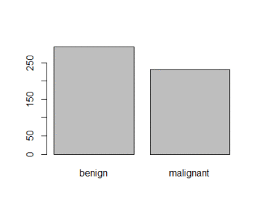
Figure 2: Plot of categorical class variable with probability based sample split
If the outcome or the response variable is categorical then split the data using stratified random sampling that applies random sampling within subgroups (such as the classes). In this way, there is a higher likelihood that the outcome distributions will match. The function <em>createDataPartition </em>of the caret package can be used to create balanced splits of the data or random stratified split. I show it using an example in R as given;
> library(caret)
> train.rows<- createDataPartition(y= BreastCancer$Class, p=0.7, list = FALSE)
> train.data<- BreastCancer[train.rows,] # 70% data goes in here
> table(train.data$Class)
benign malignant
321 169
And the plot shown in figure 3
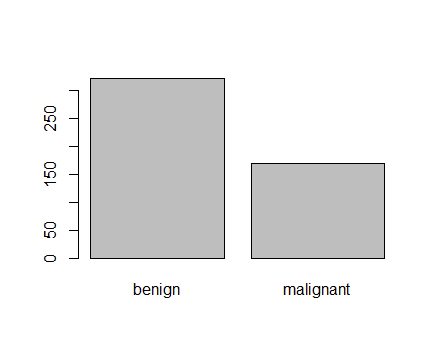
Figure 3: Plot of categorical class variable from train sample data
Similarly, I do for the test sample data as given
> test.data<- BreastCancer[-train.rows,] # 30% data goes in here
> table(test.data$Class)
benign malignant
137 72
> plot(test.data$Class)
And I show the plot in figure 4,

Figure 4: Plot of categorical class variable from test sample data
<span style="color:#000080;"><strong>Splitting based on Predictor/Input/Independent variables</strong></span>
So far we have seen the data splitting was based on the outcome or the response variable. However, the data can be split on the predictor variables too. This is achieved by <em>maximum dissimilarity sampling </em> as proposed by Willet (1999) and Clark (1997). This is particularly useful for unsupervised learning where there are no response variables. There are many methods in R to calculate dissimilarity. caret uses the proxy package. See the manual for that package for a list of available measures. Also, there are many ways to calculate which sample is “most dissimilar”. The argument obj can be used to specify any function that returns a scalar measure. caret includes two functions, minDiss and sumDiss, that can be used to maximize the minimum and total dissimilarities, respectfully.
References
Kuhn, M.,& Johnson, K. (2013). Applied predictive modeling (pp. 389-400). New York: Springer.
Willett, P. (1999), "Dissimilarity-Based Algorithms for Selecting Structurally Diverse Sets of Compounds," Journal of Computational Biology, 6, 447-457.
</p>
<![CDATA[Big or small-lets save them all- Visualizing Data]]>https://duttashi.github.io/blog/big-or-small-lets-save-them-all-visualizing-data2016-01-23T00:00:00+00:002016-01-23T00:00:00+00:00Ashish Dutthttps://duttashi.github.ioashishdutt@yahoo.com.myblog<p>I am revisiting the research question once again, “Can alcohol consumption increase the risk of breast cancer in working class women? and the variables to explore are;</p>
<ol>
<li>‘alcconsumption’- average alcohol consumption, adult (15+) per capita consumption in litres pure alcohol</li>
<li>‘breastcancerper100TH’- Number of new cases of breast cancer in 100,000 female residents during the certain year</li>
<li>‘femaleemployrate’- Percentage of female population, age above 15, that has been employed during the given year</li>
</ol>
<p>From the research question, the <span style="text-decoration:underline;">dependent variable</span> or the response or the outcome variable <span style="text-decoration:underline;">is breast cancer per 100<sup>th</sup> women</span> and the <span style="text-decoration:underline;">independent variables</span> are <span style="text-decoration:underline;">alcohol consumption and female employ rate</span></p>
<p>Let us now look at the measures of center and spread of the aforementioned variables. This will help us to better understand our quantitative variables. In python, to measure the mean, median, mode, minimum and maximum value, standard deviation and percentiles of a quantitative variable can be computed using the describe() function as shown below</p>
<div class="language-plaintext highlighter-rouge"><div class="highlight"><pre class="highlight"><code>#using the describe function to get the standard deviation and other descriptive statistics of our variables
desc1=data['breastcancerper100th'].describe()
desc2=data['femaleemployrate'].describe()
desc3=data['alcconsumption'].describe()
print "\nBreast Cancer per 100th person\n", desc1
print "\nfemale employ rate\n", desc2
print "\nAlcohol consumption in litres\n", desc3
</code></pre></div></div>
<p>and the result will be</p>
<div class="language-plaintext highlighter-rouge"><div class="highlight"><pre class="highlight"><code>Breast Cancer per 100th person
count 173.000000
mean 37.402890
std 22.697901
min 3.900000
25% 20.600000
50% 30.000000
75% 50.300000
max 101.100000
</code></pre></div></div>
<p>So, on an average there are 37 women per 100th in whom breast cancer is reported with a standard deviation of +- 22.</p>
<p>Similarly, I next find the mean and standard deviation of the variable, ‘femalemployrate’</p>
<div class="language-plaintext highlighter-rouge"><div class="highlight"><pre class="highlight"><code>female employ rate
count 178.000000
mean 47.549438
std 14.625743
min 11.300000
25% 38.725000
50% 47.549999
75% 55.875000
max 83.300003
</code></pre></div></div>
<p>I can say that on an average there are 47% women employed in a given year with a deviation of +-15.</p>
<p>Finally, I find the mean and deviation of the variable, ‘alcconsumption’ given as</p>
<div class="language-plaintext highlighter-rouge"><div class="highlight"><pre class="highlight"><code>Alcohol consumption in litres
count 187.000000
mean 6.689412
std 4.899617
min 0.030000
25% 2.625000
50% 5.920000
75% 9.925000
max 23.010000
</code></pre></div></div>
<p>This can be interpreted as among adults (15+) the average alcohol consumption in liters per capita income is 7 liters (rounding off) with a standard deviation of +-5 (rounding off).</p>
<p>Therefore the inference will be that in 47% <em>(+-15)</em> employed women in a given year the average alcohol consumption is 7 liters (+-5) per capita and the number of breast cancer cases reported on an average are 37 (+-22) per 100th female residents.</p>
<p>Another, alternative method of finding descriptive statistic for your variables is to use the describe() on the dataframe which in this case is called ‘data’ as given</p>
<div class="language-plaintext highlighter-rouge"><div class="highlight"><pre class="highlight"><code>data.describe()
</code></pre></div></div>
<p>I now provide the univariate data analysis of the individual variables</p>
<div class="language-plaintext highlighter-rouge"><div class="highlight"><pre class="highlight"><code># Now plotting the univariate quantitative variables using the distribution plot
sub5=sub4.copy()
sns.distplot(sub5['alcconsumption'].dropna(),kde=True)
plt.xlabel('Alcohol consumption in litres')
plt.title('Breast cancer in working class women')
plt.show()
'''Note: Although there is no need to use the show() method for ipython notebook as %matplotlib inline does the trick but I am adding it here because matplotlib inline does not work for an IDE like Pycharm and for that i need to use plt.show'''
</code></pre></div></div>
<p>And the barchart is</p>
<p><img class=" size-full wp-image-1227 aligncenter" src="https://edumine.files.wordpress.com/2016/01/fd1.png" alt="fd1" width="521" height="380" /></p>
<p style="text-align:center;">Bar Chart 1: Alcohol consumption in liters</p>
<p>Notice, we have two peaks in bar chart 1. So it is a bimodal distribution which means that there are two distinct groups of data. The two groups are evident from the bar chart 1, where the first group (or the first peak) is centered at 5 liters of alcohol consumption and the second group (or the second peak) is centered at 35 liters of alcohol consumption</p>
<div class="language-plaintext highlighter-rouge"><div class="highlight"><pre class="highlight"><code>sns.distplot(sub5['breastcancerper100th'].dropna(),kde=True)
plt.xlabel('Breast cancer per 100th women')
plt.title('Breast cancer in working class women')
plt.show()
</code></pre></div></div>
<p>And the barchart is</p>
<p><img class=" size-full wp-image-1233 aligncenter" src="https://edumine.files.wordpress.com/2016/01/fd2.png" alt="fd2" width="501" height="365" /></p>
<p style="text-align:center;">Bar Chart 2: Breast cancer per 100th women</p>
<p style="text-align:left;">Similarly, in bar chart 2, there are two peaks so it is a bimodal distribution where the first group is centered at 35 cases of new breast cancer reported and the second group is centered at 86 cases of new breast cancer reported.</p>
<div class="language-plaintext highlighter-rouge"><div class="highlight"><pre class="highlight"><code>sns.distplot(sub5['femaleemployrate'].dropna(),kde=True)
plt.xlabel('Female employee rate')
plt.title('Breast cancer in working class women')
plt.show()
</code></pre></div></div>
<p>And the bar chart is</p>
<p><img class=" size-full wp-image-1237 aligncenter" src="https://edumine.files.wordpress.com/2016/01/fd3.png" alt="fd3" width="495" height="365" /></p>
<p style="text-align:center;">Bar Chart 3: Female Employed Rate above 15+ (in %age) in a given year</p>
<p style="text-align:left;">In bar chart 3 we see a unimodal distribution where there is one group with maximum number of 42.</p>
<p>Now that we have seen the individual variable visually, I will now come back to the research question to see if there is any relationship between the research questions. Recall, for this study the various hypotheses were;</p>
<p>H<sub>0 </sub>(Null Hypothesis) = Breast cancer is not caused by alcohol consumption</p>
<p>H<sub>1 </sub>(Alternative Hypothesis) = Alcohol consumption causes breast cancer</p>
<p>H<sub>2 </sub>(Alternative Hypothesis) = Female employee are susceptible to increased risk of breast cancer.</p>
<p>So, let’s check if there is any relationship between the breast cancer and alcohol consumption.</p>
<p>Please note here that since all the variables of this study are quantitative in nature so I will be using the scatter plot to visualize them.</p>
<p>Note that a histogram is not a bar chart. Histograms are used to show distributions of variables while bar charts are used to compare variables. Histograms plot quantitative data with ranges of the data grouped into bins or intervals while bar charts plot categorical data. For Dell Statistica, you can take a look <a href="http://documents.software.dell.com/Statistics/Textbook/Graphical-Analytic-Techniques">here</a> for the graphical data visualization and in Python it can be done using matplotlib library as shown <a href="https://plot.ly/matplotlib/bar-charts/">here</a> and a good SO question <a href="http://stackoverflow.com/questions/11617719/how-to-plot-a-very-simple-bar-chart-python-matplotlib-using-input-txt-file">here</a></p>
<ul>
<li>When visualizing a categorical to categorical relationship we use a Bar Chart.</li>
<li>When visualizing a categorical to quantitative relationship we use a Bar Chart.</li>
<li>When visualizing a quantitative to quantitative relationship we use a Scatter Plot.</li>
</ul>
<p>Also, please note that it is very important to bear in mind when plotting association between two variables, the <span style="text-decoration:underline;">independent or the explanatory variable is ‘X’ plotted on the x-axis</span> and the <span style="text-decoration:underline;">dependent or the response variable is ‘Y’ plotted on the y-axis</span></p>
<p><img class=" wp-image-1350 aligncenter" src="https://edumine.files.wordpress.com/2016/01/ind_dep_graph.png" alt="ind_dep_graph" width="268" height="265" /></p>
<p>So to check if the relationship exist or not, I code it in python as follows</p>
<div class="language-plaintext highlighter-rouge"><div class="highlight"><pre class="highlight"><code># using scatter plot the visulaize quantitative variable.
# if categorical variable then use histogram
scat1= sns.regplot(x='alcconsumption', y='breastcancerper100th', data=data)
plt.xlabel('Alcohol consumption in liters')
plt.ylabel('Breast cancer per 100th person')
plt.title('Scatterplot for the Association between Alcohol Consumption and Breast Cancer 100th person')
</code></pre></div></div>
<p>And the corresponding scatter plot is <img class=" size-full wp-image-1251 aligncenter" src="https://edumine.files.wordpress.com/2016/01/sct1.png" alt="sct1" width="527" height="365" /></p>
<p style="text-align:center;">Scatter Plot 1</p>
<p>From the scatter plot 1, its evident that we have a positive relationship between the two variables. And this proves the alternative hypothesis (H<sub>1</sub>) that higher alcohol consumption by women has increased chances of breast cancer in them. Thus we can safely reject the null hypothesis that alcohol consumption does not cause breast cancer in women. Also, the points on the scatter plot are densely scattered around the linear line therefore the strength of the relationship is strong. This means that we have a statistically significant and strong positive relationship between higher alcohol consumption causing increased number of breast cancer patients in women.</p>
<p>Now, let us check if the other alternative hypothesis (H<sub>2</sub>), “Female employee are susceptible to increased risk of breast cancer” is true or not. To verify this claim, I code it as</p>
<div class="language-plaintext highlighter-rouge"><div class="highlight"><pre class="highlight"><code>scat2= sns.regplot(x='femaleemployrate', y='breastcancerper100th', data=data)
plt.xlabel('Female Employ Rate')
plt.ylabel('Breast cancer per 100th person')
plt.title('Scatterplot for the Association between Female Employ Rate and Breast Cancer per 100th Rate')
</code></pre></div></div>
<p>And the scatter plot is <img class=" size-full wp-image-1263 aligncenter" src="https://edumine.files.wordpress.com/2016/01/sct2.png" alt="sct2" width="529" height="365" /></p>
<p style="text-align:center;">Scatter Plot 2</p>
<p>From scatter plot 2, we can see that there is a negative relationship between the two variables. That means as the number of female employment count increases the number of breast cancer patients in employed women decreases. Also the strength of this relationship is weak as the number of points are sparsely located on the linear line. So, I will say that although the relationship is statistically significant but it is weak thus its safe to conclude that female employment rate does not necessarily contribute to breast cancer in women.</p>
<p>I now come to the conclusion of this analytical series. After performing descriptive and exploratory data analysis on the gapminder dataset using python as a programming tool, I have been successful in determining that higher alcohol consumption by women increases the chance of breast cancer in them. I have also been successful in determining that breast cancer occurrence in employed females has a weak correlation. Perhaps, there are other factors that could prove this.</p>
<p>Finally, to conclude this exploratory data analysis series of posts has been very fruitful and immensely captivating to me. In the next post, I will discuss on the statistical relationships between the variables and testing the hypotheses in the context of Analysis of Variance (when you have one quantitative variable and one categorical variable). And since the dataset that I chose does not have any categorical variable, I will also show how to categorize a quantitative variable.</p>
<p>The complete python code is listed on my GitHub account <a href="https://github.com/duttashi/Data-Analysis-Visualization/blob/master/gapminder_data_analysis.py" target="_blank">here</a></p>
<p>Cheers!</p>
<![CDATA[Big or small-lets save them all- Making Data Management Decisions]]>https://duttashi.github.io/blog/big-or-small-lets-save-them-all-making-data-management-decisions2016-01-15T00:00:00+00:002016-01-15T00:00:00+00:00Ashish Dutthttps://duttashi.github.ioashishdutt@yahoo.com.myblog<p>So far I have discussed the data-set, the research question, introduced the variables to analyze and performed some exploratory data analysis in which I showed how to get a brief overview of the data using python. Continuing further, I have now reached a stage wherein I must ‘dive into’ the data-set and make some strategic data management decisions. This stage cannot be taken lightly because it lays the foundation of the entire project. A misjudgment here can spell doom to the entire data analysis cycle.</p>
<p>The first step is to see, if the data is complete or not? By completeness, I mean to check the rows and the columns of the data-set for any missing values or junk values. (<em>Do note, here I have asked two questions. In this post I will answer the first question only. In another post i will answer the second question</em>); a) How to deal with missing values and b) How to deal with junk values.</p>
<p>To answer the first question, I use the following code to get the sum of missing values by rows thereafter I use the is.null().sum() as given to display the column count of the missing values.</p>
<div class="language-plaintext highlighter-rouge"><div class="highlight"><pre class="highlight"><code># Create a copy of the original dataset as sub4
sub4=data
print "Missing data rows count: &amp;quot;,sum([True for idx,row in data.iterrows() if any(row.isnull())]) I would see that there are 48 rows of missing data as shown
Missing data rows count: 48 Now how about I want to see the columns that have missing data. For that I use the isnull().sum() function as given
print sub4.isnull().sum() This line of code will give me the column-vise missing data count as shown
country 0
breastcancerper100th 40
femaleemployrate 35
alcconsumption 26
dtype: int64
</code></pre></div></div>
<p>So now, how to deal with this missing data? There are some excellent papers written that have addressed this issue. For interested reader, I refer to two such examples <a href="http://www.unt.edu/rss/class/mike/6810/articles/roth.pdf">here</a> and <a href="http://myweb.brooklyn.liu.edu/cortiz/PDF%20Files/Best%20practices%20for%20missing%20data%20management.pdf">here</a>.
<span style="text-decoration:underline;"><strong>Dealing with Missing Values</strong></span>
So what do I do with a data set that has 3 continuous variables which off-course as always is dirty (<em><strong>brief melodrama now: </strong>hands high in air and I shout “Don’t you have any mercy on me! When will you give me that perfect data set. God laughs and tells his accountant pointing at ‘me’..”look at that earthly fool..while all fellows at his age ask for wine, women and fun he wants me to give him “clean data” which even I don’t have”</em>). So how do I mop it clean? Do i remove the missing values? “Nah” that would be apocalyptic in data science ..hmmm..so what do I do? How about I code all the missing values as Zero. <strong>NO! Not to underestimate the Zero. </strong>So what do I do?</p>
<p>One solution is to impute the missing continuous variables with the mean of the neighboring values in the variable. Note: to impute the missing categorical values, one can try imputing the mode (highest occurring frequency value). Yeah..that should do the trick. So I code it as given;</p>
<div class="language-plaintext highlighter-rouge"><div class="highlight"><pre class="highlight"><code>sub4.fillna(sub4['breastcancerper100th'].mean(), inplace=True)
sub4.fillna(sub4['femaleemployrate'].mean(), inplace=True)
sub4.fillna(sub4['alcconsumption'].mean(), inplace=True)
</code></pre></div></div>
<p>So here, I have used the fillna() method of pandas library. You can see here the <a href="http://pandas.pydata.org/pandas-docs/stable/missing_data.html">documentation</a> . Now I show the output before missing value imputation as</p>
<div class="language-plaintext highlighter-rouge"><div class="highlight"><pre class="highlight"><code>Missing data rows count: 48
country 0
breastcancerper100th 40
femaleemployrate 35
alcconsumption 26
dtype: int64
</code></pre></div></div>
<p>and the output after the missing values were imputed using the fillna() function as</p>
<div class="language-plaintext highlighter-rouge"><div class="highlight"><pre class="highlight"><code>country 0 breastcancerper100th 0 femaleemployrate 0 alcconsumption 0 dtype: int64
</code></pre></div></div>
<p>Continuing further, I now categorize the quantitative variables based on customized splits using the cut function and why I am doing this because it will help me later to view a nice elegant frequency distribution.</p>
<div class="language-plaintext highlighter-rouge"><div class="highlight"><pre class="highlight"><code># categorize quantitative variable based on customized splits using the cut function
sub4['alco']=pd.qcut(sub4.alcconsumption,6,labels=["0","1-4","5-9","10-14","15-19","20-24"])
sub4['brst']=pd.qcut(sub4.breastcancerper100th,5,labels=["1-20","21-40","41-60","61-80","81-90"])
sub4['emply']=pd.qcut(sub4.femaleemployrate,4,labels=["30-39","40-59","60-79","80-90"])
</code></pre></div></div>
<p><span style="font-family:Consolas, Monaco, monospace;line-height:1.7;"><span style="font-family:Consolas, Monaco, monospace;line-height:1.7;">Now, that I that I have split the continuous variables, I will now show there frequency distributions so as to understand my data better.</span></span></p>
<div class="language-plaintext highlighter-rouge"><div class="highlight"><pre class="highlight"><code>fd1=sub4['alco'].value_counts(sort=False,dropna=False)
fd2=sub4['brst'].value_counts(sort=False,dropna=False)
fd3=sub4['emply'].value_counts(sort=False,dropna=False)
</code></pre></div></div>
<p><span style="font-family:Consolas, Monaco, monospace;line-height:1.7;"><span style="font-family:Consolas, Monaco, monospace;line-height:1.7;">I will now print the frequency distribution for alcohol consumption as given</span></span></p>
<div class="language-plaintext highlighter-rouge"><div class="highlight"><pre class="highlight"><code>Alcohol Consumption
0 36
1-4 35
5-9 36
10-14 35
15-19 35
20-24 36
dtype: int64
</code></pre></div></div>
<p><span style="font-family:Consolas, Monaco, monospace;line-height:1.7;"><span style="font-family:Consolas, Monaco, monospace;line-height:1.7;">then, the frequency distribution for breast cancer per 100th women as </span></span></p>
<div class="language-plaintext highlighter-rouge"><div class="highlight"><pre class="highlight"><code>Breast Cancer per 100th
1-20 43
21-40 43
41-60 65
61-80 19
81-90 43
dtype: int64
</code></pre></div></div>
<p><span style="font-family:Consolas, Monaco, monospace;line-height:1.7;"><span style="font-family:Consolas, Monaco, monospace;line-height:1.7;"><span style="font-family:Consolas, Monaco, monospace;line-height:1.7;">and finally the female employee rate as </span></span></span></p>
<div class="language-plaintext highlighter-rouge"><div class="highlight"><pre class="highlight"><code>Female Employee Rate
30-39 73
40-59 34
60-79 53
80-90 53
dtype: int64 <span style="font-family:Consolas, Monaco, monospace;line-height:1.7;"><span style="font-family:Consolas, Monaco, monospace;line-height:1.7;"><span style="font-family:Consolas, Monaco, monospace;line-height:1.7;">Now, this looks better. So if I have to summarize it the frequency distribution for alcohol consumption per liters among adults (age 15+). I will say that there are 36 women who drink no alcohol at all (and still they are breast cancer victims...hmmm ..nice find..will explore it further later). The count of women who drink between 5-9 liters and 20-24 liters of pure alcohol is similar! Then there are about 73% of women who have been employed in a certain year and roughly about 43 new breast cancer cases are reported per 100th female residents. </span>
</code></pre></div></div>
<p>Stay tuned, next time I will provide a visual interpretation of these findings and more.</p>
<p>Cheers!</p>
<![CDATA[Big or small-lets save them all-Exploratory Data Analysis]]>https://duttashi.github.io/blog/big-or-small-lets-save-them-all-exploratory-data-analysis2016-01-09T00:00:00+00:002016-01-09T00:00:00+00:00Ashish Dutthttps://duttashi.github.ioashishdutt@yahoo.com.myblog<p>In my previous post, I had discussed at length on the research question, the dataset, the variables and the various research hypothesis.
For the sake of brevity, I will restate the research question and the variables of study.</p>
<p>Research question: Can alcohol consumption increase the risk of breast cancer in working class women.
Variables to explore are:</p>
<ol>
<li>‘alcconsumption’- average alcohol consumption, adult (15+) per capita consumption in litres pure alcohol</li>
<li>‘breastcancerper100TH’- Number of new cases of breast cancer in 100,000 female residents during the certain year</li>
<li>‘femaleemployrate’- Percentage of female population, age above 15, that has been employed during the given year</li>
</ol>
<p>In this post, I present to the readers an exploratory data analysis of the gapminder dataset.</p>
<p>Although, for this course we are provided with the relevant dataset, however if you are not taking this course and are interested in the source of the data, then you can get it from <a href="http://www.gapminder.org/data/">here</a>. In the List of indicators search box type “breast cancer, new cases per 100,000 women” to download the dataset.</p>
<p>I will be using python for Exploratory Data Analysis (EDA). I begin by importing the libraries pandas and numpy as</p>
<div class="language-plaintext highlighter-rouge"><div class="highlight"><pre class="highlight"><code># Importing the libraries
import pandas as pd
import numpy as np
</code></pre></div></div>
<p>I have already downloaded the dataset which is .csv (comma seperated value format) and will now load/read it in a variable called datausing pandas library as given</p>
<div class="language-plaintext highlighter-rouge"><div class="highlight"><pre class="highlight"><code># Reading the data where low_memory=False increases the program efficiency
data = pd.read_csv('data/train.csv', low_memory=False)
</code></pre></div></div>
<p>To get a quick look at the number of rows and columns and the coulmn headers, you can do the following;</p>
<div class="language-plaintext highlighter-rouge"><div class="highlight"><pre class="highlight"><code>print (len(data)) # shows the number of rows, here 213 rows
print (len(data.columns))# shows the number of cols, here 4 columns# Print the column headers/headings
names=data.columns.values
print names
</code></pre></div></div>
<p>You will see the output as</p>
<div class="language-plaintext highlighter-rouge"><div class="highlight"><pre class="highlight"><code>213
4
213
['country' 'breastcancerper100th' 'femaleemployrate' 'alcconsumption']
</code></pre></div></div>
<p>Now, to see the frequency distribution of these four variables I use the <strong>value_counts() </strong>function to generate the frequency counts of the breast cancer dependence variables. Note, if you want to see the data with the missing values then choose the flag <strong>dropna=False</strong> as shown. For this dataset, majority of variable values have a frequency of 1.</p>
<div class="language-plaintext highlighter-rouge"><div class="highlight"><pre class="highlight"><code>print "\nAlcohol Consumption\nFrequency Distribution (in %)"
c1=data['alcconsumption'].value_counts(sort=False,dropna=False)
print c1
print "\nBreast Cancer per 100th"
c2=data['breastcancerper100th'].value_counts(sort=False)
print c2
print "\nFemale Employee Rate"
c3=data['femaleemployrate'].value_counts(sort=False)
print c3
</code></pre></div></div>
<p>The output will be <code class="language-plaintext highlighter-rouge">Alcohol Consumption 5.25 1 9.75 1 0.50 1 9.50 1 9.60 1</code></p>
<p>In the above output, values 5.25,9.75,0.50,5.05 are the alcohol consumption in litres and the value 0.004695 is the percentage count of the value. The flag sort=False means that values will not be sorted according to their frequencies. Similarly, I show the frequency distribution for the other two variables</p>
<div class="language-plaintext highlighter-rouge"><div class="highlight"><pre class="highlight"><code>Breast Cancer per 100th
23.5 2
70.5 1
31.5 1
62.5 1
19.5 6
</code></pre></div></div>
<p>and</p>
<div class="language-plaintext highlighter-rouge"><div class="highlight"><pre class="highlight"><code>Female Employee Rate
45.900002 2
55.500000 1
35.500000 1
40.500000 1
45.500000 1
</code></pre></div></div>
<p>I now subset the data to explore my research question in a bid to see if it requires any improvement or not. I want to see which countries are prone to greater risk of breast cancer among female employee where the average alcohol intake is 10L;</p>
<div class="language-plaintext highlighter-rouge"><div class="highlight"><pre class="highlight"><code># Creating a subset of the data
sub1=data[(data['femaleemployrate']>40) & (data['alcconsumption']>=20)& (data['breastcancerper100th']<50)]
# creating a copy of the subset. This copy will be used for subsequent analysis
sub2=sub1.copy()
</code></pre></div></div>
<p>and the result is;</p>
<div class="language-plaintext highlighter-rouge"><div class="highlight"><pre class="highlight"><code>country breastcancerper100th femaleemployrate alcconsumption
9 Australia 83.2 54.599998 10.21
32 Canada 84.3 58.900002 10.20
50 Denmark 88.7 58.099998 12.02
63 Finland 84.7 53.400002 13.10
90 Ireland 74.9 51.000000 14.92
185 Switzerland 81.7 57.000000 11.41
202 United Kingdom 87.2 53.099998 13.24
</code></pre></div></div>
<p>Interestingly, countries with stable economies like Australia, Canada, Denmark, Finland, Ireland, Switzerland & UK top the list of high breast cancer risk among working women class. These countries are liberal to women rights. Now, this can be an interesting question that will be explored later.</p>
<p>How about countries with very low female employee rates- how much is there contribution to alcohol consumption and breast cancer risk? <em>(I set the threshold for high employee rate as greater than 40% and threshold for high alcohol consumption to be greater than 20 liters and breast cancer risk at less than 50%). And the winner is,</em> <strong>Moldova </strong>a landlocked country in Eastern Europe. Here we can see that Moldova contributes to approximately 50% of new breast cancer cases reported per 100,000th female residents with a per capita alcohol consumption of 23%. So with a low female employee rate of 43% (as compared to the threshold of 40%) this country does have a significant amount of new breast cancer cases reported because of high alcohol consumption by the relatively less number of adult female residents. ((on a side note: “Heaven’s! Moldavian working class women drink a lot :-) ))</p>
<div class="language-plaintext highlighter-rouge"><div class="highlight"><pre class="highlight"><code>print "\nContries where Female Employee Rate is greater than 40 &" \
" Alcohol Consumption is greater than 20L & new breast cancer cases reported are less than 50\n"
print sub2
print "\nContries where Female Employee Rate is greater than 50 &" \
" Alcohol Consumption is greater than 10L & new breast cancer cases reported are greater than 70\n"
sub3=data[(data['alcconsumption']>10)&(data['breastcancerper100th']>70)&(data['femaleemployrate']>50)]
print sub3
</code></pre></div></div>
<p>the result is</p>
<div class="language-plaintext highlighter-rouge"><div class="highlight"><pre class="highlight"><code>Contries where Female Employee Rate is greater than 40 & Alcohol Consumption is greater than 20L & new breast cancer cases reported are less than 50
country incomeperperson alcconsumption armedforcesrate \
126 Moldova 595.874534521728 23.01 .5415062
breastcancerper100th co2emissions femaleemployrate hivrate \
126 49.6 149904333.333333 43.599998 .4
internetuserate lifeexpectancy oilperperson polityscore \
126 40.122234699607 69.317 8
relectricperperson suicideper100th employrate urbanrate
126 304.940114846777 15.53849 44.2999992370606 41.76
</code></pre></div></div>
<p>The complete python code is listed on my <a href="https://github.com/duttashi/Data-Analysis-Visualization/blob/master/gapminder%20data%20analysis.ipynb" target="_blank">github account</a></p>
<p>This series will be continued….</p>
<![CDATA[Batch Geo-coding in R]]>https://duttashi.github.io/blog/batch-geo-coding-in-r2015-07-05T02:34:00+00:002015-07-05T02:34:00+00:00Ashish Dutthttps://duttashi.github.ioashishdutt@yahoo.com.myblog<p>Geocoding (sometimes called forward <b>geocoding</b>) is the process of enriching a description of a location, most typically a postal address or place name, with geographic coordinates from spatial reference data such as building polygons, land parcels, street addresses, postal codes (e.g. ZIP codes, CEDEX) and so on.</p>
<p>Google API for Geo-coding restricts coordinates lookup to 2500 per IP address per day. So if you have more than this limit of addresses then searching for an alternative solution is cumbersome.</p>
<p>The task at hand was to determine the coordinates of a huge number of addresses to the tune of over 10,000.</p>
<p>The question was how to achieve this in R?</p>
<div class="language-plaintext highlighter-rouge"><div class="highlight"><pre class="highlight"><code>> library(RgoogleMaps)
> DF <- with(caseLoc, data.frame(caseLoc, t(sapply(caseLoc$caseLocation, getGeoCode))))
#caseLoc is the address file and caseLocation is the column header
</code></pre></div></div>
<![CDATA[To read multiple files from a directory and save to a data frame]]>https://duttashi.github.io/blog/to-read-multiple-files-from-a-directory-and-save-to-a-data-frame2015-06-23T16:16:00+00:002015-06-23T16:16:00+00:00Ashish Dutthttps://duttashi.github.ioashishdutt@yahoo.com.myblog<p>There are various solution to this questions like these but I will attempt to answer the problems that I encountered with there working solution that either I found or created by my own.</p>
<p>Question 1: My initial problem was how to read multiple .CSV files and store them into a single data frame.</p>
<p>Solution: Use a lapply() function and rbind(). One of the working R code I found <a href="http://stackoverflow.com/questions/23190280/issue-in-loading-multiple-csv-files-into-single-dataframe-in-r-using-rbind">here</a> provided by Hadley.</p>
<p>The code is;</p>
<div class="language-plaintext highlighter-rouge"><div class="highlight"><pre class="highlight"><code># The following code reads multiple csv files into a single data frame
load_data <- function(path)
{
files <- dir(path, pattern = '\\*.csv', full.names = TRUE)
tables <- lapply(files, read.csv)
do.call(rbind, tables)
}
</code></pre></div></div>
<p>And then use the function like</p>
<div class="language-plaintext highlighter-rouge"><div class="highlight"><pre class="highlight"><code>> load_data("D://User//Temp")
</code></pre></div></div>