Figma Image Filters plugin
In the last few years we've seen more demand for animation and short-form video. After a stint with After Effects templates we decided to work on a purpose built motion tool that we can use internally. For now we've called it "Drift", anyway Drift has a color panel which supports LUTs and comes with a collection of pre-made image filters.
Figma Image Filters plugin
A bit of Photoshop in Figma
Which led to the thought that I'd like to be able to use those filters in Figma. Email designers have typically worked in Photoshop, though more of us are moving to Figma or using both. At first I thought I could take the LUTs I'd created for Drift and import them into Figma, but we went the WebGL shader route instead. Check it out on the Figma community.What's in the plugin
- Adjust (17)
- B&W film (13)
- B&W tints (14)
- Bloom (14)
- Duotone (10)
- Grain (3)
- Sonochrome (17)
- Split tone (15)
- Intensity
- Highlight rolloff
- Shadow lift
- Blur
- Overlay on/off
- Grain on/off
- Grain intensity
- Grain size
- Grain color
Customize
|
|
B&W film presets, grain, and bloom.
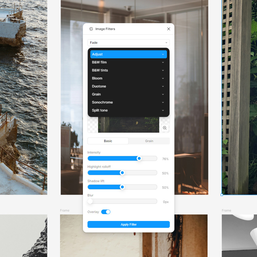
8 preset collections with a total of 103 image presets.
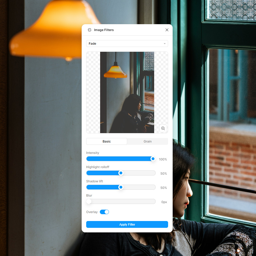
Select your image, choose a preset, hit apply filter.
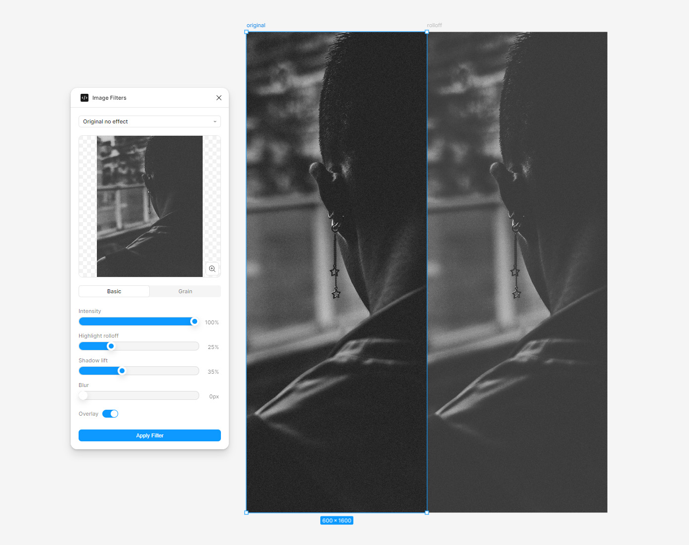
Highlight rolloff & shadow lift.
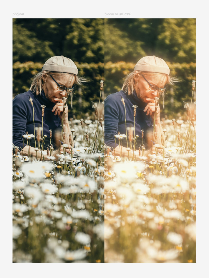
Blush preset, one of 14 bloom presets.
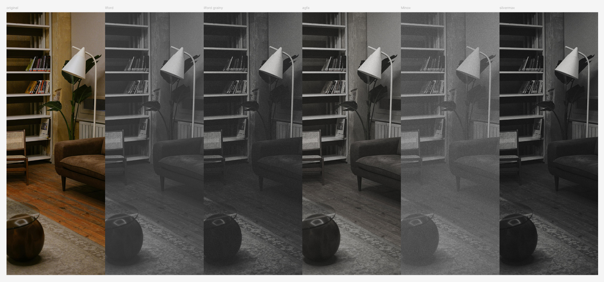
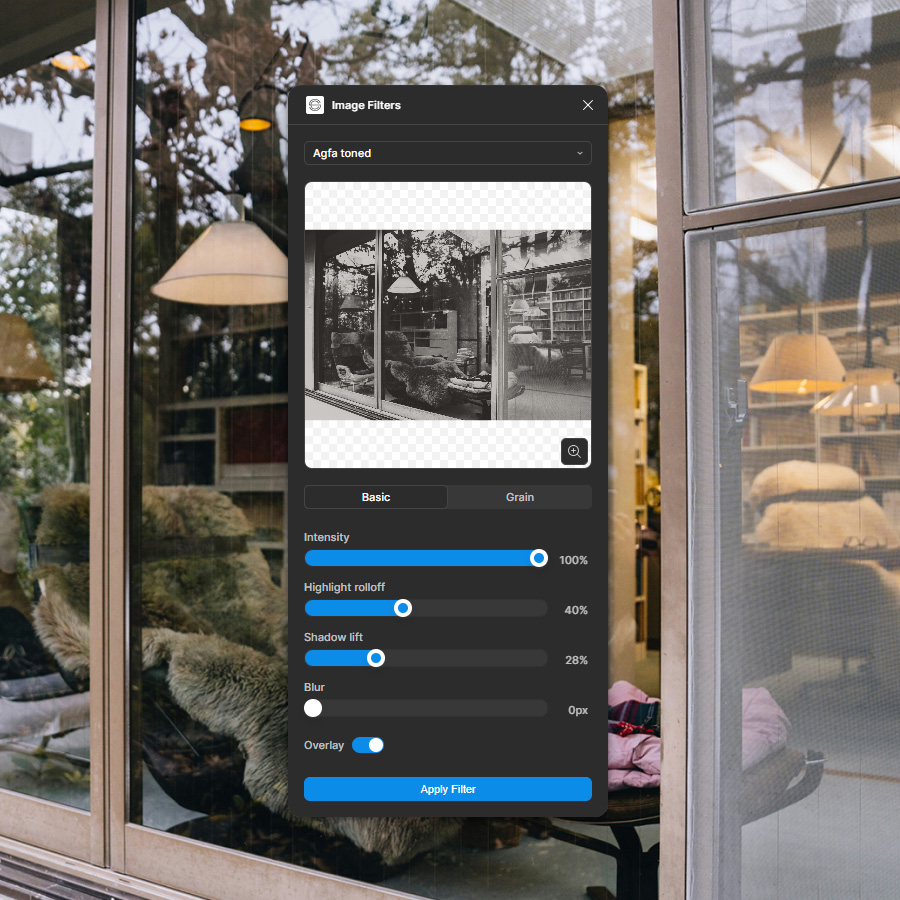
B&W film presets, more "loosely based on".
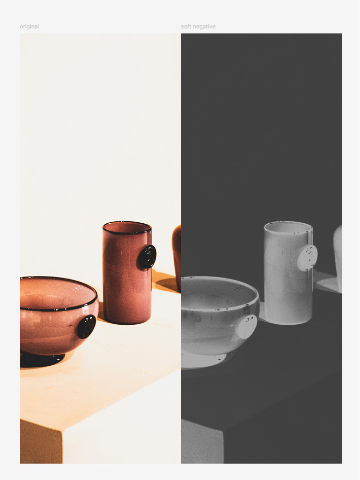
Soft negative preset.
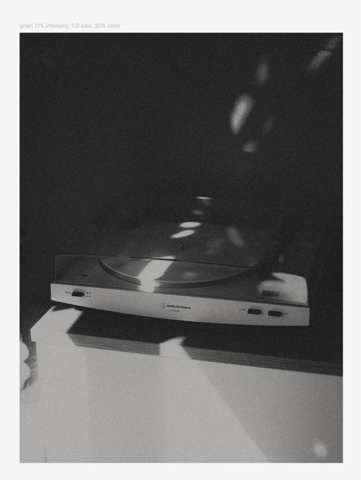
Grain has on/off, intensity, size and color parameters.
|
|
Adjust is a collection of 17 presets.
Limitations
You don't have access to all the preset parameters, there's 30+ so it's a lot to put in the UI. You can currently customize intensity, highlight rolloff, shadow lift, blur, overlay on/off, grain on/off and grain intensity, size and color.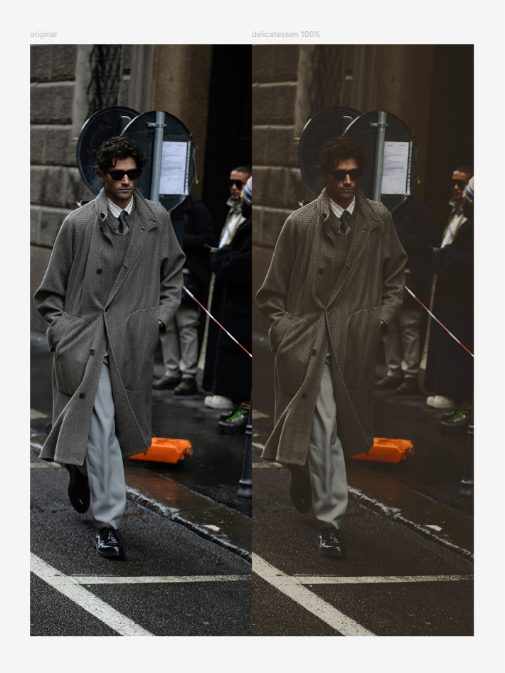
Delicatessen split tone preset.
Payment & privacy
It's a $10 one-time payment, with a 3-day free trial. You can purchase a license via a link within the plugin. It automatically gets flagged as paid, no license keys required. The plugin and your image assets are private to you, and you can use it for commercial projects.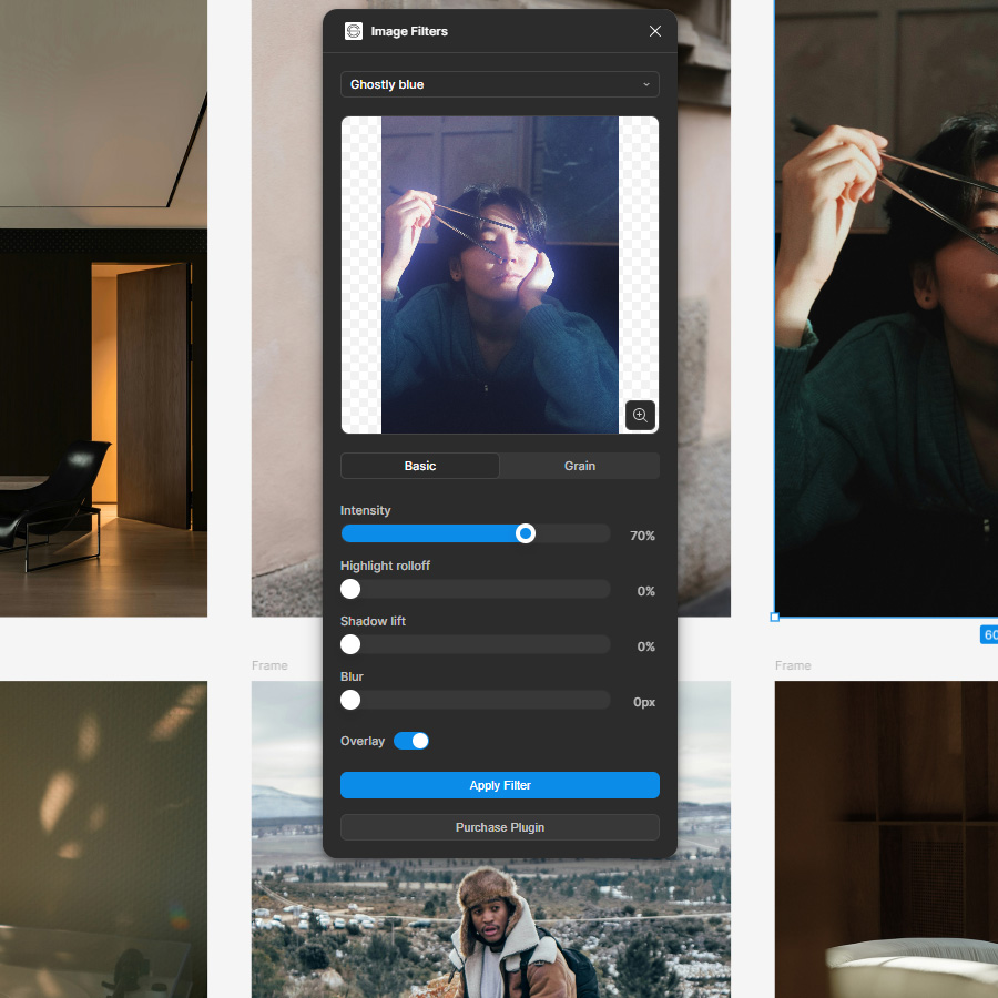
'Purchase Plugin' button should disappear once purchased.
Processed through Stripe
The 'Purchase Plugin' button takes you to our website. If you're on Safari on mac you might need to allow pop-ups in your settings/preferences. We're using Stripe to process payments, you'll receive a confirmation email after your purchase.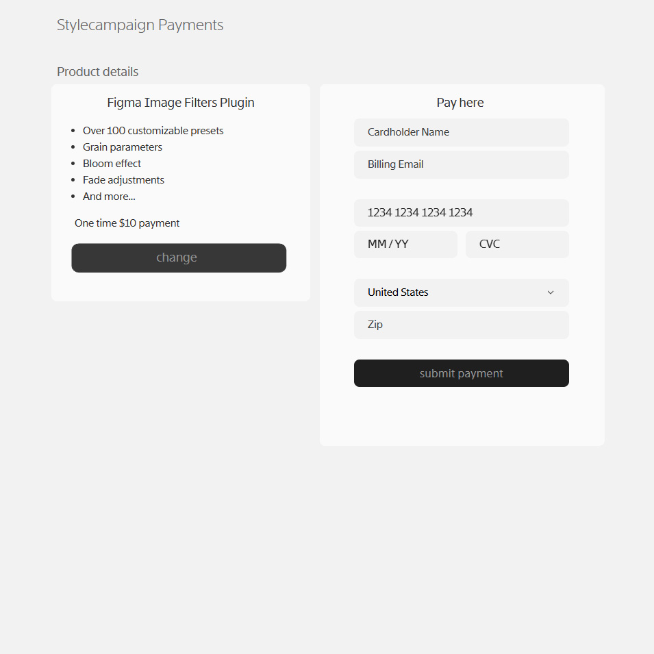
Payments processed through Stripe.
Support
Any questions best to email us support@stylecampaign.com. I'm also on X @stylecampaign, and emailgeeks slack as Anna Yeaman.Cool stuff I found along the way
- Colorists reddit
- Cullen Kelly DaVinci channel
- Steve Yedlin
- Yuriko Takagi
- George Hoyningen Huene
- William Henry Jackson
- Lee Miller & Man Ray
- Albumen Print
- Pictorialism
- Color correction look book
- Color grading B&W
- Figma UI3 community file
- First Figma plugin for designers
- Figma's plugin quickstart guide
- Making presets music