Tuhin
Kumar
Currently at Apple
Human Interface Designer at Apple
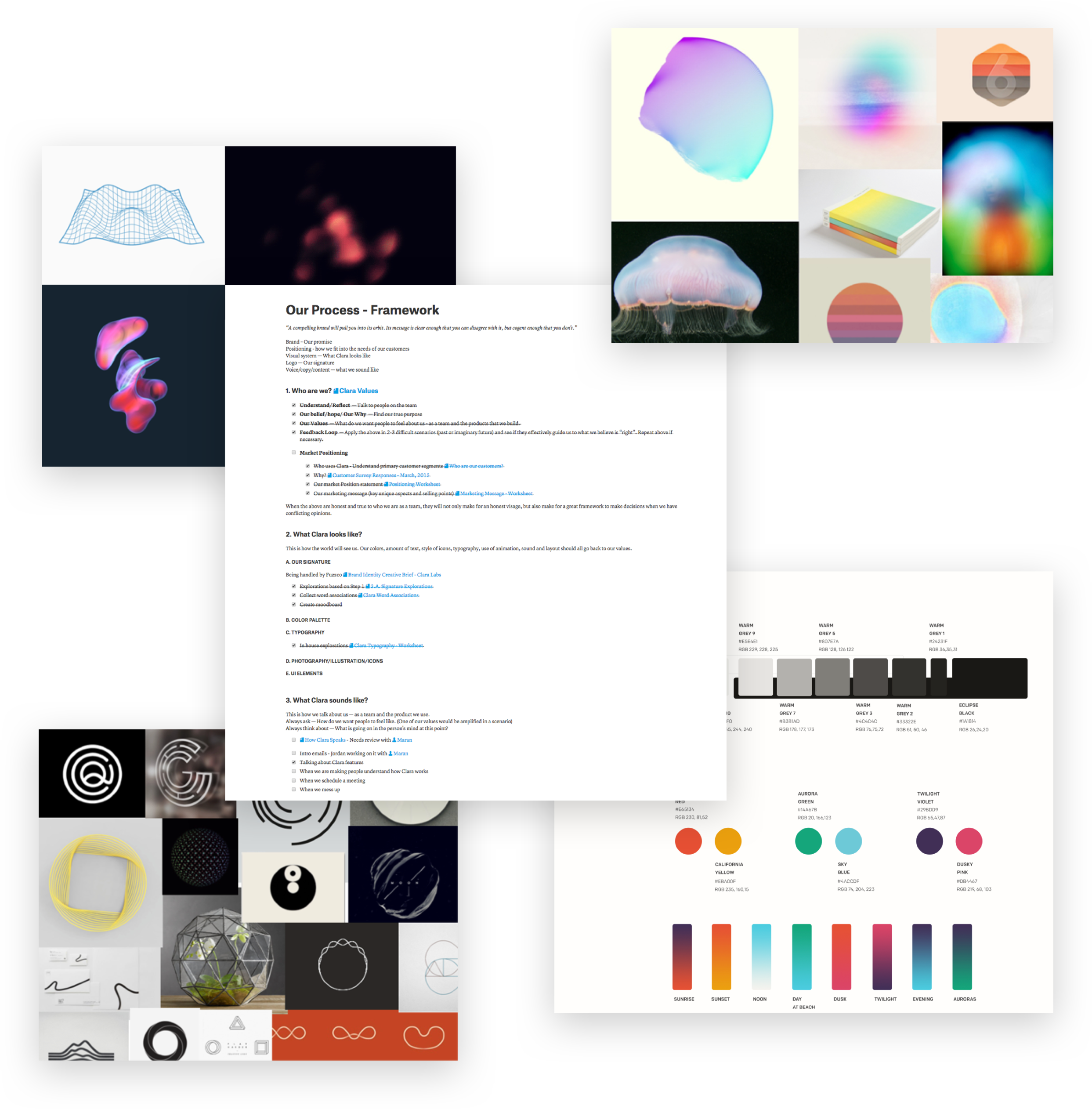
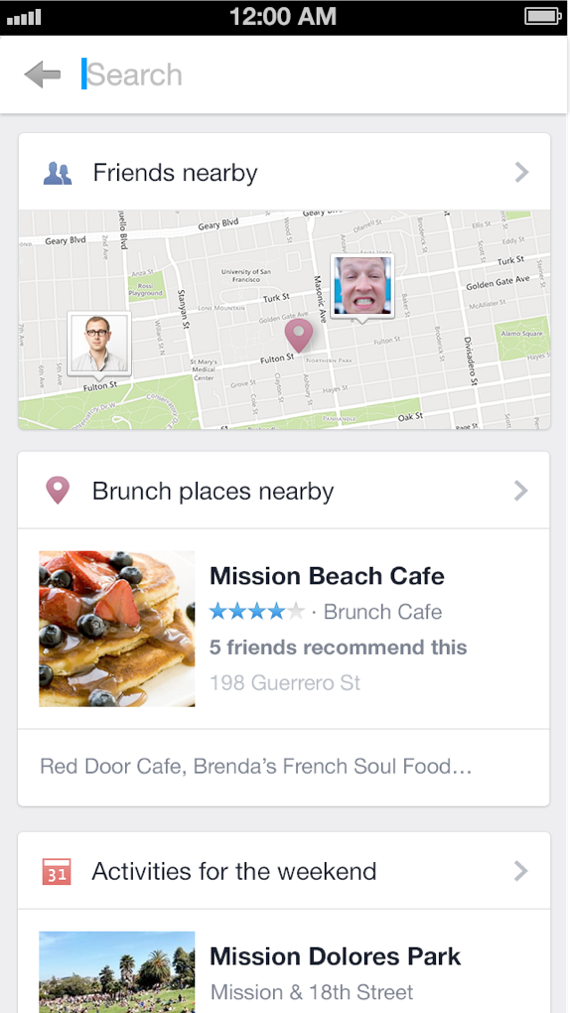
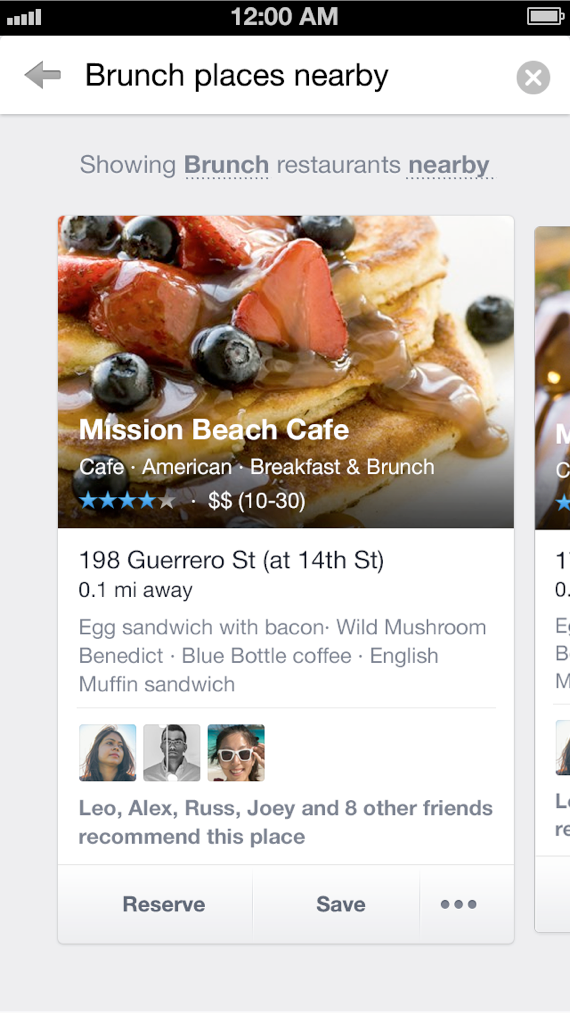
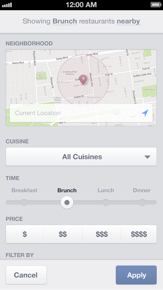
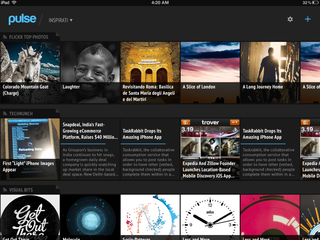
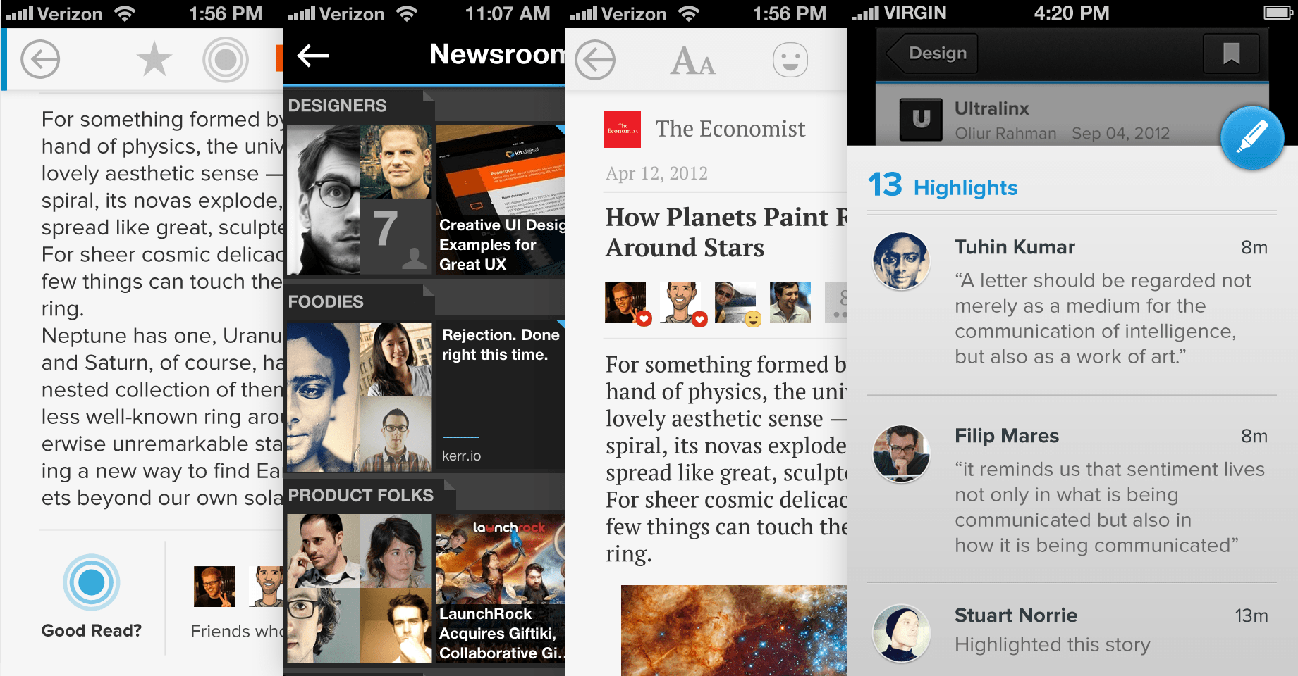
Prior to this I was at Airbnb where I focused on interactions, design system and worked on almost all the product surfaces over my 4.5 years there. Before that I was a Founding Designer at Clara — a new way of interacting with computers and information. Long time ago I was at Facebook, building systems for the society as a product designer. I was the first full-time designer at Pulse, an Apple Design Award winning news app (now acquired by LinkedIn).