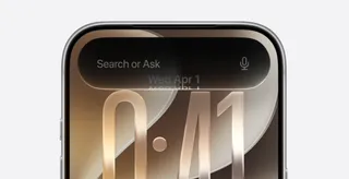
<?xml version="1.0" encoding="UTF-8"?>
<?xml-stylesheet type="text/xsl" media="screen" href="/~d/styles/rss2full.xsl"?><?xml-stylesheet type="text/css" media="screen" href="http://feeds.feedburner.com/~d/styles/itemcontent.css"?><rss xmlns:content="http://purl.org/rss/1.0/modules/content/" xmlns:wfw="http://wellformedweb.org/CommentAPI/" xmlns:dc="http://purl.org/dc/elements/1.1/" xmlns:atom="http://www.w3.org/2005/Atom" xmlns:sy="http://purl.org/rss/1.0/modules/syndication/" xmlns:slash="http://purl.org/rss/1.0/modules/slash/" version="2.0">

<channel>
	<title>Web Designer - Defining the internet through beautiful design</title>
	
	<link>http://www.webdesignermag.co.uk</link>
	<description>Web Design for real people</description>
	<lastBuildDate>Wed, 16 May 2012 16:09:18 +0000</lastBuildDate>
	<language>en</language>
	<sy:updatePeriod>hourly</sy:updatePeriod>
	<sy:updateFrequency>1</sy:updateFrequency>
	<generator>http://wordpress.org/?v=3.3.1</generator>
		<atom10:link xmlns:atom10="http://www.w3.org/2005/Atom" rel="self" type="application/rss+xml" href="http://feeds.feedburner.com/WebDesignerMag" /><feedburner:info xmlns:feedburner="http://rssnamespace.org/feedburner/ext/1.0" uri="webdesignermag" /><atom10:link xmlns:atom10="http://www.w3.org/2005/Atom" rel="hub" href="http://pubsubhubbub.appspot.com/" /><item>
		<title>WordPress WordCamp 2012</title>
		<link>http://www.webdesignermag.co.uk/news/wordpress-wordcamp-2012/</link>
		<comments>http://www.webdesignermag.co.uk/news/wordpress-wordcamp-2012/#comments</comments>
		<pubDate>Wed, 16 May 2012 16:09:18 +0000</pubDate>
		<dc:creator>Steve Jenkins</dc:creator>
				<category><![CDATA[News]]></category>
		<category><![CDATA[WordCamp]]></category>
		<category><![CDATA[Wordpress]]></category>

		<guid isPermaLink="false">http://www.webdesignermag.co.uk/?p=8897</guid>
		<description><![CDATA[Join WordPress lovers from around the globe at the UK's largest WordPress weekend unconference. ]]></description>
			<content:encoded><![CDATA[<!--wordcamp-edinburgh-header-1--><p><img class="alignnone size-full wp-image-8898" title="WordPress WordCamp 2012" src="http://www.webdesignermag.co.uk/wp-content/uploads/2012/05/wordcamp-edinburgh-header-1.jpg" alt="WordPress WordCamp 2012" width="608" height="235" /></p>
<p>WordCamp is a conference that focuses on everything WordPress. It is an informal, community-organized event that are put together by WordPress users. Everyone from casual users to core developers participate, share ideas, and get to know each other. WordCamps are open to WordPress.com and WordPress.org users alike.</p>

					<div class="adInPost">
						<script type="text/javascript">
							GA_googleFillSlot("WD_MidPage_MPU1");
						</script>
					</div><p>WordCamp include sessions on how to use WordPress more effectively, beginning plugin and theme development, advanced techniques, security and more. It doesn&#8217;t matter if you are a blogging beginner, professional WordPress developer or consultants there will be something for everyone.</p>
<p>Visit the <strong><a title="WordCamp Edinburgh 2012" href="http://2012.edinburgh.wordcamp.org/">WordCamp Edinburgh UK 2012</a></strong> for more information</p>
<img src="http://feeds.feedburner.com/~r/WebDesignerMag/~4/_0jxEe8Y6DM" height="1" width="1"/>]]></content:encoded>
			<wfw:commentRss>http://www.webdesignermag.co.uk/news/wordpress-wordcamp-2012/feed/</wfw:commentRss>
		<slash:comments>0</slash:comments>
		</item>
		<item>
		<title>Create a 3D image gallery with CSS3</title>
		<link>http://www.webdesignermag.co.uk/tutorials/create-a-3d-image-gallery-with-css3/</link>
		<comments>http://www.webdesignermag.co.uk/tutorials/create-a-3d-image-gallery-with-css3/#comments</comments>
		<pubDate>Tue, 15 May 2012 08:30:17 +0000</pubDate>
		<dc:creator>Steve Jenkins</dc:creator>
				<category><![CDATA[CSS]]></category>
		<category><![CDATA[Tutorials]]></category>
		<category><![CDATA[3D]]></category>
		<category><![CDATA[CSS3]]></category>
		<category><![CDATA[Google Web Fonts]]></category>
		<category><![CDATA[HTML]]></category>
		<category><![CDATA[Image gallery]]></category>
		<category><![CDATA[jQuery]]></category>
		<category><![CDATA[Photoshop]]></category>

		<guid isPermaLink="false">http://www.webdesignermag.co.uk/?p=8853</guid>
		<description><![CDATA[CSS3 enables us to visualise all sorts of new user interactions, including the rotation of the entire viewport]]></description>
			<content:encoded><![CDATA[<!--final-gallery--><!--prepare-images--><p><img class="alignnone size-full wp-image-8893" title="Create a 3D image gallery with CSS3" src="http://www.webdesignermag.co.uk/wp-content/uploads/2012/05/final-gallery.jpg" alt="Create a 3D image gallery with CSS3" width="608" height="370" /></p>
<p>Ah, the image gallery; a common part of modern web design, the gallery has been through numerous guises in the life of the web. Originally whole pieces of software were available to automate the generation of web galleries, and even the likes of Photoshop included a function to automatically create a thumbnail, large version and the HTML to link the two together. On the modern web, however, a click-and-wait-for-it-to-load approach no longer meets user expectations and, with the advent of CSS3, increasingly users expect to see a bit of visual flair beyond the standard lightbox effect that has become so popular. In times gone by, the only way to render a 3D effect inside a browser was using the Flash plug-in, but those days are gone as WebKit-powered browsers such as Safari and Chrome now support native 3D animation and transformation using CSS3 alone.<br />
In this tutorial we’re going to do exactly that – we’ll take a two-dimensional image gallery and provide a twist when the user clicks on a thumbnail – quite literally. As the click occurs, the whole window contents will rotate out of view to reveal the larger version of the image. All the animation and 3D manipulation will be handled with CSS, although we will use a little jQuery<br />
to help us set everything up correctly.</p>
<p><a href="http://www.webdesignermag.co.uk/tutorial-files/issue-193-tutorial-files/"><strong>DOWNLOAD FULL CODE</strong></a></p>
<h3> Source some images</h3>
<p>We’re creating an image gallery in this tutorial, so the first thing we’ll need is some images to work with! These can be of anything you like, but if you want to follow along with the images that we used, check the CD for a link to the references we downloaded from the brilliant free photo resource www.sxc.hu.</p>
<h3>Crop and treat images</h3>
<p>We’ll need two versions of each image – a small one at 600px wide and 338px tall, and a big one at 1,920 x 1,200px. Both sizes are 16:9 so crop them to this dimension, and at the same time we apply a slight colour treatment to make them feel part of the same set. Use the image editor of your choice and a Curves adjustment to reduce the blue tones. Save each into the images&gt;small and images&gt;big folders, respectively.</p>
<h3>Add some texture</h3>
<p>Locate a nice textured image on the web and crop a section. Use the Clone Stamp tool or the Spot Healing Brush to reduce contrast and noticeable features, then apply Filter&gt;Other&gt;Offset (if using Photoshop) or the equivalent to move the edges of the image to the centre. Repeat the cloning to get a perfect tiled image, then save as a JPEG in the styles folder.</p>
<h3>Create your HTML</h3>
<p>Our HTML is pretty simple, comprising a couple of unordered lists containing images and links to select images, and a few nested &lt;div&gt; tags. We’ll need all those &lt;divs&gt; to handle the 3D rotation later on. In the meantime, add the code below, or open up our start document from the cover disc.</p>
<h3>Add a stylesheet</h3>
<p>Unstyled the page looks pretty ugly, but once we’ve added some basic CSS this will all change. Let’s find somewhere to store our styles by creating a reference to an external stylesheet. Add the code shown below and create a new blank document, saving it as ‘screen.css’ in the styles folder.</p>
<h3>Basic styles</h3>
<p>Let’s get some simple styles in place to establish the main build. The background is going to be set to a dark colour, while the container will use the texture we created in step 3. We’ll also work in some style to the thumbnails list. Add this code to your stylesheet:</p>
<pre>001 body {
002 margin: 0;
003 padding: 0;
004 background: #333;
005 }
006 #container {
007 position: relative;
008 width: 100%;
009 height: 600px;
010 padding-top:50px;
011 text-align: center;
012 background: transparent url(backgroundtexture.jpg) repeat top left;
013 }
014 #container ul.thumbnails {
015 position: relative;
016 margin: 0;
017 margin: auto;
018 padding: 0;
019 width: 600px;
020 height: 338px;
021 overflow: hidden;
022 -webkit-box-shadow: 0px 5px 10px #333;
023 box-shadow:0px 5px 10px #333;
024 border: 6px solid white;
025 }
026 #container ul.thumbnails li {
027 position: relative;
028 float: left;
029 margin: 0;
030 padding: 0;
031 list-style: none;
032 cursor: pointer;
033 }</pre>
<h3><img class="alignnone size-full wp-image-8889" title="Create a 3D image gallery with CSS3" src="http://www.webdesignermag.co.uk/wp-content/uploads/2012/05/prepare-images.jpg" alt="Create a 3D image gallery with CSS3" width="608" height="337" /></h3>
<h3>Getting the captions</h3>
<p>Each image in our thumbnail set has an accompanying caption which we want to position over the top of the image as a partially transparent bar. Using RGBA to specify the background colour of an element allows us to set the alpha (or transparency) to suit our needs. Add the code below to your stylesheet to see this in action, and experiment with values between 0 and 1 for the alpha to see what effect it has.</p>
<pre>001 #container ul.thumbnails li span {
002 position: absolute;
003 background: rgba(0,0,0,0.5);
004 width: 520px;
005 height: 20px;
006 color: #fff;
007 padding: 40px;
008 bottom: 0;
009 left: 0;
010 }</pre>
<h3>Style the links</h3>
<p>If you load the page now you’ll see the thumbnails are displaying correctly, with just the first shown. We need to set up the styles for the links to allow the user to switch between different thumbnails. We’ll use the CSS3 border-radius attribute to create circular buttons for each thumbnail. Add the code below to your stylesheet to implement this:</p>
<pre>001 #container ul.thumblinks {
002 position: relative;
003 margin: 0;
004 padding: 0;
005 margin-top: 20px;
006 }
007 #container ul.thumblinks li {
008 list-style: none;
009 padding: 0;
010 margin: 0;
011 display: inline-block;
012 width: 20px;
013 height: 20px;
014 overflow: hidden;
015 margin-right:5px;
016 -webkit-border-radius:10px;
017 border-radius:10px;
018 border-right:1px solid #fff;
019 border-bottom:1px solid #fff;
020 border-top: 1px solid #aaa;
021 border-left:1px solid #aaa;
022 background: rgba(0,0,0,0.01);
023 text-align: center;
024 }
025 #container ul.thumblinks li a {
026 display:block;
027 overflow:hidden;
028 width:16px;
029 height:16px;
030 text-indent:-10000px;
031 text-decoration: none;
032 -webkit-border-radius:8px;
033 border-radius:8px;
034 margin-top: 2px;
035 margin-left: 2px;
036 }
037 #container ul.thumblinks li a:hover, #container ul.thumblinks li a.selected {
038 background: rgba(0,0,0,0.8);
039 }</pre>
<h3>Add a new font</h3>
<p>We can add a custom font using only CSS by taking advantage of Google Web Fonts, which require no JavaScript. Let’s do that to improve the appearance of our page. Head to www.google.com/webfonts and choose a typeface to suit (we opted for Coda). Add thecode provided to your HTMLand the font-family example to your body CSS rules.</p>
<pre>001
002 body {
003 margin: 0;
004 padding: 0;
005 background: #333;
006 font-family: 'Coda', sans-serif;
007 text-transform: uppercase;
008 }</pre>
<h3>Script to switch</h3>
<p>Currently when we click on a circular button, the thumbnail changes, however the big version of the image does not. To remedy this, we have to apply some jQuery code along with a little JavaScript to avoid the annoying skip that happens whenever we click on a link. Finally, we can update the highlighted button at the same time – just add the code below inside the script tags at the top of your page.</p>
<h3>Making sense of it</h3>

					<div class="adInPost">
						<script type="text/javascript">
							GA_googleFillSlot("WD_MidPage_MPU1");
						</script>
					</div><p>The code we just added grabs the href from the link and uses it to find the right list tags in the unordered thumbnails list. Once it has the right one, it grabs the big image reference and sets the big image src attribute to match. It then moves the correct list tag to the front of the stack in the thumbnails list and updates the ‘selected’ class on the links list to the selected link. Phew!</p>
<h3>Transform into 3D</h3>
<p>Everything is set for us to make the move to 3D inside our page, so let’s get started with the CSS code we need to achieve this. We’re creating two faces of a box – the front face is the ‘container’ div and the bottom face is ‘bottom’. The box itself is called rotate, while the 3D stage is called stage, appropriately enough. Add the code below to get going:</p>
<pre>001 #stage {
002 -webkit-perspective: 2500;
003 position: relative;
004 }
005 #rotate {
006 -webkit-transform-origin: 0 0;
007-webkit-transform-style: preserve-3d;
008 -webkit-transition: 1s linear all;
009 -webkit-transform: rotateX(0deg) translateZ(0px);
010 }
011 #bottom {
012 position: relative; 013 width: 100%; 014 height: 600px;
015 margin: auto;
016 overflow: hidden;
017 text-align: center;
018 }</pre>
<h3>What’s going on?</h3>
<p>It’s worth pausing to break down the code we just added. Firstly, the stage enables us to specify the perspective for our 3D scene. The rotate box code sets the point of rotation with the transform-origin attribute and also some basic properties for the animation we’ll see in action in the next few steps. We’ll add a rotation to #bottom shortly to make it the base of the box.</p>
<h3>Rotate your #bottom</h3>
<p>We want the image in the #bottomto fill our browser window, so we can’t specify the rotation directly in our stylesheet as we don’t know how big the user’s browser window is. Instead we’ll use some JavaScript code to work this out and set the CSS programmatically. Add the code below to the existing jQuery $(document).ready() function.</p>
<div>
<pre>001 winheight=parseInt ($(window).height());
002 winwidth=parseInt($ (window).width());
003 if((winwidth/16*9) 004 $("#bottom img"). css({height:winheight });
005 } else {
006 $("#bottom img"). css({width:winwidth});
007 }</pre>
<h3>Rotate your #bottom 2</h3>
<p>The code we just added sets the image so that it will always fill the browser window, but we still need to set the rotation of the. We can do this now that we know the width and height of the window. We’ll look at what this code does in a minute, but for the time being just add these two lines immediately beneath the code you added in step 14:</p>
<div>
<pre>001 $("#container").css({height:winheight});
002 $("#bottom").css({webkitTransform: "rotateX(-90deg)
translateZ(- "+(winheight/2)+"px) translateY("+(winheight/2) +"px)",height:winheight})</pre>
<h3>How it works</h3>
<p>As we’re constructing a box, as well as rotating the bottom face, we also need to offset it by the height of the front of the box. Additionally, we need to set the height of the face and move it forwards in Z space towards the camera by half the depth of the box. If this doesn’t make sense, imagine how you would position faces of a cube when making a paper model.</p>
<div>
<h3>Check in your browser</h3>
<p>We’ve got two sides of a cube set up correctly now, but before we introduce the final element, let’s make sure it renders in the browser as we’d expect. When you load the page now, you shouldn’t be able to see any sign of the #bottom. If all is as it should be, you’ll simply be able to see the #containeralong with its textured background.</p>
<div>
<div>
<h3>Trigger the animation</h3>
<p>When we click on the current thumbnail image, the animation should be triggered so that the cube rotates up, hiding the front of the box and revealing the cube’s base. The result will be a full-window view of the image that we’ve clicked on. Add the code below to set a new rotation value for the box.</p>
<pre>001 $(".thumbnails").click(function(){
002 $("#rotate").css({webkitTransform:"s cale3d(1, 1, 1) rotateX(90deg) translateY(- "+(winheight)+"px)"});
003 });</pre>
<h3>Put it to the test</h3>
<p>Test again in your WebKit-based browser, and this time, when you click on the thumbnail, you should see the full-window version animate into view. Why does it animate rather than flick straight into view? Because we added the –webkit-transition value in step 12! If you want to alter the speed of the animation, try adjusting the value 1s to 0.5s or 1.5s to speed it up or slow it down, respectively.</p>
<h3>Allow the user to return</h3>
<p>You’ll have noticed that once you’ve clicked on a thumbnail, you’re stuck in the full-window view. We can solve that by adding one last bit of code to remove the box rotation when the #bottom image is clicked. Add this jQuery code to put the fix in place:</p>
<pre>001 $("#bottom img").click(function(){
002 $("#rotate").css({webkitTransform:"scale 3d(1, 1, 1) rotateX(0deg) translateZ(0px)"});
003 });</pre>
<h3>Fully test</h3>
<p>We’ve now got a fully functioning image gallery that enables us to move between different thumbnail images and click on each to reveal a full-page version using a very slick 3D cube animation. The whole thing is rendered using only CSS3, with just a smattering of JavaScript to set up the events to trigger the animation. Test it fully in your WebKit browser to make sure that it all works as it should.</p>
<h3>Improve usability</h3>
<p>While it’s obvious to us as the designers of this user interaction what we need to do to trigger the animation, for the average visitor it won’t be quite so apparent. Consider adding some icons or text-based instructions to give the user some guidance on how to view the full-window version. It’s also worth considering adding a fallback for non-WebKit-based browsers.</p>
<h3>REALTED POSTS</h3>
<p><a title="Polaroid style image gallery" href="http://www.webdesignermag.co.uk/tutorials/how-to-create-a-drag-and-drop-polaroid-style-image-gallery/">How to create a drag-and-drop Polaroid-style image gallery</a></p>
</div>
</div>
</div>
</div>
</div>
<img src="http://feeds.feedburner.com/~r/WebDesignerMag/~4/wSznVh_-Oo4" height="1" width="1"/>]]></content:encoded>
			<wfw:commentRss>http://www.webdesignermag.co.uk/tutorials/create-a-3d-image-gallery-with-css3/feed/</wfw:commentRss>
		<slash:comments>0</slash:comments>
		</item>
		<item>
		<title>Imagine Publishing unveils Great Digital Mags</title>
		<link>http://www.webdesignermag.co.uk/news/imagine-publishing-unveils-great-digital-mags/</link>
		<comments>http://www.webdesignermag.co.uk/news/imagine-publishing-unveils-great-digital-mags/#comments</comments>
		<pubDate>Mon, 14 May 2012 14:15:26 +0000</pubDate>
		<dc:creator>Steve Jenkins</dc:creator>
				<category><![CDATA[News]]></category>
		<category><![CDATA[Android]]></category>
		<category><![CDATA[Great Digital Mags]]></category>
		<category><![CDATA[iPad]]></category>
		<category><![CDATA[iPhone]]></category>
		<category><![CDATA[Mac]]></category>
		<category><![CDATA[PC]]></category>
		<category><![CDATA[smartphone]]></category>
		<category><![CDATA[tablet]]></category>

		<guid isPermaLink="false">http://www.webdesignermag.co.uk/?p=8845</guid>
		<description><![CDATA[The entire Imagine Publishing portfolio of magazines,bookazines and ebooks are now available via the greatdigitalmags website]]></description>
			<content:encoded><![CDATA[<!--greatdigitalmags--><p><img class="alignnone size-full wp-image-8847" title="Imagine Publishing unveils Great Digital Mags" src="http://www.webdesignermag.co.uk/wp-content/uploads/2012/05/greatdigitalmags.jpg" alt="Imagine Publishing unveils Great Digital Mags" width="608" height="393" /></p>
<p>Imagine Publishing has taken its entire portfolio of magazines, bookazines and ebooks and converted them to digital. What does this mean? It means that you can now get the most entertaining, authoritative and best value for money magazines on the market for your favourite digital platform. If you have an iPad, iPhone, PC, Mac, smartphone or tablet head over to <strong><a title="Imagine Publishing -  Great Digital Mags" href="http://www.imagine-publishing.co.uk/greatdigitalmags">greatdigitialmags.com</a></strong> to uncover a heavenly selection of digital goodies.</p>

					<div class="adInPost">
						<script type="text/javascript">
							GA_googleFillSlot("WD_MidPage_MPU1");
						</script>
					</div><img src="http://feeds.feedburner.com/~r/WebDesignerMag/~4/65y6CyIPgQA" height="1" width="1"/>]]></content:encoded>
			<wfw:commentRss>http://www.webdesignermag.co.uk/news/imagine-publishing-unveils-great-digital-mags/feed/</wfw:commentRss>
		<slash:comments>1</slash:comments>
		</item>
		<item>
		<title>Web Designer 196 now on sale</title>
		<link>http://www.webdesignermag.co.uk/blog/web-designer-issue-196-now-on-sale/</link>
		<comments>http://www.webdesignermag.co.uk/blog/web-designer-issue-196-now-on-sale/#comments</comments>
		<pubDate>Wed, 09 May 2012 09:42:50 +0000</pubDate>
		<dc:creator>admin</dc:creator>
				<category><![CDATA[Blog]]></category>
		<category><![CDATA[Magazine Issues]]></category>

		<guid isPermaLink="false">http://www.webdesignermag.co.uk/?p=8831</guid>
		<description><![CDATA[Master CSS3 effects, first look at Adobe CS6 and meet Coffeescript - a new javascript library...]]></description>
			<content:encoded><![CDATA[<!--WD196cover--><p><span style="font-size: small;"><strong><img class="alignnone size-full wp-image-8839" title="Web Designer 196 now on sale" src="http://www.webdesignermag.co.uk/wp-content/uploads/2012/05/WD196cover.jpg" alt="Web Designer 196 now on sale" width="608" height="785" /></strong></span></p>
<p><span style="font-size: small;"><strong>CSS3 Effects<br />
</strong></span><br />
<strong>Master CSS3 effects</strong><br />
- Read the rule book for delivering modern page styles.</p>
<p><strong>CoffeeScript</strong><br />
- Wake up and smell Javascript&#8217;s fresh new aroma.</p>
<p><strong>Adobe CS6 First Look</strong><br />
- Take a peek at the brand new web editing updates in the latest Creative Suite.</p>

					<div class="adInPost">
						<script type="text/javascript">
							GA_googleFillSlot("WD_MidPage_MPU1");
						</script>
					</div><p><strong>ProFile- Airlock</strong><br />
- Big brand specialist talks about its mobile-first design approach and how a dishwasher secured its domain name.</p>
<p><strong>Also inside&#8230;</strong><br />
- Create kinetic animations with CSS3<br />
- Build an HTML5 game with EaselJS: part 1<br />
- Customise WordPress categories with taxonomies<br />
- Create a contemporary one-page site with Photoshop<br />
- Create an eCommerce carousel with jQuery and XML<br />
- App database support with PhoneGap: part 2<br />
- Create Twitter widgets with Web Workers<br />
- Master angular designs using CSS3 rotation<br />
- Design Diary: Meet the team behind the impressive Toyota Camry website<br />
- Comment: Mobile development studio EdgeCase MD Paul Wilson talks about startup success</p>
<p><strong>Free with this issue&#8230;</strong><br />
- WordPress Wave portfolio theme from the Molitor.<br />
- 24 Weather icons from Snap2objects.<br />
- Photorealistic T-shirt templates from Thread&#8217;s Not Dead.<br />
- Psychedelic &#8216;Action Is&#8217; font.<br />
- iMusic WordPress theme from New WP Themes.<br />
- OVER 70 MINUTES OF VIDEO:<br />
HTML5, CSS3 &amp; jQuery videos from KillerSites<br />
Flash visitor counters plus examples from Cartoon Smart</p>
<p>Get the latest issue directly from our <a href="https://www.imagineshop.co.uk/magazines/webdesigner.html" target="_self">Imagine eShop</a></p>
<img src="http://feeds.feedburner.com/~r/WebDesignerMag/~4/jwSR9fHmobw" height="1" width="1"/>]]></content:encoded>
			<wfw:commentRss>http://www.webdesignermag.co.uk/blog/web-designer-issue-196-now-on-sale/feed/</wfw:commentRss>
		<slash:comments>2</slash:comments>
		</item>
		<item>
		<title>Web Designer goes digital with Zinio</title>
		<link>http://www.webdesignermag.co.uk/news/web-designer-goes-digital-with-zinio/</link>
		<comments>http://www.webdesignermag.co.uk/news/web-designer-goes-digital-with-zinio/#comments</comments>
		<pubDate>Tue, 08 May 2012 11:20:13 +0000</pubDate>
		<dc:creator>Steve Jenkins</dc:creator>
				<category><![CDATA[News]]></category>
		<category><![CDATA[Android]]></category>
		<category><![CDATA[Blackberry]]></category>
		<category><![CDATA[iPad]]></category>
		<category><![CDATA[iPhone]]></category>
		<category><![CDATA[Mac]]></category>
		<category><![CDATA[PC]]></category>
		<category><![CDATA[Web Designer]]></category>
		<category><![CDATA[WebOS]]></category>
		<category><![CDATA[Zinio]]></category>

		<guid isPermaLink="false">http://www.webdesignermag.co.uk/?p=8813</guid>
		<description><![CDATA[iPad, iPhone, desktop, tablet, smartphone. Now you can get Web Designer on any digital platform you want.]]></description>
			<content:encoded><![CDATA[<!--WD196--><p><img class="size-full wp-image-8814 alignleft" style="margin-right: 10px;" title="Web Designer goes digital with Zinio" src="http://www.webdesignermag.co.uk/wp-content/uploads/2012/05/WD196.jpg" alt="Web Designer goes digital with Zinio" width="284" height="367" /><strong>Web Designer</strong>, the premier magazine for aspiring online creatives has teamed up with Zinio, the leading digital publisher to offer more options for getting your favourite magazine delivered in the format you want. Imagine Publishing’s new partnership with Zinio means that Web Designer is now available for PC, Mac, iPad, iPhone, Android, Blackberry and Web OS. This means wherever you are you can get the latest cutting-edge practical projects, features, interviews and inspirational design showcases at your fingertips.</p>
<p>Zinio provides the <strong><a title="Zinio apps" href="http://gb.zinio.com/apps/index.jsp">apps</a></strong> needed to get the best on-screen reading experience, while Web Designer provides the unmissable content.</p>
<h3>Where to get your Zinio digital edition of Web Designer</h3>
<p><strong><a title="Buy Web Designer on Zinio" href="http://bit.ly/Jn8u8j">Buy on Zinio</a><br />
</strong><strong></strong></p>
<p><strong><a title="Buy Web Designer on iTunes" href="http://bit.ly/ISuhaP">Buy on iTunes</a><br />
</strong></p>

					<div class="adInPost">
						<script type="text/javascript">
							GA_googleFillSlot("WD_MidPage_MPU1");
						</script>
					</div><p><strong>PRINT EDITION</strong><strong></strong></p>
<p><strong><a title="Buy Web Designer online" href="http://bit.ly/K07VoS">Buy online</a><br />
</strong><strong></strong></p>
<p><strong><a title="Get a Web Designer subscription" href="http://bit.ly/JEsGWh">Get a subscription</a><br />
</strong><strong></strong></p>
<img src="http://feeds.feedburner.com/~r/WebDesignerMag/~4/7IlZLZ_vqVY" height="1" width="1"/>]]></content:encoded>
			<wfw:commentRss>http://www.webdesignermag.co.uk/news/web-designer-goes-digital-with-zinio/feed/</wfw:commentRss>
		<slash:comments>1</slash:comments>
		</item>
		<item>
		<title>Join the latest London Mozilla events</title>
		<link>http://www.webdesignermag.co.uk/news/join-the-latest-london-mozilla-events/</link>
		<comments>http://www.webdesignermag.co.uk/news/join-the-latest-london-mozilla-events/#comments</comments>
		<pubDate>Fri, 27 Apr 2012 12:35:17 +0000</pubDate>
		<dc:creator>Steve Jenkins</dc:creator>
				<category><![CDATA[News]]></category>
		<category><![CDATA[GeekBowling]]></category>
		<category><![CDATA[GeekQuiz]]></category>
		<category><![CDATA[Mozilla]]></category>
		<category><![CDATA[Mozilla MDN Hack Day]]></category>

		<guid isPermaLink="false">http://www.webdesignermag.co.uk/?p=8802</guid>
		<description><![CDATA[Mozilla is holding a series of free events during May for hackers and developers at its brand new offices in London. Check them out]]></description>
			<content:encoded><![CDATA[<!--mozilla--><p><a href="http://lanyrd.com/2012/geekquiz-fueled-by-mozilla/"><strong><img class="alignnone size-full wp-image-8803" title=" Join the latest London Mozilla events" src="http://www.webdesignermag.co.uk/wp-content/uploads/2012/04/mozilla.jpg" alt=" Join the latest London Mozilla events" width="608" height="266" /></strong></a></p>
<h3><a href="http://lanyrd.com/2012/geekquiz-fueled-by-mozilla/"><strong>GeekQuiz fueled by Mozilla</strong></a></h3>
<p><strong>10<sup>th</sup> May 2012 </strong></p>
<p>Join Mozilla for its first ever Geek Quiz where food, drinks and last but not least, the best geeky prizes you can find in town will be provided.</p>
<h3><a href="http://lanyrd.com/2012/mozilla-mdn-hack-day-in-london/"><strong>Mozilla MDN Hack Day in London</strong></a></h3>
<p><strong>12<sup>th</sup> May 2012</strong></p>
<p>Join Mozilla&#8217;s Developer Engagement team for a day of full-stack Web hackery and good times with HTML5 and friends, Apps &amp; Games, Firefox Addons and Open Web documentation. The Mozilla developer team will be on hand to talk about:</p>
<ul>
<li>HTML5 Game development</li>
<li>HTML5 Apps &amp; Mozilla Marketplace</li>
<li>Firefox Addons &amp; Developer Tools</li>
<li>How to contribute to Open Web Developer Documentation</li>
<li>Identity &amp; Personas</li>
</ul>
<p>The developer team attending will include: Rob Hawkes (@robhawkes), Christian Heilmann (@codepo8), Desigan Chinniah (@cyberdees), Amie Tyrell, Priya Patel and many more folks from Mozilla London.</p>
<h3><a href="http://lanyrd.com/2012/monday-mobile-madness-fueled-by-mozilla/"><strong>Monday Mobile Madness fueled by Mozilla</strong></a></h3>

					<div class="adInPost">
						<script type="text/javascript">
							GA_googleFillSlot("WD_MidPage_MPU1");
						</script>
					</div><p><strong>14<sup>th</sup> May 2012</strong></p>
<p>Join Mozilla for a casual night of drinks, music and banter together with the mobile communities of InMobi, Swedish Beers, BlueVia, Ribot, Londroid, Droidcon, Over The Air and more.</p>
<h3><a href="http://lanyrd.com/2012/geekbowling-fueled-by-mozilla/"><strong>GeekBowling fueled by Mozilla</strong></a></h3>
<p><strong>16<sup>th</sup> May 2012</strong></p>
<p>Join Mozilla for an evening full of fun competition, and delicious food and drinks. Geeky dancing is optional.</p>
<p>Bring your strike skills on and see you at London Palace Superbowl in Elephant &amp; Castle.</p>
<img src="http://feeds.feedburner.com/~r/WebDesignerMag/~4/86mOAKmb5Cw" height="1" width="1"/>]]></content:encoded>
			<wfw:commentRss>http://www.webdesignermag.co.uk/news/join-the-latest-london-mozilla-events/feed/</wfw:commentRss>
		<slash:comments>1</slash:comments>
		</item>
		<item>
		<title>Enter The Lovie Awards</title>
		<link>http://www.webdesignermag.co.uk/blog/enter-the-lovie-awards/</link>
		<comments>http://www.webdesignermag.co.uk/blog/enter-the-lovie-awards/#comments</comments>
		<pubDate>Thu, 26 Apr 2012 12:03:33 +0000</pubDate>
		<dc:creator>Steve Jenkins</dc:creator>
				<category><![CDATA[Blog]]></category>
		<category><![CDATA[Google]]></category>
		<category><![CDATA[SoundCloud]]></category>
		<category><![CDATA[The Lovie Awards]]></category>
		<category><![CDATA[Tom Uglow]]></category>

		<guid isPermaLink="false">http://www.webdesignermag.co.uk/?p=8797</guid>
		<description><![CDATA[Digital award ceremony to recognise great creative work from across Europe.]]></description>
			<content:encoded><![CDATA[<!--lovieawards--><p><img class="alignnone size-full wp-image-8798" title="Enter The Lovie Awards" src="http://www.webdesignermag.co.uk/wp-content/uploads/2012/04/lovieawards.jpg" alt="Enter The Lovie Awards" width="608" height="427" /></p>
<p>2012 marks the second year of the Lovie Awards and with competition expected to be fierce, those with a techie tour de force or electronic endeavour to celebrate should get their early bids in now.</p>
<p>Last year, special awards went to electro-pop pioneer Bjork (lifetime achievement), game-changing app Tweetdeck (Breakout of the Year), and special recognition was awarded to the highest scoring entry from each language: English- ‘Who Killed Deon’ (AMV), French-‘Nespresso – Pixie’ (Soleil Noir), Spanish- ‘Ohla Hotel’ (eMascaro), Italian- Nuok, German-SoundCloud.</p>
<p>The people behind the LOVIE AWARDS want to celebrate digital and online excellence in all its forms. Categories are divided into four key areas: Websites, Mobile Apps, Online Film &amp; Video and Interactive Advertising and Media. Woven into these are permutations which cover all bases, from gaming to creative work to technical excellence.</p>
<p>There will be 11 new categories added to the mix this year, ranging from more technically minded awards like Best Home/Welcome Page to creative accolades like Best Copywriting and the Experimental and Innovation awards for mobile platforms. Social Media will play a larger part in this year’s awards, with categories added including Social Media Campaign, Social Games and Social Media for Good Campaign.</p>
<p>The judging panel will include musician and artist Imogen Heap, Google creative director Tom Uglow<strong>,</strong> co-founder of Deezer Jonathan Benassaya, co-founder of TechHub Mike Butcher, co-founder of The Next Web Patrick De Laive, executive creative director of Crispin Porter and Bogusky Europe Gustav Martner, design director and founder of OpenIDEO and IDEO Tom Hulme, founder and CEO of SoundCloud Alexander Ljung, WIRED editor at large Ben Hammersley, founder and CEO of Moo Richard Moross, and BBC exec. producer Will Saunders.</p>

					<div class="adInPost">
						<script type="text/javascript">
							GA_googleFillSlot("WD_MidPage_MPU1");
						</script>
					</div><p><strong>Entry deadlines for The Lovie Awards </strong></p>
<p>Friday, May 25, 2012: Early Entry Deadline – (reduced entry fee)</p>
<p>Friday, July 20, 2012: Final Entry Deadline</p>
<p>Tuesday, October 16, 2012: Winners Announced</p>
<p>Entries can be submitted online through The Lovie Award platform:  <a href="http://www.lovieawards.eu/">http://www.lovieawards.eu/</a></p>
<img src="http://feeds.feedburner.com/~r/WebDesignerMag/~4/CmqktXJri_0" height="1" width="1"/>]]></content:encoded>
			<wfw:commentRss>http://www.webdesignermag.co.uk/blog/enter-the-lovie-awards/feed/</wfw:commentRss>
		<slash:comments>0</slash:comments>
		</item>
		<item>
		<title>Create a web-ready 3D logo with Google SketchUp</title>
		<link>http://www.webdesignermag.co.uk/tutorials/create-a-web-ready-3d-logo-with-google-sketchup/</link>
		<comments>http://www.webdesignermag.co.uk/tutorials/create-a-web-ready-3d-logo-with-google-sketchup/#comments</comments>
		<pubDate>Wed, 25 Apr 2012 10:35:06 +0000</pubDate>
		<dc:creator>RussellBarnes</dc:creator>
				<category><![CDATA[Tutorials]]></category>
		<category><![CDATA[3D logo]]></category>
		<category><![CDATA[Google]]></category>
		<category><![CDATA[How to]]></category>
		<category><![CDATA[SketchUp]]></category>
		<category><![CDATA[Tutorial]]></category>

		<guid isPermaLink="false">http://www.webdesignermag.co.uk/?p=8756</guid>
		<description><![CDATA[Google SketchUp is the ideal software for making the move from 2D to 3D. Join Robin de Jongh as he shows us how to take a 2D logo to 3D in a web-ready fashion…]]></description>
			<content:encoded><![CDATA[<!--Sketchup-Tutorial-Quote--><!--Sketchup-logo-step002--><!--Sketchup-logo-step006--><!--Sketchup-logo-step010--><!--Sketchup-logo-step014--><!--Sketchup-logo-step016--><!--Sketchup-logo-final03--><p><a class="twitter-follow-button" href="http://twitter.com/WebDesignermag">Follow @WebDesignermag</a></p>
<p>With the adoption of HTML5, the web is becoming 3D enabled as standard. The dawn of universal fully interactive 3D graphics, virtual environments and games without plug-ins isn’t that far away from a mainstream reality. But as a web designer comfortable with 2D tools, that third dimension might seem a little daunting. This is a simple tutorial to introduce you to the notion of working in three dimensions – and what subject matter could be more fitting than the open-source HTML5 logo itself?</p>
<p>Here we use Google SketchUp to create a simple but effective web-ready 3D asset. SketchUp excels at creating such models because it encourages you to model from a 2D image as a starting point. This eases you from a 2D mindset into 3D without the hassle of learning a whole new way of thinking. So the first step, if you don’t already have it, is to download SketchUp!</p>
<p><a href="http://www.webdesignermag.co.uk/tutorials/create-a-web-ready-3d-logo-with-google-sketchup/attachment/sketchup-tutorial-quote/" rel="attachment wp-att-8757"><img class="alignnone size-full wp-image-8757" title="Sketchup Tutorial Quote" src="http://www.webdesignermag.co.uk/wp-content/uploads/2012/04/Sketchup-Tutorial-Quote.jpg" alt="Create a web-ready 3D logo with Google SketchUp" width="608" height="221" /></a></p>
<h3>Opening up Pandora’s box with third-party plug-ins</h3>
<p>SketchUp initially came with just two or three tools, and the reason it gained such rapid popularity was largely because of that simplicity. To stay true to that unique selling point, SketchUp still ships bare bones compared to other software, but importantly you can use plug-ins to provide pretty much whatever extras you need.</p>
<p>Plug-ins come in ZIP files and are usually found on forums or third-party sites – for example, <a href="http://sketchucation.com">Sketchucation.com</a>. Once you have the ZIP, extract it to your plug-ins folder. When you restart SketchUp there should be an extra toolbar or menu items in the Ctrl/right-click (context-sensitive) menu or Tools menu. Some tools need to be enabled in <em>Window&gt;Preferences&gt;Extensions</em>.</p>
<h3>01 Setting up  SketchUp</h3>
<p>After you have installed Google SketchUp, fire it up and select Choose Template from the welcome screen. Now select the Product Design &amp; Woodworking – Millimeters template, as shown above, and click Start using SketchUp. To fetch the image you’ll be working from, navigate to <a href="http://www.w3.org/html/logo">w3.org</a> and download the open-source HTML5 logo, saving it into a convenient folder to grab in the next step.</p>
<h3>02 Import an image</h3>
<p>You now need to import the 2D logo image into SketchUp as a reference to work from. Go to <em>File&gt;Import</em> and select the folder where you just saved the HTML5 image. Select All Supported Image Types from the drop-down menu and make sure that the Use as Image radio button is checked before opening it.</p>
<p><a href="http://www.webdesignermag.co.uk/tutorials/create-a-web-ready-3d-logo-with-google-sketchup/attachment/sketchup-logo-step002/" rel="attachment wp-att-8777"><img class="alignnone size-full wp-image-8777" title="Sketchup logo step002" src="http://www.webdesignermag.co.uk/wp-content/uploads/2012/04/Sketchup-logo-step002.jpg" alt="Create a web-ready 3D logo with Google SketchUp" width="608" height="456" /></a></p>
<h3>03 Placing and sizing the image</h3>
<p>Your image appears in the 3D viewport. Move your cursor to the Origin and left-click to fix the bottom-left of the image in that location. Move the cursor to the right and watch the image stretch in size. The width of the image is shown in the bottom-right of your window; type in 500 and hit Enter.</p>
<h3>04 Using preset views</h3>
<p>Go to <em>View&gt;Toolbars&gt;Views</em>. Now drag the Views toolbar to dock it where you want – either at the top or to one side of the window. Click on the Top view button, then click the Zoom Extents option. You now have the whole image filling the screen, viewing it head on.</p>
<h3>05 Draw a rectangle</h3>
<p>Select the Rectangle tool and click first on the top-left of the HTML5 shield; you should see the tooltip On Face in Image. Now move the cursor to the bottom-right until you see the tooltip On Edge in Image. Move to the right until you have the shield fully enclosed and then click to create the rectangle.</p>
<h3>06 Extrude into 3D</h3>
<p>Hold the middle mouse button and move the mouse to orbit the view so that you’re looking at the rectangle end-on. Use Pan or Zoom Extents to frame the view. Select Push/Pull and click on the shape. Move the mouse upwards to extrude the rectangle into a box – around 30 millimetres should do it.</p>
<p><a href="http://www.webdesignermag.co.uk/tutorials/create-a-web-ready-3d-logo-with-google-sketchup/attachment/sketchup-logo-step006/" rel="attachment wp-att-8772"><img class="alignnone size-full wp-image-8772" title="Sketchup logo step006" src="http://www.webdesignermag.co.uk/wp-content/uploads/2012/04/Sketchup-logo-step006.jpg" alt="Create a web-ready 3D logo with Google SketchUp" width="608" height="456" /></a></p>
<h3>07 Draw cut lines</h3>
<p>Select the Pencil tool and move the cursor over the top edge of the box. When you get near the middle, the tooltip should show Midpoint. Click there, and then click at the centre of the left side edge as indicated above. Click on the first point again and draw a line to the centre of the right-hand edge.</p>
<h3>08 Create the bevel</h3>
<p>Select the Push/Pull tool and click on the top-left section of the face that you just created. Push the face all the way to the back of the box and click; the Push/Pull-ed face should disappear. Repeat this process for the right-hand side. Once done, the top face of the shield should be bevelled, as it is in the image above.</p>
<h3>09 Construct the 3D text</h3>
<p>Go back to the Top view and use the Pencil tool to trace the edge of the ‘H’. Make sure that the tooltip always shows On Face in Image or On Edge in Image. Use Push/Pull to extrude the letter. Repeat this for the other characters, but instead of extruding, just double-click on the face with the Push/Pull tool.</p>
<h3>10 Creating components</h3>

					<div class="adInPost">
						<script type="text/javascript">
							GA_googleFillSlot("WD_MidPage_MPU1");
						</script>
					</div><p>Press the Spacebar to deselect all tools, then triple-click on the shield. Ctrl/right-click and select Make Component. Type in ‘HTML5_shield’ into the Name field, ensure the ‘Replace selection with component’ box is ticked and hit Create. Now repeat with the text, but this time hold Shift to allow you to select multiple letters at once; name this component ‘HTML5_text’.</p>
<p><a href="http://www.webdesignermag.co.uk/tutorials/create-a-web-ready-3d-logo-with-google-sketchup/attachment/sketchup-logo-step010/" rel="attachment wp-att-8778"><img class="alignnone size-full wp-image-8778" title="Sketchup logo step010" src="http://www.webdesignermag.co.uk/wp-content/uploads/2012/04/Sketchup-logo-step010.jpg" alt="Create a web-ready 3D logo with Google SketchUp" width="608" height="456" /></a></p>
<h3>11 High five!</h3>
<p>Orbit the view until you can see under the shield. Trace the outline of the shape starting at the corners, then go to <em>Window&gt;Outliner</em> and select the HTML5_shield component. Ctrl/right-click and select Hide before going to the Top view. Trace over the white ‘5’ as you have done before and Push/Pull it a long way up.</p>
<h3>12 Cookie cutter</h3>
<p>Ctrl/right-click the image and select Delete. Now rotate the view and Push/Pull the bottom face of the ‘5’ up a tiny bit. Now draw a single line to finish off the shield shape as shown. Unhide the HTML5_shield component using the Outliner. Lastly Push/Pull the upper face of the ‘5’ so that it is just clear of the shield.</p>
<h3>13 Intersect two volumes</h3>
<p>Triple-click the ‘5’, Ctrl/right-click and select <em>Intersect Faces&gt;With Model</em>. Now Push/Pull the shield shape up and clear of the ‘5’. Orbit the view and Push/Pull the bottom face of the shield shape down. Double-click the HTML5_shield component to edit it. Triple-click and go to Intersect Faces&gt;With Model.</p>
<h3>14 Erase excess geometry</h3>
<p>Ctrl/right-click the HTML5_shield component and select Explode; this makes the HTML5_shield geometry stick to the shield shape and the ‘5’ that you created. Select the Eraser tool and rub away the bottom-left and bottom-right parts of the shield that you don’t need. Make sure all lines and faces are removed.</p>
<p><a href="http://www.webdesignermag.co.uk/tutorials/create-a-web-ready-3d-logo-with-google-sketchup/attachment/sketchup-logo-step014/" rel="attachment wp-att-8774"><img class="alignnone size-full wp-image-8774" title="Sketchup logo step014" src="http://www.webdesignermag.co.uk/wp-content/uploads/2012/04/Sketchup-logo-step014.jpg" alt="Create a web-ready 3D logo with Google SketchUp" width="608" height="456" /></a></p>
<h3>15 The intersected form</h3>
<p>Erase the upper and lower parts of the shield that you don’t need; this leaves just the intersected form of the HTML5_shield component and the shield shape extrusion – or, in other words, the finished shield. Now select the underside of the shape and hit the Delete key (or Backspace if using a Mac).</p>
<h3>16 Clear internal geometry</h3>
<p>Orbit to the underside of the shield and you will see that part of the ‘5’ is still left within the interior of the shield. This excess geometry will make your file size larger than it needs to be so should be removed. Use the Eraser on this until you only have the indentation of the number in the shield.</p>
<p><a href="http://www.webdesignermag.co.uk/tutorials/create-a-web-ready-3d-logo-with-google-sketchup/attachment/sketchup-logo-step016/" rel="attachment wp-att-8773"><img class="alignnone size-full wp-image-8773" title="Sketchup logo step016" src="http://www.webdesignermag.co.uk/wp-content/uploads/2012/04/Sketchup-logo-step016.jpg" alt="Create a web-ready 3D logo with Google SketchUp" width="608" height="456" /></a></p>
<h3>17 Download some SketchUp extensions</h3>
<p>Use the Pencil tool to draw a line along one edge of the underside of the shield; this will reinstate the back face. Download the latest versions of <a href="http://tinyurl.com/sketchuproundcorner">RoundCorner</a> (RoundCorner 2.3a at the time of writing) and Libfredo (Libfredo6 4.3b) and extract them into your Google SketchUp plug-ins folder.</p>
<h3>18 Select sharp edges</h3>
<p>Save your file and restart SketchUp; now you will see an additional toolbar. Hit the Sharp Corners button, click in the menu bar under Offset and a dialog box opens. Enter 12mm in the Offset box and 3 in the Number of segments box, then press OK. Now select the six outer edges of the shield’s upper face.</p>
<h3>19 In the round</h3>
<p>Move the cursor into a blank area of the screen and you will see a green tick – left-click this to confirm and the corners are now rounded off. Click on the top face of the ‘5’. Reduce the Offset to 2mm, hit OK and click to confirm. Repeat this step with each of the letters.</p>
<h3>20 A splash of colour</h3>
<p>Select the Paint Bucket tool and open the Colors folder in the Materials palette. Sticking with the original scheme, find an orange colour and apply it to the shield. Select white to paint the ‘5’ and a grey/black colour for the ‘HTML’. Go to <em>Edit&gt;Select All</em> then use the Move tool to shift the tip of the shield to the Origin point.</p>
<h3>21 Take it further</h3>
<p>Go to File&gt;Export&gt;3D Model, select COLLADA file, then Export. You can now use <a href="http://scenejs.org">SceneJS</a>  with the COLLADA importer to serve the model in WebGL-enabled browsers. For more on creating 3D models for web/games, see this book: Google SketchUp for Game Design.</p>
<p><a class="twitter-follow-button" href="http://twitter.com/WebDesignermag">Follow @WebDesignermag</a></p>
<p><a href="http://www.webdesignermag.co.uk/tutorials/create-a-web-ready-3d-logo-with-google-sketchup/attachment/sketchup-logo-final03/" rel="attachment wp-att-8781"><img class="alignnone size-full wp-image-8781" title="Sketchup logo final03" src="http://www.webdesignermag.co.uk/wp-content/uploads/2012/04/Sketchup-logo-final03.jpg" alt="Create a web-ready 3D logo with Google SketchUp" width="608" height="608" /></a></p>
<img src="http://feeds.feedburner.com/~r/WebDesignerMag/~4/-VLbjuXXrZQ" height="1" width="1"/>]]></content:encoded>
			<wfw:commentRss>http://www.webdesignermag.co.uk/tutorials/create-a-web-ready-3d-logo-with-google-sketchup/feed/</wfw:commentRss>
		<slash:comments>1</slash:comments>
		</item>
		<item>
		<title>Promotion – Getty Images 10% discount offer</title>
		<link>http://www.webdesignermag.co.uk/news/promotion-getty-images-10-discount-offer-2/</link>
		<comments>http://www.webdesignermag.co.uk/news/promotion-getty-images-10-discount-offer-2/#comments</comments>
		<pubDate>Wed, 25 Apr 2012 10:13:53 +0000</pubDate>
		<dc:creator>Steve Jenkins</dc:creator>
				<category><![CDATA[News]]></category>
		<category><![CDATA[10% off]]></category>
		<category><![CDATA[Getty Images]]></category>

		<guid isPermaLink="false">http://www.webdesignermag.co.uk/?p=8693</guid>
		<description><![CDATA[Watch Getty Images’ ‘2011 Award-Winning Imagery’ video to get a 10% off voucher]]></description>
			<content:encoded><![CDATA[<p><iframe src="http://network.coull.com/embediframe/?v=11439&amp;t=747&amp;pid=3791&amp;auto_play=true&amp;volume=1" frameborder="0" scrolling="no" width="608px" height="500px"></iframe></p>
<p>From conflicts to homecomings, from the runway to the raceway, from natural disasters to the triumph of the human spirit, Getty Images photographers capture the moments that define the world in which we live. In celebration of their achievements, Getty Images has created this video showcasing a sample of the award-winning imagery honoured in 2011.</p>
<p>Getty Images offer the industry&#8217;s best and broadest collections of imagery and footage &#8211; including award-winning news, sport and entertainment content, plus rare and contemporary archival imagery.</p>

					<div class="adInPost">
						<script type="text/javascript">
							GA_googleFillSlot("WD_MidPage_MPU1");
						</script>
					</div><p>From multi-million-dollar advertisers to leading newspapers, feature film and television producers to bloggers of all kinds &#8211; for premium digital content, the world&#8217;s most influential media look to Getty Images.</p>
<p>You can also save 10% on all images and footage until 30<sup>th</sup> June 2012. Watch the video and click on the button to reveal your 10% voucher code.</p>
<img src="http://feeds.feedburner.com/~r/WebDesignerMag/~4/QqFlB3X7gxU" height="1" width="1"/>]]></content:encoded>
			<wfw:commentRss>http://www.webdesignermag.co.uk/news/promotion-getty-images-10-discount-offer-2/feed/</wfw:commentRss>
		<slash:comments>2</slash:comments>
		</item>
		<item>
		<title>Redesign the 99designs homepage and win $1000</title>
		<link>http://www.webdesignermag.co.uk/competition-2/redesign-the-99designs-homepage-and-win-1000/</link>
		<comments>http://www.webdesignermag.co.uk/competition-2/redesign-the-99designs-homepage-and-win-1000/#comments</comments>
		<pubDate>Wed, 25 Apr 2012 09:45:59 +0000</pubDate>
		<dc:creator>Steve Jenkins</dc:creator>
				<category><![CDATA[Competition]]></category>
		<category><![CDATA[99designs]]></category>

		<guid isPermaLink="false">http://www.webdesignermag.co.uk/?p=8755</guid>
		<description><![CDATA[99designs challenges designers to revamp its current home page to be in with a chance of winning $1000]]></description>
			<content:encoded><![CDATA[<!--99designs--><p><img class="alignnone size-full wp-image-8762" title="Redesign the 99designs homepage and win $1000" src="http://www.webdesignermag.co.uk/wp-content/uploads/2012/04/99designs.jpg" alt="Redesign the 99designs homepage and win $1000" width="608" height="331" /></p>
<p>99designs is looking to bring a new and fresh perspective to their homepage at http://99designs.com. Designers who wish to participate in the 99designs <strong><a href="https://99designs.com/web-design/contests/designs-homepage-redesign-contest-135413/brief">Homepage Redesign Contest</a></strong> can <strong><a title="99designs Sign-Up" href="https://99designs.com/signup">register for free</a></strong> and submissions will be judged by the 99designs staff and a panel of industry experts including Joe Gebbia, co-founder and CPO of Airbnb; Arem Duplessis, Design Director for <em>The New York Times Magazines</em> and  Mark Harbottle, a serial entrepreneur who co-founded 99designs, Flippa and SitePoint.</p>

					<div class="adInPost">
						<script type="text/javascript">
							GA_googleFillSlot("WD_MidPage_MPU1");
						</script>
					</div><p>99designs will choose up to three winning homepage designs, and will award a $1,000 cash prize to each winning designer. Following the contest, 99designs will test the homepage designs using its internal testing methodologies, and will incorporate winning elements into the next version of its homepage.</p>
<p>Entries are being accepted until Wednesday 14th May 2012.</p>
<img src="http://feeds.feedburner.com/~r/WebDesignerMag/~4/WRYkhk42YuI" height="1" width="1"/>]]></content:encoded>
			<wfw:commentRss>http://www.webdesignermag.co.uk/competition-2/redesign-the-99designs-homepage-and-win-1000/feed/</wfw:commentRss>
		<slash:comments>8</slash:comments>
		</item>
	</channel>
</rss>

