


Art Mediums

11 Artists on the Sketchbooks and Materials That Keep Them Creative
By: Artists Network Staff
10 Art Supplies I Can’t Live Without | Sandrine Pelissier
By: Sandrine Pelissier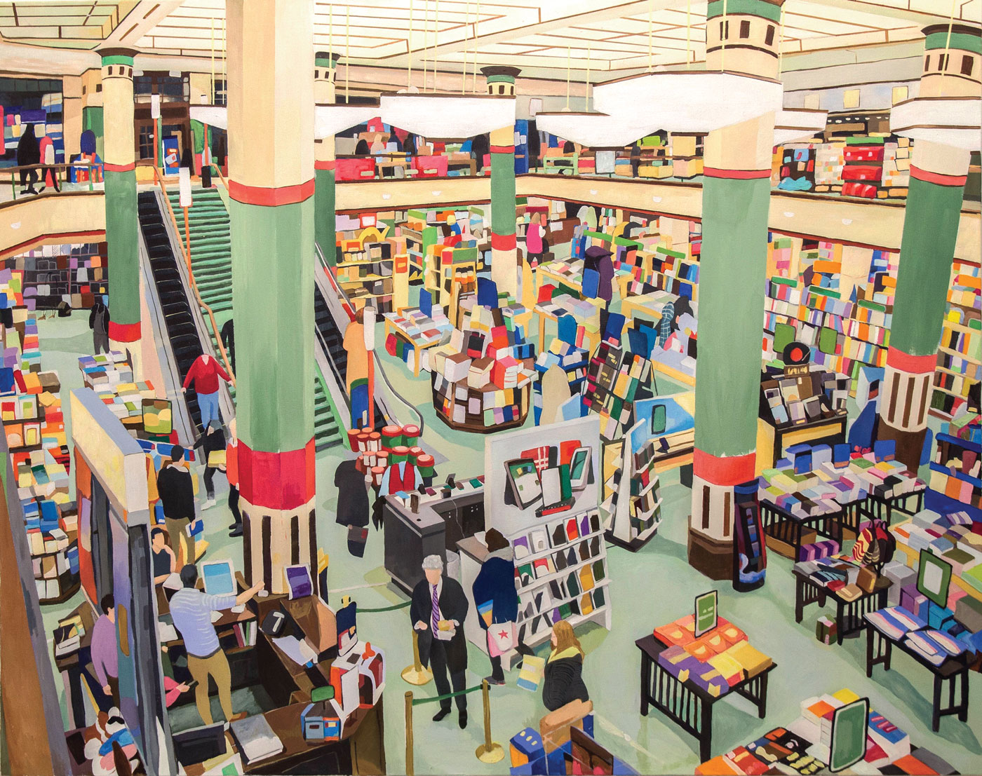
A Happy Medium! Winners of the All Media Art Competition 2018
By: Artists Network Staff


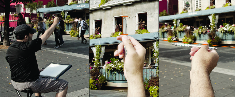
Sketching Techniques: Drawing From the Outside In
By: Artists Network Staff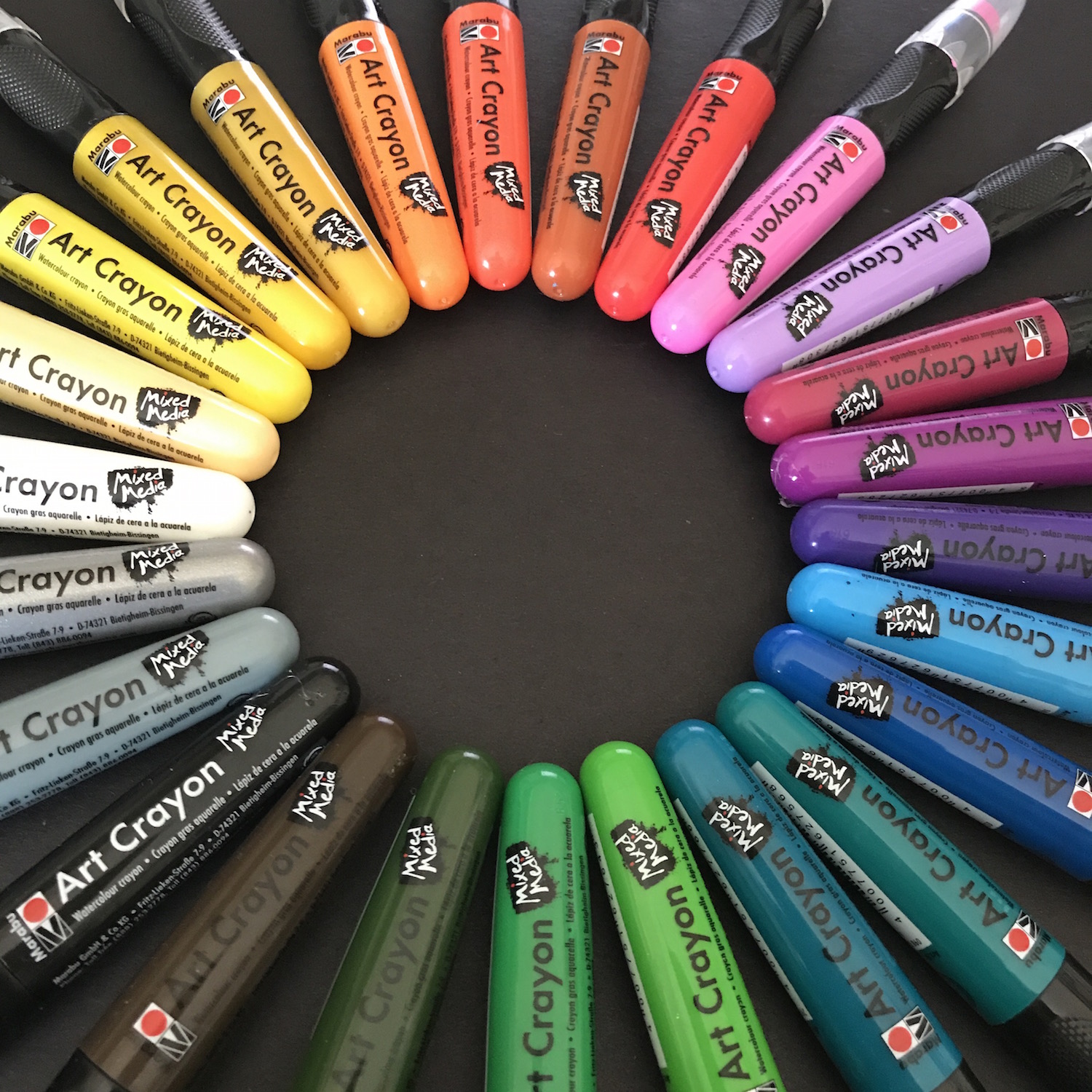
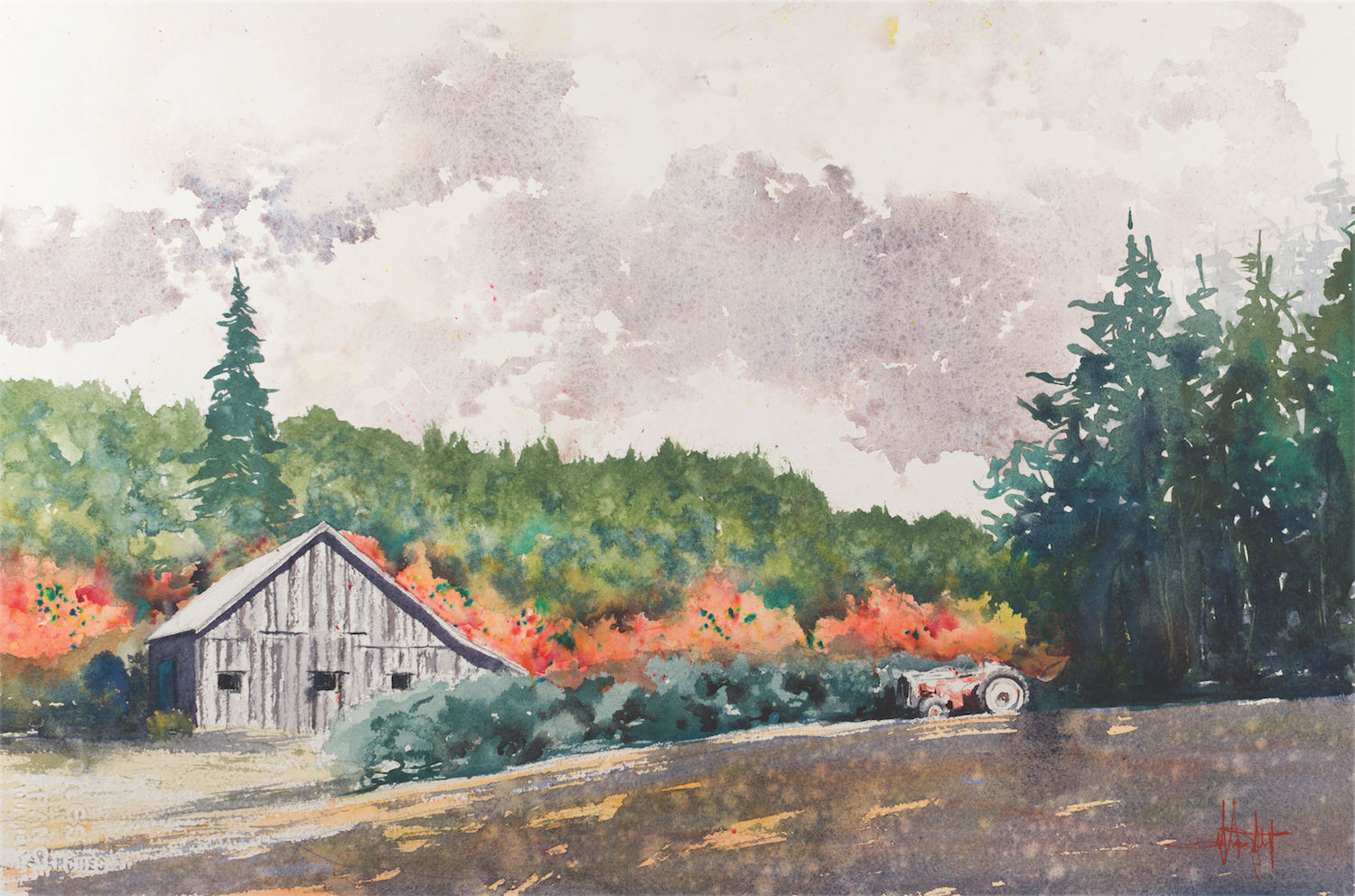
Paint Like O’Keeffe (or Matisse)
By: Artists Network Staff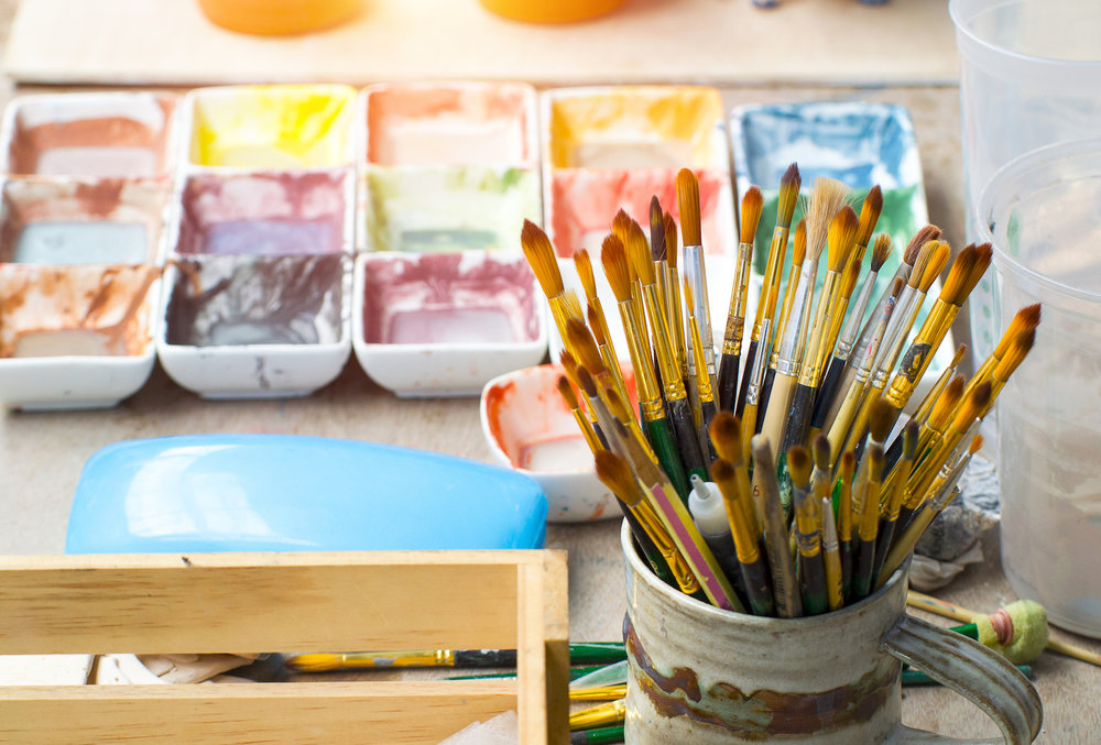
Add Colorful Flair to Your Art with Crystal-Powdered Paint
By: Artists Network Staff
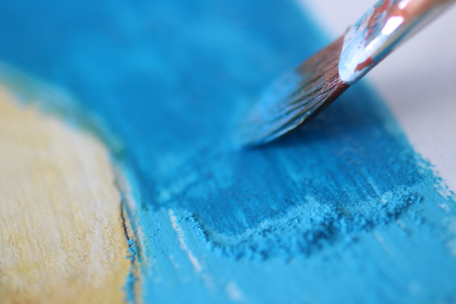
Oil Painting Basics: Brushes 101
By: Maria Woodie
5 Figure Drawing Tips
By: Austin R. Williams
Ready to Draw the Purrfect Cat? Colored Pencil Tips You’ll Love
By: Maria Woodie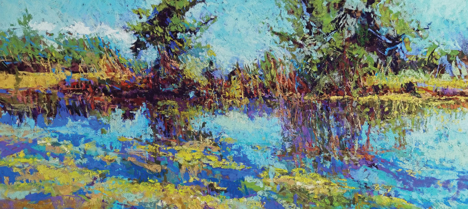
Get Inspired by 5 Top-Shelf Pastel 100 Winners
By: Beth Williams
Snownado! How to Paint Snow in Pastel
By: Artists Network Staff
How to Draw Facial Expressions: A Quick Guide
By: Austin R. Williams
10 Easy Sketchbook Tips So You Can Make Art Now
By: Artists Network Staff
