Click Below To Start Your Search:
Start Your Search
Beds, Baths, Stories, Garages, & More
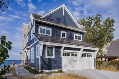
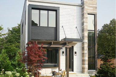
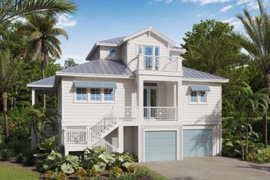
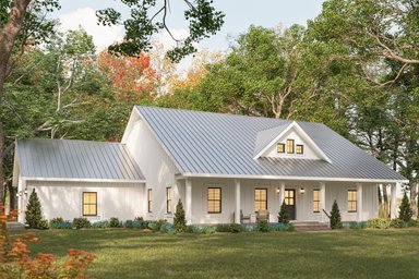
- Styles


Our Signature Plans
Shop Now
- Collections
Most Popular
By Size
Trending

Thanks for your question.
We'll be in touch shortly.
Thank you for your inquiry. Your message has been sent.
We'll be in touch shortly.
Start Your Search
The Houseplans Blog
Get inspiration for your next house.

Courtney PittmanMay 28, 2026
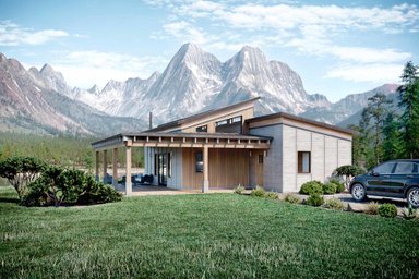
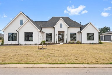
The best 20' x 36' house plans live large with clever details.
Learn MoreSmall House Plans

Courtney PittmanMay 14, 2026
Maximize space with multifamily house plans.
Learn MoreDuplex House Plans


Courtney PittmanApril 28, 2026
Learn MoreDesigners

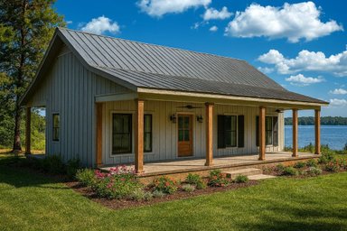
Cottage House Plans

Personalized Help is Just a Click Away.
Let us know a bit about your plans and we’ll be happy to help.
Get Expert Advice 1-800-913-2350

Architecture & Design

Courtney PittmanMarch 5, 2026
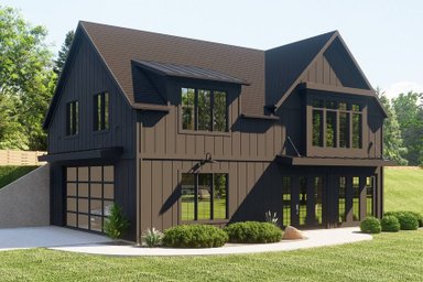
Learn MoreBarndominium Plans

Courtney PittmanJanuary 26, 2026
Learn MoreArchitecture & Design


Architecture & Design

Courtney PittmanDecember 22, 2025
Learn MoreArchitecture & Design
Cost To Build A House And Building Basics

Explore our most popular house plans
Looking for the best house plans? Start from our best selling ones.
Shop Best-Sellers
Wayne VisbeenAugust 14, 2025
Learn MoreDesigners

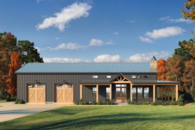
Barndominium Plans
Budget Friendly
Budget Basics
Cost To Build
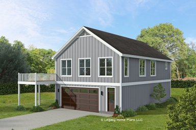
Garage Plans And Garage Apartment Plans

Garage Plans Garage Apartment Plans
Get Our Newsletter
Be the first to see new plans, special offers, and more.
