<!doctype html>
<html lang="en-US">
<head>
	<meta charset="UTF-8">
	<meta name="viewport" content="width=device-width, user-scalable=yes">
	<link rel="profile" href="https://gmpg.org/xfn/11">

	<title>LX TV &#8211; Life/Style Television</title>
<meta name='robots' content='max-image-preview:large' />
<link rel='dns-prefetch' href='//stats.wp.com' />
<link rel='dns-prefetch' href='//fonts.googleapis.com' />
<link rel="alternate" type="application/rss+xml" title="LX TV &raquo; Feed" href="https://www.lxtv.com/feed/" />
<link rel="alternate" type="application/rss+xml" title="LX TV &raquo; Comments Feed" href="https://www.lxtv.com/comments/feed/" />
<link rel="alternate" title="oEmbed (JSON)" type="application/json+oembed" href="https://www.lxtv.com/wp-json/oembed/1.0/embed?url=https%3A%2F%2Fwww.lxtv.com%2F" />
<link rel="alternate" title="oEmbed (XML)" type="text/xml+oembed" href="https://www.lxtv.com/wp-json/oembed/1.0/embed?url=https%3A%2F%2Fwww.lxtv.com%2F&#038;format=xml" />
<style id="wp-img-auto-sizes-contain-inline-css">
img:is([sizes=auto i],[sizes^="auto," i]){contain-intrinsic-size:3000px 1500px}
/*# sourceURL=wp-img-auto-sizes-contain-inline-css */
</style>
<style id="wp-emoji-styles-inline-css">

	img.wp-smiley, img.emoji {
		display: inline !important;
		border: none !important;
		box-shadow: none !important;
		height: 1em !important;
		width: 1em !important;
		margin: 0 0.07em !important;
		vertical-align: -0.1em !important;
		background: none !important;
		padding: 0 !important;
	}
/*# sourceURL=wp-emoji-styles-inline-css */
</style>
<style id="wp-block-library-inline-css">
:root{--wp-block-synced-color:#7a00df;--wp-block-synced-color--rgb:122,0,223;--wp-bound-block-color:var(--wp-block-synced-color);--wp-editor-canvas-background:#ddd;--wp-admin-theme-color:#007cba;--wp-admin-theme-color--rgb:0,124,186;--wp-admin-theme-color-darker-10:#006ba1;--wp-admin-theme-color-darker-10--rgb:0,107,160.5;--wp-admin-theme-color-darker-20:#005a87;--wp-admin-theme-color-darker-20--rgb:0,90,135;--wp-admin-border-width-focus:2px}@media (min-resolution:192dpi){:root{--wp-admin-border-width-focus:1.5px}}.wp-element-button{cursor:pointer}:root .has-very-light-gray-background-color{background-color:#eee}:root .has-very-dark-gray-background-color{background-color:#313131}:root .has-very-light-gray-color{color:#eee}:root .has-very-dark-gray-color{color:#313131}:root .has-vivid-green-cyan-to-vivid-cyan-blue-gradient-background{background:linear-gradient(135deg,#00d084,#0693e3)}:root .has-purple-crush-gradient-background{background:linear-gradient(135deg,#34e2e4,#4721fb 50%,#ab1dfe)}:root .has-hazy-dawn-gradient-background{background:linear-gradient(135deg,#faaca8,#dad0ec)}:root .has-subdued-olive-gradient-background{background:linear-gradient(135deg,#fafae1,#67a671)}:root .has-atomic-cream-gradient-background{background:linear-gradient(135deg,#fdd79a,#004a59)}:root .has-nightshade-gradient-background{background:linear-gradient(135deg,#330968,#31cdcf)}:root .has-midnight-gradient-background{background:linear-gradient(135deg,#020381,#2874fc)}:root{--wp--preset--font-size--normal:16px;--wp--preset--font-size--huge:42px}.has-regular-font-size{font-size:1em}.has-larger-font-size{font-size:2.625em}.has-normal-font-size{font-size:var(--wp--preset--font-size--normal)}.has-huge-font-size{font-size:var(--wp--preset--font-size--huge)}:root .has-text-align-center{text-align:center}:root .has-text-align-left{text-align:left}:root .has-text-align-right{text-align:right}.has-fit-text{white-space:nowrap!important}#end-resizable-editor-section{display:none}.aligncenter{clear:both}.items-justified-left{justify-content:flex-start}.items-justified-center{justify-content:center}.items-justified-right{justify-content:flex-end}.items-justified-space-between{justify-content:space-between}.screen-reader-text{word-wrap:normal!important;border:0;clip-path:inset(50%);height:1px;margin:-1px;overflow:hidden;padding:0;position:absolute;width:1px}.screen-reader-text:focus{background-color:#ddd;clip-path:none;color:#444;display:block;font-size:1em;height:auto;left:5px;line-height:normal;padding:15px 23px 14px;text-decoration:none;top:5px;width:auto;z-index:100000}html :where(.has-border-color){border-style:solid}html :where([style*=border-color]){border-style:solid}html :where([style*=border-top-color]){border-top-style:solid}html :where([style*=border-right-color]){border-right-style:solid}html :where([style*=border-bottom-color]){border-bottom-style:solid}html :where([style*=border-left-color]){border-left-style:solid}html :where([style*=border-width]){border-style:solid}html :where([style*=border-top-width]){border-top-style:solid}html :where([style*=border-right-width]){border-right-style:solid}html :where([style*=border-bottom-width]){border-bottom-style:solid}html :where([style*=border-left-width]){border-left-style:solid}html :where(img[class*=wp-image-]){height:auto;max-width:100%}:where(figure){margin:0 0 1em}html :where(.is-position-sticky){--wp-admin--admin-bar--position-offset:var(--wp-admin--admin-bar--height,0px)}@media screen and (max-width:600px){html :where(.is-position-sticky){--wp-admin--admin-bar--position-offset:0px}}

/*# sourceURL=/wp-includes/css/dist/block-library/common.min.css */
</style>
<style id="classic-theme-styles-inline-css">
/*! This file is auto-generated */
.wp-block-button__link{color:#fff;background-color:#32373c;border-radius:9999px;box-shadow:none;text-decoration:none;padding:calc(.667em + 2px) calc(1.333em + 2px);font-size:1.125em}.wp-block-file__button{background:#32373c;color:#fff;text-decoration:none}
/*# sourceURL=/wp-includes/css/classic-themes.min.css */
</style>

<style id="global-styles-inline-css">
:root{--wp--preset--aspect-ratio--square: 1;--wp--preset--aspect-ratio--4-3: 4/3;--wp--preset--aspect-ratio--3-4: 3/4;--wp--preset--aspect-ratio--3-2: 3/2;--wp--preset--aspect-ratio--2-3: 2/3;--wp--preset--aspect-ratio--16-9: 16/9;--wp--preset--aspect-ratio--9-16: 9/16;--wp--preset--color--black: #000000;--wp--preset--color--cyan-bluish-gray: #abb8c3;--wp--preset--color--white: #ffffff;--wp--preset--color--pale-pink: #f78da7;--wp--preset--color--vivid-red: #cf2e2e;--wp--preset--color--luminous-vivid-orange: #ff6900;--wp--preset--color--luminous-vivid-amber: #fcb900;--wp--preset--color--light-green-cyan: #7bdcb5;--wp--preset--color--vivid-green-cyan: #00d084;--wp--preset--color--pale-cyan-blue: #8ed1fc;--wp--preset--color--vivid-cyan-blue: #0693e3;--wp--preset--color--vivid-purple: #9b51e0;--wp--preset--gradient--vivid-cyan-blue-to-vivid-purple: linear-gradient(135deg,rgb(6,147,227) 0%,rgb(155,81,224) 100%);--wp--preset--gradient--light-green-cyan-to-vivid-green-cyan: linear-gradient(135deg,rgb(122,220,180) 0%,rgb(0,208,130) 100%);--wp--preset--gradient--luminous-vivid-amber-to-luminous-vivid-orange: linear-gradient(135deg,rgb(252,185,0) 0%,rgb(255,105,0) 100%);--wp--preset--gradient--luminous-vivid-orange-to-vivid-red: linear-gradient(135deg,rgb(255,105,0) 0%,rgb(207,46,46) 100%);--wp--preset--gradient--very-light-gray-to-cyan-bluish-gray: linear-gradient(135deg,rgb(238,238,238) 0%,rgb(169,184,195) 100%);--wp--preset--gradient--cool-to-warm-spectrum: linear-gradient(135deg,rgb(74,234,220) 0%,rgb(151,120,209) 20%,rgb(207,42,186) 40%,rgb(238,44,130) 60%,rgb(251,105,98) 80%,rgb(254,248,76) 100%);--wp--preset--gradient--blush-light-purple: linear-gradient(135deg,rgb(255,206,236) 0%,rgb(152,150,240) 100%);--wp--preset--gradient--blush-bordeaux: linear-gradient(135deg,rgb(254,205,165) 0%,rgb(254,45,45) 50%,rgb(107,0,62) 100%);--wp--preset--gradient--luminous-dusk: linear-gradient(135deg,rgb(255,203,112) 0%,rgb(199,81,192) 50%,rgb(65,88,208) 100%);--wp--preset--gradient--pale-ocean: linear-gradient(135deg,rgb(255,245,203) 0%,rgb(182,227,212) 50%,rgb(51,167,181) 100%);--wp--preset--gradient--electric-grass: linear-gradient(135deg,rgb(202,248,128) 0%,rgb(113,206,126) 100%);--wp--preset--gradient--midnight: linear-gradient(135deg,rgb(2,3,129) 0%,rgb(40,116,252) 100%);--wp--preset--font-size--small: 13px;--wp--preset--font-size--medium: 20px;--wp--preset--font-size--large: 36px;--wp--preset--font-size--x-large: 42px;--wp--preset--spacing--20: 0.44rem;--wp--preset--spacing--30: 0.67rem;--wp--preset--spacing--40: 1rem;--wp--preset--spacing--50: 1.5rem;--wp--preset--spacing--60: 2.25rem;--wp--preset--spacing--70: 3.38rem;--wp--preset--spacing--80: 5.06rem;--wp--preset--shadow--natural: 6px 6px 9px rgba(0, 0, 0, 0.2);--wp--preset--shadow--deep: 12px 12px 50px rgba(0, 0, 0, 0.4);--wp--preset--shadow--sharp: 6px 6px 0px rgba(0, 0, 0, 0.2);--wp--preset--shadow--outlined: 6px 6px 0px -3px rgb(255, 255, 255), 6px 6px rgb(0, 0, 0);--wp--preset--shadow--crisp: 6px 6px 0px rgb(0, 0, 0);}:where(body) { margin: 0; }:where(.is-layout-flex){gap: 0.5em;}:where(.is-layout-grid){gap: 0.5em;}body .is-layout-flex{display: flex;}.is-layout-flex{flex-wrap: wrap;align-items: center;}.is-layout-flex > :is(*, div){margin: 0;}body .is-layout-grid{display: grid;}.is-layout-grid > :is(*, div){margin: 0;}body{padding-top: 0px;padding-right: 0px;padding-bottom: 0px;padding-left: 0px;}:root :where(.wp-element-button, .wp-block-button__link){background-color: #32373c;border-width: 0;color: #fff;font-family: inherit;font-size: inherit;font-style: inherit;font-weight: inherit;letter-spacing: inherit;line-height: inherit;padding-top: calc(0.667em + 2px);padding-right: calc(1.333em + 2px);padding-bottom: calc(0.667em + 2px);padding-left: calc(1.333em + 2px);text-decoration: none;text-transform: inherit;}.has-black-color{color: var(--wp--preset--color--black) !important;}.has-cyan-bluish-gray-color{color: var(--wp--preset--color--cyan-bluish-gray) !important;}.has-white-color{color: var(--wp--preset--color--white) !important;}.has-pale-pink-color{color: var(--wp--preset--color--pale-pink) !important;}.has-vivid-red-color{color: var(--wp--preset--color--vivid-red) !important;}.has-luminous-vivid-orange-color{color: var(--wp--preset--color--luminous-vivid-orange) !important;}.has-luminous-vivid-amber-color{color: var(--wp--preset--color--luminous-vivid-amber) !important;}.has-light-green-cyan-color{color: var(--wp--preset--color--light-green-cyan) !important;}.has-vivid-green-cyan-color{color: var(--wp--preset--color--vivid-green-cyan) !important;}.has-pale-cyan-blue-color{color: var(--wp--preset--color--pale-cyan-blue) !important;}.has-vivid-cyan-blue-color{color: var(--wp--preset--color--vivid-cyan-blue) !important;}.has-vivid-purple-color{color: var(--wp--preset--color--vivid-purple) !important;}.has-black-background-color{background-color: var(--wp--preset--color--black) !important;}.has-cyan-bluish-gray-background-color{background-color: var(--wp--preset--color--cyan-bluish-gray) !important;}.has-white-background-color{background-color: var(--wp--preset--color--white) !important;}.has-pale-pink-background-color{background-color: var(--wp--preset--color--pale-pink) !important;}.has-vivid-red-background-color{background-color: var(--wp--preset--color--vivid-red) !important;}.has-luminous-vivid-orange-background-color{background-color: var(--wp--preset--color--luminous-vivid-orange) !important;}.has-luminous-vivid-amber-background-color{background-color: var(--wp--preset--color--luminous-vivid-amber) !important;}.has-light-green-cyan-background-color{background-color: var(--wp--preset--color--light-green-cyan) !important;}.has-vivid-green-cyan-background-color{background-color: var(--wp--preset--color--vivid-green-cyan) !important;}.has-pale-cyan-blue-background-color{background-color: var(--wp--preset--color--pale-cyan-blue) !important;}.has-vivid-cyan-blue-background-color{background-color: var(--wp--preset--color--vivid-cyan-blue) !important;}.has-vivid-purple-background-color{background-color: var(--wp--preset--color--vivid-purple) !important;}.has-black-border-color{border-color: var(--wp--preset--color--black) !important;}.has-cyan-bluish-gray-border-color{border-color: var(--wp--preset--color--cyan-bluish-gray) !important;}.has-white-border-color{border-color: var(--wp--preset--color--white) !important;}.has-pale-pink-border-color{border-color: var(--wp--preset--color--pale-pink) !important;}.has-vivid-red-border-color{border-color: var(--wp--preset--color--vivid-red) !important;}.has-luminous-vivid-orange-border-color{border-color: var(--wp--preset--color--luminous-vivid-orange) !important;}.has-luminous-vivid-amber-border-color{border-color: var(--wp--preset--color--luminous-vivid-amber) !important;}.has-light-green-cyan-border-color{border-color: var(--wp--preset--color--light-green-cyan) !important;}.has-vivid-green-cyan-border-color{border-color: var(--wp--preset--color--vivid-green-cyan) !important;}.has-pale-cyan-blue-border-color{border-color: var(--wp--preset--color--pale-cyan-blue) !important;}.has-vivid-cyan-blue-border-color{border-color: var(--wp--preset--color--vivid-cyan-blue) !important;}.has-vivid-purple-border-color{border-color: var(--wp--preset--color--vivid-purple) !important;}.has-vivid-cyan-blue-to-vivid-purple-gradient-background{background: var(--wp--preset--gradient--vivid-cyan-blue-to-vivid-purple) !important;}.has-light-green-cyan-to-vivid-green-cyan-gradient-background{background: var(--wp--preset--gradient--light-green-cyan-to-vivid-green-cyan) !important;}.has-luminous-vivid-amber-to-luminous-vivid-orange-gradient-background{background: var(--wp--preset--gradient--luminous-vivid-amber-to-luminous-vivid-orange) !important;}.has-luminous-vivid-orange-to-vivid-red-gradient-background{background: var(--wp--preset--gradient--luminous-vivid-orange-to-vivid-red) !important;}.has-very-light-gray-to-cyan-bluish-gray-gradient-background{background: var(--wp--preset--gradient--very-light-gray-to-cyan-bluish-gray) !important;}.has-cool-to-warm-spectrum-gradient-background{background: var(--wp--preset--gradient--cool-to-warm-spectrum) !important;}.has-blush-light-purple-gradient-background{background: var(--wp--preset--gradient--blush-light-purple) !important;}.has-blush-bordeaux-gradient-background{background: var(--wp--preset--gradient--blush-bordeaux) !important;}.has-luminous-dusk-gradient-background{background: var(--wp--preset--gradient--luminous-dusk) !important;}.has-pale-ocean-gradient-background{background: var(--wp--preset--gradient--pale-ocean) !important;}.has-electric-grass-gradient-background{background: var(--wp--preset--gradient--electric-grass) !important;}.has-midnight-gradient-background{background: var(--wp--preset--gradient--midnight) !important;}.has-small-font-size{font-size: var(--wp--preset--font-size--small) !important;}.has-medium-font-size{font-size: var(--wp--preset--font-size--medium) !important;}.has-large-font-size{font-size: var(--wp--preset--font-size--large) !important;}.has-x-large-font-size{font-size: var(--wp--preset--font-size--x-large) !important;}
/*# sourceURL=global-styles-inline-css */
</style>

<link rel='stylesheet' id='font-montserrat-css' href='https://fonts.googleapis.com/css?family=Montserrat:400,700&#038;display=swap' media='all' />
<link rel='stylesheet' id='font-roboto-css' href='https://fonts.googleapis.com/css?family=Roboto:400,400i,700,700i&#038;display=swap' media='all' />
<link rel='stylesheet' id='font-arimo-css' href='https://fonts.googleapis.com/css?family=Arimo:400,400i,700,700i&#038;display=swap' media='all' />
<link rel='stylesheet' id='all-css-18' href='https://www.lxtv.com/_static/??-eJzTLy/QTc7PK0nNK9EvyUjNTS3Wz0tK1i1ILErMyUms0C8uSSzJTNZPLgaLx5cZx6fn5Ccl5ugBRXT0SdOcU1FSRo4+mDiS1fa5tobm5oamlpamFhYAb2pIhA==' type='text/css' media='all' />
<script type="text/javascript" src="https://www.lxtv.com/_static/??-eJzTLy/QzcxLzilNSS3WzwKiwtLUokoopZebmaeXVayjj0+Rbm5melFiSSpUsX2uraG5uaWxgYGhmUEWAK98Iho=" ></script><script type="text/javascript" src="https://www.lxtv.com/_static/??-eJyd0F0OgjAQBOAL2d20kQAPxhP4xgWWTdWW/mBbBG4vhhPAAeabyeA8Co6h6FCwvLXXGUPPYqREztGCuVAxjDaj/Uw6reAik8uconNCgoJaeBPA5gselXakixtzBXWaMeFr9Hwsmod/dYKznU8KvPZxEQokVDASD8ecbtY6PGhRpyfs73l6Gd7yd3+TdS2rtq2axv4A+lasDQ==" ></script><link rel="https://api.w.org/" href="https://www.lxtv.com/wp-json/" /><link rel="alternate" title="JSON" type="application/json" href="https://www.lxtv.com/wp-json/wp/v2/pages/4" /><meta name="generator" content="WordPress 7.0" />
<link rel="canonical" href="https://www.lxtv.com/" />
<link rel='shortlink' href='https://www.lxtv.com/' />
	<style>img#wpstats{display:none}</style>
		<link rel="icon" href="https://www.lxtv.com/wp-content/uploads/sites/7/2020/02/cropped-LXTV@2x.png?w=32" sizes="32x32" />
<link rel="icon" href="https://www.lxtv.com/wp-content/uploads/sites/7/2020/02/cropped-LXTV@2x.png?w=192" sizes="192x192" />
<link rel="apple-touch-icon" href="https://www.lxtv.com/wp-content/uploads/sites/7/2020/02/cropped-LXTV@2x.png?w=180" />
<meta name="msapplication-TileImage" content="https://www.lxtv.com/wp-content/uploads/sites/7/2020/02/cropped-LXTV@2x.png?w=270" />

<script>(window.BOOMR_mq=window.BOOMR_mq||[]).push(["addVar",{"rua.upush":"false","rua.cpush":"false","rua.upre":"false","rua.cpre":"false","rua.uprl":"false","rua.cprl":"false","rua.cprf":"false","rua.trans":"","rua.cook":"false","rua.ims":"false","rua.ufprl":"false","rua.cfprl":"false","rua.isuxp":"false","rua.texp":"norulematch","rua.ceh":"false","rua.ueh":"false","rua.ieh.st":"0"}]);</script>
                                <script>!function(e){var n="https://s.go-mpulse.net/boomerang/";if("False"=="True")e.BOOMR_config=e.BOOMR_config||{},e.BOOMR_config.PageParams=e.BOOMR_config.PageParams||{},e.BOOMR_config.PageParams.pci=!0,n="https://s2.go-mpulse.net/boomerang/";if(window.BOOMR_API_key="8RQ7J-TJZMT-9JCJD-TCGWL-V8KR3",function(){function e(){if(!i){var e=document.createElement("script");e.id="boomr-scr-as",e.src=window.BOOMR.url,e.async=!0,o.parentNode.appendChild(e),i=!0}}function t(e){i=!0;var n,t,a,r,d=document,O=window;if(window.BOOMR.snippetMethod=e?"if":"i",t=function(e,n){var t=d.createElement("script");t.id=n||"boomr-if-as",t.src=window.BOOMR.url,BOOMR_lstart=(new Date).getTime(),e=e||d.body,e.appendChild(t)},!window.addEventListener&&window.attachEvent&&navigator.userAgent.match(/MSIE [67]\./))return window.BOOMR.snippetMethod="s",void t(o.parentNode,"boomr-async");a=document.createElement("IFRAME"),a.src="about:blank",a.title="",a.role="presentation",a.loading="eager",r=(a.frameElement||a).style,r.width=0,r.height=0,r.border=0,r.display="none",o.parentNode.appendChild(a);try{O=a.contentWindow,d=O.document.open()}catch(_){n=document.domain,a.src="javascript:var d=document.open();d.domain='"+n+"';void(0);",O=a.contentWindow,d=O.document.open()}if(n)d._boomrl=function(){this.domain=n,t()},d.write("<bo"+"dy onload='document._boomrl();'>");else if(O._boomrl=function(){t()},O.addEventListener)O.addEventListener("load",O._boomrl,!1);else if(O.attachEvent)O.attachEvent("onload",O._boomrl);d.close()}function a(e){window.BOOMR_onload=e&&e.timeStamp||(new Date).getTime()}if(!window.BOOMR||!window.BOOMR.version&&!window.BOOMR.snippetExecuted){window.BOOMR=window.BOOMR||{},window.BOOMR.snippetStart=(new Date).getTime(),window.BOOMR.snippetExecuted=!0,window.BOOMR.snippetVersion=12,window.BOOMR.url=n+"8RQ7J-TJZMT-9JCJD-TCGWL-V8KR3";var o=document.currentScript||document.getElementsByTagName("script")[0],i=!1,r=document.createElement("link");if(r.relList&&"function"==typeof r.relList.supports&&r.relList.supports("preload")&&"as"in r)window.BOOMR.snippetMethod="p",r.href=window.BOOMR.url,r.rel="preload",r.as="script",r.addEventListener("load",e),r.addEventListener("error",function(){t(!0)}),setTimeout(function(){if(!i)t(!0)},3e3),BOOMR_lstart=(new Date).getTime(),o.parentNode.appendChild(r);else t(!1);if(window.addEventListener)window.addEventListener("load",a,!1);else if(window.attachEvent)window.attachEvent("onload",a)}}(),"".length>0)if(e&&"performance"in e&&e.performance&&"function"==typeof e.performance.setResourceTimingBufferSize)e.performance.setResourceTimingBufferSize();!function(){if(BOOMR=e.BOOMR||{},BOOMR.plugins=BOOMR.plugins||{},!BOOMR.plugins.AK){var n=""=="true"?1:0,t="",a="jj65pyqxbqeqs2rib6dq-f-9970dd96b-clientnsv4-s.akamaihd.net",o="false"=="true"?2:1,i={"ak.v":"41","ak.cp":"1959353","ak.ai":parseInt("1322126",10),"ak.ol":"0","ak.cr":12,"ak.ipv":4,"ak.proto":"http/1.1","ak.rid":"542f37e1","ak.r":47762,"ak.a2":n,"ak.m":"dscx","ak.n":"essl","ak.cport":55729,"ak.gh":"23.48.98.237","ak.quicv":"","ak.tlsv":"tls1.3","ak.0rtt":"","ak.0rtt.ed":"","ak.csrc":"-","ak.acc":"bbr","ak.t":"1781010311","ak.ak":"hOBiQwZUYzCg5VSAfCLimQ==a1ljJ38dWCybXoQCzNTLAAl3W12y8TXGfrTfSJteVU+OTgKso0MDn8ZvgL8oU1q9wtIdu4jTDY40KmWslhpDRSnMt7b/Y/j+l6oSkytfign1uJ2V0z5X8jQBJphKH7WxNXrDXv1vOKj1ZzulMLu/DF9f5Wk8Lq3Bg+AdSzpC7K69el2T5aEqLr39EwduShlaWRxRl5DSBtjFK8WEdjVORkGXzhJAJR9yrni7/Iax9V3R+bxsFhKfhySqIDVyQelGFJ5qmYlFlnhq3PHHozRKwQJBDGMKqXCA766Hnh+B1FqdXmECG5XpQrcNYr01yNbh+2xmqeoleSPmXqLT3+ZIAdtRW3ZOmAb6TkntIPeJgaHHrx5Afi1uLdzk6REIgA6QxMufJQel7JSNm0v7MDtsPZMsHAxJ8RIjCWceRys67n8=","ak.pv":"12","ak.dpoabenc":"","ak.tf":o};if(""!==t)i["ak.ruds"]=t;var r={i:!1,av:function(n){var t="http.initiator";if(n&&(!n[t]||"spa_hard"===n[t]))i["ak.feo"]=void 0!==e.aFeoApplied?1:0,BOOMR.addVar(i)},rv:function(){var e=["ak.cport","ak.cr","ak.csrc","ak.gh","ak.ipv","ak.m","ak.n","ak.ol","ak.proto","ak.quicv","ak.tlsv","ak.0rtt","ak.0rtt.ed","ak.r","ak.acc","ak.t","ak.tf"];BOOMR.removeVar(e)}};BOOMR.plugins.AK={akVars:i,akDNSPreFetchDomain:a,init:function(){if(!r.i){var e=BOOMR.subscribe;e("before_beacon",r.av,null,null),e("onbeacon",r.rv,null,null),r.i=!0}return this},is_complete:function(){return!0}}}}()}(window);</script></head>

<body id="parallax" class="home wp-singular page-template page-template-template-lxtv page-template-template-lxtv-php page page-id-4 wp-theme-nbc-parallax no-sidebar">

<div class="navigation">
		<header>
			<div id="pHeader">
				<h1><a name="&amp;lpos=section navigation&amp;lid=" title="Home" href="#slide1"
						onclick="clickScroll('slide1');">LX TV</a></h1>
				<ul>
					<li class="navItem_1" data-navnum="1" id="navItem_1"><a name="&amp;lpos=section navigation&amp;lid="
							title="Home" href="#slide1" onclick="clickScroll('slide1');">Home</a></li>
					<li class="navItem_2" data-navnum="2" id="navItem_2"><a name="&amp;lpos=section navigation&amp;lid="
							title="Shows" href="#slide4" onclick="clickScroll('slide4');">Shows</a></li>
					<li class="navItem_3" data-navnum="3" id="navItem_3"><a name="&amp;lpos=section navigation&amp;lid="
							title="Branded Content" href="#slide7" onclick="clickScroll('slide7');">Branded Content</a></li>
					<li class="navItem_4" data-navnum="4" id="navItem_4"><a name="&amp;lpos=section navigation&amp;lid="
							title="Live Specials" href="#slide10" onclick="clickScroll('slide10');">Live Specials</a></li>
					<li class="navItem_5" data-navnum="5" id="navItem_5"><a name="&amp;lpos=section navigation&amp;lid="
							title="Commercial Production" href="#slide12" onclick="clickScroll('slide12');">Commercial Production</a>
					</li>
					<li class="navItem_6" data-navnum="7" id="navItem_6"><a name="&amp;lpos=section navigation&amp;lid="
							title="Social Content" href="#slide15" onclick="clickScroll('slide15');">Social Content</a></li>
				</ul>
			</div>
		</header>
	</div>
	<script>
		var $ = jQuery;
		var controller;
		$(document).ready(function ($) {
			controller = new ScrollMagic();
		});
		var canPlay = false;
		var v = document.createElement('video');
		if (v.canPlayType && v.canPlayType('video/mp4').replace(/no/, '')) {
			canPlay = true;
		}
	</script>
	<div id="canvas" class=" ">
		<style type="text/css">
			#slide1 {
				height: 400px !important;
				padding-top: 6% !important;
			}

			.slide {
				background-color: #FFFFFF;
			}

			#slide1 p {
				font-size: 18px;
			}

			#slide1 .slide .ct_bx .imageCredit {
				color: #fff;
				position: absolute;
				font-size: 12px;
				right: 0;
				bottom: 0;
			}

			@media only screen and (device-width: 768px) {}

			@media only screen and (min-device-width: 481px) and (max-device-width: 1024px) and (orientation:portrait) {}

			@media only screen and (min-device-width: 481px) and (max-device-width: 1024px) and (orientation:landscape) {}
		</style>
		<div id="slide1" class="slide" data-center="background-position: 50% 0px;"
			data-top-bottom="background-position: 50% -100px;" data-anchor-target="#slide1"
			style=" background:url(https://www.lxtv.com/wp-content/themes/nbc-parallax/static/images/LXTV_PARALLAX1.png)no-repeat fixed; padding-top:10%; background-position: 50% 0px;">
			<a id="slide-322183112"></a>
			<div class="image1" data-center="background-position: 50% 0px;" data-top-bottom="background-position: 50% -50px;"
				data-anchor-target="#slide1"
				style="background-image: url(''); background-size:cover; background-attachment:fixed; width: inherit; height:inherit;">
				<div class="image2" data-center="background-position: 50% 0px;"
					data-top-bottom="background-position: 50% -150px;" data-anchor-target="#slide1"
					style="background-image: url(''); background-size:cover; background-attachment:fixed; width: inherit; height:inherit;">
					<div class="image3" data-center="background-position: 50% 0px;"
						data-top-bottom="background-position: 50% -300px;" data-anchor-target="#slide1"
						style="background-image: url(''); background-size:cover; background-attachment:fixed; width: inherit; height:inherit;">
						<div class="story">
							<div class="float-left"
								style="background:rgb(246,246,246);background:rgba(246,246,246,0.1); filter: alpha(opacity=70);">
								<h2 style="color:#8661a9;"></h2>
								<p style="color:#000000;">
									LXTV is an Emmy award-winning production company for lifestyle and entertainment programming and is a
									division of NBCU Owned Television Stations. We develop high-quality, original content accessible
									across multiple platforms including on-air, digital, mobile, social, and out-of-home. Our diverse
									programming includes original series, live specials, integrations, custom branded programs, and
									commercial production.
								</p>
							</div><!-- END FLOAT --->
						</div>
						<!--story-->
					</div>
					<!--layer images-->
				</div>
			</div>
		</div>
		<style type="text/css">
			#slide1 {
				height: 400px !important;
				padding-top: 6% !important;
			}

			.slide {
				background-color: #FFFFFF;
			}

			#slide2 {
				height: 620px;
				padding: 0 0 20px;
			}

			#slide2 .float-center {
				margin: 100px auto 0;
				padding: 50px 40px;
				position: relative;
				text-align: center;
				background: rgb(41, 106, 138);
				background: rgba(41, 106, 138, 0.8);
				-webkit-border-radius: 10px;
				-moz-border-radius: 10px;
				border-radius: 10px;
			}

			#slide2 .float-center img {
				margin: 0 15px;
				position: absolute;
			}

			#slide2 {
				height: 380px;
			}

			#slide2 .slide .float-left,
			#slide2 .slide .float-right,
			#slide2 .slide .center {
				margin-top: 50px;
			}

			#slide2 .slide .ct_bx .imageCredit {
				color: #fff;
				position: absolute;
				font-size: 12px;
				right: 0;
				bottom: 0;
			}

			@media only screen and (device-width: 768px) {
				.slide {
					background-attachment: initial !important
				}
			}

			@media only screen and (min-device-width: 481px) and (max-device-width: 1024px) and (orientation:portrait) {
				.slide {
					background-attachment: initial !important
				}
			}

			@media only screen and (min-device-width: 481px) and (max-device-width: 1024px) and (orientation:landscape) {
				.slide {
					background-attachment: initial !important
				}
			}
		</style>
		<div id="slide2" class="slide" data-center="background-position: 50% 0px;"
			data-top-bottom="background-position: 50% -100px;" data-bottom-top="background-position: 50% 100px;"
			data-anchor-target="#slide2" style=""><a id="slide-322448632"></a>
			<div class="image1" data-center="background-position: 50% 0px;" data-top-bottom="background-position: 50% -50px;"
				data-bottom-top="background-position: 50% 50px;" data-anchor-target="#slide2"
				style="background-image: url(''); background-size:cover; background-attachment:fixed; width: inherit; height:inherit;">
				<div class="image2" data-center="background-position: 50% 0px;"
					data-top-bottom="background-position: 50% -150px;" data-bottom-top="background-position: 50% 150px;"
					data-anchor-target="#slide2"
					style="background-image: url(''); background-size:cover; background-attachment:fixed; width: inherit; height:inherit;">
					<div class="image3" data-center="background-position: 50% 0px;"
						data-top-bottom="background-position: 50% -300px;" data-bottom-top="background-position: 50% 300px;"
						data-anchor-target="#slide2"
						style="background-image: url(''); background-size:cover; background-attachment:fixed; width: inherit; height:inherit;">
						<div class="story">
							<h2></h2>
							<div class="embed">
								<style>
									.sizzle {
										float: right;
										position: relative;
										margin: 40px 0 0;
									}

									.sizzle-title {
										float: left;
										margin: 40px 0 0;
									}

									.sizzle-title img {
										position: static;
										margin: 0;
									}
								</style>
								<div class="sizzle-title"><img src="https://www.lxtv.com/wp-content/themes/nbc-parallax/static/images/SIZZLE_REEL_TEXT.png" /></div>
								<div class="sizzle">
									<script type="text/javascript" charset="UTF-8"
										src="https://www.cozitv.com/portableplayer/?cmsID=507101492&videoID=1x4kQJ6_PXuq&origin=cozitv.com&sec=news&subsec=tech&width=500&height=281">
									</script>
								</div>
							</div>
						</div>
						<!--story-->
					</div>
					<!--layer images-->
				</div>
			</div>
		</div>
		<style type="text/css">
			#slide1 {
				height: 400px !important;
				padding-top: 6% !important;
			}

			.slide {
				background-color: #FFFFFF;
			}

			#slide3 .slide .ct_bx .imageCredit {
				color: #fff;
				position: absolute;
				font-size: 12px;
				right: 0;
				bottom: 0;
			}

			@media only screen and (device-width: 768px) {}

			@media only screen and (min-device-width: 481px) and (max-device-width: 1024px) and (orientation:portrait) {}

			@media only screen and (min-device-width: 481px) and (max-device-width: 1024px) and (orientation:landscape) {}
		</style>
		<div id="slide3" class="slide" data-center="background-position: 50% 0px;"
			data-top-bottom="background-position: 50% -100px;" data-bottom-top="background-position: 50% 100px;"
			data-anchor-target="#slide3"
			style=" background:url(https://www.lxtv.com/wp-content/themes/nbc-parallax/static/images/alaska-3.jpg)no-repeat fixed; padding-top:10%; background-position: 50% 0px;">
			<a id="slide-373359331"></a>
			<div class="image1" data-center="background-position: 50% 0px;" data-top-bottom="background-position: 50% -50px;"
				data-bottom-top="background-position: 50% 50px;" data-anchor-target="#slide3"
				style="background-image: url(''); background-size:cover; background-attachment:fixed; width: inherit; height:inherit;">
				<div class="image2" data-center="background-position: 50% 0px;"
					data-top-bottom="background-position: 50% -150px;" data-bottom-top="background-position: 50% 150px;"
					data-anchor-target="#slide3"
					style="background-image: url(''); background-size:cover; background-attachment:fixed; width: inherit; height:inherit;">
					<div class="image3" data-center="background-position: 50% 0px;"
						data-top-bottom="background-position: 50% -300px;" data-bottom-top="background-position: 50% 300px;"
						data-anchor-target="#slide3"
						style="background-image: url(''); background-size:cover; background-attachment:fixed; width: inherit; height:inherit;">
						<div class="story">
							<h2></h2>
						</div>
						<!--story-->
					</div>
					<!--layer images-->
				</div>
			</div>
		</div>
		<style type="text/css">
			#slide1 {
				height: 400px !important;
				padding-top: 6% !important;
			}

			.slide {
				background-color: #FFFFFF;
			}

			#slide4 {
				height: 250px;
			}

			#slide4 .slide .float-left,
			#slide4 .slide .float-right,
			#slide4 .slide .center {
				margin-top: 50px;
			}

			#slide4 .slide .ct_bx .imageCredit {
				color: #fff;
				position: absolute;
				font-size: 12px;
				right: 0;
				bottom: 0;
			}

			@media only screen and (device-width: 768px) {
				.slide {
					background-attachment: initial !important
				}
			}

			@media only screen and (min-device-width: 481px) and (max-device-width: 1024px) and (orientation:portrait) {
				.slide {
					background-attachment: initial !important
				}
			}

			@media only screen and (min-device-width: 481px) and (max-device-width: 1024px) and (orientation:landscape) {
				.slide {
					background-attachment: initial !important
				}
			}
		</style>
		<div id="slide4" class="slide" data-center="background-position: 50% 0px;"
			data-top-bottom="background-position: 50% -100px;" data-bottom-top="background-position: 50% 100px;"
			data-anchor-target="#slide4" style=""><a id="slide-371057101"></a>
			<div class="image1" data-center="background-position: 50% 0px;" data-top-bottom="background-position: 50% -50px;"
				data-bottom-top="background-position: 50% 50px;" data-anchor-target="#slide4"
				style="background-image: url(''); background-size:cover; background-attachment:fixed; width: inherit; height:inherit;">
				<div class="image2" data-center="background-position: 50% 0px;"
					data-top-bottom="background-position: 50% -150px;" data-bottom-top="background-position: 50% 150px;"
					data-anchor-target="#slide4"
					style="background-image: url(''); background-size:cover; background-attachment:fixed; width: inherit; height:inherit;">
					<div class="image3" data-center="background-position: 50% 0px;"
						data-top-bottom="background-position: 50% -300px;" data-bottom-top="background-position: 50% 300px;"
						data-anchor-target="#slide4"
						style="background-image: url(''); background-size:cover; background-attachment:fixed; width: inherit; height:inherit;">
						<div class="story">
							<h2>
								Original Programming
							</h2>
							<div class="foregroundImageContainer" style="margin:0; position:static;"><img
									src="https://www.lxtv.com/wp-content/themes/nbc-parallax/static/images/ORIGINAL_PROGRAMMING.png" style="margin:0; position:static;" />
								<div class="ct_box"><span></span></div>
							</div>
						</div>
						<!--story-->
					</div>
					<!--layer images-->
				</div>
			</div>
		</div>
		<style type="text/css">
			#slide1 {
				height: 400px !important;
				padding-top: 6% !important;
			}

			.slide {
				background-color: #FFFFFF;
			}

			#slide5 .slide img,
			#slide5.slide iframe {
				top: 0;
			}

			#slide5 {
				height: 484px;
			}

			#slide5 .slide .float-left,
			#slide5 .slide .float-right,
			#slide5 .slide .center {
				margin-top: 50px;
			}

			#slide5 .slide .ct_bx .imageCredit {
				color: #fff;
				position: absolute;
				font-size: 12px;
				right: 0;
				bottom: 0;
			}

			@media only screen and (device-width: 768px) {}

			@media only screen and (min-device-width: 481px) and (max-device-width: 1024px) and (orientation:portrait) {}

			@media only screen and (min-device-width: 481px) and (max-device-width: 1024px) and (orientation:landscape) {}
		</style>
		<div id="slide5" class="slide" data-center="background-position: 50% 0px;"
			data-top-bottom="background-position: 50% -100px;" data-bottom-top="background-position: 50% 100px;"
			data-anchor-target="#slide5" style=""><a id="slide-322186192"></a>
			<style>
				#slide5 {
					padding-bottom: 0px;
				}

				#slide5 .story {
					width: auto;
				}

				#slide5 .story h2 {
					display: none;
				}

				.iframegallery {
					position: relative;
					padding-bottom: 65.25%;
					padding-top: 0px;
					height: 0;
					overflow: hidden;
				}

				.iframegallery iframe {
					position: absolute;
					top: 0;
					left: 0;
					width: 100%;
					height: 484px;
				}
			</style>
			<div class="iframegallery"><iframe frameborder="0" scrolling="no"
					src="https://data.nbcstations.com/national/2016/LXTV/rotator/" style="padding:0; margin:0;"></iframe></div>
			<div class="image1" data-center="background-position: 50% 0px;" data-top-bottom="background-position: 50% -50px;"
				data-bottom-top="background-position: 50% 50px;" data-anchor-target="#slide5"
				style="background-image: url(''); background-size:cover; background-attachment:fixed; width: inherit; height:inherit;">
				<div class="image2" data-center="background-position: 50% 0px;"
					data-top-bottom="background-position: 50% -150px;" data-bottom-top="background-position: 50% 150px;"
					data-anchor-target="#slide5"
					style="background-image: url(''); background-size:cover; background-attachment:fixed; width: inherit; height:inherit;">
					<div class="image3" data-center="background-position: 50% 0px;"
						data-top-bottom="background-position: 50% -300px;" data-bottom-top="background-position: 50% 300px;"
						data-anchor-target="#slide5"
						style="background-image: url(''); background-size:cover; background-attachment:fixed; width: inherit; height:inherit;">
						<div class="story">
							<h2 style="color:#8661a8;">
								ORIGINAL SERIES
							</h2>
						</div>
						<!--story-->
					</div>
					<!--layer images-->
				</div>
			</div>
		</div>
		<style type="text/css">
			#slide1 {
				height: 400px !important;
				padding-top: 6% !important;
			}

			.slide {
				background-color: #FFFFFF;
			}

			#slide6 .slide .ct_bx .imageCredit {
				color: #fff;
				position: absolute;
				font-size: 12px;
				right: 0;
				bottom: 0;
			}

			@media only screen and (device-width: 768px) {}

			@media only screen and (min-device-width: 481px) and (max-device-width: 1024px) and (orientation:portrait) {}

			@media only screen and (min-device-width: 481px) and (max-device-width: 1024px) and (orientation:landscape) {}
		</style>
		<div id="slide6" class="slide" data-center="background-position: 50% 0px;"
			data-top-bottom="background-position: 50% -100px;" data-bottom-top="background-position: 50% 100px;"
			data-anchor-target="#slide6"
			style=" background:url(https://www.lxtv.com/wp-content/themes/nbc-parallax/static/images/LXTV-Sara_Gore-View.jpg)no-repeat fixed; padding-top:10%; background-position: 50% 0px;">
			<a id="slide-373364181"></a>
			<div class="image1" data-center="background-position: 50% 0px;" data-top-bottom="background-position: 50% -50px;"
				data-bottom-top="background-position: 50% 50px;" data-anchor-target="#slide6"
				style="background-image: url(''); background-size:cover; background-attachment:fixed; width: inherit; height:inherit;">
				<div class="image2" data-center="background-position: 50% 0px;"
					data-top-bottom="background-position: 50% -150px;" data-bottom-top="background-position: 50% 150px;"
					data-anchor-target="#slide6"
					style="background-image: url(''); background-size:cover; background-attachment:fixed; width: inherit; height:inherit;">
					<div class="image3" data-center="background-position: 50% 0px;"
						data-top-bottom="background-position: 50% -300px;" data-bottom-top="background-position: 50% 300px;"
						data-anchor-target="#slide6"
						style="background-image: url(''); background-size:cover; background-attachment:fixed; width: inherit; height:inherit;">
						<div class="story">
							<h2></h2>
						</div>
						<!--story-->
					</div>
					<!--layer images-->
				</div>
			</div>
		</div>
		<style type="text/css">
			#slide1 {
				height: 400px !important;
				padding-top: 6% !important;
			}

			.slide {
				background-color: #FFFFFF;
			}

			#slide7 {
				height: 250px;
			}

			#slide7 .slide .float-left,
			#slide7 .slide .float-right,
			#slide7 .slide .center {
				margin-top: 50px;
			}

			#slide7 .slide .ct_bx .imageCredit {
				color: #fff;
				position: absolute;
				font-size: 12px;
				right: 0;
				bottom: 0;
			}

			@media only screen and (device-width: 768px) {
				.slide {
					background-attachment: initial !important
				}
			}

			@media only screen and (min-device-width: 481px) and (max-device-width: 1024px) and (orientation:portrait) {
				.slide {
					background-attachment: initial !important
				}
			}

			@media only screen and (min-device-width: 481px) and (max-device-width: 1024px) and (orientation:landscape) {
				.slide {
					background-attachment: initial !important
				}
			}
		</style>
		<div id="slide7" class="slide" data-center="background-position: 50% 0px;"
			data-top-bottom="background-position: 50% -100px;" data-bottom-top="background-position: 50% 100px;"
			data-anchor-target="#slide7" style=""><a id="slide-374751511"></a>
			<div class="image1" data-center="background-position: 50% 0px;" data-top-bottom="background-position: 50% -50px;"
				data-bottom-top="background-position: 50% 50px;" data-anchor-target="#slide7"
				style="background-image: url(''); background-size:cover; background-attachment:fixed; width: inherit; height:inherit;">
				<div class="image2" data-center="background-position: 50% 0px;"
					data-top-bottom="background-position: 50% -150px;" data-bottom-top="background-position: 50% 150px;"
					data-anchor-target="#slide7"
					style="background-image: url(''); background-size:cover; background-attachment:fixed; width: inherit; height:inherit;">
					<div class="image3" data-center="background-position: 50% 0px;"
						data-top-bottom="background-position: 50% -300px;" data-bottom-top="background-position: 50% 300px;"
						data-anchor-target="#slide7"
						style="background-image: url(''); background-size:cover; background-attachment:fixed; width: inherit; height:inherit;">
						<div class="story">
							<h2></h2>
							<div class="foregroundImageContainer" style="margin:0; position:static;">
							<img
									src="https://www.lxtv.com/wp-content/themes/nbc-parallax/static/images/BRANDED_CONTENT1.png" style="margin:0; position:static;" />
								<div class="ct_box"><span></span></div>
							</div>
						</div>
						<!--story-->
					</div>
					<!--layer images-->
				</div>
			</div>
		</div>
		<style type="text/css">
			#slide1 {
				height: 400px !important;
				padding-top: 6% !important;
			}

			.slide {
				background-color: #FFFFFF;
			}

			#slide8 {
				height: 495px;
			}

			#slide8 .slide .float-left,
			#slide8 .slide .float-right,
			#slide8 .slide .center {
				margin-top: 50px;
			}

			#slide8 .slide .ct_bx .imageCredit {
				color: #fff;
				position: absolute;
				font-size: 12px;
				right: 0;
				bottom: 0;
			}

			@media only screen and (device-width: 768px) {}

			@media only screen and (min-device-width: 481px) and (max-device-width: 1024px) and (orientation:portrait) {}

			@media only screen and (min-device-width: 481px) and (max-device-width: 1024px) and (orientation:landscape) {}
		</style>
		<div id="slide8" class="slide" data-center="background-position: 50% 0px;"
			data-top-bottom="background-position: 50% -100px;" data-bottom-top="background-position: 50% 100px;"
			data-anchor-target="#slide8" style=""><a id="slide-373365821"></a>
			<div class="image1" data-center="background-position: 50% 0px;" data-top-bottom="background-position: 50% -50px;"
				data-bottom-top="background-position: 50% 50px;" data-anchor-target="#slide8"
				style="background-image: url(''); background-size:cover; background-attachment:fixed; width: inherit; height:inherit;">
				<div class="image2" data-center="background-position: 50% 0px;"
					data-top-bottom="background-position: 50% -150px;" data-bottom-top="background-position: 50% 150px;"
					data-anchor-target="#slide8"
					style="background-image: url(''); background-size:cover; background-attachment:fixed; width: inherit; height:inherit;">
					<div class="image3" data-center="background-position: 50% 0px;"
						data-top-bottom="background-position: 50% -300px;" data-bottom-top="background-position: 50% 300px;"
						data-anchor-target="#slide8"
						style="background-image: url(''); background-size:cover; background-attachment:fixed; width: inherit; height:inherit;">
						<div class="story">
							<h2></h2>
							<div class="embed">
								<style>
									.col {
										float: left;
										margin-right: 10px;
										width: 324px;
									}

									.slide .col div {
										width: 320px;
										height: 218px;
										overflow: hidden;
										margin: 0 0 15px;
									}

									.slide .col img {
										margin: 0;
										position: static;
									}

									.distributions {
										margin-right: 0;
									}

									.col h2 {
										color: #000;
										font-family: 'Arapey', serif;
										font-size: 24px;
										margin: 0 0 10px;
									}

									.col p {
										color: #000;
										font-size: 18px;
										line-height: 30px;
									}
								</style>
								<div class="col integrations">
									<div><img src="https://www.lxtv.com/wp-content/themes/nbc-parallax/static/images/INTEGRATIONS_PICTURE.png" /></div>
									<h2><em>INTEGRATIONS</em></h2>
									<p>
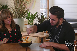
We offer custom in- show integrations within LX programming that organically and seamlessly weaves
										brand messaging into show content.</p>
								</div>
								<div class="col specials">
									<div><img src="https://www.lxtv.com/wp-content/themes/nbc-parallax/static/images/BranedContentCustomSpecials.png" /></div>
									<h2><em>CUSTOM SPECIALS</em></h2>
									<p>One-off specials or series that are dedicated to delivering brand messaging within highly
										entertaining and stylized programs.</p>
								</div>
								<div class="col distributions">
									<div><img src="https://www.lxtv.com/wp-content/themes/nbc-parallax/static/images/BrandedContentDistribution.jpg" /></div>
									<h2><em>DISTRIBUTION</em></h2>
									<p>
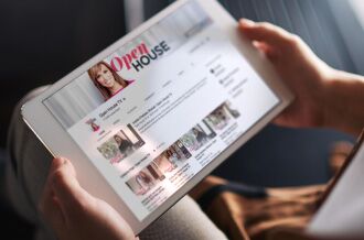
LX has full 360° capabilities. Our content travels. We offer distribution on all platforms: on-air,
										digital, mobile, social and out-of-home.</p>
								</div>
							</div>
						</div>
						<!--story-->
					</div>
					<!--layer images-->
				</div>
			</div>
		</div>
		<style type="text/css">
			#slide1 {
				height: 400px !important;
				padding-top: 6% !important;
			}

			.slide {
				background-color: #FFFFFF;
			}

			#slide9 .slide .ct_bx .imageCredit {
				color: #fff;
				position: absolute;
				font-size: 12px;
				right: 0;
				bottom: 0;
			}

			@media only screen and (device-width: 768px) {}

			@media only screen and (min-device-width: 481px) and (max-device-width: 1024px) and (orientation:portrait) {}

			@media only screen and (min-device-width: 481px) and (max-device-width: 1024px) and (orientation:landscape) {}
		</style>
		<div id="slide9" class="slide" data-center="background-position: 50% 0px;"
			data-top-bottom="background-position: 50% -100px;" data-bottom-top="background-position: 50% 100px;"
			data-anchor-target="#slide9"
			style=" background:url(https://www.lxtv.com/wp-content/themes/nbc-parallax/static/images/CarsonTwo.jpg)no-repeat fixed; padding-top:10%; background-position: 50% 0px;">
			<a id="slide-372277342"></a>
			<div class="image1" data-center="background-position: 50% 0px;" data-top-bottom="background-position: 50% -50px;"
				data-bottom-top="background-position: 50% 50px;" data-anchor-target="#slide9"
				style="background-image: url(''); background-size:cover; background-attachment:fixed; width: inherit; height:inherit;">
				<div class="image2" data-center="background-position: 50% 0px;"
					data-top-bottom="background-position: 50% -150px;" data-bottom-top="background-position: 50% 150px;"
					data-anchor-target="#slide9"
					style="background-image: url(''); background-size:cover; background-attachment:fixed; width: inherit; height:inherit;">
					<div class="image3" data-center="background-position: 50% 0px;"
						data-top-bottom="background-position: 50% -300px;" data-bottom-top="background-position: 50% 300px;"
						data-anchor-target="#slide9"
						style="background-image: url(''); background-size:cover; background-attachment:fixed; width: inherit; height:inherit;">
						<div class="story">
							<h2></h2>
						</div>
						<!--story-->
					</div>
					<!--layer images-->
				</div>
			</div>
		</div>
		<style type="text/css">
			#slide1 {
				height: 400px !important;
				padding-top: 6% !important;
			}

			.slide {
				background-color: #FFFFFF;
			}

			#slide10 {
				height: 480px;
			}

			#slide10 .slide .float-left,
			#slide10 .slide .float-right,
			#slide10 .slide .center {
				margin-top: 50px;
			}

			#slide10 .slide .ct_bx .imageCredit {
				color: #fff;
				position: absolute;
				font-size: 12px;
				right: 0;
				bottom: 0;
			}

			@media only screen and (device-width: 768px) {
				.slide {
					background-attachment: initial !important
				}
			}

			@media only screen and (min-device-width: 481px) and (max-device-width: 1024px) and (orientation:portrait) {
				.slide {
					background-attachment: initial !important
				}
			}

			@media only screen and (min-device-width: 481px) and (max-device-width: 1024px) and (orientation:landscape) {
				.slide {
					background-attachment: initial !important
				}
			}
		</style>
		<div id="slide10" class="slide" data-center="background-position: 50% 0px;"
			data-top-bottom="background-position: 50% -100px;" data-bottom-top="background-position: 50% 100px;"
			data-anchor-target="#slide10" style=""><a id="slide-322207862"></a>
			<div class="image1" data-center="background-position: 50% 0px;" data-top-bottom="background-position: 50% -50px;"
				data-bottom-top="background-position: 50% 50px;" data-anchor-target="#slide10"
				style="background-image: url(''); background-size:cover; background-attachment:fixed; width: inherit; height:inherit;">
				<div class="image2" data-center="background-position: 50% 0px;"
					data-top-bottom="background-position: 50% -150px;" data-bottom-top="background-position: 50% 150px;"
					data-anchor-target="#slide10"
					style="background-image: url(''); background-size:cover; background-attachment:fixed; width: inherit; height:inherit;">
					<div class="image3" data-center="background-position: 50% 0px;"
						data-top-bottom="background-position: 50% -300px;" data-bottom-top="background-position: 50% 300px;"
						data-anchor-target="#slide10"
						style="background-image: url(''); background-size:cover; background-attachment:fixed; width: inherit; height:inherit;">
						<div class="story">
							<h2></h2>
							<div class="embed">
								<style>
									#slide9 h2 {
										display: none;
									}

									.livespecials {
										float: right;
										margin: 0;
									}

									.livespecials img {
										position: static;
										margin: 0;
									}

									.livespecials-con {
										background: #f3f3f3;
										padding: 50px;
										width: 390px;
										margin-left: 10px;
										overflow: hidden;
									}

									.livespecials-con p {
										color: #000;
										line-height: 18px;
										font-size: 15px;
									}

									.livevideo {
										float: left;
										margin-top: 60px;
									}
								</style>
								<div class="livespecials"><img src="https://www.lxtv.com/wp-content/themes/nbc-parallax/static/images/LIVE_SPECIALS.png?a" />
									<div class="livespecials-con">
										<p>From the Golden Globes, to the Emmy Awards to Saturday Night Live’s 40th Anniversary after party
											special, when it comes to must see events, LXTV is the go to for live productions. Giving viewers
											front row seats to all the live action, LXTV’s specials are proven ratings winners as well as
											great opportunities for great sponsors.</p>
									</div>
								</div>
								<div class="livevideo">
									<script type="text/javascript" charset="UTF-8"
										src="https://www.cozitv.com/portableplayer/?cmsID=372247381&videoID=4axKQk7PpoDD&origin=cozitv.com&sec=news&subsec=tech&width=500&height=281">
									</script>
								</div>
							</div>
						</div>
						<!--story-->
					</div>
					<!--layer images-->
				</div>
			</div>
		</div>
		<style type="text/css">
			#slide1 {
				height: 400px !important;
				padding-top: 6% !important;
			}

			.slide {
				background-color: #FFFFFF;
			}

			#slide11 .slide .ct_bx .imageCredit {
				color: #fff;
				position: absolute;
				font-size: 12px;
				right: 0;
				bottom: 0;
			}

			@media only screen and (device-width: 768px) {}

			@media only screen and (min-device-width: 481px) and (max-device-width: 1024px) and (orientation:portrait) {}

			@media only screen and (min-device-width: 481px) and (max-device-width: 1024px) and (orientation:landscape) {}
		</style>
		<div id="slide11" class="slide" data-center="background-position: 50% 0px;"
			data-top-bottom="background-position: 50% -100px;" data-bottom-top="background-position: 50% 100px;"
			data-anchor-target="#slide11"
			style=" background:url(https://www.lxtv.com/wp-content/themes/nbc-parallax/static/images/GeorgeRescue_012616_0260.CR2_e.jpg)no-repeat fixed; padding-top:10%; background-position: 50% 0px;">
			<a id="slide-373384391"></a>
			<div class="image1" data-center="background-position: 50% 0px;" data-top-bottom="background-position: 50% -50px;"
				data-bottom-top="background-position: 50% 50px;" data-anchor-target="#slide11"
				style="background-image: url(''); background-size:cover; background-attachment:fixed; width: inherit; height:inherit;">
				<div class="image2" data-center="background-position: 50% 0px;"
					data-top-bottom="background-position: 50% -150px;" data-bottom-top="background-position: 50% 150px;"
					data-anchor-target="#slide11"
					style="background-image: url(''); background-size:cover; background-attachment:fixed; width: inherit; height:inherit;">
					<div class="image3" data-center="background-position: 50% 0px;"
						data-top-bottom="background-position: 50% -300px;" data-bottom-top="background-position: 50% 300px;"
						data-anchor-target="#slide11"
						style="background-image: url(''); background-size:cover; background-attachment:fixed; width: inherit; height:inherit;">
						<div class="story">
							<h2></h2>
						</div>
						<!--story-->
					</div>
					<!--layer images-->
				</div>
			</div>
		</div>
		<style type="text/css">
			#slide1 {
				height: 400px !important;
				padding-top: 6% !important;
			}

			.slide {
				background-color: #FFFFFF;
			}

			#slide12 {
				height: 207px;
			}

			#slide12 .slide .float-left,
			#slide12 .slide .float-right,
			#slide12 .slide .center {
				margin-top: 50px;
			}

			#slide12 .slide .ct_bx .imageCredit {
				color: #fff;
				position: absolute;
				font-size: 12px;
				right: 0;
				bottom: 0;
			}

			@media only screen and (device-width: 768px) {
				.slide {
					background-attachment: initial !important
				}
			}

			@media only screen and (min-device-width: 481px) and (max-device-width: 1024px) and (orientation:portrait) {
				.slide {
					background-attachment: initial !important
				}
			}

			@media only screen and (min-device-width: 481px) and (max-device-width: 1024px) and (orientation:landscape) {
				.slide {
					background-attachment: initial !important
				}
			}
		</style>
		<div id="slide12" class="slide" data-center="background-position: 50% 0px;"
			data-top-bottom="background-position: 50% -100px;" data-bottom-top="background-position: 50% 100px;"
			data-anchor-target="#slide12" style=""><a id="slide-371063871"></a>
			<div class="image1" data-center="background-position: 50% 0px;" data-top-bottom="background-position: 50% -50px;"
				data-bottom-top="background-position: 50% 50px;" data-anchor-target="#slide12"
				style="background-image: url(''); background-size:cover; background-attachment:fixed; width: inherit; height:inherit;">
				<div class="image2" data-center="background-position: 50% 0px;"
					data-top-bottom="background-position: 50% -150px;" data-bottom-top="background-position: 50% 150px;"
					data-anchor-target="#slide12"
					style="background-image: url(''); background-size:cover; background-attachment:fixed; width: inherit; height:inherit;">
					<div class="image3" data-center="background-position: 50% 0px;"
						data-top-bottom="background-position: 50% -300px;" data-bottom-top="background-position: 50% 300px;"
						data-anchor-target="#slide12"
						style="background-image: url(''); background-size:cover; background-attachment:fixed; width: inherit; height:inherit;">
						<div class="story">
							<h2>
								Commercial Production
							</h2>
							<div class="foregroundImageContainer" style="margin:0; position:static;"><img
									src="https://www.lxtv.com/wp-content/themes/nbc-parallax/static/images/COMMERICAL_PRODUCTION_TEXT.png"
									style="margin:0; position:static;" />
								<div class="ct_box"><span></span></div>
							</div>
						</div>
						<!--story-->
					</div>
					<!--layer images-->
				</div>
			</div>
		</div>
		<style type="text/css">
			#slide1 {
				height: 400px !important;
				padding-top: 6% !important;
			}

			.slide {
				background-color: #FFFFFF;
			}

			#slide13 {
				height: 480px;
			}

			#slide13 .slide .float-left,
			#slide13 .slide .float-right,
			#slide13 .slide .center {
				margin-top: 50px;
			}

			#slide13 .slide .ct_bx .imageCredit {
				color: #fff;
				position: absolute;
				font-size: 12px;
				right: 0;
				bottom: 0;
			}

			@media only screen and (device-width: 768px) {}

			@media only screen and (min-device-width: 481px) and (max-device-width: 1024px) and (orientation:portrait) {}

			@media only screen and (min-device-width: 481px) and (max-device-width: 1024px) and (orientation:landscape) {}
		</style>
		<div id="slide13" class="slide" data-center="background-position: 50% 0px;"
			data-top-bottom="background-position: 50% -100px;" data-bottom-top="background-position: 50% 100px;"
			data-anchor-target="#slide13" style=""><a id="slide-371068241"></a>
			<div class="image1" data-center="background-position: 50% 0px;" data-top-bottom="background-position: 50% -50px;"
				data-bottom-top="background-position: 50% 50px;" data-anchor-target="#slide13"
				style="background-image: url(''); background-size:cover; background-attachment:fixed; width: inherit; height:inherit;">
				<div class="image2" data-center="background-position: 50% 0px;"
					data-top-bottom="background-position: 50% -150px;" data-bottom-top="background-position: 50% 150px;"
					data-anchor-target="#slide13"
					style="background-image: url(''); background-size:cover; background-attachment:fixed; width: inherit; height:inherit;">
					<div class="image3" data-center="background-position: 50% 0px;"
						data-top-bottom="background-position: 50% -300px;" data-bottom-top="background-position: 50% 300px;"
						data-anchor-target="#slide13"
						style="background-image: url(''); background-size:cover; background-attachment:fixed; width: inherit; height:inherit;">
						<div class="story">
							<h2>
								Commercial Logos
							</h2>
							<div class="foregroundImageContainer" style="margin:0; position:static;"><img
									src="https://www.lxtv.com/wp-content/themes/nbc-parallax/static/images/LXTV_PARALLAX_test.jpeg" style="margin:0; position:static;" />
								<div class="ct_box"><span></span></div>
							</div>
						</div>
						<!--story-->
					</div>
					<!--layer images-->
				</div>
			</div>
		</div>
		<style type="text/css">
			#slide1 {
				height: 400px !important;
				padding-top: 6% !important;
			}

			.slide {
				background-color: #FFFFFF;
			}

			#slide14 .slide .ct_bx .imageCredit {
				color: #fff;
				position: absolute;
				font-size: 12px;
				right: 0;
				bottom: 0;
			}

			@media only screen and (device-width: 768px) {}

			@media only screen and (min-device-width: 481px) and (max-device-width: 1024px) and (orientation:portrait) {}

			@media only screen and (min-device-width: 481px) and (max-device-width: 1024px) and (orientation:landscape) {}
		</style>
		<div id="slide14" class="slide" data-center="background-position: 50% 0px;"
			data-top-bottom="background-position: 50% -100px;" data-bottom-top="background-position: 50% 100px;"
			data-anchor-target="#slide14"
			style=" background:url(https://www.lxtv.com/wp-content/themes/nbc-parallax/static/images/TS_ALICIA_KEYS_RESIZED.png)no-repeat fixed; padding-top:10%; background-position: 50% 0px;">
			<a id="slide-373385411"></a>
			<div class="image1" data-center="background-position: 50% 0px;" data-top-bottom="background-position: 50% -50px;"
				data-bottom-top="background-position: 50% 50px;" data-anchor-target="#slide14"
				style="background-image: url(''); background-size:cover; background-attachment:fixed; width: inherit; height:inherit;">
				<div class="image2" data-center="background-position: 50% 0px;"
					data-top-bottom="background-position: 50% -150px;" data-bottom-top="background-position: 50% 150px;"
					data-anchor-target="#slide14"
					style="background-image: url(''); background-size:cover; background-attachment:fixed; width: inherit; height:inherit;">
					<div class="image3" data-center="background-position: 50% 0px;"
						data-top-bottom="background-position: 50% -300px;" data-bottom-top="background-position: 50% 300px;"
						data-anchor-target="#slide14"
						style="background-image: url(''); background-size:cover; background-attachment:fixed; width: inherit; height:inherit;">
						<div class="story">
							<h2></h2>
						</div>
						<!--story-->
					</div>
					<!--layer images-->
				</div>
			</div>
		</div>
		<style type="text/css">
			#slide1 {
				height: 400px !important;
				padding-top: 6% !important;
			}

			.slide {
				background-color: #FFFFFF;
			}

			#slide15 {
				height: 480px;
			}

			#slide15 .slide .float-left,
			#slide15 .slide .float-right,
			#slide15 .slide .center {
				margin-top: 50px;
			}

			#slide15 .slide .ct_bx .imageCredit {
				color: #fff;
				position: absolute;
				font-size: 12px;
				right: 0;
				bottom: 0;
			}

			@media only screen and (device-width: 768px) {
				.slide {
					background-attachment: initial !important
				}
			}

			@media only screen and (min-device-width: 481px) and (max-device-width: 1024px) and (orientation:portrait) {
				.slide {
					background-attachment: initial !important
				}
			}

			@media only screen and (min-device-width: 481px) and (max-device-width: 1024px) and (orientation:landscape) {
				.slide {
					background-attachment: initial !important
				}
			}
		</style>
		<div id="slide15" class="slide" data-center="background-position: 50% 0px;"
			data-top-bottom="background-position: 50% -100px;" data-bottom-top="background-position: 50% 100px;"
			data-anchor-target="#slide15" style=""><a id="slide-322286651"></a>
			<div class="image1" data-center="background-position: 50% 0px;" data-top-bottom="background-position: 50% -50px;"
				data-bottom-top="background-position: 50% 50px;" data-anchor-target="#slide15"
				style="background-image: url(''); background-size:cover; background-attachment:fixed; width: inherit; height:inherit;">
				<div class="image2" data-center="background-position: 50% 0px;"
					data-top-bottom="background-position: 50% -150px;" data-bottom-top="background-position: 50% 150px;"
					data-anchor-target="#slide15"
					style="background-image: url(''); background-size:cover; background-attachment:fixed; width: inherit; height:inherit;">
					<div class="image3" data-center="background-position: 50% 0px;"
						data-top-bottom="background-position: 50% -300px;" data-bottom-top="background-position: 50% 300px;"
						data-anchor-target="#slide15"
						style="background-image: url(''); background-size:cover; background-attachment:fixed; width: inherit; height:inherit;">
						<div class="story">
							<h2></h2>
							<div class="embed">
								<style>
									.nativesocial {
										float: left;
										margin: 0;
									}

									.nativesocial img {
										float: left;
										position: static;
										margin: 0;
									}

									.nativesocial p {
										color: #000;
										clear: both;
										float: left;
										line-height: 22px;
										font-size: 15px;
										width: 500px;
									}

									.native-video {
										float: right;
										margin: 40px 0 0;
									}
								</style>
								<div class="nativesocial"><img src="https://www.lxtv.com/wp-content/themes/nbc-parallax/static/images/native_social_content.png" />
									<p>LX develops high quality, original content that is accessible and easily sharable across multiple
										platforms including on air, digital, mobile, social and NBCU owned Television Station properties. We
										provide clients with greater insight into the value of social media impressions and use Facebook
										Amplification and other industry best practices to maximize digital reach. Our aim is to create
										content that’s engaging and interactive to better drive social conversations.</p>
								</div>
								<div class="native-video">
									<script type="text/javascript" charset="UTF-8"
										src="https://www.cozitv.com/portableplayer/?cmsID=370318721&videoID=mPJYgC9qS_5Z&origin=cozitv.com&sec=news&subsec=tech&width=500&height=281">
									</script>
								</div>
							</div>
						</div>
						<!--story-->
					</div>
					<!--layer images-->
				</div>
			</div>
		</div>
	</div>
	<script>
		// Silde detection for Omniture Page View
		var nbcParallax = {
			wTopPos: 0,
			wCurrentPos: 0,
			wHeight: $(window).height() / 2, // gets center value of the browser window
			wThreshold: 0,
			currentSlidePos: 0,
			slideNum: "1",
			getSlidePos: function (slide, addClassName, removeClassName) {
				nbcParallax.currentSlidePos = $(slide).offset().top - $(window).scrollTop();
				if ((nbcParallax.currentSlidePos > nbcParallax.wThreshold) && (nbcParallax.currentSlidePos < nbcParallax
						.wHeight)) {
					$(slide).addClass(addClassName).removeClass(removeClassName);
					nbcParallax.slideNum = $(slide).attr("id").replace("slide",
					""); // assumes slide ID property starts with "slide"
					if (nbc.env !== "") {
						console.log("Slide number: " + nbcParallax.slideNum);
					};
					nbcu.prop49 = nbcu.eVar49 + " | " + nbcParallax.slideNum;
					nbcu.t();
				}
			},
			init: function () {
				$("#slide1").addClass("viewedDown");
				$(window).scroll(function () {
					nbcParallax.wCurrentPos = $(window).scrollTop();
					if (nbcParallax.wCurrentPos > nbcParallax.wTopPos) { // scrolling down
						jQuery.each($(".slide.skrollable-between"), function () {
							if ($(this).hasClass("viewedDown")) {
								// nothing
							} else {
								nbcParallax.getSlidePos($(this), "viewedDown", "viewedUp");
							}
						});
					} else { // scrolling up
						jQuery.each($(".slide.skrollable-between"), function () {
							if ($(this).hasClass("viewedUp")) {
								// nothing
							} else {
								nbcParallax.getSlidePos($(this), "viewedUp", "viewedDown");
							}
						});
					}
					nbcParallax.wTopPos = nbcParallax.wCurrentPos;
				});
			}
		};
		jQuery(document).ready(function () {
			if ($(window).width() > 1000) {
				var s = skrollr.init({
					forceHeight: false
				});
			}
			nbcParallax.init(); // Fires Omniture Pageview per slide
			jQuery('.socialHeader a').click(function (e) {
				var linkName = '';
				if (jQuery(this).hasClass('fbShare')) {
					linkName = 'fb'
				} else if (jQuery(this).hasClass('twShare')) {
					linkName = 'tw'
				};
				if (linkName !== '') {
					nbcu.eVar7 = linkName + ' share';
					nbcu.tl()
				}
			});

		});
	</script>
	<footer id="footerLinks">
		<nav><a href="https://www.nbcuniversal.com/terms">TERMS OF USE</a><a href="/privacy?brandA=Owned_Stations&intake=LX_TV">PRIVACY POLICY</a><a id="ot-sdk-btn" class="ot-sdk-show-settings">DO NOT SELL MY PERSONAL INFORMATION</a><a href="https://www.nbcuniversal.com/privacy/california-consumer-privacy-act?intake=LX_TV" target="_blank">CA Notice</a><a href="https://www.nbcuniversal.com/privacy/cookies#accordionheader2" target="_blank">Ad Choices</a><a href="/about">ABOUT LX.TV</a><a href="/contact">CONTACT</a><a href="/advertise">ADVERTISE WITH US</a></nav>
		<p>Copyright &copy; 2026 NBCUniversal Media, LLC</p>
	</footer>
	<script
		src="https://cdn.cookielaw.org/opt-out/otCCPAiab.js"
		id="privacyCookie"
		type="text/javascript"
		charset="UTF-8"
		ccpa-opt-out-ids="USP"
		ccpa-opt-out-geo="US"
		ccpa-opt-out-lspa="false"
	>
	</script>
	<script
		src="https://cdn.cookielaw.org/consent/aefb03c0-016d-4c82-89c4-3566908e70da/otSDKStub.js"
		data-document-language="true"
		type="text/javascript"
		charset="UTF-8"
		data-domain-script="aefb03c0-016d-4c82-89c4-3566908e70da"
					integrity="sha384-TKdmlzVmoD70HzftTw4WtOzIBL5mNx8mXSRzEvwrWjpIJ7FZ/EuX758yMDWXtRUN"
			crossorigin="anonymous"
			>
	</script>
	<script type="text/javascript">
		function displayOneTrustToggle() {
			const getUserCountry = window.OneTrust.getGeolocationData().country;
			if ( getUserCountry === 'US' ) {
				document.getElementById('ot-sdk-btn').classList.add('toggle');
			}
		}

		function checkForOneTrust() {
			if ( typeof window.OneTrust !== 'undefined' ) {
				displayOneTrustToggle();
			} else {
				setTimeout(() => {
					checkForOneTrust();
				}, 1000);
			}
		}

		checkForOneTrust();
	</script>
	<script type="speculationrules">
{"prefetch":[{"source":"document","where":{"and":[{"href_matches":"/*"},{"not":{"href_matches":["/wp-*.php","/wp-admin/*","/wp-content/uploads/sites/7/*","/wp-content/*","/wp-content/plugins/*","/wp-content/themes/nbc-parallax/*","/*\\?(.+)"]}},{"not":{"selector_matches":"a[rel~=\"nofollow\"]"}},{"not":{"selector_matches":".no-prefetch, .no-prefetch a"}}]},"eagerness":"conservative"}]}
</script>
		<script type="text/javascript">
		var nbc = {"env":"production"};

		s_linkInternalFilters="javascript:,lxtv.com";
		if ( 'production' == nbc.env || 'prod' == nbc.env ) {
			var nbcu_account = "nbcuotslxtv";
		} else {
			var nbcu_account = 'nbcunbcuotssaletotalstage';
		}
		var nbcu_prop8 = "lxtv";
		var nbcu_prop9 = "lxtv";
		var nbcu_prop10 = "lxtv";
		nbc.callLetters = "lxtv";
		nbc.contentType = "";
		</script>
		<script type="text/javascript" src="https://www.lxtv.com/_static/??-eJzTLy/QTc7PK0nNK9EvyClNz8wr1s9LStbNzUwuyi/OLEnVTcxLzKksyUwu1s8q1g/LBIrlFzkGeOplFevok6Y5v6Q4PiUzhwydjgUFvqmJxaVFqblAHUAD7HNtDc3NDU0tLU0tLLIA63pJPw==" ></script><script id="jetpack-stats-js-before">
_stq = window._stq || [];
_stq.push([ "view", {"v":"ext","blog":"172656117","post":"4","tz":"-4","srv":"www.lxtv.com","hp":"vip","j":"1:15.7"} ]);
_stq.push([ "clickTrackerInit", "172656117", "4" ]);
//# sourceURL=jetpack-stats-js-before
</script>
<script data-wp-strategy="defer" defer id="jetpack-stats-js" src="https://stats.wp.com/e-202624.js"></script>
<script id="wp-emoji-settings" type="application/json">
{"baseUrl":"https://s.w.org/images/core/emoji/17.0.2/72x72/","ext":".png","svgUrl":"https://s.w.org/images/core/emoji/17.0.2/svg/","svgExt":".svg","source":{"concatemoji":"https://www.lxtv.com/wp-includes/js/wp-emoji-release.min.js?ver=7.0"}}
</script>
<script type="module">
/*! This file is auto-generated */
const a=JSON.parse(document.getElementById("wp-emoji-settings").textContent),o=(window._wpemojiSettings=a,"wpEmojiSettingsSupports"),s=["flag","emoji"];function i(e){try{var t={supportTests:e,timestamp:(new Date).valueOf()};sessionStorage.setItem(o,JSON.stringify(t))}catch(e){}}function c(e,t,n){e.clearRect(0,0,e.canvas.width,e.canvas.height),e.fillText(t,0,0);t=new Uint32Array(e.getImageData(0,0,e.canvas.width,e.canvas.height).data);e.clearRect(0,0,e.canvas.width,e.canvas.height),e.fillText(n,0,0);const a=new Uint32Array(e.getImageData(0,0,e.canvas.width,e.canvas.height).data);return t.every((e,t)=>e===a[t])}function p(e,t){e.clearRect(0,0,e.canvas.width,e.canvas.height),e.fillText(t,0,0);var n=e.getImageData(16,16,1,1);for(let e=0;e<n.data.length;e++)if(0!==n.data[e])return!1;return!0}function u(e,t,n,a){switch(t){case"flag":return n(e,"\ud83c\udff3\ufe0f\u200d\u26a7\ufe0f","\ud83c\udff3\ufe0f\u200b\u26a7\ufe0f")?!1:!n(e,"\ud83c\udde8\ud83c\uddf6","\ud83c\udde8\u200b\ud83c\uddf6")&&!n(e,"\ud83c\udff4\udb40\udc67\udb40\udc62\udb40\udc65\udb40\udc6e\udb40\udc67\udb40\udc7f","\ud83c\udff4\u200b\udb40\udc67\u200b\udb40\udc62\u200b\udb40\udc65\u200b\udb40\udc6e\u200b\udb40\udc67\u200b\udb40\udc7f");case"emoji":return!a(e,"\ud83e\u1fac8")}return!1}function f(e,t,n,a){let r;const o=(r="undefined"!=typeof WorkerGlobalScope&&self instanceof WorkerGlobalScope?new OffscreenCanvas(300,150):document.createElement("canvas")).getContext("2d",{willReadFrequently:!0}),s=(o.textBaseline="top",o.font="600 32px Arial",{});return e.forEach(e=>{s[e]=t(o,e,n,a)}),s}function r(e){var t=document.createElement("script");t.src=e,t.defer=!0,document.head.appendChild(t)}a.supports={everything:!0,everythingExceptFlag:!0},new Promise(t=>{let n=function(){try{var e=JSON.parse(sessionStorage.getItem(o));if("object"==typeof e&&"number"==typeof e.timestamp&&(new Date).valueOf()<e.timestamp+604800&&"object"==typeof e.supportTests)return e.supportTests}catch(e){}return null}();if(!n){if("undefined"!=typeof Worker&&"undefined"!=typeof OffscreenCanvas&&"undefined"!=typeof URL&&URL.createObjectURL&&"undefined"!=typeof Blob)try{var e="postMessage("+f.toString()+"("+[JSON.stringify(s),u.toString(),c.toString(),p.toString()].join(",")+"));",a=new Blob([e],{type:"text/javascript"});const r=new Worker(URL.createObjectURL(a),{name:"wpTestEmojiSupports"});return void(r.onmessage=e=>{i(n=e.data),r.terminate(),t(n)})}catch(e){}i(n=f(s,u,c,p))}t(n)}).then(e=>{for(const n in e)a.supports[n]=e[n],a.supports.everything=a.supports.everything&&a.supports[n],"flag"!==n&&(a.supports.everythingExceptFlag=a.supports.everythingExceptFlag&&a.supports[n]);var t;a.supports.everythingExceptFlag=a.supports.everythingExceptFlag&&!a.supports.flag,a.supports.everything||((t=a.source||{}).concatemoji?r(t.concatemoji):t.wpemoji&&t.twemoji&&(r(t.twemoji),r(t.wpemoji)))});
//# sourceURL=https://www.lxtv.com/wp-includes/js/wp-emoji-loader.min.js
</script>
		<script type="text/javascript">
		var nbcu_prop8 ="sos";
		var nbcu_prop9 ="SOS";
		var nbcu_prop10 ="SOS";
		</script>

		<script type="text/javascript">
		nbcu.pageName="home:home page";
		nbcu.pageType=""; // used for 404 Error message page only
		nbcu_siteID="lxtv";
		nbcu.list1="";
		nbcu.prop8=nbcu_prop8; // division
		nbcu.prop9=nbcu_prop9; // station market
		nbcu.prop10=nbcu_prop10; // call letters
		nbcu.prop21="";// content id
				nbcu.prop23="home"; // content type
		nbcu.prop24=""; // content group
		nbcu.prop25=""; // author name
		nbcu.prop26="06\/09\/2026";
		nbcu.prop27=""; //Content: feature step 2
		nbcu.prop28=""; //content source
		nbcu.prop48 = "desktop";
		/* E-commerce Variables */
		nbcu.events=""; // filled with an event # as needed - example event1, or event19

		// Xfinity Omniture Value
		if(typeof xfinityOmniValue != "undefined") {
			if(xfinityOmniValue == "xfinity"){
				nbcu.prop29=xfinityOmniValue;
				nbcu.eVar29=xfinityOmniValue;
			} else{
				nbcu.prop29="";
				nbcu.eVar29="";
			}
		}
		if(typeof U == "object") {
			if(typeof U.sessionVideoPVTracker == "function") {U.sessionVideoPVTracker("pv");}
		}
		nbcu.eVar200 = nbcu.contextData['tve.did'];

		/************* DO NOT ALTER ANYTHING BELOW THIS LINE ! **************/
		//-->
		</script>

					<script src="//assets.adobedtm.com/a2ef59fba8e9/2549f5dc7fc6/launch-6957f2aaef2c-staging.min.js" async></script>
		
		<script type="text/javascript">
			var _sf_async_config = {"domain":"lxtv.com","uid":15527};
			_sf_async_config.path = "/";
			_sf_async_config.sections = "";

			(function(){
				function loadChartbeat() {
					window._sf_endpt=(new Date()).getTime();
					var e = document.createElement('script');
					e.setAttribute('language', 'javascript');
					e.setAttribute('type', 'text/javascript');
					e.setAttribute('src', '//static.chartbeat.com/js/chartbeat.js');
					document.body.appendChild(e);
				}
				var oldonload = document.ready;
				document.ready = (typeof document.ready != 'function') ?
					loadChartbeat : function() { oldonload(); loadChartbeat(); };
			})();
			</script>
		</body>

</html>
