<![CDATA[Paul Irish]]>2024-11-18T17:39:52-08:00https://paulirish.com/Octopress<![CDATA[Video Stabilization with `ffmpeg` and `VidStab`]]>2021-04-30T11:33:00-07:00https://paulirish.com/2021/video-stabilization-with-ffmpeg-and-vidstabWay back in Dec 2015, @maxogden wrote a nice guide on stabilizing your own video with ffmpeg. I return to it on occasion and have updated my gist comment to offer some updated commands. Since enough has changed regarding installation and use, I figure a new, spiffy, and working guide deserves a non-gist home.
Presenting the 2021-era guide to pretty easy DIY video stabilization!
On Mac OS, install ffmpeg and vidstab from homebrew:
There are plenty of options for libvidstab, like shakiness, accuracy, smoothing. The defaults are good, but you may want to experiment. There’s even a visual diagnostic mode.
Assuming the source video is named clip.mkv…
123456
# The first pass ('detect') generates stabilization data and saves to `transforms.trf`# The `-f null -` tells ffmpeg there's no output video fileffmpeg -i clip.mkv -vf vidstabdetect -f null -
# The second pass ('transform') uses the .trf and creates the new stabilized video.ffmpeg -i clip.mkv -vf vidstabtransform clip-stabilized.mkv
You now have a clip-stabilized.mkv!
Bonus: create a comparison video
Use the vstack or hstack filter, depending on if you want them stacked vertically or side-by-side:
]]><![CDATA[rAF Internals & Node Debugging Guide]]>2018-02-28T12:33:00-08:00https://paulirish.com/2018/raf-internals-and-node-debugging-guideI’ve published a few articles on Medium that may interest the reader here:
The canonical guide to using the Chrome DevTools UI for debugging Node.js. It definitely beats console.log. ;)
Aside from that, I’ve been busy working on Lighthouse, performance metrics, tooling, and DevTools.
]]><![CDATA[Advanced Performance Audits with DevTools]]>2015-03-27T08:46:00-07:00https://paulirish.com/2015/advanced-performance-audits-with-devtoolsRecently, I’ve spent some time recently profiling real-world mobile websites. Using the 1000/100/6 performance model1, and spelunking deep into each app, the findings have been fascinating.
I’ve written up case study documents for each, incorporating all the findings:
Illustrated diagnoses for the poor performance
What actions the developer should take
How Chrome’s tooling should improve
Questions and insights for the rendering engine (Blink)
In this doc, we look at the scrolling of CNET, input latency on CNET, some very interesting challenges on the responsive Time.com, and infinite scroll on Google Play’s desktop site.
The intended audience is browser engineers and performance-minded frontend developers. It’s fairly advanced, but I’m spelunking deep to identify how the sites butt heads with the browser APIs and architecture.
Lastly, we’re using this research to improve Chrome DevTools and what you hear from Chrome.
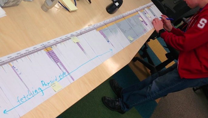
Wikipedia eng team scrutinizing their performance millisecond by millisecond.
(Yes, it’s a long paper printout of the Chrome DevTools timeline flamechart :)
Photo by Ori Livneh, CC BY 4.0
(BTW, use this link to view the same doc but with comments enabled)
1 - More on this performance model later. Stay tuned.
]]><![CDATA[WebKit for Developers]]>2013-02-28T02:53:00-08:00https://paulirish.com/2013/webkit-for-developers
Feb 2015: A lot’s happened since I wrote this post two years ago. Chrome forked WebKit and started Blink, Opera adopted Chromium, and node-webkit became nw.js. This post describes a complexity of defining WebKit that doesn’t exist much anymore; with Chrome’s departure the WebKit world is more simple and clear.
WebKit is deployed through iOS Safari and Mac Safari, and the active GTK community leverages WebKit inside the GNOME Platform. Some smaller mobile browsers use WebKit, some Chromium, some use forks of either, and many just use the system WebViews that are both powered by up-to-date version of iOS WebKit and Android Chromium.
The post below is kept intact and represents a snapshot of history in early 2013, rather than the modern WebKit landscape.
For many of us developers, WebKit is a black box. We throw HTML, CSS, JS and a bunch of assets at it, and WebKit, somehow.. magically, gives us a webpage that looks and works well. But in fact, as my colleague Ilya Grigorik puts it…
WebKit isn’t a black box. It’s a white box. And not just that, but an open, white box.
So let’s take a moment to understand some things:
What is WebKit?
What isn’t WebKit?
How is WebKit used by WebKit-based browsers?
Why are all WebKits not the same?
Now, especially with the news that Opera has moved to WebKit, we have a lot of WebKit browsers out there, but its pretty hard to know what they share and where they part ways. Below we’ll hopefully shine some light on this. As a result you’ll be able to diagnose browser differences better, report bugs at the right tracker, and understand how to develop against specific browsers more effectively.
Standard Web Browser Components
Let’s lay out a few components of the modern day web browser:
Parsing (HTML, XML, CSS, JavaScript)
Layout
Text and graphics rendering
Image decoding
GPU interaction
Network access
Hardware acceleration
Which of those are shared in WebKit-based browsers? Pretty much only the first two.
The others are handled by individual WebKit ports. Let’s review what that
means…
The WebKit Ports
There are different “ports” of WebKit, but allow me to let Ariya Hidayat, WebKit
hacker and eng director at Sencha
to explain:
What is the popular reference to WebKit is usually Apple’s own flavor of WebKit which runs on Mac OS X (the first and the original WebKit library). As you can guess, the various interfaces are implemented using different native libraries on Mac OS X, mostly centered around CoreFoundation. For example, if you specify a flat colored button with specific border radius, well WebKit knows where and how to draw that button. However, the final actual responsibility of drawing the button (as pixels on the user’s monitor) falls into CoreGraphics.
As mentioned above, using CG is unique to the Mac port. Chrome on Mac uses Skia here.
With time, WebKit was “ported” into different platform, both desktop and mobile. Such flavor is often called “a WebKit port”. For Safari Windows, Apple themselves also ported WebKit to run on Windows, using the Windows version of its (limited implementation of) CoreFoundation library.
Beside that, there were many other “ports” as well (see the full list). Google has created and continues to maintain its Chromium port. There is also WebKitGtk which is based on Gtk+. Nokia (through Trolltech, which it acquired) maintains the Qt port of WebKit, popular as its QtWebKit module.
Some of the ports of WebKit
Safari
Safari for OS X and Safari for Windows are two different ports
WebKit nightly is an edge build of the Mac port that’s used for Safari. More later…
Plenty more ports: Amazon Silk, Dolphin, Blackberry, QtWebKit, WebKitGTK+, The EFL port (Tizen), wxWebKit, WebKitWinCE, etc
Different ports can have different focuses. The Mac port’s focus is split
between Browser and OS, and introduces Obj-C and C++ bindings to embed the
renderer into native applications. Chromium’s focus is purely on the browser.
QtWebKit offers its port for applications to use as a runtime or rendering
engine within its cross-platform GUI application architecture.
What’s shared in all WebKit browsers
First, let’s review the commonalities shared by all WebKit ports.
So first, WebKit parses HTML the same way. Well, except Chromium is the only port so far to enable threaded HTML parsing support.
… Okay, but once parsed, the DOM tree is constructed the same. Well, actually Shadow DOM is only turned on for the Chromium port, so DOM construction varies. Same goes for custom elements.
… Okay, well WebKit creates a window object and document object for everyone. True, though the properties and constructors it exposes can be conditional on the feature flags enabled.
… CSS parsing is the same, though. Slurping up your CSS and turning it into CSSOM’s pretty standard. Yeah, though Chrome accepts just the -webkit- prefix whereas Apple and other ports accept legacy prefixes like -khtml- and -apple-.
… Layout.. positioning? Those are the bread and butter. Same, right? Come on! Sub-pixel layout and saturated layout arithmetic is part of WebKit but differs from port to port.
JavaScriptCore is in the WebKit repo. There are bindings in WebKit for both it and V8
Rendering of form controls
<video> & <audio> element behavior (and codec support)
Image decoding
Navigating back/forward
The navigation parts of pushState()
SSL features like Strict Transport Security and Public Key Pins
Let’s take one of these: 2D graphics Depending on the port, we’re using completely different libraries to handle drawing to screen:
Or to go a little more micro… a recently landed feature: CSS.supports() was enabled for all ports except win and wincairo, which don’t have css3 conditional features enabled.
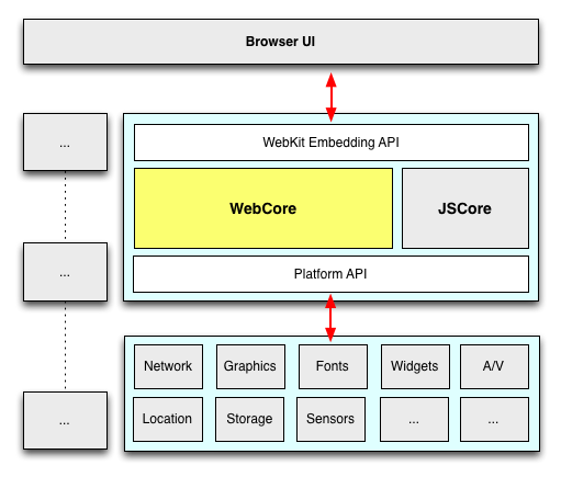
Now that we’ve gotten technical.. time to get pedantic. Even the above isn’t correct. It’s actually WebCore that’s shared. WebCore is a layout, rendering, and Document Object Model (DOM) library for HTML and SVG, and is generally what people think of when they say WebKit. In actuality “WebKit” is technically the binding layer between WebCore and the ports, though in casual conversation this distinction is mostly unimportant.
A diagram should help:
Many of the components within WebKit are swappable (shown above in gray).
As an example, WebKit’s JavaScript engine, JavaScriptCore, is a default in
WebKit. (It is based originally on KJS (from KDE) back when WebKit started as a
fork of KHTML). Meanwhile, the Chromium port swaps in V8 here, and uses unique
DOM bindings to map things over.
Fonts and Text rendering is a huge part of platform. There are 2 separate text
paths in WebKit: Fast and Complex. Both require platform-specific (port-side)
support, but Fast just needs to know how to blit glyphs (which WebKit caches for
the platform) and complex actually hands the whole string off to the platform
layer and says “draw this, plz”.
“WebKit is like a Sandwich. Though in Chromium’s case it’s more like a taco. A
delicious web platform taco.” Dimitri Glazkov, Chrome WebKit hacker.
Champion of Web Components and Shadow DOM
Now, let’s widen the lens and look at a few ports and a few subsystems. Below
are five ports of WebKit; consider how varied their stacks are, despite sharing
much of WebCore.
Chrome (OS X)
Safari (OS X)
QtWebKit
Android Browser
Chrome for iOS
Rendering
Skia
CoreGraphics
QtGui
Android stack/Skia
CoreGraphics
Networking
Chromium network stack
CFNetwork
QtNetwork
Fork of Chromium’s network stack
Chromium stack
Fonts
CoreText via Skia
CoreText
Qt internals
Android stack
CoreText
JavaScript
V8
JavaScriptCore
JSC (V8 is used elsewhere in Qt)
V8
JavaScriptCore (without JITting) *
* A side note on Chrome for IOS. It uses UIWebView, as you likely know. Due to
the capabilities of UIWebView that means it can only use the same rendering
layer as Mobile Safari, JavaScriptCore (instead of V8) and a single-process
model. Still, considerable Chromium-side code is leveraged, such as the network
layer, the sync and bookmarks infrastructure, omnibox, metrics and crash
reporting. (Also, for what it’s worth, JavaScript is so rarely the bottleneck on
mobile that the lack of JITting compiler has minimal impact.)
All right, so where does this leave us?
So, all WebKits are totally different now. I’m scared.
Don’t be! The layoutTest coverage in WebKit is enormous (28,000
layoutTests at last count), not only for existing features but for any found
regressions. In fact, whenever you’re exploring some new or esoteric
DOM/CSS/HTML5-y feature, the layoutTests often have fantastic minimal demos of
the entire web platform.
In addition, the W3C is ramping up its effort for conformance suite testing. This
means we can expect both different WebKit ports and all browsers to be testing
against the same suite of tests, leading to fewer quirks and a more
interoperable web. For all those who have assisted this effort by going to a
Test The Web Forward event… thank you!
Opera just moved to WebKit. How does that play out?
Robert Nyman and Rob Hawkes touched on this, too,
but I’ll add that one of the significant parts of Opera’s announcement was that
Opera adopted Chromium. This means the WebGL, Canvas, HTML5 forms, 2D
graphics implementations–all that stuff will be the same on Chrome and Opera
now. Same APIs, and same backend implementation. Since Opera is Chromium-based,
you can feel confident that your cutting-edge work will be compatible with
Chrome and Opera simultaneously.
I should also point out that all Opera browsers will be adopting
Chromium. So Opera for Windows, Mac and Linux and Opera Mobile (the fully
fledged mobile browser). Even Opera Mini, the thin client, will be swapping out
the current server-side rendering farm based on Presto with one based on
Chromium.
.. and the WebKit Nightly. What is that?
It’s the mac port of
WebKit, running inside of the same binary that Safari uses (though with a few
underlying libraries swapped out). Apple mostly calls the shots in it, so its behavior and feature set is congruent
with what you’ll find in Safari. In many cases Apple takes a conservative approach when enabling features that other ports may be implementing or experimenting with. Anyway, if you want to go back to middle-school
analogies, think of it as… WebKit Nightly is to Safari what Chromium is to
Chrome.
Chrome Canary also
has the latest WebKit source within a day or so.
4:00pm. tonikitoo, hacker on QtWebKit wanted to clear up some subtleties:
Nokia (through Trolltech, which it acquired) maintains the Qt port of WebKit, popular as its QtWebKit module. It might be valuable to mentioned that Digia acquired the Trolltech/Qt division of Nokia and now maintains QtWebKit. Also, not to be too nit-picker, in your subtitles “Some of the ports of WebKit” I would have said “Some of the Products running on top of specific ports of WebKit” because strictly speaking Safari is not a port, but a “Browser that makes use of the Apple WebKit port on Mac”.
]]><![CDATA[Why moving elements with translate() is better than pos:abs top/left]]>2012-12-20T00:00:00-08:00https://paulirish.com/2012/why-moving-elements-with-translate-is-better-than-pos-abs-top-slash-left
Update (2016): The more canonical writeup of this technique is at High Performance Animations - HTML5 Rocks. TL;DR: Only transform & opacity; never top/left!
In modern days we have two primary options for moving an element across the screen:
I wanted to answer this with Chrome and get some good evidence on what’s going on. I ended up recording a video on the experience:
It’s a good watch and dives into Chrome DevTools’ Timeline, compositing, paint cost, accelerated layers, and more… but if you want the abbreviated text version, read on:
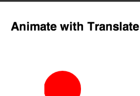
First thing, Chris made some simple demos to try things out:
This sorta works, but there is such low complexity in this situation that it’s all going to look pretty great. We need something closer to a complex website to properly evaluate the two (thx joshua for the macbook!):
Now we’re starting to get closer, but immediately I get distracted by something.
Distraction: Pixel snapping
If you run the demo above you might notice the top edge of the MacBook looks a little bit better in the top/left one. (And here I am writing a post about why translate is better! Preposterous!) So this is due to the absolute positioned macbook sticks to pixel positions, whereas the translate()‘d one can interpolate at sub-pixel positions.
One of the Chrome GPU engineers, James Robinson, called this the “dubstep effect”, as these pixels appear to be getting pounded by bass. Here’s a closeup of the effect… watch the top white edge of the macbook in each:
On the left, you see stair-stepping down three pixels and back up again. This pixel snapping may result in a less distracting transition in this case, though this wouldn’t be so noticeable if you were moving objects with less of a high-contrast situation.
Back to performance
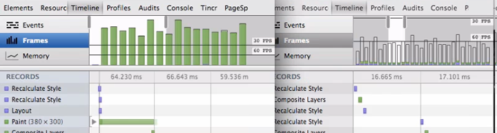
If you run DevTool’s Timeline Frames mode on these two examples here, they start to tell a very different story:
The top/left has very large time to paint each frame, which results in a choppier transition. All the CSS including some big box shadows, are computed on the CPU and composited against that gradient backdrop every frame. The translate version, on the other hand, gets the laptop element elevated onto it’s own layer on the GPU (called a RenderLayer). Now that it sits on its own layer, any 2D transform, 3D transform, or opacity changes can happen purely on the GPU which will stay extremely fast and still get us quick frame rates.
Watch the video above towards the end to see more on how to diagnose paint costs, see what areas are being repainted, and evaluate what elements are on the GPU.
Demo
Click through below, try adding more and see how the the framerate reacts. Feel free to open up DevTools, too and explore Timeline:
Guidelines for animation
Use CSS keyframe animation or CSS transitions, if at all possible. The browser can optimize painting and compositing bigtime here.
If needs to be it’s JS-based animation, use requestAnimationFrame. Avoid setTimeout, setInterval.
Avoid changing inline styles on every frame (jQuery animate()-style) if you can, declarative animations in CSS can be optimized by the browser way more.
Using 2D transforms instead of absolute positioning will typically provide better FPS by way of smaller paint times and smoother animation.
Use Timeline Frame’s mode to investigate what is slowing down your behavior
“Show Paint Rects” and “Render Composited Layer Borders” are good pro-moves to verify where your element is being rendered.
]]><![CDATA[Chrome Canary for Developers]]>2012-11-02T08:16:00-07:00https://paulirish.com/2012/chrome-canary-for-developers
If you do front-end web development and already use Chrome as your development browser, I encourage you to use Chrome Canary.
A new Chrome Canary build is available daily (we cut at 2am PST and take the best of last 40 revisions, to be specific). Running fresh builds gives you great goodies to look forward:
Chrome DevTools features
$_ (for the Console’s most recently evaluated result)
Large, experimental features (go visit about:flags)
Right now, there’s exciting stuff like Web Component’s Shadow DOM, WebRTC’s Peer Connection, and more.
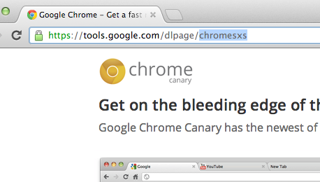
Canary runs side by side
The other reason why Canary is great is because it can run side-by-side with your other Chrome install. In fact this is why the URL for Canary’s download page is “sxs”.
I recommend running Chrome Stable and Canary. That’s how most of the Chrome Developer Relations team does it. You never need to update your browser, you can watch the new stuff coming at you (and file bugs if it breaks) and still see what your users see.
11 Weeks From Canary to 310M Users
Fun fact: when a feature lands in Canary, it’s only a short 11 week trip down to shipping to all 300+ million Chrome users on stable. That is, as long as everything is on schedule and the feature doesn’t need to bake a little longer on dev channel before making its way down. Given that, it’s a smart move as a dev team to watch as features (and sometimes bugs) trickle down to have time to adapt. When a new stable Chrome is ready, all users will have it within just a few days.
Canary is available for Mac and Windows, but sadly not Linux. :( But luckily there are packages that track the dev channel Chromium that’ll keep you up to date on a weekly basis, so you can have a pseudo-canary. If you need a one-off build of the freshest Chromium available, just go to download-chromium.appspot.com; it’ll detect your OS and serve up a build that’s less than a few hours old. Hotchachacha!
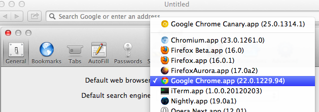
Protip: you can set Canary as your default browser : Canary itself doesn’t have a setting to let you do this, as its an edge release. (Read about how Chrome ensures the stability of the Canary build). However… if you open Safari’s preferences, Canary will be listed in the Default web browser choices, so you can choose it if you want all new links to open there.
Another small tip: sometimes your Chrome extensions affect your page inspection behavior is weird ways. Jump into incognito where extensions don’t run to get a clean look.
Live on the edge
Running Canary regularly rocks, but so do edge versions of other browsers:
WebKit Nightly is basically Safari nightly (it’s their video, GPU, etc stack, but without other Safari browser features)
Internet Explorer gives you platform previews, but since running the time-bombed VMs can be a pain, I run them in BrowserStack.
Oh right, call to action:
2012.11.02: Added CTA thanks to philip_roberts’ suggestion.
2013-03-15: Accurate data on when/how we cut Canary builds.
]]><![CDATA[Interview On Treehouse]]>2012-10-29T05:07:00-07:00https://paulirish.com/2012/interview-on-treehouseThe great folks at Treehouse sat down with me for 30 minutes to talk about frontend development, my background, HTML5 Boilerplate and tooling.
A few highlights:
3:40 Where’d I grow up? What was I into? (Also, the supercool IE4 DHTML event I went to!)
14:45 What’s my favorite feature inside the HTML5 Boilerplate?
18:34 Will web development even out where we don’t need to fuss over so many fallback scenarios?
22:52 Are abstractions okay? Should you always learn what’s going on under the covers first?
I’ve also updated the interview listing on my About page. <3z
]]><![CDATA[Why I'm so excited about Web Platform Docs]]>2012-10-08T13:09:00-07:00https://paulirish.com/2012/why-im-so-excited-about-web-platform-docs
I absolutely love developing for the clientside of the web. Delivering the actual interactions and UI that all users feel is an absolutely gratifying experience. However… it’s not a piece of cake to develop for all desktop browsers, mobile browsers, and all the device/OS combinations within.
It’s hard to track down accurate info, but hey we get by with an unruly combination of Mozilla’s MDN, StackOverflow, HTML5 Please, W3C/WHATWG specs, Wikipedia, and a mental inventory of blog posts, tweets and articles strewn over the internet.
Today’s announcement of Web Platform Docs, an initiative that’s been well over a year in the making, is huge. A few reasons why I’m pumped:
All browser vendors are working together to document the all of the clientside web: DOM, CSS, HTML, SVG, Canvas, HTML5, JS, ES5…
They’ve already contributed much of their content: all of the MSDN IE reference docs, the Opera Web Standards Curriculum, many HTML5 Rocks articles,
Full-time technical writers from Google, Microsoft, Adobe and others authoring content around new features in addition to the strong community contributions.
And obviously, a much more cohesive documentation situation, making it easier for us to develop with all the information we need.
The content is still alpha, but we now have a single place to document the web platform.
How can you help?
“Upstream” your writing. If you’ve written a widely cited article exploring a feature or documenting cross-browser bugs, gotchas, certainly you can help a educate a vastly wider audience.
Contribute browser support data. We thrive on knowing the mobile/desktop compat story. PPK will be publishing his compat tables there, and you can upstream compat facts from other sources freely.
Fix bugs! Already a few bugs/annoyances have been unearthed. Please report them but more importantly, we’d love help fixing them! Attach a patch to a bugzilla ticket and we can push it live ASAP.
Poke around the WPD: prefixed pages to get a feel for the current content activity.
This won’t be perfect overnight and will take a while to completely supplant existing distributed documentation sources… but I’m very excited about this first, shared small step. Three cheers to making a better experience for everyone building for the web.
]]><![CDATA[A browser benchmark that has your back: RoboHornet]]>2012-09-24T14:51:00-07:00https://paulirish.com/2012/a-browser-benchmark-that-has-your-back-robohornetThe past few years’ browser focus on speed has been great for us and our users. We’ve seen a huge and dramatic performance boost on benchmarks like Sunspider, Kraken, and Octane. But, these benchmarks, often crafted by JavaScript VM engineers, test raw JavaScript performance, which is rarely the bottleneck we have in our apps.
These days, our performance bottlenecks are oftentimes DOM, <canvas> API methods, SVG. Those are our priorities. So then why do we see all browser vendors competing on raw JS when we are hacking our way around to avoid the actual performance pain points? So we wanted to solve that with RoboHornet.
Today, a cross-vendor collection of developers, led by Google, is open-sourcingRoboHornet. As project lead Alex Komoroske put it, “it’s a living, dynamic benchmark that aims to use the collective efforts of the web development community and ultimately get browser vendors to fix real-world performance pain points.” Let’s look at how RoboHornet will hopefully flip the above situation on its head.
Web app developers identify and isolate a specific pain point in their app
The project is still in alpha and we’d love to get your involvement to better represent everyone. We’re using Benchmark.js internally, as its experience on jsPerf has proven it a trustworthy and reliable benchmark harness.
]]><![CDATA[Academic research on browsers, frontend development, and debugging]]>2012-09-13T08:45:00-07:00https://paulirish.com/2012/academic-research-on-browsersUniversity-level education has never really touched too directly on what we do as frontend developers. I know I was self-taught in the ways of the browser, as were all of my friends. Luckily the sort of webapp work we do these days is quite sophisticated so those CS graduates bring much of the great ideas to the JavaScript community. (Alex Sexton has been a personal inspiration here)
You mean.. there are academics… who are doing research on browsers.. in universities? My my! You mean bright minds think about the same things as us and don’t publish them on Octopress? ;)
Turns out it’s quite an active area of research. So, I’ve put together a list of academic papers, talks, and researchers all centered around frontend development and browsers (Please chime in on the comments if you know of more):
The Elm Programming LanguageElm Lang, 2011-2012 (a type-safe, functional reactive language that compiles to HTML, CSS, and JavaScript)
]]><![CDATA[Developers We Admire.]]>2012-08-17T11:46:00-07:00https://paulirish.com/2012/developers-we-admireOne of the good things about having the eyeballs of many people is that you now have the ability to throw other people into the limelight that completely deserve to be in it. Divya Manian and I have been, for a while now, putting together a list of people in the front-end development community who, in our opinion, could use more broad acknowledgment and attention. They’re also inspiring because…
They are excellently skilled in their area of expertise and go out of their way to teach others how to gain these skills
They participate in open source projects that fuel the community’s knowledge and productivity
They have independent opinions that are derived out of testing, and evidence-based fact finding worthy of learning from
So, here is a list of people we admire:
Ryan Seddon: @ryanseddon aka the CSS Ninja develops Modernizr, writes polyfills, and explores the edge of DOM APIs. His recent exploration of source maps lays a lot of groundwork for future web debugging potentials.
Hans Christian Renl: @drublic started contributing extensively to HTML5 Boilerplate and has been actively engaged in other projects we have worked on. He also maintains a blog where he shares his learning experiences and explorations of advanced CSS features.
Alexis Deveria: @fyrd maintains caniuse.com, and contributes to svg-edit, the open source svg editor. He also created & maintains the canonical timeline of web browsers which has been the basis of other browser history graphs since. He also upstreams all the data from caniuse.com to its API, is used to power sites such as api.html5please.com and html5rocks.com
Jason Kiss: @jkiss’s notes on accessibility are like a breath of fresh air into the dense field of accessibility. He tests in as many accessibility technology tools as available and bases his opinions on findings from his research. His articles are extremely valuable to web developers who have long had to base how to do the right thing on superstition and fact-free opinions.
Kit Cambridge: @kitcambridge develops some of the best-in-class javascript libraries and assists many open source projects on Github. Take a look around bestiejs to see his fine work and friendly demeanor.
Eric Dahlström: @erikdahlstrom is not just the editor of SVG specs, but also helps out often in mailing lists and Stack Overflow with SVG questions. Not only that, he is an unbelievably skilled (obviously!) at hand-coding lightweight SVG, and maintains a repository of SVG images that are worthy of learning from on how to do SVG right.
Masataka Yakura: @myakura watches HTML/etc. specification changes, browser bug trackers and mailing lists, and reports the best stuff on his G+
Tim Branyen: @tbranyen created Backbone Boilerplate and Backbone Layout Manager to make it easy for everyone to get started with Backbone. He also writes extensively on his blog on dealing with problems of creating web apps.
Mathieu Henri: @p01 has an in-depth understanding of JavaScript and shares amazing experiments that are possible within less than 1K of JavaScript such as canvas with audio (warning audio) & Speech Synthesizer. He also frequently contributes to @140bytes on what is possible with 140 bytes of JS.
Roman Cortes: @romancortes is one of few who can explore some interesting innovative uses of CSS. His explanation of a 1kb chrismas tree is a whirlwind of frontend knowledge.
Peter Beverloo: @beverloo started off a series on his blog documenting what’s new in WebKit/Chromium. He’s since been hired by Google and works on Chrome for Android. His work in distributing edge browser development news has helped thousands of people track the quickly expanding web platform.
Irene Ros: @ireneros dabbles in info-viz tools and has published several of them on GitHub. She is active in contributing back to open-source projects and also maintaining a few of them including Miso Project and underscore.nest.
Mike Taylor: @miketaylr is developer relations extraordinare for Opera. He has been a behind-the-scenes force getting a lot of cross-browser compatibility and feature detection complete and distributed.
Niklas von Hertzen: @Niklasvh created html2canvas, essentially a rendering engine in JavaScript. He’s also had a number of exciting experiements like a Sudoku Solver in CSS.
We are grateful towards everyone who has helped us along the way to shape the web to be as friendly as possible to web developers, by driving the work on frameworks, libraries, articles and outreach. They do it on their own time, because of their love of and fascination with the web.
All of them are well worth your time to pay attention to and follow and hear their opinions of the web.
Who are yours?
We’ve left out some of the bigger names in this list, so hopefully we can all discover someone new who covers a relevant field extremely well. This is our list, but feel free to leave a comment with anyone you’d put on yours. Or better yet, blog it yourself and link up your list here.
]]><![CDATA[The Skinny on IE's Update Policy]]>2012-06-29T10:47:00-07:00https://paulirish.com/2012/the-skinny-on-ies-update-policyEvery month, WebKit, Firefox and Opera are shipping incredible features; IE10 is also going to settle up and even out those HTML5 Test scores (plus some features they may debut, like Grid Layout!). But while these features are becoming available in some browsers, most of us can’t use them because we have a sizable audience who have been left behind on old browsers. A while ago I made a big fuss about IE’s lack of solid upgrade path and how it meant we’d end up with 10 major versions of IE in the wild. But luckily, things took a turn for the better when Microsoft announced a new autoupdate policy for IE.
I wanted to take a moment to explain what this IE update policy means for us web developers.
The big change is how IE now interacts with Windows Update: Before you had to opt-in to have “Recommended” updates installed automatically. It’s likely few folks did. Now, IE upgrades are shipping as “Important” and this class of updates are defaulted to install automatically. A user can still opt-out and immediately after the announcement of this feature they also published details on how enterprises can opt-out. But still, this is a good move, it helps.
The policy manifests as:
Windows XP holdouts on IE6 or IE7 get the boot up to IE8
Windows Vista and 7 users still on IE7 or even on IE8 get shunted up to IE9
IE10 only works on Win7+, and while no policy has been published for Win7 users, it’s likely any IE8/IE9 users will be moved up to IE10.
A very smart policy call was that this update policy also includes all of China, which is important because most of their Windows installs are not genuine. Microsoft decided they should get the IE bump anyway, which is great because China has been dominated by IE6 and IE8 for ages.
This update procedure was scheduled to start in Australia and Brazil in January 2012. If we look at what happened in Brazil, we have a good shift of users but it’s flattened out with a nontrivial amount of left behind users: (see the two blue lines in the chart below)
Microsoft is in a tough spot in that they have enterprise customers who have developed their intranet applications in an extremely poor manner and they break outside of old browsers. But we’re going to need some more pushes from them and us, the developer community, to get in a better state. We want to develop for the web platform of now, not the platform of four years ago.
TL;DR: There is now a policy in place, but evidence indicates that it’s not as effective in eradicating these zombie browsers as what we need. Personal opinion: we need to do better.
Hopefully this clarifies a bit about the mechanics of the update procedure. Please do correct me if anything is wrong and I’ll update the post.
2012.09.21: Months later, the net effect of the update campaign is complete. It pushed a whole bunch of users up to IE9 but IE8 usage remains solid. :( WinXP is a big problem here, obviously. We have to explore other ways to move these users off a zombie browser…
]]><![CDATA[Accessibility and Developers]]>2012-06-01T00:19:00-07:00https://paulirish.com/2012/accessibility-and-developersJacob Thornton has an inspiring slide deck on accessibility that brings to fore some of the concerns that web developers have with implementing features around accessibility.
For a very long time, developers have been told about making websites ‘accessible’. Like it is a faucet that should be turned on or off. Till Victor Tsaran’s demonstration of using a screenreader (which was in 2007 - a very long time since accessibility evangelism began) - very few web developers had any idea of the real immediate impact of implementing accessibility features.
During a Nicholas Zakas & Victor Tsaran talk years ago I finally grokked the easiest rule for a first step towards accessibility. For such a long time, we conflated functionality while JavaScript-disabled with “being accessible”. It took me years to learn that making it keyboard-navigable was the top priority.
Just as a datapoint, The WebAIM survey results (published yesterday) reveal 98.6% of screenreader users have javascript enabled.
Most developers have no idea what effect adding ARIA markup to our documents has on people using
screenreaders. We need that. Actual before-and-after video stuff makes this topic real. See zomigi’s recent post: videos of screenreaders using ARIA, for great examples.
Most developers have no idea how to implement ARIA. The W3C Primer that looks like a spec is not at all appropriate for a web developer audience.
Just like it’s valuable to witness an a11y usability session where you see how disabled people use your site, I think it’d be useful for the accessibility community to see how developers build, because thus far there has been a disconnect in communicating effectively. I don’t think we need more on the ground evangelism yet. There is a dearth in online resources at the moment, developers need to know these practical ways of using and having users benefit from accessibility techniques:
Which features should I use and which should I avoid (which features are actively harmful because of shoddy screen reader/other a11y tech support?)
What are the top priorities for developers to implement?
What one thing can I do as a web developer to my sites and apps that dramatically improves the UX for disabled users
How do some of these features work? What are they for? A demonstration of how each feature makes an impact or gets used by a user would be most helpful (e.g. how do focus rings work?).
Screenreaders & browsers
Also, I’m not quite sure how everyone else feels, but from here it feels like yelling at a fucking brick wall with JAWS and Window Eyes. We just kinda hope and pray their support for things improve. As a pragmatic approach, I tell developers that if it works in NVDA, good enough. We have a mess of browsers we need to support already, dealing with ATs that lag years behind is not at all feasible.
A lot of developers do not understand that accessibility first comes from implementing the platform accessibility API by browsers such that screen readers can take advantage of the rendering. Most operating systems expose an API that allows browsers to map what is rendered on the screen to one of the interfaces that the operating system’s accessibility API exposes.
Unfortunately, there has been no specification, so each browser has been left to do whatever it wants in terms of defining the relationship between a HTML element and the accessibility interface. Hopefully this will change with the HTML to Platform Accessibility API implementation guide and ensure each browser exposes each element consistently to the Platform Accessibility API.
Which shores up a greater concern: Better accessibility starts with the browser (and the platform). Browsers should be able to handle content loaded dynamically rather than expecting developers to do it for them. If content on a page that is displayed is altered, it needs to be noted to the accessibility api transparently instead of having developers bolt on extra markup to do so.
Accessibility should not be opt-in but opt-out.
This post is a elongated version of the comment I left on Karl Grove’s Barriers to improving the
accessibility game plan. It was probably the best post on a11y I’ve ever
read. I really liked his approach in evolving the a11y strategy and
left my thoughts.
Thanks to Divya Manian for her thoughts and words on this post. Thanks to Jason Kiss for reviewing drafts.
June 1: Added link to freshly published WebAIM survey results 2012. I encourage you to read the whole thing, as it’s a fascinating view into an audience we have challenges understanding.
2013.06.06: This has been translated into Czech: [Dostupnost a Vývojáři](http://led24.de/blog/dostupnost-a-vyvojari).
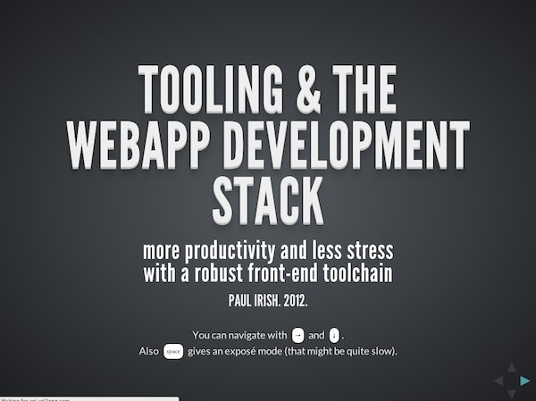
]]><![CDATA[Talk: Tooling & The Webapp Development Stack]]>2012-05-01T09:57:00-07:00https://paulirish.com/2012/talk-tooling-and-the-webapp-development-stackOne of the things I recognize at Google is how productive developers surround themselves with powerful tools for iterative development and debugging. For us front-end developers, the ecosystem of tools has exploded in the past two years, as we have a lot more software and libraries beyond Firebug and jQuery to help us build webapps. In the talk below I walk through the current ecosystem of tools and how they can make your development experience a more enjoyable one.
My slides:
Because there are so many tools around, I wanted to break them down somehow. I think contextualizing the tools as to what phase of development that assist with works well:
(You could think of the Y-axis here as the amount of code in a project..)
Looking at our tools this way we end up with:
Boilerplate
You likely start a project with more than a single blank text file.
Authoring Abstractions
CSS preprocessors, Languages that transpile to JS, Templating
I’ve been thinking a lot about workflow and integrating these tools together. Screencasts like Andrey Tarantsov’s Sublime Text Workflow really excite me and I’m eager to see more people exploring a robust development setup.
2012.05.16: Mr Jon Kemp wrote up an outline of my talk with all the links, for easy clickability: https://gist.github.com/2713513
]]><![CDATA[Vendor prefixes are not developer-friendly]]>2012-03-04T23:06:00-08:00https://paulirish.com/2012/vendor-prefixes-are-not-developer-friendlyor…
The premise of prefixes makes unrealistic demands on how developers maintain sites
There’s a lot of conversation about making prefixes work (by changing policy), but I believe they already are at odds with the developer workflow. In this proposal I hope to show that:
prefixes are not developer-friendly
recent features would have been in a much better state without prefixes
implementor maneuverability is not hampered without prefixes
The developer experience
If I’m using a feature that’s prefixed, I have a choice of using a tool to help me manage outputting the various prefixes I need or I’ll do it myself. Based on myinformal poll last week it looks like 40% of developers are not using tools. Without tool usage, authors are not including-ms-, -o-or the unprefixed variants.Page 4 of Mozilla’s prefix report verifies this; developers don’t write necessary prefixed properties about half the time (e.g. -o-transform) and in fact, they already write out the unprefixed variant well before the spec goes to CR (and do this well before adding in-ms- or-o- compatibility).
This matches my experience as well. I don’t want to return to this code to maintain it, so I’m going to add the unprefixed version. There is less of a cost to me leaving the unprefixed version and assuming I won’t need to change it vs. returning to my CSS of shipped-to-production work to add unprefixed variants each time a feature hits CR.
Any successful evangelization plan for prefixes relies on tools, but all tools prioritize the unprefixed state.prefix-free, compass,andcss3 please(I’m a tool vendor, too)all heavily suggest starting with the unprefixed state. So any successful evangelization push will just result in the unprefixed version being 100% deployed from the get-go, which ties implementors hands anyway and defeats the purpose of the prefix. I don’t have data to show that developers are not returning to their deployed, production code to update prefixes, but anecdotal evidence suggest so. Opera’s Web Opener team, for example, reports a <10% success rate when directlycontacting sites to request updates to their prefixes.
PPKwrote “If standards make web developers’ lives much harder, web developers ignore standards. This was true back in 1998, it’s still true today.” Without prefixes, implementors have an opportunity to empower developers to do the right thing while still allowing room for innovation.
PPK covered this ground well last week, but in short the policy of binding prefix-drop to CR has failed plenty. Developers have no expectation of when this will happen, nor should they.Mozilla’s roc has confirmeddevelopers are using prefixes and they won’t stop regardless of their supposed “experimental” status.
Let’s imagine there were no prefixes
So without prefixes, vendors hands would be tied and the first implementation to ship would be the one to stick, right? Nah. I think we can walk through a few examples from recent history too see what it would have been like if there had been no vendor prefixes in play.
transitions, transforms, animations
While plenty of implementation bugs were fixed, the developer would never have updated their syntax and would have complete browser support.
box-sizing
No problems. No changes.
css-gradients
Gradients has been the most tumultuous css spec, but if they had been implemented without prefixes, the feature would be in a better situation today.
Browsers discard properties and values they don’t parse successfully, so developers would have just included a cascade of the iterations of the spec. This would have successfully targeted all shipped versions of gradients:
12345
.blacktowhite{background-image:gradient(linear,lefttop,leftbottom,from(black),to(white));/* initial webkit proposal */background-image:linear-gradient(top,black,white);/* mozilla proposal */background-image:linear-gradient(tobottom,black,white);/* likely the CR */}
flexbox
Mozilla started Flexbox v1, WebKit followed with a slightly stronger implementation. Both Alex Russell (post) and I (article) recommended boilerplate code that assumed no change for unprefixed state and blocked outIE10’s upcoming implementation.
Flexbox v2 debuted and has an implementation in Chrome. Syntax is already different enough that the fallback story is happy. Without prefixing, the resulting browser support of shipped author code would be better. Again, I see no drawbacks in this example had these properties not been prefixed.
requestAnimationFrame
Soon after this feature debuted,shims were written to manage all prefixed implementations including the unprefixed state. (Sorry). Combined with quick adoption, browser have as much ability to change the feature as they would if it were unprefixed to start (that is, not much ability).
Risks and Resolutions
In CSS, new breaking changes have to introduce syntax changes that would break previous parsing attempts, as seen in the gradients example. However, if the semantics of a feature changed without syntax changes, we’d have a situation where developers are forced to detect each behavior and write compatibility code.
border-image introduced a similar situation recently: WebKit changed its semantics and required a `fill` keyword to match previous behavior. Sounds like trouble, but this change happened when the unprefixed variant was exposed, matching implementor best practices of changing a feature. The result: Greg Rewis of Adobeblogging that Chrome broke his site.
This is truly how it is supposed to work, but still expectations are broken. Developers have plenty of motivation to leave in the unprefixed state at the beginning, but this means that any change will always break them. With prefixes or without prefixes, we would have gotten the same resolution here.
In JavaScript/DOM we have a more secure safety net, as behavior can be detected. Take for examplequerySelectorAll(); it was shipped without prefix and while implementation differences exist, JavaScript libraries detect and route around them. Of course, semantics can change and the prefix → unprefix move provides an opportunity, but in my experience it’s more common to see these changes happen early on (like blob.slice()’s change).
Without prefixes there will be no mechanism to notify developers “beware, thar be dragons!”. Prefixes don’t do this now, as their removal isn’t prioritized so developers accept them as a fact of life rather than an indication of instability. The solution: getting accurate metrics of feature usage and adoption can inform implementors of if it’s too late to change a feature or still early enough to modify.
Yes, but…
As vendor prefixing is a well-worn debate, allows me to deflect common challenges to this proposal to:
The community to evangelize use of tools like Compass that protect authors from bad authoring practices and so folks who publish tutorials don’t solely define their -webkit- styles.
Browsers to track feature adoption to inform better decision-making around changes. (Answering the question: Are we stuck?)
This data should be public and update regularly.
Should be based on pageviews, to accurately weigh when a CNN.com implements something
Other browsers to implement a defined set of -webkit- prefixes on their mobile browsers. I don’t see a way around this nor do I think it’s bad.
Drop the notion that evangelism gets us out of this mess. I’ve been doing this evangelism myself for the past 3 years, but I’m also a realist. This situation needs new policy and (clearly) needs speed out of the CSS WG.
Browsers to clarify afeature detection strategy that it supports. For example, developers have no reliable way of detectingChrome’s 3D transforms support[1,2] or discounting Chrome’s-webkit-hyphensfalse positive[3]. All proposals for handling experimental properties need accurate feature detection techniques to be effective.
In summary, the ideal developer experience is 1) using tools to manage prefixes and 2) always using the unprefixed state to reduce maintenance cost. These two facts eviscerate the benefits that prefixes were introduced for, leaving only the drawbacks.
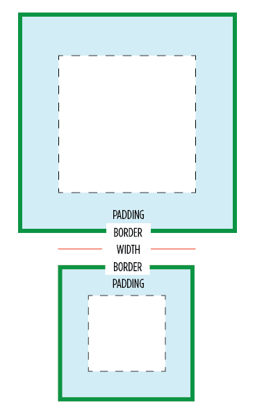
]]><![CDATA[* { box-sizing: border-box } FTW]]>2012-02-01T09:11:00-08:00https://paulirish.com/2012/star-{-box-sizing-border-box-}-ftwOne of my least favorite parts about layout with CSS is the relationship of width and padding. You’re busy defining widths to match your grid or general column proportions, then down the line you start to add in text, which necessitates defining padding for those boxes. And ‘lo and behold, you now are subtracting pixels from your original width so the box doesn’t expand.
Ugh. If I say the width is 200px, gosh darn it, it’s gonna be a 200px wide box even if I have 20px of padding. So as you know, this is NOT how the box model has worked for the past ten years. Wikipedia has a great history of this box model. Jeff Kaufman also dove into the history
Anyway, I have a recommendation for your CSS going forward:
1234567
/* apply a natural box layout model to all elements, but allowing components to change */html{box-sizing:border-box;}*,*:before,*:after{box-sizing:inherit;}
This gives you the box model you want. Applies it to all elements. Turns out many browsers already use border-box for a lot of form elements (which is why inputs and textareas look diff at width:100%;) But applying this to all elements is safe and wise.
Browser support
Due to browser support, this recommendation is only for projects that support IE8 and up. (Full browser compat at MDN) Firefox <= 28 still needs the -moz- prefix, and <= iOS4, Android <= 2.3 need the -webkit-, but everyone else uses the unprefixed. You can find more info about a box-sizing polyfill for IE6 & 7 at html5please.com/#box-sizing (which was developed with * { box-sizing: border-box!).
Is it safe to use?
Totally. jQuery works pretty great with it (except this). As mentioned, browser support is excellent. And a number of projects use this layout model by default, including the WebKit Web Inspector (aka Chrome DevTools). I heard from Dutch front-end developer Yathura Thorn on his experience:
We’ve been using *{box-sizing: border-box;} in one of my projects (deployed in production, averaging over 1mln visits a month) at work for about a year now, and it seems to be holding up just fine. The project has been tested in IE8 & 9 and the latests Firefox and Chrome versions and we’ve had no problems. All jQuery (+UI) offset calculations and animations run fine, even in any element we’ve displayed as inline-block. As of late we’ve started testing the project on mobile devices (iPhone, iPad and Android) and we’ve had no issues regarding box-sizing with any of them yet, so it seems to work just fine.
One of my favorite use-cases that border-box solves well is columns. I might want to divide up my grid with 50% or 20% columns, but want to add padding via px or em. Without CSS’s upcoming calc() this is impossible… unless you use border-box. So easy. :) Another good one is applying 100% width and then wanting to add a padding to that element.
Performance
Lastly on @miketaylr’s inquiry, I also tested perf overhead. Anecdotal evidence suggests border-box isn’t significant.
You might get up in arms about the universal * selector.
Apparently you’ve heard its slow. Firstly, it’s not. It is as fast as h1 as a selector. It can be slow when you specifically use it like .foo > *, so don’t do that. Aside from that, you are not allowed to care about the performance of * unless you concatenate all your javascript, have it at the bottom, minify your css and js, gzip all your assets, and losslessly compress all your images. If you aren’t getting 90+ Page Speed scores, it’s way too early to be thinking about selector optimization. See also: CSS Selector Performance has changed! (For the better) by Nicole Sullivan.
So… enjoy and hope you’ll find this a far more natural layout model.
2012.06.25: Adding the following section.
Adjustments for Third Party Content
Any third party widgets add content directly into the page may need extra attention. Any widgets inside an iframe (like Disqus’s new theme) are naturally insulated from the parent page’s layout styles. If you need to make adjustments to the third party content you can apply box-sizing: content-box; to the widget and its descendants. This may not be trivial as form controls in particular are border-box by default, so you’ll also have to account for that.
02.01.2012: Added a section on performance
2012.02.03: Included webkit prefixed property and usecase of a 100% width box.
2012.02.22: Added link to Jeff Kaufman’s history page.
2013.07.22: code sample updated for before/after generated content. thx snugug and eric j duran.
2014.08.24: Adjusted code based on research by Jon Neal and Chris Coyier.
]]><![CDATA[Moving The Web Forward]]>2011-12-03T19:33:00-08:00https://paulirish.com/2011/moving-the-web-forward
This Wednesday, me and a ragtag team of like-minded developers launched Move the Web Forward, an initiative to direct people’s passions into productive efforts that assist not only the web community but the entire web platform. People often feel the need to “give back”, but when it comes to contributing it’s a challenge to find the right place. This is something I’ve seen happen firsthand in the jQuery and HTML5 Boilerplate communities.
The MWF effort was inspired by a tweet by WebKit extraordinaire Dimitri Glazkov.
If you want to help out with Web standards, you could wear a blue beanie once a year. Or you could start hacking on WebKit/Gecko.
Me and Divya started brainstorming on an etherpad. We rounded up some folks on Google+ and IRC and started collecting a lot of excellent resources. Soon after a design was in the making and we started working in an open repo on github…
At this point, I want to call out Mat Marquis aka @wilto, in particular, for really taking early ownership of this project and spearheading the design and frontend development. His efforts really made the site communicate its content effectively.
Naturally the site is on github if you’d like to contribute. We have a few issues open that we’ll be improving the site with. (Also, let me just say for projects like this, a cron job to pull latest from Github makes for such a relaxing workflow.)
Thanks to Divya, Mat, Aaron Forsander, Connor Montgomery, Stephanie Rewis (great writeup!), Nicolas Gallagher, Addy, and all these awesome folk. Truly a socially developed site; everyone collaborating on IRC, etherpad and github (with as many having commit rights as possible). Fun project to work on and I hope to see everyone find the right place for them to get more involved in actively making the web as awesome as you want it to be.
2011.12.02: #movingwebforward in action!
Beyond all the people who signed up (with the avatars) on the site to commit to things.. We’ve seen some moves in the community already:
]]><![CDATA[Web browser, frontend and standards feeds to follow]]>2011-11-21T19:57:00-08:00https://paulirish.com/2011/web-browser-frontend-and-standards-feeds-to-followWhile a lot of conversation has moved to twitter and G+, hugely useful information is still published regularly to blogs. I’ve shared collections of frontend development feeds twicebefore. Now I’m back, but with three choices:
2013.07.26: Poor Reader. :’( Here are the three below bundles grouped up into an OPML file. Your new news reader can import them in one go.
Also, do not forget the most important site that has no feed: webplatformdaily.org. It’s the best thing. (2013.09.12: It has a feed now! Added)
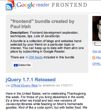
Frontend development exploration, techniques, tips. Lots of JavaScript.
275 feeds.
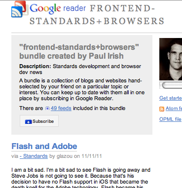
Standards development and browser dev news.
56 feeds.
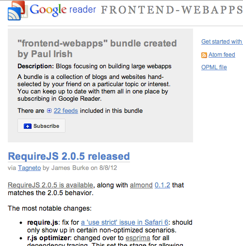
Blogs focusing on building large webapps (new!)
22 feeds.
Also, a short commentary on blogging vs tweeting.. while a lot of people have changed to twitter+jsfiddle only, tweets are not available via search after 30 days, so if you expect anything you share to last, blog it for real. :)
2011.12.02: Adding newsletters!
2012.08.09: Refreshed all the bundles. Added the frontend-webapps feed.
Also please subscribe to these guys which do a great job of highlighting the top stories of the week:
]]><![CDATA[The Fundamentals, Primitives and History of HTML5]]>2011-11-21T05:39:00-08:00https://paulirish.com/2011/the-fundamentals-primitives-and-history-of-html5Just gave this talk at W3Conf about some of the innerworkings of HTML5. Lots of did-you-know and cool insight into how browsers work. 37 minutes long,
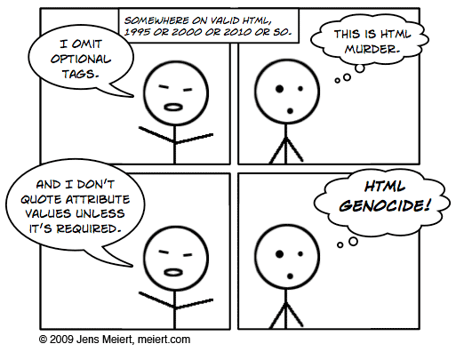
I do discuss optional start and end tags as well as not quoting your attributes. I concede that these ideas scare the shit out of people. In fact, when I first heard Jens Meiert propose the idea in 2009 my brain rejected it.
Still, I think many of the markup parsing curiosities that can be frightening only need to be understood by HTML minifiers. Always leave it up to tools to make your frontend payload smaller; you just want the most comfortable and maintainable authoring environment possible.
I shared them in this talk because 1) it can lead to writing more beautiful HTML that is easier to maintain. Leaving off </li>’s is a good example. 2) I just want people to consider browsers less of a black box of uncertainty. There are rules and specs that define behavior, so once understood you can feel confident relying on a consistent behavior. We certainly don’t have that consistency across all the web platform, but for these examples you do.
In summary, I’m not advocating you write more spartan markup if you don’t want to. But if it makes you feel good, by all means, go at it; you know now how the browsers work.
ps. the monkey HTML shirt I wore is from a store in tokyo; solo location. but they also sell on this delightfully overwhelming site
]]><![CDATA[Semantics in practice and mapping semantic value to its consumers]]>2011-11-14T10:25:00-08:00https://paulirish.com/2011/semantics-in-practice-and-mapping-semantic-value-to-its-consumersDivya Manian kicked off a good bout of discussion of HTML semantics with her post Our pointless pursuit of semantic value. It called into question the amount of time we spend on identifying the Right and Best ways of marking up our content while highlighting details of some of the consumers of semantics like assistive technology (AT). Jeremy Keith responded in Pursing Semantic Value. I wanted to chime in on Jeremy’s post so, I’ve published below my comment from the original post:
Thanks Jeremy for raising a practical example. This discussion is a tough one as much of HTML5 has clear semantics (nav/header/footer), but then parts have underdeveloped semantic meaning or add confusion to authors.
Jeremy’s gist is a great example, in fact, of a poor time investment in semantics. It ascribes value to the new method of document outlining, which recently sees different styling for h1’s depending on section nesting. Recent browsers do indeed style the h1’s different; but if you actually structure your document as such, you do it to the detriment of your screenreader users: they will either get these h1’s all as top level headlines or a mishmash of heading nesting levels that don’t match any expected behavior (As an aside, this is completely unrelated but if anyone’s curious what CSS it takes to make that new h1 styling work across browsers… feast your eyes on this beauty)
The practicalities of making accessible web content are messy, but important. The fact that we seem to spend more time on div vs article vs. section than on learning ARIA is a crime. (Furthermore, learning ARIA isn’t complete unless you’re listening to the results in a screenreader.)
My recommendation: follow the work of Steve Faulkner and Jason Kiss. These two guys are publishing the only data that illuminates what’s actually happening at the AT level in response to our work. Steve’s comment on this post does a solid job of unraveling this complex topic by showing all the many layers involved: specs, editors, authoring experience, aria, browser impl, screenreader compliance.
Also if you’d like to investigate what’s happening under the covers, I recommend:
In summary, I think it’s best to ground our efforts in pursuing semantic value by identifying precisely what the results will be. A fair rule of thumb: when it comes to semantics, if it’s confusing enough for you to ask a question about it, chances are the answer won’t make a realistic difference. Let’s build incredible stuff on this impressive platform and avoid getting mired in semantic inconsequentialities. There’s also room for more author engagement and screen-reader involvement in the standards process regarding these issues; but that’s a large topic I’ll have to save for another day.
 Wikipedia eng team scrutinizing their performance millisecond by millisecond.
(Yes, it’s a long paper printout of the Chrome DevTools timeline flamechart :)
Photo by Ori Livneh, CC BY 4.0
Wikipedia eng team scrutinizing their performance millisecond by millisecond.
(Yes, it’s a long paper printout of the Chrome DevTools timeline flamechart :)
Photo by Ori Livneh, CC BY 4.0
 For many of us developers, WebKit is a black box. We throw HTML, CSS, JS and a bunch of assets at it, and WebKit, somehow.. magically, gives us a webpage that looks and works well. But in fact,
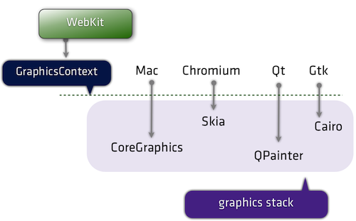


 Protip: you can set Canary as your default browser : Canary itself doesn’t have a setting to let you do this, as its an edge release. (Read about


 Frontend development exploration, techniques, tips. Lots of JavaScript.
 Standards development and browser dev news.
 Blogs focusing on building large webapps (new!)