Peltier Tech
Peltier Technical Services - Excel Charts and Programming


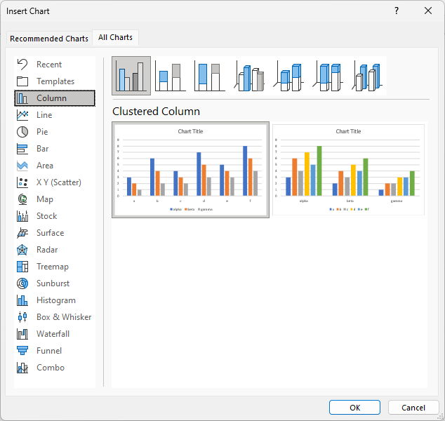
This article explores the numerous ways you can create an Excel chart: Insert from the ribbon, Quick Analysis, and keyboard shortcuts...

A reboot of PBCharts, the Process Behavior Charting Software for Excel, is ready in time for Cyber Monday!
PBCharts is an easy way to use control chart analysis to track, plan, and manage your...

Microsoft Excel was first released on Sept 30, 1985. Today is its 40th birthday. Celebrate by watching my videos of four awesome features...
