Self-Introduction in English for Students

When meeting someone for the first time, you are expected typically to introduce yourself. When addressing a gathering, you are … Read more
When meeting someone for the first time, you are expected typically to introduce yourself. When addressing a gathering, you are … Read more
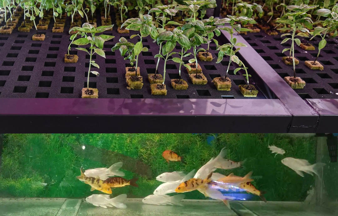
Gardening is one of the healthiest hobbies ever. It keeps the gardener active and the ecosystem robust. Having pets is … Read more

Mouse shoulder results from the prolonged use of a mouse and is a common problem amongst PC gamers, and people … Read more

Lately, a lot of conversations on social media have been around ‘hip dips.’ If Google stats are to be believed, … Read more

This is a drawing tutorial for beginners that teaches how to draw solar system in an easy way. Go through … Read more

Learn how to draw a house for kids with our easy-to-learn drawing tutorial. It explains drawing a house with basic … Read more

It’s not hard to create Lizard Tongue in Photoshop if you follow step-by-step instructions. Below is a very simple and … Read more

In this tutorial, you will learn about creating 3D text effects using Photoshop Tutorial. Step 1: Create a New Document … Read more

Coffee at the beginning of the day is an invigorating beverage. On the other end, orange juice at breakfast is … Read more