BLOG

News and information related to Webtype, including new fonts, technology, and general observations on the state of online typography.

New from American Type Founders Collection: ATF Railroad Gothic

Railroad GothicFirst introduced by the historic American Type Founders Company (ATF) in 1906, Railroad Gothic was the quintessential typographic expression of turn-of-the-century industrial spirit—bold and brash in tone, and a little rough around the edges. Well suited to broadcasting important news through headlines, Railroad Gothic became an instant hit with American printers upon its introduction. Its condensed but robust forms undoubtedly provided inspiration for many grotesque sans that followed.

Railroad GothicATF offered a number of sizes of Railroad Gothic as metal type, with some incredibly inconsistent variation among cuts. In creating a new take on a familiar face, Mark van Bronkhorst studied the varied characteristics inherent in the different sizes. He made careful aesthetic decisions in order to retain the quirky personality of the design, while regularizing the family for a more consistent feel and improved usability. Earmark features such as the spurred ‘G’ and curled leg of the ‘R’ were retained, joining with the exaggerated forms of the figures and glyphs such as ‘&’ and ‘?’ to lend warmth and flavor.

Railroad GothicThe new ATF Railroad Gothic is a measured, harmonious interpretation of the original, and has been extended to a family of five weights—Regular, Medium, Bold, Heavy, and Black—featuring a full Latin character set. At the heavy end of the spectrum, forms take on an almost humanist air; the blackest weights were carefully designed to keep counters as open as possible for the sake of legibility.

This contemporary rendition of an American classic was crafted for display use—set it big, and experiment with tight letterspacing and negative leading for added emphasis.

As with all Webtype offerings, ATF Railroad Gothic may be tested for free for up to 30 days.


New from Font Bureau: Escrow Banner and Escrow Reading Edge

Escrow BannerCommissioned by the Wall Street Journal as part of Mario Garcia’s 2002 redesign, Font Bureau’s Escrow is a robust collection of Scotch types that sets the tone of the venerable publication’s front page. Drawn in 44 styles by Cyrus Highsmith, Escrow added elegant substance to the rich WSJ typographic palette. Now there’s even more to love about this big family: Richard Lipton has extended Highsmith’s original with the 28 styles of Escrow Banner.

Escrow BannerCreated for attention-grabbing headlines, Escrow Banner pushes the design’s already strong contrast to extremes, refining strokes and exaggerating curves for optimal impact at large sizes. The result is a sturdy anchor for the news of the day, with attractive detailing (such as in the ‘k’ and ‘z’ of the black italic variants) building dramatic tension. Escrow Banner adds three widths (Normal, Condensed, and Compressed) and five weights (Light, Roman, Semibold, Bold, and Black) with companion italics to the series, offering a range of options for beauty, readability, and copy fit.

Escrow BannerTo further enhance Escrow’s utility, Dyana Weissman has drawn Escrow RE, the latest addition to the Font Bureau Reading Edge series. Escrow RE’s four styles—Regular, Italic, Bold, and Bold Italic—were carefully crafted with an eye toward optimal delivery of content on lower-resolution screens. Reading Edge fonts are precisely engineered for text settings as small as 9 px.

Wall Street Journal design director Joe Dizney was part of the team involved in the paper’s makeover. He describes Escrow as “the spectacular single element that holds the whole thing together.” With today’s expansion, the Escrow series offers designers a complete solution for digital and print typography at all sizes.

As with all Webtype offerings, all weights of Escrow Banner and Escrow RE—along with the the rest of the Escrow series—may be tested for free for up to 30 days.


New from Bold Monday: Nitti Mostro

Nitti MostroJust unleashed by Bold Monday, Nitti Mostro is Pieter van Rosmalen’s fantastical addition to his collection of Grotesque-inspired typefaces. Based on the heaviest weights of Nitti Grotesk, Nitti Mostro is an 18-style behemoth designed for setting big, bold display text. Style names like Disco Floor and Stripes Solo convey the fun factor inherent in this type family, but what makes Nitti Mostro a true joy for typographic playtime is its capacity for easy layering.

Nitti Mostro
This latest offering in Van Rosmalen’s series of “Italo-American Grotesques” consists of four sub-families: Nitti Mostro, with ten wild styles including Gradient and Chrome; Nitti Mostro Comic, a slightly rounded pair; the 1970s-inspired Nitti Mostro Disco in three styles; and Nitti Mostro Stencil, with three styles for clean or rough text treatments. Fonts within each sub-family were designed to layer together seamlessly, allowing for countless colorful chromatic effects and painless shadowing. As an added bonus, Dirk Uhlenbrock contributed drawings of nine fiercely adorable monster pictograms to Nitti Mostro.

Nitti Mostro
In order to make Nitti Mostro extremely headline friendly, Van Rosmalen made significant adjustments to his more traditional Nitti Grotesk model. Ascenders and descenders were shortened dramatically to allow for super-compact leading, and typical “Nitti-style” forms were modified to achieve a tighter letter fit.
Nitti Mostro
To see Nitti Mostro in action, check out our latest brochure site, featuring live chromatic text showings. We’ve also concocted a nifty type tester so you can experiment with this super family’s layer magic.
Nitti Mostro Brochure Site
Nitti Mostro was designed for maximum impact. Use it at 100 px or larger for best results.

As with all Webtype offerings, all weights of Nitti Mostro may be tested for free for up to 30 days.


New from Monokrom: Vinter Expansion

VinterIn 2009, Norwegian designer Frode Bo Helland first sketched the modulated sans serif forms that would eventually become Vinter. Initially released in a single extremely light weight in 2012, Vinter is Helland’s exploration of the geometric serifless roman model.

“In an effort to infuse the contrasted letterforms with tension,” Helland said, “I wrapped them around a strict geometric skeleton. Vinter connects the dots between machine-age geometry and modulated strokes.”

Helland’s pure interpretation in the Roman carried over to Vinter’s companion italic. He employed a combination of slant and rotation to integrate the geometry and modulation logic of the upright styles into the design’s italic forms. Vinter’s circular ‘o’ and ‘O’ are signature elements, their integrity maintained between weights and throughout the italic variants. This geometric hallmark is also evident in forms such as ‘b’, ‘e’, and the single-storey ‘a’ of the italic.

Vinter

“While serif typefaces commonly have cursive companions, most geometric sans serif italics are simply derived from the roman,” Helland said. “Despite optical adjustments, the signature shape of the circular ‘o’ is always lost in the process. Vinter’s approach is radically new.”

Vinter
John Morgan Studio asked Helland to draw a heavier weight of Vinter, which would be used in branding London’s Royal Drawing School. Inspired to further expand Vinter, Helland drew multiple variants, resulting in a family of five weights (Thin, Extralight, Light, Regular, and Medium) with complementary italics.
Vinter
Vinter’s fine strokes and delicately balanced details are intended for display applications, with the lightest weights sparkling at very large sizes. Web fonts were hand tuned by Monokrom and are designed to be used at 60 px or larger.

As with all Webtype offerings, all weights of Vinter may be tested for free for up to 30 days.


New: Roster from Font Bureau

RosterWebtype is thrilled to announce the addition of a new star to our lineup: Roster, by Matthew Carter, the latest release from Font Bureau and Carter & Cone. And it’s a really big deal.

Dubbed a square-shouldered powerhouse by its handlers, Roster is a slab serif with a difference. Squared-off counters punch into the interiors of letterforms, pushing the white space beyond normal boundaries. This chiseled effect lends a quirky constructive element to the family; a sort of visual push-pull that’s most evident in the lighter, narrower styles.

Roster exudes a flexible, athletic confidence, and it’s little wonder: the family evolved from custom type Carter created for Sports Illustrated in the 1990s. Bearing the moniker Wrigley, Roster’s predecessor was “intended to express the bold graphics of American sports,” said Steve Hoffman, who commissioned the design. Then seven styles, Wrigley worked hand in glove with Carter’s Fenway, a fine serif crafted to complement the SI staff’s considerable literary prowess.

“When we were close to the point of presentation to the editors of the new fonts, I suggested the names Wrigley and Fenway,” Hoffman said. “I detected a somewhat puzzled expression on Matthew’s English face. I explained that these were the names of two of America’s oldest and most beloved baseball venues, and it would be a delight for Sports Illustrated’s editors to have their new typefaces named for theses venerable ballparks.”
Roster
In preparing this family for general release, the name Wrigley was dropped, since the design drew no inspiration from the Chicago Cubs or its namesake stadium. Jesse Ragan was enlisted to assist with the expansion effort, and Roster now weighs in at a hefty 60 members. This high-impact superfamily boasts six weights (Extra Light, Light, Regular, Semibold, Bold, and Black) in five widths (Expanded, Normal, Narrow, Condensed, and Compressed), plus companion italics.
Roster
One of the things that makes Roster so special is its chameleon-like ability to convey vastly different moods depending on the weights and widths chosen. From the lean, lanky compressed extra light to the in-your-face brawn of the extra heavy expanded black, Roster’s broad range of emotions is suited to a multitude of display situations.
Roster’s character set is Font Bureau’s Extended Latin; OpenType layout features include case-sensitive punctuation, basic fractions, and standard ligatures, along with special ligatures like ‘Tu’ and ‘Ty’ in the bold and black weights.

Carter cautions that this personality-packed family is not meant for text, but should be used generously at display sizes. He recommends setting it no smaller than 30 pixels, with the heavier and compressed styles calling for larger sizes.

As with all Webtype offerings, Roster may be tested for free for up to 30 days. Put Roster to work on your site—it’s sure to become a fan favorite.


New: Marcia from Font Bureau

Marcia_Blog_1

Today, Webtype is proud to release Marcia, Font Bureau’s newest type family. What is Marcia? “Marcia started as a project in Cyrus’s undergrad class at RISD three years ago.…It was my first attempt at drawing a whole alphabet,” says designer Victoria Rushton. On paper the Roman is like a 19th-century Modern, with its high contrast, vertical stress, and ball terminals. But when you look closely, it doesn’t really resemble a Modern — some serifs are omitted, some are half-there. These departures are a lettering artist’s whimsical experiments with the Modern genre. Furthermore, the Italic is both sturdier and simpler than most moderns. And, according to Rushton, that’s part of Marcia’s charm as these “remnants of naïveté” give it a unique character.


Image showing Marcia’s characteristic forms, weights, and ligatures

Marcia’s quirkiness and exuberance can be seen in its details: the legs of the cap K and R hint at a courtier taking a bow and in Italic, the legs snap into a kick. Add swashes alternates and they become the envy of any mustache. In the lowercase, many have serifs on the left like calligraphic entry strokes, even in unexpected places (d, b, u, w). While other serifs offer sinuous semi-serifs ball terminals (a, cf) sustaining Marcia’s quirky, hybrid flavor.

Marcia_Blog-2


The numerals are lively and legible, in both lining (uppercase) and oldstyle (lowercase) forms. Here we can see more unorthodox serif forms (257). Fractions, superior, and inferior forms are also included in Marcia’s figures.


Marcia_Blog_3

Victoria Rushton designed Marcia with playful packaging and swashy subheads in mind, all on display on the typeface’s minisite. Marcia’s discretionary ligatures and alternate characters can fill any text-setting with surprising, elegant forms.

Give Marcia a try for free — all fonts on Webtype can be tested on your own sites at no charge for 30 days.


New: Miller Text from Font Bureau

Miller-Text-expansion-webtype

Matthew Carter’s Miller is a seminal reinvigoration of the 19th-century Scotch Roman, serving forthright, authoritative body copy and headlines since 1997. Today, in parallel with Font Bureau, we complete the Miller series on Webtype with Miller Text, the foundational member of an extended family that includes Miller Banner, Miller Display, and Miller Headline.

Miller-series-webtype

Along with the introduction to Webtype, Miller Text was also given new styles: Semibold and Semibold Italic. This middle weight gives the family an extra versatility for website settings where the Roman is too light and the Bold too heavy. All Text and Display weights include small caps, italics, and italic small caps, a hallmark of the original Scotches.

Miller-Text-family-webtype

You could think of Miller Text as the debonair cousin of Georgia, born for paragraphs in print rather than coarse pixels. Now, thanks to higher density displays and Webtype’s expert screen optimization, the elegance of Miller Text is ready for the web.

The face has been a staple of respected magazines and newspapers like the Boston Globe, San Jose Mercury News, Glamour, and New York magazine and now Miller Text can lend grace and gravitas to your own site. Like every font on Webtype, you can try it free for 30 days.


Webtype: Five Years of Better Fonts for Better Websites

five

This fall we celebrate Webtype’s fifth anniversary! We officially announced in August 2010 and started serving fonts a few weeks later. Webtype was among the earliest web font services on the market, but the goal wasn’t to be the first, but the best. Typefaces from Font Bureau and our other early foundries didn’t make it to Webtype customers until they were thoroughly tested on and tuned for the vast array of screens and rendering environments. This commitment to quality meant that Webtype has never had the biggest library of web fonts, but certainly the most useful and reliable one. No where is this more apparent than in the Reading Edge fonts, designs that aren’t just hinted adaptations of existing print-based typefaces, but new designs drawn specifically for the screen.

We also believed in a different way of selling web fonts. From the beginning, we offered a modular, per-font licensing model which gave customers the flexibility to get only what they need and what they use. This method also sends more cash back to the type designers, which attracted the world’s premier foundries — and continues to do so, with 15 labels now on board. Webtype was also unique in the way it worked for users. It was cleaner and simpler from the start, requiring just a single line of CSS rather than external JavaScript. All this has always been backed by a free 30-day trial that lets users prove for themselves if the type and technology really suits their needs.

It didn’t take long to see that lots of other folks agreed with our approach. As Webtype fonts began to appear around the web, designers and developers noticed the difference and joined in. Seeing how our customers use Webtype is the best part of our job, and it’s the best evidence that all the decisions and work truly pay off.

So let’s look back at some of the most interesting Webtype uses over our first five years and note some milestones along the way.

5 Years of Webtype

Big Sites

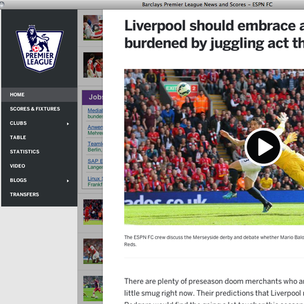
Our infrastructure has the muscle to deliver webfonts to even the most high profile websites. Heavy hitters such as TechCrunch, ESPN, and Ford are pounded with millions of visitors per day and Webtype keeps their typographic style in tact without interruption. In fact, since implementing our new serving architecture last year, we’ve had 100% up time.

espn.com

5 Years of Webtype

Smart Sites

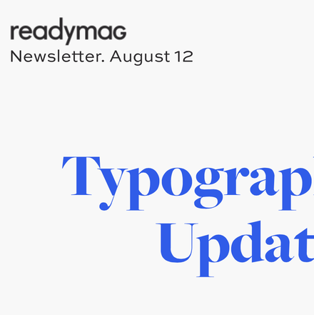
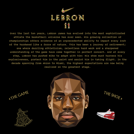
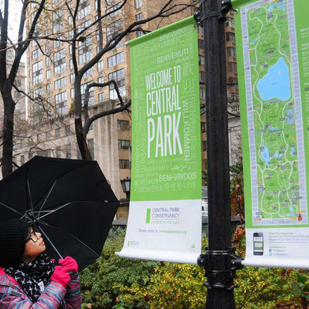
Some of the most groundbreaking examples of current web design and technology have employed fonts from Webtype. These include creative navigation and infographics like those on Nike’s LeBron 11 microsite, or editorial sites, like the rich and responsive experience of Rolling Stone’s “Greenland Melting” feature, or the clear and informative “Origins of Common UI Symbols” from Shuffle Magazine created on Readymag’s Webtype-powered platform for making your own magazines.

Readymag

5 Years of Webtype

All Kinds of Sites

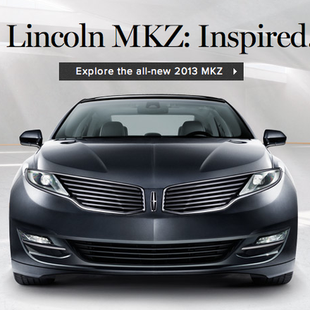
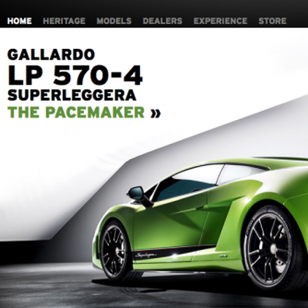
Webtype users aren’t limited to any particular industry. Thanks to our flexible set up and variety of typefaces, all sorts of companies rely on Webtype: automotive companies like Lamborghini and Lexus, fashion brands like Fossil and Levi’s, and online magazines and newspapers like New York magazine and Más Por Más. Our fonts are found in every sector, from international finance to Hollywood.

And now, some numbers

Font Collection

50

type designers

150

font familes

1,850

font styles


Font data served

2010

0.2

terabytes per month

Today

30

terabytes per month


That’s more than

500,000,000

fonts served per month

Sites Served

8,000+

Domains (Estimated)

Uptime

100%

Since September 2014


Despite all our growth, we haven’t lost sight of what separates us from other webfont providers: attentive support, reliable service, easy implementation, and above all, superior typefaces. (Psst, we have lots more type in the pipeline. Keep an eye on the blog!) Here’s to another five years.

Typefaces used in this post: Marat, Planet, Blesk, ITC Franklin, Benton Modern RE, Harriet Display, ATF Poster Gothic, Shift, Helsinki.


Introducing the American Type Founders Collection: Classic Typefaces Reinterpreted

Many of today’s most familiar typefaces had their origins in a company known as American Type Founders (ATF), the United States’ most prominent type company of the metal era. Formed in 1892 as a consolidation of 23 independent foundries, ATF dominated hand-set type in the United States by the early part of the 20th century, and was at the forefront of technical developments in designing and producing type. Given this prominence, ATF typefaces are well known and loved still today — the essence of American typography and design.

atfSince the advent of digital type, there have been many attempts to revive faces from the ATF library, but many are feeble shadows of the originals. Backed by the expertise of designers like Mark van Bronkhorst, Alan Dague-Greene, David Sudweeks, and Ben Kiel, the American Type Founders® Collection builds on the company’s legacy, introducing new interpretations of classic ATF typefaces. Fonts in the ATF Collection are developed with the needs of contemporary type users in mind. ATF designer font families build on their predecessors, offering more weights and widths, and the robust character sets and typographic features made possible by today’s font technology.

Webtype is thrilled to offer these useful and respectful interpretations, in parallel with their desktop release, bringing the same visual richness to the screen that handset type once brought to the printed page.

ATF-Alternate-Gothic
ATF Alternate Gothic is a new, significant digital expansion of Morris Fuller Benton’s classic 1903 design. Originally available in one bold weight, the typeface came in three widths for flexibility in copy-fitting layouts. ATF Alternate Gothic provides a wider range: ten weights, with four widths of each weight (40 fonts total). This extensive family can be used to pack a lot into a narrow space, and the breadth of the family makes it easy to create variations for different formats and media.

ATF-Poster-Gothic
ATF Poster Gothic is an expansion of a typeface designed in 1934 by Morris Fuller Benton. The one-weight design was a slightly condensed display companion to Benton’s popular Bank Gothic® family. This new family of aggressively rectilinear headline types features 15 fonts, greatly expanding the design’s possibilities. The all-caps design sports square corners in the counters, creating tension between angular and curved details; this feature, and the generally rectangular shape of the whole alphabet, makes ATF Poster Gothic distinctive on the page or screen, while its relationship to Bank Gothic makes it somehow familiar. Certain weights also recall the style of lettering used on athletic team jerseys, television crime dramas, action & adventure movie titles, and engraved stationery.

ATF-Garamond
The Garamond family tree has many branches. There are probably more typefaces bearing the name Garamond than the name of any other type designer. When ATF Garamond was designed in 1917, it was one of the first revivals of this classic. The new ATF Garamond expands upon a legacy of quality and craftsmanship, bringing back some of the robustness of metal type and letterpress printing often lost in digital adaptations of historic faces. Eighteen fonts comprise three optical sizes — Subhead, Text, and Micro (available by request) — and three weights, including a new Medium that did not exist in metal. ATF Garamond also includes the alternates and swash characters from the original face.

ATF-Brush
Oh, Brush … beloved script emblem of plumbers, mechanics, bodegas, lunch counters, and other low-rent concerns. Since 1942, you have given faceless apartment buildings a name, brought life to the badges and banners of otherwise tedious trade conventions, and lent excitement to the postcards of middle America’s unsung travel destinations. We have seen so much of you … but not enough! We need more weights: how about five, extending beyond humdrum Medium? We want swash alternates, too, plus lively ligatures and sporty underline tails! Give us cleaner curves and smoother connections, but stay true to your frisky self! Like a nail salon that offers cucumber water, the new ATF Brush is one step classier than the rest.

ATF-Headline-Gothic
ATF Headline Gothic cries out to be used in headlines, and that is exactly how it was used after it was first created by ATF in 1936 with newspapers in mind. The style of ATF Headline Gothic recalls the bold, condensed gothic display faces of the 19th century, but with more refinement in its details than many large types of the time (typically wood type). The digital ATF Headline Gothic, like its predecessor, comes in a single weight, all caps, but offers two styles: one crisply drawn, and a “Round” version with softer corners, to suggest a more “printed” feel, reminiscent of wood type. Of course, in either style it features a full modern character set, including necessary symbols, such as the Euro, that didn’t exist in 1936.

ATF-Wedding-Gothic
Sporting broad, unadorned caps and just a dash of flair, ATF Wedding Gothic is like an engravers gothic at a black tie affair. It comes from the same tradition as other social gothics from the turn of the twentieth century, such as Engravers Gothic and Copperplate. But where these are the faces of business cards and common announcements, ATF Wedding Gothic is a special occasion. Its swaying ‘R’ and ‘Q’, its characterful figures, and spritely-yet-sturdy insouciance make ATF Wedding Gothic well suited for tasteful engagements of all sorts. Originally offered in a single, wide weight, this version expands what was once a novelty design into a surprisingly versatile family of nine weights. An additional, narrower, standard width brings the count to 18 fonts.


Complete Benton Sans, Now on Webtype

Benton-Sans-complete-family

Today we add all the weights and widths to Webtype’s arsenal of Benton Sans. This brings our range of the expansive family in parity with the desktop version. The 80 styles include five widths (Extra Compressed, Compressed, Condensed, normal, Wide) and eight weights (Thin, Extra Light, Light, Book, Regular, Medium, Bold, Black), each with an italic.

Taking it to the Extreme

Eighty is a lot of styles. We don’t expect many customers to license and use the entire Benton Sans range. What makes a mega-family valuable is the versatility it provides for fine-tuning hierarchies, getting just the right dimensions, or achieving maximum contrast. For example, the extremes in Benton Sans’ weight spectrum give web designers new flexibility, especially when it comes to display type. As letters get larger, bolds can be bolder and lights can be lighter — and sometimes they need to be that way to get the same impact that less extreme weights would have at smaller sizes. Benton Sans Thin and Extra Light offer an elegant counterpart to the steadfast text of the standard weights. And the Black packs a heavy punch without straying from the no-nonsense character at the design’s core.

Benton-Sans-thin

Benton Sans Thin with Benton Sans RE. The Thin and Extra Light weights let you maintain a hairline appearance, even when the type is large. They also provide opportunities for optically echoing the stroke weight of much smaller type, like the text shown here.

benton-sans-black

Benton Sans Condensed Black and Thin with Benton Sans Black and Benton Modern. Big differences in font weight allow for overlapping headline effects, eye-grabbing contrast, and strong emphasis within text.

As always, the Webtype free trial applies: you can put all these new weights to the test at no charge for up to 30 days.


Categories

Webtype on Twitter