WHS Developer Tip #11: FancyListView
Q: How can make a ListView that looks more like what I see in the Home Server Console with so many images and progress bars?
A: Another one of the wonderful undocumented features of Windows Home Server is the FancyListView control (Microsoft.HomeServer.Controls, HomeServerControls.dll) that is used by all of the official Home Server Console tabs for displaying of the system's shares, users, computers and hard drives.
The first difference a user will notice is that it is drawn differently than a regular ListView, automatically making it look more Windows Home Server-ish in terms of it's shading, but also allows for the easy adding of images and progress bars in various different locations.
Terminology
Before digging in, lets go through a few terms used with ListViews so as to better understand the mechanics of what is used under the hood to draw a normal one.
A ListView is the actual control itself which has multiple different ways of displaying lists of data which are controlled by the View property which include:
- LargeIcon - Each item appears as a full-sized icon with a label below it.
- Details - Each item appears on a separate line with further information about each item arranged in columns. The left-most column contains a small icon and label, and subsequent columns contain sub items as specified by the application.
- SmallIcon - Each item appears as a small icon with a label to its right.
- List - Each item appears as a small icon with a label to its right. Items are arranged in columns with no column headers.
- Tile - Each item appears as a full-sized icon with the item label and subitem information to the right of it. The subitem information that appears is specified by the application.
The most common View used in the Windows Home Server Console is Details which gives us the familiar row and column look.
A ListView contains a collection of ListViewItems named Items which corresponds to the item in the first column when in Details view.
Each ListViewItem has a collection of ListView.ListViewSubItems called SubItems which correspond to later items in the row.
In order to automatically display an image inside of a ListViewItem, a programmer would specify with ImageKey or ImageIndex property the value corresponding to an ImageList instance that has been set to the SmallImageList property, in C# this would look like (assuming a ListView named listView1 has been created on the form and it's View property has been set to Details):
//Create ImageListImageList imageList1 = new ImageList();//Adjusting the size of the images can change the height of a row of dataimageList1.ImageSize = new Size(32, 32);imageList1.ColorDepth = ColorDepth.Depth32Bit;
//Add some image to the list with no keysimageList1.Images.Add(CommonImages.ErrorImage32x32);
imageList1.Images.Add(CommonImages.HomeServerImage32x32);
imageList1.Images.Add(CommonImages.InformationImage32x32);
//Add an image to the list with the key Healthy keyimageList1.Images.Add("Healthy", CommonImages.StatusHealthy32);//Add an image to the list with the key Warning keyimageList1.Images.Add("Warning", CommonImages.WarningImage32x32);//Associate the ImageList with the ListViewlistView1.SmallImageList = imageList1;
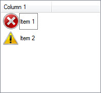
//Create first ListViewItemListViewItem listViewItem1 = new ListViewItem();listViewItem1.Text = "Item 1";//Display the first image in the listlistViewItem1.ImageIndex = 0;
listView1.Items.Add(listViewItem1);
//Create second ListViewItemListViewItem listViewItem2 = new ListViewItem();listViewItem2.Text = "Item 2";//Display the image from the ImageList with the Warning keylistViewItem2.ImageKey = "Warning";listView1.Items.Add(listViewItem2);
//Add Column to the ListView to enable item(s) to show upColumnHeader column1 = new ColumnHeader();column1.Text = "Column 1";column1.Width = 100;
listView1.Columns.Add(column1);
Which gives us:
This is how a normal ListView functions and a FancyListView works in virtually the same way, only it adds to new ListViewSubItems to the mix.
ImageSubItem
A drawback of the stock ListViewSubItem class is that it does not have any built-in support for images and leaves such work to the programmer to implement themselves. This is where ImageSubItem comes into play, providing the ImageIndex and ImageKey properties that use the same ImageList as any other ListViewItems on the list.
To expand the earlier example, lets start with the following nearly identical code (assuming a FancyListView named fancyListView1 has been created on the form and it's View property has been set to Details):
//Create ImageListImageList imageList1 = new ImageList();//Adjusting the size of the images can change the height of a row of dataimageList1.ImageSize = new Size(32, 32);imageList1.ColorDepth = ColorDepth.Depth32Bit;
//Add some image to the list with no keysimageList1.Images.Add(CommonImages.ErrorImage32x32);
imageList1.Images.Add(CommonImages.HomeServerImage32x32);
imageList1.Images.Add(CommonImages.InformationImage32x32);
//Add an image to the list with the key Healthy keyimageList1.Images.Add("Healthy", CommonImages.StatusHealthy32);//Add an image to the list with the key Warning keyimageList1.Images.Add("Warning", CommonImages.WarningImage32x32);//Associate the ImageList with the FancyListViewfancyListView1.SmallImageList = imageList1;
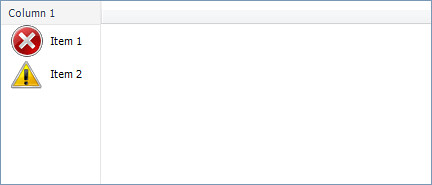
//Create first ListViewItemListViewItem listViewItem1 = new ListViewItem();listViewItem1.Text = "Item 1";//Display the first image in the listlistViewItem1.ImageIndex = 0;
fancyListView1.Items.Add(listViewItem1);
//Create second ListViewItemListViewItem listViewItem2 = new ListViewItem();listViewItem2.Text = "Item 2";//Display the image from the ImageList with the Warning keylistViewItem2.ImageKey = "Warning";fancyListView1.Items.Add(listViewItem2);
//Add Column to the FancyListView to enable item(s) to show upColumnHeader column1 = new ColumnHeader();column1.Text = "Column 1";column1.Width = 100;
fancyListView1.Columns.Add(column1);
Which in turn displays the following for us:
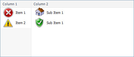
In order to add a pair of ImageSubItems that use an image from the existing Image List, we need only add the following code:
//Create ImageSubItem using ImageIndex and add to first ListViewItemFancyListView.ImageSubItem imageSubItem1 = new FancyListView.ImageSubItem();imageSubItem1.Text = "Sub Item 1";//Set to imageIndex 1imageSubItem1.ImageIndex = 1;
listViewItem1.SubItems.Add(imageSubItem1);
//Create ImageSubItem using ImageKey and add to second ListViewItemFancyListView.ImageSubItem imageSubItem2 = new FancyListView.ImageSubItem();imageSubItem2.Text = "Sub Item 1";//Set image with Healthy keyimageSubItem2.ImageKey = "Healthy";listViewItem2.SubItems.Add(imageSubItem2);
//Add an extra Column to ListViewFancy to enable new Sub Items to show upColumnHeader column2 = new ColumnHeader();column2.Text = "Column 2";column2.Width = 100;
fancyListView1.Columns.Add(column2);
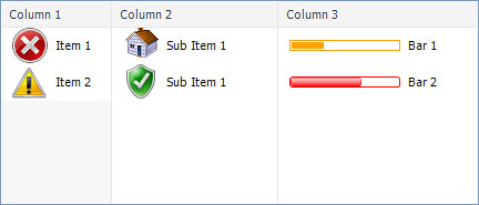
Which makes our example look something like this:
FilledBarSubItem
Another neat feature we've seen on the Computers & Backups tab is a progress bar, something that programmatically behaves not unlike the progress bars and SubItems we've already used or added.
To create and add them, we need only add this code to the end of our running example:
//Create new Filled Bar of the Rectangle styleFancyListView.FilledBarSubItem filledBar1 = new FancyListView.FilledBarSubItem();filledBar1.Text = "Bar 1";filledBar1.PercentageFilled = 33;
filledBar1.DrawStyle = FancyListView.FilledBarStyle.Rectangle;
listViewItem1.SubItems.Add(filledBar1);
//Create new Filled Bar of the RoundedRectangle styleFancyListView.FilledBarSubItem filledBar2 = new FancyListView.FilledBarSubItem();filledBar2.Text = "Bar 2";filledBar2.PercentageFilled = 66;
filledBar2.DrawStyle = FancyListView.FilledBarStyle.RoundedRectangle;
listViewItem2.SubItems.Add(filledBar2);
//Add third column to allow new FilledBars to show upColumnHeader column3 = new ColumnHeader();column3.Text = "Column 3";column2.Width = 150;
fancyListView1.Columns.Add(column3);
which makes our example now look like:
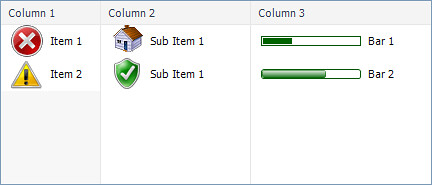
Aside from our ability to change the style of the bar (Rectangle vs RoundedRectangle) which we see demonstrated by the two FilledBarSubItem instances used above, another very useful option we have is the ability to specify additional colors for ranges.
Ordinarily if you need to specify some visual range difference, the ProgressBar control isn't enough, instead other controls may be employed or worse yet... writing your own which would likely involve manually checking the ranges ourselves, instead FilledBarSubItem gives us the following properties to do that for us:
- WarningColor
- WarningPercentage
- CriticalColor
- CriticalPercentage
Together we can get automatic colorization:
All by just by these lines to the above running example:
filledBar1.WarningPercentage = 33;
filledBar1.WarningColor = Color.Orange;
filledBar1.CriticalPercentage = 66;
filledBar1.CriticalColor = Color.Red;
filledBar2.WarningPercentage = 33;
filledBar2.WarningColor = Color.Orange;
filledBar2.CriticalPercentage = 66;
filledBar2.CriticalColor = Color.Red;
And that's in addition to being able to specify an arbitrary color for our bar in the first place.
Refreshing
Unlike a control like the TextBox or Button classes, simply updating properties of a ImageSubItem or FilledBarSubItem will not cause them to visually be updated because they aren't controls, instead they are only visually updated when the parent FancyListView is redrawn, something that ordinarily will occur when ever the containing form is hidden and then shown, something is dragged over the control, or you click on it.
Instead of relying on the system or the user, you as the programmer can call the FancyListView's Invalidate() or Refresh() methods to force it to redraw itself and all of the ImageSubItem or FilledBarSubItem instances so that any chances are then visible just as you can with most other controls, however FancyListView which inherits from ListView offers an even better option, namelyRedrawItems() which allows you to redraw only those items you want to in the list which can be as simple as:
filledBar1.PercentageFilled += 1;
filledBar2.PercentageFilled += 1;
fancyListView1.RedrawItems(startIndex, endIndex, false);Sizing and Stretching
In the previous examples I've focused on using icons with a size of 32x32 which causes each row in the FancyListView to be 32 pixels tall. Want to make it shorter? Simply change the size of the ImageList that the FancyListView uses.
One quirk of using this method to define the size of our rows, is that it is not uncommon to have a large 32x32 image for the first column, but then want a small 16x16 image for a status icon... not unlike how the Home Server Console notes drive or duplication status, you'll find that the smaller image will automatically be stretched to fill the available area.
In order to make such a small image stay small, you should use a larger image that contains the smaller image, not unlike how the CommonImages class exposes GrayIcon, GreenIcon and RedIcon which are each only 16x16, but also available as part of larger 32x32 images as GrayIcon32, GreenIcon32 and RedIcon32 as well.
ListViewItemSorter
Another one of the advantages of FancyListView is that does sorting right out of the box without any work from you as a programmer whenever a user clicks on a column header.
With an ordinary ListView, simply creating a class that implements the IComparer interface and setting an instance of it to the ListViews ListViewItemSorter property is all that is needed. FancyListView takes this a step further by defining a custom sorting class ListViewColumnSorter (Microsoft.HomeServer.Controls, HomeServerControlls.dll) which it automatically uses and requires.
Unfortunately an ordinary custom sorting class that simply implements the IComparer interface cannot be used because internally FancyListView.ListViewItemSorter typecasts the value to a ListViewColumnSorter, which forces any other sorter to from ListViewColumnSorter.
Examples
I have built a pair of sample add-ins that demonstrate a few of the things discussed above in a (very) mock (and not very accurate) Shared Folders like display which shows off several static ImageSubItems and a FilledBarSubItem that is updated and then moved once it's maximum value has been reached:
Downloads:
Conclusion
FancyListView provides an easy to use mechanism for displaying additional information to a user by allowing images in any columns and progress bars to better inform the user of the current state of the system or whatever else the add-in wants to say.
Next Time
Next week we'll dive into a few more controls in the HomeServerControls.dll assembly, some of their quirks and how they can be better used to make our add-ins look more at home in the Home Server Console.
Note: The information in this post is based on undocumented and at times deduced information on Windows Home Server and is not officially supported or endorsed by Microsoft and could very easily be wrong or subject to change in future, so please take it and everything else said on this blog with a grain of salt and use with caution.
Labels: WHS Dev Tips
posted by Brendan at
5:36 AM
1 Comments:
Oh my gosh! I totally get it now. changing the icon size is really that simple. The possibilities are endless with this. last longer
By Jake, at 2:40 PM
Post a Comment
<< Home