
History of typography: Old Style
Griffo to Caslon
In the first part of this series, we looked at Humanist typefaces; we considered them in their historical context, and took a closer look at some of their distinguishing features and modern-day revivals. Today we’re moving along the time line and will spend a little time familiarizing ourselves with some wonderful Old Style typefaces.
Humanist types, we discovered, have strong roots in calligraphy. Old style types, although they owe much to the same roots, show a marked departure from simply mimicking the handwriting of earlier Italian scholars and scribes. It’s from this period, that we can really see type getting into gear. It’s certainly one of the most exciting periods in type history.
Old Style traits
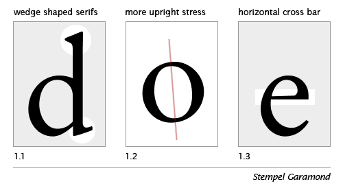
The Old Style (or Garalde) types start to demonstrate a greater refinement—to a large extent augmented by the steadily improving skills of punchcutters. As a consequence the Old Style types are characterised by greater contrast between thick and thin strokes, and are generally speaking, sharper in appearance, more refined. You can see this, perhaps most notably in the serifs: in Old Style types the serifs on the ascenders are more wedge shaped (figure1.1).
Another major change can be seen in the stress of the letterforms (figure 1.2) to a more perpendicular (upright) position. You may remember our old friend, the lowercase e of the Humanist (Venetian) types, with its distinctive oblique (sloping) crossbar; with Old Style types we witness the quite sudden adoption of a horizontal crossbar (figure 1.3). I spent quite a time trying to discover why the lowercase e should change so dramatically. After searching high and low, and opening just about every type book I own, I decided to post the question on Typophile. Space doesn’t permit to recount the entire tale here, but for those interested in such details, then head on over to the Typophile e crossbar thread. (Thanks to Nick Shinn, David et. al. for their valuable input).
The First Italic Type
And, as we’re on the topic of dramatic changes, during this period we see the very first italic type in 1501. They were first created, not as an accompaniment to the roman, but as a standalone typeface designed for small format or pocket books, where space demanded a more condensed type. The first italic type, then, was conceived as a text face.
Griffo’s contribution to roman type include an improved balance between capitals and lowercase, achieved by cutting the capitals slightly shorter than ascending letters such as b and d, and by slightly reducing the stroke weight of the capitals.
—A Short History of the Printed Word, Chappell and Bringhurst, page 92
The Old Style types can be further divided into four categories as in the figure below, and span the roman types from Francesco Griffo to William Caslon I. Unlike the relatively short-lived Humanist faces, the Old Style faces held sway for more than two centuries; a number of them are still popular text faces today.
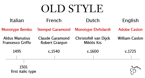
Typeface names in red; notable figures below.
Old Style faces
And here are some more Old Style faces: Berling, Calisto, Goudy Old Style, Granjon, Janson, Palatino, Perpetua, Plantin, Sabon and Weiss, to name but a few.
So have you enjoyed our brief introduction to the Old Style types? For those of you who would like to test your knowledge, which of these is generally classified as Old Style:
Times New Roman, Baskerville, Concorde, ITC Cheltenham
And, for the type-masochists among you (I fear you are in the majority), here is some Old Style homework:
1. Where does the term Garalde originate?
2. Who commissioned Claude Garamond to cut the grecs du roi?
3. Most modern-day italics are not based on the first Aldine italic (1501) cut by Griffo. What are they modelled on?
4. What is the meaning of the term “Humanist axis”?
5. Owing to a bit of a mix-up, the Janson typeface is named after Nicholas Janson. Who should it be named after?
If you know the answers, then comment away; if you don’t have a clue, then no need to worry. I thought that by posing these questions, everyone could get involved, and that way we can all learn something.
In part three, we’ll take a look at Transitional typefaces. I hope that you’re enjoying the series, thus far. If you have any comments or suggestions, then get typing in the comments section below.
I’ll be in the UK for the next couple of weeks, so won’t be posting so often. However, upon my return we’ll be back to normal. There’s a whole lot more type lovin’ to come, so stay tuned.
Read Part Three: Transitional Style


