
Your story starts here

Books and other products for every creative expression

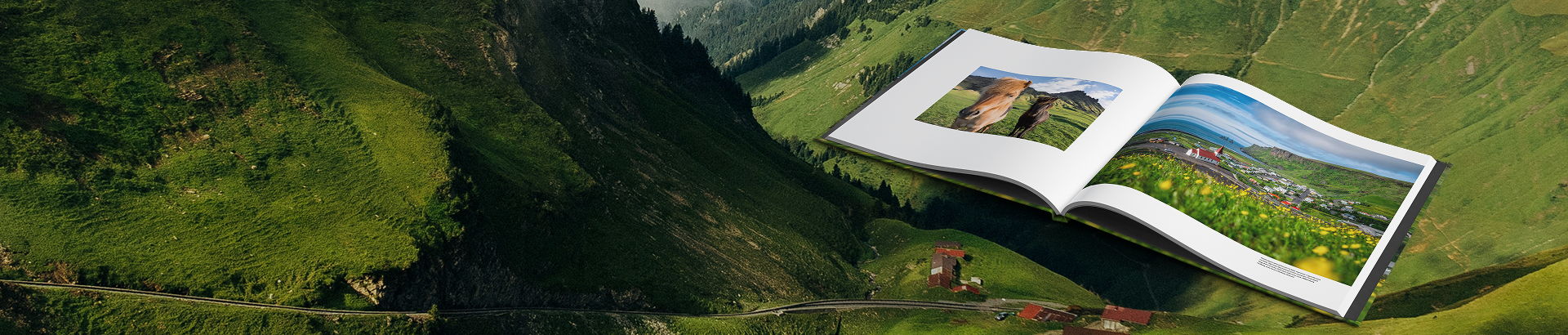
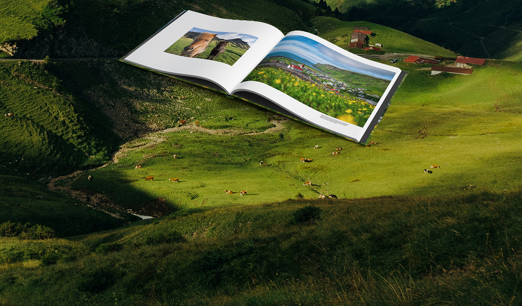
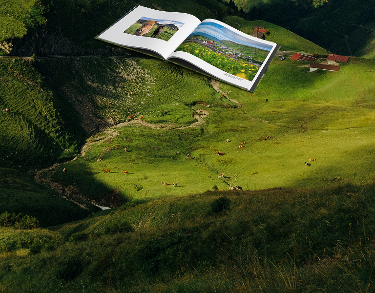
Photo Books

Paperback & Hardcover

Magazines

Notebooks & Journals
Tools and resources for makers, sellers, and businesses
Design online or use our free desktop software. We also integrate with several Adobe products.
Explore free tools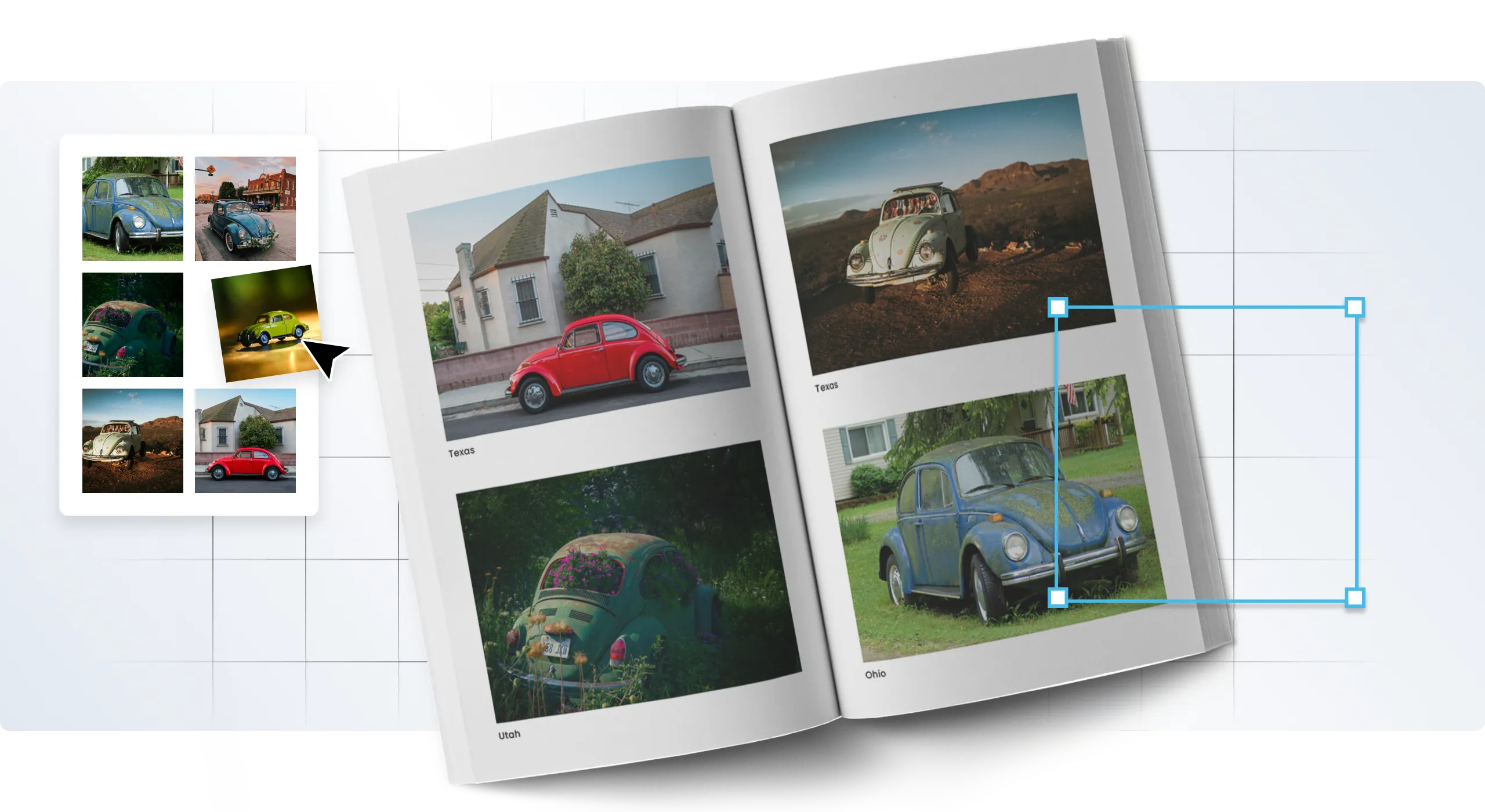
On-demand printing lets you print the quantity you need whether that’s one book or hundreds. We handle all shipping and distribution, too.
Start your book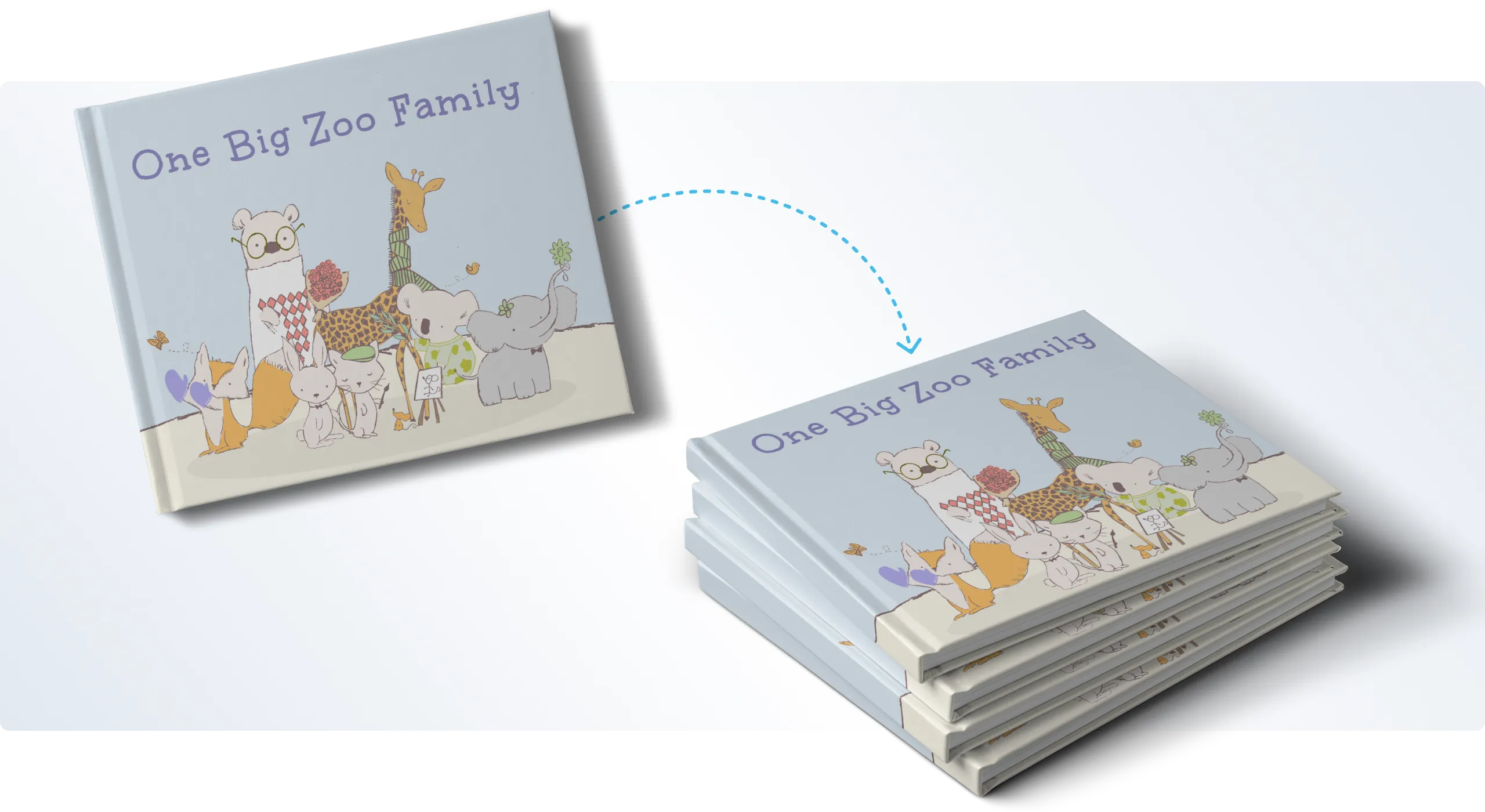
Set your books up for sale on the Blurb Bookstore, or with Amazon or Ingram, all through one convenient dashboard.
Learn more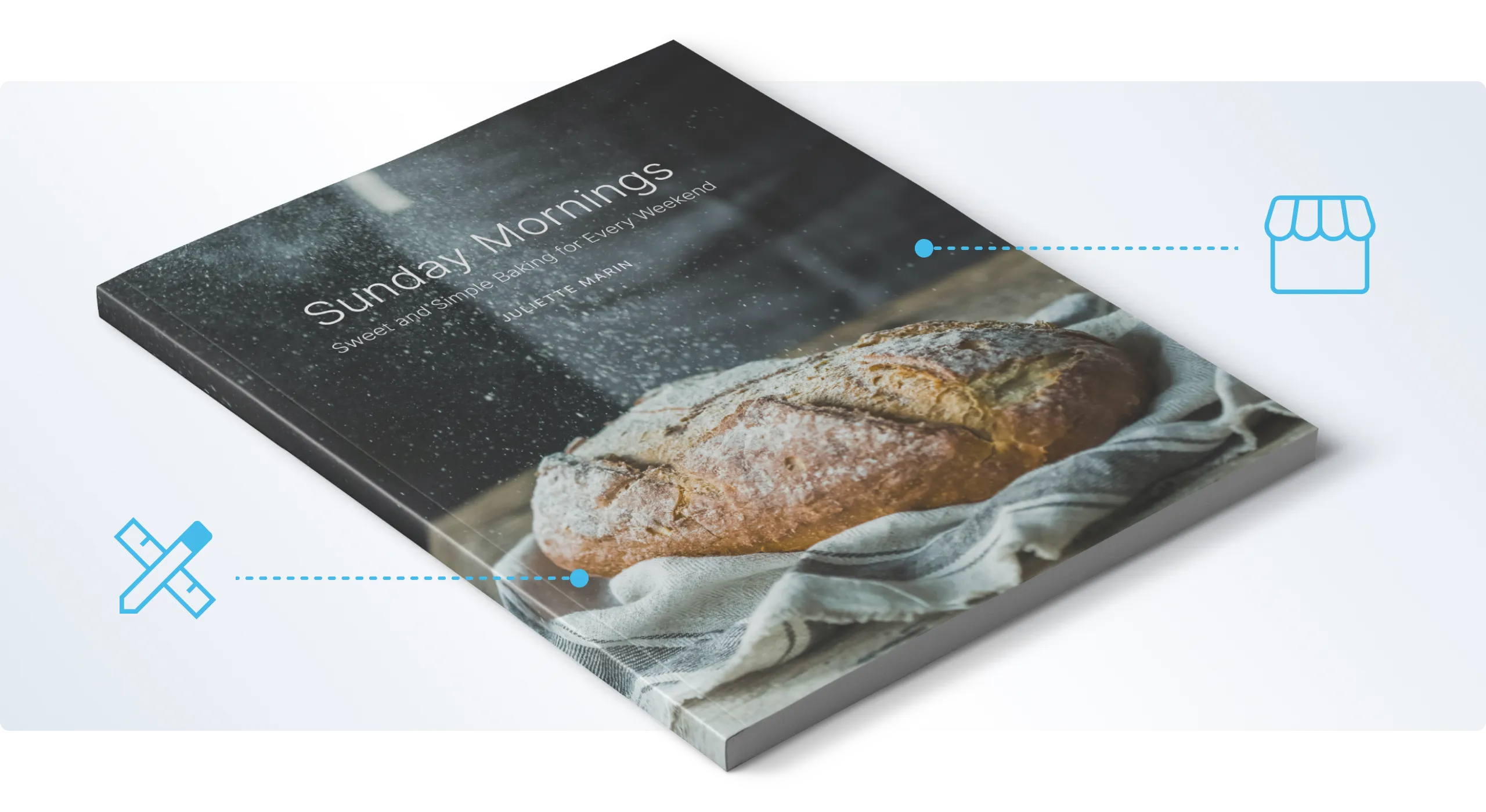
Customized support, API tools, bulk discounts, and all your print needs fulfilled. Plus, quick quotes and consultations.
Explore services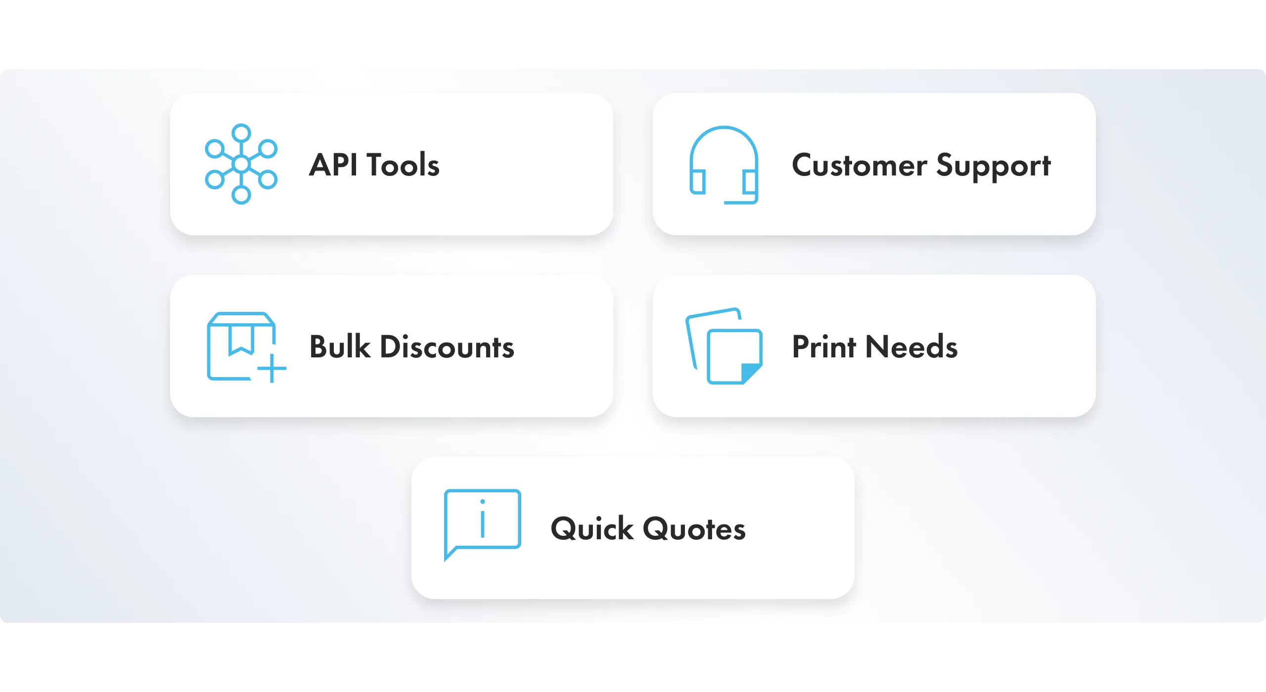
Book creation
Design online or use our free desktop software. We also integrate with several Adobe products.
Explore free tools Printing
On-demand printing lets you print the quantity you need whether that’s one book or hundreds. We handle all shipping and distribution, too.
Start your book Selling
Set your books up for sale on the Blurb Bookstore, or with Amazon or Ingram, all through one convenient dashboard.
Learn more Business services
Customized support, API tools, bulk discounts, and all your print needs fulfilled. Plus, quick quotes and consultations.
Explore services The Blurb Difference
Professional bookstore-grade quality
Versatile formats and sizes, luxe paper options, and three unique cover types all printed and shipped in-house.
Trusted printing partner
Backed by 20 years of in-house expertise and full production control, Blurb ensures consistent quality from start to finish. No outsourcing, no compromises.
Sustainable papers & practices
Our photo books are crafted in the US with Forest Stewardship Council-certified papers and printed at the facility nearest you, reducing emissions and supporting sustainable publishing.
Complete creative control
Choose between our free bookmaking software with flexible templates and page layouts or our plugins that work with Adobe programs.
Want 30% off? Sign up and save on your first book.
Inspiring examples made with Blurb
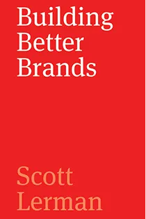
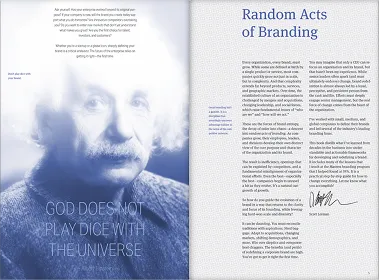

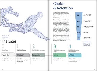
Branding at its best
- Creator type: Mid-size business, agency
- Scott Lerman, Building Better Brands
- Tool: Blurb plugin for Adobe InDesign
- Format: Paperback
- Paper: Standard Color
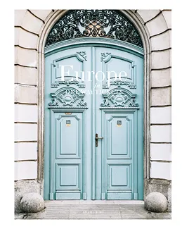
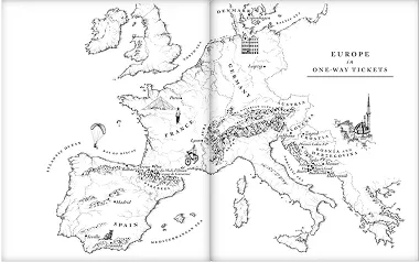
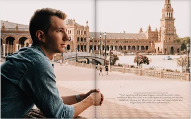
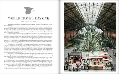
A travel treasure
- Creator type: Photographer, self-published author
- Adam C. Stuart, Europe in One-Way Tickets
- Tool: Blurb plugin for Adobe InDesign
- Format: Layflat
- Paper: Premium Lustre
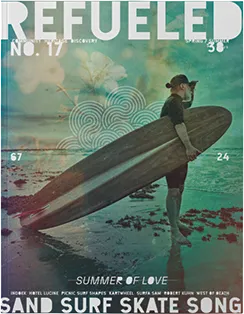

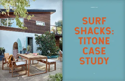
Refueling print
- Creator type: Artist, publisher, entrepreneur
- Chris Brown, Refueled Magazine
- Tool: Blurb plugin for Adobe InDesign
- Format: Magazine
Have questions?
Get answers.
What book formats can I create with Blurb?
Blurb offers various book formats for creators, including photo books, trade books, and magazines. Each format provides unique features and is tailored for certain types of content.
- • Photo Books: Perfect for fine art books, cookbooks, travel books, family albums, and portfolios, these high-quality books are available in six sizes and photo-quality papers and three cover types.
- • Paperback and Hardcover Books: This format suits novels and poetry books, plus children’s books and graphic novels. Available in four print options to balance cost and quality, paperback and hardcover books are priced to sell and printed with a free ISBN for broader distribution.
- • Magazines: These are available in one standard size and on premium paper. The magazine format is well-suited for serial content, catalogs, work samples, and portfolios intended for promotion.
- • Notebooks and Journals: Whether you’re writing, sketching, journaling, or scheduling, our custom notebooks and journals are available in three sizes and up to 480 pages with six interior paper layout options.
How do I create my own book with Blurb?
Blurb offers helpful design tools and software integrations to help you design your book. Here’s a simple breakdown about creating a book with Blurb:
- 1. Choose a book format: With several options available, choose the book format that best suits your content. For example, a photo book format is best for premium-quality art books.
- 2. Select a tool: Blurb enables creators to utilize various tools to create their books. You can use BookWright, which is Blurb's free bookmaking design software, or you can choose an Adobe InDesign plugin, Adobe Lightroom plugin, or Adobe Photoshop plugin, depending on your book's format.
- 3. Design your book: Once you have selected a tool, you can start designing your book. You can use Blurb's customizable templates or design each page yourself. You have complete creative liberty over your book's overall look and feel.
- 4. Edit your content: Editing is essential in creating your own book. Use high-quality images and organize text to tell a story that engages your readers.
- 5. Distribute your book for sale: If you want to sell your book, Blurb offers several options for promotion and distribution, including the Blurb Bookstore, Amazon, and global online outlets like Ingram. You can print one copy at a time or order many copies upfront for a lower price per unit.
Blurb makes it easy to create your own book while offering flexible design tools and lucrative distribution channels to sell your self-published book online.
How do I self-publish a book with Blurb?
The process of self-publishing a book depends on the nature of your book's content and your goals as a creator. In general, the self-publishing process involves the following steps:
- 1. Choose a book format that suits your content, such as photo books, paperback and hardcover books, or magazines, as well as your book's dimensions, cover, and paper choice.
- 2. Select a tool to organize your book's content and design your book using customizable templates or by designing each page yourself.
- 3. Edit your book's content to ensure that it's error-free and clear and that images are high resolution.
- 4. Design your book cover or have a professional design it for you.
- 5. Submit your book for printing. Blurb offers both volume printing and print-on-demand and handles shipping and fulfillment as needed.
Blurb simplifies self-publishing while taking the guesswork out of creation, pricing, and promotion. In turn, you can create a bookstore-quality finished product that rivals major book publishers.
How much does it cost to self-publish a book?
The cost of self-publishing a book varies by book format, number of pages, and number of copies. In addition to your book's chosen format and the quantity of needed copies, your book's paper choice and size also affect the publishing cost. Refer to Blurb's pricing page for a more detailed chart and pricing calculator.
How long does it take to produce and ship my book?
When creating and printing a book with Blurb, it takes about five business days to print and bind a book. Shipping can take an additional 1-5 business days, depending on the shipping method you choose at checkout. In total, the time it takes to produce and ship a book with Blurb can range from 6-10 business days. Please note that this is an estimate, and the actual time may vary depending on the book format, the number of copies, and the distribution options. Blurb does not offer expedited production times, so be sure to plan accordingly if you need your book sooner.
Does Blurb offer volume pricing?
Blurb offers volume order discounts starting with orders of 10 or more copies of the same book. For orders of 750 copies or more, Blurb offers offset printing for better economies of scale. Blurb charges no distribution fees for printed projects and no commission for print sales. The cost per unit decreases as the number of copies increases, and you can print one copy at a time or buy many copies upfront for a lower price per unit. Learn more about Blurb’s large order services.